#Monotype Imprint
Explore tagged Tumblr posts
Visit Tumblr Blog
Explore Tumblr blogs with no restrictions, modern design and the best experience.
Last Seen Tumblr Blogs


Fun Fact
Tumblr was acquired by Yahoo for $1.1B in 2013.
Text


Jasper Johns The 100 Monotypes
edited by Ortrud Westheider, Michael Philipp
Prestel Verlag, München 2018, 128 pages, 24x30cm, ISBN 978-3-7913-596-2
euro 30,00
email if you want to buy [email protected]
exh.Museum Barberini, Postdam
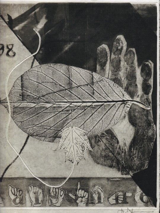
Jasper Johns (b. 1930) is one of the leading artists of American Pop art. Well-known for his large-format paintings in bright, vibrant colors, he was also a prolific printmaker, and his graphic work puts the peintre-graveur on a par with Goya and Picasso. On the occasion of his 90th birthday on May 15, 2020, the Museum Barberini presented his most recent series, The 100 Monotypes
“Is it a flag, or is it a painting?” This was the question asked by the musician John Cage when Jasper Johns began to move abstract expressionism back to figuration in the 1950s by painting flags, numbers, targets, maps, and letters. Cage alluded to Johns’s blurring of the boundaries between reality and representation. Johns has also repeatedly addressed the dynamics of reproduction by experimenting with collage and repetition.
Since each print is unique, monotypes are more akin to painting than to printmaking. Reworking the same plates many times for The 100 Monotypes, Johns added an etched imprint of his hand and symbols of American Sign Language (ASL), as well as motifs that were important to him, such as string, stencils, and allusions to his own paintings and sculptures. The artist commented about this interaction in an interview: “I like to repeat an image in another medium to observe the play between the two: the image and the medium. In a sense, one does the same thing two ways and observes differences and sameness—the stress the image takes in different media. I can understand that someone else might find that boring and repetitious, but that’s not the way I see it. I enjoy working with such an idea.” Each monotype informs the next, thus forming part of a narrative chain that reflects Johns’s artistic practice as well as his oeuvre.
26/06/26
#Jasper Johns#100 monotypes#art exhibition catalogue#Museum Barberini Postdam 2018#fashionbooksmilano
0 notes
Photo


Typography Tuesday
POST-WWI PRINTING IN ENGLAND
We return to Printing of To-Day: An Illustrated Survey of Post-War Typography in Europe and the United States, printed at the Curwen Press in 1928, and published by Harper and Brothers in New York. and Peter Davies Limited in London (a publishing house founded in 1926 by Peter Llewelyn Davies, one of the Llewelyn Davies children befriended by J. M. Barrie, and whose name was the source for Barrie’s Peter Pan).
This week we feature specimens from the section “Printing in England,” by British printer typographer Oliver Simon (1895–1956), the managing director of the Curwen Press and co-founder of the influential typography journal The Fleuron. Simon writes:
The majority of books in England are set by Monotype or Linotype machine. . . . The Monotype machine is, in my opinion, better adapted to printing the finest quality. . . . Moreover, the Monotype Corporation has a better selection of type faces to offer printers than its rival, although . . . both corporations fall short of what might be expected of them. . . .
There are no CONTEMPORARY Book-types worthy of note: printers are in advance of typographers. It is not easy to believe that there are not designers who could do good work if encouraged. . . . To-day, the two type corporations. . . have for all practical purposes a monopoly! Is it too much to ask them to commission modern types? . . . The plates that follow . . . may give a hint of what English printing will achieve in the near future if printers and publishers will have faith in their own age.
Fortunately, Simon would see his desired outcomes achieved during his lifetime. Once again, as image captions are still not appearing in the Tumblr dashboard, we list them here from top to bottom:
1,) Title page for Ernest Gimson: His Life and Work, printed in Caslon types by the Shakespeare Head Press, with an illustration by F. L. Griggs.
2.) Title page for Robert Graves’s Welchman’s Hose printed in 1925 at the Curwen Press for The Fleuron in Monotype Imprint.
3.) Page from Pompey the Little printed in Caslon with a wood engraving by David Jones at the Golden Cockerel Press.
5.) Page from William Meinhold’s Sidona the Sorceress, with an illustration by Thomas Lowinsky, published in Monotype Garamond by Ernest Benn for the Cambridge University Press.
6.) Opening page for Poor Young People, printed by the Curwen Press for The Fleuron in Monotype Caslon and illustrations by Albert Rutherston.
7.) Title page from Two Poems by Edward Thomas, designed by Percy Smith, and printed in 1927 at the Curwen Press for Ingpen & Grant in Caslon and Stephenson Blake open capitals.
8.) Opening page from Horati Carminum Libri IV, with illustrations by Vera Willoughby and Koch Kursiv type, printed by the Curwen Press for Peter Davies.
9.) Title page for Passo Domini printed in Caslon with wood engravings by Eric Gill at the Golden Cockerel press in 1926.
10.) Page from Geoffrey Chaucer’s Troilus and Criseyde, printed in Caslon at the Golden Cockerel Press with wood engravings by Eric Gill.
11.) Half title and text page from The Receipt Book of Elizabeth Raper, with illustrations by Duncan Grant, printed at the Kynoch Press in Monotype Baskerville and Stephenson Blake open capitals for the Nonesuch Press.
12.) Title page from The Poems of Richard Lovelace, printed in Fell types at the Oxford University Press in 1925.
View examples of Continental printing from Printing of To-Day.
View our other Typography Tuesday posts.
#Typography Tuesday#typetuesday#Printing of To-Day#Curwen Press#Oliver Simon#printing in England#20th Century#Caslon#Monotype Imprint#Garamond#Stephenson Blake#Koch Kursiv#Baskerville#Fell#Typography Tuesday
69 notes
·
View notes
Photo
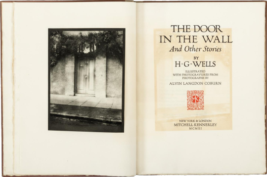
the door in the wall
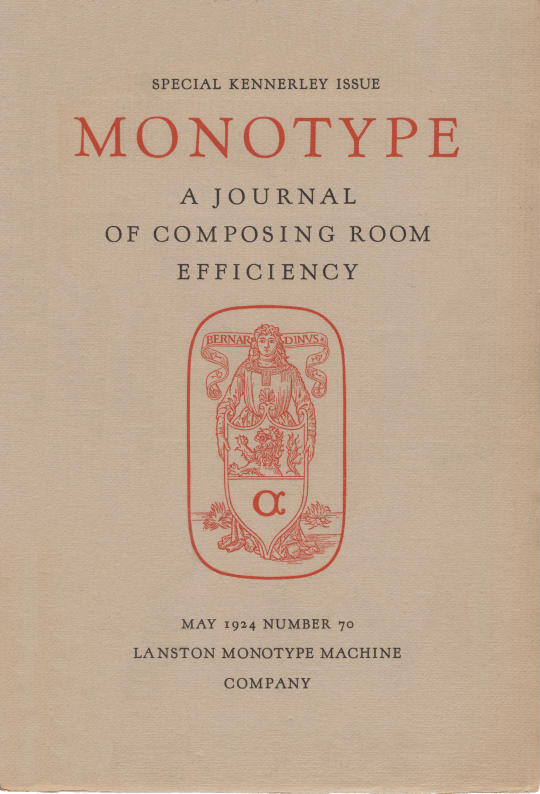
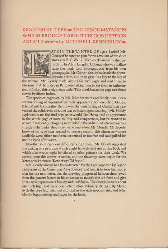
late in the winter of 1911, the english-born, nyc publisher mitchell kennerley asked his friend frederic goudy «if he cared to plan for me a volume of ten short stories by H.G. Wells.» [‘Kennerley Type, The circumstances which brought its Conception’, A Journal of Composing Room Efficiency, number 70, lanston monotype, philadelphia, 1924, p5.] «The most typographically distinguished volume bearing Kennerley’s imprint appeared in 1911. The limited edition of H.G. Wells’s The Door in the Wall and Other Stories was proposed by Alvin Langdon Coburn as a vehicle for his photographs. Kennerley commissioned Goudy to design the book, and sample pages were printed in Caslon type by Norman T. A. Munder.» [matthew j. bruccoli, The Fortunes of Mitchell Kennerley, Bookman, hbj, 1986, p51.] goudy was not pleased with the type fit of the sample pages & suggested to kennerley the cutting of a new face, one that would set more tightly yet carry color as caslon. kennerley relates that goudy drew inspiration from oxford’s fell types [monotype, op. cit., p5.]; but to my eye goudy was looking at a venetian. kennerley might be designated a 20th c. neo-venetian: serif, color, canted stroke to the eye of e, fit, canted hyphen; only, the cap-height has been brought into agreement with aldine norms. «Goudy, who retained the rights to Kennerley, leased it to the Lanston Monotype Machine Co. [lanston monotype 268] and to the Caslon Type foundry in England. … Three days after completing Kennerley Old Style, Goudy designed an entirely new face for the title page & story titles of The Door in the Wall, inspired by the lettering in the Roman Forum and accordingly named Forum Title. [bruccoli, op. cit., p53.] «Six hundred copies of The Door in the Wall were printed in November 1911; but publication was delayed by the spoilage of Coburn’s photogravures [photo-chemical engraving process, intaglio], which were to be inserted in [tipped in] the books. … Only three hundred copies were published with all ten illustrations.» [bruccoli, op. cit., p55.] of the three hundred copies not containing all ten photogravures some had at least one, but the complement was made up from aquatone prints [half-tone, relief process]. «As with many of the events in Kennerley’s career, it is impossible to be dogmatic about when Kennerley Old Style was actually first used in a book. The Door in the Wall is usually credited with this distinction, but it seems clear that Kennerley type was used to print 1911 books that appeared before the Wells volume. Kennerley stated that the first use of the type was in the four-page prospectus printed for The Door in the Wall.» [bruccol, op. cit., p53.]
some
settings in kennerley old style: ‹egg&dart›, ‹hommage à klaus›, ‹slender mark›.
#literature#photography#typography#h g wells#alvin langdon coburn#mitchell kennerley#frederic goudy#kennerley old style
2 notes
·
View notes
Text
why monotype:
its fun
gives a charcoal look without the abject mess from one
sensuality of the paper texture imprinted onto the print
2 notes
·
View notes
Photo
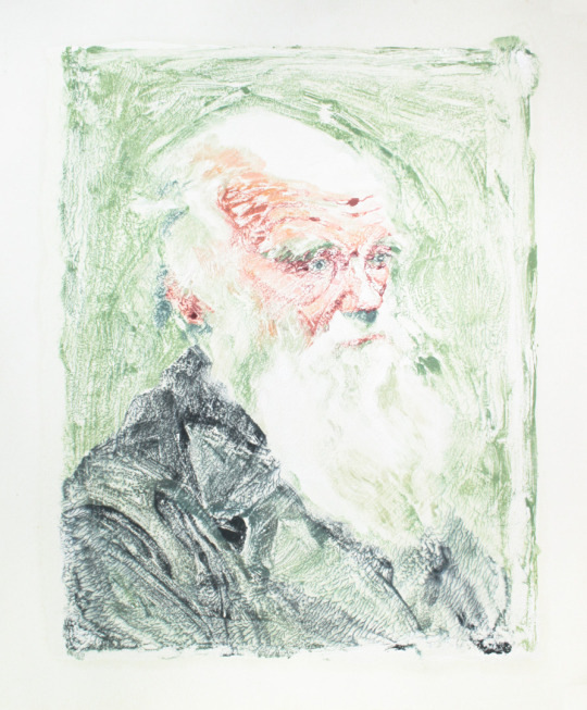


Darwin. Oil monotype on bristol paper. 15 x 18 in. Darwin (ghost). Oil monotype on BFK Rives. 15 x 18 in. After a photo by Leonard Darwin. Planning a series of historical figures, because the nature of a monotype is that a painting exists for a while, you make an imprint of it, and the painting is wiped away. The chaotic tributaries evoke geneaology, lineages, and organic structures.
#charles darwin#portrait painting#darwin portrait#printmaking#monotype#oil painting#evolution#fine art#Christian F.#illustration
6 notes
·
View notes
Photo
Private Collection. My work "N" monotype 70x30cm
2 notes
·
View notes
Photo

untitled, sylwia Zdzichowska
I'm using a defferent technics inter alia monotype, imprint, uniform-colour background. Paper have a 77x55 cm, but all around picture have a 5cm frame. I use graphic paper Canson Edition, paper density 250g
https://www.saatchiart.com/art/Printmaking-untitled/756176/2309079/view
0 notes
Photo

Woman by the Sea 2, Sheila Chapman
This painterly monotype is part of a body of work inspired by a collection of old photos I inherited from a family member. I love the enigmatic feel of this print, and the sense of timelessness. This print was made by painting the image, in Golden Acrylic paint, on to a glass plate from which an imprint onto paper was made by hand using a baren. The print is mounted in an off white mount and wrapped in cellophane.
https://www.saatchiart.com/art/Printmaking-Woman-by-the-Sea-2/781262/3758032/view
0 notes
Photo

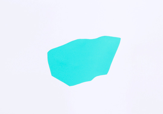
An imprint in her color, solo residency at Blindside artist-run-initiative between 29 April - 16 May.
He explained to me, as his friend had told him, “it’s the heart of the Philippines.”
An imprint in her color is a series of monotype, stencil and photographic screenprint works commemorating the unexplained and popular phenomena of the colour ‘aqua’, commonly found in the local architecture and family furniture of Filipino homes and neighbourhoods.
—————————————
2020, Untitled, an imprint in her color, 40 x 32cm, screenprint on copy paper.
#featured#aqua#philippines#color#green#printmaking#screenprinting#drawing#residency#artist#artistinresidence#AIR#blindside#heartofthephilippines#monotype#stencil#mjflamiano#colour
0 notes
Text
Otto Götz Mono printing

Götz was extremely active in exploring print-making techniques. He was interested in mono printing, a technique of drawing directly onto an etching plate, which is then imprinted onto sheets of paper. Each monotype is unique, incorporating unrepeatable chance effects. The biomorphic forms that appear in these works reflect Götz's interest in Surrealism.
0 notes
Text
First monotypes
Below are a collection of monotypes I made using found objects. Paper from a kids project, a fern leaf, off cuts of cardboard packaging, some craft material. I made several copies of each print to experiment - rolling directly over the objects, then removing the objects from the paper and creating a print from the imprint. I thought about ‘balance’ as I worked with the found objects to create abstract designs.


0 notes
Photo


It’s Fine Press Friday!
This week we present The Brick Moon: From the Papers of Captain Frederic Ingham by Edward Everett Hale (1822-1909), with illustrations by Michael McCurdy and an introduction by Alden P. Johnson. Printed in an edition of 1,950 copies at The Spiral Press of New York for members of the Imprint Society of Barre, Massachusetts in 1971. The book was designed and printed by Joseph Blumenthal, using his own typeface, Monotype Emerson, and Perpetua Titling. It is signed by the artist, Michael McCurdy, and his original wood engravings were printed directly from the block. The paper is white laid Curtis Rag made for this edition by the Curtis Paper Company, Newark, Delaware. The book was bound by A. Horowitz & Son in Clifton, New Jersey.
The prospectus notes:
“Edward Everett Hale’s The Brick Moon is one of his least known works. When noticed at all it is casually listed as science fiction. Actually it is much more: a delicious and witty satire on the author’s Boston contemporaries, still somewhat under the spell of Louis Agassiz and Bronson Alcott. The tale involves the conception, financing, building, and launching of a brick moon to serve mariners as a permanent beacon.
Hale was a prolific writer who authored and edited over sixty books, as well as being a constant contributor to newspapers and magazines. It is not surprising that he wrote a science fiction piece laid against the background of his beloved New England and its people. The introduction is by Alden Johnson, president of Imprint Society.”
This book is another generous donation from our friend, Jerry Buff.
View more posts about Joseph Blumenthal and his Spiral Press.
View more Fine Press Friday posts.
–Sarah, Special Collections Graduate Intern
#Fine Press Friday#The Brick Moon: From the Papers of Captain Frederic Ingham#Edward Everett Hale#Michael McCurdy#Alden P. Johnson#The Spiral Press#Imprint Society#Joseph Blumenthal#Monotype Emerson#Curtis Paper Company#A. Horowitz & Son#letterpress#wood engraving#Sarah Finn#sarah#wood engravings
34 notes
·
View notes
Photo

#printmaking #printdesign #printisnotdead #cutpaper #collage #mixedmediaart #contemporaryart #contemporarydesign #painting #art #abstractart #printemps #artistsoninstagram #artanddesign #modernart #opusdailypractice #sketchbook #creative #artiste #monotype #monoprint #markmaking #lottiestone #lottieanderson #canadianprintmaking #canadianart #bcartist #get_imprinted #imprint
#modernart#artistsoninstagram#opusdailypractice#lottiestone#monoprint#printemps#creative#contemporaryart#painting#monotype#markmaking#canadianart#sketchbook#lottieanderson#bcartist#printdesign#imprint#canadianprintmaking#collage#contemporarydesign#abstractart#artiste#get_imprinted#printisnotdead#printmaking#artanddesign#cutpaper#art#mixedmediaart
0 notes
Photo


Everything Is Imprinted series, monotype clothes, 2015
#artprint#atmosphere#3dobject#exhibitions#installation#intermedia#linocut#monotype#obsessive#performance#postapocalyptic#socialexperiment#stamppattern#textiledesign#communication#personalmytologies#visualpoetry#slovakartist#print#obsession#obsessions#obsessed#artobsession#artisticobsession#slovakart#slovakia#art#visualart#ingridkepkova#experimentalart
0 notes
Photo
monotype
0 notes