#Macra
Explore tagged Tumblr posts
Text


Doctor Who - revamped villains part one
208 notes
·
View notes
Link
Chapters: 1/1 Fandom: Doctor Who (2005), Doctor Who (1963), Doctor Who & Related Fandoms, Doctor Who Rating: General Audiences Warnings: Creator Chose Not To Use Archive Warnings Relationships: Second Doctor/Jamie McCrimmon, Ben Jackson/Polly Wright Characters: Jamie McCrimmon, Ben Jackson (Doctor Who), Second Doctor (Doctor Who), Polly Wright Additional Tags: Serial: s034 The Macra Terror (Doctor Who), Hurt Jamie McCrimmon, Minor Ben Jackson/Polly Wright, Protectiveness, Second Doctor Era, Mild Hurt/Comfort, Worry, Canon Compliant, Medical Procedures, Inside the TARDIS (Doctor Who), The TARDIS is the Best (Doctor Who), Sentient TARDIS, Guilt, Shame, The TARDIS Ships It (Doctor Who), Drabble, Ficlet Summary:
The Macra gas catches up with Jamie.
#ao3#fanfic#fanfiction#doctor who#classic who#macra#twojamie#jamie mccrimmon#second doctor#ben jackson#polly wright
10 notes
·
View notes
Text
the macra are the ultimate end point of the crab cycle
7 notes
·
View notes
Text
cris watches dr. who: s03e03 - "Gridlock"
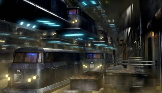
"New New York can start again. And they've got Novice Hame. Just what every city needs, cats in charge."
The doomed couple in the car looks like that Grant Wood-painting of the farmer and his wife that they also used in the opening of Desperate Housewives
Hee. Tempting Martha with knowledge is a surefire way to get her ass back on the TARDIS
He's pulling the same trick to woo Martha as he did with Rose, only in the reverse. With Rose it was Way Into the Future and then A Key Historical Figure into the Past, with Martha, it's the opposite
Aw. Martha doesn't know yet about all the Doctor's trauma
She might be too curious for the Doctors good. Already too insightful about All The Things The Doctor Is Not Telling Her
This is David Lynch's motor way: permanently stuck in traffic. Pure utter hell
Would there be Danny's?
Martha is a great hostage because she's just curiously making conversation instead of, I don't know, trying to break free
This is like Mad Max: Tranquil Road
It's Janis Joplin's coat? That is so cool
New New York might be my favourite recurring locale. It's super scifi weirdness and it's just always fun
Martha is so smart. Did I mention that? Cause she is
So the motor way is a necessary evil to keep the Macra at bay?
Ah, no, the highway is literally the only part of New New New (etc.) York that survived. The Macra are just a byproduct
How literal should we take the “children” thing? Are those kittens really human/alien-hybrids?
Soo... there's more Time Doctors? The Face of Boo wouldn't lie to me, would he? Would he?!
8 out of 8. Having just one reference to Cassandra would have pushed it into the 9 out of 8
#cris watches#cris watches dr who#doctor who#dr who#the tenth doctor#tenth doctor#10th doctor#david tennant#martha jones#freema agyeman#8 out of 8 tardes#gridlock#s03e03#macra#the face of boe#new new york
28 notes
·
View notes
Text
The Monster Makeovers of Modern Who

With Halloween just around the corner, I thought I would get back into the swing of things and talk about some monsters! No, not Rishi Sunak. Of course, I mean the monsters we actually enjoy! Daleks! Cybermen! And other horrors from the beyond that don’t try and turn trans people into scapegoats for their lack of policy. They say what you really mean- EXTERMINATE! Honesty, transparency, efficiency. Words so alien these days they belong only in Doctor Who! Mr Sunak, you’re so vain. You probably think this blog is about you. But it’s really about fashion. Specifically- makeovers!
I’ve been interested in filmmaking ever since Levar Burton took us to the set of Star Trek on Reading Rainbow. Like Doctor Who, “Star Trek: The Next Generation,” had its own makeover to attempt. They needed to establish a new look from the original series, while still implying continuity. Whole teams came together to reimagine the look of the ship’s interior, the look of the aliens, both classic and new, and even how the characters should dress. It’s truly inspiring to see these crews at work. These passionate people did their best with the available budget and resources. That said, I plan to deconstruct some of the makeovers of modern Doctor Who villains on an aesthetic and (at times) narrative level. It’s just a bit of levity for the horrors of Halloween, so let’s have some fun.
While the topic of updating classic baddies remains subjective, I’d like to think I’ve highlighted ways in which it can be objective. There are no hard rules to the process, but perhaps there are guidelines. I’ve noted a list of classic Doctor Who monsters that have since returned in the new series to discuss which designs I feel were successful and which ones missed the mark. Some of the criticisms I express will already be known to you. The Paradigm Daleks were notoriously reviled amongst fans. But hopefully. some of my opinions may surprise you. I’ve decided to exclude certain redesigns like the Movellans due to their lack of screen time. And while the Ood and Minotaur are cousins of the Sensorites and Nimon respectively, they’re technically not a proper redesign. I will however be covering the cousins of the Silurians- Homo-Reptilia, as they are very much meant to serve the same purpose. I’m presenting this list in alphabetical order, but some creatures will be listed together as a subspecies of another. Buckle up because this is going to be a long one!
Autons

As a child growing up in 90s Kansas, one of my favourite places to visit was the mall. The mall my grandpa used to take me to was known for its extravagant features. One of my favourite things, however, was a clothing store that used mannequins that interacted with the space around them. I don’t mean they moved, but rather that they were dynamically posed. My favourite leaned against the shop window with the palm of its hand. I had never seen that sort of display before. It made them feel as though they were merging into the real world. They were hip if not a touch creepy. I couldn’t tell you the name of the store, but I remember those mannequins. And aside from a granite finish, they looked like the Autons from 2005’s debut episode “Rose.”
Had the Autons returned looking like 70’s mannequins, they would still look creepy. But it would evoke more of a kitschy retro shop than something from a London high street. The creepiness of the Autons isn’t anachronistic, but rather in being timely. The less we notice them, the better. They wear their mundanity like a tiger wears stripes. You only noticed it move when it’s ready. This is a roundabout way for me to say they are brilliantly redesigned. They look modern, and you wouldn’t even notice them if you weren’t predisposed to Doctor Who. They’re exactly the featureless dummy you expect to see in a shop window. The moment their hand gun opens, you would be taken by complete surprise.
A benefit of the Autons coming first alphabetically is that it allows me an opportunity early on to address performance. Because like they say- looks aren’t everything. A Doctor Who baddie is so much more than a costume. And a minor sticking point for me is that the Autons can seem as though they hired a bunch of pop-lockers to stand around in sweaty suits. I’m reminded of the movie theatre scene from “Human Traffic,” where the employees mechanically go about their work. It’s a small grievance, but I wish they would have created a less familiar form of movement than the robot. They’re a hivemind and yet each dancer is doing their own form of popping. I know it costs time and money to do, but it would have been cool to see those dancers come up with a more alien system of movement. It’s not as though the ballet dancers chosen to portray the Weeping Angels were performing pirouettes.
This problem persisted into the Moffat era with Roman Autons. While they were under the impression that they were human, they moved about and spoke like humans. But the moment the Nestine consciousness takes root, their bodies move into a sort of robotic marching. Suddenly whirring can be heard from alien actuators and servos that make no sense for living plastic. Once again, it feels as though they would rather speak in a familiar voice of filmmaking than create one. We all know that little android sounds and robotic movements mean they’re mindless automatons, hell it’s the root of Auton. But the idea of living plastic is so much weirder than a robot. I would love to see them lean more into that.
Cybermen/Cybermats/10th Planet Cybermen

Having started my foray into Doctor Who with Paul McGann and then moving on to the 2005 series, most of the baddies on this list were brand new to me. When I did finally work my way to classic Doctor Who, I was a bit surprised to find the early Cybermen leaned more into the “men,” aspect of their name. Not only were they more articulate than repeating “Delete,” ad nauseum, but their bodies were less robotic. They moved like men. The Cybermen may be the first time I looked at a Doctor Who villain and thought “Oh the old versions were much better.”
This isn’t to say that I disliked the RTD Cybermen, but rather, I find classic Cybermen more effective. While the Cybus Cybermen felt dangerous and militaristic, they lack the humanity present in the Tenth Planet Cybermen. They remind me of the zombies from Return of the Living Dead- they’re smarter, faster, and they feel like the reanimated body of a dead person. You do get glimpses of this in these Cybermen, like in “The Pandorica Opens,” where you see a Cyberhead open to reveal a rotting human skull. The glimpses of the conversion process also imply a deeper dread of body horror.
I would argue that the Moffat era understood the walking dead aspect of the Cybermen better than the Davies era. In “Dark Water/Death in Heaven,” Moffat even pays homage to Return of the Living Dead by reanimating a graveyard of corpses with tainted rain. By this time, the look of the Cybermen had been streamlined from their Cybus look to their svelt “Nightmare in Silver,” look. I liked this redesign as it reminded me of the 80’s Cybermen with their silver space boots. They look more like men than robots. This slimmed-down look was realised even further in the Chibnall era, while also going for a more classic head style. As much as that era of the show disappointed me, its Cybermen were fantastic.
Not every Cyberman update aimed to reinvent their look, however. The updated look for the Tenth Planet Cybermen in “World Enough and Time/The Doctor Falls,” merely added detail to their original appearance. Much like the Type 40 TARDIS the 12th Doctor steals from Gallifrey, the idea was to modernise the look for the high-definition cameras of the modern age. Because of this, these Cybermen may be my favourite of the modern era. It was a risky choice to change their bare hands to flesh-tone gloves, but I understand the decision. I had always liked that the Tenth Planet Cybermen’s hands were bare skin. Historically, hands are one of the hardest things to reproduce in robotics. It also felt that the Cybermen’s hands were the last remaining vestige of their humanity. None of this is lost with the inclusion of gloves. These Cybermen are a nightmare to behold. They languish in physical pain, calling out for solace. The conversion process is still traumatic and bloody. They are horrific.
Another element of the Cybermen that was updated for the new series were the Cybermats. The look of the Cybermats, much like the Cybermen, has always changed, so it’s hard to feel too precious about a redesign. And their appearance in “Closing Time,” is no different. I’ve always liked the look of the modern Cybermat. Their eye shape is a pleasing nod to the Cybermen’s eyes while also calling back to their original appearance. Their segmented tails give an armoured appearance which evokes small creatures like armadillos and insects. My only real complaint about these little munchers would be their very organic teeth. I always figured the “mat” part of their name was meant to be a play on “rat,” so if you were to give them teeth at all, why not rat teeth? What tiny creature was converted to make these little abominations? In the classic series, I never really thought of Cybermats having anything organic about them. You could argue that the Cybermats from “Revenge of the Cybermen,” were snakelike, but I never really thought of them as organic. Regardless, I’m now trolling eBay for one of the 1:1 replicas they sold.
Daleks/Davros

Before their return in 2005, the Daleks made the briefest of cameos in the 1996 Doctor Who TV Movie, sort of. Since we only ever hear their voices, we have no idea what the Daleks would have looked like. Judging by those voices, it’s safe to say they probably would have been a bit of a departure from their general appearance throughout classic Doctor Who. Especially when you consider that adaptations in the ‘90s were known to go for new extremes in design. That’s not to say they would have been bad. The Eighth Doctor’s cathedral-like TARDIS interior was a far cry from the brightly lit round things of the ‘80s TARDISes, and it’s probably my favourite interior. But there is no denying it would be challenging to redesign the universe’s most iconic monsters.
By this measure, I consider the black and bronze Daleks of the RTD era to be a stonking success. Their redesign is mostly effective because it doesn’t aim to reinvent the wheel. It maintains the overall silhouette of the Dalek in a way that makes it immediately recognisable. The changes we do see feel utilitarian, lending these Daleks a tanky quality. You can imagine these Daleks as a product of war. They’re reinforced for battle and feel powerful. Honestly, zero notes. I can’t find a single area for improvement. They even look good in other colours and attachments. Even the mutant inside the casing was given some much-needed continuity in appearance. Where the mutant of the classic series often changed in appearance, it’s now established that Daleks are one-eyed brain squids under all that metal. Simple as can be. No need to change anything.
Enter the Paradigm Daleks. As I said above, the Paradigm Daleks aren’t exactly well-received by the fandom, and not without good reason. I’ve seen at least four different Mighty Morphin’ Power Daleks mash-ups of their big reveal in “Victory of the Daleks.” But is being a big colourful hate machine that bad? I will admit, their silhouette is a bit chonky, giving them bumble-bee bums. But their eye stalks look lethal and their voice modulation fills me with dread down to my stomach. The creepy goat eye nestled in the end of an eyestalk that looks like it would cut to the touch is a great change. I also really like the idea of them having different roles indicated by colour rank. What the hell is an Eternal Dalek? I still want to know.
The biggest issue with the Paradigm Dalek redesign is that unlike it’s predecessor, it seems to miss what is actually scary about Daleks. For starters, Daleks have no concept of elegance, so why the clean lines on the casing? Those neck louvres (that’s what I’m calling them), are far too stylised. Gone is their tank-like appearance, save for their brutal eyestalks. They made them taller as to appear more formidable, which further bolsters why they miss the mark. If you can’t make an hate-filled monster covered in armour scary, the problem isn’t height, it’s writing. Also, we stan a short king in this house.
It’s hard to take the Chibnall-era Dalek redesigns too seriously, because neither of them ever felt like they were meant to be permanent. One was meant to look like a Dalek made of scrap metal, because it was, while the other was the bi-product of two evil forces- the Daleks and the Tories. The “Revolution” Daleks do look a bit like a bootleg toy of a Dalek you could win at a fun fair. Or the result of an AI prompt for the word Dalek. Regardless, they’re fit for purpose and don’t affect my opinion one way or the other. If they had stuck around, I may feel a bit different.
Not to be excluded from the redesign process is the Daleks’ crazed creator- Davros. By the end of the classic era, Davros had a bit of a Rickety Cricket thing going where every time we see him, he’s progressively more mutilated. In the end, he was just a Futurama-style head in a jar. The Davros of the new series is back to a more classic silhouette. His one arm has returned as a cybernetic limb, while the other remains suspiciously under his keyboard. Typing one-handed eh Dave? He’s been given some gimp leather to wear, and his chair has taken on the same armoured look of the Davies Daleks. Much like the mutant inside the casing, Davros has been given a baseline appearance and it's an effective one. Couple that with Julian Bleach’s perfect performance, and you’ve got another success.
Ice Warriors
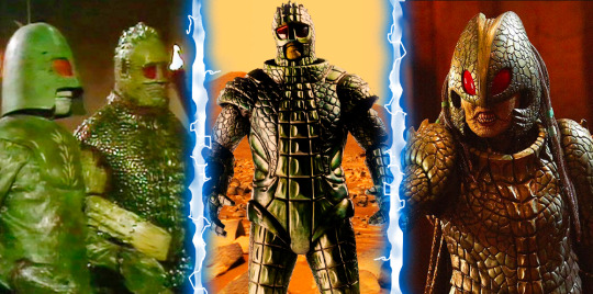
Who doesn’t love a good Ice Warrior? They’re forever cool (no pun intended). While not always villainous, they are fierce and formidable. They’re also a bit weird. The original Ice Warriors stood taller than your average Doctor Who alien. And there is something about their deep green carapace that feels believable. These battle-hardened reptiles wore their outer shells like armour. At the joints of these plated segments sprang tufts of fur. From a costuming perspective, these patches would have been used to hide seams and add points of visual interest for the average black-and-white television. From a narrative perspective, the hair only added to their weirdness. In short, I like the classic Ice Warriors very much.
The Ice Warriors are also the first classic baddie redesign I had to wait to see. By the time I had started watching Doctor Who, Matt Smith was filming series six. The Ice Warriors don’t make their return until series seven, which gave me ample opportunity to imagine what they would look like. What we got was bang on what I had hoped for. They leaned into the weird and won in a big way. When “Cold War,” aired, there was a bit of contention about the reveal of an Ice Warrior outside of its armour. Perhaps it’s because their helmets possess a sort of Judge Dredd quality that in turn causes people to think you can’t show Ice Warriors without their helmets. But they’re going full Stallone and it’s fine. Dare I say it’s even a bit cool?
A sticking point for me on the redesign was the lack of their stupid Lego Minifigure hands, which I love. But when you see their long skinny fingers reaching with their claws out, you might need to give the suit some fingers as well. Their reptilian aspects are also celebrated in their redesign. The Empress is a ferocious take on the look of the commander rank Ice Warriors. I said in my review of “Empress of Mars,” that the guns that turn people into cubes were a bit silly, and I still feel that way. And sure, I would have appreciated the odd "Ssss," at the beginning of an S word. But in the end, they allowed the Ice Warriors to shine for what they are, and that’s all that matters.
The Macra

One of my least favourite Pokémon designs is Raichu. You have Pikachu, an almost perfect marriage of form and cuteness. How do you improve on such a design? You can’t. This is why Raichu’s little curly-Q ear tufts and embellished lines look less like an evolution, and more like someone who didn’t know how to stop drawing Pikachu. Or when to stop spelling bananana. You just can’t improve on perfection. Now you’re probably wondering two things right now-
Why the drive-by on Raichu?
What does this have to do with the Macra?
To answer the second question- “absolutely nothing.” And that’s the point. There was no perfection to mess up in the case of the Macra. The originals looked like a pile of playground equipment. The only place to go was up. First order on the list- does it look like a giant crab? Yes. List over.
Changing the Macra by devolving them into dumb beasts only adds to this winning revamp. Why were they at the bottom of the motorway of New New York? Had their nefarious plot backfired reducing them to mere monsters? It’s a great little incorporation of characters lesser showrunners would have called "embarrassing." I love the Macra. I love that they didn’t overdo the Macra. I love that they don’t tell us everything. Whatever crab rave they had going on down there will be lost to time. Or until Big Finish takes a crack at it.
The Mara
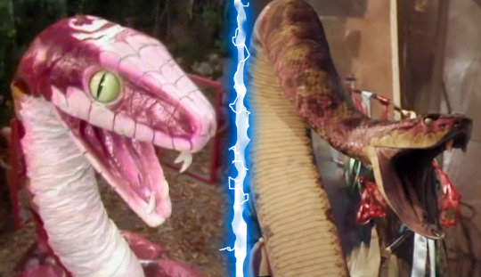
I will admit, this one is a bit of a cheat. It’s one of two on this list that you may think of as a cheat. But hey, they brought the Mara back in the web short “The Passenger,” for the season 20 Blu-ray release. I’m counting it! I’m also counting it because the Mara have been updated not once, but twice to a modern CGI standard. Plus it gives me a chance to talk about “Snakedance,” which I will always relish.
The practice of replacing old footage with newer CGI is not without its detractors. George Lucas released the special edition of the original Star Wars trilogy in 1997 and people are still arguing about it. I’m in two minds about it myself. I like some of the changes they’ve made to Star Wars, ‘60s Star Trek, and even Doctor Who. I dream of the day when they take a crack at Babylon 5. But it also has its limitations. I would be upset if they updated the model shots of Scaroth’s ship in “City of Death.” But in the case of a goofy pink snake puppet? Fine by me.
That is not to say I don’t find the snake puppets of both “Kinda,” and “Snakedance,” charming. They certainly are. But they’re also so very distracting. There’s the suspension of disbelief and then there’s the stifling of laughter. If you can get past the snake, you will see both “Kinda,” and “Snakedance,” for what they are- some of the best of Classic Doctor Who. The CGI snake does exactly that and nothing more. It’s not even a fancy CGI model. Someone probably downloaded a rattlesnake asset and coloured it pink, and that’s absolutely fine. It’s another Macra situation. Does it look more “snake,” than “snek?” Yes. List over.
The Nestine Consciousness
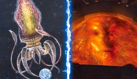
In the words of Vito Corleone- “Look how they massacred my boy!” Ok, maybe massacred is a bit harsh. But even by series one standards, that CGI pool of molten plastic is pretty damn awful. I say this with a handful of caveats. Yes, this was essentially a pilot for the relaunch of the series. Yes, the production crew was brand new. No, the budget wasn’t huge. You could probably list more reasons, but my point is made. They did their best.
I don’t need to ask why an amorphous blob was easier to depict than a giant space squid. Hell, it was too expensive in the '70s. We only ever saw it’s tentacles back then! I had to use Andrew Skilleter’s illustration from the Target novelisation of “Terror of the Autons.” Mostly because the show never shows the entire squid and also because Skilleter owns! But the kid who grew up on ‘90s Nickelodeon and Beetlejuice in me will never think of a pool of goo as an upgrade from a space squid. It’s just not gonna happen.
As returning readers may have noticed, in the “rad vs. trad,” debate, I have always sided with rad. I like Doctor Who a bit weird. So weird that I am arguing that something is weirder than a glowing vat of sentient plastic. But here I am. The beauty is that RTD explained the change as a devolved form of the Nestine Consciousness. Maybe it was temporary. The squid may return yet! Furthermore, Doctor Who audiences have been watching Talking Tree and Raccoon movies in the intervening years. People are more open to weird these days. Add a bigger budget and we may see the comeback of the cosmic cephalopod!
Rutans

This is the other entry on this list that you may feel is a bit of a cheat. The above illustration on the right comes from an official Doctor Who video game titled “The Gunpowder Plot.” It is a redesign of the Rutan Host for the Matt Smith era. Seeing as their new design is meant to represent the style of the modern series, I’m counting it.
As redesigns go, this one had a lot of wiggle room. Usually only mentioned by name, the only time we ever got to see a Rutan onscreen was “The Horror of Fang Rock.” Throughout most of the story, the Rutan looks like a quenelle of green jelly sloughing slowly up the stairs of a lighthouse. When I was five, my trip to Cocoa Beach was cut short due to an outbreak of jellyfish. The one I almost stepped on with my bare foot looked a lot like that. It’s not hard for me to imagine a little green blob as dangerous.
It feels almost too perfect then that the Rutan redesign would land somewhere in the vicinity of a jellyfish. While they are capable of shapeshifting, tentacles do add to their base physical prowess. You can imagine one of them holding their own against a Sontaran. You can imagine one wrapped around one of their potato noggins and it being lights out. Whoever worked on that game has done the show a favour if they ever bring the Rutans back. Green electric jellyfish will do just fine.
Sea Devils

Back when I reviewed “Legend of the Sea Devils,” I mused that it followed the tradition of Sea Devils stories being “not very interesting.” So it came as a bit of a shock to me back in June when Doctor Who Magazine readers ranked it the eighth-best story of the Pertwee era. What were they seeing that I wasn’t? Because by my standards, it’s about two episodes too long. My thought is that people love it mainly for two reasons- cool vehicles and the Sea Devils themselves. Much like the St Paul’s Cathedral shot from “The Invasion,” the shot of the Sea Devils emerging from the sea is doing most of the heavy lifting. Such is the legacy of effective imagery.
The element of the Sea Devils’ look that has aged the poorest has to be their netted tunics. They look dingy and cheap. I imagine on some level, they helped, as Adam Savage would say, “hide the crimes,” of the costume department. The costumes weren’t playing on camera so maybe they added the netting. I’m just speculating here. After all, their cousins, the SIlurians, walked around in the buff. The next time we see the Sea Devils in “Warriors of the Deep,” they’re decked out in a sort of Samauri attire. Just because they lived underwater doesn’t mean the Sea Devils were unaffected by Feudal Japan. Nobody seems to have cared about this change in costuming. Or perhaps they were busy recoiling from the Myrka. The Silurians remained true to their nudist lifestyle.
Other than the Daleks and the Weeping Angels with Paul Dano’s face of the Chibnall era, I rather liked most of its character redesigns. I particularly liked the Sea Devils. I like that they kept their big fishy eyes and turtle beaks. And did you catch that adorable Baby Sea Devil from “Defenders of Earth?” That thing looks like a cross between Grogu and my own pet tortoise and I would kill for it. Like the Dalek update of the Davies era, they kept the silhouette intact and simply gave it a more believable appearance. Are the eyes a bit more cartoony? Yes. Is that fantastic? Also yes.
The major change to the look of the Sea Devils are their costumes. They’re a sort of mash-up of Asian influences with little references to the netting of their first appearance. If you’re a big fan of the Sea Devils, I think it would be hard to complain about their appearance here. Their bismuth-encrusted swords are a nice addition (just don’t let them touch your skin). You can imagine them as swashbuckling monsters who once ruled the sea. Now if only someone could come along and give them a proper adventure to star in!
Silurians
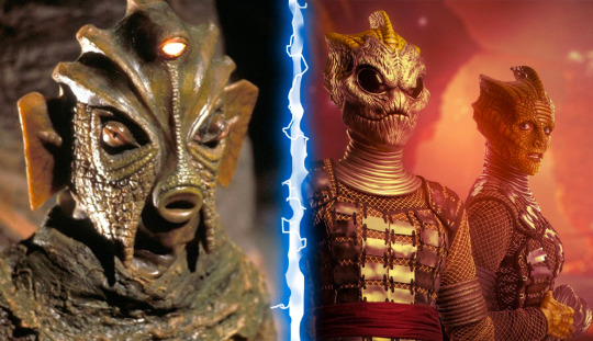
Much like the Royal Family, Doctor Who writers get a lot of leeway out of the word “cousin.” It covers a multitude of sins. Such is the case when dealing with the Silurians and their cousins- Homoreptila. It’s a blink-and-you-miss-it line of dialogue that I unfortunately missed the first time around. I was too busy blinking in disbelief at how depressing Broadchurch with lizards could be. It wasn’t until revisiting the two-part story “The Hungry Earth/Cold Blood,” that I finally heard the line explaining the discrepancy.
Why that matters is that it’s the reason I had a two-year chip on my shoulder about the Silurian redesign. This isn’t to say I thought they looked bad. The makeup job on the modern Silurians is very good. They just don’t look like Silurians. It bothered me because one of the things I liked about Doctor Who is that it often set itself apart from Star Trek. Star Trek aliens are more often than not- rather humanoid. This has always felt like a storytelling device more than anything. Less makeup equals more of the actor’s performance shining through. Doctor Who, on the other hand, asks its viewers to see something relatable in something inhuman. You can still make this complaint against “The Hungry Earth/Cold Blood,” because it does feel like they wanted you to see the human inside the Silurian costume. They couldn’t resist the Spielbergian desire to give the lizards soulful human eyes.
Any design change seems to stem directly from this need, so it feels difficult to judge them otherwise. Even their dehumanising masks were more of a measure to save money on facial prosthetics, though they do add an air of mystery. Those black-eyed masks were downright exciting until they took them off to reveal a very human face. Had they gone with those masks as their faces, I might have been able to overlook the exclusion of their third eye. It would have been very easy to modernise as well. Many reptiles and amphibians have what is known as a parietal eye on top of their heads. They can even sense fluctuations in light. Incorporating one into the design would have been very easy. That said, the ridges on their heads are in keeping with their original design and very striking. Especially on Madame Vastra.
Along with their masks, these Silurians are different in that they are no longer nudists. They now wear clothes. It makes sense that they did this. Their new humanoid appearance makes clothing essential. No need to adapt “The Lusty Argonian Maid,” for television. The costumes aren’t bad either. The netting feels like yet another call-back to their other cousins- the Sea Devils. Even their new guns do a good job echoing the disc-shaped guns the Sea Devils carried but with the aesthetics of the modern era. All in all, this redesign is fine, but I still yearn to see a proper Silurian in the modern style.
Sontarans
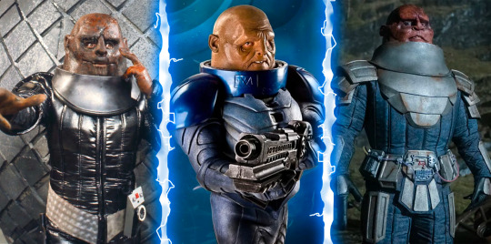
Tumblr user “zagreus-eats-your-bread,” once said of the Chibnall era Sontarans- “Big fan of the redesign. They finally look like absolute shit again. He looks like a knee.” While to some, that sounds like faint praise, I couldn’t agree with their sentiment more. The Sontarans looked awful in classic Doctor Who and I love them for that. There was something unsettling about the way Linx’s tongue would pulsate in “The Time Warrior.” The whiskers poking from his brow and mottled face only added to his vile appearance. His helmet towered over others as he sized them up. A striking foe if there ever was one.
It’s odd then, that the Davies era decided to make the Sontarans squat in stature. They even explain that it is due to the high gravity of Sontar that they’re so short. Their bodies developed for load-bearing. It made sense narratively and wasn’t really a problem. Like I said above- we stan a short king. The problems arose sometime in the Moffat era. The Sontarans had gone from dynamite in a small package to comic relief. I hesitate to blame Strax, but he is when this started to happen.
Cynicism is likely the cause. Writers looked at the Sontarans and said “Ha, potato head and a short body!” One of the fiercest races in Doctor Who history was reduced to an army too stupid to realise that an invisible tank left them completely visible inside. It’s like when people think of the Daleks as embarrassing because they look like pepper pots and completely ignore the fact that they’re also genocidal maniacs. This is why I appreciated Chris Chibnall’s desire to add some ferocity back into the Sontarans. Their stature had returned to that of the classic look, which is fine. Unlike the Daleks, there was a precedent for a tall Sontaran. And yes, they looked like shit again. We could see the Sontarans as a threat once more. Oh, they’re stuck in an off-license eating chocolate like Augustus Gloop? Oh. Right.
Time Lords
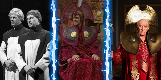
I hemmed and hawed about whether I should include these guys or not. Do I add the Master while I’m at it? But in the end, many Time Lords are monsters and they too received a makeover. Though it isn’t much of one. In fact, I once read that aspects of their costumes were reused from the classic series. You could argue that their biggest redesign happened somewhere between their first appearance in “The War Games,” and “The Deadly Assassin.” They started out looking like a cult that formed in the basement of an Apple Store. But somewhere along the line, they got seriously into collars. It was the ‘70s after all. People’s shirts were 30% collar back then.
Sadly, while the overall look of the ‘70s Time Lords carried on into the modern era, they abandoned their love for colour. Rassilon being the Regina George of Time Lord society decided that we only wear red on Wednesdays. And seeing as they’re time travellers, it’s always Wednesday somewhere! So the Time Lords left their saffron and purple robes at the cleaners. Even the citizens of Gallifrey are shown in “The Day of the Doctor,” wearing variations of red and white. Everyone fell in line and fashion suffered.
When we see the Time Lords in “The Timeless Children,” they’re now wearing very stylish Cyberman headgear. Their red hoods have now been replaced with gold numbers laser-cut with Gallifreyan writing. I would call it a fashion breakthrough if not for the fact that everyone was still decked out in drab silver. I don’t want to see the Time Lords again until they take a page from the Fifteenth Doctor’s book and learn to diversify their wardrobe. Yas hunty! Werk!
Zygons
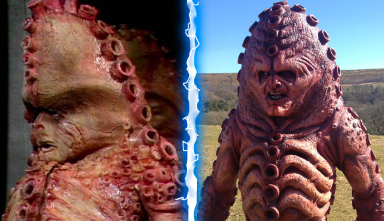
If you’ve not been to Neil Cole’s Museum of Classic Sci-fi in Hexham, you should do yourself a favour and change that. It’s a great day out, and if you’re lucky, Neil might even be available to chat. Something I learned when talking to Neil is that he has some rather strong opinions about the redesign of the Zygons. Primarily, their head shape. Throughout this article, I’ve praised some of the redesigns for their adherence to the basic silhouette of the baddies. If you were to show me either version of a Zygon in a silhouette I would identify them both as Zygons, but dammit Neil, you’re right. The head just isn’t right.
Initially, I thought it was the mouth shape, which is definitely different. When they redesigned the Zygons for “The Day of the Doctor,” my thought was “What happened to their kitty cat faces?” You may not see it, but I have always looked at classic Zygons and thought “Aw, there’s a Mister Kitty!” And they replaced their little button nose and philtrum with a set of far more human features. Seriously Moffat, what is it with you? They’re aliens! Let orange squid men covered in suckers have cat faces!
The top-heavy ridge of their heads gave them a sort of lumbering look, which may have been the impetus to change them. The Zygons of the 50th anniversary needed to do a fair bit of running. But it also detracts from the iconic lines that made them so striking back in 1975. Below the neck, the design choices make a lot of sense. Like the Ice Warriors, the goal seemed to be to add more texture and detail. The ribs seem more defined as do the suckers. Even their bio-tech devices are appropriately slimy and detailed. When they find Kate Stewart in that purple bubbly skin poncho, none of us are offering to trade places with her. Unless that’s your thing. Don’t let me yuck your yum.
My main qualm with the modern Zygon is less with their design and more with their physiology. The Zygons have always been squidgy shapeshifters. But since when do they turn people into smouldering balls of staticky hair? They tried to explain that this was a new development of technology, so why is one of the refugee Zygons able to use it on himself? It’s not as though the Zygon’s body is not already teeming with venomous stingers. If you’ve ever read Mark Morris’ “The Bodysnatchers,” you’ll know exactly what I mean. Mark does such a good job delving into the physiology of the Zygons that he set the standard by which I judge all future Zygon depictions. It’s seriously great stuff.
Aaaaand we're done! Phew! This one took a long time for me to write. I wanted to return with a bit of a long one because I haven't written anything in a while. My sister came to visit from July to August, so I had been very busy. Then I got ill, yadda yadda yadda. Expect to see more of me soon as I plan to cover the 60th Anniversary Specials and beyond. I may even review some classic Doctor Who in the meantime! Stay safe and take care!
#Doctor Who#Monster Makeover#Russell T Davies#Steven Moffat#Chris Chibnall#Auton#Cybermen#Dalek#Davros#Macra#Mara#Snakedance#Kinda#Time Lords#Zygons#Sontarans#Ice Warriors#Rutans#Nestine Consciousness#Silurians#Sea Devils#Modern Doctor Who#Classic Doctor Who#BBC#TARDIS#The Doctor
35 notes
·
View notes
Text
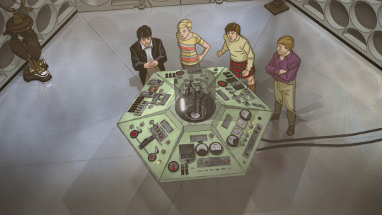
The Macra Terror
"There is no such thing as Macra!" The Macra Terror is this week's #TBT! #DoctorWho #DrWho #ClassicDoctorWho #ClassicWho #TheMacraTerror #SecondDoctor #PatrickTroughton
This is an emergency! Control must be believed and obeyed! No-one in the colony believes in Macra! There is no such thing as Macra! Macra do not exist! There are no Macra!Control Voice Synopsis The Doctor, Ben, Polly and Jamie visit a colony that appears to be a happy holiday camp. However, when they scratch beneath the surface, they find that the colonists are mind controlled by the Macra,…
View On WordPress
#Animation#Anneke Wills#Ben#Classic Doctor Who#Classic Who#Doctor Who#Doctor Who Season 4#Dr Who#Fraser Hines#Jamie McCrimmon#Macra#Michael Craze#Patrick Troughton#Polly#Review#Second Doctor#The Macra Terror
11 notes
·
View notes
Text
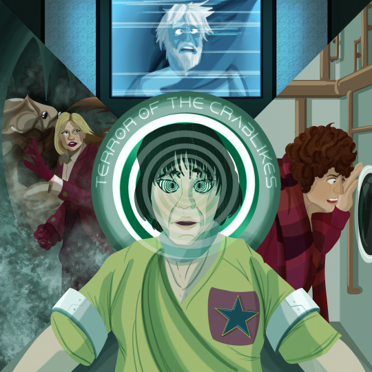
Time Ram - Terror of the Crablikes!
The Doctor and Romana arrive in a colony overrun with crabs insects Garthim alien insect things that Shawcraft worked very very hard on. (Nobody in the colony believes in the Macra!) The only person they can seem to rely on is a young rebel called Adric, who claims to have seen these beasts. (Nobody in the colony believes in the Adric!) But when Adric encounters the Rotating Brainhell, he suddenly recants and betrays the TARDIS travelers. How can the Doctor stop the Macra when K9's had his head snapped off and Romana's been taken up the Old Shaft? (Nobody in the colony believes in the Carry On films!) What do the hardworking people of this colony believe in? Work ethic, Legs & Co., and the terrible Math Claws of Bidmead, swooping down from his Maths Perch on high!
Incidentally, thanks for the shoutout on the most recent episode, chaps! Much appreciated, it absolutely made my day.
Time Ram art masterpost
Alt. title and no hypno spiral versions under the cut


#time ram#doctor who#art#my art#fan art#fourth doctor#romana ii#adric#the macra terror#tom baker#lalla ward#matthew waterhouse#macra#Garthim#this is so sad. barney play the chromophone band
8 notes
·
View notes
Text
The Magnus Archives wiki describes the Extinction as
“The fear of catastrophic change, destruction of nature, destruction of human skin and tissue, the destruction of humanity itself and its replacement by something different; all of this especially via mankind's own causing. Manifests through human technology such as computers, code, and radio, and seems to present horrifying visions of what humans could become, or what could become of humans.”
#doctor who#classic doctor who#the magnus archives#the valeyard#the dream lord#the trickster#the maestro#adipose#ood#the mara#macra#the white guardian#the black guardian#midnight entity#the silence
4 notes
·
View notes
Text
Okay everyone who commented on my post about gridlock talking about the crabs (macra) from a second doctor serial needs to finally fess up and tell me where to watch it because I’ve seen all the second doctor available on Amazon and I’m like 40% sure it’s not there. (I have amnesia about much of the earlier serials)
#gridlock#fuck I can’t remember what those crabs are called#second doctor#missing episodes#maybe#dr who#doctor who#classic who#MACRA
14 notes
·
View notes
Text
Doctor Who: Gridlock
I rewatched this story on 27 June 2023.
There’s a small teaser scene before the credits in which two people dressed like the people in the American Gothic picture by Grant Wood are driving a futuristic type of car to which something bad happens. Meanwhile in the TARDIS, the Doctor decides to stretch his definition of “one trip” with Martha. He takes her to New Earth, where he took Rose before. Martha isn’t stupid and rightly guesses that he misses Rose. They first encounter a bunch of mood sellers, and then Martha is kidnapped. Or, rather, carjacked. Sort of.
We learn very quickly about this world and the people who live there. Most of them live in flying cars stuck driving on giant motorways with weird rules. Delightfully, we meet our first out lesbian couple for Dr Who, who help the Doctor with some information. And what are these creatures living in the smog that’s sunk to the lower levels? Yep, the Macra are back! As is the Face of Boe.
This story vibes with Paradise Towers, being a Dr Who version of a fantastical dystopia based on every day events. Paradise Towers was about high rise buildings going wrong, and Gridlock is about motorways going wrong. We also get a bit more about the Time War.
4 notes
·
View notes
Text

Need to keep this tag
if i ever had godlike powers over the nature of animals i'd just make crabs smarter. like on par with crows or something. you'll walk out onto the pier at night and see a group of crabs working together to drag an unconscious man into the water. you can't help him now. he's gone.
61K notes
·
View notes
Text
Myths & Legends by Richard Dinnick
#Short Story#Whoniverse#Stories#DW#DoctorWho#Books#ScienceFiction#Fantasy#BookReview#Myths and Legends#The Master#Space#Travel#Planets#Macra#Vampires#Daleks#Saxon#Missy#War#Ice Warriors
0 notes
Text
The Doctor: They're the Macra, they're the scourge of the galaxy, they subsist off of filth and gas, the ruled an empire--
Me: oh my god they're adorable look at those little pinchies!!
1 note
·
View note
Text

Lily Macrae (British, 1994), The Pact, 2023. Oil on linen, 35 × 30 cm.
615 notes
·
View notes
Text
This surviving clip from The Macra Terror of them both laughing at Two’s little remark is so;;;;;; I love them;;;
#Doctor who#second doctor#jamie mccrimmon#Twojamie#Polly is Not seeing the funny side#obsessed once again with the way Jamie is just. Looking At Him#and then the smile grows on his face and it’s them laughing together;;; oughh god I love them sm#two laughing so much at his own little joke is so cute you silly little man ily#Someone please find the whole macra terror please god
110 notes
·
View notes
Text

The Macra Redesigned!
Doodle and design ramble below

For some reason i always associate The Macra Terror with a pink/teal colour scheme, so I definitely wanted to apply that to my design!
I took a bunch of inspirations from real crabs of course, with many thanks to my good friend Satsuma for recommending some species!

The yeti crab is obviously the inspiration for the furry arms. Having yeti crab inspirations felt perfect for a 2nd doctor era monster, since they're already familiar with another type of yeti!

I took inspo from the king crab for all the spikes. I would've loved to add more spikes but I feel like the design would've become too cluttered...

This little guy recommended by my friend was a big inspiration for a more flat face and all the stripes!

I took inspiration from the coconut crab's posture and legs. I love the way it carries its heavy body on land, especially with how it positions its claws. It's just really neat to me!
And them the flying saucer as inspiration was obviously for the see-through dome. I liked the idea of the macra being rather vulnerable in the sense that their organs are on display through that little dome window. Which is why they've grown to get clever and manipulate the colony >:o)
#the macra terror#the macra#donutdrawsthings#redesign#character design#creature design#doctor who#doctor who art#doctor who fanart#dw art#dw fanart#the macra redesign#classic who#classic doctor who#doctor who classic#2nd doctor#second doctor#the second doctor#jamie mccrimmon#for size lol#crab#crabs#yeti crab#coconut crab#king crab
235 notes
·
View notes