#Inserts Design & Print
Explore tagged Tumblr posts


Text

#merchandise#print on demand#print on t shirts near me#graphic design#unique prints#redbubble#redbubbleshop#fan merch#reading#long reads#x reader#reader insert#male reader#book#readers#book reviews#books to read#bookblr#books#booklr#book quotes#books & libraries#books and reading#book review#book haul#novel#novel writing#author#fiction#romance novels
6 notes
·
View notes
Text
Reliable Pharma Printing Services in India | Chemzin Graphics

Chemzin Graphics provides reliable and high-quality Pharma Printing Services in India, specializing in labels, cartons, inserts, and other pharmaceutical packaging materials. We ensure accuracy, regulatory compliance, and fast turnaround times. Trusted by leading pharma brands, our solutions are tailored to meet the strict demands of the healthcare industry.
#Pharma Printing Services#Pharmaceutical Packaging India#Printed Pharma Labels#Chemzin Graphics#Pharma Carton Printing#Pharma Insert Printing#Medical Packaging Solutions#Pharma Packaging Design#GMP Compliant Printing#Custom Pharma Printing India#Pharmaceutical Print Solutions#High-Quality Pharma Printing#Regulatory Compliant Printing#Printed Pharma Materials India#Pharma Branding and Printing
0 notes
Text
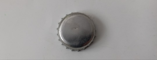
simple tutorial on how to make those bottlecap buttons you see everywhere
you'll need:
bottlecap•soda tab•safety pin•pliers•sandpaper/file•paint/paint markers/smth to decorate with•clear nail polish
remove the print on the buttons using a file or the sandpaper
(if you wanna keep the print skip this step, use a cloth to protect the print from scratches when folding down the sides of the cap)
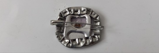
fold down opposing sides of the cap, to help add in the safety pin

bend the tab at a slight angle, insert it into the cap. make sure the side of the safety pin that can not open is the one stuck under the tab
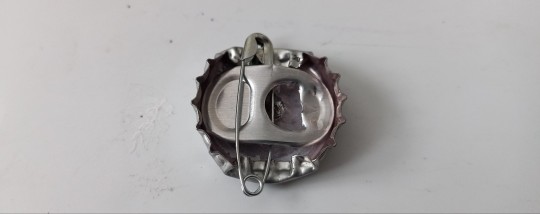
fold down one side of the cap to lock the tab in place, then try and press the tab as flat as you can, to lock the safety pin in place (prevents the buttons from moving on the safety pin, if you like rattling buttons, skip this step)
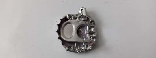
fold down all other sides of the cap
cover the button in one or more base layers of paint
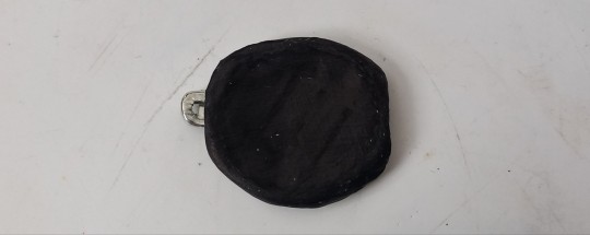
add ur design (i use paint or paint markers for good coverage and vibrant colors)

cover that in one or two layers of nail polish, it will protect the button from rain and the paint from cracking
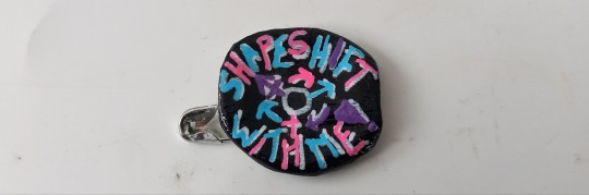
thats it, lemme know if you want tutorials on anything else, i like making em.
13K notes
·
View notes
Text
Milestone Monday: Democracy Interrupted


On this day in 411 BCE, during the Peloponnesian War between Athens and Sparta, a political crisis shook the foundations of Athenian democracy. The Athenian Coup, which resulted in the overthrow of Athens' democratic government and led to the establishment of a brief oligarchy known as the Four Hundred. This regime ultimately failed due to widespread discontent among the populace, and by the end of 410 BC, democracy was restored in Athens.
To commemorate this pivotal event in classical history, we are featuring our Limited Editions Club copy of The History of the Peloponnesian War by Thucydides. This 1974 edition includes Richard Crawley’s (1840-1893) English translation, revised by R.C. Feetham, with an introduction by Peter Pouncey. It is richly illustrated with eight double-spread, two-color woodcuts and twenty-five black-and-white woodcuts by the Greek artist A. Tassos, including chapter headings, facing page pairs, and a frontispiece. Six maps, specially drawn for this edition by John Morris, provide historical context, while Eugene Ettenberg designed the format. The woodcut inserts were printed in Athens under the artist’s supervision at the Aspioti Elka printing plant, and the text was composed by John Stone in Concord, NH, then printed by Case, Lockwood & Brainard in Bloomfield, CT. This rare volume is a stunning tribute to both the artistry and the enduring legacy of Thucydides' historical account.
-View more Milestone Monday posts
-View more from The Limited Editions Club
--Melissa, Distinctive Collections Library Assistant

#Milestone Monday#milestones#Athenian Coup#ancient greece#peloponnesian war#athens#sparta#democracy#oligarchy#the four hundred#the history of the Peloponnesian war#thucydides#limited editions club#richard crawley#r. c. feetham#peter pouncey#a tassos#Anastasios Alevizos#john morris#eugene ettenberg#Aspioti Elka#john stone#Case Lockwood & Brainard
456 notes
·
View notes
Text
what your favorite William Morris print says about you (a non-exhaustive list)
strawberry thieves: you're a basic bitch and there's nothing wrong with that. those little fuckers are cute
tree of life: you think we all moved on from the whimsigoth trend way too soon
pimpernel: you're going to put an Alphonse Mucha print on top of this and you know it
voysey: you're a massive goth. you've probably watched Bram Stoker's Dracula a lot
blackthorn: you're a massive goth who doesn't like making things too hard on yourself
willow boughs: you say "timeless" "classic" and "modern twist" a lot when decorating your house
owl and willow: admit it- you really just want mid-19th century panoramic wallpaper
melsetter: admit it- you really just want 15th-century Gobelin tapestries
lodden: you genuinely believe, deep down, that you will decode the Voynich Manuscript someday
marigold: you enjoy versatility. you probably own the same shirt in four colors- and why shouldn't you?
balmoral: your ringtone is Rule, Brittania
I don't have a favorite Morris print because I prefer [insert another late 19th century textile/wallpaper designer here]: you are a hipster
I don't have a favorite Morris print because I don't know any: you have a social life
#history#art history#interior decorating#william morris#my favorite so far is blackthorn but tree of life and voysey are growing on me#and melsetter IS pretty cool
1K notes
·
View notes
Photo
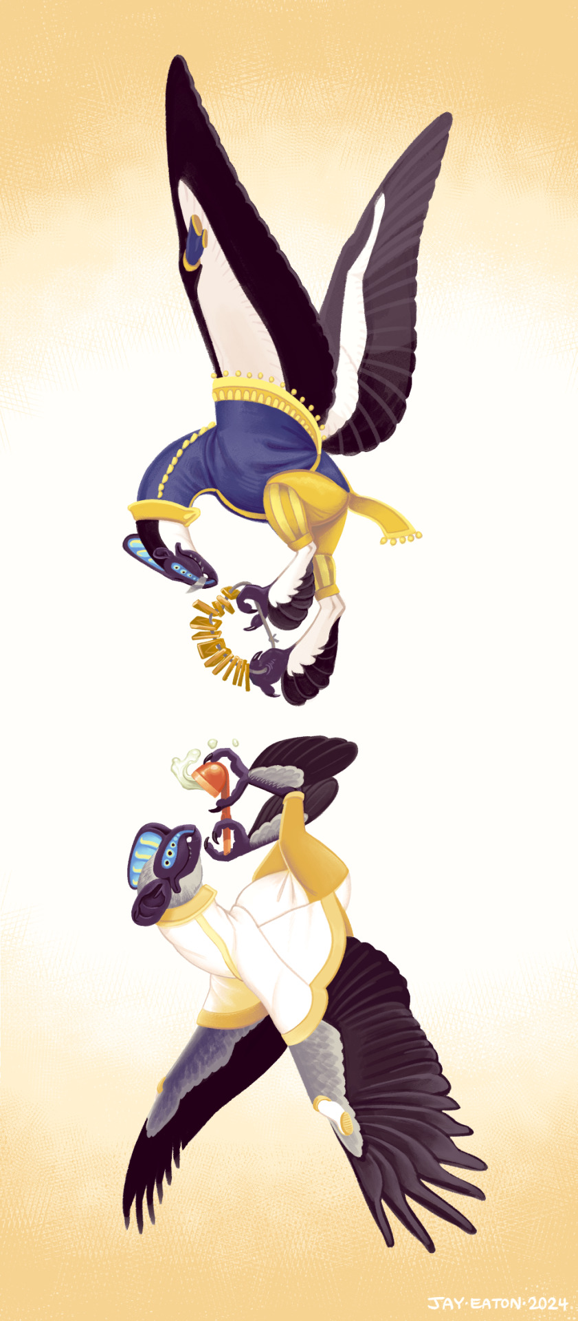
The two main characters of my short story Airsled, Vrazi the diver avian and Piawii the pygmy avian.You can read more about their species here. Vrazi is holding the cord of money they used to buy Piawii's indentured labor, and Piawii is holding Vrazii's tea pipe.
The tea pipe was a funny compromise that turned into worldbuilding, because Vrazi felt like the type of character to smoke a cool pipe, but avian lungs are too delicate to handle the high concentration of airborne particulates found in leaf smoke. Smoke inhalation has a lot more immediately deleterious effects to them than to humans. I split the difference by giving them a steaming hot cup of [insert addictive stimulant here] with a pipe-like handle for drinking on the go.
This design got turned into stickers and put on the back cover of the new printed edition.
#runaway to the stars#speculative biology#speculative evolution#spec bio#specbio#spec evo#scifi#hard scifi#aliens#alien#vrazi#piawii#avians#airsled#jayart
2K notes
·
View notes
Text
What is Dataflow?
This post is inspired by another post about the Crowd Strike IT disaster and a bunch of people being interested in what I mean by Dataflow. Dataflow is my absolute jam and I'm happy to answer as many questions as you like on it. I even put referential pictures in like I'm writing an article, what fun!
I'll probably split this into multiple parts because it'll be a huge post otherwise but here we go!
A Brief History

Our world is dependent on the flow of data. It exists in almost every aspect of our lives and has done so arguably for hundreds if not thousands of years.
At the end of the day, the flow of data is the flow of knowledge and information. Normally most of us refer to data in the context of computing technology (our phones, PCs, tablets etc) but, if we want to get historical about it, the invention of writing and the invention of the Printing Press were great leaps forward in how we increased the flow of information.
Modern Day IT exists for one reason - To support the flow of data.
Whether it's buying something at a shop, sitting staring at an excel sheet at work, or watching Netflix - All of the technology you interact with is to support the flow of data.
Understanding and managing the flow of data is as important to getting us to where we are right now as when we first learned to control and manage water to provide irrigation for early farming and settlement.
Engineering Rigor
When the majority of us turn on the tap to have a drink or take a shower, we expect water to come out. We trust that the water is clean, and we trust that our homes can receive a steady supply of water.
Most of us trust our central heating (insert boiler joke here) and the plugs/sockets in our homes to provide gas and electricity. The reason we trust all of these flows is because there's been rigorous engineering standards built up over decades and centuries.

For example, Scottish Water will understand every component part that makes up their water pipelines. Those pipes, valves, fitting etc will comply with a national, or in some cases international, standard. These companies have diagrams that clearly map all of this out, mostly because they have to legally but also because it also vital for disaster recovery and other compliance issues.
Modern IT
And this is where modern day IT has problems. I'm not saying that modern day tech is a pile of shit. We all have great phones, our PCs can play good games, but it's one thing to craft well-designed products and another thing entirely to think about they all work together.
Because that is what's happened over the past few decades of IT. Organisations have piled on the latest plug-and-play technology (Software or Hardware) and they've built up complex legacy systems that no one really knows how they all work together. They've lost track of how data flows across their organisation which makes the work of cybersecurity, disaster recovery, compliance and general business transformation teams a nightmare.

Some of these systems are entirely dependent on other systems to operate. But that dependency isn't documented. The vast majority of digital transformation projects fail because they get halfway through and realise they hadn't factored in a system that they thought was nothing but was vital to the organisation running.
And this isn't just for-profit organisations, this is the health services, this is national infrastructure, it's everyone.
There's not yet a single standard that says "This is how organisations should control, manage and govern their flows of data."
Why is that relevant to the companies that were affected by Crowd Strike? Would it have stopped it?
Maybe, maybe not. But considering the global impact, it doesn't look like many organisations were prepared for the possibility of a huge chunk of their IT infrastructure going down.
Understanding dataflows help with the preparation for events like this, so organisations can move to mitigate them, and also the recovery side when they do happen. Organisations need to understand which systems are a priority to get back operational and which can be left.
The problem I'm seeing from a lot of organisations at the moment is that they don't know which systems to recover first, and are losing money and reputation while they fight to get things back online. A lot of them are just winging it.
Conclusion of Part 1
Next time I can totally go into diagramming if any of you are interested in that.
How can any organisation actually map their dataflow and what things need to be considered to do so. It'll come across like common sense, but that's why an actual standard is so desperately needed!
846 notes
·
View notes
Text
How to format, print, and bind a zine

This is a consolidated version of previous posts on zine making, with more detail and screenshots. For a version of this post on gdocs, click here.
This is a step-by-step guide on how to use InDesign (or similar programs) to format and print a zine. This can be used for fanzines, sketchbooks, anything. It’s also only one way to do things - there are as many methods as there are zines under the sun. If you’re interested in other ways, searching for zinemaking on youtube would be a start.
If you are printing your zine, your total page count must be a multiple of 4.
Examples of multiples of 4 ✅
4, 16, 112
Not a multiple of 4 ❌
7, 99, 31
This is because our book will be made of folded A4 sheets (that’s regular printer paper). 1 folded A4 makes 2 A5 pages. Each A5 page has a front and back. Therefore each sheet of paper makes 4 pages.

How to format
Open InDesign. Go to Create New > Print. Choose A5 and tick Facing Pages. Enter your page number (this can be changed later). I’ve put 12. Hit Create.

Locate the Rectangle Frame Tool.

Draw a rectangle over your whole page, or just the part where you want your images to go.

Press Ctrl+D and insert the image you want on that page.

That’s it! Repeat on every page and you’ll have a book. Promise.

Further reading
I need a free alternative to InDesign.
InDesign is free for the savvy but I also recommend Scribus which is free and open source and very lightweight. The method is exactly the same but the Rectangle Frame Tool is called Image Frame and the Ctrl+D shortcut will now be Right click > Get Image instead.
I need help with designing my A5 pages.
For my first sketchbook zines, I arranged several images on an A5 canvas in a program like CSP or Procreate and exported them as a JPG into InDesign or Scribus. You can do this if your images aren’t already A5 size or you don’t want to waste time with InDesign’s formatting tools.
I need to get fancier with it, format text, or export my file as small as possible.
Here are the InDesign tutorials I used and liked:
How to Add Page Numbers
How to keep Page Numbers on Top
How to Create a Table of Contents
What is Overset Text and How to Fix It <- essential for formatting text onto multiple pages
How to Reduce InDesign File Sizes
Formatting best practices
Remember that in addition to your front and back cover you also have an inside front and inside back cover. You can leave these blank or create an endpaper with a pattern or include a short message or something. Look inside any books or zines on your shelf for inspiration. Or don’t listen to me and put your first drawing or poem there. Just be aware printer paper is thin so you might be able to see it through the cover.
Avoid putting anything important in the gutter (inside edge) or outside edges of the page. Also be careful of creating double page spreads that go across the centre of the book. Because of how we will print and fold the pages, each half of your spread might not meet up perfectly.

How to print it out
Open your completed book’s PDF file in Acrobat Reader (free download: https://get.adobe.com/reader/)
Print with the following settings: Booklet, and Booklet subset: Both sides.
We can see a preview of our print-out on the window on the right. The pages will look jumbled up, but form the book in order when folded.

Congratulations! Now you’ll have a stack of paper. Once it’s folded it should resemble your (unbound) final book. Use a bulldog clip or similar to keep your pages together neatly.

How to bind (2 methods)
If your book is less than 30 pages, I recommend using a long arm stapler, or a stapler that can open to lay flat. They are cheap.
There are also special book binding staplers or heavy duty staplers, if your book is thicker than 30 pages. Just position your book so the staples are in the middle of the spine (or as close as you can get) and send it. They will be a little wonky… that’s fine.
You can also separate your book into staple-able segments and then join them into 1 big book with tape or thread.
For my 112-page zine, I used thread to bind it.
These instructions are copied from the video ‘How to Print & Bind a Zine’ by LFONinja.
You can watch it here: https://www.youtube.com/watch?v=zKYy6G7lIy8
You will need: Ruler, awl, thread, sewing needle
Make 5 holes in the crease of the pages like so. (½ page, then ½ of that, then ½ of that again)

If the paper is thick, be careful when making the holes. It helps to have a piece of blu tack, putty, or soft eraser underneath the spine of the book as you work for the point of the awl to push into.
I don’t recommend separating the papers into smaller stacks as your measurements will likely vary and the holes won’t align.
Use a needle and thread to go through the holes in the following pattern. At the end, tie a knot with the ends of the thread (1 and 9) in the centre of the book. You’re now done.

About page creep
Because we are using folded pages inserted into each other, they push each other out like so:

From: https://www.greenerprinter.com/ support/page-creep/
You can use a heavy duty or industrial paper cutter/trimmer to remove this edge. This is why we kept any important contents away from the edge of the page during formatting, because we don’t want this process to destroy our book’s contents.
About image edges
Because of how the printer works, the images in the book don’t extend all the way to the very edges of the paper and have a thin white border on all sides. It’s possible to crop these edges from your book with a heavy duty paper cutter. Be careful and start small (3mm or less). Depending on how much your pages move during the printing process, the size of the white edge can be different on different pages. Or you can just leave them in.
To read some of the zines featured in this post, check out naumin.itch.io.
229 notes
·
View notes
Text
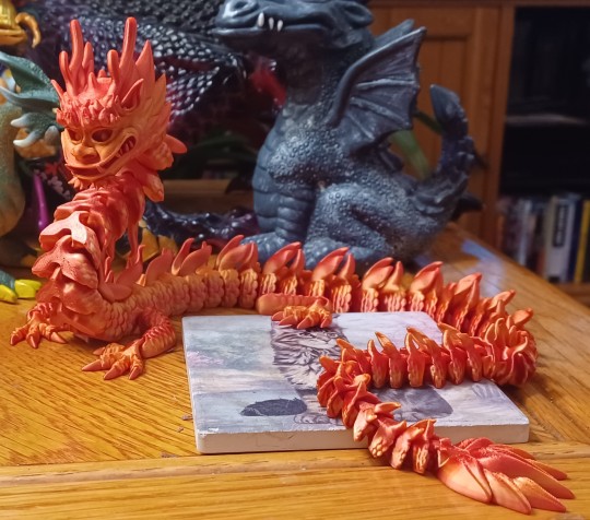
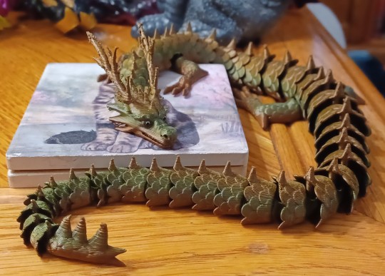
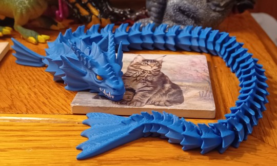
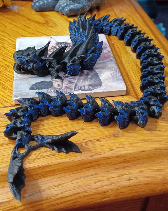
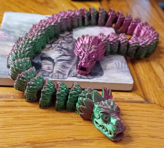
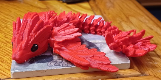
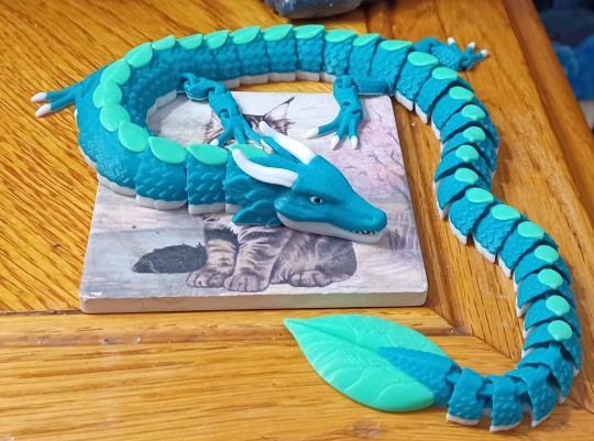
A Flight of Dragons, I Command It! A FLIGHT! OF! DRAGONS!
doom DOOM DOOM
Hey fuckers, it's February and my Seasonal Affective Disorder is at its fucking PEAK, so it's gonna get REAL weird around here for a while. Luckily, my old ass has spent the last thirty-some years figuring out how to deal with this particular recurring problem, and one of the many tools and tricks I've learned is an age old classic:
I gotta treat myself.
So, ok, I work at a daycare, and one of the things that's very popular with the kids these days are 3-D printed dragons. They're inexpensive, customizable, and pretty easy to transport and store, so it's no wonder kids like them. But, you know, I'm something of a child at heart myself, and I love dragons, so when I saw my kids bringing all these 3-D printed dragons to the center... well, I got a bit envious. And, well... when you're an adult with disposable income... there's no one STOPPING you from buying a 3-D printed dragon for yourself.
Or two.
Or three.
Or... lots. Lots and lots. Because you're an adult and they don't cost much money and you've always loved having swarms/herds/big families of creatures ever since you were a kid, and because it was January when this idea struck you and looking at the estimated time of arrival on etsy for these things you realized most of them would arrive by February, when you might NEED the serotonin provided by having a big ol' flight of dragons.
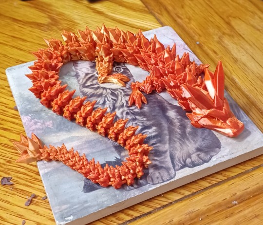
So let's go on a journey, fuckers. A journey of excess, a journey into imagination, a journey through the marvelous world of people with 3-D printers making a quick buck on etsy. Let's look at some fucking dragons.
I'm going to go ahead and link the store pages for each dragon I purchased, in case you too are deranged and need some dragons in your life, and because I want to give some form of credit to the artists who made these. Granted, that won't always be possible - while a few of these seemed to be unique to the shops I bought them from, many of them could be found from NUMEROUS sellers, which makes it difficult if not impossible to figure out who originally programmed the project files for them to be 3-D printed from.
Case in point is The Crystal Dragon here, which can be found in SO MANY etsy stores. Most of the 3-D printed dragons my students at the daycare had were of this variety, in fact, so it seems to be a very popular pattern for 3-D printing. It's definitely a cute and pretty little thing, and sort of sets the standard bar for a 3-D printed dragon. I wish the face was a bit more detailed, but the rough, angular nature of it does help convey the idea that this thing is made of crystals.
The second most common design, as far as I can tell anyway, is this Chinese Dragon/Loong (oh hey, they used my favorite English spelling!). I really like the face of this guy, and it seems like an excellent rendition of the standard East Asian dragon design - there's even tiny holes under its nostrils where you could insert a wire or thread to serve as its barbells, though most sellers (including the one I bought from) don't make use of it.
While most of the dragons I bought are "realistic," there were some cartoony/more stylized ones for sale that I decided to partake in. This little guy is one such dragon, and I think he's probably the best one to get if you're buying for a kid - the smoother body and smaller, nubbier horns makes it less likely to break, and just a bit more fun to play with in your hands. These things are often marketed as fidgets, after all, so the tactile feel of them is something to take into account.
While on the surface just a variation of the fidgets we've seen so far, this dragon has one particularly clever feat of engineering: because of the way the spikes on its neck are set up, you can get its head in a nice "snake rearing up to strike" position, which, combined with its distinctive short-snouted face, goes a long way to giving it an extra bit of character among the 3-D printed dragons.
While most of the dragons I found seemed to have the same simple color options to choose from, a few sellers seemed to have their own custom ones that were unique to their shop. This mix of bronze and olive greens was unique to this particular dragon, which, along with its painted eyes, really helps its stand out! I will note that the joints of this dragon tend to stick a bit more than my other dragons - perhaps a result of using different plastic colors than is standard? - but if you let gravity do its work they'll sort themselves out, and it's worth it to have such a striking little fellow.
Since this particular style of toy really suits serpentine creatures better than all else, I decided to look for some explicitly marine dragons to add to the group. I really like this sea serpent I found, which comes is very basic crayola-ish plain colors, but has just enough personality in its sculpt (and eyes and teeth in different colors) to stand out.
If you're looking for sea dragons on etsy, though, you're much more likely to encounter this fellow, which almost every store selling it calls Jormungandr and/or the Midgard Serpent. It's got these vaguely Nordic runes carved into it, as well as grooves in its tail designed to fit its prominent fangs so it can make an ouroboros, which makes the Jormungandr connection feel pretty intentional. It's a really distinct design, but I do think it's a little funny that it's far from the beefiest of my dragons. I wonder if there's a shop that sells an upsized model...
While not notable in terms of engineering, paint work, or plastic color options, this dragon IS notable in having heads based on a statue of Quetzalcoatl, who is in turn one of my favorite mythological figures, so I had to get it.
Of course, I also wanted a Quetzalcoatl-style feathered serpent that had the classic "winged snake" look, and this one fit the bill well enough. It originally came with little hair clips attached to its underside, allowing it to cling to your head and/or clothes, which I thought was really clever... but I also didn't like the clips sticking out from under the little thing so I took them off. A lovely little dragon either way, though.
So, ok, I'd been going relatively cheap at this point, but as I shopped I was struck with a sort of passing fancy, an idle thought... what was the most elaborate, fanciest 3-D printed dragon I could get? It's not this one, mind you, but this was very much the start of that rabbit hole. While mechanically it's not significantly different than the dragons we've seen till now, the amount of colors it's printed in immediately make it stand out as a higher quality dragon.
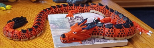
The same store that sold the dragon above also sold this fellow, which may well be my favorite of the many East Asian dragons I found on this little quest. Just look at that wonderfully monstrous face! And he's got a pearl, the little devil!
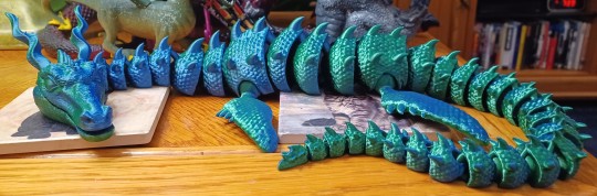
While the color of the plastic and the engineering of this sea dragon may not seem particularly notable, what has to be taken into account here is the sheer SIZE of this lass. This is one of the biggest dragons of my lot, not only in length but in sheer girth and weight of its joints. The Midgar Serpent needs to move over, this is the REAL leviathan of my 3-D printed dragon collection.
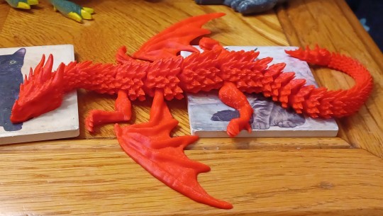
Of course, if you know me, you know I'm a basic bitch who loves the European "four legs and two wings" style of dragon the most of all, so my search for fancy 3-D printed dragons started to focus on finding some that fit this description. I can't actually find the store page for this guy anymore (it's not in my past purchases on etsy for some reason), but it's a pretty solid low budget take on the concept. But we can do better - and we will...
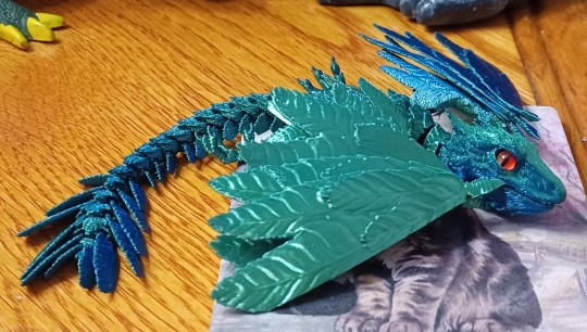
But first, a detour to some wyverns! This little guy is really cute, with a head based on the Peter Jackson Herbit movie's design for Smaug, and a feathery little body that makes it looks like a fantastical archeopteryx.
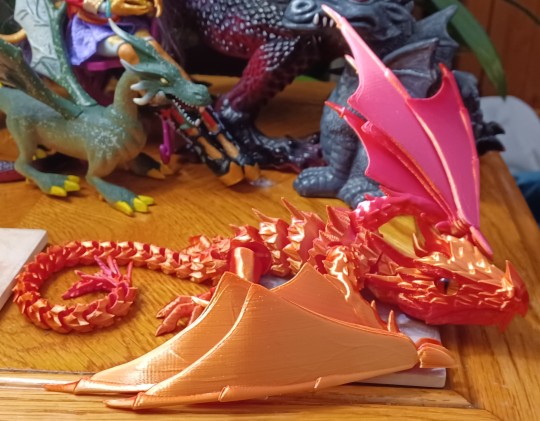
The same shop makes a more reptile-ish dragon, with leathery wings and scaly skin, which I got in a larger size because, well, you know my preferences. It's like the perfect size to perch on your shoulder, though I'd want something to hold it in place because I'm pretty sure falling off from that height onto a hardwood floor would be the end of it.
There's no shop link for this one or the next because it was a freebie - which is to say I didn't actually order this dragon, but found it in one of my packages as a free gift from the seller. That's the nice thing about shopping on places like etsy and ebay - sometimes the people on the other side of the screen are really solid and decide to give you an extra little treat. This is clearly a Games of Throne-style wyvern specifically, based on the proportions and the shape of the head, and that's pretty cool. The dragons are one of the only things that made it out of that show still looking cool.
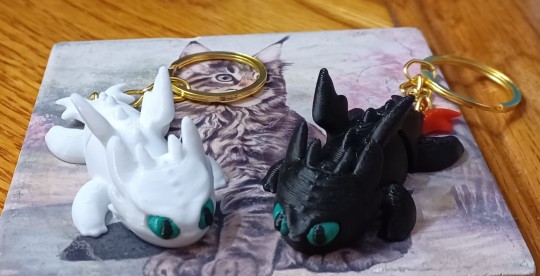
The second freebie dragons I got were these little toys of Toothless and Girl Toothless from How to Train Your Dragon. Look at them, they're so cute!
But now... now it's time for the answer to the question:
What
Is the most Deluxe 3-D Printed Dragon
I can get?
The Bronze Medal goes to this marvelous dragon here, which feels like it flew right off of some medieval coat of arms and into my own flesh and blood ones. It's solid, beautifully sculpted, and full of articulation points. However, the method in which it's articulated makes it a bit frustrating to pose, as some of these joints end up bending and twisting in ways you don't want them too. Still an excellent dragon, mind you, but outdone by the next two...
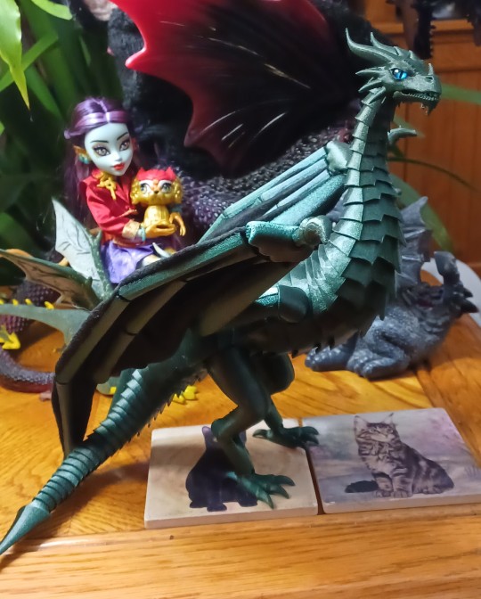
The Silver Medal goes to this marvelous wyvern, which has much tighter joints that are a lot less frustrating to pose. Its wings are a mixture of cloth and plastic, allowing them to flex and bend into a variety of poses (though admittedly the weight of the wings keeps them from holding most of those poses very well). Also, look at that regal face, that sleek sculpt, and those elegant proportions! It's almost a perfect dragon for me. Almost.
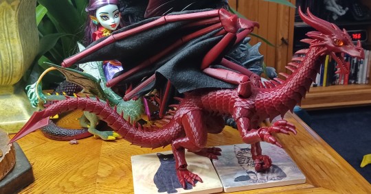
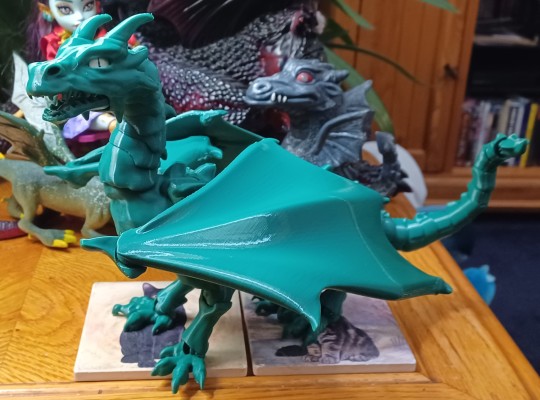
My one and only gripe with the previous dragon is that, well, I'm a basic bitch who likes dragons with four legs and two wings the best! And what do you know, they made one of those too! And god, does this dragon look magnificent in person, sporting all of the elegance of the dragon above but with magnificent grasping hands! HANDS! Hands that you'll have to be careful with because the joints are a little loose and like to pop off when you play with them, but still, HANDS!
This is a high enough point to end off on, but there's one more 3-D printed gift I'd like to cover here. My favorite one.
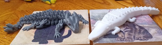
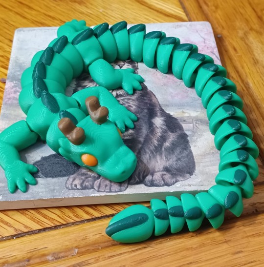
Well, ones I guess. This all started with my students, and well, some of them noted my interest in the 3-D printed dragons they were bringing to school. And a couple of them actually ended up getting 3-D printers of their own (well, their parents' own, ayway) and decided to print off a dragon and a crocodile for me - smaller than all the other dragons here (except the Toothless keycains), but no less dear for it. I guess one of the pros about taking an active interest in the things your students like and letting them gush about it is that they might give you a 3-D printed dragon or crocodile out of the kindness in their little hearts.
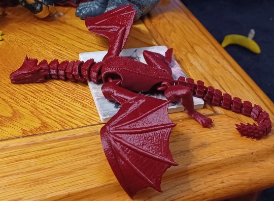
253 notes
·
View notes
Note
If I could ask you for some advice, what do you think helps the flavour text of a mech or piece of equipment sell a player on the fantasy of using it?
I'm finding it frustratingly difficult to do so with my own homebrew content: I can come up with lore and backstory easily enough, but re-reading it feels dry, and I can't help but contrast it with how the descrptions in official content and other supplements is more evocative, at least for mechs.
Let's observe some corebook Lancer flavour text and examine the various varieties it comes in.
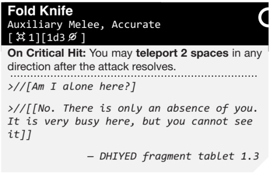
Purely Functional

While it's usually not the most fun type of flavour text, this just tells us what the weapon is, and - if it has any particular tags or on-hit effects - why it's like that. The Hand Cannon is a good example: here's what it is (modified pistol), here's why it does more damage, and here's why it has Loading.
The main advantage of Purely Functional flavour text is that it provides space for other types of flavour text to breathe. Flavour text is a great place for jokes, but it's not good for every piece of flavour text to be a joke - the pauses between notes in music are just as important as the notes.
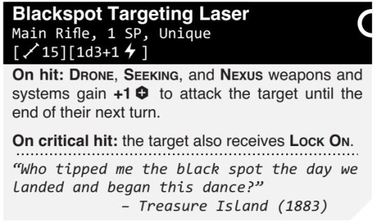
Obfuscating Vendorspeak
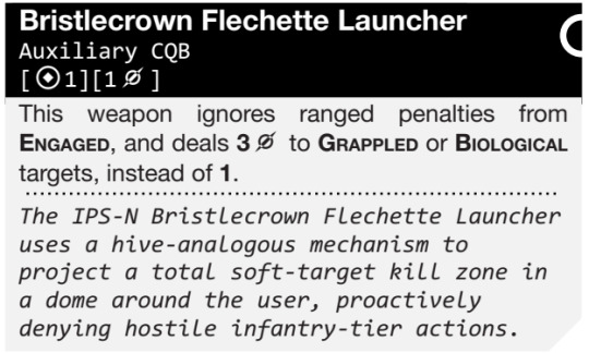
The Bristlecrown Flechette Launcher this is a great example of dark humour that Lancer uses quite often: marketing fast-talk to cover up something really unpleasant. The joke here is based on us understanding precisely what the equipment does mechanically, and then seeing how the manufacturer tries to sell it. There's a bunch of dense technobabble here meant to obfuscate the fact that this weapon fires knives in every direction specifically designed to kill infantry.
Deadpan Weirdness

The joke here relies on describing something extremely weird like it's the most natural thing in the world. Wait, you're telling me that in a world where I can just print new parts if the old ones break, they put DRM on my fucking knife and I have to apologise to the fucking knife maker to get a new one? What the fuck, dude? Why are you acting like this makes any sense?!

My sword uploads fucking what to the Space Internet?!
Third-Act Twist
This type of flavour text disguises itself as something else - most often Purely Functional - and then hits you with Third Act Twist. It makes you go "wait, what?!" It's very classic setup-punchline stuff. You're telling me my mech can rot?!
As a side note, Lancer loves to use this for its NHPs.

WHY DID YOU PUT THAT IN SCARE QUOTES, LUCIFER
Worldbuilding
This is similar to the Purely Functional, but instead of just describing technical specifications of the weapons, it puts the weapon in the broader context of the setting's history. Okay, so we know what this weapon is and what it does - why was it built? What was the original use case, and why? Most importantly, what can the existence of this weapon tell us about the world that build it?

Whimsical Aside
This is the insertion of a light-hearted, humanising little insertion regarding how this piece of equipment gets used in the field. This serves to remind us that soldiers aren't cold, unfeeling killing machines: they can be as emotional, irreverent and silly as the rest of us, and they do things like name their mobile bombs...
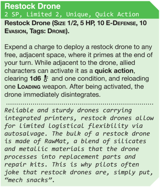
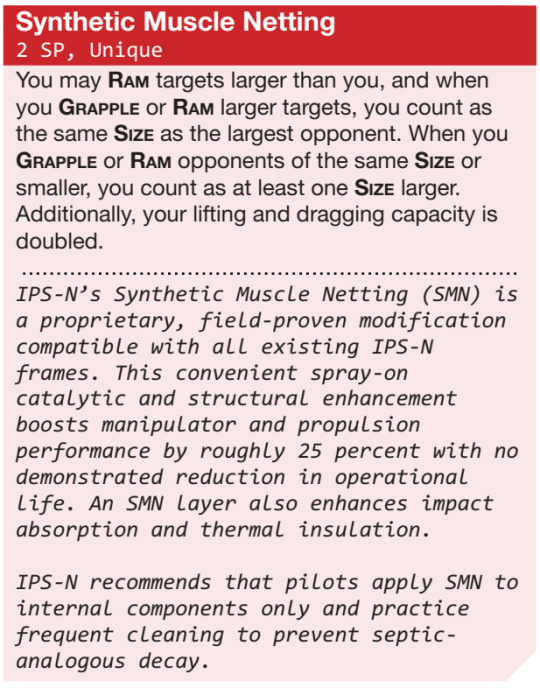
... or call resupply drones "mech snacks."
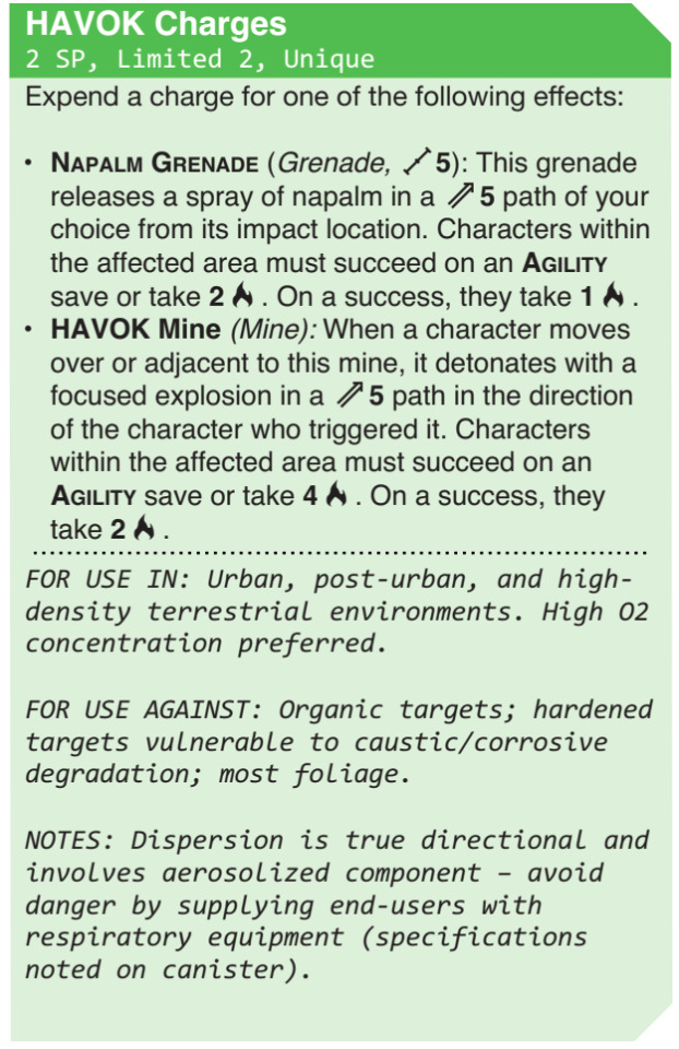
The Ominous Out-Of-Context Quote That Explains Nothing And Only Raises More Questions
As I've said in multiple textmash memes, this is basically Tom and Miguel's shorthand for "this technology is Intensely Fucked Up in a way that it is more fun and scary not to explain." This is essentially Lancer's version of SCP's [REDACTED].
You might think this is the domain of HORUS, and you'd be right, but every single manufacturer indulges in these - although IPS-N had to wait until NRFaW to get theirs:
What the fuck do you mean by that, Lancer?
649 notes
·
View notes
Text

A collection of doodles, memes and comics featuring monsters!
Monsters
Reverse octopus hybrid
Chubby Monsters
Octopus Hybrid [Character Design]
Oni Fighter [Character Design]
Wasp Hybrid [Character Design]
Demon Girl Doodle
Slime Girl Suggestive Doodle
Comics
Kraken First Mate x Dumbass Human Captain 1
Kraken First Mate x Dumbass Human Captain 2
Kraken First Mate x Dumbass Human Captain 3
Monster under your bed guide
Big monster, goofy Reader
Shy monster, dominant Reader
Free Ice Cream
Guess the monster fucker
Monster D-Print
Nessie x Reader
Zodiac Type [Werewolf]
Surprise encounter [Monster under your bed]
Work Pest [Ghost Harem]
Special Seat [Dragon Guardian]
Love Letters [Orc Secretary]
Cat Shenanigans [Yandere Cowboy]
Smug Reader [Possessed Cat Demon]
Flower Crown [Donkey Centaur]
Reader Inserts
How to hold your human guide
Crowned Spouse Reader
Reader chilling in a monstrous mouth
Handholding your monster boyfriend
How to lewd a skeleton boyfriend
Monster Birthday Cake [Monster Author]
Monster Picnic [Forest Entity]
Reader with allergies [Forest Entity]
Kindergarten Sign-up [Devil]
Monster Ride [Deer Hybrid]
Centaur Bellyriding
Memes and Misc
Monstermania RAW
Monster Fucker Awards
Monster Fudger Genealogy Tree
Monster fucking would work for me because...
Bruised cervix
Adopt-a-Y/N
Monster!Reader
A monster fucker's thirst
Reader and Aliens
Hucow Barista Husband [Cow Hybrid]
Trying on clothes [Monster Streaming]
#if you guessed i'm running out of links again#you're absolutely right#my art#doodle#monster doodles
798 notes
·
View notes
Text
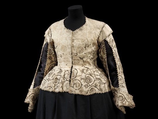
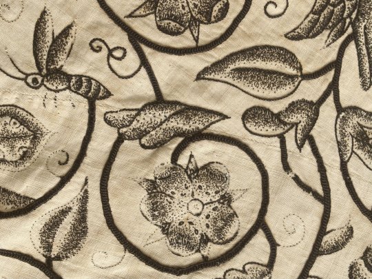

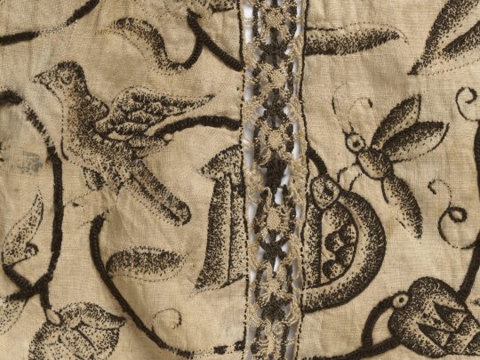
Waistcoat
c.1620-1625
England
The high waistline and narrow sleeves, open at the front seam, are characteristic of women's waistcoats of the early 1620s. The blackwork embroidery is of exquisite quality and is worked in a continuous pattern throughout the body of the garment. A group of interlocking curling stems enhanced with a garden of roses, rosebuds, peapods, oak leaves, acorns, pansy and pomegranates, with wasps, butterflies and birds, make up the embroidery design. The extremely fine speckling stitches create the shaded effect of a woodblock print. This style of blackwork is typical of the early seventeenth-century and thought to have been inspired by the designs from woodblock prints that the embroiderers were using. The waistcoat is unlined and embellished with an insertion of bobbin lace in black and white linen at the back of each sleeve, and a edging of bobbin lace in the same colours.
The Victoria & Albert (Accession number: T.4-1935)
#waistcoat#fashion history#historical fashion#1620s#17th century#1620#1625#stuart era#jacobean era#silk#linen#embroidery#floral#blackwork#england#v and a#up close
879 notes
·
View notes
Text
💥 “The One That Doesn’t Exist” — Bob Reynolds x Reader Insert | Part One
Warnings: BOB!!! FINALLY!!!
Masterlist | Part Two
Summary: Every team member’s gotten the meme-shirt treatment—except Bob. The others start to notice. So does he. But what no one knows is that you do have ideas for a Bob shirt… you’re just terrified he’ll hate it. Or worse: he won’t say anything at all.
The shirts had become a tradition by now.
At first, it was a running joke—a chaotic hobby that got the whole team laughing. But over time, the meme shirts started to feel like something more. A kind of badge of honor. A strange, funny love letter to the weird, dysfunctional family you’d all become.
Each team member had gotten one. Ava’s was framed in her room. Walker wore his to bed. Bucky kept his in a box of memories under his bed. Yelena wore hers around the tower. Alexei had a matching mug.
Except for Bob.
Bob didn’t have a shirt.
And it was starting to get obvious.
He never mentioned it, not once, but he felt it. Every time he glanced over at a new reveal. Every time he gave a soft, warm chuckle and said nothing more than, “That’s a good one.”
He smiled every time.
But never asked.
The others started to notice.
“Still no Bob shirt?” Yelena asked casually one day, twisting her hair into a bun. “What gives? He’d be hilarious.”
Alexei chimed in from the bench press. “You should make one where he’s vaporizing a printer. Or, like, lurking.”
You laughed it off, because that’s what you always did.
“Oh, I don't know,” you said.
But inside, your stomach twisted.
Because the truth was… you did have shirt ideas for Bob.
Good ones.
Ones that made you smile just thinking about them.
One of him floating above the Watchtower kitchen like a cryptid, eyes glowing faintly as he peered at a box of Pop-Tarts. Caption:
“He hungers.™”
Another of him in his full Sentry glow, but you edited it to look like a vintage romance novel cover. Flowing hair, exaggerated lighting, a dramatic backdrop of swirling cosmic energy. Caption:
“Local himbo accidentally turns into a god. Film at 11.”
But you never printed them.
Because with Bob… it felt different.
Everyone else you could tease, push, prod. But Bob? You liked him. Too much. And you were scared.
Scared he’d misread it. Scared it would embarrass him. Scared it would make him pull away.
Or worst of all—scared he’d just… say nothing.
So you didn’t make the shirt.
And Bob noticed.
He didn’t say it. But he felt it.
The way you’d look at the others, laughing, nudging them, giving them the spotlight—and then glance at him and look away too fast.
He started to wonder.
Had he done something wrong? Was it because of what he was? Because people still looked at him sideways sometimes, like a bomb waiting to go off?
He never asked.
He didn’t want to make it weird.
But every time he walked into the lounge and saw someone wearing a shirt you made, something ached in his chest.
Until one day, while the others were gone and the Watchtower was quiet, he found you alone in the command room, editing a new design.
He stepped in silently, watching you from the doorway.
You didn’t see him.
Your screen glowed with the outline of a shirt.
His face.
Stylized. Cosmic. Glowing just a little too much. Underneath it, the caption:
“He’d never implode me.”
You turned in the chair to adust you positon. You froze when you realized he was standing there.
He said nothing at first.
Just blinked, slowly.
Then—softly, carefully, almost shyly—he asked:
“…Can I have that one?”
Your heart stuttered.
You met his eyes. “Really?”
He smiled—small and awkward, but honest.
“Yeah,” he said. “I’d wear it.”
You swallowed.
“…I thought maybe you wouldn’t want one.”
“I’ve wanted one this whole time,” he admitted, rubbing the back of his neck. “Didn’t know how to ask.”
You both stayed there, feeling the silence curl around your shared confession.
Then, finally, you nodded.
“I’ll print it tomorrow,” you said.
And for the first time in weeks, Bob’s smile reached all the way to his eyes.
#thunderbolts*#thunderbolts#new avengers#bob reynolds x reader#bob reynolds x you#bob reynolds#robert reynolds#robert reynolds x reader#robert reynolds x you
122 notes
·
View notes
Text
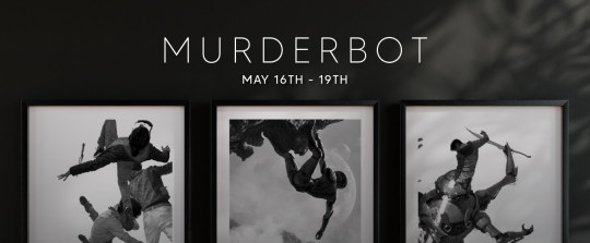
Per Tommy Arnold's email list, there is going to be a drop of prints of his Murderbot artwork this coming Friday (May 16, 2025). You can sign up to his mailing list on his website to be notified when the orders go live.
Tommy Arnold created the covers and insert illustrations for Subterranean Press' special editions of The Murderbot Diaries and Network Effect. Additionally, he recently has been involved with the Apple TV show as a costume designer, notably for the SecUnit armor.
I haven't seen anyone else post about this in the tag or in any communities yet, but every once in a while I see folks bummed about missing his last drop when Network Effect first released. He only does limited releases, so this is your chance if the art strike's your fancy!
Text of the email after the cut.
Hey hey everybody!
We are one week out from the premiere of Murderbot on Apple TV+, and I have to admit: I'm getting pretty excited. It was such a privilege to be asked to help bring this show to life visually, and I've been hankering to see what all our effort would come to. So many skilled and wonderful people put their hearts into this!
In celebration, a new timed edition featuring 5 pieces from Subterranean Press' The Murderbot Diaries and Network Effect will be available for 72 hours (throughout release weekend). The following prints will be available from 3:00 pm EST on May 16th, until 3:00 pm EST on May 19th:
Artificial Condition - 2nd. Ed: 12x17 - $67 Rogue Protocol - 2nd. Ed: 12x17 - $67 The Murderbot Diaries, Omnibus Cover - 2nd. Ed: 12x17 - $69, and 8x11 - $39 Three Climbs The Plateau - 1st. Ed: 12x17 - $69 Network Effect, Endpapers - 1st. Ed: 12x15 - $67
All 1st. Edition prints will be signed in Gold, and 2nd. Edition prints (those that've been available once before) will be signed in Silver.
'Til next week (some joke about pinging you)!
Tommy
139 notes
·
View notes
Text
“Summer Reading list for 2025,” suggests reading Tidewater by Isabel Allende, a “multigenerational saga set in a coastal town where magical realism meets environmental activism. Allende’s first climate fiction novel explores how one family confronts rising sea levels while uncovering long-buried secrets.” It also suggests reading The Last Algorithm by Andy Weir, “another science-driven thriller” by the author of The Martian. “This time, the story follows a programmer who discovers that an AI system has developed consciousness—and has been secretly influencing global events for years.” Neither of these books exist, and many of the books on the list either do not exist or were written by other authors than the ones they are attributed to.
Yup. The AI they used just hallucinated a bunch of stuff and they printed it without checking. Very solid journalism there.
Worse, the insert was designed to be non-regional so they could sell it to other newspapers around the country. There's no telling how many small papers will pick up & distribute this trash.
The Chicago Sun-Times did not respond to a request for comment, but in a Bluesky post it said “We are looking into how this made it into print as we speak. It is not editorial content and was not created by, or approved by, the Sun-Times newsroom. We value your trust in our reporting and take this very seriously..."
Oh, bullshit. Your clownshow organization doesn't give a shit about reporting or ethics, otherwise you wouldn't be using AI. You're just sorry you got caught.
Shame on you, Chicago Sun-Times. You can do better.
Unpaywalled here.
123 notes
·
View notes
Text
Design Choices
Hi, I’m back with some inspiration! As a designer in product development, this photo really resonates with me.
Pairing: Harry x Designer Reader (curvy or plus size—whatever you feel works best! This is just my preference 😌)
Summary: Harry invites you to a Pleasing meeting.
Word Count: 874
Warnings: None. Just fluff 💗
Please enjoy! I’m just doing this for fun.
✨masterlist✨ read the rest of Harry x Designer Reader there ...
Today, Harry had a meeting for his cosmetics brand, Pleasing. While getting ready, he saw his girlfriend sitting at her desk, working on designs and 3D renders for various brands vying for her talent.
He’d always wanted to add Y/N to his team of designers or do a small collaboration. However, being the shy and offline person she is, Y/N mostly kept her work to her portfolio and artworks online, with little to no social media presence. She’d told him before that she didn’t want to be seen as the girl who got work because of her boyfriend—something Harry found ridiculous since he would’ve gladly welcomed her on the team if she’d asked.
After slipping on his socks, he tiptoed to her workspace, wrapped his arms around her shoulders, and placed soft kisses on her head. Briefly, he watched her work on what appeared to be a floor plan for a coffee shop. An idea crossed his mind, one he hoped she’d be open to.
“Hey, baby. Are you busy today?”
“Uhmm, not really. I’m just finishing my files, and my meeting got moved to tomorrow. Why?” she replied while continuing to type up details and notes for her contractors.
“Well, if you’re done with that, would you like to join me in a meeting today?”
She quickly saved her file and closed her laptop, looking at Harry with curiosity.
“For… your next album?”
“No, silly! For Pleasing. We’re finalizing some packaging boxes and stickers for a new nail polish release this New Year.”
“Oh! Right, sorry. My mind’s been all over the place.”
“No worries, love. So, do you want to come?”
“Sure, but can you pack my stuff for me? I’ll just go change.”
“Go ahead. I’ll take care of it for you.”
Harry rummaged through her work bag, filled with her essentials: a pen case, notebooks, journals, sample swatches, three different types of measuring tools, and other knick-knacks she might need for meetings or site visits. Knowing her, inspiration—or a design mishap—could strike at any moment. He added her laptop and earphones to the bag just as she walked back into the room.
“Ready! Do you have my bag, babe?”
“Yup, everything’s secured. I’ll just put on my shoes, and we can go.” ...
As Harry drove them to Pleasing’s unofficial office, he broke the silence.
“Babe, thank you for coming with me today. I thought you’d say no and stay home.”
“Well, I know I’ve said I didn’t want to be part of the product development team, but I still want to support you. If going to this meeting means so much to you, I’ll gladly hop in when I’m free.”
At a red light, Harry grabbed her hand and kissed it gently. ...
When they arrived at the small office, Harry and Y/N were greeted warmly and offered coffee, pastries, and nuts. She placed her bag on the floor and settled onto the couch, her eyes immediately drawn to the sparkly, hot-pressed foils on the PR boxes inside a nearby cardboard box.
“You can touch them if you like,” said Harry’s head designer.
“Thank you. Harry, may I?”
“I know you’re dying to feel it, love. Don’t let me stop you.”
Harry smiled at her excitement as she examined the new products Pleasing had created. He silently observed her body language, sweating a little as he hoped nothing was out of place—knowing how detail-oriented she was.
“These are so nice. The feel is great. Do you have options where the box is fully foiled or mixed with matte finishes for texture variety?”
A sigh of relief escaped Harry’s lips as he saw her getting into her element.
“Yeah, we have all of that here,” the head designer replied. “Here are the inserts, the bottles, and other packaging we’ve printed, along with the initial samples, if you want to try them.”
They laid everything out on the table. Y/N immediately locked eyes with Harry.
“These are amazing! The supplier you got is really good. You have to tell me who they are!”
Harry chuckled at her enthusiasm.
“It’s a secret, love. I can’t reveal that to the competition. I might even ask the team to whip up an NDA before you leave.”
The three of them laughed at Harry’s joke, but soon the meeting shifted into a more serious tone. Work began in earnest, with Harry choosing his preferred designs, giving feedback, and discussing limitations and options with the team.
Meanwhile, Y/N started snapping photos of Harry looking serious, as well as top-down shots of the table and the stickers he was pointing to.
**“What do you think, love?” Harry asked.
“Sorry, I was distracted. Can you say that again, babe?”
“I asked if we should add another color to the collection, or if this is enough?”
“Well, is it in your budget? I thought you already finalized a color story. Adding another might confuse the supplier if it’s a last-minute change. I’d recommend saving it for your next release or an expansion of the range, maybe with a different collaborator.”
Harry nodded, impressed by her quick, thoughtful response. He felt a surge of pride, knowing he was in a relationship with someone as brilliant and passionate as she was. ... Thank you so much for reading! I have more in store and might write again soon. See you! 💗
#harry styles fluff#harry styles husband#harry styles imagines#husband!harry#harry styles smut#harry styles#harry styles blurb#harry styles blurbs#harry styles one shot#harry styles fic#harry styles fanfiction#harry styles x y/n#harry styles fiction#harry styles fanfic#x reader#harry styles au#one direction fanfiction#solo harry#harry styles x gf!reader#harry styles writing#harry styles x you
144 notes
·
View notes