#I've yet to really sit down and draw out my design but like
Explore tagged Tumblr posts
Text
why Aurora's art is genius
It's break for me, and I've been meaning to sit down and read the Aurora webcomic (https://comicaurora.com/, @comicaurora on Tumblr) for quite a bit. So I did that over the last few days.
And… y'know. I can't actually say "I should've read this earlier," because otherwise I would've been up at 2:30-3am when I had responsibilities in the morning and I couldn't have properly enjoyed it, but. Holy shit guys THIS COMIC.
I intended to just do a generalized "hello this is all the things I love about this story," and I wrote a paragraph or two about art style. …and then another. And another. And I realized I needed to actually reference things so I would stop being too vague. I was reading the comic on my tablet or phone, because I wanted to stay curled up in my chair, but I type at a big monitor and so I saw more details… aaaaaand it turned into its own giant-ass post.
SO. Enjoy a few thousand words of me nerding out about this insanely cool art style and how fucking gorgeous this comic is? (There are screenshots, I promise it isn't just a wall of text.) In my defense, I just spent two semesters in graphic design classes focusing on the Adobe Suite, so… I get to be a nerd about pretty things…???
All positive feedback btw! No downers here. <3
---
I cannot emphasize enough how much I love the beautiful, simple stylistic method of drawing characters and figures. It is absolutely stunning and effortless and utterly graceful—it is so hard to capture the sheer beauty and fluidity of the human form in such a fashion. Even a simple outline of a character feels dynamic! It's gorgeous!
Though I do have a love-hate relationship with this, because my artistic side looks at that lovely simplicity, goes "I CAN DO THAT!" and then I sit down and go to the paper and realize that no, in fact, I cannot do that yet, because that simplicity is born of a hell of a lot of practice and understanding of bodies and actually is really hard to do. It's a very developed style that only looks simple because the artist knows what they're doing. The human body is hard to pull off, and this comic does so beautifully and makes it look effortless.
Also: line weight line weight line weight. It's especially important in simplified shapes and figures like this, and hoo boy is it used excellently. It's especially apparent the newer the pages get—I love watching that improvement over time—but with simpler figures and lines, you get nice light lines to emphasize both smaller details, like in the draping of clothing and the curls of hair—which, hello, yes—and thicker lines to emphasize bigger and more important details and silhouettes. It's the sort of thing that's essential to most illustrations, but I wanted to make a note of it because it's so vital to this art style.
THE USE OF LAYER BLENDING MODES OH MY GODS. (...uhhh, apologies to the people who don't know what that means, it's a digital art program thing? This article explains it for beginners.)
Bear with me, I just finished my second Photoshop course, I spent months and months working on projects with this shit so I see the genius use of Screen and/or its siblings (of which there are many—if I say "Screen" here, assume I mean the entire umbrella of Screen blending modes and possibly Overlay) and go nuts, but seriously it's so clever and also fucking gorgeous:
Firstly: the use of screened-on sound effect words over an action? A "CRACK" written over a branch and then put on Screen in glowy green so that it's subtle enough that it doesn't disrupt the visual flow, but still sticks out enough to make itself heard? Little "scritches" that are transparent where they're laid on without outlines to emphasize the sound without disrupting the underlying image? FUCK YES. I haven't seen this done literally anywhere else—granted, I haven't read a massive amount of comics, but I've read enough—and it is so clever and I adore it. Examples:


Secondly: The beautiful lighting effects. The curling leaves, all the magic, the various glowing eyes, the fog, the way it's all so vividly colored but doesn't burn your eyeballs out—a balance that's way harder to achieve than you'd think—and the soft glows around them, eeeee it's so pretty so pretty SO PRETTY. Not sure if some of these are Outer/Inner Glow/Shadow layer effects or if it's entirely hand-drawn, but major kudos either way; I can see the beautiful use of blending modes and I SALUTE YOUR GENIUS.
I keep looking at some of this stuff and go "is that a layer effect or is it done by hand?" Because you can make some similar things with the Satin layer effect in Photoshop (I don't know if other programs have this? I'm gonna have to find out since I won't have access to PS for much longer ;-;) that resembles some of the swirly inner bits on some of the lit effects, but I'm not sure if it is that or not. Or you could mask over textures? There's... many ways to do it.
If done by hand: oh my gods the patience, how. If done with layer effects: really clever work that knows how to stop said effects from looking wonky, because ugh those things get temperamental. If done with a layer of texture that's been masked over: very, very good masking work. No matter the method, pretty shimmers and swirly bits inside the bigger pretty swirls!
Next: The way color contrast is used! I will never be over the glowy green-on-black Primordial Life vibes when Alinua gets dropped into that… unconscious space?? with Life, for example, and the sharp contrast of vines and crack and branches and leaves against pitch black is just visually stunning. The way the roots sink into the ground and the three-dimensional sensation of it is particularly badass here:

Friggin. How does this imply depth like that. HOW. IT'S SO FREAKING COOL.
A huge point here is also color language and use! Everybody has their own particular shade, generally matching their eyes, magic, and personality, and I adore how this is used to make it clear who's talking or who's doing an action. That was especially apparent to me with Dainix and Falst in the caves—their colors are both fairly warm, but quite distinct, and I love how this clarifies who's doing what in panels with a lot of action from both of them. There is a particular bit that stuck out to me, so I dug up the panels (see this page and the following one https://comicaurora.com/aurora/1-20-30/):

(Gods it looks even prettier now that I put it against a plain background. Also, appreciation to Falst for managing a bridal-carry midair, damn.)
The way that their colors MERGE here! And the immense attention to detail in doing so—Dainix is higher up than Falst is in the first panel, so Dainix's orange fades into Falst's orange at the base. The next panel has gold up top and orange on bottom; we can't really tell in that panel where each of them are, but that's carried over to the next panel—
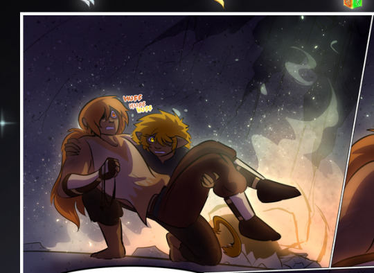
—where we now see that Falst's position is raised above Dainix's due to the way he's carrying him. (Points for continuity!) And, of course, we see the little "huffs" flowing from orange to yellow over their heads (where Dainix's head is higher than Falst's) to merge the sound of their breathing, which is absurdly clever because it emphasizes to the viewer how we hear two sets of huffing overlaying each other, not one. Absolutely brilliant.
(A few other notes of appreciation to that panel: beautiful glows around them, the sparks, the jagged silhouette of the spider legs, the lovely colors that have no right to make the area around a spider corpse that pretty, the excellent texturing on the cave walls plus perspective, the way Falst's movements imply Dainix's hefty weight, the natural posing of the characters, their on-point expressions that convey exactly how fuckin terrifying everything is right now, the slight glows to their eyes, and also they're just handsome boys <3)
Next up: Rain!!!! So well done! It's subtle enough that it never ever disrupts the impact of the focal point, but evident enough you can tell! And more importantly: THE MIST OFF THE CHARACTERS. Rain does this irl, it has that little vapor that comes off you and makes that little misty effect that plays with lighting, it's so cool-looking and here it's used to such pretty effect!
One of the panel captions says something about it blurring out all the injuries on the characters but like THAT AIN'T TOO BIG OF A PROBLEM when it gets across the environmental vibes, and also that'd be how it would look in real life too so like… outside viewer's angle is the same as the characters', mostly? my point is: that's the environment!!! that's the vibes, that's the feel! It gets it across and it does so in the most pretty way possible!
And another thing re: rain, the use of it to establish perspective, particularly in panels like this—

—where we can tell we're looking down at Tynan due to the perspective on the rain and where it's pointing. Excellent. (Also, kudos for looking down and emphasizing how Tynan's losing his advantage—lovely use of visual storytelling.)
Additionally, the misting here:
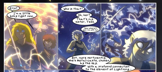
We see it most heavily in the leftmost panel, where it's quite foggy as you would expect in a rainstorm, especially in an environment with a lot of heat, but it's also lightly powdered on in the following two panels and tends to follow light sources, which makes complete sense given how light bounces off particles in the air.
A major point of strength in these too is a thorough understanding of lighting, like rim lighting, the various hues and shades, and an intricate understanding of how light bounces off surfaces even when they're in shadow (we'll see a faint glow in spots where characters are half in shadow, but that's how it would work in real life, because of how light bounces around).
Bringing some of these points together: the fluidity of the lines in magic, and the way simple glowing lines are used to emphasize motion and the magic itself, is deeply clever. I'm basically pulling at random from panels and there's definitely even better examples, but here's one (see this page https://comicaurora.com/aurora/1-16-33/):

First panel, listed in numbers because these build on each other:
The tension of the lines in Tess's magic here. This works on a couple levels: first, the way she's holding her fists, as if she's pulling a rope taut.
The way there's one primary line, emphasizing the rope feeling, accompanied by smaller ones.
The additional lines starbursting around her hands, to indicate the energy crackling in her hands and how she's doing a good bit more than just holding it. (That combined with the fists suggests some tension to the magic, too.) Also the variations in brightness, a feature you'll find in actual lightning. :D Additional kudos for how the lightning sparks and breaks off the metal of the sword.
A handful of miscellaneous notes on the second panel:
The reflection of the flames in Erin's typically dark blue eyes (which bears a remarkable resemblance to Dainix, incidentally—almost a thematic sort of parallel given Erin's using the same magic Dainix specializes in?)
The flowing of fabric in the wind and associated variation in the lineart
The way Erin's tattoos interact with the fire he's pulling to his hand
The way the rain overlays some of the fainter areas of fire (attention! to! detail! hell yeah!)
I could go on. I won't because this is a lot of writing already.
Third panel gets paragraphs, not bullets:
Erin's giant-ass "FWOOM" of fire there, and the way the outline of the word is puffy-edged and gradated to feel almost three-dimensional, plus once again using Screen or a variation on it so that the stars show up in the background. All this against that stunning plume of fire, which ripples and sparks so gorgeously, and the ending "om" of the onomatopoeia is emphasized incredibly brightly against that, adding to the punch of it and making the plume feel even brighter.
Also, once again, rain helping establish perspective, especially in how it's very angular in the left side of the panel and then slowly becomes more like a point to the right to indicate it's falling directly down on the viewer. Add in the bright, beautiful glow effects, fainter but no less important black lines beneath them to emphasize the sky and smoke and the like, and the stunningly beautiful lighting and gradated glows surrounding Erin plus the lightning jagging up at him from below, and you get one hell of an impactful panel right there. (And there is definitely more in there I could break down, this is just a lot already.)
And in general: The colors in this? Incredible. The blues and purples and oranges and golds compliment so well, and it's all so rich.
Like, seriously, just throughout the whole comic, the use of gradients, blending modes, color balance and hues, all the things, all the things, it makes for the most beautiful effects and glows and such a rich environment. There's a very distinct style to this comic in its simplified backgrounds (which I recognize are done partly because it's way easier and also backgrounds are so time-consuming dear gods but lemme say this) and vivid, smoothly drawn characters; the simplicity lets them come to the front and gives room for those beautiful, richly saturated focal points, letting the stylized designs of the magic and characters shine. The use of distinct silhouettes is insanely good. Honestly, complex backgrounds might run the risk of making everything too visually busy in this case. It's just, augh, so GORGEOUS.
Another bit, take a look at this page (https://comicaurora.com/aurora/1-15-28/):
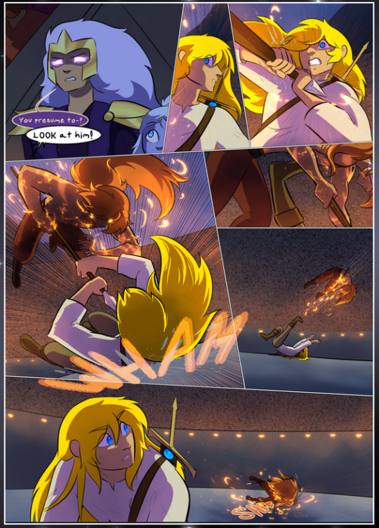
It's not quite as evident here as it is in the next page, but this one does some other fun things so I'm grabbing it. Points:
Once again, using different colors to represent different character actions. The "WHAM" of Kendal hitting the ground is caused by Dainix's force, so it's orange (and kudos for doubling the word over to add a shake effect). But we see blue layered underneath, which could be an environmental choice, but might also be because it's Kendal, whose color is blue.
And speaking off, take a look at the right-most panel on top, where Kendal grabs the spear: his motion is, again, illustrated in bright blue, versus the atmospheric screened-on orange lines that point toward him around the whole panel (I'm sure these have a name, I think they might be more of a manga thing though and the only experience I have in manga is reading a bit of Fullmetal Alchemist). Those lines emphasize the weight of the spear being shoved at him, and their color tells us Dainix is responsible for it.
One of my all-time favorite effects in this comic is the way cracks manifest across Dainix's body to represent when he starts to lose control; it is utterly gorgeous and wonderfully thematic. These are more evident in the page before and after this one, but you get a decent idea here. I love the way they glow softly, the way the fire juuuust flickers through at the start and then becomes more evident over time, and the cracks feel so realistic, like his skin is made of pottery. Additional points for how fire begins to creep into his hair.
A small detail that's generally consistent across the comic, but which I want to make note of here because you can see it pretty well: Kendal's eyes glow about the same as the jewel in his sword, mirroring his connection to said sword and calling back to how the jewel became Vash's eye temporarily and thus was once Kendal's eye. You can always see this connection (though there might be some spots where this also changes in a symbolic manner; I went through it quickly on the first time around, so I'll pay more attention when I inevitably reread this), where Kendal's always got that little shine of blue in his eyes the same as the jewel. It's a beautiful visual parallel that encourages the reader to subconsciously link them together, especially since the lines used to illustrate character movements typically mirror their eye color. It's an extension of Kendal.
Did I mention how ABSOLUTELY BEAUTIFUL the colors in this are?
Also, the mythological/legend-type scenes are illustrated in familiar style often used for that type of story, a simple and heavily symbolic two-dimensional cave-painting-like look. They are absolutely beautiful on many levels, employing simple, lovely gradients, slightly rougher and thicker lineart that is nonetheless smoothly beautiful, and working with clear silhouettes (a major strength of this art style, but also a strength in the comic overall). But in particular, I wanted to call attention to a particular thing (see this page https://comicaurora.com/aurora/1-12-4/):
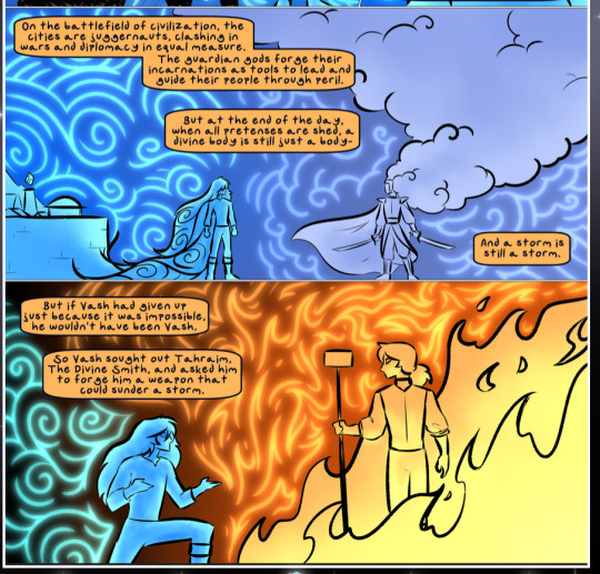
The flowing symbolic lineart surrounding each character. This is actually quite consistent across characters—see also Life's typical lines and how they curl:
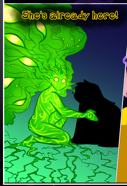
What's particularly interesting here is how these symbols are often similar, but not the same. Vash's lines are always smooth, clean curls, often playing off each other and echoing one another like ripples in a pond. You'd think they'd look too similar to Life's—but they don't. Life's curl like vines, and they remain connected; where one curve might echo another but exist entirely detached from each other in Vash's, Life's lines still remain wound together, because vines are continuous and don't float around. :P
Tahraim's are less continuous, often breaking up with significantly smaller bits and pieces floating around like—of course—sparks, and come to sharper points. These are also constants: we see the vines repeated over and over in Alinua's dreams of Life, and the echoing ripples of Vash are consistent wherever we encounter him. Kendal's dream of the ghost citizens of the city of Vash in the last few chapters is filled with these rippling, echoing patterns, to beautiful effect (https://comicaurora.com/aurora/1-20-14/):
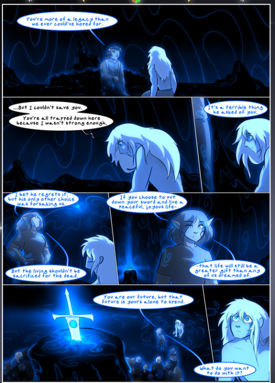
They ripple and spiral, often in long, sinuous curves, with smooth elegance. It reminds me a great deal of images of space and sine waves and the like. This establishes a definite feel to these different characters and their magic. And the thing is, that's not something that had to be done—the colors are good at emphasizing who's who. But it was done, and it adds a whole other dimension to the story. Whenever you're in a deity's domain, you know whose it is no matter the color.
Regarding that shape language, I wanted to make another note, too—Vash is sometimes described as chaotic and doing what he likes, which is interesting to me, because smooth, elegant curves and the color blue aren't generally associated with chaos. So while Vash might behave like that on the surface, I'm guessing he's got a lot more going on underneath; he's probably much more intentional in his actions than you'd think at a glance, and he is certainly quite caring with his city. The other thing is that this suits Kendal perfectly. He's a paragon character; he is kind, virtuous, and self-sacrificing, and often we see him aiming to calm others and keep them safe. Blue is such a good color for him. There is… probably more to this, but I'm not deep enough in yet to say.
And here's the thing: I'm only scratching the surface. There is so much more here I'm not covering (color palettes! outfits! character design! environment! the deities! so much more!) and a lot more I can't cover, because I don't have the experience; this is me as a hobbyist artist who happened to take a couple design classes because I wanted to. The art style to this comic is so clever and creative and beautiful, though, I just had to go off about it. <3
...brownie points for getting all the way down here? Have a cookie.
#aurora comic#aurora webcomic#comicaurora#art analysis#...I hope those are the right tags???#new fandom new tagging practices to learn ig#much thanks for something to read while I try to rest my wrists. carpal tunnel BAD. (ignore that I wrote this I've got braces ok it's fine)#anyway! I HAVE. MANY MORE THOUGHTS. ON THE STORY ITSELF. THIS LOVELY STORY#also a collection of reactions to a chunk of the comic before I hit the point where I was too busy reading to write anything down#idk how to format those tho#...yeet them into one post...???#eh I usually don't go off this much these days but this seems like a smaller tight-knit fandom so... might as well help build it?#and I have a little more time thanks to break so#oh yes also shoutout to my insanely awesome professor for teaching me all the technical stuff from this he is LOVELY#made an incredibly complex program into something comprehensible <3#synapse talks
776 notes
·
View notes
Text
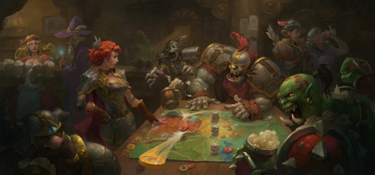
Tableskills: Making a Game of It
Recently I learned a bit of an unspoken truth that I'd brushed up against in my many years of being a dungeonmaster that I'd never seen put into words before: If you want to liven up whatever's going on in your adventure, figure out a way to engage the players in some kind of game. It's simultaneously the best way to provide a roadblock while making your player's victories feel earned.
This might seem redundant, since you're already playing d&d but give a moment of thought to exactly what portions of d&d are gamified. Once you learn your way around the system, it becomes apparent that D&D really only has three modes of play:
Pure roleplay/storytelling, driven by whatever feels best for the narrative. Which is not technically a game, nor should it (IMO) be gamified.
Tactical combat with a robust rules system, the most gamelike aspect.
A mostly light weight skills based system for overcoming challenges that sits between the two in terms of complexity.
The problem is that there's quite a lot of things that happen in d&d that don't fall neatly into these three systems, the best example being exploration which was supposed to be a "pillar" of gameplay but somehow got lost along the way . This is a glaring omission given how much of the core fantasy of the game (not to mention fantasy in general) is the thrill of discovery, contrasted with the rigours of travelling to/through wondrous locations. How empty is it to have your party play out the fantasy of being on a magical odyssey or delving the unknown when you end up handwaving any actual travel because base d&d doesn't provide a satisfying framework for going from A to B besides skillchecks and random encounters (shameless plug for my own exploration system and the dungeon design framework that goes with it).
The secret sauce that's made d&d and other ttrpgs so enduring is how they fuse the dramatic conventions of storytelling with the dynamics of play. The combat system gives weight and risk to those epic confrontations, and because the players can both get good at combat and are at risk of losing it lets them engage with the moment to moment action far more than pure narration or a single skill roll ever could.
I'm not saying that we need to go as in depth as combat for every gamified narrative beat (the more light weight the better IMO) but having a toolbox full of minigames we can draw upon gives us something to fall back on when we're doing our prep, or when we need to improvise. I've found having this arsenal at hand as imortant as my ability to make memorable NPCs on the fly or rework vital plothooks the party would otherwise miss.
What I'd encourage you as a DM to do is to start building a list of light weight setups/minigames for situations you often find yourself encountering: chase scenes, drinking contests, fair games, anything you think would be useful. Either make them yourself or source them from somewhere on the web, pack your DM binder full of them as needed. While not all players are utterly thrilled by combat, everyone likes having some structured game time thrown in there along with the freeform storytelling and jokes about how that one NPC's name sounds like a sex act.
A quick minigame is likewise a great way to give structure to a session when your party ends up taking a shortcut around your prepared material. Oh they didn't take that monster hunter contract in the sewers and instead want to follow up on rumours about a local caravan? The wagon hands are playing a marble game while their boss negotiates with some local mercahnts, offering to let the party play while they wait. The heroes want to sail out to the island dungeon you don't have prepped yet? Well it looks like the navigator has gone on a bit of a bender, and the party not only need to track them down but also piece together where they left the charts from their drunken remembrances as a form of a logic puzzle.
Artsource
212 notes
·
View notes
Text
Detective Noir AU
Alright, this au has been sitting around, waiting for me to finish it but chances are, I never will :((
So instead, I'll just post what I have so far
This was inspired by that one comment on the au post the author made(at this point you could consider me a stalker for the amount of hours I've scrolled through her feed💀)
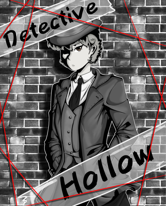
First things first, none other than our main character himself, Detective Hollow!
I made him the detective in this one mainly because I was basing it off of the theory that if there was no heroine the keyholder would simply become the hero instead(don't remember where I read this but I'm guessing it was the webtoon comment section).
I also my have just really wanted to draw him in an overcoat
gonna be honest, I did little to no research going into this AU, the thing I most tried to learn about was the femme fatale so I could get a good view on how to design Buddy
Speaking of the femme fatale:
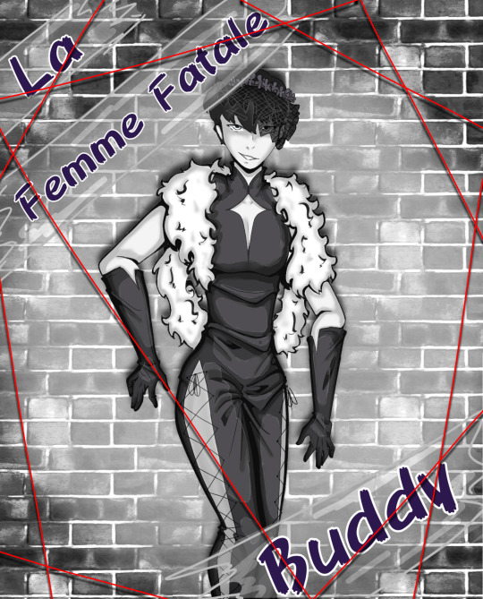
Seems like someone got caught in the spotlight!
And before you ask, yes, those are pants. Weird ones, but pants nonetheless. I swear, I hate lighting when it's from the front. Frontal lighting can go fuck itself. Please ignore the little help lines I put in
Honestly, Buddy's outfit was probably the hardest part of this one. I wanted him to look slutty, but I didn't want to make it TOO slutty, but I feel like I may have added WAYY too many folds in his pantsuit and I kinda messed up on the overcoat lol. The diamond on his chest was inspired by the diamond on the villainess key more than anything and I tried to incorporate that into his gloves too.
Anyway, have some potential outfit sketches I made:
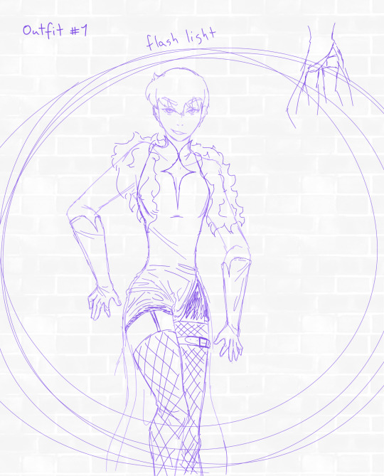
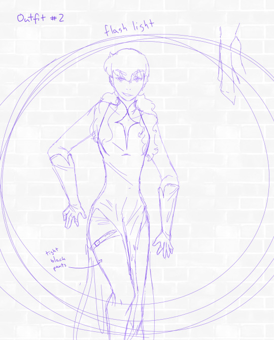
the two I thought might come off as too slutty and
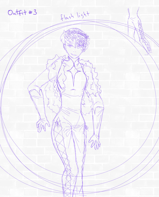
the ultimate winner of the outfit ideas
As you can see the diamond chest window and fur coat were a mut in this outfit and I'm pretty happy with the end result
Y'all know how the femme fatale usually has to seduce the main character a.k.a. the detective?
Well, y'all know me so have an extra just for you <33
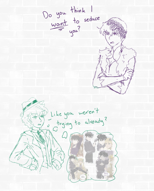
But I'm not done just yet!
Remember how I said that I made Chase the hero because of the lack of a heroine in the story? Well...
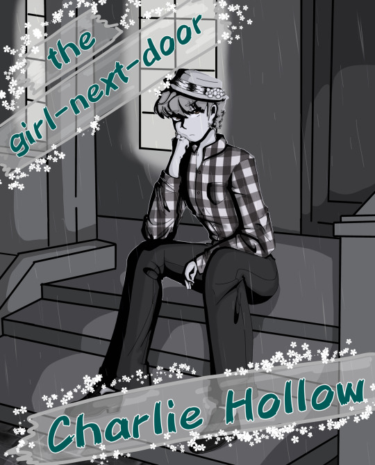
I did some more surface level research(and I mean very surface level) and decided to adapt the trope of the girl-next-door archetype for him!!
Don't think it suits him, since they usually just sit pretty and wait for the detective to notice them, but they do have badass roles once in a while and I live for those!!!
The one Chase has taken on doesn't though sadly :')
I decided to go with Charlie Hollow for this one because it sounded more like something the timid and 'pure'(yuck I know, but sadly film noir movies often prop up comparisons between the femme fatale and the girl-next-door, this being one of them) girl next door would have
Overall I tried to make this one as cutesy as possible because, why not lol
Lastly(I apologise, I made this in a rush because I was running out of motivation)
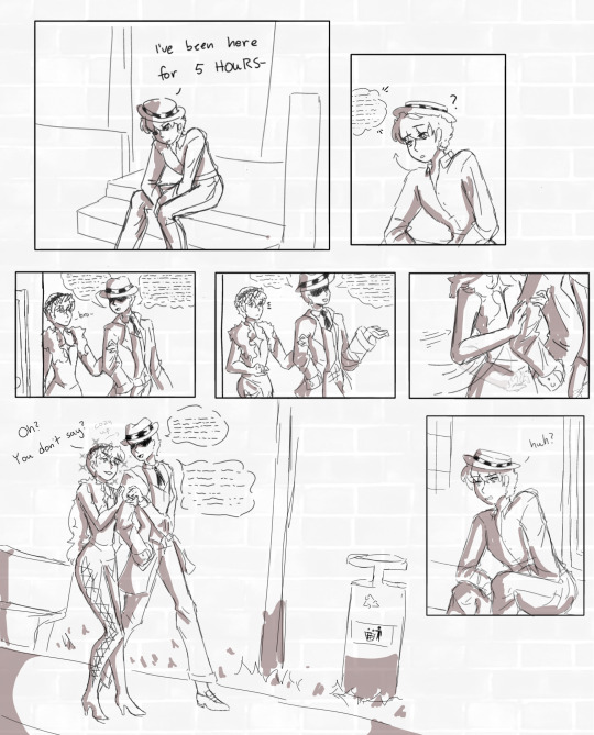
The distance between Buddy and the detective sure did close QUICK-
Originally I was planning on adding Deacon as a police officer and now that I think about it I could technically fit Prunella in here as well, but I just don't have any willpower left to keep this thing alive
My art blocks been acting up recently and I can't even pick up the pencil without immediately wanting to put it down :((
I wish I could have continued this and maybe I will someday, but until then this'll just stay in my drafts
#cinderella boy#cinderella boy webtoon#buddy#chase hollow#detective noir au#I tried out a new shading style#I can't personally judge how it turned out#what do y'all think#I feel so tired rn#French - the bane of my existence and yet the love of my life#I FORGOT TO WATERMARK NOOOO#Eh who cares#hope y'all enjoy#I know this is a long ass post#sit down for it will you?#it's worth your time I swear#plss#I've been so inactive lately lol#I can't promise anything I'm sorry DD:#I am working on a fic and on some art for said fic#but I'm not sure how much progress I can make with school hounding my back#hope y'alls thirst for fan content was quenched even if just for a bit :)
56 notes
·
View notes
Note
i wanna get better at art but dont know how to start ^^' whats a good way to get into studying anatomy and improving as an artist? tysm 💗 love your art soso much
more art converts 😼 yay!!
i think these asks were sent by different people but they're pretty related + a lot of my advice is the same! so i'll answer these together under the cut (it's so long oh gosh)
ok first of all i'm very flattered that people are asking me for art advice but i'm really not the most equipped person to ask TTOTT I've never been deliberately studious with my art so I feel bad offering advice when I've mostly gotten by with just drawing fanart and ocs a lot... my rate of improvement has therefore been slow, but I've still had an enjoyable learning experience so perhaps from that angle my input may help! i'll mainly refer you to external resources that have helped me
For anatomy + drawing humans:
1) I know I'm not diligent enough to sit down and study muscles, so instead I make it more enjoyable by drawing my favorite characters in a pose that targets the muscles I want to practice! (i default to drawing ppl naked because of this lol) This isn't the most efficient, but it serves as good motivation to get practice in. (honestly a lot of my general art advice has the undercurrent of becoming so obsessed with characters to drive your motivation to draw even when artblocked/ struggling with doubts!)
2) I want to refer you to Sinix's Anatomy playlist! Although Sinix focuses more on digital painting, he gives simplified anatomy breakdowns that include how muscles change shape under different movements/poses, which is crucial for natural human posing. the static anatomy diagrams from Google don't really help for that
3) What's just as important as anatomy is gestures! (especially important if you're used to drawing non-human objects I think!) Making figures look like they have flow to them will sell the "naturalness"(?) to your anatomy. If you have in person life drawing sessions accessible near you I'd recommend trying those out, or if you prefer trying it digitally there's this website!
This helps you not only get a sense of human proportions, but also natural posing! I'd limit the time taken to draw the poses from like 10 seconds to 1 minute(?) for quick gestures, and maybe 1 minute to 5mins(for now!! typically they go much longer) to study human proportions. I'd say don't spend a lot of time on them, repetition is more important!
4) I've also picked up on useful anatomy tidbits from artists online! Looking at how practiced/ professional artists stylize a body helps me focus on what the essential details are to convey a particular form (looking up "human muscles" and being hit with anatomy diagrams full of all the smallest details can be overwhelming! what do you even focus on?! so these educated simplifications really help me) Like Emilio Dekure's work! Look how simplified these figures are, and yet contain all the essential information to convey the sense of accurate form (even though it's highly exaggerated!)
(shamefully admits I've never studied from actual anatomy books so I can't recommend anything in that sense TTOTT)
For general improvement:
1) I highly recommend Sinix's Design Theory playlist and Paintover Pals! (+ his channel in general) You don't have to put them immediately into practice, but I think these are good fundamental lessons to just listen to and have them in the back of your mind to revisit another day. Plus these videos are just fun and very approachable! Design theory fundamentals are essential to creating appeal and directing a viewer's attention, and critiquing others' work/ seeing his suggestions are a good way to practice noticing areas of improvement+ solutions yourself!
2) If you prefer a more formal teaching resource, the Drawabox YouTube course covers all the basic fundamentals of drawing in short lessons. But honestly if I were starting out, this would be a little intimidating for me (and even now it still is! I haven't done all of them) But even if you don't watch them, the titles should give you an idea of the basic concepts that are valuable to pick up. I think it would be nice to keep in mind and revisit once in a while as you learn!
(One lesson I do encourage you to watch is the line control one! A confident continuous line conveys motion and flow much better compared to discontinuous frayed lines which I think is good to practice early by drawing from the wrist and shoulder)
3) As a universal piece of advice: Please please please use references! Use a reference for literally everything, observing is how we learn! You'll find that a lot of things you thought you knew what they looked like are inaccurate by memory alone. Also, trace! This is solely for your practice, tracing then freehanding has helped me grasp proportions when I was struggling! (of course don't post these online if you traced from art)
I've found that being able to compile references into easy to access boards has been very helpful in encouraging me to use references more. For PC, I think they use PureRef (free/pay what you want), and for iPad I use VizRef. VizRef is a one time purchase (which was definitely worth the $3.99 USD price imo)
4) On that note, try building up the habit to observe from media + real life and make purposeful comments about what you see! Like hey, when I bend my knee, the muscles/fat in my thighs and calves bulge outwards, I should draw that next time. Purposeful observation carries over to your overall visual library, and it's a little thing that adds up over time
5) For motivation, get into media you really enjoy, or make your own characters! The way I started art more seriously was by drawing fanart + OCs from anime that I liked ^^ For OCs it really encourages you to draw more because you're the primary creator of their art! Also you gotta see a lot of good art to make good art! Watching visually appealing media (like animation with appealing stylization/simplification) can passively help you learn just by observation.
ok wow I could go on but this is already a lot of information TTOTT my main aim for this reply is basically: don't let anything discourage you from learning to draw!! drawing is so fun and brings me a lot of joy ^^ practicing often will of course help you improve, and the way to incentivize that is by having fun with it! i hope this could help!💞
#my asks#art resources#trying to be concise n failing#i'm mainly worried that like. my art tips make me sound more skilled than my art actually is
65 notes
·
View notes
Note
Hey I just came to my senses and Binged your Recks au Tag, and Boy do I wish I've been here from the Beginning. Curious if you're mostly keeping the Au based in season 8 or if you just take inspiration from the series as it comes.
Either Way, I've been in a long-time hermit-art slump and your stuff is Mad inspirational. Maybe it's Corny... I know I'm just a rando on the internet, but I hope you can understand how personal i mean this when I say your Recks Pearl has One. Of. The. Most. Appealing. Character. Designs. I have seen in Forever. Been months since I've reacted to a piece of art in the same way as seeing that one.
thank you so much for sharing your art
...
Also what kind of robot would Joel Be: closer to grian or pearl?
the au is mostly based on s8, but there are elements from previous and later seasons! plus it has its own "storyline" going so i pick and choose which elements to keep and which to pass.
and im so happy to know that you like pearl's design :D!!!!!!!!!!!!!! she's one of my most favorites, both in form and function the design is so fun and unique! like, changing forms and transorming while still staying pretty much the same, her arms being able to switch positions in the shoulder joint, the three bends in the limbs, her being absolutely massive..... pearl is just so cool 🤧
for your joel question.... im not sure, again i haven't thought about his role yet, where he would be or with who if anyone... but, hmm. i might take some inspiration from his empires1 "lore" and his hc intros, by him having a lot of copies who are technically the same robot but also different somehow? in which case he would be more easily manufactured so uhhh... i guess somewhere in the middle between pearl and grian? maybe a more humanoid model? sorry i have no idea, i really need to sit down and draw to figure it out
28 notes
·
View notes
Note
13 for the ask game :]
OPE unfortunate timing, i just answered that one!
13. What's a character/ship you haven't written/drawn yet but would like to some day? oh gosh i'm not sure i've drawn so many characters and ships... i'd love to draw trujinxie some day since i think they're super sweet!! for characters, i like to find a specific "design" for them that is consistent through my doodles. it's pretty obvious i haven't settled on one for franziska yet so i'd like to find a concrete design for her lol
but i'll answer with another char and ship for writing instead!!
i really wanna write more maya!!! she's so so fun to draw for me and i'd love to write her silly dialogue
for ships, i'd like to properly sit down and write a klapollo fic -- i have a whole dragon shifter au bouncing around in my brain that i've been meaning to write for AGES, but i just can't figure out how to write it lol


(list of numbers to ask)
30 notes
·
View notes
Text
HYPERSOMNIA MARCH DEV LOG : "If you have love in your heart"
Hi! For all of you who follow HYPERSOMNIA, you should already know what the gist is here, but for those of you who are new, or just new to our tumblr, let me fill you in!

For 2024, I am trying to release a dev log about HYPERSOMNIA once a month, may come earlier, may come a little late, but I'm doing this to help give insight on to how the game is going, and to give me motivation to work on the game.
First things first, sorry about the incomplete drawing for this month's log. I've been sitting on this drawing for months and haven't touched it, and I needed a drawing for this months log so I thought "Eh, what the hell."
For this month, things have been a bit up and down, I've been focusing on more smaller stuff in engine this month, and bigger stuff outside of engine. So there's not a lot that's been added but there is new stuff that I'd like to share. :)
I'd like to start with the smaller stuff first, since I feel like most logs I've started with the bigger stuff and kinda run out of steam by the end. So it'll be along the lines of "Small in-engine stuff > Big in-engine stuff > News/closing thoughts".
NOW LET'S GET TO THOSE UPDATES!
Lots of menu work has been done this month, which isn't very exciting sounding but it's nice to be getting this stuff over with.
HYPERSOMNIA has a smaller resolution than RPG Maker MV's default, and the thing about that is a lot of content in menus doesn't scale accordingly, leaving stuff to get cut off and preventing the player from accessing information.
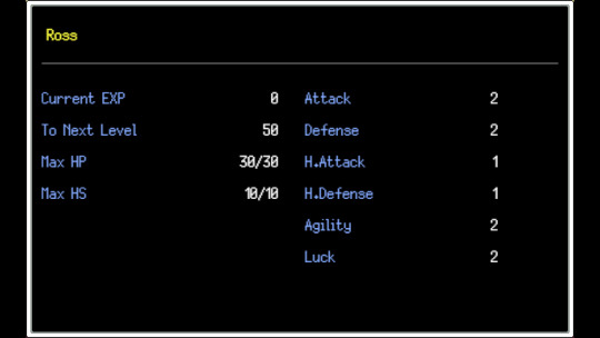
One of the things I've had to do is get the player's HP and HS to appear on the status screen. These usually appear on the main menu of the game, but since I use an alternate menu for screen space, they had to be relocated. (courtesy of SundialShark, I'm not familiar with JS so they've been a super big help with certain things in the game.)

The game's title screen also saw a slight improvement, I found a plugin that replaces the windowed options on the title screen with pictures, making them more customized. The title screen artwork itself will be revised later, as I whipped it up as a placeholder.
Also, do you remember last month's dev log? Specifically, the part of it where I talked about the equip menu in battle? Well shortly after writing that dev log, it was finished!
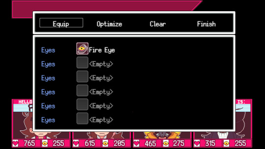
This works how you'd expect it to, you can equip/unequip eyes and give them to other party members. The only drawback to this is that touchscreen isn't fully supported I've been told, which is fine since this is a game intended for PC. It does work with controller though which is nice.
Speaking of battles, I've been working on special attack animations! I have the main 4's offense animations done.

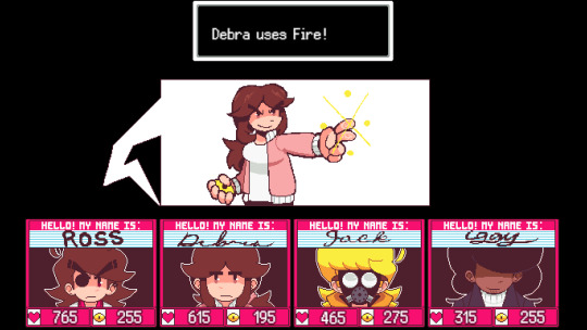
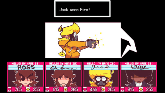
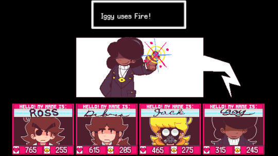
My personal favourite is Jack's. Everyone else does it all cool but Jack aims like he's holding a gun which is cooler. I'll probably touch up Ross' animation, since it looks kinda weird to me. I think his head might be too small.
Also, would you believe me if I told you that isn't all the battle stuff that was done this month? This is where that "Big in-engine" stuff kicks in.
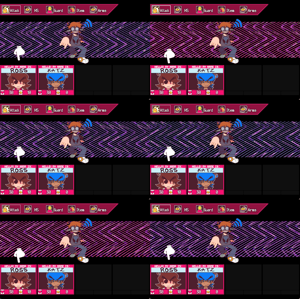
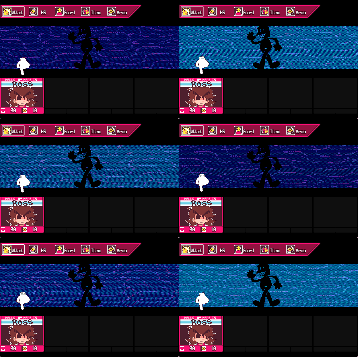

THE BACKGROUND SYSTEM HAS BEEN IMPROVED! (ALONG WITH ME DESIGNING SOME NEW ENEMIES!)
This took a bit of time to configure, but I replaced the old background system for a new one
(Which was originally set up with my buddy Majimjam of HYADES, awesome game that has a demo out RIGHT NOW!)
With Jengamon's EarthBound Backgrounds plugin, it's been really fun to just toy with it and see what I can make. I would try and run down how this works, but the funny thing is I don't even know how this works. Or, at least in full anyways. I know how to configure it and set up new presets for enemies.
That's pretty much all the in-engine stuff I've done this month, but I'm not out of stuff to talk about yet.
First, I recently wrote a thread on the RPG Maker Forums about HYPERSOMNIA, which you can read here!
Secondly, some of you might've seen this already but I decided to cut FIREBALL from the game's soundtrack fully.
There were a multitude of reasons as to why, but the biggest one is I just don't feel like FIREBALL fits HYPERSOMNIA anymore. The vision has shifted since 2021 and I feel like music for battles could reflect it better, so FIREBALL was scrapped.
The song was uploaded to my personal YouTube channel though, so you can still listen to it here.
Third, THE NEW TRAILER IS ALMOST DONE!
There's still a few things that need to be touched up, but the music and footage is all fully recorded! All that's left to do is throw it in the editor and refine it until it's finished.
I'm very proud of this trailer so far, and I think it'll blow every other trailer I've made out of the water. My goal for this trailer was to improve the editing and I think that's definitely one of the highlights for this trailer.
I'd really like to post a quick sneak peak, but everything about this trailer I feel will be such a surprise that I don't want to spoil it. You'll just have to wait for the Mother Direct!

And that's it for this month! Slow but steady progress is how I'd sum up March. I'm definitely looking forward to the future. Mostly because I'm going to a restaurant with family later today, but next month will have more in store. Like my birthday! Big things coming.
Thanks for reading to the end of the dev log, same as always, these are fun to write. I appreciate you reading them!
If this is your first log you're reading, or even your first time seeing ANYTHING relating to HYPERSOMNIA, I got a whole bunch of links for you to check out if you wanna know more about me and my stupid little game.
TWITTER
YOUTUBE
STEAM
UNIQUE INDIE RPG'S [SHOW US YOUR GAME!]
[PREV] [ABOUT HYPERSOMNIA] [NEXT]
23 notes
·
View notes
Text
THE ORIGINS OF BUDGIE CITY

Welcome to this informational article where I will be explaining what exactly this "Budgie City" is, where it came from, and in which direction it will be going. So, sit down comfortably - there are some interesting things waiting ahead of you! If you are interested in the lore, visit this article.
What exactly is "Budgie City"?
It is a fictional world that I am actively developing. At the moment, I’m in the process of writing it in the form of a paper draft. I write long texts by hand, and it seems to me that spelling out each letter, unlike typing, helps to approach the composition of sentences more thoughtfully, and to more successfully avoid strange and crooked constructions that will then have to be rewritten and corrected. It is far from the final, but I want to warm up people's interest in this world before the release of a full-fledged work, which is what I am doing now. I will not publish too many pieces of text until I have finished the story completely (though I probably will show some sneak-peeks). For now the content on "Budgie City" is mostly limited to drawings — concepts, sketches and character designs. Gradually, I've been starting to bring this topic to my YouTube channel in order to introduce the setting and concept to my viewers.
You may have seen my first video of Budgie City since 2014, which I have released quite recently — “I am not insane”, a video that focuses on one of the secondary conflicts of the story.

Where did this concept even come from?
It's quite a long story, and it's funny that this year is the ten year anniversary of me registering on the forum called "Budgie City". Yes, it all started with a regular internet forum — a by now almost extinct site format, which in the early 2000s and until about 2016-17 was the main place for interest groups on the internet. Now this has moved almost completely to social media, but before almost any hobby or interest had its own forum with different sections and topics. It saddens me a little that the golden age of forums has already passed.
In 2012, for the New Year, my parents bought me my first budgie — a classic green one, and I named him Gesha. At that time, I was not a regular "user" of the Internet yet. I only started to comprehend the vastness of the virtual network a few months later, and at first it leaned purely on me viewing memes in Google pictures and all sorts of videos on YouTube.
But in the spring of 2013, I discovered these wonderful things known as forums. And it was that point in time when I, having had a budgie with me for a year, decided to find a forum thematically fitting. Upon the request from my country, Google led me straight to the “Budgie City” forum.
The topics on there were something like rooms in a big house. The users randomly surfed through them and followed each other's daily lives. Therefore, Budgie City did actually feel really like being in a virtual society where everyone knows each other. I was getting used to the frequent people, getting to know each person individually. I went to their topics to write comments and answers, they wrote in mine. That's how we existed as this cozy club of interests.
There is an interesting thing with almost every child that is on the Internet — no matter where, in which community — a person with the admin/moder status is perceived as an absolute authority, any response from which causes awe and delight. And there were certain, more active and sociable admins in Budgie City — Anya under the nickname "Phoenix Bird" and Olga under the nickname "Olivka". The "Phoenix Bird" nickname spoke for itself — the image of a large bird of fire that walks around the city and receives admiring glances from everyone, was drawn in my head almost instantly. Olivka didn't have an image yet; I started turning her into a character much later.
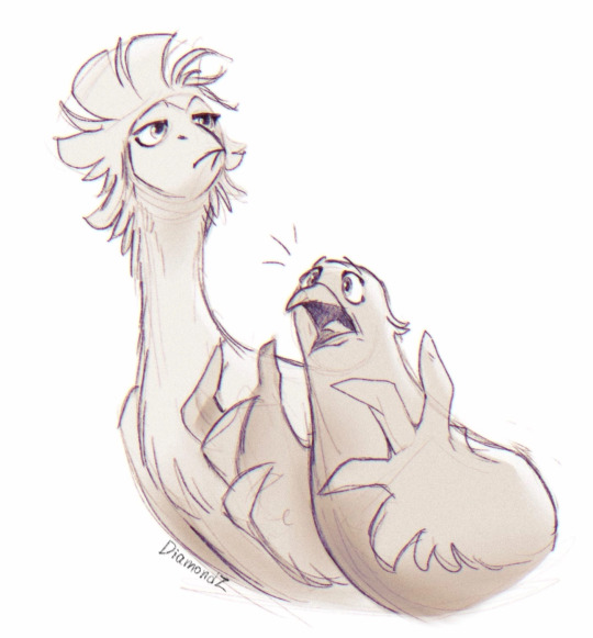
Phoenix and Olivka in their modern designs (2022)
In the early summer of 2014, I read "Warrior Cats", and that’s where the whole story took off. I suddenly felt like I should become a writer too and write my own book. And 12-year-old me, who was spending 80% of my online traffic on the forum, decided to write a story, turning part of the admin staff and the budgies of familiar forum members into their own characters. Phoenix and Olivka turned into birds, the latter in particular acquired an image in the form of a wompoo fruit dove with olive-tinged wings, the budgies of the forum were also turned into their respective characters: Gesha and Yasha (mine); Glasha and Gosha (Hoatzin); Clementine, Jack, Fenya, Nira, Mouse, Castorka, Mithril and Small (Phoenix); Kuzya (Dmitriy68), Milana (Radujniy), Raisin (yyna) and others.
Sections of the forum have turned into parts of the city — the restaurant, the mayor's office, the registry office and nursery, and suburbs with parrots of other species, located on trees surrounding baobabs.
This is how the novel of the same name with the slogan "Feathered Metropolis" was born from the "Budgie City" forum. I posted it in its own topic, had about a dozen readers and, judging by the reviews, they all really liked reading the story. Although, looking back at the writing now... I wouldn't call it something breathtaking. Rather the opposite. But then again, I am now judging from the perspective of a third-year animation director student, and not the fifth grader I was at that time.
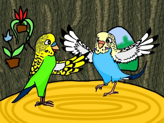
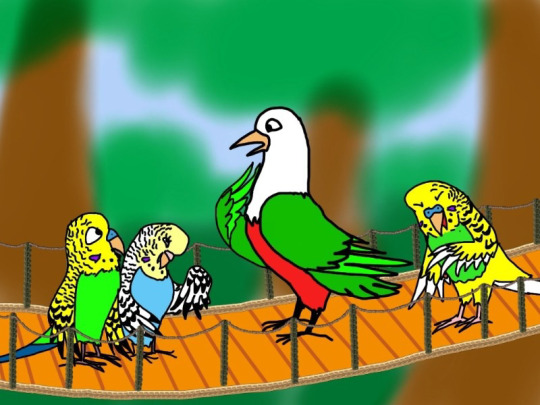
A couple of my original illustrations from 2014
The story was successfully brought to an end in about seven months, and after a while I started writing a sequel — however, the central conflict wasn’t thought out the slightest, so the plot quickly crumbled and was abandoned after several chapters.
Now the original text is lost in the vastness of the web — somewhere there is a piece of the prologue, somewhere even a couple of chapters. But the full version no longer exists — it was published only on the forum, and the said forum, unfortunately was — somewhere around 2019 — ruthlessly deleted from the Internet due to the desolation. All that's left of it are snapshots in the Wayback Machine.
Rewriting from the old version into a new one
In 2017, three years later, I made an attempt to rewrite "Budgie City" from scratch — leaving only the main conflict, the structure of the world, and the set of characters the same, to write a new text out of this "skeleton". Progress did not go beyond the prologue and the first chapter however, and rewriting was abandoned.
The same story with 2019 — a couple of pages, that’s all.
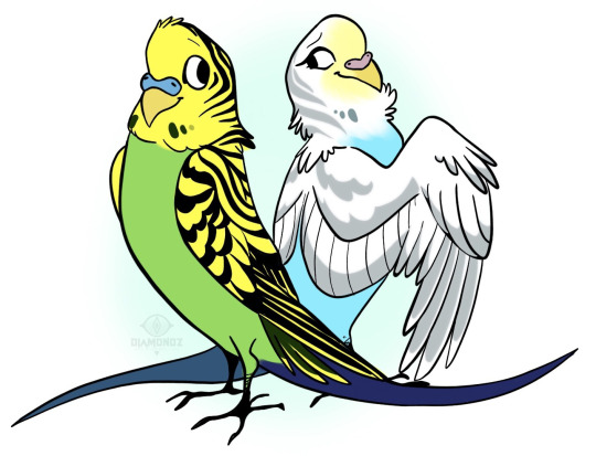
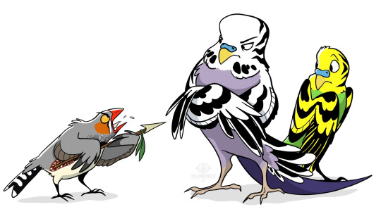
Two artworks from 2019
The next approach took till early 2021 to happen, when the original story turned almost six and a half years old. At that time I was already in the middle of my first year of animation directing at SPbGIKiT (Saint Petersburg State Institute of Film and Television). I wrote the prologue and part of the first chapter and went to proudly tell our master Galina Voropai about my "really cool" world. Galina interrupted me in the middle of the impromptu presentation, after which followed a forty-minute roast, thoroughly and in detail explaining that the "Budgie City" in its concept is a piece of junk that does not have the right to exist in its current form. And all this was in the presence of my classmates in the workshop. I gave up trying to defend myself halfway through, and when it was all over, I got up, quietly thanked Galina for a detailed objective analysis of the shortcomings of my project, went down to the first floor, huddled in a bathroom stall, and burst into tears.
It was the first (and yet the only) time in my life where I was literally crying over my work, and the girls from senior courses came to my howls, and we sat together on the windowsill of a public toilet. I was all red, shaking, and dropping snot, as they tried to calm me down.
(my mental state that day)
After that, I did not return to those written several pages for about a year and a half. I began to doubt whether I should continue at all or if it would just be a waste of time.
After the roast from the master, I went through all five stages of grief:

Yes, that was tough. But after so much time, I was finally able to evaluate the message of this scolding with a cool head and understand that most of the comments were actually really helpful - the conflict and the world did require a lot more careful study and rework. With the next approach, I wrote out all the conflicts, all the character motivations, and made a proper plan. And since the end of last autumn, I have returned to writing. Now I know where the story will begin, where it will head, and how it will end. All the actions performed by the heroes are finally based in actual logic. And, although Galina will not see the final result (she sadly passed away at the end of 2021), I hope that the new version will be one that she would have approved of.
A small FAQ:
Q: When will the book be released?
A: I don't want to make any promises as of now, because writing is a rather spontaneous and uneven process. I write more when I am inspired, and inspiration is impossible to predict. So the answer is simple — it will come out when it's finished :D
Q: Will it be released electronically or in a printed book form? Will I have to pay for reading it?
A: I plan to release the final version "Budgie City" in the same way as the old one — in open access, so that everyone can read it at any time. I will not charge money for reading the electronic version, but if there will be a demand for physical copies, I may release a small print run, which will cost money for those who want to get a copy. But it's a little early to think about that anyway.
Q: How does the world in Budgie City work? How do they live? What is the main conflict of the story?
A: All of this you can find out in this article!
Q: Where can I find more content to this world and story?
A: On this very blog or on my YouTube channel
I hope this article was helpful and informative enough for you to know where "Budgie City" comes from and in which direction it is currently heading. Thank you for reading!
Huge thanks to @annchanorsomethin for helping with translation of this article!
#budgie city#introducing post#information post#writers on tumblr#artists on tumblr#art#original writing#writing#info#lore article#article
81 notes
·
View notes
Text
Wurmple Build Log
Guess who's back to drop another overly detailed post about a cosplay project. Another Pokémon one, unsurprisingly! My dumb ass made a Nargacuga fursuit head back in 2020 so I could learn how to work with upholstery foam. It looked... alright... but I know in my heart it was a horrible, horrible mess. Fast forward to 2023, I go to a 3-day convention, wear a bunch of different heavy wigs the whole time, get a rash on my forehead and think, fuck it, I am cringe and I am free, I'm gonna finally live the dream and make a Pokémon suit. It'll be great, and I won't have to wear a wig; I'll just have to worry about heat strokes instead. Fun! Of course, in true shitpost fashion, my perfect fursuit candidate has 10 legs and is shaped like a sausage.
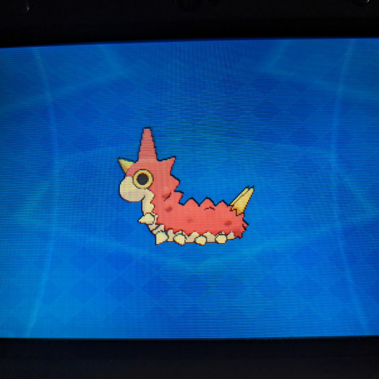
Click on over to read the wondrous tale of building a Wurmple Partial Suit in like two weeks.
1. The Worm
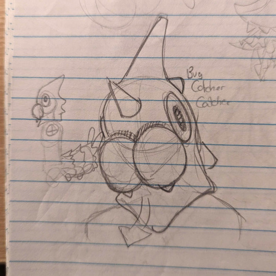
Wurmple started as a dumb little sketch in the corner of my notebook. I have a lot of cosplays and plushes under my belt but the last fursuit (head) kinda looked like it would belong in a bootleg Freddy Fazbear establishment, so I brainstormed over a bunch of Pokémon I like that would work as a partial and are simple enough in design to avoid accidentally creating Uncle Uncanny 2.0. The goal was something that would be relatively comfortable and easy to bring to events 'cause I'm just not mentally prepared to drag a suitcase in public transport and wear a full body sweat carpet yet. I ended up doodling a few ideas like Haunter or Koffing, but then I pictured a Bug Catcher trainer with a bug head and I thought it was funny as hell, so the choice was made. I picked up my copy of Alpha Sapphire to get a good look at the model and immediately ran into a problem; the eyes on Wurmple are literally on the side of the head. They sit so flush you literally cannot see them if you look at them from the front. Not a great start. I figured I could probably hide a small hole for vision right above the mandibles where the red and cream colors separate. I wasn't super confident it would work, but dammit, I was already commited to being a stupid Bug Bug Catcher. Similarly, I looked at the side profile and figured I could open a hole behind the mandibles at mouth height to breathe out of. With an disproportionate amount of confidence for the bullshit I'm about to summon into the world, I began the project by patterning out the tail.
2. Bug Ass
I'll be honest, I started on the tail so I wouldn't have a reason to back out of it if the head ended up being a hot mess. I've patterned out and sewn a few plush before, so making a big ol' headless grub sounded like a reasonable goal. I usually make plush patterns by building out the shape with newspaper and tape, but Wurmple's tail got pretty big when scaled to fit a human, so I searched for alternatives. I ended up building the base shape to draw a pattern out of by taping two pillows together. I tied down small sections to shape the belly and slapped a layer of masking tape over half of it to trace my pattern. Once everything looked good, I cut the pattern pieces out and laid them flat. The pillows were returned to the couch safely once they recovered from the barbaric treatment.
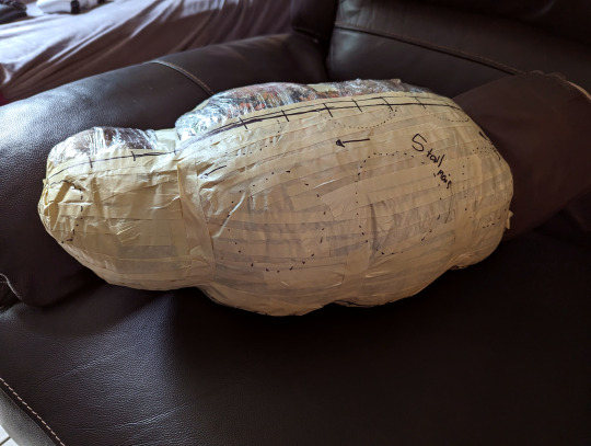
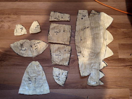
I dug through my materials storage (a sad lonely plastic bin) for some Trash Fabric ™ leftovers from other Trash Projects ™ and tested the pattern out to see how it looked. I made the pattern for the spikes and legs at that point based on the test build and adjusted some seams on the tape pattern to refine some shapes, but overall the first pattern was a great success!

With the mockup done, I pulled out the minky fabric and got to sewing the tail together. I picked minky for the project 'cause it felt right for the cartoony 3d models to have that smooth short-pile look in real life (kinda like the official mascots, really). I was aware the margin for error when your fur pile is 3mm long is basically non-existent, but hey, at least I could work without a respirator on unlike fur! Sewing the body of the tail was pretty straightforward; I assembled the belly panels together, stitched the darts on the red parts to form the curve, and attached the backside of the zigzag spikes to it. I assembled the top and bottom halves together, tacked each zigzag down in place by hand, and filled the whole thing with polyester stuffing to see my beautiful bug sausage take shape.
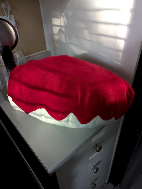
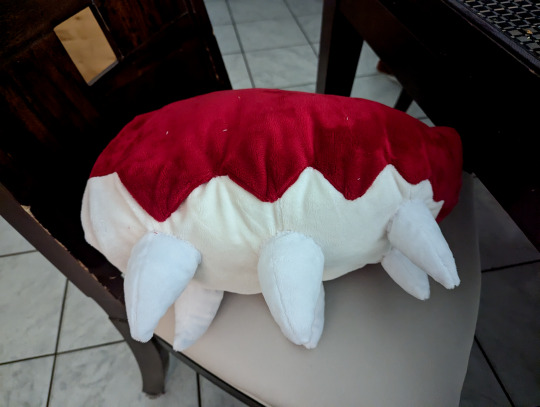
Once I was sure it everything looked good. I stitched six little white legs and attached them onto the belly by hand using the belly seams as a guide.
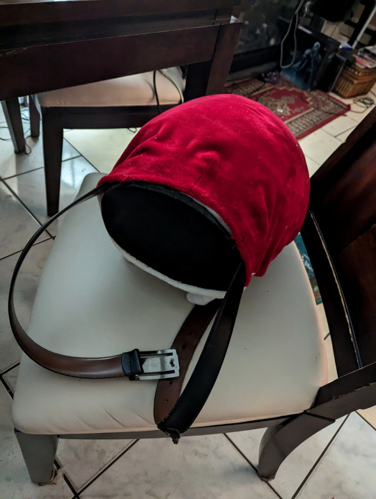
Before moving on to the top spikes, I took a break from handsewing to build the tail base. It's a little nub made out of sandwiched upholstery foam with a belt running through a channel carved into the foam. It's topped off with a layer of high density EVA Foam glued at the base to keep the anchor point sturdy. Huge thanks to Neffertity for her tail tutorials as this was the main inspiration behind the method I used for the tail attachment. The foam nub goes about a quarter of the way through the tail, with the rest of it being filled up with the polyester stuffing that was added earlier.
Once the tail attachment point was secured, I started sewing all the spikes for the top half of the tail, stuffed them, and then stitched each of them to the tail by hand. Once they were all stitched on securely, I sewed the back closed with one last minky piece and Wurmple's tail was complete!
(Looking back, I could probably have machine stitched the legs and spikes on... But I was watching some really good Resident Evil Randomizer streams while handsewing these, so I didn't wanna get off the couch to work on the pattern again)
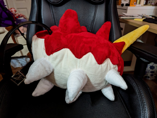

I'm so glad I started with the tail. It was basically a big plush, and I was so proud of the results when I was done that I was energized to start working on the head. Oh right, the stupid worm head with no vision.
3. The Head
Building up the shape of Wurmple's head was simple enough. I began by building a bucket head base out of upholstery foam by following Skyehigh's Studios old tutorial (new one linked here) and slapped some paper on it to figure out the size of the main elements; the mandibles and the eyes. I immediately regret following the tutorial steps for the eye holes, since I Forgot We Weren't Gonna Be Doing That, and mark where my cyclops eyehole is generally going to be instead.

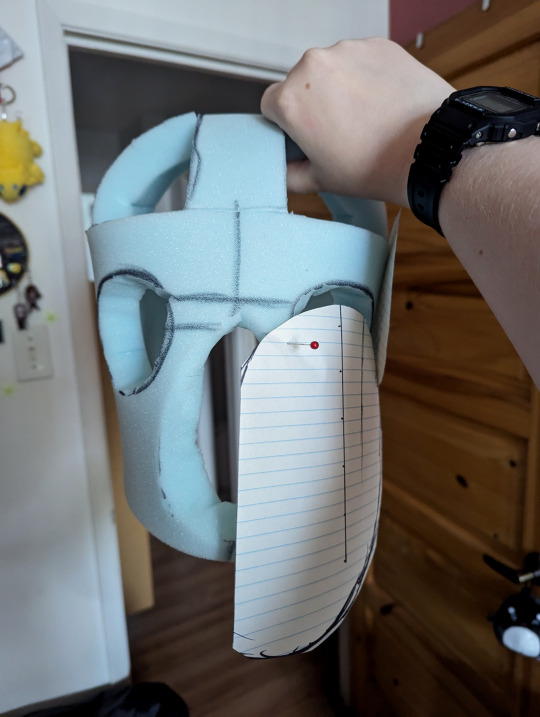
Once I was satisfied with my patterns, I cut some more upholstery foam slabs, carved them with scissors until I got down to the general shape of the mandibles and horns, and glued them onto the base. I immediately got another stress injury carving everything down and realized I did not learn from my wig ventilating mistakes. I took a break to add a turkey carver to my online shopping bookmarks, which I immediately forgot about until I sat down to write this post. Since I was using minky for this project, I needed to make sure my base was as smooth as possible. The fabric is so thin it would pick up every wrinkle ever and look sad if I didn't. I dug into the bin for some Trash Felt ™ and glued it over the mandibles to smooth things out and added some mesh to the holes of the bucket head base to keep the curved shape of the head going without sacrificing those sweet ventilation holes. I also added my vision hole and marveled at my horrifying Mando helmet abomination. At that point in time I'm having some big doubts about the vision hole, but I trudge on because I'm not just gonna wear a bug ass to these conventions.
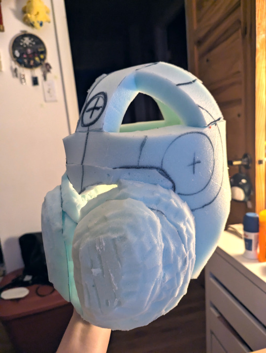

With the base complete, I covered the whole thing in tape and drew over it like I did with the tail to create a pattern, made sure to forget to take pictures of said pattern so that this step is lost to time, and started sewing the head fabric so I could slap some skin on this bad boy, starting with the horns. At the same time, I stitched the darts on the mandibles, pinned that to the head for later, and assembled the red halves of the head together on the back seam to test the fit.

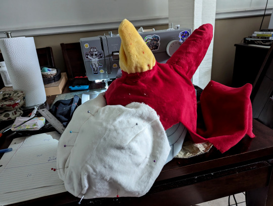
With the test fit successful, I pulled the red part off in order to machine stitch it to the front half of the head along the zigzag edge and slipped the whole thing over the head again. With everything in place, I painstakingly handstitched everything up, including the side of the mandibles and the horns.
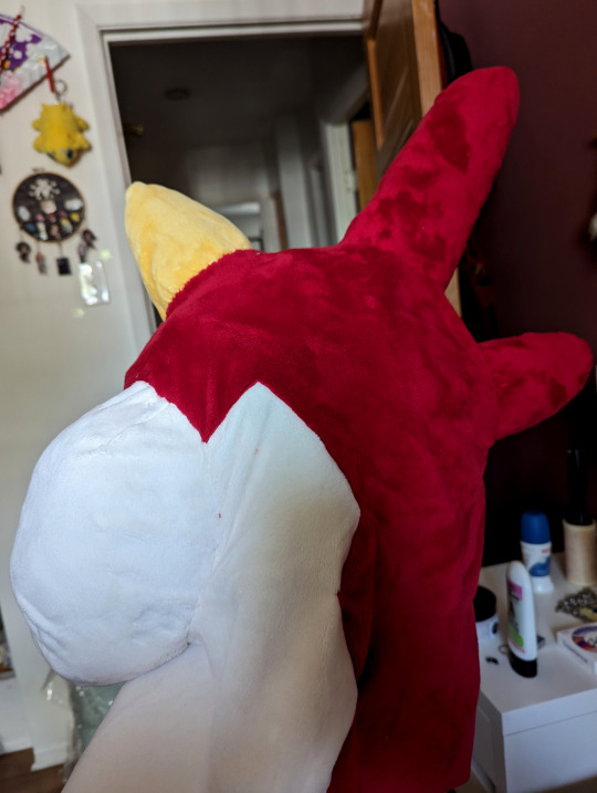
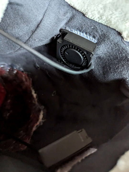
Somewhere in the magical stretch of time between midnight and 5 in the morning, I somehow summoned the inner lining of the head out of french terry knit, a tape pattern and a dream. I also painted a little piece of buckram for the eye mesh to match the red fabric and glued that to the inside of the head. I included a little velcro pocket on the back of the neck in the lining to insert a powerbank for the fans (which I then proceeded to procrastinate on installing for a whole 4 months afterwards). Since I'm an idiot and took no pictures signed an NDA with the Midnight Craft Wizard, here's a picture of the fan installation in the mandibles with velcro so they can be removed to wash it. (Fan kit by Henry's Helmet Fans)
Once the head was completed, I finally went to sleep. And then I woke up at noon and remembered I forgot the eyes WHOOPS I cut four circles out of high density EVA Foam (Two of them smaller for the pupils), heat shaped a slight curve to them, and covered them with minky. I glued the pupils to the irises and then I glued those suckers to the head and NOW THE HEAD WAS ACTUALLY DONE WOOHOO

Turns out hiding the vision hole right over the mandibles was... Actually a decent idea, in the end. It blends pretty well into the face at a short distance. The mouth opening also isn't visible in most angles so I can actually breathe pretty well, and I can even wear a portable necklace fan and have it blow hair into the head without making poor Wurmple eat the fan.
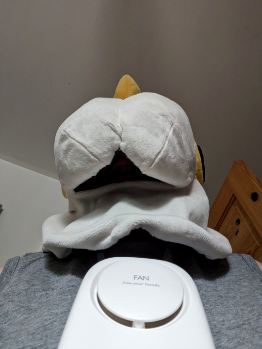
I took it for a test run and realized the eye vision in the suit was actually pretty damn bad overall because the minky covered half of the original hole up, especially on the sides. I took a heat gun and some scissors to the head so I could peel it back around the vision hole, cut some material out to open it up more, and glued everything back down with a new piece of mesh. Now I have like 40 more degrees in my cone of vision, which puts me on par with some of the guys in Metal Gear Solid.

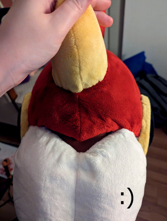
With those adjustments done, the head was finally complete!
4. Get Worm'd on

Turns out I like it a whole lot, whoops. It's definitively not perfect (what costume ever is?), but it looks leagues better than I expected it would, so it works out. Looking back, I don't think I'd really do anything else differently on the build. I still got to make the Bug Catcher outfit to go along with it, but with winter in full swing there's no rush to do so. Definitively looking forward to making a net, though!

If you're still reading, thank you for getting through my ramblings! I hope it was an interesting read, and maybe even provided some insights or inspirations for your own future projects.
❤️
#Wurmple#Cosplay#Pokemon#Pokemon Cosplay#Fursuit#Partial Fursuit#Fursuit Friday#Pokemon Fursuit#Fursuit Maker#Cosplay tutorial#Cosplay Build Log#Original Content#Oh yeah I'm totally making another dumb pokémon suit project after this it was real fun#I'm thinking maybe giving that Koffing or Haunter idea a try later. Or maybe something else equally stupid like Grimer. Something
26 notes
·
View notes
Text


Happily Ever After
Pairing: K x reader
Genre: fluff, romance, humor
A/N: I have two more exams to go y'all😭
Summary: Everyone you knew have already had their happily ever after, or are already living it, but what about you? When's your happily ever after? It comes soon after a boy you drew in your ordinary sketchbook mysteriously came to life.
"Thank you."
"For what?"
"For being here<3"
I was finishing up college exams this week. It was my last year at the University, and I was absolutely ready to leave that school. 11:48. It was starting to get late. The moonlight creeping through my curtains. The only source of light besides my desk lamp. I was already staying up longer than I had intended.
I've been studying for this math exam since this evening and I felt like I wasn't getting anywhere. I sighed to myself, feeling hopeless. "I can't do this." I whispered to myself. I closed the heavy math book I had been studying with and pushed it away.
Highlighters, pens, and sticky notes littered my desk. I decided to take small breather and pulled my sketch book out of my drawer. Drawing had always been my favorite thing to do. I didn't start doing it on my own though, before I had no interest in it.
The reason I had started to draw or even do art in general was because of my older brother. As a kid I looked up to him so much that I wanted to do whatever he did. I sighed, sketching out a body. I wasn't quite sure who I was drawing exactly, but I just went with it.
Eventually I was too lost in my thoughts to even fully realize what I had drawn. A boy, no one I knew but I suppose just a character I designed. I named him K. I wrote an entire backstory for him, decided his age, personality, his motives.
I sketched on his final details, in his hair and outfit. Holding the sketchbook in front of me, I smiled. I was genuinely proud of myself for stepping outside my comfort zone with my art. Signed, Y/n. 12/14/23.
I leaned back on my chair, feeling a lot more calm than I had been previously when studying. The soft breeze outside could be heard from my room, making me realize how silent it was.
I stared up at my ceiling silently, feeling myself slip out of consciousness, eventually dozing off..
CRASH.
I quickly sat up from chair and looked around. Spotting slight movement from the floor near my bed, I stood up and made my way towards the door, ready to dart down the hall. "Ouch.." I heard a deep yet gentle voice speak. "H-hello..?" I saw him stand up, towering over everything in my room. He's tall. Really tall.
"Who are you? What're you doing in my room?" I said, grabbing a pen and pointing it towards him. Yeah, like that was gonna do anything. "Put the pen down before you hurt yourself princess." He said, unamused, taking the pen from my hand with no effort. "Princess?" I questioned him, unimpressed and quite frankly disgusted by the name.
He smirked and shrugged. "Names K, by the way, and I have no clue how I ended up here, I swear I was just in my room.." He said, rubbing his neck sheepishly. "K..? As in like..." I cut myself off and quickly went to my sketchbook, flipping through the pages. It's gone. The picture I drew of him was gone.
I looked back up at the boy, still a bit confused and shooken up. "What? How? When? Why?" I asked myself, not knowing what was happening. "Just chill, I'm sure there's a logical explanation for this." He said, casually sitting on my bed. "Oh god, I think I'm a witch or something. Or am I just going insane? I could be dreaming.."
I said, trying to think of all of the reasons that this could be happening. "I can assure you that you're not dreaming." He said, looking at me with a straight face. "Punch me." I said, walking up to him. "Excuse me?" He said, looking at me like I was insane. "You heard me, I need you to prove that I'm not dreaming or going insane." I said.
He rolled his eyes. "I'm not gonna punch you." He said, crossing his arms over his chest. I sighed and sat down next to him on the bed. "What the hell am I supposed to say to people who have never seen you before?" I asked. "Just say that I'm your boyfriend!" He said, rather too unbothered by the words that came out of his mouth.
I looked at him, my eyes widened and pink staining my cheeks. "What..?" I asked in shock. "Uhm, okay, K, not to be that girl or anything but, there is no way that people are gonna believe that I was able to pull a guy like you." I said looking at him, shaking my head.
"The hell's a guy like me? And why not? You're gorgeous." He said, smirking over at me. I felt myself grow warm at the comment and looked away for a second. "You're going to university with me tomorrow." I said, going out the hall to take some clothes from my brothers room and gave it to K.
"You're wearing that tomorrow okay?" I said, looking up at him. He smirked and nodded. "Anything for you Angel." He said with a flirty tone. I rolled my eyes but I couldn't stop myself from smiling a bit. He went into my closet to change and then he walked back out.
"You have good fashion taste, I should have you as my stylist." He said. "Stylist...? Oh yeah-i forgot I kinda wrote you as an idol.. " I said, whispering the last part. He went back into my closet, looking through my clothes. "If you're about to be my girlfriend, I'm gonna need you to match outfits with me." He said with a grin.
I laughed a little. "Fine." I replied, giving in to his request. K changed into some PJ's and I set both of our outfits out, ready for tomorrow. "You can sleep on my bed if you want, I don't mind sleeping on the couch." I said. "No, I don't mind sharing the bed. Plus I'm not about to let you sleep on a couch." He said with a soft grin.
We both layed down silently. I stared into the darkness feeling myself start to smile a bit, I didn't realize how warm it could be with someone else in the bed with me, and I loved the company to tell the truth.. I felt K pull my against him, his face against my neck. I felt myself grow flustered but in the best way possible, I fell asleep with a small smile on my face.
Happily ever after?
©luminouslune
24 notes
·
View notes
Text
I've been working on adding a new section to my website (it is No Pickles themed) and I've got 60 or so new assets to draw... Very scary.
(Long ramble about my website and what I want to do in addition to/after I've finished DIDL)
I have really been wanting to put non-DIDL stuff on my website, I just, erm. All the things that I want to be able to show off are NOT in the state for it yet... Everything is far too underdeveloped for my standards, and a lot of the ideas I have are out of scope of my current skills and would take quite a bit of time and effort that I have been trying to funnel into Daisy. Despite it all.
While hopping around between projects and hastily slapping on new parts is fun and easy, actually sitting down and trimming it into a neat and tidy shape is a different matter.
I want a secondary project to work on so baddd. Yet my options...
Airship: Solid character designs and personalities, 1st half completely outlined, 2nd half fearfully untouched. Unsure on the actual website presentation.
TerriByte: My special little babygirl since middle school but developmentally in the pits of hell. I am unsure of what I want for nearly every aspect of it. Might end it making it entirely text-based.
Criatron: Project dedicated to making an absurd amount of character designs but I want it to be a browser game and I don't understand JS in the slightest.
TMMM: Will be an RPGmaker game but in it's current state it is absolutely overambitious and bloated and needs severe trimming. Also making games is hard and requires a lot of skills I don't have and some I don't think I'll be able to pick up (music, namely).
Wizards: Mostly solid character designs. Vague plot (I know what kicks everything off, I know how I want things to end, I don't know how to get from A to B), I have very strong visuals for how I want the webpage to be designed but lack the skills to execute it (Would have to get good at 3d modeling)
Amalgam: Specifically made with web stuff and multimedia in mind but doesn't have a singular plot as much as a bunch of tangentially related things are happening at once as experienced through wiki-like deepdives and websurfing.
There are other things as well that I don't have quite the same passion for at the moment.
If I could add a second readmore for plot/project summaries I would.
Like, I'm almost tempted to make a summary of everything and my pros and cons of working on it. Make it a PDF. Start polling people on it because of how indecisive I am. But I am also very firm in my Augh I want some of this to be a SURPRISE + I avoid putting anything on the internet if I would be very upset by people doing bad faith internet things to it.
Oh wait wait talking to myself in a Tumblr post has made me remember my plan from last February. TESTFIRE CATALOG! And by that I mean making a bunch of proof of concept demo pages and seeing which ones I like working on the most, and maybe which ones people are most interested in.
There are still a ton of new skills I will have to learn however. I wish I had infinite time and money. Oh well the time will pass anyway.
7 notes
·
View notes
Note
What’s your opinion on Terapagos?
(Disclaimer: The DLC isn't out at the time of writing this. I'm doing this review now because we have the design and official art, but keep in mind I don't have context for some elements yet and thus my opinions could change in the future.)
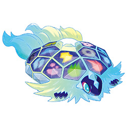
I liked Terapagos' design the second I saw the drawing of it in the Scarlet/Violet book. While I don't think the final design is quite as good as the sketch (more on that later), I do like this guy overall.
First, conceptually, it's probably based in part on the tarasque, a mythical French and Spanish creature. Not only is it in the name and region, but the mane and hexagonal turtle shell is likely derived from it:
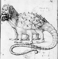
And even putting that aside, the simple concept of crystal turtle is pretty solid. Many gems are cut into a hexagonal shape to show off their luster, so using the natural plating on a turtle/tortoise shell to show off the same shape is a simple and effective. This is also nice because it visually represents the gimmick.
Visually, it's not bad. It's a surprisingly cute little thing (or big thing; we don't know its size yet. Personally I'm really hoping it's gigantic) with its big eyes and little mouth. The colors are also fine, using a yellow and blue gradient on the fur and a dark purple for contrast on the shell and body.
However, I do have to point out that it could've been better in some areas. Looking at that sketch again:
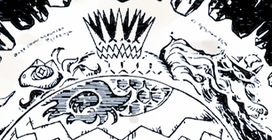
I've suspected for a long time that GameFreak has been "watering down" some of the more complex details in their designs, such as fur, in order to make them easier to model. Assuming this sketch functions as concept art in a sense, it seemingly confirms this. The Terapagos we got has some stiff, short broom-like fur around the head and three short flowing groups of fur for the tail. But the sketch? Look at that gorgeous flowing mane around the head, and the sheer detail and length of that tail (so long I had to cut it off here!). The sketch looks way better and way cooler due to this, and it's a shame that GameFreak is afraid to do more complex fur like this.
The other thing about the sketch is that I felt like it was a lot less cutesy; note how the eye is a less round shape, for example. Some of it was also misinterpretation on my part (I originally thought the eye was ringed, like a chameleon's, and the spikes on the head were ears). Keep in mind that the journals imply that Terapagos can screw with people's minds, and it sits in the bottom of Area Zero, barely moving and crystalizing everything around it. Obviously what we got wasn't bad, but I do wish it managed to be a bit more eerie and surreal. That's just personal preference, however.
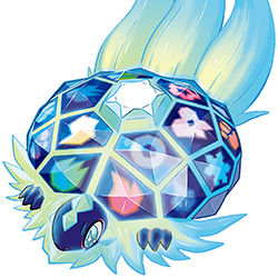
Anyway, back to the design we got, I only have two real nitpicks. First, I think the spikes on the head are unnecessary and only serve to clutter the design. And secondly, I'm not a huge fan of how the shell literally has type symbols on it. We don't know the origin of this thing so maybe it'll end up making sense, but it just feels really forced compared to just coloring each plate a different color (it's more colorblind friendly this way, but considering this is the game that removed the shiny noise and sparkles I really doubt that was GameFreak's intent).
All of that said, I do really like this legendary so far. Like I said, the concept is strong, it's adorable, and the general mythological creature vibe is great. I do wish it kept more of the complexity of the sketch and I think the symbols are a bit forced, but everything else is enjoyable and I'm interested to learn more about this guy.
62 notes
·
View notes
Text
let me put y'all on something real quick
we all know children's animation rocks (bluey, phineas and ferb, steven universe, etc etc etc)
well i've stumbled across a banger of a show that either i have yet to find the fandom for or is being incredibly slept on
it's called "Go! Go! Cory Carson," it's on netflix, and it is so freaking adorable
first of all, this is the character design:

i mean, look at them!! the little green one is Chrissy, and she is the goat of the show. the orange one chrissy is sitting on is Cory, the blue one in the background is Mama, and the one with wood paneling is Papa.
the world of the show is super cute as well! i won't bombard with photos, but the plant life is all this neat felt-looking texture (which you can kind of see in the tree in the background of this pic), and the world itself is quite adorable, using over-exaggerated hills for much of the landscaping with sparse trees and bushes adorning them (which is reminiscent of a child's landscape drawing)
the show isn't built for older kids, like shows such as steven universe, but it's also not structured in a 'dora-style' format like some shows for kids are (being overly interactive with the audience with overwhelmingly positive protagonists or pointing out the obvious every five seconds to really drive home whatever message the show is sending)
the show is about cory and how he learns about life through playing with his friends and his family. it's really endearing, with a solid cast of characters, and the storytelling is very well done. the episodes, while short, are usually nicely paced, and they provide good messaging about healthy relationships with friends, family, the world around you, and even with yourself.
the characters are decently fleshed out as well. of course, headline protagonist cory has the most character development, and we ride along with him for most of the episodes. but chrissy is a pretty fleshed out character for being a toddler who still calls 'superheroes' "Scooplbeeple," and Mama and Papa have their moments that connect with older audiences that aren't just overused stereotypes. some of the episodes also vaguely spoof popular movies and television (like mission impossible's theme and dance dance revolution), which make these already cute episode even cuter
part of my system of deciding whether a piece of media is good or not (in my super subjective opinion) is if it can make me cry. it's not always a factor, but usually, if it makes me cry that's a pretty good thing. that's because there was enough emotional heart in the media to tug at my heartstrings enough to make me cry. bluey absolutely smashed this category out of the park (sleepytime, granddad, rug island, to name a few episodes that made me sob), and i could talk about how good that show is for quite some time. cory carson has six seasons so far, and i'm part of the way through season three. so far, two episode have made me cry, "Grandpa's Treasure" and "Show and Tell," so this show definitely passes the test.
long story short, "Go! Go! Cory Carson" is an adorable little Netflix show to check out if you have about 8 minutes to spare for an episode and want to see adorable little cars zoom around their cute little town, and i highly recommend it if you like children's animation similar to shows like bluey
but, really though, chrissy is the best character in the show, hands down. she's a little car of few 'words,' but when she speaks, you listen
#i know this has nothing to do with any of the communities i'm in but i just had to share this with you all#if chrissy has no fans then i'm dead#i have no clue if this has a tag but we'll see i suppose#go go cory carson#Go! Go! Cory Carson#no clue if the ! makes a difference but i don't really feel like checking atm#anyway that's my rant for now#love you all
8 notes
·
View notes
Note
have you ever considered drawing any of the characters that appear in the mil-liminal podcast?
Yes! I do plan on designing them one day when I have more time (I have drawn Sam once in the comic, he just doesnt really have a fully fleshed out design yet.) Funny enough writing peoples personalities are a lot easier for me than drawing them, I have a hard time with character design, i think cuz i think in words instead of pictures hahaa, so I always have who the character is first, and then have to sit down and consider what they look like without having a picture in my head if that makes sense.
I think Sam would be the first I'd really sit down and work on. But I'd be interested in which characters listeners would like to see. I think so far mentioned is:
Sam and his family, Jeb, Bev and Edgar. Of course Goldie is mentioned but I've already drawn her! <3 And the 'Friend' Caro mentioned who address they've used to get the job is actually Dee from the Prom Comic for those who have read it. She will appear in the comic more as well.
#Im seeing a trend here of all my npc characters having three letter names lmao.#rj rambles#i didnt draw for this one#because like i say its hard for me to come up with designs for ocs#but i will!#sound off in the comments and tags and also what the characters we've met might evoke for those who think visually#ask box
8 notes
·
View notes
Note
sits down in my cool chair…
PLEASE YAP ABT YOUR WIFE TO ME!! SHE SOUNDS SO WONDERFUL AHH..!!!! i cant believe i’ve found another objectum alton towers person (i’m xposic w/ Galactica and Oblivion >_> galactica is my sister, oblivion is my cousin)
if you maybe wanttt… i can yap 2 you abt my sister after IDK IDK I JUST WANNA LET YOU YAP!! I loove hearing other people’s experiences with their partner
-potato anon
i'd be happy to let you yap about your sister! :3
i've loved the smiler for a little bit now! a few months, i think? she's by far my favorite rollercoaster (i have 3-4 smiler-inspired OCs!) and if i don't go on another one first, she'll be the first rollercoaster i've been on in years and hopefully the one to cure my fear of rollercoasters.
one thing i find ironic is that i originally discovered the smiler through somebody's fursuit (beautyofthebass) without even knowing it and then the rollercoaster itself through one of my tiktok mutual's posts years later! i'm very attached to her even though i've never been able to see her in-person (yet). i really like scrolling pinterest and watching videos about the smiler, even if i can't find many of them. the on-ride POVs are probably some of my favorites to watch! one of these days, i'll finally get to go on her. possibly with my irl girlfriend! (who will be my wife in a few years hopefully :3)
i consider her one of my worst "hear me outs" (compared to the others) and i think my friends may be sick of me because of how often i talk about her😔. (/lh) i'm working on trying to be able to draw her face/logo currently, one of my characters (my 3rd smiler oc) has it as part of his design so it's been good practice!
3 notes
·
View notes
Note
Hello! Can I have an Aven (Worldless) doodle if that's okay? I'm very canon divergent, so this is a somewhat inaccurate sketch of what I looks like (My ears are a bit thinner and is locate on the side of my head, like elf ears. Plus I do have the scarf, I just doodled myself with a bandana instead.)
Plus everything else is pretty similar to canon Aven's, including colour palette! However, I haven't had any kinmems (Okay, the psychological version of kinmems) as yet, so I have zero clue on just how canon divergent I am.

Thank you in advance!
yeah sure! the design is pretty interesting, i've never really drawn a character / person with parts not connected! very new and funs to draw :].
these ones are digital so i could make 'em cleaner and add some glowy bits to one or two pictures, but let me know if you'd like to see the sketch versions!
i am also running into the image limit but have a few more things, so there will just be an extra post lol :]. i'll tag you in it, but i'll try to post them at the same time anyway.
as always, please don't repost my art!
so i have these four, which are more half and half because they're just different versions. i.. attempted to make it glow but it wasn't working out XD.
transparent backgrounds on the left and colored backgrounds on the right (the glowy ones are first):


then we've got this little waving one :]. transparent background on the left and comored background on the right:
and finally there's the guy sitting down and chillin' 👍. transparent background on the left and colored background on the right:


#octahedral-chaos#worldless#doodles | i want to hold your hand! the beatles#request accepted | applause! lady gaga
8 notes
·
View notes