#I'm trying shit with the red in the lineart I like it
Explore tagged Tumblr posts
Text

Rage, rage against the dying of the light 💥
#this is a butch Ankarna truther account#emiuliss' design is everything to me#this is kinda in spired by Japanese armor#I'm trying shit with the red in the lineart I like it#Ankarna#dimension 20 fantasy high#d20#dimension 20#d20 fanart#dimension 20 fanart#d20 art#d20 fantasy high#dropout#brennan lee mulligan#dropout tv#lesbian goddesses#d20 lesbian pantheon#d20 goddesses pantheon#fhjy#fhjy fanart#d20 fhjy#dimension 20 fhjy#fantasy high junior year#fhjy spoilers#cassandra
148 notes
·
View notes
Text
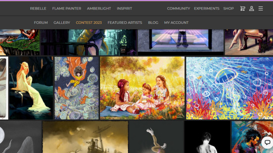
Nervous giggles
Even more nervous giggles
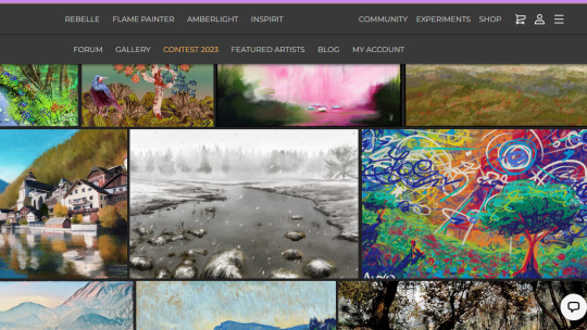
There are so many professional paintings here, so many technically advanced, highly impressive works, and I'm just like [slaps some crayons down] y- yeehaw,,
I'm keeping the Escape Motions site Exciting. keeping it Interesting and Ridiculously Colorful
#pikaposts#alo(e) art#someone commented on False Moon telling me they love my style bc it's 'very cheery!'#it's still so baffling to me that expressing my horrors is always interpreted as whimsical joyful fun#i like to say that's neat! that's it's so nice i can make good things from the bad! but i also#can't help but feel like i just speak a different language from everyone else and i'll never be able to translate well enough#to be properly understood. but i mean! it shouldn't Really matter. if i Really wanted to get my point across i could try to paint more like#munch. everyone understands the scream. a gaping mouth and a blood-red sky doesn't leave much room for contentment let alone joy.#my jellyfish painting is about the wonders of the ocean and False Moon doesn't seem that different! so idk why i'm always surprised#but aNYWAY.#i'm just bein a silly goose. the real point here is that the contest i entered is now in the judging phase and the results will#be posted May 10th... i'm gonna be running around in circles until then#i definitely don't Think i'll win but holy shit it'd be wild if i did. the prizes are art tablets i could never dream of affording#but even if i don't win i get a discount on all Escape Motions stuff in the future! so it'll be easier for me to upgrade to#Rebelle 6 <3 it has CLIPPING LAYERS and i want it so damn bad. the lack of clipping layers is my only issue w rebelle 5#bc i'm indecisive and especially when drawing characters i often do my lineart in brightly colored sections#of course that's not the only better thing abt rebelle 6-- it's got some other SUPER cool stuff#it's so fucking nice to be able to paint digitally and still have all the texture. hell yeah hell yeah#...sweet din i like to infodump when it comes to art huh. it IS one of the Most Important Things to me so i suppose that makes sense#tldr; painting. yippee!! [insert confetti cannon emoji here bc i'm on desktop rn]
3 notes
·
View notes
Note
Your art reminds me of retro shoujo manga in the best possible way. There is just something about your fashion sense and your line work that gives it these absolutely impeccable vibes.
I just want to study your art under a microscope because its so incredibly pleasing to look at. I rarely ever do art studies but I've literally not been doing anything else for days since I found your account and I'm having a blast.
Also Cae hot.
Ty! ❤️❤️❤️
I’m sure everything I do is influenced by the fact that I read manga since I was kid- all types/genres as long as the characters are lovable. Someone that I recommend, and whose style I look up to, is Irie Aki. Her line work is surreal and seems like it’s moving with how fluid it is.
I’ve also always been into fashion. I believe at one point when I was young I figured I would go to higher education for designing clothes, but chalk that up to the many things I *thought* I would accomplish. In college I took quite a few different general art classes and got taught realism from life studies. Although I default to the cartoony style that I normally put out- it’s funner and faster for me
This is very very rough, but here we go:

I saw this dress recently and saved it to my camera roll for later. So I see this, and yes it’s gorgeous, but I don’t love the neckline. I prefer high neck collars. I change it, but then the silhouette is kind of lacking up top, and more layers are added. Now it’s Spanish looking. I lean into that, putting more pleats into the ruffles than the original dress has. Then when coloring, I tend to see where the dark tones are going to go first (same with lineart- the shadows are the blacks). Grabbing the darkest color from the original, use that as a base. I also want it more saturated because why not. So bright red where the light hits, and something on the same side of the spectrum for the shadow. Shadows are desaturated. Add additional colors by feeling it out. If I was going to add a background or second character I would color balance them together so it’s harmonious in the end. Nothing is strict though, it all depends on what lighting you’re going for

The end result is pretty different from the reference and that’s typically how things go! I think experimentation and understanding your own likes+dislikes is really important! It’s what has propelled myself forward in the most impactful way
*I said it in a previous ask, but having a subject that drives you to keep creating helps a shit ton too. I’m the president of Cae’s fan club, you guys can’t beat me, don’t even try
77 notes
·
View notes
Note
You've honestly been such a huge part of me discovering I was a therian and an inspiration to my art
I remember scrolling through pinterest one time and I saw your art and the like- pixel art-eque style with the red backgrounds, black silhouetted dogs, the messy lineart, bared fangs the multiple rings around the eyes- and most importantly was the captions you'd write, the quotes and I just remember instantly feeling like I was understood cause your art had themes of feeling unholy and like a monster and feeling like there was something inside that felt like it could come out at any second and the fear that had all while communicated through your drawing of canines
It was such a huge moment for me because it wasn't just like "I relate, that's so me" it was like- idk a realization but I didn't really like- explore it too much, that feeling. Instead I just tried to find the artist who drew stuff like that and ended up following you on tumblr and I became obsessed with canine venting and canine poetry
I'd start a vent account and reblog a lot of that type of stuff (including artists like dappermouth and savanthunder) and eventually I think I'd come to realize I might be a hellhound
I've deleted that tumblr since then but I've made a new one to explore and express being a hellhound. I just wanted to thank you cause your art truly has been super iconic to me and I think I'll always remember your style and those few pieces of your art that was on pinterest that inspired me. Your art is just super personal to me and means a lot 😭
I'm not trying to idolize or glaze you anything, I just wanted you to know cause it's been like 7 years now and I still remember your art like I had just discovered it yesterday!
But yea, sorry for the long read, hope you have a good day! And thank you, for everything!

holy shit this means a lot to me thank you sm!!!!!!! happy hellhound days!!!!!
38 notes
·
View notes
Text
SCUMSUCK's wishlist.
first posted on fedi for the snowflake challenge #7, then edited to my site...
Non-tangible items:
I am a hungry hungry buttslut for art, fic, and other creations with my characters. 🙏🥺 Here's a gallery with some stuff I've gotten.
I am a hungry hungry anal masochist for comments 😼 I think the sorta comment I'd like right now is a quote I can put in the work description, like "This shit made me watch wrestling and now I'm gay" - t. John Cena.
I am very demure and modest when it comes to anon messages 💅 One of the things I miss most about the cesspool of tumblr, is getting enough questions about my silly scoutspy characterizations to create, well, my own characters out of them! Anons that stroke my shaft are a great way to get me to churn my brain and make something creative like the 300 scsp doodles or 500 headcanon posts of 2018, as opposed to sending me something blunt like "draw linguini's feet".
Forbidden fourth wish: I wish that one day someone could find scans of that YinYang monster x Vincent Valentine FF7 doujinshi that was my favorite as a wee lad! It was called "Meteo Daiou" by New Technical Punk-FF (Isuzu Suzuki). The last evidence of its existence is on this archived Sodasexy page. My life is a repeating circle. Even the scanner says this is GROSS and put it in their squick section. But Maggie age 8 liked it a little too much! Goth dude getting somno-bung by a hungry monster informed the rest of my yaoi career.
Physical items:
I like usable items that leave little waste.
Bar soap in natural, mild flavors. I got that dang eczema and anything that's too fragrant will turn me into the stay puft marshamallow man.
Books! I tend towards nonfiction, biographies, and art + photography books. Right now I'm looking at Devin Townsend's biographies...
Small pieces of usable art from indie artists, like paper stickers and washi tape! I like to put them on my sketchbooks to tell them apart.
A Brock Lesnar #69 football jersey.
Looseleaf tea! I like to try all sorts of new flavors. I can't do floral mixes, but I do like black, green, red, and white tea.
A good metal fountain pen! I've found a couple of brush pens I like. I guess it's time for me to get into stiffer tips.
Some drawing/writing ink! I like to try all sorts of new colors, especially for lineart and ink washes.
A shed or trailer to store our art.
A screen printing room and set-up that is safe from the weather and cats stepping everywhere.
A pigment printer so I can make even more vibrant stickers and art reproductions! I guess I've heard good things about Epson Ecotanks and the Canon Pixma Pro-200/300/400 lines.
An upgraded computer that can load 40 chunks in minecraft's view distance, and use big digital brushes without lagging.
I guess some big ol' terabytes of hard drives to archive my work.
More materials for our fence (wood pallets, metal fences...)
8 notes
·
View notes
Text
I wanted to reblog the og post and add the speedpaint there but ig Tumblr doesn't let you do that
It's here instead now ig, for those who want to watch (3 min.)
Notes, ramble, and fanfic updates under the cut
Video time: 3 minutes.
Total time: ~5 hours, 17 minutes.
App: IbisPaintX (ugly ass water mark in the corner).
Device/Tool: My phone and finger.
-
I like this speedpaint a lot. You can see how I improve and change things throughout the piece. I wish you could see just how much I use that undo button though - that button is my savior.
The starting sketch DOES belong to me. I want to make that abundantly clear (I use a lot of outside references sometimes). If I use an outside reference and it is in the final product (as in I use other art as reference), I will give credit if I can. The reaper picture next to it is not mine and belongs to the Subnautica devs.
-
Process (kinda):
1) Using a sketch makes this SO MUCH EASIER. It's a pain in the ass but jfc it's faster than trying to digitally sketch with your finger
2) Blah blah blah rough outline whatever
3) I swear I know how to use the paint bucket tool yall, that would've made shit so much easier, but there were gaps and i couldn't figure out where they were so my background kept turning fucking blue
4) SO PROUD OF THE BLUE TO RED FADE MARKINGS ON THE ARMS. I USED THE ERASER TOOL FOR THAT.
5) Realized the blue was too bright and i need to tone it down - tried to keep it from looking like the blue water was making him (the character) blue
6) i cant remember when the reaper reference is added it just lowkey appears
7) i wasn't trying to shade but i kinda did with the way i outlined some of his torso
8) color gradient for texture
9) scars. Tried to add more texture to the scars by adding color but i hated it.
face: his dad
(right) arm: small fish (biter? bleeder? unsure)
(right) axillary zone: prolly another reaper
(left) hip area: small fish (unsure)
front of the pelvis (kinda): scratch (prolly a claw)
(right) lower than hip zone: small fish (unsure)
10) at some point i added texture to the dorsal fin???
11) adjusting the face
12) turn off the lineart layer
13) While working on the lighting and shading (that wack white box and purple shit? yeah) I realized that I'm gonna need help figuring it out - I got on the floor behind one of the couches in my living room and tried mimicking the pose and realized that the anatomy was all fucked up and I had to fix it 💀💀💀
14) properly work on shading (kinda, still looks wack)
15) blend that shit (lowkey liked it better before) but thats fine
And there we go, you got urself a reaper Jeremy
-
I plan on working on Viktor next - might do chris first tho. I'm not sure yet. I still have other things to draw (and write, for that matter).
I'm currently working on getting a lot of my lore straightened out. I'm also trying to make character sheets for me to reference and use to write headcanon drabbles n whatnot. The world-buliding is genuinely crazy -
I mean, I made three OCs just so I could build up Chris' experience in the mafia, and that's not including Jubi. There's about 20 characters I have to write things for, and that's not taking the missing children (which is ALSO about 20) into consideration. I also have other AUs which really messes with the timeline.
All in all, I've been slowly working on more stuff to post in my oneshot book. Since I've thought about him the most, Scott's almost done. I believe Viktor will be done soon too.
-
Anywho, if you've made it to the end lf this, thanks. I like being able to post random thoughts and ideas I have, even if I know not everyone will read or engage with it.
As always, ask box is open - feel free to drop a note or smth in there. Have a fantastic day/night.
#my art#speedpaint#fanart#fnof#fnaf#five nights of flirting#five nights at freddys fangame#five nights at freddys#fnaf jeremy#jeremy fitzgerald#fnof jeremy#fic update#ramble#headcanons#drawing process#fnof subnautica au#fnaf subnautica au#subnautica au#reaper!jeremy#reaper leviathan#fnaf fanart#fnof fanart#fnof fanfic#fnaf fanfic#fanfiction
9 notes
·
View notes
Note
what's your process for coloring like? the look of that elendira is so textured and interesting, i can't figure out how you do it
AA THANK YOUU ^__^ !! textures & brushwork are my favorite things abt my art, so im happy you find it interesting hehe . its SOO cool to look at & so much fun to draw imo
i prefer to color by building in layers , if that makes sense 🤔!! hundreds of them !! such that i'm always drawing on Top of previous layers, working from big & messy blocks of color to, eventually, small and refined blocks of color until it feels processed enough. as a result, i rarely ever erase (!!) and i rarely ever draw lineart aside from the initial sketch
a rough, patchy textured brush is key here, as it'll give you dimension and variability w/ your colors. i recommend "Brush and various sets of fountain pen style (万年筆風ブラシと色々セット)" on Clip Studio (ID: 1679706) !! :3

im terrible with explanations though, so i'm going to show a step by step of that elendira drawing if you dont mind :3
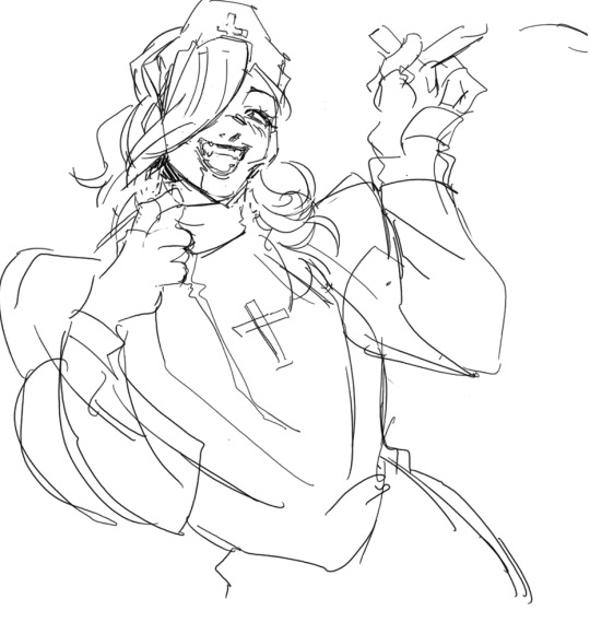
sketch layer !! because i mostly render through color alone, i try to make this as close to the finished thing as possible . ^__^ i hateee drawing the same thing over and over and like the expressivity and movement of my sketches anyways , so the more i can preserve at this step, the better. if u were to look at a side by side of my sketches and finished pieces, youd notice a lot of those og lines are present in the final drawing :3

2. flats !! pretty self explanatory, but the solid background gives me an idea of where the figure begins & ends while the colors themselves help distinguish whats what . i stick to ambient lighting @ this point because im usually not sure what i want to do with the overall palette or lighting yet . having two tones (ex, dark and light in her hair or dark and light on her skin) can also help in identifying key features early on that u wanna preserve. as you build layer by layer, sometimes these areas will remain untouched and i think it makes for a rly lovely feel at the end

3. start blocking !!! to be totally honest with you, i dont really know what i do here HAHAHA. like i just scribble the shit out of it, usually focusing on what i might want to do with lighting (ex: grey areas to accentuate folds in her costume). i think i like to start "erasing" the sketch where possible by coloring on top of it .. like if you look at her hat or her arm , you can tell i'm starting to get a sense of the shapes i like vs the ones i dont. it's at this point that the final image starts to emerge in my mind , like im gradually pulling her from a tarpit of scribbles until shes recognizable lol. chipping away at the marble until i can free her. tbh.

4. keep blockingg...when u think u are done , block some more . as you can probably see, the brushwork becomes more intentional as i add more shape, with specific focus on line weight. this is also where the patchiness of that textured brush comes in - notice how none of the colors seem totally uniform (ex: the red cross or the original sketchlines for her waist). you can see bits and pieces of the layers underneath pushing through and i really like that !! ^__^ its very fun and sketchy to me, so i try to keep them around. those areas are also great to colorpick from, because it'll give you "new" colors to work w/ that are already part of your palette.

5. GRADIENTS & GRADIENT MAPS !! TONE CURVE !! COLOR PICKER !! this is the best stage tbh. flatten your image so its all on one layer and just go crazy with all the color settings in ur program. add gradient layers and set them to darken, or overlay, or subtract, orrr. lighten or dodge glow or divide or soft/hard light.! OR!! edit the hue, saturation, luminosity and contrast.and then color pick from these edits, block even more on top of ur image, flatten, color edit again, etc. etc. until u feel satisfied.
ANYWAYSS . i hope that makes sense @__@ sry i wrote this out and deleted it like 23 times trying to make it make More sense but thats what ive got HAHA i hope its useful though :3 !
#SRY I STRUGGLED 2 EXPLAIN THIS#dude its like my brain bcomes stuffed w/ cotton anytime i try 2 write#i hope it makes sense tho..#it also probably sounds so redundant to make new layer one after the other for just a few brushstrokes#but those brushes i linked have a multiply property so if you draw on top of prev lines they'll create dark patches#and so if im working over a large area ill generally need like . 5 layers each with one brushstroke :sob: if that makes sense#this one had . 84 i think. total. layers i mean. the merylvash one had 300+ HAHAH so it rly depends#like YEAAH i could just use a normal brush but i really like the way this looks#andd sometimes the multiply function works really well or will give me the proper shadow tone im looking for#anywas.wanywaysn anyways#asktag#anonymous#long post
60 notes
·
View notes
Note
OMG YOU'RE SEVENTEEN?? (I've been following you for months and I didn't once read the pinned message beyond the line about no AI and NFTs lmao) YOUR ART IS SO CRISPY I THOUGHT YOU WERE A PRO ARTIST AROUND 30 WTF
(sorry for the yelling via text)
HOW DID YOU GET SO GOOD!! (Tips on lineart please?) WE'RE THE SAME AGE, BUT HALF OF MY ART IS SHIT AND THE OTHER HALF IS FART
ALL HAIL LITTLE RED FOOL, BESTOW THY GREATNESS UPON THOU MERE MORTAL SERVANTS
But in all seriousness, any tips on, like I said, lineart or just digital art in general? (I just started digital, and... Ten hours of work and I'm just on base colors 😎🕶️🤏🥲) I love, LOVE your style and especially COLOR! How do you tie it all together? Like, I'm 17 too, but I'm not even close to your stuff?? I'm scared as fuck from ever trying color traditionally because I spend SO MUCH TIME ON A SKETCH, so I just picked up digital and HOURS LATER IT'S STILL AWFUL
Sorry for the rambling and repeating, man, it's been a long day and it's late in the Balkans... Don't let the rambling force you into answering tho
Have a good one. ->excited fellow artist
(tip of the day: did you know that in Romanian, moon and month are the same word, with the same pronunciation, spelling and plural? It's called: lună [loonuh] and I think it comes from latin, since Romanian is a heavily latin language, with bits of french and turkish (HEAVY bits), dacian, slavic, italian)
OUAHFSHD THANK YOU SO MUCH I’M REALLY HAPPY YOU LIKE MY ART!! Also I’m sure your art is better than you think it is (we generally tend to view our own creations as worse than others because we’re the ones that made them, don’t worry I’m the same as well ajdbsjd) but yeah I’ll be happy to give you some tips and stuff! (and yeah I never colour traditionally either I just leave everything in plain biro because I don’t want to mess it up lol)
(I haven’t seen your art so these will probably be more general tips but hopefully they’ll help a bit, also keep in mind that I’m not a professional so this will be more about what has worked for me but I hope it might help you a bit)
So for stuff like lineart, avoid using chicken-scratches—it might seem easier or less daunting to do shorter overlapping lines like that but it will give your sketches and drawings that overall fuzzy look, the trick is to have longer confident strokes. It might seem a bit tricky at first if you haven’t done it before so don’t worry it happens but if you keep practicing they’ll eventually look smoother and less shaky. For the longer lines it better to draw from either your elbow or shoulder, and by that I mean keeping your wrist still and letting the larger parts of your arm do most of the work—this will also help your wrist in the long run. For things like shorter lines and smaller details then absolutely use your hand to move the pen, but generally try to use your elbow and shoulder as it will help you get those longer smoother lines. Also this is just a personal preference of mine but I generally use brushes that have a bit of pressure sensitivity which helps add some line weight. If you don’t have pressure sensitivity another way you can get line weight is by taking an eraser to some of the edges and narrowing some parts.
For colours it mainly depends on the lighting—lighting is everything and will affect how the rest of the colours will look, so it’s important to have an idea of the brightness and colour of your lighting. The background also plays an important role in picking colours for me as well as it helps provide colour context and makes it easier to pick colours by eye if you want a certain mood. If you want a more dependable way on getting colours to match up then I’d recommend having a layer that’s just colour on top of the rest of your piece—you can play around with the blending modes and opacity, I mainly use either an overlay layer with a medium colour that’s slightly desaturated or a colour burn layer with a light saturated colour; most of the time I use colour burn because if you put it over your lineart then it will also tint the parts of your lineart or sketch that’s at a lower opacity too. But with figuring out colours I’d highly recommend researching some stuff about colour theory, there are a lot of good and easy to understand explanations and art tutorials on YouTube so I would recommend starting there (unfortunately I can’t link recommend specific videos because my playlists are a mess ajdbsjdbsj but some good channels to learn from are Sinix Design, Marc Brunet and Marco Bucci).
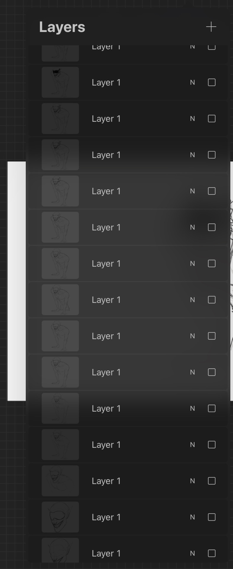
In terms of general digital art tips, ALWAYS FLIP YOUR CANVAS. You will not believe the amount of times I’ve looked at a drawing and thought it looked pretty good, flipped the canvas and found that everything’s wonky. In cases like these the liquify tool is your best friend, as well as the lasso tool and transform tools, as well as just manually fixing them by redrawing some parts. Also use as many layers as you need, and by this I mean if you’re working on your sketch, lineart or colouring or whatever and you want to do something you’re not sure you’ll like, duplicate the layers so you have a backup in case it goes wrong and you want to go back. When I say use as many layers as you need I mean use as many as you need, these are some of mine and they’re all from just one sketch because I get really anxious about messing stuff up lol, also don’t be afraid of drawing separate parts on separate layers and merging them afterwards if you want.
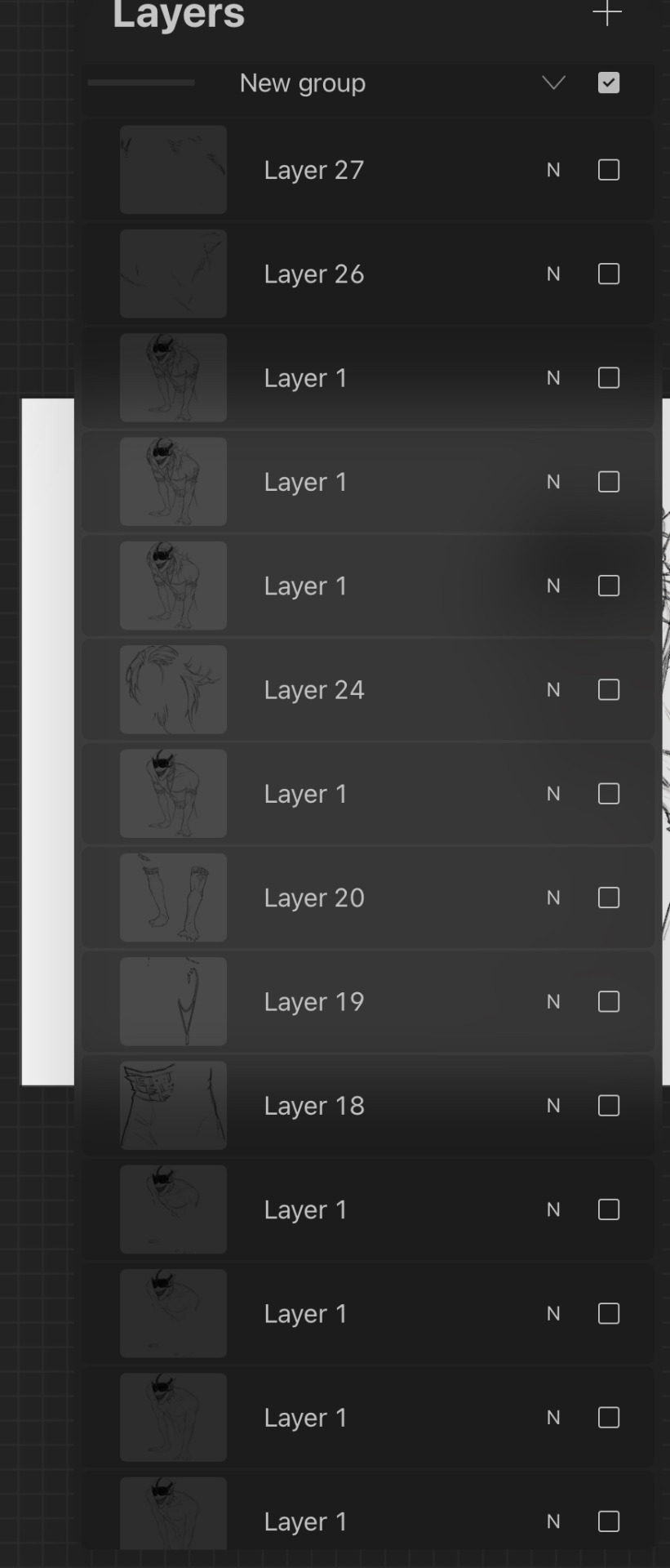
Also take your time, unless you have a deadline don’t feel like you have to complete a drawing within a certain timeframe, if you want to get faster at drawing then that’s great but don’t feel like you need to push yourself, especially if you’re just starting. Practice takes time and patience is your best friend, and you probably hear lots of other artists saying this but trust the process. You might get to a bit you’re struggling with and not like it and want to abandon the drawing, but I found that rather than saying “this is bad” or “this is wrong” start asking “how can I make this work” because a change in mindset can help you a lot with art. Also don’t feel like you have to reach certain milestones with your art by certain points either, like with the age thing and comparing your progress with other artists of either the same or different ages, because it can make you feel worse about your art. Trust me there are some artists younger than me who are like 14 or 15 who’s art I envy and—again with the mindset thing—instead of getting down that your art isn’t similar to their’s or worrying that you’re “behind” in your artistic development (there is no such thing btw everyone learns at different ages and speeds so don’t feel bad if you haven’t progressed as much as you would have liked to) it helps to ask what you like about their art and what you would like to incorporate into your own—this has helped me learn and improve a lot faster.
I don’t know if I have any more tips at the moment, but I hope that answered some of your questions! (also sorry it’s a bit long or some bits don’t make a lot of sense I like to ramble a bit lol) (also also thank you for the little fact as well!)
Have a nice day anon 🧡
19 notes
·
View notes
Note
hi ! do you have any tips on how to choose colors/color palettes ? your color choices are work so so well together !! your art is absolutely gorgeous, keep it up ! 💛
aw thank you so much! i do have some rules of thumb i go by whenever i draw but i'm not sure how much it'd be of help. i'll list them anyways JKHDFA
1.) one thing i generally always do is avoid black and white in my art unless i'm making a really dark or light piece. they're not bad shades and you're not doing art "wrong" by using them but if i want my palette to look more interesting i use dark, saturated purples and blues (lineart and shading) or tinted grays and pastels (highlights, eye whites and teeth). they do pop up on occasion though
2.) i go for contrasting colors. red/blue, orange/blue, purple/green are some of my favorites to use. in particular, i've noticed a pattern where i use honeyed oranges, wine, reddish browns and such for the main color and then utilize teals and grayish blues for the dark parts of a piece. so i'd say that, going that route, your best shot is to know which color serves what purpose when rendering
3.) this isn't really to do with choosing colors but i still find it helps. when you're figuring out your palette, using a blank gray background is your best friend. white and black both distort how light or dark you perceive your colors and plus gray is just more easy on the eye
4.) a lot of people will tell you this but REFERENCES. they work, trust me! don't be afraid to look at art whose colors you really like and then pick them out to see what the artist has glued together
5.) this is also really well known but i'll include it anyways. when you shade, it'll always end up looking better if you shift the color wheel just a little to the side and then play with the saturation. instead of shading blue with a slightly darker blue try purple instead; yellow - peachy orange; red - darker magenta and so on and so forth
i guess in general, the best way i can describe the process is just.. taking the colors and shifting them a bit so they look a little off or new. like turning the color wheel just a bit towards green so your yellow looks a little sickly. sorry if this doesn't help but i genuinely have no idea what i'm doing ever i just slap shit together until it looks good LOL
37 notes
·
View notes
Text
I made these linocut pieces back in the school year because it's free at my school and a sweetie graphic design teacher organized it (+ needed some hobbies to branch out lolol)
from the oldest to newest:

cirno fumo, first one I did that's why it looks a bit ugly. didn't do my best on the japanese writing too

kogasa tatara, I like her design a lot but I think that was too much for me to try making as my second piece (and sorry for not having a better print of her (-ω-;))
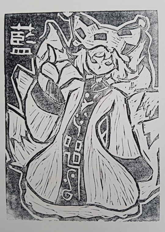
ran yakumo, actually love her a lot!! looks so cool and mystical... the pose kinda silly but lol :3c whatever looks pretty. also adding kanji significantly makes the piece cooler looking trust me (you just have to flip the symbols so it looks fine in the final piece (almost forgor about it with cirno))

kirisame marisa, spent way too much time on this one all the lineart was TOO MUCH WORK to make it look pretty, too many light spots and details phew
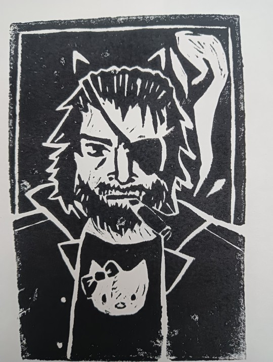
big boss catboyfied, started out as just big boss but later I got the urge to give the man cutesy cat ears (funniest shit), thanks komoda for making the hard image even harder (harder because I'm hard rn /j) also his fucking eyepatch is on the wrong eye!! forgot to flip it!! fucking dammit!!!
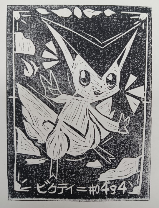
victini, actually I was at such a loss for ideas I just made my favorite mythical pokemon. tried making it look nice and give it the tarot card aesthetic but kinda sorta fucked up lol whoops whatever :3c still like him my teacher even made a few prints in red instead of black
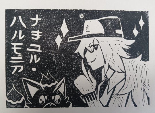
natural harmonia/N, made him after finishing my playthrough of pokemon black I've been procrastinating on a lot and damn I love this twink so much.... the designers cooked so good when they made him, great guy love him my favorite vegan animal activist, has a bonus zorua and katakana of his name to eliminate negative space (plus makes me look smart) , also some another teacher thought he's a chick, amazing
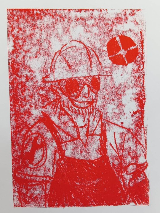
bonus (cause not really linocut) engineer I made on the last day after making N (teacher found me something to do), made him by placing a piece of paper on a still wet painted linoleum slab and drawing on top of the silly sandwich for the imprint, looks hellish and deep fried. kinda dig it (don't come at me if he looks silly I drew him for the first time with little to no sketch....)
phew this post took like an hour to glue together hope tumblr nerds will like this one
#yayy#touhou project#東方#東方project#touhou#fumo#cirno#kogasa tatara#ran yakumo#marisa kirisame#metal gear solid#mgs#big boss#naked snake#catboy#wears a hello kitty t shirt cause i thought it would be quite funny#pokemon#unova#pokemon unova#gen 5 pokemon#victini#n pokemon#natural harmonia gropius#not the n word i swear#engineer tf2#team fortress 2#tf2#fanart#art#linocut
32 notes
·
View notes
Text
Speaking of Inktober, I am a couple days behind now RIP, and I passed out like right after getting home last night so I didn't post any yesterday RIPx2
But I'll be online for a while later today to refill my queue and try to answer asks ;-;
Also I'm thinking about maybe starting to share more sketches Iol but I've just been drawing w pencil and pen so IDK how much ppl will want to see pics of my sketchbook dg dnsgnwtbfbdbd I'm gonna get back into digital someday.....
#i was hoping to be able to make a finished digital piece for my next follower milestone#but it's rushing in and I'm not nearly ready yet#so I'm doubly glad I'm trying Inktober bc i would love to put more creative energy into Shance#and I'm just rly excited to share w you guys even if i never really reach my ideal skill level#just picking up a pencil and drawing is a lot like picking up how to ride a bike again#gotta get the kinks out and move in clear confident lines and loops instead of shakily veering left and right#but man getting back into digital... just painting and coloring is fine#but fuck lineart and fuck animation if you'll pardon my French IDK how to do that shit anymore#the last thing i painted that i liked was an uninked tradigital doodle of my cornerstone lesbian ocs taking a nap lmao#i want to basically paint the same thing but with Lance 🤔🤔#probably more blue undertones than red and pink#anyway i digress#I'm gonna be on later and I'm gonna ideally be continuing Inktober catch-up as well!#text posts
3 notes
·
View notes
Note
please talk about the doing the dishes comic pleaseplease i am begging you i am on myknees please your brain is so massive plea
THANK YOU HAHA that's very sweet of you to say <3
i tried to make a symmetry with the color palettes used throughout the pages! the borders go around the color wheel: starting in orange and culminating in black, and then going backwards to orange again (roughly, as i did change the hues a bit the second time around to keep them visually distinct and appropriate to the tone i was trying to convey). then the last three pages are yellow, green, and red specifically because those are the colors i associate most with them (i love playing with the fact that green + red = yellow in additive color!). which also means i picked all new colors for Everything in Every page lol but the use of color (and the lack of it) has always been very important to the way i convey things in my art so i enjoyed being precise about it. there are certain constants throughout, though; like the color i used for "black" (lineart, vanitas's speech bubbles) usually sits around dark blue, and the color i used for "white" (their shirts, ven's speech bubbles) mostly sticks around pale warm colors.
and the seventh page being the only one to use pure black and white was very intentional of course. also the poses there are inspired by christian iconography of saint michael stomping on satan.
this comic ended up being a lot about hands for some reason. maybe something about how touch is the first frontier for connection (see further below for notes on corporeality and hugs) and also a little bit of me bringing back ven's original left-handed design and my headcanon that xehanort forced vanitas to become right-handed.
ven's "i'm with you" is a reference to sora saying the same in kh3 about roxas. and the backstory for ven's nickname and the "pure light and pure darkness don't exist" line are from the bbs novel.
vanitas is washing and ven drying because of the water = darkness symbolism in canon and ventus = wind.
but also fuck canon. in this house we ignore ux’s retcon of vanitas’s origins.
similarly when i mentioned in the other essay that i saw vanitas calling ven "brother" as an approximation of their complex relationship: in canon it seems he only calls ven that because he wants to claim total distance from ven’s identity, as re:mind hints and ux reveals that he technically is a separate being from ven/didn't originate from within him. but once again fuck canon <3 i'm repurposing vanitas calling ven his brother, as well as ven saying "we’re not brothers we’re the same," for my own lore which is "we don’t know wtf is going on and we’re trying to figure it out over time." in my lore they’re comparable to alters in a system; "we’re brothers" + "we’re the same" are Both equally true and untrue statements.
anddd i didn't address ven's "we're the same" line in that essay because i forgot it was added in re:mind, so when i tried to search up that cutscene for reference and saw the original version without that line, i was like "well i guess i made that up in my brain" aksjdkddf. so really, my more detailed thought on it is that vanitas calls ven his brother as his own sorta-metaphorical-sorta-not approximation of their relationship -> ven is resistant to that label at first because he doesn't understand it or their relationship yet -> he accepts/uses it for the first time in my previous comic, trying to affirm vanitas’s existence using vanitas’s choice of words (while having his own internal nuances and interpretation of their brotherhood as informed by his brotherhood with terra) -> vanitas is like holy shit we’re brothers (discomfort) (relief) (???).
calling back to my first fanart of these two, in my lore vanitas ALSO does, on some level, want to be protected and wants that loving brotherhood rather than an adversarial one. it's not solely ven who wants that. but it's just one of the many many conflicting feelings he has about ven so it's difficult for him to parse and admit. he is working on it tho i'm proud of him :)
wait this also reminds me of how re:mind added "HEY GUYS. FEELING A LITTLE LEFT OUT HERE!!" KASJDKFDL best vanitas characterization decision kh3 ever made
vanitas finds hugs very nice and comforting but only with ven (at least until he chills out a little and feels comfy hugging other people, maybe) which is inspired by a really good fic i read in the summer and still think about frequently. the “supernatural dysphoria” it’s tagged with is written SO well imo, it includes the idea that vanitas feels calmer when in physical contact with ven because that’s his original body which he was forcibly removed from and desperately wants back. i LOVE that. and i think ven would like hugs too because of course vanitas is the other half of his heart who he’s missed dearly. a hug between them is like coming home after a really long time away and someone moved all the furniture around but it’s still home and it feels good to be there again at last :)
canonically vanitas was always able to vicariously feel ven’s emotions to an extent; i headcanon that an aftereffect of their fusion is ven starting to feel vanitas's emotions as well, now that the connection between them has been forged anew. he has less practice with it though, so it's easier when he's in direct contact with vanitas or one of the unversed, which he showcases with the hareraiser.
the specific choices for unversed are intentional too :) i went with red hot chili = anger, blue sea salt = bitterness, hareraiser = panic, and thornbite... is like the emotional reaction to physical pain. i think it would be very easy for vanitas to conflate physical with emotional pain, especially considering he doesn't technically have a physical body and is Made Up Of emotions.
alsooo i think i phrased it a little ambiguously but vanitas doesn't think that the unversed are "the bad things" that ven is talking about!! he's saying that the unversed are like him in that they "hadn't been given a chance to see all the good things in life." i think about nomura's reasoning for their name ("those that are not [well]-versed in life/their own existences") Every Day. it's about the fact that they were all made to believe that suffering is all there is and that they are fundamentally monstrous but that is not true and there is hope and a future for them... i need to lay down now.
only ven is allowed to call him nita for now but it's still nonbinary transmasc nita nmonday. end post <3
11 notes
·
View notes
Note
1,5 & 21? For ur art ask game thing :)
Thank you for the ask:) heehee
1. Honestly uhhh I have several favourite art pieces from this year (some of them aren't dream smp related, crazy) but like, I honestly came to love all of my shit which is crazy. I'll add my favourite pieces after the cut and explain why I like them, if that's alright
5. OH!!! I think I've talked about this before, but one of my most favourite pieces is Quackity holding Slime dying, you know the one (hopefully) and it has a lot of details that I tried to leave there. I'm still thinking about redrawing it but with more little details this time. I also like the accidental tarot card art with Quackity in his butcher army arc outfit, simply because I made a tarot card on accident, I think it's fucking hilarious. But i generally try to leave details in my comics (one of the overlooked details in one of my comics is in the "mike hawk" comic with ranboo, I don't remember anyone noticing a big hole in the wall next to the front door, I left it there because in the "previous" comic of that series Techno got slammed into a wall when Quackity opened the door. It's not that noticeable, but I found it funny anyway). I can't really point out my most favourite detail in ALL of my shit because once again I try to leave a lot of them, and there're very specific details that I like in all of my drawings
21. Boy oh boy what I REALLY want to work on is like symbolism in my drawings and all of that. I'm always fascinated by artists who manage to just think out every little detail in their artworks and leave so much symbolism and details in them, and it's just a dream of mine to be able to do something like that. I have a lot of respect for iconography and people who draw icons in general, because it was just so... so fucking insane about how much symbolism they have. Also heraldry and colour symbolism, it's just SO fucking interesting to me. I really want to work on that. Also colouring and shading probably.
send me an art ask
VVV for favourite drawings

I fucking love schlatt okay. It was a pleasure to draw. I personally think this is a great drawing and like, i don't know i just really like it :D it has probably one of the best faces I've ever drawn. I also like the hair on this one :)

FIRST FULL ART QUACKITY DRAWING I'VE MADE I THINK??? I really wanted to make it look cartoony in a way, but i really like the lineart here and i tried to have somewhat of a neon lighting because i just. I like neon lighting okay. Though it looks very out of place here :D still, this is my first quackity drawing. Poggers!
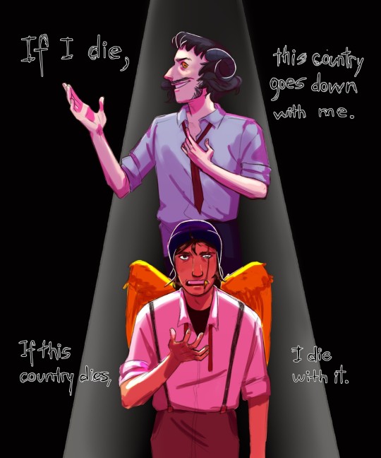
This idea lived in my mind rent free for a while. That's about it. I wanted to make an essay on this, but I'm much happier that i made an art on it. It has a lot of obvious mistakes, but I just really like it
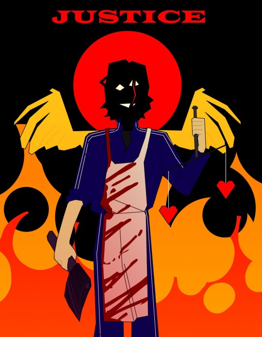
1) accidental tarot card. 2) i had a lot of fun drawing it. I also liked the idea of making a scales with hearts uneven (to show injustice and also portray that Quackity was just playing with lives which is fucked up). Also the way the scar actually splits his face, I was thinking about maybe just straight up splitting his entire head to like, somewhat symbolise how his mind was split into two parts - the before Quackity (his first days on the smp, a man who just wanted to change the word for the better) and the after Quackity (a twisted evil fucker driven by vengeance and need of power) but I didn't know how to portray it so I just left it be

I've said why I like this art. Next
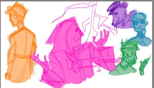
And here we are. The red Banquet drawing I've never finished. I liked the poses here a lot, and maybe I'll finish it one day. I don't know though. But the egg arc - probably one of the best arcs of dream smp. Love it dearly
i wanted to add more drawings but tumblr is homophobic and wouldn't process this post otherwise
Also guess which is my favourite light source colour lmao
6 notes
·
View notes
Note
hey, do you have any tips on drawing apps? especially ibispaintx? thanks for the answer!
Hmmm I'm not really sure if I have any tips actually, nothing I do is special but I'll run through some
Folders! Folders are very helpful
You can put several folders in a folder and clip several layers in them
You can clip folders
And of course you can close folders so that you're not scrolling forever
Make something you really like but wanna start on a new canvas? Copy it
There's different ways to go about it, you can select it or just stay on the layer (you can only copy things if they're on the same layer) and choose the dotted square in the upper right corner zone
Select copy and then open a new canvas and select paste (at the dotted square in the upper right corner zone)
You can past as many times as you need, the only time your copied item will not be there is when you copy something else, there is no clipboard
Filters are your friend!! You can find the stroke option in the style filter selection (the first/second option) and while I have not figured out how to make it come out white and not red I like it very much
My advice there is to copy a layer from canvas (essentially an option to duplicate EVERYTHING visible in one layer) and apply a stroke there
Because putting stroke on lineart never works, nor does putting it on the coloring only it comes out funky so don't do that
Experiment with the filters!! I only just found a bevel one that makes the stroke look like a 3d sticker or however and I love that so much
Screen tone is lovely, I use it occasionally
You can find it when you open the layers, next to alpha lock at the bottom and labeled "Normal"
I don't very much know shit about blending mode, but the screen tone area I advise works best when you make a layer semi transparent or at least lower the opacity so you can see the repeated pattern
If you merge that layer with another they will be labeled a normal layer- but if that other layer had anything on it, it will now relieve the pattern of the screen tone
So of you're merging screen tone layers and don't want that, merge it with an empty layer first and then go on
Uhmmmm brushes
Add brushes, play with the brushes, understand what you want from brushes AND import brushes
Now I'm not very wise on how searching for brushes works in ibis, bit you can import and export brushes at your leisure
Try to search up (outside of ibis) a specific kind of brush you need if you're unable to figure out how to make it yourself (like I) and save the qr code
In your brush options, in the upper right corner there are 3 dots
You can import (add a brush file from your device) and export (automatically saves your qr code of the brush you use to your gallery)
ONLY ibis qr codes work, you cannot import other things
That's all I've got...
#not reallt advice and more me poking at the things I had to figure out#I've been using ibis for years and I still dont completely understand it so.... yeah!#gludgen answers!#anonymous#I'm desperately trying to figure out which way I can edit my brush to make it more appealing to me but ALAS its DIFFICULT
0 notes