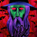
#probably more blue undertones than red and pink
Explore tagged Tumblr posts
Visit Tumblr Blog
Explore Tumblr blogs with no restrictions, modern design and the best experience.
Last Seen Tumblr Blogs


Fun Fact
Total funding amounts to $125.3M.
Text
I know this is basically heresy to the Spock fandom. I know a lot of people will disagree, and fics will continue to do things exactly the way they always have. But I must speak my truth.
Spock is not green.
Spock's blood is green but his skin is best described as sallow. Pale with a yellow undertone.
Likewise humans are not honestly all that pink (no matter what Shran says). But we are more pink than Spock is green. We have a pink undertone, but Spock's undertone is yellow.
I've thought it over: the colors of human blood, with and without oxygen; the colors of copper, oxidized and not; the color of the copper-based blood of horseshoe crabs; the optical qualities of human skin. And I offer an explanation.
If you have a lightish skin tone and you flip your forearm over, you'll see blue veins. Which is why you probably grew up thinking unoxygenated blood is blue. It's actually not; it's purple.
What we're seeing is a scattering effect. You know how the sun shines in the atmosphere, and most of the color comes straight through just fine, but the blue covers the whole sky instead of coming straight down with the rest of the sunlight? That's because our atmosphere lets the other colors straight through (the warm white of the sun as seen from Earth) but scatters blue, making it seem like it's coming from everywhere.
Human skin does the same thing to red. While blue comes straight through, as if the skin were transparent, showing clear-edged veins, red is scattered. You won't see your arteries. Instead you see a pink cast that seems to be coming from everywhere.
Importantly, which colors show through and which are scattered has nothing to do with our blood, and everything to do with the optical properties of our skin.
Back to Spock. Oxidized, his blood is grass green. Which is kind of odd when you think about it. Horseshoe crabs have copper-based blood, and it's blue. When it doesn't have oxygen in it, it's pretty much colorless.
And this is the color of oxidized copper. I wouldn't call it grass green. The proper word is verdigris.
So for Spock's blood to be grass green, there's probably something yellow in it. The plasma, or the white blood cells, or whatever.
Unoxygenated, copper is ... well, copper-colored. Orangey-brown. I'm not sure if it's possible for anyone's blood to ever get fully unoxygenated—cells just aren't that efficient. But if we assume Spock's blood is less green and more orange when unoxygenated, we might expect a yellowish-brown, yellow being the only color in both green and copper.
So we just have to assume Spock's skin has optical qualities which allow yellow through more than green or brown. The yellow is scattered, while visible blood vessels (if Spock has any) might be green or brown.
Yes, I'm arguing that Spock blushes yellowish. His ordinary skin tone would darken. You wouldn't have a whole new color showing up.
None of this implies that Spock's mucus membranes (tongue, gums, internal parts of genitals such as a sheathed penis) wouldn't be green. Without the thick, protective Vulcan skin, a lot more would show through.
I'm just saying, Spock looks pale-to-yellow on the show and I'm okay with that. I think science can justify it. (Alternatively, as SPOCKNALIA argues, Vulcan skin is too thick to show much through it, and the yellow tone is Vulcan melanin.)
However, I may still continue to have Spock blush green just for art's sake, and you can too. The only law of fanfic is that your canon is whatever you say it is.
619 notes
·
View notes
Note
This is for a story so it's not a huge deal (and there's already a bit of fantasy elements so I'm willing to handwave some stuff if necessary) but what would be the closest a peacock could get to hot pink? I saw purple morphs, but unfortunately my attempts at further research were inundated with AI slop and clickbait :(
Sooo, the closest that peafowl have CURRENTLY gotten to "pink" would probably be peach or European Violet.
Here is a good, light peach.

They are a very delicate, powder orange color. Genetically, they are cameo + purple, and the purple gene means they come in a paler version (light peach like above) and a darker version (dark peach or 'northern' peach as it's sometimes called, as it's often seen more in the northern US than the southern.... this could mean the variance is also more heavily affected by sun exposure, as sun exposure is less in the north). Here's what I mean by dark peach:

Your other "best bet" for current peafowl would be taupe, but taupe tends to be "cooler" than peach (ie, cold-color undertones, giving it a more "powder blue" feel than "powder orange" feel)
Here are a few Taupe birds in warm light


vs a taupe in cool light

Genetically, taupe is opal + purple, so you get a more grey look on them than the brighter cameo orange look.
Peach, being genetically a cameo, has no iridescence (it's "matte" in color), whereas taupe does still have some iridescence at least on the head.
Your other option is the european violet. While purples tend to look like strange blues in overcast weather, violets maintain their purple look even in dimmer lighting, and they tend to have a very "warm" purple compared to American purple's "cold" purple.
EV on an overcast day

vs american purple in shade

and EV in sun:

You can see a lot redder tones in the chest and wings than on purples.
So, those are what you'd be able to work with, for CURRENT birds. If there were a case of chromosomal crossover that could repeat to make "peach" but with cameo and EV, then maybe that bird would be pinker than peach.
But, what you ACTUALLY probably want, is a peafowl who has, like, erythrism and maybe pale leucism. Erythristic animals have high red phenotypes, and in some animals, like katydids, erythrism results in pink. Like HOT pink.

So a high-red animal would get you into the realm of at least having reds, if not just having pinks from the get-go, and then pale leucism does what it says on the tin and lightens colors over the whole body of the bird. In peafowl, you miiiiight get away with this effect using the silver white eye gene (the white eye allele that causes body "silvering" ie pale leucism effect.
For example, here's a cardinal with pale leucism:

So that's kinda where I would start with it. Erythrism + pale leucism.
But for peafowl, you would need to consider that RED as pigment is a really uncommon pigment for birds to produce all on their own. Cardinals and flamingos largely get their color from their diets (which are high in carotenoids), not necessarily by self-produced red pigments. There are some parrots who produce unique red pigments, but most of peafowl color comes from structural iridescence, not plain pigment.
So, any mutation that causes a difference in the structure of the barbules on the feathers could mean a fairly drastic change in the color we see on them (which is another important factor.... peafowl color includes ultraviolet spectrum that we don't see, but they do, so do your characters see into that spectrum? peafowl might already be pink to them). So rather than a gene that alters pigments, you could have a gene that alters feather structure. Stuff like satin in mice causes hollow fur and causes a mouse that looks shiny like it's made of satin. When peafowl get wet, their trains can look red or even fire orange.
128 notes
·
View notes
Text
Michael Kaiser, Shidou Ryuusei — Red
PAIRING: Michael Kaiser/Reader, Shidou Ryuusei/Reader WORD COUNT: 1.5k TYPE: Humor, Bad Flirting, Petty argument WARNING(S): tw Kaiser, tw Shidou
Kaiser is maybe pissed off or developing chronic depression (or uncovering a long going, underlying mental health issue).
Well, not to be overdramatic, but his life has fucking sucked ever since he came to this wretched place they call ‘Blue Lock’!
More like stupid shit lock, but he wouldn’t be caught dead saying something this immature out loud. Yoichi scored one more goal than he did — an entire goal, one of it, in surplus that is — and made a fool of him. Now Kaiser is spiraling and wanting to prove himself like a loser, when he’s the one who’s supposed to make others feel this way.
What is happening right now, in front of his very eyes, is egregious torture. Cinnamon to sauté the pear of anguish in.
He went looking for you in an only slightly creepy stalkerish way, which he already wasn’t happy about, since he had to walk around this soulless building and see too much of it at once. And when he finally finds you in one of the few communal spaces (gross, by the way), what are you doing? Betraying him by talking to Sae’s pink pervert and laughing. Your audacity to have fun while Kaiser is suffering is insolent. Ness should give you a yellow card for that.
Even if it’s below him, Kaiser can prove himself, though, both on the field and when it comes to strange rivalries with questionable undertones. He is better and more deserving of all attention, including yours, and he’s going to show you. He’s going to show you so hard, you’ll regret your ignorance so much that you’ll drop out of here and go back to school or whatever the fuck.
With this objective in mind, he reminds himself to act natural and walks up to you. In fact, Kaiser is confident no one has acted this natural before.
“Hi,” he says in an unnecessarily firm tone, with the most forced smile of all time. Maybe he should’ve come up with something before interrupting your conversation, now that he thinks about it.
Your heads snap in his direction at the same time with a weird synchrony. “Hi,” Shidou mocks, imitating Kaiser’s expression, going as far as to suck in his lips to make it seem more exaggerated and stupid.
Somehow, this situation strikes you as awkward, so you settle for staring at him expectantly. He probably had a reason to approach you, right?
“How… are you… doing?” Kaiser asks, ignoring the bug in favor of swinging an arm around your shoulder and leaning in way too close to your face. This is mostly an action meant to distract you from how strange he is acting. The only language he is proficient in is shit talking, so now he finds himself at a loss for words.
Shidou, however, is adept at smelling weakness. Without thinking twice about it — pathologically impulsive — he pushes Kaiser off of you, and his grin grows menacing. Now he’s the one draping himself over you, and he looks at Kaiser, who seems a bit caught off guard all things considered.
“We,” Shidou points a finger at himself and then at you, maybe attempting to insinuate something, “were doing great! And then the double-rat-tailed wonder came in.”
The who?!
Kaiser maintains a cheerful facade. “I don’t know if you’re aware because you seem quite stupid, but the point of a nickname is to be short. At least my hairstyle obeys gravity.”
“Wow, hear that? No way you like ‘em uptight and snobby like this guy, babe.”
“Really? Because I would’ve thought the vulgar type who treats the plays leading up to scoring a point like edging doesn’t suit you at all. Right, darling?”
Babe? Darling? May God touch these people’s wretched souls.
“Aww, you remember that? You watched me? Good times. I’m getting so popular.” Shidou lets go of you, much to your surprise. Then he stretches like a cat and yawns, overdoing it just to illustrate his boredom with Kaiser’s presence. “Anyway, forget about gravity. Pink is much better than blue-”
“No, it isn’t,” Kaiser argues childishly, crossing his arms.
“-We all know it! And what do you have in your hair? Blue. And what do I have? Pink.”
“This is stupid. They’re just colors.”
“Someone’s mad he doesn’t have pink instead of blue.”
“What? You’re so dumb. You know it’s not natural, right? I made the choice to dye it blue. If I wanted pink, I would’ve-”
“‘You’re so dumb. You know it’s not natural, right?’” Shidou repeats in a snotty tone, then throws you a meaningful glance and snorts, waiting for you to join in on the bullying. Apparently mimicking Kaiser is something he’ll add to his list of things he considers funny from now on.
You wonder if either of them have noticed you’re yet to speak at all.
“Well, what about you?” On cue, Kaiser addresses you. Are you seeing things, or is his eye twitching? “You understand opinions about colors aren’t objective, don’t you?”
Shidou perks up. “What do you prefer? Pink or blue? You love pink, right?”
“No, I bet you’re just… obsessed with blue. I bet it’s all you can think about, along with football, of course.”
“But isn’t pink so much more energetic and wild and cool and lovable?” Shidou flutters his lashes and strikes a pose as if he’s trying to act coy but in a manner so overt, it becomes clear he’s not really trying to sell his performance.
Are they even talking about colors anymore?
You shrug, deciding to treat the situation like a game. “I haven’t decided yet. Convince me which one I should pick. Get me on board.”
“I have a car,” Kaiser blurts out. Is this the only positive quality he thinks he has when it comes to his personal life? You don’t know if you find it funny or sad.
“So what?” Shidou asks, unimpressed on your behalf. “I’ve always wanted to hijack a car.” Then he wraps his fingers around one of your shoulders, overcome with excitement all of a sudden. “Let’s go on a date when this is all over and hijack a car! We could hijack his car.”
“See, he’s psychotic.” There is an arrogant smile on Kaiser’s face again.
“You’re also kind of crazy,” you say.
“There are no positives to being with him if you think about it rationally,” continues Kaiser, like he didn’t hear you calling his sanity into question. “Even if you wanted to be a deranged criminal, he’d just get you caught. Me, personally, I could plan it all out with you.”
Scratch that, he’s an overly willing lunatic who’s shielding his emotional dysregulation by talking about logic. Like that’s ever worked for anyone.
“So what if I’m impulsive? There are positives to being with me, duh!”
“I doubt it.” Kaiser’s skepticism is palpable.
Shidou’s gaze returns to you, so he can look at you straight on while delivering his next line. “Well, I’d give you a really enthusiastic massage.” Oh, this is the route he’s taking. Ok. “Jitter up your neurons like you do mine.”
“Do you even know what a neuron is?”
“Even a foot massage?” you ask, amused.
“Sure, I can do a foot massage.” Shidou remains carefree at the suggestion.
“Do you know foot reflexology?”
“No, that’s so boring.” You frown, just for the sake of seeing his reaction more than anything. Shidou tries to amend the situation, “I can learn?!”
“You can’t let him massage you anywhere,” argues Kaiser, and he seems quite offended by the notion. “He’ll probably do it wrong and fuck you up because he’s a brute. You’re gonna get injured.”
“Well, can the blue rose princess do any better?”
“Stop calling me convoluted nicknames. And maybe not, but I could hire a massage therapist with a five star rating or something. How’s that sound?”
“You’re such a robot! You’d rather be with a brute than with a robot at the end of the day, right, babe? Team pink wins all day.”
“How am I a robot?”
Gleefully, Shidou expands on his point with his grin turning even more devious, “It’s not about giving a good massage! It’s all an excuse to be all over someone. And by the way, you don’t seem cuddly at all. I wouldn’t touch you with a ten foot pole.” His definition of ‘cuddly’ is probably questionable considering it includes Sae, but still.
“What! Yes, I am! Don’t talk about touching me, you moronic deviant!” Kaiser then deflates and seems a bit unsure despite the earlier conviction and aggression in his outburst. “I mean, if you think it’s an attractive quality, that is. But if you find it degrading, then I’m not huggable at all.”
Wow, they’re both suckers. You wonder how far you’ll be able to push it in the future?
#blue lock x reader#michael kaiser x reader#shidou ryuusei x reader#shidou x reader#kaiser x reader#bllk x reader#bllk x you
223 notes
·
View notes
Text
Wash Red with Black
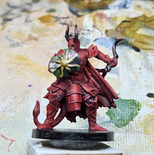
While red is arguably one of the coolest colors. Cool as in awesome not as in shades of blue cool. English is a stupid language. Already on a tangent. I have focus issues. I probably don't need to say that because it's obvious but just in case. I have focus issues, deal with it or don't read my blog. I ramble from time to time. Oddly though, if I could get ClipChamp to work today I was going to post my sermon on here which I don't normally do because it is just plain a phenomenal sermon centered around one of the Eldritch Terrors from the last Season of The Chilling Tales of Sabrina. Yes, I preach on some amazing topics. The Bible and Pop Culture can merge as one... if you read it right. If you're reading anything other than love God, love your neighbor, love yourself: Try Again, you've failed to understand the message. There is nothing normal about me and... I have focus issues. I blame the dog licking my elbow right now... weird little animal. So cute, though.
Back to the red. Awesome color. Pain in the ass to work with. It doesn't really have dark and light shades like other colors. There is red and then... there's pink which is not red and does not look good as a highlight most of the time. There is red and then... there is brown, also not red. Red shades reasonably well with black for the shadows and depth. But doesn't always feel right depending on the undertone. Sometimes orange works, sometimes a peach will work, sometimes white works if you make sure the red is dry so they don't mix together. Kind of like you can't paint a yellow sun in a blue sky or you will just have a green sky which means the end of the world or a tornado is coming. Red is a pain but if you get it to work: Amazing.
Spoiler alert: this is not one of those amazing times. Stay tuned for more on: How NOT to Paint Miniatures
Oh! The shield! I have this weird Green Stuff Paint I was just dying to try out called Evil Forest. What a great name for a color. You'll see it on the pants of Hatchet and on this Red Guard's shield and weapon. It is supposed to be a color change between red and green creating that weird effect you can see in the picture if you look close of green stripes but in metallic and... I got to try out a new paint with varying results. It's intended more as a spray paint but since I don't like to spray unless it's primer, I brushed it. Results varied... tremendously. Added into the list of "Things I Will Do Someday" is to figure out if it works better lightly brushed on in multiple coats or one heavy coat. I would hazard a guess the latter is the correct option. When it comes to painting, multiple thin coats is statistically your best choice unless your paint is too thin in which case then it just fills in all the beautiful details without coloring the surface. Also on the "Things I Will Do Someday" itinerary: Make videos instead of blogs with photos... or do both.
#miniature painting#how not to paint miniatures#painting miniatures#dungeons and dragons#vallejo#Gloomhaven#red Guard#I hate red#I love red
14 notes
·
View notes
Note
Hello, orokay!! I've adored your art for years now and I was wondering if you have any tips on how to draw and paint/render scars? I can never seem to get them to look right, any help is appreciated! Hope you're having a good year!
Hi anon, thank you so much!
Sorry this took a minute to reply to, I've been trying to figure out how I wanted to respond. For me, a lot of questions about how I do certain things are kind of tricky bc generally the answer is 'idk I just try things and tweak it until it feels right' and I don't really feel qualified to give art advice bc most of the time I'm just making stuff up as I go, but I know that's not really a helpful answer 😭
My art style tends to lean towards simple and stylized, so for scars I try to limit them to three colors at most, less if I feel like I can get away with it. It also depends a lot on the scar since there are different types of scars. Usually how I pick the colors I use is: one color darker than than the skin tone (shading), one slightly lighter than the skin tone for the injured flesh and occasionally an even lighter color for highlights. I'll include some examples under the cut. But please please please keep in mind wrt scars 99.9% of the time I'm just winging it and going off of what I think looks cool, I don't know anything about the science behind how people scar so please do your own research if you want to be accurate.
I'd say when approaching/researching scars you need to consider a few things:
Skin color of the person- Scars look different on different skin colors and different people scar differently. I think this is one of the biggest things to remember! Color pick for the scar based off of the character's skin tone and shade. The color you use for scar tissue on a person w/ light skin is going to look unrealistic and out of place on person with dark skin, doubly so if the undertone of their skin is different (ie. warm vs neutral vs cool undertones). It's so important to look up references because everyone scars differently and skin type can make a huge difference on how a person scars.
Color of the person's blood- same vibe as with blushing/lip color/etc. if your character has blue blood, the scar likely isn't going to be pink. This probably isn't something you're going to have to keep in mind a lot, but just in case. This also kind of ties into the first one because if a character has a non-human skin tone, like blue, and red blood then the scar is probably going to be more of a purple tone, for example.
Type of scar- think about the injury and what kind of scar would result from it. I'm not a doctor so idk how scarring works and generally go off of vibes, but if you want to make it as accurate as possible, I'd suggest looking up images of scars from whatever type of injury you want your character to have. I used to work with dogs and I scar easily so I have a lot of bite/scratch scars. Some of them are lighter than my skin and raised while others that were less deep are darker and on the surface of the skin (aka no texture). My brother has a very deep dog bite scar that's left a dent in his skin and light, pink and shiny scar tissue. Basically, if you know you have the stomach for it, I 100% suggest looking up examples of the type of injury you're thinking of so you can see how that injury tends to scar. Is it hypertrophic? Atrophic? Keloid?
How was it treated and how old is the scar?- is it a burn scar that received skin grafts? is it a surgical scar? stitches? did it heal well or was there infection? All of these things can change how a wound heals and scars. New scars are going to be much more stark, especially if they're still healing, and most scars fade over time. Examples under the cut...
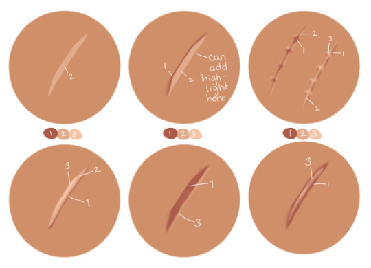
Some examples from my drawings over the years:
OC w/ healed burn w/ skin graft stylized and very simplified // really simple, sketchy scars on Narci:
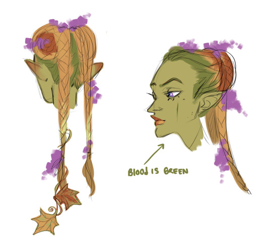
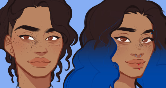
This iteration of Blue's blood is green so the scar on her cheek is green (we're going to ignore her lips and the flush on her ears lol):
raised scars on nikora and blair's cheeks:
#answered asks#i cannot stress enough i go off of vibes 99.9% of the time im not an expert anything i get right is purely by accident#pleaaaaaaaaaase do research#if anyone else has actual medical knowledge and wants to give tips/point anon towards resources please feel free to add on#i'd like to learn more too ^^
17 notes
·
View notes
Note
Hello Nat! Hope you're doing great!
So for the color/fashion thing! Would you do Jules Koundé and Eduardo Camavinga please?
Hi nony!!
I’ll do Cama on this post and Jules on another post, ‘cuz I don’t have space for them both on here.
Eduardo Camavinga Season Paletter
My first guess when looking at Cama is that he’s a cool toned. There is a stark contrast between the irises and whites of his eyes. So even if his skin is dark, a contrast between the whites of the eyes, the teeth and the rest of the features is prominent.
Gold or Silver?
I find he looks well in gold and silver, so he is not fully cool toned, but I do find silver looks bit better against his skin. So he may have a bit warmth to him.
Warmer tones:


Eduardo doesn’t wear many warmer undertones, so it’s hard for me to really see how he works with them, but these 4 pics are probably the best pictures I’ve found. I do think that nudes wash him out a bit and look underwhelming on him or overshadow him, or even make him look a bit ashy. Therefore, I think that he is more of a cool tone rather than a warm tone.
Cooler tones:


Cooler and brighter colors seem to work very well on him, they seem to brighten up his skin and don’t look dull on him, like more the warmer autumn colors. The white contrasts his skin quite well and doesn’t overpower him. The bright red and blue warms up his skin, and the pink accentuate his features. The cooler and brighter tones electrify his features and pull out his beauty and warm him up.
Conclusion 💡
I think that Eduardo is a Bright Winter. He looks the best in bright colors that are more on the cooler range, but a bit warmer Bright Spring colors look well on him too. This means that his primary color aspect of his overall appearance is bright, and the secondary aspect is cool – meaning cool colours suit him better than warmer ones.
I hoped you liked this, and if you have any thoughts or opinions, feel free to share them 😊💗
Disclaimer: I’m just experimenting and trying to learn more, so this is not professional in any means but exercise.
#eduardo camavinga#Cama#france nt#equipe de france#les bleus#real madrid#rm#football fashion#season palette#color theory
8 notes
·
View notes
Text
Concept Design [The Sacrifice]
In this post I will be describing the design process behind my concept sheet for The Sacrifice character in my project.
As a reminder, here is my moodboard for the Sacrifice.


Unlike the first one where I made each part one at a time, this time I made all the base linearts at once. I feel this helps with consistant style and also gives me more choice on what to do without overwhelming me. With the text, I decided to make it look like it was scratched into wood or stone with a knife, keeping the lines straight to help sell the theme.

To start, I began by making the side view. While making the bun, I realised that the basic design was similar to my pirate in our first project, so I looked on pinterest for some facial scars to see if there was anything that fit my character.

Eventually I found this artwork of someones OC and I knew I just had to add it to my character. I cut the lip and added the gum undenreath with some teeth, adding texture with my pencil brush. It added an aspect of mystery to the character as it makes you wonder where he got it. Was it inflicted by the cult? Self inflicted? Born with it? It makes him a little more unique so I kept the idea. I also like gore and body horror, so this fills that slot too.

Here I had finished the front view. My studies on Wednesday really helped with the face, so I'm very glad I spent the day worknig on that. I kept his irises small to show that he was scared, which I imagine he would be if he was assigned to be the Sacrifice for a cult. Once again I added the lip/cheek tear too.

Here is the fullbody finished. I am aware the anatomy isn't perfect for the fullbody, but it was more about the design than accurate anatomy. I gave him an oversized ripped t-shirt or dress and added some shackles to his wrists and ankles. I then added the ritual markings that you can see on The Follower, although his are way more obvious because he has barely any clothes. Underneath his shirt you can see a faint outline of his ribs because I wanted to get the message across he was malnourished/frail and I wasn't sure how to do that accurately so I just added some ribs to show he hasn't eaten in a long time. His face/head was a little difficult because it made him look child-like, I think it was the size, so I adjusted the size a bit and I htink he at least looks closer to an adult.

Here I started colouring. I used the purple in my original colour palette and coloured in the eye, before moving to the front view. I made the hair a really dark brown because my hair is really dark brown so I'm a little biased. I then coloured the gum in his lip/cheek tear as well as the teeth and I used the red in my original colour palette in the muscle. It's both an accurate colour and it is also the main ritual colour of the cult, so it kind of gives a hidden meaning that his connection with the cult is always inside him, even without their ritual markings.

Here I coloured the side view. The colour of the lips was a little more obvious here but nothing else really changed. It was difficult choosing an accurate skin colour because he's unhealthy so I wanted him to be really pale, but using a pink undertone of the cream still makes him look healthy? So when I make the reference sheet, I think I'll experiment with a blue or yellow or maybe even green undertone to make him look properly unhealthy.

Then finally I coloured the fullbody. I used the cream colour from my original colour palette and filled in the ritual markings and the shackles. I also added some purple corruption to his hands like that one imagine from my moodboard, but I'm not 100% on the idea. I'll get some feedback from my friends and see if they think I should keep it or not.
Designing this one was fun. I way preferred this brush over the last brush I used for sketching and my method of making all the lineart first really helped me keep focused. His design is probably the design I like the most in my head right now, but maybe (hopefully?) that will change later on when I design The Leader and The God. I'll do some more research before I work on those so they can stand out and look even better than how they would with no research.
0 notes
Text
Been a while since I posted a customs update since it's been a lot of me getting various projects started and very little completion, so let's do a lighting round!

I've sanded the entire princess alliance in prep for body repainting (minus Spinerella and Netossa, since the dolls I've going to use for them haven't come out yet). Left leg shows a raw grinding pass to remove vines and right shows after it's buffed out and softened. Using a little Acetone and washing it off also helps. Since this photo I also removed the molded on underwear and sprayed her with three coats of plastic adhesion improver to get her ready for repainting. There's some "ghosts" of the vines left on her legs still but I'm kind of headcanoning them as scars? I think Entrapta would have some of them from her machining work and errant experiments. I probably should have rounded the tips of her ears more but ears are kind of my enemy so this is what I'm working with. Still trying to figure out her hair...


I'm using Frankie for Perfuma and Lagoona for Adora. I cut and sanded down the mechanical details on Frankie's leg and filled the gaps in, as well as Lagoona's fin gaps, with some La Doll clay. I've heard people's woes trying to repaint Lagoona's leg and considering I was starting with Fearidescant Frankie with a similar translucent material leg, I thought it was best to treat them both the same way. I sanded them and then painted them with white gesso with a drop of blue and pink added respectively to make it a little closer to the rest of the skintone. I did two coats for both. I'm nervous how it will work on Lagoona, but for Frankie/Perfuma...

It worked out great! Yes, one leg isn't as smooth because of the layering and the clay, but you would never know it used to be a robot leg. After I'm 100% done with Perfuma, my goal is to repaint Venus, and then Lagoona. I'm waiting because I'm planning to use the same paint mix for all of them and just add a bit to lighten/darken it for each, and I'll definitely need a little more of the exact right shade to do some touchups as I work on Perfuma first. Repainting bodies still isn't my favorite thing and I'm not going to be doing it again after this series is done, but it went way smoother after everything I learned on the last one. The color is a little darker than it needs to be I think, but I was trying to put enough red in to counteract Frankie's blue undertone and it came out a way better color from the jump than Glimmer's did. I did one or two layers with the makeup sponge and then touched up any uneven areas with a nail art brush after that and it worked really well.


I'm also doing my first ever rerooting! And as you can see a little paint has rubbed off her nose as well as her ear tips while doing so, hence the need to save the paint until I'm done. I haven't done any of the hairline because I was waiting for smaller needles to arrive, so I've just been doing the bulk of the plugs and trying to figure out where to add new parts (I think a main one on the left side for her Princess Prom look), and this is how far I gotten because all four of the needles I bought broke (my fault, I was way overfilling then at first and went through them really fast before I figured that out, but I'm glad I bought a starter set while I was figuring it out instead of making my own from the start).
I never thought rerooting would be an option for me because of how exhausting I've heard able-bodied people call it, but I didn't think I could do Adora's hair well without it, and I thought I might need it for Entrapta's pigtails as well, so I decided to make Perfuma my guinea pig and I'll be honest: like sanding, it's exhausting but I actually really love it. My back hates it, but it's methodical and great to do while watching a show. The hair I used here is the chiffon nylon from Shimmerlocks and massive shoutout to them because customer service was super fast and helpful when I needed them. The nylon feels great so, barring Adora who I bought Saran for for color-matching reasons, I'm definitely sticking with nylon from now on unless a yarn wig makes more sense (like for Catra who I want to be able to go between long and short hair, or Scorpia who has such short hair I think acrylic will be easiest).
I think I'll be able to finish Perfuma as a doll this week, then move over to Entrapta, and then Adora, and then... I have to make clothes for all of them, oh no 😬
0 notes
Text
Revealing the Tricks to Matching Your Complexion with the Right Foundation Color.
Obtaining flawless skin is not possible without obtaining the very best suit foundation that mixes well with the skin tone. Also for the newbie or charm expert, there is constantly more to find out about the deepness of shade matching. When picking the excellent foundation color for your skin, you may really feel a little lost, so below we have collected the best overview to match you.
Comprehending Your Skin Tone
The initial step towards developing the appropriate skin matching foundation is to pick your skin tone. Complexion normally fall into three classifications: cool, warm, and neutral.
Amazing Undertones: Your skin can range from pink to red or perhaps have a blueish tint if the pulsating veins of your wrist are blue or purple. Cozy Undertones: If you have greenish veins, your skin may have a tinge of yellow, peach, or gold.

Neutral Undertones: Veins seem to be somewhat green. Your skin is neutral and has a mix of warm and trendy undertones. Understanding your complexion assists in the procedure of choosing foundations that improve and do not clash with your skin tone. Let's discover just how to locate skin colour structure thoroughly.
How to establish your perfect foundation match?
Utilise Online Tools:
Most likely to sites that have the most developed shade search options. The above devices are formulas that recommend the very best structure shades based upon your skin's touch and selections. They suggest options that will certainly probably be exact to your complexion, streamlining this entire process. This will certainly help determine the ideal foundation that matches skin flawlessly.
Visit Make-up Counters:
You can go to the beauty counters, where experts will certainly choose the shades by looking at your skin. It will certainly permit you to obtain an even much better suggestion. Furthermore, they can suggest you on different shades of your selection of brand name, and you can experiment with the shades from the sample packages. You can obtain make up structure suit conveniently.
Examination in natural light:
Keep in mind to test the foundation shade suit in all-natural light since man-made light can give you the incorrect shade. You just require a little of this, and you rub it along your jawline. The best color should be such that it can blend with the complexion of the user and does not develop great striking lines on the skin.
Consider Your Skin Type:
Select a complexion matching foundation, whether liquid, cream, powder, or stick. It ought to be based upon your skin kind. Both formulas existing distinct coverage and completing to aid satisfy your skin type demands. Hence, obtain the appropriate foundation match by following those guidelines.
Matching foundations for medium complexion
If you have a tool skin tone, which varies from olive to caramel:
Warm Touches: When picking structures, take notice of the golden tones with the peachy history, as the details of warmth add glow. Stay Clear Of Ashy Tones: Prevent picking shades that look ashy or wash out your skin tone totally. Choose devices that are brilliant in colour to make your skin look lively and much better match your skin tone. Boost your look with concealer. Once you've located your ideal foundation match, enhance it with a concealer to match structure. Matches Your Foundation: For perfect skin, apply a concealer that coincides color as the foundation. Brightens Under-Eyes: Select a concealer colour that is one shade lighter than your structure to 'colour right' the dark circles and to 'hairless' the under-eye location.
Get an image structure suit utilizing advanced techniques:

For celebrations where photography is included, guarantee your structure meticulously, such as;:
Avoids Flashback: It is advised to select structures without SPF to avoid flashback in pictures taken under flash. Blends Well: Mix your base well and check out it both in all-natural and man-made light, as the item needs to look natural in the pictures. Hope this will assist match your complexion structure.
Verdict:
Locating your tone matching foundation includes recognizing your touch by using tools like those used by makeup foundation match sites. You have to examine these products in all-natural light to obtain the best suit. The above treatments will help you select the ideal structure that matches your complexion and texture to manage a best base for the makeup.
Despite if you need makeup for work, college, or a night out, or if you are preparing for prom, college graduation, or any kind of other occasion, the proper structure color will certainly make you glow and have you totally prepared for the celebration. I can also discover my structure color making use of these ideas.
0 notes
Text

The best colors for Asian skin depend on the individual and their skin tone. Some say that warm colors like gold, orange, yellow, and red work well for warm undertones, while cool colors like blue, purple, pink, and green work well for cool undertones. Others say that bright and cool colors work best for Asians with fair skin and dark hair, while tanned skin has more options with warm, earthy, and bold colors.

r/femalefashionadvice ·
Reddit · 10y
What colors/styles compliment asian skin? - Reddit
Dec 9, 2013 — Medium grey is a nice contrast for golden skin. A deep red (not pink) or a deep royal blue is also really eye catching on me. I would say go for more jewel colours if you have lighter skin (deep plum, red, royal blue, dark greens) but more tanned skin has a lot more options IMO with warm, earthy and bold colours.
Quora
Clothing-wise, what colors work and don't work for Asian Americans? - Quora
Dec 14, 2011
Sterling Style Academy
Flawless Style: What Colors Look Good on Tan Asian Skin Tone
Jul 15, 2023 — Bold and bright colors always make a statement. Vibrant shades like red, orange, and yellow can positively pop against tan Asian skin tones. Adding bright colors can also add a touch of youthfulness and playfulness to your outfit. Nevertheless, you should be wary of neon colors, as they can be too harsh for tan skin tones. Instead, go for an orange or red scarf, or add color to your wardrobe through accessories or shoes.

Sterling Style Academy
Best Color Analysis for Asians: From Skin Tone, Hair, Clothes ...
Aug 30, 2023 — Opt for Warm Colors. If you have a warm undertone, it's best to stick to warm colors, such as gold, orange, yellow, and red. These colors will bring out the warm tones in your skin and make your complexion look radiant. Earthy tones like brown, olive, and beige also work well for warm undertones. However, you should avoid colors with blue or purple undertones, as these colors can make you appear washed out. Go for Cool Colors. If you have a cool undertone, you should choose cooler shades such as blue, purple, pink and green as they will enhance your complexion.
Asian Fortune
Color Coordinated: How to dress for the colors naturally in your ...
Mar 19, 2015 — ( Tip: In natural light, put on a piece of silver jewelry and a piece of gold jewelry and see which one looks best on your skin. If the gold one looks better and complements your skin more, you are warm. If the silver looks best than you have cool undertones. If you can't decide which one looks better than you are probably neutral. Top: Gold vs. Silver on Cool Skin Tone. Here you can see how the gold clashes with her pink skin and makes her look even pinker, whereas the silver picks up her skin tones and creates a more blended, even look. Bottom: Gold vs. silver on warm skin tone.
Here are some colors that may work well for different skin tones:
Warm spring: Cream, peach, golden-yellow, light orange, lime green, lemon yellow, and coral
Warm autumn: Beige, gold, brown, caramel
Cool winter: White, black, navy blue, red, and bright pink
Cool summer: Light and cool colors
Fair skin and dark hair: Ultramarine, cobalt blue, navy, emerald green, crimson, reds with a blue undertone, violet, white, and blush
Golden skin: Medium grey, deep red, or deep royal blue
Tan skin: Vibrant shades like red, orange, and yellow
Some colors to avoid include:
Dark overpowering colors
Rich muted tones
Sage green
Denim blue
Colors with blue or purple undertones
Neon colors
#, IHOP. Schaumburg
0 notes
Text
yes, different songs look different! it typically depends on the instruments used and the general ambience of the song.
if we're specifically talking about the amazing devil in terms of favorites, farewell wanderlust. the general color is a deep velvet red. the piano is rectangular dark purples and black for the lowest notes, and for the higher notes it's more on the blue spectrum, lightest at the the highest notes. madeleine's voice is wavy swirls of purples, once again depending on the notes she sings, but there's reds in there that match the general color; joey's is the same that i mentioned in the og post, with deep brown for lower notes and burgundy red for the higher notes. their voices swirl together when they sing at the same time. the guitar is dark brown and maroon with flecks of gold in there and the drums are dark blueish-gray. i see some silvers and golds at the point where all of the sounds mix together. i associate some specific images with this song too, like gothic castles, dark angel-like wings, and some kind of dark fantasy-type masquerade ball, but that is more because of the lyrics and my general imagination than my chromesthesia.
if we're talking about any song in general, the knight who was taught to save dragons (from the witcher season 1 soundtrack) from 0:57 - 1:20. the drumming leading up to the main sounds is black. navy is the underlying color with white flecks and it essentially looks like a starry sky (i even see a full moon-type object in there); when the music takes a bit of a jolt a couple times, it kind of has a flashing of deep purple in there. this part of the song has a foggy silverish-white ambience to it that looks like a full-on metallic galaxy. the violin is a bright silver color with undertones of pink and orange of the sunset, probably the most beautiful part about this. the other instrument (i can't put my finger on what it is) is a deep blue with some gold swirled in.
thanks so much for the questions!! <3
i have chromesthesia, a form of synesthesia where i have sensory connections between sound and sight so i can visualize music in my mind's eye. and by the way, the amazing devil has some incredible looking songs.
joey's voice is often a brownish-maroon color with swirls of very pretty burgundy and velvet reds. madeleine's voice is harder to pinpoint as it depends on the notes she sings, but it ranges from deep purple and navy to lavender purple and icy blue, with occasional yellows and whites. (the looks of their voices are big reasons, other than their insane obvious talent, that they are my favorite singers.) and the instrumentals incorporate so many deep cool tones and bright warm hues that just make everything look so magical. not to mention the specific, more coherent images my brain likes to conjure (including but not limited to dark and enchanted forests, gothic castles, angels and demons, the moon and the night sky, etc) because of how i tend to visualize complex animations to go along with songs i love.
i love to paint songs that are beautiful to me, but i've always failed to capture the amazing devil's because their music is so fucking beautiful, i cannot even do it justice. i'm going to keep trying though, because i want to show tad fans what their music looks like to me.
i am very open to answering asks about what their songs look like to me in fact please ask me because i would love to yap more !!
#chromesthesia#the amazing devil#joey batey#madeleine hyland#synesthesia#synesthete#farewell wanderlust#the knight who was taught to save dragons
105 notes
·
View notes
Text
Apprentice List
un-colored names = this animal probably will not have central focus in the story. this might change as i develop plot and etc tavie isn't in this bc she is. irrelevant for this arc sorry girlie </3 will add later when i get 2 it
Cosmo
- Fort Slybelly, giraffe, he/him notes: Star of the hour. Knows much more than he lets on. Distrusting. A bit of an asshole. Works with Greely's apprentices fairly often for his work. Does not communicate with his colleagues. Has been around the longest out of all apprentices. Orange with white splotches and dark brown eyes - Victory Wittyhoof, clydesdale horse, she/her notes: Nickname is Victoria or Vicky. Isn't horribly into reading or literacy; works to defend protected areas of wildlife. Very nice. Green with light yellow spirals, emerald eyes. Curly-haired with a large, burly body. - Baron Rowdyapple, koala, ze/zeir notes: Oldest age-wise of the Apprentices generally. An absolute gent. Is working to conserve plantlife of Jamaa. Enjoys zeir job immensely. Dark brown with purple star-patterns and a pale undertone. Is beginning to gray. Red-eyed
Sir Gilbert
- Ember The Dragon, tiger, it/its notes: War lieutenant. Orange with rusty red lightning-patterns. Green eyes - Mellow Redflower, moose, she/her notes: Manages weaponry and medical supplies Blue with white undertones, hazel spotting. No eyes - Simple Glamspirit, skunk, ae/aer notes: Mage. Doom-and-gloom Light blue and light red. White leafy patterns. Pale yellow eyes.
Graham
- Juniper Roundeyes, flamingo, she/he notes: Pushy, envious, and annoying. Good at his job. Heavily invested in utilizing levitation and electricity-based magics; currently studying how this can be used in every-day inventions. Probably one of the older Apprentices over-all next to Fort. Green and white with a dark-green beak. Has round yellow eyes and dark-green rune-markings.
- Pioneer Goldenmeadow, wolf, they/it notes: Newest of the bunch, is swamped in work all the time. Hermit. Does not come to parties or functions, seemingly too busy. It is mute. Black/yellow, with orange splotches and navy blue eyes
Greely
- Earl Grandrabbit, hare, he/they notes: Neurotic, paranoid prey animal; everyone thinks he's an absolute freak, but he's fantastic at archival duties. Enjoys reading immensely. Rarely talks to anyone outside of work, but enjoys company. Black pelt with blue crescents; pale orange eyes and skin - Feeble Gentlebug, seal, he/him notes: Caring and analytical. Head librarian at the Chamber Of Knowledge. Enjoys a good mystery. Good friends with Grand. White with blue floral markings and a blue nose. Brown eyes.
Liza
- Nice Frozenmeadow, artic fox, she/her notes: Major diplomat, but unpopular within the public. Seen as cold to most. Very ambitious, fought hard for her position. Has three cubs, all adopted. Comes from a prestigious line of fox ancestry. White with light blue legs and pale grey-blue spotting. Gray eyes. Wears a lot of silver jewelery - Jumping Desertcloud, panda, it/its notes: Handles a lot of Jamaa's whole economics system alongside Liza herself. Loves to party. Likes wine. Allegedly in a romantic relationship with Nice Frozenmeadow. Off-white and pale yellow. No pattern. Red eyes. - Daredevil Loudstar, bald-eagle, they/them notes: Daredevil is like all of the Alpha's mutual publicist. They are generally disliked and also kind of terrible at their job. The public is mildly ambivalent about them though -- they're unpopular within the Apprentice-Alpha circle. Juniper Roundeyes and Daredevil seem to enjoy each-other's company. Tan-and-black eagle with white heart-patterns. Purple eyes.
Peck
- Grand Spikypride, wolf, she/they notes: Party-goer. Popular within the media for her ferociousness. First of Peck's apprentices, and the youngest. Emotional and a little dramatic. Best friends with Feeble Gentlebug Grey-and-pinkish cream with light pink splotches. Pink eyes - Little Desertbuddy, pig, it/she notes: Currently getting absolutely dragged through the dirt by the media. Allegedly paid/cheated to be Peck's apprentice. Gentle soul with a fantastic, showy magical ability. Good friends with Mellow Redflower and Jumping Desertcloud. Well-liked despite rumors. Muted green, light brown eyes. No patterns; extremities are slightly darker.
0 notes
Text
Speaking of Inktober, I am a couple days behind now RIP, and I passed out like right after getting home last night so I didn't post any yesterday RIPx2
But I'll be online for a while later today to refill my queue and try to answer asks ;-;
Also I'm thinking about maybe starting to share more sketches Iol but I've just been drawing w pencil and pen so IDK how much ppl will want to see pics of my sketchbook dg dnsgnwtbfbdbd I'm gonna get back into digital someday.....
#i was hoping to be able to make a finished digital piece for my next follower milestone#but it's rushing in and I'm not nearly ready yet#so I'm doubly glad I'm trying Inktober bc i would love to put more creative energy into Shance#and I'm just rly excited to share w you guys even if i never really reach my ideal skill level#just picking up a pencil and drawing is a lot like picking up how to ride a bike again#gotta get the kinks out and move in clear confident lines and loops instead of shakily veering left and right#but man getting back into digital... just painting and coloring is fine#but fuck lineart and fuck animation if you'll pardon my French IDK how to do that shit anymore#the last thing i painted that i liked was an uninked tradigital doodle of my cornerstone lesbian ocs taking a nap lmao#i want to basically paint the same thing but with Lance 🤔🤔#probably more blue undertones than red and pink#anyway i digress#I'm gonna be on later and I'm gonna ideally be continuing Inktober catch-up as well!#text posts
3 notes
·
View notes
Text
The Color ~Pink~
Passing thought I just had, because obviously my entire conscious and subconscious mind is devoted to this show…What if the pink hue in this shot—

—is intended to offer not only a romantic suggestion for the future of VegasPete’s relationship, but the subduing of Vegas by Pete? I think we’ve been given pretty substantial evidence that red is Vegas’s color, as he is constantly either wearing it or in locations where it shines on him. I would post screenshots, but there are so many examples already that it’s probably just redundant.
So, Vegas is red. As far as I can tell, Pete is blue/violet. I’ve formed this interpretation mostly because of the “Pete’s Message” trailer, where a glowing blue/violet light shines down on him:

Blue is commonly associated with trust, loyalty, and sincerity--all of which Pete has demonstrated. If there has already been color meta on Pete specifically that I haven’t seen, I’d love to read it. And if blue really is Pete’s color, I think it’s an interesting choice for many reasons...
1) Combining blue and red makes purple. I think we see some violet/magenta undertones in the torture scene, but I’d be really interested to see if we get more blatant purple tones as Pete and Vegas form an actual relationship. This would put them on an equal playing field, as right now Vegas is still in the power position. The show highlights this by showing the color red prominently during the torture scene; when the color pink shines in behind them, it illustrates how Pete’s resolve and challenge to Vegas subdues him slightly.
The color pink is a vibrant shade of red, but it is definitely less severe than red is. Pink is softer; though it is a variation of red, it does not have the same domineering, raging connotations. If the color red represents Vegas’s dominance and lust for pain/control over his victims, then the color pink represents the challenge to this dominance.
I wrote meta about this reddish-pink color in my analysis of the torture scene, but all the GIFs have made me wonder if the choice for pink goes beyond typical romantic associations and can instead serve as the starting point in a merging of Vegas and Pete as characters.
Final note on this, but if Vegas and red and Pete is blue, this would reflect Kinn and Porsche’s own colors. There’s been a lot of discussion about the contrasting dynamics between KP and VP, so drawing comparisons between Kinn and Vegas and Porsche and Pete, respectively, offers a fresh perspective on these relationships. VP is the more toxic version of KP, and Vegas is what Kinn could be if he abused his powers. It makes sense then that these colors would intersect.
#kinnporsche#kinnporsche the series#kinnporsche meta#vegaspete#vegaspete kinnporsche#kinnporsche ep10#kinnporsche episode 10#Ok hopefully this is not just me yapping about colors and it does have some actual *substance*#The choice to use pink just seems so intentional to me#It's been on my mind a lot lately#There is such an opportunity to mess around with color next episode#I wonder what they'll do with it#And IS Pete blue?#I assumed so but maybe I missed past analysis on this
130 notes
·
View notes
Note
"Sit down and shut up." / "I didn't say it was a good idea." With Darkstache? 👀
They murdered somebody probably.
Tags: @darkiplurrr @taikeero-lecoredier
Prompt: “Sit down and shut up.” / “I didn’t say it was a good idea.”
The sheriff and one of his deputies stood on the opposite side of a two-way mirror, looking in. Inside the interrogation room were two men– one dressed entirely in black, and the other in neon pink-yellow– who had been arguing for the better part of an hour and putting to a stop any questioning that might’ve happened.
If they listened closely, they could catch the argument through the glass.
“I never said it was a good idea, Wil-”
“You about as good as, and you know I never pass up an opportunity to do a little-”
“Shut up! We’ve been arrested, you dolt! We don’t need to give them any more reason to detain us!”
“I was going to say light shopping.” A pause. “If you were paying more attention to me, you would know this, Darkie.”
The last word– a pet name? It sure seemed like it. Neither man standing outside the interrogation room could imagine the man in black being named Darkie-- was spat with an undertone of condescending affection, as if this was a long-standing quarrel between them.
The answering glare confirmed it, and the sterile, cramped room seem to vibrate red-blue with rage. “It was not light shopping. I know you better than that.”
At this point, the man in pink stood and slammed his hands to the rickety table, chair grating backwards across linoleum. “You don’t know me for shit!” He exclaimed. “Especially about that time in 1969-”
Just a nod from the sheriff, and the deputy put an end to this tiring charade; he burst into the room, shoving two files onto the table in front of them; one was thick, the thickest they had. The other was one sheet of paper contained within brand-new manila.
“Sit down and shut up,” he snarled in his best attempt at intimidation. “I’m going to be the one talking here, not either of you two idiots.”
All he got in response was a pair of blank stares. Then, the man in black stood up, carefully buttoning his suit jacket and adjusting his tie; the exact opposite of what the deputy wanted and had told him to do.
“I think we’re done here,” the man said, and something about the way he said it struck at the deputy’s core, cracking it wide open and filling it with ice where there should have been hot, pumping blood. “Wilford?”
The man in pink held out a hand, which the man in black promptly took. And, together, they evaporated into thin air right before the deputy’s eyes.
#darkstache#darkiplier#wilford warfstache#markiplier egos#writersofmark#fanfiction#ego shipping#lostandwandering#my writing#lost writing tag#writing prompts#fluff#humor#asks#takethepainawaybae
62 notes
·
View notes
Text
Okay but I really sincerely do love the small subversion that gets pulled in the clothes shopping episode/chapter.
Even at her most covered Kokomi seems to prefer clothes that, while not tight tight, do fit. In the winter/autumn she seems to prefer a clean cut, preppy look. Fitted sweaters with undershirts, usually paired with skirts and long stockings. If she’s wearing something overtop it’ll probably be a very nice jacket or blazer. If she does wear any patterns, from what I recall it’s usually polka dot or plaid.

Kokomi also seems to favour skirts that are closer to knee length than a mini, whether it’s a dress or a separate.

If she does wear a short skirt, she seems to prefer pairing leggings with it.

Which isn’t to say that she won’t hike her skirt up, she’s not a person who’s shy, but overall Kokomi tends to favour a somewhat conservative but feminine wardrobe. Kokomi’s perfectionism leads to her being very image conscious, and she’s a person who’s not shy to manipulate others. She dresses with that in mind, usually covering up to her neck. Kokomi wants to project what she considers innocence and purity through her clothes.
To that end, she tends not to ornament herself much, and overall she leaves her hair/head alone. If she does accessorize her hair, she’ll choose a bow or something frilly - an extension of how she prefers to wear her clothes in other words. Even then, I believe this is the only time we ever see her in hats.
Now, take what Kokomi thinks is an example Kusuo will pick out for her.

The skirt is very short, and very fitted. The anime likewise chooses ankle high white socks instead of dark knee highs, showing more leg. However, that’s not to pardon the manga. The gap is a bit long to be considered absolute territory, but the idea is still there.
So you’ve got a body hugging skirt that shows a lot of leg.
On top of that, Imagination!Kusuo has chosen a sweater that is considerably baggier than what Kokomi appears to prefer. This creates a bit of a startling clash, silhouette wise. It’s not that it’s not something that can’t be pulled off, but these pieces don’t look like they go together. The sweater also appears to be a cool shade of pink, as does the skirt, so colourwise the top and bottom suit each other but they clashe with the yellow-brown toque, and red-brown shoes (two items that by being different shades/hues of brown also clash together).
It’s also overall just a lot of neutrals (white, grey, brown) to pair with one pastel. The clash of the warm/cool colours is going to draw the eye all over the place. Separately these pieces may go together but combined the overall impression is of an outfit picked by a guy who doesn’t have much of an idea about colour coordination, silhouette, etc. The colour of the toque also really doesn’t suit her hair at all, or her skin tone, since it’s so yellow.


Kokomi’s hair is blue and her skin has cool undertones so effectively we’re trying to match for ‘blue’, here. Pink works as an analogous colour scheme. Orange works as a complementary colour scheme. Yellow might work as a primary colour scheme. But throw it all together and you get.
Well.
A mess.
It further illustrates that Kokomi is willing to compromise her standards for the boy she likes, and also that she expects Kusuo doesn’t actually know her.
And maybe that she expects he’s a leg man LMAO
Now, Kusuo says straight up that he shops and dresses to be plain so it’s not entirely unfair that Kokomi would expect he, well, doesn’t know how to dress. She probably expects his mom does all his shopping and he just throws together whatever passes the sniff test. Which is to say shows that Kokomi doesn’t know Kusuo, which is a pretty hilarious subversion given she expects he doesn’t know her. In her imagination he’s close, but not quite. We’ve got two different shades of purple, one of which is quite dark, on top of brown trousers. The jacket also does not look like it fits well (it’s a bit high on the waist/wrists and shows his shirt underneath) and his undershirt appears tucked in whereas Kusuo usually prefers letting his undershirts hang loose for the double triangle effect.
It’s not unreasonable. Kusuo might wear something like that. He certainly has enough brown slacks.

But he probably wouldn’t.
Now. Not to imply Kusuo is the height of fashion, but he’s found preferences in his self-imposed niche of plain. He tends to prefer cool toned shades, seemingly showing a preference for pastels especially, to offset his pink hair. He seems to favour white as his preferred neutral, usually going for a “I can wear ONE COLOUR today” scheme to effectively contrast the neutrals and to avoid overwhelming the pink and green he’s stuck with regardless.
He either pairs to monochromatic or contrasting effect. He usually will not wear the same non-neutral twice. When he does, the shades are usually pretty close together, so two different shades of purple layered on top of each other? Unlikely.

He also has a more preppy style, leaning hard into sweaters, cardigans, defined or constructed collars, and slacks with loafers. He likewise prefers a fit that, while loose, is by no means baggy, but like Kokomi, tends to be conservative. Buttoned to the neck, full length sleeves in winter and tees in the summer. You’ll rarely catch a glimpse of this kid’s ankles unless he’s at the beach.
(This is ignoring the sometimes ridiculous outfits he gets put in on the cover/haiku pages, yes, which don’t seem to fit what he usually wears in canon but may hint that, if he was allowed to dress for himself, a fondness for accessories?)
So Kokomi’s Imagintion!Kusuo misses the mark in several aspects and reveals, well, she probably still thinks his name is Kunio, frankly. Kokomi has been observing him but not close enough to know him. His personality is still a figment of her imagination, and his tastes alongside.
Kusuo, on the other hand, does know Kokomi. Obviously because he has telepathy but he also understands her as a dresser (goodness knows she’s stalked him enough for him to see her in casual clothes on the regular), and he DOES know how to construct an outfit. He has to because, like Kokomi, he uses his clothes to manipulate people - not to put out an aura of purity, but to blend in without looking like he’s actively trying to hide, which is pretty tricky balance.
He has to dress just decent enough to not look out of place, while also not drawing attention for being a style icon, and just poorly enough that your eyes will skim by him, while also not drawing attention for being a shitty dresser like we see with the Kurumi Special Zebradigan.
That takes skill.
So when Kusuo does construct an outfit for Kokomi, it hits the nail on the head.

This is an outfit that works very well together. The bottoms are the same colour as the small patches in the jacket holding the loops, which has a lot of subtle but cute details with belted cuffs, triangle buttons, and slim loops instead of notches cut into it. Note, Kokomi has already been seen to wear a jacket that has belted cuffs so it’s safe to assume she doesn’t mind that detail.
The jacket is also a warm red brown as opposed to a yellow brown, so we got success on playing into her skin tone through contrasting it, and the outfit itself is more monochromatic and therefore harmonious.
The sweater is a warmer shade of pink and because the jacket and shirt are both warm red leaning hues, they suit each other. The neutral white of the undershirt likewise matches the white of the fur trim in the jacket, and stacking those two whites on each other (the trim and collar) leads the eye to the face, especially because Kokomi is also wearing a hat that’s white as well. The bow is grey, and another pop of a new neutral, but because it’s such a small detail it doesn’t detract from the outfit. And it’s a bow.
The outfit from what we can see is fully covering. There’s no weird belly cut outs or low necklines. We can’t tell what her bottoms are but if they’re a skirt I doubt it’s as short as the one in her imagination. After all, they both lean toward clothes that are covering.
So let’s go over what we know about Kokomi’s preferences in fashion.

She likes a preppy style, often pairing an undershirt with a sweater. Match.
She likes bows. Match.
She likes feminine colours. Match.
She’s typically a conservative dresser to evoke a sense of purity. Match.
Apparent preference for plaid. Match.
So we got a match on both Kokomi’s preferences and a match on an outfit's execution itself, in a direct contrast to Kokomi’s expectations and possibly even the audience’s expectations. Did any of us really expect Kusuo to pick out an outfit that was that cute? Or are our expectations more in line with Kokomi’s?
Something something Asou at it again with subverting gender stereotypes something something make this boy a stylist something something unexpected career in fashion while looking plain AF hilarity.
330 notes
·
View notes