#I'm proud of the texture :]
Explore tagged Tumblr posts
Text
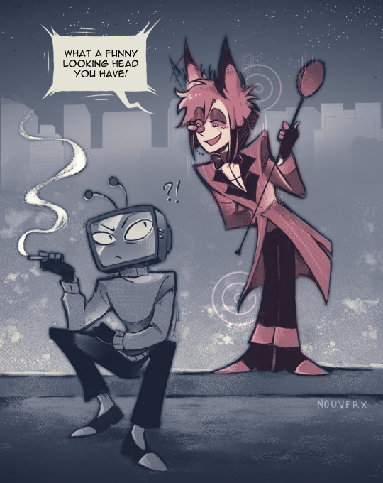
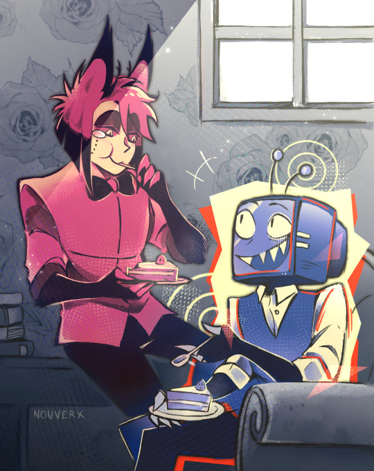
Day 1 and Day 2 of RadioStatic Week
First Meeting and Sharing a meal! I like the idea that Alastor is the one who approached Vox first because of how unique he looks eheh
#hazbin hotel#radiostatic#hazbin vox#hazbin alastor#radiostatic week#radiostaticweek#radiostatic week 2024#my art#clip studio paint#csp#digital art#hazbin hotel fanart#mostly using this challenge to test out workflows and tools on csp#I tried a different style with more textures! csp has so many more interesting brushes than autodesk sketchbook#I just had to have a little fun with it#that one post that said Vox was probably the first TV that Alastor ever saw was what inspired the first drawing#all the drawings of radiostatic week will be linked together you'll see with how the colors and shape evolve over time!#I'm really proud of this series of drawing I really tried to put some emotional intentions in the color and shape choices#tho I'll be exausted by the end of the week lolol
2K notes
·
View notes
Text

🍊...
Artfight attack for ~sealhazard!!
#I FINALLY FINISHED YEAAAAHHH YEAAAHHH LET'S GOOOO#I'M SO PROUD OF THIS I LOVE RENDERING LITTLE DETAILS AND I LOVE ADDING TEXTURED I'M SO HAPPYYYYY#RYKER ILY MWA#🖌️— My art#811#811 ryker#8:11 game#8:11#(☆) 。.゚— Ryker Dublin
495 notes
·
View notes
Text

This is one of my favorite pieces in my portfolio. It was a rendered halfbody commission for a user on Flight Rising. It didn't do well on my other platforms because of how busy and bright it is, but maybe it'll do better here.
#please#there were so many markings and textures I had to draw for this piece#it was really a test of my artistic abilities and I'm proud that I was able to finish the piece#my art#flight rising#flight rising art#obelisk dragon#stardew valley#stardew fanart#stardrop#fruit#junimo#eyestrain#tw: eyestrain#bright colors#rainbow
911 notes
·
View notes
Text
councilor 3D model
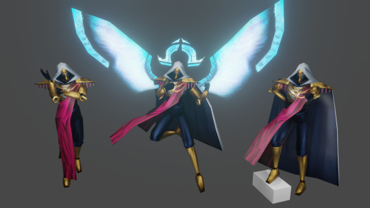
i learnt 3d modelling from the ground up to bring him to life. he's yours now. do whatever you want with him
[link]
please credit me if you make something using the model (or even ping/link me to it, i would love to see what you made!)
currently available as a .blend, .fbx and an SFM port.
#hello councilnation i'm finally releasing him to the wild#have fun playing toys with him#ultrakill#councilor#councilor ultrakill#3d stuff#obviously with the councilor having just 1 full body image of him means that some stuff i had to improvise on#so you get to enjoy my headcanons on how he looks#(like obviously the wings & halo)#(but also the chestplate design)#but did you know that the councilor's canon design has subtle engravings on his forearm armor pieces?#i only barely noticed them when painting textures and i was floored#i had to add them#to the sfm anon and whoever else wants to use this for sfm stuff-#i did my best with a port for sfm and i'm quite proud of the result#but please be aware i have never used it before so if you find that something doesn't work as it should please please let me know!!#gonna pour my heart out in tags as always so close your eyes if you don't wanna see me being sentimental but#i'm not kidding when i say i learnt 3d modelling from the ground up for this#i have meddled with blender before but never actually came close to finishing a project#and i don't know how i did it and how i kept going#(i do know) (it was my friend encouraging me every time i showed him progress)#this was like 1 entire month in the making#but i'm so fucking proud of this and how it turned out and people's tags in my act 2 render genuinely were such a huge confidence boost#so thank you guys for liking it <3#i'm still very much thinking of doing a version with just his bloodied head#but it might take a while because i want a break and i want to play warframe
558 notes
·
View notes
Text

IM 3 DAYS LATE BUT HAPPY BIRTHDAY PORTAL 2 🎂‼️‼️
#weky draws#portal#portal 2#portal 2 anniversary#chell#glados#wheatley#I had a lot of fun making this tbh!!#It's completely sketchless and on the fly#I'm proud of the texture :]
2K notes
·
View notes
Text

bun ny bunny bu nny bunny ? @wolfertinger666
#salem#original character - salem#wolfertinger666#Hi Ryeders This Is The Dawing I Said I Would Post#dropping that act AA i'm really proud of this actually#i usually will just fill bucket or default pen to colour#but this time i used a TEXTURED MARKER B) and did it manually it was awesome !!#i've wanted to draw salem art for a while now!!!#his art is rlly inspiring to me!! i've drawn more straight up furry things rather than ke/mono/mimi things because of him :]#and experimenting more with style too :D#and also he's kinda relatable :) as a fellow fat black trans man with no top surgery who came from a heavily religious background and is..#..now living with his mom that is transphobic to the point that it is almost life-threatening#it's really great to see him here despite everything ya'know?#so i can go on too :)#Well Anyways Ryeders Thank You For Reading#I Will See You Next Time I Post Something#Which May Be Soon. Like A Week Or Two Maybe#All In MsPaint Sourry..#Okay Bye Ryeders I Love You !!#bad art tw#<- art tag goes at the end this time because NO!!! This is NOT bad#so sourry if u don't like being tagged in rando fanart
215 notes
·
View notes
Text
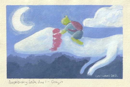
Amphibiuary is Upon Us friends! here's my entry for day 1 - a lil frog, riding an Olm dragon! this was done with gouache on some really nice paper from a local art shop! I don't do much physical painting so i'm excited to give it a try this month!!
Editing to say: this piece is now available on Inprint if you want a physical copy of your own!
#l0stw00d#amphibiuary#amphibiuary2024#olm#frog (unspecified)#gouache painting#traditional art#i did amphibiuary under aanthology last year!#if you're wondering how i'm gonna handle 29 days of serious art in a row: i'm not sure either!#but i'll take breaks or simplify things if it gets too much!#there was a bit of cleanup digitally to smooth out some texture where the paint got a bit thick and looked a lil weird flat#and the text! i was too nevous to do the text on the paper so i added it digitally lmao#i'm really proud of how this came out :)
297 notes
·
View notes
Text
sleeptober day 27 - heavens

the heavens just won't open up for me
#sleeptober#sleeptober 2024#sleep token#sleep token fanart#sleep token art#vessel#vessel sleep token#sleep token vessel#would you believe that this only took me like 30 minutes#i didn't have a ton of time to work on it but i think it turned out great!#i'm really proud of the texture#cabin's catboy cabin
54 notes
·
View notes
Text
Sending my love to everyone whose diet consists of chicken nuggets, plain hamburgers, macaroni and cheese, or spaghettio's. People who can only comfortably drink soda, sports drinks, or juice, I love you. People who need to feel their food with their hands before they can put it in their mouth, I love you. I’m so proud of you all for feeding yourselves and staying hydrated. I see you, you’re valid, and you're doing amazing.
#food#text#in this house we respect all of our siblings who have taste and texture aversions#food can be very hard sometimes#I know not everyone is willing to get it#but you and your experiences are enough#you're worth the time and the effort to get things right#every time you special order something to your tastes I am proud of you#double checking your food to make sure it's right is so important#I'm so glad you're all out there#happy eating my friends
483 notes
·
View notes
Text


it's been a tedious 2 days of redoing fornax's body scales entirely once scales+ were updated for DT; had to c/p various scales elsewhere to try and get as close as i could to their og placements, overall they're mostly the same, with a few changes or subtle additions! (i had to do a lot of cleaning up around the normals....my back hurts LOL)
but!!! i'm so happy that they've got nicer scales now........ the updated scale textures are INCREDIBLE tbh!!!!
oh also featuring a new and very important star, a beloved and expensive gorgeous birb: pretzal the quetzal :)
#fornax#femroe#au roe#if tumblr zaps me for showing off her body textures that i'm super happy and proud of then SO BE IT!!!!#proud to have figured out that i needed to grab the neck seam normals to fix that. thumbs up emoji#i knew what made up the scales that were near their knees/back of calves but i really did not want to do it LOL#(it was the hip/upper thigh scales but rotated and flipped. those are at seams. u understand how annoying that'd be to work with)#anyways bye enjoy fornax skin and a pretty bird i have no regrets buying
64 notes
·
View notes
Note
excuse me sir may i impregnate you

#représentations par le petit gardien#correspondance de savigny-sur-orge#échanges avec des anonymes#[[heavily referenced but I'm oddly proud of this.]]#[[the fact that I know exactly who asked this....]]#[[I love sketching out everything only for the texture to disappear entirely in the final product. /sar]]
60 notes
·
View notes
Text
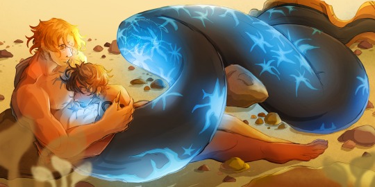


"I trust you. I like you." — a potential fic based on this (x) Detailed notes on Sabo's design below!
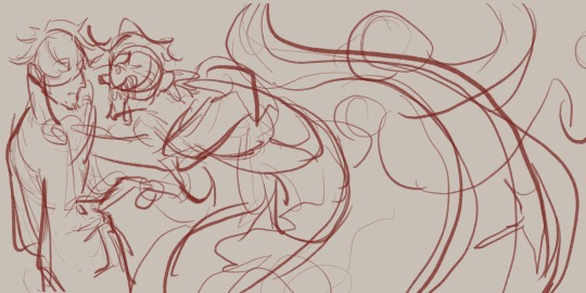
For him, I initially thought of him as a shark of all things. I say that despite not knowing how to draw sharks uh. Here it is below.

I wanted him to be a big boy and have this immense size difference with Law. He's the tallest among the ASL trio and that meant he should be the biggest merman out of the three. He's not necessarily buffer but he just has a larger frame and a longer, more muscular tail.
I also wanted him to look like a freak, a huge figure with obscenely sharp teeth. I found images on Pinterest with sharks with scars that seemed to slice through their skin and I wanted to incorporate that throughout the design. A homage to Sabo's scarred eye, if you will.
He had horns too, for some reason. I just thought it looked cool.
However, what I didn't like about this design was that it didn't read like Sabo, or at least the version of Sabo I envisioned in my head. Hence, I gave up on it. It was sort of devastating because I wanted to try something new, but we move on!
Without a clear idea for what I wanted, I spent a lot of time struggling with not just Sabo's design but with what I wanted the illustration to be overall. Later that evening, I scrolled through Pinterest (again) and found images of eels and that just clicked.
They're just the right combination of cute and just downright weird. They have that snake-like look to them, which echoed my initial shark design. On top of that, they don't look as derpy from the front as compared to sharks.
I did try again to make Sabo freaky, as shown by this sketch below. It's based on a scene from that potential fan fic, where Sabo saves Law from drowning and his inner freak shines through. I imagined a dark lighting situation where Sabo's scars are the light source. It'll be quite creepy and I'd like to manifest this vision someday!
Anyways, from here, I focused on making Sabo look cool and pretty for the illustration. I retained his human face (I am not good enough for furry art) and focused on making his tail look SUPER cool.
It's interesting to me that with this revision, I found inspiration in my initial 'failed' design. I still kept the star-shaped scars and placed them on his tail and body.
They're blue because (1) I wanted to respect Sabo's colour palette and (2) I was inspired by those ocean creatures who glow underwater. I feel that would be a good plot point like Sabo would be insecure about that because it's admittedly kinda scary but Law would think it's reassuring.
That's all I have to say about the designs. I have ideas for Ace and Luffy, but I haven't sketched them out concretely yet. I'm thinking lion fish for Ace and a cute black fish species called the Pinnate Spadefish for Luffy.
The Pinnate Spadefish has one bold red/yellow stripe and I like to think that Luffy as a merman just painted it on to look like Ace. He shifts between red and blue to imitate his Cool™ older brothers.
But yeah, that's all. I needed to yap about this, so if you read this far, thank you for reading!
#Sabolaw#revolutionary sabo#trafalgar law#happy mermay#mermay 2024#i didn't think id get to make a post for mermay of all months since it was quite hectic for me#but THE GREAT AWESOME ME HAS DONE IT YIPEE#my art#one piece fan art#id LOVE to share the full image of the colours with the noise/grainy texture with you but the file is too large haha#maybe in the future or smth#I'm super proud of the colours and I know I half-assed the lighting scenario but let me be okay haha#jacqueline's merman au
71 notes
·
View notes
Text
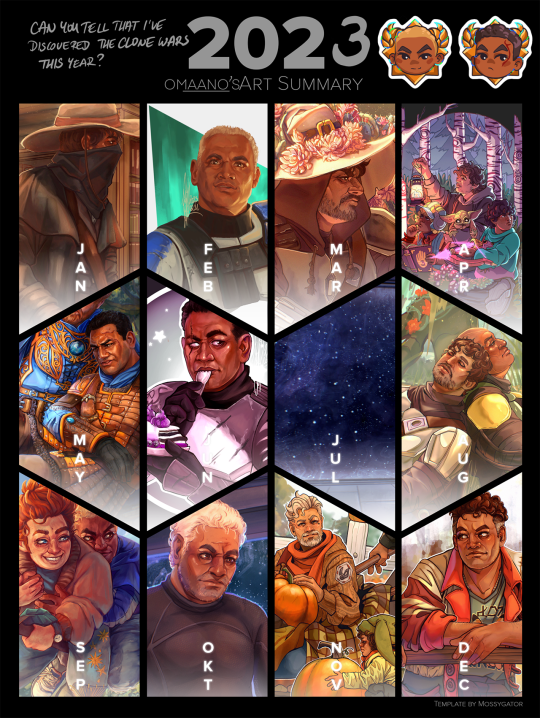
Art Summary of 2023
I kind of wish I had taken this thing to the next level and used a picture with a clone in it for March and November as well (I looked it up now, I very much could have added my Fives portrait or that first pinup-y illustration of Rex for March, and a very cute drawing of a clone OC and his dog (of whom I am promised to get partial custody, and how cool is that really?? and I am so very excited to show him off next year!!)) but it was also the year of Din in big hats as well, so I let those pieces stay :) You'll just have to take my word that there is a Rex in the July picture too.
I feel ike I have learned so much, and also have grown a lot more confident in my skills as an artist; I've learned that I love drawing backgrounds to make a "full" illustration, that intricate little details fascinate me to no end, that I can do fun things with lineart and my version of cell shading but I also miss dedicating the time to a full painting; and that harsh/stronger light reflecting off of darker skin is still something I'll have to study further next year.
Thank you everyone for your continued support in 2023! I have so many kind and enthusiastic tags screenshotted and saved for the days when I inevitably doubt what I do, it means so so much to me! I'm very grateful for the old and new friends I'd made or reconnected with this year ❤️❤️❤️ - and hello to new followers too, I hope you'll keep enjoying what I do here ❤️
✨Template source✨
#my art#art summary#2023 art summary#2023 summary of art#tcw fanart#I've spent the whole year drawing the same face and I still cannot make it truly consistent what does that say about me?#I've looked back on my annual art summaries of the past 8 years#and I am so proud of how far I have come#I'm also happy that I haven't had a repeat of 2019 where I didn't have a single thing from the first 2 months because work was hell#January has Boba and Gregor in it so that totally counts#and that Rex for March woulf have been weird because it sure as hell wouldn't be his face that I'd include in this summary LOL#it would have been the texture of his armor btw#or the scar on his chest - I really liked those details
82 notes
·
View notes
Text

oc: Angel (xe/xem) xe's cool i think..
#i love xyr design and i'm very proud of it yet i don't xem often i need to fix that#anyway xe's so pretty :) and has a shitty personality#idk what to say about the drawing.. it's all done with csp's default design pencil my beloved#i'm a big fan of its texture..#my art#oc art#digital art#oc artist#Angel
64 notes
·
View notes
Text

海浪
#my new banner!#ohhhh i'm proud of this one#tried to get some nice texture and lighting#the way the water looks.#my art#oc art#illustration
37 notes
·
View notes
Text
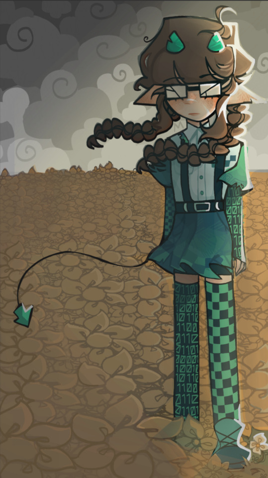
technical difficulties

my design of codeflippa and the reference image i made :D
#qsmp#qsmp codeflippa#codeflippa#qsmp fanart#in the chance my older sibling finds this and now knows i have a tumblr account. uh. hi may!! :D#this drawing is actually a bit old but i'm still very proud of it :)#i didn't really have an idea except that i wanted codeflippa to just stand in a windy flower field#now details!!#codeflippa's gloves and socks are meant to look like binary code and a missing texture#and the rip in her skirt is meant to vaguely resemble the internet bar thingy. this → ii|[#qsmp juanaflippa#juanaflippa#digital art#moral's murals#i'm pretty sure the binary code is meant to read 'hello' but i'm not that sure#← its been a bit since i drew this#oh!! i almost forgot to mention her tail point is meant to look like a computer cursor!!
42 notes
·
View notes