#id LOVE to share the full image of the colours with the noise/grainy texture with you but the file is too large haha
Explore tagged Tumblr posts
Text


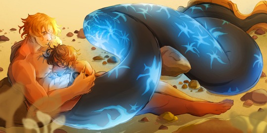
"I trust you. I like you." — a potential fic based on this (x) Detailed notes on Sabo's design below!
For him, I initially thought of him as a shark of all things. I say that despite not knowing how to draw sharks uh. Here it is below.

I wanted him to be a big boy and have this immense size difference with Law. He's the tallest among the ASL trio and that meant he should be the biggest merman out of the three. He's not necessarily buffer but he just has a larger frame and a longer, more muscular tail.
I also wanted him to look like a freak, a huge figure with obscenely sharp teeth. I found images on Pinterest with sharks with scars that seemed to slice through their skin and I wanted to incorporate that throughout the design. A homage to Sabo's scarred eye, if you will.
He had horns too, for some reason. I just thought it looked cool.
However, what I didn't like about this design was that it didn't read like Sabo, or at least the version of Sabo I envisioned in my head. Hence, I gave up on it. It was sort of devastating because I wanted to try something new, but we move on!
Without a clear idea for what I wanted, I spent a lot of time struggling with not just Sabo's design but with what I wanted the illustration to be overall. Later that evening, I scrolled through Pinterest (again) and found images of eels and that just clicked.
They're just the right combination of cute and just downright weird. They have that snake-like look to them, which echoed my initial shark design. On top of that, they don't look as derpy from the front as compared to sharks.
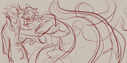
I did try again to make Sabo freaky, as shown by this sketch below. It's based on a scene from that potential fan fic, where Sabo saves Law from drowning and his inner freak shines through. I imagined a dark lighting situation where Sabo's scars are the light source. It'll be quite creepy and I'd like to manifest this vision someday!

Anyways, from here, I focused on making Sabo look cool and pretty for the illustration. I retained his human face (I am not good enough for furry art) and focused on making his tail look SUPER cool.
It's interesting to me that with this revision, I found inspiration in my initial 'failed' design. I still kept the star-shaped scars and placed them on his tail and body.
They're blue because (1) I wanted to respect Sabo's colour palette and (2) I was inspired by those ocean creatures who glow underwater. I feel that would be a good plot point like Sabo would be insecure about that because it's admittedly kinda scary but Law would think it's reassuring.
That's all I have to say about the designs. I have ideas for Ace and Luffy, but I haven't sketched them out concretely yet. I'm thinking lion fish for Ace and a cute black fish species called the Pinnate Spadefish for Luffy.
The Pinnate Spadefish has one bold red/yellow stripe and I like to think that Luffy as a merman just painted it on to look like Ace. He shifts between red and blue to imitate his Cool™ older brothers.
But yeah, that's all. I needed to yap about this, so if you read this far, thank you for reading!
#Sabolaw#revolutionary sabo#trafalgar law#happy mermay#mermay 2024#i didn't think id get to make a post for mermay of all months since it was quite hectic for me#but THE GREAT AWESOME ME HAS DONE IT YIPEE#my art#one piece fan art#id LOVE to share the full image of the colours with the noise/grainy texture with you but the file is too large haha#maybe in the future or smth#I'm super proud of the colours and I know I half-assed the lighting scenario but let me be okay haha#jacqueline's merman au
90 notes
·
View notes