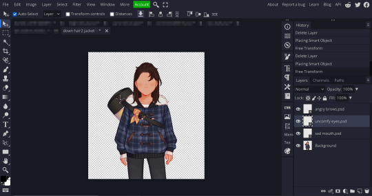
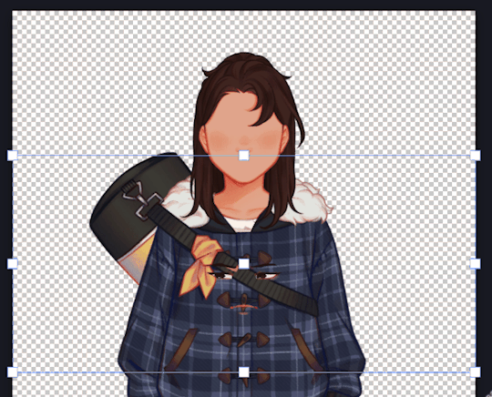
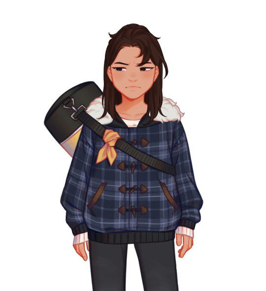
#I was deleting layers and ended up liking how these edits turned out
Explore tagged Tumblr posts
Visit Tumblr Blog
Explore Tumblr blogs with no restrictions, modern design and the best experience.
Last Seen Tumblr Blogs


Fun Fact
Tumblr has been banned in Indonesia for providing people with access to pornographic content.
Text
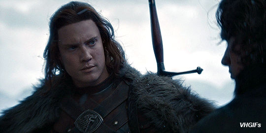
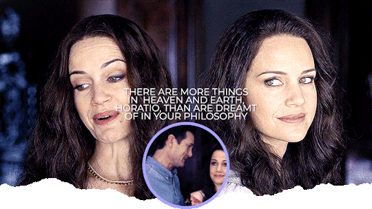
The Lord, The Lady and The Long Winter | Cregan Stark | House of the Dragon
Chapter 2/5?: The Wolf of the North
Chapter 1 | Chapter 2 | Chapter 3 - Comming soon
Cregan Stark x House Baratheon Reader
One or more parts in this story will include the following:
Warnings/ Tags: SMUT[NSFW}, smut, minors DNI, new relationship, arguments, harsh words,longing, p in v, creampie, cum play, a little rough, Cunnilingus, fingering, consensual!, hes a big man, orgasm denial, one orgasm after another 🚨SLOW BURN🚨
Summary: You’re betrothed to Cregan Stark. The pair of you navigate this relationship of convenience and perhaps even find love.
Word Count: 3,317
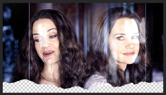
*Not my Gif
A/N RANT: I find writing easy. I just splat ideas down on the page. It’s the editing that really gets me. I spend so much time deleting and rewriting, googling synonyms because somehow I’ve managed to use the same word 4,000 times in the last twenty sentences. Agonising over the wording and then Word for some reason trying to make me spell things in american. Then the grammar actually sends me over the edge, Word telling me that there should be a comma, so I add a comma and then no that’s wrong there shouldn’t be a comma there. It actually makes me go feral. Anyway, if anyone wonders why it takes me so long to post more parts, these are some of the reasons.
Chapter 1
It had taken a little over a month for your father and your entourage to reach the castle of Winterfell. As you journeyed, the number of layers and furs you wore in the carriage increased, each piece a necessary defence against the northern chill. It was the last day of the trip, and you were thankful it had finally come to an end, eager to sleep in the same bed for more than one night in a row. You stepped up into the carriage and turned to your father, who was already seated, his expression one of calm reassurance. "Almost there," he said, his voice steady as he attempted a smile.
You averted your gaze, sitting down and looking out at the landscape that unfolded outside. A heavy blanket of snow cloaked the ground, transforming the world into a vast, seamless expanse of white. The trees stood tall and skeletal, their branches laden with frost that sparkled like diamonds in the weak and low winter sun. Occasionally, the wind howled through the barren branches, sending a shiver down your spine and creating an eerie symphony that filled the otherwise still air.
The world outside seemed lifeless, devoid of colour and warmth—how you longed for the vibrant greens and the golden hues of the south, of home. You hadn’t seen an animal for more than a week, and the silence felt oppressive, magnifying the sense of isolation that you felt. Your mind wandered to what your sisters would be doing right now, likely studying or playing in the garden with your mother watching sewing something beautiful as she always was. A lump formed in your throat as you thought about how long it would be until you saw them again. This new landscape was as much a part of your new life as your upcoming marriage; it revealed in its stark beauty but also served as a constant reminder of the challenges that lay ahead. With the shutter closed, you felt a growing knot of anxiety within you, the weight of the impending changes heavy as the snow that blanketed the ground.
At some point, you had fallen asleep, though you couldn't recall when. The anticipation of the day had kept you awake through most of the night, and the uncomfortable seat of the carriage left your body aching. But then, the resounding blast of trumpets heralding your arrival jolted you from your sleep.
“Are we here?" you asked, glancing at your father, whose expression was distant, as if lost in thought.
"Yes," he replied, turning his gaze to meet yours.
"How long do we have before meeting the Starks?" you asked, smoothing your clothes and hoping the nap hadn’t left your hair in disarray.
"Lord Stark will greet us as soon as we step out of the carriage," your father replied, straightening in his seat.
"What? Aren’t we meeting in the hall after we've freshened up?" you exclaimed, taken aback by the immediacy, realising just how soon you'd face the man who’d share your future.
"Ah, but they're Northerners," your father said with a dismissive wave, "They'd find you lovely even in rags." The carriage lurched forward, jolting you both, as your heart raced.
You thought you would have just a little more time, a chance to gather your thoughts and brace yourself for the momentous introduction. Panic rose inside you as it became clear you had mere minutes before meeting the man who would be your husband.
Your heart raced with a flurry of questions and doubts. Would he be as the tales described—harsh and unyielding as the Northern winters—or might there be warmth beneath the layers of fur and Stoic silence? The uncertainties swirled, each more daunting than the last, wrapping around your thoughts like a relentless blizzard.
You fidgeted with the edge of your cloak, trying to calm the rising tide of unease. What if your mannerisms seemed too foreign, your presence too delicate for the rugged North? At this moment, you realised your entire future might rely on one singular, daunting introduction.
You focused on your breathing, counting each inhale and exhale slowly to five, as your mother had taught you to do in moments of unease. Her voice echoed in your mind, recounting stories of Lord Cregan Stark and how he had become the embodiment of his house’s strength. At just seventeen, he had fought for power against his uncle, rallying the North to his cause and earning the legendary title of the Wolf of the North.
Now, at twenty-five, he was widely renowned as the most powerful man in the region, with whispers even calling him the King in the North. His influence stretched far, untethered by the intricacies of southern politics. In the refuge of your measured breathing, you hoped to draw some comfort from the formidable reputation of the man who would soon become your husband. Could a man so brilliant at war be kind?
The carriage came to a rest, jolting you back to the present, you looked at your father, who attempted to give you a reassuring nod as the door of the carriage swung open. He moved through it first, giving you a precious few moments to prepare yourself before he turned and extended his hand inside the carriage to help you out and down.
The cold hit you first, making you draw a sharp breath, the icy air burning your lungs. For a brief moment, you looked around and watched as snowflakes danced in the chilled air, touching gently on Winterfell's ancient stone façade. You stepped out, the snow crunching beneath your feet, you were thankful for your father's firm grasp on your hand, worried for a moment that without it, you would slip.
The northern air was sharp and invigorating, a biting chill that seemed to permeate the very fabric of everything it touched. It was the kind of cold that, if endured for too long, would nestle deep into your bones, leaving a lingering reminder of the North’s untamed power. Pulling your thick cloak more tightly around yourself, you sought its warmth and comfort, a shield against the relentless chill.
Your father stepped forward with the practiced grace of his station, turning to address the Northerners who had assembled to witness your arrival.
"Greetings House Stark, I am Lord Borros Baratheon, of the House Baratheon, Lord of Storm's End. I have come to present to you, my daughter." His voice was, steady and confident. It carried over the soft whisper of the wind, acknowledging the strength of the Northern families and the significance of the union that would soon bind Baratheon and Stark.
He turned to you and gestured for you to step forwards, and you did, curtseying to the group. Your eyes swept over the crowd of Northerners—a sea of rugged faces hardened by the winter landscape. And there he stood, amidst them, undeniably Cregan Stark. His towering form was enveloped in commanding furs, every inch the lord who embodied the unforgiving north. He looked younger than you thought he would, hearing stories of how the north aged you beyond your years made you worried about what you would be confronted with up getting here.
Cregan stepped forward with an elegant grace, offering a formal bow. Yet, the warmth in his eyes spoke an unspoken promise of understanding and curiosity.
"Welcome to Winterfell," his voice resonated, deep and steady, his accent thick.
Your father and Cregan began discussing the plans for the coming days, their voices a steady hum amidst the towering stone walls of Winterfell. You followed closely behind them, the chill of the Northern air slowly giving way to the warmth of the hall, its fires crackling and casting flickering shadows that danced across the ancient stone.
Eventually, you found your place on a chair, one of many surrounding a small table strewn with maps and parchments that detailed the intricacies of alliances and strategies. The gathering of lords settled into their respective seats, enveloping the table in a sense of purpose and gravitas. Your father leaned forward, engaged in discussions about the expectations of this union, emphasising duty and honour—the very fabric of noble life.
As they spoke, a few lords occasionally cast friendly glances in your direction, but you could sense the unspoken rules that governed the conversation. This was not the sort of assembly where women were expected to voice their thoughts; instead, you listened intently, absorbing the dialogue around you. It was both fascinating and daunting, a whirlwind of responsibilities that felt far removed from the warmth of family gatherings you had known.
You were taken aback that they allowed you to sit at the table at all, a privilege that your father would never have granted you in the South. Perhaps the customs were different in the North, a notion that intrigued and unsettled you. As your gaze wandered around the assembly, it landed on one woman at the table—until that moment, you hadn't realised she was among them.
Dressed in masculine attire, she seemed to blend right in with the lords surrounding her, sitting tall and confident as they addressed her with the same respect reserved for their male counterparts. It was a striking sight, one that momentarily pulled you from your anxious thoughts about the future.
Then, the unexpected happened; she caught your eye and offered a warm smile that brightened her otherwise stern countenance. Heat rose to your cheeks as you realised you had been staring. Quickly, you turned your attention back to Cregan, the man you were to marry, feeling the weight of the room around you as you grappled with the complexities of your new reality.
Cregan Stark was a striking figure to behold, towering head and shoulders above your father, making it instantly clear why others held him in such high esteem. His presence conveyed more than mere physical stature; as soon as he began to speak, his demeanour and the way he carried himself revealed the essence of a man of honour. Unlike the tall men of the South, who seemed like a gust of wind might send them hurtling over the battlements into the sea, Cregan's stature was built broad and firm.
The cloak draped over his shoulders only added to his impressive build, yet you could tell at a glance that this was a physique forged through hard work and rigorous training, not by indulgence in luxuries. Every movement hinted at discipline and strength, an embodiment of the Northern spirit you had heard so much about.
Your eyes focused intently on his face as he spoke, captivated by the way his shoulder-length brown hair framed his features, catching the light to highlight the rugged lines that undeniably spoke of his Northern lineage. Cregan had a strong jaw, lending a chiseled quality to his visage that perfectly complemented the air of unyielding determination he exuded.
But it was his piercing blue eyes that truly drew you in—striking and deep, they seemed to hold an entire world within them. In contrast to the often stark demeanour he carried, those eyes contained an unexpected warmth, like a flickering flame against the cold backdrop of winter. There was a kindness in their depths, a silent promise that perhaps beneath the fierce exterior lay a man capable of tenderness and understanding. With every glance, you felt the pull of his gaze, an invitation to see beyond the bravado and discover the complexities that made him who he was.
He turned and met your eye, and it took you a second to realise that he had asked you a question, you looked around the room at the lords. All poised to listen to your response. You looked to your father for guidance.
"You'll have to excuse my daughter, the journey north has been long. However, I do think that she has enough strength left to accept your suggestion of a tour of Winterfell." he smiled at Lord Stark, who looked from you to your father, an understanding smile playing on his lips as he worked out you hadn't been paying attention.
He didn’t say anything, didn’t expose your lapse in concentration, just stood and shook your father's hand. You stood too as all the other lords stood and moved towards the door. You watched as they filtered out of the room, your father and Cregan being the only two aside from yourself still left in the room.
"Well, I would say that no chaperone is required, it is said that no one in the realms have as much honour as the Starks." your father said, resting his hand on the hilt of his sword as he looked between the two of you.
He nodded and gave you a small smile and turned to leave the room, the guards at the door opening and closing the door. You felt the resounding boom of the door closing in your chest as it seemed to echo around the entire room. The room seemed smaller as you looked from the door to Lord Stark, he looked so much more intimidating now it was only you in the room.
"My Lady, what part of Winterfell would you like to see first?" he asked stepping towards you.
"I- I don’t know." you whispered, finding it too difficult to look him in the eye.
"May I?" he asked, gesturing to your cloak which you had removed and placed on the back of your chair.
You nodded, he carefully picked it up and placed it over your shoulders, you moved your hands to do up the buckle that would secure it to your body and turned to Lord Stark. The massive sword slung across his back caught your attention, its hilt visible above his shoulder—a symbol of the strength and legends whispered in the halls of your childhood home. It seemed a natural extension of him—an embodiment of Cregan Stark, the warrior and the lord.
He smiled down at you, warmth and friendliness lighting up his features. With a gentle tilt of his eyebrow, he extended his elbow towards you, inviting you to take it.
"Well, I shall show you my favourite parts of the castle, and then we'll join your father and the other lords for a late tea," he said, his deep voice smooth and rich, like honey.
You nodded, not trusting yourself to speak, as you took his hand and allowed him to guide you out of the room. Agreeing to marry someone you had never met was undoubtedly a gamble, fraught with uncertainties. Yet, with this match, a sense of hopefulness stirred within you—a feeling as if you had struck gold in a world tarnished by rusted steel.
Your thoughts drifted back to the moment you first learned of your betrothal. That night, your mother had remained by your side, holding you close as you cried, part of you mourning your childhood and the other terrified of the future. She assured you that everything would be alright, words you initially dismissed as just the comforting words you say to someone when they're crying.
But now, with time and distance, you started to see that moment in a different light. There was a certainty in her voice that had been unwavering, and it made you wonder if she had played a part in your match with Lord Stark. Her confidence lingered in your mind, suggesting that perhaps this match carried more promise than you dared to imagine in those initial, tear-filled moments.
Winterfell was a beautiful castle, said to be one of the oldest still standing. As Cregan showed you around, you noticed something different in the way he spoke. Unlike most men, who seemed more interested in proving themselves smarter than you by belittling or over-explaining, Lord Stark had a unique approach.
His way of speaking about the castle and its history felt more like listening to a passionate teacher than a rehearsed lecture. He engaged you with stories, making each tale and detail come alive, and you couldn't help but feel a sense of respect and curiosity grow within you. It was refreshing and made you appreciate not only Winterfell, but also the man guiding you through its storied halls.
He had suggested that the two of you look out over the battlements before retiring to the great hall for something to eat. The climb up to the battlements was more challenging than you had anticipated. The stairs were far narrower than any you had navigated at Storm's End, making you marvel at how men clad in armour could swiftly manoeuvre them during times of war. Yet, as you reached the top, the sight that greeted you was nothing short of breathtaking—a vast, snowy landscape stretching as far as the eye could see. There was a vast expanse of forest in the distance, but even that was coated in snow.
Your home back in Storm's End prided itself on its massive walls for protection against invaders. However, here at Winterfell, the tall walls paired with its isolated, formidable position in the North presented a different kind of strength. The harsh, unforgiving landscape surrounding Winterfell seemed an ally to its defenders, an icy gauntlet capable of claiming the lives of unprepared southern soldiers long before they could even reach the walls. The beauty and latent power of the scene sent a shiver through you, a reminder of the resilience required to thrive in this raw and rugged part of the world.
"There is a small moat hidden by the snow at the bottom of the wall," Cregan began, his gaze shifting to you with a knowing glint in his eyes, as if he was sharing a secret of the North only a few were privy to. "If aren't aware of it and attempt to climb the wall, you sink into snow taller than a man."
You withdrew your hand from the warmth of your fur muff, moving to grasp the metal handle fixed to the wall, hoping to steady yourself for a better view over the battlements. The chill of the metal immediately shot through your fingers, contrasting sharply with the cozy warmth of the muff.
"Agh," you gasped, yanking your hand away from the frigid metal.
Before you could even check for injury, Cregan Stark's gloved hand enveloped yours with a surprising gentleness. He looked down at your hand, his thumb softly brushing across your palm, sending a tingle through your skin. "Careful, My Lady," he murmured, his voice carrying a deep, soothing timbre. "Warm hands stick to cold metal. You could lose some skin if you're not careful."
You grimaced at the thought and glanced back at the metal, reassuring yourself that none of your skin lingered there. "It burns,” you whispered, eyes dropping to the red mark on your palm.
Cregan's gaze met yours, holding a mix of concern and something unspoken. He raised his hand to his mouth, biting the finger of his glove and pulling it off, his breath misting in the cold air. He placed his large, now bare hand over yours, its warmth seeping through your skin, soothing the sting of the cold. His touch seemed to linger longer than necessary, then he removed his hand from yours and pulled the glove from his mouth.
"Careful my Lady, the cold burns sometimes more than fire." He remarked, eyes locked on yours, before slipping his hand back into the glove with deliberate care. "We ought to get you some gloves." His voice carried both practicality and an undercurrent of tenderness that surprised you.
He offered his arm once more, and this time, as you looped your arm around his, the touch felt more intimate, more charged. You tucked your hand back into your fur muff, your hand still feeling the ghost of his.
A Link to My Complete Inventory
#cregan stark x reader#cregan stark x you#cregan stark#hotd#hotd fanfic#Lord stark#hotd cregan#fanfic#slow burn#i wrote this for me#winterfell#cregan fanfiction#cregan smut#house baratheon
134 notes
·
View notes
Text
How to position facial features for the Our Life sprites
Idk how many people need this tutorial (especially since I kinda sat on it for like a month...whoops) but I noticed people were starting to make more sprite edits and videos using the in-game sprites and I thought having this tutorial might help for those of you who don't know exactly how to place the expression layers for the sprite.
Part 1: What am I talking about?
Ok so some of you may be reading the post title and thinking "what the hell does that mean?". For those who are unaware, if you decompile OL1 and OL2, you can find the sprites used for the characters in the game. These files are generally in character folders that contain all the bits for each sprite as well as several versions of the sprite itself in different outfits. All these base sprites files look a little like this
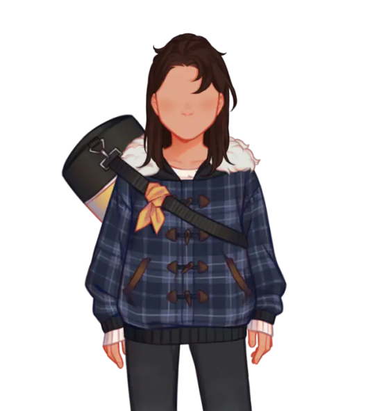
You may have noticed the glaringly obvious detail that Qiu here is missing most of their face. That's because there are several seperate images used for their eyebrows, eyes and mouth. The reason they're all seperated like this is to give more creative freedom over expressions than what would be allowed if there were just already a set number of sprites with set expressions
However, if you want to make a spite edit video, that means you have to piece all the expression layers over the sprite and, since the expression layers don't have the same canvas size as the sprite, you have to actually place them on the face yourself. This can lead to stuff like this.
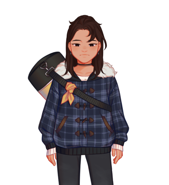
If you're looking at this and thinking it doesn't look quite right, you're correct. This is the issue you're noticing
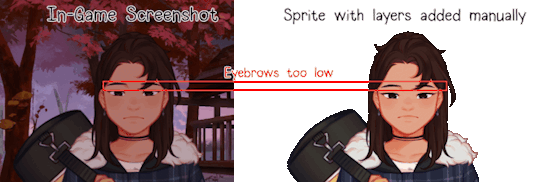
This is generally what happens when you try placing expression layers by eye, you end up sort of assuming you've got the right spot when you're actually slightly wrong. And this is gif just shows the facial features in the wrong spot vertically
So, I've explained the problem, now how do you fix it? It's simple actually.
Part 2: The actual tutorial part
What you'll need:
The sprites and expression layers you need (this tutorial assumes you already have the game decompiled. If you don't and have no idea how to do so, here's a tutorial for just that)
An editing software that has a tranform tool such as Photopea, Photoshop, GIMP, etc.
Step 1: Open up the sprite you want to use in your image editing software of choice and import in all the expression layers you want to use
Step 2: Open up the transform tool on your editing software. Where this is may vary, on Photopea and Photoshop you can open up either through the shortcut alt+control+t or clicking on edit in the top bar and selecting Free Transform from the menu. If you don't know where the transform tool is in your software, I'd suggest looking it up

(A showcase of where the tranform tool is in Photopea and Photoshop)

(What the transform box should look like
Step 2.5 (This might be photopea specific, idk if other software does this): If your transformation tool box looks like this, cancel out of the tool (using the little x button on the top bar) and then open the transformation tool back up again. Make sure you're not selecting multiple layers and also make sure you didn't open the tool with the transformation controls tick box from the top bar. If none of that works, just delete the layer and grab it from your folder again and try again
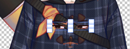
Step 3: With the transform tool still open on your desired layer, move the layer so that it snaps against the corner of your canvas. Your image editing software should automatically have layer snapping enabled but, if not, I suggest looking up how to turn it on. If it doesn't have this, the best suggestion I have would just be to make sure the corner of the transform tool's box and the corner of the canvas allign. Zoom in if need be. You then repeat this process for the other expression layers (and any other layers that aren't automatically allighned like the blush layers or the tear layers)
(Notice the red lines that show up when it snaps against the corner)
Step 4: Export your sprite file because that's it, you did it! Now you have a sprite with the layers placed in the right spots! Isn't that great!
...(maybe I should've chosed a happier expression for this...)
Anyways, I hope this helps!
63 notes
·
View notes
Note
hey, can i please ask what dimensions you use to make your header gif? (I THINK you used to have that thing where you have a little circle gif inside the header as well. If you don't mind sharing how to do that I would appreciate it! If you didn't, please disregard haha)
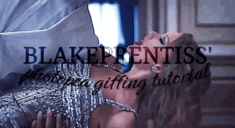
hiiii!! sorry this took me so long lmao but yes! this was my header for a while and i basically had the circle gif act as my icon (so i just hid my icon under edit appearance) so i'll walk you through how to make it!
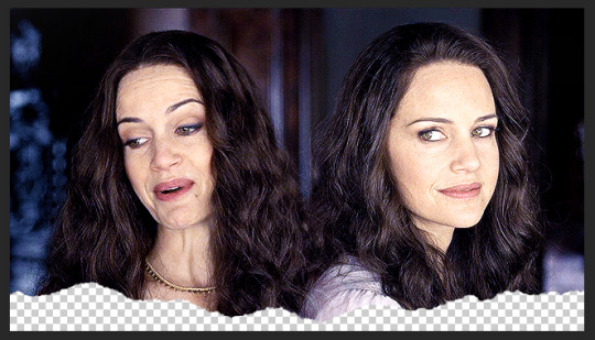
ultimately, the header contains 3 separate gifs: liv on the left, liv on the right, and hugh and liv in the circle. i find it easiest to make the gifs all separately first and then bring them all together on what will become the header's canvas,.
i crop, sharpen, color, and then convert each of the 3 gifs into a smart object and plop them onto the header canvas. the dimensions of this one are 640x360 but i believe the header dimensions have changed and are now 580x326 (that's what my current one is) but idk i never had an issue using the larger dimensions so you can try both out and see what you like best!
the original dimensions for the 3 gifs themselves were: 640x360 for the two large gifs and 368x184 for the circle. the circle gif doesn't matter quite as much, just make sure it's at least a few pixels larger than the circle you create when you get to that step!
so once all 3 gifs are turned into smart objects (if you don't know how to do this, when you're in timeline, highlight all your layers and right-click -> convert to smart object. this just makes the whole gif into one layer and they're easier to work with and adjust as necessary.
when i'm blending gifs together, i like to set the background/first layer of the gif to black. it helps when you're blending and your layer masks get really close together and instead of going to a transparent background, it goes to black and i think it gives it a cleaner look. this really is just personal preference and completely optional though!!
anyway, i brought over the two main liv gifs first and played around with where i wanted each one. this is what i have once i figure out the positioning and set both layers to screen.
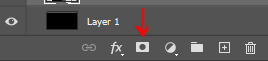
then you want to add a layer mask to each gif. select each layer separately and press this lil guy at the bottom off your layers panel:
when i'm blending, i pretty much exclusively use a soft round brush. size depends on what i'm blending and the dimensions, but hardness is always set to 0%. on a layer mask, you're going to use either black or white. black removes parts of the gif, white will bring them back. it's a very low-stakes way of getting rid of areas you don't want while not having to worry about deleting too much.
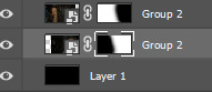
once i'm happy with the blending, this is what my layers ended up looking like (with the black layer beneath), but this will vary depending on your gifs and positioning!
the next step is the ripped paper effect at the bottom (if that's the vibe you're going for). you could theoretically do this with any kind of brush. i just like the look of it so it's not such a harsh transition on my mobile theme from the header to the background color.
these are the brushes i use but i'm sure you can google something to the effect of "ripped/torn paper brush photoshop" and find plenty others.
go ahead and group both of your gifs, your base layer, and any other coloring layers if you didn't color them before transferring them to this canvas. to do this, select all applicable layers and press ctrl+g or right-click -> group from layers.
now select the group and add a layer mask the same way we did with the gifs using the little icon at the bottom of your layers panel. your layers should look like this now:

once your brushes are loaded into photoshop, open up the brush tool by pressing 'b' and select the brush you want to use. i usually try a few different ones out just to see the different edges. you may have to adjust the brush size and make sure the hardness is set to 100% if applicable. before using the brush, make sure the layer mask itself is selected like in the above screenshot and your color is set to black.
when you hover over the canvas with your selected brush, you'll be able to see where the top edge will rest. i keep mine pretty close to the bottom -- i think the highest up this particular one goes is about 50px from the bottom. you should end up with this:
onto the circle/icon!! i truly just ended up eyeballing this size-wise. go ahead and call up the ellipse shape tool. to do this, right click on the shape tool and select ellipse like so:
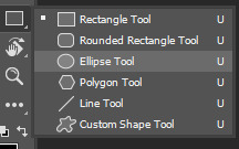
colors are totally up to you, but i like my shit color-coordinated so i believe i color picked the bottom circle (the outline) from liv's purple dress in the right gif. once you have the ellipse shape tool equipped, click anywhere on your canvas. the dimensions i used were 150x150 but of course feel free to experiment. for a perfect circle, both numbers do need to be the same.
using ctrl+t (the transform tool) drag the circle to the vertical center of your gif and right to the very bottom so it's hanging over into the transparent part. this is what will make it look like your actual icon on your mobile theme.
next, create another circle. i'd recommend using black for this one, but it really doesn't matter. the dimensions for this one are 140x140 (10px less than your outline circle), but again, this will vary depending on the outline dimensions. i liked the thickness of a 10px difference, but you can always increase or decrease that depending on your preference. this circle is going to be the base for your icon gif.
again, use ctrl+t to vertically center your circle and bring it all the way to the bottom just like you did with the outline circle. as long as they're placed/snapped to the exact same location, you'll have a perfectly consistent outline.
go ahead and bring over your icon gif, already sharpened, colored, and converted to a smart object. make sure this layer is directly above your black circle. on your gif layer, right-click -> create clipping mask. ctrl+t to move it to the same location as the circles and adjust it to your liking.
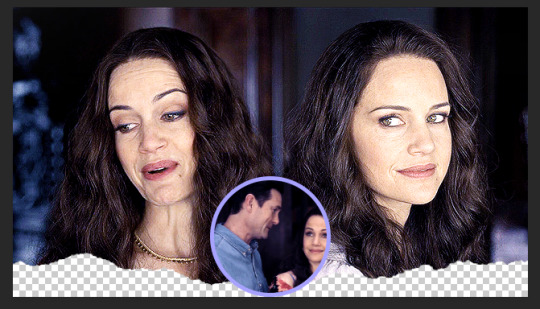
of course, it's completely up to you if you want to add text or overlays or not, but i figured i'd share what i did in case you're curious! (click to enlarge)
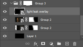
and for the overlay, i just grabbed a video off youtube of different light leaks. i only wanted it to be on the two main gifs and not the icon gif, so i plopped it into that group we made and put it at the top, over everything else, and set it to screen like so:
and that's pretty much it! if you have any questions about the tutorial (or anything else) just let me know!! i'm more than happy to help 🥰
#answered#gracegordongreene#my tutorials#gif tutorial#gifmakerresource#chaoticresources#completeresources#dailyresources
81 notes
·
View notes
Note
hii, sorry if you've answered this before but what do you use to make your edits ? your stuff is so cool it's inspiring me to try it out for myself hdkghdkgj,,

oh my gosh tysm 🥺 i really appreciate this but ill just get straight into the list! underlined = link , highlighted is website names
sorry for the long post i ended up yapping.. tldr photopea, ezgif, lunapic, alphabetiser, nameberry, magic baby names, baby centre, sekaipedia, pinterest, tumblr, . also at the bottom is a tutorial on making stamps & some templates
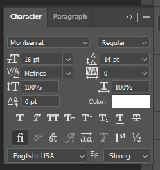
for basic editing i use photopea - https://www.photopea.com/ , if its too confusing you can also try ibis paint but its too confusing for me. i click "new project" and then use the dimensions i need ( tumblr banner = 1280x720 , twt banner = 1500x500 ). i can also make basic photopea functions tutorial if you need it bc a lot of people find it difficult to navigate. i dont have any specific favourite layer blends but i recommend light colours -> use the section under "lighten" , dark colours -> use the section under "darken" , blacks and whites -> use the section under "difference". of course once ur more comfortable u can just do whatver layer blends u want ^ ^
for gif editing / merging (layouts, pixels, blinkies) i use photopea's layer -> animation -> merge settings, however if that doesn't work i use ezgif - https://ezgif.com/ , specifically the gif maker.
for adding animations to stamps, i use lunapic's animations tab - https://www6.lunapic.com/editor/?action=animation-examples . i also used to use this website a lot for old layouts before i knew how to use photopea. below i highlighted my fav settings (3x for sizing)

for npts i use alphabetizer - https://alphabetizer.flap.tv/ to organise name lists. if you use this make sure to turn ON "ignore case" in the side menu!! it sorts capital letters as normal, and then i delete the capital letters later when formatting a post. for names i use websites like nameberry, magic baby names, and baby center. not sure how to explain it but i just get a feeling that a name suits a character ^ ^. as an example in all of these i used "orchid". for titles and pronouns i just use my imagination based off the character's wiki page.

for resources: i find proseka transparents online at sekaipedia - https://www.sekaipedia.org/wiki/Characters , or at @prosekaipng or @sekaitransparents . i find frames and pngs on pinterest or tumblr, and use unscreen to remove the background of gifs and remove.bg to remove the background of any image i cant be bothered manually removing. when i need to do touch-ups myself i use photopea
i find colour matches for layouts on pinterest, and then edit the shit out of them until it looks close enough to a colour palette (example below of some colour editing i've done recently). most of the things i do are extreme changes but i started off by making subtle changes in my old layout posts on lunapic, which i still sometimes do today like in the last example from a post currently sitting in my drafts i havent finished. ( ̄  ̄|| )
(this is how i found out my emu photopea file didnt save btw so excuse the missing elements ...)


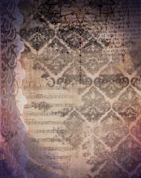
for overlays, btw i use A LOT OF THESE, and also lots of custom PSDs. a psd is basically a colouring file you overlay on top of something, and are similiar to smart filters. in photopea you can click "image -> adjustments -> (whatever)" and apply that to one singular image, and these are called smart filters because you can transfer them to other images by individually dragging them. OR you can click "layer -> new adjustment layer -> (whatever" and this is a PSD because it automatically applies to all images. in photoshop, there are no "smart filters" iirc. i use a combo of smart filters & psds & overlays. i find overlays sometimes on pinterest, but mainly on tumblr. my favs below. use layer blends on these!!

for stamps i use templates in photopea using a raster mask. you can find templates on tumblr and deviantart, majority of tumblr dumps are from deviantart, so i focus on using deviantart myself and finding original stamp works on tumblr rather than reposts. some accounts i recommend are caterpillar-with-a-crayon and dixons-graveyard. remember to credit artists!!
to do this, first open a template in photopea using either " file -> open " or " open from computer " . next select the magic wand and select the inside of the stamp. next open a new layer using the blank page (second from the right, bottom right, next to the trash can below the layers) and use the brush tool to colour in the selection from earlier. it may look like an eraser, or any other icons shown in the menu. right click and select the brush tool, then hold down to colour it in. you should have something now looking like the fourth slide, with a stamp template on one layer and the colour on a layer above it.
to make the raster mask, de-select the colour by clicking anywhere in the dark grey surrounding the canvas. while on the colour layer, select "layer" (fourth from the left, next to "image" and "select, menu in the top left), then select "raster mask" -> "from transparency" . your coloured layer will then split into the colour surrounded by black, and a white version of the colour. both connected with a chain.


now, create a folder above your stamp template by clicking the button shaped like a file (bottom right menu, 3rd from the right, between a sheet of paper and a circle cut in half). now, click on the RIGHT split from the layer (the white colouring) and drag it onto the folder. it should stick there. now, anything you put inside that folder will fit the stamp inside! remember to turn OFF the red layer by click the eyes next to the layer. this wont affect your raster mask. i used an image and the text tool.
you can also do more complex things involving stamps but this is a basic tutorial ^ ^.


16 notes
·
View notes
Text
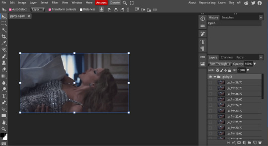
lovely anons have been requesting a gif tutorial, and while there's plenty photoshop ones out there I think there's only a couple photopea ones (if you dont know photo pea is like an internet photoshop basically) so I thought I'd make a little tutorial on how I do my gifs!
first you're gonna want to use any gif making platform to actually turn your video clip into a gif. I personally use giphy but I know there's a bunch of other platforms for this. then you're just going to open the gif in photo pea either by clicking "open from computer" on the home page or dragging it in from finder (Mac) or files.
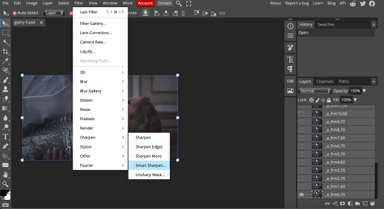
IF YOU'RE MAKING A GIFSET: the first thing I do is make sure all of my gifs are the same number of frames. its important to do this if you want all of your gifs to restart at the same time! to do this I just go to the side where all the frames are listed - this one has 29 frames (note: it says 28 on the top frame, but the very first frame is listed as 0, so always add 1 to the top number to know now many frames there are). what I do is find the gif with the least amount of frames and then make all the gifs the same number - depending on what part of the gif I want to keep/delete I'll delete frames from the beginning, end, or both which usually requires some basic math
next, I click on the top frame, press shift, and then press on the bottom frame to select all (unfortunately there's no keyboard shortcut for this I don't think). then I'll click filter -> sharpen -> smart sharpen that way I can freely customize the sharpness of each gif depending on it's original quality. usually I do 200% at 0.5 pixels but I'll adjust if necessary.
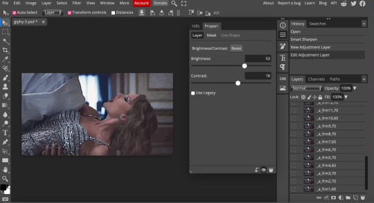
now comes the actual coloring of the gif! all of these will be adjustment layers (layer -> new adjustment layer).
first I'll select the brightness/contrast layer and play around with those settings until it looks good to me.
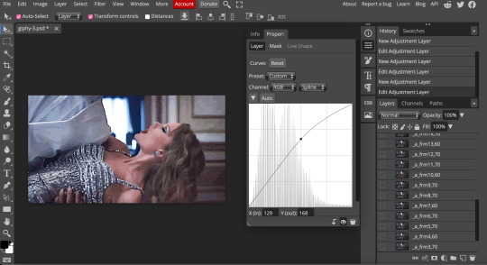
next, I'll play around with the levels and curves layers until it looks how I want it.

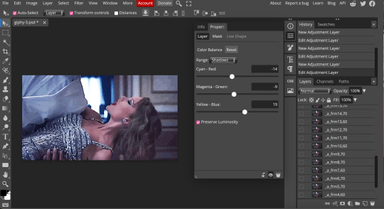
sometimes I'll stop here if it looks good, sometimes I'll play around with the saturation adjustment layer, or in this case I'll edit the color balance to deepen some of the shades that aren't popping out how I want.
IF YOU'RE MAKING A GIFSET: the easiest thing I've figured out for coloring multiple gifs to save time is duplicating these adjustment layers to each gif in the set (layer -> duplicate layer into; it'll prompt you to select the psd you want to add the layers to). when I do this I turn off the visibility for each one and one by one turn them back on (starting with brightness/contrast) and adjust them if necessary.
if I'm not adding text this is where I'll end, but sometimes I like to add texts to more of my creative gifts. usually I'll follow a tutorial (@usergif resource directory has a bunch of good tutorials that can be adapted to photo pea, or I'll just look them up on Tumblr itself). sometimes I like to do things a little simpler, which is what I'll show here.
you're going to click on the T towards the bottom on the left sidebar, type put your text, change your font (photopea has a ton and I'm not too picky but you can download fonts from the internet and upload them), as well as color and size (don't forget to select all of the text when you do this!!) then click on the cursor icon to move the text to your desired placement.
then click on the layer in the right sidebar and select blending options.
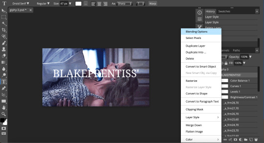
I'm going to add a stroke of 1px in black to my text and position it to the center. I do this on every text I add to gifs (even if the text is black, which I ended up changing this one to) to add some extra size/detail.
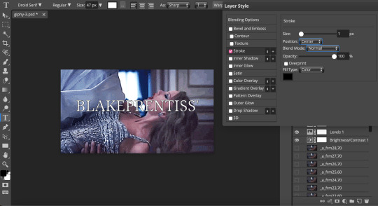
you're more than happy to stop here, but I like to play around with some of the other blending options until I'm satisfied. sometimes I'll lower the fill to 0-30%, or in this case, I changed the blending option to overlay to get the desired effect. (both under blending options)
I followed the same steps with my second row of text, except I changed the font and then warped the text a bit after placing it where I wanted by T -> warp -> arch and changing the settings.

and you're done! file -> export as -> gif to save it! I also like to do this periodically throughout the process to make sure the gif is giffing if you know what I mean

#gif tutorial#photopeablr#photopea#photopea gif tutorial#mine*#tutorial*#tutorial#gif making tutorial#gif making
35 notes
·
View notes
Note
request where Benny Weir saves the reader from getting kidnapped drowning choking an earthquake snowstorm/blizzard flash flood/thunderstorm a fire and smoke inhalation
A/N: absolutely love this idea, it sounds really cute. just ugh :)) i think i’ll do the snowstorm idea because well you’ll see :) xx since i never stick with an idea without backtracking and editing it, please for the love of god tell me so i’m able to correct it because i do not like looking back at my writing because i end up deleting it haha x this is longer than i was expecting it to be but can you blame me? Benny is so cute ugh.
The Storm in my Heart Rages On.
cw: this is a friends to lovers, pretty fluffy, and it’s just really cutesy i guess.
As it was Canada and pretty much always snowy, and it became even worse over the December and early January months. It had been snowing for around 4-5 days straight, in sub zero temperatures and we were still expected to go into school..great. It wasn’t all bad though, it was fun to make snow angles and have snowball fights with my friends, them being Ethan, Erica, Sarah, Rory, and Benny.
It was a particularly colder morning than the others in Whitechapel, and as soon as my brain registered I was actually awake, I felt the cold air in my room wrap it’s icy arms around me and not let go until I was sat downstairs with 4 layers of clothes on, in front of the fire place with (hot drink of choice) cradled snuggly between my fingers and the heater on full blast, trying to thaw out my body.
After I had thrown my final layer on, I stepped out the door and instantly felt the snow fall on my face and freezing winds caress my body, even through the layers. After walking alone for a few minutes, teeth chattering from the cold and bobbing my head along with the music I was listening to, I heard a faint but familiar chorus of voices and laughter that I quickly pinpointed to be Ethan and Rory walking together.
I managed to just barely catch up to them when I saw Benny leave his house, I decided that it would be funny if I scared him. As Rory shouted him over to them, I was lucky enough to just miss his line of sight and creep up behind him. Rory sensed I was close and looked back to see me gesturing to be quiet, and surprisingly he complied, how sweet. Although the snow was lightly crunching under my feet and my teeth chattering quickly, I caught up and shocked him by jabbing my fingers into his sides gently but enough to scare him a bit. As it turns out, I scared him more than I was intending to and he fell to his knees with a small yelp falling from his pretty lips.
From this, I made us laugh and heard Ethan, Sarah, and Erica laugh faintly from our left at the encounter. However, my laughter turned into mock annoyance when I decided to help Benny up and he pulled me down with me, into the snow and almost on top of him if only he could have pulled me a bit more to th-.
Okay, if you couldn’t guess by now, I may have a little crush on benny but who wouldn’t? Am I right??
Anyhow, we managed to make the rest of the distance to school without falling over too much, and from having boring english, and geography lessons to then having a very uneventful science lesson and a semi decent history lesson, we were finally let out to go home for the weekend. In the courtyard, I was walking with Rory toward the others when a snowball hit my face. I turned in the direction that it came from and none other than Benny Weir was on the other end of the courtyard, looking guiltily at me.
I strolled over to Benny with an air of fake bitterness and hidden joy bubbling in my chest. As soon as I approached, he was frantically apologising but laughing at the same time, claiming he was aiming for Rory, but after a few moments he scratched the back of his neck, nervously looking anywhere but me, then looked at me after a few seconds and muttered “I’m so sorry, I really didn’t mean to.” with a sincere smile on his face.
At this I couldn’t keep my fake serious facade and started laughing, which seemed to make him feel at least a bit better. A quiet “Wanna go over to them?” graced my lips and a slight gesture behind me and towards our group made Benny calm down a bit and nod in confirmation, and we began walking with our friends back home.
Since I live further away from school than most of my friends, I went to walk to my street when I saw it wasn’t physically possible, the snow had gotten to waist height and was getting higher by the moment, the snow was really picking up, making it hard to see let alone walk through it. I saw a message from my (parent/guardian) saying to stay at a friend’s house until the snow patrol people come to help us, but that may be a few hours or more. At this, I turned to the last person I was with, which just so happened to be Benny, and asked if it was okay, to which he enthusiastically agreed since his grandma was always happy to have friends over.
A few minutes later we walked into Benny’s street while he was casting a spell that made it possible to walk on his street and while I was distracted by a snow angel being levelled over, I hadn’t realise that some of the icicles that were on Benny’s porch had started to break away from the sheer force of the wind that had picked up over the last few minutes, and I had neglected to notice that it was coming right for me, aimed near my head, thankfully it seemed Benny had a bit more spatial awareness than I had and moved the icicle away from my direction and dragged me into his side and into the house to protect me from any other falling hazards.
As soon as I realised I was as flush to his side as I could get, I bloomed a bright red that could rival any cherry or strawberry. When we were safely inside, Benny held on a minute longer than necessary but it was nice, his face looked so kissable from that angle- to be held by him was comparable to finally meeting the one you were destined to spend your life with.
I soon shed a few of my layers that had gotten wet from the snow and Benny gave me one of his jumpers to keep me warm while the heating kicked in fully, and gave me a (hot drink of choice). As we soon settled into the couch, he turned to put a movie on that just so happened to be my favourite. I started to get sleepy from being nice and warm from being cold all day so I slumped a bit more into the couch and subconsciously leaned towards Benny and my head fell on his shoulder.
Other than freaking out, which he did internally because he didn’t want to disturb you because he finally got to hold you, he gently snaked his arm around my waist and pulled me closer to him. I slowly and carefully nuzzled my head into his neck while wrapping an arm over his stomach to get more comfortable and drift to sleep.
A few hours had passed, the TV was playing a random movie, the storm was still raging on outside, and I had started to wake up, recognising the smell of Benny but not being awake enough to realise that the reason why was because he was holding me until a few seconds later. When I realised this my heart rate sped up, pounding against my chest, my hands started to sweat when I realised he was holding me around my waist with his thumb idly rubbing against my side, sending a warm feeling to my heart. I had started to draw little shapes on his jumper that he was wearing when I looked up at him and saw he was awake this whole time.
My heart almost jumped out of my chest when we made eye contact, seeing him with a small, coy smile plastered across his face and his grip on me slightly tightened on me, all he said was “Morning” in his raspier voice since he’d had a nap and felt my face almost radiate with heat.
“Morning?” I inquired back, unsure of the time, and reached over to feel for my phone. It was about 5 minutes to eight o’clock at night and I had a missed message from my (parent/guardian) that said to stay at my friends house since the snow patrolling people were backed up at the moment and to come back when I could.
After I had showed Benny the time, I went to stand up, but he pulled me back down to him with a gentle but steady tug to my arm and I fell back onto him, sat across his lap. “Five more minutes, you’re too warm to leave yet.” That’s unusual, sure he’s a flirt but never like this, oh well. At this, I rolled my eyes at his childlike antics and agreed to stay there for a bit longer and when he finally allowed me to stand, we both realised how hungry we both were and went to look in his freezer.
Luckily, there was enough pizza and snacks to feed a whale so we threw pizzas in the oven and grabbed a few snacks and moved back to the couch. Around an hour had passed since the interaction earlier and I decided to ask about it.
“So Benny?”
“Yeah?”
“How come you didn’t want me to get up earlier? Don’t say it was because I was warm because I know that isn’t true, you were the one that was warm” I asked in a friendly but curious way.
“Well you were warm, and you felt nice against me. I didn’t want to let you go because” a small pause fell upon us “Well how do I say this?”
I listened intently, hung on every word he spoke, every breath he took, every movement he made, until he saw me flicking my eyes across his face and saw them linger mostly on his lips, that’s when he said “Screw it.” and kissed me…
I felt like I could have imploded with the amount of butterflies I felt at that moment but took a short breath and leaned in further when I felt him start to become apprehensive. He was slightly taken aback when I held the side of his face to keep him there when he went to pull away but he listened and held my face with both of his hands.
After a minute or two or five we finally pulled away for air and I was the first to say “I love you… so much Benny, you have no idea. I’ve loved you since we were in elementary school” and with this he looked at me with one of the biggest smiles I’ve ever seen from him as he said two simple words that meant more to me than anyone could’ve ever imagined “Me too.”
We continued the night by playing games, eating more snacks, watching a movie, holding, and kissing each other to ‘catch up on lost time we could’ve had together’ until we fell asleep again. We woke up the next morning to a confused but happy grandma Weir standing in front of us, all she said was “Took you long enough Benny” and walked away. We looked at each other and almost fell in love all over again.
12 notes
·
View notes
Note
So ummh I saw a post from your arch nemesis's blog (lol sorry) and basically Gen deleted a pic with her and her TMA machine- sorry I meant husband
Hahaha!! You mean this one?

Yeah, there are some stan accounts out there who must have their IG notifications turned on and re-post Gen (and others) almost immediately. And so they inadvertently end up outing her edits.
It’s always a weird choice to post and then delete, but I wouldn’t assume too much meaning from it. It was probably just supposed to be saved for later…or Gen’s body dysmorphia kicked in and she hated how her real face looks when she full-out smiles. (Think about how infrequently you see her do this in her own photos.)
I’m happy to see Jared out of the usual black, layered and weather-inappropriate garb, tbh. He damn near looks dressed up. So where were they headed with a driver?
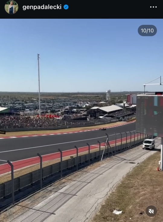
I’m more curious about whether or not Gen was even at the F1 race and/or Eminem concert. She posted a video of the track and the back of Jared’s head on this cart with Shep.

But for all the fan sightings with Jared…there was NO Gen?
Jared with Clif and fans on 10/19:


Jared with fans at the race the next day:


You all saw how many people got photos with her at ACL. But zero here?? Idk, I don’t think she was at F1 but she’s trying to play like she was for the sake of over-the-top “couples who do everything together” goals. I think Clif took that photo on the cart. It makes more sense that he would be sat behind Jared. She’d be riiiiight beside him.
And it’s totally fine and not alarming if she actually sat an event out…but it’s pathetic to lie.
5 notes
·
View notes
Note
Hi! Firstly, I love your gifs. Always makes my day when I see them on my dash. Secondly, can I ask how you get such good quality? I’m dipping my toe into gif making and am running into issues with quality. I pull stills from 1080p mkv videos. But is there some secret editing trick I’m missing?
Thanks. 😊
Aww, hi there, lovely anon! Thank you so much; I'm glad you enjoy my gifs! And I would be more than happy to share some of my tips and tricks with you! 💜💜
You've definitely got the first step down pat; anything 1080p or higher is great for maintaining the finer details in the footage. I've sometimes dipped into lower ranges like 720p and have managed fine enough, but 1080p and higher is always ideal.
But the little thing that bumps the quality up even more?
✨Sharpening Tricks in Photoshop✨
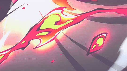
It's a seemingly inconsequential step that ends up making a huge difference in the long run! Let me show some examples with the man of the hour aka Mr. Costa Rhysca here PFFF:

The left gif is the unsharpened footage, and the right is footage with the smart sharpen and gaussian blur filters applied.

The left gif is the unsharpened footage again, and the right is footage with two layers of smart sharpen with different parameters applied.

The left gif is the unsharpened footage once more, and the right is footage with smart sharpen and high pass filters applied.
So, as you can see, a little filtering goes a long way lol! And playing around with different techniques/parameters can end up making entirely unique looks. All gif makers have their own preferences; some prefer to use heavier blur to give a smoother look, while others go very heavy on the sharpening/high pass to really make all the details pop. Some even play around with combinations of everything. It's really just a matter of playing around with things and personal preference! I personally go for the double sharpen, or the high pass if I want to bring out hair or details on clothing.
Now, in order to prime your footage for these filters, you have to turn all the frames into smart objects. To do this, you'll first want to select all the frames in both your animation window and your layers window. Convert your animation window to a timeline by pressing the button in the bottom corner:

Your frames will then disappear and turn into almost an after effects-y type timeline. You'll then want to be sure all the frame layers on the right are selected, and go to Filter > Convert for Smart Filters.

This should turn all your frame layers into a single layer like this! If you see this, and also have your timeline set, you're ready to begin adding filters! The three I referred to earlier are:
Filter > Sharpen > Smart Sharpen
Filter > Blur > Gaussian Blur
Filter > Other > High Pass
If you just want to start off with smart sharpening for now, since even just smart sharpening alone is a huge boost, these are the settings that a lot of gif makers recommend:

But you can play around with whatever you think is best! The cool thing about smart filters is that they're entirely forgiving, and you can adjust/delete them like you would with regular adjustment layers.
Anyway, happy gifing/sharpening, anon, and I hope I could be of some help! 💜
6 notes
·
View notes
Text
Watched The Thirteenth Floor from 1999. Interesting how a lot of these turn of the century science fiction movies use the trappings of film noir as a basis. And I don't think they're all doing it because Blade Runner did it. Probably something to do with all the mid-century science fiction writers that these movies are either inspired by or adapted from having stints writing detective books to pay the bills. And a murder is a good setup for a story.
Enjoyed it. It losing the Saturn Award for best movie to The Matrix is correct. It's a decent movie, and while it doesn't feel old, The Matrix feels noticeably more modern. Like seeing the way the future would go. Also, even though they cover the same ground, "what if everything were a simulation", they come at it from very different angles. The Thirteenth Floor, "what if you tortured the NPCs in your videogame". The Matrix, "what if *I'm* a simulation??". And The Matrix, I feel, simply mines a richer vein for drama and intrigue. It leans more into the paranoia of the premise. There are actual consequences for the protagonist learning the truth of their world.
And, I can't blame the movie too much, since it's from 1999 and based on a book from the sixties, but it's funny how certain it is that humans will turn to complete monsters if they get to play god over simulated people. I know the book was probably thinking more of the idea that the Nazis turned people into lampshades and soap because the systems they got from IBM for cataloguing people turned their victims into meaningless numbers, and that they were therefore disposable. This idea pops up a lot in post-war American fiction. That modernity and barcodes and ID numbers are going strip away people's humanity and reduce them to a number. In the book, the digital city is set up to model marketing trends, that's why I think that's what it's aiming at. But to modern sensibilities, even from 1999, I would say, the obvious analogue is a videogame. And the idea that everyone who trapped their Sim in a pool and deleted the ladder behind them would turn around and try to do the same to others in real lief is laughable. People definitely did worry about it, in the same way that they worried about TV before that, but it's still very funny.
Could have done without the threat of rape at the end. Again, I understand the thesis of the film. Getting to be lord and master over simulated people unleashes all of man's baser impulses. Still. Felt pretty gross. Felt like a big jump in the level of violence shown by the rest of the film.
Pretty good looking film. Clear distinctions between each layer of the simulation. Although, I noticed a goof. The newspaper at the end says Monday, June 21, 2024, but it's not! Not a Monday, it's a Friday. Even the spellcheck popped up telling me it was wrong. Movie cancelled!
But, yeah, it looks good. I was curious if they were going to show the "real" world, and what they would do if they did. But they kept it fairly subtle. Some modifications to the LA landscape, but other than that everything and everyone looked more or less as they would have when it was filmed. Possibly made easier for themselves, when I was skimming through the movie again, the "current day" of the rest of the film does have a slight 80s look to it, even though the computers clearly don't, nor are they dressed up to be. Whereas, "2024" has a more fashionable, but casual look. Has a very "Garden of Eden" look too. There's all this golden light and natural tones, open airiness with the wind blowing in through open doors and green plants in the background, the wife character in this skin tone satin that moulds to her body in a way that reads as her being naked without having any actual nudity.
Lot of similar visual storytelling used to convey ideas before they come into play in the plot. Like, editing back and forth when the hero first goes into their simulation, so you already have the idea that the simulation he displaces might travel up out of their home simulation. Sometimes this is a little too clearly conveyed? I kind of had the idea that the hero was in a simulation from the way the movie repeated certain elements between "1937" and "present day" in the opening scene. Took some of that intrigue away when the hero reached the edge of the game map, something that The Matrix retained.
But, yeah, I overall recommend it. It's perhaps a little more plain than Dark City, solid but plain, but it's still interesting to watch. I can see why it helped inspire Inception, particularly with the editing between layers of simulation.
(Wtf, it received mostly negative reviews?? It is not that bad. Not spectacular, but mostly what it's missing is some tension. Really not that bad.)
0 notes
Text
7/03/24 Notes - selection and Marquee tools
select most of the thing using the easiest tool
work on the layer mask with more manual tools
paint on layer to finesse selection
when selecting:
holding shift adds to selection
holding option subtracts from selection
holding space allows repositioning of marquee


creating a mask and creating a shape to draw on in the mask. Editing the shape in the mask with black and white adjusts the shape outside of the mask allowing you to add or erase parts of the shape easily.

option delete in the mask with white as the colour to delete segment
command A - select all
command D - deselect
command i - invert selection
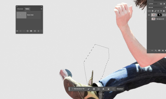
using the polygonal marquee tool and outlining the parts you want to delete then enter the mask and go option delete
using the paint brush tool to erase and tidy up the hair, adjusting the size of the paintbrush to get in between the hair, to make it less spikey and un-natural you can change the opacity to make it blend easier and look less harsh.

turned it into a single layer file and put it into illustrator and used the pen tool to draw an S like shape, then created a heavy stroke and rounded the ends in the stroke menu.

Put it back into photoshop using place linked and placing it behind the man, using place link allows me to edit it in illustrator and save it then my changes will be transferred to photoshop automatically.

Went back into illustrator to use the pen tool to create a snake looking thing using straight lines and then adding the lines inside the snake with the pen tool and adding it to the points.

added colour to the segments by using the pen tool with coloured fill and traced the different segments with the pen tool, then saved on illustrator and it automatically updated in photoshop and then tidied it up using the paintbrush in the mask.

adding a background by copy and pasting one off the internet and pressing command t to enlarge it while holding option so it doesn't distort the image.
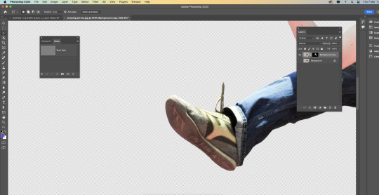
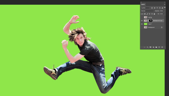
I enjoyed this task as it wasn't too hard but also allowed me to use and practice majority of the skills we have been working on in the previous sessions. I felt confident while working on this and was able to keep up and understand what we were doing. This task helped me to understand masks and painting with the white and black more as well as using the object selection tool to create an original cut out of the man, and then being able to tidy it up in the mask as well as with the marquee tool. It was also beneficial for me to know how to transfer images from illustrator to photoshop as that will be useful to know for projects. Overall, I felt confident with what i had done and my amount of knowledge and understanding i had by the end of the session.
0 notes
Text
W2D2 fundies (software)
(more) photoshop tools:
layer 1 is transparent and background is solid
b = brush
e = eraser
option, delete = fill selection. (if nothing is selected it will fill the whole screen)
shift, command, delete = fill selection wth background colour
window, brushes, genera; brushes = brush options (main 2 are soft or hard brushes)
can get soft or hard erasers too
[ ] = shrink or enlarge brush stroke
command A = select all
delete = clear everything on that layer or selection
number keys = tool transparency:
1=10% 5=50% 9=90% 0=100%
option= colour picker
command D= deselect (so helpful!)
command z = undo
shift, command, z = redo
hold down v then option and copies selection
-in move tool photoshop will move whats under your pointer
command j = like paste in place
holding shift = add to your selection (shape).
holding option = subtract from your selection
holding space = reposition the selection segment.
masks:
new layer mask looks like black and white japan flag (beside layer adjustmentd)
white pixels means visible
black pixels mean clear
option click mask to see inside
when using mask and using black brush make sure you are on the mask part of ur layer and not on normal layer
command t = tranform gizmo
in adjustment layer properties pallet there a setting that effects only the layer you are on
p = pen
same as illustrator really.
arrow, direct selection tool (the one that looks like mouse) same as A on illustrator.
window, paths, command click = shows paths an make adjustments after clicking.
shift command i = inverse selection
messing around with pen tool on photoshop. we used brush (b), eraser (e), fill selection which s just what you have selected and then option - delete. we also used shift - command - delete which is fill selection with background colour. We also played around with brushes and found how to access all the different brushes that are available. I found a spotted one and played around with it. the square brackets means you can change brush larger or smaller quicker. command a was select all -which is different than illustrator that uses A for direct selection tool (on photoshop its on the tool panel). we also played around with transparency.
we also learnt taking cuts out of selections, like circles and overlay another circle a scissor tool shows up and allows you to cut the shape. when selecting while holding shift you could add to your selection (shape). holding option you could subtract from your selection. holding space allows you to reposition the selection segment.
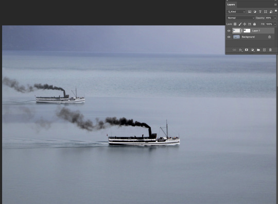
we also learnt layer masks, which is a good tool to help edit in other images to photos seamlessly. in layer settings beside image adjustments there is a tool that looks like a little japan flag and you just select the layer you want a mask on and then click the layer mask button. you can then click into the mask by option - lick. then you just can use black pen in the mask selection to rub out part of the mask. so for the boats above i used black pen to rub out the water around the boat we added in so it looked more realistic. then we changed free transformed the boat to make it smaller. then made the boat lighter by turning down the opacity so the boat looked further away in the distance.

bird edited ready to go into new photo. turned background into layer one so there was a transparent background. used = image - image rotation - flip horizontally to flip bird. then used pen tool to make the wing cleaner so there wasn't any of the original grey background when the image is put into its new background. doing this with the pen tool did get rid of the grey colour but it made the lines very clean and removed the blur effect of the beating wings. so we went back in with blur tool and blurred the ends of the wing and tail so the bird looked in motion still.
some of the settings i used when i put the bird into the new backround. then we used curve adjustment to make the bird look like it had the same lighting as the background picture, which makes it look more realistic. i used the square box pointing down tool to make the curve settings only apply to the bird. for a little extra fun i created a small segment copy from the background and created a 2nd layer of some small flowers which i placed in front of the birds beak so it looked like it was getting food and actually at the plant. You can see this in my final image below.

really enjoyed this task it was fun. :)
0 notes
Text
well here is sunny's gif tutorial for anyone who wants to learn how to gif 🎉🎉
so first of all you're obviously going to need a clip of whatever you want to gif. you can either download full videos or use a screen recorder (like obs for example) to record the specific scene you want to gif
once you have your clip you go into photoshop and look for "file -> import -> video frames to layers" then choose your clip and you'll get a screen like this
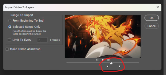
you can use the two small arrows to trim the clip to just what you need then click ok and it will open the clip up into frames
(btw if you don't already have it on make sure to go to "window" and turn on timeline. that's where you will see the frames)
now personally my first step is cropping and resizing. cropping is kind of self explanatory but to resize the gif make sure you go to "image -> image size" (NOT canvas size. just wanted to say that since the options are kind of similar) (although you can still use canvas size for cropping) and here is a handy little chart that is helpful if you want to know what to resize gifs to (width is what's important here height can be whatever you want it to be)
now personally my next step is sharpening although you can probably also do this at the end. i use maizekeen's gif sharpening actions (if you don't know how to use actions in photoshop there are many tutorials online but very basically you download the actions then go into the actions menu (windows -> action if you don't have it open) and click on load actions) and then from there you just choose your action and click the play button
then after that is usually when i delete any extra unwanted frames in the timeline (it's not necessary to delete the frames from the layers panel)
NOW is the fun part and also where a lot of this becomes up to taste and personal style ✨
make sure you have your adjustment panel open (window -> adjustments)

the ones underlined are the main ones i use. i recommend playing around and seeing what does what and seeing what ends up looking cool to you
oh and when you use adjustment layers make sure they are above all the layers of the gif like this

i made some different edits of the same gif to show some of the different things you can do. like i said it's up to personal taste and style
here is the original unedited for comparison
and here are some different edits i did real quick to hopefully give you some ideas for what you can do

and if you want to change the speed of a gif make sure to select all frames and then use this little arrow
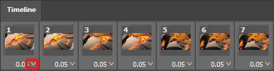
i tend to use either 0.05 or 0.04 since anything faster or slower tends to start looking wonky but you can try it out yourself and see what looks good to you
btw here is the difference between 0.05 (left) and 0.04 (right)

NOW FOR SAVING
when you feel like you're done you wanna go to "export -> save for web" (it might say legacy next to yours it still works the same) and you will get a window like this

the most important things here are the two options i circled. most of the time i just leave these at adaptive and pattern. perceptual and selective can be used in place of adaptive but i've found that adaptive tends to look best. diffusion instead of pattern can help lower the size of a file in some situations but it doesn't always work but for the love of god please don't set it to "no dither". also make sure the looping option is set to forever (unless you specifically wanna make a non looping gif)
and from this menu you can preview your gif (lower left corner). slightly above the preview button is where you can see your file size (in this case this gif is 7.8mb) tumblr says their gif limit is 10mb but in reality it's slightly less than that so if your gif is 9.7~9.8mb it's probably too big
now if everything looks good then just click on save and name your gif and you're done 👍
now i'm sure there are a lot of things i didn't explain well so if there are any question feel free to send me an ask or a dm and i'll try to explain things more in depth :)
74 notes
·
View notes
Text
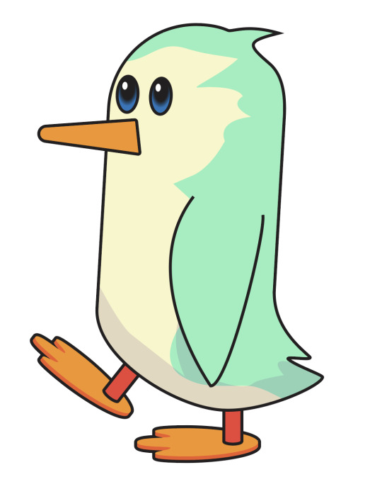
Week 3 - Penguin Drawing Task
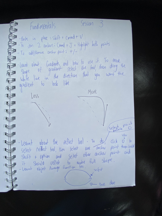
Today we learnt how to use a range of new tools in Illustrator such as how to use layers properly in Illustrator, Connecting shapes with the join command, Flipping shapes, Add / remove anchor points on a shape, Stroke Properties, Filled shapes, Compound Paths, The pathfinder tool, Gradients, Colour swatches, Global colours, Group and Ungroup, The colour tool and shape opacity and Adding points to paths. (List of tools copied from moodle).
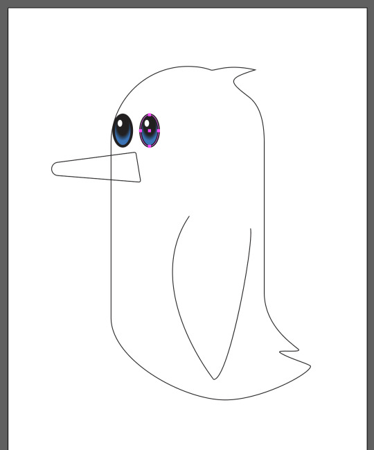
We did some more in depth shape drawing by all drawing ourselves a penguin starting drawing the body of the penguin. We here learnt how to add or delete an anchor point and put it into use by adding anchor points on his tail piece to give to a more real look as well as a wee bit of hair sticking out of its head. You can add anchor points by selecting the pen tool and hovering over a already created path and clicking where you want the anchor point.


We then started to give the penguin some features such as a beak, an arm and some eyes. The wing is a good example of a broken point. The part where the beak connects to the face was originally square but this was adjusted by turning the point into a slightly curved point and can be done by dragging the little white circle on the inside of the corner inwards to how curved you want it to be.
When doing the eyes of the penguin we were introduced to the stroke menu where we could adjust the weight of the stroke of the eyes to give it a somewhat cute look with big eyes. We also got introduced to a gradient and how to do one in Illustrator by changing the way the gradient goes and what colours it is to create a real look to the eye. To do so in Illustrator you go to the gradient menu and drag the white line in it in the direction that you want the gradient to look like.
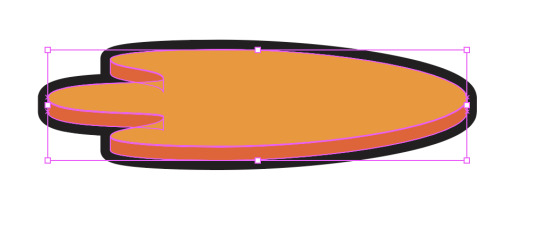
We then went on to start creating the feet for the penguin, this was originally done by drawing half the foot on a path from the apex at the back of the foot to the apex of the middle toe and then reflecting this path which I have written steps on how to do so at the bottom of the screenshot of my notes at the bottom of this post. We then joined them together using the join function by selecting all the end anchor points with direct select and pushing 'Ctrl + J'. Then we duplicated this foot and put two of them on top of each other as shown in the left photo below. We then used the intersect, minus front and unite pathfinder tools in Illustrator to give the foot a 3D sort of look. These pathfinder tools are very useful to create and manipulate complex shapes and were new to me. Finally we used the stroke tool to make the stroke go on the outside of the path instead of on the path to outline the foot without covering up some of the edges.

This is a screenshot of my layer menu as we learnt the many different functions of the layer menu such as converting things between layers and being able to lock certain layers so that they are affected when editing on different layers.

This screenshot below shows my finished penguin constructed out of shapes in Illustrator. We have given the penguin multiple colours by duplicating the body layers and making different cutouts of it, then adjusting the layer opacity and adding a color of my choice to each of these layers to give the penguin a multi-colored look.
Notes - Black drawing in middle explaining how handles work, Below steps to how to use the reflect tool.
This screenshot shows what a bit of my folder looks like in terms of file management and saving versions as you go on to ensure that you do not lose all your work at once as well as the fact that it keeps things neat and tidy and easy to find.

Today was a very useful class, personally especially when learning about the pathfinder tools functions as I had not really used these in the past and they are actually very helpful and interesting to use.
0 notes
Text
Week 6
This week, we recapped on some of last week's techniques, aswell as learning how Smart Objects can be used to make this combination more seamless as a workflow.
Things we learnt:
Photoshop
Selection tools: You can use any of the tools we used last week, in any combinations.
Masks: You'll create at least one mask to clear cut your figure from its existing background
Layer management: You'll need to keep track of what's on your layer
Illustrator
The pen tool and any of the other object creation and editing tools we used can be used here. Use what you're used to, or take this opportunity to branch out and discover some tools you're not too familiar with
Colour swatches can be used to colour your objects and change them
Combining the two
Smart objects are a great way to create a 'live' object in Photoshop that can be edited within Illustrator and update without needing to be reloaded.
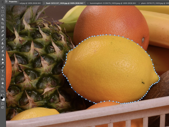
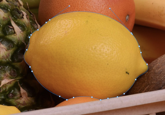
Using the same image as last week, i used the pen to to outline the shape of the lemon and then create vector mask to isolate that part of the image and then colour correct it without hindering the other parts of the image.
I initially used lots of anchor points as i thought this would creating a more precise shape, however i found this was not the case and if anything was a lot harder to control all the anchor points to fit the image properly.
After realising this i then removed a bunch of the anchor points that were unnecessary and instead replacing then with arcs and curves. I found this actually traced the shaped a lot better and was a lot easier to control.
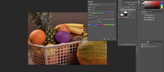
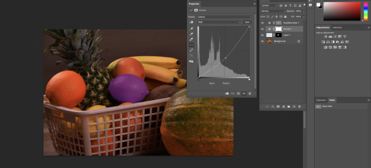
Once I was happy with the shape I then created a vector mask that isolated just the lemon from the rest of the image. Here i played around with the hue and saturation to change the colour. Once i was happy with the lemon colour i then played around with adjusting the brightness of the overall image.
Once we had recapped on those skills from last week, we then used the pen tool to outline this image. I used skills i practiced from the pervious image which ended up helping me a lot.
Once i had the initial outline of the guy, i found it hair was really sharp looking and didn't blend in very well. To fix this i played with a number of tools bit i found the most effective was actually the eraser tool with the opacity setting on it. This made parts of the hair transparent instead of white which made it blend into the background better.
Once I was happy with his outline, i think turned that selected area into a vector mask, which isolated him from the background. I then changed the background using the shortcut OPTION + DELETE which selected the full background allowing me to change it into a solid colour. This was easier was also easier to see his outline against and helped to fix up any areas i may have missed for looked rough.
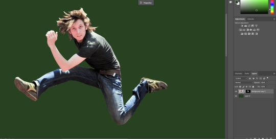
Notes for creating the vector mask:

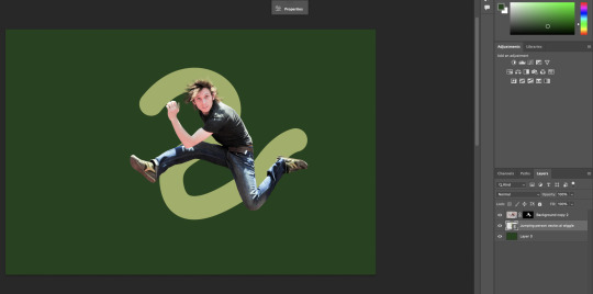
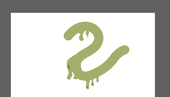
From here the next step was to create a shape in illustrator that we then turned into a smart objects so it was a 'live' object in Photoshop that can be edited within Illustrator and update without needing to be reloaded. It was placed in behind the image layer.
From here we used the Rectangle selection tool to select the parts of the shape that needed to be in front of the guy to make it look like he was jumping through it. Once selected those shapes then created vector mask again so it joined.

From here we then placed different layers to add to the image, like a new background and additional accessories.


Overall i thought this was a really useful and insightful task as i leat some key photoshop skills that I hadn't yet learnt like using the mask tool and creating a shape in illustrator that then transfers live over to photoshop.
Overall i was happy with my end result however i could improve some aspects like improving cutting him out w the pen tool but that will come with practice.
0 notes
Photo
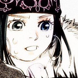
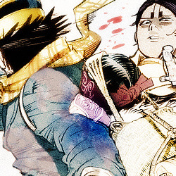
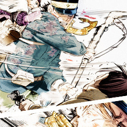
#golden kamuy#sugimoto saichi#asirpa#koito otonoshin#tsukishima hajime#I was deleting layers and ended up liking how these edits turned out#so; here's vers.2#edits#kinkamu
70 notes
·
View notes
Note
How do you make your sprite edits?
Hey! I'm flattered that you're interested, that's very sweet of you <3 I'm sorry if this reply came later than you expected but I thought for this I'd made a small tutorial, so I had to get screenshots for the whole process and stuff ehfuerhgr
So first, I start with grabbing the DRS bathing suit sprite of the character I want to edit because those sprites have the least amount of detail for me to erase (for this example let's use Junko)

Then I turn the opacity down on her model and start a basic sketch of the outfit design on top of it on another layer. Because the base has a lot of dark lines and details, I change the colour of the sketch to bright red so it's easier to see the difference.

After that, I make a new layer and start the lineart. Because the artstyle uses inconsistent line length, I try to do the same with my lines (a good tip is to see how the line width looks on the original base and try to mimic it on your own lines, it may not be 100% accurate but it'll at least be closer to the original style than if you used the same width throughout)
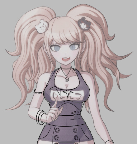
Then, I add the colours and the shading. This part gets a little complicated, because instead of doing the base colours and the shading on the same layer, I make one layer for the shading and then create another layer for the colours, which I put underneath the shading layer so I can keep the shading consistent (another tip: follow the shadows on the original base where appropriate and then add any extra shadow for stuff like fabric folds. This is especially important if you're editing a female character because of the shading around their breasts)
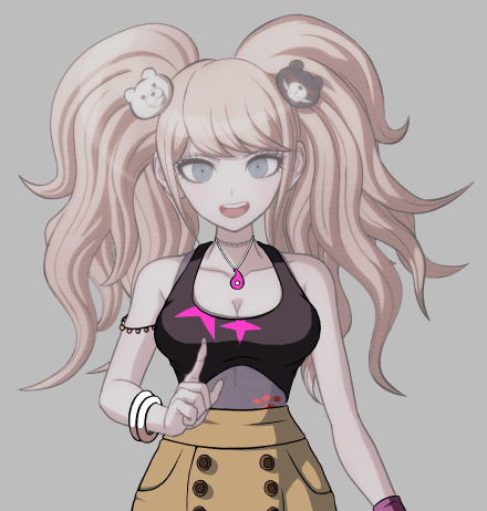
Next, I go back to the base and edit out any details from the original bathing suit that wouldn't be there with the new outfit (Junko's actually a good example for this, as her bathing suit covers her midsection but my outfit design doesn't, so I would have to edit it to look like it's exposed)
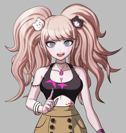
(Another tip is to add shading in accordance to the new outfit, such as the beaded armband in the picture above)
Buckle up for this part because it's a Lot-
This part might be a little confusing because I realised after taking the screenshots that I might have done the process...out of order? Compared to how I usually do them at least lmao. So what I ended up doing was blurring the lineart and shading layers slightly to match the blurriness of the original sprite, merging those layers + the colour layer together, making yet another layer, choosing a dark colour that fits the palette of the original character and making a circular gradient over the outfit, as the original sprite also has a gradient.

Then I searched for the polka-dot texture you see in Junko's hair and overlaid it with the outfit, resized it, blurred it and set it's opacity to where it matches with Junko's hair as much as possible (thanks @sir-sunny for this tip!)
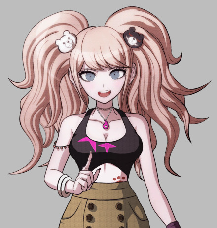
(The texture that I use is the first result that shows up on Google Images when you search 'danganronpa texture overlay', which was made by JLE42 on Deviantart, who says it's free to use)
Generally I don't name my layers, and I usually delete the obselete ones as I go on, but for the sake of this tutorial I decided to keep them so y'all know what they look like. These are the result of this one edit:
(Before the gradient)

(After the gradient)
After that, I add every layer except the sketch layer together so it's one image (depending on the layering, I have to add certain layers in different orders so the last image is as neat as possible)
And there you have it! I'm sorry if this got hard to follow, this is my first real tutorial and I'm extremely bad at articulating myself efhiuerg. I hope it's at least enough for you to get an idea of how I work!
(Any messy bits I intentionally left in because the THH sprites are messier than the other games and I wanted to replicate the style as much as possible)
(Program is Firealpaca btw lol)
#Danganronpa#Danganronpa sprite edit#Sprite edit tutorial#Tutorials are harder than I thought :')#Still kinda fun tho!!
52 notes
·
View notes