#I want texture but also blending
Explore tagged Tumblr posts
Text

Today’s work in progress!

It’s going great.
#codywan#commander cody#cc 2224#obi wan kenobi#obi wan#my art#digital art#sw tcw#sw tcw fanart#star wars#armor#clones#oil painting#technically#it’s digital art#but I love these oil brushes#i wish there was a bristle blender#I want texture but also blending#im sure there is one somewhere#oof#work in progress#art wip
167 notes
·
View notes
Text
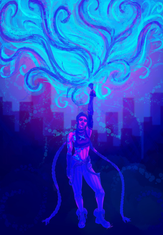
You trade your friends like guns for hire
(Please click for better quality, i spent so much time on the detail and tumblr is crunchinnggg it *tear*)
#my art#arcane#artists on tumblr#digital art#jinx art#jinx arcane#jinx fanart#jinx#league of legends#lol#fan art#art#digital painting#guns for hire#arcane season one act 2 finale#limited color palette#colour palette is cyberpunk from ultrainfinite#such a good palette for her#i did struggle a little bit with the lighting bc i wanted it to be the light blue but it wasnt blending nicely so pink it was#and even then some colours didnt want to play nice#also this took me sooooo long#idk why like the line art took a while bc her arms kept tripping me up and then when i finally finished everything i realized i still had t#do her hair and machine gun#to the point i went fuck it im not doing her machine gun#then the base colouring i had completed and accidentally clicked no to save and threw out an hour of work and had to recolour and texturize#everything#which may have been the case for it taking sooo long but it already felt like it was taking long at that point#like i really wanted to finish it before february#but i didnt#then i got top surgery lol so the shading and highlights took a while too
82 notes
·
View notes
Text
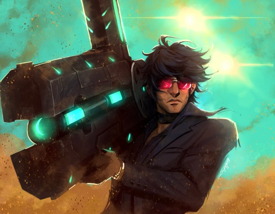
@nowfallc PICTURE!! FOR YOU!! PLEASE TAKE IT!! <3
#agh I’m so so nervous but I’m big and strong and you all agree with me <3#plus it’s nearly 6 in the morning and I pulled an all nighter to finish this. which I’m sure is not helping my stress levels At All!#ALSO!#I’m gonna do another one!#you will NEVER know which picture so get fuckin ready HELLLLLLLLL yeah!!!#<- as for those of you who were Present when I said which picture I was gonna do. ummmmm. shut up! say nothing!!#ALSO…..2!!#wanted to share how I did the scuff marks cuz I felt like it. and also I said I was gonna do it. anyway!#what you wanna do is get a real textured brush. ideally something pencil adjacent#and a mid grey color#and with LIGHT pressure you follow the edges of whatever metal bit you’re rendering#you can go a little heavier on the corners if you desire#from the corners you take a smudge tool and gently blend in the opposite direction of the corner if that makes sense#and then take an eraser (IDEALLY one that’s the same as your rendering brush)#and gently erase back towards the corner. but with a much smaller brush size#add little scratches and pick marks as you please#and that’s it#you know maybe this would make more sense with an actual diagram I’m so so bad at explaining stuff agh#I’m gonna shut the hell up now 🙏#trigun#nicholas d. wolfwood#trigun stampede#trigun fanart
591 notes
·
View notes
Text

AU where Reo is short
#i just like.... nagi looming over him...#i bet he'd love doing that...#nagireo#nagi seishiro#reo mikage#blue lock#blue lock fanart#anime fanart#manga fanart#digital art#when you want to draw a decent looking background... just shade using a textured brush that also has blending by default
118 notes
·
View notes
Text


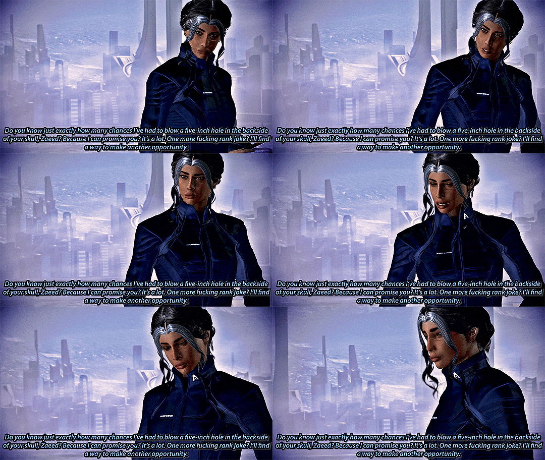


THE BEST OF PRIORITY: EARTH (PART 1 - REVAMPED)
Ft. Staff Cmdr. Sophie Oliveira-Shepard Alenko-Oliveira, Cpt. Arno Delacroix, and Zaeed Massani-Shepard MIRA'S MORE CANON ME3 "Shadow Broker resources? Yeah, they might be good for a lot of shit, Dove. Convincing the brass to get off their asses and do something about the Reapers? Not one of them. Think that one might be up to you, this time. Entertaining diction and goddamn fucking all." Mass Effect 3: Legendary Edition (2021)
#mira makes gifs ✨#sophie shepard#arno delacroix#zaeed massani#mass effect#mass effect 3#dailygaming#TBO:ME3#MORECANONMASSEFFECT#heyyyyy do you guys remember when i used to make those big fucking gif sets of the me3 missions? :)#i brought them back just a little bit :) but i felt inspired to make them a little more canon :)#zaeed is a certified little shit when it comes to soph. he will die if he does not find some way to constantly annoy the fuck out of her#he is also certified ‘i steal my husband’s clothes’ (sorry regis but he’s not sorry in the slightest)#i like to think he has very one-sided beef with arno. he pisses him off for a reason zaeed will not disclose to anyone (it's a dumb reason)#SPEAKING OF ARNO :) my beloved boy :) i’ve only shown him in renders but :) enjoy in game arno :)#i will never be more proud of anything in this galaxy than i am of the work i did getting his head ported into game#holy fuck all of the work to weight paint those lip piercings and do blending and conversion work on his face textures#he turned out so well and i am so proud of him :) those lip weights will never stop making me :)#(also his cybernetic arm is sick as fuck and i love him and could rant about my favorite pilot all day)#my favorite normandy pilot :)#i ended up making way too many gifs so this is a two parter :) i blame bioware for making me swap 9 pawns in 5 files in the prologue :)#i wanted as much content out of this swap as i could get because it turned out so much better than the idea i had in my head so :)#thanks i guess for my partial mesh swap suffering bioware. 5 files for just the prologue walk is wild though lmao#yeah there's a little bit going on here :) definitely some changes from the last time i gif'ed the prologue :)#i made some decisions about canon that are very not bioware ME3 canon because fuck bioware ME3 canon :)#also yes i gave soph a promotion. fuck ME canon lmao. soph gets a promotion lol#she also got a name change too ;)
11 notes
·
View notes
Text

Sylvan | Son of Elaria & Sylus | Oath of the Ancients Paladin


I am so happy with this sculpt and the textures!! my boyfriend said this is his favourite character he has played in his 700+ hours of baldurs gate lol. I am happy with the different similarities of Sylus and Elaria in Sylvan. Since we have to start a new playthrough, I am going to make Sylvan's twin and play as her!
#bg3#baldur's gate 3#bg3 screenshots#bg3 oc#bg3 tav#virtual photography#oc: Sylvan#since sylus and elaria died in our first honour mode game my bf and I had to start new characters#He didnt know what to play so i said to play as sylus and elaria's son hehe#i made this private commission for him and tried to blend their textures and facial features so he would look like both of them <3#we also died this honour mod playthrough cause he wanted to save the gnomes from the grymforge </3
17 notes
·
View notes
Text
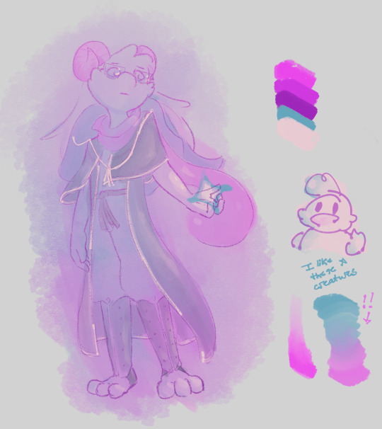
Small doodle from yesterday that turned into me learning new things about a brush I already adored
#i am not good with clothing design but I just wanted to draw ralsei#today i learned that it i don't actually need a blending tool to blend two different colors together with this thing#i only used a blender to add a little extra texture on the ralsei#when i tell you i use this brush for almost everything omg#the only thing that i dont like about it is that it's transparent#if i want to change the background color then i also change every other color in the picture#but that's kind of like the no-takesies backsies appeal that i get from traditional art so it works for me#sorry i had to gush a little bit i'm just happy i found it while it was free#ralsei#deltarune#ducks
46 notes
·
View notes
Text
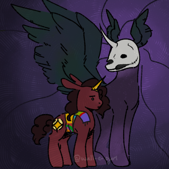
Arlaen and the Raven Queen, making a choice
#my art#unprepared casters#tightrope#The background IS the Raven Queen's hair#it blends into the nothing-void space they're in#Arlaen's horn is the same color as her cutie mark cause its her divinity#she may or may not have some tiny baby wings hidden under that scarf too but who knows. maybe she put it on there as a way to not know eith#anyway. raven wings as big ole wings and some raven-sized raven wings instead of ears. for the vibes#ALSO. BONE MASK. TOOK ME FOREVER.#horse skulls have a WEIRD nose and it took me so long to figure out how to a) do it and b) do it in a stylized way that worked with mlp#my version of it at least#i did some fun stuff with like texturing too. wanted to it to feel like there were threads and a weave in the air. which i kinda did.#very abstractly#ALSO edited my stripey brush so i think ill be using that more#ok enough tags time to turn off my brain
32 notes
·
View notes
Text


just a little bit of experimenting with Scarlet to shake the rust off 👍
#my art#gw2#guild wars 2#scarlet briar#gw2 sylvari#sylvari#my posts#I always forget how much I love the really scratchy charcoal type shading I can do with Corel's tools tbh#blending textures together that are totally different? very fun#also it was fun to lean into this lady's messed up side#there's no way she didn't look scraggly af in LW1 okay#that woman is subsisting on roughly one hour of sleep per year she is NOT doing so great in the sanity department#I also wanted this for a bluesky avatar because I still don't like my mascot/sona design wheeze. so Scarlet can be it instead#(yes this is from that sketch sheet a while back! might polish up more in the future too but i liked this one most tbh)
10 notes
·
View notes
Text


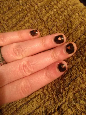
painted my nails
#it's been ages since I did my nails so I went all out#the lil heart confetti polish I always makes me look so cute#but I when I do take the time to paint my nails it's usually an impulse decision and I don't want to wait for the extra dry time#cause it's an extra coat#I can't decide of this is pastel goth or vampirecore goth#the hearts aren't actually pastel but they kinda look it cause they're this silver and red marble-y texture#so the colors blend together#also hearts just have a pastel vibe#like unless they're a Striking blood red#or bone white#or pure silver on the hilt of a dagger only to be used to slay your cursed beloved#y'know?#but also the colors red and silver and black together are strict vampire core vibes#idk im too tired for this
10 notes
·
View notes
Text
also though this dentist is genuinely the best dentist we've ever had.
she was really understanding about us having issues with toothpaste and we asked if she had any recommendations for alternatives we could try to see if those help and she gave us some options to look into so that's cool.
she also took our medical trauma into account and kept checking if we were okay throughout the appointment and asking if we needed to take breaks and we've never had a dentist do that before.
she warned us about what each tool would feel like too and actually warned us if something was going to be painful which like, I would in fact rather be warned that "this is going to be uncomfortable in this way" and "yeah this is gonna feel really bad for a few days but that's normal" than have someone try to reassure us that it won't be that bad only for it to get really painful.
our next appointment is to have a tooth removed and she explained the procedure to us and how that normally goes, and then we asked if we can take the tooth home afterwards and I can only assume from the look on her face that she's never been asked that before, but she was like "yeah I don't see why not, it is yours after all" so that's cool
#personal#thoughts#🍬 post#happy posting#I am really glad she warned us that our mouth would be sore because holy shit she was not kidding#but also we've never had a filling that blends in so well with the rest of the tooth. you can't tell there's a filling there when you look#she put so much work into it and got us to check it before we left to make sure the texture was okay#it took twice as long as the appointments we've had for fillings in the past#we're so used to having dentists just kind of rush to get everything done and being really shitty about our anxiety#which like admittedly I am probably still gonna have issues with medical trauma stuff later because that's just how that is#but holy shit it's such a relief to have a dentist who very clearly wants to make you as comfortable as possible#and is obviously taking your trauma and health problems into account the entire time#we're also used to going to one appointment and the medical professional being great#but then being shitty in the next appointment once they realise we have complicated problems and trauma and stuff#but no she was just as nice and accommodating as last time which is gonna help a lot with feeling less anxious next time I think
4 notes
·
View notes
Text
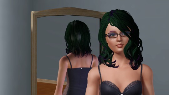
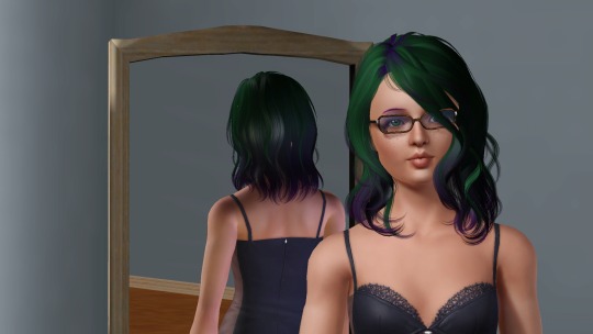
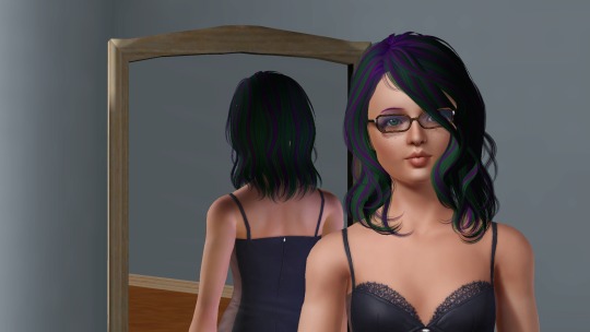
Just a look at what I've been up to the last few days. I know, I know... I just had to start ANOTHER hair project. But really, it's about time I took out some of the overly shiny original hairs (or shiny retextures), and replaced them with stuff I like better (assuming there is anything better to be had).
In some cases I have so many retextures of a hair, I have to take them into game to see what they look like to make up my mind. In this case, I kept two of the above options. The top left was kept for the braid textures, and the one at the bottom for the color streaks.
#ts3#sims3#adventures in cas#I don't like ombre textures#I don't like ombre hair#don't get me wrong#it's pretty and I'm not like anti-ombre in other people's hair#I just prefer streaks myself#If I add multiple colors or an unnatural color I want it to POP#not blend into the background#In this search for hair retextures I like I found two more who did a lot of 'streak' textures#these being Taty and LemonKixxy#but I can't really recommend them to the rest of you because all their DL links are adfly#LemonKixxy has a really nice searchable database of their hairs though#Whereas Taty's I spent 3 hours downloading them all off of a 140 page forum thread#because the hair names were in the images and therefore not remotely searchable at all#I'm also sad a lot of Sjoko/Bombsy's older hairs are unavailable#And yes I found the archive with their hairs#but it doesn't have everything
15 notes
·
View notes
Text
FINALLT figured out a rendering style that I have admired in many artists for years >:3c
#it’s really quick too omg!#I still love my looser textural painting style that’s not going anywhere#but this will be nice if I wanna give some lines pieces more dimension without just doing flat cell shading…#I also used a different lining pen and I really liked it. Will need to experiment further#ramblings#it’s really simple idk how I didn’t get it before. it’s just put down a shadow with a hard brush. blend one side of it. rinse and repeat#did a whole body on one layer like that and I really like how it’s turning out. through a lil overlay layer for some blushy color and boom#my issue is that I want every style I’ve ever seen ever
5 notes
·
View notes
Text
After looking through all the canonical Warrior Cats characters I've concluded that
1- There are a lot more Torties/Calicos than I thought there were
2- There are not nearly as many as there probably should be
#I might just partial to calicos tho!#there's also a weird amount of black and brown cats#ig torties can sometimes look brown when their colors are really blended#but this seems odd#OH there's also quite a few cats with different color paws/legs! there was one I wanted to point out 'cuz I liked it but I had a migraine-#-while looking through the designs... so I remember designs but not names#I'm gonna be looking through *all* the cats again while I make some family trees so... I'll probably get back to it#annnd there's a lot of male torties/calico#and *recent* examples so it's not just like... not knowing at this point! male torties/calicos are just a thing in this universe lol#good for them I've always wondered how people would get bent out of shape at male torties#but then completely ignore like.... the cats with actually unrealistic coat colors *side eyes the bright-ass blue cats*#*or the black cats with gray paws (or vice versa)*#FUNFACT: there are three *named* bloodcan male torties! (Scraps- Snapper and Snipe) unless I'm missing someone on the list lol#ps a lot of the warrior wiki sprites are so pretty (except for Ashfur and his family and any weird textured fur character the rest are grea#ramblingz#screaming into the void I'm gonna wake someone up lol
0 notes
Text
wuaghghg i know the only way ill improve my lineart is if i actually draw lineart (and probably do nothing But lineart, except for one or two base colours underneath) but :c what about painting. what about big messy sketch lines. what about impatience
#logically i dont Have to improve my lineart#this is a hobby i do for fun#but it would be fun to get better#i need to play with my pressure sensitivity more i think#a lot of my lines are v uniform and dont give any Depth that i enjoy#i Also need to do more gesture studies#my anatomy has improved a whole lot in the past year but it's not where i want it#textures too i want to get better at textures#but i always want to get better at textures#maybe ill actually start using the blending tool lmao i was blown away when someone mentioned it the other day
1 note
·
View note
Note
Are you the "I have strong feelings about parchment" Tumblr user? If not, I feel like I saw you might know who they are. I was going to put parchment in a fic, but then I was like "no, I can't do that without asking the Parchment Person first because I don't want to get it Wrong."
...no, but I know the post you're talking about, and I too have strong feelings about parchment, esp because I've worked on it before.
I took an illumination course while getting my illustration degree and did an "H.M." in the style of a medieval manuscript on a small piece of the stuff.
Parchment is not paper. It's cured calf or pig skin.
It's thick, and HARD like non-corrugated cardboard. If it's been stored in a roll, it does not want to unroll. If it's been stored flat, it does not want to roll. It's got the same texture as skin, because it IS skin, and you have to account for that while working on it. It smells like rawhide. It actually takes ink in a really interesting way- there's a half-second to blend of fix something before it actually sinks into the parchment, but it doesn't bleed once it's in there. It also never comes back out. It's not bright white like paper, almost a buff color, and white stands out on it.
Fascinating stuff. Actually pretty fun to work on, but it's definitely a medium for highly polished and important pieces (like illuminated manuscripts), not for casual note-taking (because it's MAD EXPENSIVE to make)
I should go hit up the local art stores and get different paper-and-other-art-media samples to demo for everyone for fanfic purposes because they are VERY different things that have different purposes, prices, origins, and societal connotations, all of which can be used in your writing.
4K notes
·
View notes