#I should make a comparison chart
Explore tagged Tumblr posts
Note
Why is Frye in her considerably less edgy phase lmao
Because Frye Splatoon is not the same character as Frye That Smokes. Frye That Smokes is taking her lunch break rn
421 notes
·
View notes
Text


← 2024 vs 2022 -> (or latest vs first procreate piece)
2024’s character is dclass1278 over on twitch ( ^∀^)
this… idk if this should go on here but i’m real happy with the progress i’ve made in ~2 years. sure the stuff i make is never gonna win any awards but it’s. improvement!
#my art#usim clem#OC#though I feel like I should disclaim that 2022’s piece was done on the awful default pen pressure on procreate#thank goodness that tweet mentioning changing the pressure chart came across my tl#literal definition of a game changer#should I also make a tag for art comparisons that might be nice for personal organisation#eh I’ll think abt it
0 notes
Note
Hihi! Can I please have headcanons with the fellowship and Thorin's company having a short (like 5 feet) human s/o. And they be part of the fellowship/company, please? Please take as much time as you need!💕
Hello again! Here's your fill for thorin's company and a short reader. Again, the height isn't specified - but I used 4'9" and 5'0" respectively on height comparison charts. Last one was platonic, this one is definitely romantic - hope you enjoy!
*・༓˚✧❝𝐭𝐡𝐨𝐫𝐢𝐧'𝐬 𝐜𝐨𝐦𝐩𝐚𝐧𝐲 𝐰𝐢𝐭𝐡 𝐚 𝐬𝐡𝐨𝐫𝐭 𝐫𝐞𝐚𝐝𝐞𝐫❞‧͙⁺˚༓˚✧ « headcanons »
○ Thorin ○ Fíli ○ Kíli ○ Dwalin ○ Bofur ○ Bilbo ○
GN!Reader | No TWs | Wordcount : 1k

𝐓𝐡𝐨𝐫𝐢𝐧
✧ He’s unusually tall for a dwarf, so is actually around your height. It’s a pleasant surprise for him and you don’t miss the satisfied grin on his face as he realises it.
✧ Doesn’t believe height should have to be a huge factor in most things, but doesn’t deny it’s nice to have the human he’s in charge of not be incredibly taller than him.
✧ It also means that when he gives you his cloak, something in him hated your shivering, it actually fits very well.
✧ Teasingly asks why you look surprised as you realise it’s not very small on you.
✧ Very relieved that he can give you proper dwarvish steel and armour, even when you aren’t sure you’ll find a set.
✧ Drags you into Erebor’s armoury to make sure there’s something for you, and there’s a second of silence as he checks your measurements. You both hope the blush on your faces isn’t too obvious.
✧ Thorin is also grateful you’re not much taller than him, because it makes it that much easier to dip you.
✧ And he can give you a quick kiss without needing to ask you to bend down.
𝐅𝐢𝐥𝐢
✧ You’re still taller than him, but not by an uncomfortable amount. And he’s completely fine with that.
✧ He still greets you with the same bow he greets Bilbo with, except this time there’s a wink.
✧ Doesn’t particularly care that you’re human and not a dwarrowdam - he can still love you just as well.
✧ It also means when he gives you one of his knives it still fits perfectly in your hands. Which means that, when he can make you a knife, he only has to worry about making it worthy of you and not about proportions.
✧ Sometimes tries to braid your hair standing up, if he’s got nothing better to do, but often asks you to sit down so he can do something more elaborate.
✧ (Is secretly sad that he can’t give you surprise kisses if you’re not already bending down.)
✧ Very excited to show you the jewellery still in the mountain.
✧ Both because he thinks it looks beautiful, and because you have a bet the majority won’t fit you.
𝐊𝐢𝐥𝐢
✧ Is the one who gets teased the most, out of the company. He’s also the one who’s most obviously in love with you.
✧ Kíli is almost late to his bow when he first sees you, instead staring for a bit too long before hurrying to dip down alongside his brother.
✧ Also the dwarf who most easily puts away his pride when he asks you to kiss him. You have to dip slightly, but in the second you do his eyes completely light up as you close the gap.
✧ Still big on hand-holding, even though he needs to have his arm slightly up for you.
✧ Really enjoys you braiding his hair, finds it very relaxing and almost completely leans into you when you do it.
✧ Is also happy to braid your hair, although that requires a little less spontaneity and a place for the two of you to sit together.
✧ Has a specific tug on your hand he uses to signal that he wants a kiss. It’s adorable, and also very obvious because he always starts blushing.
𝐃𝐰𝐚𝐥𝐢𝐧
✧ If anyone is going to be taller than you, it’ll be Dwalin.
✧ Although he’s very grateful that he’s not massively taller than you - that at most it’s an inch or two. Because otherwise he’d be missing out on so many of his favourite things.
✧ He’d be missing out on seeing your smile so clearly, he’d be missing out on looking easily into your eyes as he says he loves you, he’d be missing out on easily being able to kiss you. The list goes on.
✧ Dwalin is one of the least obvious with his affections to you, but to almost everyone else in the company he’s obviously smitted.
✧ Makes a conscious effort to be gentle around you, although you reassure him he doesn’t have to be.
✧ You like his height because it makes it much less awkward for him to pick you up off your feet and twirl you.
✧ (But he’s probably strong enough to do that even if you’re a lot taller.)
𝐁𝐨𝐟𝐮𝐫
✧ An inside joke between the two of you is that, with the hat, you’re the same height. Of course this isn’t actually true unless he’s wearing a top hat.
✧ Which he does get, after Erebor is reclaimed. It’s just tall enough - and perfectly fitted - although depending on the height difference it does start to look comically tall.
✧ Doesn’t mind the height difference at all, it doesn’t stop him from admiring you.
✧ It does, however, make him leave a lot more ‘mess’ around his workspace in the form of wooden blocks.
✧ He can then easily kiss you when on them (although denies it if asked by anyone but you).
✧ Just tall enough to be able to dip you - and is very happy about this fact.
✧ Also grateful you're not much taller, because it means the toys he sometimes makes can still fit easily in your hands and he doesn’t have to adjust them.
✧ (He certainly would adjust them for you, however.)
𝐁𝐢𝐥𝐛𝐨
✧ Largest height difference of any characters here. Would not let that stop him in any way.
✧ Except perhaps a little frown at the fact it’s harder for him to kiss you whenever he wants.
✧ However, he’s completely fine with walking up to you when you’re not busy and doing puppy-dog eyes.
✧ “Can I have a kiss, my love?”
✧ Is sad about the fact he can’t dip you. Doesn’t know how to feel about the fact you can - and do - dip him.
✧ He enjoys it overall, he can actually initiate the kisses. (And is ok with being gently moved around, in the appropriate context.)
✧ Winces the first few times you come into his house and he sees you almost hit your head on the beams. Covers a lot of the ceiling in fabric and pushpins until he can get a more permanent solution.
✧ Hides behind you when there’s a mild conflict. But goes in front of you to protect you if there’s ever any actual danger.
A/N : Hope you enjoyed! I also have one for lord of the rings - although it's a lot more platonic - and it can be found here. Thanks again for requesting <3

thank you for reading *・༓˚✧ Taglist : @celestialhole / @starwars2222 / @withasideofmeg / @nilintakan / @recordofragnarokfan2 / @ferns-fics / @fleurdemiel-145 ✧ wish to be tagged?
#thorins company x reader#thorin x reader#fili x reader#kili x reader#dwalin x reader#bofur x reader#bilbo x reader#thorins company x you#the hobbit x reader#headcanons#the hobbit headcanons
857 notes
·
View notes
Text
How could I forget.!
I forgot to post their new cards ><
One day maybe I’ll get their voices but for now these are it! :oD
(Edit for voiceclaims: Wendy-Mrs.Peacock [1985 Clue], Mathew-Cheshire Cat [1951 Alice], Aiden-Jorge/Odysseus [Epic] <?>)
And pardon the edit, I wanted to try and show where I imagine their houses in the neighborhood ^^
Oh I also need to post their outfit references—


In fact—
Here ya go! To make it easier and all in one post! :oD


Last one is for height comparison to each other!
Ill redo their relationship charts since I sort of forgot that I changed my mind with some of them ><
I tried to make them fit in universe and I hope I succeeded <:oD
Oh I should also do holiday references…. Ohhhh but I gotta brainstorm that ahhh hehe
#cloudamart#cloudamoc#aiden acreage#wendy weathervane#mathew mothly#welcome home oc#welcome home#oc#art#digital art#drawing#welcome home puppet show
447 notes
·
View notes
Text
The quirk apprehension test was... weird? Right?
The more and more you go over the quirk apprehension test the more you notice how it... doesn't actually apprehend anyone's quirks. At all. Especially when compared to the Training Camp Arc that's specifically built around improving and, yknow, apprehending the strengths, weaknesses and limitations of everyone's individual quirks.
As one of the first high-stakes events at UA the quirk apprehension test isn't there to actually evaluate or rank the class' quirks, but to create a moment of tension and anxiety for Deku's future as a hero, and to highlight how much work he has ahead of him to keep pace with his classmates. Sure, okay, cool.
EXCEPT! THE! SCORES! MAKE! NO! SENSE!!!
( Yes okay I understand the point for the test wasn't to actually properly reflect the specific skill-sets of class 1-A, I know this. But. )
Not only does the test severely limit their ability to show off what their quirks can actually do, but for a lot of them they're just... totally incompatible. Sure, some of them have been training a long time before UA, so they should have high scores anyway, and yeah some of them have quirks that naturally lend themselves to getting high scores in these areas. Sure! But!
But.
Deku should not have been in 20th. At all. There's plenty of people who did little-to-no training before UA, have quirks that don't have the kind of physicality that's helpful in these circumstances, and in a lot of ways would actively hinder them!
For many, unless you choose to sabotage your competitors, which would get you a higher score by comparison but utterly wreck the idea of teamwork and untiy, their quirks are either totally irrelevant to the task or actively detrimental. I don't say this to shit on any of the characters, just to point out that:
1. The test set up is bogus (and I'm astounded that Aizawa would set up something that's so biased against non-physical quirks, when his own would be totally useless without choosing to sabotage others)
2. Deku was active, fit, in good shape, and more than capable of getting above-average scores on almost all categories without using OFA
3. Compared to some other members of the class who had either detrimental or non-physical quirks, and also did very little physical training, he SHOULD have ranked higher than 20th at the BARE MINIMUM
So, having spent a good while talking it over with @chilchucks-timbs we created an in depth chart ranking the 1A students in each of the 8 listed tests, using the (very VERY few) recorded canon scores and common sense and logic to fill in the gaps.
Below is a chart of the final scores:

Left: Our final top 20 ranking, with scores across all 8 tests tallied and organised lowest to highest (think golf rules)
Center: The same top 20, but this time colour matched to the canon rankings, and accompanied by averages
Right: The canon top 20, colour coded
We tallied the final marks only after going through each physical test one by one and debating the outcomes individually.
Below is a breakdown of each of the rankings for all 8 physical tests:
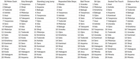
Most of our choices were based on 2 questions we applied to very category: who would be able to apply their quirk the best in this scenario, and who would perform/be hindered by their quirks the worst. Working from there, we filled in the blanks.
The biggest conclusions we drew are:
While he's shown to struggle with flexibility, Deku has proven over and over during his training montage that he's fit, active, strong, exercises to excess, and can certainly maintain a long distance run. Steadily ranking around the halfway mark of the class by topping those who can't apply their quirks to the task, combined with second place in the ball throw, there's no CHANCE he would end up in 20th place. Free my boy he did a good job he didn't deserve that.
Yaoyorozu really has the most versatile quirk that's applicable to ANY situation and she absolutely deserves to retain her 1st place position.
Asui achieving only 13th place in the canon ranking is baffling. BAFFLING. Her quirk is entirely physical and lends itself utterly to these speicifc types of tests. 13th??? THIRTEENTH??!??! When her entire quirk is hopping jumping moving??? Madness. Absolutely madness.
Bakugo maintains 3rd place either way because he really is That Bitch
Using Todoroki as an example, I think Horikoshi built his final ranking based on vibes and based on quirks. By looking at the canon ranking versus ours, I think it's quite clear that he rated them based on his own perception of their quirk strength as a whole within the context of the entire story - not how they would perform in this specific circumstance. Todoroki, who at this point, while highly trained, is still refusing to use his fire and can't actually use just his ice for very much of these tests. Side steps? Seated toe-touch?? What could ice from one half of his body POSSIBLY add to those scores? Enough to bring him to 2nd place? Not on your life
Iida stays in 4th place, all-rounder king and legend
Ashido is a similar case to Asui - how can someone with such a physically-focused quirk AND a canonically physical lifestyle rank in at 9th? Even then, her agility and speed can only take her so far HOW did she overtake Asui in the final canon ranking? How could acid possibly trump frog in jumping or side stepping?
Horikoshi has a very clear bias towards strength-type quirks that (excluding Asui) dominates among males students. Characters who are larger, stronger, an have bigger builds are ranking higher in these tests DESPITE the fact that, for a lot of them, they'd either be hindered (seated toe-touch if they're too stocky to have much flexibility, the long-distance run in their larger builds work against their stamina and endurance, etc.). Being strong doesn't make you fast, or agile, or flexible, and a lot of them shouldn't be as highly ranked as they are when other quirks are more applicable in those circumstances.
Sad to say but Koda is ranking 20th overall. Koda's quirk doesn't lend itself to ANY of these tests (unless he chose to summon animals to actively detract from his classmates scores to bring his own up by comparison) and his quirk has given him a stocky, heavy, inflexible build that would hinder him greatly in any of the tests that need speed, agility and flexibility. Despite doing well in some tests, overall his quirk wasn't able to help him AT ALL in any of these tests, and by comparison he's sunk to 20th in the end.
While there really aren't enough girls actually in the class (the first red flag) to be able to draw a clear conclusion on the final canon rankings having an extreme gender bias, I've still included a gendered breakdown because you can see just how clearly and aggressively Asui and Mina were nerfed for absolutely no logical reason.
Most of the tests' 20th place were between Koda and Mineta, based on how their physical builds would work against them in different tests (Koda would have more physical reach for jumping, running, etc. than Mineta's absurdly short build, and Koda's stockiness and inflexibility would hinder him). I know we all love to put Mineta in last place overall, but unfortunately he did absolutely kill the repeated side steps and there's no arguing with it, and despite coming in 20th more than anyone else, one 1st place score is enough to drag him out of 20th overall. (Which, again, further reinforces our argument that Deku never should have been in 20th place after managing to snag a 2nd place score in just one of these tests, even if he did perform poorly in all other physical tests. Which he didn't. At all.)
One last time, I'd really like to reiterate that these apprehension tests are straight up unfair to those without physical quirks. Koda, Jirou, Hakagure and Kaminari specifically cannot use their quirks to physically agment their own body or their movement in any way - even if they're incredibly valuable in the contexts of a physical fight, espionage, or search and rescue work. Jirou and Kaminari in particular likely did well at the entrance exam against robots, while Koda and Hakagure could do excellent work in the future as underground and search and rescue heroes. I simply cannot believe that Aizawa would use this as a useful measurement of these kids' quirks and abilities.
You cannot seriously try and convince me that DEKU has poorer running endurance, grip strength, etc. than his classmates that DON'T have physically augmented quirks, after spending months proving it to us through his intense training regimen. Mineta? Hakagure? Jirou? Kaminari? Aoyama?? You think he has a weaker grip strength than foppish waifish fancyboy Aoyama?? After dragging around piles of scrap by HAND?!? MADNESS. Madness. Even if he didn't score as well as we think he would, coming out on top of those guys (which he UNQUESTIONABLY would) combined with a 2nd place ball throw score he CAN'T place 20th overall. That's! That's not how numbers work! It just doesn't work like that!!!!


Someone could absolutely argue that Aizawa put the test together to see who puts in the physical effort to improve themselves outside of their quirk as well as being able to use it creatively - but honestly I don't buy it. At the end of the day, I know this was just a plot point to further Deku's motivation and contrast his own power level compared to his peers, and I know its not that serious, but we really enjoyed trying to fugure out how it would all shake out if the quirk apprehension tests were given some more realistic thoughts.
If you disagree with any of the rankings do feel free to comment, I think a lot of us probably have different ideas on how someone might creatively apply 1A's quirks in this scenario, and I'm hardly about to declare myself the final authority on the topic.
#boku no hero academia#my hero academia#bnha#mha#meta#mha meta#bnha meta#izuku midoriya#deku#momo yaoyorozu#tsuyu asui#katsuki bakugo#tenya iida#shoto todoroki#mina ashido#ochaco uraraka#mashirao ojiro#fumikage tokoyami#rikido sato#eijirou kirishima#hanata sero#mezo shoji#yuuga aoyama#denki kaminari#kyoka jiro#toru hagakure#minoru mineta#koji koda#boku no hero academia meta#my hero academia meta
93 notes
·
View notes
Text
9th and 12th Houses - How Far is Foreign?

An insight, that adds to depth of understanding of Astrology through diving into Vedic resources is the change in perception between the 12th and the 9th house.
In popular Astrology circles, both of these houses are commonly associated with foreign lands. However, as you explore the meaning of these houses more, you begin to understand them deeper in polarity with their opposite.
The actual house of foreign, far away travel (or relocation, depending on the chart) is the 9th house. That is because the 9th house is the opposite of the 3rd house.
Say you are European, and you lived your whole life in Europe, and you travelled around different European countries to explore the continent. This is the 3rd house. It is the expansion beyond your local home country into exploring its nearest cultural environment, and at the end of such a pilgrimage, you end up with a personal understanding of your individual, cultural identity, which moves you to its emotional interpretation in the 4th house.
But then lets say you travel or move from Europe to Asia, either of the American continents, Australia…take your pick. This is the activation of the 9th house. Because you are no longer exploring just the back yard of a culture with a certain degree of similarity, you are entering a completely new physical world.
This is why houses 9, 10 and 11, and 12th to an extent, are found in charts of famous people. You need to be able to participate in an energy, an idea, that is going to spread into foreign lands to truly be famous. This applies even if we’re talking about online success, which is the way people get recognition nowadays. Otherwise, you are at best a local singer on your continent or your country’s music festival. There is nothing wrong with that of course, as many people love to contribute to their community and they’re happy doing so, but it’s still an accurate observation. You need to be able to go far away, not strictly physically but energetically, to touch a variety of people from many cultures.
You might wonder, how does the 12th house fit into this? Clearly, it’s part of the whole 9th, 10th, 11th and 12th house group, so it should also rule foreign lands. But the 12th house is actually more than that. The 12th house rules a fantastical, foreign idea, that might not necessarily be grounded in the immediate physical, but is nevertheless energetically real and can be accessed from anywhere. It’s the idea of the collective emotional consciousness, that may not have the most quick and obvious material manifestation but is nevertheless a very real thing existing within this Universe.
Up until the 11th house, through 9th and 10th, we are dealing with more or less tangible ideas regarding foreign lands. Let’s say in the 9th house you relocated to a completely foreign culture, in the 10th house you found a way to tangibly join the most prominent physical environment of the world through that culture, in the 11th house you met some of the most prominent, affluent people in the world. I don’t have any 11th house planets, but to give you an idea of how it works, my husband has Venus conjunct Mars in the 11th house, we live in the Las Vegas area, and he plays sports and is casually friendly with some of the wealthiest people in the world, who own successful businesses, own several properties across the world, and spend a lot of their time either making a lot of money or travelling the world, or both. We are not one of those people, but it should give you an idea of what the 11th house is. It’s the creme de la creme of the physical world. I don’t personally interact much with these people, as they are my husband’s friends, not mine, and I don’t play sports with them, but I have a deep awareness of how advanced socially and financially this particular group is, having travelled to many poorer parts of the world. There are people in this world, starving, so in comparison to them, the 11th house society is the top 1% of 1%.
You might think, well, the 11th house is everything, so how can the 12th house be more? The 12th house is more because it sells something even the 11th house people can’t resist, it sells the ultimate fantasy.
In the 12th house we move on to people so wealthy, they barely even interact with others. We move to intangible concepts, physical areas and objects, that provoke people to spend obscene amounts of money simply due to some idea. The 12th house is not just real foreign travel like the 9th house, it is the embodiment of the realisation of all fantasies. That is why Venus is so happy in the 12th house, because it enjoys the ultimate idea of fantastical luxury.
The foreign area that we travel to in the 12th house is not this globe, it is deep inside us. By the time we realise all our fantasies in the 11th house we can feel tired, or even jaded. But in the 12th house we are stimulated to all of our secret, hidden desires being provoked and coming true. This can be done not only within our home, within our room, but completely within our minds. Those, who are successful in the 12th house are those, who made those fantasies concrete enough to realise them and live within them.
What if you could taste and smell the finest perfume created on this planet from purely natural oils? What if you could touch the finest fabrics, created in corners of the world you never even dreamed of? What if you could live this dream, every day, surrounded by an infinite kaleidoscope of the pinnacle of perfection achieved by our planet until this time? “What if?” is the exotic, “foreign”, “far away” dream of the 12th house, and a well realised 12th house is a dream come true.
To offer up an example, in the last few years, youtubers living in rural areas from all over the world have popped up on the internet, offering videos from their seemingly idyllic life. That is the definition of the 12th house fantasy, devoid of the actually reality of having to take the 9th house physical pilgrimage of travelling to rural China and enduring all the difficulties involved with facing the reality of such a location. It may seem idealised, yet the source material for filming is real, so while it may be distant from the viewers geographically, while it may cost the locals a lot of work, it is nevertheless part of an actual, existing reality.
This dream, that can seem excessive to a mundane mind, becomes even clearer in the context of the 12th house’s polarity, the 6th house. The 6th house is the tough battle of dealing with the ugliness and conflict of this world. That is the reality of this physical world for most of us, we get up every day and deal with conflicts, that we have in front of us. It is exhausting, and so the 12th house is everything that heals and soothes the pain of any conflict that ravaged us in the 6th house. It’s the world offering no resistance, it’s all boundaries being breached. After all, in our dreams, or fantasies, we want everything to be perfect and smooth.
Ironically enough, the karaka of the 12th house is Saturn. As someone with significant 12th house influence, it is pretty clear to me why. In order to have only the finest dream come true, to really live in a beautiful fantasy, one actually needs to do a lot of research, be picky, critical and have background expertise and know-how. Otherwise, even as just a consumer, you would be easily fooled, hoodwinked into a fake product, or end up overpaying on something, that is not worth the money you invest into it. Scrutiny of Saturn is necessary for our fantasies to be smooth. It is not something, that is given to us that easily. Saturn also rules isolation, and if the 9th house is foreign, the 12th house is the pinnacle of remote. The 9th house is what is foreign and exciting to us, mentally and physically, but the 12th house represents the most remote corners of both the physical world, and our minds.
This is why the 12th house is the furthest away from the 1st house, our basic, natural, physical life. Because the furthest thing on this planet is not just a foreign continent, it’s a journey inside our minds and emotions, the ability to blend discernment and internal surrender to divine perfection, that leads to manifestation. It is the full depth of untapped potential on the very bottom of our subconscious, a research and response to all collective energetic resources available on the planet, a gold mine waiting to be explored, exploited, and enjoyed. And it is tapping into this gold mine, that has the power to tempt, seduce, and attract people from all around the world into directing their energy towards us, even if we’re physically just sitting in our room, far away from them.
299 notes
·
View notes
Text

_____________ ׂׂૢ་༘࿐
┊ ⋆ ┊ . ┊ ┊
┊ ┊⋆ ┊ . Personal
┊ ┊ ⋆˚ Astro Observations #1
✧. ┊
⋆ ★


DISCLAIMER! This post is based mainly on my natal chart, personal experience and opinions, so take what resonates and leave what doesn't. I also included acquaintances' charts and their perspectives and confirmed my observations with the help of astrology databanks (celebrities' birth charts). If one (or more) of the observations in this post happen to be similar to other creators, please inform me, so I can tag their page. I am open to questions, opinions and debates. I do not own any of the photos on this post, they are just for ✨aesthetic reasons✨. Thank you for reading my post and I hope it will help you heal & find yourself💞.
#1
+18? TW!
Everyone can have an addiction, it is not limited only to the 12th house Lilith placement. But we can conclude that Lilith in the 12th house person is more inclined to get addicted to escapism than being dependent on the subject of addiction.
Let's say both the 12th and 8th house Lilith can deal with 🌽addiction. 8th house Lilith has a wound surrounding power and control, so they will search for a coping mechanism that will prove to themselves their own power and autonomy. For the 12th house Lilith, this is about a fear of perceiving the reality they are in (dissociation). Their wound encircles the toxic environment they live in, so they indulge in the most satisfactory and 'safest' type of escapism according to their circumstances.
#2
Lilith in the 12th house combined with noticeable 6th house placements can indicate prominent awareness towards their addictions or their ways to escape reality. That type of person who smokes but is fully aware of the consequences it has on their body. It makes sense because the 6th house is work, self-improvement and health-oriented (perhaps with health difficulties), therefore Lilith in the 12th house here can be a bit of a challenge in this lifetime, so they might be more motivated to heal. I think we can consider this dynamic not only for the 12th-6th houses but for all opposing houses.
#3
Having the Moon and Neptune in the same house might indicate an "illusion of comfort" in childhood, especially if the moon is badly aspected. It can be pinpointed to a confusing relationship with a parent; being gaslighted maybe. The house can represent in which area the confusion is/was. If this happens in the 10th house, there also might be a 'single mom' dynamic here, whether both parents were there or not.
#4
Taurus Rising with Scorpio Venus looks best when confident. Their eyes are very fierce when focused on their goal or task. Big cat energy🐅. They are like wild cats waiting for the right time to attack their prey 😩. 10/10 Certified mommy vibes. Period 💅
#5
Both the 22° Saturn and 22° Sun indicate a restricting father/paternal figure.
For the 22° Sun, the impact is 'more personal' and it affects their confidence and identity. These people's personalities might have been repressed in their childhood. In terms of how they have been repressed, we should check the Saturn placement and/or the Saturn Persona Chart.
For the 22° Saturn, the experience is more 'detached' in comparison with the Sun person. The individual might have a more grounded sense of self than the Sun person, but the Saturn Return period is going to be crucial. This can also imply a change in careers or finally healing something in regard to their career because Saturn rules Capricorn rules Medium-Coeli.

© thegod707 All Rights Reserved
#astrology#astro observations#22 degrees#taurus#10th house#lilith#lilith in the 12th house#astro notes#astro community#astro placements#taurus rising#taurus ascendant#scorpio venus#moon in 10th house#moon#22 degree#neptune#neptune in 10th house#saturn#scorpio#venus#sun#lilith in the 8th house
252 notes
·
View notes
Text
A PSA for tagging DPxDC Content
This post will include:
The proper tags to use when posting
Why we use them and not the parent fandom tags
A chart of key words to help you filter
Image descriptions under the cut
We know we can't control who tags what, and how tumblr chooses to work, or not work, but these are just some general guidelines to help everyone find or block our content.

What DPxDC Tags should you use?
General: dpxdc always
More Specific Tags: Batpham, dpxjl, dpxyj
For ALL ships please add “ship” after the ship name. For example: Dead Tired ship, Dead on Main ship, Double Edged Sword ship
What Tags should you NOT use?
Parent Fandom Tags: Danny Phantom, dp, Phandom, Phanart, Phanfic, DC Comics, DC Universe, dc, Batfamily, Batfam, Superfam
Variations of General Tags: dp x dc, dcxdp, dc x dp, dp x jl, dp x yj, dp/dc, dc/dp,
For ships please don’t tag JUST the ship name. For example: Dead Tired, Dead on Main, Double Edged Sword
As a general fandom tag we are using dpxdc, WITH NO SPACES.
Why no spaces? Tumblr is so glitchy it’s baffling a very functional website. Because of this we’ve received reports that sometimes if a post is tagged "dp x dc" or “dp/dc” then, even when the tag is blocked, the posts will still show up in the individual "dp" and "dc" tags. That isn’t cool.
Why is it important to tag separately?
dpxdc is a big crossover. The crossover fandom has been rapidly growing over the past year. The crossover fandom drowns out the original dp/danny phantom fandom by a lot, especially for people who may be interested in dpxdc but also want to enjoy regular phandom content. By not using the dp and danny phantom tags, it helps a lot to not drown out the main fandom's inhabitants and content. dpxdc as a fandom tends to pump out a lot of content (which is amazing), but that means that we need to be careful to not suffocate the main fandoms. "Why can't I tag the danny phantom or batfam main fandoms? it's a crossover" -- yeah, it is a crossover, but it's a crossover that is huge (especially in comparison to danny phantom) and dpxdc has taken over the main fandom tags. It's causing a lot of animosity and tension on both sides.
Additionally, the crossover (like most fandoms) comes with some common characterizations, tropes, aus, and concepts that tend to be interpretations that do not link back to the main fandom well. While fandoms come up with their own characterizations, tropes, aus, and concepts, it's important to know when a crossover fandom has existed long enough to establish its own sets of common themes that the main fandom may want nothing to do with.
This doesn’t mean you have to pick between dpxdc and its parent fandoms, like Danny Phantom or DC or Batfam. Indeed, by NOT tagging dpxdc with its parent fandoms, you are ensuring that people who want a space for dpxdc and a space for its parent fandoms can have both! We don’t have to pick sides! But in order to have both, we need to tag dpxdc content with a tag we can search (that is, dpxdc), AND we need to make sure we’re NOT tagging the parent fandoms (such as, danny phantom).
What if I don't want to see dpxdc content?
Here {link} is an in depth guide on how to block tags and filter certain content from appearing on your dash. We also ask that you please keep any venting out of the dpxdc.
However, if you’d like an easy list of terms to just put into your filters, we’ve made a chart!
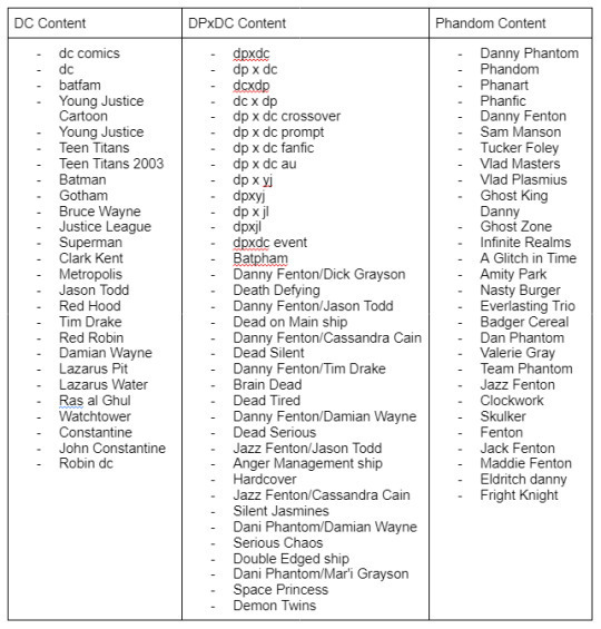
Thank you!!! 🦇👻🦇👻🦇👻🦇👻🦇👻🦇👻🦇👻🦇👻🦇👻🦇👻🦇👻🦇
[image description: A table with 3 categories, “DC Content”, “DPxDC content” and “DP content.
Under “DC Content” are listed: dc comics, dc, batfam, Young Justice Cartoon, Young Justice , Teen Titans, Teen Titans 2003, Batman, Gotham, Bruce Wayne, Justice League, Superman, Clark Kent, Metropolis , Jason Todd, Red Hood, Tim Drake, Red Robin, Damian Wayne, Lazarus Pit, Lazarus Water, Ras al Ghul, Watchtower, Constantine, John Constantine, Robin dc.
Under “DPxDC content” are listed: dpxdc, dp x dc, dcxdp, dc x dp, dp x dc crossover, dp x dc prompt, dp x dc fanfic, dp x dc au, dp x yj, dpxyj, dp x jl, dpxjl, dpxdc event, Batpham, Danny Fenton/Dick Grayson, Death Defying, Danny Fenton/Jason Todd, Dead on Main ship, Danny Fenton/Cassandra Cain, Dead Silent, Danny Fenton/Tim Drake, Brain Dead, Dead Tired, Danny Fenton/Damian Wayne, Dead Serious, Jazz Fenton/Jason Todd, Anger Management ship, Hardcover, Jazz Fenton/Cassandra Cain, Silent Jasmines, Dani Phantom/Damian Wayne, Serious Chaos, Double Edged ship, Dani Phantom/Mar'i Grayson, Space Princess, Demon Twins.
Under “DP content” are listed: Danny Phantom, Phandom, Phanart, Phanfic, Danny Fenton, Sam Manson, Tucker Foley, Vlad Masters, Vlad Plasmius, Ghost King Danny, Ghost Zone, Infinite Realms, A Glitch in Time, Amity Park, Nasty Burger, Everlasting Trio, Badger Cereal, Dan Phantom, Valerie Gray, Team Phantom, Jazz Fenton, Clockwork, Skulker, Fenton, Jack Fenton, Maddie Fenton, Eldritch danny, Fright Knight. end]
#dpxdc#batpham server#batfam#tagging both parent fandoms only because they need to know what to block and what to tag if they're getting into it#Danny Phantom#dp#dp crossover#dp x dc#dp x dc crossover#dp x yj#batman#danny fenton#dc comics#dc universe#justice league#young justice#batfamily#phandom
718 notes
·
View notes
Text
Recently, I found a very strange Naegi sprite, and it's got me thinking a lot about the DR1 Sprite process.
It's from the promotional picture announcing Danganronpa Unlimited Battle, a now defunct iOS/Android game from 2015.

To some this sprite might look normal, but it is assuredly not. Also, Kirigiri's is off, too. But for the sake of the kind of discussion I'm heading, I'm only going to focus on Naegi for right now.
It's very difficult to navigate the game's files, but I *was* able to pull a clean version of the sprite.

This sprite is weird for so many reasons. I can't tell if it's even a beta sprite or not. If it is, it looks closer to an SDR2 beta.
To illustrate what I mean, please look at this infograph from a different post of mine, about the standard Naegi default sprite.

What sticks out to most people, I think, is how different each sprite is (with exception to the last two). The style itself seemed to change, and considering Danganronpa's history, this makes sense. DISTRUST, as it was once called, was going to look and play very differently. It is then no surprised the sprites went through a very different creative process than, say, the SDR2 sprites - when by that point, the team had a clear idea of what the Danganronpa art style was to look like.
For comparison, here's a linear look at how SDR2 sprites are largely created.
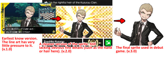
Please excuse the messiness of the chart.
What's notable is the most basic form of these sprites lack line weight. A pen with 0 pressure is used to draw the outline, then the illusion of pen pressure is added by erasing some of the ends. It's an incredibly interesting way to stylize the artwork.
Kuzuryuu is a great example as we have 3 main points in this specific graph: the "draft", the "beta" and the "final". But, as I've covered before, there is sometimes possible other sprites between these 3 points. Think of it like v.1.0, v.2.0, v.3.0 - while all the minor renditions (that, for some reason, Spike keeps around and keep accidentally misusing) are akin to v.1.1, v.2.1, v.2.2, etc...
And while I still believe my original theory I posed about SDR2 sprites being a 3-step-process is mostly true, I do think specific sprites or characters have more or less steps in between each "level".
For extra reference, here is some other sprite comparisons:

So, with all of these examples, I think you can see a clear process within SDR2's sprites.
Back to Naegi, and what confuses me...
I made a chart for this specific sprite.
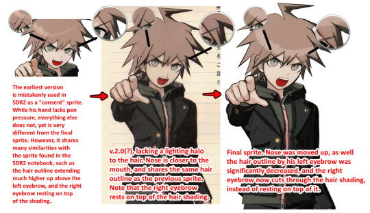
This graph shows a clear, logical timeline from point A to B, to C.

Now, let me compare the Naegi from Unlimited Battle to the final, finished sprite.

It's very different, but in ways that don't make sense. His hand is completely different from all versions of the Naegi sprite we've seen. As well, why does this sprite have lower hair, when none of the Naegi sprites in that timeline do? His hoodie zipper, also, is different from all 3 sprites. If this was a beta of the v.2.0 sprite, why is the nose in the correct position as the 3.0 sprite? Or why is the right eyebrow cutting through the hair shading, like the 3.0 sprite? If this were earlier, should it not look closer to the 2.0 sprite?
So...I don't think it makes sense to be a beta sprite, despite the outlining looking like an SDR2 beta. Then what is it?
That, I have no clue. But I have some ideas.
Firstly, this may be a sprite made only for this game. I have 0 clue why this would be, or where it would be used in-game, as the game is unplayable these days. Why this sprite only, though? The SDR2 cast was featured prominently in this game, too, and Hinata did not get any re-drawn sprites. Why did Kirigiri randomly also have a redrawn sprite?
But, stuff like this has happened before. the Danganronpa LINE stickers have many redrawn sprites. Not all of them are weirdly, but that only makes it share more in common with this game which also has non-redrawn sprites.
But if not redrawn for this specific game, what else could it be?
Well...I only have 1 other theory.
1・2 Reload (the Vita remaster of DR1&SDR2) was released late 2013, while Unlimited Battle was released early 2015. The Vita version of DR1 did something interesting that the Vita version of SDR2 did not do: go back and touch up sprites.
I'm still in the midst of finding all the characters who were edited, but the most noticeable and abundant is Kuwata's.

I'll cover this more in-depth once I get to my "DR1 PSP -> PSVita Revisions" post, but the change is clear. They added much thicker outlines to Kuwata's sprites - almost all of them. This is clearly a purposeful change and not them reusing betas on accident, as Kuwata's actual beta sprites (observed in the DR1 Demo version) lack these bold outlines.
So...what if everyone was going to get this treatment? It may be a stretch, but it's the only thing that makes sense to me. Perhaps everyone's sprites were going to be heavily edited to look more like SDR2 sprites, and perhaps this process was even started before they gave up for one reason or another. So, we only have a few characters who ever got this treatment...and then some of those sprites were accidentally used in this iOS game.
Of course, that's only my theory. There could be a million other reasons for why this Naegi sprite exists - along with Kirigiri's and...Oogami.
Yes, in the files, I also found an odd Oogami sprite with the same quirks to it as Naegi's and Kirigiri's. I'll make gifs for them both now.


All I can say is this is really strange. I wish I had a more definitive answer for what's going on here.
#makoto naegi#kyoko kirigiri#sakura oogami#danganronpa#dr#;danganbetasprites#;noxiatalksia#danganronpa unlimited battle
34 notes
·
View notes
Text
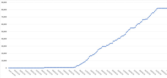
The Writing Tracker and Statistics spreadsheet for 2024 is here!
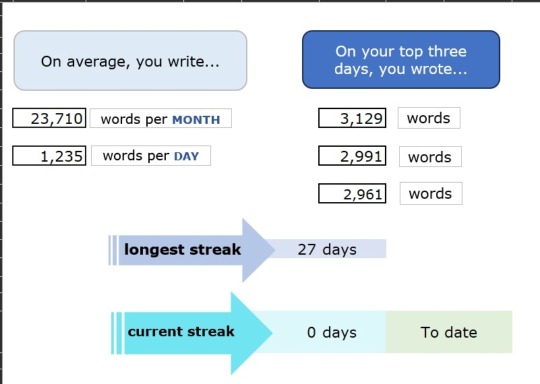
What is it?
The spreadsheet is a way for writers who like statistics to track their daily wordcounts and writing habits (and also, probably, don't want to or can't pay to use software for this purpose). The idea is, once you've got the workbook set up and customised to your tastes, all you need to do is input your daily wordcount per project into one sheet and let the rest of the workbook populate from there. I originally designed this in late 2022 because I wanted a way to track my writing habits while also comparing how much original fiction VS fanfiction I wrote. It has since expanded to be more flexible, with a comparison function that's easy to adjust or scrap entirely, and a variety of other neat statistics besides. Key features include:
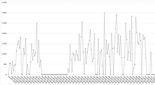
Line graph that displays your daily writing across the whole year.
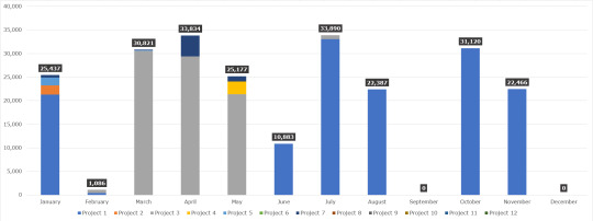
Total word counts for each month displayed in stacked columns so you can see which projects you worked on.
Counters for your current daily writing streak and longest daily writing streak.
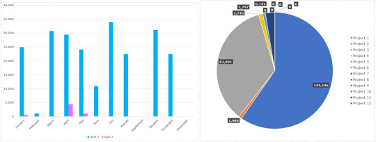
Pie chart to show which projects were worked on the most overall.
Ability to separate projects into "types" – i.e., personal and academic – and compare type totals each month.
Words-over-time progress charts for specific projects, with the ability to help set and track writing goals.
Daily and monthly averages.
You don't need to be a genius (or even fairly confident in using) Excel/Google Sheets to make this work for you. I've written up a detailed set of instructions that walk through each sheet and explain how to make a variety of changes, as well as breaking down how certain aspects work.
If this is something that interests you, follow the link below to my Payhip. It's a free resource; Payhip just gives you the option to leave a tip, should you feel like it and have the cash to spare.
Want to know more? Keep reading below the cut for a closer look at the features.
Daily graph to see your writing habits across the whole year at a glance:
Your top statistics: monthly and daily averages, top writing days, longest writing streak, current writing streak, and daily averages by month.

Monthly writing totals displayed in a stacked column chart so you can see which projects you worked on each month:
Clustered column graph to show one type of project compared to another, and a pie chart to show which projects you worked on most across the year:
Project-specific progress charts that show words over time, similar to the NaNoWriMo graph. (Plus, there are instructions on how to add goal lines to make it even more like the NaNoWriMo graph!)
303 notes
·
View notes
Note
Wrt the addiction discussion, is there not a lot of overlap between the types of people you describe (e.g. people with a physical dependency, 12-steppers, people who are unhappy with their substance use, etc)? I feel like it's a mistake to treat them as universally discrete categories, even accounting for the wide range of experiences and attitudes 'addiction' encompasses. Yes the term is heavily medicalised and used to justify punitive interventions (which shouldn't happen, obviously), but couldn't the same be said of, say, queer identities given how homosexuality was listed in the DSM until fairly recently? It's not morally wrong to identify as queer just because the category itself is rooted in oppression. The term spans such a broad array of possible identities, preferences and behaviours, but a lot of people still find it useful for solidarity-building, and I think something is lost when we eschew these fluid, broad-spectrum terms in favour of finely atomised individual behaviours.
where did i say i was interested in making new discrete categories out of the addiction label? nowhere because i explicitly am not interested in makingn categories at all. reread the post.
there is no 'addicts pride' or 'pro addiction' movement comparable to the lgbt scene, which should tell you some things about quite differently weighted use of these medical terms. incidentally, many people do in fact perceive some difference between eg homosexual and gay precisely because of the former's medical and criminal history.
the term addiction is not used for "solidarity-building" please like don't make me laugh. once again it is not only "rooted in" but currently used for pathologising efforts born of theories of social degeneration. when someone says video games are addictive sugar is addictive the internet is addictive -- these are active current new claims about the supposedly deleterious social effects of technologies and practices the speaker perceives as insalubrious and threatening to the social order, specifically relying on medico-legal notions of the Addict to make these claims.
your comparison sucks anyway because there is in fact broad agreement on what eg gay means, what practices and forms of social violence it refers to: there is no such agreement as regards addiction, not in the medical discourse and not in popular use either. reread the post.
id really invite people to think about why you are so incredibly instantly defensive over this particular piece of terminology. what do you think is at stake here? it's not useful shorthand, it's not attached to meaningful political activist groups, and it's in constant semantic shift in order to make claims about new groups and activities being socially degenerate and destabilising. in order to convey anything useful or specific about how you use substances, when, or why, you are in fact already relying on actually explaining yourself beyond this term (so is your medical chart).
the umbrella term i believe you're actually grasping for here, & it's frankly embarrassing you're apparently so far removed from harm reduction activism that you don't know this & yet are sending paragraphs whinging to my inbox, is "people who use drugs." i personally think person-first is slightly corny and usually just say "drug users" or "recreational drug users" as the case may be but i have no serious objection to the former as an umbrella term.
#if you hate my opinion on the word addiction just wait until you hear my opinion on The Entire Rest Of The DSM 👍#addiction#psychiatry#<- not taking questions if you haven't read these first
35 notes
·
View notes
Text
ASTROLOGY AND MEETING PEOPLE
Your capability of meeting people via the internet or formally is seen in the chart.
All you have to do is see if you have a lot of placements in the first 6 houses or the last 6? Of course, some people have a mixture.
If you are someone that considers yourself more likely to connect with people in intimate environments rather than crowded places, you probably should ONLY try to make friends in person rather than creating false connections online.
You can always keep it natural by agreeing to meet to see how well you guys connect instead of moving in complete delusion. That would be a better way to utilize this.
As someone with a lot of placements in personal houses(1-6), the connections I didn't make naturally were pointless and short-lived, but the connections I made in person were better, not perfect, but just better in comparison.
The planets Uranus and Neptune are both in an outer house for me personally which to me means keeping things "there" and not mixing it with my personal/private life.
My 11th house ruler is in the 12th! No trying to make personal connections through the internet for me! It simply wont work. It has been a pattern I noticed.
Another person could have this placement and have a better experience based on aspects. I have aspects that suggest "Dontt"
#astrology#astro community#astro notes#astro placements#astro rambles#natal chart#capricorn#aquarius#planets#astro observations#astro posts#astrology notes#astrology content#astro tumblr#astro blog#astrology signs#astrology observations#astrology community#astrology readings#astrology blog#birth chart#astroblr#vedic astrology#pisces zodiac#zodic signs#zodiac#libra zodiac#aries zodiac#sagittarius zodiac
32 notes
·
View notes
Text


First: This post is the premise.↑
Note: This review was not made with the intention of "judging skin color." On the contrary, it was made to point out the double standard that you non-Asian people "judge Asian skin color," but "in reality, you guys are getting the skin color wrong." Personally, I think people should be free to even change their skin color. I made this because I hate people like you who enforce a lack of tolerance.
Verification: Materials were copied and pasted to make everything the same. Area lights were used so that there would be no difference in lighting. Shang Tsung was used as the base, and everything except the skin was temporary or reused. What was surprising was that in yellow tones, Shang Tsung was the brightest in his class. This means that it is not wrong to draw Shang Tsung in lighter colors. In red tones, Sub-Zero is bright, but Scorpion is also surprisingly pale. Below are my own speculations
Among them, Johnny is the only one who is white, and because he is white, his coloring reflects his complexion, but if you look at the color of his face alone, you wonder if there is a difference between him and Kenshi. In terms of simple whiteness, Sub-Zero is by far the whitest.
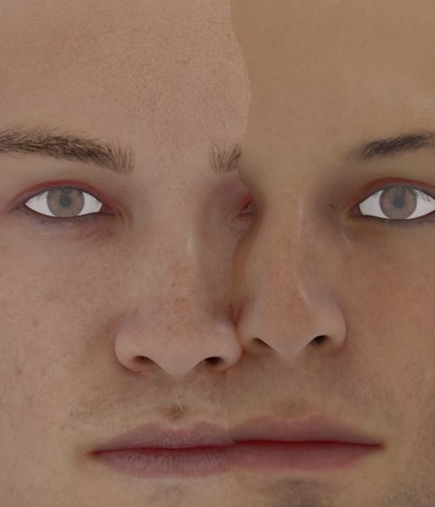
The color around Kenshi's collarbone is slightly redder, and I feel like we should get rid of the jinx that white people = whiteness.

No matter how much I review Kenshi's materials, the results always seem to have some kind of error, why?
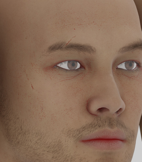
I thought Smoke was a bit high-toned even in the game screen, but surprisingly, Subsco ends up looking paler than him. I think the reason Smoke looks high-toned is because the light in photo mode is also yellowish.
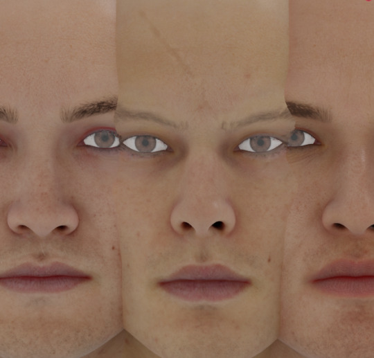
So when drawing these three, it's correct to use the same tones and make Smoke yellower.
Scorpion is a little redder and darker than Smoke, but it's wrong to make him a clear black and white contrast with Smoke. So, artists like that should be blackwashed! (But don't forget that Scorpion has Japanese roots and gets sunburned easily. He looks like he'll get sunburned.)
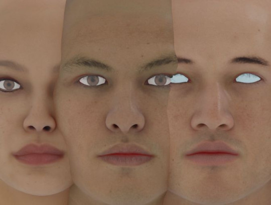
As for the problem with Raiden, he ends up being a darker tone than Liu Kang, so it's not wrong to point out that he shouldn't be colored with lighter skin.
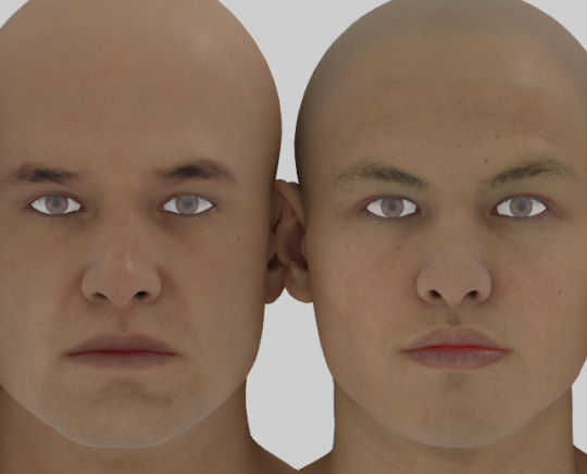
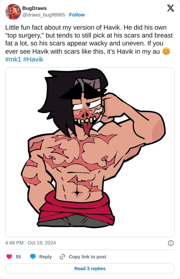
However, that Westerner "draws Havik with normal skin tone," so if the face alone is about the same tone, Raiden should be drawn with the same skin tone as Havik.
By the way, please draw Scorpion with lighter skin♥
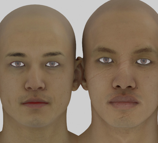
I think Takeda's skin is dark because, as a personal preference, he is half Thai. On the other hand, I think Kung Lao's skin is too yellow, not dark, because NRS made him too yellow because of a lack of Asians, so I've decided that Kung Lao is an Asian stereotype created by white people and black people.
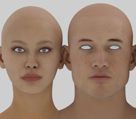
I've said before that Liu Kang's tone is light, but in reality, he's only a few tones different from Kitana. (I thought the complexion was better on screen, too, but Liu Kang's is better.)
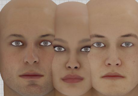
Basically, women's tones are higher than men's, even if they are the same race, but Kitana's tone is a little more beige than Shang Tsung's.
As it turns out, this assertion is incorrect, since Shang Tsung is lighter skinned than Johnny.

No matter what you guys say, Japanese people tend to draw better by putting basic bright colors first, so if you follow that rule and adjust the contrast, you can put colors like this. Use it as a color chart! I'll add character comparisons with my critiques if requested.
#mortal kombat#mk#mortalkombat#liu kang#kung lao#raiden#liukang#technical agenda#mortal kombat 1#mk1#mortal kombat scorpion#scorpion#subzero#sub zero#mortal kombat sub zero#bi han#kuai liang#shang tsung#kitana#smoke#havik#tomas vrbada#johnny cage#kenshi#kenshi takahashi#takahashi kenshi#takeda#takeda takahashi#takahashi takeda
46 notes
·
View notes
Text
how much power does tech really use, compared to other shit?
my dash has been full of arguing about AI power consumption recently. so I decided to investigate a bit.
it's true, as the Ars Technica article argues, that AI is still only one fairly small part of the overall tech sector power consumption, potentially comparable to things like PC gaming. what's notable is how quickly it's grown in just a few years, and this is likely to be a limit to how much more it can scale.
I think it is reasonable to say that adding generative AI at large scale to systems that did not previously have generative AI (phones, Windows operating system etc.) will increase the energy cost. it's hard to estimate by how much. however, the bulk of AI energy use is in training, not querying. in some cases 'AI' might lead to less energy use, e.g. using an AI denoiser will reduce the energy needed to render an animated film.
the real problem being exposed is that most of us don't really have any intuition for how much energy is used for what. you can draw comparisons all sorts of ways. compare it to the total energy consumption of humanity and it may sound fairly niche; compare it to the energy used by a small country (I've seen Ireland as one example, which used about 170TWh in 2022) and it can sound huge.
but if we want to reduce the overall energy demand of our species (to slow our CO2 emissions in the short term, and accomodate the limitations of renewables in a hypothetical future), we should look at the full stack. how does AI, crypto and tech compare to other uses of energy?
here's how physicist David McKay broke down energy use per person in the UK way back in 2008 in Sustainable Energy Without The Hot Air, and his estimate of a viable renewable mix for the UK.
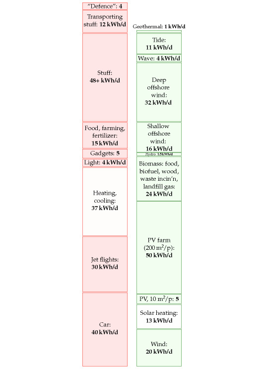
('Stuff' represents the embedded energy of manufactured goods not covered by the other boxes. 'Gadgets' represents the energy used by electronic devices including passive consumption by devices left on standby, and datacentres supporting them - I believe the embodied energy cost of building them falls under 'stuff' instead.)
today those numbers would probably look different - populations change, tech evolves, etc. etc., and this notably predates the massive rise in network infrastructure and computing tech that the Ars article describes. I'm sure someone's come up with a more up-to-date SEWTHA-style estimate of how energy consumption breaks down since then, but I don't have it to hand.
that said, the relative sizes of the blocks won't have changed that much. we still eat, heat our homes and fly about as much as ever; electric cars have become more popular but the fleet is still mostly petrol-powered. nothing has fundamentally changed in terms of the efficiency of most of this stuff. depending where you live, things might look a bit different - less energy on heating/cooling or more on cars for example.
how big a block would AI and crypto make on a chart like this?
per the IEA, crypto used 100-150TWh of electricity worldwide in 2022. in McKay's preferred unit of kWh/day/person, that would come to a worldwide average of just 0.04kWh/day/person. that is of course imagining that all eight billion of us use crypto, which is not true. if you looked at the total crypto-owning population, estimated to be 560 million in 2024, that comes to about 0.6kWh/day/crypto-owning person for cryptocurrency mining [2022/2024 data]. I'm sure that applies to a lot of people who just used crypto once to buy drugs or something, so the footprint of 'heavier' crypto users would be higher.
I'm actually a little surpised by this - I thought crypto was way worse. it's still orders of magnitude more demanding than other transaction systems but I'm rather relieved to see we haven't spent that much energy on the red queen race of cryptomining.
the projected energy use of AI is a bit more vague - depending on your estimate it could be higher or lower - but it would be a similar order of magnitude (around 100TWh).
SEWTHA calculated that in 2007, data centres in the USA added up to 0.4kWh/day/person. the ars article shows worldwide total data centre energy use increasing by a factor of about 7 since then; the world population has increased from just under 7 billion to nearly 8 billion. so the amount per person is probably about a sixfold increase to around 2.4kWh/day/person for data centres in the USA [extrapolated estimate based on 2007 data] - for Americans, anyway.
however, this is complicated because the proportion of people using network infrastructure worldwide has probably grown a lot since 2007, so a lot of that data centre expansion might be taking place outside the States.
as an alternative calculation, the IEA reports that in 2022, data centres accounted for 240-340 TWh, and transmitting data across the network, 260-360 TWh; in total 500-700TWh. averaged across the whole world, that comes to just 0.2 kWh/day/person for data centres and network infrastructure worldwide [2022 data] - though it probably breaks down very unequally across countries, which might account for the huge discrepancy in our estimates here! e.g. if you live in a country with fast, reliable internet where you can easily stream 4k video, you will probably account for much higher internet traffic than someone in a country where most people connect to the internet using phones over data.
overall, however we calculate it, it's still pretty small compared to the rest of the stack. AI is growing fast but worldwide energy use is around 180,000 TWh. humans use a lot of fucking energy. of course, reducing this is a multi-front battle, so we can still definitely stand to gain in tech. it's just not the main front here.
instead, the four biggest blocks by far are transportation, heating/cooling and manufacturing. if we want to make a real dent we'd need to collectively travel by car and plane a lot less, insulate our houses better, and reduce the turnover of material objects.
126 notes
·
View notes
Text
2024 Book Review #54 – The Design of Everyday Things by Don Norman
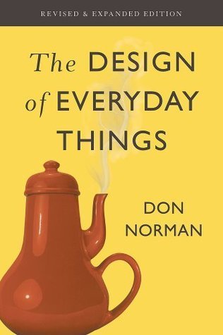
I try to read a piece of somewhat respectable nonfiction every month or so, which means I’m always vaguely on the lookout for titles that seem interesting and which aren’t either inspiration porn or just some random New Yorker’s collection of personal essays. I first heard of Design in an editorial in a local paper, which described it as a ‘seminal read’ – the basic conceit and title both seemed interesting so I through it on the list and, however many months later, finally got around to read with it. It was interesting, but altogether a more dense and technical read than I was at all prepared for when I picked it up.
The book is about what it says on the tin – looking at the processes and practices of industrial design and how it can be best applied to create useful, pleasurable tools. It is very much written for an assumed audience of at least interested amateurs or casual practitioners, with lots of specific practical tips and guidelines for the working designer to apply to their own projects. For the same reason it isn’t at all shy about the jargon or business-school models and charts.
Design, from the book’s perspective, covers an extremely broad field – everything from the physical structure of a tool to the systems and procedures that should be followed for its safe operation to the aesthetics and layout that give the most enjoyable and frictionless user experience handling it. The book considers its principles equally applicable to designing physical products and bureaucratic systems, and is mostly even convincing as it says so. That said, it absolutely assume that whatever is being designed is being designed by a large, multi-team project with budgets and stakeholders, and designed for sale on the private market, both of which do shape the advice given quite clearly (the entire final part of the book is about ‘designing in the real world’ and about these exact conditions).
The prose is written with the precise tone and cadence of an above-average but not great professor giving a long, rambling lecture that illustrates every single point with a tangential personal anecdote – though my mind may only jump to that comparison because that’s basically what this is in book form. It is not, being honest, ever exactly gripping or a page-turner; this was probably the book whose reading felt most like homework of any I’ve opened so far these year. Something not at all helped by the fact that the field of industrial design does the same thing as every other slice of academia and redefines a bunch of very common nouns to be very precise and occasionally very counterintuitive terms of art (though in fairness the book could have been much worse about this).
That aside, I did find the jargon mostly helpful, in terms of clarifying and separating out concepts. The distinction between capabilities (what a given device can be used for) and signifiers (the implicit or explicit ways a device presents itself to be used) is useful and pretty easy to keep in my head, for example.
The initial chapters of the book are primarily about the theory and best practices of designing specific, physical things – for example, how it represents a shameful failure for a door to ever require a sign or instructions on how it should be opened. This was probably the roughest part for me to get through, just because I felt like I should be taking quizzes or filling out worksheets to make sure I remembered everything correctly as I went – the sections get dense. It was fascinating reading to bludgeon through though, if only as a collection of the most practical insights yet provided by the study of human psychology. None of the best practices and recommendations given – never require the user to input more than a few commands without feedback or guidance, map the layout of controls to correspond to the physical ordering of the things they control, mechanical commands should feel like they have some sort of intuitive relationship to their effect, that sort of thing – exactly blew my mind, but it was helpful to see them laid out. Also interesting how much a lot of them contrast so strongly with the minimalist, ‘clean’ aesthetic which actually governs the design of so much these days.
The sections on mistakes and accidents were probably the most interesting and compelling in their own right. Maybe because I found the examples more intuitive, or maybe just because industrial accidents and airline disasters are more attention-grabbing examples than confusing and inefficient light switch layouts. In any case, the typology of mistakes versus errors (basically: whether you are trying to do the wrong thing, or trying to do the right thing and just failing in execution) and their subcategories seem genuinely quite useful, as do the various meditations on how to make both types less common.
This is also the section that has stuck with me in the most detail, if probably just because it seems like it might have some direct relevance to day-to-day life. Most especially the idea that focusing on how to assign fault or blame is the most useless possible thing to do when trying to investigate an accident – it only makes everyone motivated to hide any involvement they might have had, and lets you stop thinking about it as soon as you decide who is responsible without ever digging into the actual causes of the mistake. ‘Human error’ is, in Norman’s view, a mirage – if people are making dangerous or expensive mistakes at any appreciable rate, then that is axiomatically a failure of the systems which should be supporting and guiding them.
The fact that airline disasters are drastically overrepresented in the case studies used because the investigative infrastructure for them is uncommonly (almost bizarrely, really) well-designed and diligently maintained in the US is also just a fun bit of a trivia.
The third part of the book is about the actual process of designing something in a large organization. Perhaps unsurprisingly, this is mostly about bureaucratic politics and navigating frictions between, say, the design and marketing teams – the offered distinction that design is about making things that are useful and good whereas marketing’s input on the process is ensuring it is something that people will be willing to buy is pithy and memorable, if perhaps one that people on the marketing team might not be entirely happy with. This, along with terms like ‘the double-diamond design process’ and the oft-repeated saying that ‘the day a project starts it’s behind schedule and under budget’, and the gratuitous use of Japanese, all left me with the uncanny feeling of walking into an MBA seminar.
This is in fact an extremely famous and successful book – I know, because this is a heavily revised second edition, and the new material never missed a chance to say so. Having come out in 2013, the updated material – overwhelmingly about software UX, the internet, and smartphone design, because of course it is – is already somewhat charmingly outdated. The additions did include a long and very interesting section on changing standards, standardization, and when it is or isn’t worth the massive disruption involved (including a fascinating if probably not entirely trustworthy digression into the history of the QWERTY keyboard), so on the whole I’m happy I got this edition rather than the original from the ‘80s.
Overall, not a book I’m likely to open again anytime soon unless I end up making a dramatic change of careers, but interesting enough that I don’t regret reading it.
52 notes
·
View notes
Note
Do you think beauty indictors in astrology are reliable? Like does every person with Lilith in the 1st house, for example, have an intimidating attractiveness about them? Or Venus in 8th house… do all of them have strong sex appeal?
BEAUTY INDICATORS WITHIN ASTROLOGY

The answer to this question is complicated.
Celebrities are often referred to within astrology because their lives are put on public display, making them easy targets for interpretation. This is especially true when it comes to their appearance. However, I don't think celebrities should be referred to for accurate interpretations on appearance. Celebrities are more attractive in comparison to the general population, that's why they're famous. Plus, money and access to resources such as plastic surgery and specialized spa treatments are going to have a greater affect upon a persons appearance than astrology ever will. This doesn't mean that I think the images of celebrities shouldn't be used for visual examples, just that they should be taken with a grain of salt.
With that being said, I don't think beauty indicators are 100% reliable. Beauty is incredibly subjective. Some might find a Lilith first houser to have an intimidating beauty, but other people might consider their appearance to be strange and off-putting. Of course, the aspects Lilith is making within your chart are going to generate an effect as well.
Also, your appearance is going to change significantly throughout the course of your life. There are going to be years in which you face struggle and hardship, you might become injured or face severe illness for a prolonged period. Are you going to be your most beautiful, sexy self through these points in time? Fuck no, and you shouldn't expect yourself to be. Sometimes staying true to your authentic self despite its ugliness is more powerful than being beautiful.

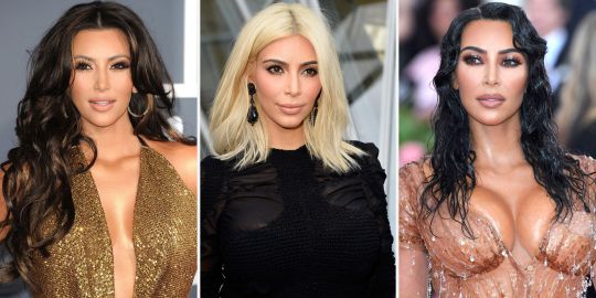
Kim Kardashian is commonly referred to when speaking on beauty indicators within astrology, and look at how much her appearance has changed throughout the course of her life. Towards the late 2010s, she was publicly criticized for having a "diaper butt," and people thought that she destroyed her face with filler and a bad nose job. However, within the past few years, she's made significant modifications and is yet again being publicly praised for her beauty.
I have seen beauty indicators within birth charts of people who I don't think are very attractive. But who knows? Maybe they weren't living up to the full potential of their beauty during that time. I know that there are periods in my life in which this was very much the case, that doesn't mean I lost any value as a person though.
I think people really start to exhibit these beauty indicators when they're living up to the potential showcased within their natal chart. If you have a strong beauty indicator placed within the 10th house, you're going to have to work hard and focus on your career for this to be strongly showcased. A Leo rising with strong beauty indicators placed within their chart isn't going to be perceived as attractive if they act egotistical and arrogant. For example, Vladimir Putin has Venus placed within the 1st house, I wouldn't call him a harmonious person.

Ultimately, if you're looking to astrology to figure out if you're beautiful, or relying upon astrology for confidence, it's a stupid idea. You're time would be better spent working on self-esteem issues. I say this generally, it's not directed at anyone specific. That being said, studying beauty indicators within astrology can be really fun and I consider it to be informative. In my opinion, it works best in connection to predictive astrology, because like I said, physical appearance changes drastically throughout the course of a persons life.
#astrology#astrology placements#astro community#astro observations#astrology observations#birth chart#astro notes#astrology tumblr#natal astrology#natal chart#astro beauty#astro posts#astro placements#astro tumblr#astrology notes#astrology community#astrology signs#birth chart placements#birth chart aspects#birth chart analysis#aspects#natal chart observations#natal chart placements#natal chart analysis#natal chart aspects#astrology blog#astrological observations#astrological signs#astrological transits#venus in first house
394 notes
·
View notes