#I need to sketch it before rendering...
Explore tagged Tumblr posts
Text

🥜Anya Forger week, day 1 - Past/Orphanage🥜
Anya escaped Project Apple's lab successfully and ran throught the streets of Berlint, until she got to some orphanage's door, where she found shelter (which isn't the orphanage where Twilight found her)
Maybe I'll do my entries a bit late than expected, I'm feeling a bit overthrow drawing rn -~-
And important note for my followers: I'm not back with posting my art, I'm only posting Anya week stuff and only here. I think Tumblr's safe from AI for now so it's cool.
#my art#fanart#anyaforgerweek#anya forger#spy x family#sxf#ibis paint art#ibis paint x#brazilian artists#brart#artists on tumblr#2024 artwork#it's kinda trash because I didn't planned the background#I need to sketch it before rendering...#it would save me so much trouble#mr chimera#I forgot to tag him
140 notes
·
View notes
Text

-- I'm suddenly reminded of that ice cream trick thing I used to see before.
⬅ Windbreaker Silly little sketches ➡
#my art#windbreaker fanart#wind breaker nii satoru#windbreaker#haruka sakura#nirei akihiko#suo hayato#suosakunirei#furin trio#last silly sketch for a while since I need to focus on fully rendered pieces that has been pending for a while... and other stuff#how long can Suo keep doing the fake outs before Sakura just snaps?#He just wants some ice cream#at least someone is having fun lol#my art: wind breaker#ウィンブレFA#wind breaker
448 notes
·
View notes
Text
"COME TO ME"

idiot's first piece of finished ultrakill art. explosion sfx
#ultrakill#ultrakill fanart#ultrakill gabriel#mostly just a practice for myself to figure out gabriel's design in my style#i know its not like. that accurate to his in game model#but i wanted to try to get Some ground first before i try working with it more#also i just needed this sketch to stop staring at me on my canvas#“oh i should render more of my sketches for fun!” he says#until he actually renders the sketch#hopefully this will be pleasing enough for his visage
28 notes
·
View notes
Text
Pinup!!!!! the baby!!!! the guy!!!!
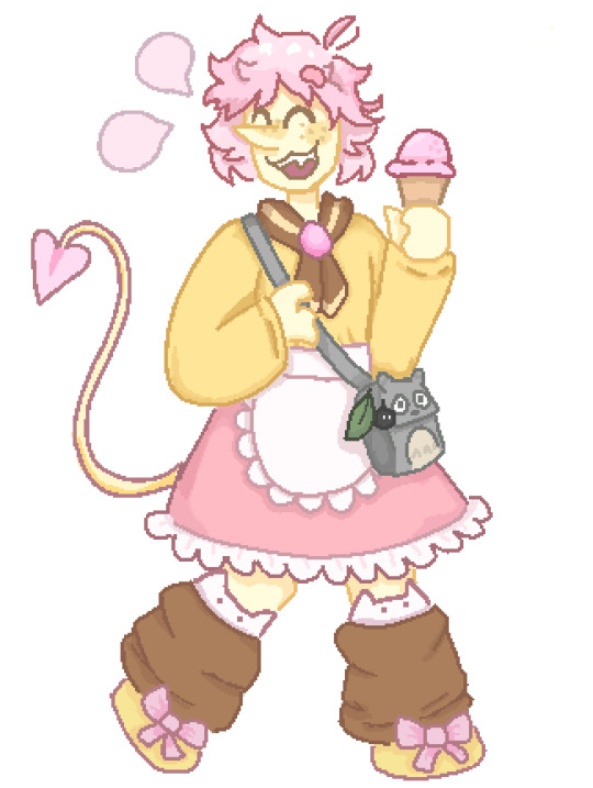
sorry if this looks kinda iffy the majority of this was drawn between 11pm and 2:30am so i was very tired loll
also yes that is a totoro bag i dont care if totoro doesnt exist in cyber city he has a totoro bag come at me
Pinup belongs to @turntableart
#read all the tags before you reblog otherwise you will be confused#i feel like i got the body type wrong uaughhh#i feel like the proportions are inaccurate#im blaming it on the clothes i promise the sketch looked good then the clothes went and ruined it#i feel really bad admitting this but now that i think about it i literally never draw chubby characters#all my addisons are pretty long and gangly for the most part and then spamton is just very small in my style hes not really pudgy#and tbh i didnt really draw full bodies very often before addisons and spamton but my one (1) oc was also pretty long and lanky#probably because i myself am pretty long and lanky#ueuugough hauguh#i need to practice more#also i feel like the shoes look weird#im generally not too happy with it but its ok ig#i was terrified of making the features too exaggerated and being offensive and i think i went to much the other way and just made him skinn#ffs#ill draw him again i promise#and it will look better pinky promise#🤙🤙🤙 theres no proper pinky emoji#i love him tho hes cute#i really like his original design#uururuguggg#ugh debating whether i should even post this or if i should keep tinkering with it#im gonna tinker with it a bit more i will continue writing tags when im done#ok tinkering over im much happier with it now#i made him a bit shorter and that solved all my problems#i think i have a habit of drawing characters too tall ngl lmao#also not too happy with the rendering but its good enough#uh im only posting the tinkered version that im happy with so if you want the untinkered version then just ask lol#pixel art#art#turn off the lights arg
20 notes
·
View notes
Text
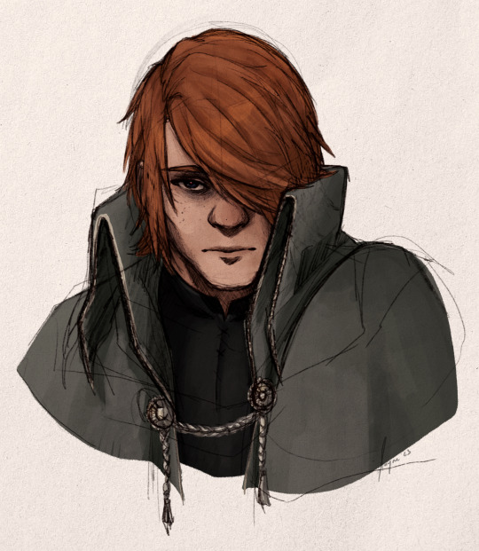

Granite in my chest--
#bloodborne#gareth#trying to embrace whatever this render style is a bit more bc it's very freeing#no cleaning. no lines.#as soon as my instinct is to 'do a new sketch layer' I start colouring instead#it might mean some parts are ??? but it's about telling myself the shapes and stuff are still there to sell whatever it is#ie the clasp on his robe lmao#2 versions because I like the clean one lots but what's a bloodborne picture without slapping some blood all over#GARTEH MY SON blows dust off him hi hello#why him? idk he was in my head#and all the sleep token I'm listening to... the album art makes me think about bloodborne#and additionally I know I need to practice more and not just draw Nini again... (takes physic damage)#me before 2024 has even started: I'm gonna try hard to do better with art in 2024#I will probably fail this idea but hey another year another promise to try and improve maybe this time I will#art: mine#tw: blood
43 notes
·
View notes
Text
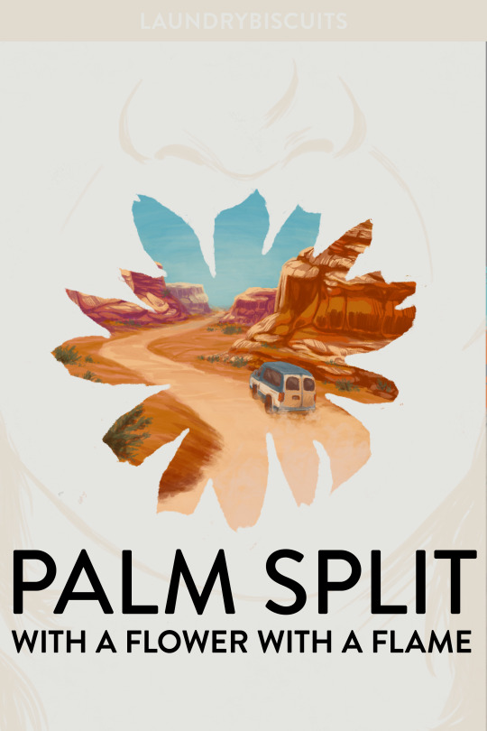
Cover design for my fic palm split with a flower with a flame (13.6k, T, Steddie hanahaki road trip AU)
#instead of doing any of the many urgent things I need to do before leaving the UK#I am fucking around with cover design and learning to paint red rocks#I do not enjoy painting vehicles so we're just gonna ignore how the van looks a little wonky#it's more of a concept sketch than a polished piece anyway; I really just wanted to render some rock formations to destress#I've also generally been getting into cover design lately bc it's such an interesting and specific challenge!
30 notes
·
View notes
Note
oooo perhaps nikolai in set me free or kunikida in the divine, if you want? 👉👈


First time drawing either of these guys!
[Character+Pallet Requests]
#Nikolai Gogol#Gogol Nikolai#BSD Nikolai#BSD Nikolai Gogol#Kunikida Doppo#Doppo Kunikida#BSD Kunikida#BSD#Bungo Stray Dogs#BSD Fanart#limited color pallet#color pallet challenge#requests#askkun#i sketched kunikida first and then nikolai#but then i colored nikolai before kunikida#so he's a bit better rendered#colors dont look exactly the same bc i mix them and use layer styles and shit fyi#idk why i feel the need to explain that lol#also glasses are hard af to draw#i should sit down and actually learn to draw them one of these days#artkkun
45 notes
·
View notes
Text
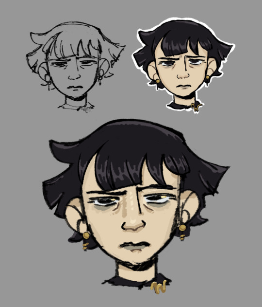
Yesterday I watched Cartoon Saloon’s short “Screecher’s Reach”, and thought Daal’s hair was almost exactly like how I envision Mathilde Lachance’s hair, so I decided to try and draw her. Today I stopped cleaning up the sketch after about an hour because I got bored, so it’s going here.
#nevermoor#nevermoor fanart#mathilde lachance#idk if anyone’s ever drawn her before (which makes sense bc no description) but I wanted to give it a shot#I’ve always envisioned her like. goth former art student. just the vibe of a pretentious 20s-30s artist who is also kinda goth. for funsies#when I said this blog is where I ‘dump’ my fanart I am being serious. bc sometimes I just quit part way through. lol.#I always try to be one of those ppl that ‘renders’ just by cleaning up their sketch + flats and then I always get bored and stop doing it#I need to stop avoiding doing lineart bc I actually enjoy doing it. when I do otherwise I just end up w a bunch of half finished stuff loll#anyways. I haven’t drawn in ages bc college sucked all my time and energy. but I just graduated 💪 and I’m excited to get back into things.#especially nevermoor stuff!!! bc I have so many ideas!!!!!#fun fact for if you’ve read this far: I like giving wundersmiths bright golden eye highlights when I draw them. just for fun!#the gold of wunder goes sooo well w the black/purple color scheme of morrigan. genius idea from jess. that’s why I always love drawing mog!#I may never draw stuff but rest assured I’m always thinking abt how I would draw nevermoor ppl/places/things and why#I have so many thoughts and my nevermoor brainrot is also is where my art/animation brain and media adaptation brain get to combine#I am going to be insufferable when (if?) the movie starts being made and I am not even sorry#anyways. enjoy this lq image. bc this is a screenshot and I have a problem with drawing way too small lol. oops.
50 notes
·
View notes
Note
hi, i ireally love your work and i don't know if you've answered this before but, what kinds of studies do you do or how did you learn color theory? i wanna get better at rendering and anatomy but im having trouble TT TT
Hi! Long answer alert. Once a chatterbox, always a chatterbox.
When I started actively learning how to draw about 10 1/2 years ago, I exclusively did graphite studies in sketchbooks. Here's a few examples—I mostly stuck to doing line drawings to drill basic shapes/contours and proportions into my brain. The more rendered sketches helped me practice edge control & basic values, and they were REALLY good for learning the actual 3D structure behind what I was drawing.

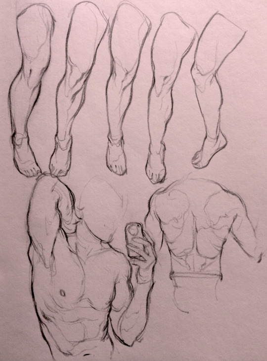

I'd use reference images that I grabbed from fitness forums, Instagram, Tumblr, Pinterest, and some NSFW places, but you could find adequate ref material from figure drawing sites like Line of Action. LoA has refs for people (you can filter by clothed/unclothed, age, & gender), animals, expressions, hands/feet, and a few other useful things as well. Love them.
Learning how to render digitally was a similar story; it helped a lot that I had a pretty strong foundation for value/anatomy going in. I basically didn't touch color at all for ~2 years (except for a few attempts at bad digital or acrylic paint studies), which may not have been the best idea. I learned color from a lot of trial and error, honestly, and I'm pretty sure this process involved a lot of imitation—there were a number of digital/traditional painters whose styles I really wanted to emulate (notably their edge control, color choices, value distributions, and shape design), so I kiiind of did a mixture of that + my own experimentation.
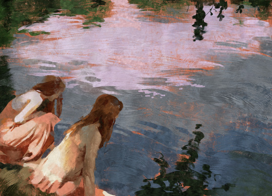
For example, I really found Benjamin Björklund's style appealing, especially his softened/lost edges & vibrant pops of saturated color, so here's a study I did from some photograph that I'm *pretty* sure was painted with him in mind.
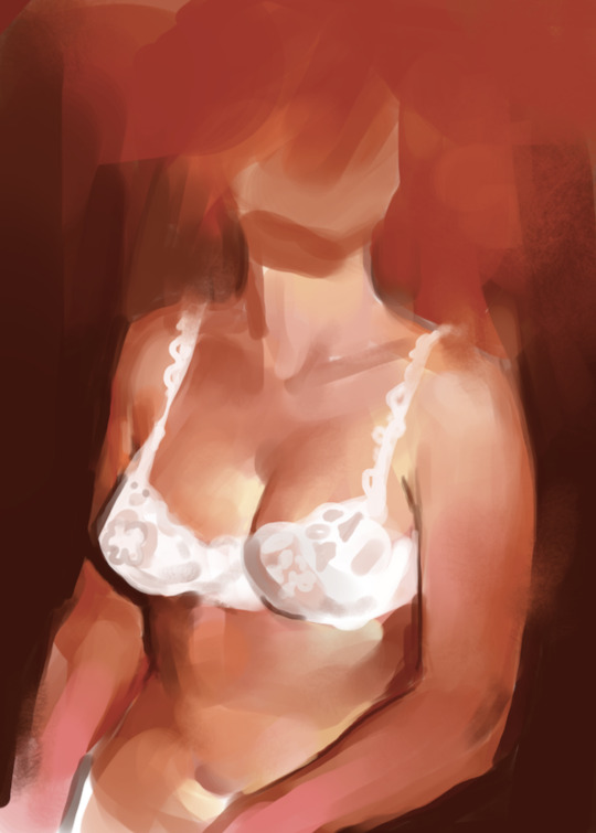
Learning how to detail was definitely a slow process, and like all the aforementioned things (anatomy/color/edge control/values/etc.) I'm still figuring it out. Focusing on edge control first (that is, deciding on where to place hard/soft edges for emphasizing/de-emphasizing certain areas of the image) is super useful, because you can honestly fool a viewer into thinking there's more detail in a piece than there actually is if you're very economical about where you place your hard edges.
The most important part, to me, is probably just doing this stuff over and over again. You're likely not going to see improvement in a few weeks or even a few months, so don't fret about not getting the exact results you want and just keep studying + making art. I like to think about learning art as a process where you *need* to fail and make crappy art/studies—there's literally no way around it—so you might as well fail right now. See, by making bad art you're actually moving forward—isn't that a fun prospect!!
It's useful to have a folder with art you admire, especially if you can dissect the pieces and understand why you like them so much. You can study those aspects (like, you can redraw or repaint that person's work) and break down whether this is art that you just like to look at, or if it's the kind of art that you want to *make.* There's a LOT of art out there that I love looking at, probably tens of thousands of styles/mediums, but there's a very narrow range that I want to make myself.
I've mentioned it in some ask reply in the past, but I really do think looking at other artist's work is such a cheat code for improving your own skills—the other artist does the work to filter reality/ideas for you, and this sort of allows you to contact the subject matter more directly. I can think of so many examples where an artist I admired exaggerated, like, the way sunlight rested on a face and created that orange fringe around its edge, or the greys/dull blues in a wheat field, or the bright indigo in a cast shadow, or the red along the outside of a person's eye, and it just clicked for me that this was a very available & observable aspect of reality, which had up until that point gone completely unnoticed! If you're really perceptive about the art you look at, it's shocking how much it can teach you about how to see the world (in this particular case I mean this literally, in that the art I looked at fully changed the way I visually processed the world, but of course it has had a strong effect on my worldviews/relationships/beliefs).
Thanks so much for sending in a question (& for reading, if you got this far)! I read every single ask I receive, including the kind words & compliments, which I genuinely always appreciate. Best of luck with learning, my friend :)
3K notes
·
View notes
Text
Let’s Draw Wings
I’ve gotten the question/request of how I draw wings lots and lots so I’ve decided to make a dedicated post!
Now...I’m no master, but I have found a way that I like to draw wings that’s efficient for me. There three main points:
References
Simplification
Texture Management
First of all - References
My favorite wing reference of all time is this post by Jenn on Twitter. I have both the images saved but I use the Wing Shapes one, below, alllllll the time. Like for real all the time!

I also keep pretty extensive collections of wing photo reference. When I’m having trouble, I’ll trace a few or do studies to get back into the swing of things. Here are links to my Pinterest boards:
Broadwing Reference (passive soaring and high-speed)
Longwing Reference (active soaring)
Shortwing Reference (elliptical and hovering)
Secondly - Simplification
When I sketch wings, I simplify Jenn’s diagram even further -
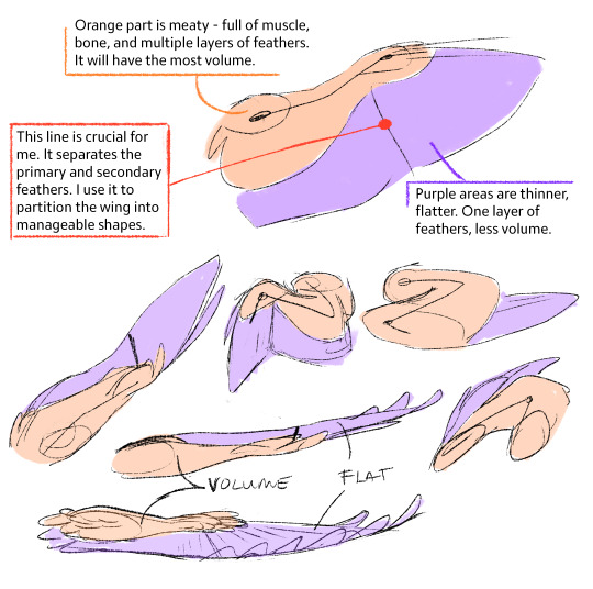
For me, the key to drawing wings is simplifying the wing down - from the structure to the feathers - the goal for me is to be able to draw them quickly and have the proper information conveyed. It needs to look like a wing in the base sketch. If it doesn’t, no amount of rendering and extra feathers will help. I like to break the wing into the three main moving parts. The orange is one part, then the purple contains two main chunks feathers that you can group together and move as their own parts.
On top of that, I like to think of wings like a sheet of paper. They can bend and fold in on themselves, with the orange meaty bits anchoring everything together.
Lastly - Texture
I like to call wings “texture monsters”. Feathers are hard to manage and can easily make wings look over-busy and muddy. Just like before, I break the wing into chunks so I can spend less time drawing the wing and it’s feathers:
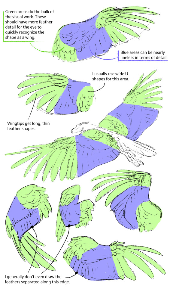
Then you can put it all together and push things further -
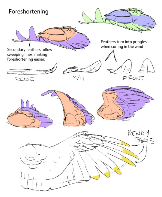
So yeah this is how I throw wings together! The wings I draw aren’t super technical or detailed, but I what matters for me is that they look and feel like believable wings at a glance -
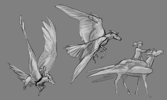
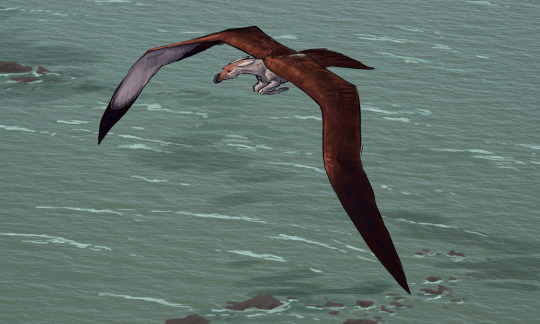
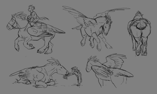
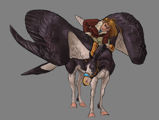
~ Larn
--
Discord | Patreon | Art Prints
9K notes
·
View notes
Text
How to make a powerful, hot vampire you still want to hug
Hi tumblr! I'm Cyrus Nemati, creative director at Little Bat Games, and a voice actor you might know from games likes Hades (I did the really secure guy and the really insecure guy).
We're closing in on the release of our debut title, Vampire Therapist, and based on tumblr's response in the past, I think you might be interested in seeing our creative process.

Andromachos is our 3000-year-old vampire mentor you'll meet early in Vampire Therapist. He's a complicated character: he was an assassin and warrior for most of his 3000 years, but a personal crisis put him on a voyage of self-discovery in the 1800s. Therapy never existed in his time, but as it developed, so did he. We needed a character who expressed wisdom and strength, but also gentleness and compassion. And of course, he's a vampire in a sexy vampire game. He needed to look like a Mediterranean dream.

This was our initial sketch of Andromachos by art director Ruth Bosch (https://x.com/rthbosch). As you can see, he's already oozing confident vampire energy, and he clearly has the wisdom of 3000 years. This is someone you want as your therapist. Vampire Therapist is a game with specific needs, and a certain lightheartedness is one of them. This Andromachos is very much grounded in reality, and just might be *too* realistically sexy.

This was @nomnomroko's first test render for Andromachos before joining the team. Right away, she understood the *figure* of Andromachos and poise of a man who has lived for 3000 years, but this was a more villainous (albeit super hot character). We toned him down shortly after, and brought back in some of the more grounded humanity from Ruth's initial sketch. You can make fan art of this version, though, we won't mind. This version might come back if we ever do a prequel!

Here's his toned down version, already much closer to the Andromachos we see in the final game. He's lost none of his power, but is already the welcoming presence we needed to have in Vampire Therapist.

Body language is also a key aspect of our game. In a game about therapy, we are mostly sitting, so the ways we can express emotion and intention are more subtle. You can already see the strength of Andromachos's character here.
Which takes us to our final rendering!

I love Andromachos. Or Andy, as more familiar folk call him. And I think you will, too. To me, he's a perfect synthesis between Ruth's initial rendering and Sybille's test that fits the comedic, warm, and very human tone of our game.
You can check out our game on Steam and GOG, and your wishlists will make algorithms happy. As you know, everything is algorithms! Help us make Vampire Therapist 2?
Steam:
And GOG:
707 notes
·
View notes
Text
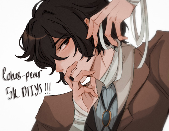
YAAAAAYYYY ITS FINALLY HERE!!! ty guys sm again for 5k i rly appreciate it <3
rules and guidelines under the cut!
rules and due date (i've never done this before so bear w me ok!!):
-due date will be march 1st! i will accept entries a few days late dw i'm nor ur professor or smth BUT I WOULD RLY PREFER IF U GET IT DONE BY THEN (just dm me if u need more time)
-pls tag ur finished piece under #lotuspear5kdtiys and dont forget to mention my user @lotus-pear! if i neglect to reblog ur piece then pls lmk even though that probably won't happen bc i'll be checking that tag every day for new entries👹
-pls don't trace the art.. i'll be really sad if u do that :(((( if u need help at all w the posing or hands then shoot me an ask or weed ur way into my dms bc ik this is kind of a complicated piece
-anyone can participate!! u don't have to be following me or anything and it's fine if we've never interacted before
-colors and expression are completely flexible and i'd even encourage playing around w it since the final product isn't meant to mimic my style. if u can then pls try to keep the pose relatively similar although i don't mind if it's changed a little bit. whatever is most comfortable to u as the artist.
-if u guys want to see the piece without any shading or rendering then pls dm me, ik it might be easier for some ppl to just see the bare sketch or the lineart w base colors
prizes🤩 (ik this is what u guys are rly after /j):
-alr so ik everybody's all like "well what's in this for me🤨" oh my god if u would just let me explain 😐 i'll be choosing three winners and two honorable mentions amongst all the contestants
-the top three winners get a follow (yea ok kinda sucky but wtv) AND they get to commission a fully rendered piece from me of a single character of their choice for free >:) (i'll discuss the details w the winners in two months)
-the two runner ups will also get a follow from me AND they get to commission a sketch of a single character from me (again, i'll discuss what this entails in further detail when the honorable mentions are selected in two months)
————
ermmm yea i think thats it for now i'll come back and edit the post if i feel the need to add anything.. HAVE FUN GUYS I CANT WAIT TO SEE WHAT U GUYS DO🫶🏼🫶🏼
1K notes
·
View notes
Text
Popsicle Date

finally rendered this. took all day, but I really did just needed to sit down and power through it. still getting used to rendering this way, but I did do a bit more experimenting, and I'm happy with how it came out. I also said this before, but I believe that these two would be deep in conversation while their ice creams melt
also my yuichi design is out of the gutter! (took a full year-) but I drew him and he's just as adorable!
I was going to do little sketches of the two of them to post later, but I have been fading out of this ship and tmnt (as in being more casual instead of hyperfixated on it). But hey, who knows, I might get inspired/bored lol
#rottmnt leo#yuichi usagi#leoichi#leosagi#happy pride 🌈#pride 2024#its nice to see my boy again#i do miss drawing turtles#but i aint pushing my luck to possibly get burnout
479 notes
·
View notes
Text
Eddie's at a party, lunch box in tow, and he's making a fucking killing.
He sets up shop in the crowded kitchen, but that doesn't stop him from spotting King Steve in the living room. Harrington's face is still fucked up from the fight with Hargrove, and he's tipping a cup almost vertically into his mouth. He's not too surprised when--the next time he spots the jock--he has a can of beer in each fist.
More customers flood up to him, and he can't help but be a little grateful for the distraction. Harrington is one unrequited crush he just can't kick.
Lunch box cleaned out, Eddie heads outside for a smoke. He's fishing his cigarettes out of his jacket pocket when he hears a snuffling sort of shuffle that sends his heart racing.
He edges forward, just enough to make out the heap of a person half-heartedly sitting up against the house. A person in fitted blue jeans, tight polo, and Member's Only jacket; swoop of chestnut hair catching in the flash of fire from Eddie's Zippo.
"Harrington?"
The guy startles, stability wavering, eyes blinking too much. "Munson?"
"You alright, man?" He asks, though he can already tell that Steve is most definitely not.
Steve shrugs. "Why do you care?" It's not mean, sounds genuinely curious.
Eddie gets it. He has no reason on earth to show concern about King Steve. In answer, he taps his boot against Steve's sneaker, giving him a small smile. "Not sure. But I'm here, so..."
"Just needed some air. Clear my head."
"How much have you had to drink?" Eddie asks.
"One or two,"
"Dozen?"
Steve laughs. "You're funny. Has anyone ever told you that?"
"I've heard," Eddie says, can't help but laugh a little too. "Wanna talk about what's going on?"
Eddie thinks that'll be a "no," but then: "Nancy dumped me."
"Yeah, big news."
"Ugh, people are talking about it?" Steve whines. It's really cute and Eddie hates himself for noticing. Hates himself more when Steve loses his balance, tips onto Eddie's shoulder, and Eddie doesn't tip him back.
Eddie can tell that Steve isn't fully with him anymore. He's a little afraid to leave the guy alone, so Eddie talks about the latest Hellfire campaign. Sober Steve Harrington probably has no idea what dnd is, but the drunk version is kind of a rapt audience.
He's just explaining about owlbears when Steve's voice, soft and sad, says "I just want someone to love me, you know?"
The admission renders Eddie speechless for a second, his chest fucking aching for the jock. He says "Oh, Stevie," knows he sounds too sad, is sure of it when Steve's nose wrinkles (it's cute; it's so fucking cute. Eddie hates himself for noticing).
Before he can backtrack, Steve slumps over, body going limp as he passes out. "Jesus H Christ," Eddie barks.
With a heavy sigh, and way too much fondness, Eddie stands. "Let's get you home, sweetheart."
He gathers Harrington up in his arms--dude is heavy--and carries him around to his van.
---
Steve wakes up, head throbbing and tongue fuzzy, with no idea how he got home and into bed. Can't really recall anything after he stumbled outside, aside from talking to Eddie Munson. But maybe that was a dream? Either way, he's home, not really any worse for wear. It's enough to let him forget all about it; what's one drunken party in a life full of them?
That Wednesday, he opens his locker after the final bell, and a Hershey bar falls out. He picks it up, flipping it over to see a note on the foil wrapping, "thought you might need something sweet to cheer you up." It's not signed, and Steve slips it into his backpack, knowing he's got a silly smile on his handsome face.
The little gifts continue to show up once or twice a week. Candy, plastic vending machine toys, sketches of the school grounds, caricatures of classmates and teachers. Sometimes they even come with a note in handwriting he doesn't recognize.
Along with the little treats, he starts seeing Eddie Munson kind of everywhere. And it's not like Steve hadn't seen him before--guy was hard to miss--but he was never around this often. Wasn't around this often and he and Steve had never shared a smile, a quick bob of the head, a quiet hello.
It isn't long before they're talking. Nothing much, nothing serious. Complaining about teachers, about classmates; sharing weekend plans. Only now Steve can't pretend to not notice the way Eddie dimples up when he smiles, the subtle muscles that bunch under the sleeves of his Hellfire Club shirt, the long litheness of his legs. Steve knows he's attracted to other guys, it's just that he didn't realize he'd be attracted to Eddie.
The gifts keep coming. Once, he opens his locker to find a plastic ring fashioned into a golden crown and a note that says, "made me think of you, Stevie." There's something about the "Stevie" that catches deep in his brain, but he can't make it connect to anything.
A few months later, Steve opens his locker and pulls out a drawing. This one--it's of him. He's gazing out into space in a way that managers to be dreamy and wistful. The Steve in the drawing is lovely, and it makes something clench deep in his gut, that someone sees him like this.
Steve tries to be more aware of the people in his surroundings, to figure out who his admirer is. He's not very good at it, even as more sketches of him--all depicting him as a gorgeous, ethereal thing he definitely isn't--show up in his locker. Especially when, so often these days, the person he sees the most is Eddie.
---
The presents in his locker continue into April, and would probably last until the end of the school year, but Steve's got a migraine starting. He keeps aspirin in his locker, gets a hall pass out of English to get some.
When he reaches his locker, though, someone is already there, with the door open. Someone in ripped black jeans, heavy black boots, a black leather jacket, and patch covered denim vest.
"Munson?" He asks. His heart beats so hard it reverberates in his ears, making it hard to hear.
Eddie jumps back, hands fluttering, face flushing bright red. "Ste--Harrington! I--uh--," he's backing up, his hands held out from his body, like he's pushing Steve away even though they aren't touching.
"Were you--?" Steve tries to ask, but the words won't quite come. There's familiar warmth low in his stomach, a twisting that has nothing to do with his impending migraine.
"I wasn't doing anything, I swear," Eddie says. He's breathing hard, eyes too bright, and Steve thinks he might be about to cry, but then the metalhead is turning away, starting to run.
"Eddie, wait!" Steve calls, chasing after him without much thought. "Please!"
Eddie doesn't stop until after they've crashed out one of the side exits, are alone outside.
"It was you? Leaving the--?"
Eddie nods, presses his hands to his eyes. "Sorry, I'm sorry, Harrington. I just--"
"Don't be sorry," Steve begs. "It's been--I liked it."
"Even now that you know they're coming from the freak?" Eddie spits. He still hides his face behind his hands.
"It's sort of been the best part of my year, if I'm being honest."
Only now does the metalhead remove his hands, blink back at Steve, dark eyes wide with shock. "Really?"
"Yeah. It made me feel-- important, I guess? Like, maybe someone saw me as something more than King Steve."
Eddie smiles now, looks down at the pavement. "I just didn't want you to think that you weren't--" he stops then, presses his mouth tight.
"Didn't want me to think what?"
"That you weren't loved, Stevie."
The statement hangs between them, Eddie's face pinking again, as the words wrap their way around Steve's heart. Loved. That he's loved. It clenches at every part of him, and he surrounds himself with the truth of it, what all those little presents were saying without words.
"Eddie, I--" he's overwhelmed by the gesture, the meaning, the reciprocal buzz in his chest, because Eddie Munson, Eddie Munson, loves him, and this fact is turning Steve's world on it's head in the best way.
"I'm sorry, Steve, really. Please don't hate me, or--or--"
"It means so much to me," Steve says, his voice a little broken. He reaches a hand out, slow, telegraphing the movement. "Can I?" He whispers.
Eddie nods, and Steve strokes the skin of his face with his thumb. "Thank you."
The metalhead nods, leaning into Steve's touch, they shift close, until their foreheads meet, until they share the same air. They stand that way for a while, long enough that they hear the bell ringing, and only then does Steve break their quiet. "Eds?"
"Yeah, Stevie?"
"You wanna hangout some time?"
Eddie laughs. "Yeah. I really, really do, sweetheart."
#steddie#steve x eddie#steve harrington#eddie munson#ficlet#one shot#secret admirer#fluff#a tiny bit of angst#friends to lovers#feelings realization#feelings confession#pining eddie munson#oblivious steve harrington#mutual crushes#high school au#eddie is in love with steve
4K notes
·
View notes
Text


Black and white is getting boring so I added some color to old and new sketches! They’re not 100% complete I just got really tired and need a break before rendering lol (Also added the bubble machine with Kinito I know a couple of peeps wanted him to have one :3)
#kinito crew#kinito fanart#artists on tumblr#jade the jellyfish#kinito the axolotl#kinito pet#sam the sea anemone#kinitopet#art dump#sketches#kinito my beloved#colors
403 notes
·
View notes
Text

[Click for better quality]
Ok yay I'm back from my vacation yipeeeeeee. I started this drawing of Keiki before I left and I was half considering just giving up on it.... until I did a short study of facial planes and then got motivated to work on this again! I'm glad I didn't give up on it though, as I'm actually really happy with this one!
Artist's Notes;
So as I mentioned in my last post about Touhou 17, I wanted to finish this by the game's five year anniversary but with how progress was going I didn't want to rush this so I decided to take a long break from it. Mainly because of the face. For a while now I was kind of feeling like I was stagnating with my drawings, not really in the clothing but in the bodies. There was something about the way I was rendering them that I just wasn't happy with, and after talking with someone else about this issue, I realized that the reason I felt this way was because the faces were too flat and didn't match the rest of the drawing and that I needed to find a way to make the rendering of the face feel consistent with everything else. So after doing a short study of the plains of the face (I used this 3D head model from art station as a reference for my short study, please go give this person some love as they are a lifesaver) I went back into this drawing and applied what I learned here. It was only after that that I finally became motivated to finish the piece, and while it started off as just a simple character sketch like Saki and Yachie's were, the moment I added in Keiki's little fire dragon I knew I had gotten in too deep and now here we are with a full on background. OK it's not super crazy or anything, but it gets the job done and it's better than there just being an empty void behind her. It's rare moments like this when I use brushes other than the Clip Studio Default Charcoal Brush and use the Clip Studio Default Paint Brushes as well (god bless the oil paint and dry gouache clip studio brushes, they were amazing). I don't know why but painting fire has always been really fun for me, there's something oddly satisfying about it y'know? I do think that another reason for this problem was because I was drawing faces like I would in my more sketchy style that didn't mesh well with my lineless style, so I'm glad I've started remedying that.
After adding in the fire dragon I had an idea to kinda make it feel like splash art in the way the composition works... probably because I have been playing Reverse 1999 again and it has taken over my brain. I do feel like Keiki's tools get a little lost in the composition, and I didn't fully render the metal parts of them mainly because I didn't feel like they needed it, but that's just something for me to improve on later down the line.
If you guys are wondering where I went for my vacation, I went to New York and got to go to the MET and the Museum of Natural History. In both places I found Kofun period stuff and I was so happy to see it you have no idea. I remember one of the Haniwa I saw had some neat face paint under the eyes that I tried to replicate with the makeup under Keiki's eyes in my drawing, though I think I'll gave to figure out how to draw makeup on characters because this reads more like blush to me than anything. While drawing this I also looked up some references of Kofun period jewelry and really liked the stuff I found, which also meant that now she has proper Kofun earrings instead of earrings shaped like Kofun tombs. I put some of the things I referenced with a closeup of Keiki's face as well down below. I made her outfit more reminiscent of the outfit I gave her at the beginning of the year with the buttons and all, though I do want to try and draw her in some more period accurate clothing like the Haniwa I took a picture of at the Museum of Natural History. I wish I could find a way to make her handercheif look better though as I wish I made it a little bit bigger, though I think I'm saying this because I've looked at this drawing for too long lmao. Once again something to work on for when I next draw her. Also want to get better at rendering hair, as some details (like the little strands in front of her ears) kinda got unreadable due to the similarities in colour lol.

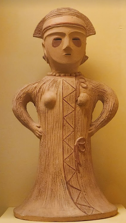


Now you may have also noticed the little cracks I added onto Keiki's face, and that's because I have fallen in love with the idea of Keiki's body being made from ceramic and that she crafted her body herself. While they aren't very visible I also tried to add some doll joints to her body, which is an idea I played around with in the past but never went to far with. I also want to get better at rendering cracks in ceramic, porcelain, etc, as I'm not sure how those read in the drawing. I also have a headcanon where the cracks in Keiki's face show up because of heightened emotions, and while Keiki is aware of this and does her best to make sure her face doesn't break off.... she will still end up with at least a few cracks during any given day, and she can often forget to repair her own body quite frequently so Mayumi has to remind her quite a lot. Mayumi even taught herself some basic sculpting techniques to help repair parts of her body that are so badly damaged to the point where Keiki can't repair them herself, i.e. if both her arms broke off, Mayumi would put them back together for her so Keiki can at least have something to repair herself with rather than nothing. I also like to imagine that if Keiki created her own body, if you took a look at Keiki from the beginning of her life she would look completely different compared to now.
BTW If you guys are wondering what a very very angry Keiki looks like....ok in order for this to make sense have any of you read volume 11 of Land of The Lustrous? Am I bringing back some memories for those of you that have? Ok good, glad we all got that mental image brewing in our minds, I'll probably draw a version of Keiki that is somewhat inspired by that one day as it's an idea I've had for a little while now. And to those who haven't gotten to that volume yet and are confused.... don't worry about it, just keep reading :)
#touhou project#art#fanart#touhou fanart#touhou 17#keiki haniyasushin#wily beast and weakest creature#touhou#東方project#own art
190 notes
·
View notes