#I like this one a lot I think the colors and the rendering are cool even though it's technically a sketch
Explore tagged Tumblr posts
Note
Heyo! Do you have any tips for making comics? :)
I've been meaning to get back into the swing of it, but concentrating on such a commitment that takes so much time is tough sometimes haha.
How do you make it work? Are there things you avoid/make easier for yourself just to make the process more fun and do-able?
First of all, I’m very happy for you! I think it’s very exciting whenever we return to a craft we were once passionate about. I wish you the best of luck!
This is a big question and I don’t think there’s really one simple answer since all artists are different and have their own strengths and weaknesses.
One of the biggest issues I face is that I have a million ideas but I simply don’t have the time to do them all. I want to share all these ideas but if I gave each and every idea the same amount of attention and detail, I’d hardly get anything done. So here are some things I've learned through my own comic-making experience, but keep in mind it may not be what you're looking for. Also remember this is NOT career advice. I make comics for fun, not for a living. If you’re looking for professional advice I would suggest looking elsewhere 👍
1 - A comic doesn't have to be fully rendered to be entertaining. Although I love to draw and line and color my work, it’s not always necessary. If I feel a punchline is strong enough to stand on its own, I’ll just make it into a doodle comic. In fact, I’ve found that some of my doodle comics perform better than the fully rendered ones! The doodle comics are still very fun for me to draw and they also serve as gestural drawing practice, so in the end it doesn’t feel like I'm making a sacrifice. I'm still getting my ideas out there and I'm still drawing, I'm just prioritizing what gets more attention so I can better manage my time.
2 - Not every panel needs an illustrated background. You definitely need to show backgrounds for establishing shots and when characters are interacting with the scene. But sometimes the focus needs to be entirely on the character and/or what they’re saying. You can choose to have a solid color background and maybe add a few textures to keep it visually interesting. You're still putting in the effort to make your art pop, but you aren’t losing a ton of time by drawing dozens of backgrounds. Color is also a good way to convey mood. I do that a lot in my comics, like this bit from “My Gal”:

^ I was trying to show a progression in excitement here, so having the colors change from cool to warm does a better job portraying that than if I just had a standard, scenic forest background for all the panels.
3 - Use resources: That's what they're there for! Because I make all these comics by myself, I have had to find resources to help me get through some of the steps faster so I can focus more on the story writing and the artwork. For example, to help me save time on lettering, I use the Onomatopedia font and the Manero Panels, SFX and Bubbles brush set for Procreate. I’m still selecting the sound effects and choosing the appropriate bubbles and tails to suit the mood and scale of the text, but this has saved me a ton of time because I’m not drawing each individual element by hand over and over again. Personally, I purchased these resources but I'm sure there are plenty of free tools out there that you can use.
As far as making it more fun... Honestly, I just love comics as an art form so much that learning about all the 'rules' and techniques and 'SOP's behind comics makes it more fun for me to make them. I recommend checking out tutorials and tips (even if you think you already know it all) and you might be surprised at how much it might ignite more of your comic-making passion. For example, I've spent hours on Blambot's "How-To" page and on ComicDevices.com just to try and soak up as much as I can. They're full of fascinating reads that make me want to try out different things!
I hope this helps! Good luck with your comics!
62 notes
·
View notes
Text

Being an artist means I have the power to draw fictional characters in outfits they would never wear. I am taking full advantage of this ability.
#my art#described#yttd#shin ☘️#shin tsukimi#your turn to die#I like this one a lot I think the colors and the rendering are cool even though it's technically a sketch
57 notes
·
View notes
Text
Girls girls girls
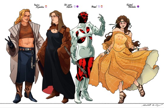
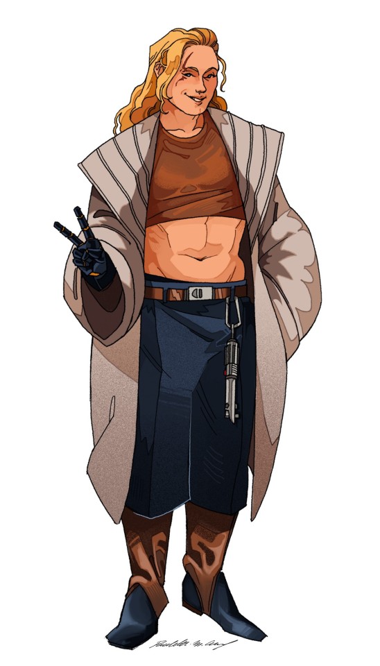
First recap was ok, but I'm in the mood to draw characters and I wanted to do a proper lineup/height charts (and then promptly drew maul in heels and Padmé on tiptoe..... I am a genius)
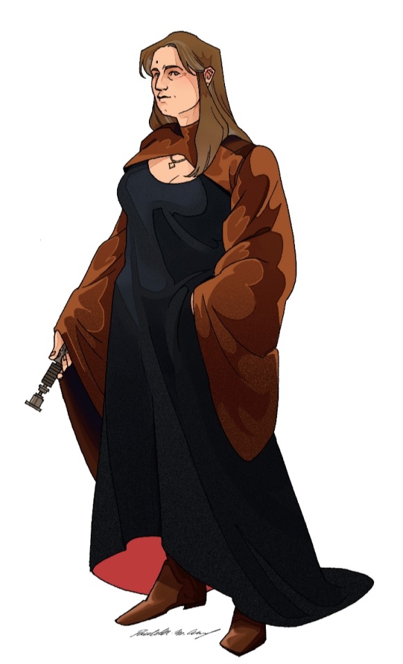
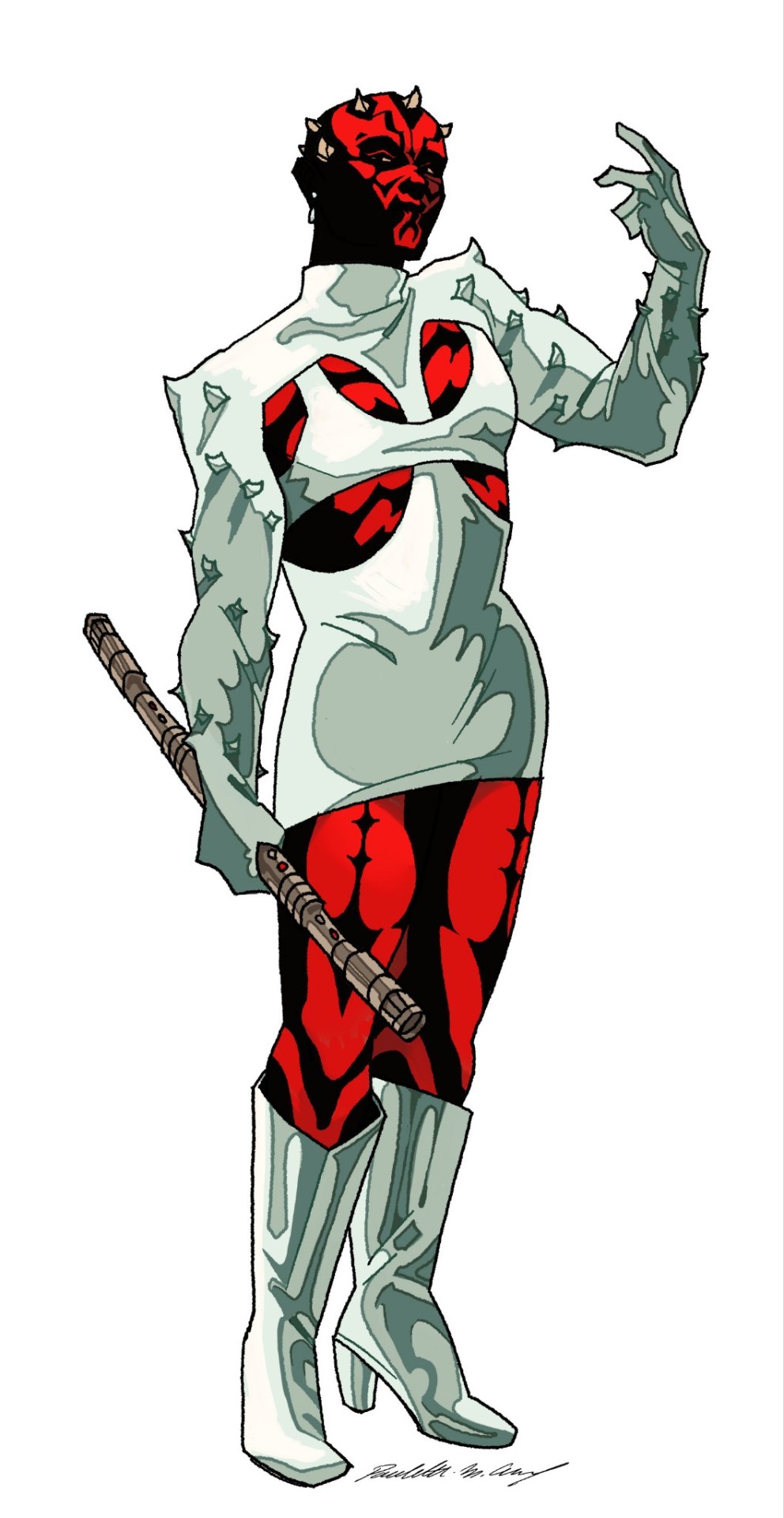
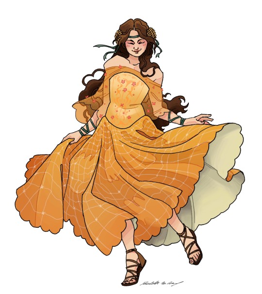
[COMMISSIONS]
[PART 1] - [PART 2] - [PART 3]
Rambling below vvv
It's always so temping to dress maul in white, and I once again caved kflodkd
Also ! I always draw her pre tpm, because it's a) the time in her life when I see her wear silly/'extravagant' outfits the most (can't really do that when you're a half dead giant spider eating rats in a garbage world fkldodi and after *that* I don't think her spirit is really into accessorizing and wearing cute fits- still a slut tho) and b) mechanical limbs are hard to draw and a pain to render (one day I will draw her old I swear !)- but ! All this to say : she stay "small" even after getting bisected ! The bones are staying in the pussy !! Let her be short, then a spider, then short once again but this time with cool metal legs :)
I usually draw Padme all serious, but she can't be all business like when frolicking in a field with her dumbass girlfriend and I think drawing her silly healed a bit of my soul <3 (also took liberties with the yellow dress design- wanted to make it a bit my own and I kind of hate the original faded yellow ngl)
For Obiwan and Anakin, I wanted them in civilian clothing because Jedi outfits are a bit boring (for what I'm doing here)- but I also wanted to stay in the same color scheme as their Jedi's outfit (and I ended up swaping them because I wanted to see obiwan dressed in black kxkdldk). I am very proud of Obiwan's outfit !! I think it fits her, while staying relatively in character :D and next to her you get no rizz butch anakin :)))
I'm having a lot of fun making these :D even if this rendering style takes so fucking long- next up is either Palpatine, Vader, Dooku, boba fett or leia, han, lando, chewie (and maybe luke, we'll see)
PS : I have never watched the 3D clone war show, this is mostly based on the movies :)
#maul really is my muse kfldkdkn I always end up drawing her in flamboyant outfits and have so much fun doing it#and then I have to dress Anakin and oh god what do I do-#being fem presenting means I have easier time coming up with fem outifits-#more masculine ones are harder for me but that's why I'm practicing !!#star wars sapphic au#anakin skywalker#obi wan kenobi#padme amidala#darth maul#anidala#obimaul#lesbian#star wars#star wars fanart#star wars prequels#art#my art#digital art#fanart
751 notes
·
View notes
Text
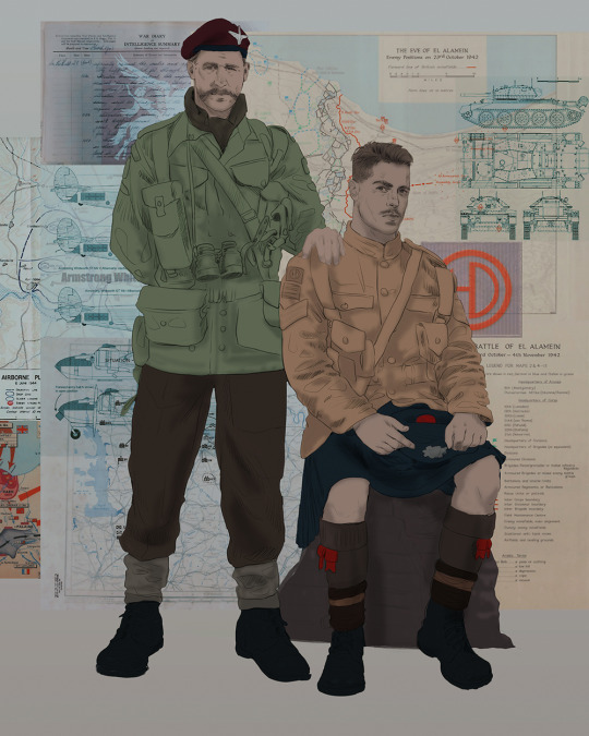
Ok! I've finally decided to put together a (somewhat) comprehensive tutorial on my latest art~
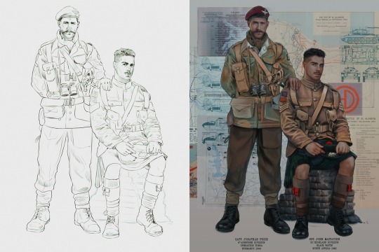
Please enjoy this little step-by-step 💁♀️
First things first--references!
Now I'm not saying you have to go overboard, but I always find that this is a crucial starting point in any art piece I intend on making. Especially if you're a detail freak like me and want to make it as realistic as possible 🙃
As such, your web browser should look like this at any given point:

Since this is a historical piece, it means hours upon hours of meaningless research just to see what color the socks are, but...again. that isn't, strictly, necessary 😅
Once I've compiled all my lovely ref pics, I usually dump them into a big-ass collage ⬇️
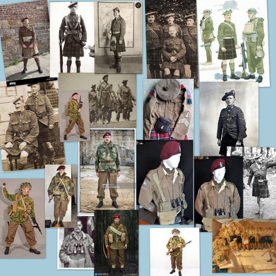
(I will end up not using half of these, alas :'D)
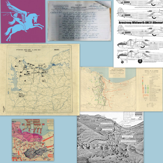
Another reference search for background material, and getting to showcase our models of choice for this occasion~
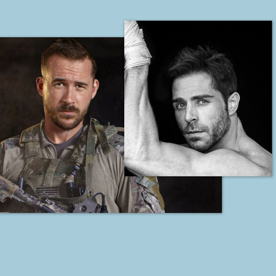
When picking a reference for an actor or model, the main thing I keep in mind (besides prettiness 🤭) is lighting and orientation. Because I already kinda know what pose I'm gonna go with for this piece, I can look for specific angles that might fit the criteria. I should mention that I am a reference hound, and my current COD actor ref folder looks like this:

Also keep in mind, if you're using a ref that you need to flip, make sure you adjust accordingly. This especially applies to clothing, as certain things like pants zippers and belt buckles can be quite specific ☝️
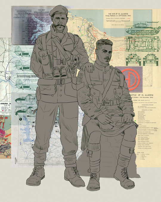
Now that we've spent countless hours googling, it's time to start with a rough sketch:
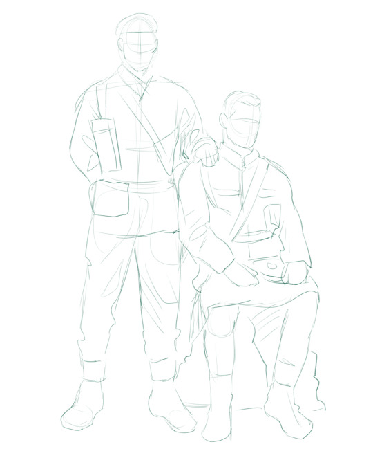
It doesn't have to be pretty, folks, just a basic guideline of where you want the figures to be.
The next step is to define it more, and I know this looks like that 'how to draw an owl' meme, but I promise--getting from the loose sketch above to below is not that difficult.
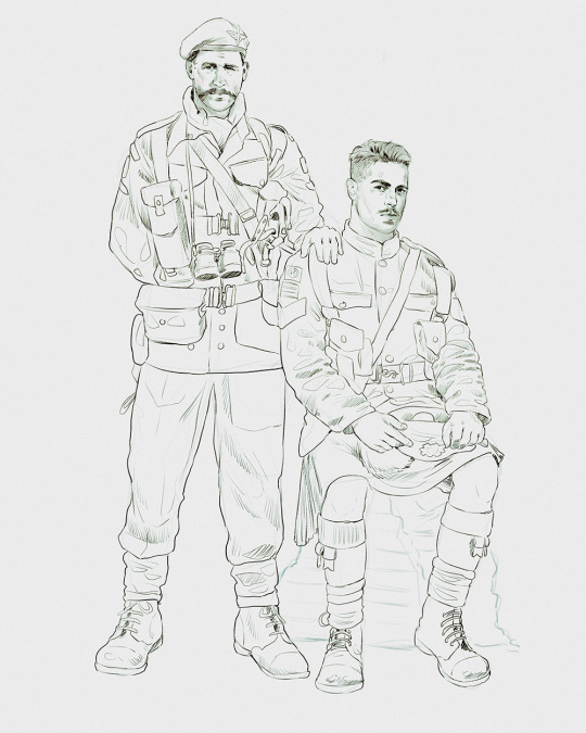
Things to keep in mind are--don't go too in-depth with the details, because things are still subject to change at this point. In terms of making a suitable anatomically-correct sketch, I would suggest lots of studying. This doesn't even have to be things like figure drawing, I genuinely look at people around me for inspiration all the time. Familiarize yourself with the human form, and things like weight, proportions, posing will seem a little more feasible.
It's also important at this stage to consider your composition. Remember to flip the canvas frequently to make sure you're not leaning to one side too often. I'm sure something can be said for the spiral fibonacci stuff, which I don't really try to do on purpose, but I think keeping things like symmetry and balance in mind is a good start ✌️
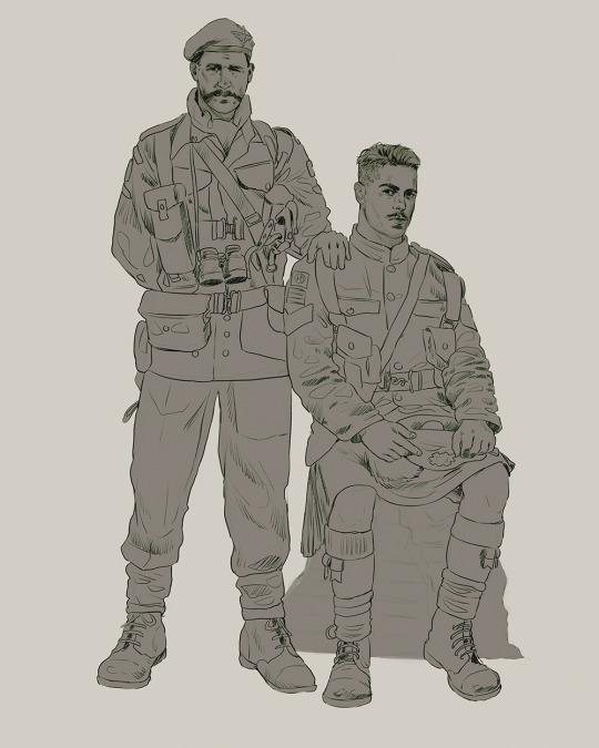
Next step is just blocking in the figures. Standard. No fuss 👍
Now onto the background!
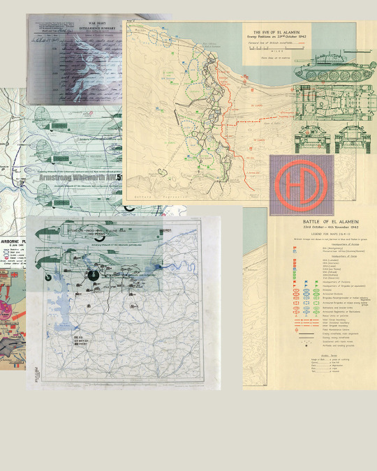
It's frankly hilarious how many people thought I was *hand-drawing* these maps and stuff 😂😂 I cannot even begin to comprehend how insanely difficult that would be. So yeah, we're just taking the lazy copy and paste way out 🤙
I almost always prepare my backgrounds first, and this is mostly to get a general color scheme off the bat. For collage work, it's really just a matter of trial and error, sticking this here, slapping this there, etc. I like to futz around with different overlay options until I've found a nice arrangement. Advice for this is just--go nuts 🤷♀️
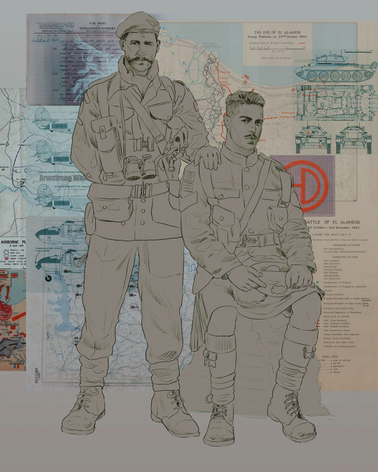
Next, I add a few color adjustments. I tend to make at least 2 colors pop in an art piece, and low and behold, they usually tend to be red and blue ❤️💙There's something about warm/cool vibes, idk man..
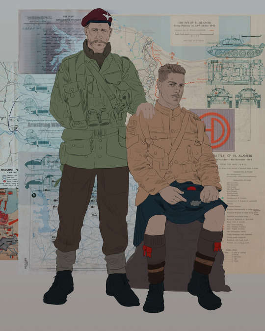
Now we move on to coloring the figures. This is just a basic block and fill, not really defining any of the details yet.
Next, we add some cursory values. Sloppy airbrush works fine, it'll look better soon I promise 🙏
And now--rendering!
I know a lot of beginner artists are intimidated by rendering, and I can totally understand why. It's just one of those things you have to commit to 💪
I've decided to show a brief process of rendering our dear Johnny's face here:
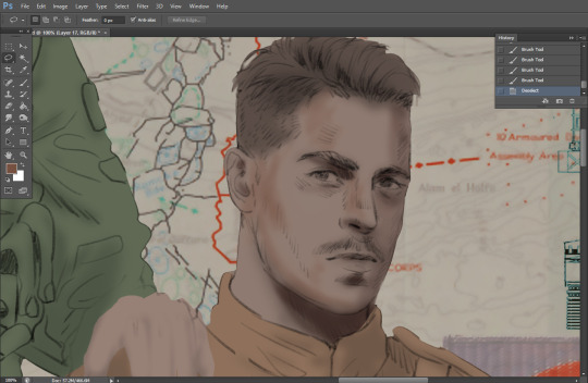
Starting off, I usually rely on the trusty airbrush just to get some color values going. Note--I've kept my sketch layer on top, but feel free to turn it on and off as you work, so as to not be too bound to the sketch. For now, it's just a guideline.
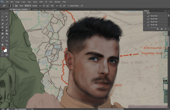
This next stage may look like a huge jump, but it's really just adding more to the foundation. I try to think of it like putting on make-up in a way~ Adding contours, accentuating highlights. This is also where I start adding in more saturation, especially around areas such as ears, nose and lips. Still a bit fuzzy at this point, but that's why we keep adding to it 💪
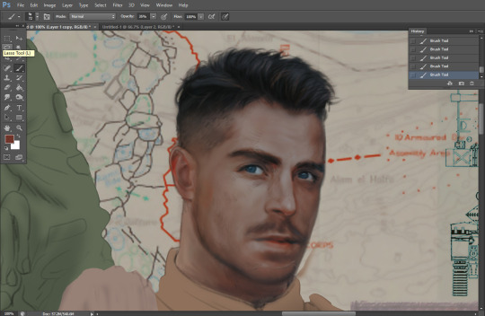
A boy has appeared! See--now I've removed most of the line layer, and it holds up on its own. I'll admit that in order to achieve this realistic style, you'll need lots and lots of practice and skill, which shouldn't be discouraging! Just motivate yourself with the prospect of getting to look at pretty men for countless hours 🙆♀️
I'll probably do a more in-depth explanation about rendering at some point, but let's keep this rolling~
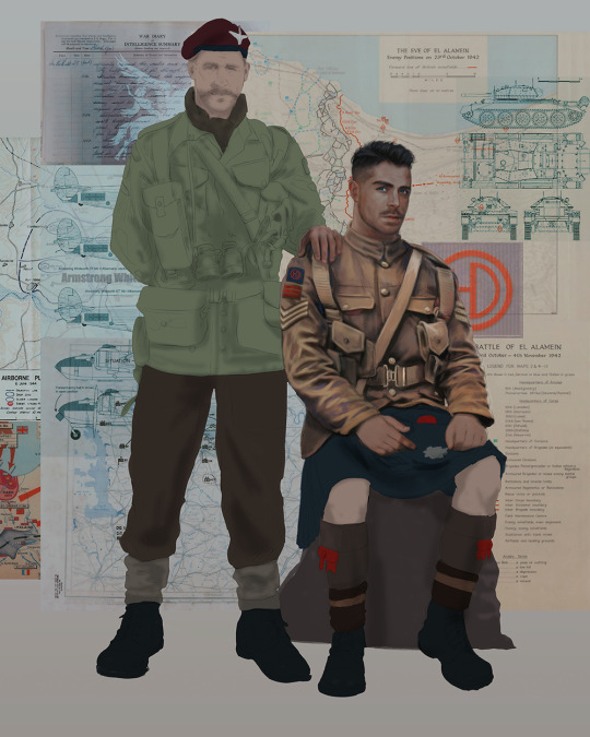
Moving forward is just a process of adding to the figures bit by bit. I do lean towards filling in each section from top to bottom, but you can feel free to pop around to certain parts that appeal to you more. I almost always do the faces first though, because if they end up sucking, I feel less guilty about scrapping it 😂 But no--I think he's pretty enough to proceed 😚
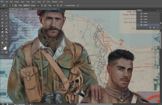
They're coming together now 🙆♀️ Another helpful tip--make sure you reuse color. By that, I mean--try to incorporate various colors throughout your piece, using the eyedropper tool to keep a consistent palette. I try to put in bits of red and blue where I can
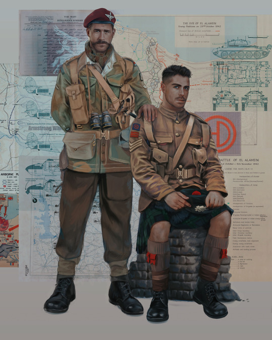
Here they are fully rendered! Notice I've made a few subtle changes from the sketch, like adjusting the belt buckles because I made a mistake 😬 Hence why you shouldn't put too much stock in your initial sketch~
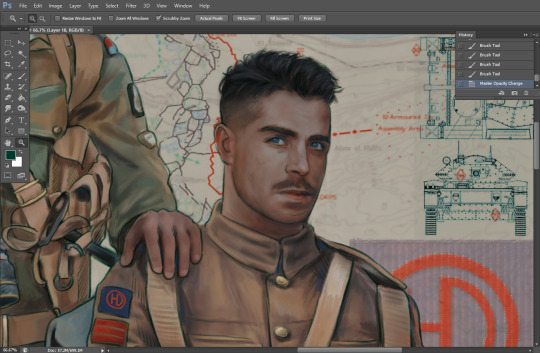
The next step is more of a stylistic choice, but I usually go over everything with an outline, typically in a bright color like green. Occasionally, I can just use my initial line layer, but for this, I've made a brand new, cleaner line 👍
And the final step is adjusting the color and adding some text:
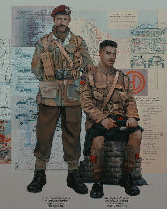
Tada!! It's done!
All in all, this took me the better part of a week, but I have a lot of free time, so yeah ✌️
I hope you appreciated that little walkthrough~ I know people have been asking me how I do my art, but the truth is--I usually have no clue how to explain myself 😅 So have this half-assed tutorial~
As a bonus, here is a cute (cursed) image of Johnny without his mustache:
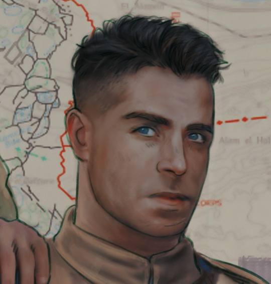
A baby, a literal infant child !!! who put this wee bairn on the front lines ??! 😭
Anyway! peace out ✌️
#tutorial#my art#art tutorial#since people have been asking#I remembered to save my process from this latest work~#enjoy 🙆♀️
1K notes
·
View notes
Note
You should tell us about color psychology that sounds cool as hell
YES… HA HA HA… YES!
GGGOD I WISH I WASN’T OUT OF THE HOUSE RIGHT NOW. but i’ve been thinking about colors literally all day so you all get to be subject to my madness! sorry this is long and rambly wauaua. nightmarishly long post under the cut.
okay. first things first, a few basics. color theory and color psychology tend to get confused a lot in discussions, but they usually refer to different things. color theory is more about we physically perceive colors (color wheels and color schemes the like), while color psychology focuses on our emotional response to colors. if you’re familiar with the children’s hospital color theory post, that poster wasn’t actually talking about color theory, but color psychology (and also it’s incredibly surface level and heavily misunderstands the subject because in what fucking universe does the quantity of positive associations with a color matter more than the context it’s used in and sorry i have personal beef with this tumblr post).
color theory is also a special interest of mine but i’m not gonna touch on it too much here because it’s not entirely important. mmmaybe another time…
essentially, certain colors (and color combinations) have associations in our brains and that affect our behavior and emotions. these associations are also very much affected by the context a color is used in. colors don’t exist in a vacuum! so while red can symbolize passion and love when used in something like a dress or a bouquet of flowers, it has a very different connotation when it’s, say, splattered on the walls or smeared on the ground in a snail trail.
or for a less Children’s Hospital Themed example, i’ll put my euphrasie and king designs here!

(of course the saturation and brightness of these blues play a massive part in how they’re perceived but this is not a post about color theory this is n)
and, of course, combining colors in a piece can also change their meanings!! i’m about to get real fucking normal.
i’m gonna be focusing on the color combo of red and yellow here because it’s the one that’s most relevant to my art (and also it’s really interesting.) basically, seeing these two colors together activates the part of our brain that controls our appetite, making us actually feel hungry. this is why so many food companies use red and yellow in their branding! it’s neat stuff!!
also, if you’re familiar with it, this is why the mv for butcher vanity uses this color palette!! along with red’s general associations with danger and blood, the color combo also physically induces hunger. pretty fitting for a song about cannibalism!
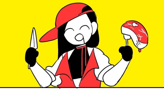
(there is also red’s association with lust and passion and how that intersects with the double meaning in the lyrics but i cannot derail this post into being an analysis of butcher vanity i’m sorry. we’d be here all week. maybe another day... wipes a tear from my eye)
and i think this might be the reason why some people feel hungry when they see my art, even when i’m not drawing food. while i don’t tend to use red outright, most of my art has very warm undertones (red-oranges and yellows especially), which could be activating that hunger response??

(ah fuck color theory managed to weasel its way into this post again)
admittedly this part is just speculation on my end. i think my rendering style and Shapes also play a role in it, but it’s interesting for me to think about!!
this is only scratching the surface of how complicated colors can get. i was going to go on an entire tangent about color grading and how green lighting can make a scene feel unnerving but this post is already Too Fucking Long. aaaa super sorry if this is Rambly or hard to understand!! i’m not Entirely sure how much the average person knows about color theory and psychology so if there’s any confusing terms here i’m fine with adding stuff for clarity!
wauauuaa thank you so much for asking!!!! i love talking about colors.
tl;dr colors have a bunch of different emotions and meanings tied to them, but you’ve gotta pay attention to the context in which it’s being used. so maybe take a step back before you put that thick red trail on the floor of your children’s hospital.
#marshtalkin#<- and by god did i TALK.#hhholy fuck how long is this. im so sorry i thought this was gonna be WAY shorter#admittedly i only realized colors were a special interest. fairly recently?#i genuinely didn’t consider that most artists probably don’t spend hours pacing around thinking about color symbolism#<- god don’t even get me started on color symbolism in my designs i’m so fucking normal#…do i even tag this as isat?? i mean i know i have to tag spoilers anyways#because of euphrasie#but this is mostly a post about color psychology even if i’m using my isat art as examples#aaaa whatever#isat#in stars and time#isat spoilers#color theory#color psychology#asks#also actually as a sidenote. sometimes color psychology is called a subsection of color theory?#but generally when someone is talking about color theory they’re talking about the technical side of things#terminology is weird and confusing unfortunately…
213 notes
·
View notes
Text

art vs artist 2024 ✨ can't believe we're here!
i've been thinking about this year a little bit these past few days, with the holidays being under special circumstances for me. the past month passed quickly but very gently, which I'm grateful for all things considered. i think it's now safe to say that after some reflecting 2024 was one of - if not the - best year of my life. I've never experienced such a whirlwind of gratifying experiences in the span of twelve months: i met so many new and nice people, had my first con experiences in amazing settings and my first job opportunities in a field i wanted an experience in for a long time, traveled the world somehow, got 10x more attached to my characters than i already was - and I'm quitting the year with just as many projects as i did when i entered it. granted, new problems came up and still persist, but with every year that passes i get one step to catching up with the anxiety and fears that hold me back, and it's that one step that each time allows me to surpass fear and welcome something new. every leap of faith partially led to the beautiful things i experienced throughout the year like a ripple effect (partially). it's gratifying and humbling in equal measure. so cool!!
art wise, i'm a lot more satisfied with the direction my art is taking than i used to be in the past two years. i came up with brush settings that shifted my line dynamic and i discovered a new rendering technique i really enjoy that allows me to balance time-efficient with textured together. i think my art has been getting a lot more expressive and while sometimes it makes me feel like I'm straying away from a more sanitized, thought through illustrative style, maybe it's worth it for the feelings to be conveyed the way i want them to. i haven't gotten to a point where i'm experimenting with my shapes, compositions and palettes in a way that shakes up my habits in a good way, but I'll get there.
I've also come to realize while making the meme that i actually have very few finalized personal works to show this year! i made most of my personal work posts on a time rush (they usually were made for specific days). I've been working on a set of drawings that required some tweaking and a few days to sketch properly, but the result is worth it, I'm so proud of them!! i wanted to get them out before the NY but it convinced me that rendering had to take its time as well, i don't always want to rush things nowadays. being on a time limit and taking all the time necessary are both good drawing exercises nonetheless.
lots of rambling, but i had lots of thoughts. I'm so grateful that some people are still in my life as we inch toward the new year. to my moulin squad, to my tol staw, to all the new friends i made this year, to my kitty, to my family. i love you like the world. and of course, to all the people who follow my work from up close or from afar, thank you so much. to know i bring a bit of inspiration, thought and color into your day has a lot more worth to me than you can imagine. thank you for manifesting your interest and your support whenever you do!! 🙏
i hope you all have safe and healthy holidays 💛 drive safely and tell your loved ones you love them. my thoughts are with Ukraine and the people of Palestine.
#art vs artist#art v artist#art vs artist 2024#artvsartist2024#french art#french artwork#french illustrator#french illustration#myeart#art summary#2024 art summary
196 notes
·
View notes
Text
i got a few asks about my process :0 so yea i took some screenshots mid-process of my recent cliff-skk thing just for that
m gonna preface everything by saying that i did have a ref for the environment!! i avoid color dropping from the image and tracing cuz i do want to hone some digital skills. also saying i'm doing an "environment study" when i'm really just drawing skk makes me feel better abt myself
when i don't have a reference, i tend to do some thumbnail sketches in my sketchbook. here's some random stuff of past work, where i rawdogged everything:
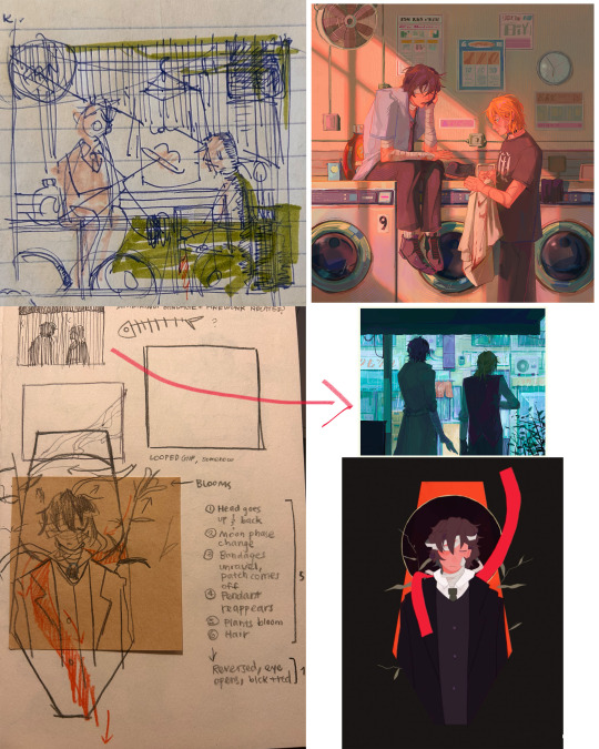
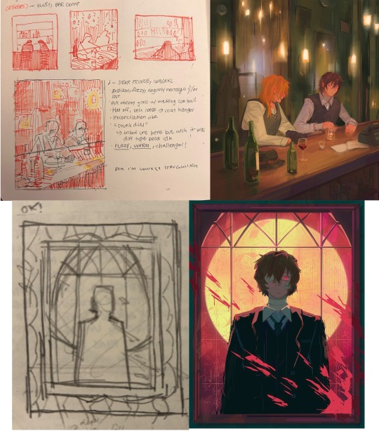
but whatever, back to the cliff-skk. i'll also post a timelapse of it for easy ref, but detailed stuff is under the cut :)
first i did some rough sketches on an orangeish background (underpainting etiquette, i find it helps things feel brighter and keep a stable tone when choosing colors to lay on top), and I quickly lined skk :)


then I laid down some flats for the background, again really eyeballing the reference for hues. afterwards i thought it was a bit bright, and i wanted a more sepia/nostalgia feel to it, so i hue adjusted everything to something more uniform


then i lay down flats for skk + the ocean, which i both had to color adjust a lot (you might see that in the timelapse), and then i jump straight into rendering the background. when i render, i always prefer to do it over something lineless, so i turn the sketch layer off. i rarely do lineart for backgrounds.
i also used to render the characters first, but i've found that it's just not a great approach—especially for art where characters and background are interacting, knowing the hues and shades of the environment is crucial to effective rendering on the character that doesn't make them look out of place.
when i'm rendering, i really try to keep in mind tenants of contrast, perspective, form, and light/shadow. ex, stuff "closer" to us has more detail; the hill in the back is minimalist (in comparison); the shadows lean cool-green while the light leans gray-yellow. rake brushes really carried me here idk... my fav brushstyle forever


eventually i reach a point where i'm satisfied (or bored) with the background. for the last stages i usually have the subjects hidden so i can really perfect the details—but then for super duper final details, like the little leaf specks and grass strands, i unhid skk so the poppy details could work around skk. then i get to rendering the characters :)
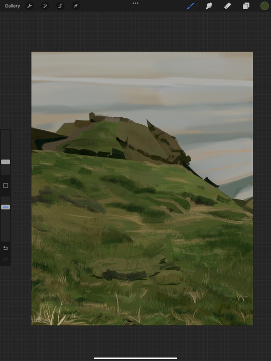
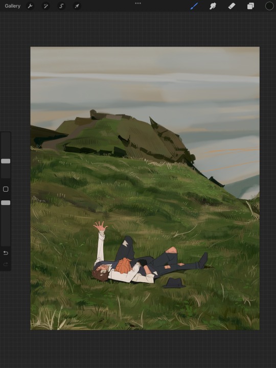
i forgot to take ss of all the stages when i rendered skk, but here's something from... about the middle of the process? i tend to render characters with the lineart hidden as well, sometimes bringing it back just to clarify things, but ultimately i prefer to define things by form than by line. that's just me tho idk, idt it makes or breaks anything, just a preference
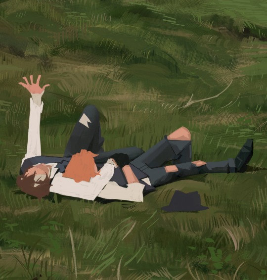
again rlly just thinking about cool/warm, reflective tones (the greenish shadow on chuuya's left inner leg, sky-gray blue on dazai's vest), really just slotting the subject into the environment. after i finish rendering the characters, i usually return to the background and add some stuff—in this one i defined the waves a bit and put some grass around skk
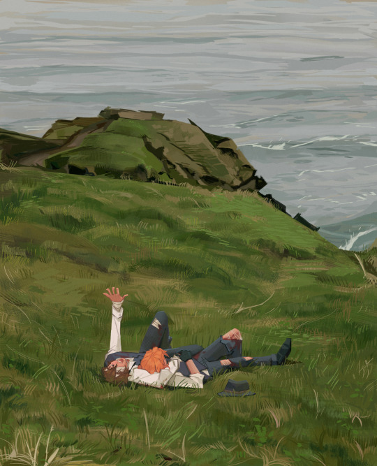
and yeah then we're done idk LOL. sometimes i run the file through camera raw (photoshop) to do some color adjustments—i find that my iPad displays colors super differently, usually making things a lot lighter than they are (u can see how dark the timelapse is...), so i find myself lightening my work a lot. i also sharpen and add noise as needed :)
i think my process has changed a lotttt even in this past year. it's kinda crazy!! it's always fun to do these and just reflect a bit on how i work. mostly just mindless insanity until it kinda works.
thanks for sending in an ask. and if u read all that, thanks to u too lolol
152 notes
·
View notes
Note
HI HELLO I love your art So much,,, do you have any tutorials on how you render your stuff? For example, the colors you use & how you pick them, how you get that pink tone around the Lineart (I think) (it's just rly cool). I would love to see stuff like that, cuz your art is Such visual candy (◍•ᴗ•◍)
Hey! Thank you so much, I'm glad you like my art, I worked hard to make it what it is!! Means a lot you appreciate it!!!!!!
I've had no professional art training, I seriously don't know what I'm doing and struggle making tutorials. But will try here!!
For me the colour work is really situational on the drawing! I find myself experimentally attempting to weaponize colour theory and there's a lot of instinct involved that I can't figure out how to verbalise yet. Here's an example of some thought process I have:
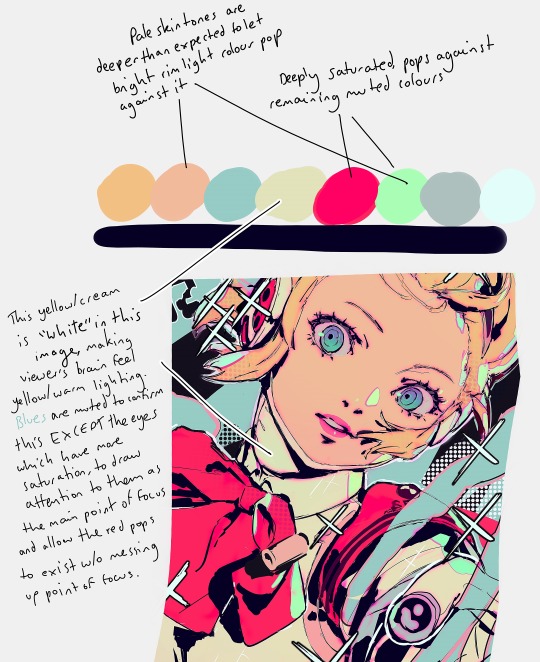
My main advice is to play with sliders a lot and really experiment (that's what I do for every drawing)!
To get the pink glow around your lineart, copy your lineart layer, fill the copy in with a pink of your choice (sometimes I do a gradient), blur the layer (experiment with how much blur you'd like), put it directly below the lineart layer, and set the layer to multiply (or any mode you think looks pretty)!
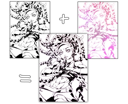
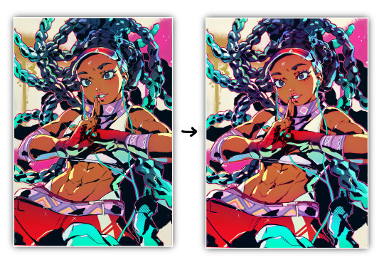
You may want to adjust your piece's brightness/colours after applying it and sharpen the image after exporting.
A lot of colour gradients are involved and on their own they can eventually compromise the gritty/punchy style, especially the ones that are between extreme and subtle. A good way to combat this is with screentones/haftones!! You can use them to diversify colours and imply shading/texture.
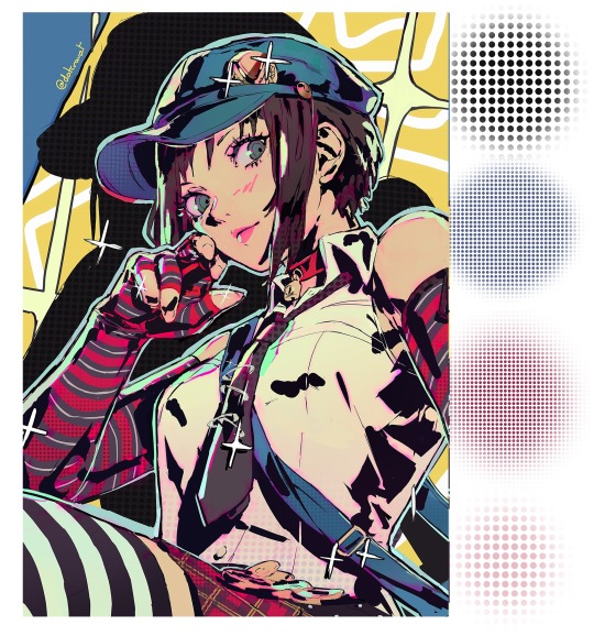
I recommend going nuts and having a lot of fun with it to find what works for you!
I often add a lot of small lens flares as they satisfyingly cut through the piece, imply flash photography (which goes well with the strong black shading), add visual noise to areas you don't want to be your main point of focus, are a great way to show speculars, and idk man sparkles are just pretty haha.
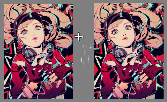
Go nuts with them and have fun!! When you get them to look good, think to yourself why that is.
I made a tutorial ~1 year ago on how I shade with black. This simple trick will really help it look good, 3D and rendered - it just requires a lot of knowledge about shadows to start with. I have a lot of experience rendering "normally" which helped me learn how to use black in an experimental way.
Minor correction that the shadows labelled "ambient occlusion" in the tutorial are actually just normal shadows, ambient occlusion is total lack of light.
I hope this is useful to you!! You have a knack for art, your work is very inspired. Please keep drawing!! I am still learning too, let's keep going baby.
-Cravat x
458 notes
·
View notes
Note
Hello :D
I have been following you for the last year or so (a few days after I got my Tumblr lmao) and I absolutely love your art!
I have been wanting to study your art style for a while but don't really know where to start,,,
Could you please show me a small portion of your art process, if it isn't too much trouble of course. Thank you and have a nice day!
hello. oh my god. this took forever to find.
im sorry it took 2 WHOLE FUCKING MONTHS for me to respond to this but i wanted to put it off until i felt happy with my art process again, so here it is
my fall 2024 rendering tutorial!
(this will be very very long)

FLATS AND WHATEVER YOU WANNA DO WITH LINES GIRL. then make sure to recolor the lineart to better match your base. trust me it helps, bold dark lines are Not your best friend when rendering. wait for that post-rendering
i start off with a doodle or a sketch, and then filling it in with flats and other details such as blush

FIGURE OUT YOUR LIGHT SOURCE. FIGURE IT OUT GIRL YOU CAN DO IT you can make it as simple as possible, make it as big as possible, dont even THINK about the details.........just make it really fucking big so you at least know where the shadows and the light goes THEN add smaller shading details LISTEN TO ME. LISTEN TO ME OKAY!!!!!!!!
my key point with this is for you to learn lighting fundamentals.
it's SOOO ANNOYING but alas......they are all correct. it helps a lot.
one thing i also really want to point out is that i like creating a big shadow shape first before fixing up the little details (such as folds and whatever) because it helps me focus on the way the lighting actually works instead of tunnel vision-ing into making the shading make sense on the clothing.

contact shadows (i dont remember if thats what theyre called okay) theyre fucking ugly because im not actually thinking sorry 💔
okay so basically:
contact shadows (if that's what they're called) are the spots in shading and lighting where light will NEVER hit.
shadows are still influenced by the colors and lights around it (it's why a blue shadow and a yellow shadow feel completely different, despite both being shadows) so it's not always COMPLETELY dark.
BUT! there are small points in shadows where light never hits, and they're almost always super dark or pitch black.
it's hard to explain shadow and light so briefly for a tutorial, but you'll notice it when watching fundamental studies and when trying it out for yourself


YES i unclipped the multiply layer YES its ugly and terrifying but it makes coloring the multiply layer easier okay the colors merged w multiply so now it looks cool and has depth overlaying colors that actually make sense
so basically what i did was color the multiply layer that i used to shade the overall drawing
adding a band of red/orange/yellow around where the light hits, and blue where the shadows get big and wide, gives it a fake ambient occlusion effect in the way that a person would get if they stood under the sun with a clear blue sky
the colors don't have to make sense, especially because i never draw backgrounds, but coloring the shadows really help it give a sense of depth and extra subtle detail and effect that just helps make the painting look nicer
around the end, i also put in colors (in an overlay layer with a low opacity brush) that actually make sense in context of the drawing, which is the lit cigarette and the yellow eyelights
mostly because none of the colors were making sense and i needed to actually make use of the lighting that DOES exist in the drawing lol

adding a muddy golden yellow pin light layer (opacity turned down to like 40-50%) to make the light colors less ugly lol
i SWEAR by the fucking pin light layer style. it's so useful and so so underrated.
i used an almost brown-ish gold color on stop of all the layers, and with the pin light layer, it helped make the bright (almost blue-ish) white colors more warm and more yellow. it just helps make things more warm (something i prefer)
i could probably show what it looks like without adjusting the layer opacity to truly show off what i mean (like in the coming section) but i sadly forgot to do that lol


make a layer on top of your drawing with this color in these ranges YES the drawing is fully merged NO don't be afraid, the base was fucking ugly anyway 💔 make this layer into an exclude/exclusion layer style TRUST turn down your exclusion layer opacity from a range of 10% to 40% literally until you're happy with the contrast and the way the color over the drawing. use your eyeballs. i know you can do it im so proud of you
this is pretty self-explanatory instruction-wise, so i'll go into why i do this instead
i really like art that seems like it has low contrast, with almost mid-gray shading and lines. i don't personally use dark and bold lines and shading, unless i find it necessary for the tone of the piece, so using this method helps lower the contrast of the art and make it look "pleasantly muddy" in the way that it's easier and softer on the eyes.
the inverted blue color also helps makes things warmer!
the exclusion layer style is still a bit of a mystery to me but i really like the effect it gives, even if i don't completely get how it works lol
if you want an alternative method to this, and if you have access to it (because i primarily use sai and sai only),
i absolutely encourage you to play around and experiment with gradient maps.
there are so many out there you can make yourself or even get from others that just give the painting an extra amount of depth and color variation. they're SO fun.
personally, if sai2 gets a gradient map update, it's over for y'all it will literally be so over no one will be able to stop me


then i merged everything and actually adjusted the contrast back up because it was looking too muddy for me 💔 but the color adjustments are still there so all hope is not lost here's a comparison of the adjusted contrast in black and white (adjusted on the left) (newly merged layer without adjusting the contrast on the right)
as you can see, i actually turned the contrast back up (despite talking all about how i liked things with less contrast lol)
i wanted to demonstrate that doing adjustments should be done in moderation, and is why i adjust layer opacity often when making color effects
you are free to play around with colors to help your style, but don't lose your initial idea and colors along the way.
you still need to trust your own colors and intuition!
along with that, i just want to say that it's completely okay to change your mind mid-painting, and it's okay to make somewhat drastic changes.
don't be afraid to change things you don't like or change your mind about certain aspects way later on
that's basically the whole thing of this!!! don't be scared!!!

now im gonna hold your hand when i say this..........but you need to learn how to render by yourself. it seems like i can teach you but i literally can't, because rendering is different on every piece and depending on how clean your base is. i have to render A LOT because of how fucking ugly my sketches are LMAO to simplify it, think of it as obsessively cleaning up every detail you can see, but with a color picker and a clean, hard edged brush. if you have shit lineart, you don't have to redraw it cleanly over and over, just paint over it. that's basically what rendering is
THIS especially is where you need to be brave and stop being scared.
like i said, i can't teach you how to render, and it's something you have to discover yourself because rendering is something that will always be personal to every single piece you make. the way you render on every piece is different.
on one piece, you will barely need to render, and on another, rendering is more than half of your ENTIRE process.
don't be afraid to paint over your old art.
rendering is a process that's both very perfectionist yet also very careless.
find your balance and just go for it.

and then that's it……..u did it………..now yuo know how to paint and render. it's literally just layering shading and lighting knowledge until you think it makes sense and looks okay lol additional note: since i render in only one layer (you don't HAVE to do this, but it'll be harder for you…), i also made slight adjustments with the transform (and liquify, if you have it) tool to make things more proportionate. (i drew the head too big lol)

if you compare the finished piece to the final unrendered base, you can see that a LOT changed, including a bit of subtle proportion adjustment.
particularly, the sleeves changed A LOT (because i really didn't like them)
but it's also over all cleaner and more coherent, instead of having haphazard colors and shading just thrown about.
rendering is when you finally use all 100% of your brain to finalize and figure out where the shading should go, where to clean up your lines, where to ERASE or ADD BACK in lines, and make sure all your colors look coherent.
it's not as intimidating as it seems, i only use a hard edged brush with a little bit of color mixing and my color picker.
it's like dragging and dropping colors to cover up mistakes, it's really quite fun when you get used to it
i wish i could explain it clearer but it's hard to describe without visuals!
i hope this helped, and i hope all my yapping isn't annoying (art as a special interest beloved)
have fun studying and trying to render in my art style!
#long post#art tutorial#rendering tutorial#art help#art tips#tutorial#kia doodles shit#artxstic-scr1bbles#tutoriel
193 notes
·
View notes
Text
More Foodfight! Material DISCOVERED

That's right, I'm back. Just like I prophesized in my last post, yet another treasure trove of Foodfight! goodness has been uncovered, and this might be one of the strangest to date...that's right, official Foodfight! Cinnamon Sleuth Cereal was sold at Albertsons back in 2007, over five years before the movie finally came out!
Okay, not really, but I had you going for a second, right? So, this IS a proposed packaging design for actual Cinnamon Sleuth cereal, but it never went into production, it never made it to stores and there was certainly never any actual cereal to be eaten. This, among several other designs and a collection of behind the scenes material, was sent in recently by a Foodfight! crewmember, who explained they were mockups created to show off possible tie-in products. I'm not sure why they chose Albertsons for these mockups but it's likely they were in talks with them at the time and wanted to show off designs including their branding. In any case, I just had the Cinnamon Sleuth box printed because I thought it'd look cool next to my collection of Foodfight! merchandise, and I wanted to see if anyone would be convinced this really existed.
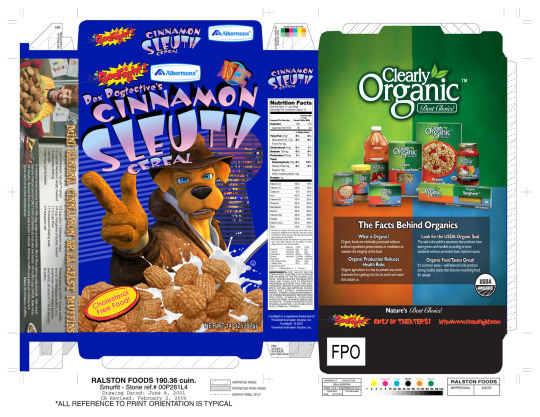
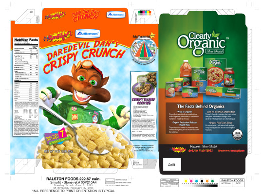
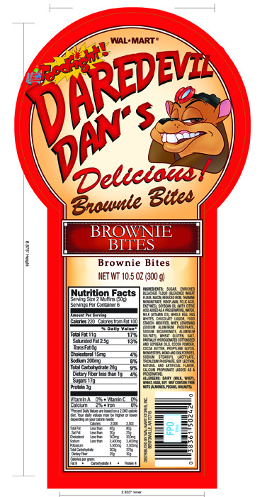
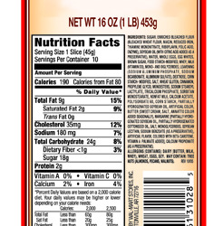
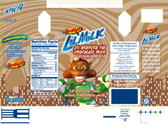
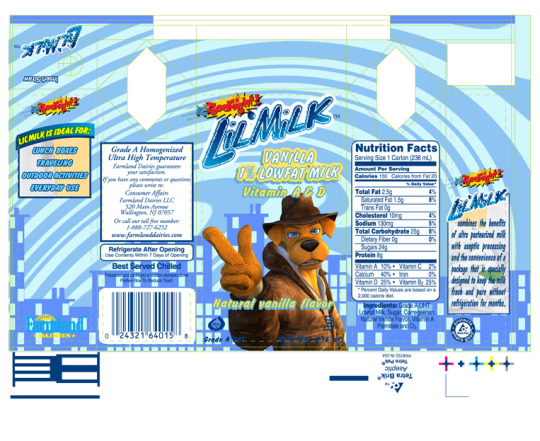
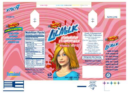
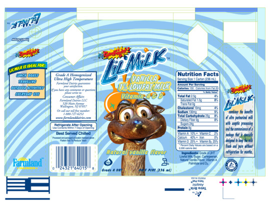
I've included all the designs above in case you want to print your own- there are several more including another cereal, brownie packaging and milk cartons. Curiously, the milk cartons have Farmland Dairy logos on them, with Farmland Milk actually appearing in the finished film at several points. I'd say this confirms my theory these mockups were created to show to companies they were already actively working on deals with, but I can't say for certain that was the case.

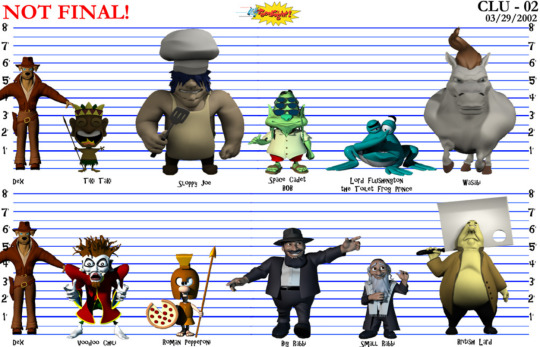

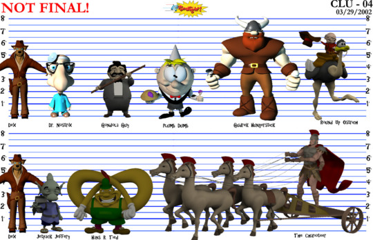


Equally curious are these character sheets from 2002, seemingly showing off almost every model created during early production. There are so many fascinating layers to this- Sunshine is still a human instead of a catgirl, showcasing a very different model to the one seen in the initial trailer, and Maximilius Moose is still a dog named Panzer Pup, both aspects that were changed once the decision was made to change Dex to a dog. However, it may be that Dex's human design was edited out and replaced after the fact, given Dex's model here appears to be the one from the finished film (you can tell by the weird hands). In any case, it's fascinating to get a closer look at all these characters- while the majority of the models for the main cast were found recently (see my last post for more on this), there are a bunch of side characters here we've only seen brief glimpses of before, including the Pringles man and the scantily-clad Cherry Waifer. The most fascinating to me however are the Red and Yellow M&Ms- I've read through their scene in the movie's script, I've seen multiple versions of the storyboard, even rough layout animation in the workprint, and it's only now I'm FINALLY getting to see their actual character models and how they would've looked in the Foodfight! artstyle. Sure, they more or less look exactly as they did in M&M commercials that aired around the same time, but it's still amazing to actually see these characters modelled and rendered after analyzing so many different iterations of the scene as it went through development.
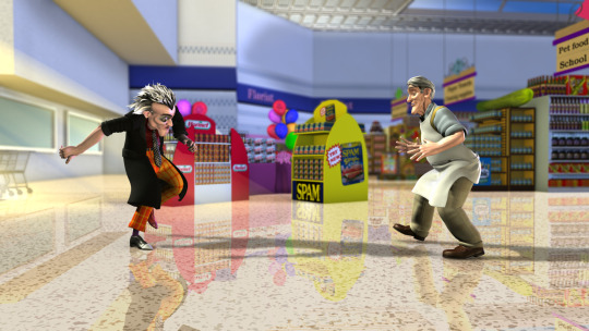
The crewmember in question also sent a folder containing over a hundred stills which while at first glance appear to be from the finished movie, are actually subtly different in multiple ways- usually lighting, facial expressions, or background textures like the sky or color of a hill. A lot of these are labelled "fix" which makes me speculate if after the movie was completed, the crew went back and tried to touch up the animation to make it look more appealing before release. Is there a slightly better looking version of Foodfight! somewhere out there in the world? Who knows, but really it would've been like trying to polish a turd. The movie was already ruined by then, and I don't think any number small changes would've done much to salvage it. However, that does bring me to my next interesting point...
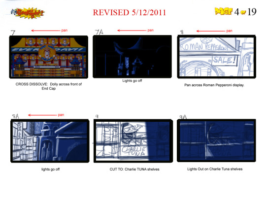
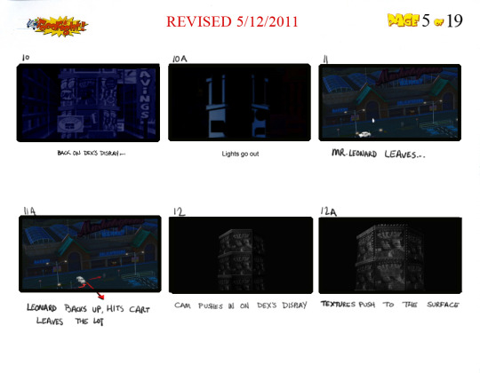
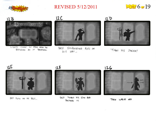
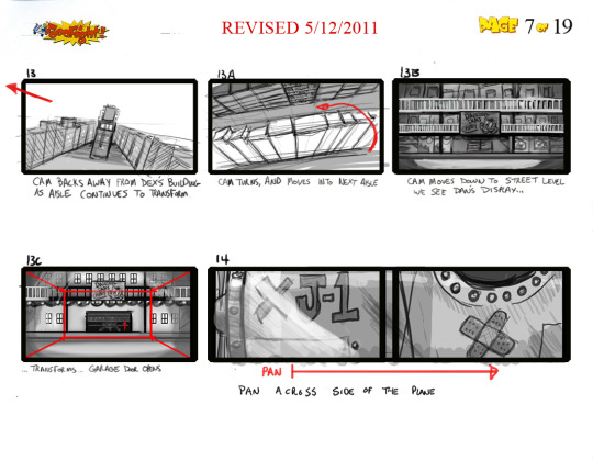
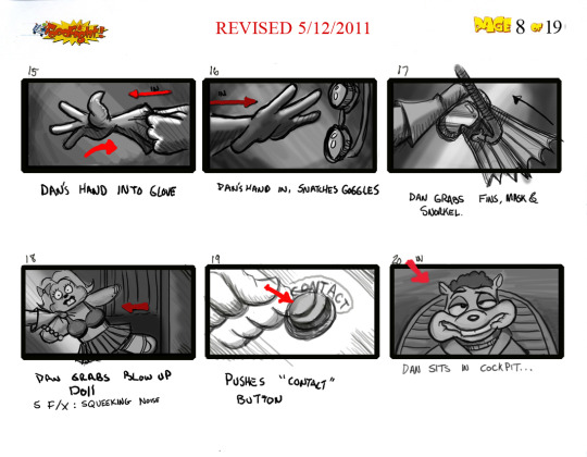
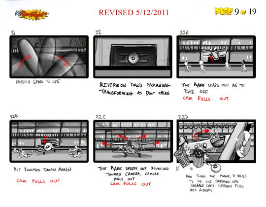
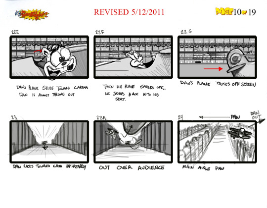
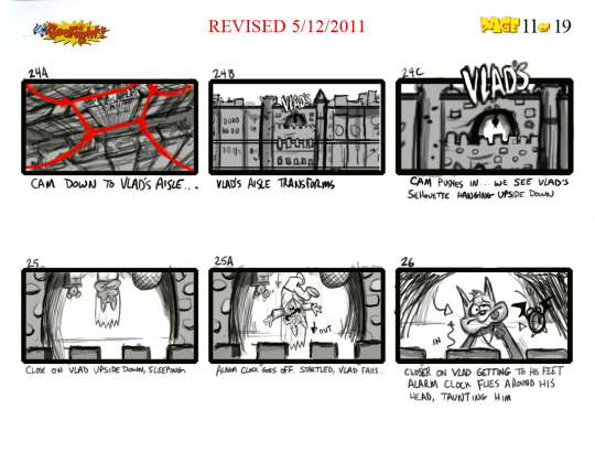
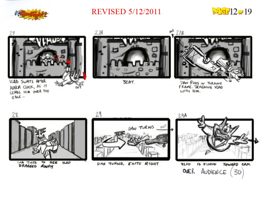
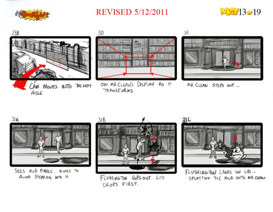
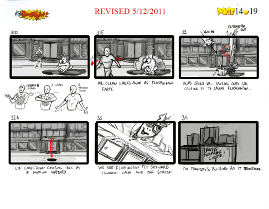
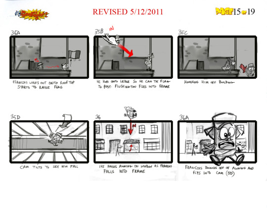
There are also storyboards dated May 2011, depicting an alternate opening to the movie giving a much more cinematic introduction to the main characters. It's crazy to think they were still working on storyboards so late in production, but there IS actually a reason for this. I unfortunately can't upload the entire sequence due to this site's image limit, but what you might notice are a lot of characters being described as "flying over the audience", "flying into the camera" or knocking things "into the audience", with some of the boards having "(3D)" written in parenthesis next to them. It's my belief that very late into production, Kasanoff wanted the movie to be 3D, made popular by the then-recent Avatar, and this new opening sequence full of flashy 3D effects was drawn up to show off what they could do with the technology. It's not clear if any of this was ever actually animated, but imagine going to see a movie that advertises itself as 3D but only the first minute contains any 3D elements. Of course, Kasanoff requesting this is only speculation on my part, but given how the movie was ruined by the crew having to cater to his whim of directing the whole thing with motion capture (made popular by the then-recent Polar Express) it's no stretch to assume the 3D opening sequence was a similar situation.
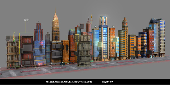
There's a ton more that was sent to us as well, so much so that I could never hope to talk about all of it. However, it should be on archive.org at the time of writing this if it isn't already, and you can now access everything Foodfight! related through the official Foodfight! collection on there!
That's right, so much Foodfight! material has been uploaded over the past year that the Internet Archive gave it its own archive, allowing you to find everything in one convenient place (including my scans of the novelization and Deluxe Sound Storybook). It'll also be updated periodically whenever something new is found, so it'll always be the home to all things Foodfight!. Whether you're wanting to take a look at some concept art shown in ROTTEN: Behind The Foodfight, read through an early draft of the script, or check out something I've talked about on my blog, it's all here at your fingertips.
I don't think there's ever really going to be an end to the depth of the Foodfight! rabbithole. I thought I was done a year ago when I finished analyzing the novelization, and look at everything that's been found since then. Every time I think I'm out, this movie pulls me back in. So...in my next post I'll FINALLY show off my collection of Foodfight! merchandise and talk about what this movie means to me, but that doesn't mean it's the end for this blog. Whenever I say I'm done with Foodfight! I end up jinxing it, so if I try to conclude things now in a few months some CD will show up with a bunch of lost footage on it, I'll get mailed concept art of a bunch of characters we've never seen before, or it'll turn out Larry Kasanoff was actually D.B. Cooper the whole time. So as long as there's something new to discuss, as long as there's a Foodfight to be fought, I'll keep updating this blog from now until forever. You better duck when they launch the cream pies!
170 notes
·
View notes
Text
Y'know, I've been replaying the Elder Scrolls games, and out of every post and article and whatever comparing morrowind, oblivion, and skyrim, there's one thing I feel that oblivion definitively did best that I don't really see talked about, and that is the icons.
Both skyrim and morrowind to various extents went in the direction of having their ui elements be renders of the 3d elements of the game. Both games did this with their map and with the icons for items (insofar as skyrim even had icons, they literally just show you the ground model of the object). Skyrim also did this with magic, and skills (sort of, with the constellation, which was cool in its own way). Morrowind did at least have skill and spell icons but they were kinda samey imo. For skills, combat is blue, stealth is yellow, magic is red, and the icons themselves are tiny. Same for magic, each school got a color and the icons were sort of neat but didn't really represent the effects well to me (although I did like them being the daedric alphabet).
But in oblivion, the ui work is a lot more colorful and interpretive. For items it's not much to right home about, just a fairly typical rendering of what the item is, but skills and magic is where this truly shines. Each skill has a beautiful icon representing it that looks like an illustration out of a medieval book and the magic icons add so much feeling to the spells you cast. Paralysis is a scorpion, chameleon actual has a cute little chameleon, each summon shows you a drawing of what you summon. I love the interpretation, and it just feels incredibly nostalgic to me. Also quests have little icons to go with them! Same with faction ranks! The ui art in oblivion is central to the kind of story book atmosphere and is a really cool part of the game that I don't think gets talked about enough
540 notes
·
View notes
Note
Forgive me if you’ve answered this already, but what is the timeline you work with for the CR character art? Do you do them all at once, or one at a time? I saw on the Dorian ask you mentioned the deliberation started long enough ago that Robbie didn’t know his brother died. Did you know they were going to a cold location? Or were the outfits designed for any weather? If you were to design their winter outfits now, would you do it any differently?
Your art is very cool! No pressure to answer all/any of these :)
Timeline varies WILDLY. The very first round, back before Bells Hells even premiered, was like 4 months out. But that took a lot more effort. Messing around and zeroing in on a thing. I can turn a character around in a week, as long as that character isn't that important to anyone. Like I know all guests love their characters, but Erika Ishii's first round took like three days (and then I heard about Yu, which took two weeks). Bordor scared the shit out of me because it was so effortless that I was worried that I either missed something or didn't know something.
I start them all at once, within reason. It's really important to get final designs (pre-rendered) to Ian, the mini painter. So one tries to work them in waves. Start as soon as you get the first brief, and then don't get too stuck on anyone. Try to keep a wide open mind so you don't accidentally railroad yourself. I have a tendency to freeze up at the render stage, because it requires a drastic change of style. So I will have to spend a day relearning how to color.
So yeah- no one told me they were going to a cold climate. They try to tell me what I need to know, but "need to know" is different for everyone. I've gotten clips of descriptions of what they are wearing, before, but generally it's just whatever they tell me directly! And no, I don't think I'd change anything too much if I knew they were going to Aeor. I enjoy a Seasonal Design as much as anyone, but only for like a one-shot (I'd love to do a holiday one shot with everyone in swim gear or christmas sweaters or whatever). But if they are going to be playing the main game in an outfit, I'd rather that outfit be iconic than specific.
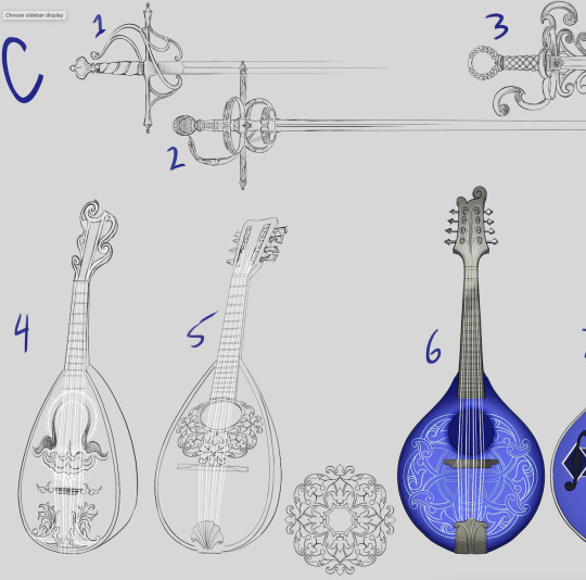
Check out some Dorian gear concepts!
307 notes
·
View notes
Note
Hii first of all, I FUCKIN LOVE YOUR ART! ITS GORGEOUS AND IM SURE EVERYONE CAN UNDERSTAND YOU REALLY GIVE YOUR SOUL INTO THAT🤧 Your color palette looks so good, What do you pay attention to when painting? (Like when do you think its better to use multiply or something like that and etc.)
first off, I'M HAPPY YOU CAN TELL THAT I PUT MY SOUL INTO MY ART!!! im genuinely in love with drawing and am always finding ways to make creating art enjoyable and impress myself with what i can achieve and learn :D
second, thanks for asking your question!! i dont mind answering it, but my response is quite long. here's my thinking process:
(you specified layer modes like multiply, so im gonna gear my answer towards that a bit) 1. REFERENCE SEARCHING IS KING. color is actually extremely hard for me, so i search around for artworks with palettes i'd like to use and study how an artist uses it. some situations i have a clear idea of what i want, but usually the images in my head are extremely vague, so i borrow palettes from various other artworks that fit the vibe of what i want. an example is this one. my main palette reference were from these artworks. im looking at this artist's use of high saturates and how drawings are overlayed on top of each other. while looking at references, im asking myself how is this artist using warm/cools, where are these warm/cools placed, if their illustration used any form of texturing (like halftones, hatching), how do they use their palette to render form/shape/gradient, when/where do they saturate/desaturate their colors. those questions inform my decisions when using colors too.
2. USING LAYER MODES WHEN NECESSARY. i used to be reliant on multiply for everything, which atp i dont do since i can definitely push colors more first before using layer modes. only when i feel like my current colors are lacking do i start tinkering with tone curves and/or brightness/contrast/hue/saturation/luminosity settings. and if that doesn't work, then i start using layer modes. using layer modes do help with achieving certain effects, color corrections, or when i want to fuck around and find out. i think having a better understanding of what these modes can do makes you more decisive on how you can properly utilize them and to achieve a particular look (like using multiply for a cel shaded style). here's an example:
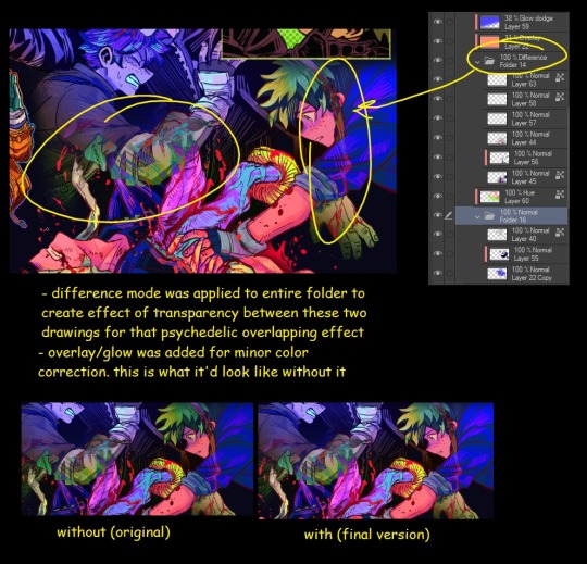
this leads into my next point:
3. BALANCING OUT VALUES. big thing that makes an illustration hard to read is if values blend together which affects the hues and contrast. i check for what elements need to be distinguished from one another and if it can be read clearly. using layer modes can either help with this or not help at all. it's very dependent on the type of layer mode. here's this example where i applied pin light:

back to #2, there are various instances where i'm using layer modes for quick color corrections and/or to help with readability:


other times, i start off having my entire subject in gray and to figure out main shadow/lights (similar to the multiply cel shaded process i linked ealier). im thinking about what this should look like if i only used 2 value tones:


when in doubt though, i check my artwork in grayscale to ensure values aren't overly blended into each other, especially if i didnt start with grayscale like this one:

painting for me takes into consideration a lot of different aspects. im thinking about how colors should interact, where/when to give contrast, checking/balancing out values, etc, but im also making it a time to study off of how other artists use their colors through the references i collected.
hope this answered your question! lmk if there's more :]
#answered art process questions#answered asks#this one took me a couple of hours to form out my thoughts while editing in examples ngl
149 notes
·
View notes
Text
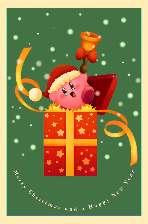
Merry Christmas and a Happy New Year!!!
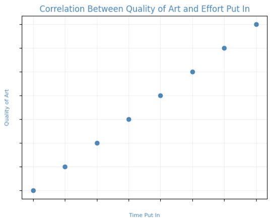
Fun fact, in making this image it was surprisingly my most easiest yet visually pleasing work. I've always viewed at as a graph like this
Of course, that isn't true! It's more like this
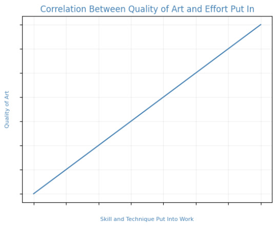
That is to say, I believe this illustration allowed me to focus on the efficient fundamentals I built!

Everything here was rendered with only three brushes. All of them the default brushes that come with CSP. Which includes Pastel, Airbrush, and Mechanical Pencil. Because it was a lineless style, that means I could be a lot more forgiving of mistakes here and there. Something doesn't look right? All I gotta do is add a little more with the GPen to the shape. Or can I just draw an outline in the color I want and fill it in with the bucket tool with a area scaling of 0.10! I have to practice more with lineless styles, it is fun! Rendering was a breeze too.
Which was a simple process of:
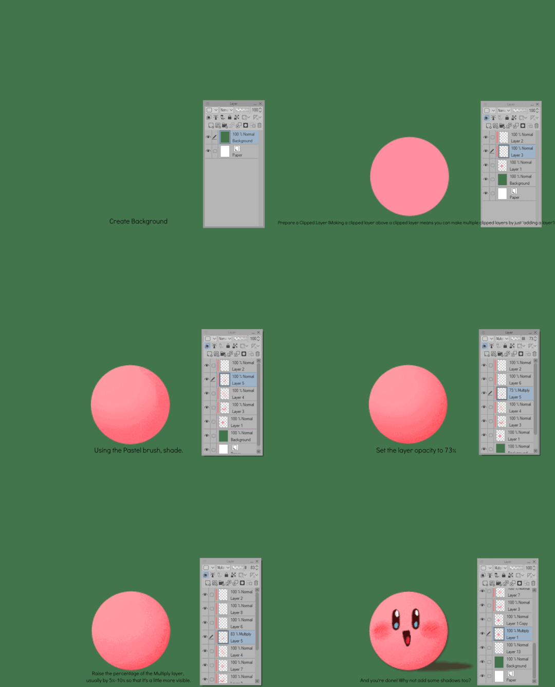
Create shape > Shade with Airbrush > Highlight with Airbrush > Shade with Pastel > Multiply Shading > Lower Multiply Layer Opacity > Overlay with Textured Fill > Move Textured Fill Layer > Finished!
It's a few steps, but once you get into the groove, it becomes very efficient. I'm sure there's ways I could shave off a few layers, like combining the Airbrush process into two layers instead of one but ehhh sometimes I do it, sometimes I don't. Usually, the bigger the shape the more likely I'll use more layers and the smaller the shape the less likely I'll use more layers! Of course, this process isn't a concrete ruling. Sometimes, I'll use more layers for extra things like the bell required more layers for rendering the shininess of metal! Anyways, I would like to believe I did a decent job at recreating the feel, the vibe, and or general look of an old Christmas Card that's more retro in nature. With a focus on simple shapes, a lineless rendering style, and using textured brushes to render, I think I got it down packed. I used a tiny bit of Chromatic Aberration to give it a little bit of a visual pop, and brighten up the colors. It's subtle, but it works.
Oh, and here's something cool! To get a more embossed Christmas Card feel, I used a new tool that came with Clip Studio Paint!
N O R M A L M A P !
Cool, right? I use a pirated copy of Clip Studio Paint 3.0 and it comes with a tool that allows you to create normal maps from illustrations. Which, from what Google tells me: "A normal map is a texture mapping technique used to add surface details to 3D models without altering their geometry" ...Neat!
Anyways, here's what it looks like
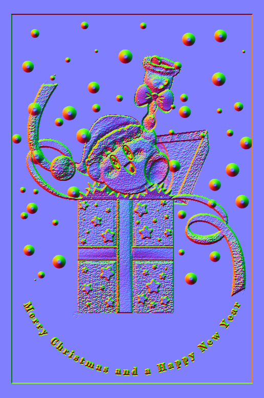
Freaky, right?
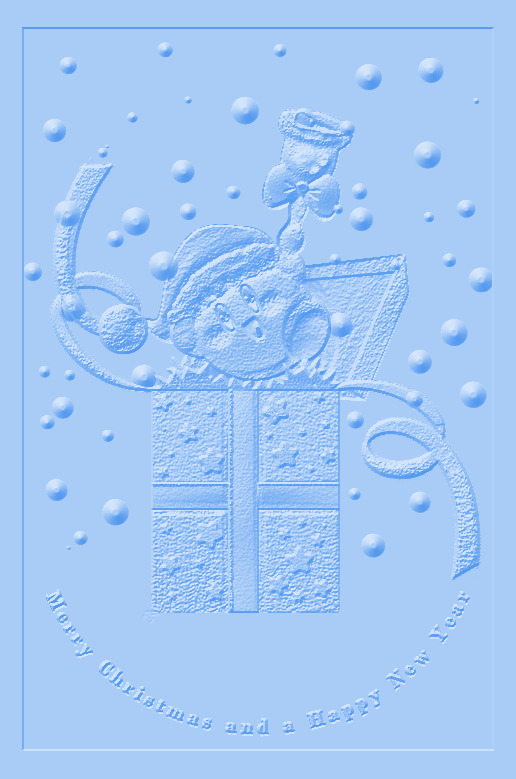
It looks like an embossed letter when you set a layer color to it too!
Anyways, I overlayed it on top of the finished illustration, set it to multiply and set the layer color to a warm yellow and it gives it not only texture but a sense of depth too! It's super cool, if you digitally paint you should try it!

With Normal Map Overlay Effect
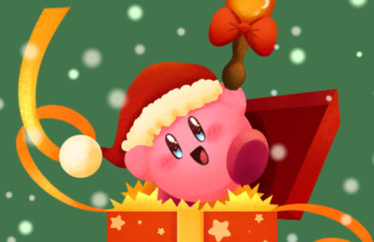
Without Normal Map Overlay Effect
It's subtle but it's there.
Anyways, that's enough blathering from me! Merry Christmas everyone! I'll be answering some asks this week, so stay tuned!!!
59 notes
·
View notes
Text
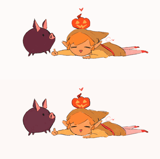
linktober 31 - HAPPY HALLOWEEN!!!
I thought for the last day I'd write a little retrospective on what this whole thing was like and what I learned. I'm too tired to draw literally anything else I'm due for a break lol
So this was my second time ever attempting a linktober/october drawing challenge, but my first time managing to complete all the days and prompts. I feel super proud of myself and accomplished for pulling it off.
There were a number of things that were surprising and that were challenging for me that I wasn't expecting this month. If anything, I think this challenge really highlighted my flaws and mental blindspots with how I approach making art.
For one thing, I came away from this not liking everything I made. I think I only like about 9 or 10 of the 30 pieces I put out there. When I don't like my art, I tend to get stuck in this mental stalemate of refusing to finish a piece until I like it, but also refusing to retrace my steps and erase/rework what I have so far for fear of losing progress or not being able to replicate the line/angle/color/etc that I liked.
It was surprisingly hard to accept when I didn't like a piece but had to move on for the sake of time and post it anyway. But once I did it a few times, it got easier. I realized prioritizing my standards over my available energy is not gonna promote progress. If I kept sinking myself into one piece and not moving on until it was optimal, I never would have finished anything-- that was the pitfall that ultimately made me bail out 10 days in last year.
I also realized my sunk cost fallacy/"what if I erase this and can never redraw it good again" stems from some real lack of confidence in my knowledge and techniques with art. I'm self-taught, and I think I tend to believe that everything I make is a dumb happy accident, even though I have mental rules when I draw, use tons of references, and have a process lol. There are a few pieces I started over 2-3 times before I got them right, and that's starting to feel liberating instead of like failing to me now, which I never expected to come out of this experience so that's cool.
Another place I had to learn to let go of control in this was with allowing for style variation. I really wanted each and every piece to be coherent and painterly, like they all came from the same book or something. But then I couldn't decide whether I wanted to do all/no lineart, all/no detailed background, all/no heavy rendering, etc. At the end I settled on just keeping the same canvas dimensions and just prioritizing filling up the space. Glad I ended up doing this, because I really would benefit from continuing to chill out and scale back how much I default to making dramatic, high-render pieces. I gotta break out of my comfort zone and make more sketchy little guys!
Sometimes my attachment to the prompts fluctuated; some prompts I thought I would love and then just wanted to get them over with. Some prompts I thought I would hate and subsequently half-ass, then I ended up redoing them and putting more effort & time into and loved the end result!
It was funny to also see how some pieces that I loved straight up did not get a whole lot of notes or attention. Some pieces I was "meh" about did crazy numbers lol. I'm used to posting maybe 5-6 times a year on here, so I'm usually indifferent to getting notes (by which I mean, I'm super grateful for likes & reblogs and the super sweet & funny messages in y'alls tags, but I'm not butthurt when I don't get notes because whatever happens, happens). Churning out 30 pieces in 30 days made me sometimes get bewildered by what did and didn't get notes, but frankly in the end I think it helps reaffirm that I should continue putting whatever I want out there because it! is! not! graded!!!
So would I do Linktober again? Probably not, sorry! it was a lot of time & effort and took me away from fall festivities more than I would have liked. I kinda only managed to pull this off because I was transitioning between jobs this month and had a week off to just draw. But I also completely see the value in taking on a challenge like this and finishing what I started, I'm super glad I did this, I think my art improved from it. I would definitely do future drawing challenges/prompt things that are quicker or have less prompts!
My advice to prospective future linktoberers: pace yourself and be gentle; this is a great chance to do something exciting and new with your art, but above all it's about you having fun. There are no prizes at the end except for what you've learned and how you feel about it, and that's for the best!!
One thing's for sure, I am zelda'd out lmao so I'll be branching out towards some little projects I have lined up for personal art and other fandoms I'm into right now
So anyway thanks to all of you who read this or who gassed me up this whole month, I appreciate you!!!!!!!! ヾ(^∇^)
73 notes
·
View notes
Note
I think it’s really cool how you’re editing screenshots from Veilguard to look like drawings! I’ve messed around with the same Photoshop filters before too!
they're not edited screenshots!
i used daz + blender + photoshop to make both of my datv pieces. here's a look at them from different angles!


(you'll notice i modeled everything on the wrong side for emmrich and had to flip it in post. this is because i am stupid)
the process for these is a little different than the one in this post (warning for butts). i'll talk about it below the cut :)
for these, the 3d step is pretty similar, but instead of just getting posing/props looking good, i am going a bit further and working on lighting, materials, camera placement, composition, etc. i'm spending probably 80% of the time for this type of piece on this step. i looooove the lighting in the lighthouse so i spent a lot of time trying to nail the vibe on both of these pieces.
i use a blender plugin called extreme pbr nexus and epic's quixel megascans library for almost all of my materials. (megascans is no longer free so idk what i'm going to do in the future. rip)

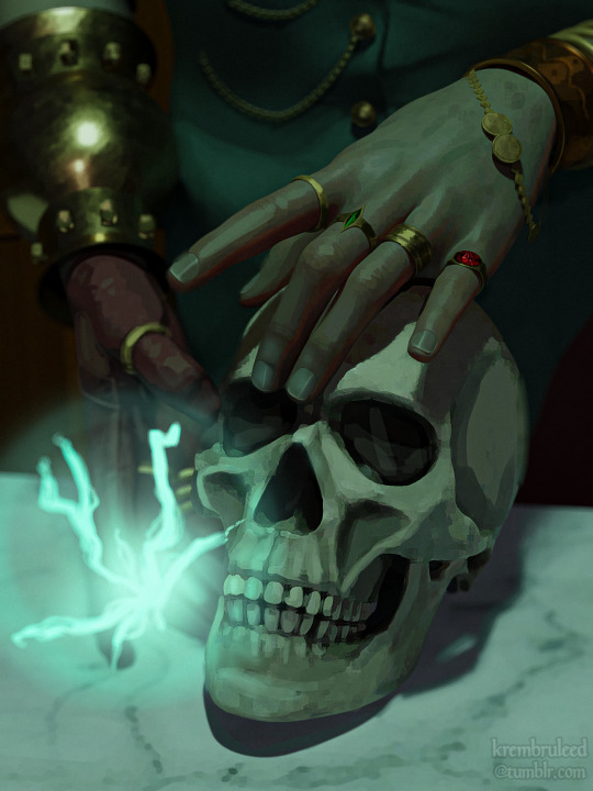
my raw blender render is on the left, and the final image on the right. i do a lot of overpainting and add detail (rings, chains, gold bracelet engravings, wisp-fred - all things i was too lazy to sculpt) and subtract detail (some cloth seams, crags on the skull, blurring objects farther away for depth of field) where i see fit.
i also used some gradient maps (my default is a blue/purple/pink but i used blue/green here) and color LUTs over the entire image to harmonize the colors.
the last step is to add grain and sharpening with a camera raw filter.


et voilà!
i'm doing one for all our guys, gals, and nonbinary pals - here's a sneak peek for the next one!

46 notes
·
View notes