#I have to learn how to give more texture to my drawings
Explore tagged Tumblr posts
Text
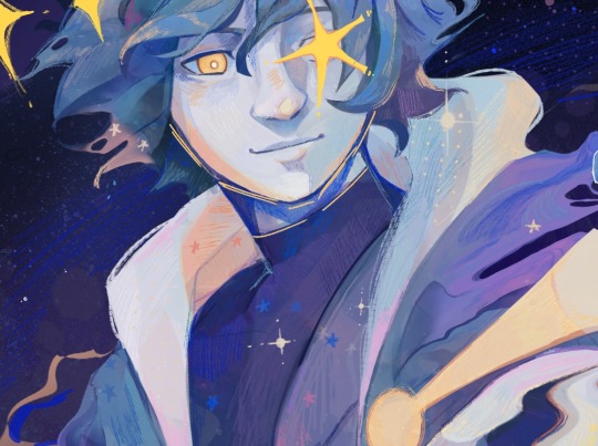
I did finish the sketch! Please click on it to see it in full res
I love him

#deltarune#deltarune fanart#deltarune ralsei#ralsei#I have to learn how to give more texture to my drawings#Why does it look chuncky on tumblr
170 notes
·
View notes
Text
Art style breakdown /tutorial(??)

Some friends asked so here we go : disclaimer im bad at explaining (so feel free to send an ask or smth)
Final art (long read so theres a timelapse at the end)


If its not for something important (commissions), i dont usually make a lineart for a drawing but just clean up the sketch , it wont be used anyway

I usually separate them by colors , mostly so i can Alpha lock them and not worry about coloring over parts
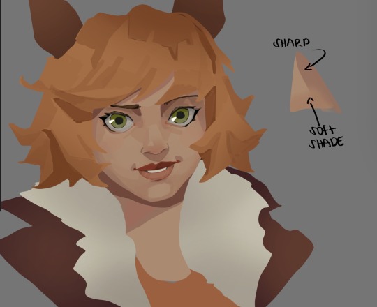
When coloring i use a soft airbrush to have gradients within the shading , so its not one solid color . How i shade is very blocky , lots of triangles lol (if im using CSP i love using the lasso fill tool ) but there are parts especially in the skin where I keep it smooth and blended, usually nose and cheek area . Using an asaro head is usually a good start to learning how to shade faces with planes in mind

Depends on the character, but I like adding shadows on the lashes/brows itself , make it look solid and 3d , it makes the eyes pop more imo

Using multiply layer to make the shadows darker for more contrast
At some point I’d merge everything together so i can just paint in one layer, easier to fix things with liquify too ; if im in CSP i keep the separate layers in one folder just in case i need em later but i cant really do that in Procreate cos of layer limits

This is the part where i make the shading more painterly .,To make the shading look sharper , i like adding lines on the edges .
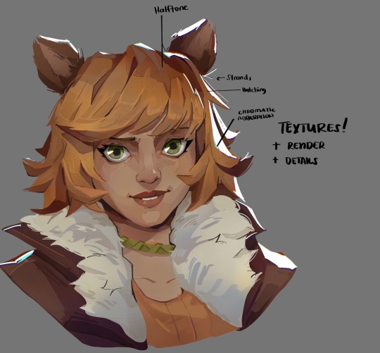
The fun part : adding the ✨
This is the part where I add textures , either from texture images or with screentone/hatching brushes. This is also around the part where i add the character’s accessories and stuff like scars and freckles (its just easier to add smaller things near the end than having them accidentally painted over at the start)
Whenever I feel like the drawing looks too much of a similar shade / temperature , I use a gradient map+layer effects (masked) on parts to give it variety . Technically you can do this by just having a layer effect on and manually adding colors but gradient maps make me go “ooooh didnt think of that color there “
CSP also has a posterization filter that i like using when i feel like some part looks too smooth to me.
I sometimes add in sketchy lines , and seeing how cool it looks in Marvel Rivals art ive been adding it more lol
Artists that influenced me are : Nesskain, Toni Infante , Valorant’s 2d art(their main artist is Suke) ,Arcane , Spiderverse and the most recent one ive been obsessing over is Marvel Rivals ( its got everything i want my art to be when it grows older lmao )
412 notes
·
View notes
Text
MICHAEL KAISER x [f] READER


cw: fluff, comfort, romance. note: a tribute to my dear friend.

My sun is beautiful, powerful. Valiant. It shines brightly but has no sharp points. I kept the thorns on my wrist.
Michael Kaiser was a paradox in himself.
"Can I open my eyes?" You whisper, your step hesitant. "Michael?"
"Not yet."
In the darkness, his voice resonates.
"We're almost there. Just a few more steps. Patience."
Patience was a virtue you didn't know. One you learned with, and for, Michael. A rose takes time to bloom; its petals slowly gain color. One wrong sound, and the stem withers. These creatures are as delicate as they are insolent.
Under your heel, the concrete fades, giving way to the soft, frayed texture of fresh grass. Yesterday's rain still soaks the earth.
The weight pressing on your eyes lifts, freeing your sight, and the landscape unfolds into a vast lake reflecting the moonlight. At your feet: a spread-out blanket holding the basket and provisions. Your gaze sparkles with wonder, your voice swelling with joy.
"Oooooh!!! Michael! Did you prepare all this?"
He says nothing. Doing things for others is not something he likes to express.
You step forward, kneeling on the red and white cloth. The basket holds those foods seen in couple picnic photos, and the comparison amuses you.
"Right by the lake, at night. It's even prettier. Michael?"
Your shining eyes lift toward the German who hasn't moved. You can clearly see that something is bothering him.
"Hm? What's wrong?"
"Nothing."
"Yes, there is something."
"… It's just that I wasn't sure if you'd like it. It's the first time I've done this."
It's not your vision playing tricks—you can almost see his cheeks suddenly flushed.
"Michael? Please, come sit with me."
With a tilt of your head, you beckon him to come. Silently, the man approaches and settles at your left. He seems strangely out of place in this intimate setting, surrounded by neatly wrapped provisions. The very thought that he took such care to prepare all this warms your chest.
"Do you like it?" he asks, his voice, usually filled with pride, now resonating with the shyness of someone experiencing a first time.
"Do I like it? Of course, Michael. Can I hold you?"
Asking for his consent, even for the smallest things, had always been a rule. Like a delicate rose, his thorns, thin and sharp, rose like a tiger's claws. Always, you took care when approaching those defenses.
A nod is his answer. You move closer to wrap your arms around him. The difference in your heights is noticeable even now, when you have to draw him toward you to fully embrace him. Tonight, the fire of his arrogance is mild. It glows like a flame in its last breath. And you, your warmth radiates.
Before you, the water sparkles under the pulsing starlight. Despite the winter chill, the cold's bite doesn't reach you.
Your eyes fall on the basket. Without waiting, you pull out two sandwiches, handing the first to the German.
"Next time, I'll be the one making them for you!" you add, smiling.
"I hope they'll be at least better than mine."
Michael never cooked. However, he had put his heart into the task, and his effort could be felt even in the tenderness of the bread yielding under your bite.
"It's not the taste that matters, Michael! What counts is that you made it with love."
Love was a rare commodity among the Kaisers. Power came after long, laborious efforts but offered no guarantee of that warmth deep inside. One couldn't have love alone.
"So? How is it?"
"It's good, GOOD! Try it!"
You push the tip of your sandwich toward his mouth. He finally accepts and takes a bite.
"Hm."
"So???"
"Passable."
And since Michael Kaiser had no love, he couldn't give any either.
"Hmm! You'll see, next time I'll cook you a dish so good, you'll be smiling all the way to here!"
With the tip of your finger, you trace the outline at the corner of his lips, then a light laugh escapes you.
Your sandwiches quickly disappear into your stomachs.
"You know, I'm glad you found time for us, despite the football competitions." Your voice resonates in the silence, carving its way to the surface of the water. "I know you give it your all for that."
"It's my life. My goal."
Power.
"Yes…" Your smile fades slightly. "Your goal."
Wasn't Michael's goal to be loved?
"You're strong, Michael. I know you'll make it. I'm sure of it. I don't even need to be in football to know that."
Some have victory in their name.
"And I'll be there when that day comes." A smile, unsure if it's natural or hides something else, lifts the corners of your mouth. "Will you sign me an autograph?"
One might think they see the beginnings of a smile at the edge of his lips.
"… Tell me, Michael. What will you do once you're the world number one?"
"I'll go where no one will come bother me."
"Where?"
"Anywhere. A cave. The top of a mountain. I'll go to Saint Helena like Napoleon when he was exiled."
"Can I come?"
"You think you'll be able to put up with me until then?"
"I don't put up with you: I like being with you."
"Hm."
"And also, I want to share as much as possible with you! By the way, thank you for this meal, Michael. And for thinking of bringing us here. It's beautiful. See? It's for moments like this that I want to be with you. And there will be many more."
"Many more…"
"Yes. I want us to live the most beautiful moments together."
Your fingers have started to move closer to his.
"You're really a tick, huh? You won't let go of this, no matter what I say." He exhales through his nose with a half-smile. "Idiot."
"You're right: I'm an idiot. But I'll stay with you no matter what. Even if you go to the other side of the world."
"Aren't you afraid? That one day, I'll disappear?"
"Michael, you know, I'm afraid of a lot of things. I'm afraid of not being enough for you, I'm afraid you'll find someone else. I'm afraid I'll drive you away because I said something I shouldn't have, or because I did something you don't like. I'm always afraid of losing you, because I love you more than you can imagine."
Your chest swells with the rush of air before your voice steadies.
"… And you, Michael, you're afraid of being loved. You're afraid of being touched. Afraid of being abandoned, forgotten, and having your name erased forever. You're afraid of giving yourself completely to our relationship. I think it's your past that influences you, and also because sometimes you think it's just not worth it. But you know what? My mission is to prove you wrong. There is love waiting for you in this world, there's a place somewhere for you. I'll help you find it."
Your fingers climb up the back of his hand. With your thumb, you trace the veins that run along the crown connected to his thorns, a vine that twists all the way to the base of his shoulder.
"I… I'm becoming romantic again, sorry. But… all this is to say that I care about you. That I love you and that you're not alone. You'll never be alone again, Michael."
Movement stirs. His left hand pulls away from your caresses.
It's not to escape; on the contrary, the loop of his arms comes to encircle you in a powerful embrace. His blonde hair, burdened with an extinguished sun whose tips have been painted blue, cascades against your cheek.
The complex, masculine scent mingled with a deep, almost velvety floral undertone surrounds you.
His voice resonates with a heavy devotion.
"… Idiot who doesn't think. Who speaks without thinking. Idiot who likes being with me. Idiot I'll take to the top of the mountain with me and dig a bed for her in the island's sand. Idiot with whom there's a tomorrow."
The tender warmth of his lips spins around yours, before finally resting there to leave a mark of love.
"Whether you're here or at the other side of the world. In a time that's not mine or in a skin I don't know: I'll recognize and love my midnight sun."

© TIGREBLVNC 2024 | MICHAEL KAISER X READER | BLUE LOCK FANFICTIONS.
#blue lock kaiser#kaiser x you#michael kaiser x reader#kaiser x reader#blue lock#bllk#blue lock x reader#bllk kaiser#kaiser x y/n#kaiser imagines#kaiser headcanons#blue lock x you#suo fanfics
202 notes
·
View notes
Text


my submission for the hermitcraft season 10 fan art gallery: Xisuma Eternal! (actual size on left, embiggened version on right)
there are a ton of little thoughts that went into this and i will now go off about them at length (ramble under the cut)
let's start with the image layout and composition! my first idea was to do an homage to the original doom box art because of X's skin, but ultimately I decided on referencing this Eternal cover (hence the title of the piece) because it sparked some stronger ideas in my brain.
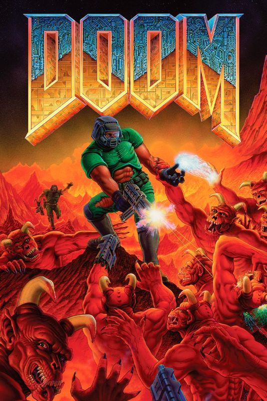
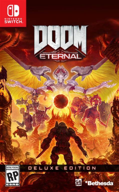
i still wanted to keep that link to the original though, so i did my very best to emulate the original logo with X's name - replacing the original texture with binary as one of many references to X's role supporting the technical side of the server.
(for no reason other than my own amusement, the binary in the letters is translated lyrics from X's verse in the hermit gang song. i don't even know how much of that is still visible after lining the letters, but i liked putting it there)
i've only been watching hermitcraft for a few months, and there's an awful lot of history i don't know about. so i focused on doing my best celebrating builds X has worked on here in season 10! i would have loved to include his base as well, but ultimately i ran out of room.
(there are still a few nods to other seasons based on knowledge i've acquired through osmosis. evil X is the most obvious, but i was also able to sneak in a couple small carvings next to the X in the title text!)
coming back around to xisuma's work on the technical side, that's why Evil X is backed by error windows. it's also why xisuma is holding a toolbox! it was the best visual metaphor i could come up with for the digital job of maintenance and repair.
(and of course he has a lovely cup of tea as well)
the allays (holding redstone) are partially in reference to farms X has been making, partially bringing back in that angelic/demonic vibe of Doom, and mostly because their intended role of supporters and helpers feels very thematically appropriate for X.
the lines in the sky are of course meant to evoke the shapes of mace race, and the black cube is a minecraft-ified version of the Soulside Eclipse logo.
(if you're not familiar, that's xisuma's music! it's good!! give it a listen sometime! it's on youtube!)
the silverfish at the very bottom are visual reference to the demon hordes of Doom - and of course they're also much more directly referencing X's very clever prank in impulse's city.
finally, on the walls of spawn we have the carved symbols - one for every other hermit. i remember X mentioning in a stream once something about fulfillment from supporting others. (i apologise if i'm remembering less than clearly.) it just felt like if i wanted to represent X, it felt important to include them as well.
and of course it made me happy to do something for Every hermit, since all of them
(smallishbeans/joel was actually the one i got most stuck on! there wasn't really a single item or symbol i could think of to narrow him down to. ultimately i decided on a torii gate and a little letter J, but i'm honestly still thinking about it)
ah right, and the Actual last thing: this turner out to be totally unnecessary, but i absolutely did draw this in the minecraft map hex code colours. it's a tricky palette to work with, and i learned a LOT about pixel art while trying to get the sky to look nice!
this piece took about 10 days to complete, maybe the longest i've ever spent on a single illustration like this - and honestly, i'm really happy and pretty proud of how it turned out!!
151 notes
·
View notes
Text
"Nawy what do you MEAN quick-ish 3D render it's got scratches and everything and I thought this was real for a minute!!"
Well, first, thank you very much that was the intention ❤, and second, you see, all speed is relative, and between finding my references, modeling, texturing and lighting, on top of having to learn how to make convincing gems, it still took me quite a few hours. I, however, cut corners everywhere for speed, and I wouldn't put this piece in a portfolio in its current state.
But! for the curious, I thought I could do a simple breakdown of how the witchcraft happens, without using too much specialized language to make it more accessible. In short,

In this case, I’m talking about a 3D model that was textured (colours and stuff) and then lit (lights on!) to make a pretty final picture. The objective is not to make a tutorial, but to put in simple terms what a 3D artist does to make something go from this, to that:
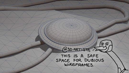

(people curious and/or trying to see if this interests them welcome)
I'm skipping the 3D modeling part altogether, since it isn't where most of the magic happens here. Just know that to be able to add colour and stuff on a 3D object, you have to go through the process or "unwrapping" it, which is like doing those foldable cubes in reverse
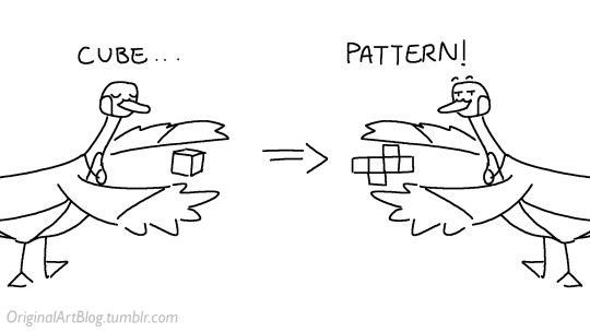
and then we can draw on it!!
Now, the good stuff:
Surfaces (metal, plastic, fabric, wood, skin, etc.) have different looks that make you able to differentiate them on sight. To make something look realistic, you have to try to replicate real life into the 3D world (duh.)
The software developers took care of the hard part (math and coding), so as artists we can play with the parameters available to make something pretty. What those parameters are depend on which "recipe" we're using. One of the most common "recipes" for realistic results is called PBR: Physically Based Rendering, named that way because it's trying to replicate real-life light physics. In this case, the 4 basic parameters are called albedo, roughness, metalness, and normal.
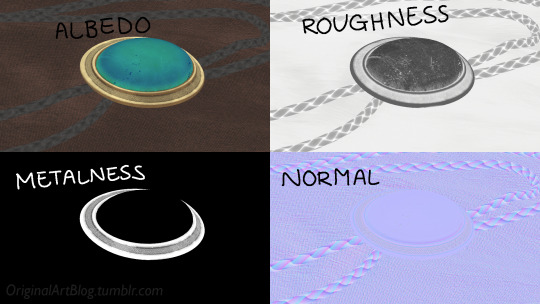
Albedo is the base colour of the surface (easy stuff). Roughness is to determine if a surface is rough or shiny. Metalness is to say if something is made out of metal or not. The normal is there to add all those tiny details you don't want to or can't sculpt on your 3D model (engravings, fabric bumps, etc.)
The roughness and metalness are black and white images because the information you're giving to the software is black = no and white = yes. It's easier to understand in the metalness image, where everything that is NOT a metal is black, and everything that IS a metal is white.
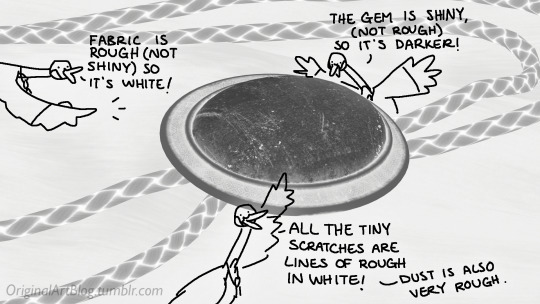
The normal is a bit more complex, but in short, it uses the colours green and red to know what is up/down or left/right, and will help the software fake relief on top of the model. You don't make it by hand; it's computer-generated from other stuff I'm not getting into.

With the technical stuff out of the way, we can actually use these. There are specialized softwares that will let you preview the results of each parameter in real time, so you can see what you're doing easily. This is what I have.
That software comes with some types of surfaces that are already set up, like the fabric in my piece, which was already 85% good for me straight out of the box. Then, it's up to me to use the tools available to decide how shiny a surface is, if there's dust or scratches and where, what colours things are, if there's metal parts, etc. That's where you can see a 3D artist's skills.
And finally, you bring it all together into a specialized software that can render 3D stuff and use those images on the corresponsing parameters, and then light the scene.
Because it all comes down to this: the light! For something realistic, light is vital to get right. You can pour your heart and soul into those tiny scratches, but if you don't light the scene correctly, well...
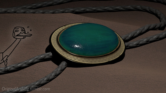
So we carefully light the scene to get some nice highlights to make the textures look good and highlight our subject (it's basically a photography studio inside a computer)
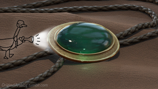
And then we add some camera effects...

and voilà! pretty picture!!
... and if you somehow did notice something different with the bolo tie from my last post, I did find out while taking all these screenshots that I messed up my initial renders in a way that made everything darker than it was supposed to be and that's why my gold looked so muddy...

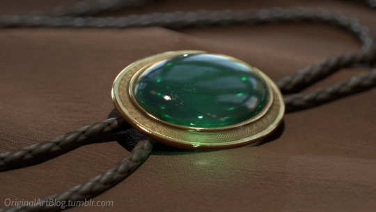
I hope this was interesting and that you learned a thing or two!
#welcome to nawy's 3d school for complete beginners#nawy's 3d#technically not art but... you know...
362 notes
·
View notes
Note
hi! i love your art so much! i'm super super new to art, never really done it at all, but The Brainrot has led me to wanting to learn. i think where i usually mess up is the hair. how in gods name do ppl draw hair?? if you could post one of your art tips & tutorials on how to draw hair (maybe step by step) i'd be eternally grateful. thank you!
hello! yes. SO since we are just doing hair ill go for shorter hair bc its what i draw most often.

i dont usually draw the scalp/bald head anymore esp for headshots but we will use it to explain. to start, i use a thicker brush for hair lines and press lightly. it gives me more felxibility.
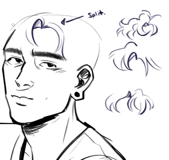
step one i define where the hair splits. MOST hair has a part or a split, even if its only at the front. i sometimes draw more bowlcut/justin bieber bang front pieces but not ofteneeee
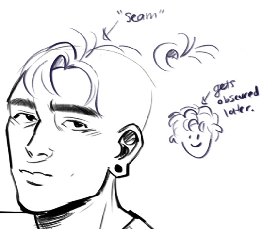
this seam helps me with the direction of my hair chunks. i usually mess it up or obscure it later, but for starting out it is helpful.ee
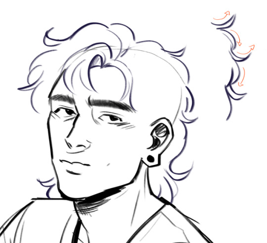
then i define the outer shape/silhouette. keep in mind: hair sticks up a LOT from the scalp usually. so if you have that bald head guideline, poof out. this pattern i show on the side of out/in/out etc works for a lot of hair textures if you amp up the curves, but not all so experiment and dont give everyone the same texture.
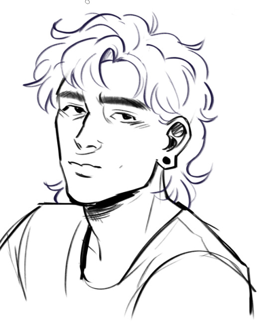
from here i add a few lines to the inside but NOT TOO MANY. think of CHUNKS, not strands. also as with the rest of my art, i dont close or clean my lines a lot. i erase the scalp line if i had one before i do this, as it will mess up the flow
and then i colour and define a lot of shapes that way! dont forget sideburn area, roots, and that hair casts shadows! Hope that helps! :] <3
241 notes
·
View notes
Note
Your art is super gorgeous! inspirational really!
Do you have any tutorials or online classes that you learned about doing backgrounds? I really want to learn how to do backgrounds/landscape like you!! qwq
(Sorry if you get this a lot!!)
Thank you! ;u;
Something important that a lot of people don't seem to know is that backgrounds and illustration are the same. I don't think they should be considered separate parts of a drawing because it makes it harder to research and learn.
In my experience, whenever I try to research how to do backgrounds, most of the resources I find aren't very helpful. It's mostly stuff like how to paint rocks, trees, water, etc. which can help! But they only talk about rendering those things. You need to know about shape language, contrast, perspective, light/shadows, brushwork, and composition which illustration tutorials/courses give you. Every rock, tree, clump of weeds/grass, etc. need to fit together with everything else in the landscape.
So! From the top of my head, the online sources I learned from that helped me the most is Tyler Edlin on youtube. Specifically these videos:
youtube
youtube
youtube
Random tips:
color relativity is real and you should use more grey
think of painting like you're sculpting instead
Imply detail: your brushwork should be creating most of the details/texture, so you don't actually need to zoom in really far and render in tiny texture details with a 6px brush (detail is the least important part of the painting imo)
#art advice#backgrounds#I would add more links but I don't have any more saved and it would take too long to go looking for them rn#you can learn quickly by doing timed studies based on photos as well#I recommend mapcrunch for that#especially if you plan on publicly posting them when your done
262 notes
·
View notes
Note
Hii first of all, I FUCKIN LOVE YOUR ART! ITS GORGEOUS AND IM SURE EVERYONE CAN UNDERSTAND YOU REALLY GIVE YOUR SOUL INTO THAT🤧 Your color palette looks so good, What do you pay attention to when painting? (Like when do you think its better to use multiply or something like that and etc.)
first off, I'M HAPPY YOU CAN TELL THAT I PUT MY SOUL INTO MY ART!!! im genuinely in love with drawing and am always finding ways to make creating art enjoyable and impress myself with what i can achieve and learn :D
second, thanks for asking your question!! i dont mind answering it, but my response is quite long. here's my thinking process:
(you specified layer modes like multiply, so im gonna gear my answer towards that a bit) 1. REFERENCE SEARCHING IS KING. color is actually extremely hard for me, so i search around for artworks with palettes i'd like to use and study how an artist uses it. some situations i have a clear idea of what i want, but usually the images in my head are extremely vague, so i borrow palettes from various other artworks that fit the vibe of what i want. an example is this one. my main palette reference were from these artworks. im looking at this artist's use of high saturates and how drawings are overlayed on top of each other. while looking at references, im asking myself how is this artist using warm/cools, where are these warm/cools placed, if their illustration used any form of texturing (like halftones, hatching), how do they use their palette to render form/shape/gradient, when/where do they saturate/desaturate their colors. those questions inform my decisions when using colors too.
2. USING LAYER MODES WHEN NECESSARY. i used to be reliant on multiply for everything, which atp i dont do since i can definitely push colors more first before using layer modes. only when i feel like my current colors are lacking do i start tinkering with tone curves and/or brightness/contrast/hue/saturation/luminosity settings. and if that doesn't work, then i start using layer modes. using layer modes do help with achieving certain effects, color corrections, or when i want to fuck around and find out. i think having a better understanding of what these modes can do makes you more decisive on how you can properly utilize them and to achieve a particular look (like using multiply for a cel shaded style). here's an example:
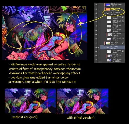
this leads into my next point:
3. BALANCING OUT VALUES. big thing that makes an illustration hard to read is if values blend together which affects the hues and contrast. i check for what elements need to be distinguished from one another and if it can be read clearly. using layer modes can either help with this or not help at all. it's very dependent on the type of layer mode. here's this example where i applied pin light:

back to #2, there are various instances where i'm using layer modes for quick color corrections and/or to help with readability:


other times, i start off having my entire subject in gray and to figure out main shadow/lights (similar to the multiply cel shaded process i linked ealier). im thinking about what this should look like if i only used 2 value tones:


when in doubt though, i check my artwork in grayscale to ensure values aren't overly blended into each other, especially if i didnt start with grayscale like this one:

painting for me takes into consideration a lot of different aspects. im thinking about how colors should interact, where/when to give contrast, checking/balancing out values, etc, but im also making it a time to study off of how other artists use their colors through the references i collected.
hope this answered your question! lmk if there's more :]
#answered art process questions#answered asks#this one took me a couple of hours to form out my thoughts while editing in examples ngl
148 notes
·
View notes
Text
-FAQ-
Hello! I've gained a whole bunch of followers lately and I've been getting a lot of questions about commissions, what my setup is, what brushes I use, etc, so I thought I'd make a post about it to answer everyone's questions at once !
Putting them under the cut <3
Commissions:
Commission prices are listed in my pinned post. You can send me a private message about your commission idea and we can get to talking :) It is helpful to have enough references handy (character, outfit, descriptions etc)
I am generally a fast drawer but I also have a job and a physical disability so there might be moments I can't work on your commission. But that is never longer than a few days at most.
Payment is upfront, the full amount and via paypal only. I know this might seem a bit scary but unfortunately there are a lot of people who end up not paying for commissions and I want to avoid that.
During the process I will send you frequent updates and will ask for input, to see if it is going in the direction you want. You can ask for changes during the sketching progress but once I've started on line-art and coloring, no big changes will happen. (You can for example ask for a different color for a shirt etc, but not for a different prop or pose or expression)
When it is completed, I will send the drawing to you via email. The drawing will remain mine and it is not to be sold or profited of by the person who commissioned me. If the commission is for something commercial/for selling, that needs to be discussed. I prefer to do drawings only for personal use!
For more questions, my dms/asks are open :)
How long have I been doing digital art:
I've been drawing digitally for about 5 years now i think? But before that I've been drawing and painting traditionally literally since the moment I could pick up a pencil.
Set-up:
It's just me and my ipad and apple pencil laying on my bed. I wouldn't even know where to begin for those whole multi-monitor/screen setups ;-; I draw only with Procreate
Brushes:
I tend to play with different brushes from time to time to get different textures, but generally i use the same few for most of my drawings/styles. My favorite one is the Peppermint Brush, for sketching. I use it in every drawing i make! I always sketch with it, and often do the line-art with it as well! And it makes for a nice textured brush for rendering as well! (i used it for a lot of rendering of the armor in this drawing)
The (procreate) brushes i use a lot are
for medieval style: inking - Ink Bleed (for line-art) artistic - Quoll (for coloring)
for general style: calligraphy - Chalk (coloring/rendering) sketching - Peppermint (line-art/sketching)
for realism: calligraphy - Shale Brush (full rendering) Also using the shale brush for smudging and erasing when drawing realistic
for lineart: smooth pencil from this pack by Heygiudi
How/why do you choose a base color:
I tend to look at a few different things when deciding on a base color/color palette.
the overall color of the reference pic
the color i associate with who or what i am drawing
the feeling/vibe i want to give off with that drawing
color has a BIG impact on the vibe of a drawing, so it is something i keep in mind when im drawing.
Using a color as a base to start, helps a lot with my drawing process. It helps me pick out other colors so they match better. It helps me get light/dark values right. And the chalk brush i use, has gaps between the strokes, so the base color will always come through a little. Having the same color come through in the entire drawing, helps pull all the colors together if that makes sense? I always start with a solid base color when i am painting traditionally as well!
Advice:
PRACTICE!!! just keep drawing and practice. I know this is such generic advice but truly practice is The Way. Learn from other artists but don't compare yourself to them. Everyone's artistic journey is different and there's no "good" or "bad". And most importantly make sure that you have fun when you're making stuff :3
I also learn a lot by studying art I admire and love. Figuring out what it is I like about it. (for example, the line thickness or the shapes or texture etc), and try to incorporate that in my own style in a way that is not directly copying or stealing.
#my art#FAQ#frequently asked questions#art process#art tips#drawing process#procreate#brushes#commission info
779 notes
·
View notes
Text
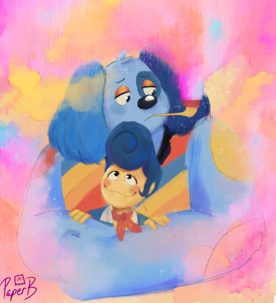
"The guilt lingers like suffocating cigar smoke."
Character: Barnaby (ft Wally as Well lmao)
Style: Mixed Media
Time spent: 4 hrs
WEHEHEHHEHE!! LOOKY LOOKYYY!!!! IT'S ART CHALLENGE PT 3!!! HERE WE HAVE BARNABY AND WALLY!!! I wonder what Barnaby is thinking about.....
OK! I wanted to use as many textures as POSSIBLE!!! Watercolor, oil painting, dots, circles, lines, and even PENCILS ARE HERE BABBYYYYYYY!!!!! I also mightve done Barnaby specifically because I wanted to do the rainbow smoke.... What can I say? I LOVE color!!!
Textures and effects change the drawing a heck-ton too! Below is the same picture without the effects!
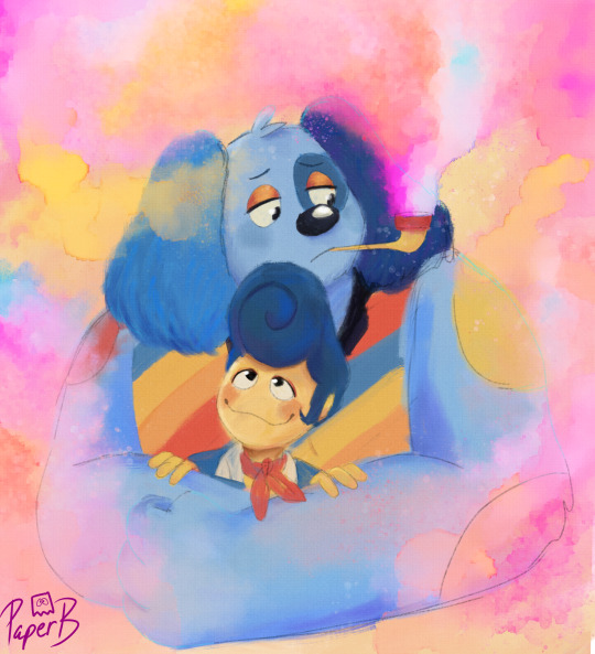
Without the Lines!!!
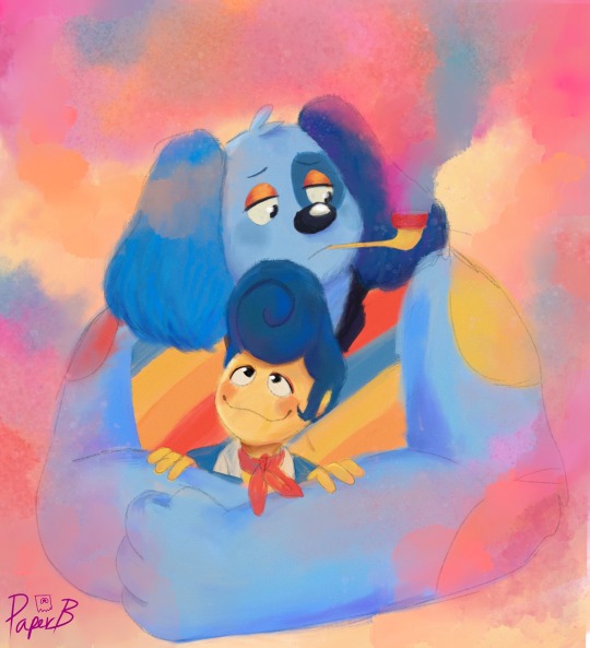
Without all the effects!
I'm actually REALLY proud how this one came out! The colors are vibrant! And the TEXTUREEEE! (You guys probably know by now that I will NEVER shut up about texture)
But hey! Since I'm trying to learn about this stuff, can you guys give me pointers? Tips? Tricks? On how to properly texturize and push my art more? Or just some critique in general?
#welcome home#welcome home au#self-aware swap au#wally darling#welcome home wally#barnaby b beagle#welcome home barnaby#3RD ART PEICE DONNNEE#onto the next challenge!!#yes you can tag as a ship
728 notes
·
View notes
Text
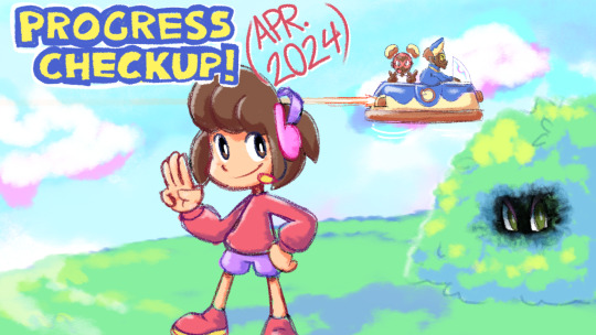
Scratchin' Melodii - Progress Checkup (Apr. 2024)
Hey guys! Just giving another progress checkup. Been working on a lot of stuff lately for Scratchin' Melodii! Keep in mind, since I won't be doing anymore demos, the stuff I talk about in these won't be released until the full game is released.
Here's what I've been working on:
Redone Nami.WAV animations (Halfway Done!) You already saw some of these in the 2023 demo!
Redone Stir & Mix animations (Done!) I've been reanimating/cleaning up some of the animations in the levels that were animated earlier in development, as many of them are either off-model to how I currently draw the characters now or just aren't consistent with the quality of my more recent work.
Lucid Mode (Getting there!) Remember that experimental "Ascension" or "3D Mode" from the 2021 and 2022 demos? Well, I've finally got it working again with the new rhythm system. It's called "Lucid Mode" now. (Unless I change my mind again!) The most difficult part so far has been programming what happens when you fall out of it, but after a long week I think I've pretty much got it under control now. I'll show a preview of this mode when I think it's presentable!
??? (Act 2 Rival Battle 3) (Being Animated & Storyboarded) Believe it or not, this will be my first time fully storyboarding a level's animations! I usually just kinda jump in with whatever I have planned in my mind, but I thought a more organized process would be worth a try this time.
Optimization Progress I've been learning some more optimization tricks, most recently with the beans in Sidechain Fever, of which I've managed to pretty much double performance! They look the same, but don't be fooled; their textures are handled differently now!
And other stuff that I can't talk about yet!
Now, with all these awesome things in the works, you're probably craving a look at some of it! Well, I don't feel like it. So here's a background model of a barbecue grill with placeholder materials.
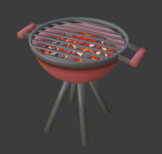
A local of Uptown JamWell was asked about their thoughts on this barbecue grill. They stated: "If we're being real here, you could probably cook banana burgers on this barbecue."
Thanks for reading!
-LJ
177 notes
·
View notes
Note
Hey, if you don't mind me asking. How was your artistic journey, I love your art and I've been struggling with improving. I try to study but then I get overwhelmed with all I have to learn and end up not studying anything. If you have any tips I would appreciate them. Have a nice day.
(Feel free to ignore/delete this if you want)
I'll try to give a few!
✶ Art analyzing videos
They are way less overwhelming than text and give way more visual information so they are easier to remember!
Since there are tons of Art analyzing and Art Theory videos it can be hard to decide which one to pick, I personally recommend to start with those that are analyzing well-known artworks (old and modern)
✶ Concept art
Also a great way to learn! Due to being sketchy and unpolished they are easier to break down than final pieces. They're great for studying the way experienced artists use shapes and colors (I recommend watching Art Analysis videos first and then study concept art because you will need to know to look for in it)
✶ Observe the art you like
If you found a drawing you like you can figure out what exactly you like about it and try to mimic it (just DON'T post your studies unless the artist gave you a permission to share an art inspired by them)
✶ Experiment
Try different styles, new bold colors you haven't used before, new brushes and textures, all of this will help you feel more confident when drawing and will give you lots of new instruments to create with
Also don't worry too much about not knowing all art theory stuff! You don't have to learn everything immediately, I've been drawing my whole life and I still don't know lots of things. Art's not about being correct it's about self-expression so be patient with yourself
80 notes
·
View notes
Note
I'm sorry this isn't a commission, but I just have a question about your art. Feel free to ignore this, of course. I was really amazed by your Miku drawing from December 16th. Seeing such a high-level piece, I wanted to achieve something similar, but no matter how much I try, I can't replicate your shading and highlights. I was so genuinely curious that I couldn't sleep. Could you possibly give me any hints or advice?
Hey, sorry for making you wait so much for this answer, i've been finishing some projects and i barely had free time. Anyways i'll try to do my best on explaing my coloring and lighting methos and you also asked me to explain how i create the folings of the clothes. Please take in consideration that 1 i am not native in english so it's a bit difficult for me to explain myself sometimes in this language and i may have some misspelings, sorry about that, and also 2 i am not great at explaing my drawing process bc i kind of turn off my brain when i draw lol, but i can explain the fundamentals that i know and help me create! Last thing i want to let you know is that i've started glazing my art, this is a metho to protect the images for AI images generators and it leaves a kind of pattern /effect on the image that i did not put there during the drawing process.
with all of this said let me start explaining things!
Learn the basics:
This may come as a cliche i guess, but yes my first ever advise to anyone is learn the basic theory on lighting and colors (on anything related to art tbh). You don't really need to spend a lot of money on books and such as there are lots of resources online like videos and documents you can read for free. It's not necesary to be an expert and even the smallest mount of knoledge is enought to inpruve your art a lot! , i find it very interesting to learn the way things work too so don't think you'll get bored of it!
To be frank, i am actually not very good at lighting lol. My lights and shadows are not very correct, but since i do have a lot o control over my colors and i know very well how to used them it kind of compensates and creates a very recognisable (i think) style.
just u know basic shitty advise that everyone is going to give you but it works! if you have free time try watching some videos or reading some documents about color theory shadow and lighting!
Your working space:
So this is something that works FOR ME not everyone likes it, you can try it see if you like it and if you do, cool! if you don't … that's cool too! When drawing on digital i prefer it when my base layer is grey instead of white. It helps with my headaches too but it's more about the fact that starting in a middle tone when coloring (in my opinion) makes the process of briging out both shadows and lights easier, let me give you an example:
Drawing from complete light (white) to compplete darkness (black) may condicion you to actually lose control in the contrast betwen these areas, i prefer staring in a middle place (grey) and that way is i want to show darkness i'll use a darkr color and if i want to show light i'll use a lighter color, but if i start on white i can't use anything lighter. I think i did a HORRIBLE job explaing myself there, but yeah it just helps me control my color valius a bit more lol.
this is the color that i used:

Another inportant thing about your woking space is you brushes, in my case i prefer using textured brushes that mix well, and i prefer using very thick strokes, if it's too think i'll just color pick the transparent color and ease it! I work in CSP i don't know what you use, but just in case i'll give you the setiings of the brushes i use the most with their codes so you can find them


Sculpting with lights and shadows
As i said before, i am not very good with light yet, so this is something that i do to help me with the process. When you think about it, lighting is used in art to give volume to the piece, not in every case bc rules in art are not there to be followed but to asist us when we need to take a creative decision. The way that we can start with our Sculpting is by creating a very easy first guide othe the shadows and lights and to do it with very big block, so that we get the general shape first,we don't neet to get lost in the detailds yet
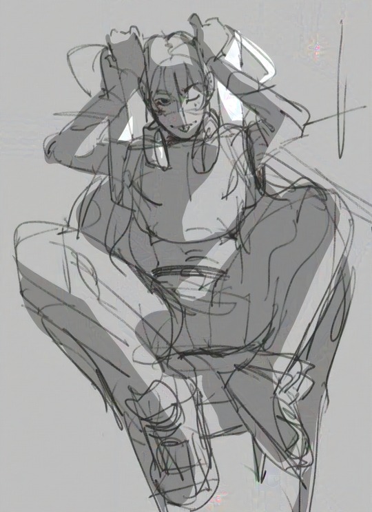
The actual coloring
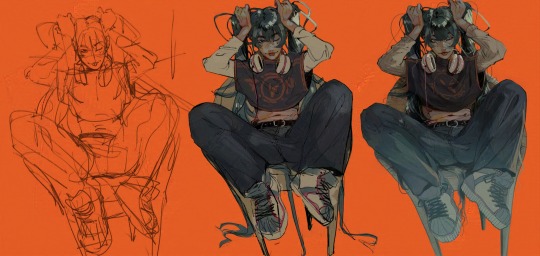
When drawing my process is divided in three stages. I first create the doodle/lineart, that doesn't neet to be super neat as i will fix it during the rendering. The basic colors, and the rendering.
During the preparation for the rendering when doing the base colors i recomend that you give special atention to the focal points of your illustration, in this case for example that's her face and the top of the hair, that's why i gave so much more atention for this part in comparation to the shirt, that it's literally not shadowed yet. Then another step that i use normally before rendering and that i can NOT RECOMEND ENOUGHT!!!! GO WILD WITH THE COLOR CURVES!!!! OMG!!!! THAT STUPID LITTLE TOOL IS SO FUCKING COOL!!!!!!!!! like for real, it gives effects that i have not been able to achive in any other way and omggggggg use the fucking color curves pleaaaaaaseeeeee
ok i'm notmal again , lets continue.
For the rendering i usually convine all the layers of the drawing on one layer, then use a textured brush that has low opacity of mixes very well fot the actual work. Tbh here is very i can't really help you a lot, bc i have no idea what i'm doing when i render i just don't know, the only thing i recognise is that i try to esare or clean the lines from the doodle/lineart, and i focus a lot on creating volume in the places that are more important.
Skins
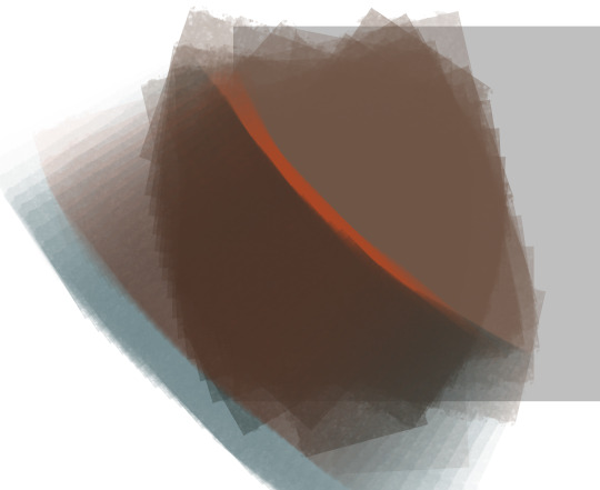
An specific thing that i do a lot when it comes to coloring skin is using an undertone in red (literally) I will put the basi color, use the brush to mark where i want shadows to be in a very vibrant red and then use a blue / green / pruple (depends on the skin) to finish the shadowing. Thios metho is nice for lots of occasions, but take in consideration that it doesnt work for example for very dark scenarios where the character is suppoused to be in the shadows, as that red tone works as a outline for the light. It just depends on the situation.
Clothes foldings:
Ok so here the only thing i can give you an advise with is to remember that the way that clothes fold dependes on gravity and that gravity works in curves most of the time that have two (or more) attachment points that are going to determinate theit trajectory. Example:
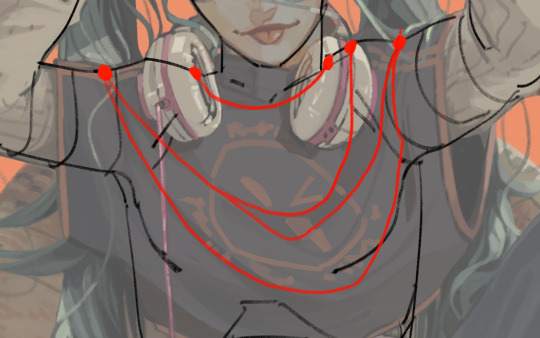
And remeber that this creates (again) a volume, that there is an inside part, that it's probably going to be draker, and an outside part, that it's going to be lightter. With this info you can start practicing with images of clothes.

this is as much information as i am able to recolect on my coloring process bc i am horrible explaining , spacially on text and in english, and i am also not very much aware when i draw, i kind of disconect. I still hope this is enough to help you a bit on your learning journy.
I may try doing a video at some point if i ever have the time so i can explain my coloring while i actually do it bc if not in that situation i'm not sure i'll be able to remeber what it is that i did.
My last piece of advise is to watch speedpaints and livestreams of artists you like during their drawing process and maybe even tray to imitate them while they are drawing to see what it is that they do exccly.
hope you have a good day and lot of lucks ! be proud of being able to create and be proud of being an artist!
#my art#art advice#color and light#aaa i'm reading and i have lots of missplesings sorry about that aaaa
223 notes
·
View notes
Note
Hello! Sorry to bother but do you have any digital art tips? I’m quite new to it and any tips, tricks or advice would be helpful! Your coloring style is very beautiful and I love it a lot!
thank you! 💚💚💚 sorry this is a bit late, hopefully there's still something helpful in it!
(also, it got pretty long, sorry!)
I think the biggest thing is to just take things slow -- digital art feels different than drawing traditionally, and it's SUPER easy to get overwhelmed by the billions of cool features that the digital world offers. (I say, as someone who spends a lot of time downloading cool brushes and textures...and then never using them ever.) there is a ton of really cool stuff you can do digitally, but because there's so much, I think it's really important to take time to figure out what is and isn't working for you. spend some time doodling without any intent to do a finished piece, figure out how you like to hold (or not hold) your tablet, what keyboard shortcuts you end up using a lot (and therefore might want to map to your pen/tablet buttons for quicker use)...that kind of thing!
everyone's workflow and preferred program and style are different, so it's hard to give hard-and-fast general advice. but the things that I think of as the essentials for learning digital art programs, and what I think of as a good order to focus on learning them in (although YMMV, especially depending on what kind of art you're doing):
brush customization (e.g. flow, opacity, softness)
layers and layer masks
selections and transformations (e.g. scale, rotate, flip horizontal/vertical, skew) (skew is underrated and I will die on that hill)
blending modes (e.g. multiply, screen)
adjustments/adjustment layers (e.g. hue/saturation, curves)
and I think most stuff after that is gravy! often very good gravy though! but yeah, as overall advice I recommend just taking things one little bit at a time, spending some time just drawing and messing around with each feature and what you can do with it. whether or not you end up incorporating any of it into your workflow, it's always good to try things out and just see how they feel! :D
and just so there is at least a little more concrete helpfulness in here, here's a few more specific things that I think are super important to keep in mind!
use! your! tablet/pen buttons! I mentioned this earlier, but they are extremely useful for keyboard shortcuts that you use often! most programs will also let you create new shortcuts for other things -- personally, I use the magic wand tool to fill in big color blocks a lot, so I made shortcuts for 'expand selection' and 'fill' and then mapped them to my tablet buttons.
flop your work horizontally often! when you're working on something, you get used to the way it looks, so seeing it mirrored is a quick way to see it with fresh eyes! in my experience, it often feels like this:
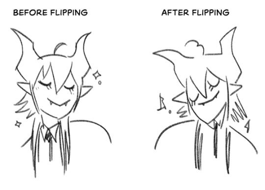
(a common thing is to find that everything is sort of 'leaning' too much one way, which is where skew really comes in handy!) (seriously, I love skew, it is my savior)

if you're working with color, keep a hue/saturation adjustment layer (or a layer filled with black or white and set to Color) on top and toggle it on occasionally to check your values! a lot of people who know a lot more about color than me (and are better at putting it into words) have written about why values are so important, so all I'll say is that the rule of thumb is that your image should still be readable in greyscale:

there are some exceptions and grey areas (do ho ho), but it's a good general rule to keep in mind! (some programs also have a colorblind mode, so you can check to see how your work will look to someone with colorblindness!)
and finally, here's some digital art programs I recommend, if you're still looking for a good one!
free: krita, FireAlpaca
paid: ClipStudio, Procreate (iOS/iPad only)
#art#...sort of#horizontally flipped mal isn't my favorite drawing i've ever done of him#but it's up there#anyway i do personally use photoshop#but i absolutely do not recommend it when there are better and free-er art programs out there#it is the equivalent of texting with a giant 90s-block phone that has been jury-rigged to somehow install whatsapp#because i don't NEED a new phone i KNOW how to use this one it's FINE#(oh god i've become my dad)#someday i will have to actually switch to clipstudio and learn new keyboard shortcuts :(
406 notes
·
View notes
Note
How do you (personally) balance designs looking cool and practical/realistic? I feel like I get stuck on my spec bio that I lose the fun in designing. Or I can't find anything neat from the animals I use for inspiration to add and don't know where to look for other ideas.
you gotta add life and whimsy. sounds kinda weird and maybe doesn't make sense, but it's true. you can spend all sorts of time making a perfected realistic looking design and if there's no life and whimsy in it, it feels flat. you can practice this by drawing very fast gestural poses, putting your character/creature designs in Situations and drawing how they'd react, and just practicing expressive faces.
Make a whole character out of your creation. doesn't have to be a character you give a name to and keep around forever as a new story protagonist or dnd character or whatever. you just have to breathe some individuality and life into it for a bit.
I'll try to illustrate what I mean.
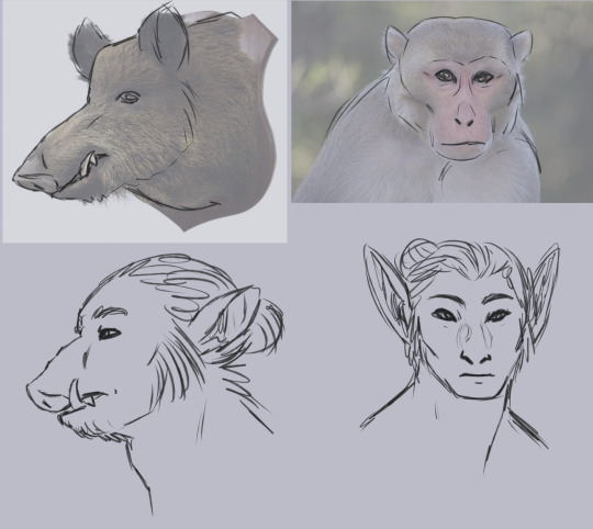
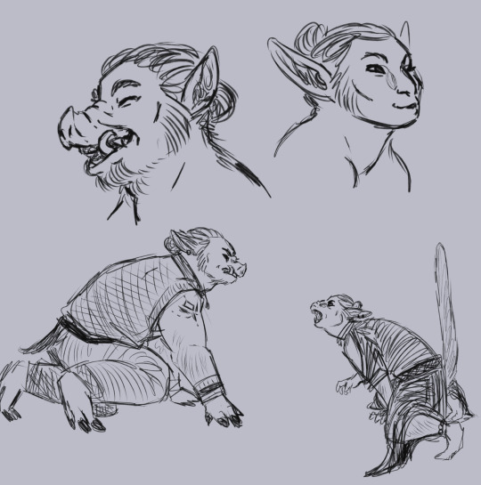
(image description: two sketch pages of an orc and an elf. on the first page, they are drawn beneath reference images of a wild boar head and a macaque. here, the orc and elf have more realistic facial proportions and match their reference animals better, but they look a little dull. on the second page, the orc and elf have been redrawn. at the top of the page are sketches of each of them laughing. the orc's mouth is wide open, making their snout wrinkle a lot as they lift it in their laugh. the elf's mouth is only a little open, with the lips pushed forward in an O shape, and they are squinting happily. below this are full body sketches of the orc and elf, fully dressed in casual outfits, crouching to snarl at each other. the orc is baring their tusks but keeping their mouth closed, while the elf has their mouth wide open, putting their long canine teeth on display and also holding their tail straight up. end description.)
body language and facial expression are so important! you gotta be loose with it to learn how to create more dynamic and lively designs. and for characters, it's also important to explore things like culture and personality so you can individualize them.
I don't know exactly what your art style looks like or what it means for you to be hitting roadblocks in the design process as you try to find that balance between looking both cool and realistic. My art style is semi-realism, and I do think stylization plays a key role in crating interesting designs. the closer you get to photorealism, the more difficult it is to create dynamic designs, in my experience. it's not impossible! but getting to that skill level in realism is harder than i think some people assume it is.
I have seen a lot of photorealism art that was clearly done by skilled artists who know all the technical things about making art, but couldn't bring out the life in their subjects. it's easy to get stuck on the technical skills, to fuss over making the shadows of a portrait match the photo reference, to get so skilled at texture that you forget about gestural posing. maybe getting so invested in realistic and practical design you neglect the whimsy. fantasy is inherently whimsical! I know this blog is all about making fantasy anatomy more believable, which often means curtailing the whimsy if it gets out of hand. but the whimsy is essential! it just needs to be cultivated and pruned occasionally if it's getting in the way of your goals. and on the other hand, so does the realism! perfect realism can't really exist in fantasy, or it would already be reality, you know what I mean? if the realism is a roadblock to designs you truly enjoy, prune it back. cut the realism down to size and make room for some whimsy. that's the balance.
56 notes
·
View notes
Note
MCYT with artist reader and like R makes them art all the time weather it's using them as an art reference and having a bunch of doodles of them, or painting full portraits of them, or like painting pictures of their pets🪩🩷🥹🛸
ooooo I'm an artsy weirdo so here you go!!! thanks for the request ; also this is the day I figure out the ufo emoji existed
MCYT ; artsy reader
includes ; tommyinnit, ranboo, badlinu, nihachu, quackity, & foolish gamers
warnings ; language
masterlist
TOMMYINNIT
bro u got a whole sketchbook dedicated to doodles of him and his character versions in mc smps (dsmp, osmp, etc)
you love painting him in watercolors 🫶🫶
you made him a watercolor portrait thing with the HTBAB logo behind him, freddie & jack
he treasures the art you give him
literally frames it and hangs it on the wall or puts it on the shelves in his office
sometimes he'll take a picture of them and posts them w ur consent to show off your talent
"look what y/n made me 🫶" or "now wtf why can't I have this kind of talent?"
will chill out with you while you're drawing/painting etc
you go over to his parents house ONCE and make a family portrait + the dogs for them
that painting hangs above their fireplace, his parents look at it everyday
he does little drawing competitions with you on stream just to bond with you a bit and make you laugh
like the "we go back to school" video, the paint gets everywhere because of him LMAO
will straight up show off your sketchbooks on stream too
RANBOO
absolutely loves showing off your art and praising you for it
you've made them so much genloss fanart
you even made them a few channel banners, especially after the rebrand (and they will never change them ever again omg)
gives you a bunch of ideas for drawing
you love drawing the lanky d!ranboo and gl!ran especially w the mask and wide arrangement of wires and stuff
you made a textured painting of genloss!ranboo and it sits on one of the shelves in his office
he's obsessed with touching it and feeling the paint
its like feeling the hours of work you put into it, something just for them
also loves posing for you
they will get so extravagant and unique with it LMAO
FREDDIE BADLINU
anything you make for him is a treasure
you made a little portrait of him and his closest friends, and it hangs on his bedroom wall where he can see it constantly
shows off your art and totally praises you for it
does silly poses for you to reference
you've made him a couple screensavers and stream starting soon pages
he absolutely loves your color pallettes good god
Freddie in acrylic paint>>>>>
"guys look at what my amazing partner made me today 🫶❤️"
sends you links to Instagram shorts or whatever to little crafts/ideas if you're having artist block
he finds a notebook full of sketches and random blurbs of/about him when you get bored and shit and have nothing better to do
absolutely head over heels because the fact you spend so much time making art of/for him, omg
if you bleach-paint shirts yk damn well he's wearing whatever you made him 24/7
NIKI NIHACHU
absolutely loves your character designs for her characters, they're all so unique and different and she loves it
your designs of osmp!niki are her favorite, considering she's literally a mermaid
the art you make with all her tattoos and piercings>>> omg
either totally adorable or totally badass
"more biker! niki bc she needs to learn how to bike rn... @/nikinihachu"
"amazing as always y/n/n 🫶 maybe I will..."
loves just quietly watching you do your thing
her and watercolor paints will never not be perfect
you make a whole mural for her because you got bored...
it's an abstract kind of goth-ish mermaid kinda thing on one of her office walls, and 'nihachu' spread across it in white, kinda cursive lettering, it's amazing
always making silly little doodles of her too
ALEX QUACKITY
cant even comprehend how talented you are
he always sees you drawing him and painting him and he's like "bro go touch grass u spend too much time thinking about me"
you also made a textured painting for Tiger
it's his prized possession, he loves it to much
almost broke down and cried when you gave it to him
loves looking at all the little doodles, drawings and character designs
his favorites are the ones of him with dynamic arm poses, even if you think they're bad
he thinks it adds a lot more personality and makes him look better LMAO
he loves and appreciates that you spend so much time on something about/for him, and so often as well
he looks so good in gouche paints that's all I'm saying
and in a kinda graffiti style as well omg
FOOLISH GAMERS
absolutely adores all the art you make of him
he'll even pose so you can get references and shit LMAO
him and watercolor paints... lord
AND COLORED PENCILS
any painting you've made for him is hung up on the wall
loves seeing your character designs for his dsmp/qsmp etc characters
he also shows them off online and points out all the cool things you've added and shit
even if it's just simple doodles of him, you'll add a splash of color w a marker or highlighter and he thinks it looks so awesome
you have post it notes all over your wall thatre just doodles of him and shit
you painted his shark logo on a giant canvas for him for a YouTube video
like 59 hours later you completed it and gave it to him as a birthday gift
he doesn't shut up about it after that
literally brags about it like he's a 15yo who just got a girlfriend for the first time before all his other friends
#lowkeyrobin#mcyt x reader#mcyt preferences#mcyt oneshot#tommyinnit x reader#quackity x reader#ranboo x reader#badlinu x reader#freddie badlinu x reader#foolish gamers x reader#niki nihachu x reader#nihachu x reader#gn reader#gender neutral reader#they/them reader
153 notes
·
View notes