#I had to go in and do it all in html just to put images in
Explore tagged Tumblr posts
Text
A List of Gender Terms !
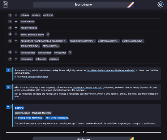

So I disappeared for 2 months, but I finally completed this project! :D (Though I've been making some random posts talking about it, so it's not like I was really gone, or what I was working on wasn't obvious.)
It started off as me having trouble keeping track of a couple gender terms (and also not knowing they existed before, since I've never really seen people talk about them), then I thought I should make a list, and if I was going to do that I might as well post it to help other people too. Which I started out trying to make that list on Tumblr, but I found it too limiting so I moved to google docs, which I also found too limiting (I just couldn't achieve my vision, if you will), and now I know html and css.
As usual, I kinda overdid it, but I think I should be a little proud of myself. I had 0 knowledge of html and css, and 2 months later I've made my own website. (I could have made it much quicker, but I often had to take breaks, a bit overwhelmed by all that new stuff.)

Anyways, it has a ton of terms on there.
I have sections for nonbinary, abinary, midbinary, atrinary, midtrinary, androgyne, agender, neutrois, maverique, ilyagender, aporagender, outherine, kenochoric, and xenogender.
For 7 categories (sex terms, adult, general term, child, gender quality, gender-quality-in-nature genders, and spectrum / -iagender spectrum).
And they all have sources on both Archive Today, Wayback Machine, and if still existing, the original post too. (At least to the best of my abilities, and there are a couple of exceptions that I couldn't figure out.)

I did put effort into this, but it's possible I missed something. So if I made a mistake anywhere, or if anyone has any extra information to add on, or if you just have some comments, you can tell me. My ask box is open, but comments on this post would probably be fine too.
Also, I checked on a couple of different browsers, mobile too, and read up on web accessibility and checked and all that (I tried using a screen reader, I'm not a pro at it though, so it's possible I may have missed something obvious), so I hope the website itself is useable. But if there's any bugs there, just tell me (it'll be appreciated).

I'm also thinking of making another compilation, but for flags (for all of the terms listed here), and maybe orientations too, but maybe later haha
I also don't know how to write a image id for the top picture, if anyone wants to write to one I'll add it.
-
Below the cut is a short little video scrolling through the site.
#compilation post#pride#nonbinary#abinary#midbinary#atrinary#midtrinary#androgyne#agender#neutrois#maverique#ilyagender#aporagender#outherine#kenochoric#xenogender#nonbinary language#it's hosted on neocities
189 notes
·
View notes
Note
https://www.standard.co.uk/comment/harry-styles-is-a-gay-icon-queerbaiting-b1136121.html
Hi Gina, Have you seen this article?
No. But thank you. I really love what the author had to say! Usually I highlight a few key comments, but I found myself highlighting almost the entire article.


[…]
And that is all well and good, however there does come a time Harry Styles deserves some respect. We know he wasn’t the first man to ever wear a dress. Still, his appearance on the cover of American Vogue in December 2020 felt like a moment. Yes ok, he has pinched a few styling tips and lyrical flourishes from the great male frontmen of our times (David Bowie, Freddie Mercury, Mick Jagger, George Michael, et al). But like Bowie caused a scandal by wearing a Mr Fish dress on his album cover in 1971, Styles does too every time he flaunts another disco coloured, nipple-grazing jumpsuit. At least someone is still trying to push the boundaries.
More than that, though, Styles’ persistent drip feeding of all things “flamboyant” — on the fashion front, credit must go to his longtime stylist Harry Lambert — is exactly the antidote a world in a toxic masculinity choke-hold needs. His own range of unisex nail varnishes? Great. Pictures of him stomping about in little heeled booties and a pearl necklace? It really is delightful to see.
His relationships with queer creatives are a convincing testament to him as a person, too. He launched gender fluid designer Harris Reed’s career when he wore a selection of his blouses on tour in 2018. He did too for S.S.Daley, another queer-centric label, which the singer gave a leg-up to stardom by spotlighting it in his 2020 Golden music video. Taking his support a step further, this month it was announced Styles bought a minority share in the brand.
And on set, the stories that come back are similar. Pat Boguslawski, the movement director best known for his current role at Martin Margiela under John Galliano, worked with Styles on his viral 2020 Beauty Papers cover shoot. Yes, the one where he is naked save for fishnets and loafers.
“He was just incredible,” Boguslawski told me in a recent interview. “It was fascinating to work with someone who is a male but at the same time so open minded and willing to do anything.” First hand testimonies are a good place to start when it comes to reading mega-stars who have their image so tightly controlled (often it’s near impossible to get any sense of true character).
While Styles has not spelled out his queerness in black and white, every plumed, pink ostrich feather coat he normalises makes it a little bit easier for those wanting to express themselves in peace and safety.
It shouldn’t be like that. In fact, it’s sickening. But that’s not Styles’ fault — and by putting it to the forefront of pop culture, he is doing the LGBTQ+ community a solid. To my mind, that is something worth applauding, not tearing down.
Full article here
#Everyone loves Harry#beauty papers magazine#vogue Harry#ss daley#Harris Reed#Harry’s queer connections#the standard#Harry’s sexuality#queerbaiting#Queer connections
193 notes
·
View notes
Note
your oc website is SO SO SO SO INCREDIBLY COOL how the hell do you even start learning how to do this ?? if you learned how to do this by yourself online, are there any tutorials or resources you can share with us? was making this website free??
omg THANK YOU SO SOOOOOO MUCH!!! It makes me so happy to hear that folks like my little site. I code my site with Phoenix Code (for the live viewer and number dials) and I host my site on Neocities - it is all free. Phoenix can be used in browser or on desktop, but I like having it on desktop more for big projects in case my files get deleted. I use the browser version when I just want to test something quickly.
The 2 videos I use and can not recommend enough to anyone who asks me are this HTML tutorial and this CSS tutorial. They are simple and easy to understand, but I recommend watching it the first go, and then following along the next few watches until you get the flow of basic parts to a website, how they're organized, and what order they go in. At this point, I've memorized exactly where everything goes, and it is all thanks to these 2 videos.
If I am being honest, I learned how to code by myself, not quite even with online tutorials but just from being stupid and messing around myself (1, because I was a kid, and 2, because I didn't understand English very well to know what tutorials are saying.) I used to do html coding for Neopet pages when I was a kid with too much online time, first by just editing the default petpages and adding info and images, and then just doing trial and error with the html. I'll just try something and then if it doesn't turn out the way I want it, I try to find out why it didn't work and also get inspiration from other similar sites to figure out where things go or how they coded (with this nifty thing called right click > inspect page or right click > view page source). And BOOM, working webpage.
It was rudimentary, white blank background without any boxes or anything, you just scrolled down the page and sections were separated by a horizontal bar. OH and every text was centered! I had no idea how to make scrolling boxes or fancy assets, but damn I still had so much fun working on it every weekend. When you find authentic selfmade sites from the 90s and 2000s, most of them aren't super fancy either unlike what modern nostalgia makes you think. So I hope you don't feel discouraged if you begin making a website and feel it isn't "fancy", you're already doing a first big step which is making a webpage and learned your first set of html code!
It was over a decade later before I coded webpages with html again. I've gotten lazy and started relying on site builders, but nothing was quite as versatile as html. I wanted to try coding my own OC site again, so that was when I started working on OutKrop (the site I posted). Until I started coding again, I had literally no idea what CSS even is (and let me tell you, it's a game changer!)
Personally, I work best when I can do things hands on. I don't read through tutorials, I code first then go back and read through coding help sites like w3schools when I find myself stuck and unable to figure something out. Sometimes I grab existing codes and play around with them to see what changes and what I can do with it, cuz having visual context is what helps me a lot.
I can also share my process:
Once I gather up some ideas, I make a sketch, including what boxes (divs in css) should approximately go. It is very rough, but shows me exactly what I need to know.
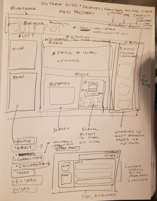
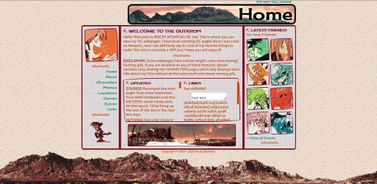
Next I load up my coding app (Phoenix Code in my case) and "sketch" the layout. Nothing fancy going on here, just putting things where they need to be, and fixing size of boxes and margins if needed. I give my boxes all a background color so I can easily see how big they are and where they are located.

After some adjustments like moving stuff around and adding assets like backgrounds and images, and changing colors of the boxes, rounding off corners, etc., we get this!
so recap + additional useful sites I use:
Coding app: Phoenix Code
Site hosted on: Neocities
Video tutorials: HTML and CSS
Sites for learning code: w3schools, also lissa explains is a great site that is written for kids to learn html so it's easy to understand. Finally, sadgrl has a lot of great resources for coding as well!
I recommend looking through these sites AFTER you tried taking a spin at coding - it doesn't have to be anything fancy just follow the HTML video tutorial I linked!
Thanks for the ask, and I hope this helps you and many others out there who are interested in building a site with html/css! Don't be afraid to get things "wrong" or have an "un-fancy" site. This is how you learn to code, and it'll become so easy once you get the hang of it.
Anyone is always more than welcome to reach out for coding help and advice :-]
51 notes
·
View notes
Text
more extra kudos images
I'm hoping most of tumblr (at least the AO3 using parts) have seen the lovely and imho useful extra kudos images by inkprovised and bizarrelittlemew. Well I'm joining in the fun! Have four more:


I'll add them to my embedding images tutorial on AO3 in a hot minute so you get easy copypaste HTML code like with the others.
And also, since I'm currently looking at everything through the lens of accessibility, I'm going to ramble a bit about why I personally feel these images are helpful. Read on below the cut:
I have this vague notion that some people may think these image give people "an easy way out" by letting them post an image instead of a "proper" comment. And I get that a thoughtful, personal comment is maybe the nicest thing that you can receive as a writer on AO3, a very special thing – short of fanart I guess.
But I'm sure that with fanart we all recognise that creating art takes a lot of time and skill that people are not expected to have, so nobody in their right mind would demand it from anyone. And I would like to raise some awareness towards the fact that putting your thoughts into words, however unpolished, also takes time and some skill and definitely energy.
Sure, I would like to write detailed comments on everything I've ever read and loved on AO3. But even for me, someone who writes quite a lot on the daily, and a naturally verbose, enthusiastic person, this is often not feasible. Because I'm tired, my brain is fuzzy for some reason, because so many others have said it all before. Because I'm already late but I had a mighty need to finish the fic before my dentist's appointment so I have something nice to think about during, and afterwards I just need a break from my whole life for a bit.
I can think of so many reasons just for me, a fairly able-bodied person. People may have motor issues that make typing hard. A friend told me lately how her style of writing got put down by her teachers in primary school because it followed vernacular speech patterns, and she still has a hard time expressing herself in writing (she's sixty). People might be just shy. There are so many possible reasons for somebody not writing a comment but still appreciating your fic very, very much.
So what I hope these images do is give a voice, a way of expressing their gratitude, to at least some of those people who otherwise would not comment at all. At the end of the day, every comment long or short, says "thank you, you brightened my day with this fic". That sentiment is at the base of long and short comments, and that is the connection that counts, I think.
Ramble over, enjoy this additional way of showing your fanfic writers some love! 💜
#witch moon ramblings#accessibility#a11y#ao3 kudos#fanfiction meta#for fanfiction readers#how to ao3#how to comment on a fic
31 notes
·
View notes
Note
Hiya! I found your blog through your neocities website! I was wondering if there’s any tips or things you read/watched that help you make your site. (Im heavily considering making one of my own neocities site it just seems fun)
hihi welcome !! i have quite a few pieces of advice, but the tldr is you should come up with an idea for what you want to make beforehand, and look up how to do each piece! your knowledge will start to fill in along the way :]
(this is probably gonna be long as hell so under the cut is all of the fun stuff /silly)
the way i personally started off was by sketching out what i wanted my site to look like! if you know what you want before you begin, you'll know where to look to figure out what you need to do. html+ css are extremely easy languages to read/write once you know what to look for!
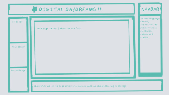
^ this was the original sketch for my site, where i planned out everything i wanted to include. it's a bit different from what actually ended up on the site, but that's alright! it's just about having an outline to work from. i think of it like outlining before you write, it feels like such a pain in the ass because u just wanna start working NOW but u will thank yourself later for taking the time to plan.
once you know what you want to make, start looking for tutorials and resources to make it easier! the grid for my homepage and some of my other subpages was made using a css grid generator, since its one of the more confusing bits of css. you can make grids without it, but its a very easy way to make a more asymmetrical design if ur using the generator!
thats linked here, it gives you some css to put in your head or css sheet, and then the html for the different boxes to slap in your main document. it can be easier to understand what itll look like if you give each one a border while you work, even if its just temporary!
when looking for information about css and html, w3schools is your best friend. its a pretty comprehensive database of every little piece of html + css you could ever need, with examples you can play with yourself to understand what each variable does! it's been a lifesaver for me, ive watched basically zero video tutorials because everything on there is explained so well and you can find basically Anything.
they even have code snippets for things that take more than one or two lines of code, which you can use and adapt yourself! (the tooltips on the official art + my art sections on the hinata shrine were adapted from a tutorial on there!)
in general, having a plan and working from there will make ur life so much easier. the pages that ive sketched out beforehand or ive had a very clear vision for have been WAYY easier to code than the ones i tried to come up with on the fly, and ive been much happier with how they've turned out as well. though i do also have some smaller, rapidfire tips as well that ill go thru now!!
— inline css (the style="" tag) seems so so useful but really should only be used when you're resizing images like buttons. when u keep all of your css in the head or in a seperate document, its way easier to debug and read later. i cleaned up my homepage recently by removing all of the inline css and looking at the code stresses me out WAY less because i can actually read it LOLOL ... plus cutting the css out and putting it in its own document made me realize that id accidentally wrote some really weird code in some places
— this is very much 'do as i say, not as i do,' but use an external editor (like visual studio code) instead of editing live on neocities! you can set up a live preview, and generally wont be pushing out 100 updates every single time you change or add something. i tend to code directly on neocities but its a bad habit and i want to break it eventually v_v
— if you really like an effect someone else has on their site, you can peek using inspect element i promise the coding police won't get you !! dont steal code line for line, but you can figure out what theyre doing and put your own spin on it. things like border images can be really cool, and i only figured out about them because i looked at what someone else was doing and figured out how to adapt it for my own site! check linkbooks and credit sections as well, a lot of people will include links to any effect they didnt make themself or got help with. (including me! the credits section of the linkbook has a ton of little things i got from other places, including a really neat little music player, the rss feed for my status cafe, and the wobbly text on the homepage!)
— most stuff in html and css basically just... says what it does in the tag. so looking stuff up for it is extremely easy! if you've used carrd before you honestly probably already know more abt html than u'd think just intuitively. when ur adjusting the margins or padding in carrd, you're adjusting the margin: and padding: properties in the css of the website it's outputting!
this is getting way too long but!! my best advice is to just get started. you'll never be able to learn without trying, and it genuinely is so fun to have something that's truly your own!
(if u have any specific questions im happy to answer anytime as well! i love talking abt neocities, its a super fun hobby and way easier to pick up than u would think!)
#originals.txt#inbox.txt#neocities.zip#god im so sorry abt how long this is i havent had time to work on the site for a while and its getting to my head /silly
6 notes
·
View notes
Note
hi there!! there isn’t a need to publish this ask I literally just am so curious if you had any resource or tutorial regarding your neocities! I’m sorry if this is so out of the blue but I saw your site and really adored the layout!! I’m specifically just wondering about the method you used for your blog posts - I’ve found some recommended ways to do it but i feel like yours is integrated really well imo :) also if you’re not comfortable answering or anything that’s totally fine lol pls don’t feel obligated. lastly your art is so gorg!!!
i'm finally going to answer this ask...!! it's going to be a very long read so i'll keep it all under this cut
i know you are specifically curious about the blog posts page but i figured this was a great time to thoroughly explain my website layout too since i had another person asking about it (i'll put that at the bottom though) :D
please bear with me btw because i... i have never made a tutorial like this before LOL
--
blog posts guide

1. scrollbox
i made a super low effort format for my blog entries. i honestly just wanted it to be a super simple scrollable box with all of my entries being in one general place. CSS to do this, i created an all encompassing <div class> that had the styling property of overflow.
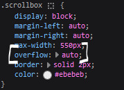
fyi, i also added a <div class> within the scrollbox class that would handle the padding but TBH i'm not sure... i needed to make an entire class for that LOL REFERENCES - scroll box
2. date & time
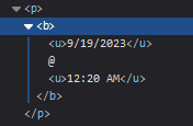
HTML ok honestly i just used a <p> element and made it bold....
3. images (optional)
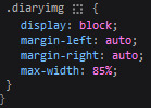
HTML i don't always attach an image to my entries but when i want to, i use this <div class> that sits below my date & time. i style it with an <img class> that i created and add an <alt text> too to make it more accessible!

CSS this is what the <img class> looks like. i like my images centered and on their own "line."
4. status
HTML again, another <div class> specifically made for the status. i just made the font size smaller to visually differentiate it from the actual entry itself.

5. blog entry text
HTML my blog entries are simply typed up between <p> tags and i use <br> to start a new line... it literally just looks like this LOL....

THAT'S ALL...>!!!!!! :)
--
website guide

1. general page layout
HTML in order to establish where i want all of my blog's content to lie, i created a <div class> specifically to store it all.

CSS the styling for it is pretty simple! just setting a max-width to limit the size of everything that will be in it and also centering the page with the margin.

2. sidebar
HTML my sidebar just comprises of a heading tag and navigation links.

CSS this is all personal taste aside from the fixed position
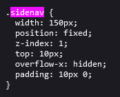
REFERENCES - fixed sidebar - responsive sidebar
3. main content
HTML because everything is stored in the <div class="content">, the sidebar and the page contents are limited to the constraints of the it.
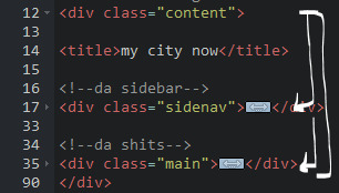
that is all pt. 2...... bless <3
#THANK U FOR ASKING BTW!!!!#it brings me so much joy when people ask me . things and i then get to answer these things#i am so sory if this is somewhat incomprehensible or a pain to read through IF YOU HAVE ANY NEEDS FOR CLARIFICATION... JUST ASK ME..!!!!#textoffun#inbox
30 notes
·
View notes
Text
HI, so long time no talk! I haven't gone anywhere, I just had some personal financial troubles that were resolved via...lots of overtime! I am a physicist by day, so that meant I became one by night for a couple months. But I remained coding, designing, & sketching things in my scant moments.
More importantly, I've been doing a lot of reading & observing of the Jcink RPC & I am really gutted by the lack of free resources I've seen become manifest. As a result, I've been percolating some easy design methods I could use to fast track totally free skins to give out as bi-monthly as I can manage in the near future.
Because I'm not one to stick to an aesthetic or design style so much as following a settled philosophy of coding, each of my skins will be entirely unique (no reused assets besides utility scripts, perhaps fonts, etc) but will all be;
Designed to be entirely responsive, with fallback & default setups for Custom Fields, image appearance or omission, etc.
Designed to load in a second & half or under, universally.
Neatened to be readable, cascade-organized, & fully notated with CSS & HTML notes to explain important components, how they work, & how to edit them.
Provided with a dark, light, & middle theme colour option as well as High Contrast option.
Provided with Staff, Member & Character profile & miniprofiles.
Provided with a full Custom BBCode suite of site templates to match the skin.
Based on the UI/UX design of a game with striking visuals that can be used for similar genres.
Now, this is a tall order, but I really want to flex my muscle & try to give folks something to be optimistic over in a landscape of drama-blog wastelanded distress. I want to put out something productive & positive, to make the community better & bring us together a bit <3 As a result, I'm going to need a little help from you all. I need to figure out which "Inspos" to work off of first based on desire for them, to fill the starving niches from most important to "least" so to speak. For the next few weeks, I'll post some polls & would be endlessly grateful if you all paid it forward by boosting but also voting on the games whose vibes you want to see MOST PRESSINGLY manifested as skins in the Jcink RPC.
I will, also, eventually port each one to Forumactivo, so for my Forumactivo folks, please let me know when you get specific polls so I can prioritize converting those skins for you! You deserve just as much love!
Of course, if there's a specific game you want to see feel free to comment on this post & I'll make sure to put it in the first poll, but for now that's all. The first list of inspo options will come out later today or tomorrow, Stay tuned & stay awesome, may the Dance keep you all absolutely blessed!
19 notes
·
View notes
Note
Hi! Gonna start off and say that I love the work you're doing with the Welcome Home neocities website! It's perfectly stylized for the project/puppet show and I can see the work you're putting into it.
I'd love to learn how to make my own neocities website (for fun? For a personal project??), so I was wondering if you could provide some tips and/or pointers for a first-timer.
Thank you!
HAHA well first of all i'm flattered that someone would think i'm skilled enough to be giving pointers in the first place. i still consider myself a novice when it comes to web design (for example, if you're wondering why every page on welcome to welcome home has its own CSS, it's because CSS is Way harder for me to wrap my head around than HTML) so i can't give any Super advanced tips, but i can at least write about what's helped me so far:
GUIDES. neocities has its own tutorial and list of HTML/CSS resources, but user-made guides are your best friend when it comes to figuring out where to go from there. a.n. lucas and pauli kohberger both have really good guides for beginners, but for the more advanced stuff, i found myself referencing the resources on solaria's webspace and sadgrl.online the most. w3schools is also very helpful when it comes to answering more specific questions like "how do i use two different fonts on the same page?" (and probably more.) if all else fails, then usually just googling "how to (x) in HTML" or "how to (x) in CSS" will yield at least one useful result. for making your website more accessible, there's the accessible net directory and this masterpost by foxpunk on tumblr.
it sounds obvious, but it helps to have a solid idea of what kind of site you want to build before you actually dive in, and then snoop around on neocities to get an idea of how other users approach the same topic. for example, i got the idea to start a welcome home wiki on neocities after being reminded of the 8:11 wiki on the same site, and then i spent a couple days just looking up stuff like "wiki" or "fansite" on neocities and then clicking on any page that caught my attention to study it.
layouts! there's no shame in using a premade one, and you can even learn more about HTML/CSS in real time just by messing around with the base code before implementing any intentional changes. sadgrl.online's layout builder is a VERY popular choice, since you can already do a lot with the basic options it offers and it's easy to further customize once you have it set up on your page; it's what i used to make welcome to welcome home. sadgrl.online's webmaster links also feature a bunch of other options under the "layouts" tag, and if none of those work for you, then you can even find something just by looking up template/templates/layout/layouts/HTML/CSS on neocities itself.
side note: if you're reading this and you want to make a wiki then you can also use this wikitable code. it came out after i had already established the Look of welcome to welcome home, so i probably won't implement it any time soon, but i TOTALLY WOULD HAVE if it was around when i first set the site up.
you can scale images up or down using percentage, with 100% being the image's default size. i don't know how helpful or acceptable that is, but i use it a lot.
don't feel pressured to get everything done at once, even if you expect people to be visiting your site frequently. usually if you just slap on an "under construction" gif or even just write "hey this site is still under construction" then people will understand. i don't think i've ever seen anyone get super huffy about slow updates on neocities, anyway.
EDIT: OH. GRAPHICS. i mention all of these on welcome to welcome home's front page but i Also wanted to note them here: betty's graphics and websets by lynn both have HUGE collections of background tiles and other graphics that work especially well if you're going for that old web charm. i also like to use this mirror of patterncooler for backgrounds bc of the customization options. you can also make your own background tile and then use a seamless tile maker like this if all else fails.
EDIT 2: ALSO. obviously. do not be like me and use discord or any other chat client as a filehost, no matter how promising it looks, because one day you WILL get a very nasty surprise when the request signature on those urls expire and the images are no longer accessible on other sites. there are a myriad of other filehosts out there, but personally i recommend file garden (and also donating to file garden if you can, even if only for a couple months. i know i said that just yesterday, but if it gets more folks to subscribe then i'm gonna keep saying it.)
#imaginatorofthings#ask#welcome to welcome home#web design#? yeah i'll slap that tag on there why not#neocities
20 notes
·
View notes
Text
Writers - Where You Gonna Post?
Hey all, so the TL;DR of this is that I post on Wattpad, Tumblr and Ao3 - All have their pros and cons, and this post is going to get into those (with a neat little summary at the end).
Note this is not an endorsement or criticism of any of them. Just my personal understandings of each, the pros and cons I've noted, and a chance to put it all in one place.
We're going to touch on - Ease of Posting, Visibility, Tagging, Searching, Cost, Security & Visibility, Functionality, and less objectively - Vibe.
word count: 1,874
-:- Ease of Posting -:-
Wattpad: 7.5/10 Tumblr: 9/10 Ao3: 4/10
Wattpad and Tumblr have direct-from-source formatting, meaning your paragraphs, italics, bolds, etc. stay in place when you copy from Word, google docs, or - I assume, Scrivener.
Tumblr has more options for font size, color, and links within the body of the text, and so scores higher than Wattpad's more limited capacity (Wattpad does allow for centering, justified, etc. positioning of paragraphs.)
Ao3 has far more CAPACITY than both, but the ease isn't there. You have to know your HTML markups, and for so people that can be a pain. There's a very useful Google Doc markup template that can do a lot of the heavy lifting for you, but hyper linking, image inserting, and other functions that are available have to be done manually.
This is great, in terms of options, but lowers Ao3 on the whole "ease of use".
-:- Visibility -:-
Wattpad: 4/10 Tumblr: 3 or 9/10 Ao3: 9/10
Wattpad has an algorithm and their tagging system - compared to Tumblr and Ao3 is pathetic. I realize I said I was going to be objective, but that is being objective. It's a spaceless tagging system, so you get really awesome tags like roronoazoroxblacklegsanjixreader and... yeah. There's also a limit on the number of tags, so if you're doing a collection of one-shots it's hard to get everyone in there.
On the upside, their search function doesn't just search by tags (would that it did though.) So having information in your summary will help your visibility. What really gets your stuff visible are reader interactions - knowing someone established on Wattpad and having them give you some shoutouts when you start is your best bet for being seen.
Tumblr's visibility - tagging, searching, etc rely HEAVILY on what kind of writer you are. SFW items are far easier to search than NSFW ones, and the Mature label hides you from people who have opted in to see Mature content, which still boggles me. The in-site search function leaves a bit to be desired, but google searches in better enough to off-set that a bit. Tagging is far more robust on tumblr, but it's also a little hit or miss, especially with new users. (I had no clue how to "tag" properly when I started, believe you me).
There's a solid foundation of readers here, so that makes it a good place to get your feet under you without being on TikTo-- I mean Wattpad.
I'm not going to say much here, because let's be fair, Ao3 was BUILT for visibility. There's no algorithm and the tagging system is robust and customizable. Searching is easy - as long as writers are decent with their tagging, and it's not too hard to find what you want, fluffy or otherwise.
-:- Tagging -:-
Wattpad: 4/10 Tumblr: 7/10 Ao3: 9/10
I've touched on this already in the other sections. Wattpad has a lot of restrictions on its tagging system, and aside from using it to "rank" stories, I'm not entirely sure what else it does. I really don't think it comes into play with searching - key words pull from titles, user names, and summaries at the minimum.
Tumblr tagging is a bless - for the most part. The site deems some words "problematic" and doesn't let you search them, which is poor practice because it doesn't differentiate smut from sex ed. (Personally, not that I want it to block anything on my behalf. If I type it Tumblr, I mean to look for it.) Fortunately, as stated, you can use external search engines to get around this.
Ao3 has probably the most robust, and most customizable tagging system of all three. This is great, as long as you know what you're doing, and terribly confusing if you don't. There's primers out there for tagging in Ao3 and other general "good to know" type things, but it's not intuitive. You really do need the primers.
And Ao3 limits neither content nor tags, so take care when searching, and use the omission functionality if you need to - Ao3 won't hold back unless you tell it.
-:- Searching -:-
Wattpad: 6/10 Tumblr: 6/10 Ao3: 10/10
Smash visibility and tagging together and you get search ratings. Wattpad can be hit or miss because of the Tikto- er - algorithm, my best advice is don't be afraid of the results on page 2 and beyond. As much as it tries to "rate" works, rating is just too subjective. You're going to have to dig, just like you do on Tumblr and Ao3.
Having fan fic reader connections is really your best bet when searching, but slugging through the proverbial trenches yields gems too - and one man's quartz is another man's diamond, so I'm not putting any writing down when I say this - what we're looking for varies, and what's out there is multitudinous and variable.
Ao3 is your best place place for good hunting - it's literally built around it. The only hangups are the limitations of what an author puts in for tags vs what you think to search. Differences in how we perceive some words regionally can limit what bounces back - and sometimes a writer might not think of the word in the first place to add it.
-:- Cost -:-
Wattpad: 3 or 9/10 Tumblr: 10/10 Ao3: 10/10
Wattpad has ads - on the mobile app. You can pay for some stuff on the desktop too, but it's not in your face there like it tends to be on the mobile app. Still, you can use it for free.
Tumblr and Ao3 both request money and offer stuff in exchange for money. Sites need money to run, so it makes sense. Neither locks functionality behind cost (neither does Wattpad, not even on the mobile app), but it's easier to ignore ads on Tumblr than Wattpad's app (and no ads on desktop at all for Wattpad >.> just fyi).
-:- Security & Visibility -:-
Wattpad: ??? Tumblr: ??? Ao3: ???
What's important about security and visibility changes from person to person and I'm not really sure how to rate them numerically.
Tumblr and Ao3 let you make your works private - member or password access only, so there's a layer of visibility control with these platforms that does NOT exist on Wattpad.
Ao3 let's people download works to read offline. Technically you can copy/paste with Tumblr and do this as well. Wattpad does not allow this - you cannot download or copy/paste a work from Wattpad (you can copy/paste when in edit mode on things you own on WP, but readers cannot).
You don't need an account to interact with Ao3 and Tumblr - I *think* you do for Wattpad, but all three are free sign ups - Ao3 is just by invitation (when did that start, btw? I signed up years ago and missed that change).
Which is best, is up to you.
-:- Functionality -:-
Wattpad: 8/10 Tumblr: 7/10 Ao3: 10/10
Let me start by saying that Tumblr's functionality for Short Form Fiction is easily 10/10 - the search limitations notwithstanding. Tumblr's functionality for LONG Form Fiction can be a real pain in the ass, hence the 7/10 overall. Linking posts is a manual nightmare, and sometimes breaks between mobile and desktop for no reason.
Wattpad's limitations on some styles of formatting and linking aside, it does have an easy to use update process, and if there's a limit to how many words can be in a chapter, I haven't seen it, or heard of it.
Wattpad's mature settings are also more functional than Tumblr's, leaving the onus of if the reader is old enough on the reader by the words of their own ToS (I still block minors, personally, since you can see who votes and comments.) They do have stricter limitations, regarding "dark" content, and there is by no means any threat to be levied against minors allowed. Shonen levels of violence, sure, but you're not posting Juno the novel on the site without some issues.
All three sites - Wattpad most recently - have blocking functionality. Wattpad's recent changes allow for deleting comments as well as blocking users, which can be a cathartic ability to have.
One thing Wattpad and Tumblr have that I'd LOVE to see on Ao3 (and if it has it I've missed it) is the ability to schedule your posts and updates. Wattpad added this recently - it's only functional on the desktop, but it works.
For those of us who can write 10k words one day, and none the next two days, it's useful for spreading out your posts. Plus there's just something nice about being able to create a backlog of content, especially if you post on a schedule.
-:- Vibe -:-
No rankings, we die like blorbos.
One of the best things - to me - about Wattpad is a paragraph-by-paragraph ability to comment. Wattpad's readers have a similar vibe as Tumblr's readers - and I mean this affectionately.
You're all GREMLINS.
It gives me life and I love it.
Assholes exist everywhere, but my general vibe of who has the most goes: Wattpad Tumblr Ao3
Maybe some of you aren't assholes, you just don't think about how your comments can be taken before you post.
Ao3 gives me the most Long Form Comments I get out of anywhere else, and I love them. Please, PLEASE, gush to me about what you loved. Feel free to toss in what you didn't vibe with - as long as you're not cruel about it, I can take it. I can't possibly write something everyone perceives flawlessly.
I post to all three, because I like the combined experience I get from them. Ao3 feeds me in ways Wattpad and Tumblr can't, and honestly you can exchange all three of those entirely.
Ao3 feels like I'm walking down the street perusing sex toy shops and someone stops me and goes "Oh I read your story and really liked it, please keep up the good work!" (sometimes maybe they throw a drink in my face.)
Tumblr feels like I'm at a rave with 500 other people and there's 50 blorbos people are doing body shots off of and we're all having fun - and occasionally some asshole comes in, but they're handled pretty quick.
Wattpad's like... being at a Barnes and Noble having coffee in the cafe that's inside the store, and there's a BDSM class being taught in the manga section that's upstairs, and sometimes people take the escalator up and right back down again cause oops.
That's my breakdown - I hope it's helped you, or at least made you laugh a little. Good luck out there, where ever, however, and whenever you post, I hope you find the words you're looking for.
(I do want to add that Wattpad does, as mentioned, have a bit of a TikTok vibe. If you don't vibe TikTok you're not gonna vibe Wattpad, flaws and all).
#quin muses#fan fiction#wattpad#ao3 writer#ao3#tumblr writers#writers of tumblr#platforms for writing
23 notes
·
View notes
Text
Toki wo Koe Sora wo Koe no #Da-nce
Evening
Typhoon🌀
A lot has been affected but, How are things around everyone
For me I just, Go outside within the timing of it not raining, Within the weather forecast, and I went out without an umbrella😳🌂
Everyone please take care of yourself
If you're spending your time at home.. by all means,
Da-nce
Please watch😌🤍
With the dances posted this time, I really want you to watch.. Toki wo Koe Sora wo Koe!
I danced in in the intro and interlude, with Sayashi-san and Fukumura-san, I hope that the next girl who learns it, will really, really watch it😂🫶🏻
Even when you bend your knees a bit to lower your center of gravity, And the parts like, Meeting you in this world.. I'm very conscious of having a flat back
Don't arch or bend your back, The posture is of a flat back..
Its kinda! That posture isn't good to do all the time, I looked it up and found a case on it! lol
Its often used in dance, a flat back
I wonder if being conscious of it is the secret to looking beautiful..🫣🫣
Since we're barefoot in the MV..
I was more conscious of my feet😌🤍
With the toes, moreso feeling the ground with your big toe, and the compass-like movement in the outro? It looks very beautiful to draw the circle
Since I haven't properly learned ballet, Its my..image of it but,
When the big toe touches the ground, I think its beautiful as the knees face forward✍🏻
Turning your foot so all of your toes are on the ground, Do your knees turn outward? Do you understand? Did you try it now?
lol
I like thinking about beautiful things like that😌🤍
For those that are into ballet and jazz, you may say its too basic and not something you think about!?
Today, Please definite watch in particular,
Toki wo Koe Sora wo Koe🌎✨
youtube
I'll also watch it again..

Harami-chan no Harami Fan Radio♪
Ishida Ayumi and Sakurai Rio Got to visit as guests🤍
Play▶️List
Graduation Announcement Blog🐣🪽
Hello! Station #531 I also talk about my graduation in this video
📺Otoboke POPS
TokyoMX August 17th (Sat) 9:30~10:00PM Ishida, Sakurai, Yumigeta are appearing💙🤎❤️
📺Hello Pro Dance Every other Thursday at 11:30PM~
📺Sendai Broadcast "Ara Ara Kashiko" Ishida Ayumi Goes~! I appear once a month as part of the AraKashi Family
The previous shows, and makings, are on OX VIDEO STORE!
Thank you for following.. Instagram💙🩵
💿 August 14th new single✨ "Nandaka Sentimental na Toki no Uta/saiKIYOU"
🪩Hello! Project 2024 Summer ALL OF US "Vega" "Altair" From July 13th~September 1st Traveling To 7 Cities Nationwide All Hello! Project groups are performing🔥
🪩"Morning Musume '24 Concert Tour Autumn WE CAN DANCE!"
Its Ishida Ayumi's last tour💙 I'm looking forward to seeing you
🪩"ROCK IN JAPAN FESTIVAL 2024 in HITACHINAKA" September 22nd GRASS STAGE 10:30AM~
→Tickets are on general sale
📻Morning Musume '24 Morning Jogakuin ~Houkago Meeting~
Airs Every Saturday, On Radio Nihon at 12:00AM~
Past Broadcast Episodes Are Available →Program Details
I visited as a guest🪽 "Sayashi Riho and The Time From Now On" presented by Meiji Bulgarian Yogurt
Also,
Thank you very much, Talking about singles and albums, and putting each into words!
Really, thank you very much!
I may have underestimated, Emotions towards it…⚠️
I was like wao~~ to hear that, there were so many feelings towards me
lol
I had a lot of interviews yesterday, Also radio and shows, As I've said at various places in Miyagi, I plan to enjoy, this period of time the most since announcing my graduation,
I guess I'm the one who won't let that not happen🕺
For my birthday this year, Alrighttt I'm the birthday girlllll🕺🕺 I spent it saying things like that←
I'm sure I would certainly be the first to do thattt🕺 It seems funnn🕺
Everyone, please look forward to…my attitude?
see you ayumin <3 https://ameblo.jp/morningmusume-10ki/entry-12863896339.html
3 notes
·
View notes
Note
List 5 things that make you happy, then put this in the askbox for the last 10 people who liked or reblogged something from you (if you don't mind doing so) Get to know your mutuals and followers :3
AAAAHHHHH SPIDERS AAAHHHHHHHHGGGHHHHHHHH
AAAAHHH what the flip ..?! uum 1 - creepypastas . specifically video game ones. Yes i know they all usually are silly thats why i LIKE THEM!!!!! i once read a creepypasta about a guy being stuck in the Mario 64 Simulation and i havent been the same since. the I HATE YOU creepypasta was silly yet has affected me permanetely in some way unknown. i like reading them Sooo much 2 - bootleg video games. i have one bootleg console (NES) and its my prized possession. i played mortal kombat 15 or something on it and the controls were absolutely horrible. and something about them is so good. theres different Flavours of them. like you just cant get the same vibe of nes/gameboy bootlegs anymore. possibly those bad HTML games online/bad mobile games count as a different era of them you see, they had to do COMPLETELY different things. i could go on and on abou this. probably 3 - plushies. i have a TON. it is a ISSUE!! IM RUNNING OUT OF ROOM!!! shoutout to my jumbo size mario and sonic plushies and several utdr ones 4 - spaghetti. is one of my Favorite Foods.. What can i say! i hope she made lots a sp 5 - my cat "merchant" :^) !!!dont have a image of her but heres a text recreation --> \__^o.o^ im convinced She is not a cat.
#i said alot but if you didnt want me to ramble better not put OPPORTUNITIES in my askbox. I WILL TAkE IT!!#blue tech sent this same ask to me sorry blue tech youre still here in spirit#.txt
4 notes
·
View notes
Text
Fanbinding Process 1: Typesetting
Someone asked me to chronicle a fanbinding project a while back and now that I'm in the starting stages I figured "oh yeah I should do that!"
Disclaimer: still new at this. Please don't judge me. And also this is just what I do and really when it comes to some of the smaller details, that's personal choice and stuff you'll decide once you get going and know what you wanna do with it!
Anyway current project: A Choriambic Progression (one of my faves!) (I'm also doing In Between Days at the same time but I'm further along in that one so it's not a good one to really show.)
Step 1: Gotta save the fic! I'll say ahead of time how I do this with AO3 fic, even though A Choriambic Progression isn't on AO3. With that, I go to Download > HTML. I've found that way will copy over all the formatting whereas the other ones didn't for me. Then I open the HTML file and copy paste into Google Docs.
Instead with A Choriambic Progression I just went to the Wayback Machine link and copy/pasted all of that.
Step 2: I do my page setup before fixing the body of the work, so I inserted a few pages above the work. I consulted a few books on hand to decide the layout. Page 1 is a simple title page:
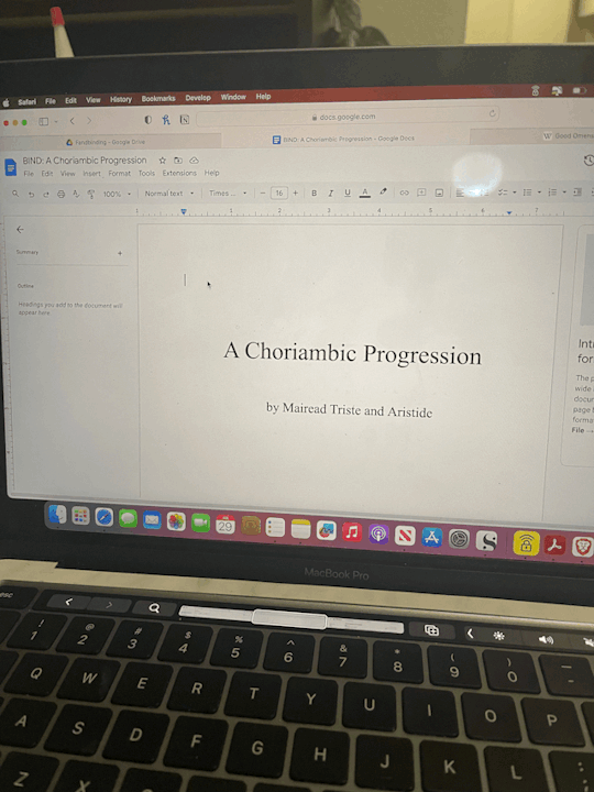
I know when I print, odd numbered pages will show up on the right and even numbers will be on the left. So when I first open the book, the simple title page will be face up.
Step 3.) Which means for Page 2 I do the copyright page:
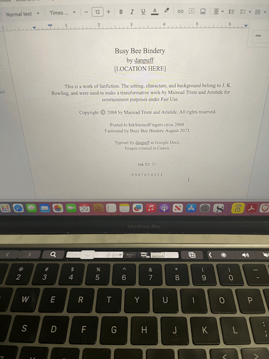
I temporarily removed my actual location for this, but: I made a name for my bindery. Most I've seen have the location of the publishing company, so I have my location in that section. Most copyright pages vary in the setup and even some information, so I borrowed what I liked! A lot have like "First Printing: Date, Second Printing: Date" so I list where all I've found the work, plus when I'm binding it. Even though it's July right now, I figure most of my work on this will be in August so I put August 2023 for that.
For ISBN I usually will put AO3 ID: and the work ID #. Since this was originally posted to Ink Stained Fingers I used Ink ID instead and it's ID # (which is 21???? Very cool.) Also since this fic is old and not really anywhere else, I had to do my best guessing on the date, which as best as I can figure was sometime 2004? And the print line for funsies! Though I don't think I'll do more than this one printing of it, but who knows!
Step 4.) Images in Canva. Which is just....me creating whatever icons and images I want to use in Canva, which is at least a title image. In Canva I opened an Instagram Post sized template. I threw in the title + artist. I had no idea what sort of art I wanted, so I just typed in "magic" and found this crystal & plant art I liked. I fixed up the font how I liked and then went to Share > Download > check Transparent Background > Select Pages: 19 (to just save page 19) > Download.

I also went into another Canva project for smaller images that i call "icons" to make my bindery icon and also a simple image I want to have at the top of the first page and downloaded both of those.
Step 5.) Back in Google Docs aaaand....I knew I'd need some pages before my title image so on Page 3 I added the "archive information" (which is where I'll normally pull the info from AO3, but I did the same basic idea here.)
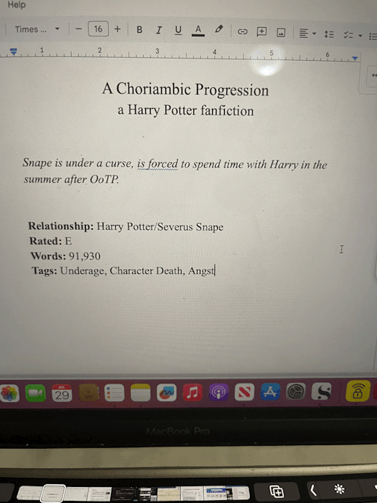
Then Step 6.) I inserted another blank page (CTRL + Enter) and on Page 6 I went to Insert > Image > Upload from Computer and added my title image. Below it I added my bindery icon and spent over fiddling with it to get it properly centered. (It never wants to center correctly.) Iirc I went into Format > Align & Indent and played with "center" and "increase/decrease indent" until it behaved itself.
Step 7.) CTRL + Enter for another blank page. Then I make sure the start of the fic is on an odd page (though I can always fix this later in Acrobat.) I inserted my cute lil story icon above the start of the story:
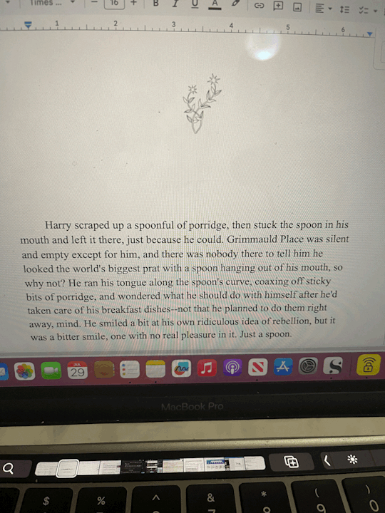
Step 8.) I realized I had a problem in that I did all this setup BEFORE setting my font. So I had to CTRL + A to select it all and set it to Times New Roman 16, which I know will print in a way I like.
Next I'll say, I like to keep the space between paragraphs in an ode to fanfic-y ways. But I also like indented paragraphs. So this is a personal choice, but with everything still selected I went to:
Format > Align & Indent > Indention Options > set Left & Right to 0. Then select Special Indent > First Line > set to .5.
THEN I had to go back and fix my title, copyright, and archive pages, but it's less annoying to do that than it would be to try to highlight over 300 pages to do this for JUST the fic. I later added some extras (such as the poem at the end, the author's note, and some review/recommendations for the fic that I wanted to format differently.)
....Basically just figure out how you want to format it.
Step 9.) CTRL + F. This fic was a NIGHTMARE to fix up, ngl. I did all of this last night but basically...I had to find all the scene breaks by going CTRL + F and searching "***" so I could replace those with a horizontal line (Insert > Horizontal Line.) But a few places had tildes instead so I had to do an extra CTRL + F: "~~~~" That wasn't so bad.
The bad part was realizing how much had to be italicized. Regular italic words had a "*" on either side, while correspondence began and ended with an underscore. So I had to CTRL + F: "_" and then highlight and italicize all the letters. Then CTRL + F: "*" to find all the italicized words of which there were like 200. Very tedious.
Step 10.) File > Download > PDF Document
Step 11.) I opened the PDF in Adobe Acrobat for my final stages. Mostly here I make sure all of the pages are in an order I like and make sure all of my pages that need to end up on the right are odd numbers. And if not, I can go to the sidebar on the right and go to "Organize Pages"...there I can reorganize or add blank pages where needed.
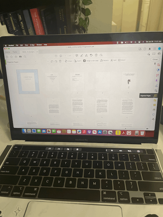
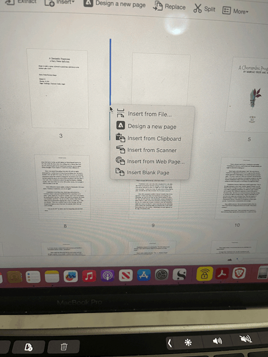
Step 12.) Page Numbers & Headers! Again this is personal preference but I can show you how I did it and you can make your own decisions about how you want to do it.
Close out of Organize Pages. Then from the sidebar I chose "Edit PDF." Then at the top toolbar I click on "Headers & Footers" and select "Add."
For me, I wanted the title as a header, and I wanted to insert page numbers. So in "Header Center" I wrote the title and in "Footer Center" I clicked on "Insert Page Numbers."
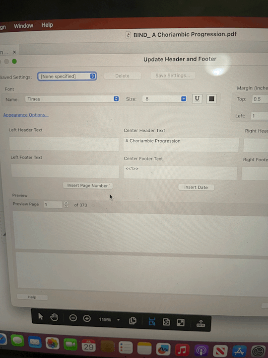
Then because I want my page numbering to start on Page 3 (I like to start numbering at the Archive Information page) I click on "Page Range Options" and in "Pages From:" I changed "1" to "3."

Note, if you fiddle with the pages later on and reorganize or add new blank pages, Adobe won't adjust the page numbers for you, which is why I make sure my pages are all in order first.
Step 13.) My least favorite part is REMOVING headers & footers from pages I don't want them on. So on all blank pages I took off the title & page number. I took the title off of the Archive information and the Title Image page. I took the title off of the "Recommendations" pages later on, too. It's not only tedious but Acrobat likes to be difficult about letting me select the page numbers so it takes a few tries of me getting the page just so before I can select and delete the page number.
Anyway at that point it's ready to go so I make sure to save it to my Fanbinding folder and next up I can print! So...we can do printing & page folding and maybe page cutting in Part 2.
You know...if I remember. 😬
#danpuff binds#progress pics#step by step#wow this is a lot#whoever asked for this i hope you're happy 😂
19 notes
·
View notes
Text
website update blog #12 (May 22nd, 2022)
hello! i'm back with some actual changes to the site now!
i apologize if the last website update blog was like...
hold on lemme check my tumblr-
wait a minute...

ALMOST 1 MONTH???
damn. well, i got some changes to show yall anyway sooo lets start!
last time i discussed my website, i told yall that i will remake the whole thing over, and THAT, is going to be my main focus.
so i moved the old files to a new folder called /legacy and made a new html file and css file.
i then thought of how im going to go about organizing this thing. i thought about it for an absurdly long time, and then i had an idea.
what if we organized it as such where the style of an html element can be changed just by using the "class" attribute?
its hard to explain so ill just show you what im talking about: (if you dont want to read this part just scroll down until you see the word SKIP HERE!)
ill give you a div element:
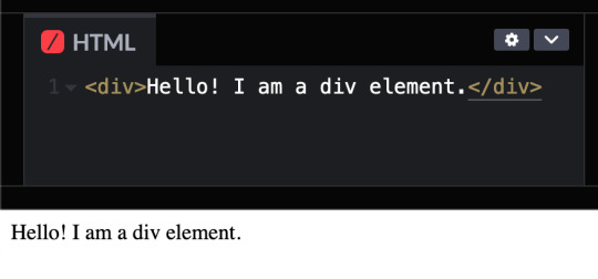
but i want to change how it looks, since its just bland text on the preview shown.
that's where these classes come in!

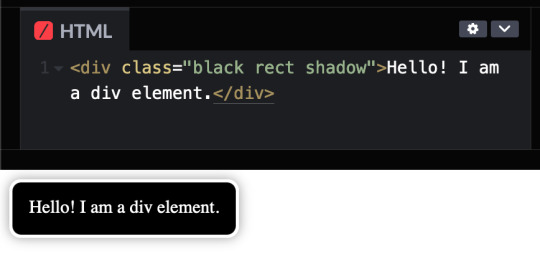
these classes are basically just there to change how any html's look! (with the help of the class attribute)
turning the div into a black rectangle with a shadow
turning the div into a white rectangle with shadow
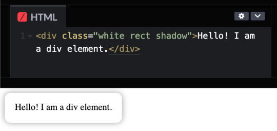
turning a div into a white rectangle (no shadow needed (although it looks like the rectangle isnt there anymore, but trust me, it still does)
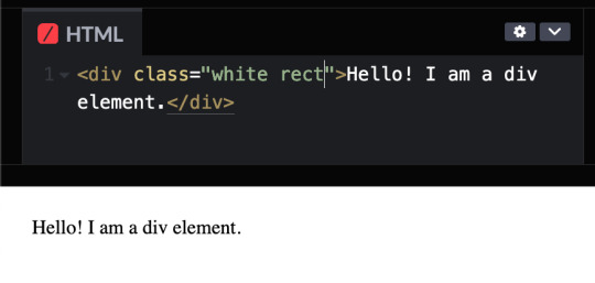
and more! you can do a whole lot with these combinations, and theres even more classes i havent told you yet, like the button and flex classes, but to put it simply, button adds a transition where the rectangle changes color from white to black and and animation that makes the rectangle slightly go up and flex is to arrange the rectangles in rows and columns.
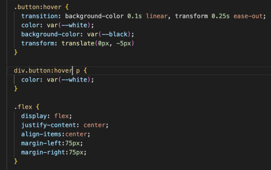
SKIP HERE!
anyway back to the website...
this was the breakthrough idea that made recreating the website SO MUCH EASIER.
aaand after only 10 days, i finally finished!


i will now explain the changes i have made with the website (compared to my website before i recreated it)! it should be obvious but i will do it anyway.
- i added a github button!

this button serves two purposes:
its a button to redirect you to the github repository of the website!
its to get the /section buttons to actually look like they are centered. the main problem of the old navbar was that it did not look centered AT ALL, so i couldnt really center the thing without looking off and weird...

and now, with the github button, everything looks decent!

- changed the footer to look like a simple (rounded) rectangle at the bottom of the page.

this was to "solve" the problem which i had with the footer thingy which was that:
if i wanted the footer to fix on the bottom of the textbox,

but when i zoom out theres so much visibe dead space at the bottom.

and another thing, if i want the footer to stay at the bottom of the screen, it doesnt look like theres dead space, buttttt

the damn footer takes up 10% of the total screen space

so i had an idea...
what if we just contain it in a small rectangle instead of looking like the navbar?
it clearly does not solve the dead space at the bottom problem, but atleast it looks nicer than before and it doesnt look like the navbar anymore :D

oh and also
- I FINALLY FINISHED THE SLOOSHI PHOTO IN THE SIDE OF THE TEXTBOX AFTER LIKE 1 MONTH
YOU CAN SEE THE CHARACTER ON THE IMAGE I JUST SHOWED YOU IF YOU HAVENT NOTICED YET
THIS SHIT TOOK ME SO LONG TO ADD ARMATURES AND POSES AND I FINALLY FINISHED ITHBHRDJ FNJKCKXLM<
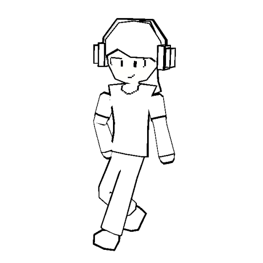
i just hope yall like it :>
aaaaaaand thats all that i have changed while recreating the thingy!!!
now the new stuff (theres only one):
- I added a new section on my website called sushiwt/lite!
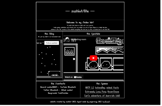
based on @pagerorgy's sc36.net (and by based i mean i downloaded the html file of the website and edited it), this WAS a temporary home while i was remaking it, but now its just a place where you can see EVERYTHING the site has to offer (in only 1 table)!
i apologize of the fact that this blog is so long, so heres a tl;dr
i remade the website with a convenient way to change the look of an element
i changed the footer's look, added big slooshi, and
added sushiwt/lite, everything in my site in one table
ok goobai :D
- sushiwt <3
7 notes
·
View notes
Note
Question is the legacy editor any good? I've never used it because I'm paranoid about it messing my posts up lmao but I'm curious
The short answer is yes. Legacy editor, the older way tumblr did posting, is in my opinion, the superior editor. I love the legacy editor. A lot. It is definitely superior and I'm sad staff has decided to slowly get rid of it.
However! With that said I've been pretty much exclusively using the beta post editor for the last like year when staff announced that they'd be eliminating the legacy editor eventually so I thought it'd be a good idea to get used to the beta editor. Which I suppose I did. I've gotten used to it and don't use legacy much at all anymore. I also wanted to use it because I got really tired of not being able to edit in mobile the posts I made on web using the legacy editor. With the beta editor you can edit across platforms which is soooo nice. (although it appears that in one of the apps many updates I can now edit a gifset I made today via legacy editor but not the posts I've made in the past using the legacy editor so who knows what's going with that).
But there's a lot of annoying things about the new beta editor that make it inferior to the legacy editor and I'm praying that staff will improve it. For starters, and probably my biggest complaint, is how awful it is to upload and rearrange images. It's so much easier in legacy editor to move images around. In beta the page moves when you start to move the image and it drives me CRAZY!!! I always end up putting the image in the wrong place because the page won't stop moving! Legacy is wonderful to arrange images. I do think the upload is slightly better in beta purely because it uploads multiple images in the order I select them where the legacy just puts them in whatever order it wants to and I have to remember what order I wanted my gifs in.
Legacy is also better because it actually differentiates between an image post and a text post. With the beta editor everything is technically a test post. So my gifsets are not considered an "image post". Some people have noted that the beta, since it's not an image post, it resizes the images a little and sometimes decreases the quality of the gif by doing that. I haven't really noticed that myself with my own gifs but doesn't mean it isnt happening.
The legacy editor also allows me to upload my gifs without stupid errors for no reason. Lately any time I upload more than 6 gifs at once I get an error message and have to upload them one by one. Its not because of size because they're always under 7mbs so I don't know why I can't upload them all at once. I hate it actually. And sometimes my gif will be under 10mbs (like 9.7mbs) and it'll tell me that the gif is too big. Excuse me tumblr but 9.7 is smaller than 10! I never had this problem in legacy.
The legacy editor is also better when it comes to using html, inserting links as text and not the stupid thing beta does where you paste the link and it becomes that stupid post preview thing that I hate, and oh my god is it awful for text blocks! When it first came out you couldnt select multiple texts blocks at all. You can now but it isn't the easiest. And it like expands when you do and makes it weird. Idk it's hard to describe. In legacy you can just...select all the text with no problems. Text blocks are treated like individual sections in the beta and make editing a major pain in the ass.
I also don't like thst apparently new xkit won't work in beta and you have to use xkit rewritten because fuck I don't want to learn how to use that one when I've been using new xkit for years but I guess I'm gonna have to now. I haven't been having any problems with xkit yet but who knows....
So yeah I think overall legacy is better. Beta Post Editor has some good things (I like the increased image upload limit, the editing tags is good) about it but there's so many problems. Unfortunately we're stuck with it so I've been sticking to using it exclusively to make the transition easier on myself. I do suggest becoming used to how it works and to just continue to provide feedback to staff about features we dislike or bugs we come across. Hopefully they'll listen and improve it.
#this got long#i'm so sorry#apparently i have thoughts about this whole legacy vs beta post editor thing going on right now#I've got to do a feedback write up to sent to tumblr#hopefully they can continue to edit and improve the beta post editor to make it more like the legacy editor#especially for us making gifsets#mod post#mod replies#ask#anon
6 notes
·
View notes
Text
Long post. Press j to skip.
I AM SICK OF THE STUPID AI DEBATES, does it imagine, is it based on copyrightable material, are my patterns in there?
That's not the point.
I briefly got into website design freelancing (less than 3 months) before burn out.
The main reason was that automation had begun for generating stylesheets in somewhat tasteful palettes, for automatically making html/xml (they really haven't learned to simplify and tidy code though, they just load 50 divs instead of one), for batch colourising design elements to match and savvy designers weren't building graphics from scratch and to spec unless it was their day job.
Custom php and database design died with the free bundled CMS packages that come with your host with massive mostly empty unused values.
No-one has talked about the previous waves of people automated out of work by website design generators, code generators, the fiverr atomisation of what would have been a designers job into 1 logo and a swatch inserted into a CMS by an unpaid intern. Reviews, tutorials, explanations and articles are generated by stealing youtube video captions, scraping fan sites and putting them on a webpage. Digitally processing images got automated with scripts stolen from fan creators who shared. Screencaps went from curated processed images made by a person to machine produced once half a second and uploaded indiscriminately. Media recaps get run into google translate and back which is why they often read as a little odd when you look up the first results.
This was people's work, some of it done out of love, some done for pay. It's all automated and any paid work is immediately copied/co-opted for 20 different half baked articles on sites with more traffic now. Another area of expertise I'd cultivated was deep dive research, poring over scans of magazines and analysing papers, fact checking. I manually checked people's code for errors or simplifications, you can get generators to do that too, even for php. I used to be an english-french translator.
The generators got renamed AI and slightly better at picture making and writing but it's the same concept.
The artists that designed the web templates are obscured, paid a flat fee by the CMS developpers, the CMS coders are obscured, paid for their code often in flat fees by a company that owns all copyright over the code and all the design elements that go with. That would have been me if I hadn't had further health issues, hiding a layer in one of the graphics or a joke in the code that may or may not make it through to the final product. Or I could be a proof reader and fact checker for articles that get barely enough traffic while they run as "multi snippets" in other publications.
The problem isn't that the machines got smarter, it's that they now encroach on a new much larger area of workers. I'd like to ask why the text to speech folks got a flat fee for their work for example: it's mass usage it should be residual based. So many coders and artists and writers got screwed into flat fee gigs instead of jobs that pay a minimum and more if it gets mass use.
The people willing to pay an artist for a rendition of their pet in the artist's style are the same willing to pay for me to rewrite a machine translation to have the same nuances as the original text. The same people who want free are going to push forward so they keep free if a little less special cats and translations. They're the same people who make clocks that last 5 years instead of the ones my great uncle made that outlived him. The same computer chips my aunt assembled in the UK for a basic wage are made with a lot more damaged tossed chips in a factory far away that you live in with suicide nets on the stairs.
There is so much more to 'AI' than the narrow snake oil you are being sold: it is the classic and ancient automation of work by replacing a human with a limited machine. Robot from serf (forced work for a small living)
It's a large scale generator just like ye olde glitter text generators except that threw a few pennies at the coders who made the generator and glitter text only matters when a human with a spark of imagination knows when to deploy it to funny effect. The issue is that artists and writers are being forced to gig already. We have already toppled into precariousness. We are already half way down the slippery slope if you can get paid a flat fee of $300 for something that could make 300k for the company. The generators are the big threat keeping folks afraid and looking at the *wrong* thing.
We need art and companies can afford to pay you for art. Gig work for artists isn't a safe stable living. The fact that they want to make machines to take that pittance isn't the point. There is money, lots of money. It's not being sent to the people who make art. It's not supporting artists to mess around and create something new. It's not a fight between you and a machine, it's a fight to have artists and artisans valued as deserving a living wage not surviving between gigs.
#saf#Rantings#Yes but can the machine think#I don't care. I don't care. I really don't care if the machine is more precise than the artisan#What happens to all our artisans?#Long post#Press j to skip
4 notes
·
View notes
Note
You should say more about your arg derailment
OH GOD OKAY here we go. so. this is a whole can of worms. back in 2018 i had just moved to a new city and i was working a job at a place that i ended up getting fired from because the owners ended up being wildly transphobic and were the kind of guys who would come up to you in the middle of work and ask you if you knew what "kinning" was and how are you supposed to answer this. to a 40 something married man. like is he asking me to drop a kinlist? here in the middle of work? wild shit. that's neither here nor there, that's just to set the stage for where i am mentally when i decide to do this thing.
anyway i hung out mostly in an area with a lot of foot traffic so there were a bunch of posters and stuff up for events and i didn't really go to too many but i liked looking at what was going on around me. started seeing this one popping up around that was a pretty simple cipher that i managed to get through in a couple minutes and gave me a url that pointed me to a couple pictures of places around town that were pretty famous and you had to visit them and get clues from there - you know, pretty standard arg stuff, whatever. follow all of this over the next couple weeks out of sheer curiosity and for lack of anything else better to do with my life. it's... fine as a little mind exercise but it's not THAT interesting. it doesn't seem like a huge big production.
uhh. so. eventually the clues come together to lead to a place and a time to meet up with "someone" and i'm like. lol no fuckin way that i'm actually doing that, buddy. like there's a certain kind of responsibility you gotta put into doing something like this right and it just seemed very off. there was nothing about who was running it or whatever and no ties in to anything else that i could actually find online soooooo... i decided to just fuck with it and make my own ending. so i spent an afternoon and threw together a flier and a simple little code and had a bunch printed at fedex and got up early the next morning and absolutely plastered them all around the area where the meeting was supposed to take place.
i only did like 2 rounds because i couldn't be assed to do any more than that but i do remember that one of the clues in the actual game involved inspecting the html on a webpage they threw together so as my message i directed every one to a page where i just had an image that had no other additional meaning. it was just an image and that was the end of the game. i did have a counter on there so i know that i actually did get some hits on it at the end of the day so i did. i did derail some people. anyway for those people i got this was the image that they saw.

and that was the end of the game
#making spaghetti#2018 WAS A WILD YEAR DON'T UH DON'T JUDGE ME I WAS 21#fun fact that's a mashup of i think 3 different adachi sprites
5 notes
·
View notes