#kaecodes
Explore tagged Tumblr posts
Text
HI, so long time no talk! I haven't gone anywhere, I just had some personal financial troubles that were resolved via...lots of overtime! I am a physicist by day, so that meant I became one by night for a couple months. But I remained coding, designing, & sketching things in my scant moments.
More importantly, I've been doing a lot of reading & observing of the Jcink RPC & I am really gutted by the lack of free resources I've seen become manifest. As a result, I've been percolating some easy design methods I could use to fast track totally free skins to give out as bi-monthly as I can manage in the near future.
Because I'm not one to stick to an aesthetic or design style so much as following a settled philosophy of coding, each of my skins will be entirely unique (no reused assets besides utility scripts, perhaps fonts, etc) but will all be;
Designed to be entirely responsive, with fallback & default setups for Custom Fields, image appearance or omission, etc.
Designed to load in a second & half or under, universally.
Neatened to be readable, cascade-organized, & fully notated with CSS & HTML notes to explain important components, how they work, & how to edit them.
Provided with a dark, light, & middle theme colour option as well as High Contrast option.
Provided with Staff, Member & Character profile & miniprofiles.
Provided with a full Custom BBCode suite of site templates to match the skin.
Based on the UI/UX design of a game with striking visuals that can be used for similar genres.
Now, this is a tall order, but I really want to flex my muscle & try to give folks something to be optimistic over in a landscape of drama-blog wastelanded distress. I want to put out something productive & positive, to make the community better & bring us together a bit <3 As a result, I'm going to need a little help from you all. I need to figure out which "Inspos" to work off of first based on desire for them, to fill the starving niches from most important to "least" so to speak. For the next few weeks, I'll post some polls & would be endlessly grateful if you all paid it forward by boosting but also voting on the games whose vibes you want to see MOST PRESSINGLY manifested as skins in the Jcink RPC.
I will, also, eventually port each one to Forumactivo, so for my Forumactivo folks, please let me know when you get specific polls so I can prioritize converting those skins for you! You deserve just as much love!
Of course, if there's a specific game you want to see feel free to comment on this post & I'll make sure to put it in the first poll, but for now that's all. The first list of inspo options will come out later today or tomorrow, Stay tuned & stay awesome, may the Dance keep you all absolutely blessed!
19 notes
·
View notes
Note
You don't know me like personally, kaecodes, but you spent 4 hours over dm with me a while back teaching me how to convert a super old skin with black's CFS to jcink templates. Just finished my first skin from scratch. I started coding because of how excited you were to see me back in the rp space so I wanted to say thanks. I hope you are doing great, because you were great to me!
<3
3 notes
·
View notes
Text

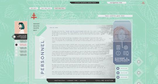
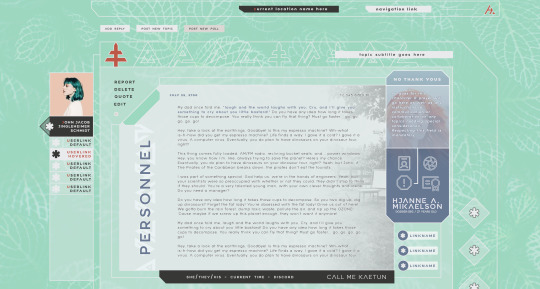
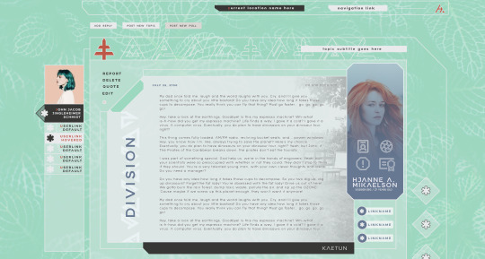
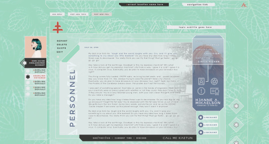
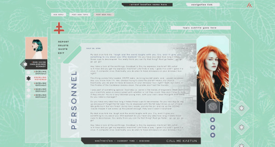
I've been on vacation but finally got back to this & to keep myself accountable I'm posting this update even if It's only one view, it is a fairly intricate work of a mockup. This is the default desktop post view for an IC account, the OOC will simply have some elements changed slightly, not enough to need a variant made.
That's all for now, next I'm working on the profiles <3
30 notes
·
View notes
Text
Universal Scroll Button(Autochange Direction) For Any Host
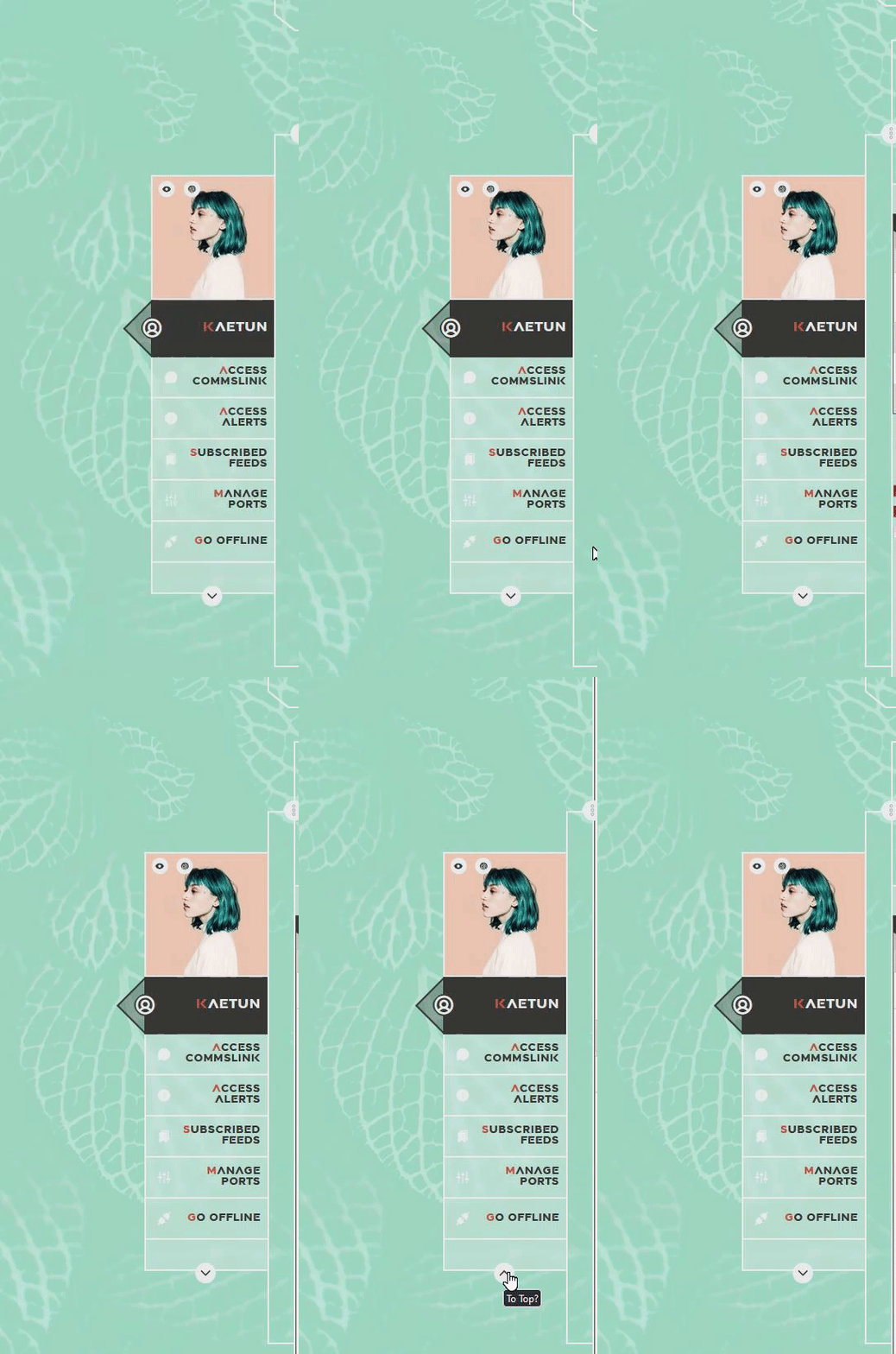
Hey, do you have a site with a lot of forums? Does your host allow you to use Javascript? Boy does this weirdo have a deal for you! For the low low price of free, you can get right now access to a scroll button that swaps directions when you scroll automatically, as well as changing the target & title on hover! Act fast, this deal won't last! I kid, but enough of the ShamWowery. In reality, this is a very simple script that reads how far you have scrolled a window, & applies or removes a class to your scroll button, as well as changing the target of said scroll button & adjusting the title to reflect which way it will take you!
It's so simple, crediting me seems superfluous but if you want, feel free to credit with a link to my blog <3 I hope the new verse of our song is eminently kind to everyone!
See it In Action(Click, or look Below):
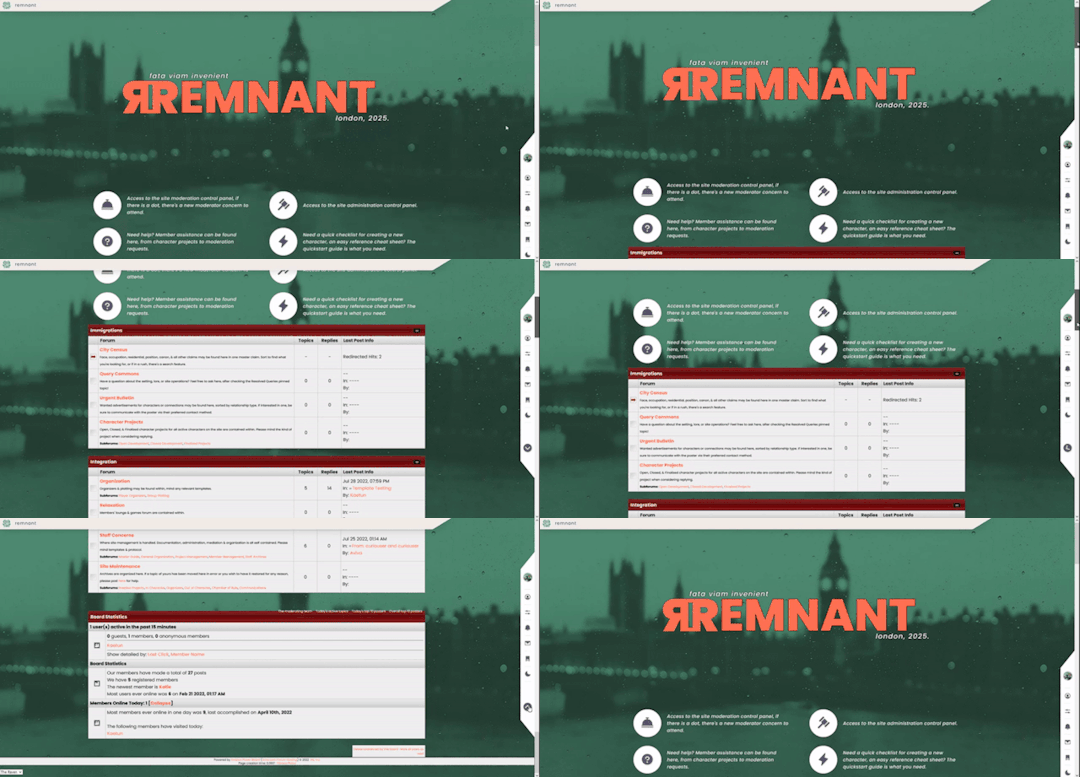
I currently use this code on two different WIPS, so feel free to check out some gifs;
To Begin
Before the end of your </body> tag in your wrappers(for Jcink) or wherever the HTML templates go on other sites, you want to place this script:
<script> $(window).scroll(function() { if ($(this).scrollTop() > 800) { $('#scroll').attr("title","To Top?").attr("href","#Top").addClass('totop'); } else { $('#scroll').attr("title", "To Bottom?").attr("href","#Bottom").removeClass('totop'); } });</script>
This seeks out an id of Scroll to adjust the href & title as needed depending on the scroll position within the relevant window. The scroll amount is in px, so to change how quickly it changes the button, alter the number 800 to whatever you desire, fiddle with it; one size never fits all.
The Styling
Once you've saved that, move to your CSS, or wherever your Style tag is to add styling for the link itself. Keep in mind the link should be contained within a container that handles its positioning for it as otherwise the script will fuck with the positioning as well as the transformation & you really just want it to spin upwards.
The styling for the link should be as follows;
#scroll { display: inline-block; positioning: relative; transform: rotate(0deg); transition: transform .5s ease-in-out; /*** ^ change the .5s to alter duration or the ease-in-out to alter the timing of the transition between button states ***/ }
#scroll.totop { transform: rotate(180deg); }
The first statement defines the default state (linking to the bottom) of the scroll button on the load of the page, the second defines the change of position once the window has been scrolled far enough to activate one's script.
The HTML
Now you've got the behaviour defined via JS & the styling defined via CSS, it's time to input the HTML, or the bone structure of the code itself. In your wrappers, template, or wherever HTML goes on your host, locate three places;
One, where you want the TOP scroll location to be. This is where the scroll button will take you once it has changed states on scrolling a certain distance. Here, you place an anchor span as follows;
<span id="Top"></span>
Two, Where you desire for the BOTTOM or BODY scroll location to be, as in where the scroll button will take you on click initially. This could also be a scroll to the start of content, in which case I recommend changing #Bottom & id="Bottom" respectively to reflect the syntax, it's entirely up to you. Here, you place an anchor span as follows;
<span id="Bottom"></span>
Finally, It's time to add the scroll button. Keep in mind, where you put it is a function of utility & design choice. Some like it persistently hovering in a fixed position, some like it in a sidebar or on userlinks, some prefer it in the navigation bar.
Wherever you place it, try to ensure that it's easily accessible on any device, screen size, & matches the User Interface logic you've used everywhere else. If you have all text buttons, don't use just an icon, if you have all icons, don't suddenly use just text. Match your action calls, so users don't feel confused while using your site.
Once you've decided where you want it, place the following code, NOTING that there should be a container for this code that positions it for you. I've provided two options; the Icon Font option (courtesy of Phosphoricons -- a free & reliable Icon Font I recommend -- As well as one which includes text, so both UI/UX design philosophies are accommodated.
Note the option with text will only rotate the caret from downwards to upwards, so the scroll text shouldn't need editing unless you want to add or supplement flavourtext.
Please choose the appropriate option for yourself;
Icon Font
<a id="scroll" class="ph-fill ph-caret-down"></a>
Icon Font with Text
<span>Scroll <a id="scroll" class="ph-fill ph-caret-down"></a>?</span>
Some Notes:
I just want to add a bit of info:
If your browser isn't scrolling smoothly to your anchors? Check your settings, & be sure the root of your CSS has scroll-behaviour: smooth; in it.
If you use this guide & have problems getting it to work, please let me know! I will troubleshoot this for you & tumblr has strange coding, I may have futzed something up, I want this to be as accessible as possible, so don't be silent; questions help!
If you are not using Jcink, or another host with a Jquery library pre-loaded, be aware that one is needed for this script to work. Most hosts will have a default Jquery library, but if yours doesn't or you're self hosting, any should do. The Jcink file is below, however, if you want to just use that.
8 notes
·
View notes
Text
A New Enterprise
It's nothing fancy, or finite, but I've been working on a resource repository for aeons & decided this year is the year I make something legitimate instead of just sketches, dreams & anxieties. To keep myself accountable, & remind myself tomorrow when I look at it again that I can design things I don't hate, I'm posting it here! I hope the new verse of the song has started out kindly for everyone <3
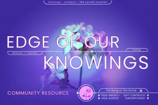
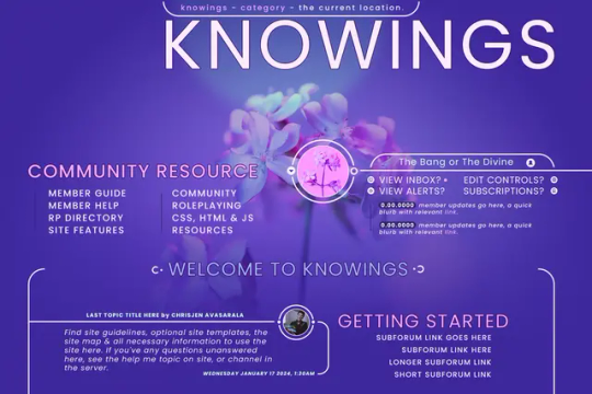
The plan so far is:
A Stats, Profile & Post View mockup coming hopefully tomorrow if I can get my shit together & stay on this roll.
Several alternative skin schemes; a High Contrast Low Saturation Skin, a Low Saturation Normal Contrast Skin, a Light Skin, a Darker Skin, & perhaps any others requested.
Scaling fonts based on a Custom User Profile Field
A Mobile first structure that will replace the mobile mode in functionality.
A full custom BBCODE template suite to serve for posting resources, trackers, & funsy optional member stuffs.
A lightweight (hopefully) blocking system that allows members to add a user ID & see a spoiler over posts of those blocked.
Other things TBD.
12 notes
·
View notes
Text
As Promised, A Poll
As I mentioned before, I intend to put out a series of Free to Use skins with consistent features & standards that are easy to install, edit, & use. These will be designed off of the inspiration of specific games, series of games, & genres of games.
I will, however, only be using games I can clearly see a visual language in the UI of. I went through a few hundred games yesterday perusing UIs & considering atmosphere to determine the shapes, themes, & vibes they might offer that would work in a skin.
I now have a working, if incomplete, list to pull from. So now, I'm going to post a weekly poll with games to choose from & brief descriptions of their general design philosophy. That said, I am already working on two skins that are inspired by games; Alan Wake 2 & Control both from Remedy games.
A sampler of the Alan Wake skin, which will be called Vigil. My notes for the skin were: Green, Moody, Noire/Surreal Detective, Lovecraftian/Unknown Menace.


As you can see, the header starts with a greeting for logged out members, or an announcement brief in the case of the logged in member. Clicking the username or briefing button in the box will bring up a full page modal containing userlinks, quicklinks, & a large custom account switcher if logged in, or featured wanteds if not. It's nothing fancy, but I thought a visual would help folks know how I design based on what will seem like vague/brief descriptors in the polls.
Speaking of which, it's time to get to the first of them. Of course, the Remedy inspired skins will be my first works, but I'd like to collate a list for what comes after, so when I hit a block or am just doodling while busy, I can get a head start on designing others...
Feel free to pick the one you like most, don't worry, none are being eliminated unless they have no interest at all, this is just about forming an ordered list based on demand. I want to make skins that are needed the most the fastest. That's all for now, thank you all so much & I would be obliged if the reach was extended through sharing <3
5 notes
·
View notes
Text
The Polls Continue
I wanted to post this with an update on the skin I'm working on, but since Tumblr keeps erroring out on me erratically & I have successfully lost two post attempts to it, I will simply toss up another Poll to follow the very successful, very well-answered one of last week before I forget to <3 Again, to be clear & transparent:
I will use these polls to gauge interest in various skin designs & inspirations to better organize the list order in which I work on them, but my pie in the sky plan is to do them all in time!
The number of votes per game will matter, not just which ones win. So even if your favourite isn't winning, it's always good to toss a vote its way as I am keeping track of the numbers, not just the percentages.
The short descriptions of the directions I'd take are short because the poll demands it & I'd like to keep these posts to an accessible size. When the subsequent favourite showdowns begin, each will come with a quick design board piece & clearer descriptions of the direction I plan so you can make a more informed choice.
Please be nice, I am doing this for free & have gotten some interesting asks already. If I'm not your cuppa as a coder, that's fine! But I don't need to be reading alladat.
As before, follow your heart, there's no wrong answer & none are being eliminated, just moved up or down in priority on the queue. Update to the Vigil skin coming as soon as Tumblr stops eating it <3
The former poll can be found here, & the original explainer post can be found here if you don't know what's up! Thanks again!
2 notes
·
View notes
Text
A Quick Note
I was going to post a WIP snapshot update of several projects plus an exciting new one, but I logged on to a really nasty anonymous Ask that I'm not going to share here because frankly you don't deserve it being read.
But I want to make something immensely clear, if you're ableist & your ableism causes you to have a problem with my more simplified style of design, or the fact that I won't use certain inaccessible scripts, or the fact that when I answer you in DMs I turn down tutorializing certain design trends?
The door is right there.
If my simpler colour schemes, or my more minimalist designs, or my refusal to use or design doHTML is a problem for you? You are welcome to not buy any skins I may ever sell. You are welcome to never commission me if or when I ever open commissions. You are welcome to not engage with this blog if the content on it does not appeal to you either in style, taste, or substance.
This is not a hostage situation. The door is right there. You send me a nasty ask every couple weeks, I don't post them & I won't post them, this is the only time I'm going to even address you directly whoever tf you are.
I'm building skins I personally like, skins I can actually use. If they're not your cuppa that is absolutely fine, but if you're going to be an ableist cunt about it come off of anon because you wrote & proofread(ostensibly), then hit send on that nasty trashfire of an Ask to try ruining my day. You should stand ten toes down in that nasty hateful puddle you pissed out.
Leave me alone.
6 notes
·
View notes
Text
"If you want it, Sing it to You."
Since it's the West's Holiday Season & I'm finishing up this premade design to give out, I wanted to get some feeling for what folks might want next. I'd love if folks helped me figure out some design directions for the future by answering; What are some features, concepts, designs or vibes y'all would want for a Freemade in the future that would fill gaps in utility, style, design logic or genre that you feel there are? Nothing's off limits, go ham, get pie in the sky! Everything helps me practice.
3 notes
·
View notes
Text
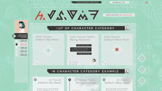
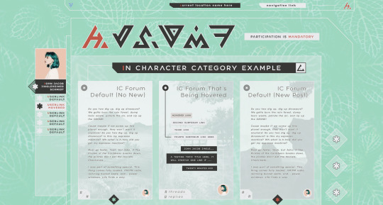
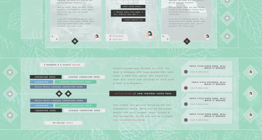
The WIP thus far.
Trying to keep myself accountable by posting progress everytime I finish or significantly update a page/view of my current WIP. Of course, as is my wont, I abandoned the original IC forum design I was using & ripped it out to try anew, discovering an aesthetic I liked much more.
After, I moved onto the stats/recent posts/site info bloc at the bottom, leaving some space for both site info & basic credits, though they may change once I get to actually coding. However, pretty chuffed with where it stands now.
Onto ~other components now~ before I let perfect become the enemy of very good.
2 notes
·
View notes
Text
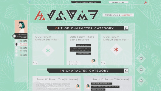
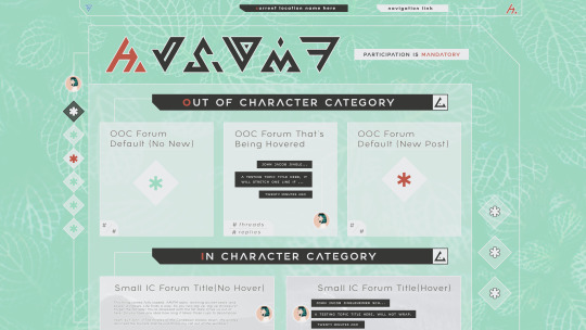
A little scared to share because I'm semi rusty on design. These are simply roughs of a skin concept for a personal project I'm working on, posting them to keep myself accountable but also to share something of an aesthetic I've worked with.
The sidebar as seen will toggle back & forth between minimal & maximal mode, but also change if one is on a smaller screen automatically. The skin design will come in four variants, a dark, light, medium low contrast & a high contrast one. Members will be allowed to change their font preference (with accompanying adjustments RE styling to keep it looking nice) in the UCP with a dropdown; as well as hide, minimize, or show the images in the skin. - Started with the light skin because I suck at light skins so I start with my weak hand, so to speak. Dark alt coming soon...ish. - Obvs, asterisks are where icons from an icon font will go. - Filler text is jeffsum because I will die before I use anything else. - This design is a rework of an old design I had somewhat abandoned, but which may come back in its own glory later. If so, this one came second. - I've tried to go for a cohesive colour palette wherein green is default, the red is urgent or attention call, blue is off compliment & white/black are the bases. The whole palette I'll share later when I toss up all my sketch/prework stuff in a master post. - Obvs a WIP, changes may occur. I am indecisive.
3 notes
·
View notes
Note
could you maybe put together a tutorial on tabbed forums?
Hello!
I've actually never done this but you know what? If it's in demand, I'll find the most accessible functional way & whip up a comprehensive guide! Stay tuned & have a great day!
0 notes
Note
love the mock ups you've posted recently! can't wait to see some of these. i love seeing dark/light versions and skins that are easy to change backgrounds on so it takes minor tweaking to make it feel fresh. your work looks fresh
Thank you so much! I'm sort of new to sharing my work, the feedback & appreciation the sharing lately has gotten has been so validating!
I'm also all for ease of use, so all of my skins will function much like each other under the hood, even with drastically different styles, I'm glad the simplicity pleases!
Have a lovely new year!
0 notes
Note
Question: I've browsed your WIPs and shares in the JCC discord. I like them but I was wondering if you intend to work toward more of a cohesive aesthetic as a designer as you go?
Hey, my first Ask ever! Thanks, but short answer: no. Long answer, I am dreadfully ashamed to admit I cannot actually find a key aesthetic for myself. I pick a theme, inspiration or concept for a skin then I commit to it fully. The only consistent things I strive for from skin to skin is full accessibility & responsiveness that doesn't sacrifice utility because those are the only things I super care about. When (if) I open commissions, I will expect clients to come with inspirations & ideas of their own that embody the skin they want for their site. I can design & code for you(general) but I simply cannot or won't find inspiration for you.
I feel strongly that doing that would make coding/design unfun for me & a commission process frustrating for a client. If one has no idea what they want, I can't justify spending the time helping them find what they want, if that makes sense.
My skins are always an embodiment of their theme or concept, which is why they're often so drastically different. TLDR I suppose but I guess I just can't see that changing for me.
0 notes