#i am so sory if this is somewhat incomprehensible or a pain to read through IF YOU HAVE ANY NEEDS FOR CLARIFICATION... JUST ASK ME..!!!!
Explore tagged Tumblr posts
Note
hi there!! there isn’t a need to publish this ask I literally just am so curious if you had any resource or tutorial regarding your neocities! I’m sorry if this is so out of the blue but I saw your site and really adored the layout!! I’m specifically just wondering about the method you used for your blog posts - I’ve found some recommended ways to do it but i feel like yours is integrated really well imo :) also if you’re not comfortable answering or anything that’s totally fine lol pls don’t feel obligated. lastly your art is so gorg!!!
i'm finally going to answer this ask...!! it's going to be a very long read so i'll keep it all under this cut
i know you are specifically curious about the blog posts page but i figured this was a great time to thoroughly explain my website layout too since i had another person asking about it (i'll put that at the bottom though) :D
please bear with me btw because i... i have never made a tutorial like this before LOL
--
blog posts guide

1. scrollbox
i made a super low effort format for my blog entries. i honestly just wanted it to be a super simple scrollable box with all of my entries being in one general place. CSS to do this, i created an all encompassing <div class> that had the styling property of overflow.
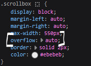
fyi, i also added a <div class> within the scrollbox class that would handle the padding but TBH i'm not sure... i needed to make an entire class for that LOL REFERENCES - scroll box
2. date & time
HTML ok honestly i just used a <p> element and made it bold....
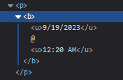
3. images (optional)
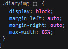
HTML i don't always attach an image to my entries but when i want to, i use this <div class> that sits below my date & time. i style it with an <img class> that i created and add an <alt text> too to make it more accessible!

CSS this is what the <img class> looks like. i like my images centered and on their own "line."
4. status
HTML again, another <div class> specifically made for the status. i just made the font size smaller to visually differentiate it from the actual entry itself.

5. blog entry text
HTML my blog entries are simply typed up between <p> tags and i use <br> to start a new line... it literally just looks like this LOL....

THAT'S ALL...>!!!!!! :)
--
website guide

1. general page layout
HTML in order to establish where i want all of my blog's content to lie, i created a <div class> specifically to store it all.

CSS the styling for it is pretty simple! just setting a max-width to limit the size of everything that will be in it and also centering the page with the margin.

2. sidebar
HTML my sidebar just comprises of a heading tag and navigation links.

CSS this is all personal taste aside from the fixed position
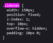
REFERENCES - fixed sidebar - responsive sidebar
3. main content
HTML because everything is stored in the <div class="content">, the sidebar and the page contents are limited to the constraints of the it.
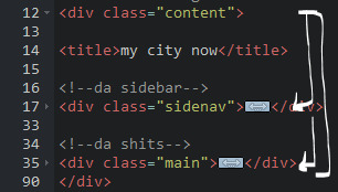
that is all pt. 2...... bless <3
#THANK U FOR ASKING BTW!!!!#it brings me so much joy when people ask me . things and i then get to answer these things#i am so sory if this is somewhat incomprehensible or a pain to read through IF YOU HAVE ANY NEEDS FOR CLARIFICATION... JUST ASK ME..!!!!#textoffun#inbox
28 notes
·
View notes