#I choose dog designs based mostly on appearance and vibes
Explore tagged Tumblr posts
Text
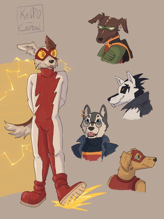


ouppy-fies your young justice
#dc#yj98#young justice#art#kelpo draws#dc impulse#cassie sandsmark#greta hayes#kon el#slobo#tim drake#robin#superboy#cissie king jones#fuck I don’t usually have to tag so many characters at once#I didn’t even draw all of them#I don’t really know why I did this#but I had fun#I choose dog designs based mostly on appearance and vibes#because I knew that if I actually committed to choosing dogs based on personality I would still be trying to decide
80 notes
·
View notes
Text
Twilight characters as random animals that I think are oddly fitting
(Also yes, I am roasting the animals as well)
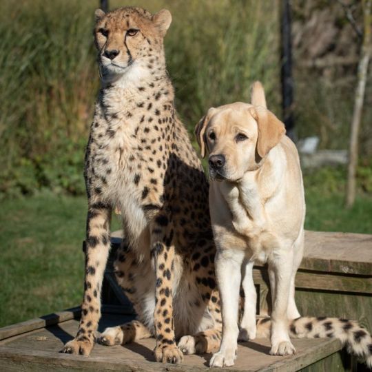
Edward: He would be a Cheetah. Now I know, seems like a cop out just because of his speed but hear me out. Cheetahs are, at face value, pretty cool. They used to be my favorite animal as a child, but then I grew up.
Cheetahs, through no fault of their own, are severely inbred. Now thats mainly because of poaching, but the cheetas anxiety also comes into play. In captivity, cheetahs are usually given emotional support dogs. I will admit it is cute but it negatively affects the population. Excluding one in the wild, cheetas can be to anxious to breed and thats not good for conservation efforts.
Cheetahs can hit up to 80 miles per hour in a couple of seconds. They are designed for fast running and agility. Their claws are similar to that of a dogs for better traction and they have elongated spines for longer strides. They have a thin build, long legs and a long tail for balance.
This has downsides though. Many times after making a kill, it will get stolen for them by larger predators. Thats right, they get absolutely bodied by the other animals. I should probably make these shorter but I'm on a rant now, so I guess this will be semi educational.
Throughout the series, we see Edward over estimated his abilities and value, constantly getting bodied by others. He's essentially a perfect mormon, though thats on S'meyers. He constantly judges others, dehumanizing them to their baser flaws, without doing any self reflecting. Him viewing himself as a monster doesn't really count to me. While he definitely hates himself, the only thing he is truly demonizing is being a vampire.
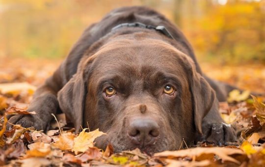
Bella: Picking up from Edwards, Bella is a Chocolate Labrador. Yes, she is his therapy dog. I feel like this is really fitting for her. I know Golden retriever would make more sense, as thats the most common breed for service animals. However, I kind of focused on her appearance. Only at first though! I just know that Edward raved about her human qualities and that would pass over as animals as well. Her chocolate eyes and brown fur, very average and boring. Thats essentially Bella. Even Edward wasn't into her until he got a wiff. Labradors a very loyal dogs and while they have more personality than Bella, I just couldn't shake it. Their also very stupid. Ok that's kind of mean, they're not stupid but when it comes to love, then yeah they are stupid.
I used to have a lab, loved him to death, but god he was something else. Very much danger prone, from their own stupidity or their lack of survival instincts. I know that labs are almost aquatic. They love water, swimming, all that jazz. We can just say that bella has a few screws loose in her dna and is just "not like other labs."

Rosalie: Now she was hard. There are quite a few animals that I think would fit for her. I'll list the other ones, but that one I went with is the Swan. Like Edward, seems a little on the nose, but I have my reasoning.
I was going to pick a predator for her, as she is shown to be very vengeful and viscous. I would have pick some type of cat, most likely a purebred, from a rich family. It could still work, but the swan just speaks to me on this one.
Swan's are known for being beautiful, graceful, and are pictured as the symbol of love. They are also very vain. Edward constantly brings up Rosalies vanity. She was constantly valued for her beauty as a human, so of course that crossed over in the transformation. She was raised to be married into wealth, she was used as a bargaining chip to increase the family's standing.
Rose has a very strong character and makes her opinions known. She's assertive and aggressive at times. She's not afraid to get dirty.
Swans mate for life and like geese, are known for being great parents. I was also going to choose geese as an option for the maternal instincts. I was wary at first because swans can be really aggressive. Like actually, you think geece are bad? Yikes bestie...
I was conflicted because swans are known for drowning dogs and sometimes people. However, I can actually see Rose drowning Bella. It's not that unbelievable lmao.
Emmett: Now this one is just ironic. I only associate him with bears. Its inevitable, but picking a Grizzly or Black bear is too obvious. So I went a slightly different route...
So I was going to pick the Sun bear just because of looks alone. Like, I'm not exaggerating, it looks like someone wearing a bear costume. I don't think it fits him but I know for a fact that he would dress up as a sun bear and sneak into a zoo to see if anyone would notice. I'll put a pic of it here
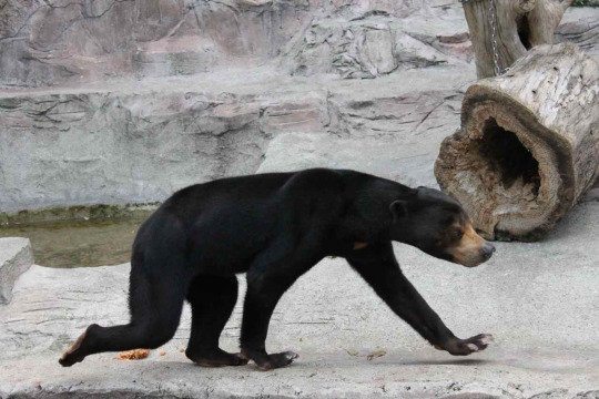
Like look at this thing. I have no words...
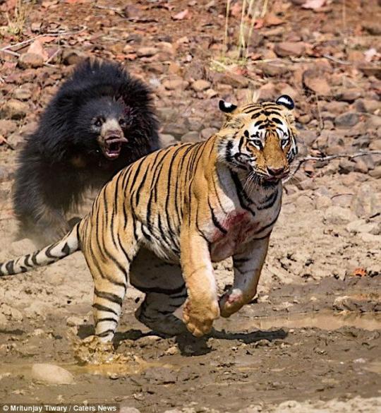
Anyway, what I picked was a Sloth Bear. Now Sloth bears are mostly nocturnal, which either way works consider vamps don't sleep. Their diet is also odd but honestly so is the cullens. They're native to the Indian subcontinent, and are known for being aggressive towards humans. Its said that for the most part they're pretty calm, so I think its just fear of humans that make them act aggressively. Honestly, that's a good thing because they are listed as vulnerable on the IUCN Red list.
They have some similarities with sloths, which is where they get the name. They have long claws and unusual teeth. They are known to hang upside down from tree branches, and is described as having a messy appearance. Honestly, Emmitt has a messy personality. Sorry bestie but you're a lot of work.
Now heres the biggest reason for choosing this bear. Aside from Baloo from the jungle book being a sloth bear, they are known to run fades with Tigers. Honestly, how fucking badass is that!? Now I don't think there are recorded instances of a Sloth bear killing a Tiger, but when push comes to shove, they can hold their own and I find that incredibly impressive.
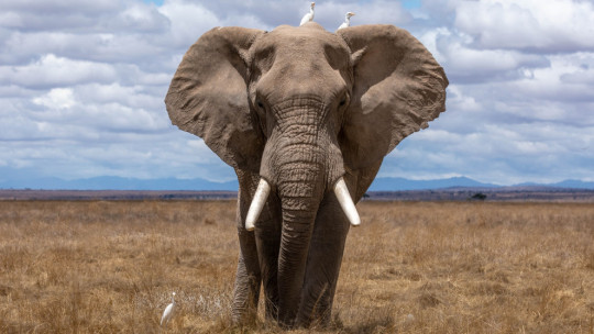
Carlisle: This one was somehow the easiest as well as the toughest. I know Owl seems like the obvious choice, and I can see it. However, I believe Carlisle values emotional intelligence as much or if not more than academic intelligence. He is so charismatic and values other's above himself. He might not be as Saint like as Edward thinks, but he does try and I think he genuinely cares about others. For that reason alone, I choose a Elephant.
Elephant's are very social animals and are extremely intelligent. I could rave about them for ages, I love them so much.
Now elephants live in a familial unit and are usually matriarchal. Bulls usually are on the outer edges of the herd or form little groups with other males. Honestly, they're not that bad aside from when their in musk.
In the group of males, the elder ones will teach the younger where to get the best food, water, how to use things as tools, and every other thing that will increase their odds of survival. This is really cute to me tbh, they do this because the females usually choose the older males because they've proved that they are intelligent and strong, that they have survived and will continue to for awhile. Teaching the younger males these things are to make the odds of them getting chosen to mate more likely. The whole unit just reminds me of a father that has to deal with rowdy teens.
Carlisle likes to take in strays, he might not have a herd but he will make one and teach them to thrive. That's how he envisions it anyway. He just has a found family and is trying his best.
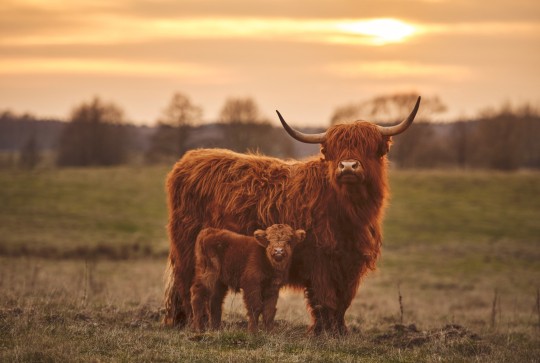
Esme: Now this might seem like an insult, but I promise it's not! This is in no way misogynistic. I love cattle and ever since I took animal science in highschool, I have appreciated these grass puppies like they deserve. Call me Castro because I love cows.
Yup! I chose a Cow for her. Specifically a beef cow. That might sound weird but its because beef cows have higher maternal instinct than dairy cows. I'm thinking Scottish Highland based on vibes alone.
They are nicknamed the Gentle Giants of Scotland. Super maternal and sweet and ugh look how cute they are!
Esme came from a abusive marriage and had just lost her child, she was depressed and desperate. Her changing was, in a way, salvation. She just fits in. She adopts all these strays along with him and will protect them to the death. She might be gentle by nature, but don't fuck with her family. She lost her first one and she isn't going to lose this one.
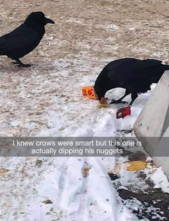
Alice: She's an odd one. There are so many possibilities and maybe I'm biased, but I feel like she would be a Crow.
Ok listen, I'm definitely biased but it just feels right. Crows get a bad rap, they are so cool! They are so intelligent and have the ability to actually sit and think about the past, prest, and future. I forget what its called, but this was only seem in humans! Maybe other apes, I can't remember exactly, but either way its awesome. They do live in groups, or murders, and remember people and faces. They remember locations and are able to pass down information through generations. They essentially have their own language! They are able to use tools too!
Alice's story is really sad. When we first meets her, it revolves around the death of her mother and her institutionalized. She was essentially tortured and forgot everything from her past. All she had was the future and even that wasn't constant. Crows a often viewed as omens, they are associated with death. I personally believe that instead of being the cause, they just know something is going to happen. They are very inquisitive and can be creative.
If you befriend a murder of crows, sometimes, depends or the group, they will bring gifts. Its can range from food to shiny metals and colorful plastic. Hell, I think I've seen a post of one stealing things from people just to gift it to their human.
Alice's love language is gifts. Even if they are focused around fashion, she still goes out of her way to get something that will look good and at least be a little comfortable. By that I mean she tends to forget peoples comfort zones, but she means well.
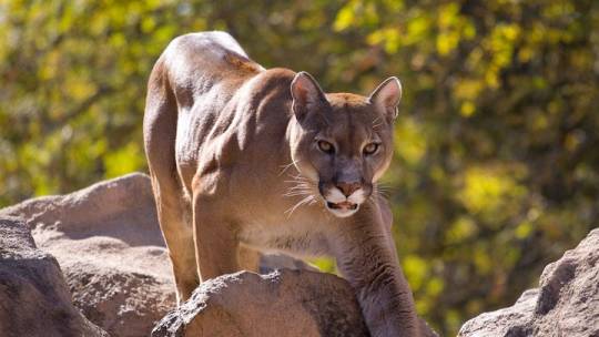
Jasper: Honestly not to sure what to put for him. I know a predator would be more fitting, but for some reason I can see a donkey working. I know, seems like I'm clowning on the confederate. Fair, but I'm serious about the donkey thing. Honestly, it would be perfect if it wasn't a herbivore. Porcupine would also work.
Being a predator would make more sense. Given his backstory and his characterization, it wouldn't make sense for him to be a prey animal. Usually I wouldn't count this, but given his gore filled past and trouble with the diet, it seemed fitting.
I see him as a Big Cat. Honestly, vamps in general just give cat vibes. Jasper though especially have some cat like qualities, which originates from hunting and being a soldier.
I specifically see him as a Mountain Lion. Aside from him being blonde, he just has the predatory stealth to him. In midnight sun, we see him use his gift to make the nomads overlook him. He's honestly really powerful.
Mountain lions are known for being stealthy with an air of grace and power to them. They are stong animals. And I mean strong. They can jump 40-45 feet.
They're very elusive and quite. They stalk their prey and tend to attack from behind but don't think they won't hold their ground if need be.
Jasper was changed during the Civil War and forced to fight in the Newborn wars. He was a soldier as a human and as a vampire. He's able to feel and manipulate others emotions. He's covered in scars and is very intimidating.
He still struggles with the diet and honestly I hate how the others handle it. Like they have no room to talk. I don't want to defend the confederate but it just pisses me off. He has to deal with his hunger on top of everyone else's. Like damn, besties always on edge! Everyone doubts him which I don't think helps any.
Also, Mountain lions and Cheetahs can purr!
@aquanova99 I'll do a Volturi one too. That one will be fun lmao
#twilight saga#the twilight saga#twilight au#bella swan#edward cullen#carlisle cullen#esme cullen#jasper hale#jasper cullen#alice cullen#rosalie hale#rosalie cullen#emmett cullen#the cullens#the volturi#honestly look at the muscle definition on that thing#jesus chriiiist
71 notes
·
View notes
Note
Hi yes hello. I saw that you rebloged the oc ask thingy and I'll be ordering for the whole table. Can I get a 2, 3 ,5, 7, 9, 10, 12, 13, 16, 17, 19, 20, 21, 32, 34, 37, 41, 45, 48, 50, 51, 55, 60, 65, 68, 69, 70, 73, 78, 83, 87, 89, 93, 96, 98, and 99? All for Biscuit. (IM REALLY REALLY SORRY I JUST WANNA KNOW MORE ABOUT THEM 😭)
This got real long... answers under the cut!
2. What are their favourite possessions? Why? (sentimentality, history, price, etc.)
His favourite possession... is you! ✋👁👁
Jokes aside, Biscuit isn't too materialistic. However, he does like the hairband he uses for his braid; it was a gift from his mother! The bow he wears around his neck is also a remnant of a modification of his uniform from his previous place of work. Biscuit used to work both as a mascot and a cook (it would switch depending on the situation) at his family's diner (restaurant? i don't know the term), and he added it because he thought it looked cute (also he couldn't do anything too feminine :( so this was the best he could do).
I will note that the cutlery embedded into him is not a part of his favourite possessions, despite his unwillingness to part with them. They're more like a part of his body, I guess?
3. Do They get jealous easily? If so, what usually causes it?
If Biscuit formed an attachment to someone and then saw them with someone else, he'd be wary of the new person, if not jealous. They'd have to become acquainted with Biscuit to ease him, though that might not always work. He'd still probably try to drag his companion away. Basically, he's pretty protective (possessive?) over those he likes.
5. What's their reputation like? Does this reputation contrast what they're really like?
I'm not sure how others would see him. Either it's "eccentric cosplayer (who's really in character)" or "weird dude". Probably the first one, as normal people couldn't survive with knives in their body for that long. Mostly Biscuit's just a weird dude though.
7. What's their "type"? What romantically attracts them to another person?
Biscuit doesn't really have a preference on appearance, it's more based on personality. Either it's someone who can care for him or someone who's just as feral/zero-braincell'd as him. He normally takes care of his victims, but he doesn't see that as attraction; it's more like caring for cattle before you eat it. If someone cared for him though, he'd be into it. As for the other one, it's just a feral power couple; both can be absolutely insane together (Run).
9. If they could change one part of their appearance, what would it be?
Spine that can turn 180 degrees. Reasoning: he has to sleep on his stomach because of the knives, but then his feet are bent uncomfy while on his stomach. Rotate spine for comfy feets. Plus, it'd be a cool party trick.
10. What's a simple thing that brings them joy?
Pets/physical affection. (Unfortunately, by unintentional design, this man is Unpettable.)
12. What's their position in their friend group? (leader, mom friend, chaos goblin, etc.)
The chill goblin: you can sit with him and have a nice hat, but if anything gets the interest of his one (1) braincell, he will go absolutely feral.
13. How forgiving are they? What do they consider unforgivable?
I think he's pretty forgiving, considering. If you attacked him, he'd probably consider it as play-fighting or something. He won't like it if you mess with his personal belongings, but he'll forgive you if it's for a good reason (for him) or if you give it back.
As for the things he'd find unforgivable, touching the two knives sticking out of his head is an absolute no-no. (The ones in his shoulders are sort of meh; he won't like it if you touch them, but he won't try to kill you for it.) The knives in his head are really sensitive, so he'll become agitated quick and snap if you try to move or remove them.
16. What food do they absolutely hate?
fish yucky >:(
17. Do they show a lot of affection, or are they pretty reserved?
If Biscuit had an s/o or a good friend (you know, people he's not interested in for food), he'd be pretty affectionate; he likes them and wants to show it! He might get a little close though, so make sure to set (and remind him of) personal boundaries.
19. What's their unusual quirk?
I don't know why, but I imagine that Biscuit can bleed infinitely. If you were to remove any of the knives embedded into him, the wound will just keep bleeding until they're inserted back in. I don't really have an explanation for this, but he is a human, so??? I just think it's neat.
20. Are they easy to wake up in the morning, or grouchy and sleepy?
While Biscuit does get up early, he's particularly lazy and groggy. It's kind of like those moods where you want to go back to sleep, but you can't because your body's awake.
21. What's their ideal date like?
Anywhere really, so long as his s/o is giving him attention.
32. What are they like at parties? Party animal, or awkwardly sitting in the corner drinking punch and reading?
Party animal, except everyone else is sitting in the corner trying to avoid him. He doesn’t really think before speaking, so he says whatever without any filter. (Plus, the knives don’t help. No, he won’t remove them.)
34. What’s their favourite drink? (Coffee, tea, juice, hot chocolate, soda, etc.)
Biscuit is a milkshake lad. His favourite is strawberry-banana!
37. Are they a hopeless romantic, or is that stuff just not for them?
Biscuit has a “love-at-first-interaction” mentality, like if someone shows genuine interest in him, then he wants to be with them and chases that feeling (and them).
41. What would they dress up as for Halloween?
Bold of you to assume that he’d even need a Halloween costume.
All jokes aside though, Biscuit has No Patience to put a costume together (or even look for one), so he’d probably just go with his normal wear. People have already mistaken the knives as cosplay/props anyway, so it’s just less work, instant results.
(He does have the old mascot suit, but he can’t wear it anymore without it hitting the knives.)
45. Are they always late, on time, or early?
None of the above, he forgot that event was today.
48. How dramatic are they?
Biscuit’s not the type to start drama, nor is he extremely emphatic (is that the word?) with his speech. He’s just kind of vibing.
50. Why would they be a good partner for a road trip?
Fun(?) to do activities with; will probably suggest random stuff to do if there’s no set itinerary (will probably suggest it anyway). If you’re looking for a spontaneous road trip, he’s your guy.
51. Why would they be a BAD partner for a road trip?
Will Never Sit Still; must be kept under watch constantly, otherwise he’ll run off to who knows where. (Just keep him on a leash or something)
55. Choose a vine you think perfectly encapsulates their character.
This video has pretty strong vibes of brainrot, so I think it's appropriate.
60. What sappy thing will they cry at? (romance movies, cute cat videos, etc.) Would they deny crying about it later on?
Biscuit loves all types of animals, especially furry ones (so dogs, cats, bats, rats… bean toes are a plus). So he’d absolutely cry if shown cute pet videos and gush about how precious and baby each one is. No denial either, if you confront him about it, he’d just justify it by gushing about them more. (He doesn’t have any pets of his own though. I wouldn’t trust him with a pet.)
As a side note, if he found out his victim was a beastkin or could turn into an animal or something, he’d be really conflicted on whether to harm them or not, but would ultimately decide against it.
65. Do they give people a lot of nicknames?
Biscuit isn’t creative enough to make genuine nicknames. However, if he forgot your name (and he probably would), he’d just name something off of your appearance (“pink jacket”, “shark guy”, things like that).
68. Are they easy to fluster? What would you have to do to truly fluster them?
Biscuit can only really be flustered by people he likes or people that he thinks are close to him. He’ll melt and nuzzle you if you surprise him with something nice, physical or otherwise :)
69. What’s their dream vacation like?
Go to the countryside and run around and be feral. Then chill in the evening and take a bath, because he needs to make sure his knives are clean.
70. Are they a good liar?
Biscuit doesn’t even try to lie. He’s really impulsive, and he doesn’t see what’s wrong with what he does. If he tried to lie, it’d be stupid/simple and obvious that it’s a lie, but he’d stick to his guns and insist that it’s true. Though, his voice/expression wouldn’t fluctuate, so you’d have to believe either in common sense or him.
73. Are they more book smarts, or street smarts?
Street smarts; this man’s head is empty (except for the two knives in there but).
78. What’s something they’re really bad at?
Almost anything that involves careful planning and concentration to complete. Things like puzzles or sewing; if it doesn’t give immediate satisfaction, then what’s the point?
The only things that Biscuit does pay attention to are cooking and, by extent, caring for his victim (as they’re a part of the cooking process).
83. What are they like as an s/o?
Loyal and (possibly) clingy. Will want to accompany you for days, then vanish out of thin air due to impulsiveness (will absolutely forget to feed his victim during this time, if he has one). Forgets about physical boundaries, but means well (trying to show affection).
Biscuit’s love languages are, in no particular order: physical touch, acts of service, and quality time. Personal hug-buddy that can cook :)
87. Do they like spicy food?
Yes he does! I like to imagine that he incorporates spice from time to time into his dishes. I don’t know what his tolerance would be though due to lack of experience (I will perish).
89. What would they get into a petty argument over?
Which animal is the best? Answer: it’s all of them. (Though he does have a preference towards furry animals, he tries to be unbiased in this argument.)
93. What type of movies do they like to watch?
Both gorey horror movies and feel-good movies (especially if they have animal protagonists). They’re just fun to watch.
96. What’s their sense of humour like? (Dad jokes, morbid humour, basic knock-knock jokes, stand-up comedy, etc.)
Physical humour, stand-up, and maybe surreal humour. Anything else might be too complex for him.
98. How competitive are they?
He’s not very competitive on his own, though if someone challenges him to a contest, he’s still going to try to beat them for the satisfaction of it. Don’t challenge him to a contest if you want to have chill times with him.
99. What would they wear to a formal event? Describe their outfit!
Biscuit has No Standards when it comes to social events, so he’s going as normal. If he had to dress fancy though (and if he had access to it), he’d probably just wear a simple pink dress shirt and dress pants + suspenders. Slick his hair back too. The knives stay.
(I don’t even think he can enter most shops with the knives, fake or not. I don’t know; I’ve never entered an establishment with visible knives before.)
This was a long post, so let me know if I missed anything;;
#i spent Too Much Time thinking about these answers#also sorry for the late reply; i kept getting distracted;;#is this man just a dog? maybe#biscuit oc#my oc#emi-bunni#ask#oc questions meme
6 notes
·
View notes
Photo


So I finally finished the Friends design set for my Soul Eater Kemono Friends AU. (for those who don't know: Friends in Kemono Friends are animal girls* created when an animal, living or dead, comes in contact with a volcanic substance known as Sandstar, and if eaten by a Cellian/Cerulean, they revert back to being an animal and their lives are "reset" to the point just before they became a Friend, losing all memories of that time. *Crona is still nonbinary in this AU since you know, they're capable of forming/voicing their own identity regardless of assigned labels
If this gets popular, I'll make a set 2 with more characters
Art by TheApatheticKat. Please do not repost or remove/edit caption
Before I list why I chose what species everyone was based on, here's the answer to a question I might get: "where's Blair/Kim/Jackie?" (There's already canon Friends for the domestic cat and the tanuki/raccoon dog, and it wouldn't be right to include Jackie wthout Kim. Actually, you know what, they're researchers and not Friends in this AU. Don't know where Blair goes yet)
Why I chose which species for which character: (note: I only chose species that didn't have canon Kemono Friends characters as of July 2020)
Maka - Domestic Rabbit: Partially because of that one manga panel where Crona hallucinated Maka with a rabbit's face, partially because from rabbit owners I follow, a Maka-like nature is way more common than you'd think. Though I was surprised there was no canon Friend for the domestic rabbit.
Crona - Fancy Rat (Lilac color): So I actually went through more species ideas for Crona's design than any other character. Mostly thinking about animals that were pink or purple in nature so I didn't have to mess with their hair too much, but those colors don't appear often (and unfortunately not in feline species at all). I had considered the Roseate Spoonbill, Galah, Web-footed gecko, Pine Grosbeak, Rusty-spotted cat, Kodkod, Black-footed cat, and the European Wildcat, but I ended up going with the fancy/domestic rat, specifically the lilac color variation. (it's actually warm gray and not truly lilac purple, but...) Because 1) I like rats, they are very cute like Crona; and 2) snake and rat symbolism with Medusa and Crona even though I have no idea how the heck I'd work that dynamic into a Kemono Friends AU considering the fluffy, G-rated nature of that series.
Tsubaki - Kerama Deer: The Will of Nakatsukasa represented itself as a deer. I could have made her based on that, but as The Will of Nakatsukasa is original to Soul Eater's lore and is not a creature from real-world mythology like the canon mythical Friends, I went looking for an actual deer species native to Japan. The Sika deer was the only major one I could find, and it already had a canon Friend, but not all its subspecies did, so that's why I ended up choosing the subspecies known as the Kerama Deer.
Liz - Big Brown Bat: Since the Thompson sisters grew up in Brooklyn, I wanted to use two similar species that live at least somewhere in New York, as Friends of similar/related species in Kemono Friends regard each other as sisters (because aside from a few exceptions, there's only one Friend per species at any given time).
Patty - Little Brown Bat: I thought because of their common names that the big and little brown bats were related species. Turns out they're not even in the same genus, and I had already written the species names on the paper in pen so... oops. They're still sisters by KF logic anyway in this AU because I'm just gonna say so.
Medusa - Ursini Meadow Viper: She had to be a snake. Because her name was lifted from Greek mythology, I wanted to use a snake that lives in Greece, and because of her personality/canon actions, a venomous one was preferable. Luckily there was a snake out there that fit all that criteria. Also the symbolism with Medusa being a venomous snake while Crona being a rat... yeah.
Arachne - Black Widow: The vibes
Eruka - Australian Green Tree Frog: I was looking for a frog species that was a close match to what her frog form looks like in Soul Eater. The Australian Green Tree Frog is predominantly green, has the white underside, and some individuals have the dark facial spots, so it was a perfect fit! In trying to see what frog features are present on frog Friends, I scanned through the wiki to find the only frog Friends are the Keroro/Sgt.Frog crossover Friends, and they had no frog features on them, so I used Eruka's clothes to give her an extra bit of a frog motif.
Mizune - House Mouse: I don't think this one needs explanation
Azusa - Japanese Sparrowhawk: Azusa just has the vibe of a bird of prey to me, so I knew where to start. I also wanted to use a hawk or falcon that is not only Japanese but has enough black/otherwise dark areas that I wouldn't have to change her hair color that much.
Marie - Smooth Newt: Since her jast name (Mjolnir) derives from Norse mythology, I wanted to use an animal that lives in Scandinavia, specifically in/around Norway. And then I found out about the existence of the Smooth Newt. It has a range in Norway, has yellow and black in its color scheme like Marie does, and has an incredibly appealing name. Smooth Newt. (though I did want to use a sheep at one point, all the super fluffy ones were already taken)
Mira - Saharan Striped Polecat: This one was a bit trickier, as nothing really jumped out at me from the start, but because of her name and theming (Mira being close to Miira, the Japanese wourd for mummy, and her wearing bandages all over in combat), I wanted to choose a species that lived in or around Egypt (because that's the first country that comes to peoples minds when they think of mummies). The stripe pattern of the Saharan Striped Polecat also made it easy to incorporate her bandages and create a cohesive design that blended her original design in well.
#soul eater#kemono friends#maka albarn#crona gorgon#crona#tsubaki nakatsukasa#liz thompson#patty thompson#medusa gorgon#medusa soul eater#arachne gorgon#eruka frog#mizune#azusa yumi#marie mjolnir#mira nygus#mira naigus#my art
58 notes
·
View notes
Text
Classic Baddies for the Thirteenth Doctor!
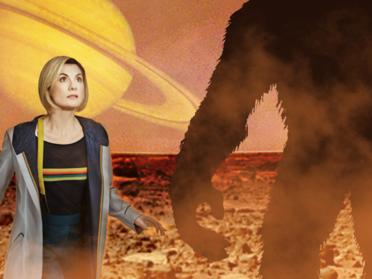
As a fan of classic Doctor Who, one of my favourite elements of the new series has been the anticipation as to which classic villains will make an appearance. Not only is it cool to see more of these older monsters, but it’s also exciting to see how they update their look. Some really nail it too. Keeping the classic design of the Daleks while making them look more tank-like and utilitarian in 2005 was a masterstroke. I liked that they embraced the Ice Warriors’ original look as well. While I may not be as hot on the updated Silurians, or Autons, it’s always fun to see classic villains regardless.
When Chris Chibnall mentioned that there would be no classic villains in series 11, my heart sank a little. Are they necessary for Doctor Who to be successful? Not hardly. But it’s fun dammit. Even if they were cameos like the Macra or the Movellans, these were moments I looked forward to. I have a sort of checklist I like to go through with each series of new Who. Are there classic villains? Check. Does the Doctor meet a figure from history? Check. Series 11 has one of those.
It’s been no secret that a major criticism of series 11 has been its lack of compelling villains. I myself have been vocal about this disappointment. So I thought I would make up a list of 10 classic villains I would like to see the Thirteenth Doctor go up against. I’m basing these off a few factors. Personal favourites, Jodie’s vibe, the era, etc. Enjoy! And feel free to add your own!
1. Autons
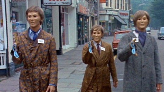
First Appearance: "Spearhead from Space" (1970)
I know they have already returned. I know I said I didn’t like their update. That’s exactly why they’re on this list now. I didn’t exactly hate the updated Autons when I first watched them. At the time, I didn’t have any classic villains to compare them to, as they were new to me. I thought they were pretty corny and not very scary, even as they did openly murder people in the streets of London. But when seeing "Spearhead from Space," for the first time, I was supremely creeped out. The newer Autons remind me of the movie theatre scene in “Human Traffic.” Just a bunch of dancers doing the robot. Not very scary. And turning the Nestine consciousness into a big vat of CGI goo, as compared to a giant plastic space squid seems like a crime. They’re due an update.
2. Voord
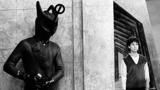
First Appearance: "The Keys of Marinus" (1964)
These guys creep me out. Their costumes are really stupid, and I still find them creepy. They’re like spiky fish men mixed with Egyptian gods. Ignoring the weird "Voord became Cybermen," storyline, and focusing on the fishman aspect would be the way to go. Could you imagine their costume if updated correctly? I picture a mix between Edward Scissorhands and a scuba diver. I’ve wanted to see Jodie encounter these guys ever since "The Ghost Monument," reminded me of "The Keys of Marinus." Something about First Doctor villains with the first female Doctor kinda works for me too. Speaking of First Doctor villains…
3. Zarbi
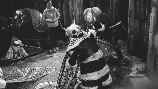
First Appearance: "The Web Planet" (1965)
Ok, so this one is a bit of a cheat. I know the Zarbi aren’t really a villain by their own doing. In many ways, these oversized ants are just dumb animals. But the biggest way this is a cheat is because I just want them so we can have the Menoptera! I love those stupid moth cuties. I think an updated one of them could look really fun. Think the aliens from the queue scene in the "Hitchhiker’s Guide to the Galaxy," movie. Something between realistic, and fantastical. They would also add a much-needed sense of levity to the Chibnall era.
4. The Dominators
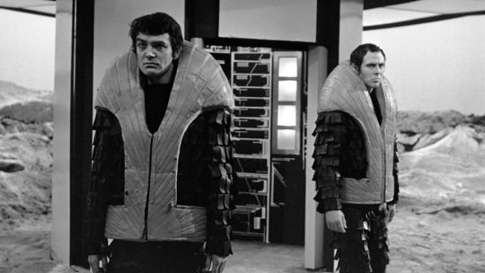
First Appearance: "The Dominators" (1968)
The Dominators are a race of men whose name pretty much describes their modus operandi. Having long ago developed beyond the need for women, these guys seem an obvious choice to go up against a female Doctor. Their look is simple enough to update. They need only to look armoured and militaristic. Their robot drones, the Quarks, would be the real challenge to update, but I’m sure they’d nail it. I would be interested in seeing a more bureaucratic ruling class of Dominators as well. Perhaps instead of having a male and female population, they have the soldiers and the suits. Could be a really interesting way to talk about the insular nature of toxic masculinity. This would fit in well with Thirteen’s villains being chauvinistic shitbirds that don’t like women much.
5. Axons

First Appearance: "The Claws of Axos" (1971)
I’ve heard the Axons get a bit of flack in the past, which is bananas to me. There’s so much potential there. They have a rather psychedelic look, and then they get super gross. I’ve always seen them as very retro style monsters. Jodie’s costume has a real 1970’s "Godspell," look about it, so I always picture her going up against monsters that look the part. They wouldn’t be hard to update either. I would make the golden lines on their humanoid forms slightly raised, like a system of fibres across their skin. And of course, their squidgy red form could be a tangled mass of CGI that kinda bubbles up from the gold lines. The transformation scenes could get very visceral. They’ve got a sneaky nature about them. Like anglerfish, their beautiful golden appearance conceals a horrific monster. They’re known for making Faustian deals with people fool enough to believe their lies. How could we resist?
6. The Mara
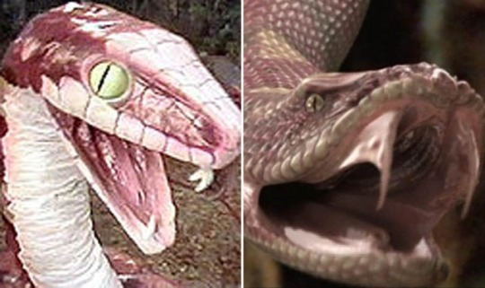
First Appearance: "Kinda" (1982)
Many people love the Kinda/Snakedance storyline. I wasn’t sure what to make of either serial, as the quality of both waivers. Over time, though, I’ve come to really appreciate them as stories. I have a love for characters that exist as a sort of gestalt. There’s something very unsettling about a hive mind. As The Doctor has three companions this time around. There’s lots of room for one of them to go off and become possessed by an evil snake god for a while. Either Graham or Ryan becoming hosts for the Mara could be an interesting way to explore their relationship. While the DVD release saw an updated version of the Mara’s snake form, I’m sure the modern show can do one better. They’ve already done giant spiders, now let's see them do a giant snake!
7. The Rani
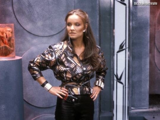
First Appearance: "The Mark of the Rani" (1985)
While I am aware many people dislike the Rani, and the idea of Chris Chibnall choosing a character created by Pip and Jan Baker is unlikely, I still don’t care. Any character can be made good in the hands of a competent writer. All it takes is one good idea. Personally, I’ve never really gotten the guff she’s been given. As a woman capable of cruel scientific experiments, the Rani is a ruthless Time Lady with more guile than the Master. People want to see Thirteen with Missy because they’re both women now, but we’ve had an evil Time Lady for years, and I’d be interested to see what regeneration might bring for her… or him?
8. Rutans
First Appearance: "The Horror of Fang Rock" (1977)
First Mentioned: “The Time Warrior” (1973)
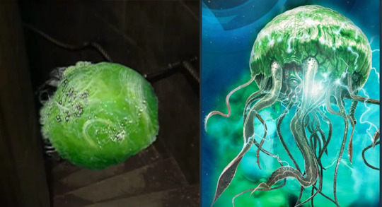
The Rutans are long enemies of the Sontaran race. I would love to see them amp up the danger by getting stuck in the middle of a skirmish between the two races. I would like to see the Sontarans presented as formidable once again. The Doctor Who video game "The Gunpowder Plot," did update their look, to a decent degree. Either way, modern Who could make a Rutan look much more imposing with CGI, or even practical effects. I’d imagine something like a green man o’ war. Jodie’s Doctor’s tendency to mediate during conflict could land her trying to broker peace between the two races. Could she be successful or would she have to count her losses?
9. Drashigs
First Appearance: "Carnival of Monsters" (1973)
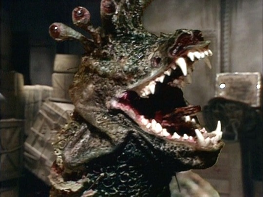
Here we have yet another Robert Holmes creation! (The other two being the Autons and the Rutans) While mostly just mindless monsters that can eat through anything, I’ve always loved these horrific beasts. With heads the size of a Volkswagen bug, and an appetite for anything in their way, these guys could really add in a danger element. I doubt they could really carry an episode by themselves, but they’d make a great threat! They may be alien snake monsters, but you may have a creeping familiarity when looking at them. This is because the puppets used were constructed around the skulls of real dogs! While I’m sure these pups died of natural causes, the information has always given them an air of creepiness and realism. As Third Doctor era baddies go, these toothy terrors were some of the more believable creatures yet! They wouldn’t need much of an update, looks wise. Part of me would still want them to be puppets. I’d imagine Thirteen’s compassion for misunderstood creatures would send her on a danger defying attempt to save their lives!
10. The Scorchies
First Appearance: "The Scorchies" (2013)
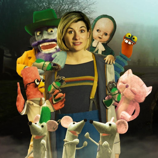
Ok, so this one is another cheat. Technically these aren’t "classic Who" villains. They come from the audios, but I’m counting them because they’re from a Third Doctor era storyline! If you count the mention of the Rutans in "The Time Warrior," this marks the fifth baddie from the Third Doctor era. What is it about that period that is so mineable? Originally a species with bodies, they lost their corporeal form when their planet was invaded and they were transported to safety via television broadcast waves! In their new puppet bodies, they go from planet to planet hypnotising their inhabitants and burning them! Why? Because they’re salty. So why them? Well, for starters, look at these guys! Jodie’s Doctor has always reminded me as a bit of mad kids’ show presenter, with her bright colours and friendly appearance. Seeing her with puppets almost feels natural. I love the idea so much that I photoshopped it! It would also make Doctor Who history. While the Eighth Doctor mentioned his audio companions in "The Night of the Doctor," no audio characters have ever made an appearance in the show (at least to my knowledge). Appearance wise, they’d be easy to create. If they wanted to go the extra mile, they could partner with the Jim Henson Creature Shop for an added distinction. I feel like no matter what you do, these little critters could draw a crowd. People would watch just to see if Doctor Who has lost its damn mind! If done right, it could be a fun romp! Who says Doctor Who villains always have to be serious?
Well, that’s it for my list! Did you agree? Do you think poor Natalie needs to get her head checked out? Feel free to reblog with your own additions! I’d love to read what you think! Expect the review of this weekend’s Doctor Who either Sunday or Monday. I’ve not yet re-watched Marco Polo, which I might actually do today, but it’s on my list to write it next week! It’s going to be the first reconstruction I’m doing, so it should be interesting! I’m not sure if I will supplement any of it with the Target novelisation, but I am thinking not. We’ll see! It’s still early into the series!
#doctor who#jodie whittaker#thirteenth doctor#chris chibnall#classic villians#autons#nestine consciousness#voord#zarbi#menoptera#the dominators#the rani#the mara#the scorchies#drashigs#rutans#rutan host#robert holmes#axons#the claws of axos#kinda#snakedance#the keys of marinus#spearhead from space#the web planet#the mark of the rani#carnival of monsters#the horror of fang rock#the time warrior#TARDIS
10 notes
·
View notes
Text
Making A Galaxy Far Far Away: An Aesthetic Photoset Tutorial
Requested by @geleixi (and varying amounts of time ago by @rockett-to-the-purple-moon, @thenameisgreed, @pizzaplanethq, and probably others who sent nice messages that I went “Oh, what a nice message this means so much I LOVE IT SO MUCH I’M TOO ANXIOUS TO ANSWER IT WRONG I’ll just do it later” and then promptly NEVER answered it.)
Brainstorming & Photo Collection
Picking a Color Palette
Choosing Images from Collection
Coloring
Textures & Effects
First off: I am not even going to remotely pretend like graphic design is a Thing I Am Better At Than Anyone Else, because that would be patently false and ridiculous, but I also get a fair number of Asks about making photosets/aesthetic posts, so here we are. I’m planning to do a separate one, maybe, for how I do the Cartoon Girls All Grown Up and Nancy Drew Dream Games series, because the “brainstorming and photo collection” part is so different that it inherently affects the rest of the process.
BUT I also feel like I don’t see a ton of tutorials that go through the brainstorming/finding images part of making aesthetics, and I tend to think of my Graphics Style(TM) as “DEEPLY Uninterested in washed-out faux sepiatone grimdark Tumblr Coloring?? + Not Good Enough At Masks To Do Negative Space Well,” which might be some people’s level of ~graphics design passion(TM)~ too, so. That’s the ride for which this ticket has been bought.

Brainstorming & Photo Collection
Obviously, the specifics of this are totally different for every aesthetic, but all of the GFFA/swworlds start from the same seed: Star Wars Aesthetic.
Star Wars itself has a very particular Lookque, imo: it’s not quite retrofuture, it’s not quite dirtpunk, it’s not quite scifi, even. There are the insanely sumptuous (and hella culturally appropriative) queens of Naboo and the ramshackle toppled AT-AT where Rey lives on Jakku and the not-even-subtle-at-all-jfc Nazi inspiration of the Empire and First Order and the straight-up millennial Tumblr witch Goffik look of the Dathomir Witches and Zabrak siths and the blue, blue water of Scarif. There “isn’t” a unifying aesthetic through Star Wars, and yet, as Gareth Edwards said, there’s a LOOK and FEEL to Star Wars: if you go a little too far to the left or right, it isn’t Star Wars anymore.*
*That said, this tutorial talks about Crait, which was invented by Rilo Jon, who went both too far left and too far right but mostly... too far-right. BA DUM BUM! Anyway.
So part of what makes Star Wars Look Like Star Wars, to me, is that it ISN’T ever Too Scifi. There’s a realism in all of Star Wars’ disparate planets -- their looks, anyway; like, talking about how Crait, in this case, makes NO ecological sense as a planet AT ALL is another post entirely. (IT MAKES NO SENSE.) It’s different from, like, Doctor Who, which I think revels in its “we can make these aliens and planets look like WHATEVER” more? Star Wars tends to be very like... “we want to use practical sets and effects.” Even for planets that only appear thus far in Clone Wars and Rebels? So it’s definitely part of the intention of SW’s Aesthetic.
ALL OF THAT TO SAY, my first step with each planet is to figure out the best way to represent it using as much real-world photography as I can and how best to channel the ~spirit of Star Wars~ in the graphic. Sometimes I fail miserably. CURSE YOU, NAR SHADAA. But most of the time it helps provide a Framework for the rest of the brainstorming and photo collection.
SO. FOR CRAIT. (For another example/totally different look and process, I wrote up a little about Haruun Kal on its post here.)
Crait has the definite benefit of appearing in one of the movies, so the first part of photo collection was to screencap TLJ. I took the caps using the 1080p digital release at a 20-frame frequency, so even once I deleted the aps that weren’t of Crait (moving the Canto Bight frames into a folder for Cantonica, of course!), I had like... 1500 images just from TLJ to start the brainstorming and collection with.
First, I trimmed down those ~1500 screencaps to 168 caps that were distinct enough from one another to give me a sense of “what happens” in the scene and, more than that, “What Crait Looks Like.” Then, because there’s additional canon material of Crait besides TLJ, I saved the unlettered images of “Star Wars: The Storms of Crait” from comic penciller Mike Mayhew’s blog @mikemayhew -- if those hadn’t been available, which they’re usually not for planets that appear in the comics (THANX MIKE MAYHEW!!!), I would have taken and cropped panels from the comic at both 100% and screen-fit/60% sizing that had utility for a graphic about planet scenery and not character.
THEN, I looked at Wookieepedia and MSW. Crait was based on the Salar de Uyuni salt flats in Bolivia, so I Google image-searched that. There weren’t actually very many images of the Salar de Uyuni salt flats that I super loved, so I ended up saving images of other salt flats as well, particularly the Bonneville Salt Flats in Utah.
THEN there was the issue of the red minerals, which were entirely fictional and not part of any real-world salt flat. BUT, there IS real red sand... so I saved some images of red-sand dunes (mostly Mui Ne in Vietnam). I also went through my Star Wars Stock Folder to find images of crystal caves and mines that I’d either saved for other planets in the past, but didn’t end up using, OR just saved because there are so fucking many crystal-based planets in SW.
Each of my big graphics series has its own Stock Folder for unorganized images that just strike the right Vibe~ and might be useful someday, in addition to every planet (or cartoon girl, or US state for the Nancy Drews, etc) having its own folder for specific/organized image collection.
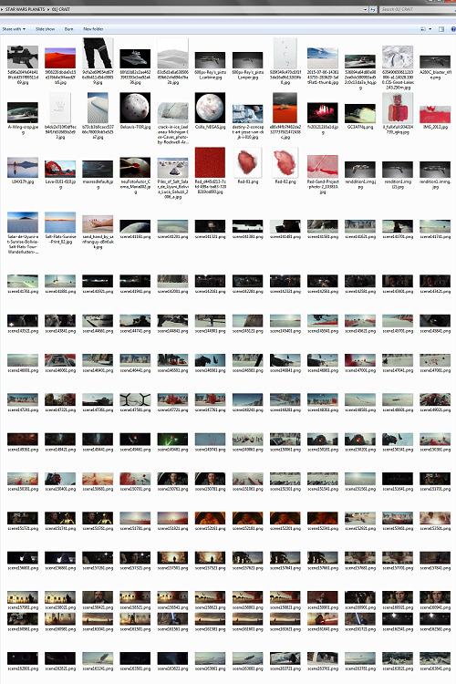
My Star Wars Stock Folder:
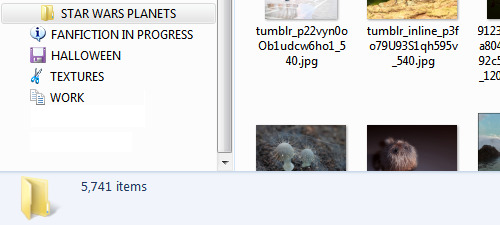
So there were already a lot of crystals, star destroyers, blasters, and bunkers that were actually in snow but whatever it was white and crystalline, to work with. I added some workable Crait-like images from the stock folder to Crait’s collection, too.
AND THEN, finally, I LOVE the vulptices, so I searched for (and found!) some of the concept art and 3D modeling images from ILM, and I put those in the folder, as well.
I also saved this, hoping I’d be able to make it work because it’s SO CUTE, but I couldn’t, but here LOOK HOW CUTE:
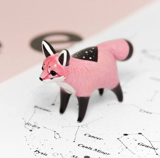
And then, lest I stay in the image-collection rabbithole forever, I said, “OK, that’s enough.” I ended up starting to actually MAKE the Crait graphic from a collection of 272 images:
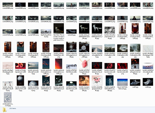
Picking a Color Palette
Obviously, the dominant colors of Crait are red and white, so the aesthetic had to be based in red and white. My first instinct was to make a duotone aesthetic using only red, white, and black/grayscale. Something like this:
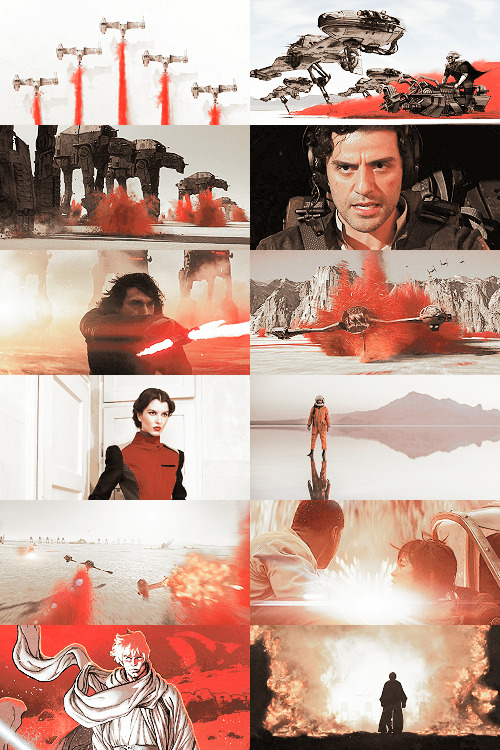
Which... I don’t hate, or even dislike. It’s definitely more in line with popular Tumblr aesthetic, uh, aesthetics. But I usually don’t like landing on that kind of coloring because it ALWAYS, ALWAYS whitewashes people of color (and jeez, it even whitewashes white people -- look at the model in the fourth frame down on the left, or Luke in the bottom-left.) The “vibrance -100 + Selective Color Red>Red + 100″ always ends up doing the above example to, in this case, Poe: turning him into a licorice man.
So then trying to correct THAT either whitewashes the FUCK out of him/people in general:
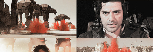
(Toning down the red)
Or introducing other colors back into the graphic as a whole:
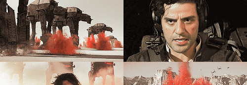
(Upped yellow and cyan.)
So I nixed that coloring before I even started. (These examples were made after the fact purely to serve as examples.)
I went back to the drawing board, AKA the Crait image folder.
But looking at the collected images -- especially the screencaps and the panels from the Storms of Crait comic -- I was struck by how much Crait also incorporates yellow and blue. (Note that I really, really wanted to try to include Trusk Berinato and Bail Organa... but we’ll talk through why that didn’t work out.) I LOVE @droo216‘s bright, almost jewel-tone edits which I 100% know I don’t have either the patience or skill to make, but I liked the idea of trying to make Crait’s aesthetics in a primary colors + black/white scheme.
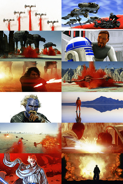
Which I actually really like! (Again, made post-facto as an example.) But again, red vibrance DiD tHe tHiNG!!! to Poe and ESPECIALLY to Finn and Bail.
So a high-vibrance look emphasizing bright colors was a no-go. Besides, going back to the source material: high-vibrance and high-energy are the opposite of what the planet of Crait is about. It’s a dying husk of a planet, being killed slowly by its own ecology as the salt in its crust dries out everything beneath it, sucking up water until everything either evolves into living crystal-dogs or goes extinct (thank u Rilo for not including dune-worms, this is the one thing you did right). Crait wouldn’t be vibrant.
But... aha! It’s also distinctly layered. I’ve done three-panel swworlds aesthetics before, so I decided to do that for Crait, too: first a mostly-white graphic like the salt crust, then white+red+yellows in the middle, and finally a dark layer of almost entirely red like the mineral mines.
Choosing Images from Collection
With the color palette and “feel” decided (dying at the surface, then growing richer and redder and angrier as the photoset moved downwards), I was able to choose images.
NEKKID PHOTOSETS SANS ANY EDITING! XXX! But for reference to see both cropping and for reference on choosing.
TOP IMAGE, MOSTLY WHITE:
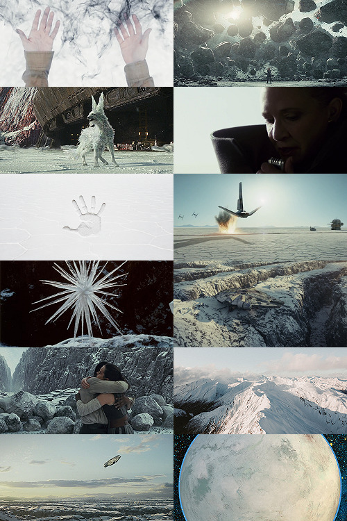
L-R, TOP-BOTTOM:
I saved this image from my dash at some point and have been tossing it into planets’ folders every time there’s a white-based color scheme. It almost got used for Ilum, but at the last second wasn’t. I felt like it fit the coalescence of Rey’s Force strength here, and also the kind of “last wisps” of Luke Skywalker, well.
“Lifting rocks.”
I’m actually still not 100% whether I should have landed on a vulptex here, but dammit they were one of the only good parts of TLJ. This vulpie baby is on the salt surface, looking out at the blinding sun, so she seemed like a good fit compared to the other caps of vulptices -- the ones loping on the canyon surface at the end were all very motion-blurry.
Carrie in that gorgeous coat in homage to Harrison in Blade Runner makes me weepy, and those were some of the most beautiful shots in the movie. This one had a good balance of white and black, so it could be placed around any level “busyness” in the surrounding photos. Especially since I suckkkk at negative space.
I saved this image to the Crait folder like the day it was announced as a planet in the upcoming Episode VIII and given its first peek. I love it!
Hi, salt flats, and also Star Wars spaceships. I actually had a lot of trouble with the level of green in this image, but the ~essence of Star Wars is PEW PEW SPACE BATTLE, so.
This is an ice sculpture in real life! It reminds me of the vulptices and is cool as hell.
The Millennium Falcon! I toyed with different caps that showed it in actual battle, but the blue would have been hardest to work with in this photoset compared to the others below. Plus, now I can save a bunch of Falcon-in-flight pictures for use on planets that only appear in the novels or comics.
NECESSARY, ICONIC, PERFECT, THE MOST IMPORTANT THING THAT HAPPENED ON CRAIT.
Fine, this is a snowy mountain and not a salt flat, but I liked the striations in color and gentle variations in grayscale.
This was the palest/least Bright Blue sky of all of the Falcon screencaps from Crait.
I tried a few screencaps of Crait from TLJ, but I landed on using the full-panel image of Crait from Storms of Crait. It has the cleanest definition of the “planet from space” options we have of Crait.
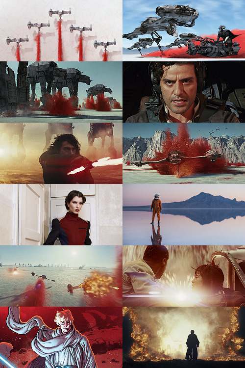
This is a promo image, not a screencap. It’s a much crisper view of the ski-speeders. I love the vivid color difference.
The blue-and-yellow additions to the color scheme didn’t work out, but I did still want to include Storms of Crait. This shot had a little more blue in it than I would have liked, but it has Leia in a ski-speeder back before the salt caused them to rust out, too!
Remember when it seemed like the Crait battle’s new AT-ATs would be super cool and like, do more than stand there menacingly behind Kyle? Me, too.
POE! DAMERON! HAS! NEVER! DONE! ANYTHING! WRONG! IN! HIS! LIFE!
KYLE! HAS! ONLY! EVER! DONE! WRONG! IN! HIS! LIFE!
I tried out like five different tiny-frame-difference screencaps of the ski-speeders kicking up red minerals, and I decided that this one, with a clearly defined spray of red surrounded by white and bluish sky, suited the placement here best: there’s red in the panel to its left as the main color, but minimal red in the above- and below panels.
I wanted to include actual Connix, but she’s wearing yellow and only ever shows up surrounded in brownish-black darkness, so here, have one of my standard Fashion Rebel Officer Stand-Ins instead -- the red and white obviously played a part in picking this shot over the rest of the options from the photoshoot.
I LOVE this slightly mystical shot of a Rebel pilot slash astronaut on a rain-slicked salt flat. How perfect?!
As we get down to the bottom of this middle panel, I wanted to include more destruction and more presence of yellow and orange. This image has a good balance of “negative space” in the sky and salt flat, and then the explosion of Nodin Chavri’s ski-speeder (I think?) ties in well to...
Finn and Rose, post-collision. I wanted to include Rose, and the almost JJ Abrams-esque white starburst in the center of this cap is a good balance to the spray of red around a ski-speeder two panels above.
Luke on Crait in the Rebel Alliance...
And Luke on Crait in the Resistance.
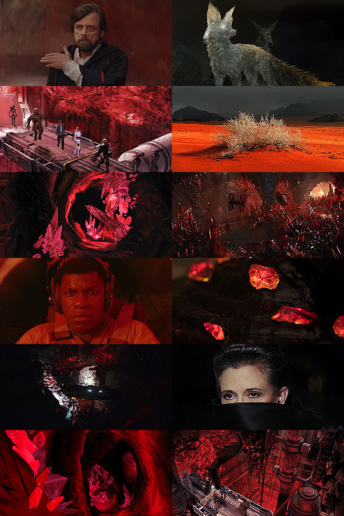
This was a kind of “????” moment of characterization -- and general direction -- in TLJ, but Luke surrounded by red as an old man would fall right below Luke as a young man, on his first mission after the Battle of Yavin, when the three graphics were aligned.
I wanted to use the straight-up concept art of the vulptex, but the black around it was TOO black, if that makes sense? So I layered it over a darkened cap of the vulptex who leads Poe to Rey and freedom. This is one of the very rare shots that I use an edited base image.
Han and Chewie! I had to include Han and Chewie. The unlettered panels from Storms of Crait that show the mineral mines are stunning; I highly recommend heading over to Mike Mayhew’s page and taking a look. The detailing of the crystals is something I wish I could have captured better at this scale.
This is one of the red-sand dunes I saved! Crait doesn’t have any living vegetation, but the drama of the black, stormy sky and the red sand drew me in here.
Some CGI crystal caves... I saved these ages ago for use on Ilum or Dantooine, I think? (Same with what will be #11 below.) I don’t love using CGI, but I think the crags on these crystal growths suited the images from canon!Crait.
A screencap of the TIEs chasing the Falcon through the mines. This was honestly one of the most visually stunning parts of TLJ, and it’s so split-second that most people missed it AND most of the screencaps have a lot of motion-blur. I’m really pleased that this one came out so crisp, and I knew I had to use it as an “anchor image.”
Finn, full-on, in red. I’m realizing belatedly as I write up this tutorial that I showed Poe face-on and Finn face-on, but I stupidly chose to show Rey only from a distance. I AM A FOOL! A FOOL!
Aren’t these resin crystals amazing? The full-size image actually shows them surrounded by snow, by the tree-stump they’re on wouldn’t fit Crait, so I cropped in closer on this image than I did for most of the Crait set.
Another shot of the Falcon in the mines. I like the way the framing of white sunlight here echoes...
Leia’s face, a bright spot in the dark, watching out over the salt flat. :(
(See #5 above!)
And again, the homage of Carrie’s coat looking like Harrison in Blade Runner made me sad, so I THREW IN ANOTHER HAN AND CHEWIE. The mining equipment here shows more detail than in the screencaps above, too.
Coloring
Like I mentioned waaaay above, in the intro: I never use set colorings for photosets. (Except Halloween Spookstravaganza, because jeez so many of those screencaps are like 240p VHS rips and it’s just not worth putting in Effort(TM).)
That said, I think one thing that I do differently than I see in most tutorials is this first step:
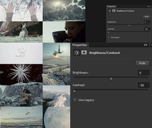
I ALWAYS start Aesthetic photosets by arranging the images and then *BRINGING THE CONTRAST ALL THE WAY DOWN.* This is especially helpful on photosets that include a mix of real photography, CGI screencaps or art, and/or comics panels, but it’s also just useful in general for photosets that use images from a wide variety of places.
The reason I do this is because it helps to “smooth out” the differences in light source, color balance, etc., that are part of the raw base images. For this set, it also helps to define the variations in color between very similar shades: the craters on Crait, the wisps of clouds, etc.
In some cases, I’ll do two layers of Contrast -50. For Crait, I did a later of Contrast -50 and then a layer of Contrast -15.
Then, I Select All > Copy Merged > [Turn Off Contrast Layer View] > Paste As New Layer.
Now, the “smoothed” version is placed as a layer above the raw layer. From there, it depends on the look of the photoset what I do -- sometimes, I leave it as-is, but I almost always lower the opacity on the “smoothed” layer until the level of contrast and balance looks consistent across the whole photoset. For Crait, I ended up with the “smoothed” layer set to Lighten 100%.
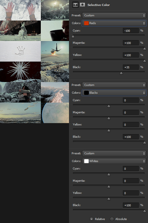
Selective Color time. There are two ways I usually start this: either one color at a time -- especially for Aesthetics like Pheryon that will essentially be monochromatic -- or, in this case, I looked at the balance of the three main colors that would carry through the entire Aesthetic.
REDS
Cyan -100 (This brightens the vivacity of the red.) Magenta +100 Yellow +100 Black +35
BLACKS
Cyan 0 Magenta 0 Yellow 0 Black +100
WHITES
Cyan 0 Magenta 0 Yellow 0 Black +100 -- This is NOT my usual setting for adjusting white, and since white is one of the main colors in the Crait Aesthetic, it might seem counterintuitive to make the white darker instead of brighter. However, this will help to make next step of color adjustments “take” on the white/whitish surfaces a lot more easily, and it will also help to balance out the bluish sky areas with the white background areas. (I’m not sure this explanation makes sense? But it’s what I did.)
Then, I Select All > Copy Merged > [Turn Off Selective Color Layer View] > Paste As New Layer > Either COLOR or HUE 100%.
“Hue” is more effective for smaller, more incremental color adjustments -- for BIG SWEEPING COLOR CHANGES, “Color” tends to work better. But it totally depends on the photoset! Try both, and see which you like better.
I feel like this is kind of the step where my process of making aesthetics stops being any different from most tutorials -- but this has been HUGELY helpful for me, a non-graphic designer-person, to be able to create a kind of “base image” that has very similar color values, brightness/contrast, and vibrance.
Sometimes this step helps to create really extreme color differences, such as in the Raydonia Aesthetic, and other times, I use it to just adjust one or two color-values so that there’s more consistency in, say, shades of yellow or shades of green, as in the Takodana Aesthetic, for which I just wanted to create a more cohesive palette of green in particular... it started out with a zillion greens, and I wanted to bring it all together into one “aesthetic.”
I think this step, and the reasoning behind it, are why SO MANY PSDs for aesthetics rely on a layer of either gray or sepiatone-ish set to Darken or Multiply as one of their key layers. But I’m just not about the grimdark life, and if I’m making an AESTHETIC OF A THING, I want the aesthetic POST to actually HAVE THAT THING’S AESTHETICS, you know?! I want to use the colors of the thing that I’m saying is meant to evoke the visuals of the thing!
Anyway. Now you have your BASE IMAGE. Often I’ll Merge All here, just for my own sanity.
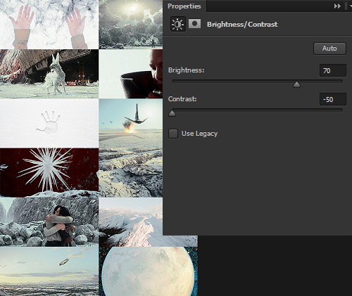
Then I go in and make any other other adjustments on a “coloring” level that I think will help with the “vibe” I’m going for! For this Crait set, I definitely needed to bring the brightness up so that the white and red popped. However, bringing up the brightness also swallowed a lot of the detail in the white surfaces -- especially the planetary surface of Crait in that bottom-right space -- so I decreased the contrast again.
Brightness +70 Contrast -50
And then I go in for the macro-level adjustments of color using any mix of Selective Color, Hue/Saturation, and Color Balance that works. For Crait, that was more Selective Color, because since I had decided on my color palette, and it sadly did not include blue, I needed to start by taking out as much of the blue, cyan, and green that I could.
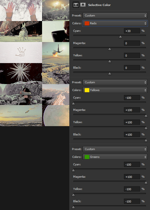
And I’m ngl, I told myself the WHOLE FREAKING TIME I was making this photoset that I needed NOT TO DELETE THE PSD RIGHT AWAY LIKE I USUALLY DO so that I could write up all the settings for this step.
But it was a reflex. And I deleted the PSD right away like I always do.
So suffice to say, I just futzed with the levels one at a time until the RED was brought up a little, the YELLOW was brought up a lot, and everything else was brought down and/or hue-adjusted to sliiiide into being yellow, red, or black/white.
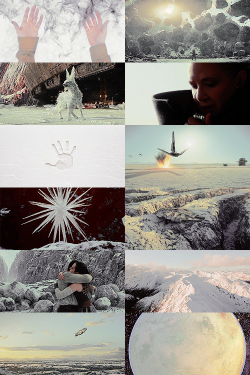
Another Select All > Copy Merged > [Turn Off Selective Color Layer View] > Paste As New Layer > Either COLOR or HUE 100%. I think I also DUPLICATED this layer and set it to SOFT LIGHT 50% and then duplicated it again to SCREEN 50%.

I could have left it like this, but I am me and I am nothing if not Extra All The Time, so I opened up my folder of light textures (and other textures) and decided to Go To Town.
Textures & Effects
For your Aesthetic-Making Purposes, here are the three I used on the Crait set:
The first two were set to Screen 100%, and the bottom one was set to Burn 15%. I layered them in this order.
It still looked incomplete, so I decided to use this POWDR Element from Creative Market, which is actually like 5400x5400 pixels and which I’m not going to share here because I paid for it and don’t want CM to revoke my access or whatever, but it looks like this, only HUGE:
I also set this element to Burn 15% and moved it around the image until it looked the way I wanted it.
Textures and effects aren’t In on Tumblr anymore, but I really like using them -- they add, not to be cheesier than usual, texture to an aesthetic post, and I think that they can also help less-skilled graphic-makers like me to hide any myriad of imperfections in coloring, sharpening, whatever. I’m an especially big fan of this noise element (set as a pattern on Screen), so I’m going to share it here even though I didn’t use it on the Crait set:

Most of my textures have been saved over the last literally twenty years since I started making fannish graphics and photosets, largely from defunct old LiveJournals, but there also used to some great sources for them on Tumblr and still are live sources for them on DeviantArt. Just search around and you’ll find what you want! :)

In conclusion, I think it’s infinitely more fun NOT to rely on premade PSDs or standardized Settings, but I also recognize and fully respect that if I made graphics differently, I would probably get easily 5-10x more notes on each post than I do. But I make graphics the way that’s fun for me, and I just try to learn a little something from every set I make. The GFFA Planets/swworlds in particular have been something that I started, originally, because I wanted to catch up and learn about Star Wars planets that I felt like I was missing because I don’t have any fannish history with the Old EU, and I wanted to learn about them in a way that helped me feel like I was engaging with the SW source material AND making the enormity of the canon more accessible to other newish or casualish fans, like I was two years ago when I started this aesthetic series. I like making aesthetics that are genuinely inspired by the aesthetic of the thing that I’m calling it an aesthetic of, so even when it ends up just looking like rainbow barf (CURSE YOU, NAR SHADDAA!!!) I’m having fun.
THAT SAID, here’s how the time breakdown for the Crait set works out:
TOTAL TIME INCLUDING IMAGE COLLECTION AND SCREENCAPPING: Est. 20 hours.
COLORING AND ACTUAL GRAPHIC-MAKING PART: 7 hours.
WRITING UP THIS TUTORIAL: 5 hours.
So, um, if you are so inclined, here is my Ko-Fi link. I post at least two graphic sets every week, sometimes up to 25 (usually during October).
I hope this was helpful at all! I had a good time thinking about my process in-depth like this, and I would love to get tagged in any aesthetics you might try making using a similar method! :)
59 notes
·
View notes
Text
Immortals: Fenyx Rising Review
https://ift.tt/39stySp
A few weeks ago, I demoed Immortals: Fenyx Rising and liked what I saw: a new IP from Ubisoft with colorful visuals, an expansive open world steeped in Greek mythology, and a comedic story that presents the Olympian gods in a new way. Sadly, the game’s strengths quickly waned, and its plethora of weaknesses began to wear on me over the 25 hours I played Immortals for this review. While I have no intention of picking up this game again, that’s not to say I didn’t have fun with it at times.
The adventure is set in the Golden Isle, where Fenyx, a shipwrecked warrior (male or female), discovers that every mortal but them has been turned to stone by a monstrosity named Typhon, who was once banished by the gods but has returned for revenge and seemingly wiped them from existence. Only Zeus and his disgraced cousin Prometheus remain, and to his dismay, Zeus must listen to Prometheus as he narrates Fenyx’s journey to restore the gods’ power.
The game’s story and dialogue are amusing at first. The banter between Zeus and Prometheus is fun, and Fenyx’s interactions with the handful of characters she encounters are written well enough. But there’s an underlying issue with the material that becomes increasingly evident as the story unfolds. While the writing can be funny, the story aims for comedy way too often, which is to say none of the story beats feel sincere because the humor is so incessant. And because the humor is so incessant, the dialogue stops being funny rather quickly. Every character is made to look like an idiot in one way or another, which undermines any drama or stakes the story tries to introduce. I appreciate the Saturday morning cartoon vibe, but I would have liked to see a little more depth.
Another issue with the storytelling is the fact that there are, as previously mentioned, only a handful of NPCs to talk to. This makes the game world feel empty, lifeless, and lonesome, despite its beauty. All of the island’s denizens have been turned to stone, of course, but I would have still have preferred for the game world to be populated with more characters to talk to, especially since the game is so dialogue-driven. In open worlds I love, I find myself exploring just to explore because I simply enjoy being there. But in Immortals, I never took the long way to objectives—I fast-traveled like crazy because after the island’s beauty faded there wasn’t much left to draw me into the world.
The lack of NPCs is a shame because the island is so spacious and scenic. As you explore its six zones (each dedicated to one of the Olympian gods), its vastness is immediately striking, largely due to the near-limitless draw distance. You can see for miles and miles around when you climb one of the gigantic statues of the gods, and the game’s visuals pop with color. At times, the environments can lack a little visual depth due to the passable lighting system and the cartoony aesthetic, but overall I found the environmental design to be appealing.
As with every other aspect of this game, the more time you spend with the visuals, the more blemishes become apparent. The character models look okay at a glance, but the facial animations are woefully wooden and inexpressive to the point where they undermine the dialogue and look borderline silly. This comes as a surprise since artists typically choose a cartoon-like aesthetic to allow their characters to be MORE expressive. Sadly, Immortals’s characters look like they’re two console generations old.
Release Date: Dec. 3, 2020 Platforms: PC (reviewed), PS5, XSX/S, PS4, XBO, Switch, Stadia, Luna Developer: Ubisoft Publisher: Ubisoft Genre: Action-adventure
Immortals’s gameplay is—surprise—a mixed bag. There are several ways to traverse the island. You can climb almost any surface (limited by a stamina bar), tame a mount, or glide around with Daedalus’s wings, which you acquire early on. These all work well enough, though the gliding mechanic can be finicky. There’s no way to move backwards, which can become incredibly frustrating during the game’s many air navigation puzzles.
Speaking of puzzles, let’s talk about the Vaults of Tartaros, which are scattered across the game world in great number. These challenge areas can be combat-based, navigation-based, or puzzle-based, and the latter two are just awful to play. I can’t tell you how much I loathed spending time in these vaults, and there are so many reasons why that I don’t care to list them all for fear of popping a vein in my forehead.
But here are a few. Worst of all is the look of the vaults. They all look the same: stone structures suspended in a generic-looking cosmic backdrop. Everything is blueish or purplish, which makes clues almost impossible to see at times due to the lack of visual contrast. And everything is square—virtually every component of the structures in Tartarus is a cube or a square, which becomes mind-numbing and frankly infuriating.
And then there are the puzzles themselves, which are inelegant and uninspired. You’re pushing blocks, pulling blocks, breaking blocks, shooting targets, rolling spheres. The puzzles are mostly physics-based, and they almost always feel janky in some way. Without going into detail, I’ll just say that 90% of the time, when I solved a puzzle, I was unsure whether the solution I arrived at was the intended result or if I’d randomly stumbled upon a wonky way to cheat my way through. And on too many occasions I had no clue where I was supposed to go next during a puzzle. I’d hit a switch and I’d hear a sound, but the camera never moves to show you what the switch actually activated.
In games with good puzzles, you’re stumped for awhile but you’re compelled to solve them because they’re visually attractive, or the puzzle is designed in a way that captures your imagination and pulls you through to the end. Immortals’s puzzles feel like putting together a jigsaw whose pieces don’t quite fit flush, or a jigsaw that comes with extra pieces just to troll you. Really messy stuff.
Read more
Games
Watch Dogs: Legion Review
By Chris Freiberg
Games
Assassin’s Creed Valhalla Review
By Bernard Boo
Thankfully, the most prominently featured aspect of gameplay is pretty great. The game’s combat reminds me of Darksiders, which I consider a huge compliment. You use quick sword attacks to chip away at enemies’ health, sweeping axe attacks to rack up stagger points, and bow attacks for ranged damage. The action feels quick, responsive, and dynamic most of the time.
There are mythical boss fights to be found all over the island as well, and these legendary encounters were enjoyable not just to play but to find. I loved spotting a hulking cyclops in the distance and making my way over to them, readying my inventory for the epic battle at hand. The combat is a huge plus for a game that suffers in most other areas.
cnx.cmd.push(function() { cnx({ playerId: "106e33c0-3911-473c-b599-b1426db57530", }).render("0270c398a82f44f49c23c16122516796"); });
You have myriad god abilities at your disposal to help you in battle, like a massive hammer swing that breaks through shields; Apollo’s arrows, whose trajectory you can guide manually; and Phosphor, a bird ally who can attack baddies alongside you. Potions play a major role as well: You’ve got health and stamina potions, and attack and defense potions that increase your stats. All of these tools and skills can be upgraded via the game’s central hub, the Hall of the Gods, where you can spend various currencies and improve your Fenyx as well as complete rotating tasks for Hermes (essentially the same as the Vault challenges).
Unfortunately, for every one thing Immortals does right, it does five things wrong. The various armors that you collect are all pretty cool looking and come with unique stat buffs, but unlocking them often requires you to solve tedious puzzles, which again, are no fun for a litany of reasons. I really wanted to like this game—it reminded me of ’90s games like ActRaiser with its art style and arcade-y action. But over time I was bludgeoned by the game’s shortcomings and came away seriously disappointed.
The post Immortals: Fenyx Rising Review appeared first on Den of Geek.
from Den of Geek https://ift.tt/3fSI7zP
0 notes
Text
Commentary - Why is Spongebob Squarepants currently TERRIBLE
youtube
What the hell happened, man? I remember when old and young ones said you were undeniably the best cartoon ever, I remember when they said that you were an improved version of Rocko and Ren & Stimpy.
They used to put you next to icons like Spiderman or Superman, now you’re not what you used to be. What happened? I understand that when a new concept lengthens so much, it stops being what it used to be. But that’s not the problem, Spongebob not only is not what it used to be, it’s just terrible. First the biggest and the most obvious problem is:
Flanderization: What is Flanderization? It is the most desperate resource of every mediocre writter. When a series has been aired for years, and now they’re out of ideas, the medicore writter resorts to turning the characters personalities up to eleven.
I’ll give you an example of what Flanderization is. Picture that I created a character, Totu. Totu is a soccer fan, he practices an hour everyday and values his friends and family. When the show has been airing for 6 years, the original writter leaves and now the medicore writter makes Totu to have soccer as his main trait to the degree of playing soccer naked on his backyard, at dawn, eventhough it’s snowing; sending his friends and family to hell. If they interrupt his soccer practice he’ll probably beat them up, and it’s insinuated that he probably has had sex with his ball and you get the idea.
What it used to be a relative nice and relatable character, now it’s a one-dimensional character, whose representative feauture is Soccer and his hobby is so over the top that it turned out nasty and obnoxious.
Another example of Flanderization is that a character whose favorite food is pie. As the show keeps going, he becomes a pie obsessive. Everytime he appears, he has to do something pie-related. He goes to pie convensions, he wears clothes with pie pictures on them, and he only talks about pie.
To this point is clear what Flanderization is about, and how you noticed, a lot of sitcom series suffer from it. I guess many of you see how this fits perfectly with New Spongebob.
Spongebob, who was a naive, but smart kid, now he’s idiotic as Patrick. Being an idiot never was his trait, he was just naive. He was devoted to his work, because he was a dedicated and industrious person. Now there’s an episode where he falls in love with a fucking hamburger.
UGH.
He bothered cranky Squidward because of his naiveness and for the most part because he was asking for it before, now it looks like he’s in love with Squidward, he spies on him and even breathes heavily in front of him.
In another episode, Spongebob buys a new pet as company for Gary, that pet transforms into a monster and is about to eat Gary, when Spogebob arrives he nags Gary because he thinks Gary is bothering the other pet.
Spongebob wasn’t that stupid in the past, he was able to recognize danger and he even risked himself to save his friends. This is not funny, it doesn’t fit with the show’s humor. It’s sadistic and maddening to the point of satiation.
What’s with the emphasis in making the characters to act like sadistic assholes? What’s the point of it? Patrick also has his problems, he was an idiot before, he didn’t truly affect anyone. He said dumb things and did harmeless idiocy.
Now Patrick is a danger, he’s no longer an idiot, he’s an asshole.
In this scene Patrick is “helping” Spongebob pouring glue so he can be stuck forever. NO really, he’s actually “helping him”
Everything he does ends up in Spongebob or Squidward getting hurt.
“Hahahaha! How funny, his best friend did this to him” – Current writers.
Making emphasis on how doesn’t Patrick realize on the physical or moral harm he’s doing.
I’m not surprised that the Internet hates him so MUCH right now.
Or even worse, making emphasis on how he doesn’t give a fuck about all of these. New Patrick’s levels of assholeness are so high that many episodes can be considered he’s got a villain status since his only function is to torture the characters. And of course, getting away with it.
It’s not like the good old days where karma existed on the series and whose do bad deeds ended up paying the price. Now the point is that the assholes get away and the innocents end up paying the price.
Sandy of course, her only trait is science. Plankton to this point is now a buffoon that makes Mr. Krabs to look like the real villain of the show. Mr. Krabs’ exaggeration for money is so ridiculous that he chooses a few coins instead of his friends or even his own daughter. It’s not like in the past when he cared for spending time with his daughter, helping her on her prom or spending money for Mrs. Puff or worrying about Spongebob’s health.
No, now Mr. Krabs doesn’t give two shits about them and his fatherhood has been exterminated. Now money is more like a sick paraphillia for him. Squidward, well, he was an embittered individual, now he’s sank on depression and every one of his scenes are amazingly painfull to watch.
Yes, it’s not fake. They’re truly suggesting suicide in “Spongebob Squarepants”
Flanderization is undoubtedly one of the most distinctive problems with new “Spongebob Squarepants” but there are also other problems.
Bad Direction: Spongebob Squarepants’ soundtrack is one of the catchiest of any cartoon, however the direction nowadays are wasting its long music repertory to repeat them over and over again. It’s like they lost the rights of the music and they can only use four tracks instead.
What the flying fuck is that?
The habitants design are getting more stilted and humanoid
some of them don’t look like fishes anymore.
And in general, it feels like the show is not going underwater anymore. The references to maritime stuff are gone and instead of putting coral as trees, now they’re putting normal trees. Its sea vibe is absent.
On the other hand, the animation which is not bad, is no longer expresive or visually fun as it used to. They forgot the visual gags, and have replaced them with grotesque imagery and moments. The reason why Hillenburg wanted a storyboard and script based show, is because he wanted the visual jokes to well represented.
And the 3rd problem with this dog’s breakfast is:
Jokes are slow or they’re not even there: There are new episodes where comedy is non-existant and no joke is happening. Other episodes take their comedy on making Spongebob cry or making other characters scream. It’s not enough to say that it is not funny at all and gets so irritating, meanwhile the old Spongebob, you had joke after joke, with well-made dialogues and visual gags; here jokes take an eternity or basically they’re not present.
I won’t deny that the in the old Spongebob had kinda slow jokes too, but there weren’t moments were Spongebob started to count or cry for TWO whole minutes.
We also have to point out that the majority of its comedy is based on cruelty, grotesque and disgusting stuff, the old Spongebob had grotesque stuff too, but it wasn’t the focus point of every joke.
ALWAYS, but ALWAYS, the SAME THING: There are only three types of episodes in this shit:
One where the focus is to torture a character, (especially, Squidward) and making emphasys on their pain.2) An episode with a grotesque premise. For example: Spongebob getting pus out of his zits.3) Plankton stealing the Krabby Patty formula.
An episode with a grotesque premise. For example: Spongebob getting pus out of his zits.
Plankton stealing the Krabby Patty formula.
Writers seem not interested to try something different. I kid you not that I can’t count the bazillion times that an episode ended in Squidward or Mrs. Puff getting arrested. It’s like the writers can’t think of a different wrap-up.“Oh, we tortured Squidward already, what else can we do? Oh, I know, arrest him for some stupid reason, that can be funny”To this point I’m 100% sure that these writers are apathetic of their job and they hate what they’re doing. And finally the last point and the one I hate the most:
The show reduced itself to be the most mean-spirited, unfair, crudest, cruelest, and darkest as it can be (Dark humour done wrong): Also translated to a Ren & Stimpy wannabe. Everybody in this show is trying to make miserable to each other. Everybody hate their lives, everybody are fucked up on the head,
And the biggest focus in the series is to make you uncomfortable with all the shit the characters has to put up with, now is seeing Patrick hurting Spongebob, seeing Squidward going through physical pain and punnishing the innocent. It’s like the show is trying to be a Ren & Stimpy wannabe.
In Ren & Stimpy, the tortures had to do with situation, here happen just because. Out of nowhere. Without a funny context in the situation. It’s just a show made for making the characters suffer most of the time. I know that Squidward suffered in the old episodes, but mostly was because he was asking for it.
He (Squidward) also had his glory moments like in “Band Geeks”. Now Squidward can’t sit down to relax because Spongebob and Patrick come to burn his eyes out, rip peaces of skin off, and of course ending up getting arrested or homeless.
I really don’t have nothing against sadistic humour, I think it’s funny in many series, but Spongebob Squarepants, whose humour wasn’t focused in that, and it had touching moments, it really feels forced and shocking.
The specific moment when the show started its decline was when “Good Neighbors” premiered. Like I said all the characters in the past had their well-deserved reward and well-deserved punnishment according the karma.
Now in the new episodes, Mrs. Puff and Squidward were in so many death-risk moments that they want to KILL Spongebob. It gets far from funny and it gets uncomfortable, disturbing and ruins the touching moments of the show.
“This is not funny, it’s INSANITY, it’s DISTURBING, seriously, this is not “Drawn Together” or “Family Guy”. This was supposed to be aimed to 8-Years old”
Meanwhile, in another dimmension
Like Mrs. Puff worrying for making Spongebob pass, Squidward felt sorry for making Spongebob cry or even Squidward cryied for Spongebob because he thought he was dead. And even when Squidward gave away his belonging on Christmas to make Spongebob happy
(Go to 9:37) Have in mind that it was SQUIDWARD who said THAT, which makes this triple as touching.
What happened to you, man? I used to be your fan, at the end there’s nothing else to see, another screw-up from Nickelodeon, and another show that doesn’t deserve new episodes, if the 2nd movie is either going to be good or bad, I really don’t know what to think, I hope I do, and it may be the finale, nevertheless, the damage is already done.
(Go to 9:59 of the video)
5 notes
·
View notes