#*swworlds
Explore tagged Tumblr posts
Photo


A Galaxy Far, Far Away → [89/∞] Crait
An Outer Rim planet hidden by its sheer distance from any common hyperlanes, Crait once boasted varied flora, fauna, and a thriving mining community -- but the minerals that made up Crait’s crust salinized and began to desiccate the planet from the inside out. Despite this, Bail Organa and the a fledgling group of rebels had a temporary base and armament on Crait in 3 BBY. By the time of the Rebel Alliance, all that remained were marooned miners’ bones, carnivorous dune-worms, and vulptices; in c.1 ABY, Leia Organa, Han Solo, Chewbacca, Luke Skywalker, and Wedge Antilles led an exploratory mission under the name SCAR Squadron on Crait and were ambushed by stormtroopers.
Thirty-three years later, the last survivors of the Resistance barricaded themselves in the old Rebel hideout and escaped total annihilation by the First Order by following the vulptices to the surface.
Luke Skywalker’s final battle was fought in absentia on Crait.
Vote for the next planet!
316 notes
·
View notes
Photo

[•2°∅] Well, the dust still hasn't settled and the community is still losing their collective minds over #XWing2! Good luck to everyone at #xwingworlds2018 Here's hoping for an Imperial comeback ;) Anything particular you haven't seen yet that you want? . . . . . . . #xwing #xwingminiatures #fantasyflightgames #ffg #boardgames #bgg #boardgamegeek #tabletop #miniature #worlds2018 #ffgop #starwars #xwingminis #swworlds
#ffgop#bgg#xwing2#tabletop#xwingminis#boardgames#boardgamegeek#xwingminiatures#ffg#fantasyflightgames#worlds2018#swworlds#starwars#miniature#xwing#xwingworlds2018
0 notes
Photo


A Galaxy Far, Far Away → [86/∞] Thabeska
An Outer Rim planet where outsiders were easily identified by the lack of dust on their clothing, Thabeska fell early to the Empire and – at least outwardly – peacefully deferred their rule to the Moffs and stormtroopers. However, surviving Force sensitive Ahsoka Tano took refuge on Thabeska early after Order 66, living in a secret room in the home of the Fardi smuggling clan. One of the many Fardi daughters was toddler Hedala, whom Tano recognized as Force sensitive.
Vote for the next planet!
441 notes
·
View notes
Text
Making A Galaxy Far Far Away: An Aesthetic Photoset Tutorial
Requested by @geleixi (and varying amounts of time ago by @rockett-to-the-purple-moon, @thenameisgreed, @pizzaplanethq, and probably others who sent nice messages that I went “Oh, what a nice message this means so much I LOVE IT SO MUCH I’M TOO ANXIOUS TO ANSWER IT WRONG I’ll just do it later” and then promptly NEVER answered it.)
Brainstorming & Photo Collection
Picking a Color Palette
Choosing Images from Collection
Coloring
Textures & Effects
First off: I am not even going to remotely pretend like graphic design is a Thing I Am Better At Than Anyone Else, because that would be patently false and ridiculous, but I also get a fair number of Asks about making photosets/aesthetic posts, so here we are. I’m planning to do a separate one, maybe, for how I do the Cartoon Girls All Grown Up and Nancy Drew Dream Games series, because the “brainstorming and photo collection” part is so different that it inherently affects the rest of the process.
BUT I also feel like I don’t see a ton of tutorials that go through the brainstorming/finding images part of making aesthetics, and I tend to think of my Graphics Style(TM) as “DEEPLY Uninterested in washed-out faux sepiatone grimdark Tumblr Coloring?? + Not Good Enough At Masks To Do Negative Space Well,” which might be some people’s level of ~graphics design passion(TM)~ too, so. That’s the ride for which this ticket has been bought.

Brainstorming & Photo Collection
Obviously, the specifics of this are totally different for every aesthetic, but all of the GFFA/swworlds start from the same seed: Star Wars Aesthetic.
Star Wars itself has a very particular Lookque, imo: it’s not quite retrofuture, it’s not quite dirtpunk, it’s not quite scifi, even. There are the insanely sumptuous (and hella culturally appropriative) queens of Naboo and the ramshackle toppled AT-AT where Rey lives on Jakku and the not-even-subtle-at-all-jfc Nazi inspiration of the Empire and First Order and the straight-up millennial Tumblr witch Goffik look of the Dathomir Witches and Zabrak siths and the blue, blue water of Scarif. There “isn’t” a unifying aesthetic through Star Wars, and yet, as Gareth Edwards said, there’s a LOOK and FEEL to Star Wars: if you go a little too far to the left or right, it isn’t Star Wars anymore.*
*That said, this tutorial talks about Crait, which was invented by Rilo Jon, who went both too far left and too far right but mostly... too far-right. BA DUM BUM! Anyway.
So part of what makes Star Wars Look Like Star Wars, to me, is that it ISN’T ever Too Scifi. There’s a realism in all of Star Wars’ disparate planets -- their looks, anyway; like, talking about how Crait, in this case, makes NO ecological sense as a planet AT ALL is another post entirely. (IT MAKES NO SENSE.) It’s different from, like, Doctor Who, which I think revels in its “we can make these aliens and planets look like WHATEVER” more? Star Wars tends to be very like... “we want to use practical sets and effects.” Even for planets that only appear thus far in Clone Wars and Rebels? So it’s definitely part of the intention of SW’s Aesthetic.
ALL OF THAT TO SAY, my first step with each planet is to figure out the best way to represent it using as much real-world photography as I can and how best to channel the ~spirit of Star Wars~ in the graphic. Sometimes I fail miserably. CURSE YOU, NAR SHADAA. But most of the time it helps provide a Framework for the rest of the brainstorming and photo collection.
SO. FOR CRAIT. (For another example/totally different look and process, I wrote up a little about Haruun Kal on its post here.)
Crait has the definite benefit of appearing in one of the movies, so the first part of photo collection was to screencap TLJ. I took the caps using the 1080p digital release at a 20-frame frequency, so even once I deleted the aps that weren’t of Crait (moving the Canto Bight frames into a folder for Cantonica, of course!), I had like... 1500 images just from TLJ to start the brainstorming and collection with.
First, I trimmed down those ~1500 screencaps to 168 caps that were distinct enough from one another to give me a sense of “what happens” in the scene and, more than that, “What Crait Looks Like.” Then, because there’s additional canon material of Crait besides TLJ, I saved the unlettered images of “Star Wars: The Storms of Crait” from comic penciller Mike Mayhew’s blog @mikemayhew -- if those hadn’t been available, which they’re usually not for planets that appear in the comics (THANX MIKE MAYHEW!!!), I would have taken and cropped panels from the comic at both 100% and screen-fit/60% sizing that had utility for a graphic about planet scenery and not character.
THEN, I looked at Wookieepedia and MSW. Crait was based on the Salar de Uyuni salt flats in Bolivia, so I Google image-searched that. There weren’t actually very many images of the Salar de Uyuni salt flats that I super loved, so I ended up saving images of other salt flats as well, particularly the Bonneville Salt Flats in Utah.
THEN there was the issue of the red minerals, which were entirely fictional and not part of any real-world salt flat. BUT, there IS real red sand... so I saved some images of red-sand dunes (mostly Mui Ne in Vietnam). I also went through my Star Wars Stock Folder to find images of crystal caves and mines that I’d either saved for other planets in the past, but didn’t end up using, OR just saved because there are so fucking many crystal-based planets in SW.
Each of my big graphics series has its own Stock Folder for unorganized images that just strike the right Vibe~ and might be useful someday, in addition to every planet (or cartoon girl, or US state for the Nancy Drews, etc) having its own folder for specific/organized image collection.
My Star Wars Stock Folder:
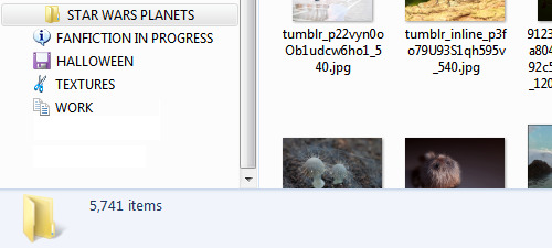
So there were already a lot of crystals, star destroyers, blasters, and bunkers that were actually in snow but whatever it was white and crystalline, to work with. I added some workable Crait-like images from the stock folder to Crait’s collection, too.
AND THEN, finally, I LOVE the vulptices, so I searched for (and found!) some of the concept art and 3D modeling images from ILM, and I put those in the folder, as well.
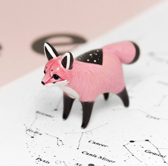
I also saved this, hoping I’d be able to make it work because it’s SO CUTE, but I couldn’t, but here LOOK HOW CUTE:
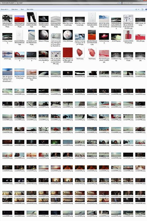
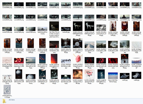
And then, lest I stay in the image-collection rabbithole forever, I said, “OK, that’s enough.” I ended up starting to actually MAKE the Crait graphic from a collection of 272 images:
Picking a Color Palette
Obviously, the dominant colors of Crait are red and white, so the aesthetic had to be based in red and white. My first instinct was to make a duotone aesthetic using only red, white, and black/grayscale. Something like this:
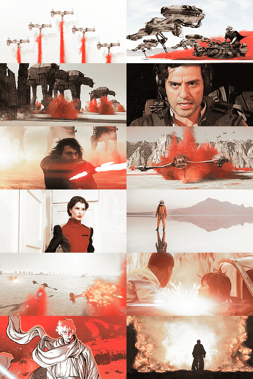
Which... I don’t hate, or even dislike. It’s definitely more in line with popular Tumblr aesthetic, uh, aesthetics. But I usually don’t like landing on that kind of coloring because it ALWAYS, ALWAYS whitewashes people of color (and jeez, it even whitewashes white people -- look at the model in the fourth frame down on the left, or Luke in the bottom-left.) The “vibrance -100 + Selective Color Red>Red + 100″ always ends up doing the above example to, in this case, Poe: turning him into a licorice man.
So then trying to correct THAT either whitewashes the FUCK out of him/people in general:
(Toning down the red)
Or introducing other colors back into the graphic as a whole:
(Upped yellow and cyan.)
So I nixed that coloring before I even started. (These examples were made after the fact purely to serve as examples.)
I went back to the drawing board, AKA the Crait image folder.
But looking at the collected images -- especially the screencaps and the panels from the Storms of Crait comic -- I was struck by how much Crait also incorporates yellow and blue. (Note that I really, really wanted to try to include Trusk Berinato and Bail Organa... but we’ll talk through why that didn’t work out.) I LOVE @droo216‘s bright, almost jewel-tone edits which I 100% know I don’t have either the patience or skill to make, but I liked the idea of trying to make Crait’s aesthetics in a primary colors + black/white scheme.
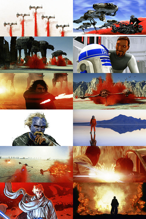
Which I actually really like! (Again, made post-facto as an example.) But again, red vibrance DiD tHe tHiNG!!! to Poe and ESPECIALLY to Finn and Bail.

So a high-vibrance look emphasizing bright colors was a no-go. Besides, going back to the source material: high-vibrance and high-energy are the opposite of what the planet of Crait is about. It’s a dying husk of a planet, being killed slowly by its own ecology as the salt in its crust dries out everything beneath it, sucking up water until everything either evolves into living crystal-dogs or goes extinct (thank u Rilo for not including dune-worms, this is the one thing you did right). Crait wouldn’t be vibrant.
But... aha! It’s also distinctly layered. I’ve done three-panel swworlds aesthetics before, so I decided to do that for Crait, too: first a mostly-white graphic like the salt crust, then white+red+yellows in the middle, and finally a dark layer of almost entirely red like the mineral mines.
Choosing Images from Collection
With the color palette and “feel” decided (dying at the surface, then growing richer and redder and angrier as the photoset moved downwards), I was able to choose images.
NEKKID PHOTOSETS SANS ANY EDITING! XXX! But for reference to see both cropping and for reference on choosing.
TOP IMAGE, MOSTLY WHITE:
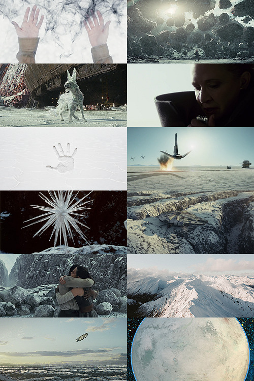
L-R, TOP-BOTTOM:
I saved this image from my dash at some point and have been tossing it into planets’ folders every time there’s a white-based color scheme. It almost got used for Ilum, but at the last second wasn’t. I felt like it fit the coalescence of Rey’s Force strength here, and also the kind of “last wisps” of Luke Skywalker, well.
“Lifting rocks.”
I’m actually still not 100% whether I should have landed on a vulptex here, but dammit they were one of the only good parts of TLJ. This vulpie baby is on the salt surface, looking out at the blinding sun, so she seemed like a good fit compared to the other caps of vulptices -- the ones loping on the canyon surface at the end were all very motion-blurry.
Carrie in that gorgeous coat in homage to Harrison in Blade Runner makes me weepy, and those were some of the most beautiful shots in the movie. This one had a good balance of white and black, so it could be placed around any level “busyness” in the surrounding photos. Especially since I suckkkk at negative space.
I saved this image to the Crait folder like the day it was announced as a planet in the upcoming Episode VIII and given its first peek. I love it!
Hi, salt flats, and also Star Wars spaceships. I actually had a lot of trouble with the level of green in this image, but the ~essence of Star Wars is PEW PEW SPACE BATTLE, so.
This is an ice sculpture in real life! It reminds me of the vulptices and is cool as hell.
The Millennium Falcon! I toyed with different caps that showed it in actual battle, but the blue would have been hardest to work with in this photoset compared to the others below. Plus, now I can save a bunch of Falcon-in-flight pictures for use on planets that only appear in the novels or comics.
NECESSARY, ICONIC, PERFECT, THE MOST IMPORTANT THING THAT HAPPENED ON CRAIT.
Fine, this is a snowy mountain and not a salt flat, but I liked the striations in color and gentle variations in grayscale.
This was the palest/least Bright Blue sky of all of the Falcon screencaps from Crait.
I tried a few screencaps of Crait from TLJ, but I landed on using the full-panel image of Crait from Storms of Crait. It has the cleanest definition of the “planet from space” options we have of Crait.
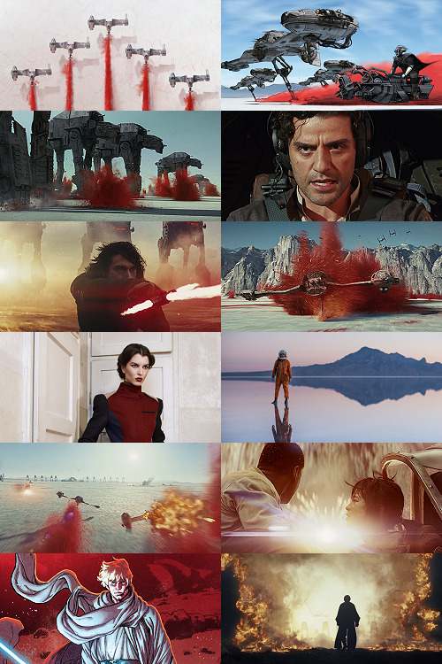
This is a promo image, not a screencap. It’s a much crisper view of the ski-speeders. I love the vivid color difference.
The blue-and-yellow additions to the color scheme didn’t work out, but I did still want to include Storms of Crait. This shot had a little more blue in it than I would have liked, but it has Leia in a ski-speeder back before the salt caused them to rust out, too!
Remember when it seemed like the Crait battle’s new AT-ATs would be super cool and like, do more than stand there menacingly behind Kyle? Me, too.
POE! DAMERON! HAS! NEVER! DONE! ANYTHING! WRONG! IN! HIS! LIFE!
KYLE! HAS! ONLY! EVER! DONE! WRONG! IN! HIS! LIFE!
I tried out like five different tiny-frame-difference screencaps of the ski-speeders kicking up red minerals, and I decided that this one, with a clearly defined spray of red surrounded by white and bluish sky, suited the placement here best: there’s red in the panel to its left as the main color, but minimal red in the above- and below panels.
I wanted to include actual Connix, but she’s wearing yellow and only ever shows up surrounded in brownish-black darkness, so here, have one of my standard Fashion Rebel Officer Stand-Ins instead -- the red and white obviously played a part in picking this shot over the rest of the options from the photoshoot.
I LOVE this slightly mystical shot of a Rebel pilot slash astronaut on a rain-slicked salt flat. How perfect?!
As we get down to the bottom of this middle panel, I wanted to include more destruction and more presence of yellow and orange. This image has a good balance of “negative space” in the sky and salt flat, and then the explosion of Nodin Chavri’s ski-speeder (I think?) ties in well to...
Finn and Rose, post-collision. I wanted to include Rose, and the almost JJ Abrams-esque white starburst in the center of this cap is a good balance to the spray of red around a ski-speeder two panels above.
Luke on Crait in the Rebel Alliance...
And Luke on Crait in the Resistance.
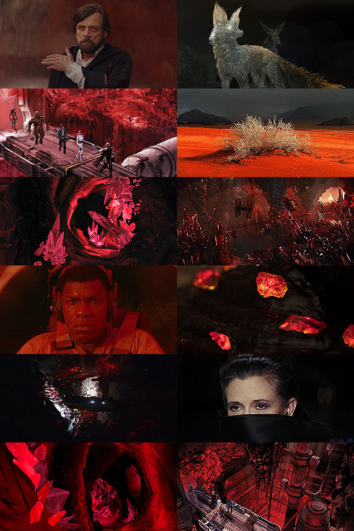
This was a kind of “????” moment of characterization -- and general direction -- in TLJ, but Luke surrounded by red as an old man would fall right below Luke as a young man, on his first mission after the Battle of Yavin, when the three graphics were aligned.
I wanted to use the straight-up concept art of the vulptex, but the black around it was TOO black, if that makes sense? So I layered it over a darkened cap of the vulptex who leads Poe to Rey and freedom. This is one of the very rare shots that I use an edited base image.
Han and Chewie! I had to include Han and Chewie. The unlettered panels from Storms of Crait that show the mineral mines are stunning; I highly recommend heading over to Mike Mayhew’s page and taking a look. The detailing of the crystals is something I wish I could have captured better at this scale.
This is one of the red-sand dunes I saved! Crait doesn’t have any living vegetation, but the drama of the black, stormy sky and the red sand drew me in here.
Some CGI crystal caves... I saved these ages ago for use on Ilum or Dantooine, I think? (Same with what will be #11 below.) I don’t love using CGI, but I think the crags on these crystal growths suited the images from canon!Crait.
A screencap of the TIEs chasing the Falcon through the mines. This was honestly one of the most visually stunning parts of TLJ, and it’s so split-second that most people missed it AND most of the screencaps have a lot of motion-blur. I’m really pleased that this one came out so crisp, and I knew I had to use it as an “anchor image.”
Finn, full-on, in red. I’m realizing belatedly as I write up this tutorial that I showed Poe face-on and Finn face-on, but I stupidly chose to show Rey only from a distance. I AM A FOOL! A FOOL!
Aren’t these resin crystals amazing? The full-size image actually shows them surrounded by snow, by the tree-stump they’re on wouldn’t fit Crait, so I cropped in closer on this image than I did for most of the Crait set.
Another shot of the Falcon in the mines. I like the way the framing of white sunlight here echoes...
Leia’s face, a bright spot in the dark, watching out over the salt flat. :(
(See #5 above!)
And again, the homage of Carrie’s coat looking like Harrison in Blade Runner made me sad, so I THREW IN ANOTHER HAN AND CHEWIE. The mining equipment here shows more detail than in the screencaps above, too.
Coloring
Like I mentioned waaaay above, in the intro: I never use set colorings for photosets. (Except Halloween Spookstravaganza, because jeez so many of those screencaps are like 240p VHS rips and it’s just not worth putting in Effort(TM).)
That said, I think one thing that I do differently than I see in most tutorials is this first step:
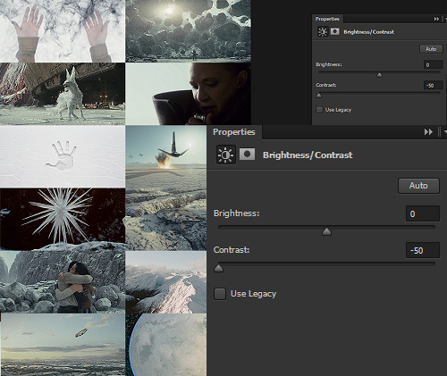
I ALWAYS start Aesthetic photosets by arranging the images and then *BRINGING THE CONTRAST ALL THE WAY DOWN.* This is especially helpful on photosets that include a mix of real photography, CGI screencaps or art, and/or comics panels, but it’s also just useful in general for photosets that use images from a wide variety of places.
The reason I do this is because it helps to “smooth out” the differences in light source, color balance, etc., that are part of the raw base images. For this set, it also helps to define the variations in color between very similar shades: the craters on Crait, the wisps of clouds, etc.
In some cases, I’ll do two layers of Contrast -50. For Crait, I did a later of Contrast -50 and then a layer of Contrast -15.
Then, I Select All > Copy Merged > [Turn Off Contrast Layer View] > Paste As New Layer.
Now, the “smoothed” version is placed as a layer above the raw layer. From there, it depends on the look of the photoset what I do -- sometimes, I leave it as-is, but I almost always lower the opacity on the “smoothed” layer until the level of contrast and balance looks consistent across the whole photoset. For Crait, I ended up with the “smoothed” layer set to Lighten 100%.
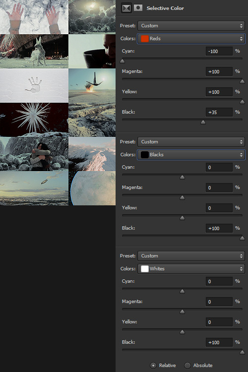
Selective Color time. There are two ways I usually start this: either one color at a time -- especially for Aesthetics like Pheryon that will essentially be monochromatic -- or, in this case, I looked at the balance of the three main colors that would carry through the entire Aesthetic.
REDS
Cyan -100 (This brightens the vivacity of the red.) Magenta +100 Yellow +100 Black +35
BLACKS
Cyan 0 Magenta 0 Yellow 0 Black +100
WHITES
Cyan 0 Magenta 0 Yellow 0 Black +100 -- This is NOT my usual setting for adjusting white, and since white is one of the main colors in the Crait Aesthetic, it might seem counterintuitive to make the white darker instead of brighter. However, this will help to make next step of color adjustments “take” on the white/whitish surfaces a lot more easily, and it will also help to balance out the bluish sky areas with the white background areas. (I’m not sure this explanation makes sense? But it’s what I did.)
Then, I Select All > Copy Merged > [Turn Off Selective Color Layer View] > Paste As New Layer > Either COLOR or HUE 100%.
“Hue” is more effective for smaller, more incremental color adjustments -- for BIG SWEEPING COLOR CHANGES, “Color” tends to work better. But it totally depends on the photoset! Try both, and see which you like better.
I feel like this is kind of the step where my process of making aesthetics stops being any different from most tutorials -- but this has been HUGELY helpful for me, a non-graphic designer-person, to be able to create a kind of “base image” that has very similar color values, brightness/contrast, and vibrance.
Sometimes this step helps to create really extreme color differences, such as in the Raydonia Aesthetic, and other times, I use it to just adjust one or two color-values so that there’s more consistency in, say, shades of yellow or shades of green, as in the Takodana Aesthetic, for which I just wanted to create a more cohesive palette of green in particular... it started out with a zillion greens, and I wanted to bring it all together into one “aesthetic.”
I think this step, and the reasoning behind it, are why SO MANY PSDs for aesthetics rely on a layer of either gray or sepiatone-ish set to Darken or Multiply as one of their key layers. But I’m just not about the grimdark life, and if I’m making an AESTHETIC OF A THING, I want the aesthetic POST to actually HAVE THAT THING’S AESTHETICS, you know?! I want to use the colors of the thing that I’m saying is meant to evoke the visuals of the thing!
Anyway. Now you have your BASE IMAGE. Often I’ll Merge All here, just for my own sanity.
Then I go in and make any other other adjustments on a “coloring” level that I think will help with the “vibe” I’m going for! For this Crait set, I definitely needed to bring the brightness up so that the white and red popped. However, bringing up the brightness also swallowed a lot of the detail in the white surfaces -- especially the planetary surface of Crait in that bottom-right space -- so I decreased the contrast again.
Brightness +70 Contrast -50
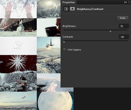
And then I go in for the macro-level adjustments of color using any mix of Selective Color, Hue/Saturation, and Color Balance that works. For Crait, that was more Selective Color, because since I had decided on my color palette, and it sadly did not include blue, I needed to start by taking out as much of the blue, cyan, and green that I could.
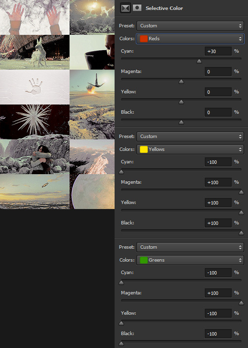
And I’m ngl, I told myself the WHOLE FREAKING TIME I was making this photoset that I needed NOT TO DELETE THE PSD RIGHT AWAY LIKE I USUALLY DO so that I could write up all the settings for this step.
But it was a reflex. And I deleted the PSD right away like I always do.
So suffice to say, I just futzed with the levels one at a time until the RED was brought up a little, the YELLOW was brought up a lot, and everything else was brought down and/or hue-adjusted to sliiiide into being yellow, red, or black/white.
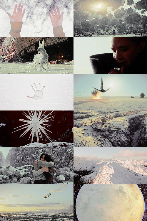
Another Select All > Copy Merged > [Turn Off Selective Color Layer View] > Paste As New Layer > Either COLOR or HUE 100%. I think I also DUPLICATED this layer and set it to SOFT LIGHT 50% and then duplicated it again to SCREEN 50%.

I could have left it like this, but I am me and I am nothing if not Extra All The Time, so I opened up my folder of light textures (and other textures) and decided to Go To Town.
Textures & Effects
For your Aesthetic-Making Purposes, here are the three I used on the Crait set:

The first two were set to Screen 100%, and the bottom one was set to Burn 15%. I layered them in this order.
It still looked incomplete, so I decided to use this POWDR Element from Creative Market, which is actually like 5400x5400 pixels and which I’m not going to share here because I paid for it and don’t want CM to revoke my access or whatever, but it looks like this, only HUGE:
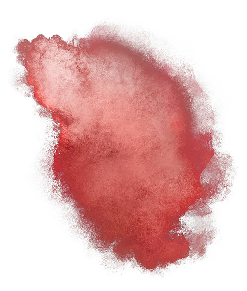
I also set this element to Burn 15% and moved it around the image until it looked the way I wanted it.
Textures and effects aren’t In on Tumblr anymore, but I really like using them -- they add, not to be cheesier than usual, texture to an aesthetic post, and I think that they can also help less-skilled graphic-makers like me to hide any myriad of imperfections in coloring, sharpening, whatever. I’m an especially big fan of this noise element (set as a pattern on Screen), so I’m going to share it here even though I didn’t use it on the Crait set:

Most of my textures have been saved over the last literally twenty years since I started making fannish graphics and photosets, largely from defunct old LiveJournals, but there also used to some great sources for them on Tumblr and still are live sources for them on DeviantArt. Just search around and you’ll find what you want! :)

In conclusion, I think it’s infinitely more fun NOT to rely on premade PSDs or standardized Settings, but I also recognize and fully respect that if I made graphics differently, I would probably get easily 5-10x more notes on each post than I do. But I make graphics the way that’s fun for me, and I just try to learn a little something from every set I make. The GFFA Planets/swworlds in particular have been something that I started, originally, because I wanted to catch up and learn about Star Wars planets that I felt like I was missing because I don’t have any fannish history with the Old EU, and I wanted to learn about them in a way that helped me feel like I was engaging with the SW source material AND making the enormity of the canon more accessible to other newish or casualish fans, like I was two years ago when I started this aesthetic series. I like making aesthetics that are genuinely inspired by the aesthetic of the thing that I’m calling it an aesthetic of, so even when it ends up just looking like rainbow barf (CURSE YOU, NAR SHADDAA!!!) I’m having fun.
THAT SAID, here’s how the time breakdown for the Crait set works out:
TOTAL TIME INCLUDING IMAGE COLLECTION AND SCREENCAPPING: Est. 20 hours.
COLORING AND ACTUAL GRAPHIC-MAKING PART: 7 hours.
WRITING UP THIS TUTORIAL: 5 hours.
So, um, if you are so inclined, here is my Ko-Fi link. I post at least two graphic sets every week, sometimes up to 25 (usually during October).
I hope this was helpful at all! I had a good time thinking about my process in-depth like this, and I would love to get tagged in any aesthetics you might try making using a similar method! :)
59 notes
·
View notes
Photo


A Galaxy Far, Far Away → [82/∞] Wobani
A troubled planet in the Mid-Rim. Wobani suffered greatly during its occupation by the Empire: its economy collapsed completely under Palpatine’s Commodities Enhancement Program, leaving the native population starving and at the mercy of Imperial welfare... which is only distributed in exchange for backbreaking slave labor. At sixteen, Leia leads a renegade mercy mission to Wobani to distribute food and medicine, and she personally brings 100 refugees to Alderaan. After Leia’s riot, the Empire turned Wobani into a planetary work-camp, where Jyn Erso was jailed under the pseudonym “Liana Hallik” (interestingly, “Liana” was frequently used as an Alderaanian name in Legends).
387 notes
·
View notes
Photo


A Galaxy Far, Far Away → [85/∞] Kaddak
An Outer Rim ecumenopolis near the Rothana Imperial shipping lanes. Kaddak was a famously lawless planet -- a sovereignty with literally no laws -- where pirates, smugglers, cartels, and various gangs had hideouts and battled for control of the main cities. The main hub of outlaw action in the city center was the Sliver, a massive shard-shaped pink glass skyscraper home to a hundred floors of cantinas, a spaceport, and the worst: the headquarters of the Ranc gang. The Sliver also served another important purpose... traitors and New Republic scum were thrown from its apex to their unceremonious deaths below.
199 notes
·
View notes
Photo


A Galaxy Far, Far Away → [81/∞] Bilbringi
An Inner Rim planet with many orbiting moons, satellites, and planetoids. The Bilbringi shipyards were politically neutral, although the Separatist dreadnought Lucid Voice was dismantled there and some of its parts made their way into the hands of the Rebels. One of Han Solo’s favorite foods was the cheesy Bilbringi meat-pie with spicy peppers, which canon creator Claudia Gray likened to empanadas.
281 notes
·
View notes
Photo


A Galaxy Far, Far Away → [84/∞] 5251977
A small, isolated planet so far from any trade routes that it had no designation in Basic besides its coordinates. No native sentients inhabited 5251977, and almost no native flora. Part of the reason for this was likely 5251977′s extremely slow rotation -- one day on 5251977 lasted the equivalent of several Standard weeks. In 3ABY, the Rebel Alliance limped to 5251977 to regroup in hiding following Vader’s invasion of Echo Base on Hoth.
128 notes
·
View notes
Photo


A Galaxy Far, Far Away → [80/∞] Kubindi
An Outer Rim planet that was highly connected, both financially and astrographically, to the Galactic Core via the Formos Trade Route. The lush flora and light atmosphere of Kubindi facilitated the evolution of the planet’s native species, the Kubaz. The Kubaz were highly intelligent sentients and highly sensitive insectoids who developed a society predicated on complex family-hives. Kubazian culture differed in ideals and aesthetics from humanoid Galactic cultures, with the Kubaz finding every planet besides Kubindi to be dirty and disgusting. The most prominent Kubaz in SW canon is Garindan ezz Zavor.
255 notes
·
View notes
Photo


A Galaxy Far, Far Away → [78/∞] Haruun Kal (requested by @crechemaasters)
A Mid-Rim planet of mountains, rainforests, and cities, Haruun Kal was the homeworld of Jedi Master Mace Windu. He was hardly the only Jedi Master to hail from Haruun Kal – all of the planet’s native humans, the Korunnai, were highly Force-sensitive. This connection built Haruun Kal’s culture, as did a schism as the Korunnai came to reject the Jedi practice of invading their planet to steal their babies. Despite Haruun Kal’s tropical appearance, the climate was temperate and varied from city to city.
Design notes: Because the Legends vision of Haruun Kal is pretty racist, I wanted to go a different direction and look at Haruun Kal and the Korunnai through the lens of Afrofuturism, because you seriously cannot have an entire planet of highly Force-sensitive people and then just be like “they’re primitives who live in the jungle,” because fuck that shit, George Lucas, seriously. That’s gross. Haruun Kal would easily be one of the most technologically and artistically developed planets in the Galaxy if literally every citizen were Force-sensitive. C’mon. So I ended up saving almost 400 gorgeous images from various Afrofuturist artists and screencapped several Afrofuturist films to gather images for this design set, and I STILL had a hard time narrowing them down! Hence the extra-long graphic set this week. The 2D images (other than the ones from the Mace comics) are by Joshua Mays. The architecture is from Togo, Ghana, Senegal, Côte d'Ivoire, Kenya, and Zambia, as well as 3D art renders created for “Pumzi” (2010). Thank you to @idabae-wells for guidance!
377 notes
·
View notes
Photo


A Galaxy Far, Far Away → [83/∞] Chal Hudda
An Outer Rim planet far from any of the major trade routes -- which served the native Chalhuddans, as it kept politics away from their marshes and swamps. The horned, five-gendered Chalhuddans were highly evolved to live in harmony with their surroundings and used their isolation to create technology and culture distinct from anyone else in the Galaxy. While virtually everyone ignored Chal Hudda, Princess Leia Organa traveled there as a teenager on a mercy mission; like her biological mother before her had with the Gungans, Leia managed to create an alliance with the amphibious species by speaking honestly and showing their tribal leader respect.
110 notes
·
View notes
Photo


A Galaxy Far, Far Away → [74/∞] Pantora (requested by @commandervisor)
A large, developed moon of Orto Plutonia in the Sujimis Sector of the Outer Rim, Pantora had many of the systems and benefits of a planet, including a seat in the Galactic Senate (and, eventually, the New Republic Senate). Because it was partially blocked from the Sujimis sun by Orto Plutonia, Pantora was a cold, snowy homeworld for the blue-skinned Pantorans, who had evolved to absorb and retain as much heat as possible. Ceremonial facial markings denoted status in Pantoran cities. Notable Pantorans included Senator Riyo Chuchi and Pantoran Chairman Baron Papanoida, as well as his daughters Chi Eekway and Che Amanwe.
658 notes
·
View notes
Photo


A Galaxy Far, Far Away → [79/∞] Parnassos (requested by @ct-hardcase)
A desolate planet in the Unknown Regions, Parnassos had a small population – because very few people were able to survive its rough, barren landscape, empty of agriculture, aquaculture, or valuable minerals. During the days of the Empire, Parnassos played a still-secretive role so important that Palpatine himself once visited the planet (and indeed crashed one of his ships there). Like Jakku raised Rey, Parnassos raised Phasma, once upon a time.
153 notes
·
View notes
Photo


A Galaxy Far, Far Away → [77/∞] Krownest (requested by @commandervisor)
A Mandalore Sector exile world covered in ice and snow. Its mountainous, coniferous forested surface ringed semi-frozen lakes, one of which was settled by the Clan Wren. Its frigid skies were patrolled by jetpack-wearing Mandalorian guards, watching for the rival Clan Saxons and both the Rebels and Empire. Krownest was ostensibly colonized by surviving Death Watch Mandalorians, as its inhabitants favored the traditional Mandalorian warrior lifestyle above loyalties to any side of wider Galaxy relations. Its citizens included Sabine Wren and her estranged family.
258 notes
·
View notes
Photo


A Galaxy Far, Far Away → [75/∞] Quarzite (requested by @commandervisor)
A small Inner Rim planet with unique climatography: the intense atmospheric pressure on Quarzite rendered the surface uninhabitable, but also created the necessary conditions for the planet’s interior to crystallize into essentially a solid diamond. The impenetrability of the crystal caverns in turn made the planet’s interior capable of supporting life and led to the creation of two complex – but warring – insular civilizations: the Belugans, a species of invertebrate sentients, and the Kage, a humanoid species evolved to exist in Quarzite’s harsh conditions.
321 notes
·
View notes
Photo


A Galaxy Far, Far Away → [73/∞] Umbara (requested by @commandervisor)
An Expansion Region jungle planet, Umbara was known as the “Shadow World” because its orbital path caused its sunlight to be almost completely blocked from the planet’s surface. As a result, it had supra-arctic temperatures despite the lush flora, which were largely bioluminescent and carnivorous. The native Umbarans had evolved to see in the constant darkness, partially with the aid of light spectrums far beyond what other humanoid species could perceive. One of the only other creatures hardy enough to survive on Umbara was the vixus, a cousin to the sarlacc and rathtar species. Jedi Master General Pong Krell was killed on Umbara.
302 notes
·
View notes