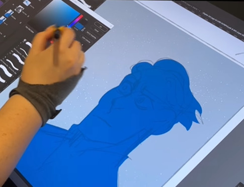
#I animated this shot in clip studio
Explore tagged Tumblr posts
Text

pov: ur the newest hire at rocket corp.
@zkylearnstherope :) - prompt: canon!victim in a santa hat
#art#artists on tumblr#clip studio paint#digital art#animation vs animator#victim ava#AvA Gift Exchange#AvA Gift Exchange 2024#my sketchbook#this was fun! canon vic's not typically a character i focus on so it was neat giving drawing him a shot
121 notes
·
View notes
Text


ham ilton cringe, edielgarm EPIC!!
#HEHE.. sorry i listened to like 3 songs back in middle school and for some reason#i got my shot stuck in my head the other day. out of nowhere. anyways kinda highkey edie core ngl#fe3h edelgard#edelgard von hresvelg#fe3h#fire emblem three houses#ferdinand von aegir#myart#fanart#digital#artists on tumblr#clip studio paint#fire emblem#anime art#thisd be after she gives her big speech after running off the monastery and asks if everyone is with her#shes so excited..#her epic black eagle strike force (tm)
46 notes
·
View notes
Text
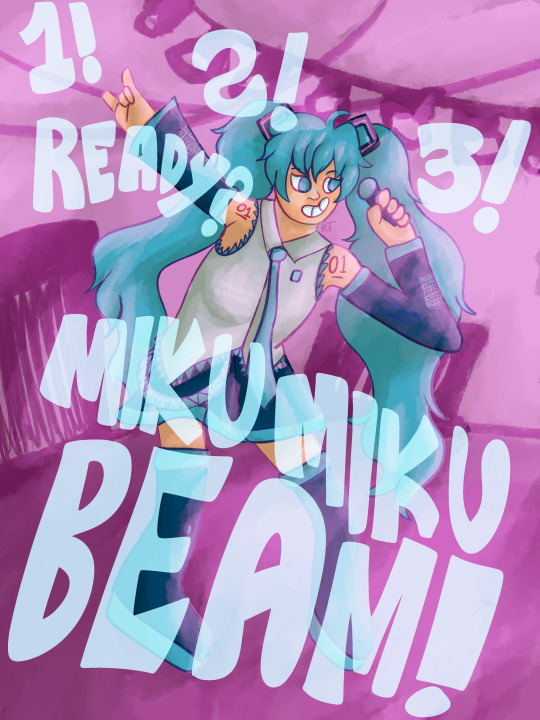
and now, it's time for the moment you've been waiting for!
(time lapse under cut)
#magical cure love shot my beloved#vocaloid#hatsune miku#vocaart#magical cure love shot#also yes. half the timelapse is just me struggling to place the type. i am aware.#miku miku beam#i debated doing an animated version of this with the text aligned to the beat so i could do the tiktok trend version but a) i'm lazy#and b) i only have clip studio pro so i would have had to import it to something else just for that and that's too much effort
8 notes
·
View notes
Text
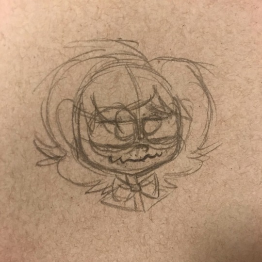
Man I’ve been productive like you wouldn’t believe my guy I’ve been productive as fuckkkkkk
#art#original art#original character#oc#Oc doodle#Oc sketch#sketch#sketchbook#sketch doodle#OC: Shaun#I did animation yesterday and almost done with the hard shot#and today I did music and recorded a bunch of new stuff I can chop up in class tomorrow#and I went through my clip studio brushes to make the transfer easier#and messaged my doctor and got homework shit done I’m fucking killing it my man#send post
15 notes
·
View notes
Text

internal monologue
#oot#ganondorf#tloz#my art#wip#animatic project#thralls of power#(tentatively starting to tag it as such)#I'm almost done with this scene???#I mean not really I have to do stupid background work for a long traveling shot because I hate myself#but the bones are all there#this specific scene is over two minutes long :)))#my clip studio paint file is almost a whole gigabyte :)))#(and it's technically just a transition scene mega rip)#I have been possessed I think#can't stop won't stop#and I'm having VACATIONS soon this will be insane#but genuinely this specific scene is starting to look really really good#like we're nearing extremely low-budget anime levels of quality#I got carried away and I blame the torches :((((
9 notes
·
View notes
Text
THE INTERVIEW
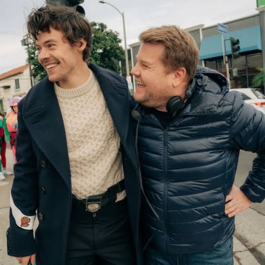
A/N: Y/N and Harry attend an interview where James Corden shows pictures of Harry with Kendall Jenner on a yacht from years ago. While Harry nonchalantly recounts stories about the day, Y/N grows visibly uncomfortable, fidgeting and avoiding eye contact. Neither Harry nor anyone else notices her discomfort during the show.
MASTERLIST
<<<<<
It was a late-night talk show, and Harry and Y/N were invited on James Corden’s program for an interview. The energy in the studio was high as fans cheered and clapped. Harry, looking relaxed and in a great mood, sat next to Y/N as they prepared to chat with James about their upcoming projects. The crowd loved them both—Harry for his laid-back charm and Y/N for her infectious laughter and grace.
James, always known for his cheeky sense of humor, had an idea for a bit to add some levity to the interview. After talking about music, fashion, and random bits of gossip, James pulled up a set of pictures on the screen. He held up one image in particular, one that instantly made Harry freeze for a split second.
The picture showed Harry and Kendall Jenner on a yacht, laughing, with Harry tugging at Kendall’s foot and her hugging him affectionately. The shot was a few years old, taken during a high-profile trip that had made headlines, with paparazzi capturing nearly every moment of their time together. The image was all over tabloids at the time, and the media had made a spectacle of it, turning it into something more than it ever was.
James, with his usual playful grin, teased, "Remember when you shook the world with these, Harry?"
Harry laughed, brushing it off with his usual charm. “Ah, yeah, that was a fun day,” he said casually, leaning back in his seat. “Kendall and I had a great time on that yacht. It was just one of those spontaneous moments, you know?” He went on to tell a story about how the day had gone, laughing about the playful moments with Kendall and the unexpected waves they had encountered.
Y/N, however, wasn’t laughing. She sat still beside him, a faint unease settling in her chest. She tried her best to keep her composure, but her fingers began to fidget with the fabric of her pants. Her knees bounced up and down nervously, and a cold feeling crept over her. She didn’t look directly at Harry as he spoke, keeping her eyes fixed ahead as though she was focusing on something in the distance. Her mind was racing, but she didn’t want to interrupt the flow of the conversation.
Nobody noticed her discomfort—not James, who was absorbed in the conversation, nor Harry, who was still animated and laughing about the day on the yacht.
It wasn’t until later, when they were back in the car on the way to their hotel, that Harry noticed a sudden shift in Y/N’s behavior. She was unusually quiet, staring out of the window with a faraway look in her eyes. Harry tried to spark a conversation, asking her how the interview went, but she only replied with a soft, "I'm just tired, Harry. It's been a long day."
His brow furrowed in concern, but he didn’t push her further, figuring she might just need some space. They arrived at the hotel, and Y/N went straight to the bathroom without saying much. When she returned, she climbed into bed, facing away from him. Harry, still not fully aware of the weight she was carrying from the interview, settled into bed beside her, trying to fall asleep. But his mind wouldn’t rest.
<<<<<
The next morning, Harry woke up early, his usual habit of checking his phone first thing kicking in. He scrolled through TikTok, lazily watching random videos while yawning. Suddenly, he came across a video of the interview from the night before—fans had already begun uploading their reactions. He tapped on the clip, expecting to see the usual praise for Y/N’s stunning outfit and his charming demeanor.
But instead, the comments were focused on something different. They weren’t discussing Harry’s story about the yacht. They were talking about Y/N’s discomfort.
The video showed her visibly fidgeting, her fingers twisting and her knees bouncing as Harry laughed and joked about his time with Kendall. There were multiple comments pointing out how obvious it was that Y/N wasn’t comfortable during that part of the interview.
"Did anyone else notice how Y/N was looking down the entire time they talked about that yacht trip? 😬"
"Her body language is so off—what’s going on, Harry?"
"I can feel the tension through the screen, poor Y/N... 😢"
“Did Harry not notice? She’s clearly uncomfortable…”
Harry’s stomach sank as he read through the comments, feeling a lump form in his throat. His gaze shifted to the next clip, which was a fan reaction video. This one was more analytical, showing a side-by-side of Y/N’s reactions to the yacht pictures and the moments when Harry was openly laughing about the past relationship with Kendall. Y/N’s discomfort was undeniable, and the video highlighted how it shifted from slight nervousness to visible unease.
His heart twisted, guilt washing over him. He should have noticed. He should have recognized the signs. But he hadn’t. And now it was too late.
<<<<<
Harry put his phone down, pacing the room for a moment as he tried to process everything. He needed to make things right. He knew he’d messed up, but he wasn’t sure how to fix it. All he could think of was the pain he might have caused Y/N, and how he’d been oblivious to her feelings.
When Y/N finally woke up, Harry was already out of bed, sitting at the edge of the room, his hands clasped together. She rubbed her eyes and yawned, trying to shake off the sleepiness. But as soon as she saw Harry, she knew something was wrong.
“Hey…” she said softly, her voice barely a whisper.
Harry looked up at her, his expression full of regret. “Y/N, I—I saw the videos,” he started, his voice thick with emotion. “I saw how uncomfortable you were last night, and I… I feel awful. I should have noticed. I should’ve been there for you.”
Y/N sat up, glancing at him. Her face was still soft, but there was a trace of sadness in her eyes. “It’s not your fault, Harry. I should’ve said something during the interview.”
Harry shook his head, standing up and moving toward her. “No, Y/N. You shouldn’t have had to say anything. I should’ve been more aware. I’m so sorry for making you feel like that.”
Y/N reached out for his hand, squeezing it gently. “It’s okay, Harry. It was just…” She paused, trying to collect her thoughts. “I don’t like seeing you talk about your past, especially not with her. It just… it made me feel like I wasn’t enough.”
Harry’s heart broke as he heard the hurt in her voice. He cupped her face in his hands, his thumbs brushing the tears that had started to fall. “You’re more than enough, Y/N. You mean everything to me. I never want you to feel like that again.”
Y/N nodded, her lips trembling slightly. “I know you didn’t mean it, Harry. I just needed some time to process it all.”
Harry leaned in, resting his forehead against hers. “Take all the time you need. I’ll be right here. And I’ll make sure I’m always aware of how you feel. I promise.”
The silence between them felt comforting, a quiet understanding passing between them. Harry held her close, his arms wrapped around her as they sat there, letting the weight of the moment settle. It wasn’t about the yacht, or the pictures, or any of the past—it was about the now, and the love they had for each other.
PART 2
#harry styles#harry styles x reader#harry styles x insert#harry#styles#hs#h#harry styles fluff#harry styles imagine#harry styles angst#harry styles smut#fluff#angst#imagine#harry edward styles#one direction#one direction x reader#1d
446 notes
·
View notes
Note
Do you have any animation software recommendations? I'm a beginner animator and i want to start learning.
There are a lot of options out there. I chatted with some of the crew to try to narrow down recommendations. There was something of a consensus that Clip Studio Paint is actually quite good as a beginner animation tool. If you work with digital drawing programs, it's overall UX will probably feel pretty familiar from the start. It's not overcomplicated, but it's still sophisticated enough to produce production quality work if you want to push it that far.
You can hone your animation chops in so many different ways, though, from TV Paint to a sticky note flipbook. I'd suggest a little experimenting to find what feels right to you. You can animate in Adobe Photoshop. The tools provided are fairly rudimentary, but there's nothing wrong with starting out plain and simple. You can animate in 2D with Blender's Grease Pencil tool too. And it's free. And maybe you can pick up some 3D skills in the process. If it's within your budget, Toon Boom is a very solid choice. It's what we use for Lackadaisy, and we know many, many other animated productions rely on it too. If you happen to like working with Procreate and you're comfortable with touch screen controls, give the new Procreate Dreams a shot. Prioritize your comfort and enjoyment in selecting a tool first. Once you have developed your drawing skills and understand the principles of animation, you get to take that knowledge with you to any other animation tool you decide to pick up next.
571 notes
·
View notes
Text
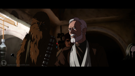
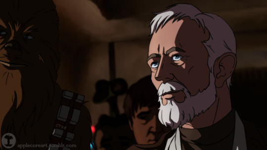
I'm using screencaps from SW:IV to study a few things– designing a shot, set design, digital painting, and developing a more realistic approach to animation character design. I really love this shot of Obi Wan-- from "too old for this sort of thing" Ben back to Obi Wan, Jedi Master, General Kenobi, total boss. (painted in Clip Studio Paint)
#RA fanstuffs#Obi Wan Kenobi#Ben Kenobi#Chewbacca#Star Wars#screencap redraw#...I totally never noticed the giant praying mantis alien at the bar until I painted this shot :|#also unintentionally the woman on the right in this shot kinda looks like Satine#I'm not sure when I'll get back to the other SW:IV s-caps-- hopefully in a few weeks
254 notes
·
View notes
Text

Yuri Plisetsky Ice Prince 👑
This was illustration was intended to for the cover of a magazine -that you can find in the previous link, please go check it out if you want- mentioned at the closing of my one-shot 'Well, Good Luck! (Babe)' part of a series before and during the Milano-Cortina Winter Olympics taking pace in 2026. Yuri is supposed to be 25 years, and prior to this, he had long hair and Coach Viktor had the idea to hard launch Yuri's new look and make some noise prior the Olympics. You could say this is only the photoshoot for the cover...
Viktor: Yura, you're so camera ready. Even your scowl looks amazing! Yuri: ...Ugh, I'm never leaving you in charge again. Viktor: But I'm your coach! It's my job to make you look good after a makeover montage.
Explanation of the creative process and chaos leading to this, below:
This idea sat on my Clip Studio Paint WIPS for a long time - I had all the sketch and line art done, though things in my art/creative process and style changed over the past 6 months. So between redoing part of it, base color and mostly rendering I worked non-stop on this for my last 5 days of holiday break.
And the layout design for the cover had been on my brain also, for months (which is here and you can go and give it some love if you want) and I had so processed already (the concept) that I spend an hour doing, at 3 am. all in Photoshop -though I really wanted to do it on InDesign for a full experience (for me) and maybe I will if I decide to print a copy on a nice paper for me-. Anyway, I wanted to share my creative process. If you read this far, thank you!
Edit: @ korruptbrekker’s tags made me think it would be good to mention my style inspiration and that indeed are Korean Manwhas. Specially the artists P (Under the Oak Tree), Spoon (Who Made Me A Princess and King The Land), Roal (Father, I Don’t Want This Marriage!) SUOL (Villains Are Destined to Die) and Cheong-Gwa (The Broken Ring.) But also I want to mix it with Japanese anime/manga style, so I’ll be exploring this style further 💖✨
#by blonndiec#yuri on ice#yoi#yuri!!! on ice#yurionice#yuri!!!on ice#ユーリ!!! on ice#Yurio#Yuri Plisetsky#Yuri#yoi fanart#yuri on ice fanart#yurionice fanart#fanart#anime fanart#fanfiction#artists on tumblr#art#trending#artwork#creative process#creative#digital art#anime#art process#clip studio paint#Clip Studio#Viktor Nikiforov#Victor Nikiforov
103 notes
·
View notes
Text
Vidu and the Quest to Make More Toons
So, a ways back I talked about Minmax, but I've been trying out basically all the video generators looking for the tools I need, and low and behold this week I find out I've been accepted into the Vidu Artists program now, wherein I get credits and access to access their cooler features in in exchange for... talking about the tech and how I use it.
Well twist my arm. I shall endeavor to be objective and informative despite free stuff (a challenge my spirit needs practice withstanding if anyone else wishes to test me)
So let's talk Vidu.
(outside of being converted to gif, no animations in this post have been cut or edited)

Also, everyone say hi to Maureen the Lizard Queen, every hero needs an evil queen that really wants in his pteruges, and she's that for TyrannoMax.
Vidu's got a bit more oomph under the hood than MinMax (no shade to MinMax, they're brand new and very promising) and it's way too early to be picking winners when it comes to video.
Anyhow, basic features that are nice include the options to upload start and end frames, options for a 4 or 8 second duration (more about that later), and a cleanup/upscale. Credits line up more or less with seconds. 4 credits for a 4 second clip, 8 for an 8 second, and again at upscale. It's straightforward in a way a lot of services aren't.

Apetomic Pyle, done on the fast settings. (not to shabby still, and it gave him monkey legs which a lot of systems balk at)
If you're on the $30/mo tier, you can choose to do a double-cost "quality" over "speed" option. Thankfully, the artist program gets me access. Since there's not yet a seed option it's hard to do a direct comparison, but the quality is going to be a must if you're doing anything that looks like cel. Much cleaner, much smoother.


(4 and 8 second quality gens)
One of the nicest features is the character reference feature. Basically it's like Midjourney's --cref, but with a very strict adherence to character details.
The above images used reference shots of Maureen and Dr. Underfang, and it got the stripes on Underfang's tie right in basically every gen. That's a ridiculous level of character model adherence and, for my purposes, all but essential.
It did misinterpret Maureen's undertail coloration for a sort of fin or drape, but the shot I used was oddly cropped, and sometimes stuff like that happens with gen AI. Given my measuring stick for errors is the era of animation I'm emulating, whatever does slip through is only going to make it more authentic.


There is a limitation in that character-reference and text-only prompts default to 16:9 presently with no options to adjust, but some room to pan is always handy and most people are going to be outputting for phone and not outdated CRT televisions, so, it's understandable it'd be a lower priority feature for the devs.


Walk cycles! By Saint Eniac it's a miracle!
On the left we have one prompted with TyrannoMax's control art, and on the right we have one using that art as the starting frame (4 and 8 seconds, respectively).
Way More details under the fold.
Vidu likes a hefty prompt.
A lot of detail and evocative language helps, and older prompting tricks like mojo-jojoing important concepts are back. For the Max walk cycles above I used:
1986 vintage cel-shaded cartoon character walk cycle. The orange dinosaur-anthro wearing blue gladiator armor walks toward screen right, the camera tracks him, holding him in center-frame. He completes a full, brisk walk cycles from the side view. He walks boldly, back straight, head high, heroic. His tail sways behind him as he moves. The whole clip has the look and feel of vintage 1986 action adventure cel-animated cartoons. The animation quality is high, with flawless motion and anatomy. animated by Tokyo Movie Shinsha, studio Ghibli, don bluth. BluRay remaster. flat chroma-key green screen background
The potential for use with my Filmation-inspired technique is readily apparent. Both versions are on-model as much as any two shots in a 1980s action-figure shilling cartoon would be, some minor blurring to clean up in post but nothing serious. It should be pretty easy to extract the needed frames for looping and compositing.
Some Extra Points
There are the usual issues with hands, though more often than not it corrects my four-fingered anthros to having a human five-fingered hand. Buzby Spurlock animation was known for those kinds of inconsistencies, though. So an opening credits video is much less far off than it was at the last post.
It's also generally impressive how well it does with my dinosaur characters. Non-humanoid dinosaurs are difficult for most image generators, much less anthrosaurs in a vintage aesthetic. Vidu has yet to override the character art to give Underfang or Max the Jurassic Park style t-rex jaw, which is something both MJ and Dall-E 3 have trouble with.


Human characters like Kitty Concolor here, much more stable.
As always, clips are curated. I didn't choose my absolute best ones (gotta have something for the videos), and I'm working on a fun series of jank reels across all the generators.
#vidu#vidu artist plan#ai video#ai animation#tyrannomax#ai tutorial#ai assisted art#cartoons#80s nostalgia#unreality#maureen the lizard queen#dr. underfang#ApeTromic Pyle
65 notes
·
View notes
Text
youtube
Some additional thoughts regarding the recently announced Astartes 2.
I don't pretend to have any particular inside knowledge of the situation between Games Workshop and the various creators that they've tangled with over the years. A lot of people have a lot of thoughts about the fanpocalypse of 2021 which resulted in SODAZ's disavowal of Warhammer and the spectacle Bruva Alfabusa made of ending Text-to-Speech, among others.
But on the flip side, you have creators like Richard Boylan that successfully parlayed a YouTube video into the Warhammer+ Angels of Death series; and despite memory holing the Lord Inquisitor, Erasmus Brosdau went on to direct the Enemy Without.
So it's not entirely beyond the ken that there's a wholly anodyne explanation for why, after five years, Games Workshop is finally returning to Astartes, and any rumor of acrimony between the company and their creatives is just a pernicious libel like the Warhammer/WarCraft connection.
I had previously believed - and, if I'm being entirely honest, still do - that there must have been some sort of creative disagreement between Games Workshop and Pedersen regarding the direction that Astartes should take, given the alacrity with which Boylan's project was produced while Pedersen's languished, even if it was something as simple as reticence to revamp the project to showcase Primaris Space Marines instead of the classic style.
As I observed at the time, Astartes was the single best piece of Space Marine media of the last thirty years and precious little has come out since that can hold a candle to it. I don't hold any of the subsequent Warhammer+ series to date in particularly high regard - bully for Boylan, but Angels of Death bored me to tears; Iron Within had all the cinematic spectacle of a Playstation 2 cutscene; and Pariah Nexus could charitably be described as unfocused, or uncharitably as a hot mess. I've been so thoroughly underwhelmed by what's on offer, I skipped the Tithe entirely and I have no comment on anything it depicted so don't at me.
But, here's the thing that really has me concerned, and to which I alluded in my earlier post:
This teaser trailer is not actually clips from the new animation, instead showing a compilation of shots that represent the former lives of the characters that will appear in the show.
While there is some footage that may not have previously been released, I'm extremely confident that almost everything seen in the trailer is taken from the original development of Astartes 2 before Games Workshop got involved, and the project has been on ice ever since. Some clips like the orks dogpiling the Lamenter have previously escaped from behind the Patreon paywall and at this point, I'm reasonably certain that most of it can be found as reuploads on YouTube.

The best case scenario, and my hope for the series, is that Pedersen's Digital Bones brand/studio/Patreon campaign is basically the licensee for Astartes and is granted sufficient autonomy to produce a product that's faithful to his creative vision for it.
It's not enough to simply mimic the structure and style of the original short, Secret Level did that and while it was certainly a higher quality production than any of the outsourced industrial animation "Warhammer Storyforge" slop that's appeared on Warhammer+, it's self-evidently an imitation; like a cover band serviceably performing your favorite song. It has to be better than that.
And I sincerely hope that it is, but I'm not getting hyped for it and I warn you not to, either.
19 notes
·
View notes
Text
Another ko-fi BTS from my She Wants Me (to be loved) AMV!! It's an animation speedpaint!! speedanimation?? audio: she wants me (to be loved) by the happy fits
I very rarely screen record my animation process because it's hard to predict when I get into a 'sit down and work for a few hours straight' mood and I'm usually watching youtube videos on the side or smth lol BUT this rare instance I wanted to test out obs and I just worked on this shot for a while!! I wish I remembered to record my screen more often... it's fun to watch back on all the stuff i was doing haha
I animated SWM(tbl) in photoshop, at this point I've completely migrated to Clip Studio Paint. I'm still getting used to animating in CSP, but I will say photoshop is definitely not set up for animation like csp is haha (CSP does have a built in timelapse feature v cool! but tbh the thing I like most about speedpaints/animations are seeing the whole process with what an artist is doing with the layers/timeline, brush changes, canvas rotating etc!!!)
commission info || ko-fi (tip jar) (for every $8 I share a BTS!)
#warrior cats#warriors#wc#video#bts#wip#my art#digital art#ko-fi#kofi#she wants me (to be loved)#thrushpelt#bluefur#bluestar#speedpaint#speedanimation#animation speedpaint#seriously what do people call these lol
22 notes
·
View notes
Text
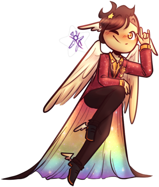
THE MAP IS OUT!! Here's my individual part for it, along with my credit image! I'm so happy to have been able to work with such cool collaborators on this project, this was so fun! :D <33
WIP and fun facts below the cut!
First pass of my part!

General Notes: - All of us had a cut-off frame so Sammy (our MAP host!) had space to transition shots! the stick in my cut-off is my oc Lixy <3 - As always, I don't have an actual animation program. Each frame of this was individually drawn in Clip Studio, saved as PNGs, and meticulously arranged in a video editing software. it took a while and a headache. the software crashed 4 times hdkjh </3 - The process was sketching, lining, then compiling it all together! Line art took the most time (because i don't like lineart hkjdh) - Fun fact, all of the sketches (seen in the wip above) were all drawn on my first plane ride ever :> <3 - The background is Alan's animation program that I took from a screenshot from AVA 6 :> I didn't want to do anything too complex for it ;w; <3 - All of the slide transitions were done manually! It may look like tweening, but I don't have a program that can do tweening lmao :'> <3 Each of the slidings was individually 3-6 frames of moving them across the frame, a single frame of stretch for movement, then a settling frame before the next stick slid in. - Green is doing air guitar as they slide in :3 <3 - My Blue design has a hat that can magically change into a Witch hat (when potion making), Chef hat (when cooking) or Sunhat (when gardening <33 - Purple looks nervous after he crashes into everyone, like they're expecting to be in trouble, but smiles and laughs when everyone else does. You can see Blue with their hands up, reassuring Purple. - Originally Yellow didn't move as much in the final laugh scene, but I saw the first frame of the person after me (@/sleptonce!) which had Yellow in a little crouch :> i adjusted Yellow to match the next frame a little better! - Also Yellow's hair is flipped from the way I usually draw it because I felt it worked better this way hgkjh <3 - (I totally didn't forget my Second's design has green eyes and had to edit those frames very quickly hfkjh <33) - The only colors that aren't the stick's original colors are when Blue's hat falls on Purple, and Red's yellow bandana <3 (These are also the only movement animation in the blinking sequence!) - Adding Alan's cursor was a literal last minute decision, he was never in any of the sketches, I literally added him in 15 minutes before submitting my part hgkjh <33 I think after my shot, Alan helps gently pick them up <3 - My suit in the credits is mostly red and orange, because my favorite sticks are Red and Second! <3 The rainbow cape reflects how I enjoy the color gang the most though hkjdh <33
Thanks for reading!! :D <33
#Alan Becker#Animation Vs Minecraft#Animator Vs Animation#AvM#AvA#my avm art#avm red#avm second coming#avm orange#avm yellow#avm green#avm blue#avm purple#starlight originals#lixy
183 notes
·
View notes
Text
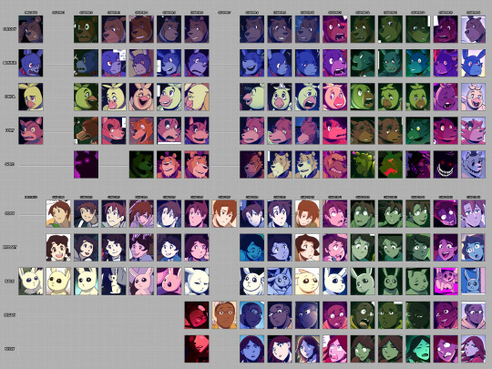
AAAAAYYYYY WE FINALLY MADE IT!!!!!
Six years later, and Lost Souls is in it's final chapter (and will be completed before the year ends YIPPEEE!!!) and I realized that I hadn't made good on something I said I would do: frequent comparisons between appearances of the characters to show how my art has changed and improved throughout the comic's run. Completely forgot. Oops...
So I figured what better way to celebrate how far we've come than to visually SHOW how different the start and the end are! Here we go! (LONG POST AHEAD!)
PROLOGUE
Not much to say about the first chapter--other than it shows its age. 💀 At the time I really struggled with contrast and color theory, because everything is muddy and blends together.
I found all the Fazbears challenging to draw, but I especially remember struggling with Chica the most SOLEY because of her beak--I was having difficulty wrapping my head around making it look the way I wanted it to. Once I let myself treat Chica's beak less like an actual beak and more like a pair of extra thick lips she became one of the easier characters to draw.
CHAPTER ONE
Its so weird seeing where my blood children started and where they ended up design-wise. Cody's hair is a lot more tamer in style in these first chapters, and it took a while to get the hang of how I wanted to depict Bridget's wavy hair.
CHAPTER TWO
UGGHH MORE MUDDY COLORS GET IT AWAY GET IT AWAY
Back during this chapter the fog looked more like actual fog than a manifestation of all the animal souls Gold had collected and tenuously tied together with sheer force of will. All I can say is I guess I was still figuring out the art direction I was going.
CHAPTER THREE
I was REALLY proud how I subverted expectations by not letting Cody or Bridget faint upon meeting the Fazbears. XD
I also did this dumb thing where I would block the farther limbs in shadow to try and save time (you can see it most notably on Halo and Bonnie's ears.)
This did not in fact save much time and ended up looking kinda dumb and making people think characters were missing limbs. >_<
CHAPTER FOUR
Character designs are notably more consistent.
Here was where I dropped using Photoshop Elements 7 for my drawing and used Krita. I still used Photoshop for finishing details etc.
CHAPTER FIVE & SIX
If I had to pin a chapter in which character designs were pretty much solidified, it would be these chapters.
CHAPTER SEVEN
The only major characters here are Cody and Regan.
I made this chapter during the height of 2020. So naturally I was in the throws of a MAJOR depressive episode.
I took a lot of short cuts in an attempt to just get this chapter DONE. Don't know if it's noticeable or not, but yeah it was rough.
I didn't include the Bidibabs and Minireenas because there's too darn many if them, and they're not always grouped together for the most effective comparison shots.
CHAPTER EIGHT & NINE
Grouped because eight wasn't particularly noteworthy.
Other than it's where I made the switch to Clip Studio Paint.
I had experimented with it when I made the prior Crybaby chapters and fell in love with the program before I even finished the free trial.
CHAPTER TEN
Ooh I was SO anxious for this chapter, because here was when the story would reach the point of no return--it was literally all downhill from here and I wouldn't be able to just drop the comic if I lost interest.
(But I didn't! )
Point being, lots of anxiety surrounding this chapter.
CHAPTER ELEVEN
Here is officially past the event horizon. At this point I had no idea how much farther I had to go in spite of the fact it was the start of the final night.
CHAPTER TWELVE
We officially enter the labyrinth here, and it is here where I officially decided I HATE the color green.
I really don't know what it was, but there wasn't many things I could do to make the characters stand out from the sheer GREEN of the vicinity, and it muddied up a lot of the colors of the characters.
Thankfully I had more experience under my belt to balance it all out (I hope 😬)
CHAPTER THIRTEEN
More green.
So much green.
CHAPTER FOURTEEN
Which is why when Cody's group went into the mirror maze I switched it up and went more aquamarine/turquoise to make it more bearable for me.
Making the light emit from the glow-in-the-dark floor panels was a happy accident--I wad playing around with layer modes and the Add Dodge (Glow) layer mode in CSP caused an interesting effect that I took and ran.
Markiplier cameos here. (And dies. Sorry Mark.)
CHAPTER FIFTEEN
The double uploads started here and OH MY GOD I can't believe I managed to survive it. I really put my pedal to the metal here, and I came out on top!
(It was a race against myself really but HOT DAMN I WAS ON FIYA.)
Side note: this chapter went through SO MANY rough drafts guys it's not even funny.
The vibes weren't jiving, the pacing was all skiddly-wompus, and at one point the chapter was FIFTY PAGES LARGE (HELL NAW)
Its a miracle I'm alive man
Do your stinkin thumbnails guys--they saved my life
CHAPTER SIXTEEN
This was the hardest chapter to finish, if you can believe it.
It took the longest production-wise, because after SIX YEARS of non-stop comic work I was definitely burned out. Thank god I had already solidified the script and thumbnails beforehand because with that guide rail in place I could drag myself across the finish line by my fingernails because if there was ONE THING I DIDN'T WANT IT WAS A FRICKIN RUSHED ENDING. >:[
(Burned by too many unsatisfying webtoon/webcomic endings that basically went "and we lived happily ever after 😌")
Visually this is my favorite chapter. I love how the colors turned out, and all the characters felt truly "mine."
And that's that!
Man I started writing a whole paragraph and I realized that I should PROBABLY save it for the Afterword, when the comic is well and truly finished. So I'll hold off on that big ol' schpiel until then, but I will say:
THANK YOU FOR STICKING WITH US THIS FAR!
💖💕😘💕💖
#ChiwwysComics#FNaFLostSouls#ChiwwysFanart#FNaF#comics#fanart#fan comic#fnaf#fnaf fanart#fnaf fancomic
45 notes
·
View notes
Text
Lore Olympus Art Analysis - Getting to the Bottom of It
For ages now it's been a common point of discussion - what's the process involved in Rachel's creation of Lore Olympus?
As a community, we've all discussed and speculated Rachel's process among herself and her assistants and how it seems to result in cheaper art each week. Same face syndrome, the overuse of the multiply tool, the dull backgrounds that often enter nightmare fuel territory, the lack of color vibrancy compared to Season 1, the repetitive poses and shots, the theories that different assistants are handling different aspects of individual panels, the clear lack of buffer, the list goes on and on.
But I think we've finally gotten to the bottom of what's going on. Or at least, deeper than we've gotten before and it feels like now we're closer to fully understanding Rachel's process than ever before.
Normally, I wouldn't care this much about dissecting the steps of creating a comic. Everyone's process is different, and when you're working with a team, that can introduce a whole new layer of understanding. I've worked with my own assistants in the past, trained to work in the animation industry which relies on coordination between people, and fully understand what's required to go into making a finalized piece of work put together by multiple people. All that's to say, having assistants doesn't necessarily mean you do less work.
When it comes to LO, though, I do feel this compulsion to tear into it more because Rachel seems to completely lack this understanding, and it shows in her work.
Before I continue, I want to throw in a quick disclaimer - when we criticize Rachel's art, it's not to throw any of her assistants under the bus. All of her assistants are incredibly skilled in their own right. When I criticize Rachel's art as a whole - regardless of who helped shape it into its final form - I'm criticizing not just the art itself, but her direction. Rachel is, essentially, a director of a team, and how she manages that team reflects how her work looks in the end after it's all been put together. I will be showing pieces of art from her assistants in this essay, none of this is to promote any shame or hate towards these people. This is purely an essay speculating on Rachel's directing capability and how she manages her team and is not meant to be taken as objective fact beyond what I am capable of proving as an outsider looking in. I consider her assistants people who are just being hired to do a job, I do not condone holding them responsible for the nosedive Lore Olympus has taken in quality over the past few years. These are simply points and speculations that myself and the ULO community came to after discussing it at length.
Alright, so, where to begin?
This essay started with me having a simple conversation with @loreolympusminoredits over on Instagram. They had pointed out a couple panels from a recent free episode where you could see the texturing wasn't being applied properly. You have to look really closely, but once you spot it, you can clearly see the outline of a square where the texturing block wasn't repeated.
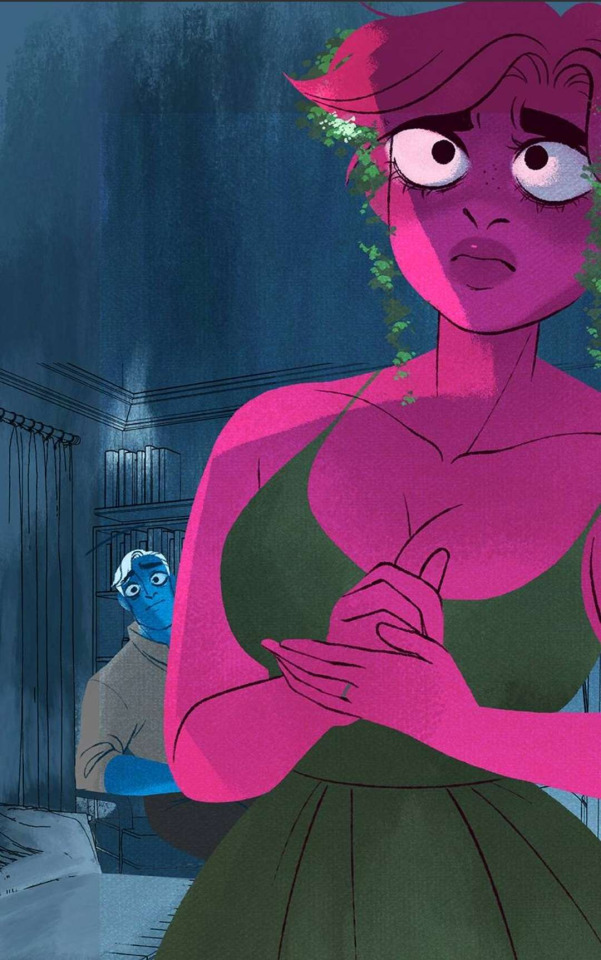


It's VERY obvious in this last panel of Hades, look along the back of his shirt, you can clearly see the color warping from the texture block overlaid on top of him.
Now, I have a few theories for this on its own, it really depends on what drawing program these assistants are using. Some of them use Clip Studio. Others use Procreate. There is no consistent requirement in workstations or software among the team, which is Rachel's first mistake. There's a reason why the animation and film industry requires everyone to be using Adobe products whether they like it or not - because it keeps things consistent across the board. It doesn't matter how good you are at Clip Studio or how much you like Procreate, you need to be on the same software and hardware as everyone else to ensure that you can access the same tools, brushes, and workflow as the rest of the team. No one wants to have someone working primarily in Clip Studio who can't access the same brushes or files as the people working in Adobe. As much as I personally hate working in Photoshop, if I were to get an industry job, I would be expected to work in Photoshop, no questions asked. It's part of the job.
Moving on from that, this led me to wonder which assistant was doing these panels, because it's clear that this texturing problem is mostly at the end of Episode 242 during the Persephone / Hades conversation. There's also one stand-out feature that tells us it's the same person making these panels - the bobblehead necks.
Bobblehead necks have been a very noticeable feature in the comic's art decline over the past while. They typically happen when a character - especially a female one - is being drawn from the front. They're usually also defined with noticeable jugular and collarbone lines.



So, which assistant is it drawing the bobblehead necks?
Rachel's art team switches up a lot. Sometimes she has 3, sometimes she has as many as 8. Some assistants tag in, others are consistent.
So far the most noticeably consistent assistants in terms of participation since S2.2 (i.e. post-time skip S2) are Dnaeri, HardHeadedWoman, AmyKing89, and HeyItsJaki (as credited on their episodes). They're the usual team credited at the end of episodes, with the exception of maybe one artist not being present or an extra artist tagging in.
Upon checking their Instagrams, I am becoming way more certain of who does what and how Rachel does her process.
Let's start with HeyItsJaki:

Very thick lineart, distinguished collarbones, defined fingernails/fingers. Thick shading underneath the neck. Sometimes pouty lips if the expression calls for it.
Now let's look at HardHeadedWoman:

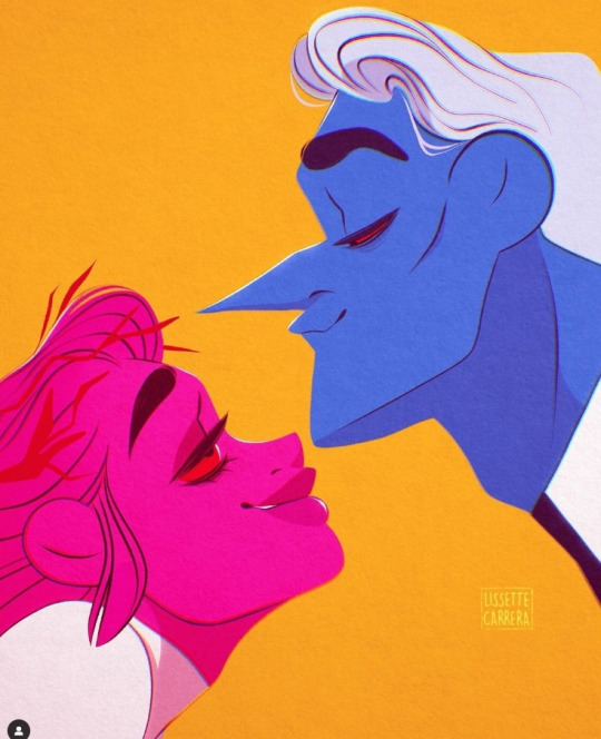
Very Disney/Warner Bros reminiscent art, with most notably, thick necks and distinguished jawline features on guys and hourglass figures/thin wrists/thin fingers on women.
And then we have Dnaeri:

It's harder to pin down her style because she seems to just draw whatever she's feeling like, but most notably are how she draws hands and collarbones, very similarly to Jaki, but with one noticeable difference - softer and rounder lines and shapes.
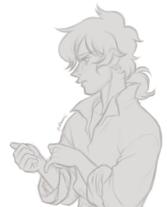
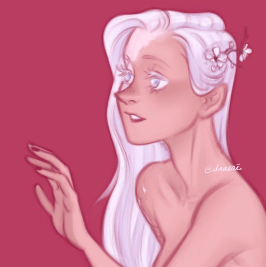
The irony is that Dnaeri and HeyItsJaki both have the same name - Jaki - so them having similar tells in their styles is just something I wanted to point out. Just a funny thought.
That said, Dnaeri DID post a drawing of Persephone once in her own style/interpretation, and there are definitely things to note here.

The collarbone distinction. The anatomy of the fingers and toes. The lighter lineart. The little 'dip' along the edge of the smile.
Moving on. Let's talk about the last assistant who I feel deserves a specific mention - AmyKim89.
You see, Amy is what I'm going to call the smoking gun. All thanks to this post:

Recognize that panel? That's the flat of Dream Persephone from Episode 204.
And this is what the final panel looked like.

Now, Webtoons cropping aside (don't mind the seam running through Persephone's chest) this confirms multiple things for us.
1. AmyKim89 was not the one to shade this panel.
2. The assistants are working purely off Rachel's sketches.
3. The assistants can be in charge of their own lining, which would explain the inconsistent lineart throughout each episode.
4. There are no backgrounds present meaning someone else is in charge of the backgrounds.
5. Flats can be changed and added to after the assistant has already done their job.
To talk about #5 first, notice the pantyhose that were added that make her legs disappear into her cloak. The baby's face changing. The added flower and necklace. Her eyes changing direction.
Regarding #1, look at how the shading makes the art so much more dull. The previous version of this panel with just the flats genuinely looks so much better than the finished piece.
This was, as I'm sure you can imagine, a pretty big find. While I'm sure Amy would probably not be happy to see me using her innocent post as proof for my hyperfocused ramblings tearing apart Rachel's process, I'm glad she posted it nonetheless because it finally shows us a smidge of what the process might be like during production.
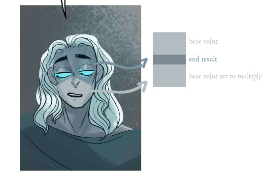
Going back to the shading really quick - Amy was not the one who shaded that panel. But I did notice that out of every little inconsistent thing in LO, the shading is some of the most consistent, and it's consistently awful. Dull muddy tones, lack of consideration of space or lighting, clearly the multiply tool being used even when it really shouldn't be, placement of shading primarily under the eyes even when it makes the face look too dim to look good.
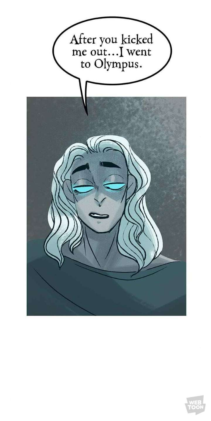
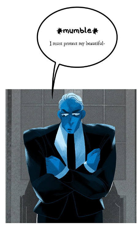
It's always being done with the same watercolor-like brush, with the same multiplied tones, and the same 'edges' along where the shading hits the light.
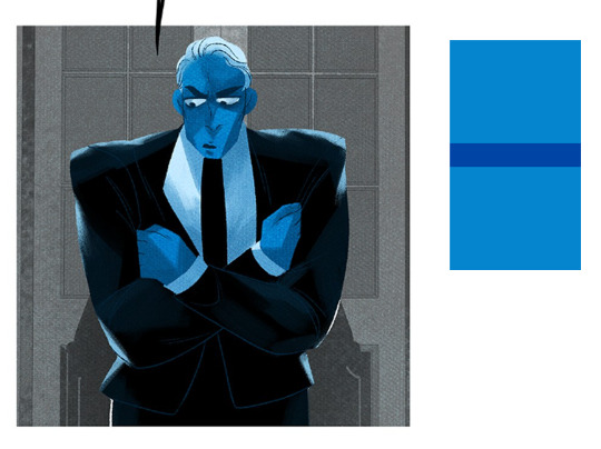
We also know that Rachel eyedrops her colors.
I don't think it's farfetched to believe that her assistants likely do too to a degree. Or they're working off color palettes from previous episodes they've done before which is resulting in this color dissonance where characters change colors, sometimes in between panels.
Considering the constant muddy shading, and the fact that the assistants may not be doing it, I believe it's Rachel doing the shading in the post-production. If you need more proof, here's a reel of her shading in Hades with the exact same techniques seen in finalized panels.
instagram
Otherwise, if it's not Rachel doing the shading, it could very likely be Dnaeri, as they're one of the longest-running assistants on the team (they came on during S1).
Moving on from that, let's circle back to AmyKim89's drawing of Persephone. She specifies she did the flats and lines for that panel, working off Rachel's sketches. But one noticeable thing is that there's no background.
This lead a bunch of us in ULO to speculate that Rachel is also the one throwing in the background and throwing PNG's of the characters on top.
Proof? How about the fact that there are panels out there with crunchy characters and pristine backgrounds?
I already suspected that the character was zoomed in and the background wasn't, but Amy's post confirms more than that - that the assistants are essentially drawing PNG's which don't get backgrounds until Rachel - or another one of her assistants - adds them.
Here's another panel that I strongly suspect was done by Amy judging by the colors (but the lineart feels like it could be Jaki):

Look at how she's floating in empty space. This wasn't drawn background first and Hestia second, this was drawn with Hestia first and they slapped a background behind her.
It would also explain why we get panels of characters missing their bottom halves or their limbs - because the backgrounds ended up being larger than they were anticipating in the final shot.

There are a whole bunch of things we can speculate on here knowing what we know from past essays and what I've laid out here.
Rachel may only be involved in the beginning and end of these episodes. She does the roughs, hands the sketches out to her assistants, which they flat and line, and she puts in the shading, dialogue/speech bubbles, texturing, and last details after they're all handed in. This would also explain why there are so many typos - lack of time to edit/proofread - and why sometimes there will be characters speaking but their mouths won't be open.
Rachel hands out the sketches to her assistants individually who flat and line it and hand them back. Sometimes they're handed individual panels, other times they're handed entire pages with a few panels on them. This would explain why we can go an entire scene with a character looking one way and then looking completely different by the next.
Think back to all those previous essays. Everything we've learned so far - that Rachel's buffer is miniscule, that she's shading with the multiply tool, that she's clearly only contributing the roughs and few panels that she makes from random drawings she did on a whim and waits until she can find a chance to shoehorn it into the comic.

Rachel started off drawing this comic just on her own. When she took on assistants, there were only two - AmbitiousIcarus and Madd_Joey.
But eventually, she took on more and more. Two became three, three became five, and nowadays, she maintains a consistent art team of 4-6 people per episode, not including herself or the rotating artists who come and go every now and then.
This has been happening steadily since the Episode 50's range of S1.
The summer when Lore Olympus' licensing rights for animation were sold to the Jim Henson Company.
I'm not gonna sit here and tell you that the assistants were the downfall of LO. I think they're all amazing artists, each in their own right - but their art is clearly failing to shine through in the wake of Rachel's poor management and organization. Rather than delegating single people to single roles - lines, flats, shading, texturing, etc. - she's handing things out panel by panel as she sketches them out... and considering how poor her time management is as we've all seen, it's not hard to come to the conclusion that these assistants are all being put in positions where they have to rush out lower quality work. Rachel is haphazardly dividing up the work between more people all the while contributing less and less on her own end in pre-production, post-production, and quality checking as time goes on. The final episodes weren't immediately noticeably bad as soon as she started taking on more assistants, but it's clear Rachel's involvement in the comic and its quality control has been declining rapidly since the Jim Henson purchase.
Again, this isn't to point fingers or assume the worst of anyone, but it really is food for thought. I hope that this was, at the very least, informative for those of us who've wondered over the years what Rachel's process is like. It definitely seems messy from what we can tell on the surface and frankly, if I could be in the same room as Rachel, I'd be using all this as an example of why she needs to manage her team and her time better. But that's not my place to do so. All I can do is speculate on it and spend way too much time writing an essay about it LMAO None of what I've written here is 'proof' of anything, as I'm not in the position to be able to do such a thing - that's reserved solely for Rachel and her assistants - but it's becoming plainly obvious what the workflow looks like and why the comic looks shittier and shittier every week.
All that said, I don't feel like her assistants get nearly enough credit for the work they do for Rachel. She can't even be bothered to remember the name of the guy who edited the books for her (it's Edwin, by the way) and you never see her bring up her assistants when she talks on interviews about how hard she works or how difficult it is to make a webcomic. At this point, Rachel may as well be the Queen of England - all the pomp and reward and credit, with nothing to show for leadership or actual work ethic.

It's not your work we're seeing each week - it's the work of people who are rushing to meet your deadlines, win your awards, and do your homework.
You are the sum of the parts you utilize in your workflow. You are not here purely of your own efforts. It can barely be called 'your work' at this point. Lore Olympus has become the Ship of Theseus - barely recognizable for what it once was after being haphazardly pieced together by the efforts of others.
And that's all I'm gonna say on that.
374 notes
·
View notes
Note
Do you have any recs for getting into 2d animation? I saw the 2d clip you put up a couple days ago (sick as hell by the way) and then I saw the like, wip version of it I guess? It's only one camera angle that doesn't seem to be moving around and my brain is just. Not comprehending how that works
Oooh I have no idea! Maybe I'm misunderstanding the question, but. All you really need is a software that has a Timeline feature, to display the frames with. I used Photoshop, but it didn't have a feature called onion skin that I really wish it had. Clip Studio and Krita both have that, so I'd go for either of them. I recently learned that Blender can do 2D animation too, but I haven't tried it. Alternatively, you could give traditional light table animation a shot. If you've never animated in 2D before, I guess I'd start with something short. Like a walk cycle. Or a simple but effective exercise is to animate a bouncing ball. You'll probably find a bazillion guides for the latter on Youtube. For my animation, I had an idea for the camera movements, but I first made the fixed angle animation to plan the action. Then I set the same scene up in 3D, that's where I figured out the camera movements. I translated that back to 2D.
29 notes
·
View notes