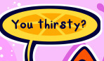
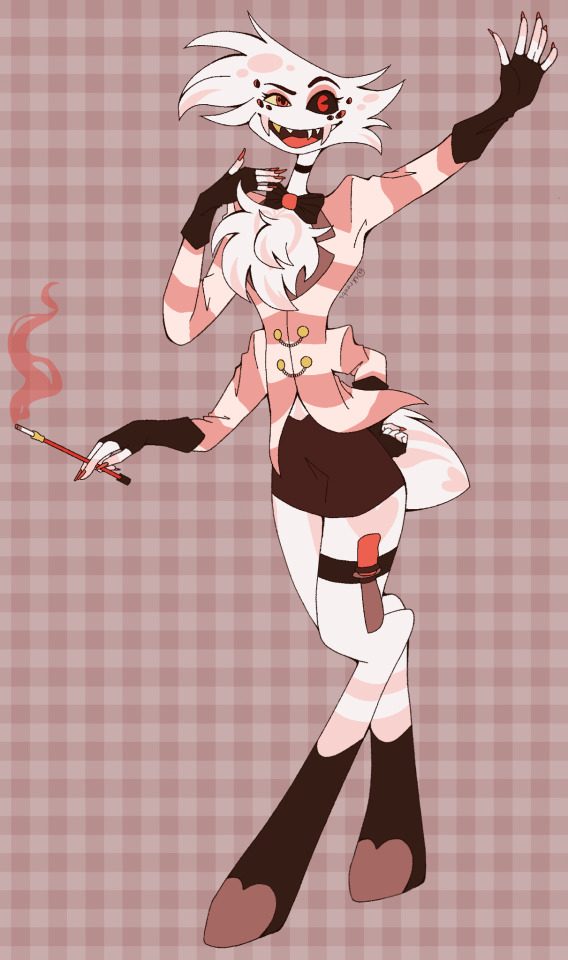
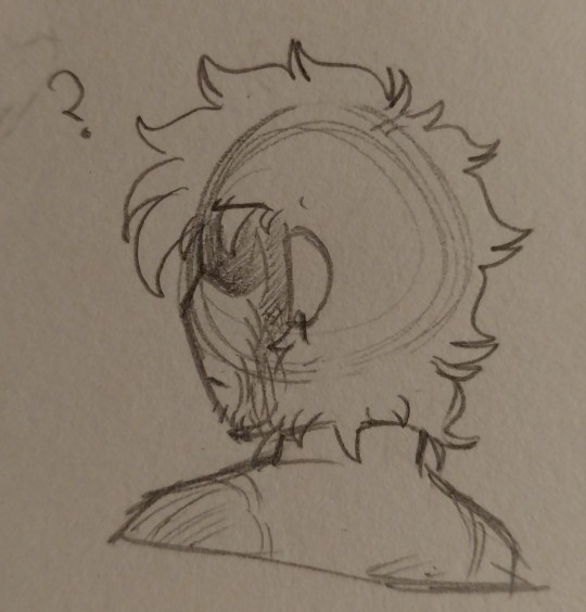
#I also really enjoyed redesigning him because I was Not going to give him his canon hair. I just gave him funny little hair wisps instead.
Text


I’ve been thinking about him non-stop. The Cringiest-failest man.
#he’s horrible and i love him so much#i can’t believe i forgot how much i loved making up ghost & halfa lore#I also really enjoyed redesigning him because I was Not going to give him his canon hair. I just gave him funny little hair wisps instead.#And the explosion scar that gets more prominent the more tired and physically unstable he gets. I have many ideas about that.#vlad plasmius#vlad masters#danny phantom#jack fenton#maddie fenton#danny phantom fanart
45 notes
·
View notes
Text
NEW NSFW Alphabet ~ Headcanon~ Billy Hargrove
Minors DNI
SO, I've taken the liberty of changing this up a bit. I've redesignated some of these letters because I think we've all seen the old ones so many times. Also, I think these changes could be more interesting for Billy in particular. Mind you not All of these are different, just some.
Enjoy

A- Aftercare (What is he like right after sex?)
Billy is attentive. He knows how rough he can be so after he's calmed down, he takes care to make sure you're okay. This can look like verbal check ins or bringing you water and towels. He'll make sure you're safe and comfortable.
B- Body Count
Billy gets around. He stopped counting after 30.
C- Cum
Billy likes it inside you. Rather that be your mouth or elsewhere, he likes the idea of the essence of himself being in you. On your chest is a close second.
D- Dirty Talk
Billy is big on dirty talk. He gets really into it and can't help telling you how good you feel and giving orders (stroke that c*ck, baby). He has no problem telling you what he plans to do to you.
E- Easy (Does he play hard to get?)
Billy is usually easy. The only exception is if you're desperate. Then, he'll tease you, making you beg and tell him how badly you want him.
F- Fight
Arguments with Billy don't typically turn into sex, believe it or not. When he's actually angry, Billy doesn't feel safe, and if he doesn't feel safe he's not getting aroused. He's much more likely to say something to embarrass you and then storm off.
G- "Good Girl"
Sex being one of the few times he can be openly affectionate, Billy showers you with praise. He's a big fan of telling you what you're good at, how nice you taste, how good you're doing. Etc.
He likes when you tell him how he's making you feel, and he LOVES to hear you say you're all his.
H- Hickey
YES, he loves giving you hickeys, all over your body but especially in places where people can see them. When you give him a hickey he wears it like a badge of honor. (Side note, this just gave me an idea for a story 😘)
I- Intimacy
Billy really enjoys intimacy and feeling loved by you, he just has trouble verbalizing it. He expresses love physically, he wants to touch and kiss and fondle you to show his affections. He's also slower to anger with you and will show up around you.
You know how cats pretend they don't care about you and then just "happen" to be in the same room as you all the time? Yeah, that's Billy. He just happens to show up to parties you're attending, even parties you're throwing that he wasn't invited to.
He crashed a wedding you attended because he heard you didn't have a plus one.
J- Jealous
Does it even need to be said? Billy will get jealous if your gaze lingers on a poster too long. He's a walking nightmare to any guy who looks your way. He's your scary dog privilege.
When he gets jealous there's a 50/50 chance that he's just as mad at you as the other person. Sometimes he views you as too innocent to notice other people lusting after you. At other times he accuses you of having a wandering eye.
It takes a long time to talk him out of his jealousy, but it always comes back to reminding him that he's good enough and you aren't going anywhere. After a jealous episode he's usually feeling vulnerable. Kisses help.
K- Kick (Something he's always kicking himself for)
Billy regrets the times you've seen him lose control of his anger. He wishes he could've been better when you met so you didn't have to see any of that and he could've avoided hurting you. Now that he's growing he just wishes he could've been a better man for you in the beginning.
L- Location
Billy is fond of car sex. He likes to get you in the backseat and put down a towel to protect the seats. He also likes to get you alone at a party with the music to cover the sounds.
M- Motivation
Billy gets turned on easily. He loves when you try to flirt with him, even if you're bad at it. If you're bad at it then he just teases you about your crumby game and watches you get flustered which he finds extremely cute.
He loves you in skirts and halter tops. He loves seeing you naked in his leather jacket. He'll pretty much f*ck you at the drop of a hat.
N- No
No scat, no golden showers, no sounding.
O- Oral
Billy is a big fan. BIG BIG fan of oral, both giving and receiving. In a way he's more proud of his skills with his tongue than with his stick. In a way it feels like more of an accomplishment to know how to use just your mouth and fingers to get someone off.
P- Position
His favorite position is cowgirl, believe it or not. (More on this later) A close second is having you flat on your stomach. He likes to have you like that with an arm around your neck, mostly because it quickly overwhelms you and he loves seeing you like that.
Q- Quickie
Billy is down for a quickie in theory. In practice he's more likely to just make you late to wherever you're supposed to be.
R- Risk
Billy likes a healthy level of risk. Like I mentioned he likes having sex at parties, but he'll also sneak into a bar or restaurant bathroom with you. Back row at a movie theater is a fun one.
S- Sloppy
Billy gets sloppy sometimes, maybe if he's drunk. He likes fingering you when you're really wet.
T- Time
Billy likes sex pretty much whenever, but his FAVORITE time is the middle of the night. If you find yourself up late with him you're going to get your cheeks clapped. This is also true if he wakes up in the middle of the night. And don't let there be a thunderstorm, Lord help you.
U- Unfair
Billy likes to tease you, fluster you, overwhelm you, make you say please, make you say exactly what you want before he gives it to you. Jerk.
V- Volume
Billy isn't shy about his sounds, he'll let you and the people next door know how he's feeling.
W- Weakness
When you ride him he falls to pieces, (see, told you we'd come back to it.) particularly when you get up on your feet and squat down on him. Combine that with a hand around his throat and he's done for.
X- Xenial (Is he hospitable?)
Billy wants you to feel safe and comfortable when you're with him. At first, he doesn't know how to go about it besides having stereotypical "girl" stuff around.
He also mistakes looking out for you and "keeping you safe" for being bossy. He'll try to tell you who to hang out with, how much to drink, and where to go because he wants to take care of you. Needless to say this causes problems.
At the end of the day, if you need anything all you have to do is ask.
Y- Yearning
Billy has a high sex drive, but it doesn't have to be penetration every time. He likes all kinds of sexual behavior and will thoroughly enjoy it every time.
Z- Zone
Billy wants above all else to just share space with you. It doesn't matter where you are or what you're doing, as long as you're safe and happy it's the perfect place for him.

Thanks for reading 😘
#billy hargrove#billy hargrove x reader#stranger things#billy hargrove smut#fanfic#sea swallow me#billy hargrove 18+#billy hargrove imagine#alphabet#headcanon
236 notes
·
View notes
Text
Whooh boy. Hi everyone! Sorry, It's been a while. But I have quite the post for you all today, because we'll be talking about a webcomic I just finished! ... I will warn you all though, that I do not have the kindest of words to say about it.
You may be aware of this comic, as it has a considerable following, especially here on tumblr, the comic is called Sparklecare. It currently has 4 volumes and is on a short hiatus so the website can finish it's redesign, but the plot summary of the comic from the last available snapshot of the website is as follows:
The comic follows the story of a cat named Barry Ill and his experience of being admitted to the Sparklecare hospital. Despite its glamorous reputation, the hospital is actually a prison that tortures and kills its patients and drains their families of insurance by the corrupt hospital's owner, Dr. Cuddles. Cuddles is a greedy Capitalist scumbag who cares about nothing but money, and so far, everything is working out for him. Any patients who escape or try to speak out against the hospital aren't believed and are written off as crazy. The story follows Barry's journey into uncovering the truth about why this place really is the way it is, and why nobody's talking about it.
From the outside, the comic is very striking and intriguing! From it's prominent art style and art direction, to the concept itself, it sounds like a fun time! ...Right? Well that's where the comic gets you; see just like the in-universe hospital, Sparklecare isn't as inviting and pleasant once you really sink your teeth in. And I'm here to talk about why I think that is.
Before we begin, I'd like to clarify since I've become aware of the community's um... Questionable attitude towards critique, that if you enjoy Sparklecare, that's totally fine! I'm not gonna tell you what you can and can't read, I'm here to express my own thoughts on it.
Now, I won't torture you with this post if it ends up on your dash, so the full post will be under the cut! Please check the reblogs, I may add more there if I run out of space.
Also, CW for bright colours, blood and a whole heaping o' medical mispractice.
Before I get into some of the more serious issues with the comic, I wanna first start off with the thing you're going to first see trying to read it: The art. Here I would say the website, but since it's getting a redesign, I don't feel confident speaking on it. I'll leave one note on it though: it needs serious optimization...
Onto the art: I will say, I found the art quite charming, especially the art in the first 2 volumes. I think the comic has a way with setting mood and tone using it's palette, specifically in the dramatic "blue/red" scenes - I think those look gorgeous!
The style in volume 1 & 2 is also very pleasing to the eye, although it can look off at points. I think the style succeeds extremely well with it's tendency to give characters large, exaggerated expressions - it's very cartoony and I love it. The lineweight is also used very well in my opinion!
However... There's a few big elephants in the room that they are The designs, lettering & panel work.
I'll begin with how the series handles it's lettering, as it's one of the most important parts of a comic. Although it's unique, that does not mean it's good.
In volume 1, it starts off fine enough, it's a simple speech bubble with white/black text.

It sort of flip-flops between having a shadow/glow and not having one, which although confusing and hurts my eyes sometimes, not a deal breaker! The bubbles are all colour coded also so no matter the scene, you understand who is talking. That is very good! I like that! I wish the colours weren't as bright as the backgrounds, but I understand why they are.
Volume 2 introduces what I consider my favorite of the lettering styles, big bold outlines with bubbles that better surround the text!
It's easily the most recognizable lettering style of all the volumes, and it's very readable. It's simple, but lettering is at it's best when it's simple and understandable.
This volume's lettering also introduces colour coded words & different fonts.

Which, I think looks lovely! It adds personality, and since fonts carry different tones with them, it helps with emphasis and how people read the dialogue. However, this isn't to say I think this lettering is perfect.. I'm not a huge fan of the random dots & spots, I think they clutter up the page when there too many characters on screen speaking, which distracted me from focusing on the actual words they were saying.
It also changes mid-way through volume 2! Suddenly, we get character-coded dots & spots... Which, cool in theory, but in practice, as I mentioned, it clutters the page if there's too many characters speaking at once.

Plus, they're used on background characters who do not appear again after their introduction, which is such a waste... If you're going to introduce these character-specific details, they should be used on characters who are important, not character we'll never see again.
When we get to volume 3 & 4, the lettering style almost completely solidifies, the same big bold outlining from volume 2... But now instead of just having personalized dots, we get fully personalized speech bubbles. Which, again, cool in theory! But in practice it's just... So hard to read.


On lettering, I will applaud the use of a custom hand-written font. It looks great! It's fairly clear and adds a nice touch to the comic's overall appearance... But how they use the font is, in my opinion, awful. Characters talk way too much for how much page space there is, which means that there isn't enough space for the bubble to encompass the text, which means text needs to get smaller.
These pages are over 2000 pixels wide and tall, but there's no consideration for how the images & text will look when shrunk down to fit into a normal browser page, which means the text gets tiny and barely readable if there's too much of it - which there often is. I'll get into how I feel about the writing in a moment.
On the panel work, it's fine, it's not super jaw-dropping but it's serviceable. Where the panel work starts to fail though, is it's pacing. See, in comics, pacing is extremely important, good pacing means a better and clearer reading experience, bad pacing can leave the reader confused and force them to reread repeatedly to understand what's going on.
Sparklecare suffers from this heavily, I feel. Take a look to this page below, while not the worst example of it, I think demonstrates a bit what I mean.

There's a lot of text, similar looking shots, and... Very little background to help, well, ground where we are, which made me feel dizzy while reading. There's not a lot of proper flow, because speech bubbles float all over the place, often times out of order in which you are supposed to read them. You tend to dart your eyes all over the page to "properly" read it, which makes for a bad reading experience - the clearer the order is, the better the flow.
On backgrounds, I do not like the near-complete lack of them. Sparklecare gets around backgrounds by filling the colour voids of the panels with dots, specks, lines and patterns - but they don't do the job! It makes the pages feel more cluttered and difficult to look at and read.

Even when they do have backgrounds, they're also filled to the brim with patterning to take your mind off how often strange they look.

Being unable to see what's going on is a reoccurring issue with the comic, and it doesn't just end at the panel work or backgrounds...
The character designs in Sparklecare also contribute to the visual clutter, what with many of them having many small details or otherwise being unpleasant to look at due to their colour palette.


Here's a few examples of characters I think have too much going on or are just eyesores. And see, I get it, they're supposed to be sparkleanimals - designed like a kid on DeviantArt was making them in 2011, but you can get that look without making the designs hurt to look at. Sparklecare both tries to work within a limited palette and tries to have every colour possible on a character and it pulls neither off well. Not to mention, the multitude of small dots & details, adding more to the pile of small dots in the comic.

When a ton of characters are on screen, it tends to make things more confusing to look at - due in part also to the comic's continuity issue. Things or characters that are in one panel or page, will disappear the next, or swap places. Overall, small art issues pile up onto a mess of bright colours and rainbow.
Now here's where we get to the fun point, The writing. Oh boy! For the most part, or at least in volumes 1 & 2, the writing is completely fine. Complicated, a bit odd, but nothing to scream about... Until volumes 3 & 4, because that's when the issues in the writing really starts to show it's rainbow-speckled face.
I'll be direct, I don't like the writing in Sparklecare. The characters are typically unlikable or annoying, and when they do have something interesting going for them, it gets walked back on for plot reasons. Characters also seem to be unable to do wrong, unless they're deliberately out to be the bad one. Characters will do something bad, but get reassured that everything is fine and it isn't their fault even though they did something bad - which is weird the first time, but awful the next 40.
The writing does have it's good points (I liked most of the writing in volume 2, I thought Hemera's struggles with wanting to keep her friends safe was really interesting and I liked the chunklings), but there's prominent issues I can't shove aside.
I namely have issues with the humor, specifically it's uh... Sexual humor. Now, don't get me wrong, I love a good penis joke every now and then, but volume 4 has about 5x the sex jokes of any volume. It was genuinely horrible to sit through because I knew every serious moment would get a joke about stroking it a page or two afterwards.


(One note on that first image there, it happens right after Barry [the green guy] completely belittles and insults Uni [the purple one]...)
The meta humor also felt very, very forced.


It always came out of nowhere, and completely out of place every time it was used. I like meta humor also, but this is supposed to be a more serious comic, yes? I mean, it should be considering the topics at hand, so suddenly throwing in references to this being a comic feels weird to read.
I will say, I do like some of the jokes, specifically these ones:


Let me circle back to the character writing really quick, because there was characters I enjoyed! ... Just not the main ones.
I think, out of everyone, my favorite characters were:
Several background characters with no lines
Dr. Party
Cyn
Jean
Rem
I also really enjoyed how Cuddles was written in volume 1 & 2, he felt very threatening to me.
Outside of these characters though, I found little interest in the main cast and even found myself rooting for the downfall of a few of them due to their poor writing.
Specifically on Barry, there's a small arc in volume 2 where he realizes he needs to stop violently denying that Uni has magic (Which is a stupid plot in my opinion, by the way, considering the worldbuilding has a lot of magic in it. You'd think the smart guy character would know that?) after Uni's magic helps them in the dump. However, right afterwards, in volume 3 & 4, Barry goes right back to verbally assaulting Uni about how magic isn't real! It's not enjoyable to read, and makes no sense to me after what happened in volume 2.
One note, since I don't know where to put this but, I don't like doom. I really don't ... I think I'm supposed to feel bad for him? But I can't! I saw him in volume 1 take glee in having power over the patients, and as the site states:
Doom is not a normal nurse, because he takes on the role of a doctor by harming people alongside regular nurse duties.
He literally tortures people! I'm sorry, I cannot forgive that! No matter how bad he feels about it.

Some more notes on writing before I end this because it's getting too long.. The disability rep in Sparklecare is, questionable sometimes. For the most part I think it's perfectly fine, buuut there are moments I don't think of fondly.. Specifically this moment in volume 2:

Barry starts having a paranoid and panicky moment due to his contamination OCD (Because they're in a literal trash heap) and Uni decides to...


Call it cute??? Genuinely what the hell, who thought this was a good thing to put in here? I haven't read the spin-off AU comic, but I hear it treats it's character with OCD even weirder. Yuck!
On a related note, I hate the cutesy names for disorders. They don't even come up often in-universe, there's little purpose in having them, especially if most of them are just real life, actual disorders. I know it's about an abusive hospital but come on man! You don't have to use baby names for everything! You don't even follow the weird naming pattern for everything! Things like autism don't get a weird cutesy name, but OCD and depression get one? Have some consistency if you're gonna make a weird universe decision.
Alrighty.. This should be the end of it, I'm not sure how to end it because there's still more I want to talk about! I'm super-duper open to talking about anything I've said here or elaborating on why I feel certain ways. This is in no way meant to be a hit-piece of the creator of Sparklecare, I think there's a lot of protentional, and I simply adore some aspects of the comic (Specifically visually). I really do hope this comic will improve over time and that it sees a long life of success.
If you come to this post to disagree, I ask you read through what I say carefully and come at me respectfully, I have no interest in fighting with people over a webcomic about furries.
-Mod Star
#mod star#sparklecriticism#sparklecarecriticism#sparklecare criticism#sparklecrit#I was considering posting this in main tags until I realized I'd get my ass destroyed. Oh well!#Apologies if anything is worded odd or has typos#I was distracted often while writing this and it is quite long so I proofread as I went.
60 notes
·
View notes
Text
Breaking Bot
(read more for some rambling about mega man fully charged)
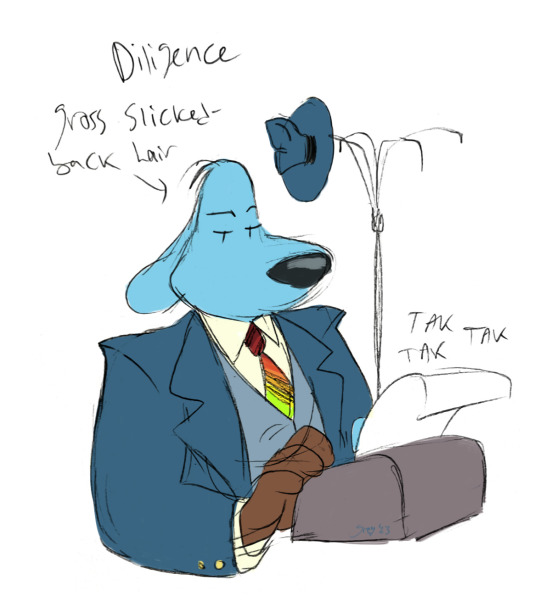
Mega Man Fully Charged has been on my mind again lately, which made me realize that there's literally a robot named Chemistryman who worked as a chemistry teacher. Not using him as a Walter White stand-in would be a criminal offense.
I'll have to admit I started getting back into Fully Charged again after seeing some asshole on twitter complain about the character design for the hundredth time. I just can't stand that kind of negativity. I swear to god, Fully Charged is like the Sonic Boom of the Mega Man franchise. Personally, I really enjoy the FC designs. I've probably said this before, but I feel like the redesigns give some of the more forgettable robot masters way more character. Like, do I care for Classic Drillman from Mega Man 4? I mean, yeah, I do, but I wouldn't care as much if it wasn't for his Fully Charged incarnation.
I also really enjoy most of the original robot masters. I already talked plenty about Blastowoman and why I love her so much, but I want to talk about the others this time.
Take for example Chemistryman. Comparisons to Walter White out of the way, I feel like his character was a really fun idea. God knows I had teachers who put me to sleep back in the day. For me, it wasn't chemistry though, it was my economics teacher. I always compared her to a story teller at a Christmas market who would read children stories out of her big fairy tale book. Only that in reality, it was stuff like the minimization/maximization principle. Most of my notes for that class were incomprehensible chicken scratch, because I just couldn't keep my eyes open. In the end, I slept through like half her classes, lol. But I gotta say that I still always got a B or higher in the end. Somehow. I thank god every day that I never have to step foot in a school again.
I really wish Chemistryman got a little more time to shine though. Two episodes is just way too little. I would gladly take three more episodes with him over those gross Gutsman episodes. I know I love talking about wasted potential with this show, but I wish there was an episode that focused on Chemistryman outside of the school setting. I get that his whole character is "boring, bitter teacher", but I'd really like to see what he gets up to when he's not trying to force children to listen to his chemistry lectures. Like having Aki try to talk him into going into retirement for good. And then he tries to find hobbies for him so that he doesn't bore himself to death. I can see him getting into building model ships or something like that, lol.
Now that I'm already writing up a storm again, I might as well talk about some other headcanons I have about the FC bots. Since Woodman was in sleep mode for 30 years after the war ended (I don't know where I got that number from. I rewatched his debut episode, but the exact number doesn't appear anywhere. Oh well, let's just pretend this is canon, even if it isn't.) we got kind of a Shadow the Hedgehog type situation on our hands. All of his friends and family got to live their lives in this new, peaceful world of harmony between robots and humans, while Woodman spent 30 years powered down in a bush or something. Completely forgotten about. Like, why didn't they go look for him after the war ended? I don't think Aki and Suna wandered that far into the forest for their school assignment. If you really think about Woodmans back story for a moment, you realize how fucked up it actually is.
Now my explanation for this goes into heavy heavy headcanon territory. When Suna calls the principal about Woodman, he warns her that Woodman is dangerous and to get away from him immediately. Now why would he say that? The principal also calls him "ruthless" in that same explanation. What I think happened back then was that Woodman actually planned to assassinate the human armies leader. (Possibly Sgt. Night?) The leader of the robots caught wind of his plan and put him into sleep mode himself, since he and Dr. Light were on the brink of finding a way to end the war peacefully. In my mind, this leader is the FC version of Swordman. Don't ask me why, he was just the first guy I thought of. And then it just stuck.
I know this makes Woodmans back story even more fucked up, but I just love putting my favorite blorbos through hardship. Don't even ask me about my headcanons for Drillman. They'd actually put me in prison.
Now all this culminates after Woodman is reactivated by Suna and Aki. Finding himself alienated from all his former friends and comrades (Maybe the other Mega Man 2 robot masters?), what was he supposed to do? He couldn't spend the rest of his life isolated (and homeless) in the forest, could he? And this is where season 2 could have delivered. But I'm done whining about that. If Capcom doesn't deliver, I gotta write my own season 2. Simple as that.
Anyway, getting back to Chemistryman, since he's pretty old, I imagine that he was already working as a teacher when Woodman was still around. Maybe he even was his teacher at some point.
And since I love having my favorite characters interact, I also thought of a scenario where Drillman wanders into the forest out of frustration over his miserable life, only to meet Woodman by coincidence. In the end, Woodman helps him work through his daddy issues and his body dysmorphia, while Drillman helps Woodman reintegrate and manage this (for him) completely new world of peace.
Another great headcanon of mine is that Chemistryman is actually Acidmans father. Just because I think it would be funny. And as Fully Charged has confirmed: robots in that universe do indeed have parents. (Flashback to the time I drew Dr. Light beating the shit out of Drillman's father)
Speaking of Drillman.... For being one of my favorite Mega Man characters of all time, I haven't drawn him nearly enough. That will probably be my next project.
This might also be a great time to tell you that I've never watched Breaking Bad before, lol. Everything I know about it comes from RTGame's Stardew Valley playthrough and the RTVS Half Life parody.
Sorry for all the yapping. But if I don't talk about robots at least once a day, I might die. This is a serious condition.
#megaman#mega man#mega man fully charged#acidman#acid man#chemistry man#chemistryman#im just gonna add my essays under the read more from now on hehe#the funny crossover you never know you needed#i am very normal about the fully charged bots#should i also tag woodman and drillman? eeeh no
74 notes
·
View notes
Text
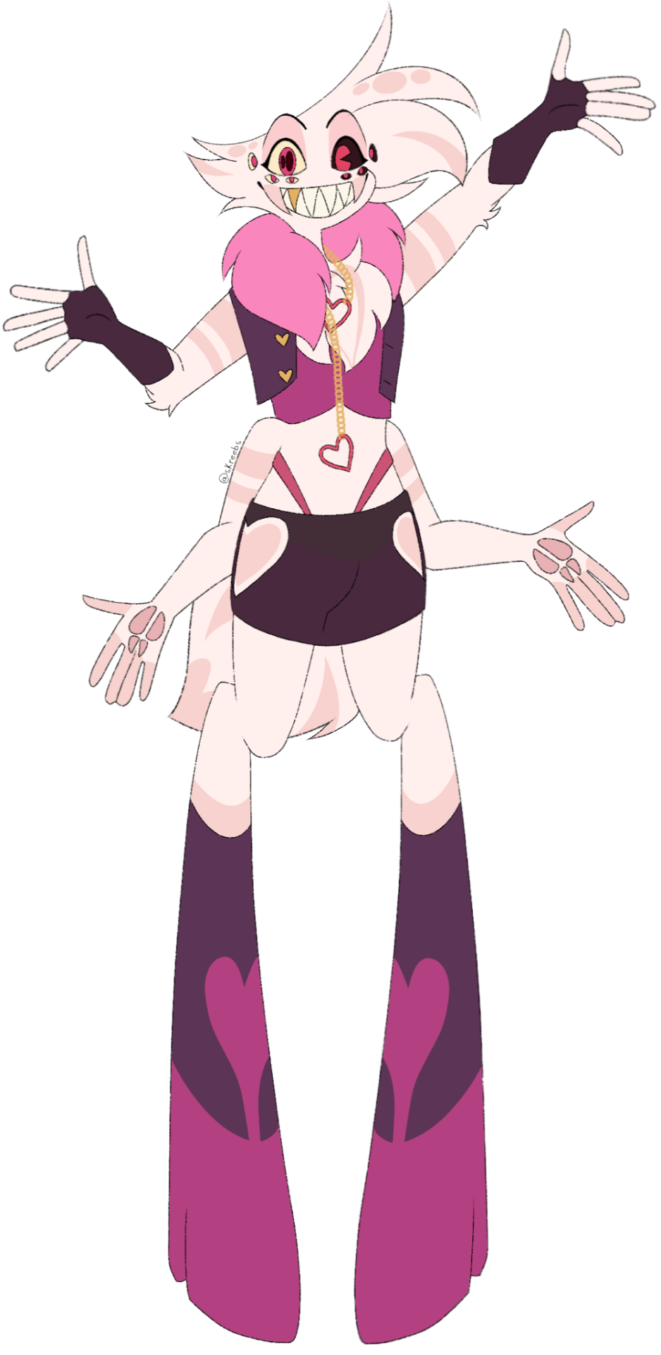
Angel Dust Redesign! (7/7)
FINALLY I AM DONE WITH THE MAIN 7 FREAKS.
Depending how I feel I might throw in some bonuses but these guys are your only guarantees! Going to be posting the full lineup separately because I don’t want to clutter this post!!
God okay where to start. I was talking about them in Husk’s post so let’s go with that. Angel’s clothing restrictions are his necklace and shoes. I might go on a bit of a tangent with this so forgive me 💔
For the necklace let me get this out of the way: yes it is a BDSM thing! I’m terrified people are going to take this as me being a weirdo but please as an adult content creator give me some space to explain before anyone jumps on me and hits me with a metal pipe. The intentions behind symbolism matter HEAVILY. I am against Vivzie’s portrayal of Angel’s abuse and the chain/collar imagery because it is blatantly either her being incredibly uncreative or her inserting her kinks into her shows. I think it is completely fine to use suggestive items in this way as long as the intentions are clear and not just there for no reason.
I would’ve probably done something else like a corset as a restriction, but I’d like to stop being so shy about Angel’s actual job. He is a pornstar and removing that outward aspect of him is taking a big chunk of his character away. I need more people to acknowledge that Angel enjoys sex and actively wanted to explore this side of himself. With the slip chain however, I would also like to portray how things Angel enjoys in his job have been used against him and made him come to resent what he does when he is forced into it. I think thats a pretty understandable thing to show.
This is harder to explain but the gist of it is just don’t be afraid to acknowledge Angel’s job. It’s okay to use sexual things as metaphors. Have you heard any christian song ever/hj
Alright with that out of the way, with the shoes. Angel’s feet are a large insecurity and discomfort of his which already makes his shoes some sort of restriction on their own, however if controlled, they can be made to stumble forward, fall over, etc. I wanted to show how Angel has freedom to go mostly wherever he pleases, though once again, that free will can be taken away very quickly.
I hated his suit so all suiting is gone entirely. He’s supposed to look attractive or eye catching at the very least. I’ve also added back the outer fangs he had in my first redesign!
I am much happier with the new one in comparison to this old guy. I know it’s only a few months old but you can really see how differently I draw him and the details I pay attention to more like the shape of his hair. Aside from the old one! I wanted Angel himself to still keep the reddish pink to show wrath and destain being masked as lust, except now his clothing is actually the pinkish-purple lust colour and it covers more eye grabbing parts of his body like the chest, hands, hips, and so on.
I don’t think I’ve ever outwardly mentioned Angel having polycoria but he does and it’s probably my favourite feature to draw aside from his hair. About the hair and fur: Angel used to have spots and basic stripes before his contract with Valentino, where afterwards they began to curl into their cordiform shapes. Most physical overlord changes with hair and skin tend to not go away, so depending on who you make a contract with it’s either a fun perk or a sort of scar.
Once again, not sure if I will be continuing with anymore in this specific lineup, but if I do end up posting more of these I really hope you like those too! 💣
#hazbin hotel#hazbin critical#hazbin hotel criticism#hazbin hotel critical#angel dust#hazbin angel dust#hazbin angel#angel dust hazbin#angel dust hazbin hotel#my art#hazbin rewrite#hazbin redesign#hazbin rework#hazbin hotel rework#hazbin hotel rewrite#hazbin hotel redesign#anti vivziepop#tw valentino#cw valentino#tw sa implied#cw sa implied
60 notes
·
View notes
Text
I'm not exactly sure how to approach this, so how about we start with some redesigns I've made and explaining the thought process behind the designs? We'll start off with the man, the myth, the legend himself:
Meliodas


I'll be honest. I do not like the shota/childlike appearance that is Meliodas. I get that it's suppose to be part of a running shtick of, "oh my God, he's a child—wait no he's a grown ass man?!" or a personal preference for the author (who makes a lot of his adult characters look like children/quite young for their age), but it's playing into one of the tropes I hate (looks young but is actually an ancient being). If it's your cup of tea, more power to you, but it's not my kind of flavor, so we're redoing him design-wise while also trying to keep some things (colors mainly).
So for his design, the thought process was like this:
Since he's a demon, I was like, "okay, bet" and told myself to pick one (1) from the three (3) options I gave myself, which was dragon, goat and crow— dragon in reference to his sin (Wrath) which is usually associated with dragons, goat because of goats being associated with hell and Baphomet and the Devil always have goat features, and crow because Morgan le Fay (which is his future wife in my rewrite, surprise! This bit is moreso fanservice to my middle school self. I'm sorry Melizabeth lovers, don't eat me alive)'s animal is usually the crow and crows are seen associated with death and that ties in with his curse of immortality.
Now, the goat jumped at me the most because it's the one most heavily associated with Hell, and he is the son of the Demon Lord whom I named Felec (based on Arthurian Legend, the little information we have on him), and I saw these amazing goats for someone's DnD character, and it just fueled my need to draw him as a goat more. The original idea was to give him goat-like features which was the ears, horns, the pupils, but then I got to thinking, "man, the seven deadly sins are all suppose to be from different races, yet it's hard to tell with how all of them looked practically human" and I know I can easily say, "ah no, this is just his human form, his true form is a lot more demonic and he needs the human form to blend in", but then I thought, "that's so boring", so lo and behold, I start with his eyes and worked my way from there.
I changed his hair to curls because his old spiky hair was not working, and his outfit had got to go because I thought, "he'd look more sick with goat legs", and made him two different outfits to accommodate that and to fit the medieval fantasy setting better. I was thinking of blending some attributes of a dragon and a crow to make him more demonic like, but I don't know, I just really like what I made and thought other features would throw everything off balance. Maybe he comes off more like a cursed goat and rolls with that idea so people don't suspect him of anything, but hey, I can always tweak it to make him more demonic if it doesn't come off that way. And I did not want to give him dark colors for his fur—that's going to go to his youngest brother, Zeldris.
(Here's my first official post! Hope you enjoy @gh0stofyesterday )
#It took me literally MONTHS to figure out a Meliodas design that I was happy with#My first few tries were just getting his design down#then I said fuck it and shoved it all off the table and went apeshit#now he's a goat#I'm also sorry for how long this post is#I'm a certified yapper#this rewrite is LITERALLY my passion#nanatsu no taizai#seven deadly sins#7ds#nnt rewrite#nnt#meliodas#nnt meliodas#nnt redesign#also also I hope this gives you all a glimpse on how VASTLY different this rewrite/redesign is going to be in comparison to the canon
31 notes
·
View notes
Text
Analyzing and reviewing all the updated models in the SOUP update for SJSM
Because why not?
Specimen 2 / Gel


The guy who wants to give you your wallet. Dude is mad skinny and more skeletal now. Although, unlike the other skinny redesigns (which I will get into later), I actually don't mind how Gel looks here. Considering the fact he was most likely a human at some point, a human who most likely was on the verge of dying from starvation and thirst, I can see Gel looking like this.

Not to mention, his new animations are pretty cool too! The animation with him rising out of the goo puddle looks more interesting now and I like how his attacking animation is much more animalistic and aggressive compared to his awkward and kinda stiff attacking animation in the original HDR. My only complaint is that his rising animation should be more slower and less choppy. Otherwise? A pretty solid model.
Specimen 3 / Subject 5


The cutie patootie spiderpede. Another decent one. He has been given a bit more texture to his body and he has a much more rounded appearance overall such as his body segments and head. His legs are a bit more thinner which looks more unnerving imo. A cool little detail that was given to him is that his pincers now move! A very unnerving sight to see.
I'm not a fan of how he's more bright in color and the animation on his legs looks quite janky looking. Also maybe it's just me, but he doesn't seem as big as his previous model. Other than that, this model is pretty solid and is a bit more scarier than the previous model, but it has some downsides.
Specimen 4 / Ringu

Vore ghost woman. Ngl, I was pretty scared when I saw little snippets of Ringu's new model. I thought she was going to be made into a skinny stick like some other models. While that ended up being somewhat true, like in her upper torso region, her arms, and neck, it's not too noticeable or atrocious.
Her hair has become longer, her skin has a bit more texture to it, her breasts are more pronounced, her arms are a bit longer, her hands are bit longer and sharper, her clothes are a pastel purple color, and the blood on her hands are more brightly colored.

My favorite new detail however is that instead of her legs being a solid black color, her legs are now half white half black. Giving off this cool little effect, like the black part is engulfing her legs or something.
What I'm iffy on is the color of her clothes. Why change it? Although I suppose it doesn't look bad, I prefer the old gray look. I also prefer the more dried blood look on her hands with her older model.
Other than that, I actually enjoy this model more than I thought I would, especially taking into account the new floating animation that was given to her, which is a very good and smooth animation that is a huge improvement from the last one. I really like this one!
Specimen 5 / Bab


Jesus christ! We were having a decent streak going. What the fuck happened here? What were they thinking?
Let's see... so they made Bab go from looking like a mannequin to looking like a stick, alright... Her head is less humanoid and looks more like a deformed cube... She has this weird texture given to her legs for some reason... Her sword is pointing downwards which makes her lose some intimidation... The holes in her face which were only visible in her death screen are now fully visible in gameplay for some reason... and because of her whole body and textures being drastically changed, you can no longer tell she's supposed to be a reference to Silent Hill... AND THEY GOT RID OF MY GIRLS CURVES!
Yeah... there's nothing redeeming here. The model just sucks in pretty much every single way. Definitely the worst model this update has to offer.
Specimen 6 / Ben


Stabby puppet guy. Now I've seen a few folks crapping on Ben, but I don't think he looks too bad. He definitely got a massive change in terms of textures, but otherwise he looks mostly the same to me. I personally like the shading that was done to his face. Makes his facial expressions really pop out and he looks a bit more intimidating overall. I especially like this shot from the trailer where the room is dark and the flashlight is shining solely on him. Was pretty unnerving on my first viewing.

Is this my idle version of Ben? No. I still prefer the original model due to the Ben Drowned and Happy Mask Salesman references being more clear and although I find the redesign to be more intimidating, I also think that it tries a bit too hard. One thing that I liked about Ben was that he seems like an ordinary and somewhat friendly looking puppet at first, before you start making a run for it once he goes after you. This one is more on the nose. Decent model nonetheless.
Specimen 8 / Deer Lord

"Deer" lord! (sorry, I had to). Funnily enough, while everyone else got the skinny treatment, it seems like the deer man got a bit wider. He also had his textures changed a bit, his snout angled more downwards with more blocky and yellow teeth rather than sharp and white ones, his height slightly decreased, and his eyes look slightly bigger.
Other than that, there's not much to say about Deer Lord's new model other than it looks great. Especially with the new textures he was given when he opens his cloak.

I still prefer the old model due to it looking more scary, thanks to the height and more thin look, but the new model is still pretty good.
Specimen 10 / Parasite

Annnnnndddd back to trash...
Yeah this model sucks. I still remember first seeing this thing from Ryan J's video and laughing my ass off. The ridiculous walking animation, the over exaggerated and way too floppy arms, and the overall terrible and bland textures. Just a trash model all around... until...

They listened to the community and updated the textures! And I'm pretty sure they mentioned somewhere that the animations would be slowed down too. I still prefer the original model, but this is a massive improvement from what we previously got and I feel like I could potentially get used to this model and even start to prefer it to the old one if they get the animations correctly (not sure about the ass cheeks, but those are there too, I guess lol).
Specimen 11 / Beef Demon


Funny beef man. This one is a mixed bag to me. I really like the goat legs, the creepy arms, and horns, but everything else screws it all up. Yet again, bro has been made skinny for no apparent reason and has lost his intimidating bulky build. His head also looks too small and his eyes look too big and odd. If he kept his bulk and his head was changed up a bit, he would probably look a lot better, but for now, this model is unfortunately kinda bad. Not much else to say.
Specimen 12 / The Sickle Man


Weird ass lonely old man. We haven't gotten a full glimpse of him yet, but we do have this screenshot. He seems darker in overall color and he looks a lot more detailed with some nice shading going on. From what little I can see, he looks pretty good!
Specimen 13 / Siren

Piano keys for teeth lady. Her model seems to be the same. So not much to say there. Although we do get to see her swimming in the water! Which has its positives and negatives. The fear of the unknown factor is lost now that she's visible, but at the same time it's really cool to actually see her instead of just only seeing her model sitting on a box and then disappearing once she goes into the water.
Unknown Specimen 2 / Otto the Otter

Har Har Har Har Har. Okay. This one is definitely a step up and is the 2nd best new model from this update. The more detailed textures, the added grim, the bits of metal, his new walking animation... it's all so great! The only negatives is that his eyes don't glow and you could say that his older model being so low quality was apart of the joke and what made him so charming. So although I really like this model, there is a sense of charm that is lost from the old one. Still very great though!
Unknown Specimen 3 / Spooper


Mpreg parasite. We hadn't got to get a super close look at Spooper yet, but from what I can see, his model looks great! Mostly just the same, aside from more detail and having different colored shoes.
Other things
The specimens weren't the only things that got an update!

The subjects in the test tubes now have 3d models which look pretty great.

The old Specimen 10 has a new model and it looks amazing! Easily the best model from this entire update.

And to wrap things up, the White Cat finally has a 3d model now. Although her fatass head makes her look like she got stung by 1 million bees, it also makes her look adorable and squishable, so I don't mind. Plus I like the little transparent effect on her lower body. Makes her come across as very otherworldly.
Verdict
So, I honestly don't think the SOUP update is downright horrible like some people say. However, I will say it's definitely a mixed bag in terms of quality and I can see what people mean when they talk about how these models diminish Kira's vision and thus their charm is lost. The only models I prefer to the old ones are Specimen 2 and 4's along with the test tube subjects, the old Specimen 10, and the White Cat. All the other ones are either equal to or downright worse than their old models.
I'll wait and see until the update comes out. Maybe I'll warm up to some of these more (except for fucking Bab. All my homies hate the new Bab). Anyways, thanks for reading and have a great day.
#sjsm#shojs#spookys house of jumpscares#spooky's house of jumpscares#spookys jumpscare mansion#spooky's jumpscare mansion#soup update
51 notes
·
View notes
Text
Howdy Slay the Princess friends! I wanted to show off my Voices designs, they’re still very likely to change cause I’m still not quite happy with all of them, but I hope you enjoy them! :3c


Explanations and a few extras below the cut! :) (This ended up being a kinda long post so be warned!)
For the most part I try to use the same body shape for all of them, with the only differences being their accessories and some beak variation. None of them have wings either- I don't like drawing them that much so they're reserved for TLQ
Alright here we go- explanation time!
Hero - Knight's helmet based on the default warrior class helmet from Miitopia, no clue if the feather, ponytail, thing... is his actual feathers or part of the hat and I probably never will. I love how he looks even if the helmet sucks to draw
Broken - Shackle and chain around his neck, not much to say about this guy, I was a bit worried it was too similar to the Prisoner's shtick at first but it's grown on me
Contrarian - Jester's cap, the most common defining accessory I saw for him in fanart and thought it fit. Probably gonna change him cause the current iteration doesn't feel quite right. (Either hat redesign or something new)
Opportunist - A tie and ripped dress shirt, I wanted a smarmy business-ey feel for him but didn't think a nice shirt would fit in with the aesthetic of the game, so I gave him a ripped one (he probably found it on the ground somewhere)
Paranoid - Perfume pendant, I adore this concept but have had a hard time conveying it properly. The pendant is filled with smelling salts in case he needs to wake someone up. I want to keep this concept so much but I know it has to go through a few more designs cause I don't really know what it's supposed to look like. Planning on adding another necklace and maybe a clock?
Smitten - A shawl with heart shaped embroidery and a flower broach, I... Don't know how to feel with this one? It doesn't quite fit Smitten's exuberance but I don't know what I would give him instead. Will probably change later if I do come up with something better
Hunted - Hooded cloak, for camouflage :0 (it's a very short cloak though basically only covers his shoulders.) I drew him twice so you could see both versions, realistically he'd always have the hood up but I find it hard to draw and doesn't look as good so I don't bother, (it probably looks weird because the hooded version is missing the feather tufts, I added a quick sketch of the hood with them below)
Cold - A hole in his chest (shamelessly based on Mad Rat Dead,) Cold didn't seem like the type to have any worldly possessions so this was the most literal way I could convey his 'heartless' personality, it is kinda bending my rule of giving all these guys unique accessories but it fits him quite well so I don't mind
Skeptic - Detective hat, this is another one that I think looks a bit weird due to the lack of tufts (version with them below) and I don't know how well this fits his personality, but Skeptic is probably the voice I'm least familiar with so I'm kinda just ignoring redesigning him until I get a better grip on his character (I also don't really know how to draw this hat- I tried my best lol)
Cheated - Cut off tuft and scars, I had a really hard time coming up with this one and I'm still not quite sure how I feel about it. It's another one that bends my rule of having accessories but I couldn't think of anything to put on him that fit the vibe of 'Being salty from repeatedly losing to someone using hacks in a game.' (Yes, that's how I summarize Cheated's personality lol)
Stubborn - ...Isn't here, Oops? Yeah, you probably noticed but I don't actually have a design for him yet. I might give him a cape? idk. He's another voice I don't really have a good grasp on, I have to play through his chapters again :')
Anyways! I had put my sort of 'design rules' for these guys in an older version of this post but I ended up not vibing with it so I edited it out- I like the post a lot better without all the excess stuff
And finally as the send-off to the post (and a thanks for reading all) here's the extra bits! My one Long Quiet full body, the Hunted and Skeptic sketch with their tufts, and a bonus Opportunist cause I realized you can't really tell what the shirt looks like lol


#slay the princess#slay the princess fanart#stp spoilers#voice of the hero#voice of the broken#voice of the contrarian#voice of the opportunist#voice of the paranoid#voice of the smitten#voice of the hunted#voice of the cold#voice of the skeptic#voice of the cheated#the long quiet#my art#spoiler tag just in case#i've been obsessed with these guys for months#all these (except the last two extra bits) were done with markers and sharpie so please ignore that half of them suck#i'm still not that good at using alcohol markers#i didn't even touch on the different beaks i picked for them#those are not all unique- i have two standard ones for most of them and a few fun extra ones
43 notes
·
View notes
Text


They're done!! also fuck you tumblr how dare you eat ALL THE INFO I JUST PUT IN HERE AAAAAAAAAAAAAAAAAAAAAAA
sigh. Anyhow here they are!! My first stab at drawing the seven heavenly virtues AU, which was actually going to be a set of references for a different drawing of them, but then I ended up coloring these instead. Lmao I'll finish the other drawing another time. All that's missing here is Max drooling over them all fjkdsljgslk;fhsh
Also, my handwriting fuckin' sucks so feel free to check the alt text/image description if you need a translation! Anyhow I'm boutta ramble about them a LOT so the rest is under the cut hehe
I'll be the first to say that color is not my strong suit, or at least that I'm not confident in my color choices, but I'm honestly pretty happy with how most of these turned out! probably my favorites are Chastity, Patience and Kindness, just because they get to be a bit unique (and also because conceptually I like them a lot hehe). I almost feel bad giving my favorite color to Diligence bc he's a loser, but whatever, somebody had to get it and he fit the vibe best lmao. Also, funnily enough, he and Temperance are the only ones who ended up having the same hue as their vice counterparts! Weird, huh? Oh actually there's Humility and pikaflute's Pride, they're both indigo teehee. But yeah, I wanted to match colors with the vibe of each virtue, so it didn't end up being a one to one thing with the vices.
Btw I kinda based Patience on that one episode of the cartoon where Sam passed out for fifteen years and woke up a monk, lol. But also I just reeeeally wanted to put him in that bathrobe, also from the cartoon, because um. Well. um. open bathrobe Sam....I don't even like men but like.......
Also there's a roll of toilet paper behind Humility because he's locked in the bathroom, poor baby. Oh and it didn't come out all that clear but that's a trowel Kindness has in his hand, he's helping with about a million things at once fjkdlsgjdlskh. I'm love him
Oh and tbh while I like most everybody, I really think I need to give sin Sam a more original design. Like, let's be honest, if he had some five o' clock shadow, no hat, and his tie back, then he's just noir Sam. And that's great I guess because we all know noir Sam was hot, but like, I don't wanna just ride his coattails. For that matter, if anybody has ideas for potential redesign elements, I'd be interested in hearing them! Can't promise I'll go with them because I'm horrifically picky but I'd love to hear anyhow hhhhfkdlsjfldshfs
ummm and that's it I can't think of anything else to say and I've kept myself up entirely too late doing this so hope y'all enjoy byeeeeee
#also sin sam absolutely shoplifted that spiky collar from a hot topic lmao. I'm keepin that#oh and temperance probably has a liver-shaped patch on him somewhere I just didn't include it lmaoo#sam and max#sam and max freelance police#freelance husbands#my art#seven heavenly virtues au#oof. I shoulda been asleep ages ago. pray for me at work tomorrow shjgksdlfsh
287 notes
·
View notes
Text
Alright, so I finally jumped on the bandwagon (for better or for worse) and redesigned the main cast of Hazbin Hotel!
Disclaimer: I am not saying that my designs are better than the ones in the show, I am just saying that this is what I would have done if I were to design the characters, plus addressing some common criticism of Vivziepop's character designs. I enjoy the show, and with that comes some artistic liberties. Proceed.
So I'm going to show each character individually, plus a brief explanation (EDIT: They were not as brief as I thought... I love these characters, so sue me!) of what I changed and why, and then a lineup at the end!! Stick with me please, I put a lot of work into these!
@theosb0rnway they are real and in decent quality this time!! Wow!!

First up, Charlie! I had no idea she was meant to be based off of a porcelain doll. I thought she was a weird hell-vampire thing ngl. Fangs, pastey skin, you get it. The only thing the doll thing had going for it was the cheek marks, and I though that was a design choice for blush, like Mabel in Gravity Falls!
Porcelain dolls are really just those gen alpha tiktok influencer-level skin care routines plus dresses from two centuries ago, so I decided to go with a more puppet-leaning/mouthpiece design, plus some more goat-ish attributes, like her lil hoovsies!
Her color pallatte is brighter than the other designs because I wanted to show how she (while still utilizing the pinks and reds of hell) is the most pure-hearted of the bunch, as she's the only one who really doesn't belong in hell.
If this does well (or I want to) I might do her demon form!

VAGGIE! My girl. I love her.
So my main problem with Vaggie's current design: HER HAIR. I'm sorry, but how are the physics of that supposed to work?? Please? /gen
She also says in the show that she's "not used to fighting with long hair, and the ponytail in episode 8 doesn't really serve that purpose? At least from the viewers POV, hence the bun.
I know she's not technically a moth demon, since she's an ex-exorcist, but I wanted to lean into the imagery. She and Charlie look a little too close to human in comparison to almost anyone else, so I wanted to give her some moth-isms. And I find it more believable that she could fight like this! Ik Alastor's the hotel's protector and all, but old habits die hard n such.

Onto Angel Dust! Okay, I gotta say, I should lower his colors general brightness-
But other than that, I think I did pretty good with him!
I am probably in the minority who thought the eyes thing in episode four was pretty cool, but I wanted to make him more visibly spider-like, and eyes seemed like a good place to start.
I will admit to taking inspiration from the iron spider suit in Avengers: Infinity War for his extra arms. I was a Marvel kid, the legends are true.
Also, PINCERS! I think that's what those are called- They're only sorta there because any other way I tried ended with messing up his general face, but the thought's there!
I did forget his spider ass, but it's there in spirit, trust.

BIG OL' SHOUT OUT TO OZ FOR HELPING ME WITH THE DEER MAN'S FACE. He was giving me a TIME-
His fuck-ass bob is NO MORE. I rest my case. Also the monocle was annoying me, so he gets old lady glasses. I don't know why his shoes look like deer hooves. he's a little fucked up anatomy-wise.
I don't have much to say about him, but I loved drawing his hair. He gets to keep some of his red, because he WOULD. I also have a design of Alastor with a coat/jacket thing that's more time-period accurate, but I really liked this design, so it's what you're getting unless someone asks for it.

I also don't have a lot to say about Husk- I took away a lot more than I added if we're being real.
Hat? GONE
Weird wing design that makes my brain hurt? GONE
Eyebrows? YOU BETTER BELIEVE THEY'RE GONE
(I had a grudge against his eyebrows, leave me be-)
He's also short and fat now, so... YEAH (for a while I thought he was real short, but that was only because I kept seeing screen caps of him next to Angel, and the guy's a beanpole-)
His wings resemble the succubi in Helluva more so now, because Hazbin has a weird relationship with wings, so I wanted to make the distinction clearer than it is in canon.
His eyes glow now because have you SEEN a cat in pitch black, dead of night? Scary little assholes. (/aff, I love my cats.) He's dead and in hell, so they glow perpetually.

As with Charlie, I had no idea Niffty was supposed to be a bug. This seems to be a recurring issue.
I shifted her hair and outfit to be a lil more 1950s-accurate, but it was pretty good before, all things considered. I actually like Niffty's Canon design a lot.
In terms of making the bug-ness more pronounces, I gave her antennae (they can glow because YES) and wings. I imagine the wings are kind of like grasshopper wings, so they make a lil weird noise. I also gave her four legs, because if there's one thing I know about bugs, they have an abnormal amount of appendages.

The quality got CRUNCHED so click on the lineup, PLEASE-
And yeah, there are the sillies! I tried to differentiate them from the RED, but I think I overdid it-
Eh, I like them!
Send an ask or comment if you want me to do any more characters, or send me a screenshot from Hazbin and I'll redraw it with these guys! It'll also give me the chance to work on backgrounds, which I need!
I really hope you guys like these!
#moth with a megaphone#friendos#hazbin hotel#hazbin hotel charlie#hazbin hotel vaggie#hazbin hotel angel dust#hazbin hotel alastor#hazbin hotel husk#hazbin hotel niffty#hazbin hotel redesign#moth's art#hazbin hotel fanart
14 notes
·
View notes
Text
FNAF SL REDUX
This whole Au is just self-indulgent for me, but you may like it, so still give this post a read if you're a fan of Fnaf sl, Fnaf aus, or both. Enjoy 😊.
This Au is dedicated to "rewriting" sister location to be more independent from the other fnaf games (*cough* *cough* FNAF 4) and to give a more unique perspective to SL'S story.
This Au is focused on the funtimes
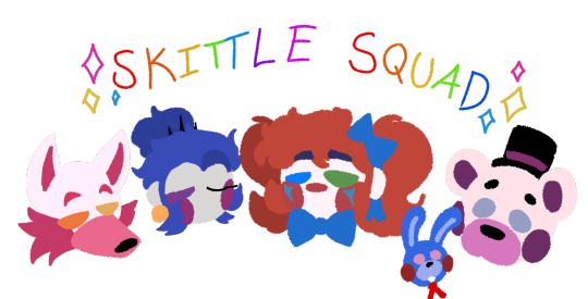
I love these 4 sillies, I just love these 4 heck all the characters in sister location. I really wanted to have an Au that focuses on the funtimes and their struggles in the facility, focusing on that also allows me to delve into the very motivations that had them want to escape the facility in the first place.
The other animatronics in SL are also part of this Au, just not as prominent as the Skittle squad.
Elizabeth is also very prominent in this Au.
Elizabeth is another character in SL. I love a lot, so she's also very present. Since she experiences the same pain as Funtimes I through, I felt it really necessary.
There are lore changes.
Not really changes, more so add ons. These add ons are here to expand upon what Fnaf had built with Sister Location but never did anything with past SL. Some stuff in here are add ons just to indulge me.
William and Michael are here too.

While they're not as focused on as the characters previously mentioned, they do have their role and place in the story.
William is intentionally designed that way. While I do have a planned human design, I have a reason he looks like his 8-bit sprite. The reason is to show the rift he would unintentionally build with Liz after her death, and this rift would become so wide that she would no longer see him as her father let alone a person.
While Michael's look would specifically be keeped hidden through most of the story to show how the Funtimes and Elizabeth perceive him.
Oh yeah, Mrs. Afton is here too for some extra plot.
I don't have a complete design for her yet, so all I have are concepts of her design. I'm still working on her character (That's the fun of Mrs. Afton not being canon yet, I get to write her how ever I like.) But I want her to be someone who's kind and sweet but doesn't take shit and has the will to beat the shit out of those who deserve it.
A major plot point she is a part of is going down into the rental facility to find clues on what could have happened to Liz.
She would find answers, but at a price
Yeah, she would, um be killed by william. I'll go into further detail on this event at a later date.
Extra changes

Redesigned the facility's map
Changed some game events because I didn't like them or I felt they could have been better
Some new faces to really bring life to this Au
Unique character designs
More a focus on events prior to Sister Location (the game) events
Spooky stuff if I feel up to it.
Mult ending ideas
This Au may also touch upon and make content in association with other games and books in heavy relation to Sister Location (ex. FNAF 6 and fazbear fright story "Room for one more")
That's all the info I got so far, I hope to post more about this Au soon.
Bye-bye
-Jester 🤡
#fnaf#aceinacloset art#fanart#five nights at freddy's#circus baby#aceinacloset rambles#fnaf sister location#fnaf fanart#elizabeth afton#fnaf au#funtime foxy#funtime freddy#ballora#william afton#michael afton#mrs afton#this wont be all I post but I will post about this a lot#I cant wait to post more about this cause i have a lot planned#!FNAF SL REDUX!
39 notes
·
View notes
Note
Hear me out-
Being friends with Michael since childhood, breaking out of Smith's grove with him, all the while Michael is developing feelings for the reader. After they break out Michael decides to ride the reader for being so good to him and helping him escape
the reason why the reader is in there could be whatever you want ( I originally was going to say reader should be in for killing thier dad)
Also sorry it's long + I love your fic 😍
Ur a literal god in my books 🙂
Michael Myers with Dominant Male S/o
My Stories are meant for the much more mature audience, 18+
You didn't regret helping Michael kill the bullies, and you definitely didn't regret killing your abusive mother and father. You did have a younger brother, but your parents starved him so much that it ended up killing him, no one cared for your brother's death except for you. The police didn't give a shit, the teachers, and the entire town just let it happen. Michael was there to try and console you but he wasn't really good at it.
Both of you ended up Smith's Grove Sanitarium together, both of you were being watched closely, they even barely let you two interact...but that didn't stop the two of you after years, of when they finally had enough and separated you two, Michael had broken out of his cell, he killed the guard who was keenly watching yours took his keys and set you free. Both of you were probably the same height, towering over basically everybody, and putting a swift end to the guards that saw or tried to go after each of you.
Michael followed you, as you were the one who got a layout of the asylum. He made sure to clear the way easily as you tried to remember the best way out.
////////////
Once Michael and you finally escaped you rested at his place, Michael came out with his suit and mask as he looked at you silently. He stalked closer to you, taking note of how you just got out of the shower and the towel loosely wrapped around your waist. The water glistened on your skin.
Michael took out his knife and slowly traced it along the towel, the blade getting a strong grip as Michael pulled, letting your towel fall down.
His knife stayed in his hand as he refused to let go, Michael sat on top of your naked body, pushing you onto his old bedroom which seemed to have been redesigned by new people living there, but both of you took care of them already.
"Michael..." You breathlessly whispered knowing you wouldn't get a response but you did get a husky grunt in return.
Slowly unbuttoning his suit until you could see his perfectly carved V line and lean body. your hands traced along his abs his mask tilting down at you watching closely as you fondled his body.
One Michael was fully nude and took off his mask to let his shaggy long hair fall in front of his face.
It didn't take long for both of you to get hard since you both did have an attraction to each other. Michael sat down on top of you, forcing your hands off his body to let you know he was in control even if he was the one getting dicked down.
With one hand he searched the nearby bed stand until he found a bottle of lube. Michael really didn't care how much he used, it splattered it all over your cock and he let your cock rub in between his ass cheeks.
Wasting no time, Michael took your cock inside him fully, you could also tell he had no preparations because he was extremely tight, however, his reactions were rather null when it came to pain.
Michael started to lower himself up and down. Your hands clamped around his waist, as he effortlessly rode you his own cock hard cock bouncy up and down from the movement.
You huffed into his shoulder holding in a groan as his body continued to bounce, His hole easily taking your cock inside and sucking it hard, before his hole repelled up and down onto your large cock.
Finally, you heard his small yet herdable groans of pleasure, Michael was also enjoying himself as he rode your cock.
Michael slightly pulled himself away from you, bending his body slightly back, letting you get a view of your cock sliding in and out of his puckering hole which was being torn open by your cock.
"Fuck..." You groaned, feeling yourself near, the sensual sight of his ass devouring your cock helped extremely, his movements got faster, and suddenly you started to thrust inside him sloppily, wanting to release.
Suddenly your seed spilled deep inside, him, Michael's hole twitching and squeezing you hard, as you realized he came after you had shot your bucket of cum into him.
Both of you were breathing heavily. Michael suddenly got up, your cock sliding out of his hole, as you watched your load of cum spill out of him.
the cum inside Michael was rather endless since it was basically your first time and his as well.
But it seemed he didn't expect you to fill him up that much.
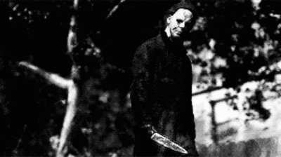
#michael myers x male reader#michael myers x reader#michael myers fanfic#Slasher x male reader#Michael myers#Slasher x reader#Michael Myers x male reader smut#Michael myers gay smut#Bottom Michael Myers#Halloween Michael Myers x reader#Halloween Michael Myers x male reader#Michael Myers x reader smut
588 notes
·
View notes
Text
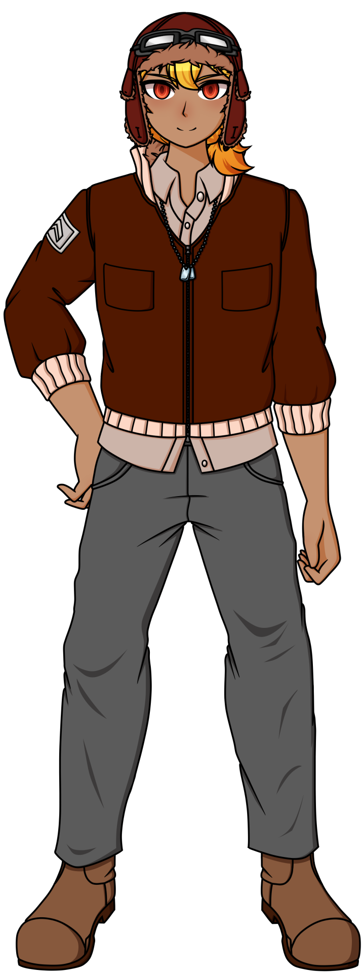
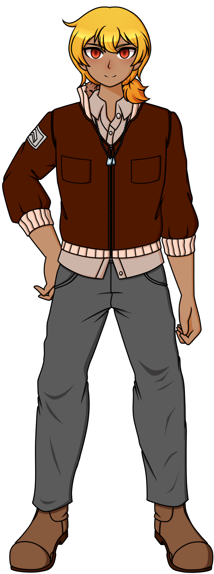
I love Haru, but he does deserve to get slapped every now and then for his pervertedness.
So, Haru is a pilot, that goes without saying with his hat and goggles as that's the most clear indication of his Ultimate Talent. His OG design was alright and I liked it as is. But I guess I just wanted to push his pilot design a little bit more while still keeping to his very casual look. So I, uh, replaced his vest with a bomber jacket. I'm sorry but I just wasn't feeling the vest as it looks like some kind of jacket that had it's sleeves ripped off and Haru decided to wear that cause he thinks it looks cool...which is actually pretty in character for him so it's not a bad design choice honestly, fkdgytdklymtlkym. I was just in the mood for a bomber jacket, so I gave Haru a bomber jacket. I just pushed the sleeves up juuust below the elbow to give the impression that he's pretty chill. When his temper is not flaring up, at least. But otherwise he's a pretty chill dude that just...wants to hang out and do dumb (perhaps even dangerous) teenage things and even go on a date or two. Anyways, back to the jacket, I also had it unzipped below his collar to again push the fact that he's pretty casual. But looking back on it now, I feel like I should've left the jacket completely open like his old vest. It would just fit his vibes better. But I decided not to go back and change the sprite simply because I was lazy and I didn't want to go through all the effort of erasing the linework and stuff. Just know the next time I draw him, I'm going to leave his jacket open. Also, I find it interesting that Haru's OG sprite has what looks to be a military symbol on his sleeve?? And his likes aside from women (of course) is also the military, at least according to the wiki. Which makes me think that Haru is a military brat of some sort, like one of his parents, probably his dad, was a pilot for the military or something. I could just be overanalyzing this but I don't think LINUJ would add these to his character without some kind of purpose. It'd be better if we actually had an idea of what his home life actually was, but alas, all we got in his FTEs was his love life (and his guilt over his role in Kiyoka's death, oof). Anyways, I decided to make that symbol on his sleeve a little more clearer on his jacket and I changed his necklace to dog tags to tie it all together. I found his blue necklace in his OG design kinda just...there...to fill in some space on his torso. And I thought it was kinda meh and out of place for such a plain necklace, so changing it to a pair of dog tags fits the whole military thing way better. After that, I changed his shoes to boots and gave him a ponytail cause...honestly, I just wanted to give him a ponytail. I love it when male characters have ponytails so Haru was lucky enough for my brain to go, "ponytail, now" while I was designing him. It kind helps his hair stand out when he's wearing his hat as it mostly covers his bangs in this redesign, not like in his OG sprite where tufts of his hair peaks out from underneath. Besides, I can see Haru being the kind of guy to grow out his hair, even if it's against regulations or something, like, say, occasionally serving in the military. For someone who seems to be interested in the military, perhaps even worked for it as a pilot, Haru actually has no issue in arguing against authority figures. No, seriously, if he's not arguing with Teruya in the killing game, he's butting heads with Kinjo. He may fall in line once, but if he has an issue with you, he doesn't hesitate to say it, regardless of your position. And with that, I just adjusted his color palette, desaturated his skin tone a little bit while making sure he remained tanned and that was it. Haru is done!
Man, I miss Haru. I feel like he really shined in Chapter 4 but I enjoy the little details of his character outside of his usual role of being the "comic relief."
21 notes
·
View notes
Text
With the final chapter of TCWKTM by @crinklytinfoil upcoming I have decided to celebrate with more doodles. YAY!
(Did I say upcoming, I meant release. Apperently I posted this 3 minutes after the last chapter updated)

I don't know why I have decided that Shrike always wears those night vision goggles(?) now but they look cool at least(GOD I LOVE THEM).
I think I've finally gotten a hang of Dani's hairstyle for my design which is a blessing because in order from the easiest to hardest hair texture to draw is Coily>Straight>Locs>Wavy>Braids>Curly with a jump of times 4 from braids to curly(My hubris for giving Cyan short curly hair has and will continue to keep biting me in the ass).
Speaking of Cyan, I've also updated him. He always has eye bags now cause he feels tired now, more so than the start of the fic at least. Since, unless I've missed something, he's still wearing Black's suit I felt I should make it a part of his outfit. One of the issues I was having when I drew him though was that we still call him Cyan but he wasn't wearing cyan anymore which is an issue when I read the story but when I drew him it just felt odd. My solution to that hangup of mine was to keep the suit and belt black’s but give him the gloves and boots so there's at least some cyan still on him since I don't think it was ever stated that Johnny cut those off, there wouldn't be a reason to and they would fit him better than Johnny's anyways. He also isn’t wearing his backpack thing or helmet(not that I ever drew anyone with theirs anyways) since I figured they probably lost it or some shit. In this pic no one is wearing theirs but that’s just because I wanted them to look like they were chilling, Cyan straight up doesn’t have his.
Funnily enough this is the one that took the least amount of time to make, I started it yesterday and finished it like now though I do attribute that to a stroke of sudden inspiration that I was able to draw in my sketchbook so honestly most of the work was the coloring.
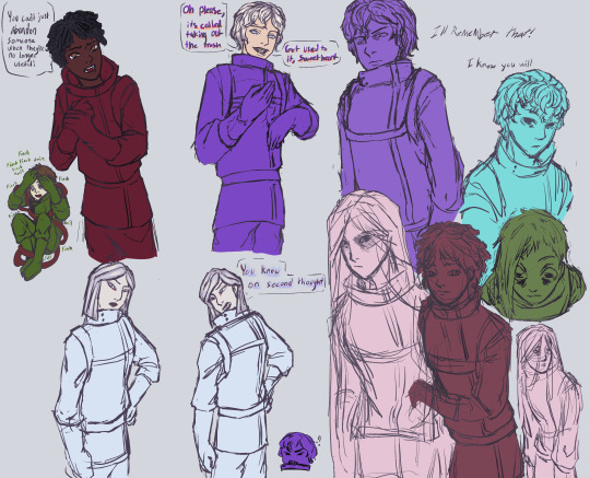
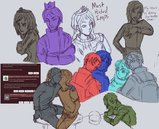
Drawing these guys just kinda being silly is so fun it's unfair, especially Purple. This man has done so much bullshit, I should shoot him on sight but the moment I pick up my pen he appears, the motherfucker! A pretty fun aspect of these purple are, as you can see, he's using Grey's skin. While I'm pretty sure in the story he looks the exact same I figured it would be more fun for drawing purposes to mix the two of them together to create some distinction rather than just drawing Grey with a purple suit.
My design for Grey had him as average height but more stout(at least comparatively for my artstyle) while Purple was a little more scrawny and tall which worked well for what I wanted to do. His bangs are center parted when Grey's bangs are gathered in the center. Also I drew their expressions differently, when it's Purple I draw his more bitter/sour, I decided that most of his expressions are squinty and tend to furrow the brows while Grey's are more, I'm not sure how to put it, genuine?
As you can probably tell I really enjoy trying to come up with the character's designs myself but I know when to throw in the towel and admit someone did better than me. I tried to come up with a design for Olive/Finch myself but I just could not come up with one I liked even equally let alone more than @krysmcscience 's design. They really captured their energy well so I’m just using theirs.
Ayy, I drew my take on good old Johnny boy. I think I did a pretty good job making him look older without him becoming a mass of wrinkles.
Drawing Flayer's ship was pretty fun, I've been trying to draw backgrounds and objects more so it was good practice. We obviously don't know what it actually looks like yet other than it is made of flesh and metal so I definitely had to just make shit up. For these bitches sake I hope it's bigger than what I designed because it is going to suck otherwise. Just as I'm typing this I kinda already wanna redesign it though.
I went for something more simple based of the premise that ships are complicated and difficult to make; the whole thing is kinda supposed to look like the flesh is doing a lot of the work to keep it together to compensate for a lack of technical knowledge and skill but just now I remembered that Flayer was the head of the mechanics so she almost certainly has more than enough knowledge and experience to make a good ship on her own even without the flesh. Oh well, I can redesign it when we learn more. I'm keeping its face though, the face was a completely but incredibly happy accident.
Also, I find it interesting that the Imposter’s missions are usually about them destroying biomechanical technology but one of Flayer's named imposter abilities is to use her genetic material to create machinery that fuses artificial and organic material.
Bounus Doodles!
I'm pretty sure these were all drawn sometime before the new year but they were all I had and I didn't want to post one image of doodles so enjoy them now.
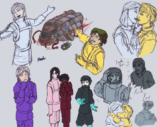
While I am still proud of Brown and Devon making out I think my favorite doodle here is Cyan and his judgmental ass face. Why is he staring at Finch like, he is not in any position to but judging like that.
I also borrowed Kry's designs for Red and Umber, I couldn't help myself for Umber, it was just too perfect!
Not sure how I feel about my take on Skeld!White(Finnegan I CANT-). I'm not sure if it's just I'm so used to seeing Kry's design that anything else feels weird or just that I made him too baby faced and princessy. I tend to draw men that are very pretty and feminine so I think I went overboard when I tried my hand since he was usually described similar to how I would normally design a man.
#among us#fanart#the crewmate who knew too much#crinklytinfoil#hirart#hirantalkstoomuch#Wait why do the colors look so much better on my phone than my monitor?#My computer is so fucked up its not even funny
32 notes
·
View notes
Text
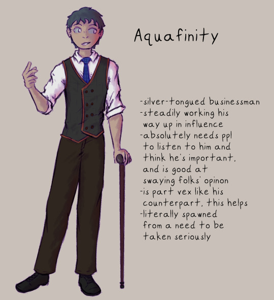
I!!! ok ok these were who i was actually originally going to make helsmets for but then i remembered aron was originally a minecraft oc and she Immediately Took The Spotlight bUT I!!!! made some helsmets of the minecraft crew (even tho their helsmets would certainly not be a crew) to fill @silverskye13's sandbox with!!!!! i will ramble!! under cut!!
SO FIREMITE
He was like the first one (maybe second??) that i came up with an idea for, and it was actually the redesigns that did it! i mentioned that he kept his more sculk-y eye and half of his face hidden bc it could freak ppl out and then also i realized that i'd kinda visualized him as a happy ray of sunshine all the time and it perfectly opened the door to! suppression. like if he's perfect beam of sunshine all the time then he's gotta be suppressing/hiding A Lot Of StuffTM, both physically (hiding as much of his warden influence as possible) and emotionally (only showing others his happiness), so i made his helsmet based off that! :V it's also kinda what firemite is afraid to be seen as i think, bc if he saw his helsmet all he would see is what about himself would scare ppl.
Tyratone was my second!! I'm pretty sure! she might've been first. but Tyr looks around at her friend group and sees that everyone else contributes- fire brings up resources from underground, aqua makes connections to other folks to keep them on good terms, and razor keeps the group protected from physical threats. She just.. has her little indoor farm. Collects crops every so often. Mostly keeps her cats alive. Messes around with firemite n tags along with razor to scout out sometmes. Like what does she even do. (She provides for the group but thinks it a task that any of them could do and that she's not really needed, even tho they do all rely on her to keep them going. Any of them *could* step into that role alongside what they do, it's simple enough, but they all appreciate having her around bc she's fun and enjoys simple things, and keeps the group together.) She thinks it only a matter of time before she's kicked out bc she's not really doing much, and so her helsmet is based around proving her worth through what she can do for other people!
Aqua took me a bit to fully realize; i had a vague idea for a while but it was toeing the line of similarity to tyr's and i didn't want repeats, so i sat and thought for a bit. in his original bio, i'd put that he kinda missed only having two ppl in the group, and that he thinks he's the leader but isn't. ok, so throwing these two things together, i can kinda figure that maybe he missed only having two people bc it meant that his opinions carried more weight, because it was only ever up against one other, instead of three others. he gets ideas of what he thinks is best and what he thinks they should do at any given time and the others tend to go with razor's ideas more than his, and it gets to him. he feels like they don't really listen to him at all, which they do and give consideration to his input, but he gets jealous and upset that razor's ideas are gone with more. so his hels is someone that constantly strives to be heard and to be listened to and to be viewed as important! i'm not actually sure if how i ended up implementing that works or not, but that's what i was able to come up with :V (the cane is just to look neat, and also it's netherite so heavy bonking stick as well should he need it sdklfj)
and then razor! razor. good night he gave me trouble. i wanted to draw him so badly and could not for the life of me figure out what his hels would be of. like i knew he'd be a fighter, but like. why would he exist in the first place?? i kinda thought about how i'd designed him and what personality traits i'd given him- he wears a lot of layers, most of his face is covered, long sleeves, it's a kinda closed-off wardrobe. and he's phlegmatic, so he goes with the flow a lot. maybe his thing is that he's doing what he can to keep the group safe, sure, but he also wants to try to stay a little closed-off, so that if he fails one day to keep them safe, it won't hurt as much and would be easier to move on. tossing around the idea that maybe that had happened with folks he was previously with- before he and fire met aqua and tyr, and maybe even before he met fire. not sure yet, (still not entirely certain on his hels concept at all tbh) but that's the fun of being in the middle of developing characters and their stories!! trying stuff out and seeing if it sticks!!
ANYWAY if u read all of that bLESS YOU ilysm these were really fun to figure out and make!!! also cannot believe i hecking. i did all these today, this afternoon/evening dslkfjsdkl i'm going to bed Extremely LateTM but it is worth it!!! i did it!!!! i'm so happy i love them sm qvq ty silver for writing such a cool hecking story that provides so so much inspiration and such a fun world to play around in, this was a fantastic exercise in character development for these four, who just existed as bullet points prior :V
#redstone and skulk#minecraft oc#firemite#tyratone#aquafinity#razormane#hi hello it is me again with more helsmet designs#-helsmit? helsmet?? whichever one lskdfj#all of my rambling is in the readmore this time so no paragraphs of tags!!
26 notes
·
View notes
Note
❤️❤️❤️❤️❤️
hewwo thank you for asking <3 i'm gonna randomize some wips and give u a nice lil ramble lol
(1) train master chidori
in terms of me redesigning folami, i think i'm also gonna tweak her personality a bit too. i want to give her braids and slicked down baby hairs instead of the initial poofs that i had her with previously--and i think that may change which association creature/thing that i want her to be associated with bc i mostly just associated her with poodles because of her hair LOL. in terms of her personality, i originally made her a bit airheaded but i think i may kinda wanna give her more mature vibes since she's technically gonna be the oldest and most experienced of chidorky's crew. more... zakuro from tmm energy tbh. i think that may be the vibe i wanna go for for her lol.
(2) celestial weddings
beloved extremely wholesome polycule shenanigans lol. i think the one character that i know much less about their romance arc with dag is muu? muu is from denjai, which is the fourth sphere and its a swampland and marshy type of place. muu themself is the youngest of all of dag's lovers and it definitely shows in how upbeat they are and how they very much look up to dag in an almost hero worship kind of way. tbh they probably have the senpai/kouhai romantic relationship arc and ngl its very cute. muu also flaps their hands whenever they get excited about something and they tend to stumble over their words when they get excited, which is a lot lol.
(3) nondisclosure
i used to be sooo back and forth about nyseah and 17's relationship when i made the characters many many moons before; (and actually now that i think about it, most of the characters from that wip, except everything relating to owen and helios's storyline still exists in this version of the story lol. idk if i'll ever go back to those two characters but they did have a sweet relationship, it was just SO thematically different than everything else that was going on, which is how it developed into what i call now nondisclosure LOL) i actually kind of wanted them to get together only because i built up 17 to be a sort of "he's justified for his actions and he actually does care about nyssie.... somehow" back then. but i think i was also biased because he was one of the first "morally grey characters" i really ever made and i suppose back then i was much simpler in what i wanted from those kinds of characters.
when i think about nondisclosure now, 17 barely plays a role in it from what i think. tbh i think 12 plays more of a role than he does and that's because i'm obsessed with 12 and i think everyone should be obsessed with 12 but this isn't about him this is about 17 and nyssie. i think it works better for nyssie to not get with him in the end because like he seriously violated her in a way that younger me didn't really see an issue with (thanks ya and anime for not thinking this kind of relationship was bad or that it could be fixed LMAOOO... not to say that i don't enjoy making those kinds of relationships now, its just the fact that now i'm more likely to lean into the relationship being fucked up LMAO). anyway tho, mama nyssie and her brood of kiddos is the best ending for her because its the one where she's the happiest :D
(4) sixteen candles
ranger being aromantic makes so much of how he acted in all of the old chapters that i wrote many moons ago make so much fucking sense. like seriously, he was soooo noncommittal to the point of it being basically a meme, and even tho the friend i would talk with about these characters at the time helped me make a character for him to be with and i 'enjoyed' it to a certain extent, it always felt kind of off? and i think its because the person ranger will always be the closest with is always gonna be nanette, like they are inseperable and i think them defining a qpr is actually So Fucking Good for them. i'm kinda obsessed with their dynamic ngl, adn i also like the idea that ranger is just like down to fuck all of his besties and at the same time they all have a relationship with each other where that's just a thing that they do.
i really need to work on roger tho because he is so conflicted about a lot of things. not just to get him open to the fucking really, but mostly just because he has the roughest go of it relating to family and it kinda hits home for me personally a bit, so in some ways i feel like idk how i should handle it. but overall, love they. i should think about them more tbh LOL
(5) the liminal space series (overall)
chloe being involved in jenna's story is honest to god still so funny to me. like here's this "average" small town popular girl, who's popular by virtue of being normal enough and outgoing enough that everyone likes her, but having a bit of an alt style so people think she's edgy and unique and then all of a sudden she's hanging out with the town weirdos trying to hunt down a what? what did you say it was jenna? a chupa--WhAT?
and the fact that she's so taken aback with how casually jenna says that she likes her that it just takes her and her sexuality for a wild ride and at the end of it all she has to go to college and pretend that she didn't just have the craziest senior year/summer of her fucking life LMAOOO its just so funny to me.
#s: jenna the reaper#s: sixteen candles#s: nondisclosure#s: celestial weddings#s: train master chidori
10 notes
·
View notes
Last Seen Blogs

shittoy
Welcome to the landfill
quantum-coaching
Quantum-Coaching

leahkittens
Untitled

op-info27-blog
군산op 프로필 사이트 JJ 군산오피 군산역오피 군

djwuzhere
The world is yourz