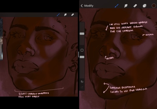
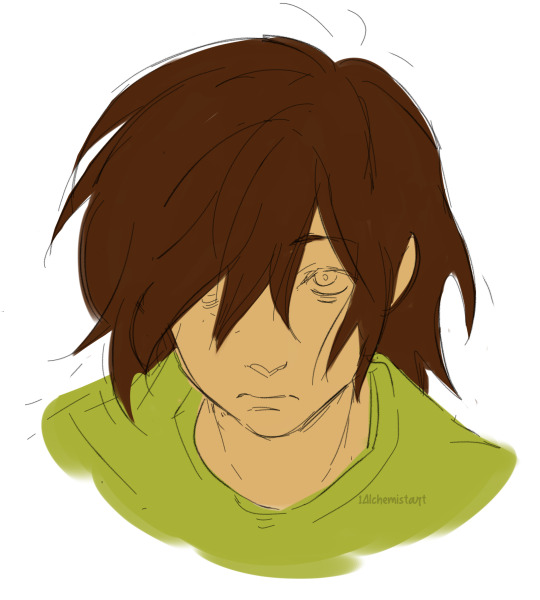
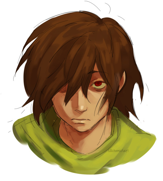
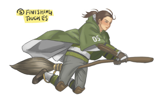
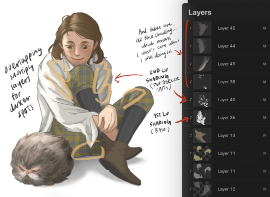
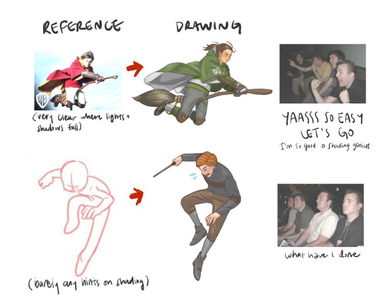
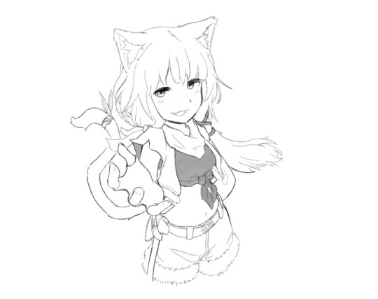
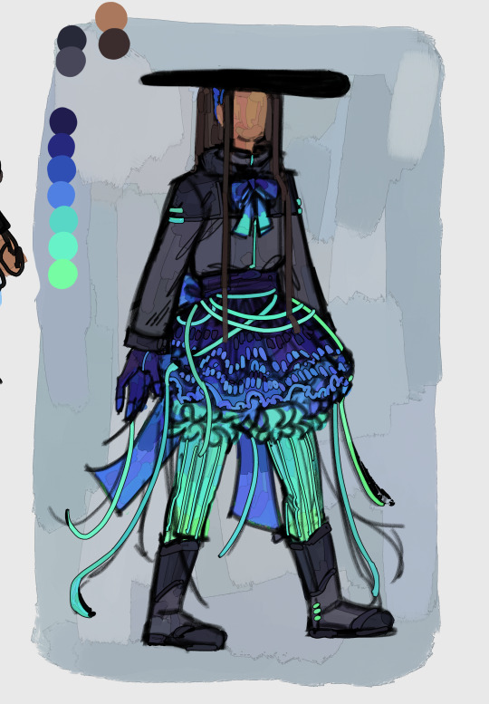
#I also changed light shading techniques between them
Explore tagged Tumblr posts
Visit Tumblr Blog
Explore Tumblr blogs with no restrictions, modern design and the best experience.
Last Seen Tumblr Blogs


Fun Fact
US Tumblr user growth rate is estimated to slow down to 4.1%.
Text

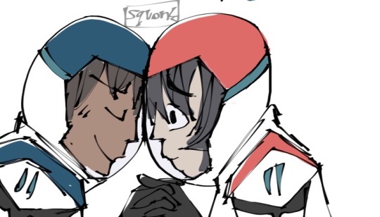
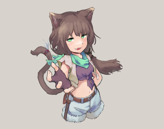
colour palette challenge
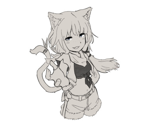
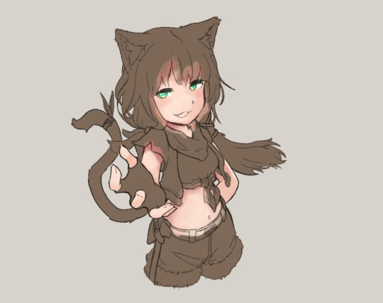
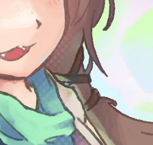
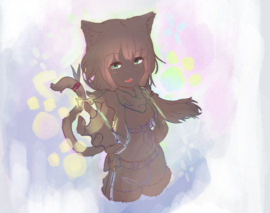
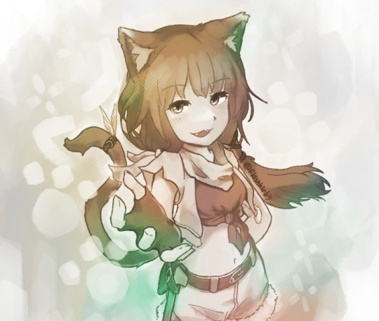
#I do not know how to do colour palette challenges#I probably broke a few rules lol#I’m trying a bunch of different styles atm to see which one suits me best. please bear with me#klance#my art#I also changed light shading techniques between them#and didn’t put any shadows in the second one. I’m trying new stuff.
126 notes
·
View notes
Text
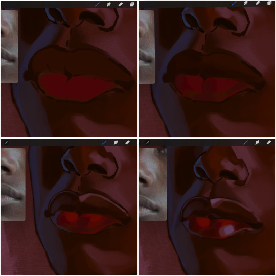
eaudera's detailed tutorial for skin rendering
okay loves i've put together a tutorial in text form detailing my step by step process of shading darker skin + the brushes and techniques I use and why I use them. you will be following along as we shade a piece together, you can find the lineart to the piece here. *turn off your true tone and night shift displays for the most objective viewing.
i wrote a lot on the preview pictures, if you find spelling errors (which you def will) or are unable to read my handwriting, you'll find the typed out version of the writing in the alt text feature.
disclaimer: i'm not an art professor nor am i academically/classically trained in art. a lot of the verbiage and techniques i'm using to teach you all here are from my current self taught and observed understanding of art, light, and anatomy
support me: kofi / ig / twt / commissions
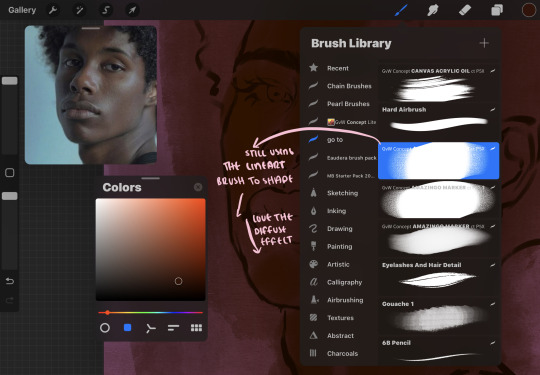
firstly, here are my two staple brushes. you can find the second brush here, i modified it by making it larger.
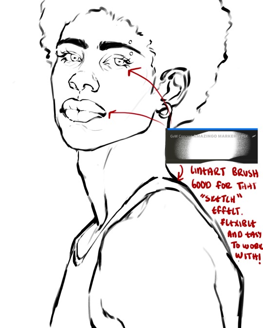
the lineart brush is very good for easy sketching and simultaneously cleaning up that sketch to produce the final lineart you'll be using in your piece. the diffusion from the erased parts/the diffusion created by lowering the pressure of your pen creates a light graphite effect which i enjoy! give it a shot.
you'll notice quickly that there are lighter strokes throughout this lineart, these are simply acting as rendering guides for me in order to remember certain placements. i erase/draw over these lines a lot.
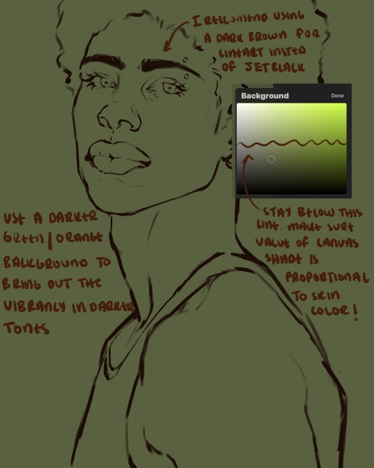
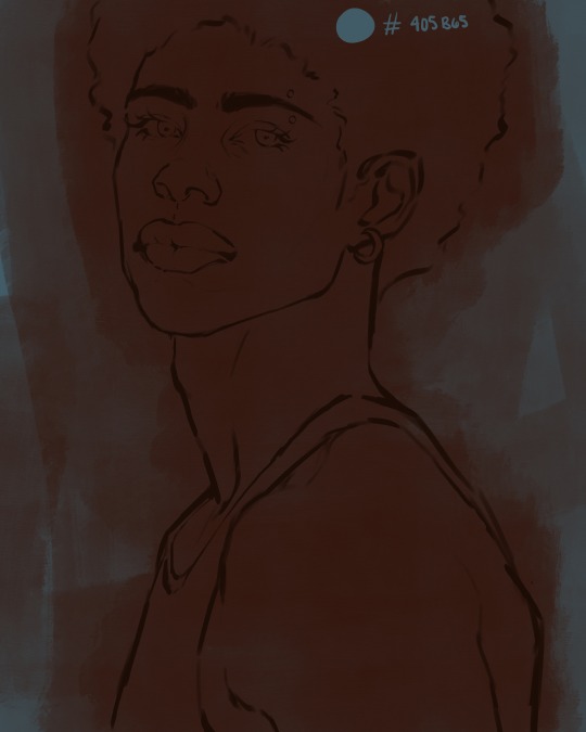
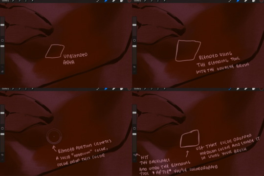
i initially learned to shade skin on a completely grey background with very slight orange undertones, and for a while this was very helpful in providing the most objective view of the base colors you're using (objective as in free of being effected by colors of different values). as you might know, using a white background for dark skin will seemingly darken the value and dim the vibrancy of your base colors, and using a black background will do the opposite. if you're using a darker skin tone, you want your canvas shade to be of a value that is proportional to your skin tone to avoid the same problems created by colors with too light or dark of a value. now if you're using a screened device to draw, you have the extra burden of screen reflections/wavering color output on different screens, so you're never really sure if the exact color you're using will be consistent across the board. priming your canvas with neutral colors will help with that. whereas priming with more vibrant colors will slightly change the undertone of your skintone (especially if you're using a low opacity brush), but it makes for a funner canvas and more creativity with your color palette imo. if you're a beginner i recommend you stay below the wavy line to avoid too light of a canvas shade.
for these same reasons i avoid keeping my lineart jet black. when you lay down the base colors under a black lineart it can look very unfavorable.
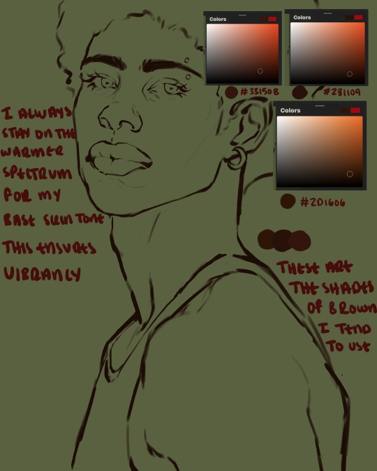
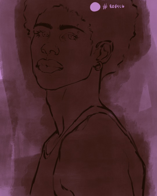
here are some skin tone variants that i tend to use the most, peep how i never wander off too far to the left of the spectrum where the reds are. i definitely favor red-oranges as compared to green-oranges for my skin tones, however, because i stay primarily on the left side of the color spectrum for my rendering, red can quickly become too much too fast. so i make sure to use a skin tone that can work very well with green-orange shadows. for this specific piece i will use the third shade (#2d1606).
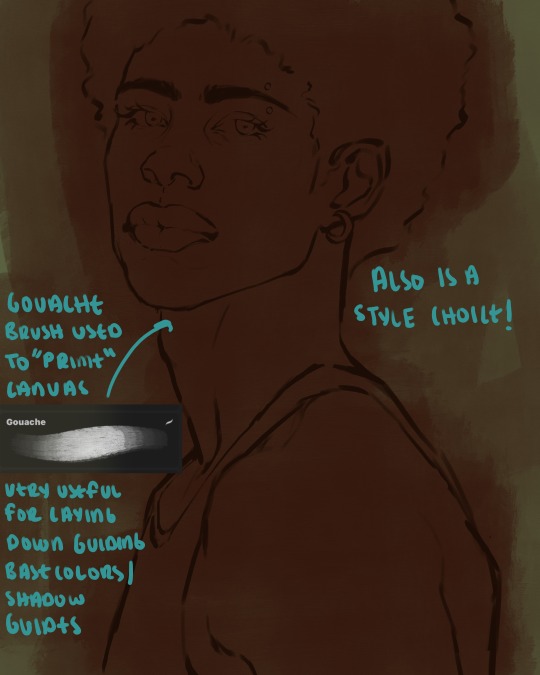
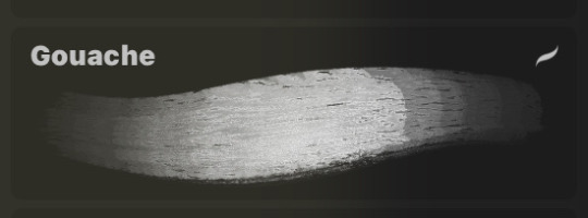
heres where the gouache brush comes in handy. i use it very loosely to "prime" the canvas almost. if you've ever done oil painting you'll realize very few artists draw directly onto a completely white canvas, though i've already primed my canvas essentially by changing the background color, i loosely shade over it with the skin tone color using the gouache brush. i find this gives me a better grasp on the composition of the piece due to increased harmony between the canvas and the skin color. it also looks really cool to me and resembles a real canvas almost.
as stated before, priming your canvas with neutral colors (grey) can help give you a more consistent view of your base colors, when you get the hang of understanding the colors you most often use (i.e, how they interact with other colors), you can start using more vibrant and fun colors to color your canvas with! the gouache brush changes opacity depending on the pressure exerted by the pen, if you zoom in you'll notice patchy areas where the canvas color bleeds through the layer more prominently than it does in other areas. for some people this might throw off the consistency of the shadows, but you should be fine as long as you're using a consistently opaque brush (which we will be doing)
i know i recommended beginners use a grey canvas like i did, but since this tutorial is using my techniques i figured i'd also teach you guys how to use variantly opaque brushes to your advantage. we will be drawing on the pink canvas from here on out.
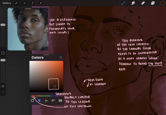
a reference is so helpful, i still rely on references to guide my shadows/lights. i'm past the point of relying on references for exact coordinates for rendering or lineart, but they are still incredibly helpful. in most references of darker skintones you come across, color dropping directly from the picture will give you very grey colors! we want to prioritize vibrancy in this case, so attempt to formulate your own colors or colordrop and increase the vibrancy :)! keep in mind i'm now using the lineart brush to shade. the diffuse/soft corners of this brush allows fewer pixels to be scattered wherever you lessen the pressure, this is perfect for color dropping medium colors to blend two colors together. you'll see how i blend colors later on.
as mentioned previously, red can become too much too fast- so i avoid monochrome rendering as much as possible by using shadows of different undertones. my most frequent combination is using a red-orange skin tone and then using a green-orange shadow.
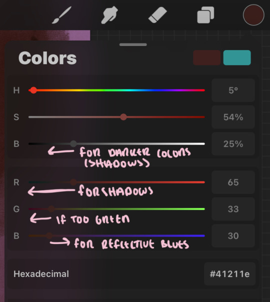
the value spectrum will be your best friend in mixing values and undertones, i use it all the time to formulate the best less saturated darker shadow that is proportional (not too dark, not too grey) to my skintone value. if the shadow is too green simply increase the magenta, if you're looking for a "reflective" shadow, increase the blue.
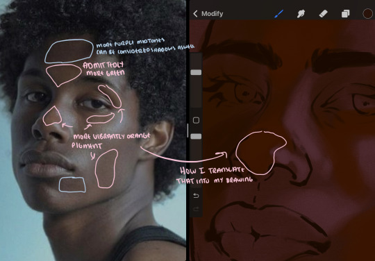
when i begin shading, i always slide the curser to a truer orange color on the spectrum and increase the saturation (slide towards the right) while i decrease the brightness (slide down). heres how it looks when i'm jumping between shadows and highlights while trying to keep my colors proportional (but not identical) to whats happening in the reference ^. i most often times will rely on the value tool, however.
you will notice that a lot of darker skin tones have patches of orange vibrancy, these areas are most common on the nose and cheeks. this is only a detail to pay attention to if you're going for more of a realism rendering style :)
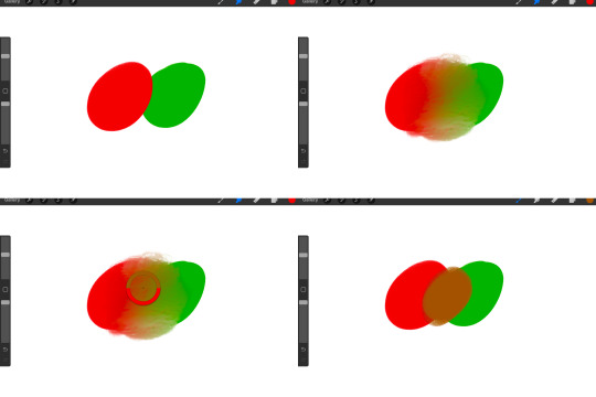
now onto how i prefer to bridge/blend colors together by utilizing the blend tool.
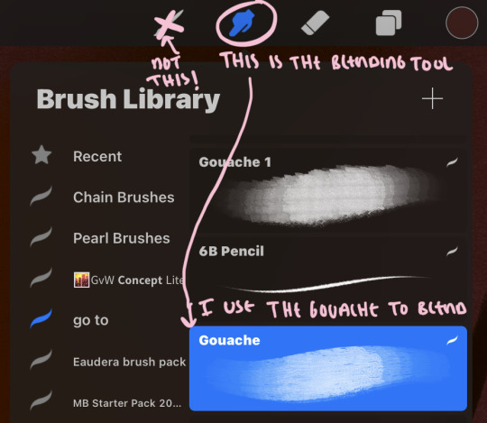
i do not like simply blurring colors in order to blend colors together, it can lead to overblending which can make your portrait look heavily gaussian blurred (think 2010 deviantart art... yea that). the brilliant thing about procreate is you can utilize brushes really efficiently, which include changing the brushes you use for blending. so in reality, artists who use the blending tool on its own can still have portraits that don't look it! there also exists plenty of brushes that have properties allowing it to blend into its surrounding colors are you draw. but in my case, the above photo is 99% of the times how i will bridge two colors together. doing this allows me to keep pretty consistent brushstrokes across the whole portrait, which i enjoy. it also gives me better control of the shapes i use in my rendering, an aspect that is pretty easy to lose when you're using the blending tool directly and solely.
in case the blending process is a bit hard too see, heres that same process recreated with different more visible colors:
now once you've placed your shadows where they generally tend to be (according to the reference photo), let's make those shapes a bit more specific and pick up on smaller details to make your rendering look more complete.
your base colors will never be as dark or as light as you need them to be when you begin rendering, making sure you have a decent contrast between your lightsource highlights and the shadows is key to capturing the essence of a light being cast on your character. it's much easier to keep building upon your shadows before rendering the highlights, i laid down the highlights only to create a guide/help me map my shadows better. do not darken the entirety of the areas affected by shadow, you'll find that shadows are rarely ever the same value, it's a gradual process affected by things like position, height, etc. so make sure the darkest of your shadow colors are preserved only in areas where the shadows are the or should be the darkest.
you'll notice i labeled some areas as "detail", adding very specific shadow placements is a detail. in the reference, the model has a pretty prominent brow bone, creating a shadow over where his eyelid creases just above his lash line, paying attention to feature details like this help enhance the rendering and its realism.
now that i've mapped my shadows i'm going to move onto to rendering my highlights and the region of the face where the lightsource is most prominent.
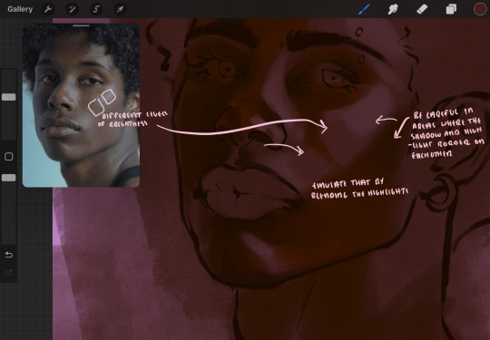
i described shadows as a gradual process earlier, this is because of the lightsource. light tends to spread when its further from the affected surface, creating a larger area affected by the light. of course, this varies depending on how intense and how close/far the light source is. in this case, the light is being casted above him further to the other side of his face, but again, remember that the face is not 2d and more prominent areas are affected more by light. it's due to this that there still exists a, albeit very minimal, shadow beneath his cheekbone. i exaggerate the shadow here for stylistic purposes, but it also helps in keeping me uphold that contrast between the highlight and shadow once again. so i refrain from blending the light into this area like i did in other areas.
midtones are the areas most unaffected by the light source, they're neither shadows nor highlights. and because light spreads, it is brighter in certain areas and darker in others. it is most easiest to blend the darker ends of the highights into the midtones of your portrait. you can emulate this by once again using your blend tool. blend the outer areas of the light and colordrop this color and use it as the darker light more proportional to the midtones. note that before i add even lighter shades to the areas where light is most concentrated, i blend what highlight placements i currently have there.
we're going to switch gears now and focus on the reflective shadow occurring on the darker half of his face.
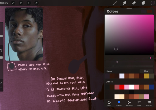
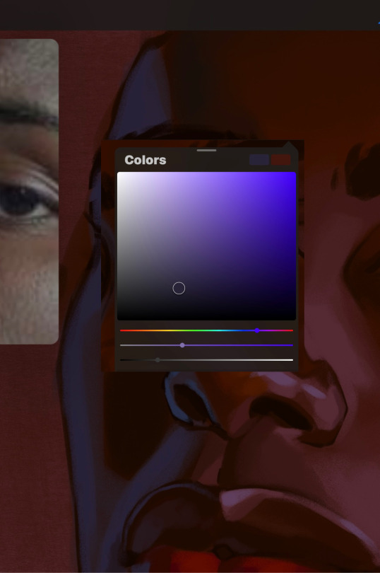
this shadow is a reflection from the lighter background the model is up against, the light being casted above him is allowing for some bounce back from his surroundings, leading to very faint light visible in areas primarily affected by shadows. hence why i'm referring to these colors as "reflective shadows".
in this case, the reflective shadows are blue, or appear to our eyes as blue. on darker skin, "true" blues (blue-purple) are not often times present. what is present rather, is a very grey tone with cool undertones/a grey tone on the blue side of the spectrum, which creates a blue that is much more proportional to the value of the skintone than a true blue. in this case i used a deeper grey on the pink color spectrum, which is more purple. this was intentional, and was done in order to create some sort of color harmony between the contrasted deep oranges im using for the bordering shadows and the blue-grey i'm attempting to emulate.
while i utilize this blue-grey, out've a purely stylistic choice, i still introduce true blues to my rendering. in fact i love using blue/purple reflective shadows in my art, it creates a stunning and colorful render. in this case, i used the blue-grey as a stepping stool to introduce that trueer blue more naturally. you'll see this happening in the second picture above, where i used a slightly more vibrant and slightly more brighter blue, and used it on areas where this reflection was more prominent (and therefore brighter).
you'll notice how the shadows that border on these reflective colors are less saturated and darker than the shadows on his chin. introduce a darker and less saturated (more green) shadow to that area on his cheek and the darkest shadow of this photo, the sunken area near his nose bridge and inner eye corner. i emphasize this line in the lineart so you can follow this shadow more accurately:
this is also a detail in my opinion and can make your portrait more realistic if you include.
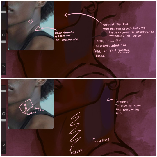
we're going to pivot to his neck area before continuing. you'll find the area of his neck with the most light is also the least vibrant, i laid down a grey base color to emphasize this detail in the portrait. afterwards i added key details. i wanted to stay at least somewhat true to the color dynamics occurring in the reference hence why i used the grey, but i'm not a very big fan of using blatant grey directly on the skin, so i made it more blue.
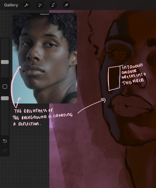
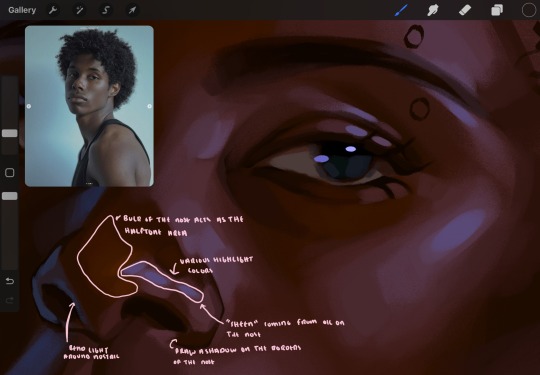
moving forward, the outer eye and the nose can be some of the most "detail focused" areas of the face when it comes to rendering. due to their more "bulbous" anatomy, light tends to curve around them in more complex ways than the flatter parameters of the face.
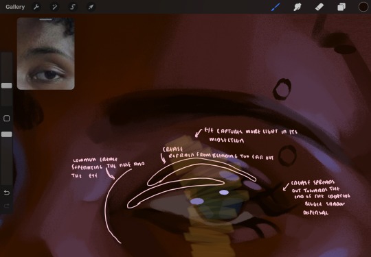
when it comes to the many creases that surround the eye, the skin folding over itself creates a very thin shadow from between the folds. the key to rendering this crease is to concentrate the blending to a very small scale, do not overblend the area because the hill created by the crease very easily captures light, creating an area where the shadow and highlight meet in very close proximity. slight blending is needed for this area, you can deepen the shadows in both horizontal corners of the eye for more accuracy. the midsection of the total eye area (eyeball and socket) tends to capture the most light, remember this is due to how bulbous rounder shapes tend to capture light from whichever direction its coming from.
this is of course the case for the nose as well. highlights are typically placed as a dot on the outermost part of the nose by artists, but highlights also spread on either side of the tip of the nose. the nose tends to collect a lot of oil, creating a sort of sheen on the upper parts of the nostril. when rendering a portrait where the position of the head is more cast to the side, the highlight of the nose changes from the bulb of the nose, to the upper nostril. in this case, the highlight spreads, causing a "half tone", or the remnants of the light on the bulb of the nose. this is the easiest place to blend highlights and shadows together. now for the shadow detailing on the nose, i'm actually drawing on top of the lineart on a separate layer. which i'll go into detail about in the next part. you want to focus the shadow on where your lineart is, the outermost part of the nose.
now were going to really detail your portrait by introducing a new layer, the detail layer! this isn't technically apart of the skin rendering, so i'm gonna keep it very brief. this is the layer you're going to render the lips, eyeballs, and eyebrows. more specifically, the purpose of this layer is to reduce the reliance on lineart. in terms of order, it goes above the lineart layer. we're going to soften and even erase the lineart in certain aspects. i use bolder/thicker lines when creating my lineart, but this can become a nuisance/hinderance when rendering.
starting out with the lips:
people w brown skin tend to have two toned lips, with the top lip resembling the same skin tone as the face and the bottom lip being redder/pinker and lighter than the upper lip. in my case, i prefer a more vibrant red for the bottom lip. once i lay down these base colors, i begin shading on the second layer.
i personally enjoy the look of a poutier lip shape, this includes emphasizing the middles of the lips as opposed to the ends. i've highlighted the shapes that this lip shape often entails. the small circles on the corner of the lip line are just pockets that occur when the mouth is closed and become emphasized by the fat around the mouth. the parameters of the lip lines do not often meet these round corners, theres often times a "double lip line", that exists around these areas. i love including that in the art, its very easy to emphasize by simply drawing a highlight from the corner of the lips along the curvature of the bottom lip towards the middle.
shadow mapping on the lips tend to go: highlight, shadow, highlight, shadow. the top lip going inward creates a highlight on the most outward part: the top of the lip. and the bottom lip curving outward thus creates a shadow on the bottom of the lip.
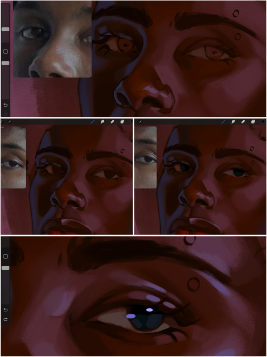
when it comes to the eyeball, i don't draw the white parts as solid white, nor do i make them too bright most of the time. they're most often times an orange grey, i also dont spread this color out if you can notice the uncolored white part of the eye. i do this intentionally to keep some of the shadows that are naturally present on the eye. very specifically right where the upper eyelid sits on the eyeball, it tends to create a small shadow that follows the curvature of the eye. this shadow is crucial, if you can see the first and second picture do not have this shadow, making the iris look more exposed and the eye appears to be held wider.
when it comes to the iris, i do very little. if i'm drawing a dark colored eye i will cover the entire iris brown, before darkening it with an almost black color. i leave the brown sides of the iris exposed to aid in bridging the values between the whiter parts of the eye and the very dark iris. this blended ring also appears on all eyes in real life. lastly, dark eyes tend to show light reflections much easier than lighter eyes. these reflections can be any color in art, in this case i kept it blue-green. i bend these reflections around where the pupil would most likely be depending on the drawing.
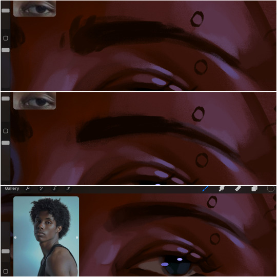
next, the eyebrow. i find it tedious to draw individual eyebrow strands when it comes to rendering, i actually prefer to blend the parameters of the eyebrows to create cohesiveness. sparse and fine eyebrow hairs are penetrated by light and shadows more than what you'd find on the scalp. it's harder to see light on someones scalp due to the bulk of hair crowding the scalp, whereas as its easier to see such light on the eyebrow. to introduce this concept to my art, i will initially draw the entire shape of the brow. then when rendering, i erase the parameters, leaving the darkest part of the brow. then i blend. the lower brow bone will be blended the least, whereas the area of the eyebrow connected to the T zone will be the most blended thanks to the shadow following the nose bridge. the far end of the brow by the hairline tends to be the lightest given the light source.
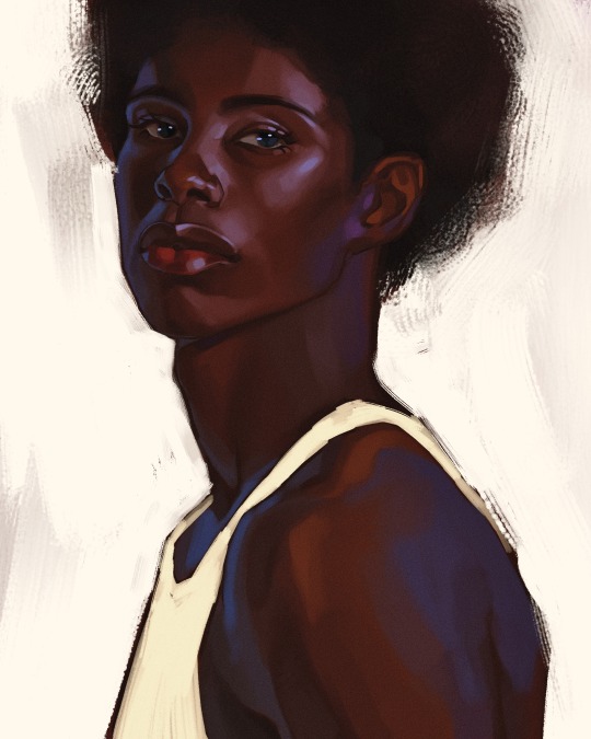
and lastly, i loosely draw a white border around the portrait for stylistic purposes. then i combine the layers (group together your layers, then duplicate and compress the duplicate group so that you still retain your individual layers) to edit. i typically add noise and play with the curve setting. and heres the finished image:
i hope you enjoyed!!
#i didnt proofread this if u find spelling errors pls lmk#black artists on tumblr#digital art#illustration#painting#black art#commissions#tutorial#art tutorial#how to shade#rendering tutorial#brushes
303 notes
·
View notes
Note
Hi there! This is a big ask but would you consider doing a tutorial of how you render? Even just some quick tips would be helpful, or maybe the brushes you use? Finding a brush for line art is way easier for me than finding one for colouring/rendering T-T (I’m specifically looking at your march from fields of Mistria you did a little while ago)—I love your art!!
thank you dear!
i'm not sure i'd dare call this a tutorial but it's a little breakdown of steps if nothing else, for this style of rendering in particular? since you referenced my march art in particular :]
i usually use the bong pen in clip studio paint, but any flat brush that allows you to layer color comfortably is a good idea! the size of the brush shouldn't change with pressure but rather, its opacity -- most art programs i know contain brushes that either are this, or can be edited to BE this, so alternatives can be found pretty easily :D
i'm gonna be using good ole kris deltarune for this bc of my present deltarune fixation 👍
as many people do, i usually start with a sketch -- level of roughness is based entirely upon my mood, depends on how much you feel like mixing your own mistakes in color later lol. do a better sketch if you wanna spend less time fixing and more time refining! i felt like going for a rough sketch this time around :]

then we lay some flat colors in... i neglected coloring the eye bc this is kris deltarune, the entire upper half of the face is going to be in shadow so ill just be coloring it in the shading stage, lol
the way i personally do shading and highlighting is by manually selecting the colors i think would work well with the flats i have and the lighting i have in mind :] a quicker way to do shading would be to use a multiply layer, of course, but i tend to shift things around way too much here for a multiply layer to work well for me!
the main way i select in-between shades is why i use brushes that change opacity with pressure instead of size! i select a darker color and lightly drop it on the color i want to shade. then, if i want a softer transition, i very lightly do a stroke or two with the same shadow color. the result will be an in-between color between the light and dark! pick that and very lightly brush it along the edges of the shadow :D you can also always alter that in-between color to be more vibrant and saturated, or alter the vibrancy of shadows by very lightly applying barely-opaque vibrant strokes to it. the world is your oyster
then i either merge it all together, or shove it all in a folder, copy the folder and merge the copied folder together so that i can always backtrack very easily... and we begin painting over the lines! The Rendering Has Begun.
the techniques i use for this stage are the same as in the shading/hihglighting stage, we're just being much more refined now and covering the lines. if you're going for something more realistic, you're gonna want to be rid of as many of the lines as possible by the end, which is another reason why making a neater sketch to begin with saves time haha
using references of the lighting you've got is going to make it much easier overall -- what i'm linking here is a very good resource for this, but of course do also peruse real photos of what you're aiming to draw! you can also always use yourself as a reference. i couldn't quite figure out kris's mouth in the end stages, so i used my own in that angle as a guide

make sure to take breaks from a big render, because your eyes are going to adjust to mistakes you've made and you won't be able to see them until you've taken some time to Not look at your own art. this applies to literally any art you make, not just this type of render! it's also healthier to take breaks every now and then anyway lol, don't do massive works in one sitting, you WILL suffer
don't be afraid to change stuff up in the rendering stage either if you feel like it. as you can see below, i ended up changing their expression. just make sure to duplicate your layers so you always have a backup in case you decide you don't like your changes!
keep going until you're happy with what you've got! you can always overwork it so that's another reason to keep backups lol. i like to make use of overlay layers near the end to make certain areas more vibrant where i feel like they should be :]

and you should be done! i don't render in this style very often but it's very good practice and it does look cool :] i hope this has been helpful!! MUAH
#deltarune#kris deltarune#kris dreemurr#utdr#ut/dr#asks#art questions#art tutorials#my art#yeah that's all the tagging i'll do lol#scheduled
40 notes
·
View notes
Text
Older Sophul in the manga?? (+ the unintentional mini essay I wrote about them)
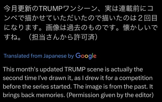
Friendly reminder to all of you (the 10 Sophul fans out there) that there are actually 2 manga versions of THAT ch22 scene (so spoilers for that ahead).
I do NOT see anyone talk about this so I will talk about it.
First there’s the one that we actually got in the manga:
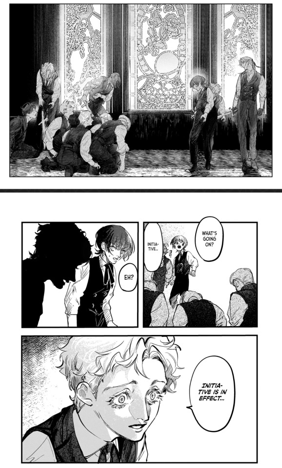

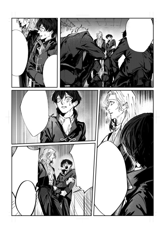
And then there is this from Hamaguri’s twt:
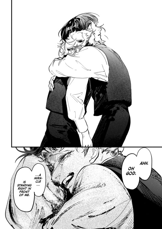
+ notes edit: mini(?) essay on the differences between these 2 variations bc I am totally normal:
this unofficial version of the scene does not show a background or any dramatic lighting. it also does not have as large a range in brushes/shading techniques like the manga does (for the brushes I specifically mean the ‘Oh god there is a miracle in front of me’ panels).
in the 2013 TRUTH version of the play, there was no scene where sophie and ul were hiding in the chapel. I have not seen the other versions as they are not subbed, but if they are also like this maybe it explains the lack of background in the unofficial manga scene.
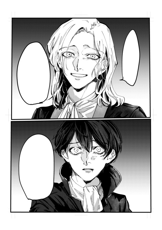
there are also differences in storyboarding etc that also contribute to the higher level of intensity in the official manga version: for example, the hug is given a full 2/3 of the page with 0 background in official version, while the original scene rendition’s hug has only 1/3ish of the page AND it overlaps other panels. so it feels like a sort of transition from one panel to another in the older one, but in the official it’s a whole new page, you don’t see it coming, more of a panel meant to catch you by surprise, it’s given more space on the page because it’s a bigger deal.
but I’ll get into that in a minute.
both versions have their differences in characterization, paneling, and feel, and I think that’s what’s so good about them both. in this essay I will 🙏
let’s start with the protagonist of all time (literally, as per the series chronology 💔). Firstly I do NOT fw his haircut in the first rendition. he wouldn’t be the same without his fuckass signature jellyfish cut.
Secondly, take for example, the panel when Ul grabs him to hug him. I think older sophie’s expressions seem more horrified, whereas in the official manga he just looks utterly stunned. poor boy :(
I like older sophie’s expressions in this scene more though, I can’t place why. but regardless, it does make more sense for younger sophie to be stunned rather than scared/disturbed in the official version. here’s why: ul seems to be characterized a little bit differently in these versions. not sure if it’s intentional or not but here’s how I see it.
in the second set of panels, where older Ul is saying ‘Could it be.. are you TRUMP?’, his irises are left unshaded and are somewhat bigger than in the manga. in the official, younger ul’s eyes are wider/shaped different while the irises appear smaller + are shaded. these changes from the original to the official contribute better to the feeling that he’s tweaking I think. and there’s more to that.
older ul’s vibes in that specific panel, because of the way it’s drawn, feel like he’s looking at sophie like this because he’s already found in sophie what he wants.
or at least that is how it feels to me, especially when you compare to the manga version, where there is more dramatic lighting, no colored-in background, younger ul is tearing up, the inner ends of his eyebrows are tilted steeper. younger ul’s face (eyebrows and mouth especially) is drawn to actually look more like he’s asking a question. meanwhile, nothing of older ul’s mouth is visible except for his teeth and the corners of his mouth are angled in some kind of smile. it all gives the vibe that he is looking at/talking to sophie differently in the different versions.
almost like in the official, younger ul is less certain of everything than older ul is.
it’s like official manga Ul is searching in sophie for what he wants (as opposed to contest rendition Ul’s look of having found it in Sophie already). he is unsure and trying to convince himself/confirm somehow that it’s there. this difference in how ul might be feeling differently in these two versions can also be seen through the hug.
in the older drawn scene, the movement of ul going in to hug Sophie comes off a lot more natural/slow-occurring (even if still unexpected). ^ see my comments on the storyboard/paneling changes in the third paragraph.
my interpretation is that younger ul’s hug is more sudden because he is more desperate/insecure about his idea, and he has a need to feel like it’s true, so he acts very unpredictably + immediately to try and confirm it.
so this bit of the older version, while less sudden, is better like this than it would have been if their expressions matched their manga counterparts. it’s like older ul already knows what’s in front of him, he’s fully accepted it even while he asks, so he doesn’t need to hug sophie quite as abruptly, he’s not desperate to find some kind of proof for anything.
^^ I’d like to think maybe they knew each other for longer in this version of the scene because they’re older, even though I know that’s 99% likely not the case.
extra note because I forgot to target the body language earlier: younger ul is hugging sophie with his face right in sophie’s shoulder, and older ul is hugging sophie with his head past sophie’s shoulder. they’re both postured the same (I think?) while hugging. older ul would probably be hugging like that because he’s taller than older sophie. but they’re the same height when younger so for the manga it looks like ul is specifically hugging sophie like he’s trying to hold onto him.
but because of all these changes from the first time the scene was drawn, the manga version is much more intense than this trial/unofficial version and now we have the masterpiece that is the manga. it’s likely that the decisions for these changes were not all intentional, and maybe i’m reading a little too much into it but it’s TRUMP & I have the Theme of Sophie and Ul looped on spotify rn so what else can I do .. all these differences are so good to me I fuck with them heavy 💜
honestly wasn’t even planning to yap about everything I found til I was about to press the post button and went ‘wait’ and started noticing. so if all this sounds like bullshit it probably is. oopsies.
but. no one talks about these sophul pictures and I think we should change that 💔
#true of vamp#trump series#trump suemitsu#suemitsu kenichi#sophul#sophie anderson#ul delico#angelico fra#raphael delico#dali delico#delico’s nursery#trump truth#gerhard fra
31 notes
·
View notes
Note
Hi 👋🏽 I so admire your arts too!! If it’s ok, I’d love to know more about your approach to shading and rendering. I always find your use of colour so calming and complementary. 💖💖
Whereas I tend to be over saturated and why I often draw in greyscale

When I read that you liked my arts too I died. I was down on the floor. Crying tears of joy. Then I realized I have a response to draft so I got up.
So here ya go!! I hope you find something interesting here. I organized it into 3 parts for easier reading:
Rendering Overview
Picking Colors
Shading (or winging it and hoping for the best)
Also if anyone has any tips I'm all ears!! I’m always trying to optimize my process, make it quicker + cleaner
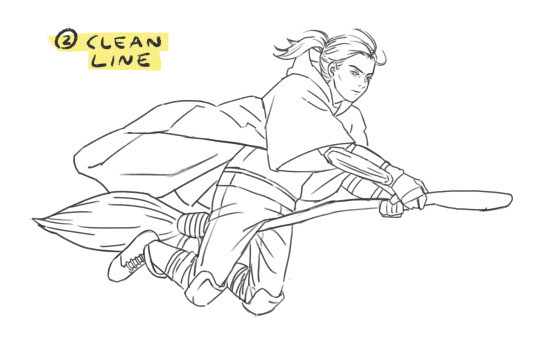
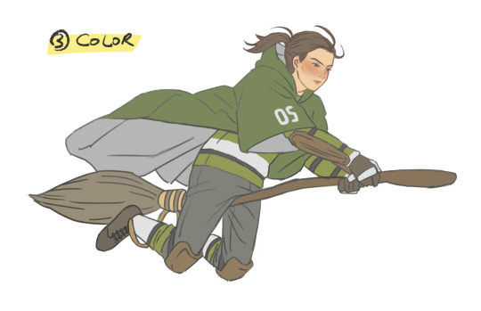
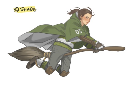
Rendering Overview
My current rendering process on Procreate (click and swipe):
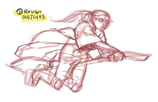
1. Rough sketches
This is where I try to get the anatomy and pose right. I can get up to 3 reps in here depending on how refined I want it to be. Yep I care a lot about my lines...
2. Clean line
... coz it's my favorite part!! I get such a dopamine rush seeing the sketches come together into a clean line lol. Here I use the Selection Tool and Liquify to resize and adjust the forms (gotta move away from doing this too much tho)
3. Color
First I create a flat base layer and color over it using Clipping Mask (pretty standard I think). Then I divvy my drawing into as many layers as possible - one each for skin, hair, shirt, waistcoat, trousers, etc - as I color them all. More on this below.
4. Shade
ewww shading... my least favorite part. I use Multiply layers and gray colors, again pretty standard. I usually have 1-3 layers here, stacked on one another, depending on the desired depth. More on this below.
5. Finishing touches
This stage involves a lot of small (but important imo) things, which vary depending on the drawing:
Tinting lines (Because shading makes the colors darker, lines need to get darker too)
Highlights on hair, face, clothes, eyes, etc. I can never make up my mind between Overlay/Hard Light/Soft Light layers for this
Little wisps of hair or lighting effects
and voila I have something to share with the world. wooo
Picking Colors
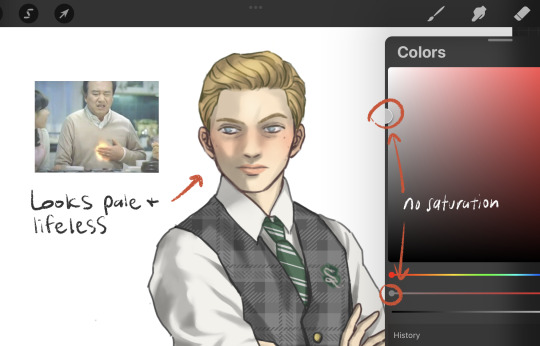
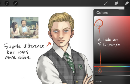
Ok about my colors… I wish I had some fancy technique to show but tbh I just eyeball them and try them out a bunch. Now if I’m using a reference I could use the color picker, but I don't like to coz the results are way off for whatever reasons (ex. lighting in the img). Anyways it doesn’t have to be the same color as the reference; as long as the colors “make sense” to me I'm happy.
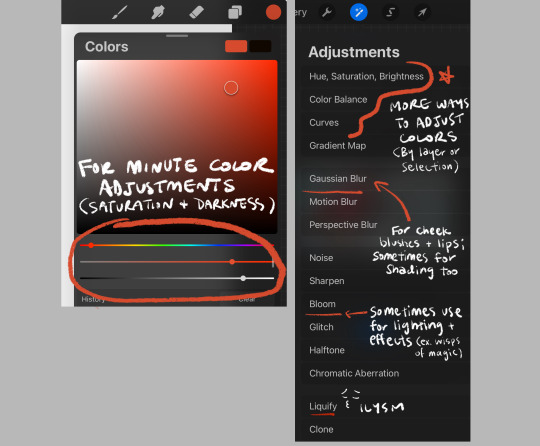
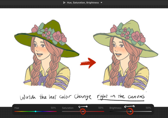
But what if the colors I chose are too saturated or too dark? I use the Adjustment Tools for this. I can just select the layer (or an area using the Selection Tool) and edit its darkness and saturation. I found this way easier than painting over or color-dropping repeatedly.
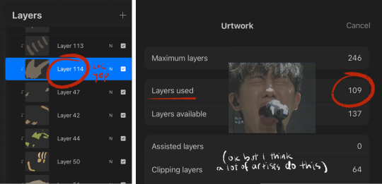
This is why I leverage as many layers as possible. It allows a modular control on my rendering - I can change the color of my character’s skin, eyes, or waistcoat patterns and keep all other components unaffected and clean. Sometimes I have like 100+ layers and it drives me batshit crazy but the pros still outweigh the cons. Or so I tell myself
( + I would love to understand grayscale and use it as freely as u do. I watched bunch of vids on it but something about it just hasn’t stuck with me yet 😔)
Shading I guess
Similar to coloring, I create several Multiply layers and stack them together for depth. For example:
This is again for that modular control but honestly I wouldn't be doing this if I was good at shading... I feel so lost every time, I just don't know how it works. But one ‘hack’ I’ve come up with is shading skins and clothes differently. I use reddish gray for skin (and brown/red hair), and just gray for everything else.
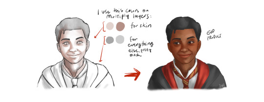
The character feels more lively and natural with a bit of red undertones in their skin. I don't think this is the best way to render skins though. Just a little shortcut til I get to study the topic more.
Something else I do to get over my fear of shading is using good references. I’m always lurking on Pinterest for them but alas, I can’t always find that perfect image with perfect lighting and poses. It’s kinda sad funny how the quality of my rendering depends so much on the reference:
(it's not a 'bad' reference per se - I chose it really for the pose, not for shading)
At the end of the day tho I’m just a learning artist so I try not to be too harsh on myself. Someday I'll render shiny shoes and shirt creases without refs. I yearn for that day
Well on that cheerful note thanks for coming to my Ted Talk your interest in my rendering approach! I’ve been wanting to document it for my own records so this was great.
I picked up digital illustration just last year and self-learning it has been a fun but lonely process. If you have any tips or more questions talk to me ANYONE PLEASE I’m dying to talk about it if you can't tell by the sheer length of this post. For which I'm sorry but hopefully it wasn’t too dense a read ok I’m really done now bye!!
39 notes
·
View notes
Text
Accept trade request?
praxie about to dump your trade window with vendor trash. i still find it very cool that the merchant class in RO exists and is tied very heavily with server economy - the realest support class
Process breakdown for my own benefit + anyone interested:
Line Art
This piece was mainly meant to be rendering practice, and as part of that, stop spending so much time fussing over line art (which i am still very guilty of doing)
Initial sketch (left) to get the general composition down, and then some additional guidelines to help with hair and clothes (right).
Line art (left), normally I spend a lot more time polishing and refining this, or straight up doing yet another line layer on top, but I've recently just started leaving it in its sketch-y state, and doing some erasing to clean up over extended or messy lines.
Then using a fill tool to block out the character (right), and fill in any gaps with a brush. The main purpose of this is so I can use Alpha Lock to avoid going over the lines during painting.
Some really interesting resources (and interesting art channels) that I've been using as a reference point:
youtube
youtube
youtube
(that last one has english subtitles btw, bless you based naoki saito dragalia artist)

(left) Changing the base colour to brown helps with gaps while painting skin, and changing the background colour to a neutral tone helps with balancing contrast. (right) Afterwards, I start blocking out the individual pieces with various colours so its easy to tell what I have or haven't missed.
Once colours are down, slap some shading in with hue shifting to spice up the colour variety. I don't know what the non-pixel art term for this is, but basically it's when you make the colour change hue and saturation as it darkens. Here's an example of the scarf, without hue shifting on the left, and with on the right:
Since each section of the image is its own layer, the colours can be adjusted until everything looks good. This is usually where I do that technique where you put a grey layer over the image and setting the Blend Mode to Color. This makes the image greyscale, so luminosity/contrast can be adjusted for readability (combined with eye squinting to see how easy it is to distinguish important image elements).

After that's done, the real change that makes the piece less harsh is to alpha lock the line layer, then start painting over it with colours that match the surroundings.
Here's also where I make small touch ups, like remembering to colour the rest of the hair and shorts, and doing that thing where the face has a soft skin glow that affects the surrounding hair.


Here's the fun part where I put a bacground in, otherwise known as throwing random colours around and seeing what sticks. I wanted try my hand at the cool brush stroke outline effect, which basically involved painting outlines between layers that sit on top of each other, such as between the palm of the hand and arm, or the back shoulder and the hair. Also random cat paws and sparkles for good measure.
Some cheeky Ben Day (aka comic book / manga) dots over areas where light might shine and create bloom. Into the spider-verse does this and it looks awesome.
Finally, air brushing some colours over the top on a layer with Soft Light blend mode. It's not readily apparent when isolated, but if I greyscale the image and then apply the layer it gives a dream-like effect
youtube
This video by OyunOrka quite succinctly goes over a bunch of things that can be done here, but obv don't have to do all of them.
Anyway, happy catgirl wednesday
10 notes
·
View notes
Note
I am a bit jealous of the way you paint. Do you have some tutorials or ways to improve? I love paint, I try my best, but my colors end up always muddy 🥲
here's a bunch of miscellaneous thoughts... I hope this helps!!! I've never really written tutorials before so it's a bunch of different tips collected together
whenever you see something that inspires you, save it somewhere! then look at all your inspirations every once in a while and analyze what made you like them - like certain techniques or colour usage or something. then when drawing, try to incorporate it! (i've saved finished pieces, sketches, half-done stuff, speedpaints, lots of different things as inspiration)
using more saturated midtones for shading could help in making things not look muddy (like this tutorial). of course having more desaturated colours could also be a vibe you're going for
don't be afraid to use desaturated or bolder colours!
I love underpainting (tutorial on it)
I also love using the lasso fill tool. I don't do lineart so whenever I need to plop down a big bunch of colour (like for people) it's lasso fill time! on procreate it'd be select -> freehand -> color fill
some people will be like don't overuse blending tools and soft brushes and! while I do think it's super important to learn how to rawdog just blend things, eventually you'll find that reintroducing them into your workflow could be useful! I guess it's more of an advanced tool?
granted I just use hard brushes to blend everything anyways. if you feel like you're overusing blending/soft brushes then try using a harder textured brush, or the good ol round brush with opacity and size being controlled by pressure. or alternate between the two
my painting workflow is changing refined sketch layer to a multiply layer + making it a different colour -> underpainting colour -> lasso fill in shapes (with the underpainting) -> laying colours down at a lower opacity or with a textured brush -> sometimes using a multiply layer for quickly putting in shadows -> some minor painting under the sketch lines -> painting over everything (sometimes I merge a bunch of layers together). here's a video of a wip!
I don't know how to describe this... colour constancy... so, colours look different in different lighting conditions but the brain still recognizes them as the same local colour. one thing I had to really figure out was how to choose colours under different lighting conditions (instead of using a multiply layer for everything)(I still use multiply layers for some things though) bc I found that outright picking them made things more interesting? since style is all about your own choices. like in the above video Paradox's skin is actually a dark grey-purple and his labcoat is dark grey-blue but the brain recognizes that's a white guy with a white labcoat in a different lighting condition. uh. Color and Light by James Gurney has better explanations of this
thumbnailing colours are useful. also don't be afraid to restart your colours over and over if they don't feel right - kinda like a warmup
I like having a brush with minor colour jitter on stroke (like 3%) I can switch to for some colour variation
change your pen's overall sensitivity to be something like this so you don't have to press as hard to get to the ~100% range

get funky and experimental with it! break the rules once you've learned them!
tutorials I liked:
the book Color and Light by James Gurney
importance of values and contrast (pics)
mini rendering tutorials (pics)
underpainting (pics)
colour tips (pdf but the sample tutorials are already helpful)
anatomy quick tips: skin (video)
how i paint skin/light by niro (video)
the fastest way to learn to draw color & light (video)
3 techniques for incredibly realistic portraits (video)
I also find speedpaint videos to be super useful to get a sense of other people's workflow!
brushes I'm using
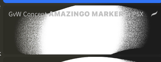
verkomy's fun marker for sketching + textured painting
moss' sketchy sketch for some sketching
an edit of a default round brush to have a uniformed glaze rendering mode, and variable size (40%), opacity (50%), and flow (max) based on pressure. I think there's other edits too?
default soft brush for quick soft brush needs, like putting down some colours for tinting something with an overlay layer
a square-ish textured brush with 3% stroke color jitter. copied it from a CSP brush that I use (PX paint)
#I had this typed up and then I accidentally refreshed the page so hopefully I have everything captured again#really hope it helps!!#EDIT: added some brushes
8 notes
·
View notes
Text
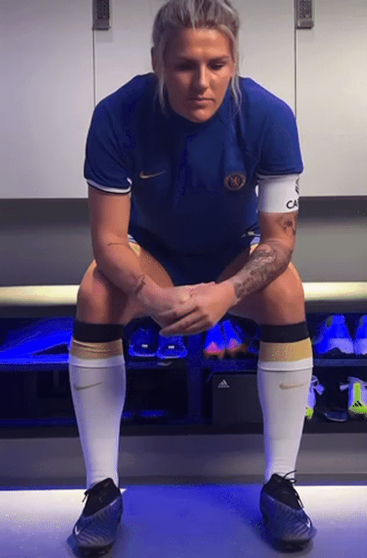
Millie Bright x Reader
Part Four: Lover’s Auction
“Hey pretty girl” Millie’s soft morning voice awoke you from your slumber, prying your eyes open to see the beautiful woman peering down at you made your face light up. “What’s that cheeky smile for, aih?” she said tucking the duvet around your feet that had become uncovered in the night. “I like waking up to you” the smile was still plastered on your face as you sat up to take the cup of tea she’d made you out of her hands. Millie sat down on the edge of bed, draping an arm across your body, “big day today princess, how you feeling?” she asked laying her head down in your lap. You hadn’t been awake long enough to register your feelings about today and longed for a few more minutes of blissful ignorance before you had to acknowledge them. Today was the day you watch a live football game for the first time since mum passed 20 years ago. Football was your thing together and although you know that she’d love to see you go again, you felt guilty for going without her. It may not seem like a big deal but it was like a huge black cloud hanging over you. You’d recently started watching Millie’s Chelsea and England games on TV with your dad and the prospect of football as a whole certainly wasn’t as daunting as it once was but there was still an awful feeling in your stomach - the feeling of betrayal and guilt mixed into one huge cauldron about to boil over in your tummy.
Dad loved watching football with you again, for years he’d go to his friend’s house or the pub to watch Tottenham just so he wouldn’t upset you but now he gets to watch his beloved Spurs at home, without the fear of his baby girl having a complete meltdown. Every week he makes sure he’s home in time to watch Millie’s games with you, he’s filled you in on the new offside rule (one that’s changed many times since you last played), he always bought mountains of snacks home with him and even teases you about wearing the shirt of a rival team of his.
“The sun’s shining, it’s a lovely day” Millie pulled the curtains and interrupted your thoughts, she’d noticed you still hadn’t answered her question and went for the distraction technique instead. “Are you more of a pie or hot dog kinda person?” her question sparked the glint in your eyes to come back, “I’m more of a chips and hot chocolate kinda girl” you smiled, the rumble in your belly already tasting the overly salty chips you’ll get in the stadium. “Oooh, mayo or ketchup?” the blonde asked, busy getting herself ready for the day and determined to keep the conversation going so you didn’t slip back into overthinking. “Ketchup. Unless I’m drunk, then mayo” you laughed at her silly question, “I can work with that!” Millie replied as she tugged on her socks and trainers then told you that Rachel had already left to meet her team.
Throughout the morning Millie kept checking in, conscious not to push you into going if you weren’t 100% ready but also encouraging and reassuring you. She wanted you to do this just as much as you wanted to do it for yourself and her gentle and caring nature showed that. It was a lovely summers day so no coats were needed but you tied a hoodie around you in case it got chilly in the shade. Leaning over the sink to spit out the toothpaste and wipe your mouth Millie’s arms found their way around your waist, her chin nuzzled between your shoulder and neck as you looked at yourselves in the mirror. “We make a cute couple if I do say so myself” you laughed, turning your head to kiss her as she hummed in agreement. “How are you feeling gorgeous, you haven’t answered yet?” she said in an almost whisper, squeezing you a little tighter to make you feel safe. “Anxious, apprehensive, a teeny bit excited but that might be just because I get to spend the entire day with you” spinning around inside her arms to face her, interlocking your fingers behind her neck you stood together as one for a second. “I got you, okay?” she lingered a kiss on your forehead and waiting for your acknowledgement of her statement - Millie makes you feel safe, there’s no doubt about that and her pet names made you feel increasingly soppy. She didn’t want to rush you but it was time to leave, taking a deep breath before leaving the bathroom she lead you out to the car and drove to Bescott Stadium.
Walking towards the stadium there was a buzz in the air, an atmosphere that felt familiar as excitement started to build among fans. You watched families pass by with children in tow which made you smile, they had women’s names on the back of their shirts and everyone walked together with no fuss. Not like men’s games where they have to be separated, it made you feel happy to see how big women’s football had grown since you left it, they’re a big deal now! “Oh! Can I get a programme?” tugging on Millie’s arm to drag her towards the person selling them. Millie was wearing a cap with her hair tucked underneath to try and go as unrecognisable as possible – she could have easily snuck you in through the VIP entrance but wanted you to soak up the atmosphere from outside. “You can have whatever you want doll” she chuckled to herself, watching you become more and more excited with every step. Flicking through the programme Millie’s arm wrapped around your shoulders, peering over to look at the glossy pages too. “Shall I get you one of those?” chuckling as she pointed out the merch stall you were passing selling scarves with players faces on; she was joking but you were running with it! Your eyes lit up as you pulled her over to the stand and paid for two scarves with Rachel’s face on, “this is so funny!” holding up the face next to yours so Millie could take a photo of you in front of the stadium to send to your dad. You couldn’t believe what was happening, it all felt so huge! You never dreamed that the game you played as a child could lead to a professional career but here you were dating someone that proves you could of and should have!
As fans trickled through the turnstiles Millie took you through the main entrance and once safely inside took of her off her hat letting her blonde hair drop past her shoulders. You were lead to the bar where you had a few drinks to settle your nerves before making your way out onto the balcony to find your seats. The roar of the fans as the whistle blew took your breath away, you’d been prepped by Rachel the night before that it was big game and one that they should win but Villa’s form had been quite unpredictable lately. Millie pointed out her best friend on the pitch to you and talked you through the line up, giving you all the information you needed to enjoy the game, she gave a special nod to Jordan Nobbs who moved to Villa after 12 years at Arsenal last season and Kenza Dali who plays for France. Millie held your hand throughout and at half time you went to collect the chips and hot chocolates for you both, Millie insisted on paying but you beat her to it. It’s only fair seeing as she drove you halfway up the country! She doesn’t see it that way though and isn’t used to having someone pay for her, you said that if she continues to date you then it’s something she’ll have to get used to – it’s just chips after all! By the second half you got so into the game that you were shouting and clapping along with the crowd. Millie enjoyed watching you stand up and sit down every two minutes of the second half shouting support at the team, it was like watching a completely different person come alive! When Rachel scored twice in the space of five minutes you launched yourself into the air, noticing her point up to the sky then towards you and Millie in the stands. Your girl nudged into your shoulder, “that was for her dad.. and your mum” she smiled with glassy eyes at your confused face. “She said this morning that if she scores she’ll dedicate it to your mum, she always dedicates her goals to her dad” taking you in for a big bear hug. You didn’t know Rachel had lost a parent too and somehow felt more connected to her than before, it was cute that she dedicated a goal to your mum on your first game back and was very thoughtful of her. Villa won 5-0 which was a huge win for them being close to the bottom of the league apparently, the crowd went wild and you were in awe! You hadn’t seen a spectacle like that since your home team avoided relegation on the last game of the season way back when.
You had a great weekend in Birmingham and arriving home made you feel a little sad that it was over. Just like always dad was home to greet you as soon as you walked through the door, keen to hear all about your adventures and how the game went. He couldn’t wait to come with you when Chelsea play Tottenham in the future! “While you were gone I found this out the attic” he said handing you a large glitter covered cardboard box. “Is this..?” you asked getting a little choked up when he nodded. “The memory box mum made you, yeah. I thought you might like it now that you’ve got back into football?” Carefully lifting the dusty lid uncovered brightly coloured joy – your old kit, newsletters, signed England programmes, sticker books and posters, a shirt signed by your entire home team, your first pair of boots, game tickets, photos of you playing – there was so much inside you’d forgotten about! Tears fell from both of your eyes as you carefully admired every piece of memorabilia, each one bringing another memory to the forefront of your mind.
The next time you hung out with Millie you took the box with you, keen to show off your footballing past. You spoke about how mum took you to some of the England games when you were little and meeting the likes of Fara Williams, Alex Scott and Carly Telford, there was even photos of you with them after your last game with mum at a 2003 friendly. Millie smiled and admired the photos just as much as you did then scrolled through the contacts in her phone, pointing those same names out. Your mouth dropped at the blasé way she said it, these women you idolised growing up are actually in Millie’s phone, she knows them! “Who knows where you would have been if you didn’t stop (y/n/n)” a weak smile etched onto your face, you wondered if you would have been playing in the WSL against Millie if you carried on playing football, if mum was still alive… “she would be so proud of you, I bet she was right there with us this weekend” noticing sadness taking over, she didn’t mean for her comment to upset you and realised that what she said probably wasn’t the right thing to say in this moment. “It’s a good job you found me, aih?” squeezing you so tight you couldn’t help but laugh, “well it was my dad that found you actually!” Millie had this very unique quality to notice very quickly when your emotions change to negative and was very good at snapping you out of it which is something you admired about her. For so many years your anxiety had gone unnoticed by many yet here is a person that has only known you a few months and able to sense when you were overthinking. Millie carried on talking about your memories and asked if you planned on coming to her game at the weekend, looking at her holding your tiny pair of boots you couldn’t help but feel truly happy and finally felt ready enough to say yes! You couldn’t imagine the feeling you’d get watching your girl play live when watching Rachel gave you such a thrill. “Yeah, dad can’t wait!” you nudged into her side with a cheeky grin, “Rach and Sarah are gonna come down to sit with you too, I’ve already spoken to them” she assured. You thought that was lovely gesture, she’s pretty perfect like that.
Millie had arranged for you all to be in a box, her game was being played at the much bigger Stamford Bridge meaning there were a lot more people at this one. You arrived outside with your dad where they were giving out free flags at the entrance, you both grabbed one then bought a programme and a scarf with Millie’s face on. Dad took a photo of you just like you did at Villa’s game and sent it to her, the photo made you laugh so much your ribs hurt! You made your way to your seats and shortly after you arrived so did Rachel and Sarah. You were introduced to her girlfriend and dad was quick to introduce himself and handed out business cards before you told him off. “This isn’t a PR event” you hissed at him, slightly embarrassed that he couldn’t hold back from the opportunity.
Watching the game with dad felt nostalgic, he was smiling throughout watching you enjoy yourself again and couldn’t help imagine what your mum would have thought. His master plan had worked! Well.. he only thought he’d get you back into watching the game, he didn’t expect you to start dating a footballer! He could tell what a massive difference meeting Millie had made to your mood and outlook on life and hoped you’d make it official soon. He’s never liked any of your partners but this one he can certainly get on board with!
Part Five
#millie bright#millie bright x reader#lionesses#lionesses x reader#woso x reader#woso masterlist#woso fic#woso community#woso imagine#woso one shot#woso fanfics#wlw fanfic#fanfic series#woso series#chelsea wfc#Chelsea wfc x reader
114 notes
·
View notes
Text
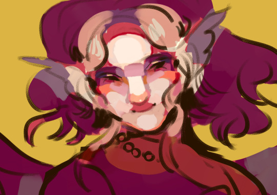
colouring tutorial from sygni aka sima
DISCLAIMER 1. eng is not my native language 2. i am using techniques of a realistic art so it's not for everyone! but you may find some tips interesting tho
big text screamer
so obv 1. making our sketch (and after lineart if you're using it bc im not) 2. filling up background, then character. think about what atmosphere you want to create in result, try to use different background colours for your characters for diff effects in result. i've had a small post with a little explaining for choosing colours, you can use that too! i suppose i can make a post about emotional effects of different colours if someone interested bc that's really a HUGE part of final effect on viever. actually i can tell and explain in art so much feel free to send questions <:D so like that! (tbx i changed it like 3 times so it's okay to change your colouring desigions mid-drawing if you're feeling something feels off)

3. time to get some basic shading going! don't skip that step i swear to god you can think bruh sima for what do you they added overlays that i can use after i finish the art? are you a caveman or what please just trust me it'll add so much charm in your art so how to do it: 1. choose where your light sourse is. on my art it's in front of griande 2. use a CONTRASTING colour for each big part of a character (hair, clothes, face etc) and make shades with that. REMEMBER dark colours going next to light ones, light to dark. please don't use black for shades for god's sake. also shades are cold coloured most of the time thats important too ig 3. if you're confused where you shall place shades then find a ref or make a photo of yourself OR use a mirror (preferable!) and this things can help you understand face shading better too \/
don't feel not good enough that you need to study sth or use refs it's fully okay every good artist using that!

so i know this looks like mess BUT what did i do (guys trust the process): 1. desided i want a face to be a centre of viewer's attention so made everything else darker 2. put a light on a face, the most light shade on the parts which are closer to light sourse - at my art it's nose and a bit of forehead. and exact same thing but backwards with eyes remember face isn't flat! so even if forehead is in the light, it slowly goes back, so it won't be light all the way (you can see it on previous photo of the gypseous head)
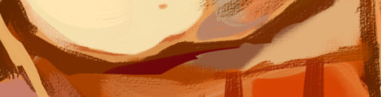
then the longest part goes: we're using semitones (colour which are simmilar to base shade) to connect shades to light parts, to add volume to the art make sure your brush moves according to .. ehh.. face shape? just take someone and weirdly touch their face to understand how it goes and with your brush cope that example (look closely to the strokes):

so i've did something
i know this looks like "let's add some details" type of thing but: i've added semitones to the shadows to correct their forms -> to suit the relief of the face added a contrasting (to pink of the base) orange as blush, a dark blue to show the farthest spots from light added a basic reflects on the sides of the noce (orange spots), chin (peach). reflections on things are sooo important and add so much life in your art! yet it's easily done: you just create a little light blended line on the bottom of your shade. if next to thing you're making a reflection on is the diff-coloured thing, then pick a colour from it and mix them. example \/
made an edge on a forehead (dark-red line) yet i'd make it more accurate later, and will add it on the chin and sides of the nose to highlight them and separate from other parts of the face. actually this edges are just the darkest spots between the light of the item and reflection on the bottom of it. i like to make it noticible, yet someone tend to blend shades in. if you're just studying how to shade i'd reccomend starting without using blending yet you can notice how colours going more dull from forehead to chin to make her look like she's angling her head forward, i guess i'll make it more noticible later
AND i'm going to sleep but i have more to tell + i need to finish the work later anyway so put some feedback for part 2
63 notes
·
View notes
Note
how do you choose color schemes for your art cos they're always so good, also i looove your horror magical girls <3
<3 receiving this ask made me SO excited i love talking about processes and techniques. anon i hope you enjoy the essay
note: for anyone wondering how i get the different color strokes in my art, that's color jitter! I can answer a different question on that, but it's just a brush setting that changes the color for each stroke. This answers how I choose the base colors :)
GENERAL RULES
I think the first thing to know about my process is that I'm weirdly strict with the colors I use? I see people who color pick and wiggle the color around a bit each time and it's really cool! But my brain doesn't like me doing that, so it makes most of my color palettes a pretty closed ecosystem.
As a overview, I have 3-4 "types" of colors with their own color gradients. Be aware of tone! Don't make the types of colors the same tone. Additional colors are made from combining the types. I use 25-75% opacity for new colors instead of blending them.
This is a good example of the closed ecosystem concept:

My 3 types of color are brown, green, and pink. The circles of colors are the ones I manually picked from the color wheel. The rectangular blocks of color are the new, in-between colors.

Something to note is that my new colors aren't 25% opacity, then 50% opacity, then 75% opacity. I draw a rectangular strip of the base color and draw over it with a 25% opacity brush. Then, I draw over half of that again with the 25% opacity brush. I keep doing this until I'm satisfied with my colors.
This character is a dryad and I wanted to add more interest to the bark skin, so I used the pink for some highlights. The brown and pink are both warm colors and it made the most sense to use them together. This is how it looks without the pink accent:

It ties the brown and pink together pretty nicely, right? I usually do this because I don't really like having two types of colors that are very similar in hue. If I have a pink-red color, then all pink-reds in the piece should be a color from its gradient (or a new color made from it). This makes sure all colors in the piece have a distinct relationship to each other.

(If I'm drawing something that's predominantly one or two hues, the threshold for merging colors is higher)
If that's not the case, then I prefer to manually include a gradient relationship. This particular instance was a little weird, where the brown seems more red than it is. It's actually an orange, but because I never used a medium or light toned variant of the color it just seems red. Changing its hue to pink would be pretty noticeable, so I chose to use the gradient method here.

Here's some other examples with the types explicitly added


and some with just the swatches


As a rule of thumb, there are usually at least 3 types of colors: skin, hair, and clothing base colors. Skin and hair are generally unique, but not always.
CHOOSING GRADIENT/SHADING COLORS
This might change in the future (i want to experiment), but most of the time* when choosing my shading colors I move counterclockwise from lightest to darkest.

I originally started doing this because I use the same color for skin shading as the blush, which was tinted red. In general, this works pretty well because when moving counterclockwise from yellow the average tone of the color decreases. Purple has the darkest tone, so red/blue/purple are often my darkest colors.
*There are exceptions to this, particularly when I'm using green or blue-green. If that's the case, then I do the same thing but clockwise. Purple is still my darkest value.
It's a personal preference, but I very rarely use a yellow as the light color in a shading gradient moving towards green. You'll usually see me use yellow and then move towards orange/red OR use a yellowish green and move towards blue/purple. I'm not the biggest fan of yellow-green and use it extremely sparingly. Consequentially, this does pretty distinctly separate my warm and cool colors. It's not intentional lol
HUE RELATIONSHIPS
To be honest, I usually have two types of color schemes: Boldly different colors or similar colors with a bold accent.
If anyone has seem my art then they know i LOVE a good contrasting color scheme. I know there's actual contrasting colors-- yellow-purple, orange-blue, red-green-- but in this context I'll be using "contrasting color" to refer to the actual contrasting color and it's immediate neighbors. For example, red and blue would be contrasting in this context. Red and purple would not.
The reason I want to make this definition is because I think that you can get the same visual impact of actual contrasting colors as long as a color is the opposite mood (warm/cool) AND not next to the base color. Using the same example, red would be a warm color with green as its actual contrasting color. Yellow is also warm, so we can't use that despite it being green's neighbor. Blue works. Purple is red's neighbor, so we can't use that despite it being a cool color.
Here's some examples of color schemes with really prominent contrasting colors:
For purple/orange

For red/blue


For pink/green

As for the other type of color scheme, it's 2 or 3 neighboring colors and a contrasting color (which is usually very saturated)


In some cases, the "contrasting color" is just a very light grey/white


In both cases, you just need a color that pops from the rest! Because my color palette is so limited, this accent color ends up being used for jewelry, trimmings, embroidery, etc. It helps tie everything together.
FINAL NOTES
I can (and will!) break the rules established here. I experiment, I make the objectively bad decision, I want to try other things. That's art. If you find something here that's interesting, try it out! Make it your own! (maybe tag or dm me, id love to see it)
If anyone has any questions, please let me know! I love answering these and it's really cool knowing someone might take inspiration from this :)
#sketchmre tutorial#sketchmre answers#tutorial#art tutorial#color tutorial#idk how else to tag this lmao
6 notes
·
View notes
Text
'To watch Ripley is to be hypnotized by its quiet, seductive beauty. Shot in crisp black and white with dizzying noir stylishness, the Netflix series draws viewers into the solitary and sad world of New York City grifter Tom Ripley (Andrew Scott), then pulls them along with him as his life is changed by an ultra-wealthy man’s request that Tom find his wayward son Dickie (Johnny Flynn), who is living a deliciously posh life on the Amalfi Coast of Italy, and persuade him to come home.
Creator/writer/director Steven Zaillian calibrates the finest of details to place us in Tom’s experience, with close-ups on Tom’s scuzzy bar of soap in his New York flat and lingering looks at Dickie’s expensive fountain pen, background sound effects subtly emphasizing a scurrying rat or a wafting aria. (I watched it with the English subtitles on, and it’s fun to see how many times the captions have to describe specific ambient sounds.) This approach distinguishes this adaptation from the sunny lushness of its most famous forebear, The Talented Mr. Ripley, the 1999 Anthony Minghella film starring Matt Damon and Jude Law.
In fact, this marks the sixth screen adaptation of Patricia Highsmith’s 1955 novel and its four sequels. But it earns its existence in both its unique approach to the material and its ability, as a streaming series with eight luxurious hours of runtime, to live Tom’s life as it slowly morphs from a daily struggle to a sparkly glide through a blessed life of leisure. It uses some of this extra time to indulge an obsession with the Baroque painter Caravaggio—known for his skillful contrasting of light and dark, an artful reflection of the show’s themes as well as its film technique. (Vulture has a glorious breakdown of similarities between the show’s visuals and Caravaggio.) The series also has the advantage of centering the always-excellent Andrew Scott, who imbues the title character with both pathos and mystery, often taking viewers through an entire arc of changing emotions and motivations without uttering a word.
And Ripley takes on new significance in a social climate that is reckoning with enormous wealth disparities—and the realization that the bootstrap-powered American dream is more mythical than ever. It joins a barrage of television shows that skewer the rich for our entertainment, such as Succession, White Lotus, and Your Friends and Neighbors. Instead of poking holes in the dream, however, Ripley invites us to cheer for the psychopathic outsider as he attempts to steal the good life out from under the privileged. Here, the rich are not neurotic fools; they’re simply so blind to the scale of their good fortune that they can’t comprehend what someone like Tom might do to snatch it from them. It’s a story that’s both timeless, and perfect for 2025.
Where to Watch: Netflix.'
#Peabody Awards#Ripley#Netflix#Andrew Scott#Steven Zaillian#Patricia Highsmith#The Talented Mr Ripley#Caravaggio
2 notes
·
View notes
Text
Fic/Lore idea pt.2
The courtyard buzzed with low conversation as Nobara sat perched on the edge of a low wall, spinning a nail between her fingers. Yuji was mid-stretch, cracking his knuckles, while Megumi stood with his arms crossed, clearly still skeptical of their new classmate.
Then—
“I’m ba~ack!”
Yume Miran came bounding around the corner, her vibrant hair catching the dying light—pink, green, and blue streaks shimmering like cotton candy fire. Her glowing, swirling eyesglinted in playful shades of violet and peach.
Yuji grinned. “Hey! You disappear to change outfits or something?”
She tossed her head with an easy laugh. “Nooo, I had to check in with Gojo-sensei. He says hi, and also that I’m probably way cooler than you.”
Yuji gasped. “Rude.”
Nobara smirked. “He’s not wrong though.”
Yume winked at her. “See? That’s why we’re best friends already.”
Nobara gave a proud nod and bumped her shoulder.
Megumi, still distant, narrowed his eyes. “Where did you really go?”
Yume turned to him, folding her hands behind her back. Her smile didn’t drop—but her tone got just a bit silkier. “Still suspicious, huh? Guess I’ll just have to win your trust with violence.”
Yuji raised a brow. “Uh… what?”
She clapped her hands suddenly. “Let’s spar!”
The others blinked.
“Spar?” Nobara asked. “Right now?”
“Why not?” Yume grinned. “Training makes the heart grow fonder. Or… well, makes the bruises grow bolder. Whatever. Come on! Let’s go until dinner—winner picks the first dish!”
Yuji brightened. “You’re on!”
Nobara cracked her knuckles. “Bring it.”
Megumi hesitated.
Yume tilted her head at him, her smile warm but unreadable. “You too, Megumi-kun. Unless you’re scared of getting shown up by the new girl?”
His eyes narrowed further, but he sighed and stepped forward. “Fine. But don’t complain if it gets rough.”
She beamed. “Promise. I like it rough.”
From Within…
Ayumu stirred faintly. Yamika, don’t hurt them. Oh, I won’t, Yamika purred. I just want to see what makes them bleed best. Yamika—! Relax. I’m still wearing the mask… for now.
Here's the next part of the scene, where Yume (Yamika) follows Gojo’s strict instruction not to use cursed energy—so instead, she studies and perfectly mimics the others' fighting styles during the sparring session. It adds a layer of unsettling brilliance, while still keeping her playful persona intact. And beneath it all, her feelings—toward Yuji, Nobara, and even Megumi—are genuine, not part of the mask.
Scene: Jujutsu High – Training Field, Moments Later
The four stood in a loose circle under the soft orange sky. The training field buzzed faintly with anticipation.
“Alright!” Yume spun on her heel. “No cursed techniques, no flashy finishers, just good old-fashioned hand-to-hand. Let’s keep it cute!”
“Cute?” Nobara laughed. “I don’t do cute in battle.”
“Then make it hot,” Yume teased with a wink. “I’m adaptable.”
Yuji stepped forward first. “Let me go first—test the new girl’s reflexes!”
Megumi muttered, “Or test her ability to survive your chaos.”
Yume dropped into a loose, bouncy stance, mirroring Yuji’s own footwork with eerie precision. Her posture shifted from graceful to grounded, channeling the same instinctive brawler’s energy he carried.
Yuji blinked. “Whoa. You’re… copying me?”
Yume grinned. “Imitation is the sincerest form of flattery~”
Then he lunged.
They traded a flurry of jabs and low kicks. Yuji was fast—but Yume was faster in how she read and mimicked. For every punch he threw, she countered with near-identical force and placement. No cursed energy, no enhancements—just pure skill, reflected back at him like a mirror.
Yuji skidded back, panting. “Dude… that’s freaky.”
“But kind of fun, right?” she beamed. Her chest rose and fell with breathless joy. “You fight like you mean it. It’s honest.”
“She likes you,” Ayumu murmured faintly from deep within.
Next up: Nobara.
“You’re gonna regret this,” Nobara smirked.
Yume blew her a kiss. “Only if you don’t hit hard enough.”
This time, Yume shifted again—her stance sharpening, chin tilted, feet angled like Nobara’s. Her movements turned snappy and rhythmic, laced with theatrical confidence. Every dodge and strike came with flair.
They danced around each other in high-speed precision. Yume didn’t even have a weapon, but still perfectly mirrored Nobara’s attitude, her momentum, even her dramatic pauses.
Nobara pulled back, huffing. “Okay, okay, I hate how much I love this.”
Yume clapped. “That’s what besties are for~”
Last: Megumi.
Yume turned to him, her smile flickering smaller. “Your turn, Gloomy-kun?”
Megumi stared at her for a long moment, then moved into position. “This won’t be like the others.”
Yume’s eyes narrowed slightly, colors shifting cool and calculating.
She moved like him.
Low guard. Silent feet. No wasted motion.
It was uncanny.
Megumi lunged, and for a moment, it was like fighting a warped reflection. Yume didn’t smile this time. She was quiet. Precise. Unnervingly aware.
Megumi pushed harder.
She matched. Each block. Each pivot. Every counterattack. Like she’d known him for years.
They broke apart at last, breathless, sweat on their brows.
Megumi stared hard. “…That wasn’t just mimicry.”
Yume tilted her head. “Maybe I just see you.”
He said nothing. But the suspicion in his eyes deepened.
Yuji flopped onto the grass. “Okay. You win. You’re terrifying. And awesome.”
Nobara collapsed beside him. “If she’s our classmate, I vote she leads.”
Yume sat cross-legged, laughing. “I just wanted to have fun. I didn’t expect you all to be so endearing.”
And she meant it.
Because even with her mask on— Even as the daughter of a curse watched them through borrowed eyes— Yamika liked them. All of them.
Especially the boy with Sukuna in his chest.
Here's the next scene where the first-years go out to dinner at a sushi place together—Yume (Yamika) plays along like it’s a normal outing, but inside, she’s struggling with the growing, genuinely confusing feelings she has for Yuji. It’s awkward, hilarious, and a little existentially gross for her—because he’s literally the vessel of her father.
Scene: Downtown Tokyo – Late Evening, Outside a Sushi Bar
Neon signs glowed along the street. The group had cleaned up and changed into casual clothes, still buzzing from the earlier sparring session.
“Okay, this place has the best sushi in Tokyo,” Yuji said proudly, leading the way with excitement in his step. “I’ve been dreaming about it all day.”
Nobara rolled her eyes. “You dream about food every day.”
“Exactly. This is a dream come true.”
Yume trailed behind them, hair tied in space buns, a star-shaped sticker under one eye. She wore a cropped bomber jacket and jeans with a colorful belt, her piercings glinting under the streetlights. Despite the playful outfit, her thoughts were a mess.
He smiles like an idiot. He gets way too excited about fish. And he literally houses the soul of my disgusting, ancient father. So why the hell is my heart doing this fluttery crap?!
She resisted the urge to physically shake it out of her system.
Megumi noticed her stiff expression and muttered, “You okay?”
Yume forced a sugary smile. “Mmhmm! Just thinking about… salmon roe!”
Nobara leaned in and whispered, “She’s totally crushing.”
Megumi’s brow furrowed. “Crushing on who?”
Nobara grinned. “Yuji.”
Yume nearly choked. “EXCUSE ME?!”
Yuji turned around. “What? Did someone say my name?”
“NO,” Yume and Megumi said in unison.
Inside the Sushi Bar
The place was cozy and softly lit, with bar seating and warm wooden walls. The group sat at a booth by the window. Plates began to stack quickly.
Yuji beamed at Yume. “You ever had sushi this fresh before?”
She blinked, holding a piece of tamago with her chopsticks. “I’ve… eaten many things. Fish included.”
Nobara laughed. “You’re so weird sometimes.”
“I’m trying to be relatable,” Yume grumbled, cheeks slightly red. She stole a glance at Yuji—he was talking to the chef now, asking about tuna belly.
He’s sweet. He’s brave. He’s warm. And he’s carrying the guy who once bit my finger off when I was six.
She physically winced.
This is so gross. Why couldn’t I be into, like, Inumaki or something?
From deep within, Ayumu chuckled faintly.
“He makes you soft. That’s new.”
“Shut up.”
“You’re blushing.”
“I will stab me.”
“You like him.”
“…I will stab you.”
Meanwhile
Gojo, across town, sneezed.
“Must be my girls,” he muttered, sipping his drink.
Here's a fun yet tense scene where Yuji excuses himself, and Megumi and Nobaraimmediately seize the opportunity to interrogate Yume about her “not-so-secret” crush. There’s teasing, suspicion, and just enough emotional weight beneath the surface as Yamikastruggles to keep the mask on—especially under Megumi’s sharp gaze.
Scene: Sushi Bar Booth – Moments After Yuji Leaves
Yuji wiped his hands on a napkin and stood up, stretching. “Bathroom. Don’t steal my eel roll.”
“Too late,” Nobara said, mouth full.
Yume gave him a two-finger salute, but didn’t meet his eyes. Her multicolored gaze was focused on her own half-eaten plate, clearly distracted.
As soon as the bathroom door closed behind him—
“Sooooo…”
Yume flinched.
Nobara leaned forward, predatory grin in full force. “Are we gonna talk about how you’ve been lowkey heart-eyes for Yuji all day?”
Yume blinked. “I don’t know what you’re talking about. This is just my face.”
Megumi raised an eyebrow. “Your ‘face’ blushes every time he says your name.”
“Coincidence,” Yume said quickly. “Or I’m allergic to his… vibes.”
Nobara gasped dramatically. “So it’s true! You do like him!”
Yume buried her face in her hands. “Please stop talking. I’ll die.”
“You totally do,” Nobara sang. “You tried to copy his fighting style like it was a love language. And don’t think I didn’t see the way you looked at him when he said he liked your hair.”
Megumi was less amused. “You’re acting. All day. But the way you react to him—that’s not part of it.”
Yume’s hands slowly lowered.
“Why do you care?” she asked, voice quieter now. “What if I do like him?”
Megumi leaned in slightly, eyes narrowing. “Because something about you isn’t right. I don’t know what you are yet, but if you’re going to hurt him—”
“I won’t,” Yume said sharply, her tone cracking the surface of her usual warmth. “I would never hurt him.”
That stunned both of them into a short silence.
Nobara softened first. “Then tell him. He’d probably be into it.”
Yume laughed—but it was tight, hollow.
Tell him? What? “Hey, I like you. Also, I’m technically two people in one body, and the other one’s a semi-cursed soul whose father lives inside your stomach.” Yeah. That’d go over great.
Instead, she smiled again, perfectly sweet.
“Maybe later. After dessert.”
Nobara snorted and passed her a piece of mochi. “Coward.”
Megumi didn’t smile.
“Just don’t pretend too hard,” he muttered. “One day you might forget who you are.”
Yume’s smile faltered. For a fraction of a second— She looked lost.
Then Yuji returned, plopping into his seat. “What’d I miss?”
Yume beamed at him. “Nothing important! Want the last shrimp roll?”
Yuji lit up. “Heck yeah!”
Megumi and Nobara exchanged a glance over their drinks.
Something was definitely going on.
Here’s a quiet, gentle bonding moment between Yuji and Yume (Yamika) as they walk back to the dorms. It’s light, warm, and doesn’t reveal anything about her true identity or feelings—but the connection they share feels real, and for a moment, Yume lets herself just be.
Scene: Streets of Tokyo – Walking Back to Jujutsu High
The night air was cool and crisp, carrying the faint scent of rain from earlier. The city lights shimmered off the wet pavement. Yuji walked beside Yume, hands tucked into his hoodie pocket, a soft grin on his face.
The others were a few steps ahead, arguing about whether or not Megumi actually cheated at the bill-splitting game.
Yume walked quietly, her arms swinging a little. Her colorful hair caught in the breeze, and her mood-swirled eyes had settled into a calm blend of soft blue and pink.
Yuji broke the silence first.
“You know, I was kinda nervous when Gojo said we were getting a new first-year.”
Yume tilted her head. “Oh?”
“Yeah. I thought, like, what if you were super stuck-up or scary or something?” He laughed. “Instead, you’re just… fun. Like, weird-fun. In a good way.”
Yume smirked. “Wow. Flattery from Sukuna’s Airbnb.”
Yuji groaned. “Don’t call me that.”
“Fine. Cursed Timeshare?”
He laughed harder now, bumping her shoulder lightly. “You’re evil.”
Yume smiled. And for once, it wasn’t rehearsed or practiced—it was real.
“...You’re easy to talk to,” she admitted softly.
Yuji glanced over at her, his expression gentler. “Same.”
They kept walking in silence for a moment, the noise of the city fading behind them.
Then Yuji asked, “So, what made you wanna be a sorcerer?”
Yume paused, then looked up at the sky. “...I guess I wanted to figure out who I was. And what I’m supposed to be.”
Yuji nodded like he understood. “Yeah. I think about that a lot too.”
She smiled again, more quietly this time. “Of course you do.”
Their eyes met for a beat—but there was no confession, no secrets revealed. Just a quiet, shared sense of somethingbetween two people who didn’t fully understand themselves—but understood each other.
And in that moment, Yamika let herself forget the curse in her blood, the secrets she held, and the danger she represented.
She was just Yume.
#jjk#gojo satoru#jjk gojo#jjk fandom#jjk oc x canon#Gojo is so fineee#yuji itadori#nobara kugisaki#fushiguro megumi#Yuji my glorious king#Yume miran#Akatsuki Kiko Ayumu#Yamika Sukuna#Ayumu is badass#Gojo is a simp for Ayumu
4 notes
·
View notes
Text
All very good points!
Also, while AI and digital tools are pretty darn good at imitating traditional media, there should be more interaction of the brush with the canvas, at least until the 20th century when artists start using all kinds of media.
Online reproductions of traditional paintings aren't always detailed, and some painters smooth out their strokes and edges or pile on enough paint to hide the weave of the canvas, but I still feel like digital tools attempting to recreate oil painting are too uniform, missing subtle irregularities of line and hue since one keeps having to mix more colors unless you buy a gazillion different tubes.
Look at my boy Cézanne, varying stroke thickness, paint opacity, obviousness of his brushwork, leaving irregular little flecks. He wasn't focused on drawing, but color — he realized that a dress could look yellow and blue to our eyes, so he used warm and cool modulations of the same color, a technique most painters after him adopted more or less.


The AI generated image tries to mimic some of these methods, like the varying thickness of brush strokes, but it's random. Why do some edges get dark outlines but others not? Why are most of the highlights the same brush size? Why is the painting blank between the central man's legs? Why is there so little shading or color variation to suggest the 3 dimensional forms of the body?
Some more examples of real paintings from the Art Authority app vs AI...
Renoir, "Charles and Georges Durand-Ruel," 1882. Renoir picked up Cézanne's warm and cool colorplay, turned up the lights and added lots of quick feathery brushstrokes, so you get all these flecks of color. Cigarettes and pipes are also really common before the 1970s.

Okay, not everybody uses texture and highly visible brushstrokes. Even so, hue variations are nearly impossible to avoid when mixing pigments manually, and any decent painter will indicate certain highlights and edges/details with single brushtrokes to capture a shape. Note close strokes almost like crosshatching along edges of some shadows to keep them from being too sharp (the back of the older man's outstretched hand and part of his sleeve, eg)
Caillebotte, "The Floor,Scrapers."

Jumping ahead, way past the impressionists, below is a 20th century oil painter softening edges to hide brushwork, opting for a formal, almost photographic style with no background, and favoring realism instead of impressionism.
At first glance, it's hard to find the human touch in the style of painting, apart from the fact that the woman's personality comes through in a way that AI just can't pull off. But again, you've got those subtle warm and cold variations in the background, a finely-observed use of dusty rust, crimson and dark burgundy to capture the texture of velvet, and careful modeling of shadows and brighter areas to suggest the forms of her body coming towards you.

Paxton, portrait of Mrs Charles Tappan, 1935.
Notice her skin tones are a rich medley of greens and yellows and pinks that the AI generators can't model as skillfully because they don't understand the landscape of the individual's features or the way skin shows a hint of what's underneath. Also, when you look closely, there are distinct brushstrokes to indicate her crimped hair, to pick out highlights on jewelry and chair, and to define a few edges.
And how about Leyendecker, since there's a lot of AI-generated imitations?


I had to look up and make sure he was really using oil paint. Yes, but he mixes it with thinner and stand oil so it flows like watercolor/ink. And he's a master of the art deco/sign painter's craft of precise, clean lines and curves. His bold, angular brushstrokes are amazingly regular and parallel; and he loves cross hatching. (I bet he did phenomenal ink drawings.) But if you start squinting at the pinstripes — see the gent at far right — you'll see how he interrupts them, changes their color, alters their direction to follow folds and form with precise imprecision, if that makes any sense.
The AI versions of Leyendecker jump out like a sore thumb.

Where did those curves from come from? Where's the contour line pinstripes? The jaunty single line to indicate eyelashes? Where's the arrow collar? Where's his boyfriend's round button chin? Why are the wrinkles of his shirt continued into his suspenders?
Note: I should be careful, since digital artists don't mix traditional pigments to select their colors or have physical hair brushes, so some of the things I mentioned above (subtle color variations, irregular brushstrokes) may not show up. They are still painting, they're just using different tools to do it. So the OP's method of checking to see if the painter was born yesterday, so to speak, is probably safer than playing art critic.
But I think it's worth taking a closer look and searching for the human hand behind the art: the irregularities, the deliberate choices, the understanding of reality that AI doesn't have. If nothing else, it'll reward you with a greater appreciation for someone's work, and you'll probably spot things you missed! And the imperfections... the signs of our common humanity... are part of the fun.
this is your periodic reminder that for all the artifacts and errors and "tells" one could possibly list, the only reliable way to actually determine if an image is ai generated is to investigate the source. it is becoming increasingly common for "fake classical paintings" to circulate around curative aesthetic blogs, and everyone should be using this as an opportunity to not only exercise their investigative skills but also appreciate art more in general. you're all checking out the artists you reblog, right? 🫣
so what are some signs to look for? let's use this very good example.
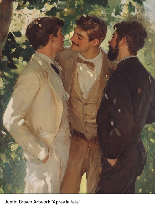
what a lovely late-impressionist piece blended with evocative leyendecker-esque themes! why haven't you ever heard of this artist before? surely tumblr would be all over an artist like this. who is justin brown?
your two options from here are to do a search for the name, or a reverse image search. i prefer reverse image searching, particularly when it comes to a common name like "justin brown". so what does that net?
Immediately, without looking at any text, something is wrong: it barely exists. an actual historical piece would turn up numerous results from websites individually discussing the piece, but no such discussions are taking place. Looking at the text, though, does show the source-- and at least in this case, the creator was honest about their medium.
But let's also look at the "exact matches", in case a source doesn't make itself apparent in the initial sidebar results like this.
This section will often tell you post dates of images, and here it can be seen that the very first iteration of the image was posted 15 days ago. It did not exist online prior to that.
Seeing how long an unsourced image has been floating around is a skill applicable to more than just generative images! See a cool image of an artifact or other intriguing item with a vivid caption? Reverse search it! If all the results are paired with that caption and only go back a few months, you might just have viral facebook spam.
Sometimes generative creators are dishonest about their medium and do not tag it like in the example, so that's when establishing "jpeg provenance" becomes important. While it can be a little trickier to determine if someone is using generative images and not admitting to it if they aren't trying to pass it off as a classic, something to consider is the age of their account and the frequency with which they post. Here are some account red flags:
-Did they only start posting art after 2022, or if they did before, did their style/skill level WILDLY change? Not gradual improvement-- I'm talking amateur graphite portraits straight into complex digital renders. Everyone starts somewhere, newness is not a red flag alone; it's newness combined with existing in a vacuum away from any community.
-Do they post fully-finished paintings several times a week? -Do many of these paintings seem iterative of a similar theme or subject matter ("three well-dressed young men face each other under shade and dappled sunlight")?
-Does their style change in inconsistent ways? An artist that can swap between painting like Drew Struzan and Hokusai should be pretty well known, right? Why is no one hyping this guy?!
-Do they have social media besides the source instagram? If so, what are they posting about? Are there any WIPs? Doodles? Interactions with other artists? Gallery dates? 3am self-doubt posts? Or is it all self-promo? Crypto? Seemingly nothing art-related at all for someone pushing out 3 weekly paintings?
Basically, if it's important to you to omit this stuff when you curate, please don't just smash reblog if the source doesn't seem to be the OP themselves. Seeking out sources was important even before this became an issue, now it is more than ever.
peace n love
29K notes
·
View notes
Text
chapter 19: an almost deleted scene (2)
(a/n: alternative title for the chapter: Feisty)
"Okay, take out your lipgloss" Poppy scattered her collection of BeautyRush on the school desk.
I had two lip smackers that my sister had gifted me. One was skittles, the other one was sprite. I also had a roll-on straberry gloss I had bought myself (my parents' money) at "Todo Moda" during the weekend. The five of us put them in the middle of our school desks making a considerable collection that looked so cool in their plasticky colorful glory and, idk why, we put them into a light green plastic pencil holder that Poppy had brought from home.
"This way we can share while we're in class!" It was a cool shiny display in the middle of our school supplies. Our gloss obsession was a bit deluded and silly but the bond between us sharing them felt so real. We were doing geography or math and we had taken over the desks at back of the classroom. Mr. G hadn't scolded anyone for completely disregarding the sitting chart and changing places, so my friends and I were all together in one "school team", rolling with it. We all went in to take one, I chose the most true-pink gloss, almost like a magenta shade that looked just clear on the lips. It smelled like pure sugar. I was happy that MJ took my Skittles lipsmacker.
"1, 2, 3, lipgloss"
"That one is so dumb, guys" called out Liv. Maybe it was, but we just laughed.
"This is awesome"
We nodded in agreement with Ella, I flipped my front pieces of hair off my face so it didn't stick to my lips, the now familiar thick texture of petroleum jelly making me smell berries under my nose.
"Oh, wait. Careful with the cherry gloss!" Said Poppy pausing the silly bliss of the moment.
"This one??" I asked showing her mine.
"No, it's red. The 'cherry bomb' one isn't clear gloss, it's so so red."
"Which one?" we all were moving the glosses around on emergency mode all over the desks but it wasn't there. Then I smelled cherry. We all darted our eyes to the head of the table.
"Wait, this one?" Ella's lips were dripping red like a vampire frozen in spot with the lipgloss still pressed to her bottom lip, squeezing more product out. It was definitely THAT one and we all cracked up laughing. It smelled really fucking good, I could smell it from 1.5 metters apart, holding on to my chair while laughing so much I could've fallen to the ground. Ella bursted out a laugh still confused, not knowing how funny she looked but having an idea by how much we couldn't stop laughing. Her lips were red, the gloss making a line down the left corner just like blood, and MJ didn't miss the moment to call her sexy. Elizabeth sent each one of us a flying kiss, playing along to the dumb sexy vampire jokes. I wiped my tears away to keep writing down whaterver we were copying from the blackboard, still carrying a giggle in my chest.
That afternoon we were messing around still at school before Jazz. We all had been perfecting a walking technique, a model stride that made your hair move in the wind, even with zero breeze needed. My friends and I would line up and practice before dance class or recess or whenever we could in the hallways, each starting with the right foot on the count of 3 to be coordinated. By this moment, it was a nonchalant reflex to go everywhere chatting while walking like that. So we walked the length of the running track at least three Times just to enjoy ourselves while discussing TV shows, probably talking about Shake it Up's latest aired episode.
"I almost cried with 'Add it up', it was so good." MJ held Ella by the shoulder while still strutting with us.
"Yeah!! I liked it better than 'Meatball it up'" She agreed. I was wondering how in the hell they knew the episodes' names.
"Rees? Did you catch 'Add it up'?"
"Mhh... I don't think so..." I had watched the first episode and the Olive Garden one like five Times now, but apparently I was missing more. Sometimes my mom would be late to pick me and my sister up from school and I couldn't catch it before America's Next Top Model started.
"O.M.G. You'll love it" MJ would spell out OMG when talking. "It's about Cece!" A smile grew on my lips.
"Lame, Rees! Keep up with the episodes!" Ella and I had the most savage friendship at Times, so I pushed her by the shoulders, making her laugh and starting a quick physical fight between us. After being stopped by MJ who was giggling and Poppy who finally snapped out of counting the petals of a pink geranium from The Flowerbed, we reached the basketball court. The four of us found a bech facing the basketball court to chill at before having to change out of our school uniforms. The boys before jazz were still annoying, but today we were hanging around them even while they were having basketball practice. Everyone was in for the banter, which some days could actually be just innocent enough to make us more friends and less enemies. MJ and Poppy were bickering with the boys warming up for practice. Ella and I were once again quoting Disney Channel not paying too much attention to the dudes doing shoulder rolls and neck stretches wearing baggy basketball shorts and tanktops.
"I tipped over the canoe, I cut my lip... and my top came off." I was even copying Cece's voice and closing the imaginary olive green jacket over my flat chest. We would do this scene all the Time, unprovoked.
"Cece, you were 10. Nobody even knew you were a girl." Ella was my Rocky, pretending to sit back on a bench in the Chicago subway. (The irony in this, I was currently actually 10 loll).
"I knew!!" our cadence was exact, and in the end we would burst in laughter and repeat it all. The rhythm between us was the best thing, like a quick witted game of cards we had perfected.
"Go Joe!" Poppy was being her extra cutesy self, while the team did some laps around the court. Joe winked at her, still running.
"Get out of the way, girls" Max came up to us, pretending she was about to throw a ball to our face and retrieving it at the very last second before it hit us. We were so used to it by now, we barely even flinched.
"Stop that!" Poppy whined in complaint of the aggressive game.
"Let me try" Ella jumped up and quickly took it out of her hands.
"No. Let go" MJ, Poppy and I were now laughing at the scene. Both girls fighting over it, Ella hunching over the ball hidding it from her reach, her curly hair falling over her face.
"It's mine now, Max" she stated with a laugh.
"Noo, Elizabeth, let go." Max was trying to use her elbow to make the dirty synthetic ball fall from my friend's grip. Max lets out a laugh too. "Ella."
"Ohhh, Max can be nice. Did you just call her "Ella"? I loved pissing her off like this. She looked me in the eye with half a laugh and her basketball back in her hands.
"Watch it, Rees" She did the trick again, only this Time the ball actually hit me straight in the face by accident. "Omg, sorry" She was laughing but sounded genuinely surprised by the slip. We were laughing too, cause it was one of those good days. She rubbed my forehead a bit, holding back a giggle.
"I'm fine, I'm fine, thanks" I acted just a bit pissed keeping her hands away, but finding it funny too.
"You girls are distracting" Mick yelled wearing that crush he had on both Poppy and MJ on his sleeve.
"So focus" asked MJ. I could laugh so much when my friends acted like this. Some of the guys were finishing their laps now, panting from the running, while forming a group in one corner of the court.
"What are those? The cheerleaders?" Their coach was paying attention now, shading his eyes with one hand to be able to see us better. He was so deeply annoying.
"Yea, they're our cheerleaders" Joe agreed, he seemed very okay with the idea and I fucking hated his coach.
"In your dreams" Poppy blew her boyfriend a sarcastic kiss, while she walked her way closer to them. The rest of us following behind to back her up.
"Oh, we'd never be cheerleaders for you." MJ was being real now, sniggering.
"You should! Isn't that what you do?" This was getting my blood heated.
"Oh, they're your friends who do dance" their coach didn't speak directly to any of us.
"Yes. So you could cheer if you're going to be here watching us"
"We dance. It's so not even similar" Ella corrected Rick, her arms crossed. We nod our heads, as if all of us had said the thing.
"What's the difference, again?" Max was back to being annoying, and the boys were too, laughing.
"You just twirl around in mini skirts" They all broke into a laugh at Rick's joke. I didn't know the word "misogyny" at the Time, but these dudes were constantly making me discover the concept from firsthand experience.
"Cool, as opposed to what?" I had been quiet but my voice appeared harsh and hostile. "Running like graceless deadbeat horses after one single lap? The team is terrible ?" I said bluntly making them silent. I wasn't used to talking back like this, even worse cause it sounded like my insult went out to an adult too. But what the fuck?!
"Yea... you guys always lose your games" Poppy added, her eyebrows furrowed. And it was true.
"Girls, we're in the middle of practice. You can't even be here to start with." The adult who started this decided to speak again. "Imma ask you to leave"
"Yea, kick them out coach!" our classmates encouraged him finding their laughter again, booing.
"Yea, let's go girls." Said MJ. That was the cue for our hair flips but this was too serious for that. "Enjoy your stupid class" She murmurs, starting to walk away. I know most of them caught her words.
"It was a joke, girls!" Despite de half-apology, Joe was partially still laughing.
"You are a joke!" Ella had to scream it from the other side of the courtyard and I knew it was a good retort to exit with. I flipped my hair subtly over my shoulder to feel less shaken up as we walked lined up, all four pairs of legs matching the beat.
"Damn! Graceless deadbeat horses was insane, Rees" says Ella as a compliment. I hear the naughty snigger on her voice and we all break in a bit of a laugh at what I said, hopefully they'd hear us giggling. I wanted them to know it had no effect on us.
"'Enjoy your stupid class' was crazier" I break from the line to jump a bit and look at them. "And Ella, just now?"
"It was good" says Poppy in deep recognition of the scene. We strode taking the short hallway to get completely away from their sight. The running track was more populated yet chill as always. It felt funny, even if we had to take some punches, I was so fixated on the good parts. Did I really have those harsh comebacks in me? We kept walking,four different shades of medium to dark brunette hair moving in a made-up breeze of our own.
"I really hate the boys, though. And Max." MJ was setting the pace for our coordinated walking.
"Yea... we should stop talking to them. And the school should get a cheer team, maybe that would show them how hard that also is." I state, feeling a bit amused. They conversation gets cut short cause we see a girl a year below ours was approaching us, directly to Poppy. I couldn't tell right away, but then I recognized her brother's hazel eyes.
"Hey, can I talk to you for a minute?" Joe's sister was asking for a word with her.
"Sure, Sienna. I'll see you in a minute, guys"
"Catch us at the bathroom" Poppy nodded at Ella's words while picking up her pace to match Sienna's. It was not the first nor the second Time this happenned. She was good looking, prettier than Joe and she had a cunning look in her eyes he didn't have. Poppy had already told us how Sienna was a big cause of drama and arguments between Joe and herself. She had even cried to us about it a couple days back, so I didn't understand how she would still have these private conversations with her but... I think she was trying to get on her good side, so she stopped talking shit about her to her brother, making them fight.
"Hmm... Sienna is a bit..." MJ started.
"Yea, I don't like her either." stated Ella. I sighed. I mean, I didn't even fully liked Joe to begin with, so. "Anyway. Let's get changed?"
0 notes
Text

i first began with a silhouette to get the idea down, it was originally just a flow line for sketching the character but it turned into this. the main pose i was inspiring from was my previous drawing and a sprite of Jojo's Bizarre Adventure's Dio in his signature pose.

with assistance from the silhouette drawing and using the reference above., i put together the basic shapes to make up the body and head of my character. in regards to the ears, i changed them to fit better to be recognised better as a lynx cat rather than generally inspiring from any large cat in wildlife.

i then added more details along the feet, hands, added the fluffy around aredite's neck, redesigned his shoulder armor and his cape. at this point i was struggling with how to shape the shoulder armor like a angular point look without having the perspective and the form off. making the hands were a struggle in terms of what size i was going to make them and whether to add long sharp claws

i then began with the line art while along the way readjusting proportions and refining shapes and objects of aredite's appearance

i continued to add the shoulder armor, tail, torso and legs. the perspective and rotation for the chest was a slight challenge as i wanted to reference from the pose of dio above while staying close enough to my characters physique.


i then added some small details to the mouth, put together the arms and hands using basic cubic shapes to break down the complex parts of the body, added more corners along the cape using reference, reshaped the shoulder armor and finished off the legs down to the claws. at this point, i was still sharpening the edges of lines strokes and still wished to fix the line work until i was satisfied

i resized the fluff underneither the characters head to make the shoulder armor more apparent and began to add details to the face to give it a far more fierce and rageful expression to reflect how i imagined the character to appear like. along the way i cleaned up and connected lines together such as the ankles of the feet and the chest of the torso.

i decided on adding details to the body and rest of the character to make the details such as muscles, bones, fur, ripples in the cape and tendons of the feet more apparent. also thinned out some lines to create depth and almost shadow


i made the ears thicker to match more similarity to lynx cats in real life. i also removed and fixed the left arm as i had gotten the anatomy incorrect as i was treating the bicep as the forearm before this point. i also made the mouth detail more open so it was better to see in the silhouette

i made another silhouette of the character and didnt feel satisfied so i went and made the adjustments of the ears, hand and mouth as seen above

i then resized the head as i felt it too large for the body and hands. i fixed the hand to the left using a technique of breaking down the shapes of the hand and fingers and also made the claw of the hand more apparent to be shown in the silhouette.

i felt satisfied with my line work and enlarged the character to have higher stroke line resolution. i achieved this by hitting cmd t and enlarging the drawing and using the sharpen and sharpen more filter in order for the lines to not appear as blurry.

i then filled in each section of the character (fluff, body, mouth, shoulder armor and cape) using the magic wand selection tool and hitting select, modify, expand and expanded the selection to a few more pixels and separated the fills into individual layers so i could then change the lightness.

while adjusting each layers lightness, i added extra details on the shoulder armor and made parts of the character's body fur a more pale shade of gray.

i then made the colour palette all along and between red and yellow and achieved this by changing the hue and saturation of the layer segments. the rest of the palette. were shades of gray. i added a symbol to the shoulder plate to be one of the focal points to the viewer alongside the face and upper body.

i created the shading by creating a layer on top of the rest of the colours but below the line work layer. using a brown swatch and applying darken and 50% on the shading layer. my aim for my shading was for the light to hit where you can see the arrow where some parts are in the light and some are not.

this was the colour used in question. i however had to use pure black in order to achieve shading for the shoulder.


this is the final product. to reflect, i am far more happy with how the design and form of this redesign of my character, aredite, turned out compared to the previous design of him. this new design far more reflects how i imagined the character in my head put into illustration. the most difficult part of this process was certainly the hands and proportions of the character. i wasnt sure whether i wanted to make his design more buff but when i attempted to enlarge the torso, it just didnt look right. while the design is similar, there are still elements that set themselves off from each other, including the claws, ear shape, shoulder plates shape, colour and detail and a slight change to the colours.
1 note
·
View note
Text
So, if somebody wants to improve their ability to distinguish between colors or as a hard time distinguishing colors, then there is an ability and I believe if the child is colorblind. Initially, you can work on it and help grow capability. Yes, by mixing shades of Gray. Then eventually mixing in colors that are closest to that gray or black or white. As they grow their ability to recognize different shades of black white and Gray, you can start mixing in other colors. And eventually they will be able to see color.. Why cells can adapt.
Color Mixing and SortingThe practice of mixing colors, either digitally or with pigments, is a good way to train the eye. One method is to find natural forms and match their colors using both paint and Photoshop.
https://alvalyn.com › 6-apps-to-hel...
6 Apps To Help Improve Your Color Vision - Alvalyn Creative
So places that sell glasses can also do vision training. Yes, Doctor's offices. Can you come in and this is a part of rehabilitation or Giving ability 🤔. 🤔 So all these places have to do.To stay in business is to adapt and they can do different types of medical treatments that include these physical training..... So doctor's offices can have people come in to do different types of physical training.... And they work with nurses. And this gives them abilities. So if you can't see color now, giving them an ability to see color.
Here are some exercises that can help improve your vision:
Toothpick and straw method
This exercise uses a straw and two toothpicks to help you become more aware of your side vision.
Eyeball movements
Rolling your eyes in circles and moving them in other directions can help improve the flexibility of your eye muscles.
Transitioning between central and peripheral vision
Training your eyes to transition between central and peripheral vision can improve your overall visual competence.
Reflexion
How To Improve Peripheral Vision With Simple Exercises - Reflexion
Jun 1, 2020 — The Toothpick And Straw Method. There's no shortage of techniques to improve your peripheral vision. Humans have been doing this for centuries! One of the easiest and most accessible techniques out there utilizes nothing more than a simple straw and two toothpicks. This exercise is designed to make you more aware of what's going on in your side vision. Your central vision, also known as foveal vision, is incredibly sharp and focused. That's because there are more rods and cones in the center of your retina. Plus, those ocular rods and cones are far more sensitive to light.
zoomax.com
Vision Exercises for Your Peripheral Vision - Zoomax
By training your eyes to transition between central and peripheral vision, you can elevate your overall visual competence. Eyeball Movement: Engage in eye exercises that involve moving your eyeballs in various directions, such as rolling them in circles. This enhances the flexibility and agility of your eye muscles.
You can also try these tips to improve your vision in different situations:
Driving at night
Avoid looking directly at high beams and instead look at the lines in the road. Let your eyes adjust naturally, or you can try closing your eyes and covering them for a while before entering a dark area.
Viewing night-sky objects
Try looking to one side of the object you're trying to see, about 8–16° away from the center of your eye. This can be difficult at first, but it will improve with practice.
Read the book Who Moved My Cheese and similar books. This tells you either you adapt or you're gone. So adapting means if you need to get more education, you get more education. Adapting means how you do business. If things are changed and you need to do business differently then you adapt and change. It's adapt, change, and overcome.
Goodreads
https://www.goodreads.com › book
Readers who enjoyed Who Moved My Cheese?
"Who Moved My Cheese?" is a simple parable that reveals profound truths. It is an amusing and enlightening story of four characters who live in a "Maze" and ..
So I have already read. Lots of these books on talking about adapting and changing and overcoming. So it is not my fault.It is on you to adapt the change and overcome your deficiencies.... And if you don't you won't be put to waste....
Shepherd - Explore, discover, read!
https://shepherd.com › books-like
100 books like Who Moved My Cheese? An A-Mazing Way to ...
100 books like Who Moved My Cheese? An A-Mazing Way to Deal with Change in Your Work and in Your Life ; The Power of Now · Eckhart Tolle ·
Yes, God is watching if you're doing the sniff test meaning high awareness.
What does sniff represent in Who Moved My Cheese?
The four who moved my cheese characters provide examples of how people might respond: Sniffs - High awareness. They can sense change quickly and identify possible opportunities. Scurrys - Embrace change and quickly look to put it into action.Oct 3, 2020
https://www.tobysinclair.com › post
Who Moved My Cheese Summary - Dr. Spencer Johnson - Toby Sinclair
Watching Bloomberg television as I put this together.
0 notes