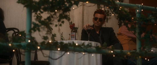
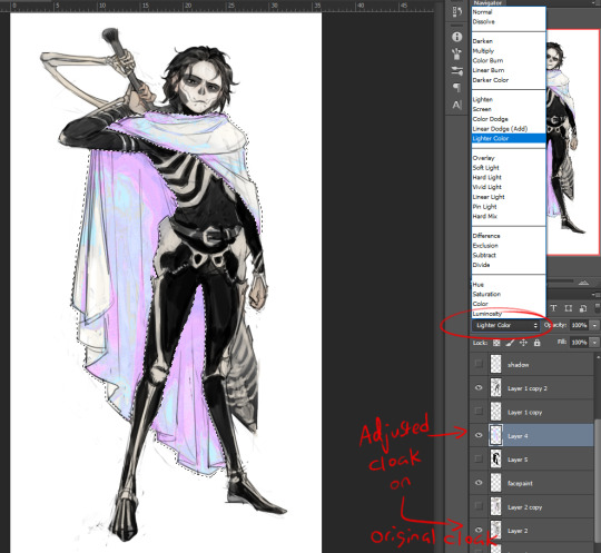
#I already merged the layers and added all of the effects
Explore tagged Tumblr posts
Visit Tumblr Blog
Explore Tumblr blogs with no restrictions, modern design and the best experience.
Last Seen Tumblr Blogs


Fun Fact
Tumblr has been providing a Korean-language service since 2013.
Note
Hi, me again!
Ty for the reply, I would love an in depth tutorial if you don't mind as i really wanna get this effect to work and I kinda work best when it's spelt out for me when learning new techniques lol :)
hey anon, no worries! here's how i used this amazing template by @danesdehaan and added a rolling effect like this (from this gifset):
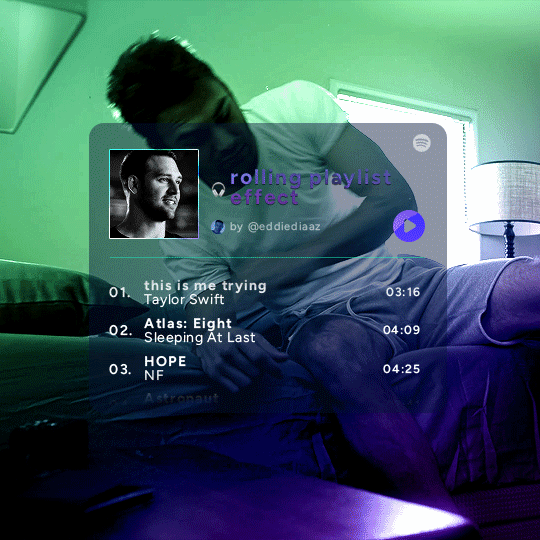
this effect uses photoshop's timeline. i use cs5, for reference.
detailed tutorial under the cut :)
I. PREPARING THE TEXT
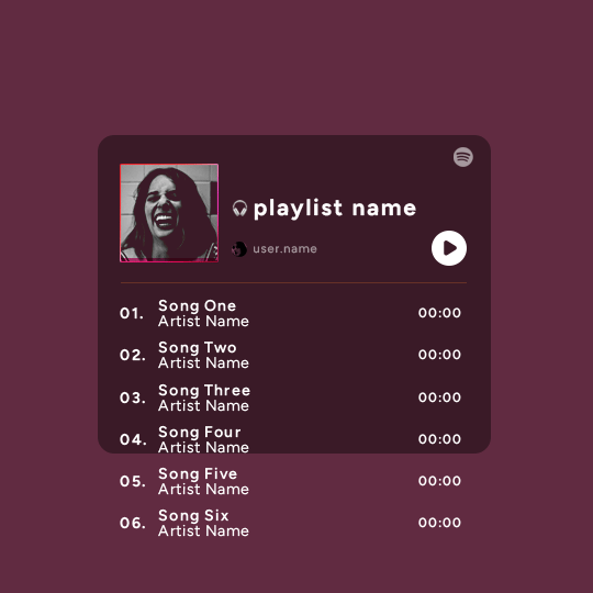
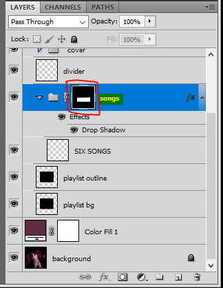
when you open the template, you should have a group called "songs" with 3 groups for each song. what you wanna do is duplicate these numbered groups until you have the amount of songs you want. for each group, use the move tool or your keyboard's arrows to move the duplicated song text layers/groups on your canvas so they're under the first three that are already there. make sure these new duplicated layers are in the "songs" group.
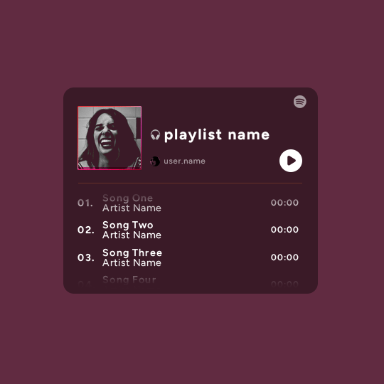
then type the numbers, song titles, artists, song durations, etc. it should look like that:
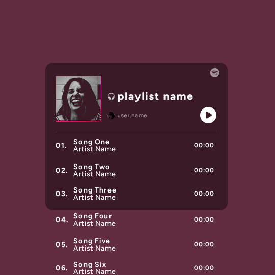
i wanted mine to have a smaller gap in between each song, so i used the arrows to move each song group closer together, and it looks like that before the animation:

II. ANIMATED EFFECT
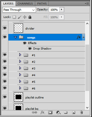
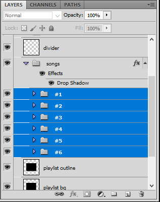
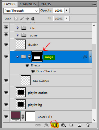
once you have typed everything, make sure there are no mistakes and that you won't need to edit anything about the songs or durations or anything like that, because you won't be able to go back. when that's done, select all of the numbered song groups and right click > Merge Layers.
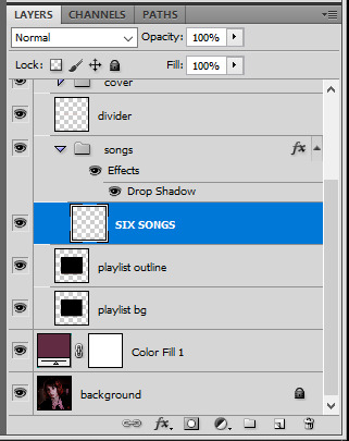
that will give you one layer with all of the songs together. i've renamed mine "SIX SONGS". make sure this new merged layer is still in the "songs" group.
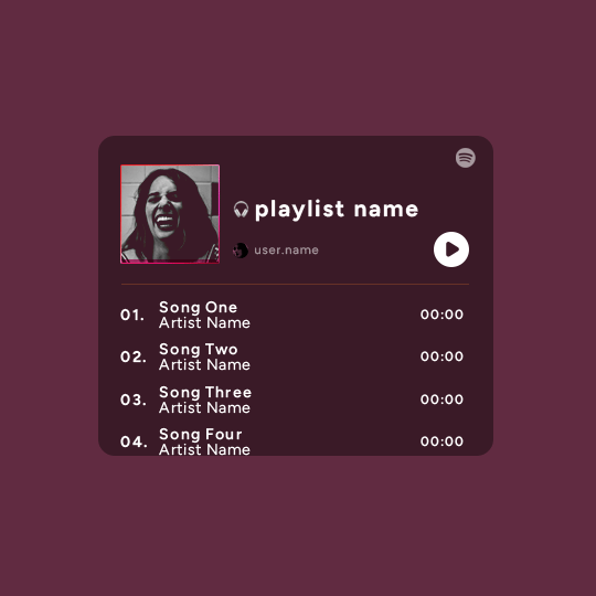
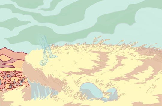
once that's done, you're ready for the animation. and it's pretty easy, because you only need two keyframes: one at the start of the gif, and one at the end.
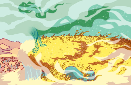
go to the start of your gif on the timeline, and toggle the position keyframe animation by clicking on the little stopwatch icon. a little yellow keyframe should appear where the cursor is, at the start of the gif:

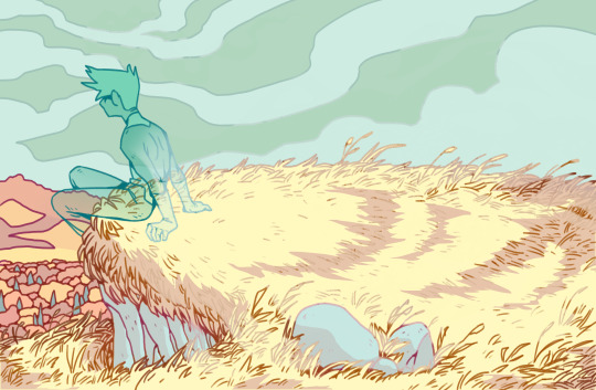
then go to the end of the gif with the cursor. with the "SIX SONGS" layer selected, use the move tool or keyboard arrows (my preference) to move up the text until all the songs are inside the darker rectangle. once you move this layer's position, a keyframe will appear on the timeline and the animation will be created.
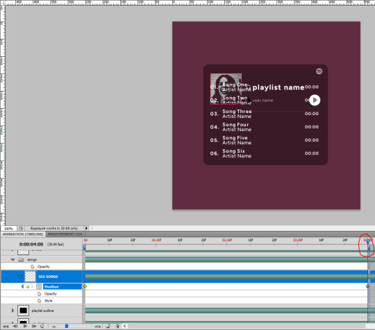
the animation now looks like this:
if you want, you can now edit the speed of the animation by moving the keyframes. the closer the two keyframes are, the faster the animation will be; the further apart the keyframes are, the slower the animation will be.
III. LAYER MASK
since we want the songs to be contained in the dark rectangle and below the line, we need to add a layer mask. i started by creating a shape of where i want the songs to be contained with the rectangular marquee tool:
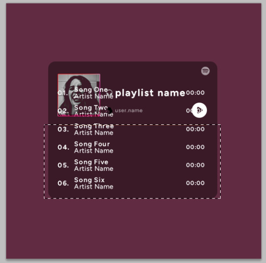
then, on the layers panel, select the "songs" group and click on the layer mask icon to create a mask with that rectangular selection.
if you play the animation after making that layer mask, it should now look like this:
if you like it that way then you are done, yay!
but if you'd like softer edges, like i have done for mine, click on the layer mask's black and white thumbnail. use the brush tool with a 0% hardness and the black color to make the edges of the mask softer. make sure you are making your brush strokes with the layer mask's thumbnail selected.

once you have brushed a bit of black with a soft rounded brush on the top and bottom of the mask, the animation should look like this:
and that's it! i hope this was clear enough :)
#alie replies#Anonymous#*ps help#photoshop#tutorial#resource#completeresources#allresources#resourcemarket#usertj#usertina#usercats#useraish#userdean#userabs#userraffa#userbuckleys#uservivaldi#userisaiah#usernorah
498 notes
·
View notes
Note
Hello! I’m just here bc I’m a little confused on what you meant by Smythe drawing out “each individual asset” when she was making comics? Now, granted, I can see that it made her file ginormous, but me personally as someone who knows nothing about making online comics but is really wanting to get into it (and also as someone who has a ‘too many layers’ problem myself), is there a way to avoid using too many layers?
My current way of making comics has been to draw the panels individually and then format them (which I know is terrible management wise and also messes with the quality) but I honestly have no other idea of how to do it properly, and seeing how stunning Lore Rekindled looks, I don’t know how you would manage to put all that lighting effects and little details on the same layers. (But also I may be thinking of it wrong so I’ll let you talk qwq)
Ah I can actually give you a visual breakdown of what I meant by that!
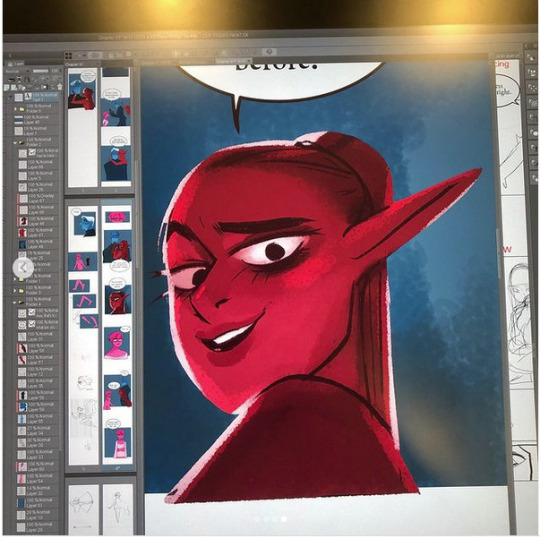
So in this you can see there are a TON of layers, and not even all of them are visible because some of them are stuffed into FOLDERS that have been left closed. BUT if you look REEEEALLY carefully-

^^^ These layers right here? That's specifically Minthe from this panel in Episode 61:

(the unique pose here makes it real easy to tell that this is the corresponding panel, you can see the matching body shape with the dark shading that's clipped to the base layer below it!)
So what this means is that Rachel didn't draw all her characters on one base layer, she drew every single character in every single panel separately. Now of course, she could merge all these layers together as working on separate layers helps make it easier to work on elements that collide separately (like one character being 'underneath' another character like Hades is here) but because she has all of those clipping layers with the shading already added in, she likely didn't merge them afterwards because that would actually create MORE problems (because if she merged the Minthe layer in with Hades, then the shading for Minthe that she painted outside of the lines would show up on Hades and then she'd have to erase it which is just a bunch of extra work).
You can also tell all these characters are on their own layer because the layer thumbnail EXCLUSIVELY shows those characters. A layer will show as much canvas length as it needs to cover what's in that layer, so if the thumbnail is only showing one character, that means there's NOTHING ELSE on that layer. If there were more elements on this layer than just Minthe, the layer thumbnail would look more like this:
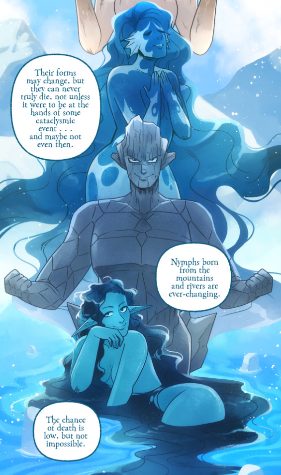
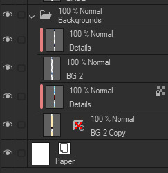
Now let's compare it to Rekindled's layers! I'll use a completed page to make it fair as we use a lot of extra layers in the post-production phase where we add the texture effects and glow and all that fun stuff, plus I'll even make it a more complicated page like that big nymph explanation spread from Episode 51:
So I'll break it down to make this make more sense:
BG 2 Copy (technically this is supposed to be BG 1) - Basically the panel shapes, what I'll do is mark out the panels with flat blocks and through that we'll add background elements in a clipping layer (usually done by Banshriek). Often times they'll do multiple layers to make the process easier and then merge them all together in the end. With these shapes operating as panels, it means I can just auto select the whole layer, invert the selection, and easily erase whatever's outside of it (such as the lineart and base colors that I put down afterwards). I could just use masking layers like I did in [AFTERBIRTH] but I find this way works better for the process of making Rekindled.
BG 2 - This is where we add objects / foreground elements. So stuff like furniture, interactables, anything that needs to be kept separate from the larger background to make it easier to work with. This can also include "floating" panels that need to be above other panels, such as this:

All of the backgrounds are then nested in a folder for organization purposes (we also sometimes use clipping layers on top of those folders to apply extra effects over anything contained within that folder without affecting other folders, that's a common technique that Banshriek applies)
Then we get into our Characters folder:
BASE - This is where I do the majority of my work, all the characters in every panel on a page are flatted into this layer. Sometimes I do have to create separate layers to, again, make it easier to work with overlapping characters, but usually those layers will be merged before I go into the shading process. I simply shade on a single layer by using the lasso / magic wand tool to select my area for painting, the flat colors make it really easy to do that. Sometimes I need to create a secondary shading layer if I've put down dark colors that start to bleed into the lighter colors, but again, I merge when I'm done into a single shading layer. We also sometimes employ an Add (Glow) layer into the clipping set if we need a glow effect that's exclusive to the characters and doesn't travel outside of their base colors.
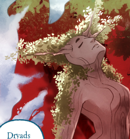
There's a (leaves) layer here that I used for the dryad because I needed the leaves to be above the base layer, after that I selected the leaves elements so that I could erase the lineart in the layer above it where needed.
LINEART - It's lineart, enough said haha That said, I do think Rachel actually uses clipping layers for her lineart in places, it seems to be visible in some of her process videos where you can see the lineart present in a clipping layer, and that would explain why there are panels where the lineart suddenly 'cuts off' and doesn't travel outside of the base layer, like so:
GLOW - This is where we do an Add (Glow) layer that isn't restricted to the base layer, it's where we add all the fun lil' glow and sparkle effects over the characters !
The CLOUDS layer is, like the leaves, a background element that needs to be above the base layers rather than constricted to the background.
Above the Characters folder you can see what I mentioned earlier where Banshriek has added more post-production effects that are exclusively clipped to the contents of the Characters folder. This means the effects / blend modes do NOT affect the background layers or anything above it.
The BLUR (Overlay) layer is something we just started doing over the past several episodes, it's a technique I actually picked up from 66 of City of Blank where I merge all the layers into a new visible layer which I then apply a Gaussian Blur to at around 60% and then set to Overlay (and then I adjust the layer opacity until it looks right, usually around 25-35%), it gives it a bit of a softer "dreamier" vibe in the final colors and really helps unify everything!
CANVAS - This is an Overlay layer which is also set to an opacity of 25-35% where I go over the panels with the Add Canvas brush from the Kyle Webster set, unlike the Canvas overlay texture in CSP I can actually choose the colors I want to use which means I can match the canvas texture color to the mood and environment of the scene (ex. I'll use a very light blue for scenes in the Underworld). Not only does it give it that signature texture from S1 of LO, but it also helps balance out the effects of the BLUR layer.
The SKETCH layer sits on top of everything and gets turned off once all the base layers and lineart are down, and ofc the SPEECH folder is just where all the text is kept.
I know everything I just laid out is a LOT but ultimately it's how we operate, it works for us! But it also begs the question of why Rachel operates the way she does because a lot of it seems extremely unnecessary and more likely to bite her in the ass (the more layers there are, the bigger your file size gets, the risk of drawing on the wrong layer increases as well as the risk of posting a panel that's missing elements because the layer was left turned off by mistake, etc.) And it's more so concerning with how she operates with her assistants because if she's still using this many layers when collaborating with other people, hooo boy. Though based on what I've observed of what her assistants contribute, I get a lot more of the sense that she circumvents this by having the artists do the flats separately and then importing them in as separate assets that she then just imports into the page and places them where they need to be. Still not a great workflow IMO because it's what's led to a lot of the issues of characters "floating" rather than feeling like they're actually in the environment-
-but that's still an issue that could be solved by Rachel just taking more time to actually flesh out the backgrounds and lighting to give more of an impression of the characters actually existing in the space. Like that Hestia panel could easily be fixed by just giving the background a bit more detail and putting actual shading underneath her (and lighting from whatever direction it's coming from).
Either way, regardless of whether or not Rachel's process is productive or not, I hope that breakdown helps explain how we do it in Rekindled! Learning how to manage layers is definitely a skill that can be tricky to harness, but once it "clicks" there's a lot you can get away with. Ultimately how you do it is up to you, but my best piece of advice to offer is to just be open to other types of workflows because you don't know how much you might be shooting yourself in the foot doing things the hard way when there are often way easier and more efficient ways to get the same job done. That's basically the vibe I get from observing Rachel's workflow, it seems like she's still using methods that she thinks are working for her (and probably did work just fine for her when it was JUST her) but could be vastly improved for her and her team if she'd just get over the initial hump of stepping outside of her comfort zone. Would probably make for a better comic too LOL
I hope that helps! Good luck! ( ´ ∀ `)ノ~ ♡
#ask me anything#ama#anon ama#anon ask me anything#lore olympus critical#anti lore olympus#lo critical#lore rekindled#webcomic advice
155 notes
·
View notes
Note
Hi! I was wondering if you’d be up to share how you made the before and after slider on this post:
https://www.tumblr.com/freckleslikestars/780305824654540800/before-after-gif-colouring-challenge
It’s really cool! Thank you!
Aww thank you so much! I literally had a dream about doing this two weeks ago, and when @sophsun1 tagged me I was like "oh my gosh lets try it!"

Now, before we start, I'm going to assume basic knowledge of gif making, colouring, etc. I'm using Adobe Photoshop 2025, but you should be able to adapt the steps for pretty much any software that has a timeline and allows for vector masks.
Once you understand key frames and vector masks, it's super easy to do!
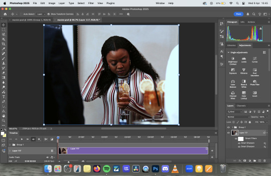
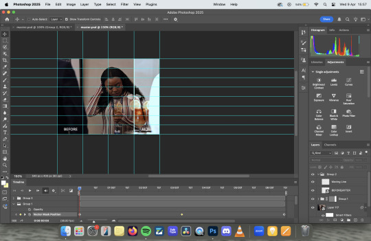
First, we're going to open our gif in video timeline view, with our colouring already done. (My colouring is all in "Group 1")

Next, I converted the footage to a smart object, leaving the colouring as it's own independant group. This isn't technically necessary, but I do this to a) apply sharpening and b) so my layers tab is less cluttered. This is normally also where I'd make sure my image size is correct (I do 540X400 pixels) but I forgot so I did that later on this one.
At this point, I turned some guides on and, using the rectangle tool, drew a rectangle that was around the size of the canvas, clicked to the last column on the right hand side.

The next step is to turn it into a vector mask. With command held down on a mac (I think it's alt on windows, but don't quote me on that) drag the rectangle layer onto the colouring group layer. It will fill in the whole canvas with colour.

Delete the rectangle layer, so that you're just left with the gif itself and the colouring layer with the rectangle vector mask over the top.

Next we're going to animate it, so you need to open the dropdown for the colouring layer on the timeline, and you'll want to scroll down to where it says Vector Mask Position

Making sure your playhead is at the very beginning of the gif, click on Vector Mask Position and drop a keyframe. Then, move your playhead to the very end of your gif and drop another keyframe - at this point you don't need to move the vector mask at all.


The next thing you need to do is find the middle of your gif - this doesn't need to be overly precise, particularly with longer gifs, but the precision means that the vector mask moves at the same spead both ways. Drop another keyframe there.
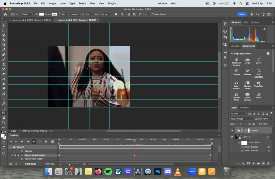
With the playhead over the keyframe, select the vector mask on the layers panel and using the move tool, move it across to the first column on the left. I personally prefer to use my arrow keys to just nudge it left, rather than faffing about with clicking and dragging.

If you were to export it at this point, it would be perfectly fine, you'd get the moving vector mask to show the before and after, which has a pretty cool aesthetic all of it's own. But lets add some details to make it look like a before and after sample image.

I started by adding the BEFORE and AFTER - I used Adobe Clean as my font, but font choice is really personal preference. I just centred them in the bottom left and right squares of my guidelines. I then drew a white line, using the line tool, down where the divide is, added a couple of rounded arrows (and lowered their opacity), and merged the three of them together (keeping the text separate).
Then I simply followed the same steps to add key frames to the line in the same places as I did with the vector mask, making sure that the centre one was nudged to the location for the vector mask on the centre key frame.
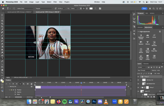
Export as usual and et voila!
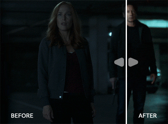
Something to note is that this effect works better with longer gifs. As you'll see, this X Files gif was a touch too short, and so the slider feels a little too rushed:
Also, if you're wanting all of the sliders to move at the same time/speed, you're going to want to make sure all of your gifs are the same length, which I didn't do because I'd had a long day and I was procrastinating from postgrad work for an assessment I have tomorrow. Which is incidentally what I'm also doing right now.
Anyway, there you have it! Super simple when you know how! If you have any further questions, don't hesitate to ask! :)
#my gifs#gif tutorial#I genuinely love the colouring of that Abbott gif. The X Files one pisses me off because it started off so dark#that when you don't see the comparison it looks like i did absolutely nothing. but the comparison makes it slightly better
24 notes
·
View notes
Text
like a month and a half ago I wrote about Ninjago for a school essay and it has been itching at my brain cuz my teacher gave me an 80 on both the draft and final despite me adding three new paragraphs to it like he suggested and also having three people proofread it and say it was good. he didn't even tell me what I did wrong and it's driving me insane. so I thought I might share it here because I put a lot of effort into it.
(will include spoilers for Dragons Rising season one but not season 2 cuz this was written before it came out)
Ninjago Dragons Rising and How to do a Soft Reboot
When a show goes on for a while, it can become pretty stagnant. The way showrunners and creators try to fix this problem is with a soft reboot. They introduce new characters and locations to spice things up, or in the most extreme cases, they reset the entire story, but still try to acknowledge that everything that happened before still happened. This can have a polarizing effect on fans of the show, and it may, or may not, drive some fans away. In the case of Lego Ninjago, a show that has been going on for fifteen seasons as of 2022, the writers have a challenge in trying to do a soft reboot, while not sacrificing the history and appeal of the show. This is the first time I have seen a soft reboot that has managed to keep the heart and soul of a show while making things fresh and new.
One of the first things that they improved was the characterization. A lot of the time, if a show goes on for a while, the characters can suffer from Flanderization. “The act of taking a single (often minor) action or trait of a character within a work and exaggerating it more and more over time until it completely consumes the character. Most always, the trait/action becomes completely outlandish, and it becomes their defining characteristic, turning them into a caricature of their former selves” (“Flanderization”). This is often quite common in media that has gone on for a while. For example, one of the characters Kai started out as a hot-headed brave person, but as the show went on, he became more stupid and reckless.
The show fixed this by giving the characters a new purpose. Kai became a mentor to Wyldfyre, a new character in the show, and he became more levelheaded and enjoyable as a character. He isn’t the only character to benefit from new characters being added. All of the new characters serve a purpose to the show. Arin is one of the new main characters, he acts as an audience surrogate, specifically for the returning fans of the series. To put it in simple terms, Arin is a super fan of the main cast. This background allows him to make references to the older seasons, without it sounding forced or out of place. On the other hand, his counterpart Sora has the exact opposite role. She is the audience surrogate for newcomers. She isn’t from the original world where some of the main cast came from. Thus, she is able to ask questions that will fill in newcomers to the show on old lore from previous seasons.
Another thing that they did, that I haven’t seen in other shows, is expand the world. In the world of the show, there exists sixteen realms. The whole plot of the soft reboot is that all of these realms merge together, which makes one massive new world. This opens up a lot of possibilities, and the world that the show existed in before the soft reboot was already thoroughly explored. Adding the new area definitely adds a new layer of excitement to the show.
The show also had a problem with stale villains. They have recycled villains multiple times, and most villains are pretty bland. With the new show, they added the kingdom of Imperium, which has its own villain empress Beatrix. Her lackeys, Ras and Rapton, are both unique in their own ways. Rapton is a dragon hunter, who is obsessed with capturing dragons for fun. While Ras is a mysterious outsider from another realm, he has an allegiance to another unknown person, and this adds mystery to his character.
I have watched this show since I was in third grade. It has been an important part of my life for years. Every time there was a new trailer, I would spend hours looking over every little detail and theorizing what would happen next. Up until season 10, all the episodes would air on Cartoon Network, which was unfortunate since my family used streaming services instead. I was so excited to go to my grandparents and watch the episodes since they had cable. Eventually with season 11, they moved the show to Netflix, and I got to watch them as they came out instead of binging them all at once when I went to my grandparents’ house.
Unfortunately for me season 11 was extremely disappointing. The season had a good concept, but a poor execution. It also used a lot of tropes for the characters and failed to resolve the conflict in a satisfying way. This season is known amongst fans as one of the worst seasons to ever come out of the show. It was so disappointing to me, that when I saw the trailer for season 12, I just lost interest. The plot seemed boring, and I didn’t care for the character they were focusing on. So, I dropped the show and ignored it for about two years, until I saw a clip from an episode I had never watched. To my surprise, I liked it, and it was actually funny for once. I ended up looking up more clips and episodes, eventually watched the seasons I missed, and regretted giving up the show. Season 11 was just a rough patch, and due to me dropping the show, I had missed two of the best seasons the show had ever had, seasons 13 and 14. Season 15 was an ok season all together. Looking back a year and a half later, it was definitely made to tie up any loose ends that the show had before the soft reboot happened.
All this change and improvement is great for the series. When the creators first announced that Ninjago was getting a new TV show, and that it would be a soft reboot of the show, I was concerned. Soft reboots have a history of not really benefiting a show at all. It often ends up falling back on old ideas or introduces new ideas that don’t fit well with the show. As more trailers and clips started releasing, I was once again reminded why I love the show so much. The world and characters are amazing, and the story never fails to reel me in. This new TV series is a promising new step in a good direction. I personally can’t wait until the next season.
#ninjago#lego ninjago#ninjago dragons rising#all he told me was that it needed to be ''revised and edited'' what ever that means
24 notes
·
View notes
Text
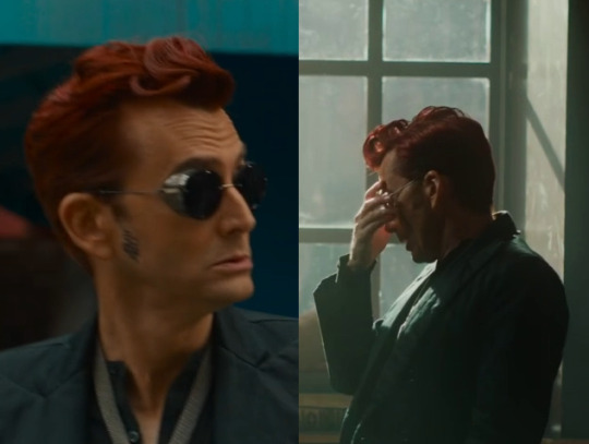
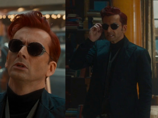
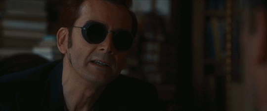
The Sunglasses Trick
(For reference: The Sunglasses Trick Visual Representation | The Sideburns Scheme Post #8 v4 | The Sideburns Scheme)
We'll be taking a more detailed look at The Sunglasses Trick for this post.
If you are already quite familiar with my theories, the newer content is under the Sideburns and Alternate Hissing headings. There's a little extra something at the start of the Misc section as well.
If you are new to The Sunglasses Trick or want a refresher anyway for an overall more detailed post, here is how it goes:
...
Every Threshold Trick has a primary Single, a primary Double, and a primary Triple.
The Sunglasses Trick has an interesting layered aspect of itself as part of what makes it really special. The Single is one Triple. The Double is two Doubles. The Triple is three Singles.
Here is how the Trick happens chronologically within the story:
Double #1 of our eventual primary Double (Episode 1)
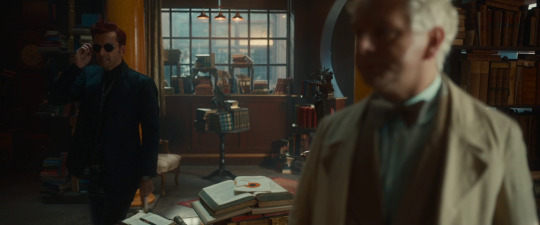
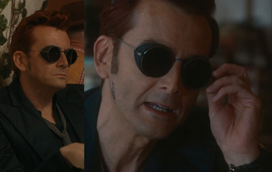
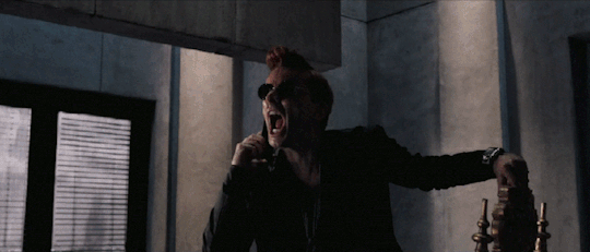
Crowley removes his sunglasses touching two end pieces with one end. Both doors are opened.
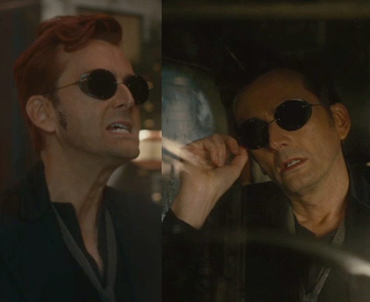
Triple Part 1 of our eventual primary Single (Episode 1; Not Hissing)
Crowley removes his sunglasses before being summoned to Hell by touching the right end piece. He did not have a subtle demonic hiss as an added sound effect.
Triple Part 2 of our eventual primary Single (Episode 1; Not Hissing)

Crowley removes his sunglasses before throwing them on a desk by touching the left end piece. He did not have a subtle demonic hiss as an added sound effect.
Single #1 for our eventual primary Triple (Episode 2; Different Sunglasses)
Crowley removes the first set of present day sunglasses while holding a Jane Austen book by touching the right end piece. He had a subtle demonic hiss as an added sound effect.
Single #2 for our eventual primary Triple (Episode 2; Different Sunglasses)
Crawley removes his Job era sunglasses by touching the right end piece. He had a subtle demonic hiss as an added sound effect.
Single #3 for our eventual primary Triple (Episode 5; Different Sunglasses)

Crowley removes the second set of present day sunglasses by touching the left end piece. He had a subtle demonic hiss as an added sound effect.
We have three Singles that have something that make them all different—the different sunglasses...yet we also have something they all share in common: he hissed. We're going to go ahead and merge these Singles into the Triple. Now it's time to get the Single and the Double.
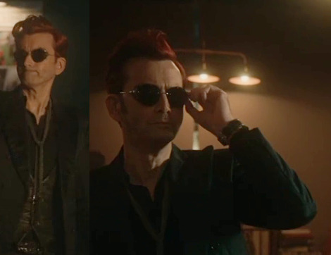
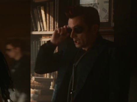
Triple Part 3 of our eventual primary Single (Episode 6; Not Hissing)

Crowley removes his sunglasses and holds them. When removing them, his right hand did so on the right end piece. He did not have a subtle demonic hiss as an added sound effect.
The Triple is already taken by our previously merged Singles that became the Triple. This group did not have three different pairs of sunglasses. It did lack hissing. We're going to merge these parts and switch this Triple to the Single. Now all that's left is to finish the Double.
Double #2 of our eventual primary Double (Episode 6)
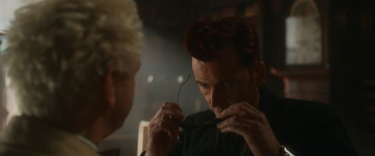
Crowley puts his sunglasses back on. He touches the thresholds of his thresholds with both hands. Note that on the front view, two sets of fingers are touching each other as one of the fingers of each pair touches each edge. From the back view, there are two visible digit tips with the thumb and index finger.
The Double is done.
Both doors are closed.
...
Findings
In the past few months, between about July 2024 and October 2024, I've noticed at least two other findable patterns regarding these touches. There isn't anything particularly mind-blowing or earth-shattering on the scale of discovering The Sunglasses Trick itself (for me) with these findings. But still, I have them as new to me, and maybe further meaning to them will reveal itself over time.
Let's go over some helpful information for these incoming findings, for anyone new or wanting a refresher again.
This Threshold Trick has 8 touches total.
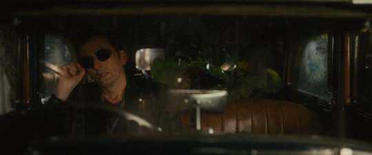
The fifth touch in particular is notable because it is the only touch in all six Threshold Tricks that does not take place during the present day storyline. It's for when Crowley hisses during the Job minisode with his line, "I want to. I long to destroy the blameless children of blameless Job, just as I destroyed his blameless goats."
We're going on a tangent here. If you don't already know, Crowley has shorter sideburns for a more "human" reading from a space during the present day storyline. In turn, longer sideburns give a more "supernatural" reading from a space. The minisodes change things so that you have to figure out the equivalents of those time periods based on the clues. In the case of the Job minisode, Crowley has the more "human" reading with shoulder-length hair that's not quite as fluffy as what can be found in other scenes. It is found 3 times: talking to Job and Sitis, witnessing God is talking to Job, and working with Aziraphale to restore Job's children to him. For the purposes of this post, "short sideburns" later will include this particular reading.
Now back to the touches of The Sunglasses Trick. The last two touches have a special situation since Crowley holds his sunglasses while talking to Aziraphale in the bookshop before he eventually puts them on within that scene. The other touches avoid that exact scenario.
For three of the touches, the sunglasses are detached and end up on earthly object. Those are the dark horse statue, the car rear view mirror, and a desk.
For the touches regarding the first and second hiss, Crowley's understood to be holding the sunglasses and never seen putting them back on. In both instances, a later scene indicates he put them on again sometime off-camera. For the third hiss, the sunglasses are never seen being placed into a pocket, but we do see that's where they ended up due to a scene when he is exiting the bookshop after that touch happened.
...
Sideburns
Okay, fine, fine. Here is one of the extra patterns I noticed.
With the exception of the last touch for The Sunglasses Trick, every preceding Crowley scene has short sideburns, or its equivalent, that takes place before a touch.
Episode 1, Touch #1:
Before Crowley removes his sunglasses in the bookshop, he had short sideburns while crossing the street with Aziraphale from the coffee shop to the bookshop.
...
Episode 1, Touch #2:
Before Crowley removed his sunglasses while in his car, he had short sideburns for the scene where he shot out lightning from himself.
...
Episode 1, Touch #3:
Before Crowley removed his sunglasses after his return to the bookshop, he had short sideburns while restoring power to the coffee shop.
...
Episode 2, Touch #4:
Before Crowley removed his sunglasses when he hissed at Gabriel and held a Jane Austen book, he had short sideburns while crossing the street with Aziraphale from the pub to the bookshop.
...
Episode 2, Touch #5:
Before Crowley removed his sunglasses when he hissed at Aziraphale, he had the short sideburns equivalent as he talked to Job with Sitis giving him a human alias of Bildad the Shuhite.
...
Episode 5, Touch #6:
Before Crowley removed his sunglasses when he hissed at Gabriel again and held a wine glass, he had short sideburns while talking to Aziraphale at a table outdoors.
...
Episode 6, Touch #7:
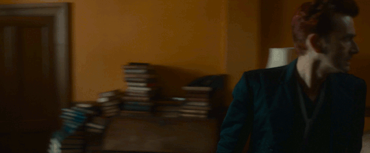
Before Crowley removed his sunglasses for the argument scene in the bookshop with Aziraphale, it's rather hard to find him. He's barely visible as Maggie and Nina leave. When he is found, he has a hand in his pocket and a short left sideburn. This particular cut is placed in a notable spot once it's found because Crowley's sideburns have been staying longer since he interrogated Gabriel. It is, in fact, how I eventually noticed this pattern at all because I wanted to know why the story went through all of the trouble of such a tiny detail that took so many months for me to notice at all.
...
Even though we do not see short sideburns between the seventh and eighth touch, the argument scene is cut in such a way that Aziraphale has a solitary cut without Crowley speaking or being seen on camera when Aziraphale says, "And I said, "Me?" And he said…"
...
Alternating Hisses
Across Good Omens 2, Crowley has 6 findable demonic hisses. I'm struggling on how to describe them as different from his other miracles, but they are different. I think they tend to be more subtle and lower in pitch.
We've already gone over three of these hisses with The Sunglasses Trick since that's the group of Singles that become the Triple.
I will review them with the other three below nonetheless due to my overall point.
Hiss #1:
In episode 1, Crowley has a subtle demonic hiss after he says, "Yeah, I won't," and before he says, "You're on your own with this one."
...
Hiss #2:

In episode 2, Crowley removes his sunglasses. He has has a subtle demonic hiss after he says, "Ah, you can do better than that," and before he says, "Come on, think! Think hard! What is the very first thing you remember?"
...
Hiss #3:

In episode 2, Crowley has a hiss toward Sitis after he says, "You tell me." This particular hiss is the most questionable of this batch because it is not as subtle as the others. I've gone over Crowley's other miracles for both seasons the best I can, and it still seems to fit best with these hisses in comparison to the other miracles. So, I hope have this idea right in its intended place for my point of what this pattern is.
...
Hiss #4:
In episode 2, Crowley has a subtle demonic hiss to Aziraphale before he says, "I want to. I long to destroy the blameless children of blameless Job, just as I destroyed his blameless goats."
...
Hiss #5:
In episode 3, Crowley has a subtle demonic hiss after he says to Aziraphale, "Word with you, angel, in private." It happens as he stands from when he had been sitting on the chair's arm rest.
...
Hiss #6:
In episode 5, Crowley has a subtle demonic says just before he says, "And I... Did Not Care For It."
...
When all 6 hisses are compared chronologically, they alternate between hisses that are not those for The Sunglasses Trick and those that are. That is to say, the odd-numbered ones are hisses that are not for The Sunglasses Trick. The even-numbered ones are for The Sunglasses Trick.
...
As for why such patterns exist with the sideburns and the hisses, I don't know beyond the more obvious, "These games make patterns to be found, and I found them." The sideburns issue in particular is at least incredibly helpful to finding and understanding the games of The Sideburns Scheme and Earthly Objects exist.
A lot of times there is a meaning behind the patterns, but I can't always decipher what the meaning might be.
That's how things are now.
If you quietly play along, I hope you have fun toying with the ideas yourself. If you ever come up with something and feel like sharing, I would be interested to read about it.
...
Misc
And so long as I'm going through the trouble of making an overall more detailed post about The Sunglasses Trick, here is some further information about it.
For those subtle demonic hisses, season 1 doesn't even seem to have those hisses though if that season has at least one, I think I found it when I was trying to compare those hisses to other miracles.
In season 1, Crowley makes an extremely overt and obvious snake-like hiss at Hastur when he enters his phone, including sticking out his tongue in the process. If you listen closely after he has entered the phone, you can hear a much more subtle demonic hiss quite similar to the ones found in season 2.
...
The Sunglasses Trick has two sets of three, and one can figure out that the Singles are determined by the different sunglasses being used for the hisses. That helps differentiate them more plainly than the other set of three.
For each of the touches with the hisses, Crowley is "holding" an earthly object. For the first hiss, Crowley holds a Jane Austen book in his left hand. For second hiss, he has no evident physical touch on an object and instead I surmise that the crows that are actually goats are held by him through his supernatural power as a demon. For the third hiss, Crowley holds a glass of red wine in his right hand. These touches are the way for an audience player to figure out that the sunglasses themselves have thresholds, which can then further assist in setting Door Mode or Accessory Mode.
The Threshold Tricks tend to avoid earthly objects or have special rules on how they are touched, so this particular holding pattern suggests Crowley is actually required to have these objects, instead of avoiding them. Since I like the idea of Crowley being very powerful but mitigating that power for whatever reasons he has, I like to think that is his intention. They help lessen the impact of the hiss for whoever is on the receiving end.
...
Every Threshold Trick has a match to a ball invitation. The Sunglasses Trick is matched with Crowley's invitation.
...
The Sunglasses Trick is the first of three Threshold Tricks that complete during the Final Fifteen. Of those three, it's the only one that took place over multiple episodes. It is done by Crowley for Crowley.
...
The touches of The Sunglasses Trick are "pocketed" by the Doubles. A Double starts the Trick. A Double ends the Trick.
I suspect there is a specific phrase to be found describing this Trick that includes the word, "Perfect". My top guess is Perfect Reversal, followed by Perfectly Layered Pocket, but I am not sure on either of those. Considering what I mention below with the rainbows and white light, Perfect Refraction at least occurs to me as another option.
From my own personal experience, the touches are the best way to figure out that the Tied Hands and Belt Head are an active part of Crowley's advanced play in Earthly Objects even outside The Pocket Trick.
Similarly, these touches help significantly with realizing Muriel's bookend connection with Crowley.
...
The Pocket Trick, The Bigger Thresholds Trick, The Door Trick, and The Window Track have rainbows.
The Perfect Entrance Trick lacks a rainbow.
While The Sunglasses Trick also lacks a rainbow, it has a reflection of white light in Crowley's watch, indicative of the Trick's special layering. Rainbows are refractions of white light.
The core concept of the The Sunglasses Trick is, "Crowley's sunglasses are his door to himself."
And that's all I have for this post.
I hope I don't have to edit this post beyond possibly fixing typos or word flow, but FYI, further edits sometimes happen with my posts.
#crowley#david tennant#good omens#good omens 2#good omens s2#good omens season 2#good omens meta#good omens crowley#good omens analysis
8 notes
·
View notes
Note
how did you make your icon?
on photoshop! i'll leave the explanation under the cut (but be warned i'm a terrible teacher):
i'll show you two methods, the first one is how i did it bc i wanted to use the actual flag for my icon!
firstly, i downloaded the flag (just google "bisexual/gay/transexual/whatever flag" and you should find it easily) and the picture i wanted to use, then i opened both on photoshop.
on one of them (doesn't really matter which) you'll click on this little icon to unlock the layer:

and then you'll copy the OTHER picture (ctrl+a -> ctrl+c) and paste it on top of the picture you unlocked (ctrl+v). if your flag is on top of the picture, just drag it to make sure it's under it, like this

then hit ctrl+shift+c to open the canvas size window and change it to whatever size you want. my icon is 64x64 but the standard size for icons on the dashboard is 44x44. AND if you're gonna leave your icon visible it should be 96x96 or bigger! it's up to you though.


now you select the elipse tool and make two circles! one has to be bigger than the other

mine are set like this, the color doesn't really matter. (also i like leaving a 1px margin, which is why the canvas size is 64x64 but the bigger circle is 62x62)


the bigger circle should be under the background, while the smaller one should be right under your picture. (mine are already resized, but you can select each layer and hit ctrl+t to resize them — this can be done either before or after the next step, i usually do it AFTER)

now you have to right-click on the flag and click "create clipping mask", and do the same on the picture. it should look like this


now you can sharpen your picture and add adjustment layers to your liking. if you do use adjustment layers, remember to select them all and create a clipping mask for them as well, this way they'll only be applied to your picture and not the flag/anything else. alternatively you could just select all adjustment layers and merge them with your picture BEFORE creating the clipping mask. but anyway this is how it looks with the clipping mask on all of them


and there you go, just remember to save it as a png file to preserve the transparency!

now SECOND method is a little easier (i think) but it might not look as precise. it's great if you want a gradient effect though!
you'll open your picture, unlock the layer, change the canvas size to whatever you like, but you won't paste the flag on top of it. instead, you'll make the big circle with the ellipse tool (in my case, 62x62), place it under the picture and create a clipping mask, like this:


now you can resize your picture (ctrl+t) to fit it inside the circle (or you can do this after the next step, which is what i'm gonna do). select both the picture and the circle and hit ctrl+g to group the layers

(i added a layer mask to the group bc i was testing something but if you're making a circle icon that's not necessary!)
now you have to either double click the empty area beside the folder or the fx button at the bottom of the window

this should open the layer styles/effects window! go to stroke (i think it's called stroke idk my ps is in portuguese), set it to inside and to whatever size you want. on fill type, choose gradient

in this case, i opened the pride flag on a separate window and color-picked each tone and tried to make the lines less blurry

but again, if you want a blurrier effect, you're free to do it differently, like this for example

click ok twice and now you can select your picture, resize it and edit it if you haven't done it yet. just make sure all layers are inside your group folder!

and that's it <3 again, remember to save it as a png file!!!
hope it helped! if you have any questions please feel free to ask, i suck at explaining things sajhkdsahdkjashd
2 notes
·
View notes
Text
SWV: A Small Worms Viewpoint
So I’ve been re-reading ORV,
And as I do with any peice of media I start thinking how I could cross it with Worm.
So here we are.
Light worm and ORV spoilers
There’s a few different routes.
The simplest would be a basic alt-power similar to most The Gamer fics except with Dokjas reading based powers.
This would include stuff like her being able to bookmark other Parahuman powers and fourth wall.
And while nothing wrong with that, kinda boring imo.
The second would be taking the larger premise of ORV, that being someone who has read a book suddenly having it come to life around them.
This could be taken two ways, both off which have merit, but one much more unique.
One way is a character in worm like Madison or some small side character that is barely mentioned has read worm and thus would interact with it once they realize it was real.
This could be fun, but is quite similar to a lot of SI stories or ones where Taylor time loops.
The second way would be for worm to come to our world. A high schooler who loves the series arrives to school one morning to discover its name is now Winslow and there’s a girl being taken out of a locker. This student would have ri be an OC, but I think it could be quite fascinating to see how Worms world would layer on top of ours.
And while it would follow some conventions of a SI fic, the added component of the worlds merging would have enough of a knock on effect to sufficiently change the plot and add new elements.
The third and most interesting way I can think of, would be for the star stream to arrive in worm.
No readers, no future knowledge beyond what a prophet could provide. Just good ole scenarios and chaos added to Brockton.
Constellations would be other shards with Dokkaebis being entities of a sort. Scion and Eden would be retroactively gotten rid of (Cauldron would go ballistic of course) and parahumans who have triggered would be pre contracted to their shards/constellations.
As for when I’d set it. Either at the beginning of Worm with Taylor either just triggered with QA as her Sponser, or during Warlord Era so that she has some competency under her belt.
Oo! I know I said no future knowledge, but a post GM Taylor time looped back to the locker expecting to be able to do it all again only to be interrupted by the star stream out of left feild could be fun.
Heck, why not both.
Swap perspectives between a fresh faced un powered or just recently powered Taylor (maybe right after she’s met the undersiders?) who barely has a grip on things and a GM between who thought she had a grip on things and is now being shown there is a far bigger ceiling then the god she’s already tossed down.
Could be a fun dynamic playing on the ORV one of Dokja and Joonghyuk but in a diffrent way.
Thats all for now
Probably will write more later
#parahumans#worm parahumans#wormblr#worm web serial#worm#orv#orv spoilers#orv novel#fanfiction#writing#fanfic ideas#SWV: A Small Worms Viewpoint
6 notes
·
View notes
Text

Snap Turtle Monster Design
Earlier this week I came across Romeck_ Art's channel on youtube they are a professional illustrator and designer. They uploaded this video documenting their process of designing a cow-like creature called a Mludhuz. Though not a full on tutorial, its a well documented close-up into designing a unique critter with commentary. I would definitely recommend giving their vid and channel a look.
Reminded me I haven't done any creature designing of my own in a while so this guy was born. He's not finished yet, but I've got his basic look down enough to share.
Process and wips under the cut
Basic Idea:
alligator snapping turtles
(loosly) narwhal / whale like
salt water or fresh water
easygoing lumbering giant
could kill easily but would most likely run away


Sketch and base shading
Everything is loose and proportions aren't correct. I'm not concerned with accuracy at this stage, my focus is on nailing down the basic form im going for. Shading is soft to lock down values, parts that are further away are lighter, closer parts are darker, that sort of thing. The texture is minimal and will be used as a foundation for scales, spikes, and other details later on. All of the shading is beneath the sketch layer.


Texture and correcting the pose
At this stage I merge the sketch and base together. I'll blend the sketch layer into the softer values already established and start blotting in more detail on top. First by sketching the square scales on the limbs and adding paneling to the shell and underbelly.
I made a custom brush for the square scales that made my life easier:

I also changed the leg placement and squished in the dino's torso. I decided I didn't really like the snakelike appearance the sketched shell had. With his hind legs more bulky and the turtle shell more round he seemed closer to the tortoise look I was going for.


More touch up work and color
To pull the values together I move to a separate layer and go over the ref with a soft circle brush. I'll add the highlights and darker shadows with black and white. Then use multiply, screen, and overlay to get the effect that I want.
Color is added with the color layer mode. Ill keep the colors muted and grey for most of the base only adding saturated values where I know I want them. In this case the horns, crest, beak, and tail are most saturated, added color to attract a mate maybe?
Thats it for now :)
#artists on tumblr#fantasy#digital art#photoshop#my art#snapdragon#snap turtle#aligator#creature design#turtle#fantasy creature#conseptart#monster
4 notes
·
View notes
Text

Kodhi'ra having some fun with his homecoming to Sharlayan :)
(fun facts, lore, & technical details under cut!)
Fun facts and lore!
G'raha is definitely taking the photo, and the pose was possibly his idea. (they are having so much fun running around their old stomping grounds being Menaces and also In Love :D)
I'm really happy with his outfit!! One of the coolest things about it is that it kind of wound up as a more elegant/refined version of the outfit he wore for a significant portion of Shadowbringers, which I refer to as "Slutty Spite Mode":


Context for Slutty Spite Mode: he immediately knew that the Exarch was G'raha, who was his roommate for several years (of mutual oblivious pining) in Sharlayan + boyfriend for several weeks after they met up again on the Crystal Tower expedition (shortly followed by The Incident). He was also very, very pissed about Raha now basically ignoring him and playing dumb. So he found this outfit in Eulmore and basically went "alright. let's see him ignore THIS."
(Also, the crowning achievement of Slutty Spite Mode was hooking up with Emet-Selch in Rak'tika, after he retrieved Y'shtola. ...Yeah, basically all of Shadowbringers, for him, was just "unfathomable levels of gay drama.")
Anyways. Character development via skimpy outfits!!! He's now far more secure in his relationship with G'raha and he can wear skimpy outfits because he likes them and they agree with his sensory issues (any pants thicker than leggings are The Actual Worst) instead of trying to torment the Exarch.
As it happens, the top is "Thaliak's Chestwrap of Healing" which is also significant! He's feeling a lot more comfortable with/embracing his Sharlayan heritage, which he was previously a lot more conflicted about: he originally wound up in Limsa at the start of ARR because he got expelled from the Studium for getting in a fight.
This is also, by far, the most technical gpose I've ever done for several reasons!
In-game lighting effects: I put a plain backlight behind him, and a teal one right about where the aetheryte "would" be if he was, in fact, using it as a star globe.
For the dual focal points: I had to take 2 screenshots - one focused on the aetheryte (with invisible catboy), and one focused on my boy with a chromakey - and merge them with GIMP to get the dual focus effect.
Despite my absolute best efforts I could NOT get the transparent background to work with chromakey. It drove me completely bonkers. I had to resort to a flat color, and then I realized the reason that the color replacement kept leaving an outline was because there was another shader in there blurring the edges and blending in some of the neon green (one of the anti-aliasing ones - which, now I know what anti-aliasing does!)
Extra post-processing: While I was already in GIMP, I decided to experiment with some extra editing/effects! I added some extra copies of the Kodhi layer behind him with blur and a drop shadow to make him look less sharp-edged and stand out more. Also added a little extra bloom on the aetheryte, sharpening on both the aetheryte and the catboy, and slightly darkened the sidewalk right under him. I haven't done any post-processing on my other screenshots, so this is new territory for me, but for the most part I'm very happy with how it turned out!
Shader used: Arkana Strength.
3 notes
·
View notes
Text
Making Venus:
Firstly, I decided to use an actual picture of Venus as the details of the surface were too difficult to recreate and would take me far too long.

I put the picture on top of a circle that I have already drawn in case the picture isn't cut correctly. This means that it would still form a circle.

Next, I used the 'Object Selection' tool to draw around Venus in the picture. I then pressed Ctrl + LMB to make the cut and then I clicked on 'Select', 'Inverse', and then I pressed backspace to delete the background.


Here, I decided to merge the layers together so that I can add glow effects to make atmosphere effect.

At this point, I had forgotten how to add an atmosphere effect in photoshop from when I made some when I was doing GCSE Photography. I used this video to refresh my memory.
youtube
Here, I added an outer glow. I made sure that the opacity was at 100%, the spread was at 13% and the size is at 10%.

This was the colour that I chose for the outer glow.

Next, I added an inner glow. This time, I had set the opacity to 90%. I copied and pasted the hexadecimal colour code from the outer glow colour box.

Once I did that, I exported it as a PNG. I already noticed an issue. I made the outer glow too big to the point it is cut off at the sides.

When I tried to export a larger version for tumblr, the inner glow is not covering all the planet.

In the meantime, I received some feedback from my friend Nathan/ He said that the glow looked to yellow, making it look like it is supposed to be the sun. As a result, I made the colour whiter in appearance as one of my changes.

I had set the opacity to 100% again, but changed the size to 1px.

This was the new hexadecimal colour code that I was using for both the inner and outer glow.

For the opacity, I put it to 85%. For the size, I wanted to make it larger than 640px to make sure that when I export a larger version of the PNG, it still covers the centre of the image. The problem was that the limit was 250px.

To get around this issue I had to make a new canvas that was 640x640 and copy and paste the layer onto it. From there, I had to rescale it. This is what I have to do whenever I need a larger scale of Venus.

This method (despite additional complexity) seemed to do the trick.

Venus (Grumpy) (Start screen):
Mood board:
I wanted to draw Venus as a grumpy and short-tempered planet. I wanted to do that because I feel it would make sense if planets were sentient, because Venus has to deal with temperatures of 465'C and over 75 atmosphere's of pressure.

Here, I made two new layers. The first new layer is for the face. The next layer was intended to test out giving Venus an iris in each eye.

I decided that it should be orange to represent heat. Overall I liked how it looks so I decided to keep it. I then merged these layers together. This was because I wanted to copy and paste it into a larger canvas to add the arms.

Meanwhile, I exported it as a PNG. I liked the look of this design.

Here, I made the canvas that was 128x64.

At this point, I was trying to make it look like Venus was crossing their arms. However, I didn't like how it looked. Another reason why I didn't stick with this is because any corrections that I would need to do would be unnecessarily complicated and time consuming.

Instead, I just went with a more basic arm position.

At this point I was ready to export the image. Before I did, I merged the visible images.

This is the exported PNG that I plan on using for the start screen.

Venus (Lose screen):
I plan on Venus looking injured on the lose screen. This is to suggest that Earth has accidentally hit Venus with at least one Dyson sphere solar panel.
Here, I drew an outline that I will use the 'Paint Bucket' tool to fill.

For some reason, it wouldn't fill. It would only colour in individual pixels.

I then realised it was because I was on the same layer as Venus. I solved this by erasing what I had currently done, and made a new layer to draw on. This fixed the issue.

Next, I made another layer to make it look like there are multiple bands of bandages.

This was the final outcome.

0 notes
Text
Designing the Lose screen:
Here, you can see two things that inspired me for the lose screen. Firstly, the all-in-one computer that you can see in the mood board below, is the computer I have at home. This game has been based around certain features that either my computer has or other computers have. Chippy (The player's character) is based on the integrated graphics card that is used in my computer. I also found Window's infamous blue screen of death to be key piece of inspiration behind the lose screen.

Firstly, I did a rough trace over a picture for the computer that would be featured in the Lose screen. I had drawn it in 64bits.


Next, I copied and pasted it into a new canvas that's 1280x720. I then added a new layer to draw what could be interpreted into being a desk.

I thought about adding a translucent black fog with binary numbers that I made in a 7x7 pixels canvas. I made the black fog translucent by reducing the opacity of the layer to 95%. I decided to add this fog because it is supposed to look like binary code is taking over the screen.

One problem was that the fog had blocky edges that make the enlarged 64bit and 7bit drawings not look right. Another problem was that when I tried to draw in a smaller pencil size, it kept erasing what was already there.

Here, I tried to duplicate the computer layer and make it black to create the effect of a shadow. I did this by clicking on 'Image', 'Adjustments' and 'Hue/Saturation'.

I ticked the 'Colorize' box and clicked onto the colour I wanted.

This did not give me the result I wanted.

Here, I used the history feature so that I can reverse these changes and try something new.

Eventually, the pencil tool started to draw again. I then made other layers invisible so I could merge the binary numbers layers in order to duplicate them quicker.

I found this to be the best method.

Here, I made a shadow for the computer to make it more realistic.

Meanwhile, I decided to give the fog a more ethereal appearance by the edge.

Next, I wanted to animate the Lose screen, so I added flames and smoke to be animated for the different frames. I also decided to make it look like the computer case was melting.

At this point I had flattened the frames into layers and created a sprite sheet for it. I also made a GIF of the animation.

Lose Screen GIF V1:


After I imported the sprite sheet into Unreal Engine, I felt that it would look better with a background. So this is what I did. From here, I repeated the steps to import it into Unreal Engine.

Lose Screen GIF V2:


0 notes
Photo

shiny new header is shiny and new
that was long and frustrating to make but came out neat eh
#i do not know how the heck to edit gifs together side by side i literally had to copy past all 38 frames after doubling the canvas width#and of course like 3 frames were misplaced/off by a pixel and the fuckery involved in fixing it after i merged the layers already ughhhh#then i yoinked a transparent png off the manson website turned it into a resizable vector graphic and added an arc reactor to the kaoss pad#then gradient fill under for a nice effect#hell yeah looks good
5 notes
·
View notes
Note
I have been experimenting with transparency art (thank you so much for your tutorial!), but my biggest question is: how on earth do you get it to overlay on other colors? Its absolutely mind bending
With much patience and frustration 😫 (>>>The previous tutorial<<)
The key to making transparency work with colours, is getting the colour saturation and opacity levels to visually match.
Let’s lay down the basics. I've got these two coloured boxes and I want one of them to be transparent. But I also want them to stay the same colour until someone clicks on them, right?

Of course, the problem is that as soon as we drop the opacity, the colour saturation also drops and we get this:

So what you have to do is hyper-saturate the colour of the low opacity area until it matches the full saturation one.
Or as close as you can get. If you can't get it exact, colour-pick from the 50% opacity area and recolour the 100% area so they match. This works best with colours that are already muted or pastel.
That's the basic principle. It gets 10x more complex when you start adding multiple colours and backgrounds... Full tutorial continued under the cut (this is going to be a LONG post) vvv
I'm going to use my Hill King ectober piece because it's a good example of how this transparency trick works on complex pieces.
The first step is to plot out approximately what colours/mood I wanted to end up with in the final piece.
Next I push my saturation ALL the way up.
And then drop the whole background opacity to 40% (Keeping all your background layers in a single folder is the easiest way to do this) I fiddled around with the individual colours, pushing their saturation and hues until I was satisfied with this sort of pastel look.
And here we are with the lineart added in. A few things needed to be retouched to accommodate the lines and that’s normal. If you have to change a few things make sure to pull your colours from the 100% version and not colour-pick from the low opacity.
Now to make the transparent section. This part may vary depending on your drawing program. I'm using Krita but I'll try my best to make the process applicable to other programs.
This is where it gets complicated:
Save two versions of your image.
One with lineart and colours at 100% full saturation.
One with the low opacity colours and NO lineart.
Make sure you have a white background under everything so that they are NOT transparent yet. Saving the two versions as flat images is VERY IMPORTANT. Do Not merge all your layers. Just save as a PNG.
Your two versions should look like this:
On a new layer draw your cut-away shape. This is the area that you want to be transparent at the end. I used an eraser for the stars and crown so they show up as the colours underneath. If you can, make the edges of your shape just a little bit blurry. Hard edges will show up and reveal your trick.
Duplicate this layer so that you have at least two copies.
You are now going to cut your shape out of the low opacity flat image. In Krita that means setting the cut-away shape layer to ‘Erase’ and merging it down with the low opacity layer. With other programs it might mean selecting your cut-away shape and manually ctrl+x cutting the shape out or using some kind of clipping mask.
If you’ve done it right, you should be able to see your high saturation layer with the lineart underneath.
By dropping the opacity of your high saturation layer it should blend in seamlessly with your background. In this case, I drop it down to 40% to match. You’re going to get this funky little ghost effect with the lineart from underneath.
If I had kept my lineart as part of the original low opacity image when I saved it, it would have ended up looking like this:
Now, remember how I said to make a duplicate of the cut-away shape? That comes back here. The cut-away section of lineart is stuck at 40% opacity. If we simply plop our lineart back on top of everything at it’s current opacity, it stands out too much. (In my opinion, this might be perfect for your piece!)
But I want it to blend in a bit, more like this:
So I take my lineart and my cut-away shape and do the exact same thing as before. Except this time I keep my shape at 50%. In Krita, with the Erase layer, this means it only erased 50% of my line’s opacity. I have zero idea how this would work with a clipping mask, sorry :(
Which gives us this:
(Use a black background under the see-through area to show it off)
And that’s it! We now have transparent colours that blend seamlessly with the full opacity sections and lineart that is clear but doesn’t distract from either version!
Turn off all your background layers and save as a .png image (this won’t work with a .jpg!). Upload your pic to tumblr and see if it works. If the transparency doesn’t show up correctly you may have to scale your image down to a smaller size! Tumblr is very picky like that.
This process isn’t perfect and it sure takes a lot of time but the effects can be super cool and totally worth the effort! If you’ve made it all the way to the end of this LOOOONG tutorial you are a BAMF! Put a little ‘yeehaw!’ in the notes for yourself and Happy Arting!
#tutorial#art tutorial#transparency tricks#transparent art#stove replies#long post#art ref#do you ever sit and realize you're kind of pioneering a wildly niche art technique?#idk maybe there's people out in DeviantArt who know what's up#faq#34420#not me forgetting my own process while making this tutorial#this tutorial has been a LONG time coming#krita
3K notes
·
View notes
Note
yoooo how did you end up doing the iridescent effect??
So I followed an iridescent skirt texture tutorial (link if you're curious, but it's all in Chinese), which was where I got the gradient map technique, but I ended up changing some steps and goofed around quite a bit because the tutorial wasn't very clear, and also I'm doing the effect on a white material instead of a darker one. So here's what I did: (it's very messy and inelegant; if I figure out a better/more streamlined process I'll update. Program is Photoshop CC)
I first quickly laid in the cape colors (I tried to vary the colors already as much as I could so that hopefully it later gives me some nice variety after I do the later steps)
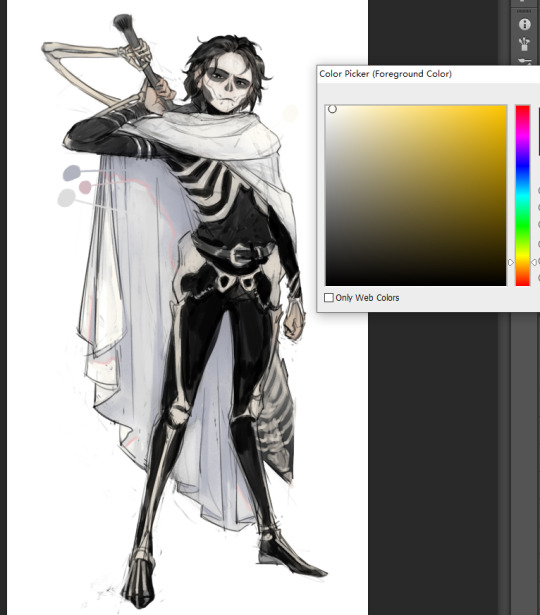
Then, select the cape and copy it to a separate layer (I used a layer effect with this new layer on the original layer later so this is important!!). And now we can start goofing with the separate layer. On this layer, go to Image - Adjustments - Gradient Map. Click on the long box with the gradient to bring up the Gradient Editor (you can see this is where I got the Rainbow Cape when I was clicking around the presets XD...but the first solid color to solid white one should be good for this.
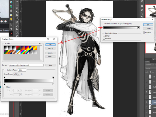
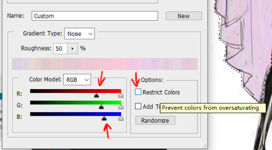
Now, in the Gradient Editor, open this Gradient Type dropdown menu and select "Noise"
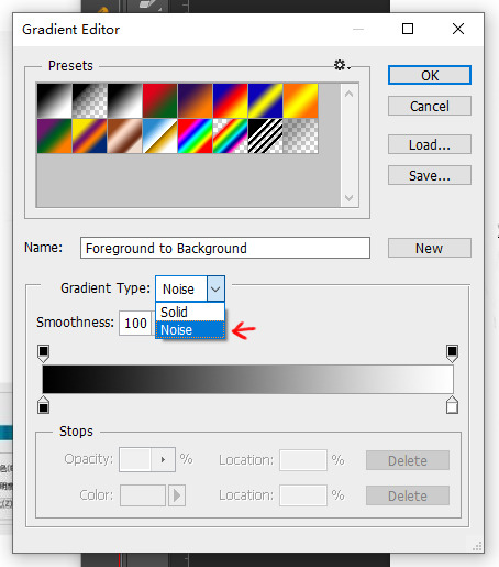
BOOM already it'll start giving you a pretty crazy color (you're toxic I'm slipping under)
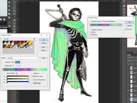
Since I'm going for a white material (lighter values), I don't want the darkest values to be so dark, so I slide the darkest value sliders towards the right (I don't think the placement matters too much, just do it randomly until you get a comfortable value you want). I also unchecked this "Restrict Colors". I want to go ham don't stop me
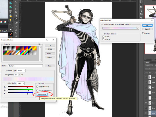
And here's where you can have some fun. I clicked this "Randomize" button a bunch until I got one that looks pretty nice (Photoshop's generally pretty good, this was around fourth try lol). Rave! Party! Even if you never get one you like, you can pick one with a good spread of colors/values and go to Image - Adjustments - Hue/ Saturation to change the color yourself some more.
Now, to get that real shininess, go to Image - Adjustment - Curves and start adding curve points to make it look like the stock market
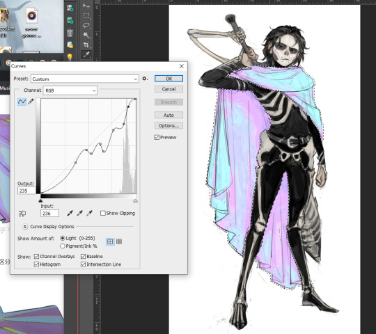
Finally, I go through the layer styles, pick one that looks best over my original color layer (in this case, "Lighter Color" -- I think most of the times "Lighten" or "Lighter Color" looks best, but you can scroll through the lighten section to pick the one that works best in your case) and voila!
I personally like to have my colors on one layer while I'm still working, so I also merge the two layers afterwards. Obviously after this effect I still paint over it some more to add more shadows and details, but this was basically the gist of what I did! Hope this helps!
185 notes
·
View notes
Text
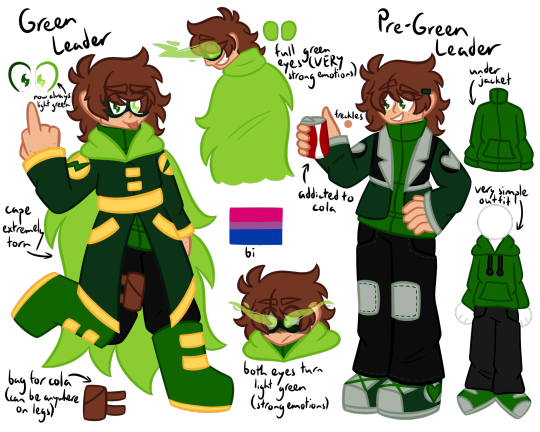
MY EDD DESIGN!!!! Did I go overboard on this ref? Yes zhkshdkfn some hcs under the cut cause I have. Way too many thoughts JSKJF
OK FIRST OFF a lot of my ideas regarding powers and stuff are inspired by @/actuallyunreal's grimsworld au, so PLEASE check them out, I just love their Edd so so much
Pre-Green Leader:
NOT pre-powers cause he does still have powers from the weird magic radiation shit here!!! His eye turns light green permanently tho cause of side effects I'll talk about later
After getting infected, Edd HAS to maintain some level of his powers or else he gets lethargic and can even start negatively impacting his health if he goes long enough, so he mixes the radiation shit into his cola to ensure that doesn't happen (also prevents the others from stealing it lmao)
His powers respond to his emotions but during this period that isn't a Huge issue, he's still able to live relatively normally (besides benign stuff like unconsciously floating)
Anyway besides powers- Edd is indeed wearing 3 layers (jacket, track suit top, gray t-shirt underneath) and nobody knows how he isn't incredibly warm all the time
He likes giving his friends his jackets when they're cold tho!!! Matt and Tom I imagine are especially susceptible to being cold so it's pretty common to see them with Edd's jackets in wintertime
Tom did the stitching on his pants :] pants had holes in them so Tom fixed them up and then added some extra flair
Shows the most affection (openly) of the main four!! He also shows affection by being a dick tho
Green Leader:
This isn't a swap, Red Leader exists too/The End happens/all that fun stuff! However after The End, Edd eventually goes "if Tord is the leader of an army I should make my own, to stop him or whatever"
So he's trying to do what Tord is doing, with the supposed purpose of stopping him, but he doesn't even truly know what Tord is actually doing?? Cause the Red Army is more just a vigilante group rather than an actual army, it's like... six people lmao
So Edd tries being this serious leader of an army and stuff but he can't... do it JSKJD he'll call Tom to his office to give orders or something and before Tom can even get there he's already left and blasting shit at random somewhere
But rewinding a bit- directly after The End, Edd is VERY distraught and hurt and it causes his powers to go haywire (since they're emotion based)
He's in "strong powers mode" like all the time, and eventually it starts taking a toll on his body, including permanently affecting one of his eyes (the now-light green one)
He can still see through it and stuff, but it causes him stabbing pain and migraines a lot of the time
All this continues pretty much through his entire reign as Green Leader until he and Tord finally make up and he disbands his army/it unofficially merges with the Red Army cause Edd... doesn't like running it
After that he becomes basically Tord's second in command but he's practically never around cause he just prefers blasting stuff lmao
Very chaotic neutral I think!! Was always chaotic neutral, but it's especially obvious during this period
#eddsworld#ew edd#I dont... know how to tag shit#green leader#<my art>#the other 3 are mentioned a bit in the hcs but since theyre not in the art I wont tag them#[edd]#[tord]#< however I will cc tag him lmao#also these are just some of my hcs!! I didnt even include anything with a self insert LMAO#(would very much appreciate rbs cause this took..... forever :"D)
39 notes
·
View notes
Photo
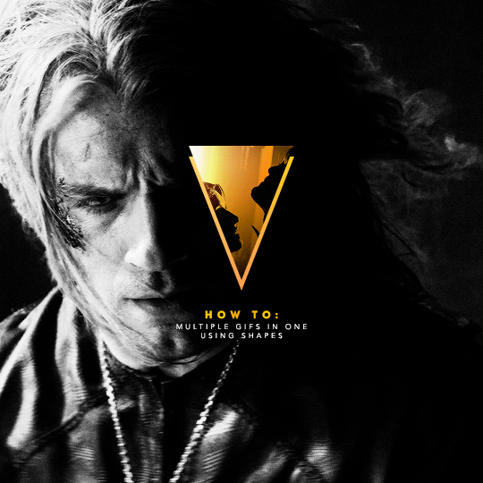
I've recently been asked by several lovely and curious souls to break down this Witcher set, so I thought I’d go ahead and put together a proper tutorial for everyone. All you need is Photoshop and basic giffing knowledge, preferably using the timeline. This isn't necessarily simple, but I would say it's one of the simpler things I've done—somewhere between easy and medium difficulty, maybe.
I. MAKE YOUR BASE GIF
To start, we’re going to be making our base/background gif, which is 540x540. You can color it any way you’d like, but I picked black and white for that particular set because I didn’t want the final product to be too ‘busy’. I wanted to keep the attention on a pop of color at the center instead, which ended up being the second gif and the text.
As a quick sidenote:
Since the gif is so big, I would recommend using at least 1080p footage. I’d recommend always using 1080p footage regardless, but I wouldn’t call it 100% necessary unless you’re making larger (540px, as opposed to 268px or 177px) gifs.
Keeping in mind that the second gif and text will be going in the center of the gif, you’ll want to align the subject/s accordingly. For example, I kept Geralt and Jaskier and Yennefer mostly to the left or right.
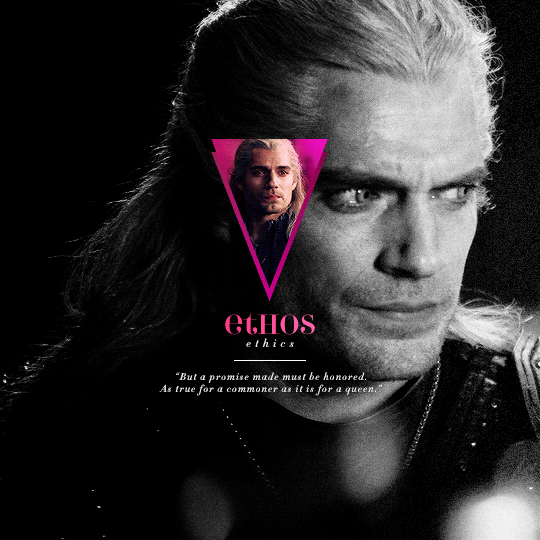

Here is the base gif I'll be using:

And here is a tutorial on how I make my black and white gifs if you’d like to get the same grain effect.
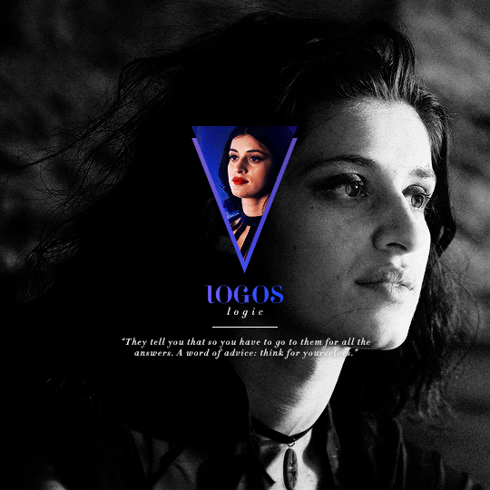
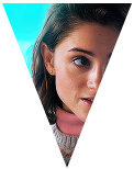
II. MAKE YOUR [SHAPE] GIF
Next is the gif for the shape. Sizing is up to you and ultimately depends on the shape you choose. For me, I know I want an isosceles triangle, so the height of my gif is going to be slightly bigger than the width. My dimensions in the original set were 118x150, so I’ll be making my gif 122x154. You want to oversize here since we’ll be trimming the edges off later on.
After sharpening and coloring, this is what my gif looks like:

III. GROUP YOUR LAYERS
Sounds simple, right? And it is, but it’s as pivotal as it is easy. Maybe it’s dramatic of me to say that I live and breathe by this step, but I kind of do live and breathe by this step. It’s the same technique from this tutorial, and it’s a pivotal step in my blending process also.
Having said that, let’s put all your layers in a group. Do this for both gifs!
CTRL + A or Select > All
Layer > Layer Mask > Reveal Selection

IV. CUT OUT YOUR SHAPE
You can go about this a couple of different ways, but regardless, it’s as simple as editing your layer mask. No, really. It’s why I love grouping layers and slapping a layer mask on. It makes life so much easier in the long run.
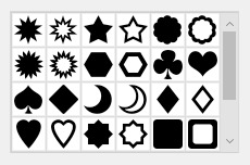
➥ PHOTOSHOP’S CUSTOM SHAPE TOOL
The Custom Shape tool on Photoshop has all the basic shapes you need. Triangles, circles (even though you could just use the round selection tool), stars, and even all the playing suits.
Go ahead and pick a shape to add to your canvas if you haven’t already. Don’t worry too much about the dimensions; you can manually input a specific width and height at the top. Rotate it if you need to (I’ll be rotating my triangle 180° so that it’s upside down) or leave it as is, but when you have it sized the way you’d like, center it and then merge it with a new layer. This way, we can right click on the layer thumbnail and select ‘Select Pixels’.

Next, click on the group layer mask. Invert your selection [SHIFT + CTRL + I or Select > Inverse] and then invert that part of the mask [CTRL + I or Image > Adjustments > Inverse]. Your gif should now be shaped accordingly.
➥ B&W TEXTURES AND VECTORS/PNGs
Alternatively, if you don’t want to limit yourself to basic shapes, you can use a texture or png of anything at all. An instrument, a specific symbol, something abstract, maybe even a flower—it can be literally anything, so long as it’s pure black and pure white. (If you aren’t familiar with how layer masks work, white is what shows and black is what’s hidden. Anything in between and what you get is partially or not all the way transparent, which will look wonky when the smaller gif goes on top of the base gif.)
For example, here’s an icon template by @argetnallison:

Select your image (CTRL + A or Select > All) and copy it.
Go back to your gif. Press ALT and click on the group layer mask at the same time. This will pull up your layer mask.
Paste your image onto the layer mask.
Et voila, as the French and magicians and... other various individuals including myself say.
➥ PAINT BRUSHES
If you’re like me and have a bunch of custom brush sets downloaded, brushes are another way to get fun shapes. If you don’t have any downloaded but are interested in trying it out for yourself, DeviantArt and Brusheezy are the best (or at least my favorite) places to look for them.
It’s the same steps as above, but painting instead of pasting.
V. FINISHING TOUCHES
Now that you’re probably sick of me going on and on about shapes this and shapes that—we get it, Ava, there are shapes, get on with it—it’s time to drag the gif shape onto the base.
To center, because I am admittedly border-obsessive when it comes to things being perfectly 100% centered, I set guides [View > New Guide] in the middle. It’s your width and height divided by two, so I have a vertical guide at 270 and a horizontal guide at 270.
For a “3D” (I don’t know what else to call it, other than “well, I just thought it looked neat”) effect, I added a gradient with the same exact layer mask as my gif shape and positioned it underneath and slightly below the gif.
All that’s left is to add text (I wrote a mini tutorial on gradient text here if you’re interested) and we’re finally done!
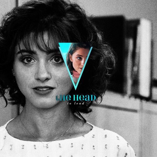
You can also do this with more than one shape, like here:
Or make the shape full-scale, like here:
Happy editing!
#completeresources#allresources#yeahps#itsphotoshop#resources#tutorials#ps asks#mine*#as always feel free to reach out if any of this is confusing#i'm sleep deprived so i feel like the chances of that are pretty likely
1K notes
·
View notes