#I DO NOT NORMALLY POST SKETCHES BUT I CLEANED THESE UP
Explore tagged Tumblr posts
Photo

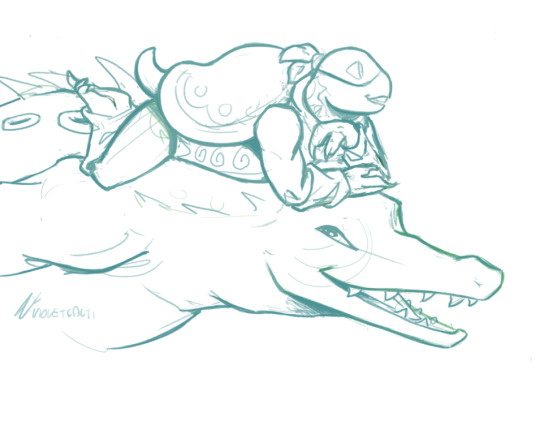

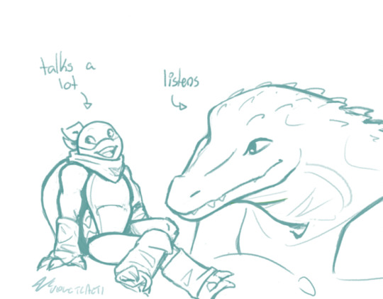
Your honor, they are best friends!
#leatherhead fans rise up hes my favorite#THEY DESERVE TO BE FRIENDS IN EVERY UNIVERSE#tmnt#teenage mutant ninja turtles#leatherhead#leatherhead tmnt#michelangelo hamato#mikey tmnt#green garden tmnt#please do appreciate how difficult it is to draw a crocodilian#nikasart#I DO NOT NORMALLY POST SKETCHES BUT I CLEANED THESE UP#A LOT#A TREMENDOUS AMOUNT
545 notes
·
View notes
Text

╭┈˖⋆ ⋅ ❁ ⋅ ──── ┊ He appeared to me in dreams ┊ ˖⋆࿐໋₊ ☆ ┊ My guardian angel ever since uvu ╰┄───➤ °♡•.
╭─ •.•°⋅ ✿ ⋅°•.•.•°⋅ ✿ ⋅°•.•°⋅ ✿ ⋅°•.•°⋅ ✿ ⋅°•.• ─╮ Do NOT steal to other platforms! ♻️ Sharing is appreciated and encouraged 💖 ╰─ •°•.⋅ ✿ ⋅.•°•.•°⋅ ✿ ⋅°•.•°⋅ ✿ ⋅°•.•°⋅ ✿ ⋅°•°• ─╯
#pokemon#pokemon gijinka#I’m sure it’s quite obvious which mon he’s supposed to be#So I have a giant stuffed one on my bed#it saved me from a run in with a drunkard who was looking for a fight until he saw the giant plush tied with the seatbelt on the rear seat#the drunkard proceeded to do the cross and kiss looking at it and immediately left like he wasn’t about to beat me up really bad#also the plush kept me sitting upright when chocking on my own blood after the post surgery complication so I didn’t loose consciousness#It saved me from harm twice and I have the vague memory of knowing this was the plush itself in dreamland#don’t ask me what it was like I can only remember the design as I woke up at 5am to do a quick sketch for later cleaning at normal hours#And yeah apparently he was a dj in there ajdiendienfiekfmk#I wasn’t fond of the mon but Josh is just special#momochiiee art#momochiiee ocs#josh
8 notes
·
View notes
Text
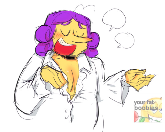

he deserves some cleavage . i think
#a little bit of boob. as a treat#i was worried about posting thi s because is the world ready for flavio boobs.....#i gotta be the person that makes the least normal art of him EVER#(i am far from normal anyway)#there was gonna be another doodle but weeehhhhhhhh its ok#this was a sketch i took and coloured and cleaned up and it actually looks REALLY good so im posting it too#i should colour my art more often maybe ...#jerms art#DO I WANNA TAG THIS IM EMBARASSED....#THIS IS VERY SELF INDULGENT#digital art#paper mario ttyd#flavio#paper mario ttyd flavio
47 notes
·
View notes
Text
honestly i'm having fun w digital art again and i think the key was simply making myself use a much looser brush. i've known this would work but was like haha noooooo i can't do that <3 like well why not? stupid
#chatty!#technically it's a sketch brush there's a line brush to go with it. but i like the sketch brush more <3 JGDFNJHD#i don't dislike the line one but i think i hate doing lines. i like the blendy sketchy brush#i usually prefer my sketches to my finished pieces bc they're more fluid through being. looser. messier#i simply need to stop cleaning my art up bc then it gets too stiff and i don't like it. my messy art is my fav#maybe one day i'll do normal lines again but that'll be when i can follow my sketch without ''fixing it'' during lines#i sketch something and then completely ignore it bc it's not Correct. who cares#i've made this post basically exactly multiple times before and u'd think i'd know this by now already. i don't <3
2 notes
·
View notes
Text
To the anon who sent me that Spitdash request

#I am SO normal about them#Even though I dont draw them as much as I'd like#I DO have lots of sketches with them which I need to clean up - including a few kinky ones#I LOVE THEM#also hot damn I love all the requests so far#some of you are really cute and seem shy#but some are unhinged and I LOVE IT#my posts#mlp
18 notes
·
View notes
Text
Yan!Batfamily x Singer!YN (neglected)
Inspired by @@gotham-daydreams's fic, your work is wonderful and makes me think about many things…. One of the things I think about is if they found Reader from her music…. Reader here is heavily inspired by Naomi Jon, she is an independent singer from Germany, she regularly makes videos on youtube about makeup, shopping on websites, tiktok foods, things like that. She is a very fun person to watch and I highly recommend you watch it, all her videos are in English. (one detail is that she doesn’t talk much about her family, and lives with her friend Vincent and boyyy every time I read about Reader from Not [ ] fics I remember her. If you disagree, that’s okay, I still like the idea of YN’s glow up <3) “Have you seen, come and read my diary Then you will see, that you don’t mean shit to me” – MANTRA- Naomi Jon
I imagine that while shopping at a store, Steph liked the store’s playlist and went to look for who was singing it.
Imagine her face when she finds out that the person she was listening to… was the YN everyone was looking for. She immediately discovers her YouTube channel, social media… and everyone immediately starts binge-watching and stalking all of her videos
Dick would be the type of person who would learn the choreography for your music videos, just to dance with you. He swears he can be the fun older brother you need, he can be in your videos too! And cook! I don't think he wears makeup, but he would watch all your makeup videos because he likes your reviews, and when you make a joke or mix up the language in the video he finds it so funny that he can't help but laugh. He wants to test out the latest skincare products with you and wants to travel together! You look so different now, with bold eyeliner and colorful hair, Dick wonders if you've always been like this and he was just blind because he didn't see it. Come on, he didn't know you had this fun and easygoing side, let's spend more time together, okay?
“This dress deserves… THE BUSINESS WALK!”
Jason sees how you've grown, and how much better you are away from Gotham. Like a flower that blooms only when it's in a clean and suitable environment, you've brilliantly transformed into who you are. But a part of him, the biggest part, thinks you'd be much safer around your family, where they can protect you. You sing and post so many videos on the internet, what if someone comes after you? Let your brother stay close, okay? And who is this friend who lives with you anyway? He is not trustworthy - no. It doesn't matter if you've known him since you were kids and have lived together for a long time. Another thing I bet he would do is join you on the days when you dye your hair in the craziest ways possible, he has some experience with dye, you know?
“C’mon FriendReader, this is the plan for this hair dyeing technique. Yes, all seven colors are here!”
For those who neglected Reader and pretended you didn't exist, he is your #01 Fan now. Tim definitely listens to ALL your music, and is 100% connected to your social networks. He watches and rewatches all your videos, they are so interactive and relaxed that he has the illusion that he is living it all with you. He's the type of person who eats while watching your videos, and watches them before bed, and when he's having a particularly stressful situation he'll lock himself in his room and watch one of your vlogs, because your voice has such a calming effect of normality that for him, it's like at any moment you'll open his door asking to try a 2-ingredient recipe you saw on TikTok.
“Timothyyy~ try this recipe I saw on tik tok!”
Damian is an interesting case… because he discovered that his precious blood brother has a side to him that he never saw. When he walked into your room and looked at all your memories, all your pictures of your achievements, all your music sketches he KNEW you were talented, but when he saw you in action in your videos and shows it was like a cartoon character came to life. YOU came to life! Definitely buy all your merch, and talk about you all the time to John. Do you still have two cats?? Enough, the kidnapping is you and them two.
“My next show will be…”
Bruce goes back and rereads your journal drafts and realizes how much your music has really changed, your focus now being only on your fans and not your family. Like everyone else in the family, he watches your videos daily and keeps thinking “I could give her a bigger box of surprises so she can record a video” “Did she think that dress was pretty? I could buy her a better one, shinier and pinker, just like she wanted.” When you post a video of the backstage of a show and all your lively preparations, he can’t help but feel guilty for the thousandth time that day. He should be by your side right now, a father should be behind the scenes giving you comfort and strength to go on the show. He should be in the front row cheering when you realized your dream of going on stage for the first time. The whole family should… You’re trying so hard, your dedication is palpable in your videos and shows. The little girl grew up and became a dreamy woman, but who do you run to when you need to cry? Let him be your comforting shoulder now, let him come into your life again.
“I made this song especially for you, my fans!”
When Alfred put that video of YN’s childhood on TV, where she performed in a school play, to remind everyone of her absence, he couldn’t be more proud of his work when weeks later he hears her voice coming from one of the boys’ rooms. It's you singing one of the songs, the batboy repeating it for the tenth time. Your voice has changed, from a childish and angelic voice to a woman's, your looks have gradually gained confidence and personality, but your “presence” in the mansion is ghostly. He feels so happy for you, you are externalizing to the world what he has always seen: that you are incredible. Alfred doesn't need to marathon your videos to feel closer to you, he already has affectionate memories, he already has albums from when you were a baby and tested recipes with him, he already has videos of you training to sing when you were little… But he still watches your videos because unfortunately, even with him you lost contact. He watches the videos like a grandfather watches his grandson's stories “Oh? Are you in Tokyo now? How wonderful, dear, remember the coat.” “Oh dear YN, I don't think this recipe will be good for you…” “Yn, be careful with the scams on these strange websites!”
“Guys, I know what you’re thinking… BUT maybe combining onion and chocolate CAN work.”
#dc jason todd#dc comics#dcu#batman#dick grayson#bruce wayne#batfam#jason todd#yandere batfam#yandere batboys#yandere batman#this is platonic btw#batfamily#alfred pennyworth#dc robin#red hood#batman and robin#yandere tim drake#yandere dick grayson#yandere jason todd#yandere damian wayne#yandere damian x reader
897 notes
·
View notes
Text
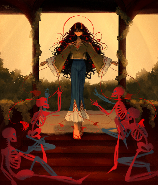
I swear to god, Zanmu has just been on my mind recently, she's taking over my fucking brain please send help
Artist's Note:
Why is it that everytime I do a drawing of Zanmu I always make the canvas size fucking huge and it ends up being a living nightmare to fucking export. I swear to god I had to go from 1200 DPI to 600 to 350.
Exporting hell aside, I loved working on this piece. With Zanmu's design, I wanted to combine all the design details that I love and have seen in other people's drawings of Zanmu and give them my own personal touches. First of all, her sleeves were inspired by @amemenojaku's design for Zanmu, and I absolutley love that detail because not only does it make her feel more regal, it also can be a callback to Satori and old hell, and also gives me the idea that Satori's fashion sense was inspired by Zanmu because IRL a lot of historical fashion was inspired by what the nobles were wearing at the time, and since Satori was around since when Old Hell used to be Hell, she probably took some wardrobe inspo from her (or it could be my headcanon that Satori could've been Zanmu's royal advisor or she was in her court or something but that theory is kinda grasping at strings from other headcanons I have, but that's for a different post). Also, the eye makeup she has was inspired by @jothelion's drawings of Zanmu, and like, I fucking love that detail because it just adds so much like omg I just love it sm.
And now for the design details I put in. I gave Zanmu tassel earrings because I think they'd look great on her. I also really like to exaggerate her hair and really try to make it look wild, as well as having little grey hairs here and there. I also try to add some wrinkles to the corners of her eyes, but TBH I don't know how visible that detail is, since the image is pretty fucking big. I also really exaggerated the tassles/strings on her outfit, since I really wanted to play around with the potential flow they could have. Also, big fan of giving Zanmu longer sleeves and pants. IDK why but I just like how it flows better. Also big fan of making her taller, idk why a lot of fanart makes her short. Also, I placed her horns closer to the front of her head as I just think placing horns in that position looks cool.
Also, if you're wondering about the halo, I took some inspiration from a few of Caravaggio's paintings where he often depicts saints with this very thin halo around the top of their heads. I just liked that detail a lot so I thought I'd include it.
Fun fact, I was originally gonna make the four skeletons Chiyari, Biten, Enoko, and Hisami but I didn't like the prospect of having to draw four more characters, so I chose to replace them with skeletons (if you wanna get silly with it, Zanmu got Hisami to kidnap Aya, set up some skeletons with bones from her bone collection and told her to take a picture of her).
I kinda gave up on Zanmu's feet and the one skeleton's hands (as if drawing hands normally is hard enough but NOPE, HAD TO MAKE IT LIVING HELL FOR MYSELF BY MAKING IT A SKELETON) and the quality of the image may suffer because of how much I had to fucking compress it (Zanmu's presence alone was enough to make the computer lose all of it's desire and motivation to export the drawing of her lmao), but I have been hacking at this piece for a while now, plus I need to learn when to call it quits when it comes to drawings). Also as I was fixing up the hands there was one spot where I forgot to clean up with the sketch and I can't fucking unsee that now and it's going to fucking bother me until I fix it but fixing it requires going back and putting my computer through hell so yeah.
So yeah, that's about all I have to say with this drawing, it was fun but also a nightmare lol
#art#touhou project#fanart#touhou fanart#touhou 19#unfinished dream of all living ghost#zanmu nippaku#touhou#東方project#東方
542 notes
·
View notes
Note
if Jimmy and Timmy get married, how would the wedding go? Who proposes to the other? how does the proposal go?
this is the best ask ever i forgot how much i love schmaltz <3<3. heres some quick doodles as a bonus <3


as for the wedding and events proceeding, i think its go well! they deserve a little break from the stuff in their life, as a treat /q. Unless something like the syndicate crashes their party (i.. dont think theyd be that evil to do that tbh, i havent really dabbled w them story wise but idk, its a wedding im sure they'd be civil for once..) or some interuniversal threat pops up that needs their immediate action (something like garnet's wedding from su). which tbh would probably inhance the expirence for timmy, hes a straight menace and thinks stuff like that is awesome </3. but anyways
in general relationship stuff timmy may be the more forward one but i think jimmy would be the one to establish the milestones, plus that hes more traditional in my characterization of him. that being said, timmy would totally unintentionally propose or joke about marrying him and jimmy would 100% take him up on that with no hesitation.
now onto wedding stuff bc damn do i have a soft spot for this kinda stuff <3<3
the flowers i chose are forget-me-nots and pink / peachy orange aster flowers with a touch of roses in those same colors as well. i implore you to look up the flower meanings i had fun w em <3
I chose the color peach/a coral (is that what that color is ??) for the wedding because its a combo of timmy's pink and jimmy's redish orange (vermillion ?). i just think combining their colors when it comes to ships is just so so CUTE <3<3<3. this is also why that jimmytimmy painting i did a while back has primarily those colors <3. it didn't fit the theme but timmy wanted them so he gets a green, hot magenta pink, and purple flowers for his suit so his only family that loves him can be there.
this is uhh kinda angst implied but it wouldn't be something i made without a bit of angst <3. timmy's biological family would not be there, his mother would probably call once she heard that he got married but timmy decided to abandon that life and those people for good, and for the better tbh. the rest of the nicktoons unite crew would be there + maybe their plus one ig, but dib instead of zim, or maybe them both (zim wants to look normal so attends these events where its expected u show up yk, and dib follows bc clearly. hehe). cindy would probably arrive and agree to being a bridesmaid to show she isnt homophobic but would probably cry and/or drink in a corner the whole time </3, losing both of her boyfriend prospects at once /j
when they toss the bouquet danny is the one who catches it.. he looks over to manny and they share a flustered look while everyone else cheers <3
this is how id imagine it to go at least, there might be more sketches of this in the future i just gotta clean em up first </3. aaah this post is so long </3. told u i loved this kinda stuff SHHSHUSH !! <3<3<3
#jimmytimmy#jimmy timmy power hour#timmy turner#jimmy neutron#danny phantom#spongebob squarepants#nicktoons unite#S☆K♡#art#clip studio paint#digital art#tigerghost#ask thingy
125 notes
·
View notes
Text


ive been loving @loudn-mcyt's superhero au and was seized with a need to draw Wayfinder and Timekeeper because, as always, im predictable. i just think theyre neat!
i ran out of art stamina before i could do coloring, but im pretty happy with these. very long rambling about design choices under cut:
okay despite having them in the same order as the stats post to match i actually drew Timekeeper first so we're starting with her.
civilian Ruby is Ruby Corundum, and is basically just Ruby's default skin. i could've gone for Cherruby seeing as this is a SBK AU, but i felt like drawing your average rubert.
Timekeeper, meanwhile, is based heavily off tRuby (or, maybe more specifically, off Sapphire). was very much winging this and wanted something long and swooshy that wasnt a cape, so.. tRuby's coat! i was gonna have a completely new outfit under it, but nothing looked right so they get to keep the vest and pants. the undershirt is Cherruby's, though. i did fancy the coat up a bit with shoulder pads, a different.. lapel? ive forgotten the word for the folded bit. and while its not pictured in the cleaned-up sketch it has a crystal pattern and maybe some iridescence because i wanted to pull in Ruby's gemstone aesthetic
also Timekeeper has the crystal hair i normally draw Ruby with in a braid like tRuby / Sapphire. and pointy ears! Ruby's a normal human while civilian, but considering Ruby and Viking's... everything... i had fun with making them a little less that. this is helped by me picturing Ruby doing a whole-ass magical girl transformation into Timekeeper, lmao. ANYWAY. eyes change color because of time powers, and theyve got their clock as always
Wayfinder was designed after, so i was relying a lot on what i established for Timekeeper because i wanted them to match! Viking is just Summertime but with glasses because im still fiddling with the idea of drawing him with glasses anyway and its a fun tie to Ruby. he is also a normal human. no catboyism here.
visual similarities with Timekeeper: same undershirt, pants, gloves, and boots, core item on chain necklace, pointy ears, and the chevron design on his shoulders is similar to Timekeeper's shoulder pads and chain accents. and, although you cant see it because of his goggles, his eyes also change color to match his domain.
he was originally gonna be based more off Wanderer, but as much as i love the parka the aviator jacket is too iconic and the mask blended in with the goggles too much. he gets dViking's wispy bits though bc of his intangibility power and i wanted there to be some kind of change like Timekeeper's hair.
UH. YEAH. this was fun! i dont know if im gonna draw the rest, im just always Incredibly Normal abt spacetime siblings, but considering i havent drawn any superhero stuff before At All im really proud of this. ok bye
63 notes
·
View notes
Note
I finally got all my brain ducks into enough of a row to send this! I just wanted to say that Tumblr recommended your art to me on a whim, and I am actually OBSESSED now lol. I had no prior investment in Submas or anything tangentially related to it prior to this (aside from liking Pokémon generally lol), but I couldn’t help but tear through everything you’ve drawn for these silly little rat children and I love them so much now!!! I wanna pick them up and shake him around like little action figures! The shenanigans and the heartfelt moments are just,, UGH so good! I have no words! Thank you for the food I am going FERAL over them <3
Your art is also high key goals for me now tbh. I absolutely ADORE your coloring and rendering style, and also they way you draw Pokémon in general?? Very animalistic but still recognizably Pokémon?? Literally galaxy brained. I’m going to SCREAM. I know you already posted a bit of your art process, but I’d love to know if you’ve got any rendering tips and/or how you get that clean but sketchy look. It looks so good I want to eat it lol.
(Also I really love the way you’ve been formatting Elesa’s dialog, with the extra lines around the letters. It really gives the vibe that her grasp on Galarian is currently shaky at best and idk, I like that you’ve managed to find a way to convey that over text. I think that’s pretty cool :D)
I SAW YOU REBLOG A WHOLE BUNCH AND IM,,, (throwing hearts at you)
Thank you so so much! I’m glad you love these terrible little guys wandering Unova just as much as I do, haha!
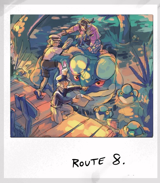
As a treat, lemme pull out some drafting for the mini illustrations. I usually start every snapshot with a run down of what I remember from the area, possible shenanigans encountered, and then a doodle of ideas to come.
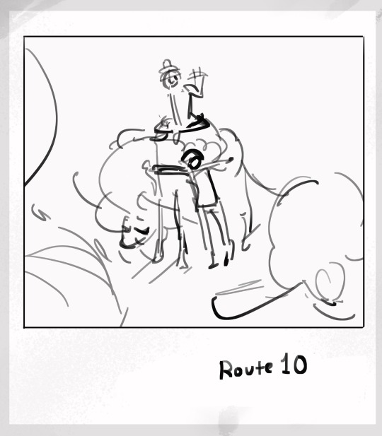
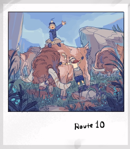
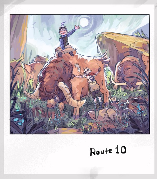
From there, it’s a SUPER rough sketch, followed by lineart and rough color, and then cleanup!
(More thumbs and their finals below!)
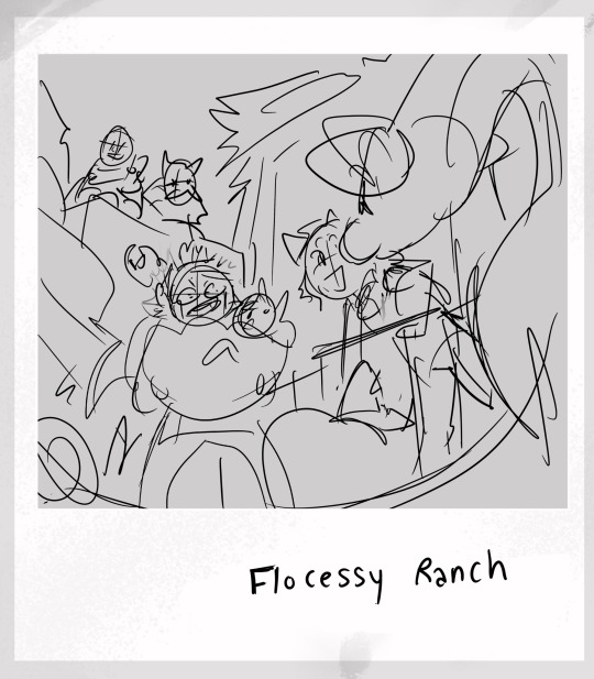
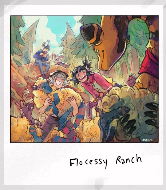
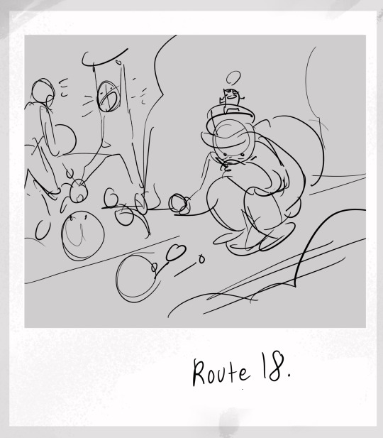
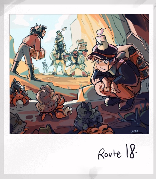
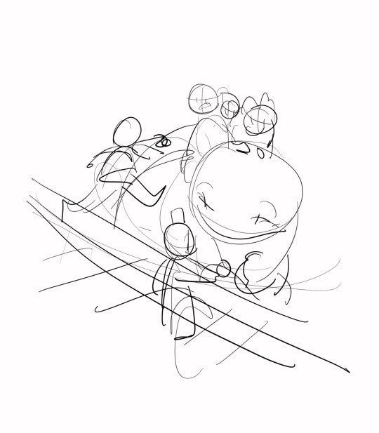
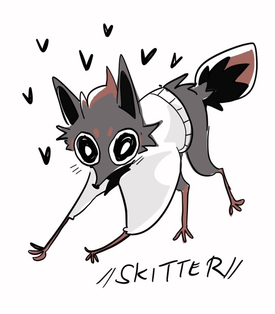
At the end of the day, all my lines are VERY sketchy. I’m a lot stronger when it comes to mashing colors. That, and if you set your line layer from normal to multiply, the lines will always be automatically darker then whatever layer is placed underneath. It’s a trick used quite a bit for placing cel shadows in animation, but it’s useful for lineart in a pinch.
For colors, I like to stick to a limited pallet and branch out only after setting my primary colors. This entire series has been very experimental for me though, as you can probably tell.
As for the last bit— YES… YOU GET IT! As Elesa grows, the lines in her dialogue will start appearing less and less. It’s the little things that map the span of time for these guys.
Yippee!
#ask#mailbox#aah… scared to respond to my inbox because there r so MANY asks but#this one’s asking for tips and i love getting on my soapboxes#and also the sheer amount u reblogged??? holy shit okay if ur gonna put the effort so shall i!!#ANYWAYS!#critterbitter screams into the void#critterbitter
347 notes
·
View notes
Text


Malyck Pencil Sketch
Normally, I tend to only draw rough pencil sketches (more like the third image). I decided to try an A5-sized sketchbook recently, after using the reliable Muji B6 sizes for years. I think the combination of slightly nicer-texture paper, and the larger size from this Stalogy A5, encouraged me to clean this one up a bit more than I usually would. (The Muji B6 paper is very smooth.)
Mechanical pencil used to be my favorite medium, but I'm very out of practice now with doing finished drawings in it. Maybe I'll try giving it a go more this year.
The date changes above because yesterday, I originally wasn't going to work on it more past the second image. Then, I decided to today.
Link to post: https://landylachs.com/sketchblog/2025/02/malyck-pencil-sketches-february-5-2025/
With support from ArenaNet.
38 notes
·
View notes
Note
Your art is wonderful!!!
A constant inspiration to my own creativity and art work. Could you explain some of your art style to me? I’m interested in looking at a bunch of different ones to try and finally find one for me.
Goodnight!!🌙
Thank you so much! That means the world to me! I’d be happy to share some of my process with you 😄
Keep in mind I’m completely self-taught, so this is just the process of how I make my drawings and not any sort of professional advice 😅 apologies for the long post ahead 😪
Starting with the basics, my biggest influences are Jin Kim and Ami Thompson. Both are amazing character designers and I really admire their stylization and expressions. Whenever I feel stuck on something, I always go back to their drawings for inspiration.
I typically start in Procreate with a canvas size of 3300px x 4200px or 11” x 14” with a DPI of 300.
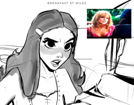
I put my reference in the corner of the canvas (in this case it’s a screenshot from the movie She’s the Man) and I start my rough sketch (emphasis on rough). Sketching is probably the longest part in my drawing process because I’m focusing on expression, composition, proportions, etc. This usually has about two to three passes before I move on.
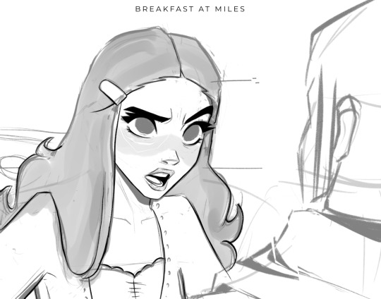
Then I lower the opacity of the sketch and clean it up with some lineart on a new layer. Lineart doesn’t play a huge part in my style, but I still like to play around with line weight. Since I knew this was going to be a fully rendered piece, I didn’t spend much time on lines that I knew were going to be removed later in the process.
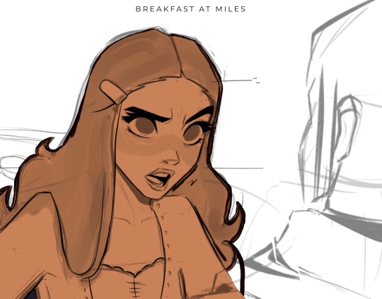
Underneath all of that, I use the skin tone and color the base of the character. I make sure that I color ever so slightly past the lineart, for reasons that will be important later. This part can be tedious, especially because I use a textured brush, so there are a lot of gaps that I fill in later.
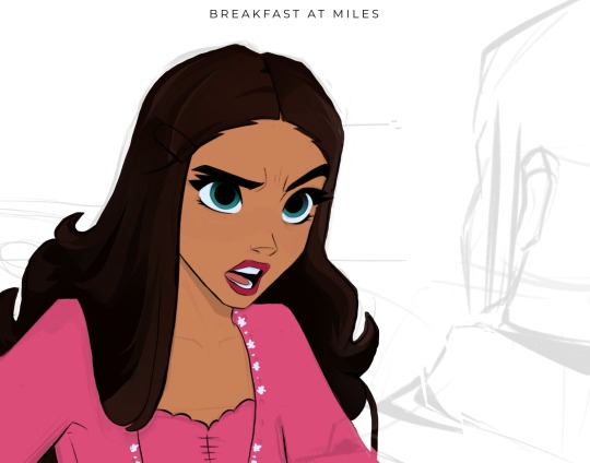
Then using new layers with clipping masks, I start the flat colors. Nothing too crazy here.
I’ve made color palettes for characters and backgrounds that I typically draw, so this way it speeds up the process and maintains style consistency. If I need a color that I don’t normally use, I’ll just play around with the colors until I find something that fits well with everything else.

Next, on a multiply layer, I add some basic shading (with the skin tone color) and blush (with an orange-pink color). I also move onto the background. Some are more complex than others. If I’m going for a more cinematic look, I’ll fill the background in with some basic shapes and blur it slightly. Thankfully the background was pretty simple in this reference.
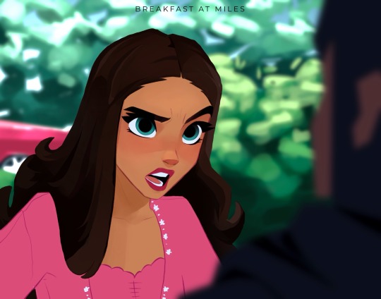
I start checking proportions now that everything has basic colors. Then I duplicate my lineart layer and change it to a pinkish-red and put it on multiply mode and turn down the opacity. This is why the base color layer needs to line up with the lineart, otherwise there’d just be gaps underneath. Instead of erasing my black lineart layer, I put a mask on it and just keep the eyes and eyebrows.

Then I start working on the shading and hair, which is an entire process in itself. Maybe I’ll make a tutorial on that one day 😅
I also use some vivid light and soft light layers and put in some subtle colors for extra pizzazz.

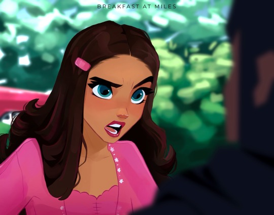
Then I add a hard light layer to the eyes for that glossy look and on a normal layer add some white details just to make some things pop more (like the nose, lips, eyes, sometimes hair, etc.)
I did make an eye tutorial a while back, but my process is still the same!
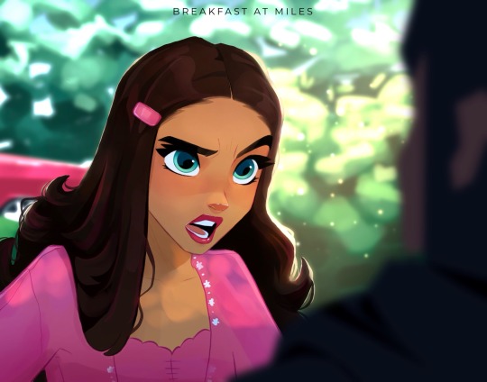
Lastly, I spend a lot of time playing with different blending modes (multiply, add, soft light, vivid light layers) and really focus on the lighting. I used to focus on adding a lot more details and make the coloring more realistic, but I found that the more simplistic coloring was easier for me to do and fit my style better. Sometimes I still tend to go too far with the details and realize that it looks better when I tone it down a bit.
That’s pretty much it! Let me know if you have any questions! Hope this helps. Have fun making art!
#art#digital art#procreate#art process#danny phantom#fanart#danny fenton#my art#paulina sanchez#tutorial
42 notes
·
View notes
Text
My messy process for drawing that zero people asked to see XD ...
Sketch #1: just shapes, zero definition. The scruffier, the better - it adds movement and flow, and I neaten it up later. All about composition, character proportions, checking sizes/heights, who's going where, etc. If I'm happy with a character's shape but not their placing or pose, I just select and drag around.
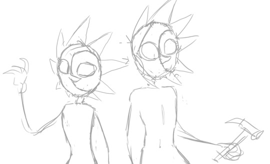
Sketch #2: go over the bare bones with an equally scruffy but more detailed sketch. I've got references on hand for hands, my greatest nemesis - I still screwed up Solar's hand here, but oh well, every day's a school day. Experiment with expressions, wrinkles, hand poses, double-check character references to add in details I'd otherwise forget later (individual eye shape, markings, etc.)
Depending on the complexity, I may do a third sketch, but not needed here. I don't want to have to make changes at the lineart stage when clean-up takes twice as long, so this scruffy stage takes a while.

Lineart: weirdly, I love sketchy styles, but am completely incapable of doing them myself. I prefer sharp lines and crisp edges, so I use a small, pressure sensitive brush in deepest black, and annihilate it with the eraser tool to taper edges and add sharp detailing. I also play with sharpening filters to get the resolution I want.

Colour: I add a fill layer beneath the lineart in a colour that's not going to feature on the characters at all. This means I can a) get into the nooks and crannies and erase any overlap from the select tool, and b) any missed spots when I colour in will stick out like sore thumbs, so I don't leave gaps for background to shine through in teeth or sclera etc. I then colour on top of that. I keep it simple, only adding variety and shading to the eyes and odd detailing - bells, buttons, etc.
This will sound bloody obvious, but adding colour can change the whole look and feel of the picture. For example on this piece, once colour had finished, I realised the lack of neck ruffles made Solar look weirdly exposed compared to the equally shirtless Eclipse, like he'd been interrupted getting ready for a shower or something. So a rescue shirt was added! (You can see shirtless Solar on the original post here.)
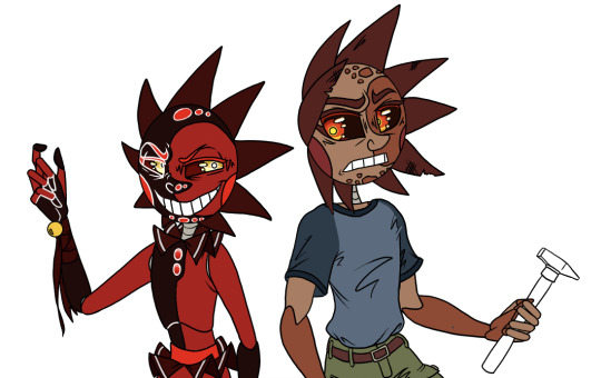
Background: I'm allergic to drawing backgrounds so I speed-run with shapes and textures, mucking about until it looks good enough. I have no idea why but I'm adding borders to all my drawings at the moment, so that goes in too. Normally I also add a white border around the characters, but not for these refs.
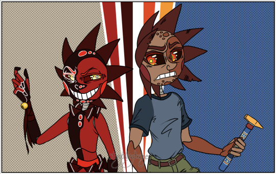
And ta da. Nothing special, but works for me! Moment of silence for Solar's haunted hand.
#drawing process#how I draw#belabour the sketch stage to save a life in lineart land#why are hands so wickedly difficult#you can never have too many expression details#tsams solar#tsams eclipse#sun and moon show
25 notes
·
View notes
Text

Day 82
Another one that I love!~ Gonna be a lot of those from here on if you couldn’t tell!
Junko’s the Ultimate Fashionista (in the english release at least but hey Ultimate Gyaru has to have a little crossover right??), so of course she handles Mikan’s wardrobe the moment she’s allowed to. So . . . Extremely cute scene of her having Mikan try out clothes to see what she does and doesn’t like.
An opportunity for Junko to pamper Mikan, AND i get to draw Mikan in a sweater???? Heaven. Also like are we all in agreement that sweaters just look fuckin amazing on Mikan?? Like I admit, I think I just like drawing Sweaters on Mikan but they just make her look so much cuter because of how god damn cozy she looks in em.
Unfortunately that’s all I have to talk about for that topic? I think? So instead let’s shift over to a recent development involving Junkan!
I’m in the midst of working on the Junkan Christmas Eve comic, which hopefully will be getting posted on time a few days after this, and during the process of making there’s been something new with my current abilities.
I have officially hit the point of proper freehanding on these two.
Y’see this probably won’t make too much sense but i’ll do my best to explain.
So normally when it comes to sketches I’ve done things a bit less proper compared to more professional artists. I usually get a little start on the anatomy, and then just start sketching all the character details and moving out from there. It isn’t often that I do a full sketch for the basic anatomy of a character, I only do it when I really wanna not fuck up a pose. And as you also know up till now only one piece in this event was drawn normally. Everything else is a sketch that i cleaned up and colored, or just a sketch.
This is because generally speaking I can’t do art using my normal pen tool without a sketch to work off of, it requires a lot more finesse to use the G-Pen both because of the larger shifts that can occur in line width, and the slightly looser feel it has compared to my Pencil Tool.
That’s all to say that I have drawn Junko and Mikan so many fucking times that I can just, draw them without proper sketches now. I’m at a point where I just need to draw the head, torso, and legs for an anatomy sketch, and then with the G-Pen I can just, draw from there. That’s big for me personally, and also fucked up because god how even??? There hasn’t been a drop in quality either so far, i’m still able to refine the expressions and i haven’t fucked up with the arms too much yet, I’d even say it’s resulted in some of my favorite Junkos and Mikans period.
Now, the catch is that again, this is only Junko and Mikan. I could prooooobably get to this point with Mukuro eventually just because her design is much simpler compared to other DR Characters? I struggle with getting her colors right rather than linework, but that’s about it and still not really useful in my main line of work unless I memorize every character that’s ever existed, and it took like 150 fucking times for Junkan I can’t do that for an obscure RPG character that I might get commissioned once and then never again.
It’s also not something that I think i’ll apply to my normal Junkan works, because I am a perfectionist to a fault when it comes to pieces I care about and I want to make sure every detail these is exact. I need to be meticulous for ship art like this, every detail is important. And I can maximize that with sketching.
This new skill is basically useful for one thing. Speed.
I pride myself on my efficiency, even if I have waned over the years due to burnout and overwork, when I get into it I can fuckin move with my art. And so if I need to say, make a 28 page comic in under a month? Being able to mostly skip an entire phase of the art process is very, VERY useful, ESPECIALLY because it’s a comic. Something which generally takes more time than my normal art by nature of it’s format and what it involves. When making the Comic for Day 60 it was all sketches, which was equally fast but could leave small imperfections at the time that either went under my radar or I just let slide because i was trying to be efficient.
This is basically perfect for having to speedrun a Junkan comic, it’s all the speed with the usual amount of visual quality.
So in short . . . I’m turning into a nightmarish hell machine but specifically for drawing Junkan. I am genuinely curious how much farther I can go up from here, like, what the hell else could I be capable of with this???? Am I just gonna learn how to fuckin beam the art onto the canvas with my brain???
Moral of the story is just get mind numbingly obsessed with a ship and I guess you’ll get better at stuff??? I have no idea, i’m still kind of processing the comedic value of what this year has been because I was desperate for these two to make out.
As always, Reblogs, Comments, and Little Notes in the Tags are appreciated!~ They always make my day!~
#danganronpa#junkan#junko enoshima#mikan tsumiki#junko x mikan#tsumiki mikan#enoshima junko#enomiki#shipping#junkomikan
32 notes
·
View notes
Note
(afab reader)
Something tells me that despite having difficulties in social situations, Ford would actually be able to tell when you’re giving the fuck-off vibes, especially during your period.
His mind has made a list of all the hints, both blatant and subtle, that you just don’t want to talk or be talked to or be touched or anything, which he gets. One of the things that irritate him is when someone cannot for the life of them read a room or a face.
If Ford had something he wanted to ask/tell you, he’d probably just go with passing/leaving a note.
I can definitely see him recognising the signs from his own bad moods.
Everyone can tell when he's in a foul mood because he makes no qualms about hiding it, and for me personally, I'm the same. I very visibly emanate 'do not touch' vibes like a gas leak when I get to this point, but I can also try to hide it if I'm feeling delicate underneath all the anger and need to come off as 'normal' around others.
Ford immediately picks up on the more obvious signs, but over time he starts to notice the ones that are less so. Like, the way you hold yourself or the way you're not quite smiling with your eyes. He picks up on the tightness in your voice and the way that when you think no one is looking, you have to take a moment to collect yourself so you can maintain a good hold on your mood.
And he leaves little check-in notes for you to pick up throughout the day so he doesn't bother you with constant 'how are you feeling' questions, which can get boring pretty fucking quick, in my experience. Just stuff around the house (I'm think in the MTB au, he'd leave them in areas where he'd know you were going to clean, so you'd be guaranteed to pick them up) that he thinks will cheer you up; a science joke here, a compliment there, maybe even a little sketch. And then, as you said, any questions he had in relation to something, he'd plan it out in advance and pop a post-it note on the fridge for you. Maybe he'd even leave them in a book you're reading so they fall out when you pick it up or something.
18 notes
·
View notes
Text
Uhhh very messy sketch dump of my magical boys with various levels of cleaned up (but still very scratchy overall)
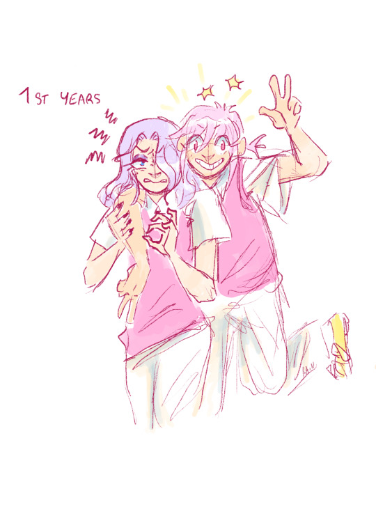
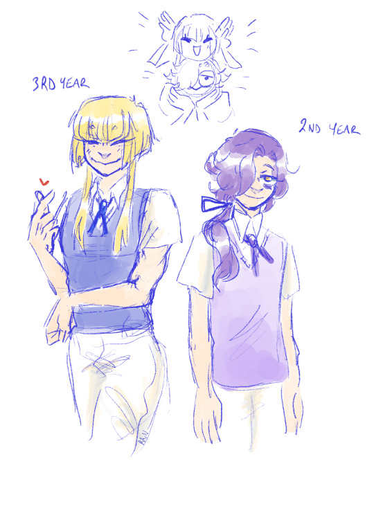
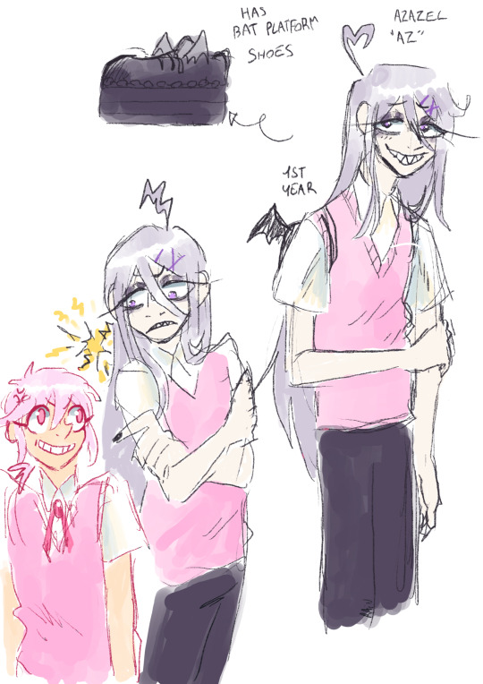
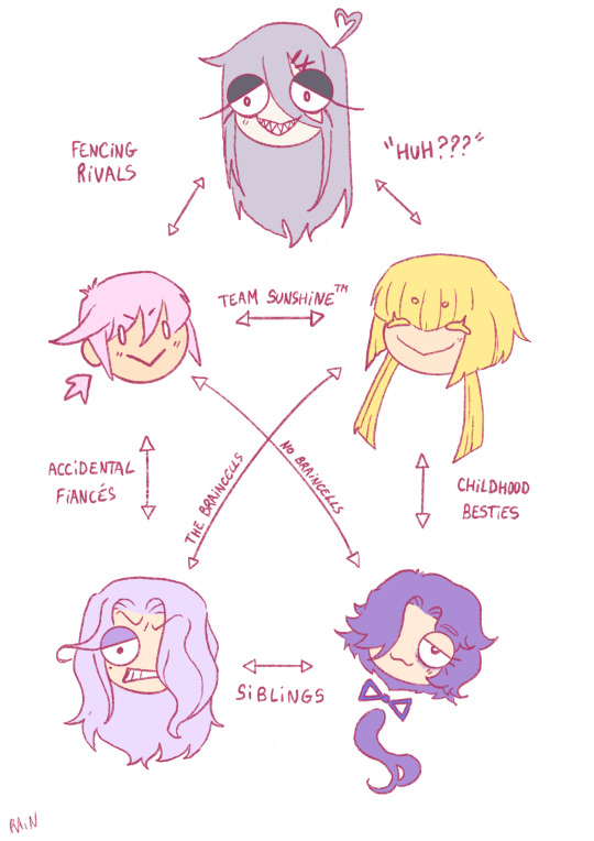
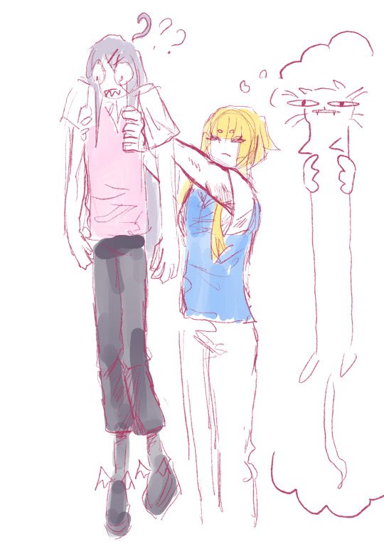
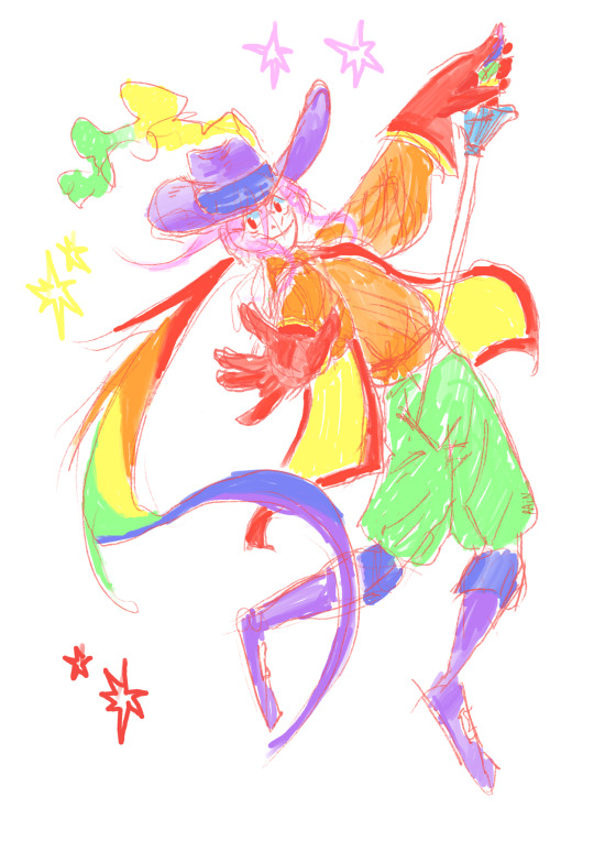
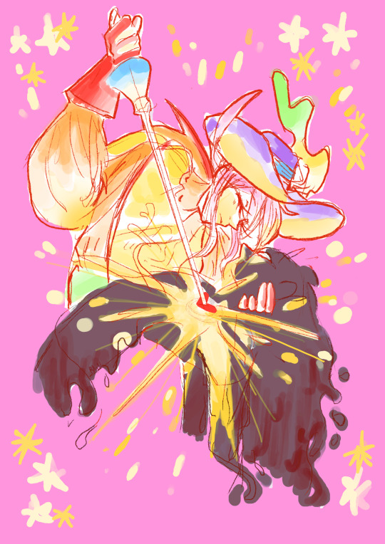
Wanted to scribble them a bit more in their everyday look/university uniforms ! each year has a different uniform color and they follow each other in a rainbow gradient order until year 8, year 9 and 10 students wearing all white and all black uniforms. (yknow like black belts and white whistles are for highest grades in martial arts/ made in abyss) Also added my main boy's rival ! He's really mad that Gloire gets to go on missions already and not him despite being as good as him at fencing ! Musketeers help the hearts in distress, an both may be good at swordfighting and dumb but Az is emotionally dumb which is why he cannot go on missions. (and usually very few to no first years can already go on official missions, which is quite normal, and there are emotional intelligence classes alongside fencing)
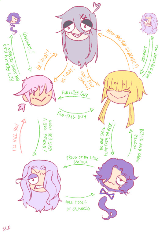
And relationships chart ofc ! I've always wanted to draw one with my own characters hehe. These are how it is between them in the beginning of the story. Idk if I should write their names or nah everytime, I'll add a link to the magical boys art specifically on my pinned post though ! (I'll do clean caracter sheets when I get the time to)
#magical boy#magical boy oc#original character#musketeer#messy sketches#Az is quite tall already and wears platforms because hell yeah cool shoes#long dumb noodle guy but somehow good with swords#lowkey inspired by mandy from totally spies but mix that with squalo from reborn#Aalis really does look like a rook hunt double but this was purely by accident#Gloire (lil main guy) was inspired by classicaloid mozart !#I'm not sure what I was inspired by or if I had any specific inspo for the brothers tho..#in a phase where i have a hard time concentrating on my art lately aahsdfhjk I'm really trying to get back on tracks#and ignore myself thinking what I'm doing looks bad#anyway hope the little lore dump is interesting !#raindr0p oc
85 notes
·
View notes