#Gimp vs Photoshop
Explore tagged Tumblr posts
Text
how i do my visual novel filtered photo backgrouds
ive had some questions about this so i figured i'd put together a quick post on my process and what goes into it.
this isnt really a tutorial and instead is just a ramble of how i do stuff with a ton of examples and pictures lol

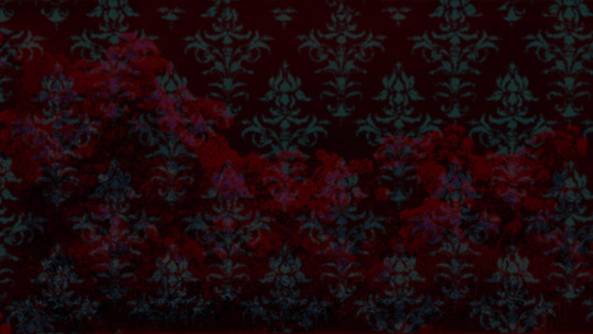
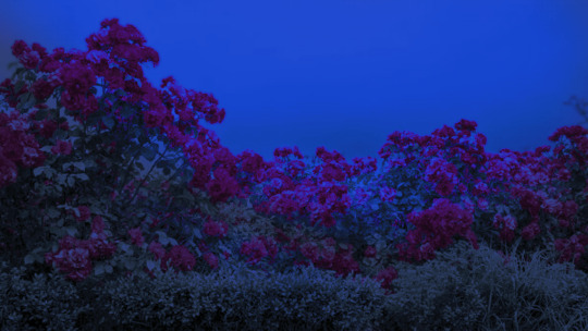
read more below. this is a long post and you probably want to be looking at these images on your computer instead of your phone
step one is that i find CC0 photos or otherwise easy licenses to use because I'm lazy and don't want to have a list of credits of random photographers caue i used one of their images but also i don't want to use stuff without crediting
because they have a general lincese that just wants you to mention the site i prefer unsplash or pixabay but there's other public domain type photo sites too obviously
so like okay heres a random picture

i have a photoshop CS5 from 10 years ago. but these can be done with gimp or krita and whatever. theres even photopea that has photoshop in the browser
basic stuff is that i start by cropping my bg into my renpy resolution (i use 1920x1080) this is also the part where sometimes i might rotate a bg. it is a good way to add some chaos vibes to a scene
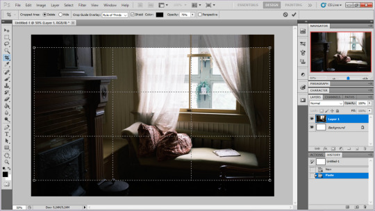
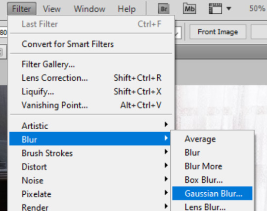
i tend to add some mild blur effect since i find that having too sharp photos as backgrounds clashes with the artstyle of my sprites. like just a couple pixels worth of blur tends to do it
the next part is called fuck around and find out

i like to play with the values to just get random results. hue/saturation for tinting the picture, messing with the curves to get some really sharp effects, or channel mixer to add more of a color
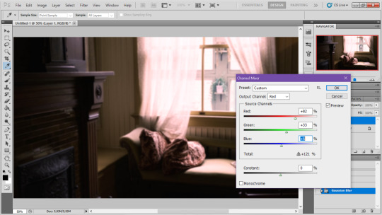
this part is just purely vibes based but i personally think reducing the colors of the background is the simplest way to create something that feels coherent. especially if you make backgrounds based on moods. like having a blue tinted bedroom vs a red tinted one really changes the atmosphere
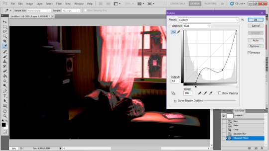
you can get some pretty intense effects but its always important to remember that its meant to be a background and there's a risk it distracts from the sprites
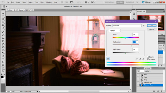
in this case im not including the effect for the curves. after the colours look fine the final step i tend to have is apply some sort of effect.

i really like changing the colour mode to indexed colour since i like crunchy pixels. (had to zoom in to 100% to show the actual effect) downside of indexed is that it doesn't look ideal unless its displayed in the exact resolution it was made in but i like it
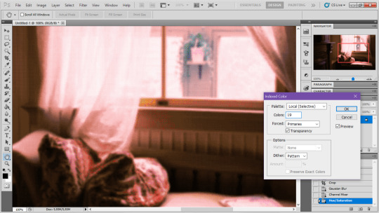
here is the images before indexed mode:

after indexed mode(i think you have to click the image and open it in full to see the actual effect):

another thing ive been playing with recently has been grain+chromatic aberration combo. it makes things feel surprisingly lively with just this simple thing so you'll probably see me overusing this effect in the future

you have to mess with the numbers to get the effect you want but for me these were the parameters I've been using
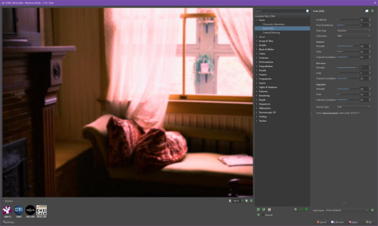

ignore the preview missing idk why it does that.
heres the image (the non indexed version) after these krita effects

one random special mention i have is that playing with layer blend modes is great
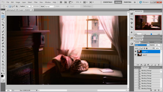
in this example i just copied the same background, mirrored it horizontally and set the layer blend mode to color and it lowered the layer opacity slightly. it just adds some.... idk what to call it visual noise? itj just fucks it up a bit. i used overlapping images and screen modes in some of the hopeless junction images i did for some pretty nice effects
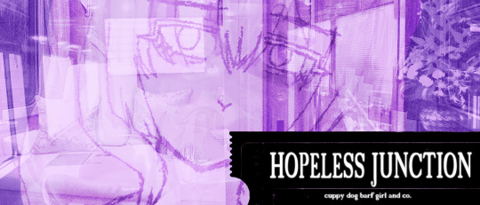
i dont really know waht the blend modes do i just scroll until something looks good lmao
theres a ton you can do with these. like for example just adding a single air brush dot of a bright color on a separate layer and setting it to some blend mode to add a tint to a background
i used these both in malmaid and in the second one i just brushed on some color on a separate layer to give it a moodier vibe


i think having variations of the same background is an extremely easy way to add some life to the bgs without having to do new stuff. like here was the hotel lobby when entering, and here is the hotel lobby when they ran away from the place. i added a radial blur with photoshop

i think theres some beaty in artifacts that come from low resolution images too. sometimes i intentionally use images that have clear compression artifacts cause i think it looks neat. i don't really worry about the details too much as the vibe is the most important thing
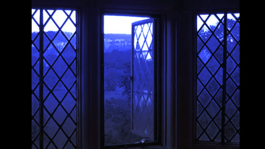
its honestly just a matter of knowing these tools exist and just fidgeting around with combinations to find what you want. it also helps to look at other backgrounds or images in general that you come across and just be curious. how was this done? how could i recreate it? that's the type of experimenting that has led me to these.
idk thats all i have to say. ty for reading and play malmaid on steam like and subscribe for more gay puppies

137 notes
·
View notes
Text

It's been a long time since I've drawn digitally. I've lost my touch quite a bit. Too long time without practising, and a new set up that I am not used to (new graphics tablet, new software (photoshop vs gimp painter).
I love Gallifrey landscape, really love this planet.
I draw little Theta and Koschei enjoying the dawn. I draw a little cat with them cos It was cute. Love their three shadow on the rock.
#doctor who#doctor who fanart#dw fanart#the master#koschei#the doctor#theta sigma#thoschei#gallifrey#this is gallifrey#digital illustration#my art
81 notes
·
View notes
Note
Would you be able to share some of your gif making process/programs you use to make them? They look great! 💕
Omg thank you,,, 🥺💕💖💕 And yes ofc! I'm going to write down everything I can think of about my gif making process but if I forget anything/you have questions about something specific let me know! ✨
(Long post ahead)
Emulators & Recording
I use different emulators and recording programs, depending on the game I want to play/record:
DesMuMe: This is the one I use for DS games, and it comes with a neat “Record AVI” feature under the “File” tab. Just click it, choose a location for the file and click OK (make sure the Compressor is set to “Full frames (No compression)”). Recordings have a limit of 2 minutes/2GB, but when it reaches it, the program will automatically create a new file and keep recording until it reaches 2 minutes, and the process will repeat (the next recordings will have “part_X” in the name file). When you’re done recording, just lick on File > Stop AVI. Also! The recordings will always have the original resolution. My DesMuMe is set to be 2x its size with a gap between the screens, but all recordings are 256x384 pixels with no gap.
VisualBoyAdvance: Like DesMuMe but for GBA games. Also has a recording feature in Tools > Record > Start AVI recording. The resolution of the video will be that of the original game but I think there’s no limit on how long the recording can be. I’d still recommend stopping and restarting the recording every 5 minutes or so.
Other games & OBS Studio: For 3DS games I use Citra, and Dolphin for Wii ones. They both have Recording features but I don’t use them because they create weird files. Instead, I record them with OBS Studio. Open the program, click on "Start Recording" and then on "Stop Recording" when you’re done. Pretty simple, just remember OBS records your screen so obviously if your emulator window is minimized it won’t record it. You can change your OBS settings to only record the emulator window but I’m too lazy to tinker with OBS so I just record the whole screen lol. There’s always a slight loss of quality with OBS. If you’re recording games with 3DS models then it won’t be too noticeable, but I do not recommend using OBS for pixel/pixelated games like Nintendo DS and Game Boy ones.
Misc: Before OBS, I used to use Camtasia Studio 8. Also does the trick, but instead of saving a .mp4 file it creates its own type of file and it requires you to manually export it as a .mp4 (it's a hassle). It has some editing features too, which OBS does not as far as I can tell. Also, besides DesMuMe I have MelonDS. Highly recommend it if you need to use the multiplayer option (to trade pokemons between games for example) and most importantly for the better mic feature (you WON’T get past the Nintendogs tutorial on DesMuMe). Also the 3D model graphics are of higher quality, but it doesn’t have a recording feature so you will have to rely on OBS and as I said it lowers the quality.
As for video file types, both .avi and .mp4 are allowed in Photoshop. However, .mkv (mostly used for TV shows and movie files) is not, so if you want to edit, say, an anime episode in that format you’ll need to convert it to .mp4. I use Format Factory for that, although I think here’s a slight quality loss.
Here's a comparison of a pixel game recorded with OBS vs with DesMuMe. It's tiny but it will have you shaking the screen violently when you notice it.
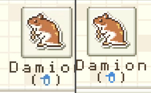
OBS recording vs. DesMuMe recording
Do not delete or move the video file until you’re done making gifs of it. Even if you save the file as a .psd, you will get an error message if the video file is gone from its original location and you'll have to start over again.
Editing (I)
I exclusively use Photoshop 2020. If you use CSP, GIMP or other editing program you’ll have to find the equivalent features or look at other tutorials, because I’m only familiar with Photoshop. Other PS versions should have either the same or similar features. Here are the steps I usually follow (names might be wrong because my PS is in Spanish “OTL):
Importing: Drag and drop your file into PS. You should have your Timeline window on the bottom part. If you import a .mp4 or .avi file you should get the Video Timeline, which is what we will work with. If you export a .gif you will get the Frame Animation Timeline; in that case you need to convert it to a single timeline. Click on “Convert to Timeline Video”, then select all the layers (click on Layer 1 and then hold Shift+Click on the last layer) and then right-click on the last layer > “Convert to Intelligent Object”. This is what your PS window should look like for both cases:
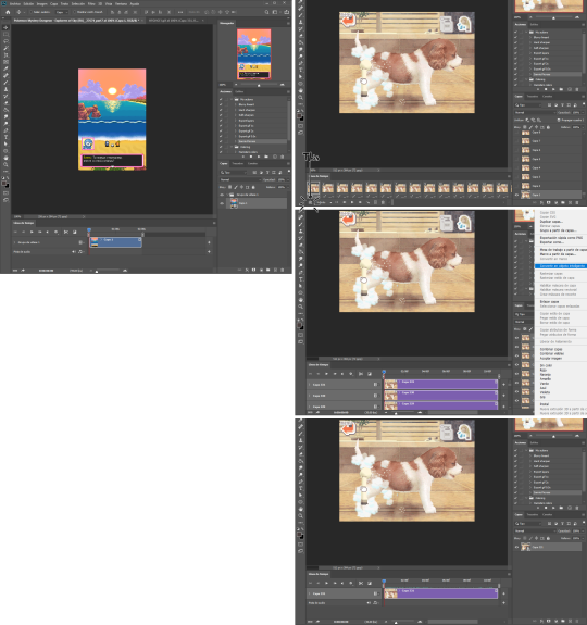
avi/mp4 file (has a Video Timeline) vs. gif file (has a Frame Animation Timeline)
Cutting and resizing: Often your file will either be the wrong size or have unnecessary parts. To resize your video, go to Image > Image Size (NOT Canvas size) and change the resolution. For good gif quality, the image resolution should always be 540 pixels wide (Tumblr’s image size), height doesn’t really matter. PS will change the height proportionally if you change the width. So, for example, a 1440x1080 video will be 540x405 after the conversion. Similarly, you can crop out parts with the Selection tool + Image > Crop. Making pixel games bigger requires a different method (more on this later).
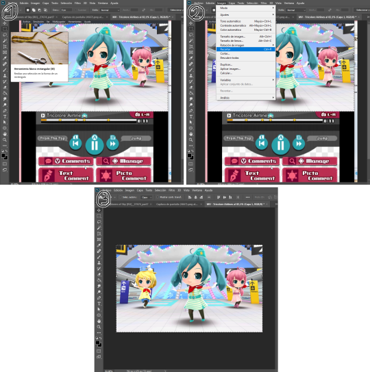
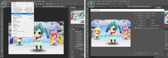
Cropping vs. Resizing
Cutting the timeline: Your gif will likely be too long, or you might need to stitch two parts together. In the Timeline window, move the vertical red line to the part where you want to make the cut. You can precisely move frame by frame with the arrows next to the play button. You can also zoom in and out the timeline with the slider at the bottom. Once you’ve placed the red line on the part where you want to make a cut, click on the scissors. You’ll get two layers – delete the one you don’t need and repeat until your gif is the right length. Similarly, you can click on either end of the timeline and drag it left and right to extend/reduce the length, but it’s less precise. I recommend moving the gif layer out of the video group in the Layer window, especially if you’re going to stitch parts together or add new layers that aren’t Color adjustment layers (like your watermark). If you do so, you’ll notice that each layer occupies a different line in the timeline, while if it’s in a group, it will all be in the same line (this means that all layers will be one after the other, you won’t be able to overlay them).
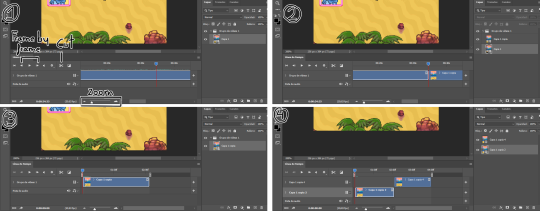
Cutting the timeline (1-3) + Moving the gif layer out of the video group (4)
Color adjustments: The fun part! You can get hella crazy with this one. If you want to go for really fancy stuff, I recommend checking out @/usergif, they have lots of tutorials and gifsets you can use as inspiration. I am however a simple man and will mostly use the same tools: Sharpen, Hue/Saturation, Gradient Map and Curves.
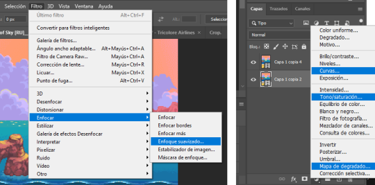
Soft sharpen in the Filters tab + Curves, Hue/Saturation and Gradient Map in the Layer window
Editing (II)
Can't make a bullet list of a bullet list so here's each adjustment layer explained. Note that this part is very personal so feel free to tinker with the settings for each tool until you get what you like:
Sharpen: Used only with non pixel media, aka for 3D models and series/movies. It makes the image look sharper. You'll notice that the video layer can have two icons: a movie film or a folded paper (in the "Import" section, the Pokémon gif has a movie film icon, while the converted Nintendogs gif has a folded paper icon). If your layer has the former, the sharpen tool will only be applied to one frame. To avoid that, right-click on the layer > Convert to intelligent object. Resizing the image will also do the trick. Filters are always applied to the layer, they don't create a new one (this is what the rest of the following adjustments will do). As for settings, this is what I usually have:
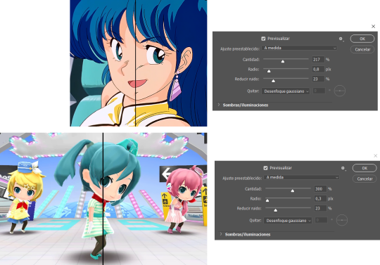
Two types of Sharpen settings (original on the left)
Hue/Saturation: Changes both the global colors and specific hues. To do the latter, open the menu right above all three sliders (by default it's set to "All") and then choose the color you want to change. Be careful! Sometimes you might accidentally edit the wrong hue, for ex a bluish green if you are editing blue hues. If you want to see what parts of the gif you're targeting, set the saturation to the max. Colors play a heavy role on gif size: the more diverse and brighter the color palette, the bigger the file. Gif size will be the ruin of your gif making process, so don't go too overboard with this. More on gif size later, but for now, I recommend "unifying" the color palette (aka making some hues similar).
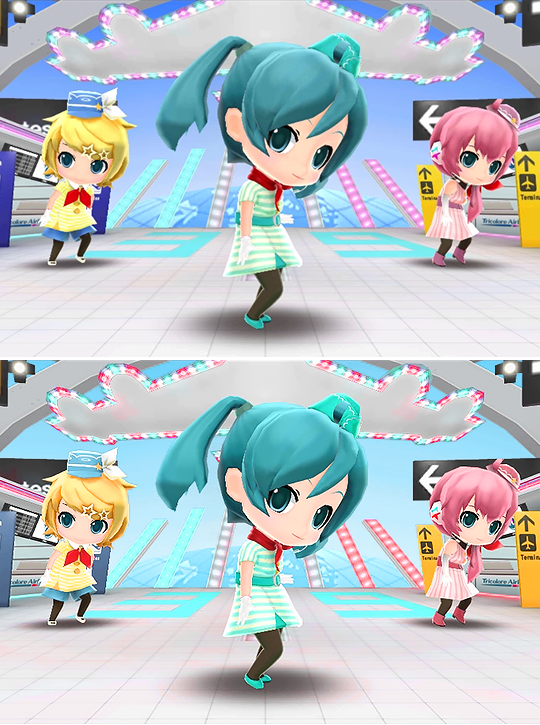
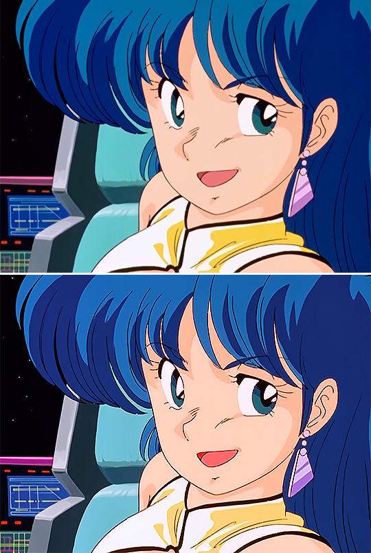
Two examples of Hue/Saturation adjustments (Original above)
Gradient map: Adds a gradient overlay to the image. When you open the Gradient Map window, click on the gradient and you'll be able to edit it or create a new one. To do so, click on the tiny boxes with colors (only the lower ones, the upper ones won't work), then on the slightly bigger box to change the hue. To add a color, click anywhere below the gradient; to move the colors around, drag the tiny boxes and move them, and to edit the limit between each hue, drag the tiny diamond. The way gradient maps work is by editing the colors from lighter (right) to darker (left). So if you have blue on the right of the gradient, light hues will be blue, and if you have pink on the left of the gradient, dark hues will be pink, with mid tones being a mix of pink and blue (either purple, or bluish purple or pinkish purple). The image will look weird when you add a gradient map, but don't mind that for now. Just create the gradient you want and click OK. Now, select the new layer that has been created and play with the blending modes and the opacity of the layer until you get something you like. For blending modes, I usually go for the ones in the second and third sections. To edit either the Hue/Saturation layer or the Gradient Map one, click on the black and white icons (left to the mask, aka the white box) in the Layer window.
Video showing how Gradient map works
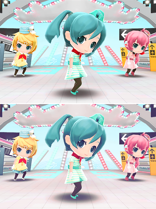

Two examples of Gradient maps, with a readjustment of the Hue/Saturation layer (Original above)
Curves: Edits the light, dark and mid tones. Click any point in the curve/line and then drag it around to see what it does. You can make more than one point in the curve. Afterwards, change the blending mode and the opacity.
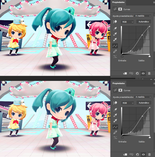
An example of a Curve and the same example with the Curves layer at 40%
Gaussian blur: Sometimes I add a blurry/fuzzy effect to certain gifs. To do so, duplicate the gif layer (right-click > Duplicate layer), then, while selecting the new layer, go to Filters > Gaussian blur and pick a small numer (0,4-1). Click OK, set the blending mode of the new layer to Darken and lower the opacity.
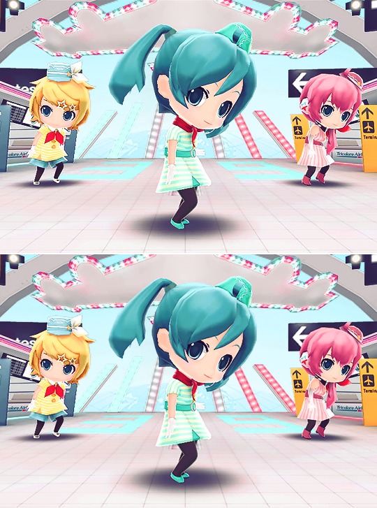
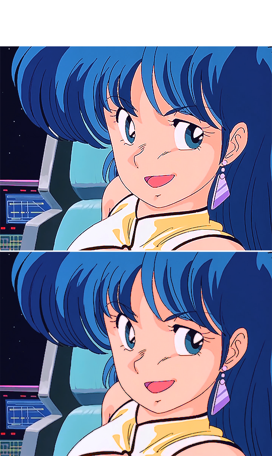
Two examples of images with Gaussian blur applied (Original above)
Watermark: Add a watermark to your image. Click on the Text tool, create a text box, pick the font, the size, the color and the placement, and then click the ✔ button. Change the blending mode and opacity of the text layer. Personally, I have a .png image of my watermark that I just import to the gif and then edit, instead of creating a text box everytime. Regarding watermarks, I get that they are annoying but it's going to be far more annoying when someone reposts your gif without credit or crops the watermark out. Tumblr sucks when it comes to reporting this kind of stuff and you deserve to have your work respected (you've spent time and effort on this!!), so I highly recommend putting a watermark on your gifs. If you want to avoid having someone crop it, put it towards the middle of the image and not in a place that can be edited easily. Also, I usually save gifs without a watermark and add it afterwards.
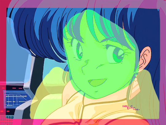
Red: Danger zone, can get cropped easily. Blue: Also Danger zone, can be edited out. Green: Too obtrusive. Yellow: Perfect place, can't be edited out and it's not on the main focus of the image
Exporting
This is the "hell on earth" part. To export a gif, go to File > Export > Save for Web (Legacy), then once it loads (may take some time), play the gif a couple of times to make sure it looks good and save it. These are my settings:
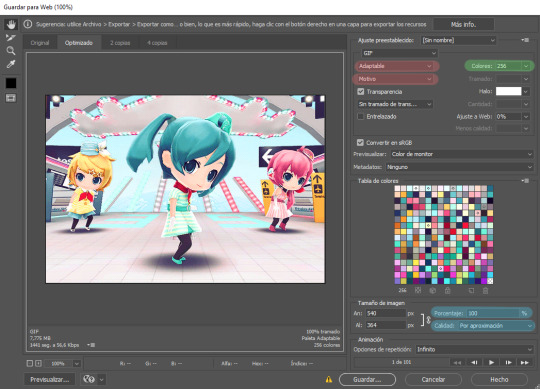
Settings for the Save for Web (Legacy). You'll only need to tinker with the settings on the right.
However, there's one thing to keep in mind: Tumblr has a size limit of 10MB per gif, meaning your gif won't be uploaded if it's larger than that, and you'll be surprised how easily you can surpass that limit. Also, gifs can't be longer than 500 frames, aka 8 seconds (to check the duration of your gif, zoom in in the Timeline Window, you can see the seconds at the top). Here are some pointers regarding gif size:
Pixel games and anime have a smaller size than life-action and 3D models: This is because the former have limited color palettes and the latter has way more colors. For example, Pokémon Mystery Dungeon or Sailor Moon will rarely pose problems, but Arcane, Breaking Bad, Nintendogs or Baldur's Gate 3 will.
The more complex the animation/motion, the bigger the size: This is because complex animations/motions, like a fight, have more unique frames than, say, someone moving their head up and down and nothing else, and that means there's more information to store.
The longer the gif/the bigger the resolution, the bigger the size: Kind of self-explanatory, longer gifs or gifs with big resolutions means more information stored in the file.
Bright and diverse color palettes increase the gif size: As explained in the first point, more colors means more information and thus a bigger file size.
The more it exceeds the limit, the bigger the changes you'll have to make: If it's 10.5MB you can get that number down easily. If it's like 20MB, you might need to cut the gif in half.
How do you solve this? There are a couple of methods:
Make the gif shorter: In the Timeline window, cut parts of your gif until it's short enough. If you don't want to delete certain parts, you can divide your gif in two separate ones.
Make the colors less bright/unify the color palette with an Hue/Saturation layer: If you haven't done this in the editing process and your gif exceeds 10MB, it's time to edit the gif colors.
Reduce the color palette: In the Save for Web (Legacy), you'll see that there's "Colors: 256" on the left (marked in green in the screenshot). 256 is the max amount of colors you can have, but you can reduce it. PS will automatically get rid of colors that have a smaller presence first (for example, in the anime gif above, if I reduced the colors it would get rid of the reds and magentas before the yellows or the blues).
Change the settings in the Save for Web (Legacy) window: Besides the color palette, there's a setting on the right side, marked in red in the screenshot above (the first one). I have it set to "Adaptable", which is the highest setting, but you can change it to "Perceptual", "Selective" or "Restrictive". This will lower the quality and thus the size, but sometimes it might mess up the gif. Similarly, you can change the setting below that one (set to "Motive" in the screenshot) to "Noise", "Difusion" or none at all to change the quality and size.
Optimize the gif: I use ezgif.com for this. Click on "Optimizer", upload your gif, make the Compression level smaller, click on "Optimize" and then save your gif. This will inevitably lower the quality, so I usually don't go lower than 35. Also, try to get your gif right below the 10MB limit, so if a compression level of 20 gets your gif to 9.5MB but a 15 gets it down to 9.9MB, choose 15. ezgif also has other cool features like one to slow down your gif's speed, so check it out!
Don't make gifs of media that causes problems: If you regularly find yourself being frustrated with gifs of X media exceeding the size limit, you might need to find something else. It sucks to think that you might not be able to make gifs of your favourite piece of media, but gif making should be fun, not ruin your day. Of course, it's up to you to decide how much effort you're willing to put on a gif, but don't overexert yourself either.
The Save for Web (Legacy) window is also where you can make your gif bigger in the case of pixel/pixelated games like Pokémon Mystery Dungeon or Nintendogs. In the "Image Size" section, set the quality to "Nearest Neighbor" and the percentage to 200% to double its size (it will be somewhat close to 540 pixels wide). You can make the gif three, four or even more times its size wih this method.
Closing thoughts and results
Managing a gif blog would require a whole new post with some advice so I'll leave that out for now. There are other things I've also left out like actions (highly recommend learning about them) but these are the basics methinks. Again, if you have any questions, my ask box is open ✨
And here are the gifs with a comparison to the original 🎉
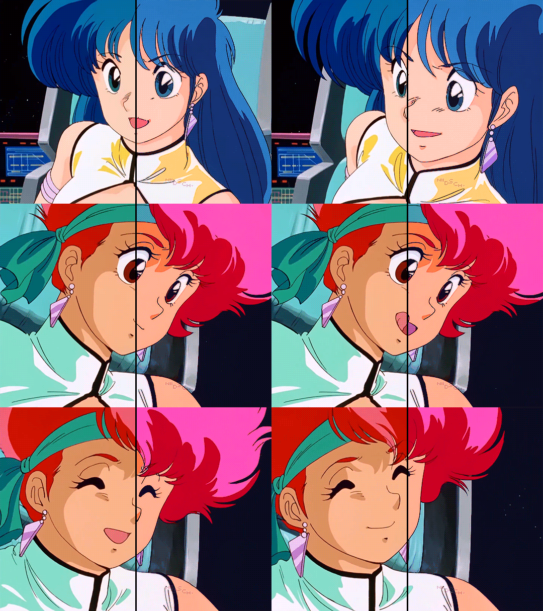
Sharpen, Hue/Saturation, Gradient map and Gaussian blur

Sharpen, Hue/Saturation, Gradient map, Curves and Gaussian blur
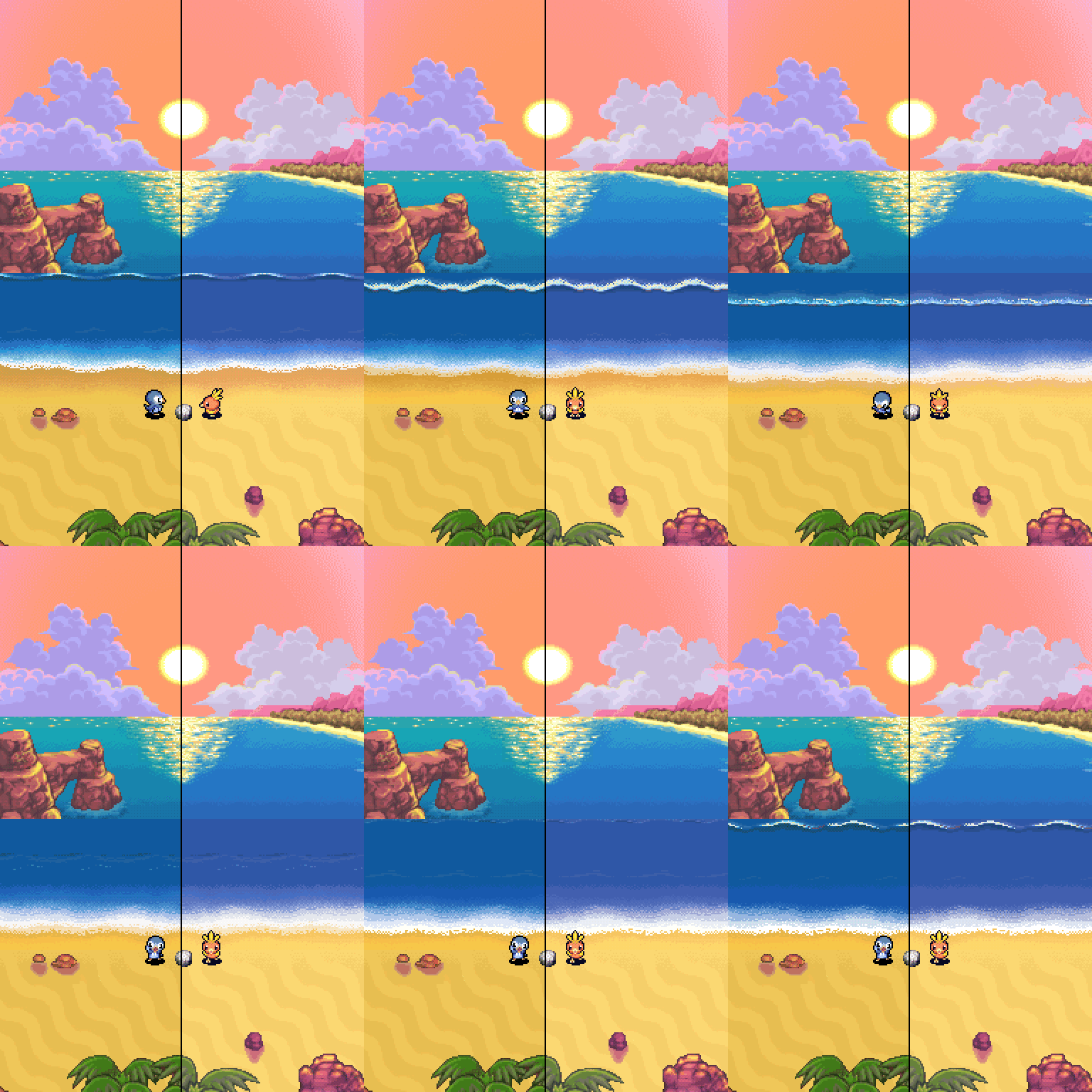
Hue/Saturation and Gradient Map
#ysiposting#whew this took a while#now if you'll excuse me I'm going back to studying for exams. regrettably
23 notes
·
View notes
Text
anyone else find that post talking abt adobe vs gimp and being like 'gimp is a bad replacement for photoshop, we're gonna keep using adobe and block its bad features bc gimp sucks hee hee!'
GIMP AND PHOTOSHOP ARENT THE ONLY TWO ART PROGRAMS THAT EXSIST WHAT ARE YOU TALKING ABOUT. stop sucking adobes dick and download firealpaca!!!
#so irritating#they genuinely worded it like gimp and photoshop are the only two art programs that exsist
39 notes
·
View notes
Note
Hello Shasta, thank you so much for linking Rudhira's post but I think they didn't do Cluedo woods only Cluedo colors? Do you have a tutorial somewhere on how to recolor stuff in your Cluedo woods? Sorry for being so annoying about this but I'm pretty obsessed with your stuff lol. Thank you <3
Hello and thank you for the compliment!
Here's a tutorial for basic recolors using GIMP at Sims2Artists. If you're using Photoshop, I'm no help. @poppet-sims might have written one, not sure.
Recoloring vs. Retexturing For recolors (using the tutorial linked above) you're using EA's original textures and shading for the chair, layered on top of a solid color you've chosen. For retextures (e.g. using a cluedo wood on the Hemnes bed), you have to figure out which part of the TXTR needs the wood grain running vertically and which needs the wood grain running horizontally. If you're new to retexturing, EA original ts2 meshes are not easy (welcome to hell!)


For the Hemnes bed TXTR, I used EA's white texture (top) for my shading layer. When I did the pirate wood retexture (bottom), I probably guessed correctly where the wood grain was vertical and where it was horizontal but I'm sure there was LOTS and LOTS of fiddling too (but I can be a perfectionist). Because of EA's sadistic mapping, using textures with a distinctly noticeable grain (like wide stripey Cluedo woods) could be be extra frustrating.
Best wishes and good luck, I feel like I'm sending you off into battle

12 notes
·
View notes
Note
Hi there! You might not know the answer to this but I wanted to ask because you have such good CAS screenshots. Do you have any tips/methods for editing screenshots to look better when someone doesn't have ReShade/Gshade, or know of any other sources that could help? I tried it out but my laptop just couldn't handle it and it made the game move like molasses :/ I don't mind the vanilla shading in gameplay but I still wanna make my CAS screenshots look good— do you think that's doable without shaders or is there not really a photo editing route to get the same effect(s)? I have a CAS lighting replacement, just not shaders anymore.
CAS lighting replacements are for sure a good place to start! Past that it's really just a matter of editing in post. Photopea is essentially a free version of Photoshop; that's probably my #1 editing program suggestion. (There's also GIMP, which I don't love quite as much, but it's really up to personal preference.) It may not 100% replicate the effect you'd get with ReShade, but you can certainly play around with settings/effects and see what sticks. I typically adjust contrast & sharpness first, then maybe vibrance or color saturation.
If you're using Photopea you can also utilize Actions, which are helpful because they'll do the work for you in one click. (You can use Photoshop actions as well, but you'll have to tinker with them as they sometimes won't translate 100% in Photopea.) You can download actions free from a few different sources, but I got the ones below off DeviantArt.
Unedited photo vs. with different actions applied:


It takes a little playing around to get a feel for it, but I think that'd be your best bet.
22 notes
·
View notes
Text
I've been seeing a lot of simblr aethestic X authenticity posts today and find the whole discussion super interesting, as it goes into topics such as art/storytelling, commodification, and consumerism.
I haven't seen it discussed enough, but the way Tumblr handles notes is also hugely to blame in this whole popularity vs authenticity thing.
I was surprised to find out that on Tumblr "notes"/likes are considered kind of worthless as far as boosting a post's visibility. Apparently they do nothing to promote posts. Presumably, any poster's aim should be to get those coveted reblogs. According to this model the onus of a simblr's survivability is on whether or not people find your content not only enjoyable, which they may reward with a perfectly awesome note, but worthy of taking up space on their own simblrs: that's where I think some really interesting thinking is happening as people ponder what they deem deserving of a reblog.
I haven't had my simblr all that long, but I'm already seeing so many of my mutuals--many of whom were new to the platform as well--either quit or express frustration over all the time they put into their creations only to be met with silence. I find this platform very unforgiving to folks who are starting out, who just want to share their content and don't use Reshade/GShade or Photoshop/Gimp, etc. I find that people often feel the need to be choosy with reblogs because catching people's attention has to be such a calculated maneuver in order to become recognizable and unique (brandiiing!) or to maintain a balance between supporting friends and promoting their own content. Not wanting to engage in that hustle may mean settling for a smaller (but perhaps more constant) circle of people that interacts with their content (even if that might be more satisfying and pleasant on a personal level).
But here's the rub--it shouldn't matter. However folks choose to engage (or not) with content, create (or not!) a pixelated empire on social media, or simply have their stuff acknowledged and encouraged, much of the angst could be resolved if the Tumblr algorithm would boost a post's visibility based on notes AS WELL as reblogs. I think a lot more folks would be more generous with notes- it's really only just a simple click- as opposed to agonizing as to whether or not someone else's content fits on your page or other reasons crossing people's minds.
(Just my thoughts on one angle of a more complex discussion--feel free to add yours; just don't be an asshat about it).
13 notes
·
View notes
Note
Does the program matter? Big artists I see all use csp and photoshop, or sai. Art programs are expensive, sales don't always come up :(
Sorry I took a bit to answer this it got lost in the Box
No not at all, absolutely not whatsoever, and anyone who tells you otherwise is a sack a shit Sure, some programs have features that a different one doesn't have. But that's how literally everything is, someone else is always gonna have something different. And sure everyone says just pirate it too. But why bother when completely free, perfectly good, easily accessible, open source programs are right there? Plus I have separate thoughts on the photoshop obsession
The only thing you miss out on using a free program is the little bragging rights "I'm a better artist cause I use gimp" tag. The program doesn't make the art, you do! Use whichever program you like the best! Try different methods, use different tablets, go mobile vs laptop/desktop, draw traditional then scan it and do it again digitally, the art world is yours to do what you like with my friend
#sorry i hate art snobs LOL#the only thing they do is bring others down and make getting into art hard for new artists#you can use whatever program you want! but it truly doesnt matter which it is#what matters is whether you like it and whether it works good for your device and that's it#please for the love of whatever you believe stay away from deviant art as a budding artist#sunflower asks#art advice#lol#funny enough my first two programs were gimp and then sai#i had a digital arts class in 10th grade when i was in online school. we used gimp. then i moved to sai free trial#i hated it. then i got fire alpaca! and now my life and art is amazing!
10 notes
·
View notes
Text
Transforming Images into Icons: Mastering Vector Conversion Techniques
Icons customized and unique: Common Queries Answered
1.What software is used to make icons?
To design vector icons, follow these steps:
1. **Sketch ideas**: Start with rough sketches on paper or digitally.
2. **Choose software**: Use vector graphic software like Adobe Illustrator or Inkscape.
3. **Create shapes**: Use basic shapes to build your icon.
4. **Simplify**: Keep designs simple and recognizable.
5. **Test sizes**: Ensure clarity at various sizes.
6. **Export**: Save in vector formats like SVG or AI.
2. How to design vector icons?
To design vector icons, start by sketching ideas on paper or digitally. Use vector graphic software like Adobe Illustrator or Inkscape to create clean shapes with the Pen tool. Keep designs simple and scalable, using limited colors and clear lines. Ensure consistency in style and size. Export icons in SVG or AI format for versatility and use.
3. How to create a PNG icon?
To create a PNG icon, use graphic design software like Adobe Illustrator or free tools like GIMP or Inkscape. Design your icon with the desired dimensions, ensuring it has a transparent background if needed. Once completed, export or save the file as a PNG format. Adjust settings for quality and resolution as required.
4. How do I turn an image into an icon?
To turn an image into an icon, follow these steps:
1. **Choose Your Image**: Select a clear, simple image.
2. **Resize**: Use an image editing tool (like Photoshop or GIMP) to resize the image to typical icon dimensions (e.g., 16x16, 32x32, or 64x64 pixels).
3. **Format**: Save it in icon format (.ico) or PNG for transparency.
4. **Edit**: Optionally, simplify the image and enhance contrast for better visibility at small sizes.
5. **Use an Icon Generator**: Online tools (like ConvertICO) can convert images to icon files easily
5. What file type are icons?
To create a PNG icon, use graphic design software like Adobe Illustrator, Photoshop, or free tools like GIMP or Canva. Start by designing your icon, then ensure the background is transparent. Export or save the file as a PNG format. Adjust the size and resolution as needed for your intended use.

Visit: VS Website See: VS Portfolio
0 notes
Text
Top Tools for Creating Stunning Cover Art for Apple Music
Creating professional cover art for Apple Music doesn’t require a huge budget or extensive graphic design skills. With the right tools, you can produce visually appealing cover art that captures the essence of your music and attracts listeners. This article explores some of the best tools available for designing stunning cover art, whether you’re a novice or an experienced designer.
1. Free vs. Paid Tools: Understanding the difference between free and paid tools can help you choose the best option for your needs.
Free Tools: These are ideal for beginners or those on a tight budget. They offer basic features that are sufficient for creating simple yet effective designs. However, they might lack advanced functionalities.
Paid Tools: These provide a wide range of features and greater flexibility, suitable for more complex and professional designs. They often come with a learning curve but offer extensive tutorials and customer support.
2. Tool Reviews: Here’s a detailed look at some popular design tools, highlighting their features and benefits.
Adobe Photoshop:
Features: Photoshop is the industry standard for graphic design, offering a vast array of tools for photo editing, digital painting, and compositing.
Pros: Highly versatile, supports numerous file formats, extensive online tutorials, and community support.
Cons: Can be overwhelming for beginners, requires a subscription.
Canva:
Features: Canva is a user-friendly online tool that provides templates specifically for cover art. It includes a drag-and-drop interface, a wide range of fonts, and access to millions of images.
Pros: Easy to use, great for beginners, free plan available with many features, vast template library.
Cons: Limited advanced design capabilities compared to Photoshop.
GIMP (GNU Image Manipulation Program):
Features: GIMP is a free, open-source alternative to Photoshop. It offers many advanced features, including layer editing, photo retouching, and digital painting.
Pros: Completely free, powerful features, supports various plugins.
Cons: Less intuitive than paid tools, fewer tutorials available.
Adobe Spark:
Features: Adobe Spark allows users to create stunning graphics with ease. It offers a variety of templates, fonts, and design elements tailored for cover art.
Pros: Easy to use, integrated with Adobe Creative Cloud, suitable for quick projects.
Cons: Limited customization options compared to Photoshop.
Fotor:
Features: Fotor is an online photo editor and design maker that offers a simple interface and a variety of tools for creating cover art.
Pros: Easy to use, offers basic editing tools, free plan available.
Cons: Limited advanced features, some functionalities behind a paywall.
3. User-Friendly Features: When selecting a tool, look for features that make the design process easier, especially if you’re new to graphic design.
Templates: Pre-designed templates can save time and provide a starting point for your cover art.
Drag-and-Drop Interface: A user-friendly interface allows you to easily add and arrange elements.
Tutorials and Support: Access to tutorials, forums, and customer support can help you overcome challenges.
Customization: The ability to customize templates and elements ensures your cover art is unique and reflects your music’s identity.
4. DIY vs. Professional Design: Deciding between designing your cover art yourself (DIY) or hiring a professional designer depends on several factors.
DIY Benefits: Cost-effective, allows for personal creativity and control, various tools available to simplify the process.
Professional Design Benefits: Access to expert skills, can save time, ensures a polished and high-quality result.
When to Choose DIY: If you have a clear vision and are comfortable with basic design tools, DIY can be a rewarding option.
When to Hire a Professional: If you need a complex design or lack the time and skills to create it yourself, hiring a professional can be more effective.
5. Tutorials and Resources: Access to tutorials and resources can significantly enhance your design skills and help you make the most of your chosen tools.
Online Tutorials: Websites like YouTube, Skillshare, and Udemy offer numerous tutorials on cover art design.
Community Forums: Join forums and social media groups where you can ask questions and share tips with other designers.
Official Tool Resources: Many design tools have official resources, including tutorials, blogs, and user guides.
Conclusion: Using the right tools can simplify the process of creating cover art on Apple Music, ensuring your music stands out on Apple Music. Whether you choose a free tool for simple designs or invest in a paid tool for more advanced features, the options available today make it possible for anyone to create stunning cover art.
0 notes
Text
Compressing Images for the Web: Maintaining Quality While Saving Bandwidth in Affordable Design for Sydney
In Sydney's competitive digital landscape, small and medium-sized businesses (SMBs) understand the importance of a strong online presence. A visually appealing website is key to grabbing attention and engaging visitors. However, large, unoptimized images can slow down website loading times, leading to frustrated users and lost conversions. This is where image compression for the web comes in.
Affordable web design in Sydney doesn't have to compromise on image quality. By implementing smart image compression techniques, you can maintain visually stunning content while keeping your website running smoothly. This not only improves user experience but also saves valuable bandwidth, a crucial factor for businesses on budget-friendly hosting plans.
Why Image Compression Matters for Your Sydney Business Website
Images are powerful tools for storytelling, showcasing products, and creating a visually engaging website. However, using uncompressed images can have a significant negative impact on your website's performance:
Slow Loading Times: Large image files take longer to load, leading to a frustrating user experience. Studies show that visitors are likely to abandon a website that takes more than 3 seconds to load.
Increased Bounce Rate: Slow loading times can significantly increase your bounce rate, the percentage of visitors who leave your website after viewing only one page. This translates to missed opportunities for conversions and sales.
Reduced SEO Ranking: Search engines prioritize websites that load quickly. Slow loading times due to large images can negatively impact your website's search engine ranking.
Higher Bandwidth Costs: Depending on your hosting plan, excessive image file sizes can lead to higher bandwidth usage and potentially higher hosting costs.
Image Compression Techniques for Affordable Web Design in Sydney
Fortunately, there are several image compression techniques you can employ to maintain image quality while significantly reducing file size:
Image Resizing: Reduce the physical dimensions of your images. This is particularly effective for large photos that don't require high resolution on a website.
Example: A product image displayed on a category page doesn't need to be the same size as the high-resolution version used for a detailed product page.
Image Format Optimization: Choose the most appropriate image format for your needs. Here are some common image formats and their uses:
JPEG (JPG): Best suited for photographs with a lot of color variations. Offers good compression but with some loss of quality at higher compression levels.
PNG: Preserves lossless quality but results in larger file sizes. Ideal for graphics with sharp lines and text or images requiring transparency.
WebP: A newer format offering superior compression with minimal quality loss. However, browser compatibility may be an issue for older versions.
Lossless Compression Techniques: These techniques reduce file size without sacrificing image quality. While not as dramatic as lossy compression techniques, they can still provide significant file size reductions.
Tools and Resources for Compressing Images for Your Affordable Sydney Website Design
There are numerous online tools and software programs available to help you compress images for the web. Here are a few popular options:
Free Online Tools: Several free online tools offer basic image compression functionality. These can be a quick and convenient option for occasional use. Canva: https://www.canva.com/ and TinyPNG: https://tinypng.com/ are two popular examples.
Image Editing Software: Most image editing software, such as Adobe Photoshop or GIMP (free, open-source alternative), offer built-in image compression options. These tools provide more control over the compression process and allow you to choose the desired level of quality vs. file size.
WordPress Plugins (if applicable): If your website is built on WordPress, there are several plugins available that can automatically compress images during upload. This is a convenient option for ongoing image management.
Finding the Right Balance Between Quality and Compression for Your Affordable Sydney Web Design
The ideal compression level depends on the specific image and its intended use on your website. Here are some general guidelines:
High-impact Images (Hero Images, Product Photos): Maintain a higher quality for these visually-critical images.
Thumbnails, Gallery Images: Use a more aggressive compression level for these images, as slight quality loss will be less noticeable.
Icons, Logos: Prioritize lossless compression to preserve sharpness and clarity.
Test and Monitor Results
Always test the compressed versions of your images to ensure acceptable quality. Several online tools allow you to compare the original and compressed image side-by-side. Ultimately, the best compression level is the one that achieves a good balance between visual quality and file size reduction while still meeting the needs of your website design.
Working with an Affordable Web Design Agency in Sydney and Image Optimization
Many affordable web design agencies in Sydney specialize in creating websites that are not only visually appealing but also optimized for performance. Look for agencies that:
Understand the importance of image compression: The agency should be well-versed in image optimization techniques and incorporate them into their design process.
Use image optimization tools: Many agencies utilize specialized tools and software to efficiently compress images while maintaining quality.
Provide ongoing support: Image optimization is an ongoing process, especially as new content is added to your website. Choose an agency that offers ongoing support to ensure your images remain optimized for performance.
Optimizing Other Web Assets for Affordable Design in Sydney
Image compression is just one piece of the puzzle when it comes to website performance optimization. Here are some additional tips for affordable web design in Sydney:
Minify code: Minification removes unnecessary characters and formatting from your website's code, resulting in smaller file sizes and faster loading times.
Enable browser caching: Caching allows browsers to store website elements locally, reducing the amount of data that needs to be downloaded on subsequent visits.
Choose a reliable web hosting provider: A reliable hosting provider with a robust infrastructure can significantly improve website loading times.
FAQs on Image Compression and Affordable Web Design in Sydney
What are the best tools for compressing images?
There's no single "best" tool. The ideal option depends on your needs and technical expertise. Free online tools like TinyPNG are convenient for occasional use, while image editing software like Photoshop offers more control. For ongoing image management on a WordPress website, plugins like Smush can be helpful.
How much image quality loss is acceptable?
There's no one-size-fits-all answer. Aim for a balance where the compressed image still looks visually appealing on your website. A slight loss in quality on less critical images like thumbnails is often a worthwhile trade-off for faster loading times.
Do I need to re-compress old images on my website?
Yes, it's beneficial to revisit existing images and re-compress them using updated techniques and tools. This can significantly improve your website's overall performance.
How can I measure the impact of image compression?
Several online tools like Google PageSpeed Insights (https://developers.google.com/speed/pagespeed/insights/) can analyze your website and offer recommendations for improvement, including image optimization. Tracking website performance metrics like loading times before and after image compression can also help you gauge the impact.
Conclusion
By implementing image compression techniques as part of your affordable web design strategy in Sydney, you can create a visually stunning website that loads quickly and delivers a positive user experience. Remember, a fast-loading website not only keeps visitors engaged but also improves your search engine ranking and potentially leads to increased conversions and sales. By considering these tips and working with a web design agency that prioritizes performance optimization, you can ensure your Sydney business website thrives in the competitive digital landscape.
affordable web design in adelaide affordable web design in melbourne
0 notes
Text
how to make a digital file for embroidery machine
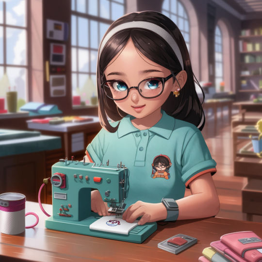
A Beginner's Guide to Creating Digital Files for Your Machine
The whirring of the machine, the dance of the needle, the vibrant colors coming together to form a stunning design - embroidery is a captivating art form. But before your machine stitches its magic, a digital roadmap needs to be created. This digital file, often called an embroidery file or an embroidery design, tells the machine exactly where to place each stitch and in what color. If you're new to the world of embroidery machines and want to create your own designs, this comprehensive guide will equip you with the knowledge and steps to transform your ideas into digital instructions. Buckle up, and let's dive into the fascinating world of embroidery digitizing! Understanding the Digitizing Process Embroidery digitizing is the process of converting an image or artwork into a format that an embroidery machine can understand. This format typically consists of vectors (lines and shapes) and stitch information (type, length, color). The digitizing software translates the image into these instructions, essentially creating a map for the needle to follow. There are two main approaches to digitizing: Manual Digitizing: This is the traditional method where a skilled digitizer uses specialized software to meticulously create the stitch instructions point-by-point. It requires a deep understanding of embroidery techniques, stitch types, and fabric properties. Automatic Digitizing: With advancements in software technology, some programs offer automatic digitizing tools. These tools can simplify the process for basic designs, but often require manual adjustments to achieve optimal results. For beginners, starting with automatic digitizing software can be a good option. However, as you progress, understanding the principles of manual digitizing will give you more control and flexibility in creating high-quality embroidery designs. Tools of the Trade: Embroidery Digitizing Software The heart of the digitizing process is the software. Several embroidery digitizing programs are available, catering to different skill levels and budgets. Here are some popular options to consider: Wilcom Embroidery Studio: A powerful and industry-standard software offering a comprehensive set of tools for manual digitizing. It comes with a steeper learning curve but is highly versatile. Hatch Embroidery: A user-friendly software with strong automatic digitizing features and a good balance of ease of use and functionality. Inkstitch (Free, Open-Source): A free and open-source software designed for vector art conversion into embroidery files. It's a good option for beginners or those comfortable with vector editing software. However, it may require more manual adjustments compared to paid options. When choosing software, consider factors like your budget, skill level, desired features (automatic vs. manual digitizing), and compatibility with your embroidery machine format (discussed later). Additional Software: Depending on your workflow, you might find other software helpful: Vector Editing Software (e.g., Adobe Illustrator, Inkscape): For creating or editing vector artwork before importing it into the digitizing software. Image Editing Software (e.g., Adobe Photoshop, GIMP): For preparing images for digitizing, such as reducing colors and cleaning up details. Preparing Your Design for Digitizing Before diving into the software, some prep work on your design can significantly improve the digitizing process and final embroidery outcome. Here's what to keep in mind: Design Choice: Embroidery machines excel at creating bold outlines and filled areas. Opt for designs with clear, well-defined shapes for optimal results. Avoid intricate details and small text, as they might not translate well into stitches. Image Format: Embroidery software typically works with vector formats like DST, EXP, PES, etc. If you're working with an image (e.g., JPG, PNG), you might need to convert it to a vector format using image editing or vector editing software. There are also online tools that offer basic image-to-vector conversion, but the results may require further refinement. Color Reduction: Embroidery machines typically have a limited number of threads (usually up to 15-20). If your design has many colors, you might need to reduce the color palette to match your machine's capabilities. Software tools can help with color reduction, but it's also a good idea to experiment and choose colors that complement each other well. Step-by-Step Guide to Digitizing with Embroidery Software 1. Import Your Design: Open your chosen embroidery digitizing software and import your prepared design (vector or converted image). The software might offer different import options depending on the file format. 2. Define the Embroidery Area (Hoop Size): Embroidery hoops come in various sizes, limiting the size of your design. Specify the hoop size you plan to use for embroidery to ensure your design fits within the designated area. 3. Underlay : An underlay is a layer of stitches placed beneath the main design elements. It helps stabilize the fabric and prevent puckering, especially for delicate fabrics or designs with dense stitch fills. Some software offers automatic underlay generation, while others allow for manual customization of underlay stitch type, density, and placement. 4. Digitizing Objects: This is where the magic happens! Here's a breakdown of the digitizing process for different design elements: Outlines ( (satin stitch) or (back stitch)): For outlines, you'll define the path the needle will follow using satin stitch (for a smooth, filled look) or back stitch (for a more defined edge). Fill Areas ( (satin stitch) or ((tatami stitch)): For areas of solid color, you'll choose a fill stitch type like satin stitch (for a smooth, dense fill) or tatami stitch (for a textured fill). The software will automatically generate fill patterns based on your chosen stitch type and density settings. Text: Digitizing text requires careful attention to detail. Some software offers automatic text conversion tools, but you might need to adjust stitch types, sizes, and spacing for optimal results. 5. Defining Stitch Parameters: Once you've outlined and filled your design elements, you can refine the stitch properties for each area. Here are some key parameters to adjust: Stitch Type: Choose the most appropriate stitch type for each element based on desired texture and effect (e.g., satin stitch for smooth fills, bean stitch for textured fills). Stitch Density: This determines how close the stitches are placed. Denser stitches create a more solid look but take longer to embroider. Experiment to find a balance between coverage and stitch count. Stitch Length: This controls the individual stitch size. Shorter stitches provide more detail but increase stitch count. Longer stitches can save time but might not capture intricate details as well. Thread Color: Assign thread colors to each digitized element based on your chosen color palette. 6. Editing and Cleanup: After defining the stitch parameters, it's crucial to review your work and make any necessary adjustments. Here are some things to look for: Jump Stitches: These are non-essential stitches used to move the needle between disconnected areas. Minimize jump stitches to prevent thread breaks and improve embroidery quality. Overlapping Stitches: Ensure stitches don't overlap unintentionally, as this can create unwanted bulk in the finished embroidery. Smoothness of Curves: Review how well the digitized outlines follow the curves of your design. Refine anchor points or adjust stitch density if needed to achieve smooth curves. 7. Test & Save: Once you're satisfied with your digitized design, it's wise to create a test stitch-out on a scrap piece of fabric similar to your final project fabric. This allows you to verify the stitch quality, identify any errors, and make adjustments before embroidering on your final project. Finally, save your embroidery file in a format compatible with your embroidery machine. Most software allows exporting to various file formats like DST, EXP, PES, etc. Consult your machine's manual for the specific format it requires. Additional Tips for Beginners Start Simple: Begin with basic designs that don't have excessive details or complex color variations. As you gain experience, you can tackle more intricate designs. Practice Makes Perfect: The more you digitize, the better you'll understand the software and the nuances of embroidery techniques. Experiment with different stitch types and settings to see how they affect the final outcome. Online Resources: There are many online tutorials, forums, and communities dedicated to embroidery digitizing. Utilize these resources for additional learning and troubleshooting. Consider Digitizing Services: If you find the digitizing process overwhelming, there are professional digitizing services available. They can create embroidery files based on your artwork for a fee. With dedication and practice, you'll be well on your way to creating stunning embroidery designs from your own digital artwork. Remember, the journey of digitizing is as rewarding as the finished embroidered product. So, unleash your creativity, explore the possibilities, and happy stitching! Read the full article
0 notes
Text
Effortless Raster to Vector Transformation: A Comprehensive Guide
Raster to vector conversion is a transformative process in graphic design, revolutionizing the way images are created and manipulated. Converting raster images, composed of pixels, into vector graphics built on mathematical equations offers scalability and versatility. However, the conversion process often poses challenges. This comprehensive guide unveils the secrets of effortlessly transforming raster to vector, offering a step-by-step approach for impeccable results.
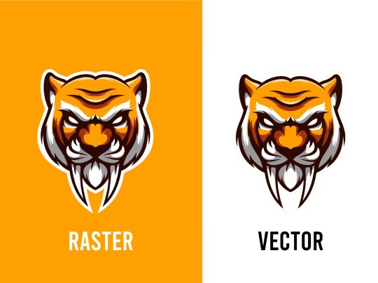
Understanding Raster and Vector Graphics
Raster graphics are composed of pixels, forming a grid where each pixel carries colour information. Common formats include JPEG, PNG, and GIF. Enlarging them can lead to a loss of quality due to pixelation.
Vector graphics, on the other hand, are based on mathematical equations, using points, lines, and curves to create shapes and patterns. They're scalable without losing quality, ideal for logos and illustrations. Formats like SVG store vector graphics, allowing easy scaling without compromising quality.
In essence, raster graphics excel in complex images like photographs, while vectors are better for clean, scalable designs. Understanding their differences helps in choosing the right format for specific needs, whether it's web design, printing, or digital art.
Choosing the Right Software
Assess Specific Needs: Identify your organisation's unique requirements and functionalities. Consider factors like scalability, user-friendliness, and compatibility with existing systems.
Research and Compare: Explore available options thoroughly, comparing features, customer reviews, and pricing models. Look for software that aligns closely with your needs and offers flexibility for future growth.
Vendor Reputation and Support: Investigate the vendor's reputation for reliability, customer service, and ongoing support. Ensure they offer regular updates, maintenance, and responsive assistance.
Scalability and Integration: Choose software that can scale alongside your business and seamlessly integrate with other tools or systems you currently use to avoid compatibility issues.
Cost vs. Value: Consider the total cost of ownership, including licensing, implementation, training, and potential future expenses. Balance this against the value and ROI the software promises to deliver.
Preparation: Cleaning Raster Images
Assess Image Quality: Begin by evaluating the raster image for imperfections, blurriness, or artifacts that may impact its clarity.
Backup Original: Prior to cleaning, make a duplicate or backup of the original raster image to avoid accidental loss or damage.
Use Image Editing Software: Utilize specialized software like Adobe Photoshop or GIMP to perform cleaning tasks such as spot healing, clone stamping, or noise reduction.
Address Specific Issues: Focus on specific areas needing improvement, like removing dust spots, correcting color balance, or enhancing details without compromising the original quality.
Save in Appropriate Format: Once cleaning is completed, save the cleaned raster image in a suitable format (JPEG, PNG, TIFF) to maintain quality and usability for future purposes.
Conversion Techniques
Compelling Call-to-Action (CTA): Craft persuasive CTAs that encourage immediate action, using clear and enticing language to prompt conversions.
A/B Testing: Implement systematic testing of various elements (such as headlines, colors, or layouts) to analyze and optimize the most effective combination for driving conversions.
Simplified Forms: Streamline and simplify conversion forms by reducing unnecessary fields, making the process effortless for users, thereby increasing completion rates.
Persuasive Copywriting: Employ persuasive and concise copy that addresses customer pain points, highlights benefits, and fosters a sense of urgency to encourage conversions.
Visual Content Optimization: Utilize high-quality images, videos, and infographics strategically placed to visually guide users towards conversion points, enhancing engagement and conversion rates.
Manual Tracing: Precision at Your Fingertips
Manual tracing is the meticulous art of precision, placing control directly in your hands to craft with finesse and accuracy. Its essence lies in the intimate connection between creator and creation, where every stroke and curve is a deliberate choice, a testament to expertise and dedication. Like a conductor leading an orchestra, manual tracing empowers you to navigate complexities, capturing intricate details with finesse and grace. It's the embodiment of craftsmanship, offering a tactile experience that transcends digital boundaries. With each deliberate movement, it grants you unparalleled control, transforming a blank canvas into a masterpiece. Manual tracing is the symphony of precision at your fingertips, where creativity harmonises with meticulousness to produce exceptional, finely crafted results.
Automated Tracing: Streamlining the Process
Efficiency Boost: Automated tracing expedites workflows by eliminating manual steps, reducing human error, and enhancing overall efficiency.
Accuracy Improvement: Advanced algorithms ensure precise tracing, minimizing inaccuracies often associated with manual processes and ensuring reliable results.
Time-Saving Solution: Automation significantly reduces the time required for tracing tasks, allowing for quicker turnaround times and faster decision-making.
Scalability Advantage: Automated tracing systems can easily scale to handle larger volumes of data or complex tracing requirements without compromising quality or speed.
Enhanced Analysis Capabilities: By automating tracing, organizations gain the ability to conduct in-depth analyses, uncover patterns, and derive valuable insights from traced data, driving informed decision-making and strategic planning.
Refinement and Optimization
Refinement and Optimization encapsulate the iterative process of improving, enhancing, and perfecting systems, processes, or ideas. Refinement involves fine-tuning existing elements, eliminating inefficiencies, and enhancing functionality. It's about scrutinising details, seeking better solutions, and polishing existing structures to achieve higher standards. Optimization focuses on maximising efficiency, effectiveness, and performance. It involves streamlining processes, leveraging resources effectively, and achieving the best possible outcomes. Both concepts synergistically drive progress by continuously evaluating, adjusting, and enhancing to meet evolving needs and standards. This cyclic pursuit of perfection fosters innovation, fosters growth, and ensures sustained excellence in various domains from technology and business strategies to personal development.
Saving and Exporting
File Formats: Choose appropriate file formats for exporting, ensuring compatibility and quality preservation. Consider formats like PDF for documents, JPEG/PNG for images, and MP4 for videos.
Regular Backups: Implement a routine backup schedule to safeguard your data. Use cloud storage, external drives, or dedicated backup software to secure information in case of system failures or data loss.
Version Control: Maintain multiple versions of your work. Versioning helps track changes, revert to previous iterations, and avoid accidental loss of crucial information.
Optimized Settings: When exporting, adjust settings for file size, resolution, and quality. Opt for compression or resolution adjustments to balance size and quality, especially for large files.
Metadata and Organization: Embed relevant metadata and organize files systematically. Proper labeling, tagging, and folder structures streamline retrieval and maintain clarity across exports.
Conclusion
Effortless raster to vector transformation is a skill that combines technical prowess with artistic finesse. Understanding the nuances between raster and vector graphics, selecting suitable software, meticulous preparation, choosing the right conversion method, and refining the output are pivotal steps in achieving impeccable results. Embrace the versatility and scalability of vector graphics, transcending the limitations of raster images, to unlock endless creative possibilities in graphic design. With practice and perseverance, mastering raster to vector conversion becomes a gateway to unparalleled design precision and flexibility.
0 notes
Text
What are the tools used to design and develop website?
Designing and developing a website involves a variety of tools and technologies. The choice of tools can depend on your specific requirements and preferences. Here's a list of common tools and technologies used in website design and development:
1.Text Editors and Integrated Development Environments (IDEs):
·Sublime Text
·Visual Studio Code
·Atom
·Adobe Dreamweaver (IDE with WYSIWYG editor)
2.Version Control Systems:
·Git
·GitHub, GitLab, Bitbucket (for hosting and collaboration)
3.Web Browsers:
·Google Chrome
·Mozilla Firefox
·Microsoft Edge
·Safari
4.HTML/CSS Frameworks:
·Bootstrap
·Foundation
·Bulma
·Materialize
5.JavaScript Libraries and Frameworks:
·jQuery
·React
·Angular
·Vue.js
6.Graphic Design and Image Editing:
·Adobe Photoshop
·Adobe Illustrator
·Sketch
·GIMP (open-source alternative)
7.Wireframing and Prototyping Tools:
·Adobe XD
·Sketch
·Figma
·nVision
8.Content Management Systems (CMS):
·WordPress
·Joomla
·Drupal
·Magento (for e-commerce)
9.Web Development Languages:
·HTML (Hypertext Markup Language)
·CSS (Cascading Style Sheets)
·JavaScript
·PHP, Python, Ruby (for server-side scripting)
10.Databases:
·MySQL
·PostgreSQL
·MongoDB (NoSQL)
·SQLite
11.Server Technologies:
·Apache
·Nginx
·Node.js
·Express.js (Node.js framework)
12.Hosting and Deployment:
·Amazon Web Services (AWS)
·Microsoft Azure
·Heroku
·cPanel (for shared hosting)
13.Responsive Design Testing:
·Browser developer tools
·Responsinator
·BrowserStack
14.Performance and Optimization Tools:
·Google PageSpeed Insights
·GTmetrix
·Pingdom
·WebPageTest
15.SEO Tools:
·Google Analytics
·Google Search Console
·Moz
·SEMrush
16.Accessibility Testing Tools:
·WAVE
·Axe
·Color Contrast Analyzer
17.Task Runners and Build Tools:
·Gulp
·Grunt
·Webpack
18.Code Editors for Frontend Development:
·VS Code
·Sublime Text
·Atom
19.Code Version Control and Collaboration Tools:
·Git and GitHub/GitLab/Bitbucket
·Trello, Jira, Asana (for project management)
20.Text and Image Editors for Content Creation:
·Microsoft Word, Google Docs (for text content)
·Adobe Photoshop, Canva (for image content)
These tools and technologies are just a starting point, and the specific tools you use will depend on your project's requirements, your team's preferences, and the technologies you are most comfortable with. Web development is a dynamic field, so staying up-to-date with the latest tools and trends is essential.
0 notes
Text


Hello and thank you for the very kind words! Hope it's okay to answer publicly in case this is helpful to others.
I looked at some of your vitrine textures, you did a beautiful job! And those were fussy with the skinny curvy 'alpha' door designs and you even took the time to do different wood accents for the picture frames and keepsake box, etc!? You might think no one notices stuff like that but I did :3
I can't help with Photoshop, but in GIMP I don't know how best to describe it but you know how irl you can use a paper cutter for straight lines but you have to use scissors for curves? For curves on a texture, instead of scissors, I use the lasso tool and then those curves can look 'crunchy' (pixelated). I rectangle-select just that curved section on my texture (e.g. the vitrine's door design section) and blur it a little: Toolbar > Filters > Blur > Gaussian Blur... Size X 0.50 Size Y 0.50
About recolors looking less bright, I have that problem too! It can be a combination of things
The shading overlay I've made is too dark and/or grey — lighten/brighten the shading overlay a bit — 'colorize' the shading overlay, I do this especially for warm colors (pinks/peaches/yellows)

This is a cushion texture in cluedo peach with my original shading overlay on the left and a colorized shading overlay on the right, that's exactly the same peach color underneath both. Sometimes my shading overlay can really 'muddy' the wood/color/texture underneath it.
Inconsistent TXMT settings — You could check what TXMTs Michelle uses on their AL wood recolors and match them — For fabrics and wood/painted wood, mine are usually: reflectivity 0.5 stdMatDiffCoef 0.8,0.8,0.8 stdMatEnvCubeMode none stdMatSpecCoef 0.074,0.074,0.074 stdMatSpecPower 20
Weird Mesh The original mesh you're recoloring might just have odd shadows/lighting in game and/or look very different outdoors vs. indoors. It's a mesh thing and not your recolor.
Hope this helps a little! Also it's nice to remember that we can be our own worst critic. One time I asked Fanseelamb for help with a clothing texture; they looked at my PNG and kindly said 'I don't see anything wrong!?' So yeah me being all perfectionist when it was fine haha Looking forward to your possible build items in island colors!
34 notes
·
View notes
Text
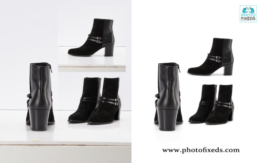
Title: "Mastering Background Removal and Retouching: A Comprehensive Guide for Flawless Edits"
Introduction
Background removal and retouching are essential techniques in the world of digital image editing. Whether you are a professional photographer, a graphic designer, or an e-commerce business owner, knowing how to expertly remove backgrounds and enhance images can elevate the overall visual appeal of your work. In this comprehensive guide, we will delve into the art of background removal and retouching, providing step-by-step instructions and valuable tips to achieve flawless and captivating edits.
Part 1: Understanding Background Removal
The Importance of Background Removal
Discuss the significance of background removal in various industries, such as e-commerce, product photography, and digital marketing.
Highlight how a clean and isolated subject can make the image more impactful and versatile for different applications.
Selecting the Right Tools
Introduce popular software and tools for background removal, such as Adobe Photoshop, GIMP, and online background remover tools.
Provide a brief overview of each tool's capabilities and advantages.
Manual vs. Automated Background Removal
Explain the differences between manual and automated background removal techniques.
Discuss scenarios where each method is most suitable and effective.
Step-by-Step Background Removal Process
Walk through a detailed step-by-step process for manually removing the background from an image using Adobe Photoshop or similar software.
Include tips for selecting precise edges, handling intricate details, and dealing with challenging backgrounds.
Part 2: Mastering Image Retouching
Understanding Image Retouching
Define image retouching and its purpose in enhancing the overall quality of an image.
Explore the different aspects of retouching, including skin retouching, object retouching, and color correction.
The Art of Skin Retouching
Guide readers through the process of achieving natural and subtle skin retouching for portraits.
Address common issues like blemishes, wrinkles, and skin tone inconsistencies.
Object and Product Retouching
Share techniques to enhance the appearance of products and objects in commercial and advertising images.
Cover topics such as adjusting lighting, removing imperfections, and highlighting key features.
Color Correction and Enhancement
Explain the significance of color correction in achieving a consistent and visually appealing image set.
Offer tips for balancing color tones, adjusting white balance, and creating specific moods through color grading.
Part 3: Advanced Background Effects and Compositing
Background Effects for Creative Edits
Introduce creative background effects like bokeh, blur, and gradient overlays.
Showcase how these effects can add depth and uniqueness to images.
Compositing Techniques
Explore the art of compositing multiple images to create imaginative and surreal visuals.
Provide step-by-step instructions on blending subjects seamlessly into new backgrounds.
Conclusion
Mastering the art of background removal and retouching is a valuable skill that can transform ordinary images into stunning works of art. Whether you are looking to enhance your photography, elevate your graphic design projects, or optimize your e-commerce product images, the knowledge gained from this comprehensive guide will empower you to achieve flawless and captivating edits. Remember, practice and experimentation are key to refining your skills, so don't be afraid to explore and unleash your creativity in the realm of image editing.
if you need this related service please contract:
https://www.fiverr.com/s/d2ZY4Y
0 notes