This is my multifandom writing blog! I mainly write fanfiction, and am willing to chat with anyone who pops into my inbox. My main is 9tfs83My ao3: https://archiveofourown.org/users/WindySkyes
Don't wanna be here? Send us removal request.
Text
reminder that coming up with some fake little dudes and creating intricate storylines in your head is a completely free and fun way to pass the time and the government can't stop you
64K notes
·
View notes
Text
Taking the red hats off of half a dozen gnomes and loading them carefully, tearfully, into a revolver.
78K notes
·
View notes
Text
Surprise!! Chapter 14 is here~ 🥳
https://archiveofourown.org/works/24649294/chapters/148887589#workskin
It’s been, uh. Awhile. Huh? 😅 I have no excuse lol
Not happy with how the manga ended, so I’m giving Izuku and Shigaraki the ending they DESERVE! Or like. One that makes more sense, theme and morality wise. 😂
Enjoy!
3 notes
·
View notes
Text
Writing advice from my uni teachers:
If your dialog feels flat, rewrite the scene pretending the characters cannot at any cost say exactly what they mean. No one says “I’m mad” but they can say it in 100 other ways.
Wrote a chapter but you dislike it? Rewrite it again from memory. That way you’re only remembering the main parts and can fill in extra details. My teacher who was a playwright literally writes every single script twice because of this.
Don’t overuse metaphors, or they lose their potency. Limit yourself.
Before you write your novel, write a page of anything from your characters POV so you can get their voice right. Do this for every main character introduced.
232K notes
·
View notes
Text
YALL GO FOLLOW FANE’S PATREON HER ART SLAPSSSS
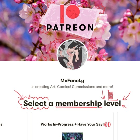
🔗Patreon Link in HERE🔗
💯👌Ever wanted more content?👌💯
Ever wondered why I don't post often? (I wonder that all the time)
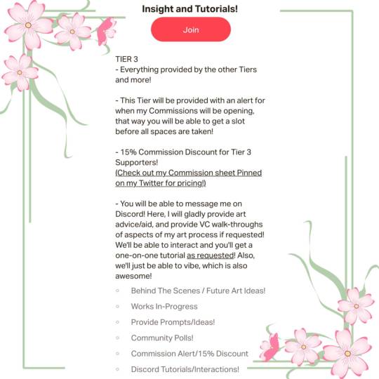
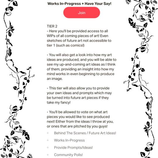
I finally have a base where there will be consistent content on Patreon along with offers that will let you guys have a say in what gets produced! Along with a few cool other tidbits (such as discounts on art, voting on up and coming pieces, an abundance of WIPs 👀👀) Subscribe to my Patreon and get that and SO MUCH MORE!
71 notes
·
View notes
Text
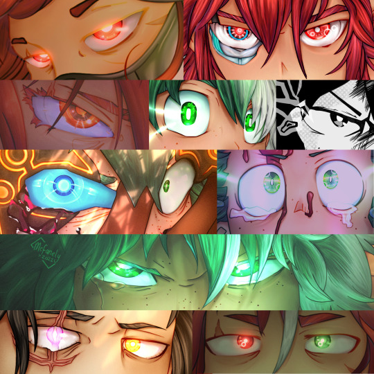
Try and guess what my favourite part of the art process is~
-
Commissions are open! Though going fast, DM me if you’re interested, my commissions page is pinned on my Twitter!
42 notes
·
View notes
Text
AAAAAAAAA 😍😍😍😍

Commissioned by @/v.mays.1 on Instagram for their up and coming fic! I'll be sure to post the link here when it's up!
-
If you want to commission me, my page in pinned on my Twitter! DM me anywhere!
448 notes
·
View notes
Text
If you're reading this...
go write three sentences on your current writing project.
385K notes
·
View notes
Video
The Wandering Village is a colony management sim where you build a settlement on the back of a massive wandering colossus!
Read More & Sign Up For The Beta (Steam)
9K notes
·
View notes
Photo

Ten Things I Learned from Ursula K. Le Guin, Karen Joy Fowler
5K notes
·
View notes
Text
Here's my contribution to the Spread the Love challenge animation collab. Had a lot of fun with this one. I'll be sharing a process video of this soon.
96K notes
·
View notes
Text
it is not an evil thing to look at yourself with kindness. your life was never meant to be a punishment
85K notes
·
View notes
Photo

Gif version of the animation I did with the chara designs of Drag on All for One.
2K notes
·
View notes
Text
Why do people stop commenting on fics if they’re more than a week or two old? Please comment on old fics. Tell me you like my one shot from 2014. Tell me you like my old multi-chap I finished in 2016 that I spent a year writing. I will be fucking thrilled.
136K notes
·
View notes
Note
Oh almighty napkin arm with googly eyes, I humble peregrin dare come forth with a request... could you make some character design breakdowns for some more realistic characters? Like your power ranger fanart? I tried to break them down on my own, but I'm not sure I did it that well... it's incredibly useful and interesting... Keep being awesome, and thanks for how you already helped me anyway!
Thanks for the patience, had to mull this one over. The more complex a design gets, the more difficult it is to break down. Basic character design tips may not be enough…so let’s delve into:
Character Design Tips Part 2!
Before we start, it’ll help to read my last character design post, where I laid out four concepts: shapes, silhouettes, colors, and inspiration. In this post, I aim to build on and rephrase these in a way that hopefully makes it easier to apply them. I’ll be drawing examples from my Power Rangers (2017) fanart to illustrate my points.
(Disclaimers:)
(Ideally, you should already be comfortable with drawing people. If not, look into figure drawing, gesture drawing, etc.)
(Whereas my previous tips were more tried and true, the tips here are more my own thoughts, so they may be half-formed.)
(Again, these are not rules. They’re just tips to add to your toolbox; the more tools you have, the more versatile you’ll become.)
Without further ado, let’s start!
Based off what we know about shapes, silhouettes, colors and inspiration, I want to cover: lines and angles, external and internal silhouettes, values, and references.
1. Shapes => Lines and Angles
Last time, I laid out three basic shapes:round, box, and triangle.
Problem: limiting yourself to these 3 shapes can be useful and fun for simpler designs, but they may be too simple or look out of place on more complex designs.
Solution: let’s go to the next level! Instead of shapes, shift your thinking to lines and angles!
Lines can be curved, straight, or diagonal.Angles can range from obtuse to acute angles.Follow your intuition: what feeling do you get from each line or angle?If I follow my own intuition, I see that:
curved lines = natural, soft
straight lines = balanced, grounded
diagonal lines = off-balance, in motion
obtuse angles = broad, relaxed
right angles = rigid, unnatural
acute angles = slim, dynamic
If this sounds familiar, you’re right! It’s just the shapes all over again:
curved lines make round shapes
straight lines with obtuse/right angles make boxy shapes
diagonal lines with acute angles make triangular shapes
But lo! Since we broke the shapes into their smaller components, it’s much more flexible! Now we can use lines and angles for more complex designs:

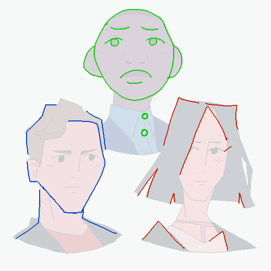
2. Silhouette => External and Internal Silhouettes
Last time, I explained the silhouette test: if you black out the figure, it should still be readable.
Problem: blacking out the figure only tests the outline of the design, i.e. the external silhouette. But what about the inside of the design?
Solution: block in the figure and test for the internal silhouette!
If you want not just an interesting outline, but an interesting costume, block in the major components of your design to see if it has a readable internal silhouette. This test can help you avoid boring or cluttered costumes and makes your design stand out. If your internal silhouette is too empty, try adding props or designs. If it’s too busy, simplify it.

3. Colors => Values
Last time, I talked about the 60-30-10 and 70-30 rules for color.
Problem: those rules work on the assumption that you’re only using 2 to 3 colors. But what if I want to use more colors?
Solution: good news! The same idea applies if you split your palette into 3 major values: shadows, midtones, and highlights.
Balance your palette by converting your colors to grayscale and applying the 60-30-10 rule to the values. This is related to the idea of silhouettes; if you get a nice internal silhouette, you’ll probably end up with a nicely balanced set of palette values, and vice versa.
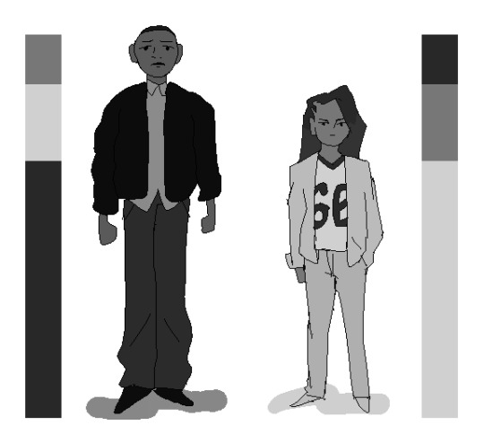
(Fun fact! You can split your palette in different ways. In a watercolor tutorial, Miyazaki splits the palette into bright, dark, black, green 1, green 2, blue 1, and blue 2.)
4. Inspiration => References
“Good artists copy, great artists steal!” -Picasso
Problem: Coming up with something 100% original is tedious and doesn’t always give great results. It saps the inspiration right out of you!
Solution: It’s a lot easier to steal ideas from references!
Note: don’t just copy, steal! Cherry-pick/massage the aspects of the reference you find the most appealing and work them into your design. Ditch anything that you don’t care about. Make it your own! Make it something you can put your own name on! Below is the reference image I used for my designs:

And below is my fanart:
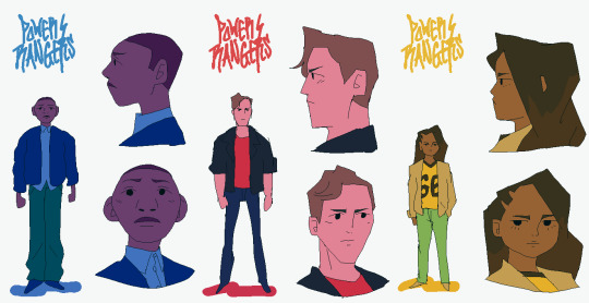
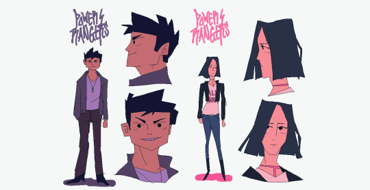
That’s it for now! Thanks for reading! If you guys want to see any other topics, feel free to ask and I can try my hand at it.
If you want to see my previous character design tips, click here.If you want to see the full-size Power Rangers fanart lineup, click here.If you want to see other character designs I’ve done, click here.
9K notes
·
View notes


