#GOD it was the lineart that took so long
Explore tagged Tumblr posts
Text


This new Humming-Spider issue looks great! Hope it’s a good read <333
Jokes aside GOD IM SO HAPPY TO HAVE THIS FINALLY FINISHED, this has been a wip since last year ówò SO happy with it tho. Will I ever do mock covers for the other sinister six? Who knows, hopefully they don’t take a whole year like this one did KSMSMDH
#Spiderman#spider man#mysterio#quentin beck#Earth-4918: Humming-Spider#rufioarts#GOD it was the lineart that took so long#specifically the smoke#I actually had to redraw at some points when I was lining because my style changed between the sketch and lineart because of how much time#went by KSMDMDHDK
52 notes
·
View notes
Text
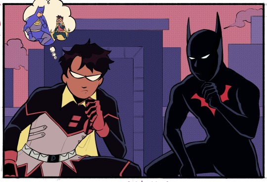
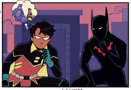
I've been binging Batman Beyond recently (Terry ily so much) and thought about how- bc of the JLU twist which I think isn't even canon to the comics BB verse but shhh bare with me- he'd technically be Damian's half brother??? Which is just so ridiculously soap opera to me. I need them to interact in a silly time travel adventure so bad you don't even understand (ID in alt)
#dc comics#damian wayne#terry mcginnis#batman beyond#batman and robin#mine#also feat the mild damian uniform redesign i like playing around with. it's fun i like her. i love u classic robin colours#the backstory for this image in my mind is that Terry knows of Damian/has maybe met him#in the future (whether we're going w the rebirth ''damian rejoins the league'' angle that i. don't love conceptually but can't judge-#-bc i haven't read. or if we go w/ some other potential future route for damian) and Terry is like. experiencing whiplash at meeting him-#-as robin. like you are 5 feet tall why r u so bossy. where is your dad good god. this is why i don't have a robin (?this is pre matt-robin)#but Terry's in an unfamiliar time trying not to cause a paradox so he puts aside his indignitude(?) at being bossed around by a kid#just long enough to make sure nothing goes horrifically wrong. hence this image takes place#<- i could've been a lot more eloquent explaining this but it's very late and i should've been asleep ages ago#anyway. absolutely crazy to me that Damian has had multiple flavours of secret brother plots and terry is a potential addition. rip damian#(also in my ideal future damian took up the nightwing mantle (EVERYONE READ NIGHTWING MUST DIE!!!) before retiring(#idk what his future career is. lowkey hes a webcomic artist in my brain but that's so horrendously self indulgent i can't condone it#also i decided to try my hands at lineart again. evil. how are you so stiff looking and difficult to do. waughh#anyway if things look weird. no they don't
812 notes
·
View notes
Text


heeyyy gaaanggg
the pose and the background of the album version (left) are based on oingo boingos only a lad album art. not cause i think he has anything to do with it but just cause ive been wantin to draw that pose for like. weeks and i didnt know who to put there. so why not my latest bug man.
#my art#digital art#digital painting#fanart#resident evil 7#ethan winters#goddd PLEAAASEEEE#i havent known if i was gonna post this or not multiple times in the process of drawin this. but ultimately i spent too much time on it to#NOT post it. embarrassment be damned#but at the same time what am i even doin yknow. what is this what is goin on pleaaseee PLEASEEEEE#I DONT KNOW ANYTHING ABOUT RESIDENT EVIL!!! I DONT KNOW N O T H I NG I KNOW LESS THAN NOTHING#HOW?? HOW DID I GET HERE??? WHY DID THIS HAPPEN???? i know exactly the answer to all those questions but it still boggles me how fast this#happened. usually it takes WEEKS if not MONTHS for me to start makin fanart. this was faaasttttt TOO FAST and im like. genuinely constantly#thinkin about this game. im ALWAYS thinkin about this game. part of why this took me so long to do is cause i always wanna play re7 or thin#about re7 in a strange and deranged way. ive actually genuinely been SICK WHAT HAPPENEDDDDDD#im losing it!! anyways this took me a looonggg ass time and i redrew it soo many timmmessss#i did like. 3 lineart passes. the album version i did 3 shading passes. i really struggled!! and ultimately i dont know how i feel about it#like i kinda resent it. for takin so long and makin me suffer so much#never again. never again will i spend that much time on a drawing. i HATE when drawins take a long time. i HATE that. it makes me madddd#ive been insane. ive been so insane. and im not gettin better like i cant sleep sometimes cause im thinkin about this game and this guy and#that gal like i think about them!! so! so much!! oh my god!!#in the time it took me to finish this ive done like 10 sketches for other pieces like. and ive had like 3 ideas ive written down.#and like 50 that i havent written or sketched.#IVE WRITTEN POETRY!! P O E T R Y !!!#i write the occasional poem when im feelin some kinda profound emotion but i NEVER write poetry about media SOBBING#anyways thats the post i think this is the beginnin of the end so lets hold hands and pray. ugh sorry if i get sick. im shakin.
158 notes
·
View notes
Text

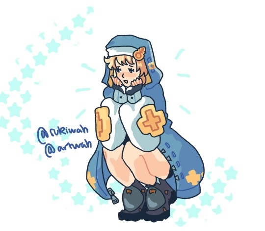

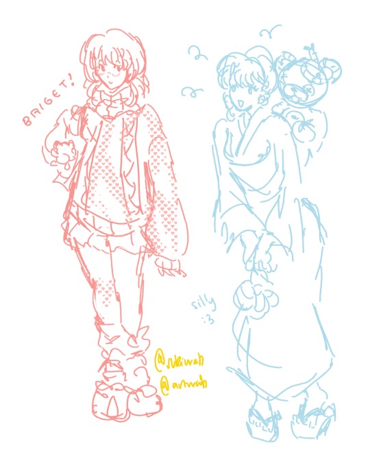
im little bit obsessed with bridget guilty gear atm ^_^
#experimenting just a tad with poses and colours... i heart Ishiwatari' stuff it reminds me a lot of nomuras style#admittedly i know...very little about bridget.... i may be a poser guilty gear fan guys#that one ggxxacp illustration is sooooooo ....krazy i had to redraw it#also it literally took me so long to do the lineart and colouring on these T_T thank god for long yt videos....#idk whether i should post the first 3 separately or not...#guilty gear#guilty gear strive#ggxxacp#bridget#bridget guilty gear#dizzy guilty gear#baiken guilty gear#jam kuradoberi#fanart
209 notes
·
View notes
Text
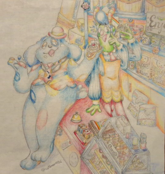
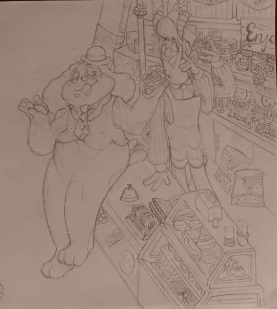
My part of an art trade I did with @bloomynmoon!
#welcome home#barnaby b beagle#howdy pillar#laughingstock#barnaby x howdy#at least I intended it like that#art trade#my art#note this was done way before the update came out so I had to guess on Howdy's shop#I liked the line art so much for this piece that I kept it and now y'all get to see it#y'all got no clue how hard it was to bring myself to color this...I was so scared of messing it up big time#god I love these two lots#two repressed idiots <3#also remembered to post this just for u bog#I hope it helps feed your laughingstock addiction#spreading the laughingstock propaganda#y'all don't wanna know how long it took me to make all those shop details#just to have them eaten up in the coloring process oof#main reason I'm sharing the lineart ahahha
82 notes
·
View notes
Text

When I tell you this took me so long. SO long to finish.
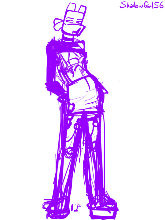
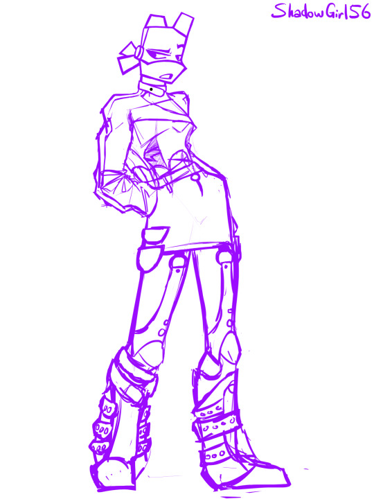
Donnie in a funky outfit I wish I owned because literally every item is a part of my dream closet <3 click for quality I know tumblr is going to butcher it
So many progress photos below. Because I like documenting the process if I'm doing things in an organised way :)


#i wanna be him so bad </3#rottmnt#tmnt#rottmnt donnie#tmnt donnie#rottmnt donatello#tmnt donatello#shadow draws#art#actually. i do want to talk about how long this took#just looking for references took me like half an hour probably#and then the SKETCh took me a SOLID hour. bc i couldn't get the post right#and then. i didnt actually draw lineart i just colored the sketch until it looked clean enough to pass as lineart#which took an UNGODLY amount of time. i didn't even check#and THEN the colors. and THEN the rendering. and THEN the lighting#god. i love it though#it took me three days. to finish this. like three entire evenings (which is when i usually draw)#im so proud of myself actually#shadow rambles (in the tags)
62 notes
·
View notes
Text

style meme ft. mizuki
#tag tba#project sekai#prsk#mizuki akiyama#fanart#this was a fun exercise but my god drawing in the prsk style took so long#thin smooth textureless lineart is my nemesis#for reference drawing in my style took like not even an hour all in all. the canon style took me the entire rest of the day. shrivels up
27 notes
·
View notes
Text
Literally less than a year ago I was doing lineart with the default photoshop brush. The one that’s just straight up a round circle. This is what happens when you’re too adhd to bother with tutorials and jump feetfirst into digital art like psshhhh I’ll figure it out
#i mean I DID. i AM. but oh my god.#icarus is talking#i know I HAD the brush I use for lineart now by October last year#but I was still using the default one in art from January at least…#i used other brushes occasionally before that so like. i was getting there. but idk why it took me so long to quit that brush entirely 😭
0 notes
Text


This took SO GOD DAMN LONG
Lineart my mortal enemy the day I catch you...
Anyways this is inspired by this post

#vat7k#varian#varigo#my art <3#varian and the seven kingdoms#tts#tts varian#hugo vat7k#alchemy boyfriends#hugo rottewange#hugo the human#varian tangled#tangled varian#varian the alchemist#varian and the 7 kingdoms#varian tts#im so done
475 notes
·
View notes
Text
Introducing Follower gang!
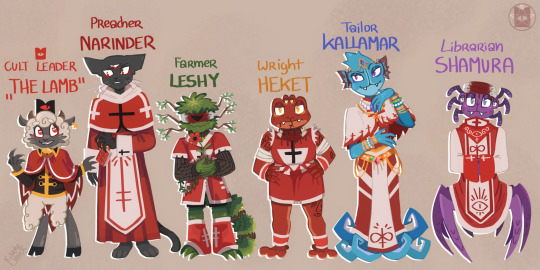
There. Finally did all the Bishops follower designs!
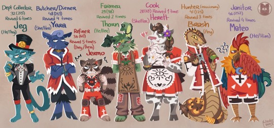
The 7 deadly sins
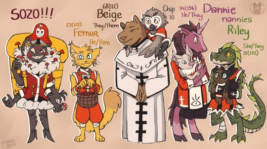
And some other follower gang, done with lineart this time because the other 2 pieces made me lose my soul for how long they took.
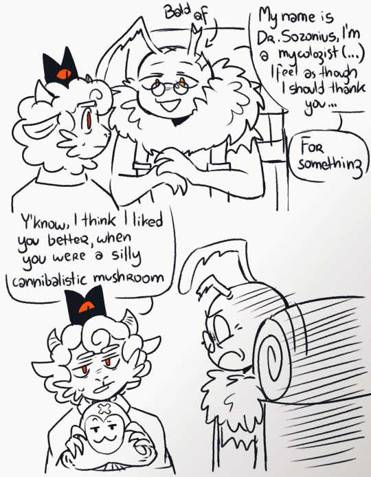
(Also a small HC if I may: Dr. Sozonius is trapped inside the mushroom on Sozos head, while the actual mushroom is controlling his body)
+ some more doodles
Info about the 7 Sins and more doodles below:
Jeg represents Greed - he was one of the first of Lamb's followers. (At first, it was very difficult for Lambert to indoctrinate people, due to their inexperience, this guy was like the 5th or so) Jeg has...a very specific personality to say the least, yet the Lamb can't help but be fond of him. They eventually nominate him the Tax enforcer role and...That might've been the worst decision of their life. But they did not take the role away. Jeg acts smug 24/7 and relishes in his new power, but deep down, dudes pretty insecure, ( but don't tell anyone!) He used to have a huge crush on the lamb, but then Narinder and eventually the other bishops came, and since their leader was for some reason head over heels for the ex god of death, Jeg grew bitter and often got into fights with Nari, as well as charging him and his other siblings more than the average follower. Though he's mostly mellowed out since then.
Brash represents Gluttony They despise Helob, since they used to fight for "food" a lot, and eventually Brash got really injured and was found by the Lamb. She tried to eat them, but was quickly disarmed. Despite this, they decided to spare him and bring his sorry ass back to the cult to indoctrinate. They were very cunning and didn't trust the lamb either, but eventually they cooled off and accepted the new life. She still eats people tho, just not from the cult, otherwise jail or *worse*
Yara represents Pride She is one of the core followers. She's very strict and somewhat self-centered, she likes things done her way, or if not her way, the lambs way. Period. No one else can boss her around or even give a helpful advice. She's actually a pretty stand up deer, and despite being incredibly stubborn still makes a good friend. She gets along with most people though Brash annoys her, since he keeps snatching body parts off corpses. She has always been extremely devoted to the lamb and will be annoyed if any follower dissents and tries to preach against them. She wasn't surprised in the slightest when they eventually took down all the bishops.
Thorn represents Envy He had a pretty terrible life before the cult. When he was brought in, she was bitter about her newfound situation. He wasn't very trusting of the lamb and thought they expected something out of her (which technically they did, but it's just work). He envies the fools who are so oblivious and just do everything as they're told and let their lives be guided by some amateur god. Similar to the other two, he puts on a mask, He often acts overly saccharine to hide his true feelings, but doesn't have any bad intentions. (Most of the time) She does genuinely like some people, but others, he only pretends to like to appease the lamb or to blackmail them. He hates when the people he actually cares about are threatened.
Jermo represents Wrath Jermo absolutely does not trust anyone. Similar to Thorn, and most other followers tbh, their life was absolutely horrible prior to the cult. They trusted some people, they got betrayed, and almost died several times because of it. It was extremely difficult for the lamb to make them stop dissenting. They legit had to give them the loyalty necklace in order for them to finally stop dissenting. Jermo keeps getting into fights with other followers, because they feel as though everyone is always against them or is constantly judging them. (They're technically not wrong) They've died 5 times, because they keep getting into fights with other followers. Lamb strongly considered keeping them dead, but decided to challenge themself with them (also they're too cuddly to just be killed off) Despite their many, *many* flaws, Thorn has a huge crush on them, since he's one of the people who managed to see their soft side. Jermo, deep, deep, deep down actually cares a lot, but they've been hurt too much by everyone, so they retaliate for the same stuff to not repeat.
Herett represents Lust At some point, she passingly heard about the cult and since it seemed like a peaceful place from the rumors (and also had hot people in it) she eagerly joined in. She's usually in the kitchen area, if not hanging around the love tent or babysitting some kids. She crushes on almost everyone, but for some reason she hates Kallamar (legit in my actual game she rejected him so hard, despite having the lustful trait and not caring prior)
Mateo represents Sloth Is perhaps the 1st or 2nd of Lambs followers, so they're absolutely not letting go of him, dudes lived 4 long lives and is tired of it, he keeps switching jobs since with age he's been slacking off more. He's currently stuck as a janitor (he hates it) He's also one of the few people who managed to befriend Jermo, his mellow, don't care attitude is somewhat comforting to them. Aside that, he gets along with almost everyone, as best as he can at least.

Not much else to say about the gang in the third pic but Riley and Dannie are platonic bffs and were forced to babysit kids when the lamb was crusading. The lamb was a little incompetent here to give carnivores children to take care of, but thankfully they actually managed to be good with them and got used to being on nanny duty.
The capybara (Beige) is a retired teacher and adopted a little owlet to take care of (Chip)
While Femur is our below yellow cat, and that's my HC name for him. He's a gatherer here.
#cotl#cult of the lamb#cotl lamb#cotl narinder#cotl toww#cotl leshy#cotl helet#cotl kallamar#cotl shamura#cotl oc#cotl ocs#cotl sozo#cotl yellow cat#more ocs#cotl fanart
2K notes
·
View notes
Note
Hello :D
I have been following you for the last year or so (a few days after I got my Tumblr lmao) and I absolutely love your art!
I have been wanting to study your art style for a while but don't really know where to start,,,
Could you please show me a small portion of your art process, if it isn't too much trouble of course. Thank you and have a nice day!
hello. oh my god. this took forever to find.
im sorry it took 2 WHOLE FUCKING MONTHS for me to respond to this but i wanted to put it off until i felt happy with my art process again, so here it is
my fall 2024 rendering tutorial!
(this will be very very long)

FLATS AND WHATEVER YOU WANNA DO WITH LINES GIRL. then make sure to recolor the lineart to better match your base. trust me it helps, bold dark lines are Not your best friend when rendering. wait for that post-rendering
i start off with a doodle or a sketch, and then filling it in with flats and other details such as blush

FIGURE OUT YOUR LIGHT SOURCE. FIGURE IT OUT GIRL YOU CAN DO IT you can make it as simple as possible, make it as big as possible, dont even THINK about the details.........just make it really fucking big so you at least know where the shadows and the light goes THEN add smaller shading details LISTEN TO ME. LISTEN TO ME OKAY!!!!!!!!
my key point with this is for you to learn lighting fundamentals.
it's SOOO ANNOYING but alas......they are all correct. it helps a lot.
one thing i also really want to point out is that i like creating a big shadow shape first before fixing up the little details (such as folds and whatever) because it helps me focus on the way the lighting actually works instead of tunnel vision-ing into making the shading make sense on the clothing.

contact shadows (i dont remember if thats what theyre called okay) theyre fucking ugly because im not actually thinking sorry 💔
okay so basically:
contact shadows (if that's what they're called) are the spots in shading and lighting where light will NEVER hit.
shadows are still influenced by the colors and lights around it (it's why a blue shadow and a yellow shadow feel completely different, despite both being shadows) so it's not always COMPLETELY dark.
BUT! there are small points in shadows where light never hits, and they're almost always super dark or pitch black.
it's hard to explain shadow and light so briefly for a tutorial, but you'll notice it when watching fundamental studies and when trying it out for yourself


YES i unclipped the multiply layer YES its ugly and terrifying but it makes coloring the multiply layer easier okay the colors merged w multiply so now it looks cool and has depth overlaying colors that actually make sense
so basically what i did was color the multiply layer that i used to shade the overall drawing
adding a band of red/orange/yellow around where the light hits, and blue where the shadows get big and wide, gives it a fake ambient occlusion effect in the way that a person would get if they stood under the sun with a clear blue sky
the colors don't have to make sense, especially because i never draw backgrounds, but coloring the shadows really help it give a sense of depth and extra subtle detail and effect that just helps make the painting look nicer
around the end, i also put in colors (in an overlay layer with a low opacity brush) that actually make sense in context of the drawing, which is the lit cigarette and the yellow eyelights
mostly because none of the colors were making sense and i needed to actually make use of the lighting that DOES exist in the drawing lol

adding a muddy golden yellow pin light layer (opacity turned down to like 40-50%) to make the light colors less ugly lol
i SWEAR by the fucking pin light layer style. it's so useful and so so underrated.
i used an almost brown-ish gold color on stop of all the layers, and with the pin light layer, it helped make the bright (almost blue-ish) white colors more warm and more yellow. it just helps make things more warm (something i prefer)
i could probably show what it looks like without adjusting the layer opacity to truly show off what i mean (like in the coming section) but i sadly forgot to do that lol


make a layer on top of your drawing with this color in these ranges YES the drawing is fully merged NO don't be afraid, the base was fucking ugly anyway 💔 make this layer into an exclude/exclusion layer style TRUST turn down your exclusion layer opacity from a range of 10% to 40% literally until you're happy with the contrast and the way the color over the drawing. use your eyeballs. i know you can do it im so proud of you
this is pretty self-explanatory instruction-wise, so i'll go into why i do this instead
i really like art that seems like it has low contrast, with almost mid-gray shading and lines. i don't personally use dark and bold lines and shading, unless i find it necessary for the tone of the piece, so using this method helps lower the contrast of the art and make it look "pleasantly muddy" in the way that it's easier and softer on the eyes.
the inverted blue color also helps makes things warmer!
the exclusion layer style is still a bit of a mystery to me but i really like the effect it gives, even if i don't completely get how it works lol
if you want an alternative method to this, and if you have access to it (because i primarily use sai and sai only),
i absolutely encourage you to play around and experiment with gradient maps.
there are so many out there you can make yourself or even get from others that just give the painting an extra amount of depth and color variation. they're SO fun.
personally, if sai2 gets a gradient map update, it's over for y'all it will literally be so over no one will be able to stop me


then i merged everything and actually adjusted the contrast back up because it was looking too muddy for me 💔 but the color adjustments are still there so all hope is not lost here's a comparison of the adjusted contrast in black and white (adjusted on the left) (newly merged layer without adjusting the contrast on the right)
as you can see, i actually turned the contrast back up (despite talking all about how i liked things with less contrast lol)
i wanted to demonstrate that doing adjustments should be done in moderation, and is why i adjust layer opacity often when making color effects
you are free to play around with colors to help your style, but don't lose your initial idea and colors along the way.
you still need to trust your own colors and intuition!
along with that, i just want to say that it's completely okay to change your mind mid-painting, and it's okay to make somewhat drastic changes.
don't be afraid to change things you don't like or change your mind about certain aspects way later on
that's basically the whole thing of this!!! don't be scared!!!

now im gonna hold your hand when i say this..........but you need to learn how to render by yourself. it seems like i can teach you but i literally can't, because rendering is different on every piece and depending on how clean your base is. i have to render A LOT because of how fucking ugly my sketches are LMAO to simplify it, think of it as obsessively cleaning up every detail you can see, but with a color picker and a clean, hard edged brush. if you have shit lineart, you don't have to redraw it cleanly over and over, just paint over it. that's basically what rendering is
THIS especially is where you need to be brave and stop being scared.
like i said, i can't teach you how to render, and it's something you have to discover yourself because rendering is something that will always be personal to every single piece you make. the way you render on every piece is different.
on one piece, you will barely need to render, and on another, rendering is more than half of your ENTIRE process.
don't be afraid to paint over your old art.
rendering is a process that's both very perfectionist yet also very careless.
find your balance and just go for it.

and then that's it……..u did it………..now yuo know how to paint and render. it's literally just layering shading and lighting knowledge until you think it makes sense and looks okay lol additional note: since i render in only one layer (you don't HAVE to do this, but it'll be harder for you…), i also made slight adjustments with the transform (and liquify, if you have it) tool to make things more proportionate. (i drew the head too big lol)

if you compare the finished piece to the final unrendered base, you can see that a LOT changed, including a bit of subtle proportion adjustment.
particularly, the sleeves changed A LOT (because i really didn't like them)
but it's also over all cleaner and more coherent, instead of having haphazard colors and shading just thrown about.
rendering is when you finally use all 100% of your brain to finalize and figure out where the shading should go, where to clean up your lines, where to ERASE or ADD BACK in lines, and make sure all your colors look coherent.
it's not as intimidating as it seems, i only use a hard edged brush with a little bit of color mixing and my color picker.
it's like dragging and dropping colors to cover up mistakes, it's really quite fun when you get used to it
i wish i could explain it clearer but it's hard to describe without visuals!
i hope this helped, and i hope all my yapping isn't annoying (art as a special interest beloved)
have fun studying and trying to render in my art style!
#long post#art tutorial#rendering tutorial#art help#art tips#tutorial#kia doodles shit#artxstic-scr1bbles#tutoriel
186 notes
·
View notes
Note
hiii!!! loving your locket comics!!!!!! just wanted to ask a few questions about your process, if you dont mind :D
whats your general process like?
do you do thumbnails, how do they look like?
roughly how long does it take you to complete a comic panel or page?
how detailed are your sketches? do you do multiple?
do you have any specific techniques for lineart?
do you typically use references for your comics?
generally, how much effort and focus do you put into your comics?
do you have any advice for drawing comics?
sorry for for the absolute bombardment of questions, lmao. just really enjoy your art and comics and very interested in the behind the scenes!! feel free to skip any questions (or this whole ask) well wishes and salutations!!! :D
Hello! I'm so glad you enjoy my comics, and I totally don't mind breaking down the process!
For a normal comic page, I would likely actually write a script since it's much easier to keep track of dialogue and actions. But since these are short, I just write it into my thumbnails.
Step 1: Thumbnails. Easily one of my favorite parts, since I get to throw all my ideas down. I do these comics on a 2-panel grid, so I don't have to worry about actual paneling, and it allows me to focus more on the setup of each shot. Think of it like storyboarding!

Step 2: Add cleaner thumbs if needed. I actually made 3D models of Deadlock and Ratchet's chest in Blockbench, so I often trace them to save myself some time! (It might look insane, but I promise, for me, it's not.)
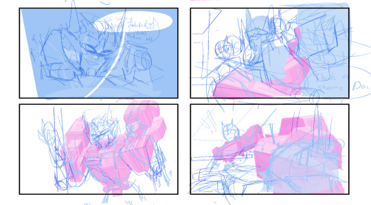
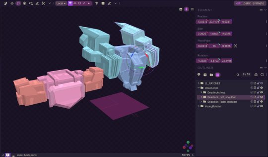
Step 3: Lettering! I actually like to get the lettering out of the way right away since it can take a while. Ever since I started treating lettering as its own form of art, my skills have gotten better, but it also takes much longer.

Step 4: Clean sketch! I'm just now finding out that people think I’m doing lineart for these? I am not… these are all just clean sketches. Maybe doing the blackwork gives the illusion of lineart?

Step 5: Color! Most of these comics are in black and white to save time, but it also lets me focus on values and shot framing again. I add my glow overlay to the eyes, and boom, done!

Roughly how long does it take you to complete a comic panel or page?
It really depends on how complicated the panels are. I like to step out of my comfort zone. I know the Grimlock and Misfire one took longer because of how many panels there were and the fact that I was drawing characters I’d never drawn before, but I’d say it usually takes around 5-8 hours for a whole page.
Do you typically use references for your comics?
I'm literally the reference GOD- we all know this. But yes, I love using references and doing character studies. I have yet to do a study on LL Drift, but I have a few references of him that I’ve made.

Generally, how much effort and focus do you put into your comics?
I mean, I wouldn't say I don't put in a lot of effort? I put in enough. I don't know… there's a point in the clean sketch process where you can kind of just turn off your brain. I'm passionate about comics, but we can all agree there's a point in a drawing where you just zone out.
Do you have any advice for drawing comics?
I think being able to balance dialogue and visuals is super important. I don't know if you guys have picked up a graphic novel from Barnes & Noble recently, but if you open a page, you'll see a character sitting with the biggest bubble you've ever seen, filled with paragraphs of text. While I get it—being a novel as much as it's graphic—I personally like to visualize emotions more. If it means adding two more panels to make an interesting dialogue setup, I don't mind doing it. Another thing to remember is that not all panels need to have details or 100% effort. Sometimes you need to simplify and move on, and that's okay! Those two extra panels that are giving you a better stage setup might be the ones that need fewer details and less time. I would consider my comic page work and my 4-panel work very different. One is about paneling, setup, and visuals, while the other is very much like storyboarding. Both are skills you learn with practice and study.
118 notes
·
View notes
Text
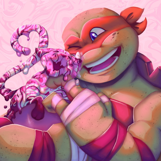
Day 17 of TMayNT: Fav Mikey
@tmaynt
I was NOT intending to fully render this piece whatsoever, in fact, my plan yesterday was to get ahead of the prompt list but NOPE. Instead, I fell in love with the sketch and the lineart never looked the way i wanted it to, so i decided to PAINT OVER IT. GOD. It took me so long, but i am VERY happy with how this piece came out.
Fun fact for you: I was around 12? Or so when the 2012 series came out, prime middle schooler, going through puberty, and I was THE 2012 Mikey defender. I’d get into actual fights with my brothers about him. It was all because I was the youngest in my family and also had to deal with older brothers constantly poking fun and teasing, so I felt a lot of kinship with Mikey lmao.
#my art#tmnt#tmaynt#tmaynt day 17#tmnt 2012#tmnt 2k12#tmnt mikey#tmnt michelangelo#12 mikey#2012 mikey#ice cream kitty#tmnt fanart#teenage mutant ninja turtles
113 notes
·
View notes
Text
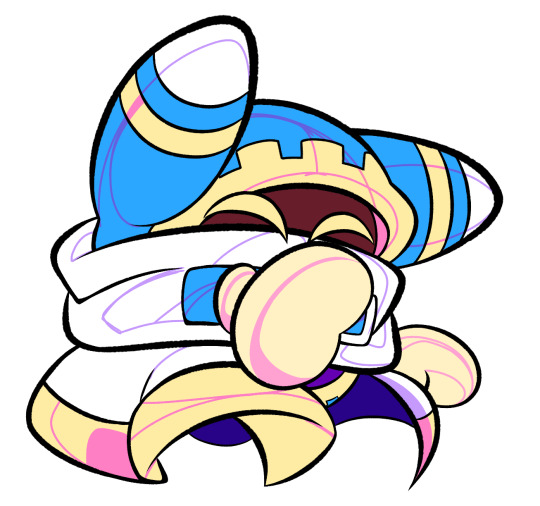
im so sorry it took me so long to answer these oml but YES i'd be happy to show how i draw and color :)
— SKETCHING
please note that i almost always sketch traditionally first lol it's just a lot easier for me to determine how the drawing is placed that way, but i always go over and re-sketch it digitally
for magolor i always start with a basic egg shape (lmao) and then i add his ears. then I draw the scarf; it's easy to determine the shape and dynamicism based on where the bottoms of the ears are located
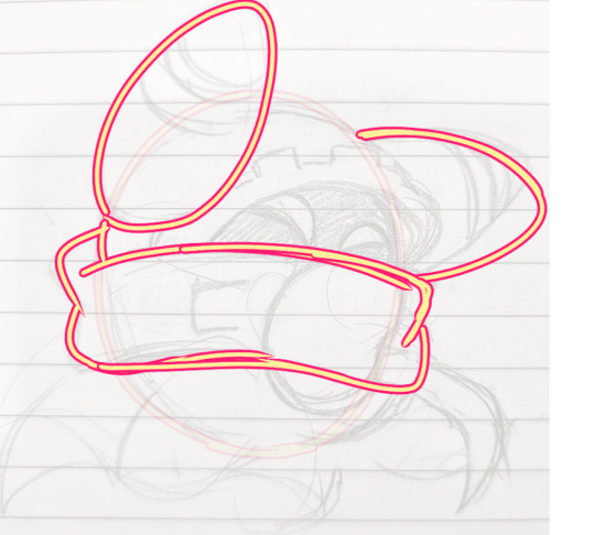
then i usually add the cape and hood together. where and how these are placed and what these look like in general are very important because they're the main area that perspective is directed to (the ears and everything else is important too ofc!! but the hood and cape usually help demonstrate where he is looking and how he is moving the most). then i add everything else, usually his hands last!
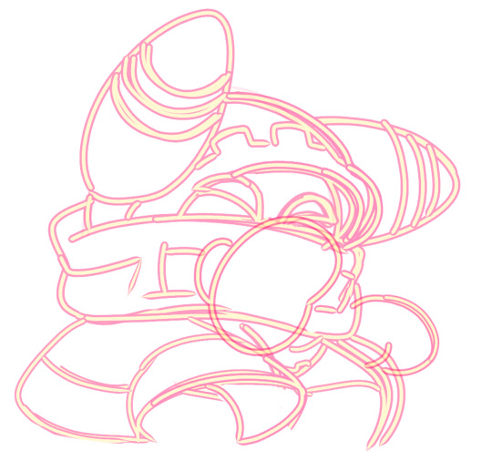
— LINEART
ohhhhhh god my worst enemy. Hope youre sitting down because this will be embarrassing LMAO
lineart is easily what i struggle with most and is more often than not the most time consuming and grating step for me. If i had a choice i would drop it in a heartbeat, but my style is so dependent on thick lines and shapes that it's difficult to 😭 a hole i dug myself into unfortunately ITS FINE THOUGH. ANYWAYS I'm getting sidetracked
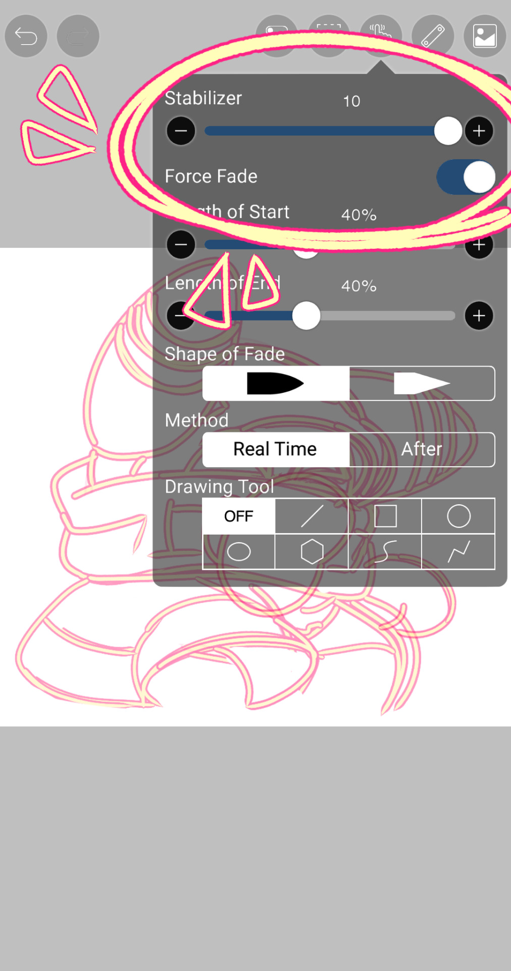
i use my finger to draw all my digital art, which means i usually have to use a Heavy stabilizer to avoid shakiness and staggered lines. Unfortunately ibis paint's stabilizer is actually dog water and doesn't even stabilize more than half the time (in which case i have to repeat lines over. And over. And over again until i get it right) but when it does like me and works properly it's very helpful!
i always use the soft school pen bleed brush as my main tool for lineart. This brush has been my best friend for everything, i even use it for sketching idk it just really like the way it looks lol. sometimes i change the aspect if i want the lines to look more ,, chalky?? or smoother depending on the work

i don't really use this tool much but for this specific piece, force fade was my partner in crime
also i think i need to mention that i use so many layers for this. So many layers lol like to the point it's embarrassing. and at the end i merge most of them (except for the gear patterns, rings on his ear, and eyes + hands, which usually need to be by themselves as they're colored separately) Thank you for layers
and i end up with this!
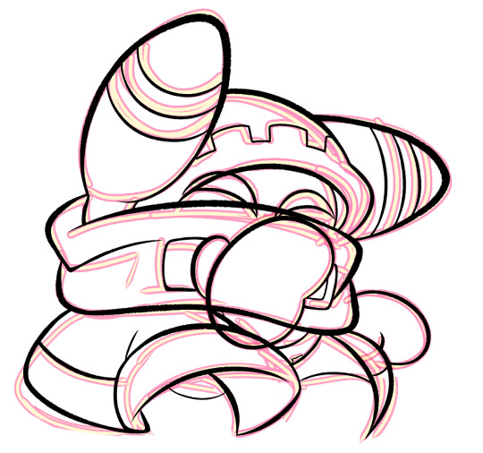
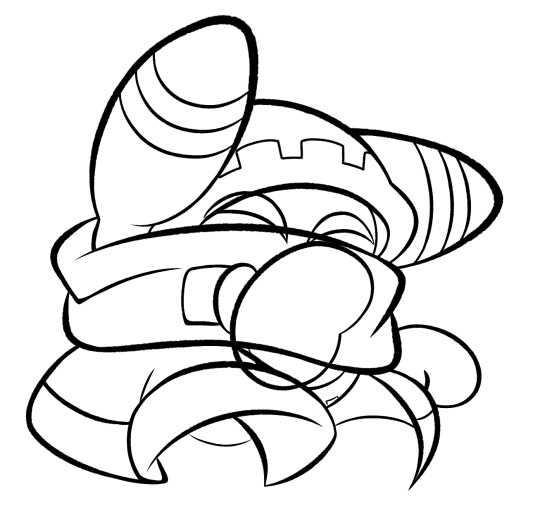
— COLORING && SHADING
yippee yahoo the fun part !!! the part that i love the most
at this point, if i havent already, i always create a folder for convenience in organization because this is the part that i stress the most about what details are on which layers lmao
then i add ANOTHER layer below that for the color, then i put every single color used on their own separate layer!
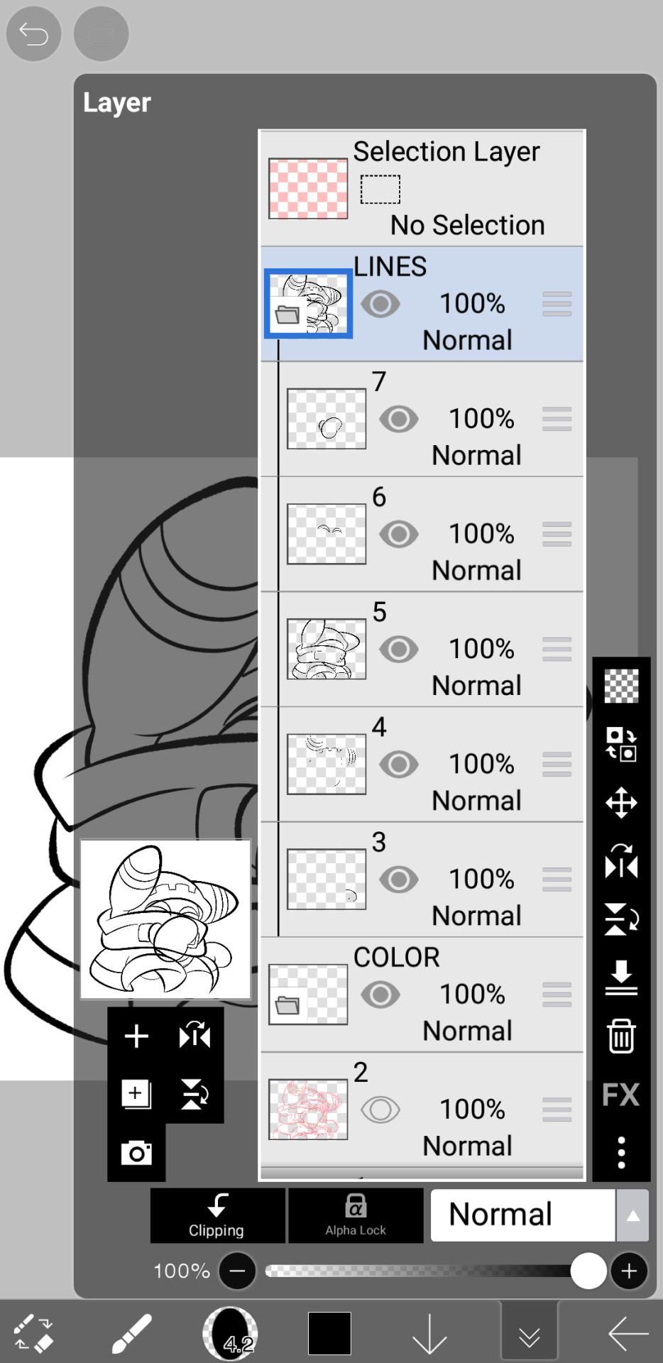
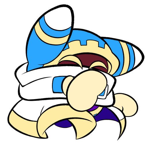
now, for shading, if im working on larger pieces with more complex shading, i'll usually plan it all out. normally when just drawing magolor, i don't really need to do this anymore because i'm so used to it lol, but for funsies i did it here anyways
then i use the bucket tool to fill them all in
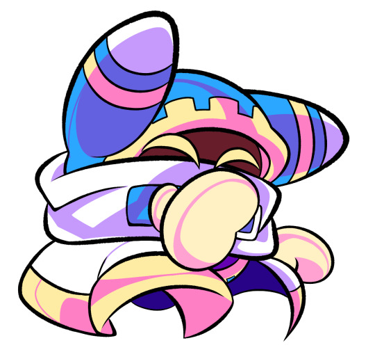
i usually have a set color palette for all the characters i draw (though the way i shade white differs. A lot between my work as you can probably tell fhdfgf). For every color, i have two specific tones that are associated with the shading. for example, indigo + violet are shaded with my blue, pink + light orange (or lighter pink depending on my mood lol) are shaded with yellow, etc.
so, i shade the other areas with the 2nd shading color

a big tip i can give for coloring is to look at a color wheel when you draw. i know that sounds like. Such basic advice LMAO but that seriously was a huge help for me when developing my shading and something i learned while studying — if you notice, in all of the shading in my work, all of the colors used are analogous on the color wheel. note that not ALL combinations will work together like others obv !! but it's a huge step in knowing where to go with it
then i add other extra details like extra lighting, halftones (if i feel like it // if it fits the work), glow to his eyes, and color the lines and ta-da!

another tool i use a lot especially with my more recent art are blending modes, especially multiply. i use a clipping layer to add a dark color (usually a dark blue or purple) and set it to multiply, then erase the areas that emit light

and this is the end result! this is a very very basic demonstration of it fhdjg i was a pretty messy with the lighting and erasing in this example but you get the general idea right

and that's how i draw :) i hope this was helpful, and thanks for asking and being so patient with the response!
#ask#magolor#kirby#macdraws#ive wanted to make a tutorial for So long and finally found a bit of time to do it lmao
144 notes
·
View notes
Text
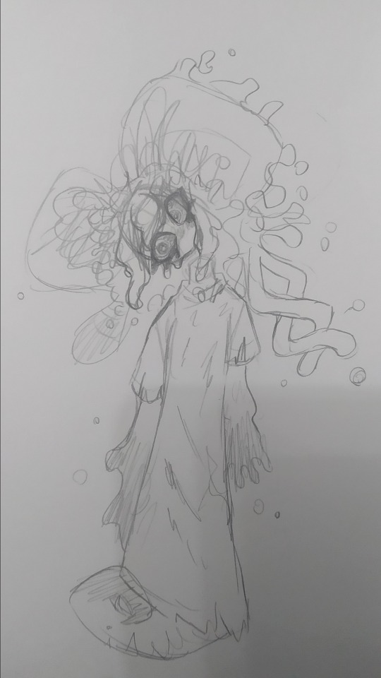
rat brainrot going hard
sorry for not posting this week, i was cooking some stuff but this drawing took almost the entire week to do, worst part, it was a shitpost
i still dont know why this took me so much
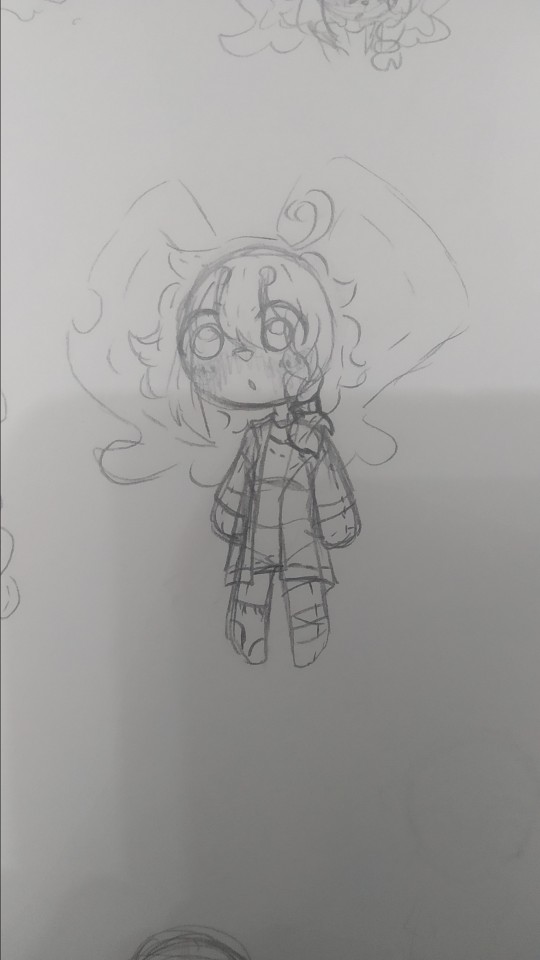
so uh, almost all my drawings this week have been related to this two(and lis) so much so that i struggled because i wanted to draw other things so i would just stare at a blank sheet of paper for over half an hour, god that was torture, tho i dont mind drawing the sillies, sometimes it gets a bit boring drawing the same over and over y'know? im also going to take this as an opportunity to ramble about my forgo gijinka, because surprisingly i hadnt done that yet.
og image

ok now to actually talk about the wet rat
ive tried doing a gijinka of em since i joined the fandom (my first gijinka was fecto elfilis (well not really they were fnaf, but i mean when i got into kirby and when i started using the term gijinka))
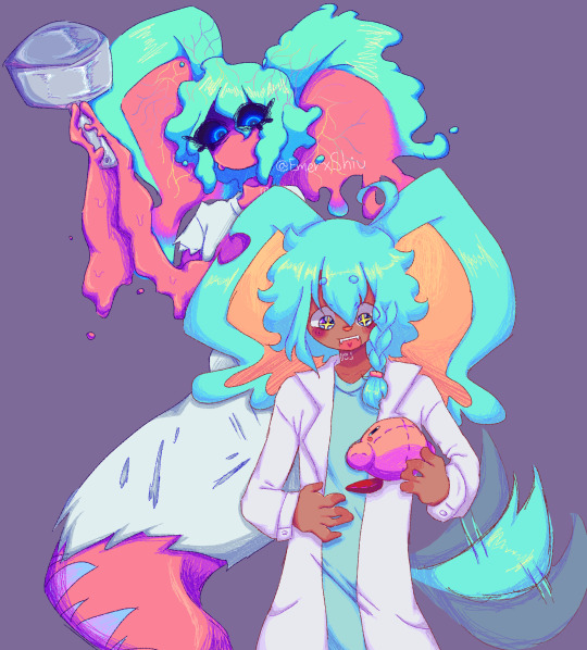
but most of the time it just looked like elfilin but like...evil, with a different ear and a hospital gown, thats it, so i barely drew them since i didnt like that, but on february, i actually sketched an idea that i liked, and thought it looked cute but a bit off (i mean off in a good way)
(yes im posting this image again because i think its the best drawing of my forgo (im very inconsistent with my style ok))
they have their eyes closed most of time, like in game, i considered giving them legs but i ended up with the tail, since i didnt want to end up with like a fourth evil elfilin, the arms are like that so i can have em be small and weird like in the actual game, but i also made it so they can like change it, that way i can make em have hands and stuff if necessary (like to hold that frying pan for example)
not sure if a lot of you notice it but um, bro has no neck, i took away his neck privileges, i did it just to see but i ended up falling in love with that and stuck around, and also that allows me to draw them bending their head like in the drawing above because their neck isnt necking and i like that, i like being able to draw characters doing stuff that shouldnt be anatomically possible or is abnormal (i did something a bit similar with void) thair clothes are rugged because well forgotten land you know what i mean, but in general theyre actually pretty simple
i also did the drawing in digital

i tried doing very sketchy lineart, i tried a new brush in this one and thats the one im using for my last drawings (not sure if anyone noticed the brush change) it was pain painting it because i did it all with the brush in the same size, not changing it, god did my hands hurt and it was a bad idea
i accidentaly downloaded the following 3 drawings twice lol
sleepy zzzz
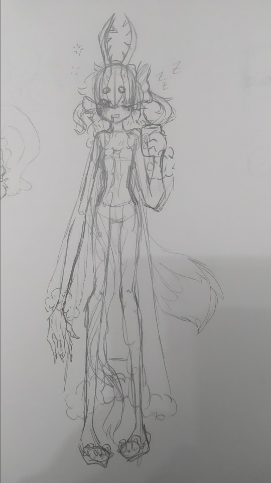
i think they would wear something like this to sleep, i dunno i just wanted to draw em in something cute, and sleepy, with elfilin slippers (the mug also has elfilin btw) oh and also i like changing their hair, here one of their long bangs is tied into a bow, kinda like callie from splatoon, i have some drawing im probably wont post, one more of forgo wich looks very much like the upper one but like eyes closed, and one of fecto elfilis gyaru because my sister asked me to draw them like that, bad thing is i didnt look up references on gyaru since i couldnt use my phone at the moment, i did like the hair i did for them in that one tho, they have their bangs tied up in a bun, and then left the rest loose, making it look longer than it actually is. i might redraw it, but actually looking up gyaru so i can make something more accurate, i like the style, but im not too informed on it
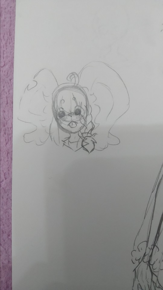
elfilin being silly like a kitty :p
not much more to say on this, just sillines :3
there is totally not a cropped drawing there
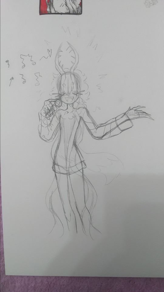
based on the kirby manga, where they make it so elfilis sings really bad, at first i didnt like it that much since i had imagined they'd sign great, but after i while i started to find it a bit cute so now its a headcanon, they like to sing but suck at it.
writing this just made me remember i wanted to do another drawing too for this with kirby and them singing, but i forgot to do it, im kinda tired (and its late) ill probably draw it, but for next post or another one
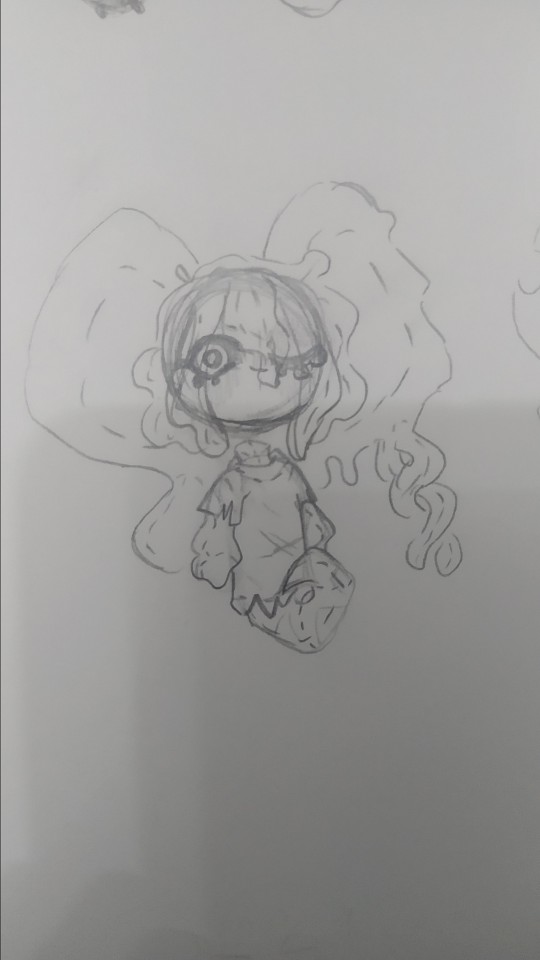
tried drawing fecto forgo as a plushie, silly.
i wanna learn how to sew so i can make plushies of characters (like prince fluf!) but im way too lazy, i will get around it some day! (hopefully)
elfilin too as a plush
i also wanna learn to sculpt, i tried doing a clay kirby once, but one his feet broke in half, and one day my mom put it in a box, and his eyes fell off and stuck to the box :(
i really wanna do figures for characters i like or dont have enough merch or my ocs (prince fluff, flamberge, fecto elfilis)
but as i said, im way too lazy and unmotivated, though its be nice, one day, maybe one day if i stop procrastinating
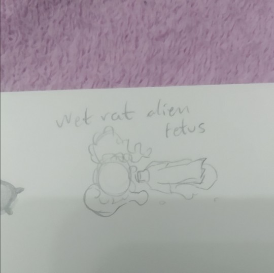
it doesnt have the same ring to it as "feto rata mojada alien" wich is how my sister and i call them (she doesnt know that much about kirby, but i sometimes show her my drawings (reluctantly sometimes, but im the older so like >:) she has too if she wants to show me her stuff too))
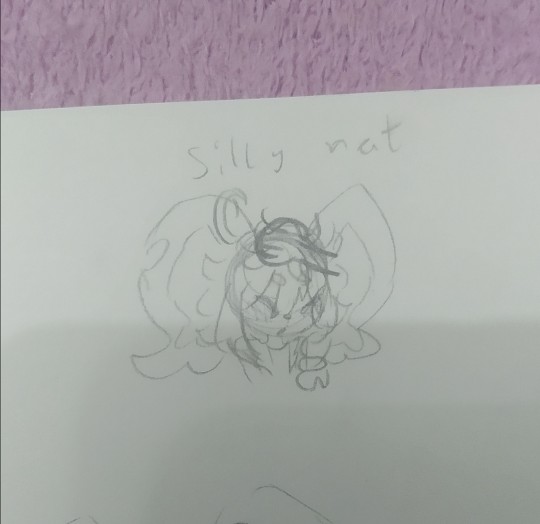
silly rat and wet rat, thats how i call em (because wet rat alien fetus is too long sometimes)
you can tell the brainrot was too strong (were near done(kinda))
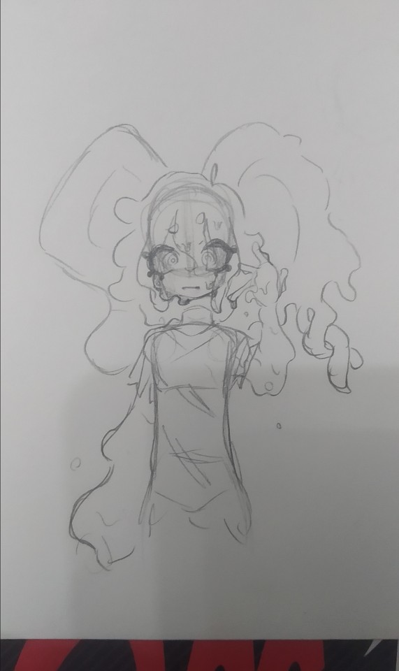
they gain a mouth whenever i fell like it very much
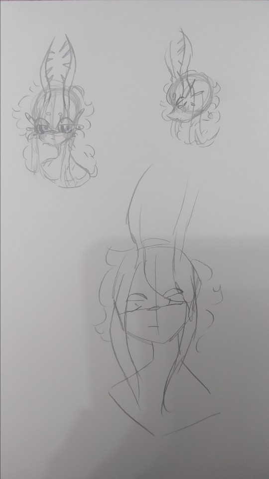
artblock hit, and all the rest of pages i stared at them for 30 minutes
it felt weird looking at my fecto elfilis with the eyes so big, it looked off (in a weird way)
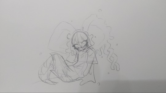
dunno, tried drawing them in a different pose i i dunno really
i think these are from tuesday. i did more but those were oc (mostly splatoon) or other kirby character related, and i want this to be a rat post (might post those tommorow or another day maybe)
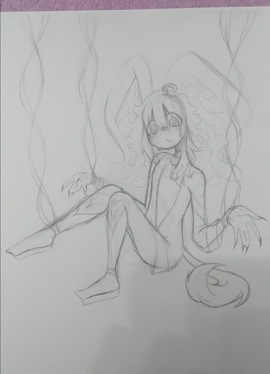
i dunno (x2), i tried drawing elfilin like elfilis, i really liked the hands here. i still struggle a bit with anatomy but i think this was quite good for my usual character just stading looking at the front or a quarter profile. im considering making this into a fully digital drawing, what do i say by considering im actually doing that fuck it, i just think it looks kinda cool

"This new creation, driven by pure chaos, was defeated by the bright light of Kirby's hope."
Chaos Elfilis reminds me of a moth. kirby's hope is a bright light.
you can see my thought process. i just thought itd be a bit cute and kinda silly and funny.
the kirby fandom wiki, said that chaos elfilis looked akin to a moth, and it just stuck with me, so i wanted my gijinka of them to be moth inspired, and thats when i saw just how cute moths are! i mean im still a bit scared of insects but at least now i kinda like em.
i feel like i need to say sorry to that one moth i desintegrated in a matter of seconds with a book because i thought it was an spider and didnt think (im so sorry little guy)
but ah yeah elfilis, moth, it made sense to me since chaos elfilis has the soul of morpho knight, who is a butterfly, and moths are kinda like butterflies too. and i thought itd be cute
so uh yeah i sometimes like making my chaos elfilis be a bit like a moth, that includes liking light, a lot, so uh kirby is like a lamp in here because i said so
now to talk about the desing since for some reason i hadnt earlier, as i said before, they are very moth inpired so uh im might say that word way too many times (im sorry i suck at explaining stuff)
their horns are thinner to resemble moth anntenae, and they curve just because i thought it look cool, and to differentiate it a bit from fecto elfilis. their bangs tie into a bun (i forgot to draw that but i dont wanna go and change it now, way too tiredv man and i still have to post this on other places) the bun looks a bit like an eye, because well, they are basically a soul boss, and moths have things in their wings that look like eyes, btw chaos elfilis doesnt have their wings here because i got lazy and i didnt want them to like cover most of the drawing. the things coming from their bun are like the trhee things theyve got in their head, theyre shaped like that to resemble insects legs a bit, fecto elfilis also had the 3 things (i dunno how to call em sorry) as their eyelashes, but chaos elfilis has just white eyelashes, because the bun already has the 3 things and because my morpho has white eyelashes so (i still havent done my morpho gijinka yet, i just know im gonna give the butterfly some white eyelashes cuz cute and pretty grimm reaper) the rest of the hair is shaped into like a ponytail but like, adn shaped, with whats left shaped like a lil moth
the waistband they have is a nod to morpho, they used to have a bow shaped just like the butterfly morpho appears as, but i took it out because i thought it crowded the design way too much, and also because it was too on the nose. the arms have those golden things because my fecto has it and because my og chaos elfilis gijinka had them so i wanted to bring it back, the hand fades into white because the red in the hand wasnt hard to distinguish so i came up with that to make it easier to see.
the red part of the pants are actually a bit fuzzy akin to a moth and the white part has those stripes to loke like insect stuff because y'know akin to a moth. the boots are like the red part in their legs their model in-game has, so i just made em tall boots, the high heels? originally it was platform just ike my fecto but then i wanted to draw them in high heels when i was slightly redoing chaos elfilis, and welp, i loved it and now theyve got high heels. those rings around the ankle are inspired by the ones leaongar has around their arm. also can you tell anatomy is not my strong suit? and that i dont draw high heels often?
i made a slight change in my kirby, making the sleeves be a different color, since the one he had before i felt was way too white, and i wanted to have more saturation in it
i also forgot but elfilin is supposed to wear that during forgotten land, and then i decided that after the anding of the main story he changes clothes, but i forgot about that while doing this so he has his pre-ending clothes (also because i still cant really decide on their second outfit for the post-game)
god im so tired i wanna talk and show more drawings but o shit im sweating why is it so hot in here
um thank you for reading all the unnecessary long rambles about why i do certain stuff in my gijinkas, i appreciate it a lot (im still sorry about writing walls upon walls of text but i just cant help it)
Jambuhbye! :D
#art#fanart#kirby#kirby fanart#kirby gijinka#silly#digital art#firealpaca#traditional art#fecto elfilis#elfilin#chaos elfilis#kirby elfilis#fecto elfilis gijinka#elfilin fanart#elfilin gijinka#chaos elfilis gijinka#gikabi#gijinka#fecto forgo gijinka#fecto forgo#shitpost#they have invaded my brain#fuck it the next drawing are probably gonna be them too btw#its 1:53 rn lord save me please#you know what#staright up kill me please#i love you tumblr mwah thank you for not having such a small character and image limit like x formerly know as twitter#i still dont know why the alastor elfilis blew up on twitter#im cooking some fanfics btw
34 notes
·
View notes
Text

look at me getting shit done!!
okay so for the next tarot card, the High Priestess, i chose the figure of The Body - specifically Harrow's obsessive characterization and adoration of her. The High Priestess in the Arcana tarot "guards the threshold between the physical and spiritual planes," which in my interpretation can be seen in the way Harrow turns to The Body for guidance while she grapples with reality and the River in HTN. The High Priestess is the divine feminine, which I don't necessarily think is reflective of Alecto, but of Harrow's idealized version of The Body and her devout worship. pulling the High Priestess in a reading can signify the importance of prioritizing your intuition and subconscious mind, themes that are obviously very prominent in HTN. while drawing this card i also started to think about how in christianity, there is the holy trinity: God, Jesus, and the Holy Spirit. something about Alecto's series of personalities (The Body, Nona, Alecto) is reflective of this trichotomy and i just thought that was interesting. do i have any grand plot analysis about this thought? no. but that is okay
i have to apologize for how long it took me to crank this one out; i started to get frustrated with the rendering of all the background portions and i was also depressed because of my job (which I quit!) so it took me awhile to finish. i finally just forced myself to finish it though and i'm really happy with the result! that being said, for my next card i'm going to try a new lineart technique, and i'm excited to see how that goes, so stay tuned!
edit: i realized i left some lineart in my drawing over the hair that was meant to be erased...had to fix that and also i'm posting the print version rather than the card version :)
#tlt#the locked tomb#tarot#alecto#the body#htn#atn#gtn#ntn#harrow the ninth#digital art#queer art#analysis#the background is supposed to be a frozen lake bc i could not get myself to draw any more rocks#also the metal is all frozen too and i know the tomb is encased (i think) but lets just call it artistic liberties#self reblog#edit
65 notes
·
View notes