#Create Snip Corner Rectangle
Explore tagged Tumblr posts
Note
do you have a tutorial or pattern available for your cardboard masks? i love the shape and proportions of them
i went ahead and made an illustrated tutorial that i hope will be helpful :) thank you btw!


I started this mask on the snout, which is originally a flat rectangle. then i fold it into 3 parts, so it becomes kind of like a hollow shape. then the top front corners get snipped but only part way! just enough so they can be folded in and create the muzzle shape. the edges can be trimmed to make the nose pointed and the muzzle lips rounded.

after this i cut a long straight rectangle and bend it a bit before attaching it to the nose bridge. then i cut out two parts for the cheeks which should be flat on the edge which they attach to the muzzle, and round on the egde which forms the side of the face. these should also be slightly bent to create a rounded cheek. the step after this can be tricky, which is cutting two more straight rectangles and then bending them to bridge together the forehead strip to the cheek pieces. this step ends up really defining the shape of the face depending on how bent/long/tight you make them

after that I cut out little triangles to fill in the gaps to create an appropriately sized eye, and for this one I also added some strips to form eyelids. the ear shape varies depending on species but i generally try to bend them a bit to add depth (admittedly the cat ear shape i've illustrated is based on the pattern for Furby ears lol)

the final touches for me are making the eyes out of mesh and attaching elastic using paperclips, and then you can paint/felt/fur/decorate it however you want!

yayyy yippeeeeeee I hope that helped :3 have fun
447 notes
·
View notes
Text
Mille-feuille recipe
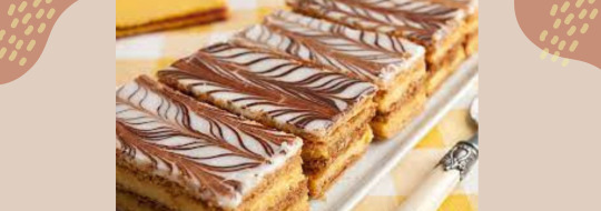
INGREDIENTS
For the Pastry and Filling:
1 1/2 pounds frozen puff pastry, or 1/2 batch homemade pâte feuilletée
3 cups store-bought pastry cream (or homemade)
Optional: 1/2 cup heavy cream, whipped to medium peaks
2 tablespoons all-purpose flour
For the Royal Icing and Decoration:
80 grams bittersweet chocolate, melted
2 large egg whites, room temperature
2 teaspoons fresh lemon juice
350 grams confectioners' sugar
>>>>Get access to the tutorial video here<<<<
PREPARATION
Prepare the Pastry and Filling
Gather the ingredients. Preheat oven to 400 F / 200 C.
If using homemade puff pastry dough, have it ready and chilled. Or thaw store-bought frozen puff pastry dough according to the package directions.
If you want to lighten the texture of the pastry cream, fold the optional whipped heavy cream into it. Cover and refrigerate until assembly time.
Bake the Pastry Layers
On a lightly floured surface, gently roll out the puff pastry dough into an elongated rectangle, the thickness of a thin piece of cardboard.
With a sharp knife, cut the dough into three equally sized pieces.
Transfer the dough to a baking pan (or pans) lined with parchment paper and pierce the dough all over with a fork.
Cover the dough with another sheet of parchment paper and place a baking pan or pie weights on top to weigh down the dough as it bakes.
Bake the weighed-down dough, in batches if necessary, for about 18 to 20 minutes or until the dough is deep golden brown. The weights and the top layer of parchment paper pan can be removed for the last 5 minutes or so of baking to help crisp up the dough.
Transfer the baked pastry layers to racks to cool completely.
>>>>Get access to the tutorial video here<<<<
Assemble the Mille-Feuille
Gather the ingredients. If the baked pastry layers look unevenly sized, you'll have the chance to trim the edges for a uniform look after assembling the pastry.
Start by distributing half of the pastry cream over one layer of baked puff pastry.
Top with another layer of dough, pressing gently to adhere it to the pastry cream.
Spread the remaining pastry cream over the second layer of pastry, top with the third layer of pastry, and again press down gently. Reserve.
>>>>Get access to the tutorial video here<<<<
Decorate the Mille-Feuille
Melt the chocolate in a saucepan over very low heat and transfer it to a pastry bag or decorating tube fitted with a fine round tip. Alternatively, you can use a small plastic bag with a pierced or snipped corner to make a tiny opening. Reserve.
Using a standing mixer or mixing by hand, make the royal icing by beating the egg whites, lemon juice, and confectioners' sugar on low until the mixture is very smooth and glossy. This should take at least 7 to 10 minutes.
Add more confectioners' sugar or water, if necessary, to achieve a consistency so that when the icing is drizzled back into the bowl from the beaters, it will sit briefly on the surface of the icing before sinking back in.
Immediately pour the royal icing over the top layer of the assembled pastry and spread it evenly over the entire surface with the help of a spatula. Some of the icing might drip over the edges.
Working quickly before the icing sets, drizzle the chocolate across the icing in evenly spaced parallel lines. Don't worry if some of the chocolate drips over the edges or if your lines look sloppy. After trimming the edges the appearance will be very refined.
Drag the tip of a thin, sharp knife through the lines of chocolate, spacing them evenly from one side of the pastry to the other; go first in one direction and then in the opposite direction to make a chevron pattern. This creates the most classic mille-feuille decorative pattern.
Before trimming the edges or cutting into individual portions, refrigerate the assembled mille-feuille for at least two hours, or freeze for at least 30 minutes if pressed for time.
>>>>Get access to the tutorial video here<<<<
#cooking#foodie#recipe#cookingtips#homecooking#foodblog#frenchpastry#french pastry#patisserie#french baking#french dessert#french recipes#pastrychef#bakinginspiration#french cuisine#homemadepastry#french food
4 notes
·
View notes
Text
Pleated mask tutorial under the cut!
I hope this makes sense! I can’t communicate.

First: fold your fabric and put your template on top. The bottom of the template should touch the folded edge. for reference, my template is 8 inches tall and 8.5 inches wide. It’s kinda hard to see cause it’s clear acrylic though! But you can make a template with a piece of printer paper. Anyway, cut around the sides and top edge to create your fabric piece.
Also see that line in the upper right of my template? Mark that and sew a button hole there. I completely forgot to do this for the tutorial cause I was watching TV.... It’s 3/8 long, starts 3/4 of an inch from the top of the fabric, and is 1 7/8 inch from the side. But really you can put it anywhere off to the side as long as it’s 3/4 of an inch from the top.

Here we have the cut fabric. Opened up it’s 16 inches tall and 8.5 inches wide.

Fold the fabric back in half but inside out. Use pins to mark a 4 inch gap in the middle of the top (opposite side of the folded edge).

Sew with a 5/8 inch seam allowance from the edge of the fabric to the pins, leaving the 4 inch gap open.

You’ll now have a fabric tube. Roll it slightly to bring the 4 inch gap down from the top. Make the extra fabric that sticks out beyond the seams you just sewed in line with the top of the fabric roll. This is hard to explain so I hope it makes sense! Also, if your fabric has a definite front and back, you want the front facing the ironing board here.
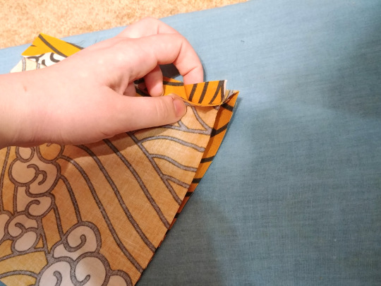
I hope seeing it from the side shows what I mean a little more. Anyway, once you have it lined up, iron it flat.

Now cut two 7 inch pieces of elastic. open a side of the mask and put the elastic on the inside, pushing the end of the elastic into the corner of the mask. It should meet the edge of the fabric flush. Pin it into place.

Push the other end of the elastic into the other corner of the fabric and pin that in place.

Stretch the side of the mask flat with your hand and put a pin in the middle. Repeat these elastic steps with the other side of the mask.

The mask will kind of pull itself into this shape because the elastic is pulling the fabric in.

Next, sew the sides with a 5/8 inch seam allowance. Don’t sew over any folds! Stretch the elastic out of your way as you go so your end product is a flat (though slightly scrunched) rectangle.

Like so.

Snip all 4 corners off the mask close to your seam. You’ll snip a little piece of elastic off too, that’s fine.

Flip the whole thing inside out through the 4 inch gap hole.

Iron it flat again.
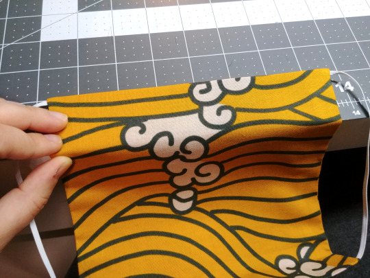
Not make your pleats. I keep them even by draping them over the edge of my table and then pinching the corner.

Also I do the top and bottom pleats first because they’re the most obvious. Then whatever fabric remaining becomes the middle pleat.

Like so. You can use pins but I use clips because it’s easier for me to reposition the pleats and also I stab myself less.
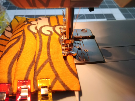
Finish the mask of by sewing the pleats down by running a stitch all the way around the outside edge of the mask. Sew really close to the edge. As this seam goes across the top of the mask it will also form the pocket that holds the nose wire.

Different mask, but you can see here. The button hole is the entrance to the nose wire pocket.

And it’s done! You can iron it again to press the pleats but the seam around the edge will hold them in place more than anything.
36 notes
·
View notes
Text
Erawan with Bangs: A Fanfiction
I hate y’all for making me write fanfiction for this goddamn series. This is not my best work, but I wanted to contribute to this extraordinary idea, and my lack of art skills would be a disservice to the EWB cult community. People mentioned by name: @crescentcitysux @croissantcitysucks @antisjmmemes . Obligatory tag: @erawanwithbangs . This was barely researched, so it’s probably inaccurate in places, but I refuse to devote precious time to this shitty world. This got a lot longer than I expected, and it’s also the first time I’ve actually written in a while, so forgive me for the low quality.
Erawan, King of the Valg, Ruler of Darkness, future Emperor of all Erilea, was taking a walk through Morath.
Being such a powerful, dastardly monarch of evil was a tiresome job, and walking through his former vessel’s city and reveling in his power and authority was always an enjoyable past-time. All was silent as he strolled through the streets of the mountainside city, breathing in the crisp, cool air and surveying his territory. Even his fellow Valg, not that he shared any resemblance to them beyond origin, stayed away, sensing the power he possessed and steering their human hosts away, pausing only to bow in deference, wholly black eyes lowered to the dirt, before departing. As they should. He was King of the Valg, and he would not tolerate impudence. He was special, different, not like the hordes of common demons. His only equals were his brothers, his fellow monarchs, still barred from entering Erilea. For now.
He paused mid-step as his gaze spotted the edges of a cloak whipping around the corner of a crumbling stone building, eyes narrowing as he quickened his pace. There was something foreign about whoever he was approaching, he could sense it. They didn’t have that oily, hissing black aura that accompanied the Valg, nor the blood and iron scent of the Witches, or even the ashes and cream that followed the Fae. Whatever it was, it closely resembled that of humans, the stale white bread and salty tang of seawater, but there was something else. Something new.
“Hey, you!” he snapped as he rounded the corner and caught sight of the person whose species still eluded him. There were three people, and he caught a variety of different impressions: drying ink, old parchment, rain on pavement, dust-filled libraries. They were dressed in mortal clothing, but it was nothing like the modest, formal rags he was accustomed to. It was all short sleeves and denim, strange pictures covering their shirts. “I demand to know who you are and what your business is in my city.”
They blinked at him, turning to each other and conversing in hushed whispers before one of them spoke. “I’m Aelia,” she said, and then pointed to her companions. “That’s Lyn, and that’s Salty. We’re here on vacation.”
“...Vacation. Here. In Morath. In Valg territory.”
“Yes, that’s what she said,” the one called Salty said, rolling their eyes. “Our world got annoying, with all their bickering and pandemics and fires and refusal to stop perpetuating outdated views on race, gender, and sexuality, so we decided to come here.”
“You’ve got a very nice city here, Erawan,” Lyn said, a very serious look on her face. “Very evil-looking. I’m getting a ton of demonic vibes. Love it.” They exchanged conspiritorial glances and burst into peals of laughter. He exhaled sharply through his nose.
“I don’t know how you know my name, and I don’t know mortals like you got into Morath, but you will leave, and you will leave now, or I will make you.” He raised his hands, and tendrils of writhing darkness slid from the centre of his palm, winding around his fingers and up his arms. But rather than looking frightened or intimidated, they continued laughing, and the last of his patience evaporated at their disrespect. With a snarl, he flung out his hands, twin whips of shadow lashing out at the trio of mortals who dared make fun of a Valg King.
Aelia raised an eyebrow. “Chill out, Erawan. Take a joke.” They flicked their wrists, and his darkness dissipated. Furrowing his pale brows, he tried again, but they again vanished before touching the humans.
“Well, you’ve been a very impolite host, Erawan,” Lyn said, looking disappointed. “We were going to stay longer, but I suppose we’re not welcome here. Come on, guys.”
“By the way, your forehead is massive,” Aelia added as they span on their heels and began walking off. “Maybe you should get bangs to cover it!”
“Erawan with bangs!” Salty exclaimed, and with a final howl of laughter, they disappeared, leaving him standing in the middle of the street. He had never felt more insignificant, more powerless. How easily they had humiliated him!
Hours later, he was still fuming over the incident as he stood in front of his mirror, examining the ivory expanse of his forehead. It’s a perfectly ordinary forehead, he reasoned to himself, measuring the width of it and frowning. Those intruders were just trying to annoy you, to make you doubt yourself. But they had succeeded; he had never realised just how big his forehead had been until they had so casually told him. It was so large! The universe had made him beautiful beyond reason, but it had not deigned to give him a normal-sized forehead. He withheld the urge to slam his fist into the mirror, instead thinking of a better solution.
With a wave of his hand, the hair at the top of his head began growing at an accelerated rate, and he brought it down to his lips, picking up the scissors on the table and leaning in so that his nose was pressed against the glass. He would have preferred for one of his brothers to do the deed, but they were not here, and he needed to remedy the problem immediately. His hand wavered as he figured out where to start, but with his scissors splayed open and readied at the bottom of his eyes, he began to cut.
A few snips was all it took, as well as a few more stylistic ones. Discarding the strands of golden-blond, he stepped back and grinned, admiring his new haircut. While before his hair had been slicked back, revealing all of his gargantuan forehead, now there was a healthy set of bangs concealing his greatest shame from sight. They reached his brows, thicker in some sections and thinner in others, creating a fantastic layering effect and breaking up what would be a horrific straight line. He nodded in appreciation.
But when he turned, a flash momentarily blinded him. When he blinked away the harsh light, he was greeted with the three insolent mortals, all holding a small rectangular contraption which had been responsible for the light. They were comparing something on the rectangles and giggling. His fingers twitched, but he refrained from trying to strike at them again.
“Oh my god,” Salty squeaked, flailing their arms. “Erawan! With! Bangs!”
“The people need to know about this,” Lyn declared.
“We’ve created a monster,” Aelia sighed, but there was no regret on her face.
“Hey,” he snapped, crossing his arms over his chest. “Are you making fun of me? I like my bangs!”
They quieted and stared at him, gazes penetrating, until he had to tear his eyes away. When he dared look back at them, they were nodding to each other in agreement.
“Bye, Erawan with bangs!” they said, giving him mocking, cheerful waves as they once again disappeared, just avoiding the scissors that he had thrown at them. They instead sailed through empty air and ripped through the fabric of his favourite shirt. He could practically hear Aelia, Lyn, and Salty’s jeers of laughter, their cries of “Erawan with bangs!”
When later the Valg princes asked about the screams of rage that had shaken the whole city, he would blame it on that sex-obsessed, fire-wielding nuisance of a queen. The searches he ordered to hunt down three strangely-dressed, rectangle-holding mortals turned up empty.
45 notes
·
View notes
Photo
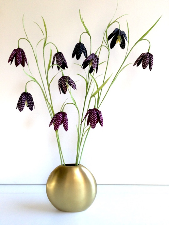
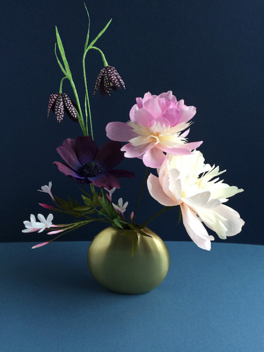
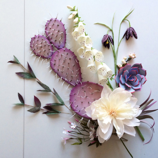
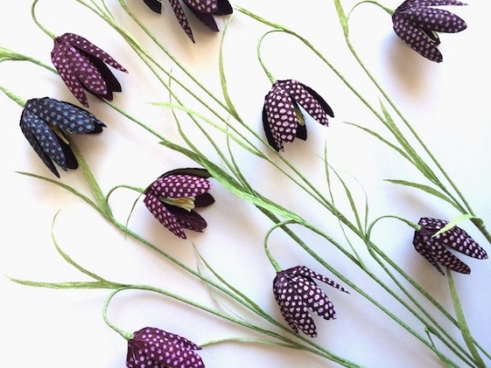
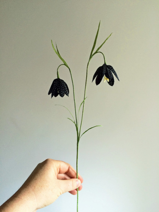
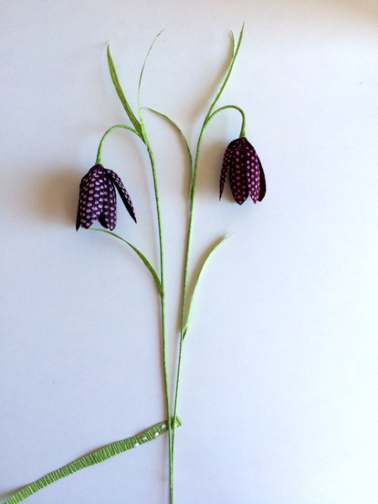
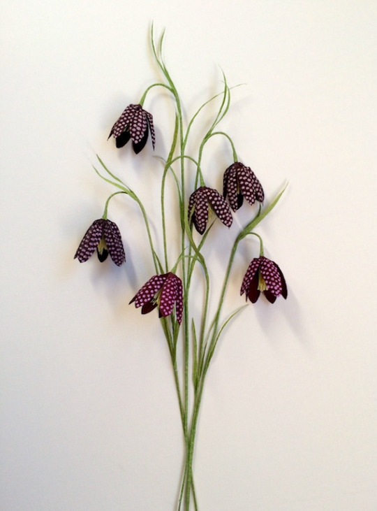
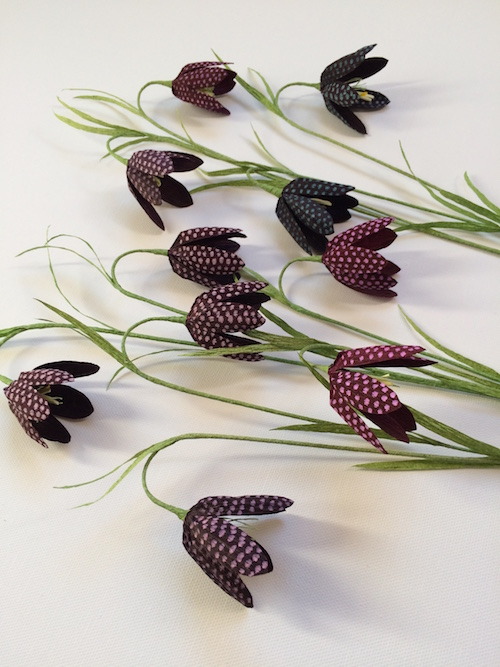
Crepe Paper Fritillaria Tutorial
The fritillaria meleagris is a spring blooming bulb, but its common names — which include snake’s head fritillaria, dead men’s bells, leper’s bell, and Lazarus bell — reflect the dark glamor that makes this little bloom perfect for Halloween.
Dyeing and dotting each little petal might seem like a lot of fuss for such a small flower, but even a single sprig with a couple of blooms adds sophistication and complexity to a paper flower arrangement.
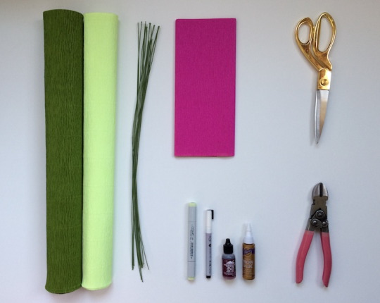
Supplies
Templates
Doublette crepe paper (since you’ll be over-dying the crepe, almost any red, pink, or purple color will work, but I prefer to start with an already fairly rich color to help achieve a deep oxblood color)
Green crepe for foliage and stem wrap (I’ve used extra heavy crepe in moss from Papermart)
Pale green crepe in any weight (I’ve used “limon” heavy crepe from Papermart)
Small yellow stamens (or make your own using the instructions in this tutorial)
Lily stamens (or make your own using the instructions in this tutorial)
22 gauge cloth-covered stem wire
Aleene’s original tacky glue
Hampton Art Chalk Marker (fine point) (other white paint pens might work, but I tested several different types and found that this one gave the best results)
Ranger ink in any dark red, pink, or purple (I especially like “currant” for this project, but it can be nice to use a few and have some variation in your blooms)
Copic marker in color G20 (“wax white”) to color white lily stamens
Sharp scissors
Wire snips
This tutorial is for personal, noncommercial purposes only.
A note about grain
The little crinkles in the crepe paper should run up and down your petals and leaves, rather than side to side. This will mimic the veining that occurs in live plants. When you’re ready to cover the wire your flower is built on, you’ll cut thin strips across the grain of your moss green crepe paper, so you can gently stretch them as you wrap, creating a smooth stem. Templates on the template sheet are drawn so that the grain runs from the top of the template to the bottom (so parallel to the template letter).
Building the center
The fritillaria center is a combination of fine, light green fringe, 2 small yellow stamen heads, and 2 larger lily stamen heads.
Use template A to cut a rectangle from your pale green crepe. Stretch the rectangle horizontally so that all the wrinkles are pulled out. This will give you fringe for several flowers.
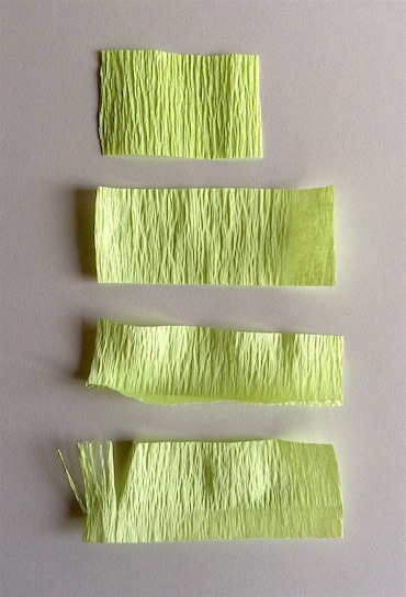
Use the dotted line that runs across the bottom of the template as a guide, and crease and then uncrease the bottom of your rectangle. This crease line marks how far you should cut into the rectangle as you make the fringe.
Cut a fine fringe across this rectangle, cutting your fringe lines with rather than across the grain. Snip off 3/8” of your fringe rectangle. Gently twist and then untwist the fringe to make it look more organic. Straighten with your fingers.
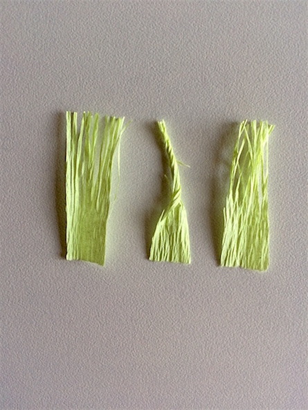
Remove two lily stamens from your bundle and color them with your light green copic marker.
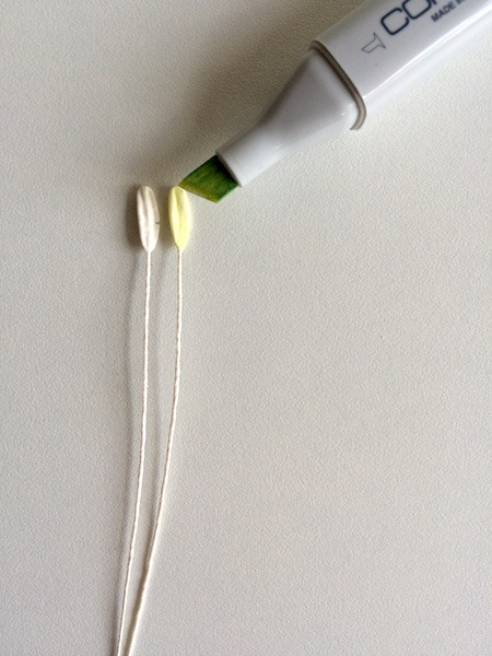
Remove 1 small yellow stamen, and bend it in half.
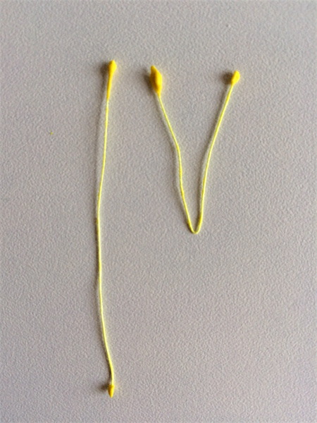
Dot a small amount of glue on your green fringe, on the area below the crease line that you haven’t cut into.
Lay two lily stamens down the center of the fringe piece, lining up the tips of the stamens with the tips of the fringes.
Lay your tiny yellow stamens on top of the lily stamens, so that the yellow stamen tips fall a bit lower than the lily stamen tips. Gently press the stamens into the glue on the bottom of the fringe.
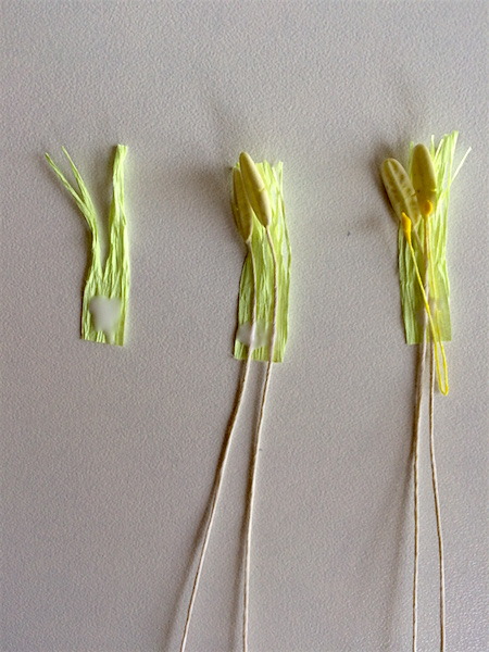
Trim along the bottom of your fringe to create a clean edge.
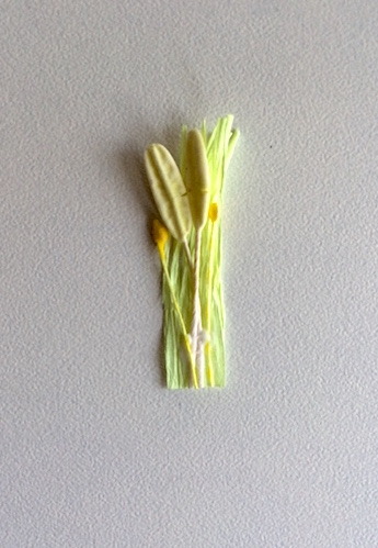
Apply a bit more glue across the bottom of your stamens and fringe. Place your stem wire on the fringe and stamen stack, so that the tip of the stem wire falls just above the crease line.
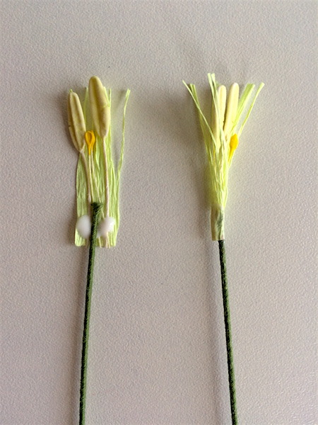
Wrap the fringe piece around the wire. (It’s not important that it be a perfectly smooth wrap. If you find yourself gathering and smooshing the fringe and stamens around the tip, that’s fine. Just pinch all around to smooth it out.)
Dyeing the crepe
To achieve the rich, deep oxblood color, choose a doublette crepe in dark pink or red. Work in a well ventilated area. You may want to wear gloves and use a disposable container to avoid pink fingers and a permanently pink dish.
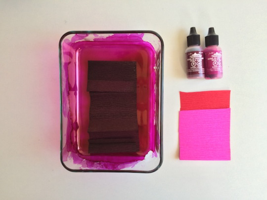
I like to work in small strips and squirt the ink directly on the crepe for maximum depth of color. Wait until completely dry to proceed.
Cutting petals
Use template B to cut six petals, making sure that the grain runs up and down the petal rather than from side to side.
Follow the directions on your paint pen, and practice a little bit on a scrap of crepe paper until you feel comfortable with the flow of the pen and the size of your dots.
Working in straight lines from the top of the petal to the bottom, apply columns of similarly sized dots. The columns should be fairly close together and fairly regular, but if you just dot like you mean it, it’ll come out great. No need to be excessively precise or regular. I find it helpful to do my first row right down the middle, and then cover the petal on either side of this row. Let the dots dry.
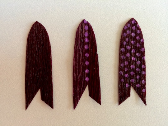
Shaping the petals:
Template C shows a tiny shaded area on the top, right of the petal. Apply a very small amount of glue to this area.
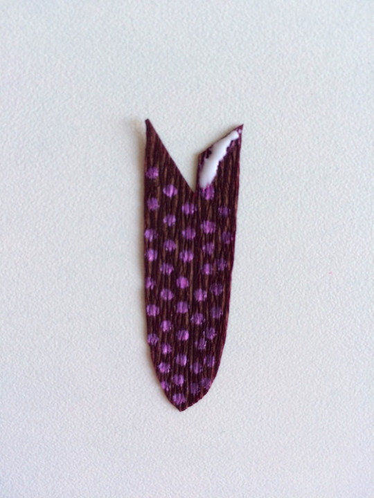
Template C also shows two dotted lines, one on the upper right of the petal and one on the upper left. Tuck the glued section under the upper left area of the petal, lining up the dotted line on the upper left side of the petal and the dotted line on the upper right side of the petal. The point on the left side will extend slightly past the point on the right side.
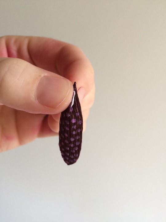
Wipe away any excess glue.
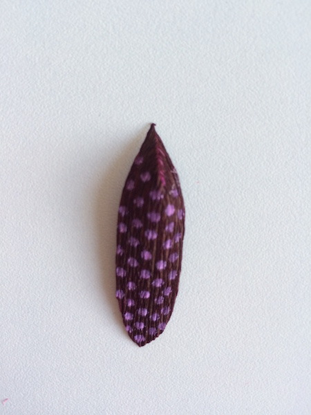
Working with a small section of the petal at a time, gently stretch the petal horizontally, from the bottom of the petal up to the little corner or point that was formed when you glued the two upper areas of the petal together.
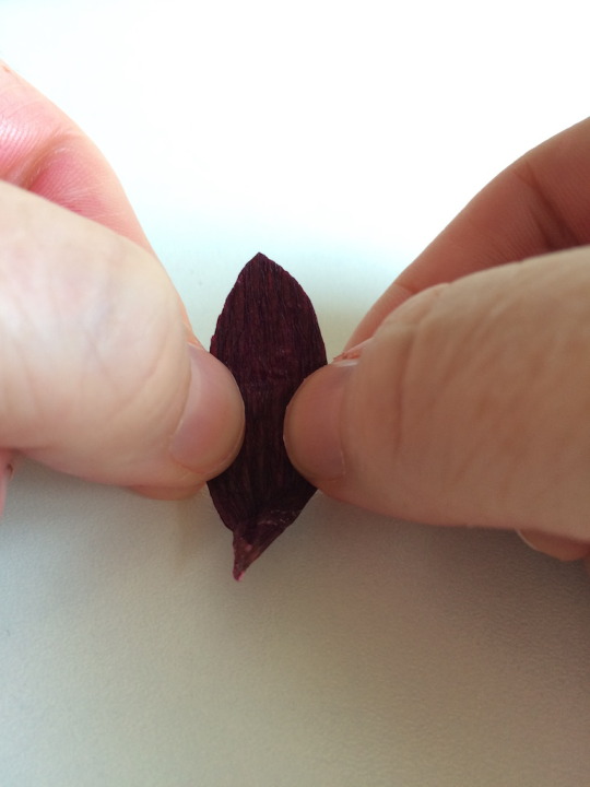
Attaching the petals
You’ll attach the petals in two rounds of three.
Dot a small amount of glue to the pointy tip of your petal.
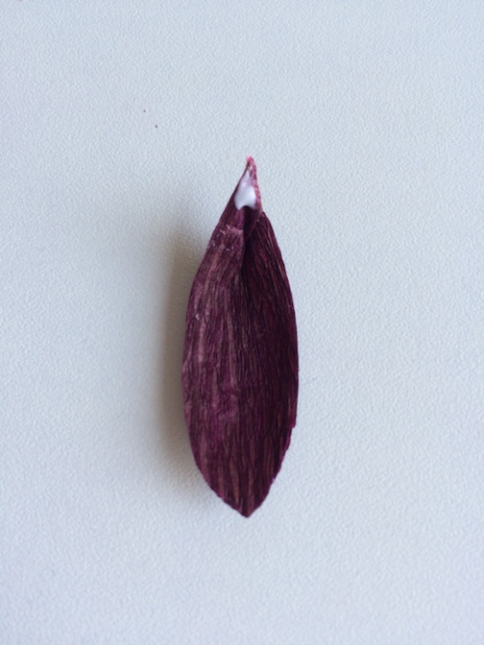
Position the petal so that the tips of the stamens fall about two thirds up the petal. Press the bottom of the petal into the wire.
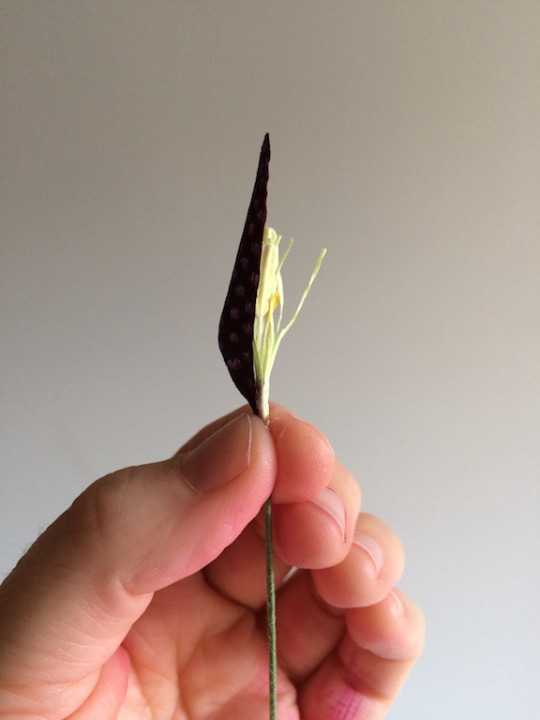
Add two more petals, so that your first three are evenly spaced around the stamens. Let dry.
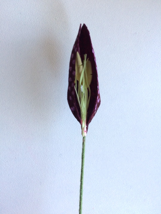
Image above: The first two petals positioned around the center.
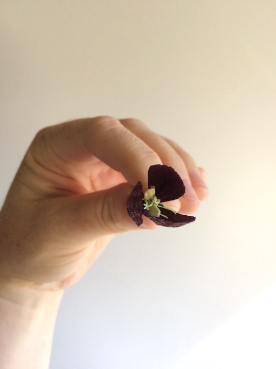
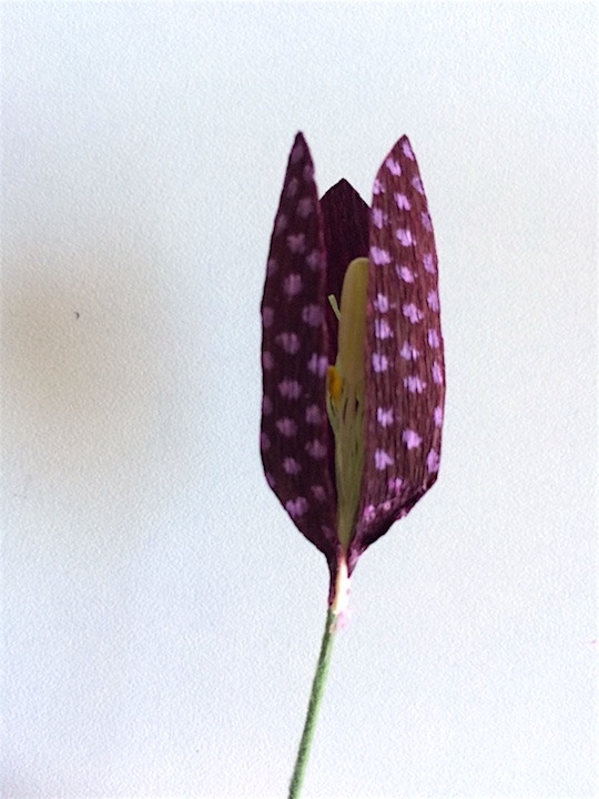
Image above: The first three petals spaced evenly around the center.
The first three petals will have little gaps between them like this:
These gaps are where you’ll place your second set of three petals so that you have two staggered rounds of three. I’ve pushed out the second row of petals below so you can see the placement.
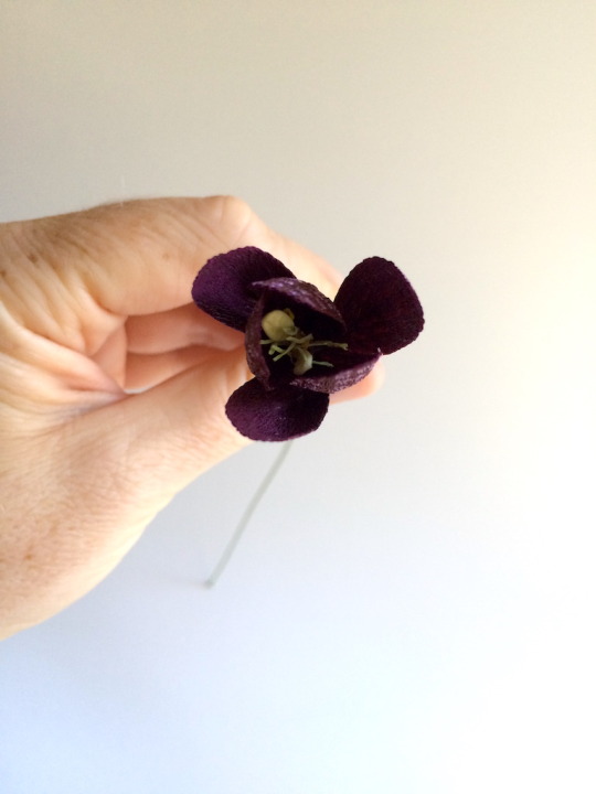
Wrapping stems:
Cut several 6-8” x ¼” strips across the grain of your medium green crepe. These will be your stem-wrapping strips.
Dot glue lightly along the first two inches of the strip. Start at the bottom of the bloom, covering the bottoms of the petals that are glued against the wire. Hold the strip at a 45 degree angle to the wire, and gently stretch as you spiral down the stem. Continue to add glue, two or three inches at a time.
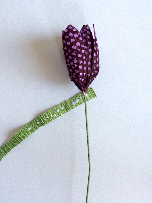
Wrap all the way to the bottom of the stem and then clip any excess green crepe.
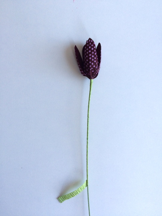
Adding leaves
Fritillaria leaves are very simple to free hand. Cut an assortment of narrow, tapered blades roughly 1/8” inch wide and between 2” and 5” long.
Curl these very slightly by holding the leaf the way you would curling ribbon, that is, by gently scraping the length of a leaf between your scissor blade and thumb.
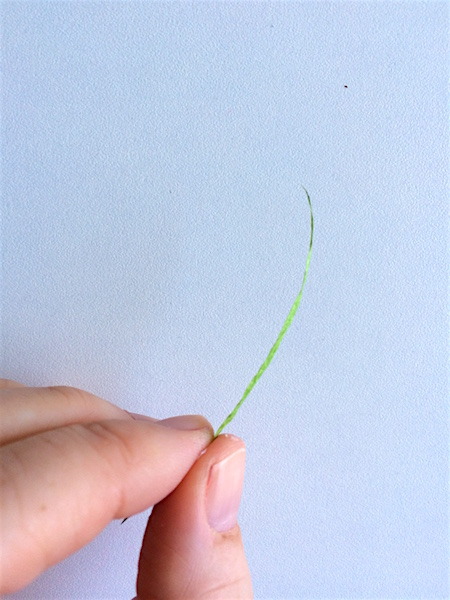
Dot a very small amount of glue on the bottom of two of your blades.
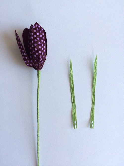
Attach them to the stem, 1.5”-2” from the bloom.
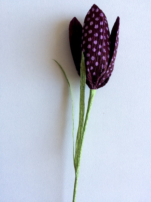
Use another lightly glued strip of green crepe to cover the bottom of this foliage and wrap toward the bottom of the stem, just as you did when you wrapped the bottoms of the petals.
Gently bend your stem so that the fritillaria looks down. Gently push the bottoms of your foliage blades so that they follow the curve of the wire a little bit. This will make them sweep upward at an angle, rather than sticking straight up.
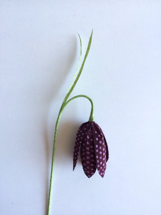
After my stem is shaped, I like to add one or two more blades to my stem, varying their placement to add variety to my bouquet. I don’t worry about wrapping the bottoms of these.
Finishing your flower
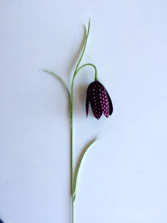
Finally, for arranging purposes, I like to join two fritillaria stems into a single stem, wrapping them together starting about 1/3rd of the way up the stem. Dot another green horizontally cut wrapping strip with glue, and wrap the two stems together, making sure that the blooms are facing opposite directions.
Wearing safety glasses, use your wire snips to trim the bottom of the stem to your desired length.

10 notes
·
View notes
Text
Java 10 Support & Nested Reports Provision by LINQ Reporting Engine inside Java Apps
What's New in this Release?
Aspose development team is happy to announce the monthly release of Aspose.Words for Java 18.8. There are 86 improvements and fixes has included in this regular monthly release, such as Java 10 tested and supported now, New and updated Samples and Examples, Change SHA-1 to SHA-256 and public asymmetric key from 1024 to 2048 for the license mechanism, Implemented support for “underline trailing spaces” compatibility option, Implemented support for paragraph alignment in Omath when inserted using EQ fields, Enhanced computation of interscript spacing values based on TTF properties, Improved wrapping of text around floating objects, Improved calculation of position of floating tables and shapes, Improved floater overlapping logic, Improved computing of pages numbers in continuous sections which have restart attribute and conflicting oddity, Fixed line justification issue when RTL span is at the end of the line, Fixed issue with null dml properties, Fixed issue with rendering of floating shapes in truncated headers/footers, Fixed issue with rendering of lines inside of a field result when updated in truncated part of a cell, Improved rendering of math operators in MathML objects, Improved rendering of MathML objects with n-ary math element when n-ary character and limit location are not specified, Fixed a bug with rendering of a math n-ary element if it is part of a fraction, Fixed a bug when polyline with an arrow and a very small line segment at the end, Fixed a bug when an arrow pointer is incorrectly directed while rendering Bezier curves with arrows, Fixed a bug where the end of the line was outside the “stealth arrow” when rendering, LINQ Reporting Engine supports nested reports. Aspose team has tested Aspose.Words for Java with Java 10 and is pleased to announce that Java 10 is now supported by the latest versions of Aspose.Words for Java. Developers can insert contents of outer documents to their reports dynamically using LINQ Reporting. Starting from Aspose.Words for Java 18.8, developers can enable doc tag to check the template syntax and populate with data using LINQ Reporting. By default, a document being inserted is not checked against template syntax and is not populated with data. It has added support to create snip corner rectangles in this version. This release has added HtmlSaveOptions.ExportCidUrlsForMhtmlResources property. Users can use this property to save the resources of MHTML document using the “Content-Id” URL Scheme. It has also added new property ShowComments in LayoutOptions class. This property is used to show or hide comments in fixed file formats e.g. PDF, XPS. By default, the comments are visible. A new property ShowInBalloons has been added to RevisionOptions class. This property is used to show revisions in the balloons. By default, the revisions in balloons are not shown. Previously, Aspose.Words used to save “@font-face” rules of HtmlFixed documents into a separate file “fontFaces.css” while other CSS declarations were written to “styles.css”. We have changed this behavior and now Aspose.Words saves all CSS rules and declarations into the same file “styles.css”. In case the old behavior is required for compatibility with legacy code, it can be restored by using the new public property HtmlFixedSaveOptions.SaveFontFaceCssSeparately. It has added new property RecognizeUtf8Text in RtfLoadOptions class. This property allows to detect UTF-8 encoded characters and preserve them during import. Obsolete value NumInDash was removed from NumberStyle enum. Please, use NumberStyle.NumberInDash value instead. Obsolete method ToTxt() was removed from Node class. Please, use ToString(SaveFormat.Text) instead. The obsolete property Location has been removed from the FootnoteOptions and EndnoteOptions classes. Please use the Position property. Also, the FootnoteLocation emum type has been removed. The list of most notable new and improved features added in this release are given below
Allow setting "Layout in Table Cell" option of shapes
Add feature to create Snip Corner Rectangle
Track changes rendering issue in resultant PDF
Add a feature to escape ampersand symbol during replacement
Change SHA-1 to SHA-256 and public asymmetric key from 1024 to 2048 for the license mechanism
Add feature to populate template document loaded by "doc" tag
Include Formatting Comments in Save To Tiff
Add feature to detect encoding characters and change them to UFT-8 in output RTF
SaveDate field's result become visible after re-saving the document
Reference resources in MHTML documents using the "Content-Id" URL scheme
Spaces and special characters trimmed when rendering
Remove UTF-8 BOM from CSS parts in MTHML documents
Rework span shallow size tests
Combine styles when saving Words to HTML with HtmlFixedSaveOptions
Incorrect font fallback for Asian characters
Implement the second way of rendering the shape outline
Line Caps Rendering - PolyLine caps direction is not correct
Update minimum possible font size
Remove Aspose logo from Venture license in trial mode
Remove obsolete public properties EndnoteOptions.Location/FootnoteOptions.Location
Set RunPr.ComplexScript to True for Thai letter list labels
SetLicense throws IllegalStateException.
Update Metered license code.
Save HTML to PDF-A_1B does not generate indexed images anymore
Borders look incorrect after converting document to PDF using MS Word or Bullzip PDF Printer
Table with different preferred widths extends outside the page when rendered
Table preferred width no longer automatically resizes when cell preferred width is set
Table column widths are calculated incorrectly during rendering
Cell's contents move to next line after conversion from Doc to Pdf
Elbow Arrow Connectors are not rendering correctly in PDF
Visio objects are overlapped in output PDF
Floating table is positioned improperly
Hijri Date is displayed in English Numbers in output DOCX/PDF
Text is missing after conversion form DOCX to PNG
DOCX to PDF conversion results are inconsistent in Multithreading
DOCX to HTML Issue with HtmlOfficeMathOutputMode as MathML
OfficeMath nodes are exported incorrectly as MathML in output HTML
Image generated from Dokkered web app is completely black.
Thai characters are converted to numbers in PDF
text-anchor' property is not imported correctly
Insert SVG into Aspose.Word.Document results in black image
The rendered PDF output is corrupted
Document.UpdateFields displaces text of frame when using 'IncludeText'
Arrow shape is rendered incorrectly
Numbers List Change while Converting Doc to PDF
Paragraph's text is missing in output PDF
Incorrect rendering of the OMath if FirstLineIndent is specified, after converting to PDF
Problem of incorrect Revisions Count after Comparing documents
CSS border style is not applied to image in output PDF/DOCX
Content is rendered on multiple pages in HtmlFixed/PNG
Distance between symbols not preserved in PDF
Borders of some SmartArt elements not preserved in PDF
LayoutCollector.GetStartPageIndex returns wrong page number
Equations render partially in generated PDF
Document.UpdateFields generates wrong alphabetical sort order for INDEX field
PDF output doesn't match the original DOCX document
Word breaking in Thai language is wrong
Signature images are not visible in generated PDF/Imag
Unknown yellow color rectangle is rendered after conversion from DOCX TO PDF
DOCX to PDF conversion issue with textbox shape glow
StartTrackRevisions hangs and process does not complete
Incorrect rendering of the text outline with zero width after converting to PDF
Extra pages are created when DOCX is converted to PDF
Improve conditions for hanging punctuation
Vertical spacing between Paragraphs increased when rendering to PDF
Remove whitespaces from MathML content while importing html to model.
Line Caps Rendering - Stealth arrow is rendered incorrectly.
Line Caps Rendering - Curved arrow has incorrect direction.
Other most recent bug fixes are also included in this release
Newly added documentation pages and articles
Some new tips and articles have now been added into Aspose.Words for .NET documentation that may guide users briefly how to use Aspose.Words for performing different tasks like the followings.
Inserting Documents Dynamically
Create Snip Corner Rectangle
Overview: Aspose.Words
Aspose.Words is a word processing component that enables .NET, Java & Android applications to read, write and modify Word documents without using Microsoft Word. Other useful features include document creation, content and formatting manipulation, mail merge abilities, reporting features, TOC updated/rebuilt, Embedded OOXML, Footnotes rendering and support of DOCX, DOC, WordprocessingML, HTML, XHTML, TXT and PDF formats (requires Aspose.Pdf). It supports both 32-bit and 64-bit operating systems. You can even use Aspose.Words for .NET to build applications with Mono.
More about Aspose.Words
Homepage Java Word Library
Download Aspose.Words for Java
Online documentation of Aspose.Words
Post your technical questions/queries to Aspose.Words Forum
Receive notifications about latest news and supported features by subscribing to Aspose.Words Blog
#Java 10 Support#Nested Reports by LINQ Reporting Engine#Create Snip Corner Rectangle#Reference Resources in MHTML File#Java Word Processing APIs#Show Revisions in Balloons
0 notes
Text
Assistant Animator Task- Chinese Houses

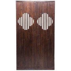
For this task I was asked to make two Chinese houses based on the references provided. I was given one image as the main focus for what type of house the animator wanted and a few other images for just inspiration. Later on when I had finished the houses, I was given an image for the style of doors the animator wanted.
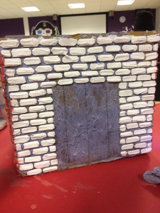
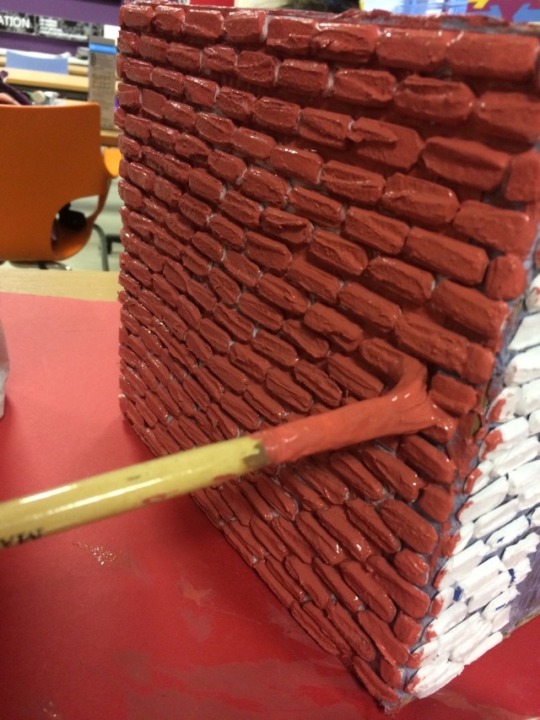
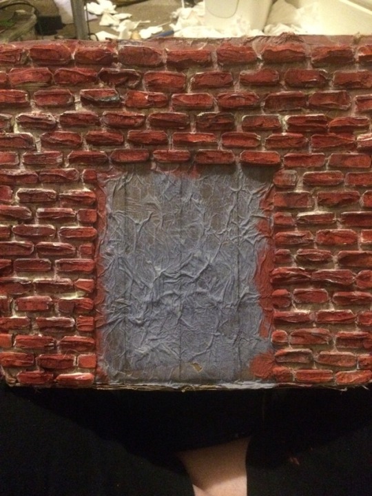
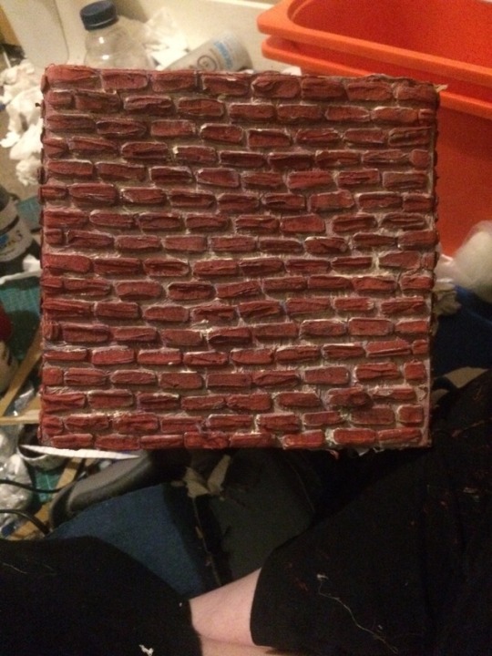
I firstly gathered the cardboard. Due to the specific measurements the animator wanted, I had to build the boxes myself. I then proceeded to cut out hundreds of individual bricks out of foam board. I used references of bricks to get a realistic effect. I cut up the foam board in a specific way, cutting same size rectangles, snipping off the corners and then slicing them in half. When slicing the foam board, it left a rough, uneven look which weathered bricks have, so it gave me the correct effect. I used a reference image of a brick wall because I knew bricks were laid in a particular way. This helped me to create a proper wall pattern instead of normal rows of rectangles. I had to remember where the doors would be going and brick around them accordingly. In the corners of the walls or smaller spaces, I did half a brick, which is what brick layers do in real life anyway. I used reference images again to get the correct colouration of the bricks. It took me a while to get that particular unique red and I ended up adding colours I thought I would never use, to get the correct tint. My final touch to the bricks was dry-brushing black and white paint over them. This gave them a weathered look. I wanted this look as the animator said they wanted a harbour feel to them, so I thought the houses would be a bit aged. I also added extra white paint in between the bricks for the look of cement.
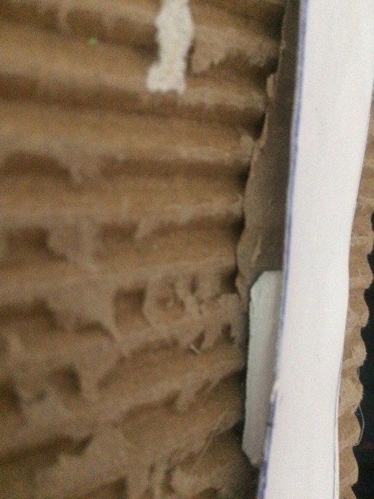
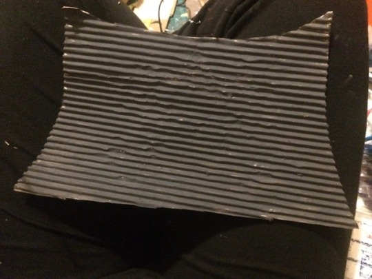
The roofs of the Chinese houses had a corrugated loook to them, so I thought why not use the corrugated part of the cardboard itself? I asked the animator and she said it would definitely work. It was an easy and cheep way to get the efffect. I carefully dampened one side of the cardboard and carefully peeled off the paper thin layer that covered the corrugated part. I didn’t peel the other side so it would still be sturdy. I then painted it a dark grey, going from the reference image. I had to add a few coats as the cardboard warped a bit when I painted the first layer, so I had to keep the roofs in the correct position as theu dried. I then trimmed the roofs to straighten them. I glue gunned the roof pieces to the houses in a curved piston to match the reference and added separate

My final touches were to create the doors and windows. I used the reference that the animator gave me. I copied and pasted the same windows From the reference into photo shop and stock them over the pre-painted cardboard doors. I was also instructed to put similar windows on the sides of the houses, but make them circular instead of the shape in the reference and give a crosshatched look to them. I created these windows with the crosshatching in Photoshop.
Overall I feel these houses turned out good. The animator seem to like them a lot as they fitted in well with her scenery and worked with her green screening parts. The houses were also sturdy, light and easy to position in which ever way the animator felt. I think if I were to improve these, I would have perhaps made the rows of bricks a little bit neater here and there, but other than that I think I did a good job on them. Whilst creating these houses I kept asking for feedback, just to make sure I wasn’t doing anything wrong with the design of the houses, that would affect the aesthetics of the animators props dramatically.

I quite enjoyed this task and I picked up some useful skills, mainly how to make realistic bricks by cutting phone about a certain way and adding try rushing for detail. It was a good chance for me to experiment with different ideas and techniques to see if they worked.
These houses were definitely time-consuming props and took me several days to complete, alongside doing my other modules. I think what took most of the time up was cutting and trimming all the individual bricks. However, I am glad I did the bricks this way as I think they look more effective than if I just printed out a brick pattern and stuck it down. The way I have made the bricks gives a more three-dimensional, realistic effect and will add shadowing and depth to them during animating.
1 note
·
View note
Text
Pop tart crisps

#POP TART CRISPS FULL#
Let dry for 2 hours or until the icing is hard.Įnjoy in a bowl with milk, if they make it that far. Spread icing on each mini tart and top with sprinkles. Pop-Tarts have a sugary filling sealed inside two layers of thin. Savor the satisfying avor of strawberry or blueberry lling wrapped in crispy pastry dough, and topped with delicious frosting and crunchy sprinkles. You want it as thick as possible while being spreadable. Pop-Tarts is a brand of toaster pastries that the Kellogg Company introduced in 1964. Slowly add the milk, 1/2 teaspoon at a time, until it just forms an icing. Snip a tiny corner off the plastic bag and squeeze a little jam on one half of each piece of dough.įold each piece of dough over and press the edges lightly so they stick together.īake on a parchment-lined baking tray at 350☏ for 12-14 minutes, until golden. Includes 1, 17.7-ounce box of 36 Pop-Tarts Crisps, 18 packages total, 2 pastries per package Packaged for freshness and great taste. Spoon the jam in a plastic bag, avoiding adding any large clumps of fruit, and seal. Frosted Chocolate Mini-Crisps Frosted Concord Grape Frosted Double Berry Gingerbread (Fall 2010, returning yearly) Gone Nutty Chocolate Peanut Butter (. Pop Tarts Mini Crisps Baked Bites, 8 ea Vitamin B6, 10 Folic Acid, 10 Flavor. Pop-Tarts have a sweet filling sealed inside two layers of thin. It’s like a sweet and buttery cracker, made punchier with an additional layer of faintly mouthwatering icing. Pop-Tarts is a brand of toaster pastries produced and distributed by Kelloggs since 1964. This isn’t entirely a bad thingin fact, the crust on each Crisp is probably the best part anyway. Per Pouch: 110 calories 1.5 g sat fat (8 DV) 80 mg sodium (3 DV) 9 g total sugars. These were 1 1/2 inches by 2 inches.ĭab milk around the edges of each rectangle. The point is that Appletastic, and Pop-Tarts Crisps in general, are very crust-heavy when it comes to dominant flavor waves. If you have any queries we’ve not answered, get in touch via Facebook ( or send us an e-mail ( ).Unroll the crust and roll the dough to about 12 inches across.Ĭut the dough into rectangles that you can fold in half. If you have any questions for us, please check out our extensive FAQ section here: FAQs. Save when you order Pop-Tarts Crisps Frosted Strawberrylicious - 12 ct and thousands of other foods from GIANT online.
#POP TART CRISPS FULL#
See the sellers listing for full details Product: Allergens: Wheat. Start your day with a sweet boost from Pop-Tarts Crisps Frosted Strawberrylicious- a delightfully crispy take on the classic Pop-Tarts Toaster Pastries you. They make the most amazing gifts for family, friends and colleagues and are suitable for any occasion! Item specifics Condition: New: A brand-new, unused, unopened, undamaged item. We also create our own unique American gift hampers, chock full of the most delectable American candy on offer. A quick and tasty anytime snack for the whole family, Pop-Tarts Crisps are an ideal companion for lunchboxes, after-school snacks, and busy, on-the-go moments. It’s like having your own online American supermarket! Savor the satisfying taste of blueberry-flavored lling wrapped in crispy pastry dough. We are proud to be one of the largest distributors of American food, groceries, candy, sweets, sodas and energy drinks here in the UK! Our vast product range and unbeatable prices make us the best in the UK! We sell a HUGE variety of American brands, from Hershey’s to Mars, Mike & Ike to Twizzlers, Gatorade to Monster, M&M’s to Ruffles, the range is endless and it keeps growing! We aim to bring the most authentic taste of America back to you in the UK & Europe, so you can experience the real taste of the States, whether you’re new to American foods or are an expat looking for a taste of home. Includes one, 5.9-ounce box of Frosted Blueberrific Pop-Tarts Crisps.

0 notes
Text
How Can Women Save the World With Reusable Pads? And how can you make them in 2021?

The number of times women shop for pads during their period should not be watered down the drain. The reality here is that women must shop monthly for toiletries in bulk to last them the whole menstrual period However, the perplexing issue about how harmful these menstrual cycle toiletries are to the atmosphere persists. Some argue that they are biodegradable because they are made of cotton. And if it isn't that bad, what about the long-term consequences? Women will use menstrual pads for the rest of their lives starting at adolescence. Disposable pads, on the other hand, are only used once and then discarded. A lifetime's worth of pads and tampons adds up quickly. As history has demonstrated, they do not end up where they should, but rather in landfills, destroying environmental channels and paths. This is also another example of why women should use reusable pads.
Reusable Pads
I was quickly drawn to reusable pads after seeing them advertised in a focused ad. They looked aesthetically millennial, eco-friendly, and came in a variety of pretty designs which attracted them to me. I choose pads over tampons unless I'm busy so I can wear them outside and my menstrual is not heavy enough to saturate a whole tampon. The thought of washable cotton pads that I could reuse made the bargain even sweeter.
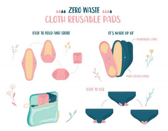
There are a large number of women out there who are hoping for a better option than disposable menstrual pads. Many women have already begun to use tampons, while others have dared to use menstrual cups. If none of these options appeal to you, the safest choice for me is to use menstrual reusable cotton pads. For those that are accustomed to disposable sanitary napkins, it can seem difficult. Your tastes will shift after reading this article on menstrual reusable pads.
What is a Menstrual Reusable Pad?
Menstrual pads that can be used multiple times are known as reusable menstrual pads. They collect menstrual fluid and depending on your menstrual flow, the pad can last for around 4-5 hours. Since using the pad, wash it thoroughly and clear any bloodstains before reusing it. These fabric pads are normally made up of several layers of cotton or hemp, but not plastic. It can seem intimidating at first, but once you get the hang of it, you'll be using reusable pads in no time. It also saves you money so you don't have to throw out this pad to buy new ones.
How to Make Reusable Pads?
Step 1: Create the Pad BaseCreate a template - Start with creating a diamond shape with rounded corners. It should be about 9 inches tall (22.86 centimeters) and 8 inches deep (20.32 centimeters). When you're done, cut out the template. Increase the width of the top and bottom corners. They can have a width of around 2.5 inches (6.35 centimeters). Make use of the template to cut out two pieces from your cotton flannel - This is going to be the outside of your fabric pad, so choose anything you want. You may use a patterned or solid color fabric. You may also do one hand with a pattern and the other with a solid hue. Instead of flannel, you should use cotton thread. Lots of fun options can be found in the quilting and calico sections of the favorite fabric shop. Sew the two pieces together - Starting with the right sides facing in, pin the two bits together. Sew a 0.64-centimeter seam allowance around the piece. Since you'll be carving a slit through it, there's no reason to leave a void for turnover. Cut a vertical slit in the middle of the piece - Be sure you're just cutting one sheet of cloth at a time, not both. Place the slit exactly in the center. It just has to be a few inches/centimeters tall to be effective. Turn the piece right-side out through the slit - Push the pad's corners into the slit you made with your fingertips. If the edges/corners aren't coming out well, use a pencil or a knitting needle to force them out. Then make use of hot iron to press the pad base. Step 2: Create the Pad LinerCreate a template - Begin by drawing a vertical rectangle with rounded top and bottom edges. Make sure the rectangle has a height of 8 inches (20.32 centimeters) and a width of 2.5 inches (6.5 centimeters). When you're done, cut out the template. Use the template to trace the liner pieces - 3–4 pieces of soft toweling are needed. Trace two more pieces from the flannel using the pattern, adding a 0.64-centimeter seam allowance. The toweling would be used to build the liner. The flannel would be used to protect the liner. The flannel should be the same color as the base pad. Stack and sew the toweling pieces together - Use a seam allowance of 0.32 to 0.64 centimeters. Using a zigzag stitch, go around the edge of the piece. When you're done, set the stack aside. This stack does not contain the two flannel bits. It makes no difference what color the thread is. This will be placed inside the liner shell. Sew the flannel pieces together to make the liner cover - This is where you get to join the flannel pieces together using a pin with the right sides facing in. Sew a 0.64-centimeter seam allowance through them. Leave no room for turning around. Instead, prepare to cut a slit into the object. Cut a vertical slit into the liner cover, then turn it right-side-out - Use the same method you used to make the pad base. Make the slit about 4 inches (10.16 centimeters) tall this time. So you'll have ample space to tuck the towel covering. Cut notches into the pad's angled corners. This will aid in the reduction of bulk. Tuck the towel liner into the flannel liner - Simply insert the towel liner into the flannel cover through the slit. Any spikes or buckles should be smoothed out. Step 3: Join the Pad Base and Liner TogetherPin the pad liner on top of the pad base - Turn the pad base until the longer axis is vertical and the slit-facing side is facing up. With the slit facing down, place the pad liner on top. Make sure it's balanced and visually focused. When you're done, pin altogether. Topstitch around the liner to secure it to the pad base - Sew a 0.32 to 0.64-centimeter seam allowance across the pad liner. Backstitch at the beginning and end of each stitch, then snip the thread as close to the fabric as possible. When you sew, remove the buttons. This can be done with a similar or contrasting thread tone. Sew another 0.5 inch (1.27 centimeters) inside the liner - Be sure you're stitching 0.5 inches (1.27 centimeters) away from the topstitch rather than the liner's side. Use the same color of thread as before. This would assist in securing the liner to the foundation and preventing buckling. Add some snaps or Velcro to the wings - You may use sew-on snaps or snaps that require a tool to set. Velcro may also be used instead. However, self-adhesive Velcro can be avoided. While it is simple to submit, it does not last long and will inevitably fall off. Plan ahead of time so the wings will close on the outside of your panties. https://www.youtube.com/watch?v=cZtPLyj_EiA
How to Use Reusable Menstrual Pads?
A reusable cotton pad works in the same way as a single-use plastic pad. They're made to fit inside your underwear, snap shut, and capture your menstrual cycle. Reusable pads nowadays have a coating that prevents the clothes from staining. It also has a holder that allows you to securely put your pad on your panties. There is an added provision where you wrap an elastic belt around the waist to keep the pad in place for longer periods.
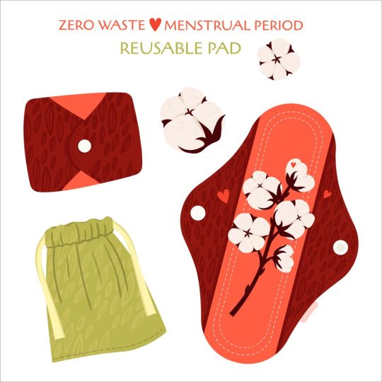
However, a reusable pad is both cost-effective and environmentally safe. It's easy to use and comes with a band and lining which is just everything you need to make it awesome. A single pad will last nearly 12 hours. It varies depending on the individual's menstrual cycle. All you have to do is put it on your underwear and wrap the band around it. It's that easy.
How to Clean Reusable Period Pads
1. Rinse and soak After removing your pad, rinse it and place it in a wet bag before you're ready to do the laundry. You may even soak the pads in water until you're able to wash them to help prevent staining. Put them in a leak-proof garbage can or bucket with some water, Castile soap, and antibacterial essential oils like peppermint or tea tree oil. 2. Wash We recommend using a simple, environmentally friendly detergent that is free of chemicals and fragrances. To avoid staining, wash with cold water. If your pads have been immersed in sweat, first run them through a rinse and spin cycle in the washer. Then, along with your pads, you can add towels or something else you like to wash. Fabric softeners can never be used on recycled menstrual pads since the conditioners will grease the tissues and minimize absorbency. If your pads get less absorbent with time, you may need to "strip" them of any detergent residue. 3. Dry To avoid shrinkage, we firmly advise hanging to dry. You can tumble dry them in a low-heat environment if you're short on time. That concludes it! Your pads will be ready to use after they have dried.
How Many Reusable Pads Do You Need?
The length of a woman's menstrual cycle varies greatly among individuals. You'll need to consider how much you refresh your period utilities during the day to estimate how often you'll need to span your cycle. We recommend using 6 to 12-day pads, 1 to 3-night pads and 3 to 6 pantyliners in total, but it all depends on your flow and how often you do laundry.

How Do I get Reusable Pads?
Well, there are several choices to pick from, but they can be costly and something you must continually replenish at the supermarket. Most reusable menstrual products, on the other hand, will not only save you money but also benefit the environment. If you like to use pads, adding reusable pads to your period arsenal will change the game. You can always check for reusable menstrual pads online. Amazon is a fantastic place to purchase them. Finally, I believe it has reached a point where every woman needs to consider switching to reusable pads. Nondisposable is usually a safer option when you consider helping yourself and keeping the world safe. Also, since reusable pads save you money, you can begin purchasing them for your flows. Reusable pads will last for years, and assuming most women menstruate for around 40 years and spend $8 every other month on single-use pads, she would have spent $1,920 in her lifetime. If she uses one pack every month, the total is $3,840. Consider what you could do for that sum of money.

Read the full article
0 notes
Text
New Post has been published on Strange Hoot - How To’s, Reviews, Comparisons, Top 10s, & Tech Guide
New Post has been published on https://strangehoot.com/how-to-take-screenshot-in-windows/
How to Take Screenshot in Windows 7 & Windows 10
Be it a computer or a smartphone, user interface is a game changer for all applications available. You like a specific action on a UI of one app and another action on the UI of another app. Imagine a situation where you want to show these different UIs to your team. Here you go with screen output in seconds. With screenshot grab, one can exchange the image output to explain things better. Another usefulness of grabbing your computer screen is if you have encountered any issue or error. Your IT support team always asks for an image to understand it better. The Quality Assurance team in IT is the best example of using screengrabber tools to share with the development team. Nowadays, video recording also has become essentials to show UI behavior of the application or the specific screen of the tool.
In all of the above cases, it is necessary to know how you capture the user interface as image output. In Windows operating systems, there are some built-in tools available for free with predefined features of editing the image. There are paid tools and also online tools available to take screenshots.
Methods to take screenshots in Windows 7 and Windows 10
There are multiple ways through which you can use to take screenshots in Windows 7 and Windows 10 from your desktop/laptop. Ten Methods are listed here.
With PrintScreen (whole window) and Paint Image Editor
Online Tool (screenshot.net)
Try PrintScreen (part of the window) and Save in Word
SnagIT – Image Capture Tool
GIMP Tool
Game Bar
Digital Pen
Snipping Tool
PrintScreen
Snip and Sketch Tool
Method 1 – With PrintScreen (whole window) and Paint Image Editor
In this method, 2 utilities are being used. PRINTSCREEN and Paint.
Activate the target screen of which the image to be shot.
Use .
Start Paint (from the Accessories menu)
Do to copy the image output.
You will see the taken screen on the while blank screen shown.
Save the output in any of the below formats available.
The output is as expected as the activated window on your desktop.
Method 2 – Use of Online Tool
In this method, an online tool is used via accessing the browser. It is quick and available all the time without having it installed in your machine. It is free with minimum features.
Start your browser. Access https://screenshot.net/.
The Take Screenshot button is located at the center of the web page. Use it to open a toolbar below.
See the camera icon, 2nd from the top. Use it.
Make the selection of image output you want to take using mouse-click-drag-release action.
You will find the snap taken.
Choose the tools (Pen, Highlighter, Text) and many more options. Make the changes and save.
NOTE: The desktop version is available with more options such as choosing the screen modes, record, automatically take the image instead of manually.
Method 3 – Try PrintScreen (part of the window) and Save in Word
In this method, 2 utilities are being used. PRINTSCREEN and Word tool.
Make selection with the mouse-click-drag-release action.
Do this :
Start word tool, create a new document.
Do “Ctrl+ V“to copy the image output.
The image will be inserted in the document.
Save to apply the changes.
Share the document with others.
Method 4 – SnagIT – Image Capture Tool
This tool is used for professionals who use image related stuff on a daily basis. Their work is dependent on such tools. It is very useful and efficient. The tool provides various predefined templates. Professionals can create their own template with specifications of taking the image output using presets.
Download the tool from TechSmith SnagIT website.
Follow onscreen instructions and complete steps.
On success, open the tool.
To capture the whole screen:
Activate the window or screen you want to take the image output.
CTRL + SHIFT + P or a red-dot icon to grab the selection of an image. Alternatively, use
The output will be opened in the homescreen of the tool.
Save the changes in appropriate format.
To take the output as a portion of the screen:
Using the mouse-click-drag-release action, make a selection.
CTRL + SHIFT + P or a red-dot icon to grab the selection of an image.
The output will be opened in the homescreen of the tool.
Save the changes in appropriate format.
To grab the output content from the window having scroll:
Open the tool.
See the selection arrow in the image below.
Open preset with + icon.
New preset is the selection to make.
Image → Selection menu as below.
Instead of Region, choose Scrolling Window.
Hit the green button as shown with the selection arrow in the image below.
Now, perform the mouse-click-drag-release action to select the entire content with scroll in a window.
Save the changes with the auto-format set.
Include cursor in the image
Open the tool.
See the selection arrow in the image below.
Switch on the Capture Cursor setting.
Using the mouse-click-drag-release action, make a selection of image output to be taken.
The output will be shown in the editor with the cursor shown.
Save the changes with the auto-format set.
Read More: How to Stop Windows 10 Update in Progress
Method 5 – GIMP Tool
The tool comes with very basic image grab features. Either area or full window are the options one can find on this tool.
Open the tool.
Use the below menu options as highlighted in yellow.
You will see 2 options as below.
For the active screen, use the option that is already chosen. For the entire screen (which contains multiple windows), choose the second option.
Grab to set the option.
Now, make the selection of the area using mouse-click-drag-release action once the + icon appears.
The image is grabbed and opened in the editor.
Save your changes with appropriate file format.
Method 6 – Game Bar
From settings, search by entering the keyword, game…The window is shown.
Switch the “record game…….broadcast using Game bar” setting ON.
Define shortcut key for “Take screenshot” setting. OR
Use the default WINDOWS+ALT+PRTSCRN keys. The image grab is done.
Do “Ctrl+ V“to copy the image output.
You will see the taken screen on the while blank screen shown.
Save the output in any of the below formats available.
Method 7 – Digital Pen
Before pressing the tip of your digital pen, do the following steps:
In the search bar at the bottom left, enter settings.
In the settings, search for “bluetooth & other devices” settings.
Choose the Pen & Windows Ink option from the left pane.
Scroll down to pen shortcut options.
Choose the Screen Snipping option.
Once done, just press the tip of your digital pen and the full screen is captured. It is that simple and easy.
Method 8 – Snipping Tool
In-built tool available in Windows 7 and Windows 10. Various grab options are available with the tool.
In the search bar, type “snip..”. You will see the match with the Snipping Tool list item.
ENTER to open the tool.
Here you go! New is the selection you make. Before that you can check the mode selected for your image output.
1st Option (Free-form snip) – highlight the image in a shape
2nd Option (Rectangular snip) – portion of the area selection in an image
3rd Option (Window snip) – to take the snap of active screen
4th Option (Full-screen snip) – to take the snap of whole window (similar to printscreen)
Choose the 1st option and take the shot.
Once grabbed, you can use tools to edit / update the image and save it.
Similarly, use other options based on your image output requirement.
Use the pen tool on the grabbed image:
Highlighter: Next to the pen icon, you will see a highlighter. To highlight a certain part of the screen, use this option.
Eraser: Use an eraser (the icon next to highlighter) to clear the portion you have highlighted with the marker or the pen.
After all this, save your changes along with the image output.
Choose the folder in which you want to save your image output.
Method 9 – PrintScreen
This method works the same as described in Windows 7 sections of “With PrintScreen (whole window) and Paint Image Editor” and “Try PrintScreen (part of the window) and Save in Word”.
Method 10 – Snip and Sketch Tool
This is an in-built tool available in Windows operating systems. This is very much similar to the snipping tool. All the options and actions are similar in terms of grabbing the image output.
In the search bar, type “snip &..”. You will see the match with the Snip & Sketch list item.
Open it. The homescreen of the tool is shown as below. Use New to proceed.
You will see the small bar as shown in the green border highlight. Different options can be used for grabbing the image output as per needs.
Select the first option which is “Rectangle”.
Make the selection using the mouse-click-drag-release action. Editor window is shown where you will need to choose New.
Choose the option that suits your requirement.
Once grabbed, you will see the image output in the home screen of the tool.
Use the options to explain the image output. The options are highlighted in the green border.
Use the editing options as per your requirement.
Once done, save or copy or share the image output.
NOTE: To print the image output, click the 3-horizontal dots on the upper right corner.
Takeaway
All of the above methods are easily doable and quick to be performed. The time to grab the image output is an important factor to pick up the tool. Whenever the team needs to capture the screenshots on a daily basis for each ticket they log, it should be done in fractions of seconds. Tools play an important role in quickly grabbing the screenshot and proceeding with the next steps.
0 notes
Text
Aspose.Newsletter September 2018: New APIs for Working with Excel, Photoshop, Word, XPS & EPS Files
Aspose Newsletter for September 2018 has now been published that highlights all the newly supported features offered in the recent releases. It includes information about 5 New file format manipulation APIs launched this month; Excel Spreadsheet Processing APIs for PHP Applications, Manipulate Photoshop Files without using Photoshop, Perform Word Documents Processing Functionalities within Native C++ Applications, Manipulate Complex XPS Files Easily within .NET Applications, Converting EPS Files at its Best & many more.
Excel Spreadsheet Processing APIs for PHP Applications
Aspose.Cells for PHP via Java: Create, Manipulate or Convert Excel Spreadsheets in PHP applications without needing Microsoft Excel.
Manipulate Photoshop Files without using Photoshop
Aspose.PSD for .NET: Dynamically Create, Read, Edit & Convert Adobe Photoshop PSD and PSB files to raster image file formats.
Perform Word Documents Processing Functionalities within Native C++ Applications
Aspose.XPS for .NET: Aspose.Words for C++: Create, Build and Modify Word documents including advance document formatting within C++ applications, without using Microsoft Word. More details
Manipulate Complex XPS Files Easily within .NET Applications
Aspose.XPS for .NET: Create, Edit and Save existing as well as new XPS documents within any types of .NET application (C#, VB.NET, ASP.NET and J#).
Converting EPS Files at its BEST within .NET Applications
Aspose.EPS for .NET: Programmatically empower your .NET applications to read and convert PostScript (.ps) and Encapsulated PostScript (.eps) files into PDF documents.
Support of Nested Reports by LINQ Reporting Engine and Creating Snip Corner Rectangle within .NET and Java Word Applications
Aspose.Words now supports inserting contents of outer documents to your reports dynamically using LINQ Reporting engine. Just enable doc tag to check the template syntax and populate with data using LINQ Reporting in .NET and Java applications. Another exciting feature allows creating snip corner rectangles in word documents. There are several shape types added within “ShapeType” enumeration to choose from.
Support of Stock Chart and Improved PowerPoint Presentation Rendering
Aspose.Slides have massively improved chart management features within PowerPoint presentation and slides. This new release announces support of Stok chart as well as improving rendering performance for exported PDF and slide thumbnails within .NET, Java, C++, Reporting Services, JasperReports and SharePoint applications.
Support for HTTP Proxy in Email Clients and Converting Outlook Task to MHTML in .NET
Work with popular emailing protocols including SMTP, POP3 and IMAP using Aspose.Email for .NET. Aspose.Email for .NET already supports Socks Proxy but we have further enhanced this capability by providing support for HTTP Proxy as well. You can confidently use POP3, IMAP and SMTP email clients with HTTP proxy. Another new feature supports Outlooks’ Task conversion to MHTML and produce MailMessage like output. The MhtSaveOptions’ FormatTemplates lets you specify additional options to set the output format in desired format. Read more details
New Barcode Generation API for .NET and Java Applications
Aspose.BarCode API now enhances your barcode generation experience to a new level. The new APIs for .NET and Java are represented by BarcodeGenerator class that is simple to work with but powerful enough to give you maximum control over Barcode generation as per customized requirements. With this enhanced API, generate and work with barcodes in more flexible ways.
.NET Code Example: Add Text with Gradient Shading and Manipulate Tables inside PDF documents
Aspose.Pdf now supports applying gradient shading or pattern color space to the text. Aspose.Pdf.Color class now introduces a new property of PatternColorSpace that can be used to specify shading colors for the text. The PDF API also supports manipulating (adding and replacing) tables inside a PDF document. Read more details
.NET Code Example: Convert Microsoft Project MPP file to HTML
Aspose.Tasks for .NET now enhances the Project data conversion to HTML by providing capability to save html elements to separate files. You can also export the fonts, images and CSS styles to separate files while exporting project data to HTML. Read more details.
Code Example: Convert OneNote to PDF with Hyperlinks in .NET and Java
Aspose.Note has already supported converting OneNote documents to PDF but conversation with hyperlinks in images was not available. This OneNote API now lets users retain hyperlinked images during conversion to PDF in .NET and Java applications.
.NET Code Example: Render HTML to PDF, EPUB, SVG and MHTML
Aspose.HTML for .NET has massively improved the performance of HTML parsing module. A new vendor prefix -aspose- is introduced to customize behavior of CSS properties. Rendering of HTML documents to several other formats including PDF, EPUB, SVG and MHTML has been enhanced and respective Renderer classes have been extended. Read more
.NET Code Example: Read GML Files with and without Specifying Schema
spose.GIS for .NET now supports reading Geometry Markup Language (GML) file format either with and without specifying schema. It also provides support for reading data from ESRI File Geodatabase. Read more details.
Code Example: Import and Export 3D Scene into Draco 2.2 Format in .NET and Java
Aspose.3D now allows you to import as well as export any 3D Scene or Mesh into Draco 2.2 format. Several other enhancements have also been made to import glTF files with Draco compression in your .NET and Java applications as per the specified requirements. Read more.
Updates about new Product Releases
Aspose.Total for .NET - a compilation of Aspose latest .NET products
Aspose.Total for Java – a compilation of Aspose latest Java products.
Aspose.Total for Android – all the latest versions of Aspose Android APIs.
Aspose.Total for SharePoint – a compilation of Aspose latest SharePoint products.
Aspose.Total for Reporting Services– a compilation of Aspose latest Reporting Services products
Aspose.Total for JasperReports – The latest versions of Aspose JasperReports products.
Aspose.Total for C++ – The latest versions of our C++ products packaged into one product suite.
Aspose.Words for Reporting Services 18.7 – Upgraded Aspose.Words for Reporting Services to the latest version of Aspose.Words for .NET 18.7.
Aspose.Words for JasperReports 18.7 – Upgraded Aspose.Words for JasperReports to the latest version of Aspose.Words for Java 18.7.
Aspose.Diagram for .NET and Java 18.7 – Improved Rendering of Microsoft Visio files to Images and PDF
Supporting User Groups and Conferences
Aspose is sponsoring a number of user groups and upcoming events, including:
September 3-4: APIDays – Melbourne, Australia
September 15: DDD Melbourne – Melbourne, Australia
September 19-21: NDC Sydney – Sydney, Australia
Sponsor a user group? Get in contact: [email protected]
Collect a copy of Aspose Newsletter, July 2018 edition
Collect the English version of this newsletter
#PHP Excel Spreadsheet APIs#Manipulate Photoshop Files#C++ Word Documents Processing#Manipulate Complex XPS Files#Converting EPS Files .NET#mproved PowerPoint Presentation Rendering
0 notes
Text
DIY Strapless Bow Top
There’s no better time to wear a giant bow than the ‘present’… Right?
Put a bow on it has been my motto for a while, and when it comes to the size of bows… Well, it matters. For this project we decided to go big, and it turned out to be the perfect party piece. Just pair it with earrings that say ‘what curfew?’ and you’re good to go! Once again I used my favourite mustard linen, I just love this colour!
What You'll Need
3 Metres Fabric
Fabric Marker
Fabric Scissors
Color Thread
Measuring Tape
Pattern Making Ruler
Elastic
PIN IT
The pattern for this top is really simple, and is basically made out of several rectangles! You will create a simple strapless top, and add a long sash to it which ties into a bow at the back. The length of the sash can be adjusted depending on how big you want your bow to be and how long you’d like the tails to hang behind. More is more we say!
Draft and cut your pattern pieces from your fabric. We used a mustard linen for this DIY. Because you guys know how I feel about mustard!
PIN IT
1
Begin by inserting the invisible zipper into the back panels. Use our tutorial here to do that.
PIN IT
2
Sew a tunnel and thread in two strips of elastic that are slightly shorter than the width of the panels. Then secure the ends of the elastic to the seams on both sides.
PIN IT
3
Place the right sides of the back and front panels together, and sew down both side seams. Your base strapless top is now done!
PIN IT
4
To sew the sash that will tie into the bow at the back, fold it in half and sew down one short edge and the long edge, leaving the other short edge open in order to flip it right way out later. Snip off the corners of the sewn edges, as you'll get a sharper corner when the sash is flipped out. Hand stitch an invisible stitch to close off the remaining short edge.
PIN IT
5
Then find and pin the mid-points of the sash piece and the top, and hand sew them together using the invisible stitch again. You only have to sew along the top edge of the front panel.
PIN IT
Like what you see? Or just want to save it for later?
Pin It
Voila!
PIN IT
PIN IT
For my party outfit I went with a pair of high wasited wide leg pants, although thia top would look really nice with jeans too! I’m also wearing these gorgeous earrings from The East… Love them!
Pin this DIY on Pinterest!
The post DIY Strapless Bow Top appeared first on A Pair & A Spare.
from RSSMix.com Mix ID 8265713 http://ift.tt/2AAnSEr via IFTTT
0 notes
Text
New Post has been published on Strange Hoot - How To’s, Reviews, Comparisons, Top 10s, & Tech Guide
New Post has been published on https://strangehoot.com/how-to-take-screenshot-in-macbook-air-with-picture/
How to Take Screenshot In Macbook Air [ With Picture]
Introduction: MacBook Air
The thin and light MacBook Air is available with more power than before, with fantastic Retina display, Magic Keyboard, highly sensitive Touch ID, double performance processors, lightning graphics and twice the storage capacity than before.
Compact wedge-shaped body made from 100% recycled aluminium gives it the tag of greenest Mac. It has shown the ability to work all-day with extended battery life making it most desirable Mac which is a portable and perfect all-to-do-it notebook.
Launched on 18th March 2020, Apple MacBook Air 2020 price starts at Rs. 92,990 in India.
Full Specifications MacBook Air 2020
Model MacBook Air 2020
Brand Apple
Colours Gold, Silver, Space Grey
Material Aluminium
Weight in kgs 1.29
Dimensions in mm 212.40 X 304.10 X 16.10
Operating system macOS
Battery Capacity (up to hours) 11
Display Size 13.30-inch
Display Resolution 2560 x 1600 pixels
Processor Intel Core i3 10th Gen
RAM 8GB
Graphics Processor Integrated Graphics
SSD 256GB
Wi-Fi Connectivity/Supported 802.11 a/b/g/n/ac
Bluetooth version 5.0
Touch Screen No
Web Camera Yes
Finger Print Sensor Yes
Backlit Keyboard Yes
Pointer Device Trackpad
Internal Mic Yes
Speakers 2 Speakers
USB Ports 2 x Thunderbolt 3 (Type C)
Headphone/Mic Combo Jack Yes
MacBook Air features to impress the User
MacBook Air with new Magic Keyboard has refined scissor mechanism with 1 millimetre of travel delivery with comfortable responsive and silent typing. With inverted-T arrow keys, glide across code lines, gaming and spreadsheets. Backlit keys have light sensor ambience offering type settings with low-light.
The Force Touch trackpad offers precise control for a uniform response with facilities of Multi-Touch for pinching and zooming gestures.
User’s fingerprint becomes your password with Touch ID giving you the features of advanced security and convenience for immediately accessing documents, notes and system settings.
Apple’s second-generation T2 Security Chip is a custom Mac designed in silicon by Apple helps in making MacBook Air very much secure than ever before. Unlocking Mac or authenticated documents with information stay safe with the T2Security Chip. Data which is stored and kept on the SSD is automatic and gets securely encrypted with on-a-go data encryption. And you have Siri, as the most trusted friend and companion to help you through it.
MacBook Air sound quality has been enhanced for a better user experience. Speakers provide stereo with double the bass than before and volume has increased by 25% with one of the latest processing of sound and upgraded tuning features.
And more expansive stereo sound produces immersive audio while watching a movie or listening to music. The FaceTime camera offers community to talk to the user in HD quality. User’s voice and talks are captured more accurately during FaceTime calls with 3 microphones array. It also to help in dictation and communicating with Siri.
The array of three-microphone is capable of capturing voice crispier.
Thunderbolt 3 offers highest bandwidth for huge versatility according to industry standard for USB-C. It helps in creating a universal port which have been all revved-up for data transfer. It can also charge with on-going video transfer through a connector which has a transfer speed of 40 Gbps approximately. It can connect to pre-existing devices thru a cable or adapter. Thunderbolt 3 has a characteristic plug which has a unique reversible plug-in feature to make it right side up always.
Screenshot becomes a proof or a reference
A screenshot also called a screengrab or screencap, is an image or part of a picture showing the contents of a laptop or tab or mobile or computer display. Screenshots capture exact image what is seen on the screen to share with people or take it as a proof or idea for later reference.
Screenshots offer the facility of capturing, saving, and extremely purposeful sharing. It will not be an exaggeration to insist on saying that it is the vital thing on the internet. Screenshots are nowadays taken as new era artefacts and serve as a medium to showcase the crazy stuff that you were seeing and wish to share with others.
Screenshot: Print screen in Mac with a Purpose
Collaborate
A print screen in Mac helps in sharing the image with co-workers for excellent feedback in place of writing a foot-long email after many edits.
Demonstrate
A print screen in Mac demonstrates precisely what you wish to talk about with a finely clicked screenshot leaving the least to be misunderstood. Less confusion means less explanation and more time to work.
Show precisely what is happening.
A print screen in Mac provides visual help for the maintenance engineers to see exactly what is going on with a machine. It helps in the identification of the problem by the support team.
Various Procedure to take Screenshot on MacBook Air
Screenshot in MacBook helps in capturing the entire screen, or a portion of the screen.
Taking Screenshot on MacBook Air
Tap and hold on to screenshot mac keys simultaneously: Shift, Command, 3 help in taking a screenshot in MacBook.
User can edit screenshot in MacBook by clicking the thumbnail placed in the side of the screen.
User may wait till the screenshot in MacBook gets saved on the desktop.
Capturing a part of the screenshot on MacBook Air
Tap and hold screenshot mac keys simultaneously: Shift, Command, 4.
Select the part of the screen for capturing a screenshot in MacBook, drag the cross air.
Tap and keep on holding the Space bar for dragging and moving the selected part.
Tap Esc key for cancelling the part of the screenshot in MacBook which was selected earlier.
Release the mouse or track pad button to capture the screenshot in MacBook.
Editing of the screenshot in MacBook can be done by pressing the thumbnail placed in the side/corner of the screen.
User may wait till the screenshot in MacBook gets saved on the desktop.
Capturing a menu or a window with screenshot on MacBook Air
Open the menu or the Window to be captured with a screenshot in MacBook.
Tap and keep on holding screenshot Mac keys simultaneously: Shift, Command, 4, Space bar. The pointer changes to a camera icon.
Tap the Esc key for cancelling the part to be taken as a screenshot in MacBook.
Tap and keep on holding the Option key for clicking the menu or Window for capturing it to exclude the Window’s shadow from the screenshot in MacBook.
Editing the screenshot in MacBook can be done by clicking the thumbnail in the corner of the screen.
User may wait till the screenshot in MacBook gets saved on the desktop.
Finding the Saved snapshot on Mac
Snapshot on Mac gets saved on the desktop by default. General filename of the screenshot in MacBook is “Screenshot[date]at[time].png.”
User can specify and get it changed from the default location for the saved screenshot in MacBook. It can be done by checking into Options menu in the Screenshot app.
User may even drag the thumbnail of the screenshot in MacBook to a desired folder or document.
User may set a timer and choose where screenshot in MacBook to save using the Screenshot app. Tap and keep on holding the screenshot Mac keys simultaneously: Shift, Command, 5 for capturing the screenshot.
Tap and keep on holding Control Mac key while taking the Screenshot in MacBook for copying a screenshot to the Clipboard. After that, the user can paste the screenshot in MacBook to the desired place. Universal Clipboard can be used to paste it on another Apple device.
Editing a Snapshot on Mac
There is no technical and official snipping tool for editing screenshot in MacBook. User can still have the liberty to get functions by learning how to take and edit screenshot in MacBook. The various ways a user may opt for taking snapshot on Mac and edit them afterwards are as follows: –
Use Macs Preview.
Tap and hold simultaneously Shift, Command and 3 to capture a screenshot of an image or page to save the Screenshot to the desktop.
Tap and hold simultaneously Shift, Command and 4 with the space bar to screenshot a single window. By clicking the Window you desire to get the screenshot in MacBook of will complete the process.
Press simultaneously Shift, Command and 4. Keep clicking while dragging the mouse to the area that you wish to capture as a portion of the screen.
For rotating the new image, the user must go to the top of Preview and try to find an icon looking like a rectangle with a curved arrow. Click on it for the image to rotate 90 degrees, It will further rotate 90 degree as the user tap the button each time.
For adjusting the size, user must open Tools menu to choose “Adjust Size” to adjust the image size. The user can even change the resolution, width and height of the screenshot in MacBook.
For cropping the image, open Tools and tap the “Crop” option to make necessary changes in the screenshot in MacBook.
For changing and adjusting the colours of the screenshot in MacBook, tap “Adjust Colour” in the Tools menu.
Sharing a Snapshot on Mac easily through Email or WhatsApp
User has to follow simple steps mentioned below to share the screenshot in MacBook.
Open the Window you would wish to take a screenshot of the present in any of the tabs. Tap Shift, Command (⌘) and 3.
The screenshot in MacBook will be saved on the Desktop directory as a .png file.
Open the email program or website or WhatsApp Web.
Tap on the Attach icon. Select the screenshot in MacBook from the Desktop directory
The screenshot will get attached to the email or the WhatsApp for sharing it to the desired person/organization.
Read: How to Share Screen Using Web Skype
0 notes
Text
DIY Strapless Bow Top
There’s no better time to wear a giant bow than the ‘present’… Right?
Put a bow on it has been my motto for a while, and when it comes to the size of bows… Well, it matters. For this project we decided to go big, and it turned out to be the perfect party piece. Just pair it with earrings that say ‘what curfew?’ and you’re good to go! Once again I used my favourite mustard linen, I just love this colour!
What You'll Need
3 Metres Fabric
Fabric Marker
Fabric Scissors
Color Thread
Measuring Tape
Pattern Making Ruler
Elastic
PIN IT
The pattern for this top is really simple, and is basically made out of several rectangles! You will create a simple strapless top, and add a long sash to it which ties into a bow at the back. The length of the sash can be adjusted depending on how big you want your bow to be and how long you’d like the tails to hang behind. More is more we say!
Draft and cut your pattern pieces from your fabric. We used a mustard linen for this DIY. Because you guys know how I feel about mustard!
PIN IT
1
Begin by inserting the invisible zipper into the back panels. Use our tutorial here to do that.
PIN IT
2
Sew a tunnel and thread in two strips of elastic that are slightly shorter than the width of the panels. Then secure the ends of the elastic to the seams on both sides.
PIN IT
3
Place the right sides of the back and front panels together, and sew down both side seams. Your base strapless top is now done!
PIN IT
4
To sew the sash that will tie into the bow at the back, fold it in half and sew down one short edge and the long edge, leaving the other short edge open in order to flip it right way out later. Snip off the corners of the sewn edges, as you'll get a sharper corner when the sash is flipped out. Hand stitch an invisible stitch to close off the remaining short edge.
PIN IT
5
Then find and pin the mid-points of the sash piece and the top, and hand sew them together using the invisible stitch again. You only have to sew along the top edge of the front panel.
PIN IT
Like what you see? Or just want to save it for later?
Pin It
Voila!
PIN IT
PIN IT
For my party outfit I went with a pair of high wasited wide leg pants, although thia top would look really nice with jeans too! I’m also wearing these gorgeous earrings from The East… Love them!
Pin this DIY on Pinterest!
The post DIY Strapless Bow Top appeared first on A Pair & A Spare.
from RSSMix.com Mix ID 8265713 http://ift.tt/2AAnSEr via IFTTT
0 notes
Text
DIY Strapless Bow Top
There’s no better time to wear a giant bow than the ‘present’… Right?
Put a bow on it has been my motto for a while, and when it comes to the size of bows… Well, it matters. For this project we decided to go big, and it turned out to be the perfect party piece. Just pair it with earrings that say ‘what curfew?’ and you’re good to go! Once again I used my favourite mustard linen, I just love this colour!
What You'll Need
3 Metres Fabric
Fabric Marker
Fabric Scissors
Color Thread
Measuring Tape
Pattern Making Ruler
Elastic
PIN IT
The pattern for this top is really simple, and is basically made out of several rectangles! You will create a simple strapless top, and add a long sash to it which ties into a bow at the back. The length of the sash can be adjusted depending on how big you want your bow to be and how long you’d like the tails to hang behind. More is more we say!
Draft and cut your pattern pieces from your fabric. We used a mustard linen for this DIY. Because you guys know how I feel about mustard!
PIN IT
1
Begin by inserting the invisible zipper into the back panels. Use our tutorial here to do that.
PIN IT
2
Sew a tunnel and thread in two strips of elastic that are slightly shorter than the width of the panels. Then secure the ends of the elastic to the seams on both sides.
PIN IT
3
Place the right sides of the back and front panels together, and sew down both side seams. Your base strapless top is now done!
PIN IT
4
To sew the sash that will tie into the bow at the back, fold it in half and sew down one short edge and the long edge, leaving the other short edge open in order to flip it right way out later. Snip off the corners of the sewn edges, as you'll get a sharper corner when the sash is flipped out. Hand stitch an invisible stitch to close off the remaining short edge.
PIN IT
5
Then find and pin the mid-points of the sash piece and the top, and hand sew them together using the invisible stitch again. You only have to sew along the top edge of the front panel.
PIN IT
Like what you see? Or just want to save it for later?
Pin It
Voila!
PIN IT
PIN IT
For my party outfit I went with a pair of high wasited wide leg pants, although thia top would look really nice with jeans too! I’m also wearing these gorgeous earrings from The East… Love them!
Pin this DIY on Pinterest!
The post DIY Strapless Bow Top appeared first on A Pair & A Spare.
from RSSMix.com Mix ID 8265713 http://ift.tt/2AAnSEr via IFTTT
0 notes