#Contemporary width
Explore tagged Tumblr posts
Text

The Measure of StyleDeciphering the Right Tie Width
Let's delve into a realm where even the seemingly small details can make a world of difference. Today, our focus falls upon a quintessential accessory: the tie. More specifically, we'll explore the art of choosing the right tie width—a crucial element in crafting a look that exudes sophistication and style.
Firstly, let us dispel any notion that all ties are created equal. Oh no, my dear readers. Just as a bespoke suit is tailored to perfection, so too should your tie be carefully selected to complement your ensemble. And at the heart of this selection process lies the tie width—an often-overlooked aspect that can greatly impact the overall aesthetic.
So, how does one determine the ideal tie width, you ask? Ah, allow me to shed some light on the matter. As a general rule of thumb, the width of your tie should correspond to the width of your suit lapels. This creates a harmonious balance that ties your entire look together, quite literally.
Now, let's talk numbers. A classic tie width typically falls between 2.75 to 3.5 inches (7 to 9 centimeters). This timeless measurement strikes the perfect balance—wide enough to make a statement, yet not overly bulky or distracting. It's a Goldilocks scenario, if you will—not too slim, not too wide, but just right.
Of course, personal preference and body type play a role in this equation as well. For those with broader shoulders or a larger frame, a wider tie width may be more flattering, while those with a slimmer build may opt for a narrower width to maintain proportion.
But beyond mere measurements, consider the occasion and your personal style aesthetic. A wider tie width lends itself well to more formal settings, such as business meetings or black-tie affairs, adding a touch of gravitas and refinement to your look. On the other hand, a narrower width exudes a more contemporary vibe, perfect for casual outings or creative environments.
In conclusion, choosing the right tie width is an exercise in balance, proportion, and personal expression. So the next time you're standing before your wardrobe, pondering which tie to adorn your neck, remember these timeless principles. And with a deft touch and discerning eye, you'll effortlessly elevate your style to new heights. Until next time, keep curating
#articles#Tie width#Men's fashion#Suit lapels#Proportion#Style#Elegance#Balance#Personal expression#Body type#Formal attire#Casual attire#Suiting#Fashion tips#Tailoring#Sophistication#Versatility#Occasions#Classic width#Contemporary width#Styling advice
0 notes
Text
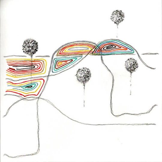
width - pencil, fineliner on paper 18x18cm 2023
#art#artists on tumblr#oc#sketchbook#sketch#fineliner#pencil#doodle#abstract#minimalist#contemporary#2023#width#landscape
2 notes
·
View notes
Photo

Porch - Side Yard Inspiration for a large craftsman screened-in side porch remodel with decking and a roof extension
0 notes
Photo

Bedroom Master
#An illustration of a tiny arts and crafts master bedroom with white walls curbless shower#contemporary#bungalow#random width#screen porch#glass tile#beadboard ceiling
0 notes
Photo
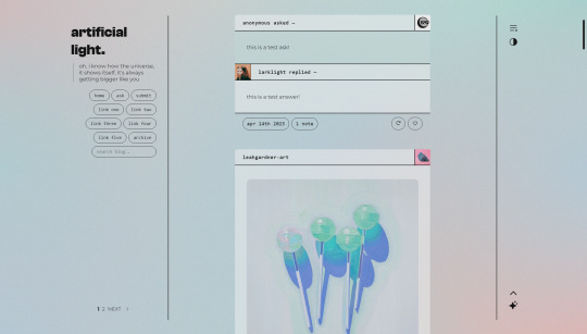

artificial light; preview — code
simple theme designed for a clean, contemporary aesthetic.
includes:
minimal sidebar with title and (optional + concealable) description and a search bar
up to five links
customizable post widths
custom font sizes
lots of color options!
dark mode (which responds to browser settings)
semi-responsive layout for mobile use
(optional) infinite scroll
jump to top button
full credits in the code! please like or reblog if you plan on using!
#tumblr theme#code hunter#coding cabin#tumblr themes#theme hunter#codingcabin#my themes#anyway i am free#i've proven to myself that i can do this#which was mostly my aim here
3K notes
·
View notes
Text
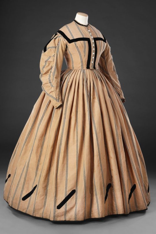
Day Dress
Early 1860s
By the early 1860s the width of the skirt, supported by the crinoline frame, had reached its zenith. Such a surface area provided the perfect canvas for bold, decorative effects, and contemporary photographs, fashion plates and surviving garments show large designs of strongly-contrasting applied velvet or braid encompassing the skirt above the hem, echoed on a smaller-scale on the bodice. The maker of this unpretentious one-piece day dress has interpreted this fashion in a simple, but effective, manner. Black velvet ribbon has been stitched to the bodice to suggest a yoke, and diagonal strips of ribbon with pointed ends have been applied to the base of the skirt at intervals, and to the tops of the sleeves. The dress has been made by hand from a worsted wool fabric, possibly incorporating linen, which has a slightly harsh but practical character; it is woven with bands of simple black pattern which have been matched symmetrically on both bodice and skirt. In common with many one-piece dresses of this date a small watch pocket has been inset at the left front waist seam. The dress’s one concession to complexity is the construction of the sleeves which are pleated into a piped curved seam running down the front of each sleeve.
The John Bright Collection
#day dress#fashion history#historical fashion#1860s#crinoline era#19th century#1860#1861#1862#1863#wool#velvet#brown#john bright collection
246 notes
·
View notes
Text

An unknown 18th century wreck at Bamburgh Beach in Northumberland on the north east coast of England
The exposed remains are the port side of a wooden sailing vessel lying on its starboard side with its stern inshore. The length of the exposed material is 22.5m and the width of the exposed material is 5m. Which ship it is is still being examined on the basis of contemporary documents, but so far she remains unknown.
93 notes
·
View notes
Text
Part VII Louis XIV’s Final Summer Set (N⁰ 1984)

The fate of this set is, like its entry, somewhat perplexing as contemporary sources contradict one another. Memorialists of the time claim that instead of inheriting the set, the Duke of Tresmes, First Gentleman of the Room, received financial compensation [162], while the Garde-Meuble, on the other hand, maintains that the Duke did in fact inherit the set alongside those present in the Antechamber and Cabinet [163]. The latter version is the most plausible, as it explains both the absence of set 1984 from the 1729 general inventory and the decision to create a new summer set for the bedchamber upon Louis XV’s return to Versailles in 1723.
Furthermore, the death inventory of the Duke of Tresmes in 1739 mentions a satin Persian-style crimson background, present on the second floor of his townhouse under the number 135 [164], corresponding to the set described in the death inventory of King Louis XIV, which was meant to be inherited by the Duke.

page from the Duke of Tresmes Death Inventory, Number 135 AN MC ET II 473
7.1 The Tapestry Itself
The brocades used in the creation of set 1984 came from earlier deliveries in 1687 and 1688 by the Parisian fabric supplier Charlier. Indeed, at the end of the 1705 entry, we learn that Lallié used brocades numbered 96, 991, 116, and 128 for the bed, seats, footrest cushions, tablecloth, and fire screen, described as “a satin Persian-style brocade,” also referred to as the small-pattern brocade. Brocades 95 and 98, called the large-pattern brocade, were used for the bed and alcove tapestry. These brocades were described on July 23, 1686, as “pieces of brocade one ell wide, with crimson background with patterns of gold and silver in Persian colors” [165]. The delivery of brocade 98 can be traced to February 4, 1687 [166]. Jules Guiffrey reconstructed a more complete description of the brocade by combining elements mentioned in several sources: “Five pieces of rich brocade, one ell wide, with crimson red satin background; featuring compartments, cornucopias, scrolls, and flowers woven in gold and silver, with contours around the ornaments in violet, green, and blue silk, in the Persian style, made by Mr. Charlier of Paris” [167]. For the 1705 delivery, eight pieces of large brocade were destined for the alcove tapestry alongside seven pieces of column brocade. These column brocades were part of a delivery from November 29, 1688, by Gautier and manufactured in Lyon. They were described as “columns of rich brocade with vine branches and grapes, with a base and capital woven in gold and silver, twisted, with musk, on a crimson satin background” [168] and received the number 124. Designs featuring twisted brocade columns were fashionable at the time; Swedish diplomat Cronström even discussed similar ones in his correspondence with Swedish royal architect Tessin, where they considered possible decor for royal apartments in Sweden. Cronström wrote, “One could also take satins from Turin and have twisted columns and borders or friezes made, cut according to the design of Mr. Berain. All of this would be appropriate, new, and in good taste.” Mr. Berain was indeed the royal ornamentalist for the King of France. The column designs Cronström referenced, which he sketched, are now in the Stockholm National Museum collection.

National Museum, Stockholm, NMH CC 1382 recto
This layout, however, differs from the one described in the King’s bedchamber at King Louis XIV’s death, where set 1984 is mentioned with an alcove tapestry of only five pieces of large brocade alongside six pieces of column brocade [169]. Moreover, the dimensions of the alcove tapestry as described in 1705 far exceed the size of the bedchamber’s western wall, given that each large piece of brocade was one French ell wide (1.18m) and the brocade column half that width, totaling 13.6 meters (44.52 ft). This discrepancy suggests set 1984 was used in the Versailles King’s bedchamber almost incidentally rather than as a planned choice. This discrepancy in the alcove layout of 1715 featured only five pieces of the large brocade, each one ell wide, and six pieces of column brocade, each half an ell wide, totaling eight French ells or 9.44 meters (31 ft), which is much closer to the actual dimension of the King’s alcove.
7.2 The Bed
The main element of set 1984 was its state bed, with its impressive dimensions. Its components were:
• No Headboard: None of the descriptions indicate the presence of a headboard.
• The Headcloth: Made of two pieces of the large brocade according to the 1705 Garde-Meuble diary [170] and four according to the 1715 death inventory [171].
• The Valences: Both the 1705 and 1715 entries spare details on the main fabric used, only noting crimson satin lining. It could be inferred that they were crimson to match the background of the brocade. Large gold fringes formed festoons at the bottom [172], and this style of valence, different from the previously used campanes, was increasingly popular at the time. Similar ones appear in a painting by Louis Silvestre depicting Louis XIV Receiving the Prince Elector of Saxony in his Fontainebleau bedchamber near the end of his life.
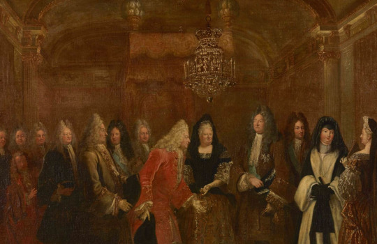
: Louis XIV reçoit à Fontainebleau le prince-électeur de Saxe, 27 septembre 1714, Louis de Silvestre and Hyacinthe Rigaud, oil on canvas, 1715, 120 x 155 cm, Château de Versailles, MV 4344
• The Curtains: Two bonnes grâces, four curtains, and two cantonières are mentioned, with gold fringes at the edges and bottom, lined with the same fabric. The brocade used is not specified, but we can infer that it was the smaller pattern given that the headcloth, mentioned afterward, is said to have been of “the larger pattern brocade,” implying the curtains were not.
• The Quilt: See above.
• The Case Curtain: Made of crimson gros de Tours taffeta, with gold fringes at the bottom and edges, hanging from a golden rod.
• The Columns: The two front columns were placed in a sheath of large-pattern brocade.
• The Vases/Finials: Four in total (one at each corner), filled with feathers and covered in the large-pattern brocade.
7.3 The Armchairs and Stools

Two armchairs were included in the 1705 delivery [173] and three in 1715 [174]. We can assume that an additional armchair was added once the set was transferred to the bedchamber, possibly used with the table. They were garnished with gold fringes at the bottom, and their wood was surprisingly painted red with gold floral decorations. The brocade used was the small pattern, specifically brocades 96, 99, 116, and 128 as described on July 23, 1686: “Two pieces of brocade, two feet wide, with crimson background and elevated patterns in gold and silver with Persian colors” [175]. In 1886, Jules Guiffrey attempted to enhance that vague description by referencing entries from the brocade chapter of the 1729 general inventory and brocade discharges from set 1984, creating this more precise description of the small pattern brocade of number 96: “Two pieces of brocade, two feet wide, with crimson satin background, cornucopias, rinceaux, and flowers of elevated gold and silver, with outlines in green and purple silk, in the Persian style, from the Charlier manufacture in Paris” [176]. The specifics of the colors are consistent with brocade discharges noted at the end of the entry for set 1984 [177].
The twelve folding stools were similar in terms of brocade and style to the armchairs, with gold fringes and woods painted in red with some gilded ornaments.
6.4 The Fire Screen

The fire screen was similar to the seats, with the small-pattern brocade, gold braids around the edges, and wood painted to match the fabric. A braid with a lead pear covered with gold bouquets is also mentioned [178].
7.5 The Table and Tablecloth
The set came with a tablecloth made of the smaller brocade, with fringes on the sides and at the bottom, lined with taffeta, along with a red leather table rug with gold fringes. The table mentioned in the 1715 death inventory under these tablecloths was likely the fir table previously listed in the 1708 inventory and used with set 1379 (see Part 6.6) [179].
7.6 The Portières Tapestries
At the time of the 1705 delivery, no portières were included, and they only appear in the 1715 death inventory [180]. They were made from five pieces of brocade each and described as “assorted to the one of the bed.” Each of the four doors was equipped with one, embellished with gold fringes on their sides, and lined with crimson taffeta.
6.7 The Portieres Tapestries
At the time of the 1705 delivery, no portieres were included; they are only mentioned in the 1715 death inventory [160]. Made from five pieces of brocade each and “assorted to the one on the bed,” each of the four doors was equipped with one. They were embellished with gold fringes on their sides and lined with crimson taffeta.
[135] AN O1/3308 f⁰ 9 r⁰
[136] AN O1/3298 folder 3, item 4, f⁰ 1
[137] Verlet 1961 and Castelluccio 2016 mention set 1379 while omitting set 1984, while Meyer 1980 and Richard 2018 mention set 1984 while omitting set 1379.
[138] Hans 2022 confuses sets 1379 and 1984 and provides a description combining elements from both sets.
[139] AN O1/3308 f⁰ 9 r⁰
[140] Ibid f⁰ 134
[141] AN O1/3298 folder 3, item 4, f⁰ 2 v⁰
[142] The folio 135 of the 1705 Garde-Meuble diary (AN O1/3308) is missing.
[143] Saint-Simon, tome XXIII, p. 213; Dangeau Journal, éd. E. Soulié, Paris, Firmin Didot, 1854-1860, tome XVII, p. 177
[144] AN O1/3298 folder 3, item 2
[145] AN MC/ET/II 473
[146] AN O1/3306 f⁰ 31 v⁰
[147] Ibid f⁰ 59 v⁰
[148] Guiffrey, Jules. Inventaire général du mobilier de la couronne sous Louis XIV (1663-1715), deuxième partie. Paris: Au siège de la société, 1886, p. 198
[149] Ibid f⁰ 111 r⁰
[150] AN O1/3298
[151] AN O1/3308 f⁰ 7 v⁰
[152] AN O1/3298
[153] AN O1/3308 f⁰ 7 v⁰
[154] AN O1/3308 f⁰ 7 v⁰
[155] AN O1/3298
[156] AN O1/3306 f⁰ 31 v⁰
[157] Guiffrey, Inventaire général du mobilier de la couronne sous Louis XIV, 1886 edition, vol. 2, p. 198
[158] AN O1/3308 f⁰ 8 r⁰
[159] Ibid
[160] Ibid
#sims4cc#sims 4 custom content#sims4rococo#sims4#ts4cc#ts4 historical#versailles#history#palace of versailles#historical research
25 notes
·
View notes
Note
Considering you only gain muscles by working out, and to work out, you need to lift heavy things, technically, Clark couldn't be muscular since he's way too strong to actually be able to train his muscles. Which means: Clark chubby farm boy is actually a possible and viable thing.
SO, fun fact! This is totally true, and in fact addressed often in comics.
It's usually agreed upon in canon that Clark didn't develop his powers right away, with his capacity for absorbing and utilizing solar energy gradually expanding, around the same time as the onset of puberty, probably around age 14. So though his powers' growths were rapid once they manifested, he did have some time to adjust until they reached their maximum. And it was during this time he was helping out on the farm, using that as a kind of informal training (lifting hay bales for strength, which progressed to lifting cattle to lifting tractors, etc.; practicing control and finesse with say, chickens and caring for livestock with super speed).
Remember, Clark is supposed to be potential for the high school football team in Smallville, and that immediately makes me think stocky and sturdy, not cut and visibly muscular. At the point where he's at the full strength he'll know as Superman, he's got pretty much no upper limit, and generally nothing that's going to help him train his muscles. So definitely, early career Superman is going to be more mass than muscle.
However, once he gets full access to the Fortress of Solitude and the support of the Justice League, he can get some assistance - Wonder Woman has incredible, divinely empowered strength, and as a warrior trains often - she helps instruct him in martial arts and can help him train at full strength. Meanwhile, Batman can help him train in environments built to limit his power, like red sun training rooms and such.
Considering his physiology is more dependent upon solar energy than anything else to build his strength and keep him healthy, I'd say solar energy keeps him from atrophying. But considering if he's got energy akin to photosynthesis from the sun, I'd suggest he never really gets much of a lean musculature and remains bulky and sturdy.


Above is Christopher Reeve both training and in costume as Superman - his muscles are well-formed, but his torso isn't like, eight pack abs and dehydrated - he's clearly building muscle mass and body fat in a healthy way, and it shows in his costume. He looks sturdy, and strong.


Above is golden age Superman next to a bodybuilder/powerlifter, which I think Superman's original design is supposed to evoke. He's not popping muscles through his suit, but he's clearly really fricking fit and strong. Even his waist is more close to the width of his chest than more narrow like you see in more contemporary illustrations.


My thought is that Clark's physique is a lot more like someone at the Highland Games. Built for strength and sturdiness. He doesn't have to keep lean because he's not worried about endurance and agility because he already has that from his powers. Big arms, broad chest, likely a little bit of a tummy. And if he's under layers like Clark usually dresses, he can easily be mistaken for pudgy instead of powerful.
In any case, that's my untrained viewpoint on the subject. Basically my sweet polite farmboy is basically a photosynthesizing plant with muscles. Wait, is that why Poison Ivy's pheromones can work on him???
#clark kent#lore exploration#batman's got cut muscles cause he's built like a gymnast/runner/ mma fighter#wonder woman's stacked because she's a demigod and a greek warrior#superman is thick and sturdy because he's a plant with intense strength and no need to consider endurance#this doesn't stop me from loving muscly depictions or faceclaims of my boy#but i just feel like he's more realistic and healthy looking with more of a powerlifter build
22 notes
·
View notes
Text
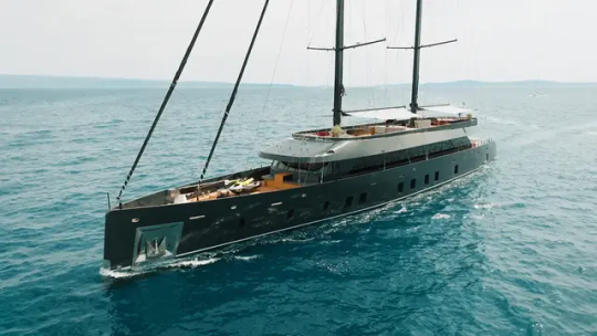


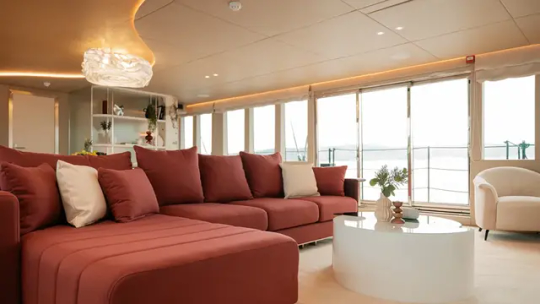
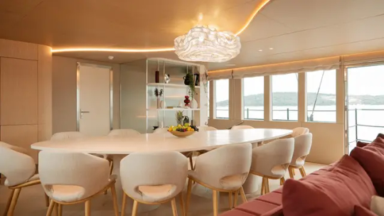
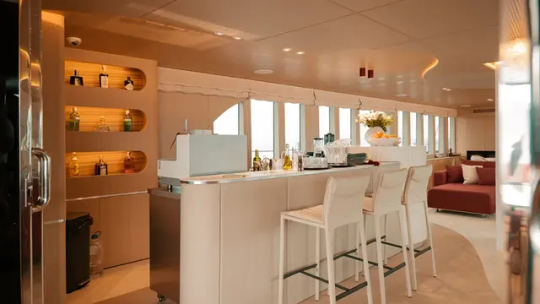
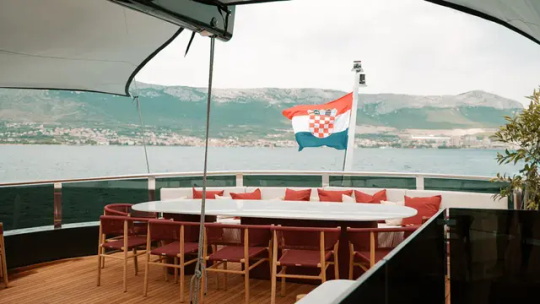
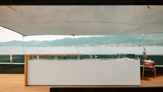


The 170-Foot Sailing Yacht 'Reposado'
'Reposado' is available for charter in the Med, with rates starting at roughly $146,800 per week.
The custom 170-footer, which was recently delivered by Tramontana and listed for charter with IYC, combines the cruising capabilities of a high-tech sailer with the lavish amenities of a luxury superyacht.
Penned by the Croatian yard’s in-house team, Reposado features a sleek, contemporary exterior and an expansive, light-filled interior. The vessel is centered around a generous main salon that showcases elegant decor and bespoke furniture inspired by nature. The warm, inviting space is adorned with a plush L-shaped sofa, a coffee table, and a sophisticated bar from which you can enjoy your favorite reposado. Forward of the salon lies a formal dining area with a custom 12-seat table.
The Reposado can sleep 12 in six convertible cabins. Both the owner’s suite and the VIP measure the full width of the 28-foot beam. Seafarers (and any furry friends) will be attended to by a highly experienced crew of 10.
The exterior decks are geared toward entertaining. The sundeck is adorned with a wet bar, a fire pit, and an alfresco dining table at one end and a huge lounge at the other. Toward the center of the deck, an eight-seat Jacuzzi and sizeable sun pad sit beneath one of the two towering masts. At the aft, Reposado is outfitted with a giant beach club that gives guests direct access to the sea. The vessel also has a full arsenal of water toys, including a chase boat and Jet Skis.
In terms of grunt, Reposado is powered by twin Caterpillar C18 engines that enable a cruising speed of 12 knots and a top speed of 14 knots.
#The 170-Foot Sailing Yacht 'Reposado'#yacht#superyacht#luxury#luxury yacht#luxury living#luxury lifestyle#billionaire#billionaire lifestyle#rich#sexy
19 notes
·
View notes
Text
Stuck at making mirrors? A tiptorial..
I discovered something while pulling my hair out of frustration in creating a custom mirror in TS3.
So the usual flow in creating mirrors is to clone a mirror (preferably a base game one), replace the mesh with your self-made or converted mesh while keeping the mirror group, resize the mirror group accordingly, assign bones if needed, import your mesh, edit textures and catalog info, then export and test in game.
Usually having the w values (more info here) untouched results in mirrors reflecting the backside and is usually resolved by setting the w value with negative values or just zero. The reflection will show up just fine.

However...
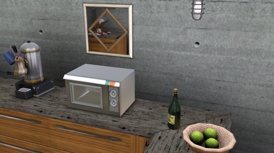
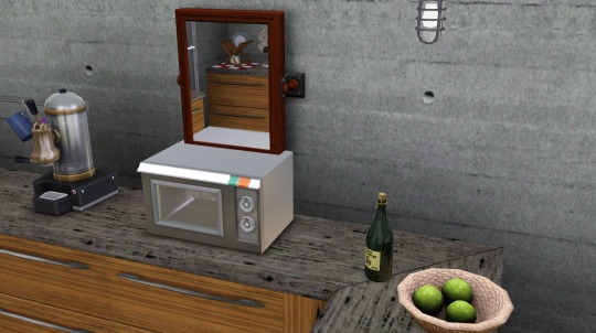
Once you rotate to a certain angle, some reflected objects disappear from view (example in left, right one is the vanilla base game mirror showing reflected objects normally).
It seems that the 1x1 base game mirrors are the culprit! Cloning any of them will produce the same result.

Avoid cloning them at all costs, and clone the 2x1 ones instead:

I cloned the 'mirror wall contemporary' and followed the same procedure. If you want your mirror as a single tile object you can just adjust the footprint to 1x1 (tutorial here, go instead for the predefined width x depth section and select 1x1). This will result in a mirror showing the correct reflections without even touching the w values!
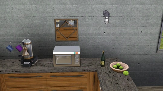
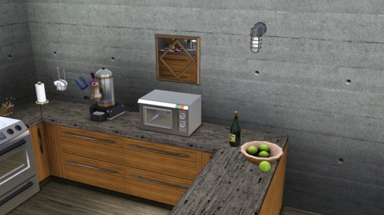
I hope this helps!
ADDENDUM 28 OCT: Some EA mirror meshes have visible faces on both the front and back sides, that will most likely cause the "backside reflection" error ingame. Below is an example of how the mirror mesh is shown in Milkshape:

It will be resolved by removing the faces on the back side of the mesh (illustrated above, the back side is selected in red), so that only the front face will be rendered. So in other words, make sure the mirror mesh faces only the front side so that it will render properly ingame.
59 notes
·
View notes
Text

US Vogue October 15, 1967
Model : Jean Shrimpton
Zigzag stripes, left, a young and fresh mink idea, contemporary, spectacular. White and pale brown mink with a narrow shape, hidden buttons, a separate mink scarf muffling the throat. An Emeric Partos design, from natural pale brown Emba Palomino mink and "Jasmine", white Emba mink. Marvella earrings. Pink mink, center, the new heavenly fur like the blush of dawn on fresh snow - a coat with a small plump collar, shirt cuffs, white leather belt through mink belt rings. By J. Weinig, from natural pale pink Glacial Emba mink. Hattie Carnegie earrings. Pale mink in two widths, right, worked in alternating layers for a wonderful light and shadow effect. Notched collar, leather belt. By Betty Yokova for Neustadter, from Breath of Spring variety "Tourmaline", natural pale beige Emba mink. Richelieu Earrings. With the three pale mink coats: Evins boots. Hair: Ara Gallant; Tovar-Tresses hairpieces.
Les rayures en zigzag, à gauche, une idée de vison jeune et fraîche, contemporaine, spectaculaire. Vison blanc et brun pâle avec une forme étroite, des boutons cachés, une écharpe de vison séparée étouffant la gorge. Un design Emeric Partos, de vison brun pâle naturel Emba Palomino et "Jasmine", vison blanc Emba. Boucles d'oreilles Marvella. Vison rose, au centre, la nouvelle fourrure céleste comme le rougissement de l'aube sur la neige fraîche - un manteau avec un petit col dodu, des poignets de chemise, une ceinture en cuir blanc à travers des anneaux de ceinture en vison. Par J. Weinig, de vison rose pâle naturel Glacial Emba. Boucles d'oreilles Hattie Carnegie. Vison pâle en deux largeurs, à droite, travaillé en couches alternées pour un merveilleux effet de lumière et d'ombre. Col cranté, ceinture en cuir. Par Betty Yokova pour Neustadter, de variété Breath of Spring « Tourmaline », vison naturel beige pâle Emba. Boucles d'oreilles Richelieu. Avec les trois manteaux en vison pâle : bottes Evins. Coiffures : Ara Gallant ; postiches Tovar-Tresses.
Photo Richard Avedon vogue archive
#us vogue#october 1967#fashion 60s#fall/winter#automne/hiver#made to order#emeric partos#emba#hattie carnegie#j.weinig#neustadter#ara gallant#david evins#jean shrimpton#richard avedon#tovar-tresses#betty yokova#vintage vogue#vintage fashion
8 notes
·
View notes
Text
The Anointing Screen
The Anointing Screen has been designed and produced for use at the most sacred moment of the Coronation, the Anointing of His Majesty The King. The screen combines traditional and contemporary sustainable embroidery practices to produce a design which speaks to His Majesty The King’s deep affection for the Commonwealth. The screen has been gifted for the occasion by the City of London Corporation and City Livery Companies.

The Anointing takes place before the investiture and crowning of His Majesty. The Dean of Westminster pours holy oil from the Ampulla into the Coronation Spoon, and the Archbishop of Canterbury anoints the Sovereign on the hands, chest and head. It has historically been regarded as a moment between the Sovereign and God, with a screen or canopy in place given the sanctity of the Anointing.
The Anointing Screen was designed by iconographer Aidan Hart and brought to life through both hand and digital embroidery, managed by the Royal School of Needlework. The central design takes the form of a tree which includes 56 representing the 56 member countries of the Commonwealth. The King’s cypher is positioned at the base of the tree, representing the Sovereign as servant of their people. The design has been selected personally by The King and is inspired by the stained-glass Sanctuary Window in the Chapel Royal at St James’s Palace, which was gifted by the Livery Companies to mark the Golden Jubilee of Queen Elizabeth II in 2002.
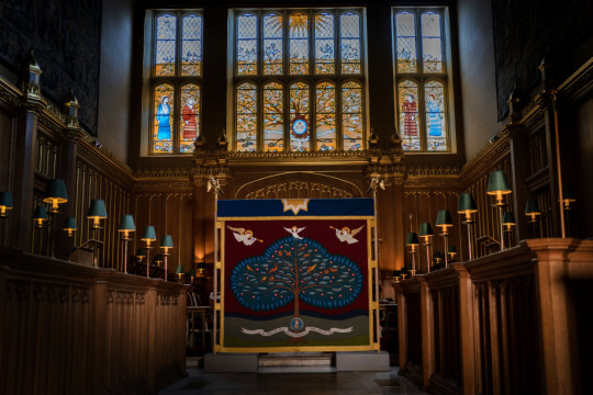
The Anointing Screen is supported by a wooden pole framework, designed and created by Nick Gutfreund of the Worshipful Company of Carpenters. The oak wooden poles are made from a windblown tree from the Windsor Estate, which was originally planted by The Duke of Northumberland in 1765. The wooden poles have been limed and waxed, combining traditional craft skills with a contemporary finish.
At the top of the wooden poles are mounted two eagles, cast in bronze and gilded in gold leaf, giving the screens a total height of 2.6 metres and width of 2.2 metres. The form of an eagle has longstanding associations with Coronations. Eagles have appeared on previous Coronation Canopies, including the canopy used by Queen Elizabeth II in 1953. Equally, the Ampulla, which carries the Chrism oil used for anointing, is cast in the shape of an eagle.

The screen is three-sided, with the open side to face the High Altar in Westminster Abbey. The two sides of the screen feature a much simpler design with maroon fabric and a gold, blue and red cross inspired by the colours and patterning of the Cosmati Pavement at Westminster Abbey where the Anointing will take place. The crosses were also embroidered by the Royal School of Needlework’s studio team.
At the Coronation Service, the Anointing Screen will be held by service personnel from Regiments of the Household Division holding the Freedom of the City of London. The three sides of the screen will be borne by a Trooper and Guardsman from each of The Life Guards, Grenadier Guards, Coldstream Guards, Scots Guards, Irish Guards, and Welsh Guards.
The screen has been gifted for the Coronation by the City of London Corporation and participating Livery Companies, the City’s ancient and modern trade guilds. His Majesty The King is a keen advocate and supporter of the preservation of heritage craft skills, and the Anointing Screen project has been a collaboration of these specialists in traditional crafts, from those early in their careers to artisans with many years of experience.
The individual leaves have been embroidered by staff and students from the Royal School of Needlework, as well as members of the Worshipful Company of Broderers, Drapers and Weavers.
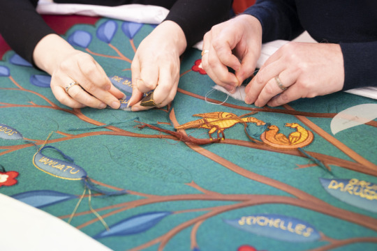
As well as heritage craft, contemporary skills and techniques have formed part of this unique collaboration. The outline of the tree has been created using digital machine embroidery by Digitek Embroidery. This machine embroidery was completed with sustainable thread, Madeira Sensa, made from 100% lyocell fibres.
The threads used by the Royal School of Needlework are from their famous ‘Wall of Wool’ and existing supplies that have been collated over the years through past projects and donations. The materials used to create the Anointing Screen have also been sourced sustainably from across the UK and other Commonwealth nations. The cloth is made of wool from Australia and New Zealand, woven and finished in UK mills.
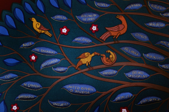
The script used for the names of each Commonwealth country has been designed as modern and classical, inspired by both the Roman Trojan column letters and the work of Welsh calligrapher David Jones.
Also forming part of the Commonwealth tree are The King’s Cypher, decorative roses, angels and a scroll, which features the quote from Julian of Norwich (c. 1343-1416): ‘All shall be well and all manner of thing shall be well’.
This design has again been inspired by the Sanctuary Window in the Chapel Royal, St James’s Palace, created for Queen Elizabeth II’s Golden Jubilee in 2002. At the top of the screen is the sun, representing God, and birds including the dove of peace, which have all been hand embroidered by the Royal School of Needlework.
The dedication and blessing of the Anointing Screen took place earlier this week at the Chapel Royal, St James’s Palace, where it was officially received and blessed by the Sub-Dean and Domestic Chaplain to The King, Paul Wright, on behalf of The Royal Household.
117 notes
·
View notes
Text
12 Amazing Wooden Door Designs For Your Home
When you are designing the interior of your home, give some thought to the design of the doors. Doors are primarily a functional element of your home, as they provide much-needed security and privacy from the outside world. The design of doors is also important, as it can add to the aesthetic appeal and enhance your decor statement. We've rounded up the best wooden door designs to give you decor inspiration.
Front doors add character and style to the outside of your home and create the first impression of your home for visitors. They should be in keeping with the architectural elements of your building. Is it classical or contemporary? Would a natural framed door look good, or should it be painted to match the other design elements?
Are you aware of the difference between the wood used to make doors and furniture? If not, this guide will help you make the right choice between different types of wood before investing in furniture and decorative items, crafts, and handicrafts to decorate homes.

Ideas to incorporate beautiful Wooden Door Design in Your Home
1. Contemporary Teak wood Door
Here's a contemporary door in teak wood with a vertical glass insert that allows you to see who your visitors are before you even open the door. You can take, help best interior designers in Noida so they can guide you through this process.

2. Three Side Glass Panelled Wooden Door
This lovely entry door makes a grand statement and is surrounded on three sides by glass panels which add a lovely aesthetic.

3. Teak Wood Rectangular Panel doors with Mirror
Rectangular panels in polished teak wood emphasize this country home's rustic plaster façade, while tall glass panels on one side add functionality.

4. Rosewood Door
This fine rosewood door is embellished with cornice detailing and includes white panels to add visual appeal.

5. Ornamental Wrought Iron Doors
Gorgeous decorative wrought iron sets distinguish the panelling in this mahogany front door that blends in perfectly with the home's exposed brick façade.

6. Minimalist White Wooden Door
Elegant in white, this charming front door is detailed with molded panels that are simple and clean. The side window, even in white, gives a glimpse of the visitors.

7. Functional and Aesthetic Balcony Doors
Balcony doors are the transition between the inside and outside of your home. Large glass French windows can open the view and allow a seamless view of your garden. If you need privacy, use frosted or opaque glass that will still let in light.
Related blog: 15 DIY Vertical Garden Ideas in Budget

8. Glass Bathroom Doors
We love opening these all-glass bathroom doors to a private balcony. The dark wood frame is sleek and minimalist.
Related blog: 15 Bathroom Decorating Ideas on Budget for 2024

9. Wooden Doors with Glass for a Glimpse of The Outdoors
Glass adds a touch of contemporary style to any design and can make heavy doors look visually lighter. Strategically placed glass panels can allow sunlight to flow through during the day, bringing freshness and happiness to your home.
Related blog: How to Build a Gravel Patio: DIY 9 Steps

10. Get Twice the Style with Double Doors
If you have the space, open your areas with more eloquence. Double Door Twice adds elegance and makes a grand statement.
If you want to keep one side short and use only one side as an entry door, the overall width of your double door should be at least 6 feet.
Double doors look better in homes with high ceilings, as the design proportions work better in larger spaces.
Related blog: Types of False Ceiling Lights: Complete Guide

11. Sliding Doors That Are Sleek and Functional
Sliding doors allow you to create privacy when needed in open-plan homes. There are different types of sliding doors, including doors that completely disappear into the wall on either side. There are some sliding low folding doors that stack on the sides of the opening. Sliding doors come with single track (or top hung), and double track fittings.

12. Glass Panelled Doors
This glass-panelled wooden door slides in on both sides as well as is surrounded by glass above, allowing expansive views of the interior.

#Latest Wooden Door Design 2024#Wooden Door Designs#Door Design Ideas#Modern Door Design#Best Door Design For Home
6 notes
·
View notes
Text


Rowland and Chinami Ricketts use natural materials and traditional processes to create contemporary textiles. Chinami hand-weaves narrow width yardage for kimono and obi. Rowland hand-dyes textiles that span art and design. Together we grow all the indigo that colours our cloth, investing ourselves and our time in our textiles because we believe this way of working to be an essential part of the material’s integrity and authenticity.
40 notes
·
View notes
Text
The Ultimate Guide to Choosing the Perfect Black Leather Belt for Women
A black leather belt is not only a practical accessory but also a timeless fashion staple for women. Whether paired with jeans, dresses, or skirts, this versatile piece can elevate any outfit. Its neutral color and sleek design make it suitable for both casual and formal occasions. The durability of leather adds to its appeal, ensuring longevity and style for years to come. Investing in a high-quality black leather belt can be a game-changer for your wardrobe, helping you achieve a polished look without much effort.

How to Choose the Right Black Leather Belt for Women
When selecting a black leather belt, consider the width, material quality, and buckle design. A thinner belt might be more appropriate for formal attire, while a wider belt can be a bold statement piece for casual outfits. The leather quality is essential—premium leather ensures that the belt not only lasts longer but also looks more refined. Pay attention to the buckle style as well, whether it's classic or contemporary, to match your personal taste and wardrobe needs.
Black Leather Belt for Women's Casual Outfits
A black leather belt for women is an essential accessory when it comes to casual outfits. It can seamlessly tie together jeans, leggings, or even a simple t-shirt dress. The key is to keep the look simple but polished, as the belt naturally draws attention to your waistline, creating a more defined silhouette. Choose a belt with a minimalist buckle design for a chic yet laid-back look. For a more edgy vibe, go for a belt with a statement buckle or embellishments.
Styling a Black Leather Belt with Dresses
Pairing a black leather belt with dresses is a fantastic way to accentuate your waist and add structure to a flowy outfit. Whether it’s a maxi dress, shift dress, or bodycon, the addition of a belt can elevate the look instantly. For casual dresses, opt for a slim belt to keep the outfit balanced, while a wider belt can work wonders with more formal dresses, adding a touch of sophistication.
Black Leather Belt for Women: A Must-Have for Professional Looks
A well-chosen black leather belt can completely transform a professional outfit. It adds a touch of class when paired with tailored pants, a blouse, or a pencil skirt. The key to making it work in a professional setting is subtlety. Choose a belt with a sleek, simple buckle to maintain a polished, refined look. It’s an accessory that speaks volumes without being too flashy, making it perfect for the office or business meetings.
How to Incorporate a Black Leather Belt into Evening Wear
Incorporating a black leather belt into evening wear can add an edgy yet elegant touch to your look. For evening dresses or jumpsuits, the belt can break up the outfit and give it a more balanced appearance. A black leather belt with an ornate buckle can provide a dramatic effect, drawing attention to your waist and adding an unexpected element to your evening ensemble. This accessory can work wonders in making a simple dress feel more sophisticated.
Why Leather Is the Best Material for Women's Belts
Leather is undoubtedly the best material for women’s belts due to its durability, texture, and timeless appeal. Unlike other materials, leather only gets better with age, developing a unique patina that adds character. Additionally, leather belts hold their shape well and are less likely to stretch or lose their form over time. The smooth texture and rich color of leather create an elegant look, making it a versatile option for any outfit, whether casual or formal.
Black Leather Belt and Jeans: A Classic Combination
When in doubt, pair your black leather belt with jeans. This classic combination never goes out of style. A simple black leather belt can complement any pair of jeans, from skinny to bootcut or high-waisted to low-rise. It helps to create a balanced silhouette and can be used to tuck in shirts or add definition to an otherwise loose outfit. This pairing is perfect for a casual day out or an effortless chic look for almost any occasion.
How to Style a Black Leather Belt with Outerwear
A black leather belt can be the perfect finishing touch to your outerwear, especially coats and blazers. Cinching in the waist of a long coat with a belt adds a touch of femininity and shape to your outfit. It can also help to highlight your figure beneath the layers. Whether you're wearing a trench coat, pea coat, or oversized blazer, adding a black leather belt ensures your look remains polished, even on the coldest days.
The Versatility of a Black Leather Belt in Every Season
One of the greatest things about a black leather belt is its versatility across all seasons. In warmer months, it can be paired with skirts, dresses, and shorts to add structure and flair. During colder months, it works effortlessly over sweaters, coats, and jackets, allowing for easy layering. This versatility makes the black leather belt a year-round accessory, proving to be an essential investment for any wardrobe.
How to Maintain a Black Leather Belt for Longevity
To keep your black leather belt looking pristine, proper care is essential. Regular cleaning with a damp cloth can help remove dirt and prevent discoloration. Apply a leather conditioner occasionally to maintain its softness and prevent cracking. Additionally, store your leather belt in a cool, dry place to avoid any damage from humidity or heat. With the right care, your black leather belt will continue to look stylish for many years to come.

Where to Buy the Best Black Leather Belt for Women
When searching for a black leather belt, quality should always be a priority. High-end department stores, boutique shops, and online retailers often carry a range of styles to suit various preferences. Look for belts that offer premium leather and a well-constructed buckle to ensure long-lasting durability. Don’t hesitate to read reviews to gauge the quality of the belt before making a purchase.
Black Leather Belt: A Perfect Gift for Women
A black leather belt makes an excellent gift for women of all ages. Whether it's for a birthday, anniversary, or special occasion, a high-quality leather belt is a thoughtful present that combines both function and style. When gifting a belt, ensure you choose a versatile design that suits the recipient's style, whether it’s sleek and minimalist or bold with unique buckles. A black leather belt is a gift that can be cherished and worn often.
FAQs
What makes a black leather belt a must-have accessory?
A black leather belt is versatile, durable, and timeless. It can complement nearly any outfit, from casual jeans to formal dresses, making it a must-have in any woman's wardrobe.
How do I determine the right size for a black leather belt?
To determine the right size for a black leather belt, measure your waist and select a belt that is 1-2 inches larger. This ensures a comfortable fit while allowing room for adjustments.
Can a black leather belt be worn with all outfits?
Yes, a black leather belt can be worn with virtually any outfit, from casual to formal, making it a versatile accessory suitable for almost any occasion.
2 notes
·
View notes