#Catalogue Raisonné
Text


This week I went through all six volumes of Jasper Johns' drawings catalogue raisonné for the first time, and made a little pile of pictures I found. Including the watercolor (and fluorescent spraypaint?) flag on orange ground he made in 1957 on a page from an old yearbook, which he gave to his boyfriend Robert Rauschenberg's ex-wife Susan Weil [top]
And a 1969 picture I'd heard about, because it makes the flags into self-portraits, which is the first time he made a vertical composition with two flags, and where he put the title on the back as TWO [F-SLURS].
Anyway, curators are great, but so is going through an artist's 60 years of drawing in chronological order and seeing every thing.
#jasper johns#catalogue raisonné#I'd say buy the book but the book is six books and weighs forty pounds and costs six hundred dollars#two f-slurs
7 notes
·
View notes
Text

Paul Klee
Rocks at Night
1939
Paul Klee Catalogue Raisonné, Vol. 8 (New York: Thames and Hudson, 1998), no. 7787 [KLEE 1939,383 (K 3)].
Watercolor and ink on chalk-and glue-primed letter paper, mounted on paper
263 notes
·
View notes
Text


Wood Engraving Wednesday
CARL MONTFORD
This engraving, "Fisherman's Terminal," by noted Seattle wood engraver Carl Montford, is from the wood-engraving collection Surroundings: Engravings in Wood printed for the Wood Engravers’ Network (WEN) at the Piano Press in St. Paul, Minnesota in a limited edition of 110 copies. Montford is a long-standing member of WEN and is considered the dean of Northwest wood engravers. A catalogue raisonné of his half century of work was published by Chatwin Books and is still available for only $45.
Our copy of Surroundings is a gift from our friend Jim Horton.


Carl Montford celebrating Thomas Bewick with fellow wood engravers at the historic bar, Blackies in Newcastle, England (2014).
View more prints from Surroundings.
View more prints by Carl Montford.
View more engravings by members of the Wood Engraver’s Network.
View more posts with wood engravings!
#Wood Engraving Wednesday#wood engravings#wood engravers#Carl Montford#Fisherman's Terminal#Surroundings: Engravings in Wood#Surroundings#Wood Engravers' Network#WEN#Piano Press#Jim Horton
61 notes
·
View notes
Text
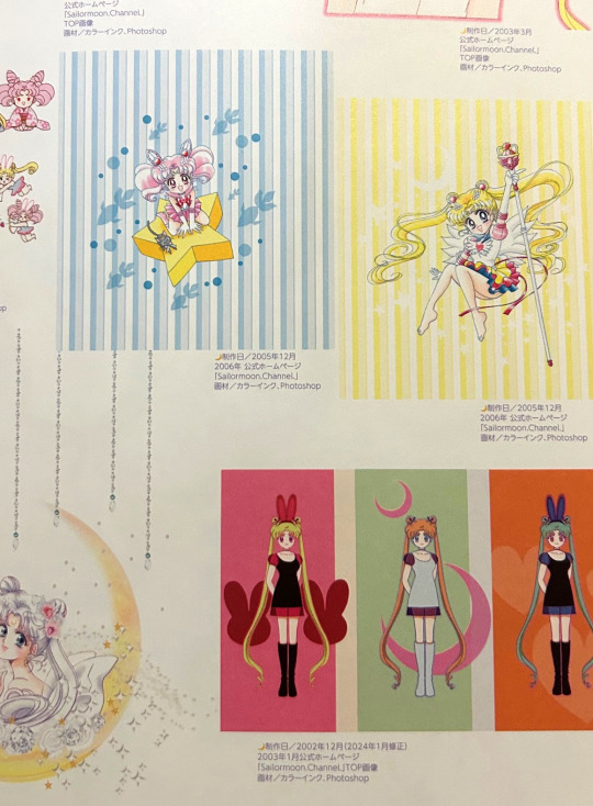
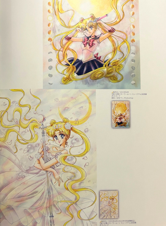
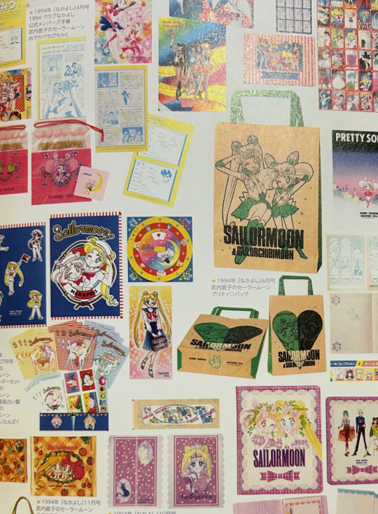
My extremely brief review of Sailor Moon Raisonné Art Works 1991~2023 book is as follows: fantastic as something akin to an exhibition catalogue, disappointing as an art book.
Longer version:
Takeuchi is a great artist, Sailor Moon has some extremely memorable illustrations, there hasn't been a new art book in decades... this should have been a slam dunk in terms of meeting fan expectations. Unfortunately I think the portrayal of this as a preserved "art collection" is a bit disingenous given the format of the book, the number of art revisions, and its overall quality are pretty standard for exhibition catalogues rather than actual art books.
In saying this I absolutely love art work catalogues, particularly when they provide context on how the illustrations were originally used. "Raisonné" shines in this regard, it gives revision notes and context to the original uses of all images from Nakayoshi colour pages through to furoku. Loooooove this:


It even features a comprehensive account of furoku and zen'in for the manga, which is another thing I appreciate in these types of publications.

The main problem, as countless people have pointed out, is that the actual art work in this book is extremely tiny. Many of the rarer images fans were excited to see in decent resoluton (like the colour art from Codename wa Sailor V) are a few cms across here, piled up crammed from a couple to a dozen a page.
The character designs presented exquisitely in full in the "Materials Collection" art book are condensed to a handful of pages rendering Takeuchi's chracter notes unreadable and the gorgeous sketches lacklustre at best. Why are they included at all when some designs are barely visible here? The paper quality too is fine for a catalogue but there's just no comparison to the paper and print quality found in the original Sailor Moon art books.
I think it also has some very standard art collection flaws on top of this, including baffling choices when it comes to putting artworks partially across two pages (will never not hate this in any art book, it's particularly egregious here where the cover illustrations from THE BOOK ITSELF are about the third of a page in size and placed across a page spread).
There's already been plenty of dissatisfaction expressed about this book and I'm not here to give it an additional kick around because I do feel it has value as an art work catalogue. I just think there was a definite divide in what Kodansha produced vs. fan expectations and if you purchase the book knowing this then at least you'll be aware of what you're getting.
#personal#photo#my photo#popped the longer version under a cut#so you only have to read my ramblings if you want to#the book got scanned almost immediately after release#because of course it did#but i won't be sharing any scans on here myself#i just wanted to give my thoughts as a consumer
86 notes
·
View notes
Text
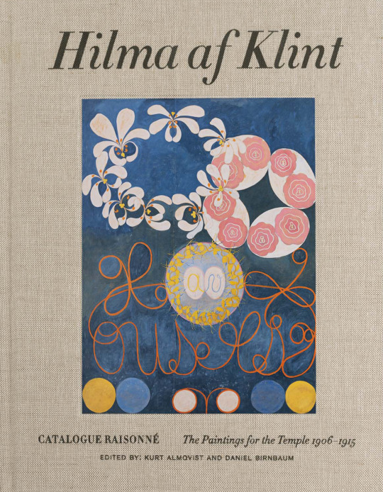
Hilma af Klint. Catalogue Raisonné, Volume 2: Paintings for the Temple 1906-1915, Edited by Kurt Almqvist and Daniel Birnbaum, Bokförlaget Stolpe, Stockholm, 2020 [Stiftelsen Hilma af Klints Verk, Stockholm]
#graphic design#art#drawing#mixed media#geometry#catalogue#catalog#cover#hilma af klint#kurt almqvist#daniel birnbaum#bokförlaget stolpe#stiftelsen hilma af klints verk#2020s
230 notes
·
View notes
Text
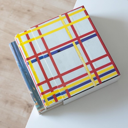
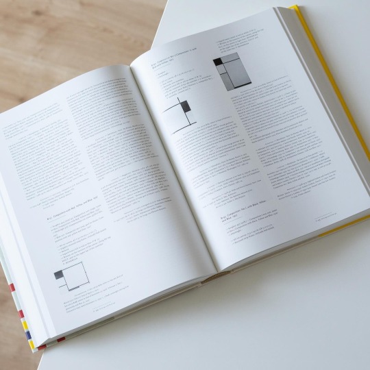
The Neoplasticist paintings of Piet Mondrian were among the earliest artworks I admired as a kid. In my teenage years the passion for his art intensified and at one point I wanted to study all of his works, from his earliest to his latest New York paintings. Consequently I asked my parents to buy me Mondrian’s catalogue raisonné in exchange for good grades. Luckily they agreed.
Compiled by Robert P. Welsh and Joop M. Joosten, experts on Mondrian’s naturalistic and abstract works respectively, the 1998 catalogue raisonné is a treasure trove for anyone with a passion for the backside of artworks: exhibitions, sales, owners and literature are listed for each of his works and add up to comprehensive biographies that are no less fascinating than the actual artwork. I particularly love the drawings and sketches included as they offer additional insights into Mondrian’s working process and the deep contemplation preceding each of his seemingly simple abstract works. Today Mondrian’s catalogue raisonné is also digitally available and can be accessed by anyone via pietmondrian.rkdmonographs.nl, a wonderful project that is much easier accessible and searchable than the present tomes of 7+ kilos.
48 notes
·
View notes
Photo

Tom Thomson
Summer Day (1915)
oil on composite wood-pulp board 21.6 x 26.9 cm
SPECIAL NOTE: the Catalogue Raisonné of Tom Thomson is here: https://www.tomthomsoncatalogue.org/index.php
601 notes
·
View notes
Note
Do you have any art/painting recommendation which are very teen aegon coded

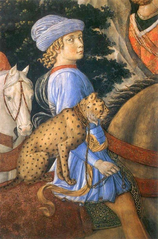

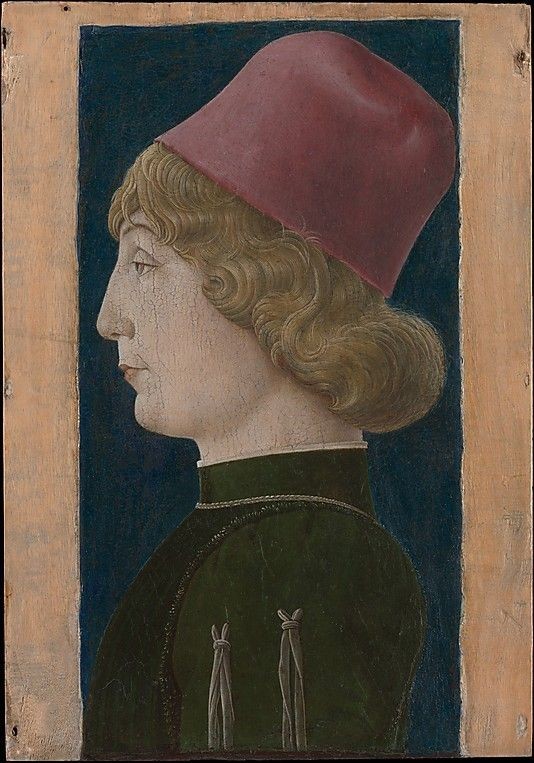
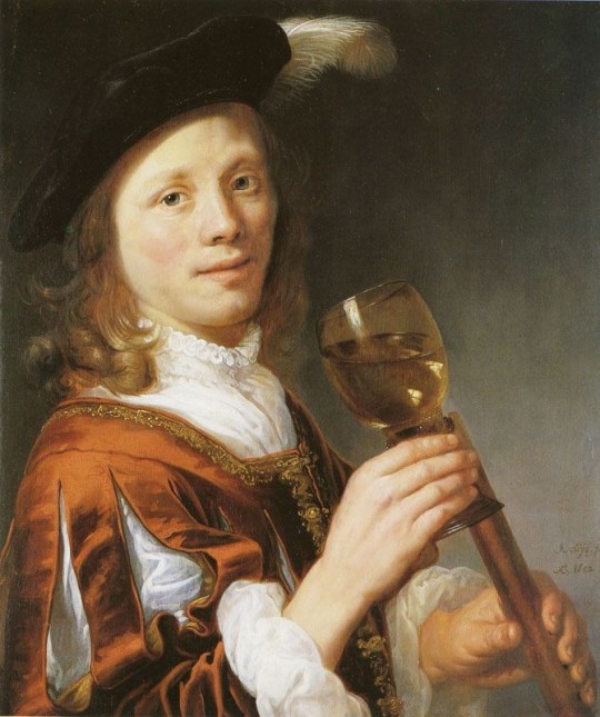

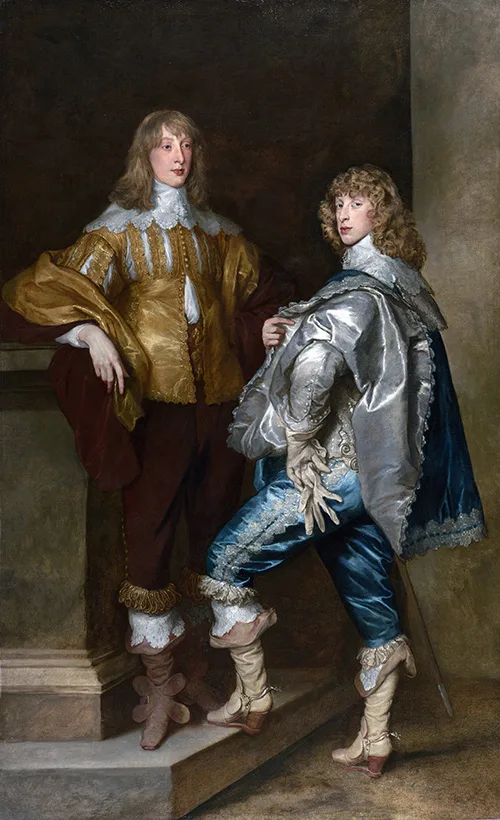
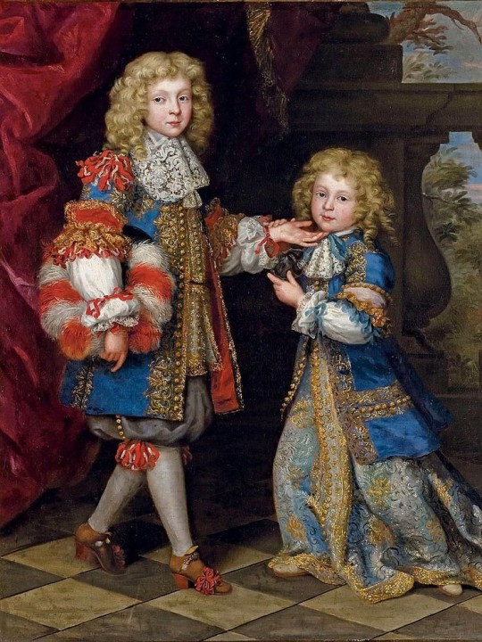
From top left: (descriptions are from left to right side)
Detail of frescoes in the Hall of the Months, Palazzo Schifanoia,
Portrait of Guiliano De Medici by Benozzo di Lese di Sandro Gozzoli
Carlo Crivelli catalogue raisonné, 1975 Bovero
Portrait of a Young Man Cosmè Tura (Cosimo di Domenico di Bonaventura)
Boy with Wine Glass and Flute Jacob Gerritszoon[a] Cuyp or Cuijp 1652
Rembrandt van Rijn, Man with a Hawk, 1643
A late portrait of the two sons of the 3rd Duke of Lennox, Lord John Stuart and his Brother, Lord Bernard Stuart; Anthony van Dyck.
Portrait of two brothers by Henri Gascar (1635 –1701)
32 notes
·
View notes
Text

This week, we have eight amazing timeskip/future fics recced! Some skip ahead a handful of decades, while some skip ahead centuries, but all of them are wonderfully heart wrenching and hit just the right spot. Check them out under the cut, and as ever, comment or kudos if you like them!
The Matter of Lot 19 by pagerunner (10102,Teen)
Warnings: None
Pairings:
Keyleth returns to Whitestone after many, many years to see about a unique and precious clock that's up for auction. But she's not the only one intending to bid...and her competitors might not only be interested because of the clock's connection to a certain legendary de Rolo.
Reccer says: Beautiful and Bittersweet and has a lot of great older Kiki and Sun Tree moments.

Library Magic by westwind (2739,General)
Warnings: None
Pairings:
After the Mighty Nein's adventuring days are over, Caleb travels with a library in an enchanted wagon. He comes across a stranger who's nevertheless familiar.
Reccer says: I liked it
The More Things Change by FinnsKeeper (4922,Teen)
Warnings: Major Character Death
Pairings:
Beau is hurt. The best chance they have of saving her is asking for her to be consecuted
Reccer says: A heartbreatking but fascinating take on the nein being consecuted
Unexpected and Predictable by alullabytoleaveby (2131,General)
Warnings:
Pairings: Verin Thelyss & Caleb Widogast
The last thing Caleb expects to hear on a rainy Tuesday evening is the sound of a knock at his door and Verin Thelyss, Ambassador of the Bright Queen to the Dwendalian Empire, on his doorstep. But he should have expected it. After all, Essek had already prepared for this eventuality.
Reccer says: I love this glimpse of Verin, and Caleb being able to explain his relationship to Essek's brother.
What Makes a Home? by literalfuckinggarbage (3188,General)
Warnings: Child abuse, abusive parenting
Pairings: Beau & TJ
TJ turns up on Beau's doorstep after running away from Kamordah. Beau takes care of her little brother.
Reccer says: It's really lovely seeing an older Beau step up to being an older sister and the relationship between her and TJ is incredibly sweet. They have a rapport, they banter, and the love that's grown between them over the years is plain in each word between them. The ending is so wonderful too and it's a concept I really should rotate more.
cycles by justsleepwalkin (500,General)
Warnings: Major Character Death
Pairings: Caduceus Clay & Essek Thelyss
Caduceus and Essek take a walk among the falling leaves and have a talk about endings and beginnings.
Reccer says: Beautiful and atmospheric - a perfect moment between the two of them.
From the Mixed-Up Files of The J. Lavorre Catalogue Raisonné by renquise (2328,General)
Warnings: None
Pairings:
An art history report on the famous artist Jester Lavorre
Reccer says: I adore epistolary fics and this perfectly scratches that itch. Seeing what people might say about Jester and her friends centuries after they are gone is a treat!
a little birdie told me by Ink_Beneath_Her_Fingernails (1647,Not Rated)
Warnings: None
Pairings:
Kiri absently wonders if the Gentleman somehow had the foresight to keep her name out of their ears, and how he'd managed it for all these years. (Or: The mob boss Kiri we all deserve.)
Reccer says: Mob Boss Kiri - what's not to love?
This is one of our weekly communally-generated gen rec lists. Every week we announce a new theme and allow anyone to submit a fic recommendation. Please note that the summary and content notes are provided by the reccer, and may be different than what the author has provided. Please assume good intentions all around. <3
And hey, anyone includes you!
Next week, we'll be featuring prank fics!
Then, it'll be Ashton focused, Hair Care, and Pre-Campaign!
Any fics coming to mind? Well, then use this form to submit!
If you're looking for some more, check out some fics written in the critter genfic bingo tag, or the older rec lists! Or you can request your own card and join in on the fun!
#critical role#critter genfic rec lists#timeskip au#future fic#keyleth of the air ashari#vox machina#caleb widogast#beauregard lionett#verin thelyss#tj lionett#caduceus clay#essek thelyss#jester lavorre#kiri critical role#the mighty nein
32 notes
·
View notes
Text
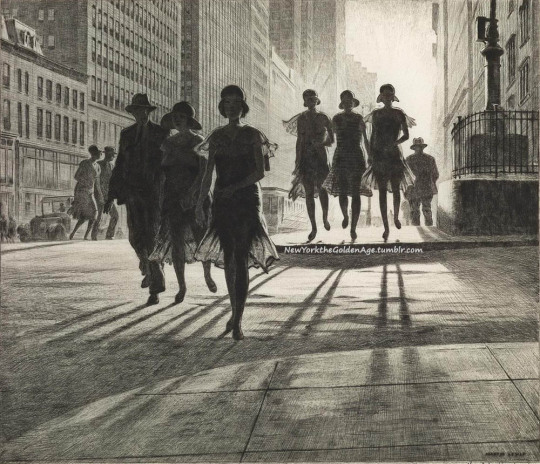
Martin Lewis, Shadow Dance, 1930. Drypoint and sand ground.
According to Paul McCarron, author of a catalogue raisonné on Lewis's work, "The location depicted appears to be the intersection of Thirty-Fourth Street and Park Avenue, looking west."
Lewis has captured the bright summer sun setting across the Hudson River, its raking light forming long shadows from the figures walking east across Park Avenue. Among Lewis's most masterful prints are those depicting scenes of New York City life. These prints have historical interest, as the imagery captures the architecture and styles of the time, while simultaneously incorporating ephemeral moments. The time of day, the weather, the lighting, the street-level views--each aspect was important and added to the atmosphere of the scene. Lewis's use of shadows and light to create mood, life and movement is most powerful in his New York prints. Shadow Dance is among his most celebrated works, incorporating all of the aspects that make his prints such cherished glimpses into New York's bustling yester-year, while simultaneously capturing the timelessness of city life.
Photo & Text: Swann Auction Galleries
#vintage New York#1930s#Martin Lewis#Paul McCarron#prints#drypoint#sand ground#NY in the 1930s#vintage NYC#artwork#shadows & light#Shadow Dance#NY art
61 notes
·
View notes
Text


Someone found a misattributed sterling silver bowl and saucer by Harry Bertoia, got it authenticated, got an entry in the catalogue raisonné, and is flipping it for at least 4x in just four months. Impressive hustle.
2 notes
·
View notes
Text


Scottish artist Craigie Aitchison CBE RA RSA (1926-2009) was well known for his paintings depicting landscapes, portraits, and crucifixion scenes in a distinctive Mediterranean palette.
Andrew Lambirth, who knew Craigie for 20 years wrote wrote so stories in the Atchinson's Catalogue Raisonné. Here are a few bits of his recollections:
"Although Scottish by birth, Aitchison moved to London in 1963, and thereafter divided his time between his terraced house in Lambeth and a second home in Italy, outside Siena. He painted still-life subjects, religious pictures, portraits and nudes, landscapes and his dogs. His preferred models tended to be West Indian or African because he loved the way other colours looked next to warm skin tones.
The first painting by Aitchison to enter a UK public collection was Model Standing Against a Blue Wall (1962), when it was bought by the Tate from the Beaux Arts Gallery in 1964.
Some of Aitchison's most popular paintings have been of objects he lived with: a tea caddy or a candlestick, a cup or a vase (mostly with flowers in it), a cellophane-wrapped Italian Easter egg or a handful of liquorice allsorts.
If Aitchison found a good model, he would paint him or her repeatedly, and his all-time favourite was Georgeous Macaulay.
There are several of his Crucifixions in public collections, but one of the most memorable is in Birmingham, dating from 1984–1986. A large canvas, as many of Aitchison's late Crucifixions are, it depicts Christ on the cross, but without any arms.
Aitchison was quite prepared to take liberties with human anatomy if it helped him to make the image more powerful, and his Christ figures sometimes have only one arm or one leg. (As he once replied to an interviewer who asked him why he did this: 'Not everyone is lucky enough to be born with two arms and two legs'.)
Craigie first painted a Crucifixion when he was a student at the Slade School of Fine Art, which is part of University College in London. One of the teachers said: 'It's a very serious subject and much too big a subject for you to tackle.' But that only spurred Craigie on to paint another one.
He never succumbed to adverse criticism, though he remembered it and was clearly wounded by it. Two visiting Slade tutors, Victor Pasmore and John Piper, both told him to give up painting. Thankfully he didn't. As he said, if it had been somebody he really respected, like L. S. Lowry, also a visiting teacher, he might have paid attention. But Lowry only encouraged him.
Considering the crowded nature of his home, he was surprisingly minimalistic in his art, as well as a great colourist. He thought his intensely poetic images were quite straightforward, but they are impossible to imitate convincingly. Although they look so effortless, he himself often had trouble with them.
In another interview with me in 2004, Aitchison discussed this: 'That seems to be all that it's about – deciding. Somebody said that painting is a complete and absolute way of having to make up one's mind. Whether to put two trees instead of one, or to leave it. It's exhausting trying to make up your mind. If it wasn't like that it would just be boring to do.'
Andrew Lambirth, writer and author of "Craigie Aitchison – Prints: A Catalogue Raisonné"
https://artuk.org/.../the-intensely-poetic-paintings-of...
29 notes
·
View notes
Text


Unfolding Oz
Inspired by L. Frank Baum’s original classic, The Wizard of Oz in Pictures is a delightful, tiny accordion book created by book artists Peter and Donna Thomas and printed in 2001 in an edition of 26 lettered and 75 numbered copies in Santa Cruz, California. The couple have worked collaboratively since 1977, creating over 500 handcrafted books. The Wizard of Oz in Pictures was commissioned for the International Wizard of Oz Club, and is reproduced from a one-of-a-kind of the same name by Donna Thomas that used her own handwritten text and watercolor illustrations. Donna Thomas writes:
It tells the story in one continuous illustration (follow the Yellow Brick Road!) that is folded as an eight-panel accordion. I chose to use our nested accordion binding to complement the theme of movement in the story, from the flying house to the flying monkeys, and the cloth binding material was inspired by Dorothy's gingham dress.
Our copy is an artists' proof and is a gift of the artists. You can view nearly all of Peter and Donna Thomas's artists books in our online catalogue raisonné of their work.
View more posts with work by Peter and Donna Thomas.
-Melissa, Special Collections Graduate Intern
#Peter and Donna Thomas#wizard of oz#The Wizard of Oz in Pictures#the wonderful wizard of oz#l frank baum#dorothy gale#international wizard of oz club#accordion books#limited edition#book art#accordion#book artists#gingham#handcrafted books#artists books
23 notes
·
View notes
Text
Rediscovered Rembrandt Valued at $15,000 Could Now be Worth 18M
A painting valued at $15,000 just two years ago is now expected to fetch up to $18 million at auction after being identified as the work of the Dutch master Rembrandt.
“The Adoration of the Kings” has been virtually unseen since the 1950s, when it first came to light.
It was acquired by collector J.C.H. Heldring in Amsterdam in 1955. His widow sold it to a German family in 1985, where it remained until it was sold by Christie’s in Amsterdam two years ago.
At the time of the sale, Christie’s attributed the biblical scene to the “Circle of Rembrandt,” suggesting it had been carried out by a student or an artist close to the famous painter, and estimated its value at between €10,000 and €15,000 ($10,600-$15,800).
The monochromatic painting, which measures 9.6 x 7.3 inches (24.5 x 18.5 centimeters), was purchased by an anonymous buyer for €860,000 ($908,000) at the Christie’s sale.
Although that was more than 50 times the painting’s estimated value at the time, it is now expected to fetch millions more, after emerging as “a work of great significance” by the Dutch painter, according to a press release from Sotheby’s.
After the anonymous buyer consigned it to Sotheby’s, the auction house embarked on an 18-month research project to arrive at the painting’s true attribution and value.
The examination, which involved x-rays and infrared imaging, as well as intensive discussions with leading Rembrandt scholars, led Sotheby’s to conclude the painting is “an autograph work by Rembrandt.” It now values the work at between £10 million and £15 million ($12.2 million-$18.3 million).
The auction house believes it was painted early in Rembrandt’s career, around 1628, when he would have been about 22 and living in the Dutch city of Leiden.
A rare find
The vast majority of Rembrandt’s works hang in museums around the world, and almost all of those that have come to auction over the past three decades “have been portraits or studies of single character heads,” according to the Sotheby’s release.
As such, “The Adoration of the Kings,” which depicts the encounter between the Three Wise Men and the baby Jesus, is a “fantastic opportunity” in the art world, George Gordon, co-chairman of Old Master Paintings Worldwide at Sotheby’s.
In a phone call, he said: “I would say that it’s particularly significant because it adds to our understanding of Rembrandt at this crucial date in his development and career, when he was clearly very ambitious and developing very quickly as an artist.”
The earliest reference to the painting appears to be from the 1714 inventory of a collector in Amsterdam, Constantijn Ranst. It was then offered for sale in 1814 and again in 1822 – after which it disappeared from view until the mid-20th century.
It was included in museum exhibitions and referenced as a Rembrandt work by leading Rembrandt scholars in the 1950s, but in 1960 German art historian Kurt Bauch, who only knew the painting from a black and white photograph, described it as a product of the Rembrandt School and omitted it from from the catalogue raisonné he was compiling. Thereafter, the painting was “entirely overlooked and completely ignored in the Rembrandt literature,” according to Sothebys.
Gordon sad that those bidding at the Christie’s auction in 2021 “must have thought it was much better than the description and that it might well be a Rembrandt.”
Sotheby’s close examination revealed a number of changes and revisions that Rembrandt made, including to the baby Jesus’ halo and the Virgin Mary’s headdress, according to the auction house.
“Very few narrative paintings by Rembrandt remain in private hands, making this an opportunity for a private collector or an institution that is as rare as it is exciting,” Gordon said in the news release.
“This sophisticated painting is in equal measure a product of Rembrandt’s brush and his intellect. All the hallmarks of his style in the late 1620s are evident both in the visible painted surface and in the underlying layers revealed by science, showing multiple changes in the course of its creation, and casting fresh light on how he thought,” he added.
By Lianne Kolirin.

#Rembrandt#Rediscovered Rembrandt Valued at 15000 Could Now be Worth 18M#Rembrandt 'The Adoration of the Kings'#dutch artist#painter#painting#art#artist#art work#art world#art news#old masters
26 notes
·
View notes
Text

Hilma af Klint. Catalogue Raisonné, Volume 3: The Blue Books, Edited by Kurt Almqvist and Daniel Birnbaum, Bokförlaget Stolpe, Stockholm, 2020 [Stiftelsen Hilma af Klints Verk, Stockholm]
#graphic design#art#drawing#mixed media#geometry#catalogue#catalog#cover#hilma af klint#kurt almqvist#daniel birnbaum#bokförlaget stolpe#stiftelsen hilma af klints verk#2020s
182 notes
·
View notes
Text


The succinct building(s) of the German Federal Constitutional Court in Karlsruhe frequently appears in the German news. Opened in 1969 it combines earnestness and transparency and consciously avoids monumentality. But despite the regular presence of the building in newspapers and on television Baumgarten is a relatively unknown protagonist of postwar architecture. As a result there are basically only two substantial publications on the architect, namely the 1988 catalogue raisonné published by the Berlin Akademie der Künste and the present study by Annette Menting published in 1998 by Gebr. Mann Verlag. In contrast to the former publication Menting primarily focuses on Baumgarten’s key works to elucidate important aspects of the architect’s work, e.g. their structural design. At the same time the author also provides comprehensive context for each of the buildings discussed in detail, welcome additions to the overall chronological discussion of Baumgarten’s life and work. The discussion also covers the architect’s early prewar successes, among them the garbage loading station (1934-36) in Berlin-Charlottenburg, a remarkably modern construction realized despite the Nazi’s tight building politics.
Through these building, as Annette Menting explains, Baumgarten after WWII became an important transmitter of interwar modernism in Germany whose work sought a clear break with the ideologically imposed monumentality of the former regime. In his purposeful architecture Baumgarten focused on the interior organization tailored to the requirement of future users and inhabitants. At the same time he was able to make the most of sometimes tight budget in order to create maximum value for dwellers, an approach that remains topical to this day.
With her valuable book Annette Menting provides an all-encompassing overview of Paul Baumgarten’s life and work that through its unusually deep dive into the constructive foundations of his architecture provides fascinating insights. Highly recommended!
#paul baumgarten#architecture book#architecture#germany#nachkriegsarchitektur#nachkriegsmoderne#book#monograph
19 notes
·
View notes
Last Seen Blogs

rosiers-promise
Rosier's Promise

help-me-maikol
Ann

set-the-table-hannibal
Hannibal + Will

helpstudentpoints
Untitled

drawingpandas
Pengwings