#Cardboard Slipcase
Explore tagged Tumblr posts
Text


Luke Vibert - Big Soup
34 notes
·
View notes
Text

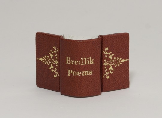
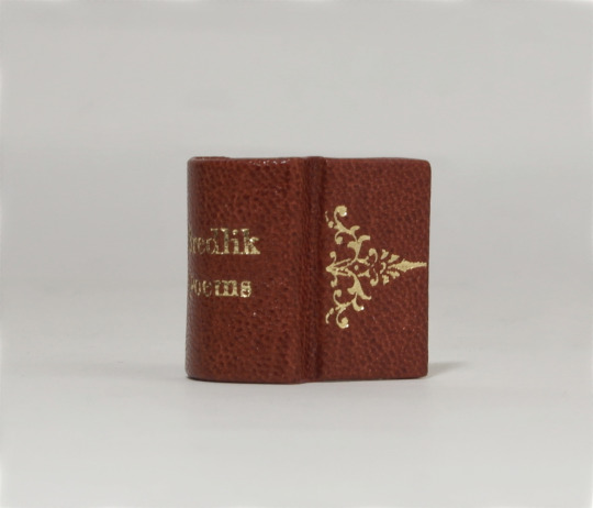

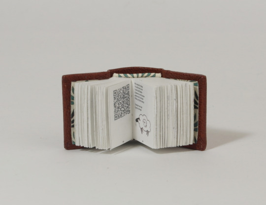
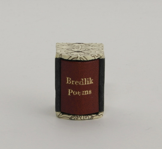

Bredlik Poems (anthology) - collected and credited by @marvinhere doodles by Jenny
This typeset was shared with me complete with doodles and QR-codes.
materials used
cover binders board, 1,5 (covers) cardboard (spine stiffener) leather, goat (covering material) heat activated foil (hot stamped title and decorations)
inner book Munken polar, 100gsm (book body) printed decorative paper (endpapers and endbands)
slipcase binders board, 1,5 decorative paper, printed (narrow sides) satogami paper, black (wide sides, inner lining)
dimensions 2,5cm x 2,5cm
#bookbinding#fanbinding#bredlik#typeset by @marvinhere#doodles by jenny @thimblejuice on instagram#tiny book#mini book#gift#full leatherbinding#slipcase#hot stamped title
550 notes
·
View notes
Text

Anthony Froshaug: Typography & Texts / Documents of a Life, (2 volumes in cardboard slipcase), Edited by Robin Kinross, Hyphen Press, London, 2000 [BOOKS at, Amsterdam]


#graphic design#typography#book#cover#book cover#catalogue#catalog#box#anthony froshaug#robin kinross#hyphen press#2000s
20 notes
·
View notes
Text


#RPGaDay2024
RPG with great form
I love cool new approaches to the physical form of rpgs. That’s why I dug things like Action Cards, Zombie World and For the Queen. I dig useful tactility– where the randomizer has some depth to it. So I prefer card-based approaches over things like tokens & tracking markers.
One classic high-end form factor has been the slipcase. It’s probably the earliest ttrpg prestige format. But a lot of slipcases are just for show. They look nice but don’t do anything. The slipcase for Bluebeard’s Bride is particularly weak, with really thin cardboard. Slipcases also sometimes work against a game– especially if you actually need the books to reference. So you’re having to pull things out and put them back.
So the Runequest slipcase feels like a cosmetic indulgence, versus the two volume Guide to Glorantha slipcase which feels like a high quality dictionary or encyclopedia-- a singular reference work you sit down to read. The Yellow King rpg has an interesting approach to the slipcase problem: the slipcase is magnetic and unfolds into a GM screen. However if you do that, you have to put the other three YK rpg volumes you aren’t using somewhere.
Which brings me to the most amazing thing I’ve seen in recent years: the physical form version of Yazeba’s Bed and Breakfast. The slipcase here just feels right. It’s not just a book storage thing, but a container for the wonders. I’d backed the Kickstarter at the top level– but as I usually do I hadn’t looked at anything after that, awaiting the final version.

I’ve never been as stunned and pleased as I am with what I got. Thematically, graphically, artistically this is one of the greatest ttrpgs things ever written. I love the box of bits held in the slipcase, giving you a clear place to manage these add-ons. It’s brilliant. It’s the kind of brilliant where I have a hard time imagining how someone surpasses it. It provides the gold standard.
Which is part of what makes it so disappointing that I heard (second-hand) that Jay Dragon really took a beating financially and emotionally getting Yazeba produced. This reminded me of that and I signed up for Jay's Patreon today, just to do a little more to offer thanks for their work.
(fixed reference to jay)
14 notes
·
View notes
Text
Led Zeppelin DVD (2003)


Housed in a cardboard slipcase and contains a foldout digipak with 2 DVD transparent trays, 16 page booklet and a 2 page promotional material from other Led Zeppelin releases.
Some copies included a small double-sided printed insert
Comes with detailed notes about each performance
Occasional bootleg visuals are interspersed with official recordings.
In addition to the listed tracks, there are various clips and audio excerpts (in some cases complete) appearing on the interactive menus including 'Moby Dick', 'Heartbreaker', 'Thank You', 'Stairway To Heaven', 'Dazed And Confused', 'Since I've Been Loving You', 'That's The Way', 'The Song Remains The Same' as well as backstage shots.
Region: 1
Picture Format: 4 x 3
Sound: L-PCM Stereo, Dolby Digital 5.1 Surround Sound, DTS 5.1Surround Sound (Main Feature); Dolby Digital 2.0 Stereo (Extras).
Colour & Monochrome.
Running Time: 5 hours 20 minutes
Atlantic Records
#my vinyl playlist#led zeppelin#robert plant#jimmy page#john paul jones#john bonham#atlantic records#hard rock#classic rock#heavy metal#70’s rock#dvd#dvd collection#music video#album cover#album art
12 notes
·
View notes
Text

This special part of my collection is the ACM Consideration version of the debut album, called The Spark That Lit The Flame. It's a very rare find and it has a very beautiful cover art and is basically the standard version of the debut album with a cardboard slipcase.


@taylorswift @taylornation
#taylor swift#taylorswift#taylor swift fan#ts13#taylor nation#taylornation#@taylorswift#swifties#swiftie#taylurking#taylor swift wonderland#taylor swift collector#taylor swift collectibles#taylor swift collection#taylor swift rares#rare cd#rare cd's#taylor swift cd#taylor swift cds#cd collection#cd album#for your consideration#acm awards#acm consideration#ts debut#taylor swift debut#debut era#country taylor#country pop
29 notes
·
View notes
Text
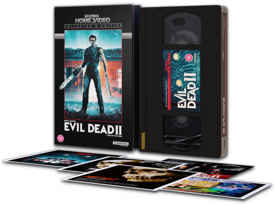


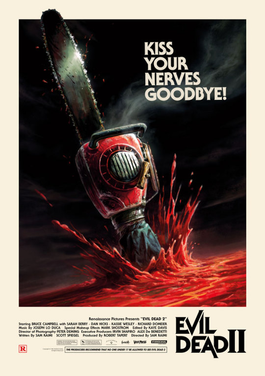
Vice Press presents 'Evil Dead II', the first release in their new Vice Press Home Video project.
Collector’s Edition in a clear plastic clamshell with reversible cover art by Matt Ferguson x Florey & James Bousema, plus a set of 5 postcards featuring Evil Dead II movie posters, including Matt Ferguson x Florey and James Bousema's releases for Vice Press. In a limited edition 500 for £24.99.
Blood Splatter Variant Edition in a cardboard slipcase with cover art by Matt Ferguson x Florey, with a black VHS tape screen printed with red 'blood splattered' ink, in a limited edition 250 for £24.99.
A2 sized (16.5" x 23.4") fine art pigment prints by Matt Ferguson x Florey & James Bousema on 250gm Naturalis Absolute White Matt Archival paper, in limited editions of 2000 for £29.99 each.
On sale Thursday November 16 at 6pm UK through Vice Press.
#Art#Evil Dead II#Vice Press#Vice Press Home Video#VHS#VHS Video#Matt Ferguson#Florey#James Bousema#poster#print
12 notes
·
View notes
Text
Now and Then - There WILL Be a CD Single
It was always odd that there was not a CD single of “the Beatles last ever single” included in the long-awaited big release announcement last week. Well, now there is. A CD single in what looks to be a simple cardboard slipcase has belatedly appeared on the official UK Beatles site: Like all other formats, the CD will feature ‘Now and Then’, plus the 2023 stereo remix of ‘Love Me Do’. The…

View On WordPress
2 notes
·
View notes
Text


they might be giants - dial-a-song CD
Two digipak CD's and a booklet inside a cardboard slipcase. Tracks 12, 13 & 14 on Disc Two were previously unissued.
#photoset#they might be giants#cds#dial a song#dial-a-song#idk which is the tag. if such a thing exists#ants#bugs
4 notes
·
View notes
Text
Personalizing Your Book Cover: From Plain Paper to Custom Designs
1.How to hide a book cover?
Hiding a book cover can serve a multitude of purposes, ranging from the preservation of a book's aesthetic appeal to the protection of sensitive or personal content. Whether the intention is to maintain discretion regarding the subject matter or to simply keep the cover from showing signs of wear and tear, there are several effective strategies to consider. One straightforward approach is to utilize a plain, non-descript book jacket that provides a neutral appearance while still safeguarding the original cover. Alternatively, wrapping the book in neutral-colored paper can provide an elegant solution, blending seamlessly with any surrounding environment. For those seeking a more tailored approach, employing a cloth cover that complements existing decor can add both functionality and style, ensuring that the book remains discreetly integrated into the space. For a more permanent solution, creating a custom slipcase can be an excellent choice, allowing for easy removal of the cover when necessary while offering robust protection. This can be accomplished using sturdy materials such as cardstock or cardboard, which can be cut to fit the dimensions of the book precisely. In situations where privacy is of utmost importance, consider labeling the spine with a generic title or employing a simple color-coding system. This method not only maintains the anonymity of the book's content but also preserves its integrity and accessibility, ensuring that it remains a valuable addition to your collection without drawing unnecessary attention. By thoughtfully considering these options, one can effectively conceal a book cover while also enhancing the overall presentation and protection of the literary work.
2. How to design a book cover in Canva?
Designing a book cover in Canva presents an accessible yet impactful opportunity to showcase your literary work. The process begins with the selection of the appropriate dimensions for your cover, which typically measures 6x9 inches for print formats; however, it's essential to consider the specific requirements of your chosen digital platforms if you are aiming for an eBook release. Canva offers an extensive library of customizable templates, high-quality images, and a diverse range of fonts that allow you to create a visually appealing and cohesive design tailored to your book's identity. By leveraging these resources, you can set a strong foundation for your cover that resonates with your target audience. As you delve deeper into the design process, focus on integrating compelling visuals and typography that accurately reflect the genre and theme of your book. It is crucial to ensure that both the title and the author name are prominently displayed and easily readable, as these elements are key to capturing potential readers' attention. Consider the use of contrasting colors and engaging imagery that will draw the eye while maintaining a professional aesthetic. Once you are satisfied with your design, download it in a high-resolution format suitable for both printing and digital distribution. This final step is vital, as it ensures that your book cover not only looks polished and appealing but also meets industry standards, ultimately enhancing its marketability.
3. Is there a app to design a book cover?
In today's rapidly evolving digital landscape, authors and publishers have unprecedented access to a wide array of applications designed to create visually striking book covers that cater to their specific needs and preferences. Platforms such as Canva, Adobe Spark, and BookCoverZone have emerged as popular resources, offering user-friendly interfaces and customizable templates that can accommodate both novice designers and seasoned professionals alike. These tools are particularly beneficial for those who may not have extensive graphic design experience, as they provide step-by-step guidance and an intuitive design environment. Additionally, these applications boast extensive libraries of high-quality images, fonts, and design elements, empowering creators to craft unique and engaging visuals that capture the essence of their narratives.
By harnessing these digital tools, authors and publishers can effectively translate their book's themes and genres into compelling visual representations, ensuring that their final designs resonate with potential readers. A well-designed book cover serves as a crucial marketing instrument, capable of attracting attention in an increasingly crowded marketplace. As consumers are often drawn to visually appealing designs, the importance of a striking cover cannot be overstated. Furthermore, the ability to incorporate unique artistic elements allows creators to differentiate their work, fostering a memorable identity for their publications. Ultimately, leveraging these innovative applications not only enhances the aesthetic appeal of a book but also contributes to its overall success in terms of marketability and reader engagement.
4. Can I copyright my book cover?
Yes, you can indeed copyright your book cover, as it falls under the category of artistic expression, which is safeguarded by copyright law. Copyright protection specifically applies to the original design, artwork, and any unique graphic elements that are incorporated into the cover. In order to secure this form of protection, the creator must demonstrate that the cover exhibits a sufficient level of originality and creativity, distinguishing it from other works. This originality can manifest in various ways, including the choice of colors, typography, imagery, and layout. While copyright automatically attaches to original works upon creation, it is highly advisable for authors and designers to register the copyright with the U.S. Copyright Office. This formal registration not only provides a public record of the work but also enhances legal protection, making it significantly easier to enforce one’s rights in the event of infringement. It is crucial to understand, however, that copyright does not extend to ideas, concepts, or general themes; rather, it only protects the specific expression of those ideas as conveyed through the artwork. For example, while the concept of a fantasy novel may be common, the unique artistic representation of that theme on the book cover is what qualifies for copyright protection. This distinction underscores the importance of originality in design and artistic expression. Additionally, securing a copyright can deter potential infringers and provide a stronger legal standing should disputes arise regarding the use of the cover design. Therefore, for authors and designers alike, understanding and leveraging copyright is essential not only for protecting their creative works but also for fostering their professional integrity and standing within the literary community.
5. Can I paint on a book cover?
Painting on a book cover can serve as a profoundly expressive and creative endeavor, but it demands a careful and informed approach. Before embarking on this artistic journey, it is crucial to assess the material of the book cover. Different materials—such as leather, cloth, and paper—each necessitate distinct techniques and types of paint to achieve a desirable result without damaging the underlying surface. For instance, leather may require specialized paints that can adhere effectively without cracking, while cloth might benefit from fabric paints that maintain flexibility. Furthermore, one must consider the intrinsic value of the book; altering the cover of a rare or collectible edition could significantly diminish its worth. Therefore, conducting thorough research on the book's edition and its market value is imperative before making any artistic modifications. In addition to material considerations, the longevity of the artwork should be a priority. Utilizing archival-quality paints and sealants is highly recommended, as these products are designed to resist fading and deterioration over time, ensuring that the cover art remains vibrant and intact for years to come. It is also wise to apply a protective finish that guards against environmental factors such as moisture and UV light, which can adversely affect both the artwork and the book itself. Ultimately, painting a book cover can transform a standard volume into a unique piece of art, reflecting the owner's personality and tastes while preserving the book's integrity and functionality. This thoughtful approach not only enhances the aesthetic appeal of the book but also honors its role as a cherished object in any collection.
0 notes
Text
LET’S DISAPPEAR! – BUS126
14,5 x 20cm, 2 books in unique slipcase, 128/64 pages, EN, 240 copies + 10 special editions, 2019, published by Hitzerot In LET’S DISAPPEAR! BUS126 presents a selection of his artistic work since 2007 till 2019 showing his pieces more and more developing into abstract forms. In addition to the 128 paged photo book LET’S DISAPPEAR! also includes a separated 64 paged text book with essays. Both books come in an individual cardboard slipcase handbuild by BUS126! The second edition without slipcase is available at Hiterot >>


0 notes
Text
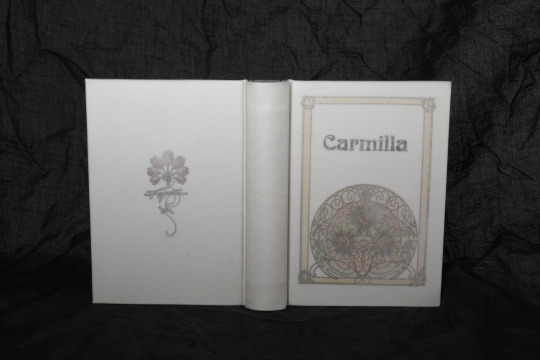
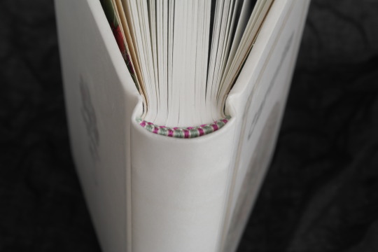
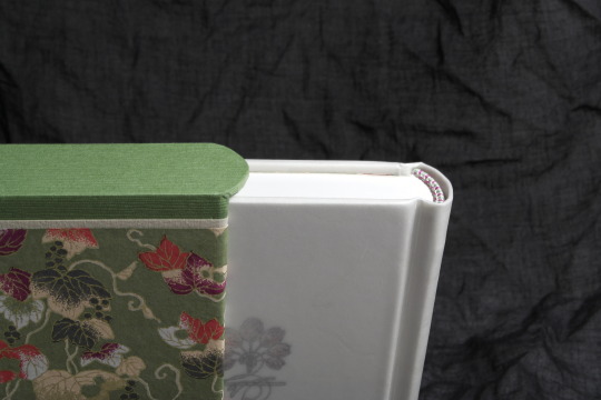


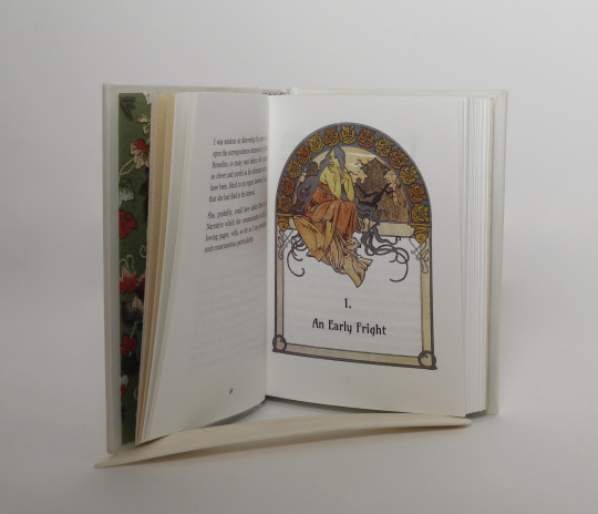


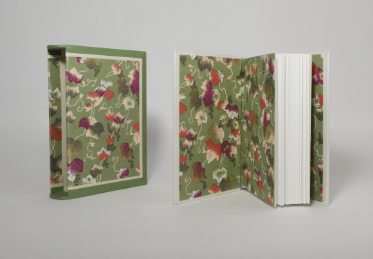
Carmilla - Robert Sheridan Le Fanu Full vellum Bradel binding with slipcase
Book art - Alphonse Mucha Many thanks @notwhelmedyet for inspiring me towards Mucha for bookart
Materials used:
case board - museumsboard, white spine stiffener - cardboard gathering the case and laser printed cover decoration - white paper cover material - calf parchment
inner book text block paper - Schleipen fly 05, 115gsm endpapers - Chiyogami paper and Hahnemühle Ingres Bütten paper sewing material - linnen thread (flax) endbands - buttonhole silk (Gütermann) edge finish - head and foot edge polished Font's used Titel font - Boecklin's universe Chapter title, page count and drop caps - Amarante text body - Georgia
Slipcase case construction - grey board (1,5 and 1mm) covering materials - Tsumugi paper, Hahnemühle Ingres Bütten paper, Chiyogami paper
#bookbinding#Carmilla#le fanu#vellum binding#vellum#parchment#slipcase#Mucha#alphonse mucha#bookart#polished edges#this was a bit of a go for a vellucent binding#next time I'll try a treatment and see if it can be more clear#parchment bindings are always a bit nerve wrecking#also I improvised a new background because white parchment on white background is not really much of a contrast
300 notes
·
View notes
Link
Check out this listing I just added to my Poshmark closet: Collectible Proof Set 1973, six US coins.
0 notes
Link
Check out this listing I just added to my Poshmark closet: House Of Blues - A Soul & Gospel Christmas 2 CD Box Set Mint 1994 Super Rare.
0 notes
Text
Nils Petter Molvær - Khmer
https://www.discogs.com/release/4816629-Nils-Petter-Molv%C3%A6r-Khmer
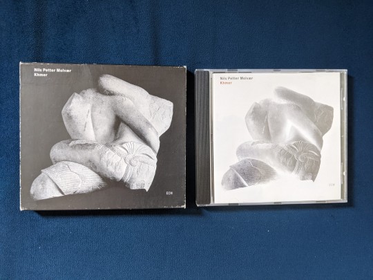

Welp, it was only a matter of time before the wacky jazz cuts started to come out of the woodwork. This one comes to us from Norwegian trumpeter Nils Petter Molvær by way of eclectic jazz and classical label ECM (which I'm sure will make many more appearances on here as time goes on).
Khmer, released in 1997, was a touchstone in the burgeoning genre of future jazz (aka nu jazz), which saw jazz artists flirting with ideas from the worlds of electronic, dance, and hip-hop. You can find earlier incarnations of these ideas in Miles Davis' 80s output (which, as maligned as it was at the time, continues to inform some of the trendier jazz styles of the last 20 years), as well as many of Bill Laswell's various projects and collaborations. Future jazz would go on to peak in the early 2000s with artists like Herbie Hancock jumping on board and very successful (by jazz-adjacent standards) releases from artists like St Germain.
As you might imagine, most future jazz feels (somewhat ironically) aesthetically and stylistically mired in time in the late 90s/early 00s. I think Khmer does a better job than most of feeling a little less dated. While some of the drum loops show their age, tracks like Platonic Years feel like they could have been released last week. Khmer seems less interested in pretensions of getting club play and more in threading those ideas into larger soundscapes. Many future jazz releases feel like they're desperately trying to reach a younger, trendier crowd, whereas Khmer seems to be bringing some newer (again, relative to the time) ideas to ECM's listener base of more open-minded jazz fans. Molvær's playing is tastefully sparse and intentional, often adding little aside from the occasional melody line to a track (again reminding me of Miles' later output, although Molvær's style is much softer and eschews the heavy funk influences Miles had in that era). The rest of the players follow a similar schema, with very little traditional soloing and more of a focus on creating a cohesive musical story.
The copy in front of me is the regular mass-market 1997 German CD release, sporting ECM's signature cardboard slipcase (which, like most, is looking worse for wear 26 years later). ECM had abandoned vinyl at the time, so Khmer would go on to be CD-only until its 2019 LP issue. It also has received a few limited Japan-only releases on SHM-CD and HQCD. ECM has always adhered to strictly minimalist design philosophies, and this release is no exception. The liner notes are simple but informative; no exposition or interviews, just the facts. The rest of the packaging follows suit.
As is the standard at ECM, Khmer is impeccably recorded, mixed, and mastered. It's refreshing for this style in particular, as many of the other releases I've heard in the genre have shot for more of a highly compressed club sound. Khmer maintains wide dynamics while still keeping the bass deep and the drum loops punchy.
Overall, Khmer is a fun listen. I wouldn't describe it as particularly essential outside of its niche in a brief moment in jazz's history, but it's well worth checking out. It's interesting enough for focused listening, but inoffensive and vibey enough to fade into the background if needed. It's also a pleasantly accessible listen for non-jazz listeners, while still being reasonably recognizable as a form of jazz (something that definitely can't be said for every future jazz release). Give it a spin sometime if that sounds like your type of thing. Until next time, may your drum loops stay well-sequenced and may your ligatures stay well-connected.
0 notes
Text

Got this one today, directly from Japan. It's the Japanese deluxe edition of Speak Now (Taylor's Version). It is a CD version that comes in a 7" cardboard slipcase. It includes an also 7" booklet, a neutral white booklet with japanese lyrics, the two cd's on a cardboard circle that looks a bit like a 7" single vinyl, and with a guitar pick. Mine also came with a mini sticker that's exclusively to the first few hundreds or thousands of orders.


#taylor swift#taylorswift#taylor swift fan#ts13#taylor nation#taylornation#swifties#swiftie#taylurking#taylor swift wonderland#taylor swift collectibles#taylor swift collector#taylor swift collection#cd collection#taylor swift cd's#taylor swift cds#deluxe edition#japanese#japanese edition#japanese deluxe edition#obi#sticker#stickers#booklet#7"#cardboard slipcase#slipcase#guitar pick#guitar picks#speak now (tv)
3 notes
·
View notes