#Cape Air
Explore tagged Tumblr posts
Visit Tumblr Blog
Explore Tumblr blogs with no restrictions, modern design and the best experience.
Last Seen Tumblr Blogs


Fun Fact
In 2020, 27% of US Tumblr users had an annual household income of over $100,000.
Text
No. 17 - A Gay Plane Has Landed (A Rainbow Twitter Icon Livery Compilation)
Yep, it’s that time again! As we wrap up the yearly scheduled month of concentrated rainbow Capitalism, let’s go over some of the paint jobs airlines have used as a much more expensive variant of changing your Twitter icon to a rainbow version for the month of June, immediately after it stops being actually timely.
To be clear: I am not rating the liveries as a whole. Those get their own posts. I am rating the modifications made to the livery for the occasion. I am judging this, not on overall quality, but on creativity and shamelessness. I want to see a tastefully designed plane that will make homophobic people get mad when they find out it’s operating their flight for as long to come as possible.
It is not activism and it means nothing, but it has the potential to be somewhat funny, and I think the task of integrating a big gaudy rainbow flag into what’s otherwise a regular airline livery is an interesting and difficult one, and it’s fun to see different airlines to take on the same challenge. It also gives me a chance to review a bunch of special liveries that only change part of the design, as opposed to the ones I’ve already covered which invent a full new paint scheme. Some airlines even had multiple goes at it!
I just want to make my stance abundantly and unambiguously clear. This is not a sincere appreciation of a conglomerate of millionaires deciding they’ll make more money if they paint rainbows on their plane. This is me rating airline liveries.
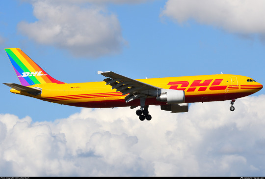
N653GT (Amerijet International for DHL)

I begin with N653GT because she flew directly over my house at 4,500 feet maybe a month and a half ago at time of writing. I’m a bit sad that I didn’t get a picture because it was nearly midnight, but not too sad, because it’s not like it’d be recognizable as anything except a DHL plane. I’m unsure if this was Amerijet International’s idea, DHL’s idea, or a mixture of both, but calling it an idea is honestly even generous. You could easily just not notice that there’s anything different about this livery at all.
Grade: D
D-AEAS (DHL)
Unlike the prior airframe, this plane is registered in Germany (rather than the US) and is part of DHL’s fleet proper. I do think I prefer this to the Amerijet incarnation, both because it’s more visible and because the diagonal lines blend with the body at least somewhat. Couldn’t they have extended the red one a bit, though? That color literally already exists in their color scheme.
Unfortunately, D-AEAS seems to have been repainted to the vanilla DHL livery sometime in October 2022.
Grade: C-
D-AEAR / “Delivered With Pride” (EAT Leipzig for DHL)

I’m almost angry because I do think this is very well done. It sort of combines the two prior attempts and turns them into something much better. This implies that they’re learning.
Relocating the rainbow DHL symbol to the top of the tail solves that weird spacing issue with the gap at the end which the Amerijet incarnation had. It also makes the rainbow tail far more dynamic by giving it the distinct curve of an actual rainbow, then improving it even further by stretching it rather than making it perfectly circular, which adds even more visual interest. I really like how this covers the often-neglected sort of concave line where the vertical stabilizer actually meets the top fuselage, which is often ignored in liveries that bother to integrate the tail with the fuselage proper. I find that in this case the dynamic nature of the curved rainbow actually makes me feel like this tail is part of the fuselage proper despite there being no paint which actually leaves it, an effect probably aided by the fact that the yellow line of the rainbow directly flows into the main yellow of the livery. The fact that the red in the rainbow is also present in the rest of the DHL livery prevents it from feeling unbalanced despite the fact that the main logo is unmodified.
This livery is very new. Hilariously, I think it was only applied around the 15th or so. I doubt this will happen, but it would be hilarious if they removed it immediately after the end of the month. I also sort of hope they don’t, because this is a pretty solid rainbow plane. (...it would be very funny though.)
Grade: B+
D-AINY / “Lovehansa” (Lufthansa)
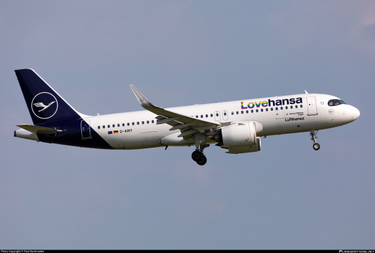
While I generally dislike the Lufthansa livery so much that I made this blog, I have to give them props for a tasteful pride integration. It’s neither garish nor negligible, and as a little bonus the interior also has a rainbow motif. I hope at least one German was very shrill and indignant about having to rest their neck on the dreaded gay antimacassar.
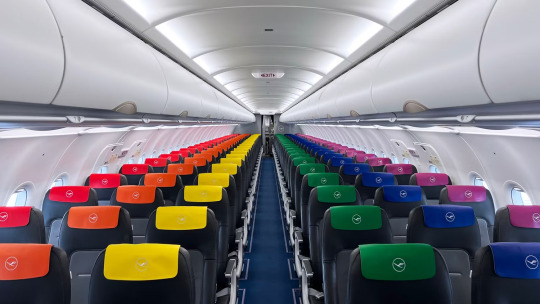
It does feel like somebody thought about this, unlike the Lufthansa livery as a whole. And it will be graded as such, independent from the Lufthansa livery as a whole, which I still hatehansa.
Grade: B-
N854VA (Alaska Airlines)
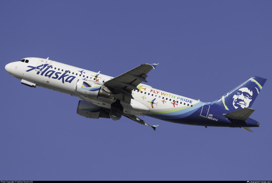
I really like Alaska’s take on the pride theme. It actively adds something to the design of the livery without overpowering it - this is still recognizable as an Alaska Airlines plane but also as a pride plane. The font chosen is fine and the little airplanes are cute. It’s nice. It’s tasteful. It’s delightful. I’ll be honest, it got a smile out of me even though my emotional investment in the concept of a gay pride plane is less than minimal, just because I think the little airplanes are a nice and cute design.
Apparently a lesbian couple got engaged on a flight operated by this plane. Good for them, I guess. A lot of these airlines operate “pride flights” (???) which as far as I can tell are just like a flying club night with the sort of people who would pay money to attend such an event, which sounds utterly miserable to me, but I’m here to talk about the liveries, not any of this. It just felt worth including a mention of at some point, as this seems to be an industry-wide phenomenon even with airlines which operate no rainbow planes, and this is the only one of the planes which I have any reason to believe hosted a gay marriage proposal. So do with that what you will. In my case, I’ll do nothing.
N854VA was stored in December of 2022, but is only 11 years old, so surely she’s still airworthy. I’m just saying, if anyone from Alaska Airlines is reading this: bring her back.
Grade: A-
LX-LQC “Be Pride. Be Luxembourg” (Luxair)

I’m a little conflicted here, because the paint splash isn’t the worst concept ever for a rainbow addition but it is just added to the existing white part without modifying the existing livery otherwise and doesn’t do anything especially interesting. It somehow feels small despite being large. Your eyes could honestly glaze over it. That’s sort of one of the hazards of propliner liveries but that’s no excuse. At the same time it’s far too large. It feels clumsy, haphazard. I don’t really think I care for it. The rainbow logo on the nacelles is a decent touch but not nearly enough to save it.
The airframe was repainted in the standard Luxair livery in December 2022. Still, while they are no longer Pride, they are, to the best of my knowledge, still Luxembourg.
Grade: D+
VH-QPJ “Rainbow Roo” (Qantas)
One of the earliest examples of a pride plane comes from one of the oldest airlines still in operation. The A330 (GAY330, as it was called at the time) adopted her paint scheme in February 2017 in partnership with Sydney Mardi Gras and kept it until May 2018. A trailblazer for sure. I think the flag on the tail looks sort of bad, but just replacing the logo with a rainbow version is literally as obvious and simple of a pride livery as I can think of and I’m honestly fine with that.
Grade: C-
I do, however, respect that the special flight they did for Sydney Mardi Gras included a Qantas-themed drag queen named Qantana. That said, it seems they hired a drag queen to perform as Qantana instead of there simply being a full-time Qantas-themed drag queen, and I have to say I’d respect it a lot more if someone had just committed to making Qantas camp to that degree. I mean, there’s an entire, what, three seasons of Aussie Drag Race? I’m just saying I feel like the fact that it hasn’t happened reflects poorly on Qantas’s general vibe.
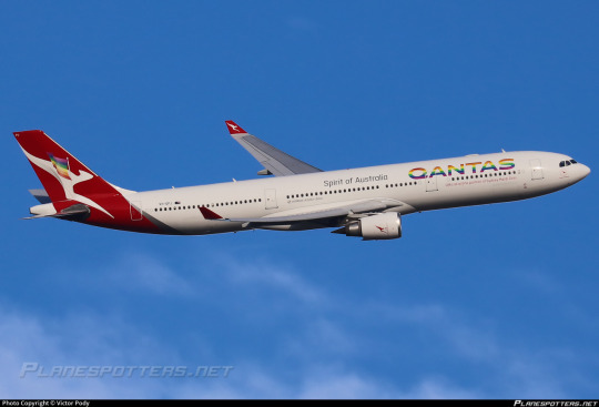
VH-EBL “Pride is in the Air” (Qantas)

As of February of this year, Qantas decided they were going to give it another shot. This new livery, not in partnership with anyone, is very similar to the original. Much like the original, it’s entirely fine. I do prefer the way that the flag’s stripes are ordered from left to right rather than top to bottom this time around, as it’s much more legible. They also seem to have updated to the progress flag instead of just the standard rainbow flag, and they’ve removed that weird out-of-place flag detail from the tail. Again, I think it could be improved by making the Qantas logo on the tail rainbow as well for balance, and on the nacelles for completeness, but the current state is absolutely fine.
In all honesty this is probably objectively a C but I do feel the need to upgrade the rating slightly to acknowledge the subtle yet palpable improvement. That’s growth.
Grade: C+
C-GPTS (Air Transat)

Another gay330, this time from Canadian carrier Air Transat. Another simple replacement of the logo, though it does feel unbalanced. The rainbow on the light blue looks nice, I’ll give it that, but it’s super blink-and-you’ll-miss-it. I’m unsure why nobody thought of making the text rainbow too. Maybe to save paint? I say this because in a very blatant and literal variant of the changing your Twitter icon strategy, she only wore the livery for the month of June 2019 before being reverted to Air Transat’s standard.
Grade: D
N247GS (Cape Air)
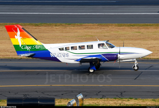
Cape Air is a regional carrier based in...Cape Cod, shockingly. They’re very Cape Cod, not in a Kennedy way. I’ve had nothing but good experiences flying with them in the Caribbean, where they operate a tiny fleet of Britten-Norman Islanders, but they also do flights in the Northeast US and especially Cape Cod. They’re a nifty little airline and if you’re ever in a position to fly with them I recommend it - flying in a little 12-seater twin prop is a really unique experience compared to a full-size jet.
This livery is fine, mostly just replacing the standard blue part of the Cape Air tail with a rainbow, but I like the extra touches on the engine nacelles and wheel pants. I also appreciate the airline’s statement that she’ll wear this livery for the rest of her service life. How long will that be? Good question - Cape Air is phasing out their Cessna 402 fleet for their new Tecnam P2012 Travellers, but they still have a pretty big fleet of them and they seem to be going strong. N47GS in particular is 41 years old, which sounds outrageous but isn’t particularly eyebrow-raising for this sort of plane, and she seems to be in good nick, so here’s to many more years of service. Go grandma!
Grade: C+
G-SAJE “Pride Jet / Jet Pròis” “Flying's for all” (Loganair)
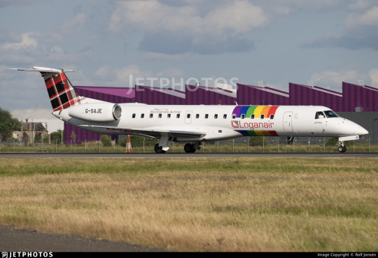
I truly struggle to figure out how to rate this, because this particular plane looks...borderline featureless before modification. I do sort of like what they’ve done here, in the sense that it reminds me of SAS’s old belly stripes livery and it looks very clean and all that. I think I would really like this on most other liveries, but it’s hard to accept it just slapped on a plane white plane. It’s not integrated into the livery because there’s nothing to integrate it into. I don’t know, I feel like there could have at least been something to match the tartan pattern? I’m not going to turn this into a general Loganair review but the tartan is so underused here and I think at least changing the stripes to a sort of diagonal weave pattern would do a lot to make it fit better. I just don’t know. With a canvas this blank it’s hard to think of specific ideas but this leaves me feeling very wanting and unsatisfied. Come on, Loganair. The sentence ‘Scottish regional airline with tartan-based livery’ leaves me frothing at the mouth, you’ve got to pull yourself together because the potential is way higher than the service ceiling on that plane! (...wait, the ERJ-145 has a 37,000ft ceiling? Why did I expect that to be so much lower? Good for her.)
This livery is also hot off the presses, June 2023 release.
This really is hamstrung by the absolute nothing it’s working with beforehand. I definitely think this is more elegant than Luxair’s attempt but the livery is so bare to begin with. I guess - I said I’m judging this exclusively by the pride addition, but it’s so hard to not interpret it holistically. I’m too good at my job :/
Anyway. It’s fine but the canvas is so underwhelming that I just can’t like it. Sorry.
Grade: C-/D+
Thomas Cook Airlines
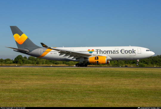
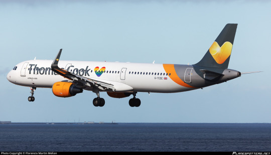
Thomas Cook actually had at least two pride planes (I’ve seen the number five tossed out but could only find these two - G-TCDE and G-MDBD - for sure). It’s...fine. Like, whatever. It’s a little heart that’s rainbow instead of the generic yellow Thomas Cook heart. It’s not too visible but I’d describe it as a sweet little touch. I prefer it to what Luxair did. It’s fine. I wish they did more, but it’s fine. I don’t think either of these liveries were left intact for terribly long, and there was no fanfare or reporting about either of these. Following Thomas Cook’s legendary 2019 implosion and the resulting record-setting peacetime repatriation of UK nationals G-TCDE is currently stored and in a default Thomas Cook livery, while G-MDBD is flying for a new airline in a new livery. No clue what happened to the other potential gay Thomas Cook planes, but I don’t think it matters either.
Grade: C-
XA-MAQ (Aeroméxico)
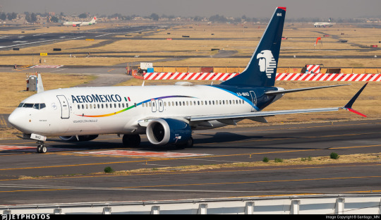
The immediate impression is of an Air Transat or Thomas Cook-style tiny replaced element, but the more I dwell on XA-MAQ the more I appreciate her. Like, it is just the red stripe replaced with a rainbow one, but I’ve realised - and this is true of Thomas Cook’s fab (alleged) five as well - that replacing the logo on the tail without touching the rest of the fuselage or the nacelles ends up looking unbalanced, but replacing a little flourish avoids that and fits more smoothly into the rest of the design.
Also, while both are small, the little ribbon isn’t the only touch. Immediately beneath it on the fuselage is text reading ‘volamos con orgullo’, which is Spanish for ‘we fly with pride’, if my Googling is correct. I find that pretty cute. No, it’s not a lot, but it’s cute. It’s at least an implication that more went into this design than checking off a box. A lot of the others, Air Transat in particular, feel very ‘oh, we made the logo rainbow, guess we’re done!’.
Plus, bonus points for keeping the livery - it was first applied in June of 2021 and is still in service.
Grade: B-
G-VPRD “Rain Bow” (Virgin Atlantic)
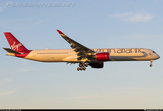
Wait...huh? This can’t possibly be the right plane, can it? This is just a normal Virgin livery.
Wait. Wait a moment.
Zoom...enhance...

image: Virgin Atlantic)
That’s your pride livery? The entirety of your pride livery? Not a small part of a more interesting whole, not a large design that’s visible on the fuselage, this tiny...e-girl cheek decoration of a guy who looks vaguely fruity? This is your big move towards inclusivity that you brag about flying to Doha?
I already dislike Richard Branson, but I will not forgive him for this particular act until he paints what will be renamed to GayceShipTwo entirely in rainbow colours with THIS PLANE IS GAY written in massive letters on it, and also sends me a million dollars directly shipped via GayceShipTwo to my local airport. Is the runway big enough to land it? No clue, but that’s going to be his problem to figure out and is none of my business. And then afterwards he will fly GayceShipTwo back to his house and land her on his own head, killing himself instantly. Likes charge, reblogs cast.
Grade: F
N724AV (Avianca)

I have mixed feelings. On one hand, all they’ve done is replace the barely-above-standard tail-only design with a rainbow. On the other hand, I do like that it’s not just a flag and has something actually visually interesting about it with the way it intersects itself. I do wish they’d also replaced the logo, nacelles, and winglets with the same rainbow pattern, but the general amount of things going on in the middle and front at least prevents it from feeling unbalanced. I mean, did they do an Air Transat? Sort of yes, but their livery is a lot less rear-heavy at base and there’s a lot more to look at here.
I don’t know. I think it’s fine. Just fine. Can’t knock it too hard, but not exciting.
Grade: C-
__________________________________________
Well, that’s it for the good, the bad, and the Virgin Atlantic of every pride livery I could find record of. Let me know which tepid corporate gesture you found most aesthetically pleasing, and remember: I am doing my utmost to psychically harm Richard Branson with my malicious thoughts, and this medical equipment I’ve stolen is going to help me in this goal.
I’ll have a couple more posts coming out about planes which aren’t gay pride planes but look like they might be, so keep an eye out for those tomorrow and Monday.
#tarmac fashion week#a gay plane has landed#aeromexico#air transat#alaska airlines#amerijet international#avianca#cape air#eat leipzig#dhl#loganair#lufthansa#luxair#qantas#thomas cook airlines#virgin atlantic#special liveries#compilations#long haul
41 notes
·
View notes
Text
0 notes
Photo


airplane mode : sju - vqs san juan, puerto rico
0 notes
Text
DP X DC PROMPT #28
(#) = Notes at the end of post
✦
Chartreuse
Due to the high levels of ambient ectoplasm, all the citizens of Amity Park gained a permanent change in eye color. They don't glow or flare in response to rampant emotions like true ghosts or the halfas though. They're just an unnaturally bright yellow-green.
The thing is, nobody else on Earth has this eye color, and it's never been seen in the human race until the recently graduated Amity Parkers started branching out to other cities to find jobs.
Nobody paid this any mind at first, though. Many just thought the individuals liked strangely colored contacts or it was a trick of the light. It's not until Danny and Tucker are both hired for positions in Wayne Enterprises that questions start popping up.
At first, the other employees thought the two might be related. It could happen, it's not that strange. However, when both of them said they're nowhere near related, just childhood best friends, it left everyone confused. If they aren't related and they aren't wearing colored contacts, then what are the odds of too completely unrelated people having the exact same strange and unseen eye color?
After a while, everyone just stops asking questions. After all, both men are easy to get along with and are excellent at their jobs, so a strange eye color isn't really something to complain about. Their stares were just a bit more intense than most people, and honestly, they've seen stranger things.
It helps that they've started seeing other people with the same eye color popping up in celebrity, sports, and activist circles. (1)
However, It's not until the power goes out during a late meeting/presentation, and Tim Drake accidentally turns on and shines his cell phone light into Tuckers eyes, that he starts seriously digging.
Needless to say, the animal-like green shine of his pupils scared the shit out of him and got him wondering if two of his new employees were part of a previously unknown alien race that'd recently settled on Earth without anyone noticing. When he looks into the middle of nowhere town they came from, this idea is even further cemented when he sees every person he finds a photo of have the exact same shade of chartreuse eyes. Ignoring the ghost rumors and "sightings" as just a strange tourist trap for the strange little town to make extra income, he brings the info he found to the other bats and birds.
They aren't exactly welcomed when they go snooping around Amity Park, unfortunately... (2 & 3)
✦
Now. To make this a bit more cracky, when confronted, do Danny and Tucker just come clean or do they milk the idea of them being aliens for all it's worth? (4) Add in a few strange, but perfectly normal for them, things they do that have people scratching their heads and make the assumption even worse/more irrefutable. This includes the unexplainable eye shine Tim discovered.
✦
(1) Paulina became a supermodel and is coveted for her striking eye color and beautiful complexion. Dash became a coach for a well known college in Metropolis, while Kwan became a fitness trainer and sponsor for health related items that actually work, also partnered with the college Dash coaches at. Sam became a notorious environmental activist and is the enemy of many companys who are determined to turn the world into a toxic wasteland. With the help of Danny's parents, she's found many eco-friendly chemical compounds that dissolve many of the toxic substances damaging ecosystems around the world. Etc, etc.
(2) Ectoplasm exposure has made everyone a bit more territorial over the town, including their protectors. They don't need outside heroes/organizations interfering with their work and don't/won't take kindly to the sudden interest hero organizations gain over them and their strange little town. That hasn't worked out too well with other government sanctioned organizations in the past and they don't want a repeat, thank you.
(3) Maybe Team Phantom even established themselves right around the same time or even before the Justice League was formed and they just flew under the radar until now. Maybe Amity Parkers feel a bit superior due to their seniority in having an excellent team in the know about the supernatural/non-human side of the world/universe? Who knows? You pick! Amity Park has been through a lot by themselves, so it's no shocker if they have an extreme amount of solidarity towards those they call their own.
(3 cont'd) Also! Since Amity Park has become so rich and saturated in ectoplasm over the years, they were eventually annexed/became an outside part of the Ghost Zone. Jack and Maddy are border patrol and any ghosts coming through need a passport now. Amity Park is basically a vacation hub for ghosts? Ghosts can freely roam the streets, they just don't wreak havoc anymore. That'd basically be terrorizing their fellow citizens at this point anyway and that's a no no. That means jail time with Walker. Amity Parkers also aren't afraid anymore and in fact CAN hit back now. This does not stop the Bat Clan and eventually the Justice League from thinking they're a town full of aliens tho. Some are just more human looking than others. Or they've been on Earth and procreating long enough with humans that their hybrid offspring have also started looking more human, is the ongoing conclusion.
(4) The Anti-Ecto Acts are not an issue here! Team Phantom already dismantled and annihilated the GIW years before they even thought of leaving Amity Park on its own. Before graduating highschool even. Yes, Team Phantom is perfectly self-sufficient and able to handle their own problems and have kept the city-wide ghost infestation pretty isolated outside a few events that were handled quickly and with the world none the wiser. So the world is still pretty ignorant of the existence of ghosts/the Ghost Zone. Would Team Phantom and Amity Park prefer to keep it that way though?
#dp x dc#dc x dp#everyone in amity park's eye color changed to chartreuse/yellow-green#the rest of the world finds this strange but it's whatever#weird things happen all the time in the dcu#tim thinks danny and tucker are part of an alien race#amity parkers are territorial over amity park because of radioactive green juice in the air#amity park is now part of the ghost zone just an outside part#competent team phantom#retired team phantom sorta#they're still on call if a new ghost shows up and gets any ideas but other than that they hung up the capes and ghost hunter gear#amity parkers are also feral enough to handle their own problems now#team phantom might as well be retired heroes turned annual trainers for new ghost hunters/liminal police recruits#danny phantom is NOT ghost king#danny phantom crossover#dp x dc crossover#dp x dc prompt#dpxdc#writing prompt#prompt
803 notes
·
View notes
Text
YOU KNOW WHAT
Orym going over to Dorian and leaning in him for the cape scene probably felt like such a victory for Dorian. Because he was able to comfort Orym in real time. Orym was exhausted and stressed and Dorian was able to melt that away from him. I love that I love that scene I'm LOVE it
#silver sending stones#cr spoilers#dorym#orym of the air ashari#dorian storm#siiiigh#as if the cape scene couldn't mean more to me
252 notes
·
View notes
Text


Din Djarin + Chapter 11: The Heiress
#din djarin#din#my gifs#din edits#star wars gifs#i miss him so so much#clan mudhorn#seriously it feels like a season should be airing rn#DIN COME HOME THE KIDS MISS YOU#oh to watch a sunset with din djarin#and his big fruity cape#yeaRN ING#pedro pascal#the mandalorian
554 notes
·
View notes
Text
Redraw of the cape post, because that entire concept deserved better than the illustration I gave it.
#just give 12 a cape it's all I ask#yes I was watching Musketeers again#doctor who fanart#twelfth doctor#clara oswald#whouffaldi#twelveclara#guess who watched Heaven Sent + Hellbent again#I only cried half a tear but I did get Really sweaty#which is an improvement from last time#it took me about 8 years to getting round to watching those 2 episodes because Face the Raven destroyed me so hard#I'm pretty sure I couldnt eat for a whole day after FtR aired#although at that point I had been steadily absorbing Clara's personality into my own for a few years#I don't have a personality I stole it from Clara Oswald#read all of the 12clara books. listened to the audiobooks. Running out of content at a concerning rate#had to buy another comic#one day I'll have consumed all 12+Clara content. Then I'll just have to take matters into my own hands (make it myself)
472 notes
·
View notes
Text


Marvel Meow (2024) #1
#the American flag is weird ngl#like … I get it… she served in the Air Force … but right above the bed???#carol danvers#captain marvel#chewie the flerken#hero pets#marvel comics#marvel comic art#marvel comic panels#comics#comic books#cape comics#superhero comics#comic book art#comic panels
181 notes
·
View notes
Text

Inktober Day 3: Boot (or it was supposed to be boot, but then I got distracted by a witchy Moon idea)
:3
#inktober2024#he spoooooky#10/10 would fly through the air with him#sparkly cape#fnaf moon#fnaf daycare attendant#fnaf dca#bubbie art
130 notes
·
View notes
Text

never falter, hero girl! 🩵🪽
#precure#cure sky#hirogaru sky precure#hiropre#illustration#hirogaru sky#soaring sky precure#pretty cure#hero#cape#rainbow#sunset#blue#atompalace art#🥹🥹 thank u hirosky I’ll miss u#this was baby’s first on air precure season so I’m v fond of it#the aesthetics strongly match my tastes and the characters are fab and so much more oughhh#cure prism is my favourite precure!!!!!! I’ll miss seeing her weekly#haven’t seen all stars F yet tho and I want to watch more seasons before doing that but ahhh I can’t wait
358 notes
·
View notes
Text
Feeling insane after making a plushie like i needed to breath, first human one i've made, i truly just winged it, zero tutorials just a rabid need to create him, Victor Frankenstein style, that's why he looks silly but I love him like that!
Might take some weeks but will make a proper post of it once i get all the clothes muahaha but here's a sneak! Black Jack!
(Bowtie is a stand in for now)
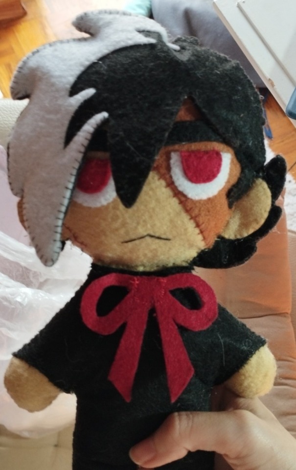
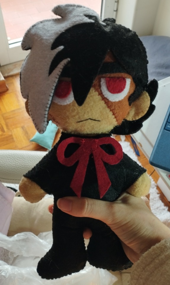
#i will ask my mom for help with making the jacket although in my design i changed it to a kind of cape to be easier#but what i wanted most was the surgeon outfit (<- uhm idk what the name is in english only know scrubs but not sure if it applies here)#actually my mom works in an hospital (pretty small one basically just psychiatric or pacients who are staying to be regularly checked#So i kinda wanna go to my mom's service and take photos of the plushie black jack in the break room cause they have a whole kitchen set#And LIKE TWO AIR FRYERS and i think that's hilarious#plus meeting my mom's friends cuz there's some nice ladies there#mytxt#black jack
23 notes
·
View notes
Text
one of my favorite things in teen titans is robin wearing his own mask underneath the red x mask
#i mean he obviously has an identical mask underneath his own mask lets not pretend#theres a scene where cyborg pulls him back hy the cape or something and they have like#that effect where the mask kind of stays floating in the air for a second and i pausit and he just had those#like round whites with a black outline#which is how they draw him comically sometimes#i literally don't remember if there's a moment where the mask is even mentioned in tt sorry#don't tell me I'm rewatching i barely remember anything so this is very fun#i di remember my favorite bits tho#so the red x and the apprentice episodes but that's all i think lmao#also i used to be so focused on robin when i was watching this as a kid#but rn im also appreciating the other characters as well though i hate all the#romance teasing this show has uh I don't see it i like robin and star as friends so much tho#i REALLY like robin and cyborg here tho they're awesome here for some reason hehehehee :]
39 notes
·
View notes
Text


ଘ(੭*ˊᵕˋ)੭* ੈ♡‧₊˚
#💙 sugar life posting 🌙#stim#stimming#stimblr#stimmy#butterfly#butterflies#butterflycore#gifs#gifsets#fashion#clothing#clothes#capes#lack#purple#pink#white#green#nature#naturecore#hot air balloons#balloons#skies#blue
35 notes
·
View notes
Note
But the you in this situation also knows the contingency plans to outwit the people you work with
Again, you're obviously very inexperienced at contingency planning. Here, I shall provide you with the steps I took.
Step One: Ask the World's Greatest Detective to create a contingency plan to deal with me.
Step Two: Did not ask for details.
#I believe Red Hood and Agent A also have plans that can be used to handle me#I don't believe Superman has a plan to deal with me beyond wrap me up in my own cape and put me in air jail
23 notes
·
View notes
Text
went to pride today and had a lovely time :) all of the furries and queens and teenagers in town seemed to be there. i'm For Sure gonna be kind of fucked up tomorrow because my body is not well enough currently to be on its feet in 80f/27c weather for five hours, but!! dignity of risk and all that. i talked to so many queer people and partook in so much queer joy and that was way more important than my ability to leave my bed tomorrow :D
#which was good because everything queer on the internet the past few weeks has been very scary.#hard to be scared when you're watching a 12-year-old with a she/they pin a rainbow cowboy hat a cape and an i 💕 milfs shirt dance to drag#the shirt took me OUT. i was like WHO GAVE YOU THAT. WHY ARE YOU THE FUNNIEST CHILD ALIVE#many other nice queer experiences were had as well. too many to list them all!#and the one time i started getting faint we were able to easily duck into an air conditioned library to cool off.#yay 💕#autoimmune tag#for the impending befuckery. for today i am ok!
39 notes
·
View notes
Text
advertising fics is so embarrassing but closed mouths don't get fed so like. I wrote a dorym fic about them waking up next to each other.
https://archiveofourown.org/works/59217607
please clap
#silver sending stones#orym of the air ashari#dorian storm#cr 3#dorym#It's got a lot going on#the title was almost “where we started and where we are now”#but thats way too long#I just think it sums it up nicely#i just take myself too seriously#like. this is so embarrassing but people do it every day#anyways#have a fic#now i think i'm going to take the tags from my cape post and make a fic#i just want to harp on the fact that i don't think they've been sleeping near each other. but i think they went back to each other after 10
30 notes
·
View notes