#Brush Script MT
Explore tagged Tumblr posts
Visit Tumblr Blog
Explore Tumblr blogs with no restrictions, modern design and the best experience.
Last Seen Tumblr Blogs


Fun Fact
Tumblr has 16.74 million mobile monthly users in the US.
Text
Font identified: Brush Script MT
40 notes
·
View notes
Text
Gah! Is there really not any web-safe cursive font other than Brush Script MT? 🤮
(And, no, I can’t use webfonts, because you can’t use embedded fonts in CSS on AO3. Which is fine, because you can do a hell of a lot more on AO3 than on most of today’s online platforms…but it would be nice if we had real choice—more than just one or two faces—in web-safe fonts for more than just serif and sans-serif styles. Signed, Sad There’s Been No Change Since I Last Worked on Web Browsers.)
1 note
·
View note
Text

Pancarte promotionnelle pour un gite, 3 typographies centrées. Fixation sur un arbre.
📍Rimeize
Typographies Brush Script MT Algerian Calibri
Techniques utilisées Feuille A4 imprimée recouverte d'un feuillet plastique Fixation avec vis cruciforme et rondelle
Analyse Ce panneau promotionnel est structuré autour du mot central "Gîte". Pour le faire ressortir et donner un indice des valeurs de ce gite et de son public cible, deux images de type clipart viennent encadrer ce mot.
Contrairement à certaines affiches imprimées plus abouties, on sent encore ici le coté DYI, ce qui permet aux petits gîtes de garder une image proche et accessible.
L'usage de la typographie fait ici est très particulier, la typographie "Brush Script" est utilisée avec une couleur bleu (la couleur la plus populaire dans le monde) pour inviter le marcheur dans une expérience de rencontre personnel avec un ou une hôtelière. Sous ce titre, La typographie Algerian est utilisée pour ajouter de l'élégance et de l'habillage à l'affiche ainsi que pour faire ressortir le mot "gîte" et le numéro de téléphone. Ces deux typographies présentant des problèmes de lisibilités, particulièrement à petite taille, le choix a été fait d'utiliser la sans-serif Colibri, une troisième typographie très lisible généralement proposée par default sur de nombreuses versions de Word pour les indications sur l'adresse.
Brush script et Algerian sont des typos qu'on trouve rarement sur ce genre d'affichage amateur et on peut saluer la recherche esthétique de l'auteurice
Note sur le support Si l'utilisation du support peut choquer (le fait de mettre des vis dans un arbre semble rentrer en contradiction avec le respect de la nature propre au chemin) Il faut noter que c'est une pratique courante, pour les panneaux comme pour les barbelés des clôtures. Les arbres choisit sont généralement en bonne santé et ne semble pas tant impacter par cette méthode de fixation. Cette technique de fixation invite la réflexion: Si nous sommes choqués ici par cette agression envers la nature vivante, peut-être que certaines pratiques devrait nous choquer davantage dans notre consommation quotidienne.
Texte Aux chants des oiseaux GÎTE A LA CHAZE DE PEYRE : (3.5kms après Aumont-Aubrac) TEL : 06.82....
---
Une erreur ? Une question ? Quelque chose à ajouter ? N'hésitez pas à me contacter.
0 notes
Text

#destructive tendencies#pink#glitter text#is there a tag other than traumaposting for the cutesy edgy stuff lol#gif warning#purple outline#oie#brush script mt italic#brush script font#script font#flashing lights#thick outline#negative#purple#✏️
128 notes
·
View notes
Text
look man i don't know how to tell you but the first gen neopets kids were significantly younger than me... the closest i got to Going On Line (tm) back in the day is when we were still building our own personal websites with glitter text and four point purple brush script mt font. possibly on geocities, or maybe before that, i genuinely do not recall
formative part of your childhood and/or early internet usage?
or pick whichever one is your main one today. i'm not a cop, i won't know.
7K notes
·
View notes
Text
Script Brush Font | Koplexs Studio

Samarata – Natural Handwritten Brush Font
script brush font, brush font, brush fonts, font paint brush, paint brush font, brush stroke font, handwritten brush fonts, brush handwriting font, brush style font, brush style fonts, font free for commercial use, brush script font, font brush, fonts brush, big time rush logo, rush band logo, free fonts brush script, rush band font, font rush, rush font, rush fonts, brush letter font, brush font script, brush script fonts, script font brush, font brush script, brush script mt, brush script mt font, fonts brush script mt, font brush script mt, font brush script free, script brush font free, free brush script font, free script brush fonts, brush script font free, brush script free font, brush script mt italic font,
0 notes
Text
Instagram Fonts Generator Copy and Paste

Math Bold Script Gothic Fraktur Verdana Arial Helvetica Comic Sans MS Courier New Georgia Impact Lucida Console Palatino Tahoma Trebuchet MS Times New Roman Consolas Monaco Copperplate Brush Script MT Old English Text MT Copy Styled Text Enhance your Instagram game with our Instagram Fonts Generator! Whether you want to add a bit of elegance, humor, or individuality to your posts, captions, or bio, our generator offers a selection of attractive fonts that will make your content pop.
Why should you use our Instagram font generator?
Diverse Font Collection: Choose from a wide choice of typefaces, from elegant and classic to quirky and bold. There is a style for every mood and event.Easy to Use: Simply input your text, then select your preferred font and copy it. You can easily paste it into an Instagram photo, caption, or profile.Instant results: As you experiment with different fonts, you can see how your text changes in real time.Boost Engagement: Unique fonts can help your content get notice and enhance.
How It Works
Type Your Text: Input the text you want to change into the font generator.Choose your font: Browse the assortment of trendy fonts and choose the one that best fits your text.Copy and Paste: Click to copy your changed text and paste it into your Instagram post, caption, or biography. Read the full article
0 notes
Text
The Art of Font Selection: Creating Impactful Print Materials at Graphic Studio"
Introduction: At Graphic Studio, we believe that font selection is a crucial aspect of designing impactful print materials. The right font can evoke emotions, establish brand identity, and enhance the overall visual appeal of a design. In this blog post, we will explore how our experienced designers at Graphic Studio expertly balance fonts and design elements to create captivating print materials across a range of industries. We will showcase additional examples and even suggest specific fonts, including popular ones available in CorelDRAW, a widely used design software.
Corporate Brochures: Professionalism and Elegance Corporate brochures require fonts that exude professionalism and elegance while maintaining readability. For a financial institution or law firm, our designers often opt for sophisticated and classic serif fonts such as Times New Roman or Garamond. These fonts lend an air of authority and trustworthiness to the brochures, establishing a strong brand presence.
Restaurant Menus: Reflecting Culinary Delights Restaurant menus should capture the essence of the cuisine and reflect the establishment's personality. For a contemporary restaurant offering fusion cuisine, our designers might choose a clean and modern sans-serif font like Montserrat or Helvetica. These fonts convey a sense of sophistication and align with the restaurant's innovative and cosmopolitan image.

Wedding Invitations: Romance and Elegance Wedding invitations demand fonts that embody romance, elegance, and personalization. Our designers often recommend stylish script fonts like Edwardian Script or Great Vibes for the couple's names and headings. Complementing these with a classic serif or sans-serif font, such as Baskerville or Futura, for the main content ensures readability and balance.
Fitness Brochures: Energy and Dynamism Fitness brochures should convey energy and dynamism to attract potential clients. Our designers might suggest bold and vibrant fonts like Bebas Neue or Impact to create eye-catching headlines. For the body text, they may opt for a clean and modern sans-serif font, such as Myriad Pro or Arial, to ensure legibility and maintain a professional appearance.
Art Exhibition Flyers: Creativity and Expressiveness Art exhibition flyers call for fonts that reflect creativity and expressiveness. Our designers might recommend artistic display fonts like Brush Script or Broadway for capturing attention and setting the tone. Complementing these with a minimalist and modern sans-serif font, such as Futura or Gotham, for additional information ensures clarity and contrast.
Some suggested fonts from the Graphic Studios library include:
Bickham Script Pro: Perfect for elegant and formal designs, such as invitations or certificates. Franklin Gothic: A versatile sans-serif font suitable for a range of designs, from brochures to posters. Bodoni MT: A classic and elegant serif font ideal for conveying sophistication and refinement in various print materials.
Conclusion: Font selection plays a crucial role in creating impactful print materials across industries. At Graphic Studio, our skilled designers carefully balance fonts and design elements to evoke the desired emotions, establish brand identity, and ensure readability. Whether designing corporate brochures, restaurant menus, wedding invitations, fitness brochures, or art exhibition flyers, the thoughtful selection of fonts contributes to the overall success of the design. By leveraging a combination of industry knowledge and access to a wide array of fonts, including those available in Graphic Studio consistently delivers captivating print materials that effectively communicate the intended message.
0 notes
Text
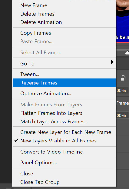
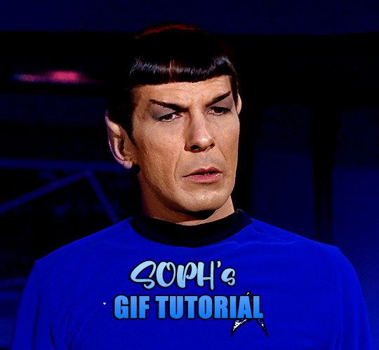
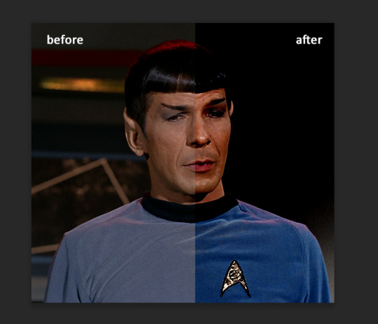
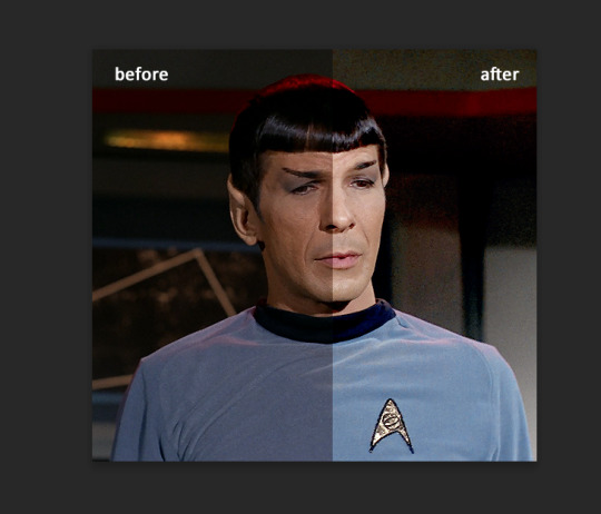
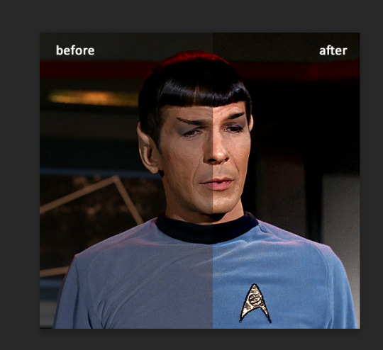
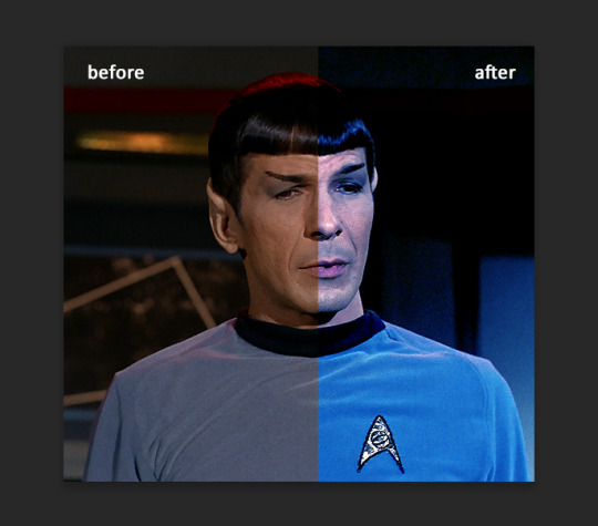
This is PART II of the GIF tutorial.
Part I
In the part 1 i talked about all the settings I used to create this specific gif, adding some more of the same color balance, curves, levels and selective color the final result is
Could do, but not really what i want to. If you want to go with natural colors or smt, then yeah, it will do. But that's me and if I don't enhance blue I will probably die or smt.
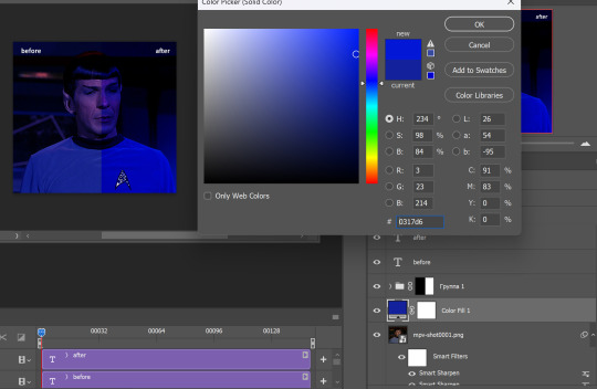
I could use color balance to do it, or other tools, but I prefer using new fill layer - solid color. Choose the color you want.
You see, this gif does not have much movements and it will be easy to use fill layer and erase parts you don't want to. If you have a gif where character moves you will need to adjust it for each layer :\ But it's fun, just takes forever of your time.
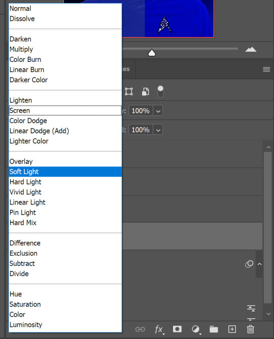
I put it under adjustment layers and set blending mode to soft light.
there are blending modes if you don't know where they are, just press where 'soft light' is (by default you will have it on 'normal') and you will see them all. Play with them, you will love them
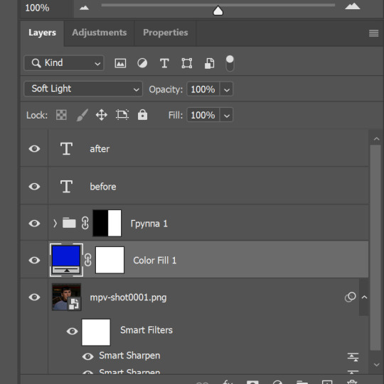
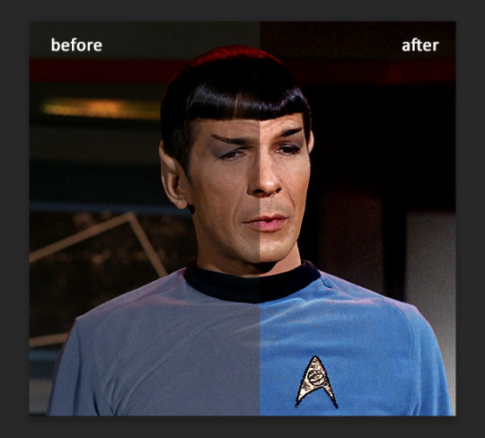
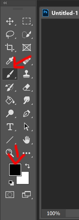
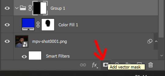
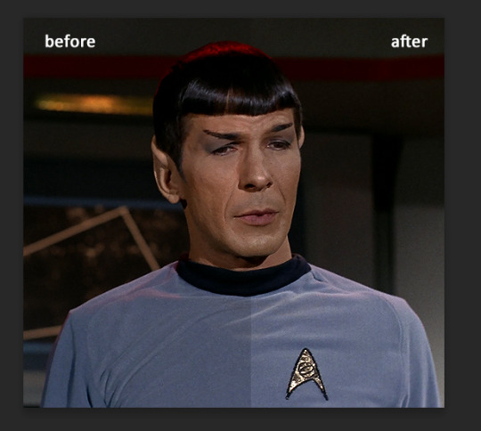
Now, the blue is BLUE. But his face also is blue. And for that we will choose 'brush tool', press 'D' so foreground/background colors are black and white. Depending on which layer you select it might be white and black, so you just swipe them so the black is on top. Then go and click on the white box near the color fill layer, erasing it can be restored after
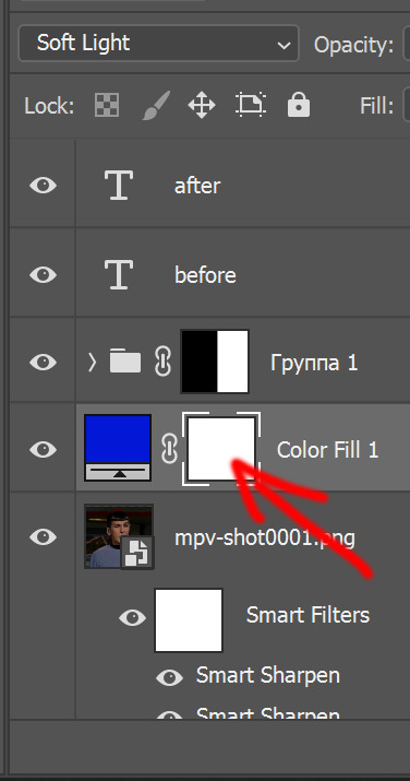
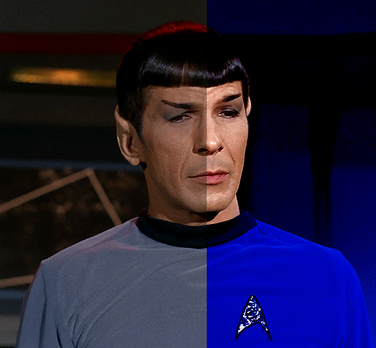
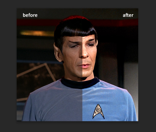
Since I want his Spock's uniform be super blue and the background too, i just draw over his face.
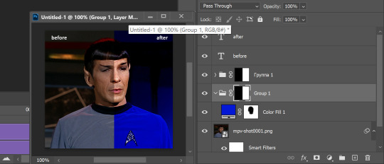
Basically, by clicking this vector mask tool you can add those white boxes and erase using black color, or undo it by drawing over the image with white color. And vice versa, if the box turns to black it is invisible (ctrl+i) unless you use white and draw over it, by that you make parts of the layer visible.
I love vector masks, they are my best friends, yeah i don't really have friends *sad emoji*
But before saving or smt, play the animation, erase more if needed. At this point we have this (and I realized i did not reverse frames in the beginning, so i will fix it later)
Using vector masks you can change background color as well, if you want it different.
But also, you can change already this by those tools explained before, or hue and saturation. This blue is much easier to edit.
Play with the sliders, drag them from one point to another until you like the result. And if the background looks off for some, you can always add more tools and change settings to look pretty.
You might ask, why we went through all the tools and settings if we could just color it? :D a good question, but without it the result would look like
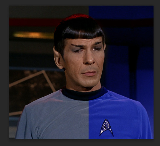
and while the blue is great, everything else looks not as good, and also, I wanted more blue.
So that's it, we have finished the gif!
Now add some text
If you are worried about you might make mistake somewhere while typing, you can always go to chakotaya.net and use transcripts from there :3 You have star trek, doctor who transcripts and some other stuff i never checked. Like, all the love to Chrissie who put so much work into it and made it possible to have all the scripts in one place <;3 AMAZING!
So, choose text, click on the gif somewhere (don't worry, we will position it after) and copy paste or write down text you want.
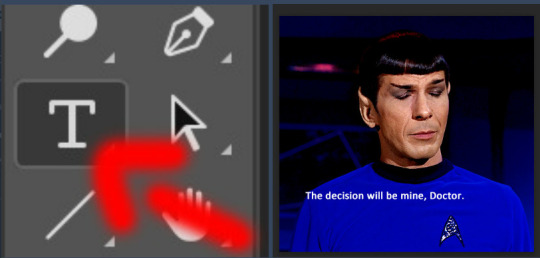
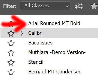
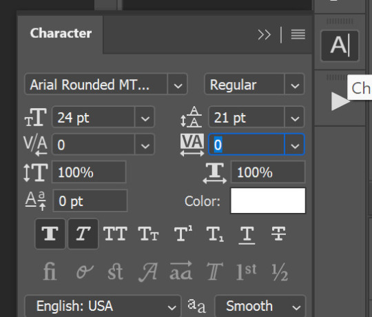
I do not like calibri font for subtitles when it comes to big gifs, so i choose Arial round MT bold with these settings
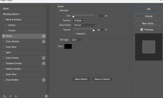
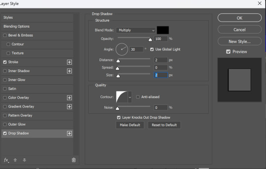
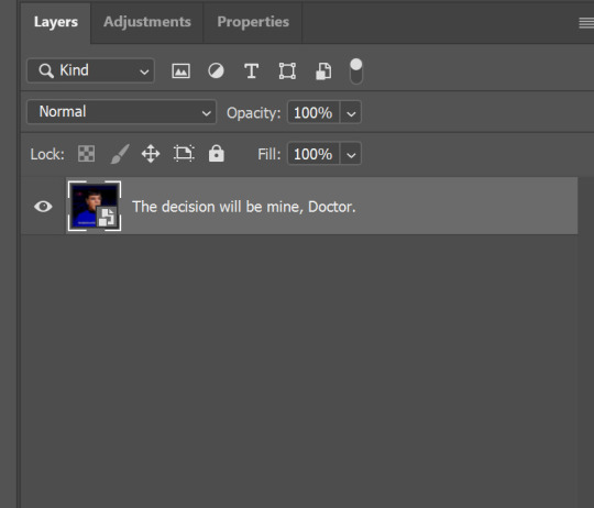
Now, you need to add some more, outline and shadow. Double click on the text layer, in a menu that pops up choose Stroke and Drop Shadow, I used these settings
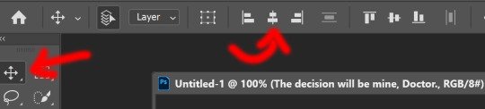
And you are finished, now text positioning. You can either press and hold 'ctrl' button and drag text layer wherever you want, or press move tool and do the same. After you positioned it press the second button from this picture to align text layer in the center.
so now we have this
it's time to save it! YAY! If you read to this line you must be really patient, i respect you :D
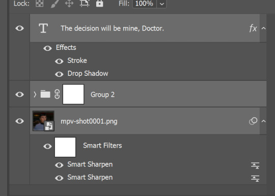
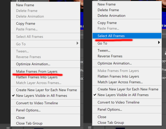
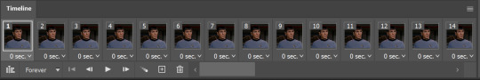
select all the layers and convert it to smart filters
click on those 4 lines on your timeline and choose flatten frames into clips, so not you have this, you have to convert timeline, press those tree empty boxes at the bottom
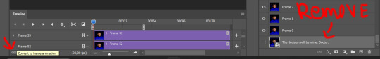
After that click on those 4 horizontal lines again and make frames from layers - select all layers
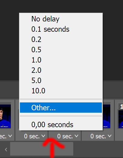
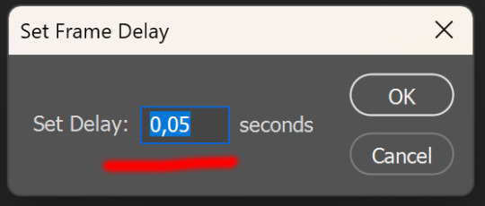
open menu by clicking on 'time' on one of the layers - other - set to 0.05, that's the best option for the gifs if you do not skip layers.
and since I did not do it in the beginning, we need to reverse layers, as gif is playing backwards.
now you can save the gif, go to file - export - save for web
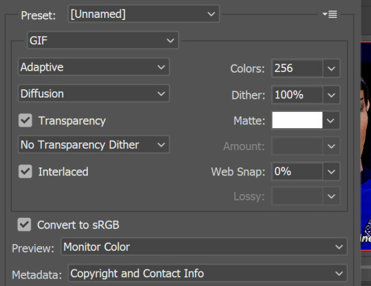
I did not need it here, since gif is playing 'forever' by default, but make sure that it is set to 'forever'. And those are settings I save gif. Sometimes you need to change adaptive to selective, but i live diffusion there since i do not like how pattern looks like.
That's it, we are finished! Thank you for sticking up to this point
a few advices by the end.
do not skip frames
always set to 0.05 so your gifs look good and are not too slow (for animated tv and movies it is different)
always choose the best quality of the video you can get, the better quality is the better gifs turn out to be.
experiment and enjoy the process! HAVE FUN!
FIN!

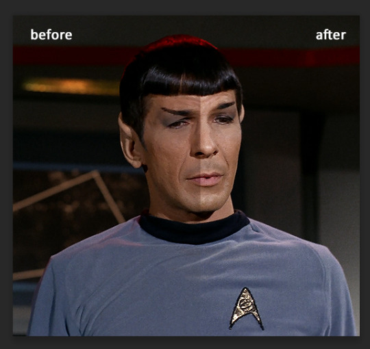
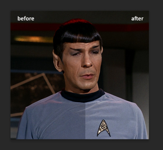
a very foking detailed GIF tutorial you asked for and how I color my gifs
However, I color them individually, so there will be explanation of tools I choose instead of showing what settings I used for this specific gif in this tutorial.
I will go through entire process of how I create gifs, the process of gifmaking can be different for others and there is no obligation of how to create a gif. Basically, do it however you like and enjoy the process.
this is part I, part II is here\in reblogs.
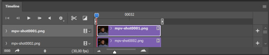
First, you will need to prepare everything, you choose the moment you want to gif and make screencaps. I use mpv player to create them, here is a great tutorial on how to install it. So I won't go over it, just follow it and or use another player which allows to make screencaps, such as kmplayer.
Once you make screencaps go to photoshop - file - scripts - load files into stack - browse - select screencaps and upload them.
At this point I will also add that I use keyboard shortcuts a lot, you can set them up to your preference, that is much easier for me and might be for you too, and I am so used to them that I forget where are some settings. You can do it from edit - keyboard shortcuts, you may set up anything there.
You will have all screencaps uploaded into one file. Once I have it I change canvas/image size, I also remove 10 pixels from each side, because I hate that some files have that weird black line which looks awful on gifs. But that's up to you. Use proper dimensions for tumblr, that is important since your gifs will look 'not good' when you upload them. I will go with 540x500px this time. (correct dimensions for tumblr are 540px for big gifs, 268px for two gifs along each other and 177-178-177px for the three gifs together)
Go to images - image size (crtl+alt+i) and change the size.
After that I make animation, because without it we would not be able to convert all the screencaps into smart filters. Go to windows - timeline
you will have something like this by default

click on create frame animation - then on 4 horizontal lines which will open menu - make frames from layers
click on convert to video timeline (that 3 horizontal lines and 1 vertical line or whatever it is, right under the first layer) you will get something like this.
now, this will be animated. If you choose convert to video timeline right away it will not be animated.
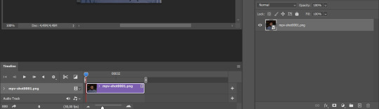
Now, select all the layers - filters - convert to smart filters
You will have something like this, and if you play it - it will be animated anyway. That way you can edit ALL the screencaps at once.
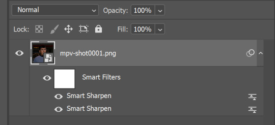
I usually start with sharpening, settings may change according to the files I have, for some you will need more sharpening, for some less. I go with filters - sharpen - smart sharpen and usually that's enough
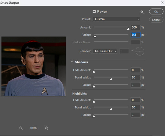
but I sometimes add more sharpening, just change radius to 0,2. So, repeat the action.
You will have it like this
and at any point of making gif you will be able to change settings for it, if after coloring it will look not as good as you wanted to.
I will not go into a lot of details about coloring for this gif, because does not matter how good the coloring on this gif will be, it won't work as good on another gif.
There is no right way to start coloring, you may start with curves, levels or selective colors depending on the screencaps you want to edit.
Well, this time I did start with layer - new adjustment layer - curves. (yeah, i guess by the end of the day we all do lmao) (Always use 'layer - new adjustment layer'. That's the only thing I suggest to remember when you color. ) Just to brighten gif a little bit, but you also can change colors with it.
those are not settings I used for this gif!
Curves have option to edit colors, just press RGB and you will see options for RED, GREEN, BLUE. Upper slider adds the said color, the slider at the bottom removes it. That's a great tool if you have a very red\yellow\blue\green scene, with those settings and moving sliders here and there you will be able to add the color you want, for red scene I suggest to use more green and blue, as well as for yellows but with less green. Just move them to see what fits your gif better.


there are also eyedrop tools which will help you to edit picture, with the first one you need to find the darkest part of your gif and click, it will adjust your picture according to it. If there's too much red, it will make it bluer, etc. The middle one is the one I use the most out of them, cos it changes the midtones, it's great if you have very yellow picture, just press the yellow part and it will make it bluer\greenish, depends on the picture, and then you can adjust it to make it look better. And the last one you can use to lighten picture as well, just find the brightest part of the picture and press it. It will adjust other colors accordingly.
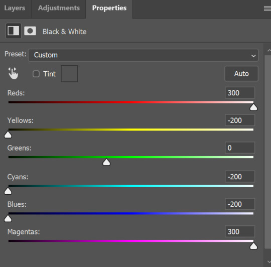
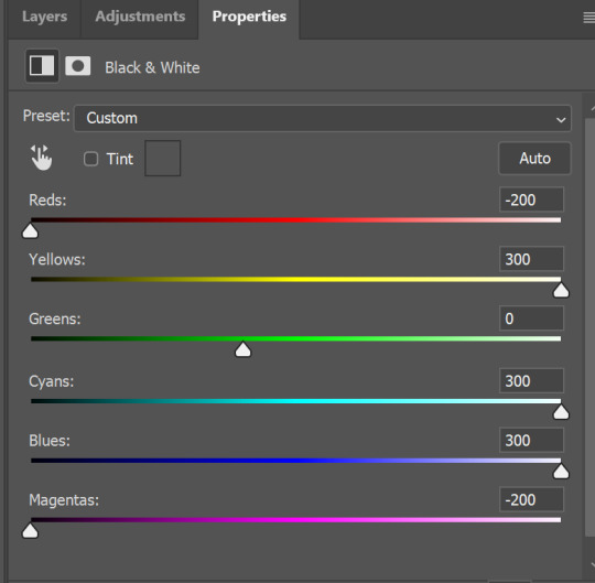
I like to play with settings, I could add more darkness to the gif by levels, by selective colors making dark colors even darker, but sometimes I just use layer - new adjustment layer - black & white. Putting it on soft light blending mode and changing opacity. Idk, I like the effect :D Also, by using these, you will be able to darken part or lighten specific colors
so yeah, play around and figure out what is the best way for you.
after that I used layer - new adjustment layer - selective colors. I think this is one of my favorite tools out there, I love it, I usually end up with 30 selective color layers if I make a super complex gif :D
You can change colors with it, make them more vibrant, or less.

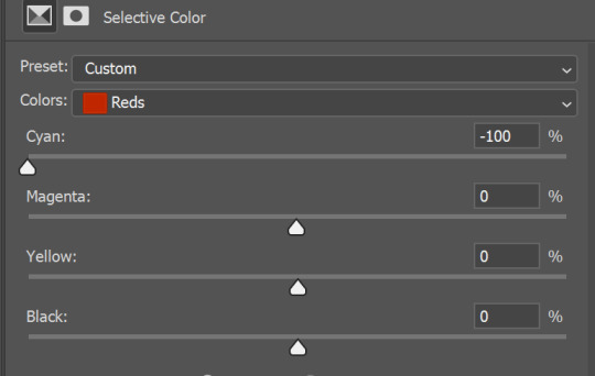
for each color you will have 'cyan, magenta, yellow and black' and by dragging sliders you can change colors, make them darker or lighter for the lovers of those paster gifs :D

But don't worry, that's not where I will go with the gif, so it will look better, i promise.
You know how much I love making blue even more blue. So I go with more selective color layers to enhance it.
You do not have to use just one, and you won't be able to make it with just one sometimes. So add as many as you like to get the result you want.
next is one of my favorites - layers - adjustment layers - levels
with it you can darken colors or lighten them, there's also auto, as well as on curves, which will find the most suitable settings for your picture.
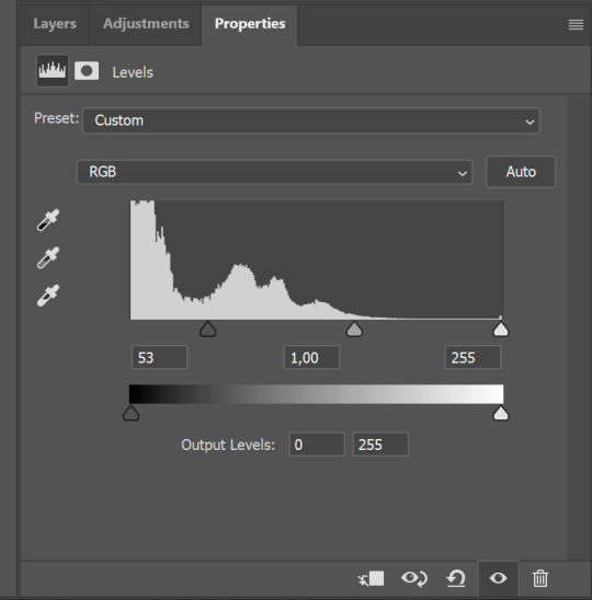

I hardly ever change the middle slider, cos
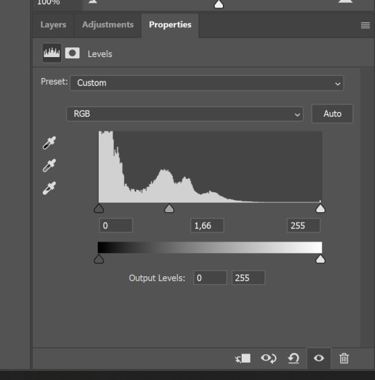
nope.
so, we are at this part of the gif by dragging sliders.
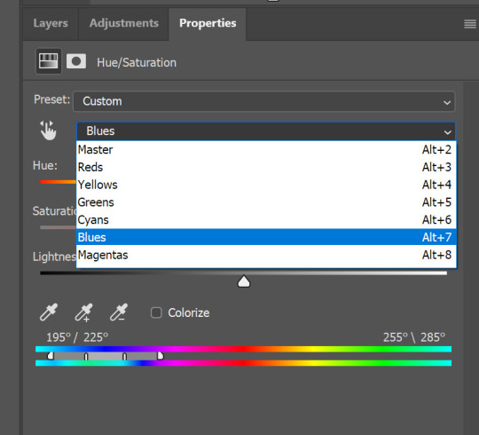
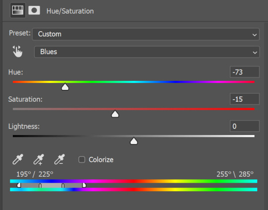
next one I used is layers - adjustment layers - color balance. right now I will stop adding directory, this tutorial is already long enough, so most of the things are there in layers - adjustment layers.
Absolutely love it, most of settings do the same things but a little differently, this one changes colors but also entire picture, not just part of it. You have shadows, midtones and highlights
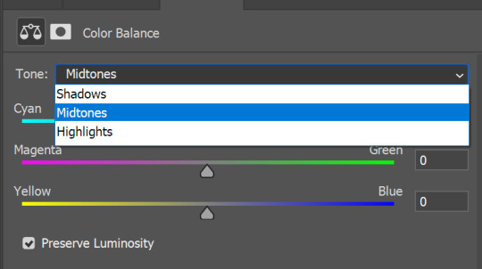
Each of them is really great when you have a yellow\red\blue\green picture to edit. And each of them has 3 sliders cyan\magenta\yellow.
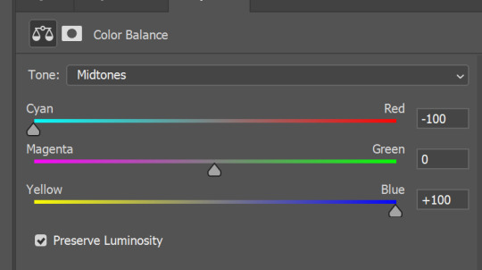
You see, if you drags sliders the other way it will make picture more yellow.
END OF PART I
since tumblr
132 notes
·
View notes
Photo

4 notes
·
View notes
Photo


🐝 * ― 𝐏𝐑𝐎𝐌𝐎 𝐓𝐄𝐌𝐏𝐋𝐀𝐓𝐄 𝟎𝟎𝟐: 𝐓𝐔𝐋𝐈𝐏𝐀. ( a free four-panel promo template. each panel is 268x324 px. coloring not included. fonts used are amarillo, brush script mt, and copperplate. feel free to adjust to your needs but please credit me if using. )
DOWNLOAD HERE.
#promo template#rp promo template#rp template#free promo template#free rp template#free rp promo template#free rp resources#rp resources#rph#( tbh i had no ideas what images to use for these )#( so that's why the preview looks kinda weird )#( but i like the template )#type: template#type: promo
235 notes
·
View notes
Text

If you wanna imitate 90s arcade games ya gotta have a little arrow at the top corner of the screen that flashes periodically, but now I gotta figure out what word to put it in it
(Also, reminder to self, the font Brush Script MT Italic really works with the aesthetic when it's legible, use it more)
4 notes
·
View notes
Note
What stock font are each of the pevensies
These are all their email signatures now:

(Algerian)

(French Script MT)

(Blackadder ITC)

(Informal Roman)
Bonus! Let's do the other Narnia Kids :)

(Modern No. 20)

(Papyrus)

(Times New Roman) (of course)

(Brush Script MT)

(Viner Hand ITC)

(Harrington)
#i'm trying to pick very conspicuous stock fonts here#please do not use these fonts in your serious business materials#in the name of all that is good#also as with the flowers largely vibes based although I do have some logic#narnia#a narnian look about them#ask me hard questions
26 notes
·
View notes
Text
Testing Fonts on OIE - 8 / ?
150x20px blinkie template made by me


Boomerang 16px | Brewsky 15px | Brittanic Bold 15px
Brush Script MT Italic 15px | Burtinomatic 18px | Calisto MT Bold 17px
Camelot MF Bold 17px | Candy 13px | Carnival MF Rimmed 14px
#oie#oie fonts#blinkies#typography#boomerang font#brewsky font#brittanic bold#brush script font#brush script mt italic#Burtinomatic font#calisto mt font#calisto mt bold#camelot mf font#camelot mf bold#candy font#carnival mf font
28 notes
·
View notes
Text
Headcanon: Murtagh starts teaching dragons how to read and write
He starts with Thorn, of course. When Galbatorix chains them with their names instead of iron fetters, Murtagh has just enough freedom to bring the little red hatchling to the castle library, hidden in his shirt while he still fits.
Thorn, incredibly eager to learn about anything that makes his Rider happy, begins by mimicking Murtagh—sticking his nose to the pages, warbling quietly. So Murtagh begins teaching him letters: at first with tidy looping penstrokes on scraps of paper, and then, as Thorn grows painfully fast, painted onto cool marble floors and scratched into the dirt.
Thorn starts copying letters with a talon dragged through the sand, or dipped into ink and scratched carefully on paper. Eventually, Murtagh fashions an enormous pen Thorn can hold in his claws, fitted with exchangable heads: a quill nib, a brush, even a chisel. He begins writing poetry, strings of simple phrases inked onto faded paintings and carved into the walls of Urû’baen’s dragonhold.
Nasuada finds one, long after Galbatorix’s defeat. A few haunting words, painted in an elegant, looping script on a threadbare tapestry, perfectly encapsulating a terrible, aching loneliness.
(She has it painstakingly restored, paint and all, and it stays in her chambers. When the burdens of Queenship rest heavy on her shoulders, she spreads it over her duvet, and finds her dreams, if not happy, are at least more peaceful.)
By the time Murtagh and Thorn join Eragon and Saphira at Mt. Arngor, Thorn is still writing, and growing more prolific: poetry, lyrics, prose. Murtagh buys him bolts of cloth, reams of paper, and barrels of ink. At the mountain, Thorn and Murtagh are collaboratively teaching classes on literature and the written arts.
Saphira, of course, is impressed. She doesn’t demand that Thorn teach her, of course—she’d rather use the word persuaded—and Thorn, of course, obliges. He also teaches Fírnen, and the dragons who are already larger than the library can hold.
Murtagh, meanwhile, begins introducing the smallest dragons, and each hatchling as it breaks its shell, to the books and scrolls of the library; he begins making more of the dragon-pens in various sizes, improving their design as he goes, to be passed down from generation to generation of literate dragons. He even begins designing special, enormous scrolls, filled with a special fire-resistant paper he invents with the help of all the brightest minds in the mountain, of every race.
Eventually, invention leads to the creation of a printing press, so that dragon literature can be reproduced for the hands of their Riders; the design of the machine is quickly given to the rest of Alagaësia, which enters a new era of literacy and education.
And soon, across Alagaësia, a new book is published in volume after volume: Thorn’s Compendium. Every lyric, every stanza, every story, collected and shared across a new world.
(Nasuada has a signed copy of every single book.)
#inheritance cycle#christopher paolini#murtagh (inheritance cycle)#murtagh tornacsson#the cyclists#thorn bjartskular#murtagh and thorn x peace and happiness#i have had this idea for a VERY LONG TIME OKAY#queen nasuada#i really did mean for this to actually be about murtagh teaching all the dragons to write#and then it turned into a ‘lyrical thorn appreciation post’#every century he totally presents a beautifully crafted poem at the aghaëti blodhren#…idk if that’s the right place for the dots on that word shhhh
119 notes
·
View notes
