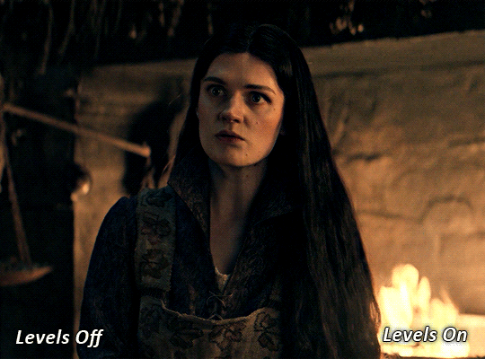
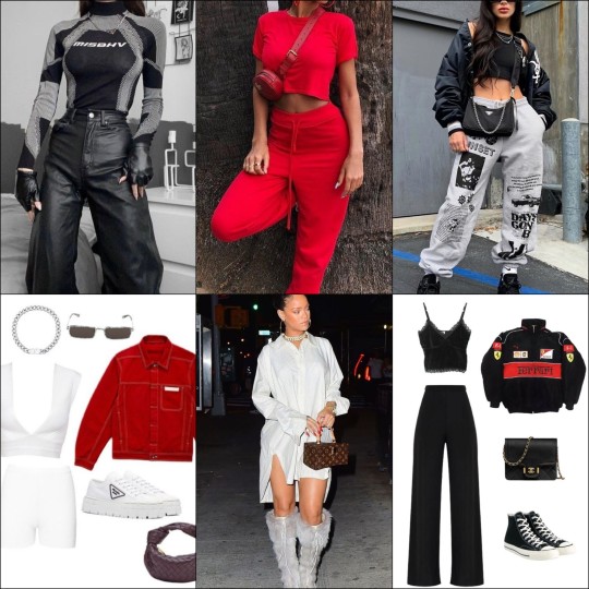
#Black with bright contrasting colours like red
Text


Dᵃ𝐧Ǥ𝔢R𝑜ᑌ𝓈 Ⓦ𝓸𝓶คη ⚐ ☙ ❧龘⃢🌹 ᭣᭫៹𖥸 ☽
⫘⫘⫘⫘⫘⫘⫘⫘⫘⫘⫘♡̸᳝
Moderation is a fatal thing (...). Nothing is more successful than excess.
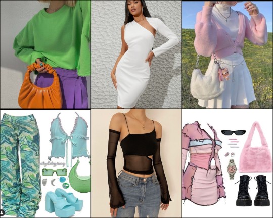
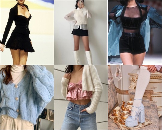
#aesthectic#messy layouts#dividers#girls icons#soft icons#fashion#modelshoot#tumblr slang#rude boys#1960s#2 tone#black and white#punk rock#alternative rock#asianwomen#asian#leather jackets#delinquency#motorcycles#Black with bright contrasting colours like red#green#yellow#deathcore#monsters#Grimm’s fairy tales#black eyeliner#crosses#cemeteries#Black#white
33 notes
·
View notes
Text
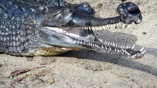
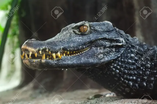
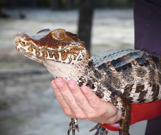
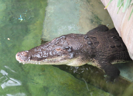
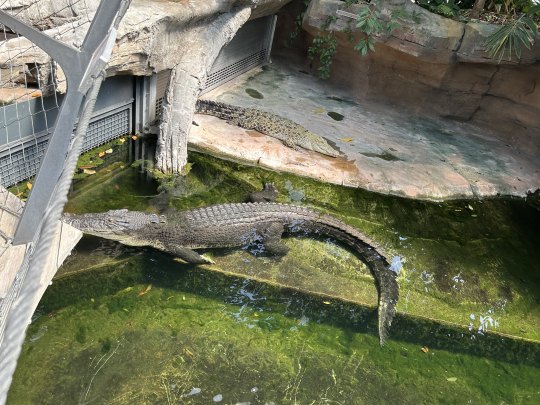
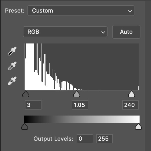
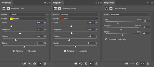
Croc colours and patterns
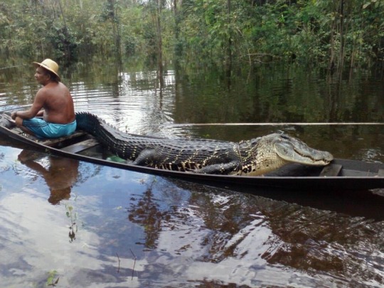
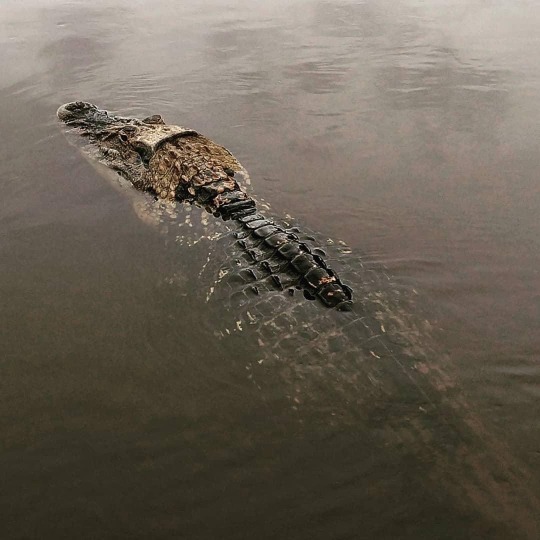
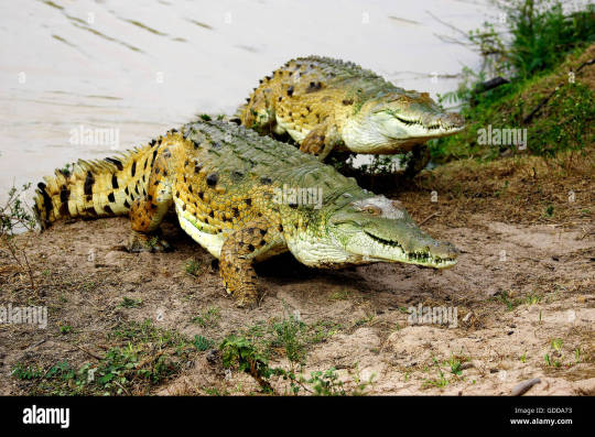
Somewhat inspired by a recent post by Joschua Knüppe, I feel like it's a good thing to remind people just how diverse colours and patterns in modern crocodilians are. When I see people make art, it often seems to stick to grey or yellowish-brown tones, which is of course not incorrect. But theres a lot of, imo, underappreciated variety still. It's also worth noting beforehand that patterns are most striking in younger individuals and naturally become more muddy the older and larger an animal becomes. But as you will see, even some decently large and old animals may maintain a striking appearance.
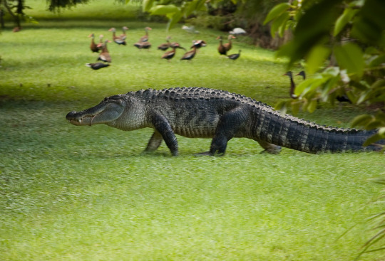
Take this alligator for example. Gators tend to be on the darker side, dark greys to black, sometimes countershaded and sometimes pretty consistent. Some individuals, like this one photographed by Gar Luc, still retain clearly visible stripe patterns from when they are younger.
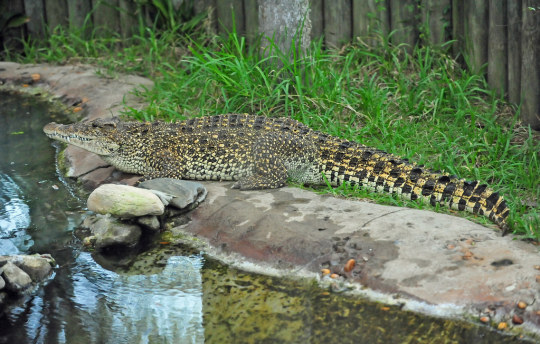
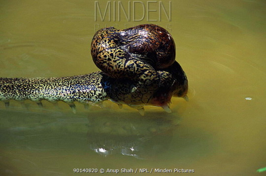
Or take one of my favourite species, the Cuban Crocodile, which can appear almost bright yellow with a dense pattern of leopard spots. Of course like with the gator you can find individuals that are much more drab, with washed out colours, but individuals with clearly defined patterns still exist.
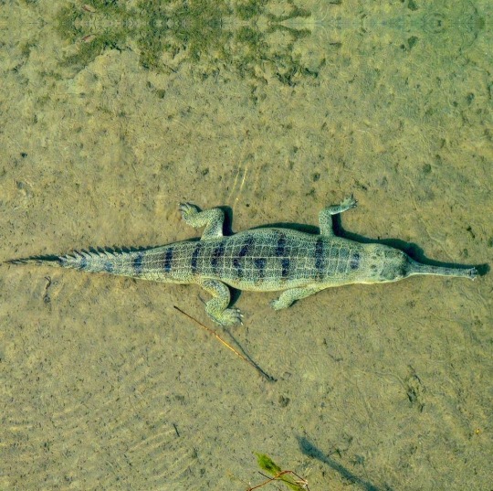
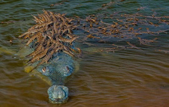
Then there's gharials of course. They can range quite a bit in colouration. They can be brown, especially younger ones and females and I've seen males range in colour from a drab grey to almost a light blue or even something that could be described as metalic black.
Black Caimans are also pretty interesting in my opinion and pretty easy to tell apart from other species once you pay attention to their colour. They are primarily a deep dark black of course, but what sets them apart from spectacled and other caimans is that very fine pattern of thin white stripes across the flanks that creates this beautiful contrast. They can also have patches of brown like the one on the right.
Orinocos also vary a great deal. Tho I know less about them than I wish I did, I know that individuals can range from drab brownish greys to yellow to somewhat earthy browns that almost range into reds.
The next ones a bit of an outlier. There are specific cave dwelling dwarf crocodile populations in western Africa with striking orange colouration. Tho this one is not exactly natural pigmentation to my knowledge and instead the result of the chemicals present in the water they inhabit, brought there by bat guano. Still very pretty animals.
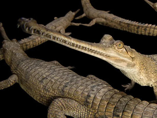
And then there's Paleosuchus, the dwarf caiman which contains two species. Again highly varied. The first image, which I believe is a Schneider's dwarf caiman, shows a very earthy brown. The others, which unless I'm mistaken are Cuvier's dwarf caimans, show colours ranging from dark with a rusty head, black to this still beautifully patterned individual. Of course these variations are also subject to change with age.
While salties aren't exactly known to be the most vibrant, I'd be remissed if I didn't mention this specific one. It's kept in a zoo in Germany and has this almost bizarre colour combination of creamy white underbelly and chocolate brown top which I've never seen in another saltwater crocodile. Photos by my friends Markus Bühler from the Bestiarium blog and René Dederich

Spectacled, Broad-snouted and Yacare caimans I'll give a quick shout out. I think most people are familiar enough with how they look like and while their colours aren't anything special, I still think one should appreciate their patterns of spots and stripes and facial markings.

The last one I wanna highlight is the false gharial, Tomistoma, another one of my favourites. Part of the reason why being its at times beautiful reddish-brown colours.
#crocodiles#crocs#gharial#gator#alligator#crocodilian#herpetology#reference#colours#inspiration#paleoart inspiration
2K notes
·
View notes
Text
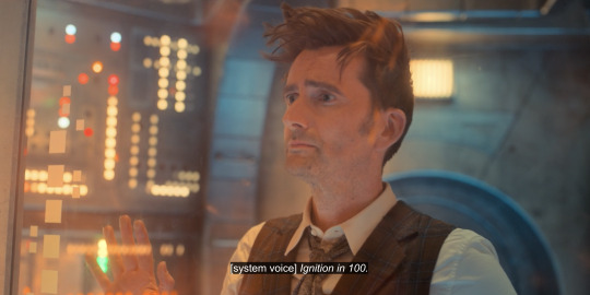
Colour theory. The 60th Specials have this gorgeous colour palette of reds and blues and greens throughout. But what do they all mean?
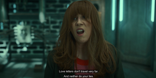
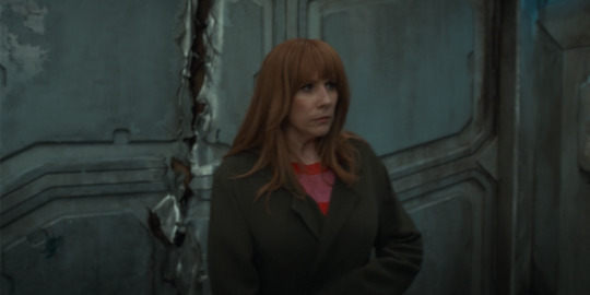
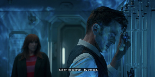
Donna spends much of the specials drenched in red – her fiery copper hair, her pink and red jumper, the warmth of her house as the Doctor looks in from the cold, blue night, of the vortex, and of flames.
In many scenes, she's in fact the only source of warmth in frame.

The Doctor's palette is, of course, blue, and he starts his journey very blue prior to stripping off his long, solid overcoat to reveal brown and blue tartan (a mixture of both the Doctor's he's been) and white (a carte blanche that can throw to any colour).

Red and blue, the Doctor and Donna. These are our two primary colours for the Doctor and Donna as individuals. But it doesn't stop there.
Donna often throws red to the Doctor.
Or they share a frame of equal parts red and blue.
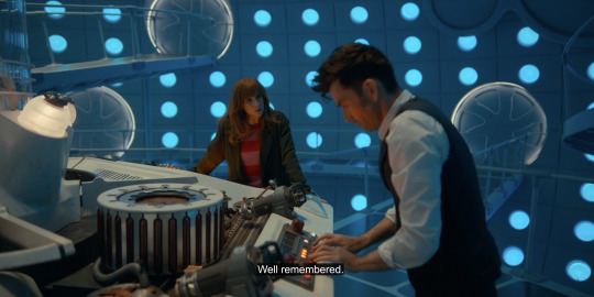
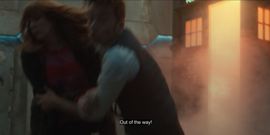
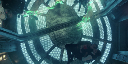
But more often than not, the Doctor casts Donna a sickly blue green – not in the moments of peril Donna chooses, like her choice to remember the mind of a Time Lord to save her daughter, but the moments of peril that truly make Donna afraid.
Staring out into the black nothingness of space without stars at the edge of the universe, so far from her family. Being confronted with herself. Half-remembering the Doctor with her daughter in danger, because of her (perceived) failure.


At her most afraid, like when the Doctor is genuinely angry at her, encroaching in her space, she wraps her body in her dark green jacket, a futile attempt to self-soothe. On an RGB colour wheel, green is our third primary colour.
Whereas the Doctor, at his lowest points, is drenched blue.
But where do they end up?
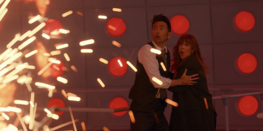
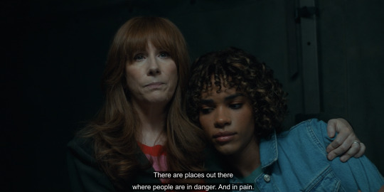
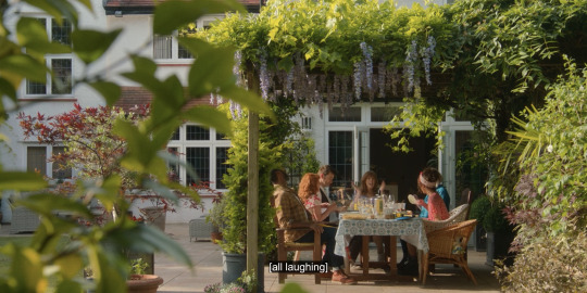
In glorious lavender purple and natural green with flickers of red and brown and yellow and blue.

Purple is a secondary colour, an additive of red and blue. Purple complements green. Green and red add to yellow; add a bit more red than green and you get brown. Yellow complements blue. Red and blue and green are triadic colours – high contrast, bold and vibrant, spaced evenly on the wheel.
Because their ark is not just for Donna to take on part of the Doctor, but for the Doctor to take on part of Donna as well. They are the Doctor and Donna, human and Time Lord, man and woman, travelling and at home – all these things and both and more, binary not-binary, a circle, complete.
Compare and contrast to season three and four.
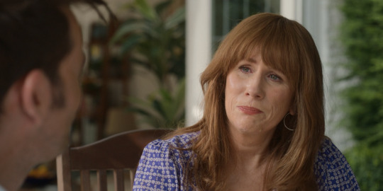
Donna's colours are deep, jewel-toned reds and purples and blues, analogous colours. She's a bright, discordant blot in a sterile office. She's resplendently human in Pompeii. But by the end, she's adopted a long, brown coat, with just a hint of purple peaking out from a singlet top under all those layers. During Turn Left, never meeting the Doctor slowly sucks her colour to grey almost (but not) completely.
And when the Doctor takes her memories he returns her sans-jacket. Deep jewelled purple again.


The Doctor splits into a Doctor brown and a Doctor blue. One home, with a family. One travelling, alone. A bittersweet – not a happy – ending.
Now is their happy ending.
#doctor who#catherine tate#fourteen x donna#fourteenth doctor#ten x donna#david tennant#doctor x donna#donna noble#tenth doctor#tatennant
715 notes
·
View notes
Note
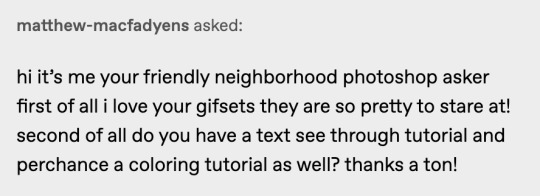
hi i'm sorry to bother you but do you have any tips on giffing dark indoor scenes? yours always look so good!
hi there! not a bother at all :) i can definitely try to explain the steps i usually take under the cut!
this tutorial will assume that you already know the basic steps of gif-making — if you don't, there are lots of great tutorials floating around on this site that can help you out! :)
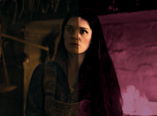
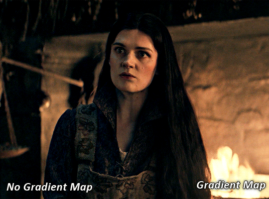
here's the gif i'll work with to explain my steps, the bottom being the original and the top being the coloured/brightened version.
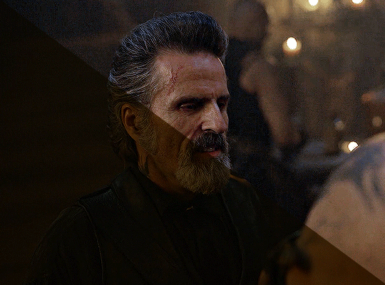
before we start, a general tip i recommend keeping in mind: if you want to brighten a dark scene, you'll want to get your hands on the highest quality download you can find. 1080p is decent, but if your laptop can handle 2160p 4k hdr files* without sounding like it's about to explode, that'll get you even better results!
(*colouring hdr 4k files requires a different set of steps — the scene will appear washed-out on photoshop, so you need to make sure that you don't end up whitewashing anyone if you do choose to work with this type of file.)
since most of my downloads are 1080p, i'll use this type of file in this tutorial.
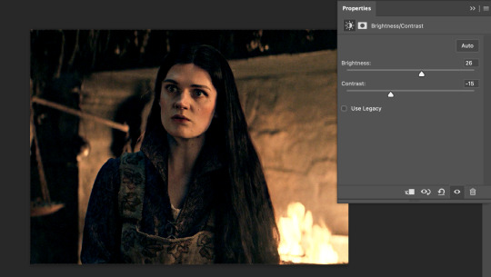
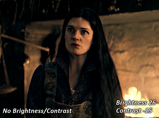
the first step of my gifmaking process with 1080p files is almost always the same no matter what scene i'm giffing. i make a brightness/contrast layer and set the blending mode to screen:
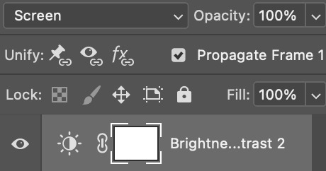
now my gif looks like this:
depending on the scene and how washed out it looks after this layer, i'll play around with the opacity. for this gif, i didn't touch the opacity at all. use your best judgement for this, because every scene is different!
i find that dark indoor scenes are usually tinted in yellow or green. one of my first goals is to try to fix the undertone of this scene before focusing on brightening it any further. i go to colour balance for this, and play around with the midtones, shadows, and highlights.
again, every scene is different, so the amount to which you use colour balance will differ, but for this specific scene, my goal was to neutralize the yellow. i focused particularly on the midtones and shadows of the colour balance layer, moving the scales to the opposite of the reds.
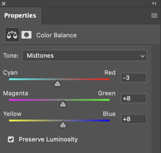
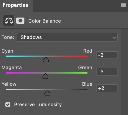
doing so will help with neutralizing the yellow. the only reason i moved the scales towards magenta and blue (therefore making it a bit more red than less) rather than green and yellow in shadows was because i wanted a darker contrast in the blacks. moving them to green and yellow made the overall scene more yellow since there were so many dark spots that shadows affected. (you'll see what i mean when you start experimenting with your own gif — this part of the process really just depends on your preferences!)
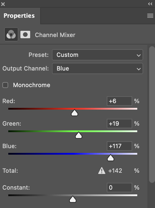
our gif might not look that much better yet, but it will soon! our best friend channel mixer is gonna help us out. for an in-depth post about how to use this adjustment layer, i recommend checking out this tutorial.
i'm someone who prefers to make more than one layer for the same adjustment layer for a reason i can't even explain (i just find that it helps me stay more organized). so don't think of this process like i can only use this layer once so i MUST fix it NOW. you can create multiple layers of the same adjustment layer, because every layer on top will affect the ones underneath it.
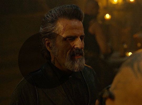
since my priority is getting rid of the yellow tint, i went to the Blue section of the channel mixer and increased it in all of the scales:
this step alone has helped us out so much, because look at our gif now!
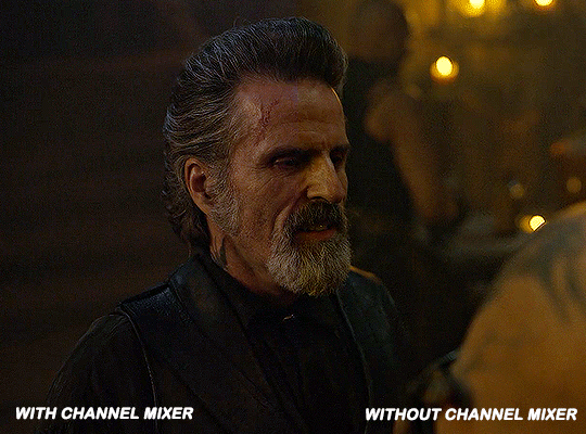
not only does the background look less yellow, but so does izzy's skintone.
now i'm going to focus on trying to brighten the scene even more without destroying the quality. the levels layer can actually help out a lot with this.
the amount to which i move each toggle differs per scene, and i think experimenting depending on your gif works best for this layer.
side note: i prefer not to use the ink droppers on the side because the contrast in the result usually ends up feeling too strong for my preferences, but if you find that this works better for you, then go for it! basically, the first dropper with the black ink should be clicked before you select the darkest part of the scene that you can find, and vice versa for the third dropper with the white ink — click it, and then select the brightest part of your scene.
curves is the next layer that does fantastic work! unlike the levels layer, i do actually use the ink droppers for this. it's the same concept, with the first dropper being used on the darkest part of the scene, and the third dropper on the brightest.
try to think of curves as something that not only further brightens your scene, but also helps with the colour neutralizing process.
i grab the first dropper, then click the darkest parts of the gif that i can see. depending on the undertone of the blacks that you're clicking on, the tint of your gif might actually change significantly. this is why i prefer to click once, then undo the action if i don't like what it gives me. izzy's leather jacket was the sweet spot for this gif.
when i'm satisfied, i make another curves layer and use the third dropper to click the bright/white parts of the scene. for this gif in particular, the lights in the background were a good fit because they carried a yellow undertone — this meant that my curves layer actually helped to further neutralize the yellows in the scene as a whole!
(i manually dragged the curves graph upwards for the third dropper to make it brighter. i don't need to do this if the dropper does this for me automatically, but since the lights were pretty bright, it only changed the tone of the scene and didn't increase the brightness — hence the manual step.)
pat yourself on the back, because this is what our gif looks like now!
this is good, but it's not great — there's still just a bit too much yellow in the scene for my liking (sorry, i'm picky! :P)
i created another channel mixer layer and played with the toggles until i was satisfied:
ta-da! the gif as a whole is much less red/yellow now:
this is when i start fixing the colouring now — namely, his skin tone. selective colour will be your best friend here. i wanted to make his face just a tad brighter and less of a yellow-ish magenta shade, so i focused on the reds and yellows.
then, out of habit, i created another selective colour layer and took out more of the "yellow" in the whites to make them whiter, and increased the black (just by +1, since the contrast is pretty good enough already).
note: i switched to "absolute" for these two colours. basically, relative = less vibrant colour manipulation, and absolute = more vibrant/stronger colour manipulation. i prefer to stick to "relative" for fixing skin-tone since "absolute" can be a bit too strong for that.
our gif looks like this now!

his face looks brighter and much less yellow, so i'm satisfied!
this next step is not mandatory at all — again, i'm just picky and despise yellow-tinted scenes. i personally believe that indoor scenes that are yellow/green tinted make them look more dark than they actually are, so i do my best to get rid of these colours.
i also don't always do this, but for this gif, i just simply went to hue/saturation, selected the yellows from the drop-down menu and decreased its saturation.
be careful not to do this too much. depending on the quality of your download, this can significantly decrease your gif quality. i tend to worry less about this when i'm working with 2160p files, but again, those files require an entirely different set of steps when it comes to brightening/colouring.
since this was a 1080p file download (and one that was actually less than 1GB, oops, don't do that), i played it safe and decreased it by -39 only.
note: you also want to be cautious of colour-washing skintone when it comes to this step. i find that another selective colour layer can help perfect the skintone in case the yellow drains out of it too much, but skip the hue/saturation step if it's too difficult to work with — better to be safe than sorry.
anyway, this is the final gif!
that's usually what i do when it comes to colouring dark indoor scenes! i hope this tutorial makes sense, and if you have any further questions, don't hesitate to reach out! :)
#tutorial#gif tutorial#resources#completeresources#coloring tutorial#allresources#dailyresources#userraffa#userdean#uservivaldi#alielook#usercats#usermoonchild#usernaureen#userbarrow#userabs#useraish#useralison#userisaiah#*mytutorials#i am so sorry if this is incoherent#it’s so hard to explain things coherently 😫
680 notes
·
View notes
Text
How to write: ethnicity & skin colour

requested by: anonymous
request: How exactly can I describe a characters ethnicity/skin color casually, without it sounding like a specific scene that just exists to describe the skin color? I hope this makes sense lmao… I just want to write a scene where I casually mention someone’s ethnicity or skin color
description of appearance: No matter if skin colour or hairstyle or clothes, a text is more dynamic if you don't dedicate an entire scene/paragraph to it but rather sprinkle the necessary information in here and there. However, there can be instances where it's conducive to the plot to put that entire paragraph (e.g. introducing a new important character with backstory). Otherwise, I'd say try to keep it short and put it where it serves the plot.
ways to incorporate...
... a description of appearance:
when a character makes their first entrance (describe everyone's colouring - POCs' and white characters')
the impression their complexion makes together with their clothes: "the bright yellow of their shirt complemented their dark skin"
the way their colouring interacts with lighting: "the grey weather took away the rosy hue of their fair skin"
when appearances create a contrast: "I immediately noticed them because they were the only other black person"
... ethnicity:
let the characters mention it where it makes sense
regarding the narrator you've chosen for your story, it can also be blended into an inner monologue
include parts of their culture: traditions, terms, family, etc. (this also allows to bring up their ethnicity repeatedly over the story and not only at the beginning)
show their struggles: are they affected by social struggles? then show it!
words to use to describe skin colour:
... basic colour descriptions:
brown
black
beige
white
pink
... more specific colours (try sticking to familiar/common words that can be easily visualised):
amber
bronze
copper
gold
ochre
terracotta
sepia
sienna
porcelain
tan
... prefixes or modifiers (can be easily combined with basic colours):
dark
rich
warm
deep
fair
faint
light
cool
pale
... undertones (pre-dominant colours underneath the skin - often warm or cool, sometimes also neutral and olive):
yellow
orange
coral
golden
silver
rose
pink
red
blue
... avoid food analogies as it's often received as offending, fetishising, and/or objectifying.
That's all I can provide as of now but I'm sure you guys have aspects to contribute. I'm very interested to hear your thoughts, so please feel free to add to this post whatever you like to/can share <3
And for more information, maybe also check out @writingwithcolor for more specialised posts on the topic <3
#ethnicity in writing#writing advice#writing skin color#terminology#writeblr#writers on tumblr#writing guide#creative writing#how to write#writing inspiration#writing ideas
3K notes
·
View notes
Text
i was asked by @matthew-macfadyens for a colouring tutorial, so here we go ! i've been making gifs for almost 4 years now and finally feel comfortable and confident in my skills to make a full tutorial on my colouring process. there are so many different ways people colour gifs, and there's no wrong way, this is just how i do it ! i learned to gif by reading so many tutorials and picking and choosing what works for me, so hopefully this can help someone out !
if this tutorial helps you, please considering supporting me !
buy me coffee ♡

TUTORIAL UNDER THE CUT
what you'll need:
- photoshop ( i use ps cc 2023 & frame timeline )
- basic ps knowledge ( how to make gifs, how to sharpen gifs, general understanding of adjustment layers, layer masks and blending modes )
- a whole lot of patience
helpful resources:
the beginner's guide to channel mixer by @aubrey-plaza
giffing 101 by @cillianmurphy
gif making for beginners by @hayaosmiyazaki
colouring yellow-tinted shots by @ajusnice
becca's mega colouring tutorial by @nataliescatorccio
@usergif
PART ONE: BASE COLOURING
- step 1: curves
- step 2: exposure
- step 3: colour balance
- step 4: selective colour
- step 5: levels
- step 6: brightness / contrast
- step 7: gradient map
okay so, before we get started, this tutorial is for colouring only. at this point, i've already gotten my screencaps, imported them into photoshop, made the actual gif & sharpened the gif. the above image includes what my typical adjustment layer stack looks like !
STEP ONE: CURVES
a lot of people do the majority of their heavy lifting in curves...i'm not one of those people. i've never gotten the hang of curves and haven't been able to fully taken advantage of everything it can offer. i use curves to mainly brighten up my gif and to start my process.
i use the "auto" button in the curves function - this automatically corrects the curves for your gif ( mainly the brightness / contrast )
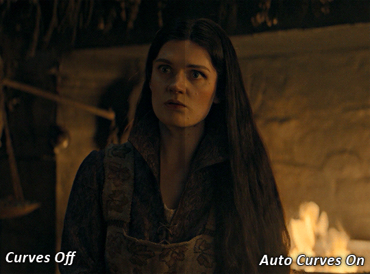
you can see that the auto curves has brightened up the gif and evened out the brightness/contrast. i just find this gives a better starting point for the colouring process.
STEP TWO: EXPOSURE
this step is for, you guessed it, brightening the gif more and evening out the contrast and blacks. i don't have any real rules for doing this, the amount i highten the exposure and contrast is different based on the scene and the show, however, i tend to stay around +1 on both exposure and gamma correction.
exposure effects the brightness of the gif and gamma correction effects the blacks and contrast. this step also effects the saturation of the gif, so it's important not to go too crazy. i often end up coming back to this step every now and again to adjust and fiddle with it.
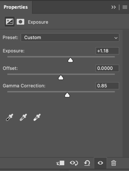
for this gif, i put the exposure at +1.18 and the gamma correction at 0.85
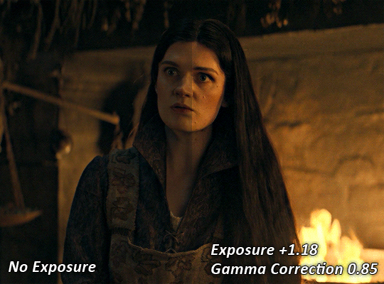
you can see this step serves to add some more brightness and contrast - it also adds some more saturation, that we don't always want, but don't worry, that's what the next steps are for !
STEP THREE: COLOUR BALANCE
i use this step to do a lot of my heavy lifting - i'm a whore for colour balance. this serves to even out the colours and help neutralize the colours for an easier canvas. it's important to understand the basics of colour theory for this, i recommend checking out the channel mixer tutorial i listed above, because a lot of those steps applies to colour balance.
essentially, there's three separate profiles to edit on - highlights, midtones and shadows. in each profile, you have 3 colour sliders. the top one is your cyan to red, middle is magenta to green, and bottom is yellow to blue. the colouring of the scene will decide where to move your sliders.
for example: if your original scene has a cyan tint to it, you'll want to pull your slider to the right, towards the red to help neutralize the cyan. if your scene has a green tint, you'll want to pull it left towards the magenta. as you move the sliders, you'll notice that sometimes it brings out other colours you don't necessarily need, you can adjust the other sliders to help neutralize further.
i always do my main correction in the midtones profile.
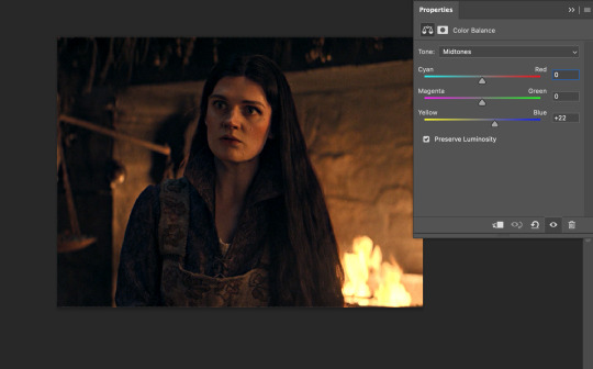
since this scene has a heavy yellow tint, my first step was to adjust the bottom slider. i pulled the slider to the right towards blue at +22. you can see this helped get rid of a lot of the yellow, but adding in the blue warmed up the reds and made it more saturated.
to help with this, i pulled the top slider left towards cyan to help neutralize that red.

i pulled the top slider to -28 and you can see this cut out that heavy saturation and redness. it's looking a lot better, but now it's a little too green for my liking. this is where that middle slider comes in!
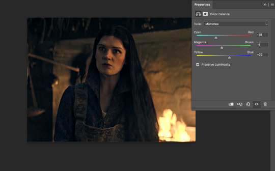
i pulled the middle slider to -6 towards the magenta to help counteract the green that came in. ( i ended up going back in and adjusting the bottom slider to +10 instead, as it was a little to blue )
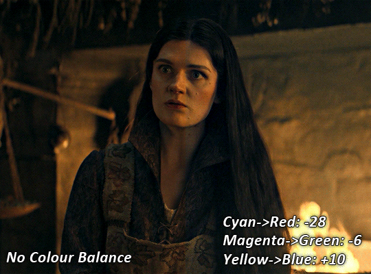
you can see this step really did the heavy lifting, helping to neutralize the canvas so that it's easier to work with...but it's not quite perfect yet!
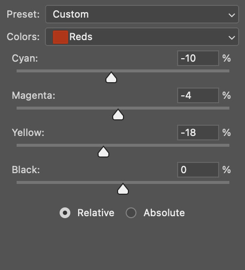
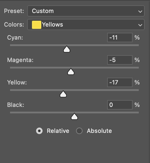
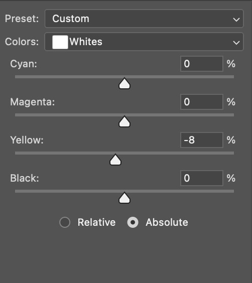
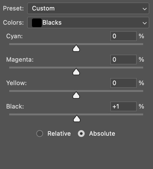
STEP FOUR: SELECTIVE COLOUR
a lot of the same principles around colour theory apply to selective colour! this is where i go to adjust the colours according to what my colour palette is. for this gif, the overall colour is going to be purple, so i'll adjust the individual colours with that in mind.
i only ever adjust my red, yellow, white and black profiles! sometimes i'll do the other colours, but that's only for tweaking the final colour. i normally don't touch them at all.
ps: you'll notice i prefer a cooler toned gif, and almost always go for a more magenta looking red/yellow.
i always start with my yellows:

in the yellow profile, i pull my cyan towards the left to -38 (this helps eliminate the green in the yellows) and my yellow slider to the left to -27 (this cools down the yellows. i top it off by adjusting my magenta slider to -10, to help lower the saturation of the yellows.
you'll notice this step got rid of most of the green undertones - that's because the green was nested inside the yellows, so by taking out a lot of the cyan and yellow, you're left with a warmer yellow as opposed to a cooler yellow.

next i go on to my reds. this step will mainly effect the alys's skin tone, but i'm going to do pretty much the same as above but with much less dramatic of a change. lowering your colours in your red profile too much can lead to a very saturated gif, which is not what i'm going for.
i pulled my cyan slider to -19, magenta to -9 and yellow to -15. you can see this helped add some more cooler tones to the reds.
the next profiles are your white and black profiles. i use white to brighten the lightest parts of the gif. no rhyme or reason here, i just pull the black slider towards the left...usually around -25. for the black profile, i always move the black slider towards the right. anywhere from +3 to +8, depending on the gif. for this gif, i did +8. this darkens the blacks and, in my opinion, helps the gif pop!
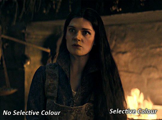
you can see this step got rid of the yellow tint, gave the gif a more neutral look and adjusted the reds to better compliment a purple colour scheme !
STEP FIVE: LEVELS
this adjustment has three toggles - i'm not 100% sure what each toggle really does, i just know that by pulling the leftmost toggle to the right, it darkens your gif, and pulling the rightmost toggle to the left brightens your gif.

this step is so hard to explain, but really i just pull the toggles around until it looks good...sorry !
STEP SIX: BRIGHTNESS / CONTRAST
this step is exactly what it says on the tin...it brightens your gif. this step is based on your scene and personal preference, there's no real guide to it.
i always pull my brightness slider to the right ( brighter ) and my contrast slider to the left ( less contrast ).
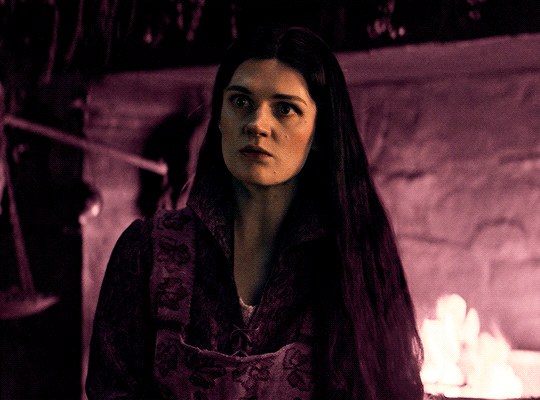
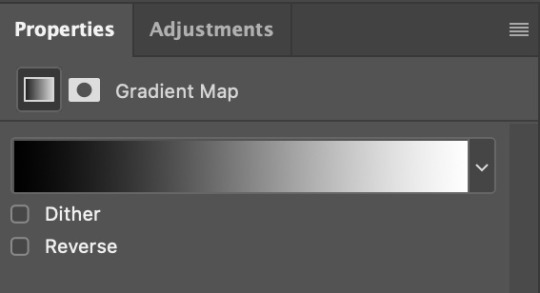
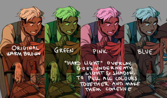
STEP SEVEN: GRADIENT MAP
this last step is something i learned from @nataliescatorccio ! i add a gradient map to the top of my stack, and choose a lighter colour of what i want my overall gif to be. in this case, i used a very light purple!
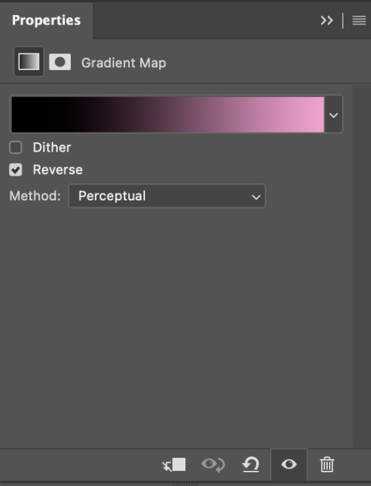
i then set the blending mode to "soft light" and lower the opacity to anywhere from 20-30%. for this gif, i did 30%
this step will help make your colour pop once you do your main colouring!
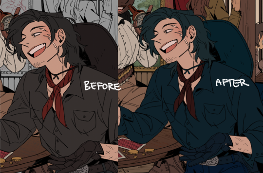
PART TWO: PAINTING & COLOURING
- step 1: layer 1
- step 2: layer 2
- step 3: layer 3
- step 4: final touches
okay, so my actual colouring process is based in 3 layers. for this gif, i'm using a deep purple/mauve colour !
STEP ONE: LAYER ONE
between your brightness/contrast and gradient map layers, add another blank layer. change the blending mode of this layer to "colour" and set the opacity to 40%.
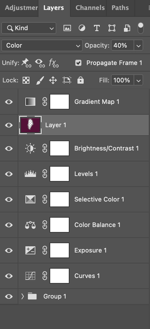
then, using a soft round brush with an opacity of 100% ( size of the brush is your preference, i typically use around 108 ), colour the parts of the gif you want coloured !

you can see this helps us get the canvas to a more uniform purple colour!
STEP TWO: LAYER TWO
for layer two we're going to do the exact same thing. add a layer above your previous, set to "colour" at 40%. we're going to go over the same areas!
you can see this helped get the purple so much more vibrant and closer to what our final colour is going to be!
STEP THREE: LAYER THREE
for our final layer, add another layer above the previous 2, set your blending mode to "multiply" and your opacity to anything from 60%-100%. for this gif, i did 60% !
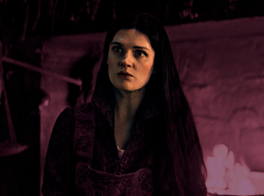
now, our colouring is pretty much done but you can see that, now that our colour is down, alys's face is still a little too blue/green/yellow for the background purple. the next step, we're going to adjust and add final touches!
STEP FOUR: FINAL TOUCHES
at this point, i went back into my selective colour layer and adjusted my yellows & reds and went back into my colour balance layer to adjust everything overall.

at this point, i'm going to go in and add some adjustments layers above everything - i usually add some brightness/contrast, and a selective colour layer to darken the blacks.
which brings us to our final result:
#usergif#dailyresources#pscentral#ps tutorial#tutorial#coloring tutorial#allresources#userbecca#tusermich#userjoelle#ughmerlin#mialook#*tutorial#**
140 notes
·
View notes
Text

Thank you @cobbbvanth for asking me for this; I’ve never been more flattered! ☺️ I’ve only been making gifs for a little more than 2 years, so I’m really still only figuring Photoshop out, and my colouring owes everything to other people’s tutorials (some of which can be found here). To be honest, I was only asked some tips, but I have no clue what to include and what to leave out; so, here’s my complete (if random) colouring process.
NOTE: This is a colouring tutorial, not a gif-making one. The tutorial that taught me everything I know about that (and to which I am eternally grateful) is this one by @hayaosmiyazaki.
I. SHARPENING
My standard sharpening settings are:
One Smart Sharpen filter set to Amount: 500 | Radius: 0,4
A second Smart Sharpen filter set to Amount: 10 | Radius: 10
One Gaussian Blur filter set to Radius: 1,0 and Opacity: 30%
One Add Noise filter set to Amount 0,5 | Distribution: Gaussian
II. BASIC COLOURING
This is the part where I add most of the adjustment layers available and just play around with them. Obviously different settings work for different scenes, but I do have some standard ones.
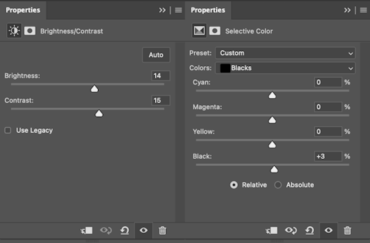
Brightness/Contrast
I usually up the Brightness to +10-30, and the Contrast to about +10.
Curves
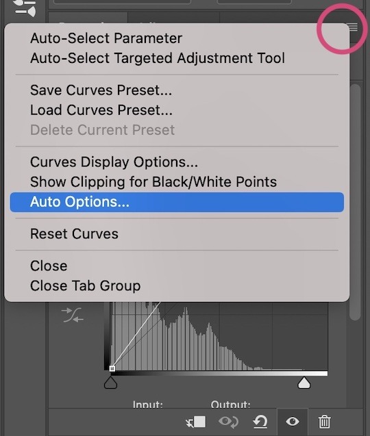
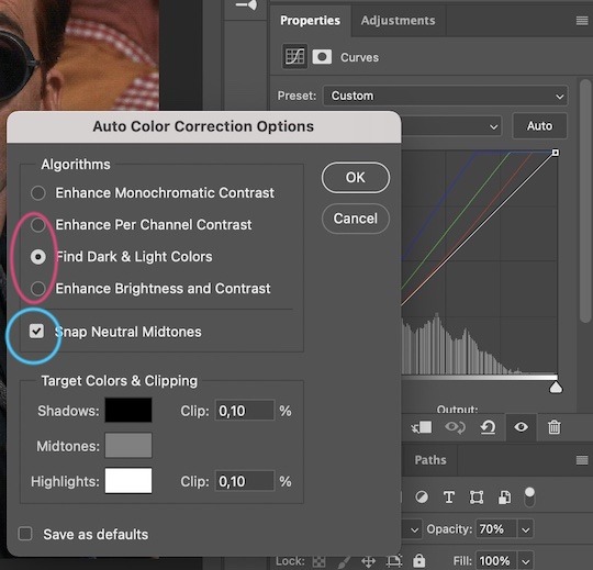
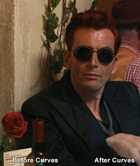
For the first Curves layer I go to Auto Options > Enhance Brightness and Contrast, and then adjust the opacity until I’m happy.
I might repeat the above step if the gif still looks too dark to me.
I add another Curves layer, I go to Auto Options and this time I pick either Find Dark & Light Colors or Enhance Per Channel Contrast, and check or uncheck the Snap Neutral Midtones option, until I see something I like. I will then adjust the opacity.
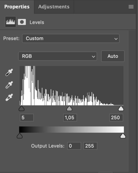
Levels
I add a Levels layer that usually looks something like this:
Exposure
I add an Exposure layer, where I usually set the Offset to around -0,0010.
Selective Color
To make the faces look okay, I create a Selective Color layer, select the Reds and usually add some Cyan (+10-20%) and play around a little (±5%) with Magenta and Yellow too. I might also add another layer, select the Yellows and make slight tweaks there too.
III. FUN COLOURING
About colour manipulation: PiXimperfect just uploaded a tutorial that explains everything so much better than I ever could, so I highly recommend you go watch it. It’s made for static images though, and things are more complicated with moving images, so I also recommend @elizascarlets’s tutorial.
The reason I usually go for a softer colouring is that a more vivid one requires a lot of patience and precision, and I honestly can’t be bothered. Instead, I try to tweak the colous only a little, so that the edges can be a little rough without it looking too wrong.
One thing to remember is that each gif is different, and there isn’t one foolproof way to do this, so you will need to use a different technique depending on the gif you’re working with.
Okay, so, after I’ve decided what colour I want my background to be:
1. I create a Hue/Saturation layer and change the greens, cyans, blues and magentas to that colour. That’s easy enough, since it doesn’t mess with the face colour. I then set the blending mode to Color. If your background doesn’t include any yellow or red, you might be done here, like in the case bellow:
2. To change the yellows and reds, I create a new Hue/Saturation layer, select the yellows/reds, move Saturation to 100 (temporarily) and then play around with the sliders until the face colour isn’t affected. I then change it to whatever I’ve chosen and change the blending mode to Color.
3. If for whatever reason step 3 doesn’t work (the background is white or black for example, or just too red), I might create a Solid Color layer set to whatever colour I want, set the blending mode to Color and then select the layer mask and carefully paint with a soft, black brush over the people’s faces/bodies. I will then lower the Opacity, to whatever looks smooth enough. If there’s a lot of movement in your gif, you might have to use keyframes (see elizascarlets’s tutorial linked above). However, my main goal is to avoid using those; that’s why I try my hardest to tweak around as many Hue/Saturation layers as needed and not have to create a solid color layer.
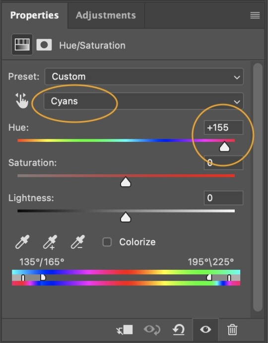
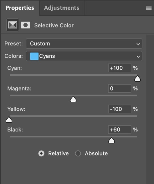
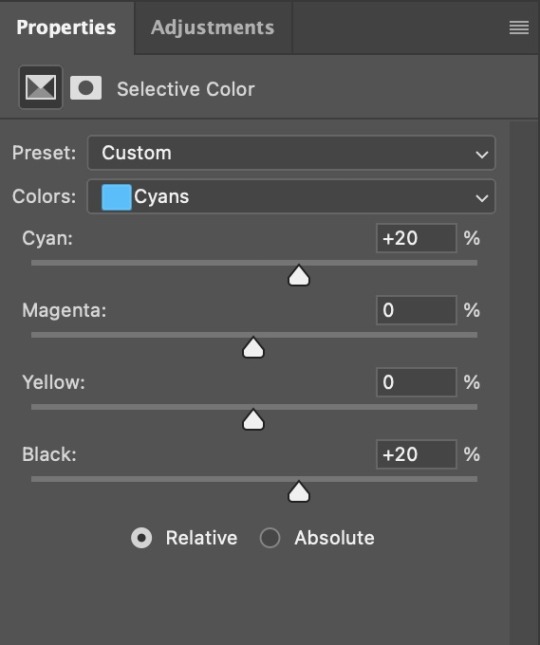
4. Once my background looks the colour I want it, I might add a Selective Color layer that matches my background color and then try to make it look more vibrant. For this Aziraphale gif below for example, I’ve selected the Cyans and then set Cyan to +100%, Yellow to -100% and Black to +60, then created another one, selected the Cyans again and then set Cyan to +20 and Black to +20.
5. If the gif has a white area, I create a Solid Color layer with a colour that matches the rest of the background and then set the Opacity low. I might also create a Selective Color layer, increase the Black and then play around with the colours.
IV. FINISHING TOUCHES
I create a Vibrance layer and set the Vibrance to around +30 and the Saturation to about +5.
I create a black and white Gradient Map layer (with black on the left end of the spectrum and white on the right), set the blending to Luminosity and the Opacity to about 20-30%.
AAAND that’s about it I think! This ended up way too long and perhaps a little incoherent. I tried to make it as general as possible, so you might have to mix and match for best results. Feel free to ask me for further explanations about any one of these steps, and please tell me if you want me to go through the colouring of a specific gifset (although, as I said, I'm by no means an expert). Happy gifmaking!
#gif tutorial#allresources#completeresources#dailyresources#photoshop tutorial#minee#tutorial#tutorial*#chaoticresources#uservivaldi#userdanahscott#usersanshou#userfanni#userbuckleys#userrobin#tuserjen#userdavid#userzaynab#tusermimi#thingschanged#tuserju#usertj#userhallie
322 notes
·
View notes
Note
Sorry if you’ve answered this before, but I really love how your illustrations have such a cohesive color palette, how do you pick your colors to have a certain theme without looking monochromatic?
(In your breakdown on the saloon/western BP illustration, you mentioned that the overall color was reddish brown so you added blue to the main group to set them apart. But like how did you decide on which reddish brown colors to use for the flats?)
Thank you!! Your art is really expressive and the colors always work so well in the illustration. I’m always in awe of your pics
That’s an excellent question! My drawings actually start out pretty monochromatic because I tend to put most of my effort into the lighting and shading part to help differentiate where I want people to look.
For all of my pieces, I want my characters to be in focus. So no matter what, I always have to keep their main colors in mind and make sure their outfits and the background don’t clash with them (Kain’s red hair tends to be a problem, pft).
For my flats, I generally work with two main colors that tend to contrast each other and then I mix a lot of neutrals around them. (Sometimes the main colors are in the light and shading itself, but I’ll just focus on the flats!).
Sometimes, I will change the hue of their colors. So while Kain has bright orange hair, I will dull it down if it overwhelms the piece or doesn’t fit with the tone - like I did for the cowboy drawing - but never so much that it no longer looks like him.
With the cowboy drawing as an example, if I strip it down to my flats, it instantly becomes very dull and monochromatic. I really enjoy working with these colors because they’re easy on the eyes (or my eyes specifically) and I can see the difference in subtle hues a lot better than if they were very high in contrast. I like working with subtleties when I want background characters to become a single unit but still be separated as individual people.
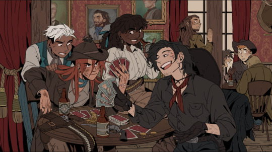
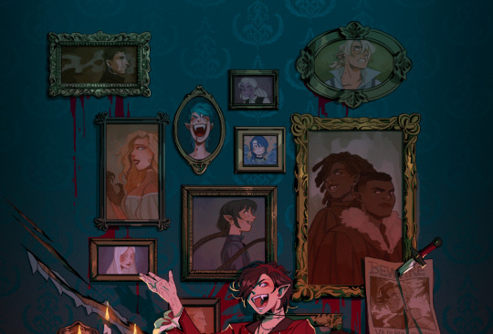
When I picked the colors for the background, I wanted to separate the characters from the walls. Therefore, I kept the walls red and gold, and the characters brown - they’re still within the same warm-colored family, but they’re far enough away from each other that they don’t become one with each other. I also like to not have clothes from different characters blend together, so overlapping colours can't be the same. I made one coat lighter than the other, the glove warmer than the dark jacket, and so on.
(their coats are also in the same realm as the green/gold colour of the details for the curtains and the frames on the walls)
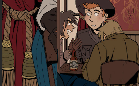
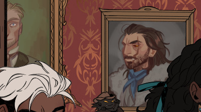
For the paintings I actually chose to put a bit of blue and green in to help create some interest for the main characters and keep your eyes around that area, as it matches the blue they’re wearing, just a whole lot darker. It also makes them pop just enough so they look interesting against the wall, but not enough to overshadow the main characters
I know, because of the way I work with layers, that when I add my overlays, I automatically brighten and saturate the colors a lot. It’s a lot easier for me to saturate something “dull” and move it into all kinds of hues than saturating something already high in contrast and then trying to force it into a new color theme.
But because of this, I usually have to go back and change the colors I work with constantly while the overlays are on. Since the overlays don’t know what sort of materials they’re laying on top of, everything gets lighter and washed out, so dark skin tones, hair, and clothes have to be corrected one by one afterward. If I were to remove the overlays after I corrected it to make it feel like a dark blue outfit on Raki, it’s basically just a black void now; but with the overlay, it’s a dark blue outfit. Before that, he simple blended in with the background too much and he didn’t feel like he was a part of the group either.
I always try to put down colors how I imagine they’re going to look like, unaffected by light, but I’m also naturally drawn toward more earthy and warm tones, so all of my color choices will tend to lean that way.
Here’s another example of main colours vs. neutrals; the main colours are red and green/turquoise, with dark browns and greys to encapsulate them, and gold for accents or to make certain things pop (the chair, Dakon’s dark coat, etc.).
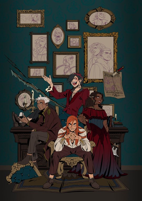
I never want them all to wear the exact same color, but I want them to feel connected and be in the same 'colour family,' so Dakon and Kain have nearly the same dark red/brown, and Christie and Raki have nearly the same 'bright'/red.
The blacks and browns, I’ve kept warm as well, so they stay within that realm of red. I also make sure that none of them are too close to Kain’s hair since he’s in the middle of the piece, and I want your eyes to be drawn toward the middle, and his orange hair helps with that.
The paintings I basically do not care too much about, as long as each individual painting has a single dominating colour. I mute them down with a darker overlay and ensure they don’t have strong shadows and light, so they get pushed to the background, so despite being a bunch of different colours, each painting feels like a solid color and they’re still cast in the same light as the rest of the piece, so they feel like they belong in the same room.
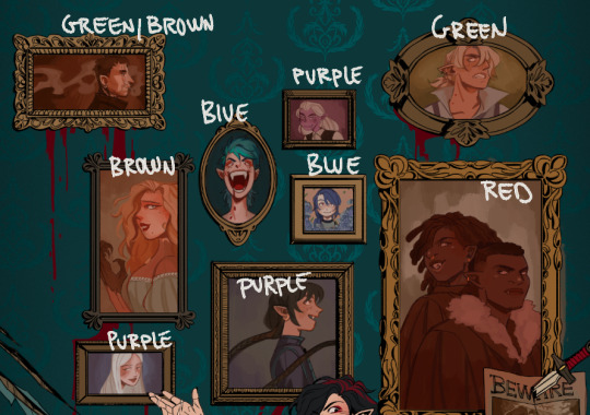
I try to help move the eye around the piece as well, so I keep the big painting sort of in the same realm of red and brown as the main characters, because it’s so big it shouldn’t dominate with a new color and force interest toward it. The blue/purple ones melt in with the background as they’re close to the turquoise background, but without disappearing, the yellow ones work sort of like the gold accents and blend in with the frames, and the green paintings at the top give the illusion of a monochrome fade, so everything gets more eerie and green as the image goes up - there’s also a subtle green fade that affects the gold accents from the top down, to enhance that effect.
This is just a few examples, if there are any pieces in particular you were thinking of, and it’s neither of these, just let me know, and I can break those down as well!
Thank you for the question; I hope I answered it somewhat, and thank you for the kind words! <3
400 notes
·
View notes
Text

Your Fashion and Style Guide
Pt.1
Part 2 (Libra - Pisces) Here
Use your Rising & Venus sign!
Aries:
Prioritizes comfort but doesn't compromise for their fashion style
Absolutely rocks streetwear & athleisure
Prefers sporty fits the most!
Looks best in red & black clothing
Their style always has some sort of edge to it
Big on grunge and vintage rockband t shirts
They love combat boots and they generally prefer flame or camo print clothes
This sounds odd but they kinda remind me of a racecar aesthetic?
Very Sharp with their fashion choices
They look great in leather jackets
A bold colour paired with a neutral for a high contrast look suit them best
They love the rockstar or baddie aesthetic
Looks ~
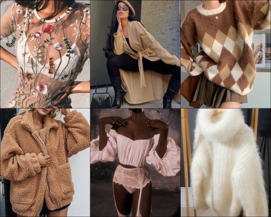
Taurus:
They have three modes, classy bitches, edgy e-girls & bohemian botanical.
But generally, I see classy and soft the most
Green, Brown, Beige, White, Black, Pink & Red for sensuality.
They love wearing neutrals but they often mix it up with some colour now and again
They usually have some sort of special necklace
A fan of pearls because it's classic
But diamonds are their best friends too ofc
Fuzzy & Fluffy cardigans or sweaters have their heart, especially the white and brown colours
They are into floral and flannel patterns
Their favorite colour options are brown & pink or white & pink 🕊💕
They usually dress more modest but make it look high fashion
They usually like to incorporate silk or a corset into their outfit, being ruled by venus makes them into a sensual and seductive look
Generally they favour comfortable fabrics and silk
Looks ~
Gemini:
I noticed they don't really like dark colours and generally prefer brighter neutrals or colours
They like off-the-shoulder, cold shoulder, cutout tops & cool designs on their shirts whether its long sleeve or not
They choose tops based on the arm style such as balloon sleeves or cutouts
Asymmetrical styles suit them best
Colors are white, bright pinks, and green.
Earrings & Bracelets are their favorite accessories
They like a fairy aesthetic, something that feels whimsical
Likes to switch between feminine and masculine clothing frequently
Very experimental with their clothes
Looks ~
Cancer:
Either soft and girly or moody and dark!
They prefer to keep it modest unless showing off their chest
Their choice of jewelry are pearl necklaces
The shoes they tend to favour are chunky block heels & sandals
Prefers blue, pink & white or black
Soft and flowy clothes like cardigans or kimonos
Knee high socks + sweater dresses look great
They love sweetheart necklines
Into crop tops! Usually silk crops
They like to pair tight clothes with a flowy jacket! Especially if it has a pop of colour
Overall style changes depending on how they're feeling that day
Looks ~
Leo:
Everytime I looked up a Leo rising celebrity that were ALWAYS wearing sunglasses
A fan of sunhats too!
Anything bright & metallic suit them perfectly
They look lavish in silky and shiny materials
They tend to wear fur coats
They like long and sturdy coats in general!
Usually they own big statement jewelry
Everything looks shiny tbh especially their hair.
Sparkly clothes & sequins are their weakness
They could rock sundresses
They look great in animal print, specifically cheetah or leopard.
Bold fashion is their go-to
Even if they wear neutral colours they make sure the texture stands out
Jumpsuits were really popular among them! I think they like to look playful but glamorous at the same time
They will not leave the house unless they look ready for a fashion show lol
Their motive is to standout and turn heads.
Looks ~
Virgo:
Less is more for them
They like simple t-shirts with cute mottos like "be kind" or some shit that HAS to be written in small font or they won't wear it LOL
A Preppy Style & Sweater Vests are their thing
So is gingham print
They rock high-fashion looks
Fake glasses are a cute trend they look good in
A big fan of trench coats and cardigans
They prefer a business casual look
They prefer earthy tones & greens.
They are all about the simplicity in versatility! For instance they usually like black jeans and a white top but the top can be a tube top or a halter top based on what they want that day
They LOVE BLAZERS
Very picky about fashion, I find super bright colors often turn them away
Quality > Quantity for them
A lot of them look great in crop tops, or waist accentuating clothing like kim k is known for
Watches are usually a staple item they prefer
Looks ~
#astrology#astro observations#astrology observations#astro notes#astroblr#astrology notes#astro community#aquarius#zodiac#zodiac signs#astro thoughts#astrology blog#astro observation#astrology observation#astrology opinions#astro note#astrology note#astro chart#natal chart#birth chart readings#birth chart#horoscopes#horoscope#12 signs#zodiac wheel#leo#gemini#virgo#aries#taurus
2K notes
·
View notes
Text
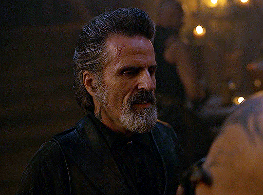
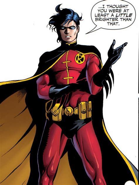
My biggest comic pet peeve is whenever artists draw nightwing/jason/tim as Robin when someone's already taken over the mantle, and they use the wrong design.
Like, if Robin has long green pants instead of scaly shorts, I will assume it is Tim Drake. Not Dick Grayson.


While Dick (left) and Jason (right) had near identical outfits, their builds and facial shape are the biggest giveaways for which Robin we're dealing with. Dick is a lot leaner and taller, where Jason is a big shorter, but naturally more bulky. And even that is so inconsistent that 9/10 times I just end up guessing

Tim started the trend of having a long pants, as well as a blacck cloak for decreased visibility. This is partially attributable to Tim's Robin having been largely a solo stint, solving most of his cases on his own, while Bruce did the same elsewhere in town, instead of being the bright perskn contrasting Batman's dark blue. This suit stayed mostly the same, except that in the final years before he took on Red Robin (2007-2009) his suit became red to match the animated series. (In universe, this was the "I'm so emo everyone is dying" phase)


Damian's main alterations are immediately clear, as he clearly favours black and red colours, limiting the green.
With all that said, which Robin is depicted in the image below?

This image from worlds finest: Teen Titans, and it depicts Dick Grayson.
The fully yellow cape might've given away that it wasn't Tim, and while Damian did have a double sides yellow cape, his pants were black.
In fact, the only time I recall ever seeing the fully yellow cape combined with green full-length pants was in a pre-crisis story where Jason Todd grew up as a blonde circus kid with Dick, so he put on Dick's old trapeze costume.


While it shouldn't be consequential at all, I wish the authors tried to give the Robins distinct constumes as kids, or at least kept the main elements from when they were actually Robin.
#tim drake#jason todd#dick grayson#damian wayne#red robin#robin#robin costumes#dc#batfam#nightwing#dc comics#batman#comics#comic books
159 notes
·
View notes
Note
how do you make your colours so scrumptious... that's a vague ask but it's like, how do you make the colours mash together well and make sure they don't clash against eachother. And when you do designs, what inspires you to make your agent ocs outfits or do you just make them because they look silly.
hmmm... no.1 i stay away from pure black and pure white. i always use an off-white and a dark desaturated color of whatever i'm using, as well as for when i use grays. here's an example vv
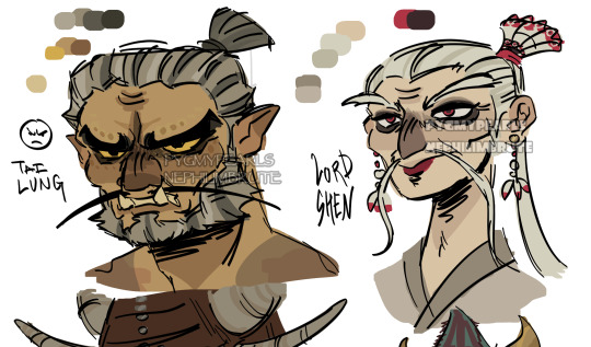
^^ all of the colors on my tai lung come from yellow hues in various shades (if that makes sense). same with my lord shen. the red is a reddish-pink, and the black is, of course, a desaturated and darker shade of the red

i tend to stay in the middle area here, i don't really like to use bright or very saturated colors. another example is when i choose an ink color for marina, i don't use something that's TOO bright, but going for something a little darker to pair with the primary color of her tentacles and her skin
now, here's my chameleon vv
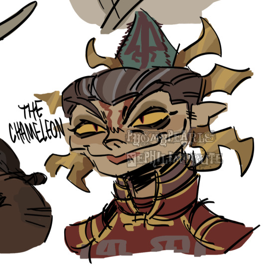
her colors were a little difficult to figure out, but i'd say they work together somewhat...they all fall into the category of being desaturated and such. mainly warm colors with the exception of the green, but i made the red a little pinkish/purpleish so it wouldn't contrast as much
it REALLY depends on the character but most of the time my lighter colors will be less saturated, and for darker colors they'll be saturated. this obviously varies, like with undead characters all of their colors would be a little more muted
i also have a theme i keep in mind for my colors. like with my fantasy marina, i think of olive or yellow-green. the only colors that i don't change (often) in the palette are the skin tones. another example is my young craig design, i think of the sepia filter and...old looking colors? like grayish browns and yellows and stuff like tha.t...i dunno
the main way i learned how to color is actually by coloring...normally? the colors all looked weird and had such contrast, but i'd overlay another layer on top with a solid color, set the blending mode to multiply, and lower the opacity. sometimes i'd do this with the mono color filter instead of a solid color
i also take inspiration from other artists! wolfythewitch is one of my biggest inspos for art in general, great coloring and anatomy. if you're looking for an artist with saturated colors that pop, check out bigskycastle!
now onto the second question...if you mean their uniforms..yeah i just went with whatever looked silly. (OLD ART ALERT ERR ERRR) cap3's uniform is intended to be a few sizes larger since it was most likely supposed to be for val before she got fired. and she wears pants instead of shorts since she wants to cover up a lot
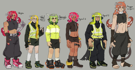
not much is different with maggie. other than the fact that she's wearing a uniform too small for him and it ended up looking weird
but if it's for outfits in general i just scroll through the lists of gear on inkipedia and pick whatever i think the character would wear
106 notes
·
View notes
Text
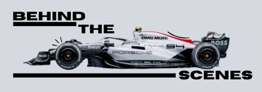
TRAILER : THE BEGINING
🏁 Content warnings : Swearing.
🏁 Spoiler alert : Please read the masterlist, Character sketch and Team sketch to understand.
🏁 Genre : Drama, Action, Sports
🏁 Reading time : 15 minutes, 6 seconds
🏁 Word count : 3.0.k (3021 words)
🏁 Chapter summary : It all begins now.
🏁 Author's note : So, this is it, welcome to the beginning of this wild ride. Just wanted to explain a few things [so skip this right now if you're not really interested, no hard feelings !] Now, this format is probably confusing, basically the first part of this is the trailer, how it would look on Netflix, the actual video/film. And the writing after the banner, Behind the Scenes, is literally behind the scenes, what isn't shown on camera. Second, this whole series is meant to be very dramatic, it's entertainment made by "Netflix" [not really, please don't sue me] for God sake. With all that said, Enjoy!
Masterlist · 🪷 Aisha · 🪷 Porsche F1 Team · 🪷

[Please play this song whilst reading the trailer & feel free to stop once we get behind the scenes with the drivers !]
The screen fades from black to show a Porsche F1 car skidding down the track, the sound of screeching rubber against the tarmac harmonises with the energetic music that pumps behind the video.
Circular shots of a driver climbing out of the car from different angles flash across, and just before they tug off their helmet the scene changes to the paddock, pit crew, mechanics and drivers rush past in a blur, their differently coloured uniforms merge together like lights in a city scape. Suddenly, everything stops and the music fades away momentarily.
“In the fast-paced world of formula 1,”
Scenes of driving legends hoisting up their trophies with happy grins and champagne soaked racing gear flash past. Ayrton Senna, Michael Schumacher, Kimi Räikkönen.
“Where every second counts and emotions run high.”
The grating sounds of cars speeding past bursts into the frame, Max Verstappen shaking his fists ambitiously as he wins, yet another grand prix, Charles Leclerc as he wins in Spa and Monza, Carlos sainz and Lando Norris partnering up in the Singapore 2023- “Yeah, it’s on purpose.” The Spaniard grits out just as the narrator begins to speak again.
“Our team is about to redefine the game,”
The narrator is revealed, a woman, tall and proud as she sits in front of a grey backdrop. Her blonde hair is cut to a sharp bob and her glasses, astute and black sit high on her nose as she laughs jauntily and arches a well-managed, bleached brow at one of the three camera’s recording her, “Is that good?” she huffs out, thick Manchester accent shining through her cheerful words.
Black takes over once again, and the Indian flag, flapping in the wind from a tall pole that reaches high into the sky is shown, the bright, proud colours shining against the pale, blue sky. The camera pans down to the bottom of the ground, where the same driver,who was emerging from the car in the begging is looking up, at their flag.
But instead of their helmet securely fastened around their face, it’s held between the crook of their elbow and waist. The white base is glossy as multiple sponsor logos are littered around the entire frame, along with the black, bold letters “PATEL” being showed off at the back, currently visible to the camera along with the behind of the driver’s racing suit.
The shot pans up, revealing long flowing hair, black thick strands a contrast to her off white racing suit. The same flag peeks out from between the chunks of her fluttering locks, large and proud on the expanse of her back. The driver begins to turn and just as her red painted lips come into view the scene changes and a different narrator begins to speak again.
“From the makers of 'Drive to Survive' comes a new Netflix Original Series that takes you behind the scenes of the most exhilarating sport on the planet.”
Scenes of the woman running across the paddock and into her garage, her teammate not far behind overlay the announcement.
Another moment is revealed, this time of her ducking into her car, glove covered hands braced on the halo as her face turns upwards towards a racing engineer who speaks to her. She nods before turning to look directly into the camera and lowering herself into the cockpit.
The woman begins to speak again, "Aisha is our trailblazer in Formula 1.”
The iconic lights of Formula one begins to count down as the mechanical ticking echo throughout the grand-stands and the camera goes to shoot the anticipatory lull in the air as spectators hold their breath whilst the engines start up and the last light dims.
“She’s smashing stereotypes and racing towards victory.” The team principal shakes her head, a soft, proud smile playing on her light pink lips.
The team car revs menacingly as the gaggle of drivers manoeuvre their way through turn one of Bahrain.
The Porsche chassis glows between the unmanageable scuffle of the other 18 cars on the track, as both team racers attempt to come out on top in the dangerous pile of engines, the expectant victor of the throng doesn’t appear, the deep blue red bull is yet to emerge. The crowd gasps and cheers as the true victor begins to approach the next turn, speeding down the straight.
The camera catches the proud logo on the side of the car, “Porsche” and on the back, as the DRS begins to activate, the opened flap reveals, “Patel”.
“I just hope people are ready to see her in action. Because she isn’t stopping anytime soon" She stares into the camera as her name appears on screen, a small box enveloping the words, “Katherine Anderson, Porsche team principal.”
Finally, the rumoured driver comes into the scene, walking up to the stool as the camera drags up her slack clad legs, the cream material swishes by her ankles along with the golden payaal that jingles with each step of her stiletto heels against the floor. Her torso is revealed slowly, a tight top hugs her bust whilst the printed Porsche logo morphs against the curves of her chest. The varied tennis barcelets and charmed jewellery around her wrist titillate together as she takes a seat on the chair, and her face is revealed.
She squints her eyes and brings a manicured hand up to push away the straightened hair from her lips, her mouth purses as the unintelligible voice of the producer talks to her, whilst her eyelashes flutter and she hums in agreement.
“So, I just talk?” She asks, pointing a finger at the camera that faces her before blotting the lipstick on her lips. She nods once as the cameraman confirms.
“My name,” She tilts her head as she smiles, perfect, white teeth shining underneath the light, “Is Aisha Patel, and I drive for Porsche F1 Team.”
The camera cuts again, showcasing Aisha on the podium, pushing a large trophy up into the air as her teammate, Pierre cheers and sprays champagne on her stomach from his place on the “2nd” platform. She shakes her head and laughs as her entire head becomes soaked with the bubbly, sweet drink. Multiple identical shots are placed one after the other, of her standing proud and sweaty on the 1st place podium.
“I’ve worked my ass off,” Aisha’s voice over-runs the music, “And I’ll be damned if anything stands in my way.”
She squares her shoulders as she unzips her racing suits and bunches it up at her waist as she stomps over to Max Verstappen, the Dutch man looking equally malicious as his blue eyes roll with annoyance and already red face puffs out intimidatingly.
She pokes a finger into his fire-proof covered chest as she begins to shout, ignoring the worried stares of the crew around her in the Red-Bull garage. Max spits out the long, twirling straw from between his lips and begins to argue back.
Her mouth moves angrily as she goes to snatch the can of branded drink from his tense hands, throwing the sugary drink in his face, thoroughly dousing the shouting man and reducing him to a spluttering mess as she stomps away, flipping off one of the camera’s that eagerly follows her.
The narrator returns, his deep timbre rumbling through the video, “But the road to victory is never easy, as Aisha navigates through rivalries, scandals, and the pressure to perform.”
The scene switches to Aisha rushing out of a hotel in England, the night before Silverstone and the odd, overwhelming flashes of hounding reporters seem to be tuned out of her gaze as Lando runs behind her, grabbing helplessly at her hand whilst tears stream down her flushed face.
Her hair is mused and makeup runs haphazardly across her tan skin, she wretches her wrist out of the man’s grip, shaking her head as her lip wobbles. She covers her eyes before dodging and weaving through the paparazzi, barely able to mumble polite, “excuse me’s” from between erratic sobs, as she unlocks her expensive car and slips into the driver’s seat.
The second shot is of her and Carlos, hand in hand as her shoulders begin to shiver in his hold whilst she adjusts the heavy cardigan that hangs limp from her shoulders. The Spaniard’s face is tough and rocky as his hands comes to embrace her upper arm, cradling her against his side whilst the rest of the drivers begin to flee the racetrack, already tired from the latest qualifying session.
Yet, the papparizzi continue to hound the pair mercilessly, Aisha hides her face as the man beside her stops his firm footsteps and turns to a reporter from a less respectable news channel, the sleezy jounarlist gulps but stands his ground as he pushes his microphone forward. Carlos glances down at the tech with disgust, and just before he opens his mouth, the scene ends, and we’re taken back to Aisha who sits contently in the interview.
“In this world, you must fight for every inch. And I'm ready to fight, no matter the cost.” She smirks at another camera, her side profile showing off noticeable details over the expanse of her face like the sharp cut of her nose and the splattering of freckles across her cheekbones along with the odd beauty marks spotted above her lip and a few inches from her nose.
The final shot is off Aisha climbing out of the Porsche car, removing her helmet, allowing her hair to flow over her shoulder and down her back as she tilts her head at the camera and leans back against the pale white halo of her car.
She then crooks her finger at the viewers, gesturing for the cameraman to follow her hand as she holds up a singular finger, and points upwards towards the sky.
The shot is then of the of the expansive indiago above, and through the magic of editing, the Porsche logo takes up the screen.
“Get ready to experience the thrill, the passion, and the drama of Formula 1 like never before.” The narrator ends his sentence powerfully as the crescendo of the song reaches its peak.
“This is 'Formula for Love'.” Aisha ends the trailer, waving at the camera before the video is overtaken with black once again.
The title card appears, “Formula for love – A netflix original series”.
As the words disappear, a shot of Aisha’s car speeding off into the distance after which a mechanical, “Streaming soon, only on Netflix.” ends the trailer.
Aisha sighed, tapping her thighs as the filming concluded and many on-set employees rushed to her side, patting at her face along with offering her a can of thumbs up, the condensation runs down the metallic container and onto her fingers.
“Thank you, guys so much,” Aisha sipped at the straw protruding from the can in her hand before smiling at the people who merely stared at her, already putting away their various tools. A compact snapped shut, a damp towel thrown over a shoulder and a camera cover flipped closed.
Aisha sucked in a breath, flicking her eyes over the workers before looking over at Kate, who was signing a paper handed to her on a writing board.
She chuckled at Aisha’s worried expression and the silence that hung in the air, “It’s okay,” she assured the driver, who looked relieved as the people recovered and retreated away from the filming set, going back to their stations.
“They aren’t very used to people thanking them.” Kate shrugged, “They reacted like that to me as well,”
“Oh, thank God,” She patted her chest as she waved at the director, who smiled back and showed her a happy thumbs up, “This is all so new to me.” Aisha tugged at her hair as Kate pulled up her phone and scrolled through her calendar.
“Don’t worry too much about its Aisha, you’ll get there.” She rubbed the nervous driver’s arm and hissed when her phone vibrated, “I have to go, so much to get done before our first season,” Kate shook her head, wishing Aisha goodbye as she walked out of the trailer and out towards their still concealed garage.
Aisha hummed distractedly, before realising she had no idea what to do once Kate had walked away, “Wait!” But the team principal had already left, “Damn it,” She bit her nail once, handing off her empty can and plucking out her phone from her pocket.
“Oh, there you are.” A media manager bounded up to Aisha, surprising the woman as she jumped and whipped her head around to the approaching worker, “The driver’s briefing is about to begin,”
The man waved a hand at his face before pinching his Porsche x Adidas apparel between his fingers and forcing air between the material and his chest. He was likely middle aged, and sported dark brown hair with peppery roots and salted strands that peeked out from between the chocolatey curls.
He showed her his F1 team ID and stopped fanning himself to usher her with his hand.
“Shit- okay,” Aisha stuffed her phone away, following him out of Netflix filming trailer, out to the dark murky sky above the paddock, towards another building.
The office was tall and white, covered with floor to ceiling windows that were shielded with a layer of reflective film, “Oh God.” Aisha murmured beneath her breath as she took a few calming breaths, already forgetting to trail behind the man who was staring at her impatiently whilst holding the door open, watching as she stared at the building by straining her neck upwards.
She prepared herself, flapping her hands around slightly and jolting when the manager cleared his throat.
“Please hurry Miss. Patel. It won’t look good if you’re late.”
“I know, I know.” Aisha repeated, assuring the increasingly nervous man who walked up to her.
“It will be okay,” He laid a hesitant hand on her shoulder, taking an exemplary deep breath for her to copy. He continued when she did, “I’m Harry, sorry for not introducing myself, and I will be in charge of all media at Porsche.”
“Okay?” Aisha shook her head a few times to clear her mind, “Meaning?”
Harry chuckled and hung his head, “Meaning. That I’ll be with you in there. You won’t be alone.” He pointed a finger at himself, “See, you already have a familiar face to look for,” His slightly aged face wrinkled happily when Aisha smiled at him and relaxed visibly beneath his comforting hold.
“Thank you, Harry,” She huffed and stood straighter, “Let’s do this.”
Her heels clicked beneath her confident steps as she thanked the man who held the door open for her and Harry, who walked contently behind her.
Aisha craned her head around the bend, following the acrylic signs that read, “Driver briefing – Conference room 1.” She adjusted her shirt, feeling, for the first time in forever, conscience of her clothing and slipped a thumb beneath the waistband of her slacks to adjust them slightly.
“Let’s do this,” She pushed at the milky white door, steeling her face with a bored, neutral expression just as her name was called out, most likely for rollcall.
But, Aisha stopped in her tracks, the door barely nudged open when a flurry of deep chuckles and whispers erupted at the sound of her name.
“Seriously? Is this what fans are doing now?” The speaker rolled his “r’s” whilst shaking his head.
“How much do you think that cost them?” An oddly familiar British voice mumbled whilst crossing his arms and nudging the man next to him.
And one of them groaned and slapped his thigh once, complaining about “-needing better media stunts.”
Aisha scoffed quietly, so these were some of her heroes? Assuming that a woman could never possibly be selected to race, instead she was an obsessive fan who had shrines for each of the men stashed in her closet?
She pushed open the door, causing a few drivers to rustle and shift in their seats and turn minutely towards the sound of the door hinges, opening and closing.
Aisha walked forward and planted a hand on her hip, leaning onto one leg as each of the men looked towards her with annoyed expressions.
“I’m sorry, fans aren’t allowed here.” A French man, dressed in glaring red began to stand up, nodding discreetly at the security men flanked at either side of the doors- who glanced at each other hesitantly and barely moved at his guidance, obviously recognising her, “How did you even get in?”
“Ridiculous what they’ll do for an autograph,” Another one stood, and stared at her thunderously, his Dutch accent causing him to lisp his angry words, “All right, time to go.” He was the first to directly address the security, “Guys, get her out.”
Aisha held up her hand, between her fingers a prestigious card stood proud, the F1 logo bedazzled in gold foil, shimmered beneath the yellow lights, she glanced over her shoulder at the burly, guards who relaxed at her identification.
“Aisha Patel?” She looked to the FIA officer who stared at her, amused with her entrance before ticking off her name, “Porsche F1 driver.” She announced her title, smirking with slight arrogance at the gob-smacked expression on both the French and Dutch men, both of whom flushed an embarrassed red and muttered apologies whilst returning to their seats, next to both of their teammates.
“I’m here for the briefing?” Aisha prompted the officer, before smiling at the rest of her fellow drivers, most of them attempting to suppress their cackles at the other two’s mistake.
“Yes, of course Miss Patel,” The man greeted her, gesturing to an empty seat next to Pierre who smirked at Aisha.
She began to walk down the walkway between the sets of chairs filled by F1 team personnel and racers, waving at a few of the managers from other teams who knew of her position and staring darkly at some drivers who looked her up and down with curiosity.
“Sorry for being late, I was busy paying of my debt. Do you know how much it costs to get your name on the register?” She leaned forward on her crossed knees, looking down the row with a sarcastic expression. The ones who did dare to meet her eyes mumbled in agreement and slumped against their seats.
“Fuck-“The driver who made the comment doubled over, hiding his freckle covered face in his hands, causing his bright orange athleisure jacket to stretch prompting his teammate to chuckle whilst patting his back.

honourary tags [for special pookies] : @disneyprincemuke, @weekendlusting, @woozarts, @mellowarcadefun, @paintedbypoetry, @33-81, @kazuha-pista-badam
A/N : And that's that, the first ever episode [trailer really] of this series is done and dusted. As always please show some love to this tinker-bell minded writer and remember to comment and reblog <33
#f1#f1 fanfiction#Max Verstappen#charles leclerc#Carlos Sainz#Lando Norris#Max Verstappen imagine#Max Verstappen fanfic#Max Verstappen fluff#charles leclerc fic#charles leclerc fanfic#charles leclerc x reader#charles leclerc imagine#Carlos Sainz imagine#Carlos Sainz fanfic#Carlos Sainz fluff#Lando Norris imagine#Lando Norris fanfic#Lando Norris fluff#f1 fanfic#f1 imagine#f1 blurb#f1 fic#f1 drabble#f1 fandom#f1 x female reader#f1 fluff#f1 smut#f1blr#[darlingwrites]
125 notes
·
View notes
Text
cherry blossom boy
ship: natsu dragneel x lucy heartfilia
summary: Despite sporting it for most of his childhood, black had never really been Natsu's colour. He had spent almost all of his adult life cycling through new hair colours but none had ever really felt like his. With his new roots growing in and decision paralysis striking, who better than to pick his next one than Lucy?
ao3

Glancing up at his reflection in the mirror, Natsu dragged his hand through his hair as he made note of his appearance. It had been a while since he’d last done anything with his hair, and it certainly showed with the length and regrowth at the scalp. The black roots were a stark contrast to the vivid red of the rest of his hair.
He’d never really liked the black, hence the need to bleach it out every few months. It never felt like his colour. Many a time, he had been compared to his brother because of the fact, even though Natsu couldn’t see the similarities otherwise. Though certainly not his favourite, being compared to Zeref was tolerable enough that he sported the jet black for a fair few years of his life. No, it wasn’t until he was forced to share with Gray that he had decided that black simply wasn’t for him. Someone had once told them they looked like brothers, and Natsu had bleached his hair in the bathroom that very same night. He’d fried it to a crisp, but he’d never looked back since then.
Thankfully, his hair had since recovered from that incident, no doubt thanks to Lucy’s offer of help (and forbidding him from doing it himself since then out of fear of giving himself a chemical burn). It had been years since then, and Lucy had been bleaching and dying his hair over the bathroom sink ever since.
Though he couldn’t recall when was the last time they had done his roots, based on the regrowth, it had been two, maybe three months since then. That was longer than they typically go, but that was entirely down to his indecision as to what colour he would be going next.
He had thought the bright red would be fitting to his fiery personality, but the novelty had quickly worn off when he had been compared to Erza, ever known for her scarlet locks. He had tried orange prior, but one comment from Loke about how flattered he was that Natsu was trying to imitate him was enough for him to abstain from the colour for the rest of his life. Cool colours never quite seemed to suit his warmer complexion, so he had been at a complete loss for what to go for this time.
For a moment, he contemplated simply letting it grow out and defaulting back to black for the first time in his adult life. That thought left as soon as it came, however, in favour of doing what he tended to do best in these sorts of situations—ignore the problem and pretend it doesn’t exist in hopes maybe it would go away.
Upon entering the kitchen, he noticed Lucy was already pouring them each a mug of steaming hot coffee.
“Good morning,” she greeted, her voice soft and sunny, just like she was.
He regarded her with a tired grunt in response as he approached before resting his forehead on her shoulder. Her hand came up to tangle in his hair, lightly grazing her fingernails across his scalp before dragging her fingers through to the tips of his hair.
“It’s probably about time we do your roots again,” she mused as though she had plucked the thought straight from his head. “Have you decided on what we’re doing with it yet?”
Pulling his head off of her shoulder and picking up the mug before him, he shook his head.
He never usually left it this long—he would always make sure to keep up with his roots or get bored with whatever colour he had going on before they could grow out this much. In all the years Lucy had been doing his hair, there were probably only a handful of times where she had been the one to bring it up.
“Not going to stay with red?” Lucy asked, to which Natsu shook his head again.
Though it had certainly been one of the better colours he’d cycled through so far, something about it never seemed right. Vibrant reds had always been so synonymous with Erza that he almost felt bad about going red himself, even though it was his favourite colour. Though he liked it, red, much like every other colour he had tried, never felt like his.
All the options that never felt quite right had left him with a decision fatigue that had had him putting it off entirely.
“Why don’t you pick for me?” He finally suggested, having tired of weeks of indecision.
“Me?” Lucy asked, pointing at herself in mild bewilderment.
“Yeah,” he shrugged.
She looked a little sceptical about his suggestion. He’d never left it up to her before—he’d always been the one to pick out the colour; she was simply in charge of putting it in for him.
“Are you sure?” She followed up, uncertainty laced in her voice.
Lucy was his ride-or-die, his best friend, his emergency contact. There were more dire things that he had left in her hands before now, so letting her pick his hair colour felt trivial in comparison.
“Yeah, ‘course,” he replied, as though it were the most obvious thing in the world.
Still, she regarded him with a sceptical expression.
“What? You don’t wanna?” He said.
“No, it’s not that; I’m just surprised you asked,” she replied, her tone turning more teasing. “I thought if you hadn’t asked me by now, then you just never would.”
A mischievous look spread across her features, as if he had handed her a golden opportunity to get back at him for every time he had been a pain in the ass to her.
“I could do anything; I could make it green, I could make it black, I could shave it all off if I wanted to,” she added, with a poke in the chest for emphasis.
He knew she was just messing with him, but even still, he wasn’t about to let that slip past him.
“Like hell you will!” He shouted back, eliciting a laugh from Lucy.
Her empty threats weren’t enough to make him take the offer back, but it was enough to make him question whether or not he would still have a full head of hair after this.
-
There was a giddy smile across Lucy’s face when she arrived home, carrying a bag holding all of her supplies in it. Any apprehension she may have held about being put in charge had since fizzled away. With a raised brow, Natsu moved to look inside, but Lucy was quicker than he was and slipped it out of his grasp before he could catch a glimpse.
“Nah-ah,” she scolded. “It’s a surprise.”
Natsu was never a fan of surprises. He really didn’t like change, much less change that was out of his hands, but somehow this didn’t seem so bad. He trusted Lucy more than anyone—he’d put his life in her hands if he had to, so committing to a colour of her choice he could simply bleach out or cut off if he didn’t like it was really no big deal.
That, of course, did not stop him from trying to grab the bag out of her hands, if only to commit to his life-long goal of being a pain in Lucy’s ass.
“Hey! Stop it!” She yelped, running right out of his reach. “Get off!”
Unfortunately for him, Lucy was much more agile than he was and was able to slip away into the bathroom, bringing the hair dye with her. He grabbed the knob, but Lucy, knowing him better than anyone, had already locked it from the inside, leaving him to rattle the door, knowing his efforts were futile.
“Let me iiiinnn,” he whined, flopping his entire body weight against the door with a thud.
“No way!” She shot back. “You get to have your fun, and now I get to have mine!”
She was right—no one had been subjected to more of his pranks and shenanigans than her (sans perhaps Gray), but that still didn’t stop him from pawing at the door like a cat locked out, howling to be let in. She didn’t cave, however, long since used to Natsu’s bullshit, and he couldn’t do anything more than rap at the locked door in an attempt to at the very least be a bother while she prepped his new colour.
Much to his dismay, Lucy had locked the colour away in the medicine cabinet by the time she let him in for the bleaching, and he was left pouting in the chair she had dragged in from the kitchen.
With her brush, Lucy mixed the lightener and developer together with enough confidence and expertise that one could be convinced that she was trained to do it. Though she was certainly no professional, they both knew she was leagues better than Natsu, and having someone who had full view of his head certainly made things easier too. With an experienced eye, she began to apply it to the roots of his hair. The coolness of the bleach mixture, though familiar, still came with a slight sting.
“Is everything okay? Doesn’t hurt, does it?” She asked.
She knew the answer to that already, but it had simply become routine at this point. Sure, it stung a little, as was the nature of putting chemicals on your head, but Lucy was careful and Natsu was used to it, so it was never that bad.
He merely hummed out an affirmation, and that seemed to be good enough for Lucy.
The process of washing out the bleach was always Natsu’s favourite part. He tried his best not to doze off, soothed by the feeling of the pads of her fingers massaging his scalp, though the uncomfortable position she had him in, hunched over the bathtub, kept him awake. He could very well do this part on his own, but he enjoyed the small intimacy that came with her doing it for him. He liked how she was gentle when she knew she didn’t have to be, even when he would have been more rough and careless—not because she thought he couldn’t handle it, but just because she cared. He appreciated how she always checked with him to make sure the water wasn’t too hot or the blow dryer too loud. Even though they had been doing it for years now and she had long since perfected the right temperature to set the water and the right setting to have the blow dryer at, she still always made sure to check in with him every step of the way.
Her checking up on him was just as part of the routine as all of the rest of it was.
Had he been more sound of mind, he might have tried to use this as a chance to sneak a look at the colour as she applied it to his hair, but she had him putty in her hands, his mind hazed over, too preoccupied in his contentment to bother sneaking a peek. Even as the colour ran down the side of the tub in rivers of vividly stained water, his eyes remained shut.
“You ready?” Lucy asked once she was finally satisfied with her work.
Natsu only replied with a vigourous nod of his head. He wasn’t sure he had ever been held in eager anticipation for anything so long in his life. He hadn’t a clue what colour she might have gone with, but what he did know was that there had been a self-satisfied smile plastered across her face throughout the whole process. Whatever it was she had chosen, she seemed rather proud of herself for it and clearly excited for him to see it too.
Turning around to face himself in the bathroom mirror, for the first time today, he saw the colour that Lucy had picked out for him.
It was pink. Bright pink.
It wasn’t as though she had tried to tone it down, disguise it, make it any more palatable to someone who wasn’t a fan of the girlish connotations of the colour. No, this was pink, pink.
Pink like cherry blossoms, pink like the sheets on her bed.
Pink. Lucy’s favourite colour.
He leaned in closer to the mirror as if to get a better look and dragged his fingers through his hair from root to ends. This was not a colour he would ever have chosen for himself, but seeing himself in it now, he couldn’t describe it in any other way than just feeling... right.
He was quiet as he took it all in, his thoughts not showing through on his face.
She looked up at him with shining eyes, looking warm and ever hopeful, but she couldn’t hide from him the tinge of nervousness that lingered deep within them.
“Do you like it?” She asked.
“I love it,” he grinned.
Lucy clapped her hands together in a mixture of delight and relief. If there had been a twinge of nervousness lingering within her, she had done a good job of hiding it, given that he only really noticed when she let the façade drop.
There was a glimmer of pride flickering in her eye and a self-satisfied smile on her lips. He couldn’t help the way pride prickled in his heart too and the wide grin that still donned his own lips. He slung his arms around her, pulling her into his side in a crushing hug that had her squealing and trying to wiggle her way out. It didn’t stop him though—it only served to make him hold on tighter, and when she finally gave into the fact that he would not be letting go, she wrapped her own around him.
He nestled his nose in the crown of her head, his heart full with the knowledge that he would forever carry with him the love of his best friend in her favourite colour, adorning his hair.
101 notes
·
View notes
Text

lust life - SIRIUS BLACK
(sirius black x female!reader)
summary: you've been hooking up with james potter over the summer, but when you return to hogwarts you find yourself drawn to his best friend. you've adamantly hated sirius black throughout your school years, and you're sure the feeling's mutual... or you were
warnings: sexual references, strong & suggestive language, description of injuries including blood, cuts and bruises, 14+
other parts:
PART 1
PART 2
PART 3 (current)

PART THREE
The bold red and gold letters were unbearably obnoxious- something like this had Gryffindor written all over it. The bright colours were in stark contrast with the dark greens and black tones of the Slytherin common room. You didn't even have to walk up to the noticeboard to read the massive words plastered across.
'INTER-HOUSE PARTY
WHERE : gryffindor common room
WHEN : friday
TIME : 10 PM
(any snitches will be hexed- courtesy of Sirius Black)
You scoffed at the last part, looking around. no-one seemed to be particularly interested and neither were you.
Upon closer look, you saw rips and tears on the sides of the poster. Whoever had placed it there must have used a permanent sticking charm to prevent anyone from taking it down.
You left the room, rolling your eyes.
On the way to detention you stared aimlessly at your feet whilst you walked, completely submerged in your thoughts. A certain gryffindor boy weaseled his way into your mind. Sirius Black- the reason that you were currently headed to Filch's office on a day when you could be doing Charms homework, or spending time with your friends instead.
So when you felt a hand on your shoulder you spun around so suddenly you almost tripped over your feet. Two strong arms held you steady, as you met a familiar pair of green eyes.
"James?" You asked quizzically, glancing around to see if anyone was looking, "What happened to making sure no one saw us together?"
Still chuckling at how startled you had been, he quickly ushered you into a broom cupboard. You were fairly certain a second year had witnessed the two of you do so.
After the amused look on his face had finally faded away, the both of you just stared at eachother awkwardly. Just as you were about to ask why he was making you late to detention, James took a deep breath.
"I have feelings for Lily." He blurted out.
You weren't sure what you'd been expecting him to say, but it definitely wasn't that. You stared at him for a second, confused about the momentary wave of relief that washed over you.
James looked at you uncertainly, unsure of how you'd react. You'd suspected for a while. A long time, actually. And James' feelings for Lily Evans simply didn't bother you. Perhaps because you had known your time together was coming to an end anyway; the passion the two of you used to have was gradually ebbing away. The boy opposite you jumped as you began to speak, knocking the dusty cleansweep by his arm onto the floor with a loud clatter.
"Cool." You shrugged, "It was fun while it lasted Potter." And you left, leaving James in the dark with a pleasantly surprised look on his face.
It contorted into one of shock as Remus slipped in not even seconds after you'd left.
He looked sickly pale. His footsteps were small, and he moved slowly.
"Erm.." James sheepishly rubbed the back of his neck, "Shouldn't you be resting, Moony?"
But Remus ignored him, "(Y/n)? Really? Out of all people- the one person your best friend despises?" Despite his weakened state, Remus defiantly crossed his arms, "Don't you think he deserves to know?" But James had already stepped out of the cupboard, and was lingering by the open door.
He gestured to his friend's frail figure, "You need to be resting, it isn't healthy for you to be up, especially not when it's almost time." He paused, "And anyways, it's over." James shrugged, "It was just a fling, and now we're going our separate ways."
"Are you sure Sirius will see it that way?" Remus inquired knowingly, but James had already left.
⚜
"Your wand, (L/n)." Filch snapped, snatching it the second you pulled it out of your robes. You raised a hand towards the doorknob hesitantly, the grime on it so thick that what you imagined had used to be a shimmering gold, was now a dull grey.
Filch glared, "What're you waiting for then?"
The caretaker's threatening glare encouraged you to open the door and enter. Filch immediately closed the door behind you. As you grudgingly looked around the room, it became clear that it must've been used for storage. Boxes were stacked up the walls, the air was stale, and the only source of light came from the full-moon which illuminatined the room through a large, floor length window opposite.
You groaned, checking the likely broken clock on the wall. Black was late, which wasn't suprising, but you knew that to clean this place without magic you'd need an extra pair of hands.
Heading to the moudly cardboard box closest to the door, you opened it up, coughing as dust billowed in your face. The contents seemed to be random trinkets that didn't have any practical function. Great, you thought to yourself, setting to work.
An hour passed. 9 pm. Black still hadn't turned up.
As time slipped by, not only had you finally realised that Black wasn't going to come, but also that Filch had locked you in.
The room was pitch black by the time Filch opened the door. Mrs Norris stalked inside as Filch took a look around, candle held high. Once he was satisfied with the cleanliness of the room he gestured for you to leave, reluctantly handing back your wand as you did so.
The hallways were dark and quiet. Even the portraits' inhabitants were asleep as you headed back to the Slytherin common room. You were exhausted, covered in dust and grime with aching limbs, but only one thing was on your mind.
The fact that Black had bunked that definition made you almost shake in anger. It was now midnight. You had spent four hours cleaning that room, and the person who had gotten you into the situation couldn't even be bothered to show up. Engulfed in spite and bitterness, you didn't notice the person ahead until you crashed into them.
"Sorry." You grumbled, prepared to walk past when you suddenly realised who it was.
"(L/n)?" Sirius Black stuttered in shock, as your wide eyes took in his appearance.
His hair was matted, and stuck to the sweat beaded on his forehead. A deep gash was just above his cheekbone; red glittered his face.
You stumbled backwards, hand shakily rising to your mouth, "Oh-- oh my god--"
Black looked at a loss for words, "I-- uh--"
"We've got to take you to Madam Pomfrey," you stated urgently, all previous anger dissipated in an instant, "you stay here, I'll go get--"
"No!" Black snapped, causing you to jump. His eyes were bloodshot, and were full of such a desperation that you had never seen before. Then, in a much more subdued and pleading tone, "She can't--" He rubbed his forehead, and you noticed his hands were coated in blood, "--no one can know."
You hesitated.
"No one." He emphasised, still tense, unsure whether you'd make a run for it or not.
Shaking your head in disbelief, your mind snapped into action, "Fine. Come with me."
Taking his elbow, you began to lead him away.
"(L/n) I don't have the time--"
You stopped so abruptly that Black crashed into your back.
"Listen to me," You faced him, eyes practically blazing, "You are going to come with me, and I am going to help you because I swear to god I refuse to be the one responsible if you're discovered tomorrow morning dead." Your breathing was heavy with adrenaline as he stared back at you silently.
"Okay?!" You snapped without meeting his eyes, immediately beginning to tug him again.
"Okay!" He said exasperatedly, "but it won't help if you tear my bloody arm off!"
"I ought to do just that after you left me in a four hour detention to clean up some disgusting room by myself." Ignoring his protests and unsympathetic apologies, you pulled him inside a room you often frequented, but with a different boy.
"Is this the prefect's bathroom?" Black raised an eyebrow as you pushed him down onto the toilet seat. Ever since you and James started having regular meet-ups, he had given you the password to enter the Prefect's Bathrooms. Apparently it hadn't been changed yet.
You nodded, quickly wetting a tissue and wiping off the blood from his face before taking out your wand. Black sank into silence as you worked, but his pained expression and sharp intakes of breath whenever you dabbed at a cut didn't escape your notice.
Brushing aside a few strands of hair stuck to his forehead, you murmured "Episkey!"
And the gash on his cheekbone quickly closed up.
"Where'd you learn that?" Black asked in awe, absentmindedly running a hair through his thick hair.
"Just because you don't pay attention during Charms doesn't mean everyone else doesn't." You stated, looking up briefly from rolling up his trouser. He had leaned back with a wolfish grin on his face, and you briefly revelled in how someone could look so handsome so effortlessly, before snapping back to your senses.
"Immature prick." You sighed, moving your hands down to the bottom of his shirt. It was soaked in blood. Peeling it up cautiously, you bit the inside of your cheek as you saw the wounds littering his abdomen.
"Didn't realise you were so eager to undress me," He smirked, as you instantly withdrew your hands in disgust.
"Can you not give it a rest for one second ?!" You snapped.
From then on he stayed silent, opting instead to rest his head against the cold wall and close his eyes. You began to murmur charms, working on each open wound until most of them were gone. The deeper ones would inevitably scar. His smooth skin felt warm against your fingers, and you observed how his muscles tensed whenever you accidentally brushed against them.
You began to wish you hadn't said anything.
After a few more anxious minutes, you sat back. There would definitely be some bruises the next day, but without a professional healer there was really nothing that could be done.
The silence was so prominent between the two of you, and your thoughts so loud, that you began to wonder whether he in fact could hear them. But Black made no semblance of opening his eyes or moving, and you wondered whether he really had fallen asleep. You cleared your throat to let him know you'd finished.
His dark eyes fluttered open, and you stared at the bruises forming under his eyes. Without much thought, you lifted your fingertips and brushed his right eyelid. Whatever had happened, it was no normal courtyard fight. These injuries had to be supernatural.
"I'm sorry." You whispered finally, fingers dropping as you began to tap them against the cold tiles on the floor.
He stared intensely, and you struggled not to squirm.
"I don't mind it when you touch me." He said bluntly, causing you to get flustered.
"No-- I meant--"
Sirius Black looked as though he could laugh, causing you to descend into an ashamed silence as he spoke, "Oh about yesterday? I deserved it I--"
"--about what happened at the Malfoy's." You interrupted, finally making eye contact, "I didn't know."
He stayed silent, but Sirius' grey eyes resembled a storm, the emotion so prevalent you found yourself lost in in them. His eyes bore into yours as you sat there, with bated breath, unsure whether he understood to what you were referring.
"I judged you. Unfairly. Just like Elizabeth did to Darcy..." You trailed off, cringing at what you had just said- internal monologue was internal for a reason.
Besides, he had likely forgotten and was probably wondering if you'd had too much pumpkin juice to drink during lunch.
You attempted to salvage your apology, "At the Chrismas ball, in the--""
"--in the broom cupboard." He almost smiled, eyes twinkling as he remembered your first proper encounter. As though it was a happy memory shared between two childhood friends.
"I'm sorry." You repeated, and he smiled so broadly, radiantly, that you couldn't help but blush, cheeks aching as you both began to laugh.
⚜
Everything seemed to shift. Much to the majority of Hogwarts' students' shock, you and Sirius began to be civil to one another. You exchanged smiles when passing in the corridor, you laughed when he pulled a prank in class, you even walked to Potions with him at the beginning of third period the following day. People couldn't seem to believe that a Gryffindor and a Slytherin who had despised eachother for years had suddenly begun to exchange niceties.
When Friday finally came around, Serafina couldn't contain her suspicions. Fully aware of what the gossips in Hogwarts could be like, she hadn't wanted to offend you by believing the talk of the school. You hadn't yet told her about what had happened that day - only about you and James breaking it off - and so she was desperate to know what had changed between you and Sirius.
Eyes practically shining as the two of you sat underneath the large oak tree in the courtyard, you started to explain everything that had happened when Sera cleared her throat. Her eyes were focused curiously on something behind you.
Turning around, you grinned as you saw Sirius nearing you.
You waved as he stopped roughly a metre away from you. He didn't return it.
Lowering your hand slowly, you noticed something had changed in his demeanour.
All of a sudden James was at his side, out of breath as though he had been running, eyes wide in...
fear?
"Don't do this mate," He began to beg uselessly, as you glanced around in confusion, students had begun to gather around, "She didn't--"
"Tell me." He began in a low voice, as James looked at anywhere but you, "for how long exactly you've been fucking my best friend."
hi loves!
i had so much fun writing this chapter! hope you enjoyed reading it as much as i did writing<33
as always, i'd love to hear your thoughts<3
- L
taglist ;
@cumslutforaemond @blackst0nes7077 @s0vval @starsval @ttulipwritezz @xreaderbooksreads @thewiselionessfantasy @willows-lane @kieyriez
___
these works are the property of ausfortheheart
all written content is mine, do not steal, plagiarise, or publish any of my works without my permission
#sirius black x reader#sirius black#themarauders#the marauders era#james potter#james potter x reader#remus lupin#harry potter x reader#harry potter#enemies to lovers#hogwarts
290 notes
·
View notes
Note
hi! i'm currently taking a stab at a short comic for the first time and i was wondering — if you're willing to share — what goes into the “base” of your projects? your creative notes have been a HUGE help in pinpointing things i might want to outline in my own work before i actually start making the project, but i'm still incredibly curious about the initial work and planning that goes into the making of yours. love your art!
hello anon! first of all, congratulations on starting on a comic! I hope you find it very fulfilling, and a great learning experience. To answer this ask, I'm going to use bite of winter as the main example for my work process.
Text: More often than not, I start with the entire textual part of the comic finalised. This is kind of obvious, considering my comics are entirely built around it serving as a sort of narration substitute, but it stays true for comics that are just dialogue as well. Speech bubbles will always take up more space than you think. It's good to have all the dialogue finalised before you start so you can accommodate them in the thumbnailing process.
--
Thumbnails: I make thumbnails for all my comics so that I can, at a glance, see if things are cohesive. I'll often spend a lot of time at this stage, since it's also the part where I wrack my brain for smart things I can do compositionally (sometimes I go into comics knowing what sort of smart things I want to do e.g the comparison between the open grave + the empty bed was the entire inspiration behind making shallow grave).
Thumbnails are always quick and dirty for me. I know my own brain, so I always just do the bare minimum and know I'll be able to interpret it later. Here are the thumbnails I made for bite of winter.
note: the bright blue border on all the 'pages' is just to indicated where i should try to keep my panels.
it's extremely shitty but it's decipherable to me, and the whole point of thumbnail is that you're hopefully saving yourself time in the future by getting all this planning out now.
--
3. Colour: Colour blocks are how I plan out how a comic's colour scheme should look as a cohesive package. Although I didn't used to do this for comics, I do it now ever since I wasted around 8 hours on patchwork canary just fiddling with the colours (ugh).
I'll usually go into a project knowing what kind of tone I want to convey with it, which gives me a launchpad for what kind of colour scheme I'd like. For instance, RED, one of my best comics, only uses three colours (black, white and red) and that limited colour palette enhances the message behind it. I think it wouldn't be nearly as impactful if it was all standardly coloured - having that contrast pushes Red's impact as a significant character in the narrative by making her pop on the page.
In a similar vein, almost all of the sunset's emotional complexity gets expressed through its colour palette of red, blue and yellow.
Even though it might be more conventionally coloured with shading and whatnot, the choices behind making certain scenes darker/lighter and etc really sells the story more in my opinion.
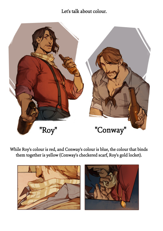


These are the colour thumbnails I made for bite of winter. It's incredibly rough, but at a glance you can tell the comic doesn't have any particular page that is jarring or pulls you out of it.
As one more note: I'd advise doing all thumbnailing/colour-blocking at a much smaller size than the actual page is going to be. It keeps you from obsessing over fine details, and encourages you to just block in shapes and colours really quickly.
--
that's all from me for now. I hope this helped, and I wish you luck on your project. Pace yourself! Comics are more work than people ever say they are, and it's good to just take your time and enjoy the process.
368 notes
·
View notes
Text
Spoilery thoughts on Batman #148:
This story was pretty clearly drafted to be a 5 or 6 issue story, probably originally resolving in #150 as bringing the family together is a nice round number issue sort of event. My best guess is that the Nakano and Vandal Savage plot and some more of the back ups around the captured villains got cut to the bone to speed things up after Zdarsky was told #150 was needed for Absolute Power (and #149 is apparently doing the epilogue to set up for whatever goes on in Absolute Power). There’s a couple of really clear “and we just skipped 3-4 pages” sort of moments in the shape of the script for this issue (and in hindsight in #147) that if it had been allowed even an extra issue the story would have more space to breathe.
And despite that revised pagecount, Zdarsky still manages to deliver the moments he wanted to bring for Dick, Babs, Jason, Tim and Damian, so I’m impressed by that. Cass unfortunately did get relegated, but if I’m being objective about this, DC’s still waffling over whether Current Cass is adopted or not, and Zdarsky was already juggling a big list of characters (plus part of the point of having a big cast is that you don’t HAVE to focus on all the cast).
I did like how much space Zdarsky still found for the Damian-Tim-ZEA Robin plot. That did NOT resolve the way I predicted from the costume’s first hints in the background (I was totally on team ‘Tim puts on the costume sacrificially to try to get through to ZEA Bruce thinking he can handle this, and gets brainwashed’), but it was satisfying in terms of acknowledging Tim and Damian’s relationship (it was giving me Gates of Gotham vibes, which are the best Tim and Damian working together vibes), there was more discussion of the different elements both bring to the role of Robin and what’s good and bad about each, and how ZEA Robin doesn’t understand what makes you Robin. It was a pretty balanced fight scene. Tim gives Damian an assist, Damian gives Tim an assist, Tim’s a bit too overconfident and pays for it, Damian was a bit petulant about having to sit part of it out (though being tied up is like, PURE Robin aesthetic).
As far as the costumes go for the Robins Fight scene: honestly, switching Tim into a darker costume that was black and green with red accents complemented Damian’s black and grey with red accents aesthetic well, and contrasted with the ZEA costume being so bright red and yellow (which is playing off the original red, yellow and purple ZEA suit). Jimenez also gave everyone a different mask shape, which also helped distinguish everyone when you have three ‘Robins’ appearing in the same fight. All the Bat redesigns at the moment are leaning into darker palettes, and I appreciated the choice to go back to green as Tim’s ‘colour’, rather than red, given: his pre-2006 history used to use green quite often as his distinguishing colour; he can share it with Babs (team green for the computer nerds!); it’s not a colour they’ve particularly focused on for Damian for ages; and it gets him out from under having to share colour palette with Jason, given Jason can’t keep a costume consistent for a year.
It’s fine. It’s not my favourite Robin design I’ve ever seen, it’s not the worst Robin design I’ve ever seen (even on Tim), and it made the fight a lot clearer to follow.
I really liked that Barbara’s contribution was Oracle based and it made her inclusion make sense. I cackled at Dick getting to punch Daniel Captio (I was having serious echoes of the Cave argument in Bruce Wayne: Murderer/Fugitive, and from Tim’s delighted face for that punch I think Tim was too).

In terms of Jason, having him volunteer to take on the Lazarus-linked part of the plot and tell Bruce “let us have control of our own decisions” IS the resolution and apology for the mind alteration plot (which I am still pretty sure was a Rosenberg driven decision, not a Zdarsky one, in Gotham War), and look. That’s the sort of resolution you get a lot for comics plots. They’re cool. It was never going to end up as a big song and dance.
I like that the resolution pulled everything back to Failsafe. Good way to round off 2 years on the title. Nice extended story arc, with shout outs all the way back to #125.
I did have to laugh at Nakano calling Cass, Steph and Duke ‘child soldiers’ though. Those are all actual adults, sir! Even Duke’s supposed to be 18+ now.
45 notes
·
View notes
Last Seen Blogs
moleskincontents
Gelo Medina

destiny-rahl
target attention grabbing
theocarme
Théo Carme

nick-vuepeer
Vuepeer

plumrose4
PlumRose