#BI dashboard tools
Explore tagged Tumblr posts
Visit Tumblr Blog
Explore Tumblr blogs with no restrictions, modern design and the best experience.
Last Seen Tumblr Blogs


Fun Fact
Users from the US are the majority of Tumblr visitors.
Text
Don’t Implement a BI Dashboard Tool Without Understanding These Key Performance Metrics
With 74% of companies planning to increase their investment in data analytics, the urgency to adopt BI dashboard tools is more pronounced than ever. Yet, success hinges not on the speed of adoption but on the precision with which these tools are utilized.

Our goal is to ensure that your BI tool isn’t just another software subscription, but a transformative force within your organization. Let’s delve into the metrics that matter — the ones that will define the success of your BI initiatives and, ultimately, your business’s competitive edge in the marketplace.
Critical Metrics for Evaluating BI Dashboard Tools Before Implementation
Implementing a BI dashboard tool involves more than just setting it up; it requires an understanding of the specific metrics that can determine its success or failure. This deeper dive into the critical metrics incorporates advanced technicalities and BI-specific information to ensure that your BI dashboard software not only functions efficiently but also aligns perfectly with your strategic objectives.
1. User Engagement Metrics
Understanding user engagement with your BI dashboard tool is very important. Metrics such as active users, session duration, and frequency of use provide insights into how integral the tool is becoming in the daily workflow of your team. For instance, a high number of active users and extended session durations typically indicate that the dashboard is delivering value, prompting users to rely on it regularly. These metrics help you gauge the dashboard’s usability and intuitiveness — key factors in sustained adoption.
To gauge the effectiveness of your BI dashboard tool, detailed user engagement metrics need to be considered:
Active Users: This metric tracks the number of distinct users who interact with the dashboard within a given timeframe. High activity levels are indicative of a tool that’s considered essential by its users.
Session Duration: Measures the average time users spend on the dashboard per session. Longer durations often imply that users find the dashboard useful for their analytical needs.
User Interaction Events: Advanced tracking of interactions, such as a number of reports generated, filters used, or custom views saved, can indicate how deeply users are engaging with the tool.
These metrics help identify not only the usability of the BI dashboard but also its integration into regular decision-making processes.
2. Data Quality Metrics
The adage ‘garbage in, garbage out’ holds particularly true for any BI dashboard software. Data quality metrics are crucial as they directly influence the reliability of the insights generated. Key metrics include:
Accuracy: Are the data points correct and reflective of reality?
Completeness: Does the data fully capture the required information without gaps?
Timeliness: Is the data updated frequently enough to support real-time decision-making?
Regular audits and feedback loops can help maintain high data quality, ensuring that your BI dashboard solutions are based on the most reliable and up-to-date information.
You can ensure the integrity of your BI systems, where decision-making depends on the integrity of the data presented, in the following manner:
Accuracy: Implement data validation rules and anomaly detection algorithms to ensure that the data reflects true and verified information.
Completeness: Use completeness checks to verify that all expected data fields are populated and that missing data notifications are configured to alert users when data gaps are detected.
Timeliness: Establish benchmarks for data freshness and set up real-time monitoring to ensure data is updated as frequently as business needs dictate.
3. Performance Efficiency Metrics
The technical performance of your BI dashboard tools can significantly affect user satisfaction and overall productivity. Important metrics to track include:
Load Time: How quickly does the dashboard populate data upon request?
Real-Time Processing: Can the tool effectively handle streaming data to deliver up-to-date insights?
These metrics are critical for businesses that rely on timely data to make quick decisions. You can ensure a BI tool’s performance parity in the following ways-
Load Time: Monitor backend performance to ensure data queries and visualizations load within acceptable time frames. Optimization may involve enhancing the data architecture or streamlining the data retrieval processes.
Real-Time Processing: Employ streaming data technologies and in-memory analytics to facilitate real-time data processing, crucial for dynamic and fast-paced business environments.
If a BI tool lags or fails to update promptly, it could lead to missed opportunities or flawed decision-making based on outdated information.
4. Adoption Rate Metrics
Lastly, measuring the adoption rate of your BI dashboard tool provides insight into its overall success across the organization. This metric assesses how quickly and broadly the tool is being used after its introduction. A slow adoption rate could signal issues with user training, dashboard complexity, or a mismatch between the tool’s capabilities and the users’ needs. Strategies to enhance adoption include comprehensive training sessions, regular updates based on user feedback, and executive endorsement to encourage utilization across all levels of the company.
Understanding the adoption rate involves several layers of analysis:
Initial Uptake: Measure how many users start using the tool within the first weeks of launch. Low uptake might indicate the need for more user training or adjustments to the dashboard’s interface.
Continued Usage: Track how usage trends develop over time. Are users continually engaging with the tool, or do they drop off after the initial phase?
Departmental Penetration: Analyze adoption across different departments to identify which teams are leveraging the BI tool most effectively and which may require additional support.
These metrics not only assess how quickly and extensively the BI dashboard tool is adopted but also highlight areas where further intervention may be required to increase its effectiveness across the organization.
Conclusion
As we’ve detailed, the careful evaluation of key performance metrics before deploying a BI dashboard tool is not just a step — it’s a strategic necessity. These metrics provide a compass that guides your BI initiative, ensuring it not only launches successfully but continues to deliver value long into the future. They empower your organization to leverage data with confidence, making informed decisions that propel your business forward.
At Grow, we understand the importance of this foundational step and support our clients through every stage of their BI journey. We encourage you to explore how our BI dashboard solutions can transform your data into actionable insights with precision and ease. Experience the full capability of our platform with a 14-day free trial and see how other businesses are achieving remarkable success with Grow by checking out Grow Reviews 2024.
Don’t let the potential of your data be hindered by unoptimized tools. Choose a BI solution that grows with you. Explore Grow today and step confidently into a data-driven future.
Original Source: https://bit.ly/3yNDzbZ
0 notes
Text
Top 5 Benefits of Low-Code/No-Code BI Solutions
Low-code/no-code Business Intelligence (BI) solutions offer a paradigm shift in analytics, providing organizations with five key benefits. Firstly, rapid development and deployment empower businesses to swiftly adapt to changing needs. Secondly, these solutions enhance collaboration by enabling non-technical users to contribute to BI processes. Thirdly, cost-effectiveness arises from reduced reliance on IT resources and streamlined development cycles. Fourthly, accessibility improves as these platforms democratize data insights, making BI available to a broader audience. Lastly, agility is heightened, allowing organizations to respond promptly to market dynamics. Low-code/no-code BI solutions thus deliver efficiency, collaboration, cost savings, accessibility, and agility in the analytics landscape.
#newfangled#polusai#etl#nlp#data democratization#business data#big data#ai to generate dashboard#business dashboard#bi report#generativeai#business intelligence tool#artificialintelligence#machine learning#no code#data analytics#data visualization#zero coding
3 notes
·
View notes
Text
How does data analytics help manufacturers optimize production lines?
Data analytics helps manufacturers optimize production lines by identifying inefficiencies, tracking equipment performance, and forecasting maintenance needs. With a product analytics dashboard, manufacturers can monitor real-time metrics, reduce downtime, and improve overall productivity while minimizing costs. Visit our website to know more my clicking here.
#business solutions#business intelligence#businessintelligence#data#businessefficiency#bisolution#bi tool#bicxo#business intelligence software#data warehouse#product analytics dashboard#manufacturing
0 notes
Text
From Data to Decisions: Empowering Teams with Databricks AI/BI
🚀 Unlock the Power of Data with Databricks AI/BI! 🚀 Imagine a world where your entire team can access data insights in real-time, without needing to be data experts. Databricks AI/BI is making this possible with powerful features like conversational AI
In today’s business world, data is abundant—coming from sources like customer interactions, sales metrics, and supply chain information. Yet many organizations still struggle to transform this data into actionable insights. Teams often face siloed systems, complex analytics processes, and delays that hinder timely, data-driven decisions. Databricks AI/BI was designed with these challenges in…
#AI/BI#artificial intelligence#BI tools#Business Intelligence#Conversational AI#Data Analytics#data democratization#Data Governance#Data Insights#Data Integration#Data Visualization#data-driven decisions#Databricks#finance#Genie AI assistant#healthcare#logistics#low-code dashboards#predictive analytics#self-service analytics
0 notes
Text
youtube
Unlock the power of Business Intelligence (BI) and elevate your business to new heights! In this video, we break down the fundamentals of BI, showing you how data-driven decisions can transform your company. Learn about the core components of BI, including Data Collection, Integration, Analysis, and Visualization, and discover why BI is essential for making informed decisions. Key Takeaways: Understand the basics of Business Intelligence Learn the key steps involved in BI Discover the benefits of BI for your business See real-world examples of BI in action Whether you're new to BI or looking to deepen your understanding, this video is for you. Don't forget to like, comment, and subscribe for more insights on how to leverage BI for your business growth! Helpful Resources: Explore our blog for more in-depth articles: https://vuelitics.com/blog
Connect With Us:
Facebook: https://www.facebook.com/profile.php?id=61560856345182&sk=about_details Instagram:https://www.instagram.com/vuelitics_velan/ Twitter:https://x.com/vuelitics Linkedin: https://www.linkedin.com/company/vuelitics/ Youtube: https://www.youtube.com/@Vuelitics Website: https://vuelitics.com/
#Business Intelligence#Data Analytics#BI#Informed Decisions#Business Growth#Data Driven#Business Insights#Data Strategy#BI Tools#Data Integration#what is business intelligence#what is bi?#power bi dashboard#business intelligence introduction#business intelligence and analytics#what is business intelligence and analytics#what is business intelligence tools#what is business intelligence explain in brief#what is business intelligence (bi)#BI Systems#Youtube
0 notes
Text
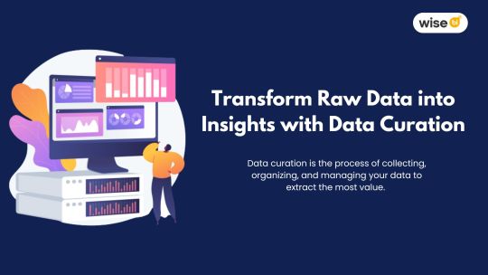
Data curation is the process of organizing, cleaning, and enriching data to make it more usable for analysis. Data curation services help businesses extract value from their data and make wise data-driven decisions.
1 note
·
View note
Text
Omri Kohl, CEO & Co-Founder of Pyramid Analytics – Interview Series
New Post has been published on https://thedigitalinsider.com/omri-kohl-ceo-co-founder-of-pyramid-analytics-interview-series/
Omri Kohl, CEO & Co-Founder of Pyramid Analytics – Interview Series
Omri Kohl is the CEO and co-founder of Pyramid Analytics. The Pyramid Decision Intelligence Platform delivers data-driven insights for anyone to make faster, more intelligent decisions. He leads the company’s strategy and operations through a fast-growing data and analytics market. Kohl brings a deep understanding of analytics and AI technologies, valuable management experience, and a natural ability to challenge conventional thinking. Kohl is a highly experienced entrepreneur with a proven track record in developing and managing fast-growth companies. He studied economics, finance, and business management at Bar-Ilan University and has an MBA in International Business Management from New York University, Leonard N. Stern School of Business.
Could you start by explaining what GenBI is, and how it integrates Generative AI with business intelligence to enhance decision-making processes?
GenBI is the framework and mechanics to bring the power of GenAI, LLMs and general AI into analytics, business intelligence and decision making.
Right now, it’s not practical to use GenAI alone to access insights to datasets. It could take over a week to upload enough data to your GenAI tool to get meaningful results. That’s simply not workable, as business data is too dynamic and too sensitive to use in this way. With GenBI, anyone can extract valuable insights from their data, just by asking a question in natural language and seeing the results in the form of a BI dashboard. It takes as little as 30 seconds to receive a relevant, useful answer.
What are the key technological innovations behind GenBI that allow it to understand and execute complex business intelligence tasks through natural language?
Well, without giving away all our secrets, there are essentially three components. First, GenBI prompts LLMs with all the elements they need to produce the correct analytical steps that will produce the requested insight. This is what allows the user to form queries using natural language and even in vague terms, without knowing exactly what type of chart, investigation, or format to request.
Next, the Pyramid Analytics GenBI solution applies these steps to your company’s data, regardless of the specifics of your situation. We’re talking the most basic datasets and simple queries, all the way up to the most sophisticated use cases and complex databases.
Third, Pyramid can carry out these queries on the underlying data and manipulate the results on the fly. An LLM alone can’t produce deep analysis on a database. You need a robot element to find all the necessary information, interpret the user request to produce insights, and pass it on to the BI platform to articulate the results either in plain language or as a dynamic visualization that can later be refined through follow-up queries.
How does GenBI democratize data analytics, particularly for non-technical users?
Quite simply, GenBI allows anyone to tap into the insights they need, regardless of their level of expertise. Traditional BI tools require the user to know which is the best data manipulation technique to receive the necessary results. But most people don’t think in pie charts, scatter charts or tables. They don’t want to have to work out which visualization is the most effective for their situation – they just want answers to their questions.
GenBI delivers these answers to anyone, regardless of their expertise. The user doesn’t need to know all the professional terms or work out if a scattergraph or a pie chart is the best option, and they don’t need to know how to code database queries. They can explore data by using their own words in a natural conversation.
We think of it as the difference between using a paper map to plan your route, and using Google Maps or other navigational app. With a traditional map, you have to work out the best roads to take, think about potential traffic jams, and compare different route possibilities. Today, people just put their destination into the app and hit the road – there’s so much trust in the algorithms that no one questions the suggested route. We’d like to think that GenBI is bringing the same kind of automated magic to corporate datasets.
What has been the feedback from early adopters about the ease of use and learning curve?
We’ve been receiving overwhelmingly positive feedback. The best way we can sum it up is, “Wow!” Users and testers highly appreciate Pyramid’s ease of use, powerful features, and meaningful insights.
Pyramid Analytics has virtually zero learning curve, so there’s nothing holding people back from adopting it on the spot. Approximately three-quarters of all the business teams who’ve tested our solution have adopted it and use it today, because it’s so easy and effective.
Can you share how GenBI has transformed decision-making processes within organizations that have implemented it? Any specific case studies or examples?
Although we’ve been developing it for a long time, we only rolled out GenBI a few weeks ago, so I’m sure you’ll understand that we don’t yet have fully-fledged case studies that we can share, or customer examples that we can name. However, I can tell you that organizations that have thousands of users are suddenly becoming truly data-driven, because everyone can access insights. Users can now unlock the true value of all their data.
GenBI is having a transformative effect on industries like insurance, banking, and finance, as well as retail, manufacturing, and many other verticals. Suddenly, it’s possible for financial advisors, for example, to tap into instant suggestions about the best way to optimize a customer’s portfolio.
What are some of the biggest challenges you faced in developing GenBI, and how did you overcome them?
Pyramid Analytics was already leveraging AI for analytics for many years before we launched the new solution, so most challenges have been ironed out long ago.
The main new element is the addition of a sophisticated query generation technology that works with any LLM to produce accurate results, while keeping data private. We’ve accomplished this by decoupling the data from the query (more on this in a moment).
Another big challenge we had to deal with was that of speed. We’re talking about the Google era, where people expect answers now, not in an hour or even half an hour. We made sure to speed up processing and optimize all workflows to reduce friction.
Then there’s the need to prevent hallucination. Chatbots are prone to hallucinations which skew results and undermine reliability. We’ve worked hard to avoid those while still maintaining dynamic results.
How do you handle issues related to data security and privacy?
That’s a great question, because data privacy and security is the biggest obstacle to successful GenAI analytics. Everyone is – quite rightly – concerned about the idea of exposing highly sensitive corporate data to third-party AI engines, but they also want the language interpretation capabilities and data insights that these engines can deliver.
That’s why we never share actual data with the LLMs we work with. Pyramid flips the entire premise on its head by serving as an intermediary between your company’s information and the LLM. We allow you to submit the request, and then we hand it to the LLM along with descriptions of what we call the “ingredients,” basically just the metadata.
The LLM then returns a “recipe,” which explains how to turn the user’s question into a data analytics prompt. Then Pyramid runs that recipe on the data that you’ve already connected securely on your self-hosted install, so that no data ever reaches the LLM. We mash up the results to serve them back to you in an easily understandable, visual format. Essentially, nothing that could compromise your security and privacy gets exposed or leaves the safety of your organization’s firewall.
For organizations looking to integrate GenBI into their existing data infrastructures, what does the implementation process look like? Are there any prerequisites or preparations needed?
The implementation process for Pyramid Analytics couldn’t be easier or faster. Users need very few prerequisites and preparations, and you can get the whole thing up and running in under an hour. You don’t need to move data into a new framework or change anything about your data strategy, because Pyramid queries your data directly where it resides.
There’s also no need to explain your data to the solution, or to define columns. It’s as simple as uploading a CSV dataset or connecting your SQL database. The same goes for any relational database of any sort. It takes only a few minutes to connect your data, and then you can ask your first question seconds later.
That said, you can tweak the structure if you want, like changing the joining model or redefining columns. It does take some time and effort, but we’re talking minutes, not a months-long dev project. Our customers are often shocked that Pyramid is up and running on their classic data warehouse or data lake within five minutes or so.
You also don’t need to come up with very specific, accurate, or even intelligent questions to get powerful results. You can make spelling mistakes and use incorrect phrasing, and Pyramid will unravel them and produce a meaningful and valuable answer. What you do need is some knowledge about the data you’re asking about.
Looking ahead, what’s your strategic vision for Pyramid Analytics over the next five years? How do you see your solutions evolving to meet changing market demands?
The next big frontier is supporting scalable, highly specific queries. Users are eager to be able to ask very precise questions, such as questions about personalized entities, and LLMs can’t yet produce intelligent answers in these cases, because they don’t have that kind of detailed insight into the specifics of your database.
We’re facing the challenge of how to use language models to ask about the specifics of your data without instantly connecting your entire, gigantic data lake to the LLM. How do you finetune your LLM about data that gets rehydrated every two seconds? We can manage this for fixed points like countries, locations, and even dates, but not for something idiosyncratic like names, even though we are very close to it today.
Another challenge is for users to be able to ask their own mathematical interpretations of the data, applying their own formulae. It’s difficult not because the formula is hard to enact, but because understanding what the user wants and getting the correct syntax is challenging. We’re working on solving both these challenges, and when we do, we’ll have passed the next eureka point.
Thank you for the great interview, readers who wish to learn more should visit Pyramid Analytics.
#ai#AI engines#Algorithms#Analysis#Analytics#app#banking#bi#bi tools#Business#Business Intelligence#business management#CEO#challenge#change#chart#charts#chatbots#code#columns#Companies#compromise#dashboard#data#data analytics#data lake#data privacy#data privacy and security#data security#data strategy
1 note
·
View note
Text
Mastering Efficiency: Retail Inventory Management Solutions
Business intelligence (BI) in the retail industry delivers comprehensive data on contact between customers and eCommerce stores. This data can allow merchants to make better business decisions. It can also assist brick-and-mortar stores in understanding client behavior, making merchandise adjustments, and altering prices accordingly. Business intelligence helps merchants be prepared for pricing, stock availability, trends, shipping, and more.

Optimize your retail operations with precision. Explore our advanced inventory management solutions for seamless efficiency and improved profitability.
#Benefits of BI in Retail#Best BI software for Retail Industry#BI for retail industry#BI in Retail Industry#BI solutions for retail#Business analytics in retail industry#Business Intelligence in Retail Industry#Business Intelligence Tools for Retail#Customer Behavior Analysis#Retail Inventory Management#Omnichannel Retail Analytics#Predictive Analytics for Retail#Retail Analytics Solutions#Retail Business Intelligence#Retail Competitive Intelligence#Retail Data Analysis#Retail Dashboard Solutions#Retail Intelligence Software#Retail Performance Metrics#Retail Sales Forecasting#Retail Marketing Analytics#Supply Chain Analytics for Retail
1 note
·
View note
Text
Exploring the benefits of Power BI software: Everything you need to know
Power BI is a business analytics service by Microsoft. It provides interactive visualizations and business intelligence capabilities with an interface simple enough for end users to create their own reports and dashboards.
Here are some key benefits of using Power BI:
Data Visualization: It allows users to create compelling, interactive, and visually appealing reports and dashboards. It supports a variety of data visualizations, including charts, graphs, maps, and tables, making it easier to interpret and analyze data.
Ease of Use: It has a user-friendly interface that allows both technical and non-technical users to create reports and dashboards. The drag-and-drop functionality simplifies the process of building visualizations, making it accessible to a broader audience.
Data Connectivity: It can connect to a wide range of data sources, including Excel spreadsheets, cloud-based and on-premises data sources, databases, and online services. This flexibility allows users to consolidate and analyze data from various sources in one central location.
Real-Time Analytics: It can be configured to work with real-time data streams, enabling users to monitor and analyze data as it is generated. This is particularly useful for businesses that require up-to-the-minute insights to make informed decisions.
Integration with Microsoft Products: It integrates seamlessly with other Microsoft products and services, such as Excel, Azure, and SQL Server. This integration enhances collaboration and streamlines workflows for organizations already using Microsoft's ecosystem.
Mobile Access: It offers mobile apps for iOS and Android devices, allowing users to access reports and dashboards on the go. This ensures that decision-makers have access to critical business insights regardless of their location.
Natural Language Processing (Q&A): Power BI incorporates natural language processing capabilities, enabling users to ask questions about their data in plain language. The system then generates visualizations based on the query, making data exploration more intuitive.
Security and Governance: It provides robust security features, allowing administrators to control access to reports and dashboards. It also supports row-level security, ensuring that users only see the data relevant to their roles.
Scalability: It can scale to meet the needs of both small businesses and large enterprises. It can handle large volumes of data and accommodate increased user loads as organizations grow.
Cost-Effective: It offers various pricing plans, including a free version with limited features. This makes it accessible to small businesses and individuals while providing the option to scale up as needed.
Get acquainted with Power BI in our blog.
#company development software#development company software#software company#power bi#power bi services#power bi dashboard#power bi tool#microsoft bi#software businesses#nitorinfotech
0 notes
Text
Tools For Business Analytics Vs. MS Excel: A Comparison
Business analytics tools have revolutionized the way businesses make decisions. With the explosion of data in recent years, whether you're a small, medium, or large enterprise, you'll require sophisticated tools to analyze large datasets and gain insights into their operations. While Microsoft Excel has been a popular tool for business analytics for decades, it has limitations.
This blog will explore the limitations of using MS Excel for business analytics and compare popular tools for business analytics that can enhance data processing, visualization, and scalability.
MS Excel & Its Limitations for Business Analytics
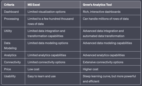
You have probably used Microsoft Excel at some point, regardless of whether you are an expert in data analysis or dealing with data. Excel, launched in 1985 as part of Office 365, is a widely used spreadsheet program. The program takes the shape of a spreadsheet, with data organized into rows and columns and the capability to rapidly and easily apply computations and mathematical formulas. Additionally, it is utilized to transform data sets into visual information.
Excel is an excellent tool for basic data manipulation and visualization, but it falls short when it comes to handling large datasets. Excel can struggle to hold more than a few hundred thousand rows of data, and processing time can be prohibitively slow for complex calculations. Furthermore, manual data manipulation leaves Excel prone to human errors that can lead to inaccurate analysis.
Popular Tools For Data Analysis
Tableau
Tableau is a powerful data visualization tool that supports users with the ability to analyze and communicate their data meaningfully. With its intuitive drag-and-drop interface, Tableau allows users to quickly and easily create interactive dashboards, reports, and visualizations that enable them to identify insights and make informed decisions. Its USP lies in its ability to connect to multiple data sources, including spreadsheets, databases, and cloud services, allowing for seamless data integration from different sources. Tableau's robust data modeling capabilities, combined with its advanced analytics and data visualization features, make it a popular choice for businesses of all sizes.
Power BI
Power BI is a cloud-based business analytics service that provides users with a wide range of tools for data analysis and visualization. Its USP lies in its ability to connect to hundreds of data sources, including spreadsheets, databases, and cloud services, allowing businesses to integrate and analyze their data efficiently. With Power BI, users can create interactive dashboards, reports, and visualizations to identify insights and make informed decisions. Its advanced analytics and data modeling capabilities and its easy-to-use interface make it a popular choice for businesses looking for an all-in-one solution for their business analytics needs.
Google Analytics
Google Analytics is a web analytics service that gives businesses insights into website traffic and user behavior. Its USP lies in its ability to provide detailed information on how users interact with a website, including page views, bounce rates, and conversion rates. With Google Analytics, businesses can gain valuable insights into their online presence and make informed decisions about their digital marketing strategies. Its easy-to-use interface and powerful reporting capabilities make it a preferred choice for businesses of all sizes.
Grow’s BI Tool
Grow is a robust BI dashboard toolthat offers businesses a comprehensive real-time view of their data. Its USP lies in its ability to consolidate data from multiple sources, including spreadsheets, databases, and cloud services, into a single dashboard that can be accessed from anywhere. With Grow, users can create custom dashboards and reports to track KPIs, identify trends, and make data-driven decisions. Its intuitive interface and easy-to-use features make it a popular choice for businesses looking for a powerful BI dashboard tool that can be easily integrated into their existing workflows.
Why Does Grow Stand Out and Outperform Excel and Others?
While all of the above tools - Tableau, Power BI, Google Analytics, and Grow - offer unique and valuable features for business analytics, Grow stands out as the ultimate winner due to its comprehensive features, usability, and pricing.
Compared to MS Excel, Grow business intelligence tools provide firms with a scalable and efficient solution for handling large datasets and complex calculations. It offers an all-in-one platform for consolidating data from multiple sources and creating custom dashboards and reports that provide real-time insights into business performance.
Compared with other business analytics tools, Grow's BI dashboard tool outperforms its competitors with its intuitive interface, ease of use, and seamless integration with different data sources. It offers robust data modeling and analytics capabilities and powerful visualization features that enable businesses to identify insights and make informed decisions. Additionally, Grow offers a cost-effective solution, making it an attractive choice for businesses of all sizes.
The Ultimate Comparison of Grow's BI and MS Excel
When it comes to handling large datasets, Grow's BI outperforms Excel. With the ability to handle millions of rows of data and an automated data transformation process, Grow's BI dashboard tool makes data analysis faster and more accurate. Its interactive data visualization capabilities also provide insights that are difficult to see with Excel's traditional charts and graphs.
Choosing the Right Tool for Your Business Needs
Selecting the right tool for business analytics depends on various factors, including business requirements, constraints, cost, and technical support. Evaluating each tool's features and advantages and comparing them to your business needs is essential before deciding. For example, while Power BI offers advanced data integration capabilities, there may be better tools for businesses with limited budgets. In this case, Grow comes out better than other tools in the market.
Conclusion
Do you need help with large datasets and complex calculations using MS Excel for your business analytics? Look no further than Grow Analytics and its powerful Business Intelligence tools.
With Grow Analytics, you can elevate your data analysis game to the next level using its powerful dashboard, comprehensive analytics suite, and user-friendly interface. Plus, their pricing is competitive and transparent, so you'll never have to worry about hidden costs or surprises.
But that's not all - with Epicor Grow, you can use a robust suite of integrated solutions designed to streamline your business operations and improve your bottom line. Grow BI offers many features, including advanced analytics, real-time data tracking, and customizable dashboards.
To truly understand what is Business Intelligence and why is it so important, head over to our informative blog and discover your reasons to use Grow Business intelligence.
Don't settle for subpar tools for business analytics using MS Excel - take your business to the next level with Epicor Grow. Join the ranks of satisfied Grow Analytics users after reading Grow Reviews 2023 and experience the power of business intelligence for yourself. Sign up today and see why businesses worldwide trust Grow to help them drive wins and expansion.
#Tools for business analytics#Business analytics tools#Bi dashboard tool#Business Intelligence tools
0 notes
Text
Integrating Geographic Data with BI Dashboards for Strategic Insights
The Importance of Geographic Insights in Business Intelligence
1. Enhancing Market Understanding
Geographic data allows companies to visualize market trends and consumer behavior across different regions. Using the best BI dashboard tool, businesses can segment data by location to identify which areas are underperforming or outperforming. For instance, a retail chain could use geographic insights to see that while their urban stores are performing well, rural areas are lagging, prompting targeted marketing campaigns or adjusted inventory levels.
According to a report by Mordor Intelligence, the location analytics market size is expected to reach USD 22.8 billion by 2026, growing at a CAGR of 13.2% from 2021 to 2026, stating the increasing reliance on geographic data in strategic planning.
2. Optimizing Resource Distribution
Effective resource distribution is crucial for maximizing ROI, and here geographic insights integrated into BI (Business Intelligence) software prove invaluable. Logistics companies, for example, can analyze route efficiencies and distribution centers’ locations to minimize delivery times and reduce costs. A study by Esri reveals that companies implementing geographic information systems (GIS) can see a 5–25% improvement in operational efficiency.
3. Tailoring Products and Services

4. Risk Management
Geographic data is critical in assessing and mitigating risks, particularly in industries like insurance and real estate. The best BI dashboard tool can overlay environmental data, such as flood plains or earthquake zones, with business locations to assess risk levels. Insurers can set premiums more accurately and property developers can make informed decisions about where to build or invest.
5. Competitive Analysis
By using geographic insights, businesses can also monitor competitors’ activities across different regions. BI (Business Intelligence) software can help identify areas with high competitor saturation, areas underserved by the industry, and potential for expansion. This strategic use of geographic data helps companies stay one step ahead in a competitive market.
6. Regulatory Compliance
For businesses operating in multiple regions, compliance with local laws and regulations is simplified through geographic insights. The best BI dashboard tools can help track and manage region-specific compliance requirements, reducing the risk of penalties and legal issues. For example, a multinational corporation could use BI tools to monitor environmental compliance across different countries.
Step-by-Step Guide to Setting Up Geographic Dashboards
Creating a geographic dashboard using a BI dashboard tool is a strategic approach to visualizing and analyzing data that is location-specific, offering profound insights into various aspects of business operations from sales to distribution.
Step 1: Define Your Geographic Data Objectives
When embarking on the journey of integrating a geographic dashboard within your business intelligence framework, setting clear, actionable objectives is paramount. This foundational step is not just about harnessing data; it’s about strategically aligning it with your core business aspirations, ensuring that every insight extracted is of intrinsic value.
Determining your company’s use of geographic intelligence is the first step in implementing the best BI dashboard tool. Does it pertain to optimizing logistics, enhancing customer service, or identifying new market opportunities? Your objectives should mirror the complex tapestry of business needs, woven with precise, location-based threads of data.
Market Penetration: For businesses looking to expand, geographic data can delineate regions of high customer density or areas underserved by competitors. A study by Forbes highlights that companies using spatial data for market analysis see a 15–20% increase in market reach.
Resource Allocation: Whether it’s deploying field personnel or positioning inventory, geographic objectives can drastically streamline operations. Utilizing a BI (Business Intelligence) software that incorporates real-time geographic data ensures resources are always optimally aligned with demand.
Risk Mitigation: In industries like insurance or real estate, geographic data can forecast potential risk areas for natural disasters, aiding in crafting preemptive strategies. Incorporating this into the best business intelligence dashboards allows for a dynamic risk assessment model that adapts to new data seamlessly.

With a clear understanding of the types of insights geographic data can provide, the next step is crafting specific, measurable objectives that resonate with your strategic goals. This is where the granularity of a BI dashboard tool becomes invaluable. Consider the following approaches:
Quantitative Objectives: These might include specific metrics like reducing delivery times by 10% in key regions or increasing market share by 5% in new geographic markets by using insights derived from the best BI dashboard tool.
Qualitative Objectives: These could focus on improving customer satisfaction scores in specific areas or enhancing brand visibility in untapped markets. Even though these are less about numbers, the right BI (Business Intelligence) software can track and analyze sentiment and visibility through geographic tagging and data analysis.
Timeline-Based Objectives: Set deadlines for achieving geographic insights milestones. For instance, understanding market dynamics within a new region within six months post-launch of a new product.
Determine the granularity of geographic information required to support your objectives. This involves deciding whether data should be analyzed by zip code, city, state, or region. The level of detail will affect both the type of data you collect and the insights you can extract. More granular data provides deeper insights but may require more sophisticated tools and analysis techniques.
Step 2: Collect and Prepare Your Geographic Data
Collecting geographic data involves tapping into a diverse array of sources, each offering unique perspectives and insights. The aim here is not just to gather data, but to capture a comprehensive geographical narrative that enhances decision-making.
Satellite Imagery and Aerial Photography: These provide a bird’s-eye view of large geographic areas, offering updates on land use changes, urban development, and environmental shifts.
Sensors and IoT Devices: Deployed across various locations, these devices provide real-time data on traffic patterns, weather conditions, and more, feeding into the best BI dashboard tools for immediate analysis.
Public and Commercial Databases: From government land records to commercial location databases, these sources are foundational for demographic and economic analysis.
User-Generated Content: Social media and mobile apps offer crowdsourced geographic data that can reflect real-time events, trends, and movements.
A report by MarketsandMarkets estimated that the geospatial analytics market would grow to $96.34 billion by 2025, highlighting the expanding landscape of data sources crucial for geographic analyses.
Once data is collected, the preparation stage is about transforming raw data into a refined, dashboard-ready format. This involves a series of technical and analytical steps designed to ensure compatibility with BI business intelligence software.
Data Cleaning: Remove inaccuracies and inconsistencies such as duplicates, incorrect entries, and missing values.
Data Integration: Standardize data formats to ensure seamless integration into the best BI dashboard tools. This might involve converting data into common geographic data formats like Shapefiles or GeoJSON.
Geocoding: Convert addresses into geographic coordinates. This is vital for plotting data points on maps within BI tools accurately.
Data Enrichment: Augment data with additional layers of information — like adding population density or economic activity indicators to enhance the data’s analytical value.
A survey by Gartner indicated that organizations believe poor data quality to be responsible for an average of $15 million per year in losses, underscoring the importance of meticulous data preparation. To facilitate the collection and preparation of geographic data, leveraging advanced tools and technologies is non-negotiable. The best BI dashboard tool not only integrates data but also assists in its refinement and preparation.
Step 3: Set Up the Dashboard
Setting up a geographic dashboard using a BI dashboard tool involves more than just loading data; it requires a careful orchestration of design, functionality, and analytics to ensure the dashboard not only displays data but also transforms it into actionable insights. This step is important for business users, data analysts, and entrepreneurs who rely on the best business intelligence dashboards to make informed decisions. Here’s a detailed exploration of how to set up a dashboard that leverages the full capabilities of BI (Business Intelligence) software, ensuring each component is optimized for maximum impact.
Designing for Clarity and Impact
The design of your dashboard is the first thing users will notice, and it can greatly affect their ability to understand and use the geographic data effectively. The best BI dashboard tools provide robust customization options to help tailor the dashboard to specific business needs.
Layout Planning: Start with a layout that logically organizes information, grouping related data visually. A well-thought-out layout helps users intuitively navigate through data and derive insights faster.
Visualization Selection: Choose visualizations that best represent geographic data, such as heat maps for density, line maps for movements, or bubble maps for displaying data points with varying sizes. Each visualization should enhance the understanding of the dataset, revealing patterns that raw data alone cannot.
Interactivity: Incorporate interactive elements such as filters, hover-over details, and drill-down capabilities. These features allow users to engage with the data dynamically, exploring different layers of the data without overwhelming the initial view.
A survey by MicroStrategy revealed that 84% of business users say that well-implemented dashboards and BI tools increase their decision-making speed.
Integrating Data with Precision
The integration phase is critical as it involves populating the dashboard with accurate and up-to-date data. This step must be executed with precision to ensure the reliability of the insights generated.
Data Connectivity: Utilize the data connectors provided by your BI business intelligence software to link data sources directly to the dashboard. This ensures data freshness and reduces manual data handling errors.
Data Synchronization: Set up synchronization settings to refresh data at required intervals. Real-time data synchronization is crucial for applications like tracking logistics or monitoring live operational data.
Quality Checks: Implement automated checks to validate data as it enters the dashboard. This preemptive approach to data quality can mitigate issues that might distort analytical outcomes.
Customization for Deeper Insights
To truly leverage the best BI dashboard tool, customization is key. This involves tailoring the dashboard not only to the needs of the business but also to the preferences of its users.
Custom Metrics and KPIs: Define and integrate custom KPIs that are relevant to your geographic analysis. Whether it’s tracking sales performance across regions or monitoring delivery times, these KPIs should reflect the strategic goals of the business.
User-Specific Views: Create multiple dashboard views tailored to different user roles. For instance, a strategic view for executives with high-level metrics and a more detailed operational view for managers.

Testing and Feedback Loop
Before the full rollout, it’s essential to conduct thorough testing and gather user feedback. This iterative process helps refine the dashboard for optimal usability and effectiveness.
User Testing: Involve a group of end-users in the testing phase to use the dashboard in real scenarios. Their feedback can provide invaluable insights into usability issues or additional needs.
Feedback Implementation: Quickly implement changes based on user feedback to ensure the dashboard meets the practical needs of its users.
Step 4: Test and Optimize
The final and arguably most crucial step in leveraging a BI dashboard tool is the iterative process of testing and optimizing the dashboard. This phase is designed to ensure that the dashboard not only functions as intended but also aligns perfectly with the user requirements and business objectives. For business users, data analysts, and entrepreneurs, this means rigorously scrutinizing the best business intelligence dashboards to ensure they deliver actionable insights with precision and efficiency.
Rigorous Testing for Robust Performance
Testing is the first line of defense against potential inefficiencies and inaccuracies in your BI (Business Intelligence) software. This phase involves several key activities:
Functional Testing: Verify that all features of the dashboard work as expected. This includes testing data loading times, interactive elements, and visualization accuracy. Functional testing helps identify any technical glitches that could impair the user experience.
User Acceptance Testing (UAT): This is conducted with actual users to ensure the dashboard meets their needs and expectations. UAT can reveal insights into user interaction patterns and potential improvements that might not be evident to developers or analysts.
Performance Testing: Assess how well the BI dashboard tool performs under various data loads and user numbers. According to a survey by Tableau, 70% of businesses report increased user adoption after optimizing their dashboards for performance.
Optimization: Tailoring for Excellence
Following testing, optimization is essential to refine and enhance the dashboard’s functionality and user interface. This includes:
Data Refresh Optimization: Ensure that the dashboard refreshes its data efficiently without lagging, especially if it’s meant to display real-time data. Optimizing data refresh rates can significantly improve decision-making speed.
Visualization Refinement: Based on user feedback, refine the visual elements of the dashboard to ensure they are intuitive and effectively communicate the intended insights. For example, simplifying a complex map or adding explanatory tooltips can enhance user understanding and interaction.

Customization Enhancements: Tailor the dashboard further to meet specific user roles or preferences. This might involve creating personalized views or adding customizable widgets that allow users to manipulate data dynamically.
Feedback Integration: A Continuous Loop
Optimizing a BI dashboard is not a one-time task but a continuous improvement process that depends heavily on user feedback:
Iterative Feedback Collection: Establish mechanisms for ongoing feedback collection, such as regular reviews with users or automated feedback tools integrated within the dashboard.
Agile Implementation: Adopt an agile approach to quickly implement changes and enhancements based on feedback. This ensures that the dashboard evolves in line with user needs and business dynamics.
Training and Support: Continually offer training and support to users to help them make the most of the dashboard’s capabilities. According to Gartner, ongoing training can increase BI tool utilization by up to 40%.
Step 5: Training and Deployment
The culmination of developing a geographic dashboard using a BI dashboard tool is its deployment across your organization and the training of your team to leverage this powerful resource. This stage is critical not just for ensuring a smooth transition but for empowering your users to harness the full potential of the best business intelligence dashboards. The objective is to make the transition from a static data environment to a dynamic, insight-driven one that facilitates better decisions at every level of the organization.
Deployment: Seamless Integration into Daily Operations
Deployment involves more than simply making a new tool available. It’s about integrating the best BI dashboard tool into the existing technological ecosystem and workflows in a manner that is both seamless and impactful.
Staged Rollout: Rather than an all-encompassing launch, consider a staged rollout. Start with a pilot group that can provide insights into potential hiccups before a full-scale implementation.
System Integration: Ensure that the BI dashboard tool integrates smoothly with other systems and platforms in use. This may require some backend adjustments or middleware development to ensure that data flows are uninterrupted and secure.
Access Management: Set up clear protocols for access management, ensuring that every user has rights that align with their roles and responsibilities. This step is crucial to maintain data integrity and security.
Training: Cultivating Proficiency
Training is a vital component that determines how well your team can utilize the BI (Business Intelligence) software. Effective training programs are tailored to the specific needs of the users, from novices to seasoned analysts.
Role-Specific Modules: Develop training modules that are customized to the roles of the users. Sales personnel might require training on accessing and interpreting sales performance metrics, while senior management might need to understand how to view high-level strategic reports.
Interactive Learning: Utilize interactive sessions, including hands-on workshops where users can practice with real data sets. According to a LinkedIn report, employees trained with active learning techniques are 75% more likely to apply learned skills in their jobs.
Continuous Learning: Establish ongoing learning and development programs to keep up with updates to the BI software and evolving business needs. This approach helps in sustaining user engagement and software utilization.
Ensuring Successful Deployment
Deployment success is measured not just by software functionality but by its adoption across the organization and the value it adds to business operations.
Feedback Loops: Implement regular feedback loops to capture user experiences and difficulties encountered with the dashboard. This insight is invaluable for refining tool capabilities and user interfaces.
Support Systems: Set up a robust support system to assist users with technical issues and queries. Quick resolution of problems increases user satisfaction and engagement with the tool.
Impact Measurement: Establish metrics to evaluate the impact of the dashboard on business operations. This could include time saved in report generation, increased accuracy in data-driven decisions, or improved user productivity.
Conclusion
The integration of geographic data into BI dashboards represents a transformative leap forward in how businesses harness the power of spatial information to make strategic decisions. Through the detailed steps outlined — from defining objectives and collecting data to deployment and ongoing optimization — companies can uncover hidden patterns, optimize operations, and outmaneuver competition in ways previously unimagined.
As we have explored, the capabilities of the best BI dashboard tools extend far beyond mere data visualization. They empower organizations to interpret complex geographic datasets in real-time, ensuring that every decision is informed by up-to-date, accurate, and relevant information. This ability to dynamically interact with geographic data can redefine market strategies, enhance customer engagement, and streamline operations across multiple locations.
For those seeking to embark on this journey, selecting the right BI tool is crucial. Grow, with its intuitive interface and robust functionality, stands out as a leading choice for integrating geographic data into business intelligence. Grow’s platform is designed not just for data analysts but for any business user desiring to leverage deep insights to drive strategic actions.
We encourage you to explore how Grow can transform your business intelligence capabilities by signing up for a 14-day free trial. Experience firsthand how integrating geographic data with Grow’s advanced BI tools can enhance your strategic decision-making processes.
For more insights into the benefits and user experiences with Grow, consider reading through Grow.com Reviews & Product Details on G2. Here, you’ll find comprehensive reviews that underscore the effectiveness and impact of Grow’s BI solutions in various industries.
Embrace the potential of geographic data with Grow, and start making more informed, location-smart decisions today.
Original Source: https://bit.ly/3TdjxhJ
#best BI dashboard tool#BI (Business Intelligence) software#best business intelligence dashboards#best BI dashboard tools
0 notes
Text
What advantages does PolusAI provide in terms of speed and decision-making? PolusAI accelerates data analytics processes, offering nine times faster generation of dashboards and insights, enabling swift data-driven decision-making. This rapid processing allows businesses to act on insights five times faster than traditional methods, enhancing responsiveness and strategic agility. PolusAI’s homegrown NLP engine provides real-time insights, ensuring decision-makers have up-to-date information. By streamlining data analysis and reducing the time from data collection to actionable insights, PolusAI significantly improves operational efficiency and decision accuracy, helping businesses maintain a competitive edge and quickly adapt to market changes.
#newfangled#polusai#etl#nlp#data democratization#business data#big data#ai to generate dashboard#business dashboard#bi report#generativeai#business intelligence tool#artificialintelligence#machine learning#no code#data analytics#data visualization#zero coding
0 notes
Text
What benefits do AI inventory systems offer businesses?
AI inventory systems offer businesses numerous benefits. From the perspective of an enterprise resource management software organization, these systems significantly streamline operations. By leveraging an inventory analytics dashboard, companies gain real-time insights into stock levels, helping to prevent overstocking and stockouts. This not only reduces holding costs but also ensures products are always available when customers need them.
Moreover, AI can predict demand patterns, allowing businesses to optimize their inventory based on upcoming trends and historical data. This predictive capability means fewer surprises and better preparedness for market fluctuations. Additionally, AI inventory systems automate many manual processes, freeing up staff to focus on more strategic tasks, ultimately boosting overall efficiency.
In short, integrating AI into inventory management with tools like an inventory analytics dashboard enhances accuracy, saves time, and cuts costs, making it a smart move for any forward-thinking business.
Visit our website if you are interested by clicking here
#business solutions#business intelligence#business intelligence software#bi tool#bisolution#businessintelligence#bicxo#businessefficiency#data#data warehouse#procurement#inventorymanagement#inventory analytics dashboard
1 note
·
View note
Text
How the HR sector is leveraging data better using HR analytics
Advaiya's BI and analytics solutions provide HR Analytics dashboards that include reports, and analytics features. In HR analytics software, all your reports can be found in one location. All your data is consolidated, and you can access it all at once, which speeds up data collection and improves efficiency.
#BI and analytics solutions#HR analysis tools#HR analytics#HR Analytics dashboards#HR data analytics#human capital analytic#Human resource analysis tools#human resource analytics#Human resource data analytics#Human resource management#Human resources management
0 notes
Text
What EDAV does:
Connects people with data faster. It does this in a few ways. EDAV:
Hosts tools that support the analytics work of over 3,500 people.
Stores data on a common platform that is accessible to CDC's data scientists and partners.
Simplifies complex data analysis steps.
Automates repeatable tasks, such as dashboard updates, freeing up staff time and resources.
Keeps data secure. Data represent people, and the privacy of people's information is critically important to CDC. EDAV is hosted on CDC's Cloud to ensure data are shared securely and that privacy is protected.
Saves time and money. EDAV services can quickly and easily scale up to meet surges in demand for data science and engineering tools, such as during a disease outbreak. The services can also scale down quickly, saving funds when demand decreases or an outbreak ends.
Trains CDC's staff on new tools. EDAV hosts a Data Academy that offers training designed to help our workforce build their data science skills, including self-paced courses in Power BI, R, Socrata, Tableau, Databricks, Azure Data Factory, and more.
Changes how CDC works. For the first time, EDAV offers CDC's experts a common set of tools that can be used for any disease or condition. It's ready to handle "big data," can bring in entirely new sources of data like social media feeds, and enables CDC's scientists to create interactive dashboards and apply technologies like artificial intelligence for deeper analysis.
4 notes
·
View notes
Text
Best Odoo Power BI Connector In Market: Full Comparative Analysis
In today’s fast-paced business environment, having a reliable ERP system isn’t just beneficial—it's essential. Odoo has made a name for itself with its flexible and integrated approach, offering a comprehensive suite of solutions for businesses of all sizes. If you're serious about getting insights that truly matter, connecting Odoo ERP with a powerful analytics tool like Microsoft Power BI is where the magic happens. By doing this, you can pull data from different areas of Odoo and create insightful dashboards, helping you make informed, data-driven decisions.
In this post, we'll take a closer look at the Power BI connectors available from top providers—Techfinna, Webkul, Cdata, and Cybrosys. Our goal is to help you navigate these options so you can find the right fit for your needs.
Why Consider a Power BI Connector for Odoo?
You might be asking yourself, “What’s the big deal about integrating Power BI with Odoo?” That’s a totally valid question! While Odoo offers a robust platform for managing your business, when it comes to advanced reporting and analytics, Power BI really stands out. Connecting these two tools can transform the way you analyze data.
Here’s why you should think about this integration:
Create Dynamic Dashboards: Imagine having real-time insights at your fingertips. Dynamic dashboards help you visualize your business data like never before.
Tailor Your Visuals: Every business has unique needs. With Power BI, you can customize your data visuals to tell the story that's most important for you and your team.
Dive Deep into Data Patterns: Tackling complex data can be daunting, but this integration allows you to uncover patterns that help drive strategic decisions.

In comparison, other providers like Webkul, CData, and Cybrosys offer decent solutions but lack the direct connectivity and easy integration that Techfinna provides. Techfinna is the best Odoo Power BI Connector due to its unique direct connection capability, allowing for flawless integration with Odoo and real-time data synchronization.
Conclusion
The Techfinna Power BI Connector is the top choice for businesses looking to enhance their analytics and reporting capabilities. Its direct connection capability, real-time synchronization, and user-friendly design make it the ideal solution for companies aiming to maximize their data’s potential.
While competitors offer viable API-based options, Techfinna’s connector delivers unmatched performance and efficiency, making it the preferred choice for Odoo and Power BI integration.
#odoo18#microsoft#power bi#technology#odoo#tech#odoo crm#odoo erp#powerbiintegratin#connector#odooconnector#odoopowerbi#microsoftpowerbi#odoointegraion
2 notes
·
View notes