#And pull on animation and drawing styles that are in fact *very* reminiscent of the slapstick comedy in Western comedy cartoons
Explore tagged Tumblr posts
Text
@shinkai-kaiju
what's funny about one piece is that for all that it takes place on a strange world filled with weird and silly looking characters, they do take their pirating and politics very very seriously and every big confrontation involving one of the big players of this world always has massive worldwide repercussions, but our protagonist is literally just anime bugs bunny and doesn't give a shit about any of that. the essence of this series is really the juxtaposition between the importance of the situations luffy finds himself in VS how little mind he actually pays to them. it's like this image as a 1000+ episode show

#Okay okay okay but like#It's even MORESO with gear 5#In a meta sense and an animation sense#Because bugs bunny (and a lot of other older comedy cartoon characters)#Are basically able to do whatever they want with the rules if it's funny#And the fight against Kaido with gear 5 luffy is literally changing the shape/form/substance of the things around him#(The ground and kaido mostly)#Like the fucking thing with him grabbing kaido by the snout THROUGH KAIDO'S EYES?#(Putting aside how fucked up it is)#That's cartoon logic! He can do that bc it's funny and he wants to!#And then from an ANIMATION sense#(And tbh havoc you can probably explain this better than I can @shinkai-kaiju)#From an animation sense they change the style they use for the fight!#Like I don't necessarily have the vocabulary to describe it but they break a lot of the stylistic habits of one piece l#And pull on animation and drawing styles that are in fact *very* reminiscent of the slapstick comedy in Western comedy cartoons#A la buggs bunny or Tom and Jerry#Like watching it we were literally calling it “luffytoons” bc it's so reminiscent#Anyway sorry I'm still not over the gear 5 episodes whoops
916 notes
·
View notes
Text
Random Spy x Pyro hcs
Pyro likes how fancy and gentlemannly Spy is, even if it's not really their style. They gush over the simple things, like Spy pulling their chair for them or opening the door. Nobody has ever treated them like that before.
Pyro holds tea parties and Spy absolutely attends them. He brings his own biscuits and even his own tea, because while Pyro likes playing pretend, there's no reason they can't use the fancy teacups for actually drinking tea. Pyro drinks theirs through a silly straw.
Spy likes how Pyro smells. Especially at the fact he can even smell them at all; his sense of smell has dulled due to his constant smoking, but Pyro is very pungent with how sharp gasoline can be. Even dried blood. Spy hates the latter but learned to enjoy the former, because it reminds him of gas stations, dark nights, and of course, Pyro.
Spy is very picky about physical contact, both because of his own boundaries and because of his expensive clothes. He makes a lot of exceptions for Pyro, but overall prefers simple things like holding hands or sitting next to each other. Doesn't stop Pyro from giving him the occasional hug, but they make sure their suit is clean and that Spy can get out of it anytime he wants (which he rarely does).
Spy has a huge knife collection and lets Pyro paint some of them, particularly the duplicates. His favourite knife is the one that is balloonicorn themed but he uses it sparingly, because he doesn't want to damage it.
Spy lights his cigarette from the pilot light of Pyro's flamethrower from time to time. It is not safe and actually more of a hassle than getting out his lighter, but he enjoys the view of looking up at the flamethrower and Pyro. Plus, it shows that he trusts them with their finger on the trigger.
Pyro gave Spy his own balloonicorn plush, Reindoonicorn because it's apparently fancy like him. He keeps it on his bed but does not sleep with it... but usually wakes up with it in his arms (which is a secret he keeps to the grave)
Pyro had a problem with being too quiet and mumbling their words, making them even harder to understand through the filter. But Spy, being a master of disguises and voices, helped them project their voice and enunciate their words.
They share words together sometimes on paper or in a little notebook, writing out conversations back when Spy had trouble understanding them and when his knowledge of ASL was the bare basics. Pyro's handwriting has capital letters mixed in with the littles written like the words they'd read in a children's book, while Spy's is cursive and round.
They share that notebook of their written conversations, but Pyro is usually the one who keeps it. Occasionally they flip through it to reminisce and giggle over Spy's overly fancy handwriting.
Pyro is more used to drawing animals than people and made Spy his own unicornsona. Pyro also draws themself as a unicorn, but one with a cute little tail, while Spy's is the more traditional medieval long one. Spy likes the decision.
Lots of parallel play here. Spy either reads through the latest catalogue of Mann.co daily or is meticulously cleaning his knives. Nearby Pyro is either drawing on a sketchpad Spy got them (because he couldn't bare to see them drawing on Engineer's discarded blueprints anymore, made it hard to see the art) or doing the same, cleaning their flamethrower and axe. Completely silent but together.
Pyro enjoys giving gifts to Spy, but they are not too knowledgeable in the kind of stuff he likes. Like fancy clothes or some shade of wine, but they prefer making their gifts anyway. They give him drawings of himself, a pack of cigarettes they thought he'd like, sometimes something softer like a blanket or scarf. On the surface Spy accepts it all with an easy smile but underneath he is absolutely jumping with joy.
They enjoy standing outside at night during Spy's evening smoke, where they trace constellations together and talk about all sorts of stuff. This close Spy can sometimes see Pyro's eyes through the lens, and Pyro can see his guard falter as he relaxes into what they carved together.
#tf2 pyro#tf2 spy#pyro x spy#spy x pyro#tf2 headcanon#tf2 french toast#i say 'x' but i actually see them as very very close friends like queerplatonically#but people tell me the way i see them and the things i make them do together is usually taken as romantic so idk#you can take it either way#i am very sane about these two#nomi writes#dk why i put this stock fire image but it feels right
65 notes
·
View notes
Note
☔️
thank you sm! 🫶🏻💗
questions
☔Is there a fic concept you have that you'd like to just explain and share because you're not sure you'll ever write it? If so, what is it?
sadly, I don't think I'm going to write my prince x bodyguard au any time soon, because it was getting a toll on my mental health but! I still love it and can't wait to get back to it. basically wylan is the Prince of kerch and jesper is commissioned (by the king) to be his kingsman and convince him into marrying a duchess - the real plan of the king tho is to put wylan into an asylum so that he can keep being king -- it's somehow similar to the handmaiden plot wise
here's a tiny bit of it 😊
So, as the Duchess and the King's consort — whose name, he finds out, is Alys — take their promenades, or have tea in the afternoons, Wylan gets utterly wild.
The first day it had been rowing.
"Do you even know how to row?" Jesper had asked because, from what he gathered and from what Kaz told him, the Prince isn't a very outdoorsy man.
He doesn't know whether it's actually true, because Wylan loathes outdoor, prompted activities as much as he yearns to be outside under the sun, laying like a lizard on warm stones and watching everything with avid eyes, twinkling like they see the sun and flowers and grass for the first time — every time. So, Jesper lets himself believe that Wylan is an outdoorsy man — he just doesn't find pleasure in the activities he is required to learn outdoors.
"No," Wylan had said, looking radiant and happy and excited, eyes glimmering with unspoiled joy and smile wide like that of a child.
One of the oars had gotten stuck and, in an attempt to get it free, Wylan had pulled too hard and the boat had tipped over. They had fallen into the lake, and for a brief moment Jesper had fought against the water flooding his lungs, reminiscent of other waters, long lost in his memories but still vivid, real whenever a storm breaks the sky. But Wylan had laughed so much that Jesper hadn't had it in himself to be mad. He still treasures in his heart the way Wylan's nose scrunched up, the melody of his wild laugh, the light of fierce endearment in his blue eyes — even more cobalt than usual, as the lake water reflected in them.
The second day it had been embroidery, out of all things.
"I know how to draw and paint in so many styles, I think it's outrageous that I was never taught embroidery or sewing."
"Perhaps because they are women's activities?" Jesper had suggested.
Wylan had blinked and climbed onto a stool in his secret painting room, regarding Jesper with a condescending stare. "I didn't peg you to be such a stick in the mud."
Jesper had laughed and settled for pacing through the room, devouring all of Wylan's art with awe and affection, as Wylan embroidered daffodils and asters and carnations, teaching himself satin stitch and woven wheel and lazy daisy as if he was snatching them from his memories. And, mayhaps, he was.
Today — today it's pruning.
Jesper can't believe the Prince is up on an orchard ladder, shears held carefully in his hands and green needles nested in his hair and on his silk shirt. Jesper feels the urge to reach out and shake the leaves off of his hair, but he forcibly keeps his hands to himself. His fingers, ever so restless, don't get the hint, and they start tapping on his knees and kneading through the grass and digging in the fresh soil, dirt gathering under his nails — but if the Prince doesn't mind a little dirt all over, who is he to complain?
It actually reminds him of home, and that's what shocks him most — the fact that they are doing something that he used to do simply, easy as living. He woke up, fed the animals, pruned their trees and weeds, and plowed the soil. Every day, on repeat over and over again, until the day he left.
5 notes
·
View notes
Note
Hit me with some Atlantis: The Lost Empire (2001) Trivia!

KJNDFGK YES!!!!
- the original screenplay was 155 pages (so roughly 2.5h of movie) and i think about that every day. disney give me the og 2.5 hour long atlantis screenplay please please please please hello
- u know the movie's prologue w atlantis sinking? the movie originally had a whole different prologue that was FULLY ANIMATED before being scrapped for the sake of smth that'd give the viewers more of an emotional attachment to the atlanteans (and kida in particular)
- the movie's unofficial slogan was "fewer songs, more explosions". the production crew had tshirts with it.
- the atlantis language+alphabet was created by the same linguist who created klingon for star trek! and like it's a proper constructed language w distinct grammar and phonetics and stuff. also it's read in a "left to right then right to left" zigzag pattern. fun :)
- the movie's style was very heavily influenced by mike mignola's art!! he was one of the production designers, but the directors wanted the art to be reminiscent of mignola's from the very beginning - like. when mignola saw some of the initial designs done before he joined the project he was like "hey those are some nice hands" and the design team were like "yeah they're your hands. we had a whole meeting about the way you draw hands" kfjnkgfkj
- there was supposed to be an Atlantis spinoff tv series called Team Atlantis, but after the movie performed kinda eh at box office the series was cancelled :'( the direct-to-dvd sequel (atlantis: milo's return) is actually just the first 3 episodes of said tv series in a trench coat.
- also. the directors did in fact have an idea for a Proper sequel that involved helga (the hot blonde lady) coming back as the main antagonist. and like. disney it's not too late--
- the last shot of the movie where it pulls out from this to this:


was, according to the directors, the most difficult animated shot in disney history at the time - starting from a 40cm piece of paper to the equivalent of a 450m (METRES. not centimetres. metres.) paper made up of Many, Many carefully drawn individual pieces put together
#thank u for the ask i know so much abt this movie.#watching it with me is like director's commentary but 100x more unhinged 😌#atlantis
137 notes
·
View notes
Note
What do you think is the focal point of each breath? Like how thunder breathing seems to focus on speed, what are the focuses of the other known breaths? Love breathing seems to rely on the user's flexibility and insect breathing seems to rely on agility.
Oooohhhh the Breathing Techniques. I'm a sucker for sword stuff, and one of my favorite details in any story that makes prominent use of swords is the various forms of swordplay that exist in said world. So, of course the Breathing techniques in KNY were one of my favorite elements. So, we're gonna talk about them all.
Sun Breathing:
Sun Breathing, as the original form of the breathing techniques seemed a very logical place to start in our analysis of the focus points of each technique. Honestly though, Sun Breathing might be the easiest to identify. All other forms of breathing were derived from Sun Breathing, and as each of them focuses on more singular attributes, it would make sense that Sun Breathing is in general, a more holistic approach to swordplay. It relies on Yoriichi's Zen like state to function at its best, and is shown to feature a variety of techniques within its wheelhouse. It is the whole body, mind, and spirit, perfectly aligning into the sword strikes of someone in a Zen state.
Moon Breathing:
Moon Breathing is the only one of the original derivatives of Sun Breathing to not pass down into the repertoire of the Demon Slayer Corps in the form that we see it in, as it was only practiced by Michikatsu, who defected to the other side, becoming the demon Kokushibou. This one is a tricky one to pinpoint what's going on, as in the only form we see it in, the form has been tampered with so much by Kokushibou's Blood Demon Art so greatly, it shows very little resemblance to its former self. So, instead of analyzing the direct techniques to determine a focus, we'll instead take the thematic approach. Michikatsu was one of the first Demon Slayers to begin using Total Concentration Breathing after Yoriichi introduced it to them, and given the name of the style referencing the moon, which more dimly reflects the light of the sun, we can perhaps infer something along these lines: Moon Breathing requires much of the precise swordplay that Sun Breathing does, yet is lacking in the Zen that a true wielder of Sun Breathing must possess. It is a dimmer reflection of Sun Breathing's capabilities. In fact, given that there was some decay of the true forms of Sun Breathing as it was learned by the Kamado family, I would say that Michikatsu's original Moon Breathing might resemble the Hinokami Kagura.
Water Breathing:
Water Breathing seems to focus on the basics of swordplay, with a distinct emphasis on curved strikes and slashes. We know that Water Breathing is one of the more widely practiced styles in the Demon Slayer Corps as of the main story, with many different cultivators, as it is noted to be easy to learn. However, despite the relative ease of learning this style, I believe it is likely one of the more difficult styles to master, and I believe that the only true masters of the style that we observe in the story are Urokodaki and Tomioka, though I believe both Sabito and Makomo could have mastered the style had they lived.
Thunder Breathing:
Thunder Breathing emphasizes finishing off your opponent with a single strike, and because of this, places a heavy focus on both the art of drawing the sword, (Iaijutsu) and placing a lot of focus on the legs. (not me just barely realizing that Jigoro lost his leg, and therefore could no longer practice the forms effectively, hence his retirement). There is a lot of layering to the techniques of Thunder Breathing, as we know that mastery of the first form is key to mastery of all further forms. We also can see through Zenitsu that the first form is easily modifiable, accounting for both the sixfold, eightfold, and Godspeed variations, which I believe he developed himself, before using that base ground to develop the seventh form.
Stone Breathing:
Stone Breathing seems tailor made for intense physical strength and unconventional weapon choices. None of the five known forms of Stone Breathing seem like they would work at all for a traditional swordsman, and unlike many of the other forms, seem like they would require the user to be pretty physically powerful to pull off. So the focus here seems to be on pure physical power, alongside unique weapons.
Wind Breathing:
Wind Breathing is incredibly reminiscent of a real life sword style, namely Jigen Ryu. This style holds a high focus on high stances, as well as delivering an intense first strike, with teachings of the practice dictating that a second strike is not even to be considered. As far as things specific to Wind Breathing, the intensity and frequency of attacks should be noted. There seems to be a certain rough aggression to the style, and while that may merely be Sanemi's own personal take on the style, given we have no other sources, I would say that rough aggression is one of the focuses of the style, alongside its common ground with Jigen Ryu.
Flame Breathing:
Flame Breathing seems to focus on the energetic, passionate motion of a flame. However, that energy is channeled in a very precise manner, almost akin to the singular flicker of a candle's flame. Kyojuro's movements are energetic, but also incredibly precise. The movements are tight and controlled, but also have that passion and momentum of a fire burning. We see that the style must be incredibly precise by the way Kyojuro is able to use his sword just perfectly to deflect some of Akaza's punches, without damaging the blade at all. Flame breathing also features incredible variety in the types of strikes it employs, from the more straightforward slash of Unknowing Fire, to the almost defensive circular movement employed in Blooming Flame Undulation. Just like how a fire can be completely unpredictable, Flame Breathing seems to have a technique for every combat situation, rendering the user unpredictable in their own right.
Now we move on to the breathing styles that aren't directly derived from Sun Breathing.
Flower Breathing:
Flower Breathing was derived from Water Breathing at some point in the past long enough ago that a Sakura tree planted by the first wielder of the style is quite large in the main story. Flower Breathing places a heavy emphasis on observational skills, knowing your opponent, obvserving them and their environment to maximize chances of defeating them. Because of this focus on the gathering of information, Flower Breathing's techniques seem to be dual-purpose, serving as both methods of attack, and of evasion. The eyes are an important body focus for users of this style, as masters of the style tend to have very naturally good eyesight, as well as the final form, Equinoctial Vermillion Eye, raising the user's vision to such a high level that the world around them seems to move in slow motion.
Insect Breathing:
Insect Breathing is directly derived from Flower Breathing, and was the personal creation of Shinobu Kocho, the Insect Hashira. This style is quite unique among the Breathing Forms, as it is the only 3rd tier derivation from Sun Breathing that we know of, as well as focusing on an entirely different style of fighting than any other style. Given Shinobu's inability to cut off a demon's head, she has a uniquely designed sword, tailor made for piercing movements, rather than the traditional slashing movements. Speed is huge here, as well as taking the evasion elements of Flower Breathing and cranking it up to 11. After all, Shinobu's unique sword likely deals with additional fragility concerns, given it's function is essentially as a giant sword-shaped syringe. So, if Shinobu can inject her foe as quickly as possible, without risking a prolonged fight risking her sword's durability, that would be an ideal focus point for her unique fighting style.
Serpent Breathing:
Yet another derivative of Water Breathing, this style also seems to be the personal creation of one of the Hashira, namely Iguro Obanai. Serpent Breathing takes the 'flow' elements of Water Breathing and makes them the emphasis of the style. Obanai's sword is unique in that it's unique, but even Gotouge (who loves telling us the reasons why trivial details are the way they are) hasn't given us a reason why Obanai wields this unique blade. The blade is most similar in structure to an Indonesian Kris Blade, although with a much larger size. While there is no confirmed correlation, it seems to me that this style of sword would be at the very least, the optimal blade for Serpent Breathing. Serpent Breathing also likely incorporates Kaburamaru's role as a seeing-eye snake, likely avoiding making strikes too close to the body so as to avoid any accidental beheadings, as well as forms with very instinctual cues. In fact, of the derivatives, Serpent Breathing seems to be the closest related to its inspiration, likely only optimizing Water Breathing's styles to work best for Obanai.
Sound Breathing:
Somehow, this style is related to Thunder Breathing, although the styles seem completely different. This style makes heavy use of Uzui's njinja background, taking elements of that fighting style, and integrating them with the more conventional needs of the Corps' general fighting style. Mimicking the disorienting nature of sound and noise, Uzui makes use of small grenades, as well as his unique nunchuck swords, which notably have much larger blades than most standard Nichirin swords. This style is explosive and bombastic, and relies heavily on Tengen's unique ability to read the flow of a battle like a sheet of music. This style is pure chaos incarnate, and focuses on bringing the best out of Tengen's ninja training, as well as explosions.
Beast Breathing:
A personal style invented by Inosuke Hashibira, Beast Breathing is a distant relative of Wind Breathing. Making use of Inosuke's two jagged katana, excellent flexibility, and animal instinct, this breathing style is all rough edges and agression just barely channeled. Inosuke's excellent, animal-like sense of environmental awareness allows him to go full ham on aggression without needing to put much thought into an ambush, while also rendering him able to directly pinpoint a target in a large, chaotic crowd. None of these forms seem possible with only one sword, so it is necessary for any pupil of Inosuke-sama's to become a dual wielder like himself.
Mist Breathing:
Mist Breathing is a derivative of Wind Breathing, but seems more polished, making use of well refined swordplay, and streamlining the rough edges so key to Wind Breathing's identity. This is all for a good reason of course, for like the mist it evokes, this style is all about obscuring your movements and intent with your blade. In order to pull off feints, and other deceptive ploys with a blade, intense skill must be required to shift into the intended form with giving very few cues. Mist Breathing appears to be quite difficult to master, as the only known user of the style, Muichiro Tokito, is a literal genius with the sword. Mastery of Deceptive techniques as well as a refined grasp of swordplay is the focus of this style.
Love Breathing:
The personal creation of Mitsuri Kanroji, Love Breathing is derived from Flame Breathing, which she learned during her study with Kyojuro Rengoku. This style is incredibly personal, and it would take a miracle for someone to recreate it, given the perfect storm of Mitsuri's skillset. It takes the basics of energetic momentum focused on in Flame Breathing and multiplies it with Mitsuri's own flexibility, strength, and unique sword. It can be inferred through the flexibility of her sword that energetic momentum combined with intense flexibility is the key to this style.
And that about wraps up the breathing forms. Much like many real life fighting styles, these forms are very complex, and difficult to pin down to a single focus element. By giving a more holistic analysis of each style, I hope I was able to give you a sense of the essences of these fighting styles.
#an excuse to research sword stuff#probably more in depth than the ask really needed#kimetsu no yaiba#total concentration breathing#nichirin sword#kny meta
80 notes
·
View notes
Text
some ryou headcanons of mine! i have many more from over the years and could go on about him forever. it’s totally okay if you don’t agree with ANY! i just thought i’d post a handful for fun! under the read more for your dashboard's pleasure!
he’s extremely creative generally speaking - since he can create beautiful tabletop RPG worlds and detailed characters i always imagined his talent there extends to things like drawing, painting, sculpting, and all around having an artistic touch. i love the idea of him painting beautiful watercolors of his friends and loved ones - and some haunting pieces as well, like what he’s seen in the shadow realm.
ryou always struck me as a closeted violinist. i’m not sure if it’s because i subconsciously associate him with my other two favorite anime soft boy violinists (quatre from gundam wing and momiji from fruits basket) but i’ve always been able to picture ryou and his sister taking music lessons together before the incident. maybe she took harp or cello and he took violin. as another tribute to her he keeps practicing by himself throughout his life.
i personally love british! ryou even if it’s exclusive to the american dubs and have lots of headcanons based on him being born in england, traveling around the world with his father after his mother and sister pass away, and eventually ending up in japan - the home country of either one of his parents? eurasian ryou is *chef’s kiss*.
being more of a withdrawn and lonely child (but well traveled) gave ryou time and opportunity to pick up lots of hobbies and humbly considers himself a jack of all trades. he’s broadly artistic, likes to cook, plays (and is good at) various kinds of games, writes, perhaps speaks multiple languages (or is at least fluent in english and japanese while dabbling in others), partakes in tarot/ouija, reads a lot of fantasy and horror fiction, etc. not very athletic but likes to dance! probably knows some ballroom dancing.
it’s clear his relationship with yami bakura is obviously complicated. we see in the manga that ryou believes bakura will grant his wishes for friends - and bakura does, in fact, in his yamis-going-too-far way. we also see ryou reject bakura but then become convinced again that the spirit has changed. maybe he WANTS to believe that, after witnessing yugi’s spirit be an okay guy. bakura seriously harms and then saves ryou in battle city, and when ryou wakes up he actively seeks out the millennium ring again. my personal headcanon is that bakura keeps granting ryou various wishes and HAS been since he first claimed ryou as his host. sort of like a genie with really unfortunate consequences. i also think ryou could be privy to bakura’s past and may believe in his cause a lil bit. i could make an entire post on their relationship alone.
while ryou loves creepy duel monsters cards and all things occult, he DOES scare easily and isn’t the biggest fan of jump scares. he enjoys the feeling of being scared during horror movies, though, and finds most of them fascinating. he loves reading horror novels as well. the shadow realm probably gave him ptsd but he knew how to survive! the guy was prepared.
part of his charm is that he doesn’t pay much attention to his appearance but still always smells like citrus and fresh laundry. sometimes in the winter he smells like citrus and musk or like he left his jacket near the fireplace overnight. he likes his hair but doesn’t bother taking time to style it so i imagine the routine is fairly simple. shampoo, conditioner, wrap in towel, flip over, vigorous towel dry, flip over, hair dryer to his face, natural volume from genetics activates the Poof, and Go! all hair texture headcanons for ryou are always good.
while initially shy and withdrawn, once ryou is comfortable with people his strange sense of humor comes out and he probably, somehow, ALWAYS surprises his friends often with unexpected, hilarious observations and comments. when talking about a hobby of his he can become very passionate, but only after he makes sure he TRULY won’t bore anyone.
in terms of romance, if/when he thinks about it, i always imagine he’d look for something warm and reminiscent of family feelings/togetherness that he lost at such a young age. someone who finally makes him feel like he’s home and doesn’t care about things like status and wealth. someone who will play games with him, maybe someone who doesn’t like scary movies so he can seem extra brave, someone who will always justify his sweet tooth, or who can pull off elf ears.
#ryou bakura#ryo bakura#bakura ryou#bakura ryo#bakura#yami bakura#yugioh#ygo#ryou!headcanon#i cant sleep so here we are#yugioh headcanons
20 notes
·
View notes
Text
Owl House rewatch thoughts
* Hard to say from what little we see of her, but I think Luz' mom might have been less worried about her daughter reading fantasy and more about the "multiple incidents of bringing uncontained live animals and explosives to school" thing.
* If Eda considers Luz' Azura book as being only useful as kindling, it means she's not inclined to view human books as something she can make snails on. Considering how unique her portal to the human realm is treated, where did Amity get her Azura books? I've seen people suggest the author travels between realms, but if that were the case, Amity would've been able to get the latest volume from a local store rather than needing to borrow Luz' copy.
* Suggestions for other species that escaped from the Boiling Isles: the platypus and peacock mantis shrimp.
* "Weak nerd arms" ok really identifying with Luz here.
* Really love this take on Chosen One stories. Because yes, there is an appeal in being told you're special, you're unique in the best possible way, but ultimately this is a story about people who aren't "special" so much as outcasts who do their best with the situation they're in. Which is something that a lot more people can aspire to be.
* The fact that this was a set scheme(as the multiple fake maps would indicate) rather than a trap specifically designed for Luz indicates that even people who've spent their lives on the Boiling Isles would be drawn to the idea of being a magical chosen one. I bet Amity's not the only one to have an interest in fantasy literature around here.
* Oh wow Amity's first appearance outside the credits is . . . something. It's easy to forget just how far she grew in one season.
* Eda's not a *bad* teacher, so much as she has yet to learn that teaching requires expanding on a concept you introduce and explaining your reasoning. "Here is what you can learn from tasting snow" instead of just "here, taste these different kinds of snow"
* Hm. For someone who despairs at the concept of the school teaching blind obedience, her teaching style kinda relies on it. Bit of a hypocrite there, Eda.
* Gonna be honest, the first time I watched this and King mentioned Eda sneaking a drink of elixir, I thought it was going to turn out to be a magic-looking flask.
* It seems slightly odd that King's apparently known Eda for a while but didn't have any idea of the curse. Maybe she was just REALLY good about keeping up with her elixirs pre-series.
* Really like the metaphor for a chronic illness that's kept under control by medication.
* If the Emperor's Coven provides access to all forms of magic, you'd think others aspiring for a spot would be permitted a multi-track education at Hexside. That might be why none of them seem to be that impressive at magic when they're supposed to be the "best of the best" -- even if they have *access* to all forms of magic, they've only had training in one specific field during the bulk of their education.
* lbr, Lilith's cheating was worse because at least Eda told Luz what she was doing.
* You'd think Willow and Gus might have caught on that Luz didn't have permission for them to come over when she told them to hide from Eda.
* It's nice that Eda realizes raising a kid with a "screw the rules" mindset will result in a kid who breaks her rules sometimes. Cleaning up the mess she caused is really the correct punishment for Luz; directly dealing with the consequences of her actions but otherwise considering it a lesson learned.
* Reading to kids in the library is an A+ way to shift Amity from "Jerk" to "Jerk with a heart of gold" territory.
* Prediction: At some point, Luz will return to the human world (probably only briefly but Eda won't know at the time) and Eda will come across the "Coping with empty nest syndrome" book Luz got her from the library. She'll cry. King will cry. Hooty will cry. Every viewer will cry.
* Pretty sure that, given what the world is like, if any of them ended up questioned about their actions during the body swap episode, they could just say "Oh yeah I was body swapped that day. What'd I get up to?" and everyone would consider this a perfectly logical explanation for them acting out-of-character.
* HC that Hexside is fully aware some illusion-track students skip class by having an illusion of themselves attend in their place, but they figure a student maintaining a decent replica of themselves for the duration of the class period requires enough effort to count as a form of class participation, so they just let everyone think they're getting away with it.
* Gus and Willow are really ride-or-die friends. Always nice to have.
* Probably some of the mystery appeal will be gone from the Human Appreciation Society once a legit human is just attending classes on a regular basis; being able to get definitive answers to questions rather than spending your time speculating would cut back on the draw.
* I love all the details they include on this show -- a lot of other shows would just stick in scribbles while panning past pictures instead of writing out all of Eda's incident reports.
* The pallisman is a neat concept; sort of like a mix of a wand and a familiar, a magical control that will have opinions of its own.
* Given Bat Queen apparently has enough of, um, a biological aspect to have kids, I wonder if that means Owlbert is capable of laying eggs. Or having eggs with another owl/pallisman if the male pronouns are anything to go by.
* I mean even Phineas and Ferb didn't question Perry laying an egg when he uses male pronouns so could go either way in terms of what Disney would allow.
* Reading the book fair signs, it looks like sci-fi is a popular genre in the Boiling Isles. Makes sense, since what we'd consider Fantasy would be more contemporary/urban fantasy to them.
* Getting the vibe that someone on staff had a less-than-amicable experience co-writing with a friend to inspire this one. And/or experience with shitty contracts.
* The Hexside requirements also required knowledge of basic runes, but given Luz apparently had no issue with that I'm guessing she just picked those up offscreen.
* "I've seen worse" is the ideal admissions response tbh. Like . . . she pulled off the required spells and the headmaster has seen decades of students' awkward first attempts. It probably counts as a good day when no one's admissions test resulted in needing to bring in someone from the Construction Track to repair the building.
* It's very reminiscent of D&D that the majority of the cast has the response of "This is clearly a trap. Let's check it out!"
* You'd think that carnival fortune tellers wouldn't have the same appeal in a world where it's something you study at school. Unless it's viewed the same way as those "magic" shows they have sometimes where the tricks all involve chemical reactions.
* Kinda surprised a school that teaches kids fire spells doesn't have some kind of fire suppression system in place.
* Hrm. Guessing the mind guardian went back and undid their own damage offscreen; otherwise they'd have had to go re-do the repairs before leaving.
* Good they had the wifi and charging cable coming through the portal to explain why Luz' phone still has service and the battery's not long dead.
* Luz, how have you survived this long with your instinct for pushing buttons. The same as the rest of humanity in a world full of buttons, I suppose.
* Probably if they thought about it, the best criteria for picking Grom royalty would be less who's the most skilled at magic and more who has the most low-key fears. . . . nvm, having a Stay-Puft incident would cause them to reasonably scrap that approach. Maybe appointing someone who obsesses over grades would have better odds of producing a relatively-simple-to-combat exam paper.
* I'm thinking the letters are written by Eda, who doesn't intend anything sinister by it so much as being the type to cover her bases when pulling off a scam and realizing Luz' mother would need some evidence to indicate her daughter was safely at camp.
* The band-aids clearly have some healing spell built-in, considering they've been used to heal inanimate objects.
* someone on the writing staff has a long-standing rant about Quidditch they've been holding back on.
* I know that normally the humor in the cut from "she's finally growing up." to Luz planning the heist would be that she's doing something that sensible adults would consider to be a bad idea, but if Eda saw her just then she'd wipe away a tear of pride and go "Her first self-planned heist! They grow up so fast!"
* Eda's the one who talks about cheating at stuff, but Lilith has a habit of playing *dirty*.
* I would like to say I appreciate them going with a more serious credit sequence because it was disconcerting with Star Vs when a dark ending was followed by "I THINK EARTH'S A REALLY GREAT PLACE"
* Lilith may have made a 30-years-late attempt to redeem herself, but I really don't trust her. I don't quite want her dead, but she DID spend decades trying to force her sister to join the Emperor's Coven as a prerequisite for curing her curse.
14 notes
·
View notes
Text
Little white lies
Little white lies is a magazine created with the sole aim of capturing and reviewing movies through out the year normally printing 4 times a year quarterly, though the magazine has become more well known for its independent ethos and iconic, striking illustrative covers created by a new artists each time, deadicating its front section to upcoming theatrical release.
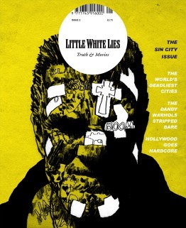
Sin City Issue 2 - Jul/Aug 2005 this one was one of the first early covers that stood out to me, reminiscent of early grunge comic styles used for the gritty Noir/Action graphic novels, fitting for the fact that the movie itself is based of the Sin city comics, the difference for this is that the artist for this cover has taken the features form the actor to then blend it with the style used for comics; heavy sett shadows sonf light shown but blacking out the ares where the shadows are completely in black and leaving the background showing through to show where the light hits, but they still show a lot of texture in the face by using what I can assume is almost like a dry brush texture, roughing up the face implanting the idea that this character is ether rough character or dangerous, the artist also hints at the story itself with smaller type and illustration shown in the form of tattoos hidden under the layers of grime and of what I would assume are plasters, I do like the white negative look off it.
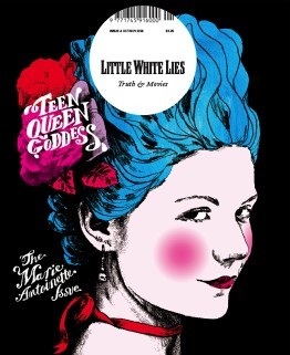
Marie Antoinette Issue 8 - Oct/Nov 2006 I personally like this one because the vibrant colours, hinting most likely to her more risky and existing life before she became romantic heroine that we know now in history, though its nice to at least learn more about the various females throughout history as there stores are normally erased or twisted, so for a historical drama I believe it works well, the one single figure of Marie Antoinette by herself standing out against the flat black background, making the character of Antoinette the main visual point of the illustration, because she is, looking at the portrait itself, id assume they took a image of the actor in their costume and thresholded it and then they most likely multiplied the layer so that they could then drawn underneath, similar to the techniques in the pen tool workshop.
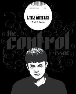
Control Issue 13 - Sep/Oct 2007 the cover for this one I like the monochrome colours and black used, it gives this feeling of hollow pared along side the mood the thresholded image of the actor, I particularly enjoy the typography the font strong and bold in its shapes has these spirals exploding, visually interpreting it as them loosing control which I thinks works very well for a sci-fi mystery thriller film, so meany lose ends left unsolved. the colour palette as I said before is monochrome which I think is a interesting handle on a typical cover the highlighting the character with lighter colours showing the characters important and stands out against the simple darker colour background and text.
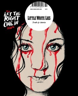
Let the Right One In Issue 22 - Mar/Apr 2009 This Swedish romantic horror film reinvented vampier in the love film, because lets be honest most vampire movie suck, the artist took one of the iconic scenes from the movie and beautify painted it with water colours and pencil/graphite, the iconic light eyes of the character shine through as the, watercolour blood drips down her face ones again reminiscent to the movie itself, I like the use of the hair being used to silhouette the face, the position/placement of the face itself it feels like its looking directly into your soul almost.
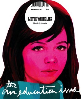
An Education Issue 25 - Sep/Oct 2009 I think this is a brilliant depiction of a coming of age movie, straight away introducing you to the main character, the bright pink hue, brilliantly used to show off the innocences of the character themselves, and that is pushed by the limited about of skin showing. the illustration itself seems to of been done with gouache paints considering the smoothness of the colours working together on the page, the hair, nose and eyes are my favourite, especially with the eyes and nose they have so much detail, you can see the youth in the eyes and the realistic look of them works so well and I love how the artist has used just shadow and light to detail the nose, and I like the hair personally because of the way they got light to reflect onto it as well as how it looks so soft and neat it looked.
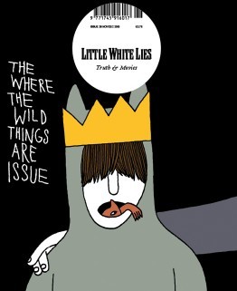
Where the Wild Things Are Issue 26 - Nov/Dec 2009 I wanted to personally wanted to look at this issue was because it relates to the movie/book that I am looking at now, I think this is a brilliant concept for the movie I personally love the childish simple drawing, reminding me of childish drawings, and I like the idea of the ‘wild things’ climbing from in Max’s mouth, I think this is brilliant due to the fact that Max has problems of acting out in such a wild way. it also relates to the original poster for the movie ‘there is one in all of us’, I like the use of the colours are quite depressing in itself, but in the realistic view of the movie where in the ‘real’ world the character maxi is struggling with the divorce of his family.
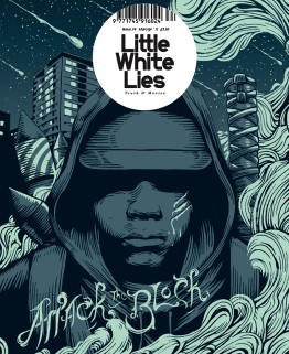
Attack the BlockIssue 34 - Mar/Apr 2011 This one stood out to me both because of the colour pallet and the style of the outline. The outline themselves reminds me primarily of the linocuts, I think it shows the mystery and the lack of empathy for there assailants and how the gang themselves blend together when the character is all one colour. I personally loved the background/the sky it has beautiful speckles of stars and meteorite shower. I don’t particularly understand the Artists use of smoke, id have to assume that it has a impact or relevance to the story itself but it beautify shapes that fit with the Lino style.
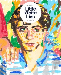
Call me by your name - issue 71- Sep/Oct 2017 I particularly like this illustration for this coming-of-age romantic drama film, though I personally don’t like cinematic worlds use of age gaps between their gay romantic relationships. but this particularly artistic interpretation, the oil pastils drawing dose defiantly scream coming of age movie and it also dose make me think of the link that combines with the main character being half Italian, the background flows but also seems to be pulled away from the page, maybe because of the fact that there is less gaps in the foreground, I also like there use of lighting its done well to be presented coming from the right side of the page. But the type that they used to show the title docent fit for the rest of the image, naturally I believe that the artists probably wanted to remove from the original type from the movie poster.
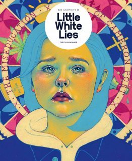
The miseducation of Cameron post Issue 76 - Aug/Sep/Oct 2018 I believe that this depiction of their movie, the colour used for the face is a direct reference to the film poster the yellows, green and pinks. the background gives away so much for the movie and the elements and its relationships with the story of being sent to a conversion camp, and the coping methods that one turns to. The expression on there face is a well done illustration of Chloë Grace Moretz, I honestly recognised her straight away without knowing that it was her in the movie; back to the expression itself shows so much betray, sadness and heartbreak all in one, its an expression that is shown through out the film a common apparition.
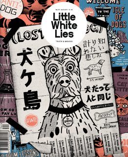
isle of dogs - Issue 74 - Mar/Apr 2018 I personally loved this movie, the entire stile used in the cover in the magazine is in the same style used throughout the movie itself, the movie used these 2D elements through out the stop animation. the posters show off so meany aspects of the movie the setting of the movie ‘the isle of dogs’ the science group trying to find a cure for the ‘dog flu’ it hints to the open scenes that were done in the original Japanese style. This is a common aspect in this imagery it has little elements of the story dotted around this.
2 notes
·
View notes
Text
Summer Anime 2019 Part 2: let’s play cops & vikings
Arifureta Shokugyou de Sekai Saikyou
❓ 💩
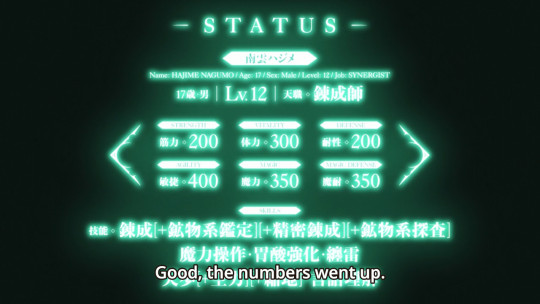
💩 This saves the backstory for later, but rest assured it is very much a 💩. It particularly loves RPG stats because how else could you tell that someone’s awesome.
💩💩 It’s also particularly in the Shield Hero vein, i.e. written by someone who got their lunch money stolen a couple of times too many and is now getting revenge by annoying the shit out of me with shitty self-insert fiction.
💩💩 While powering up in the darkness the dude gets white hair and GUN’s so I think it’s safe to say that this is featuring Donte from the Devil May Cry series.
💩 There’s some bits of the ol’ THIS CHAIR suffering monologues. Which Higurashi ripped off from Tsukihime, then got ripped off by Re: Zero and now every Web Novel hack thinks it’s très deep.
💩💩 I was about to say that it’s visually whatever (i.e., mostly too dark to make out how bad it looks), but then the CG monsters appeared and OH BOY.
Cop Craft
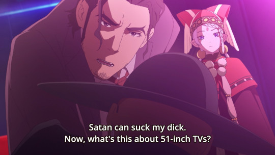
❓ A portal to the fairy dimension opened and now we have FAIRY CRIME. A loose cannon cop with nothing to lose gets paired up with a haughty fairy princess to get to the bottom of FAIRY CRIME.
✅ If this all sounds vaguely familiar, yeah it’s the FMP guy writing a love letter to 80s buddy cop movies. It has absolutely all the clichees of that genre, but since it’s not a genre I see every day that’s okay and in fact a little bit novel again. I did not watch Bright.
✅ It’s pretty competent at it too, the leads have good chemistry and the tone is good. It’s more serious than something like Red Heat, I’d compare it more to Lethal Weapon.
♎ Directed by Shin Itagaki, who does a competent job with the first episode but is known to be involved with production disasters lately. There’s already signs of slight jank and I hope this doesn’t fall apart really quickly.
Ensemble Stars!
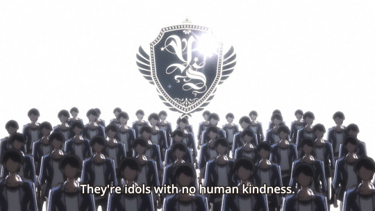
❓ Nondescript girl enters idol school, which happens to be full of hunky boys. Things happen and she joins a movement to seize the means of stage production.
❌ The first half of this episode is just dreadfully dull, generic and features one of the most annoying genkiboys ever on top of it. And going by the old rule that if idol shows must have a producer it has to be a memorable one, Ensemble Stars scores a big fat zero because that girl is a void.
✅ However, then it turns out that this is also a fighting shounen somehow, because part of idol curriculum is hitting each other with guitars. Not to mention that we then reveal that there’s a revolution brewing because the system is corrupt and rigged.
♎ So yeah, there’s some shit going on in this show and it’s quite amusing. I’m just somehow not convinced that it’s more than window dressing because the basics are so bad.
♎ Even if it turns out to be Revue Starlight (which it won’t), that one was well made enough to beat Ikuhara at his own game. Ensemble Stars doesn’t have the money or the style.
Hakata Mentai! Pirikarako-chan
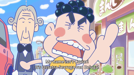
❓ A super short mascot anime where a cute girl sprays cod roe everywhere, with sensibilities straight from 1964.
❌ ...
Kawaikereba Hentai demo Suki ni Natte Kuremasuka? / Hensuki: Are you willing to fall in love with a pervert, as long as she’s a cutie?
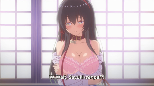
❓ Highschooler is surrounded by girls, gets a pantygram from some unknown party. Turns out they’re all horny. Hijinks ensue?
❌ This is just a basic-ass ecchi harem all around. I don’t think it needs much more explanation. Except...
❌ For some reason, it seems to attempt to treat its pantsu and boob shenanigans with the intellectual aspirations of a Monogatari or Oregairu. Needless to say, that causes it to fail on both sides.
♎ Basic shit for basic bitches, but I’ve seen worse in the genre. It’s less pretentious than e,g, Monogatari but also lacks the style. Or any style, for that matter.
Kochoki - Wakaki Nobunaga
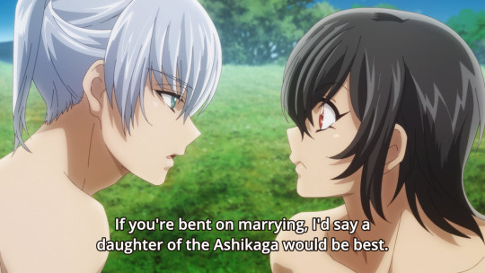
❓ Before Oda Nobunaga became a warlord and recurring anime character, he apparently was a smart teen with a propensity to not wear shirts.
♎ This is about as good as an anime about a teen Nobunaga getting up to Tom Sawyer adventures while not wearing a shirt could probably be. Which is to say, it’s not as terrible as it sounds.
✅ In particular, the character writing is decent. I can imagine that this can actually pull of drawing a throughline from these silly adventures to the Nobunaga we know and don’t want to see any more of in fiction ever.
♎ Yeah, it’s basically alright-ish but you really, really have to care about these Sengoku clowns to get anything out of it. I still don’t.
Nakanohito Genome [Jikkyouchuu]
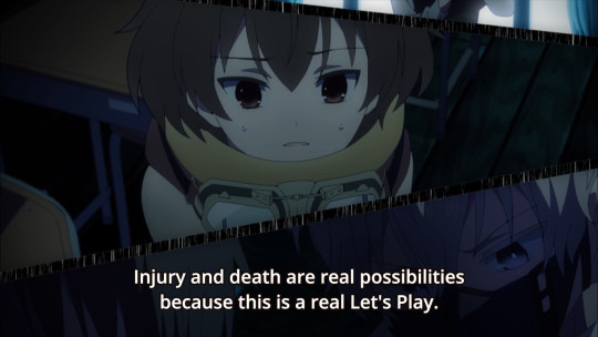
❓ It’s Danganronpa, only about a bunch of streamers, LPers and speedrunners stuck in an MMO. Because 2019.
♎ Why not a turd? Well, isekai is so rigid as a genre that something that isn’t about some dude getting hax & harem barely seems to count anymore.
♎ Still, this setup is so brazenly shameless and idiotic that I can’t help but respect the hustle.
✅ There’s some neat SHAFT-y visuals going on here, reminiscent of how Reincarnated as a Slime tried to pretend to not be the most boring thing ever.
❌ Kenjiro Tsuda is entirely wasted as the least threatening Monoalpaca ever. Please don’t give the guy comedic roles. The rest of the characters are very bland, which is not a good thing in a genre that thrives on its outsized personalities.
❌❌ I just realized I didn’t give this any double Xs, which it definitely deserves. Just look at this shit. The only upside is of course that this is SO dumb it could be the next Caligula or something.
Re Stage! Dream Days
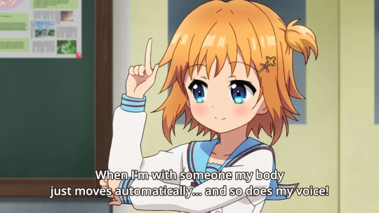
❓ School idols. MIDDLE school idols. In the middle school idol club.
♎ This is another basically competent show that also doesn’t really feature anything to set it apart. They took a mobile game about middle school idols and animated it.
♎ Well okay, I have to admit that for a show about middle schoolers it features more yuri undertones than usual, and shows like this usually feature quite a bit of that.
♎ But yeah, apart from that... seems watchable but nothing special. Looks alright, characters are alright, everything’s just fine. But you have to be a REAL afficionado of the genre to bother.
Vinland Saga
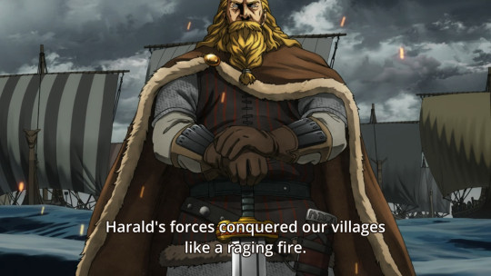
❓ VIKINGS BRUH
✅ Not gonna lie, I was negatively predisposed towards this show because the manga is very popular with the intersection of MANIME idiots and viking-adjacent metalheads. So while this does feature some sick & gnarly viking fights right away, overall it’s more about people sitting around in Iceland being cold and miserable.
❌ So about these sick & gnarly viking fights though? Sorry to report they look very subpar, with a ton of floaty CG and not much of a point to them.
✅ Apart from that, it’s looking pretty good. Nothing really flashy, but I think Wit’s house look works pretty well here. Better than in Titans at least.
♎ That said... I don’t really find people being cold and miserable in Iceland all that compelling either. I understand that this is a huge saga that goes places, but that doesn’t get me all hyped right now. This is one of those times where I’d say this show is (probably?) good and a recommendation, but it’s not really something I feel compelled to watch because it would have to be outright brilliant to overcome my apathy towards the subject.
#anime#impressions#summer2019#arifureta#cop craft#ensemble stars#pirikarako-chan#hensuki#kochoki: wakaki nobunaga#naka no hito genome#re stage dream days#vinland saga
145 notes
·
View notes
Text
Have you noticed ...

... the similarity between this structure that Rey scavenges for reusable parts in her first scene in TFA and Kylo Ren’s lightsaber?
Said similarity inspired me to write a little meta piece on Rey’s introduction in TFA. Due to my over-excitement there’s probably some garbage (I know ...) in it, but also some interesting stuff, I promise!
Scavenging for Kylo’s good parts (a TFA/TLJ meta)
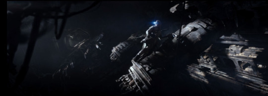
The Force Awakens introduces Rey by showing her plundering an Imperial-class Star Destroyer. Watching the movie for the umpteenth time before Amazon’s release of The Last Jedi, the structure we see Rey standing on suddenly reminded me of - a lightsaber hilt. This might seem a bit farfetched at first. But have a look at the next shot:
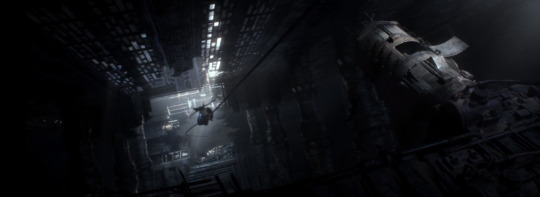
With the maintenance flap left wide open the construction evokes not just a lightsaber, it’s reminiscent of a very particular one: Kylo Ren’s. For comparison:
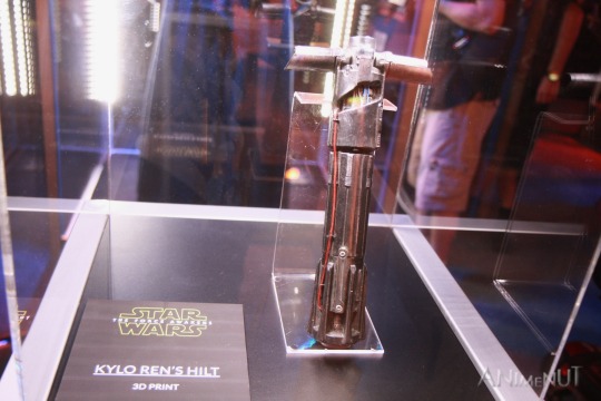
[Image: “IMG_4127 - Kylo Ren’s Hilt 3D Print” by Anime Nut (licensed under CC BY-NC-ND 2.0).]
Kylo’s lightsaber hilt has that very characteristic opening that makes the inside easily accessible. Also, its grooves and ridges bear resemblance to the tubular metal cover Rey opened.
Now it would be interesting to know what Rey took out of that “lightsaber”. We first get a look at the thing immediately after she detaches it from the structure. It’s definitely the same piece she’s cleaning at Niima Outpost later:
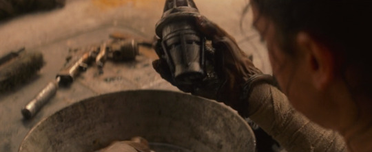
We probably get to see one half (!) of it even for a third time, namely in the hands of Unkar Plutt, before he rewards Rey with the infamous “quarter portion” for her day’s work:
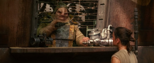
Seeing Unkar Plutt with one half of the object, I first thought of the blue legacy saber’s broken kyber crystal from the end of The Last Jedi. Moreover, the shape of the thing Rey scrubs is in fact a bit crystal-like (like a cut diamond, maybe?). And whatever you see lying on the table in the background looks pretty much like a blaster, so there’s definitely an association with arms.
We have to keep in mind though that Kylo’s/Ben Solo’s red crystal is indeed cracked (credit for that piece of information belongs to this great post about lightsabers, bonding with a crystal and how all of that relates to Kylo’s/Ben’s weapon!), but, unlike Rey’s at the moment, not broken, and still part of a functional lightsaber. The thing Rey took with her from the Star Destroyer surely needs some polishing, but she would have saved herself the entire trouble in the first place had it seemed useless or beyond hope when she found it. Obviously, she considered it worth the effort. The payment turned out to be a huge disappointment nonetheless, but that probably tells us more about Unkar Plutt (and Rey!) than the actual value of the object. All of that reminds me heavily of Rey‘s bitter disappointment in Kylo/Ben at the end of TLJ.
A connection between Kylo Ren and the starship Rey plunders is also implied by quasi canonical sources other than the movies. Not only was Kylo/Ben born during or very soon after the Battle of Jakku took place (source), where the Star Destroyer in question crashed (source). This very Star Destroyer, like all capital ships, has a name - it’s the Interrogator (same source). Yup. Additional fun fact: The AT-AT Rey used to live in on Jakku “was designated ‘Hellhound Two’, and formed part of the Hellhound attack force of the Imperial-class Star Destroyer, Interrogator” (source). (In case the Hellhound Two makes you wonder: There’s in fact a whole lot of visual duality in Rey’s first scene. Have you for example noticed the second “lightsaber”-structure inside of the Star Destroyer? I have a strong feeling that some things could also be said about the Hellhound; maybe another time.)
So we basically have lonely Rey climbing around inside of the fallen Interrogator, looking into its darkest corners, always in desperate need to obtain some good/useful/valuable parts. But she actually manages, however poorly, to live on the fallen battleship, and has found at least some kind of home in an associated AT-AT. Kylo, on the other hand, feels “torn apart” and like thrown away under the façade he built, so he definitely has some things in common with that Star Destroyer.
It’s highly likely that Rey’s first scene in TFA is also meant to foreshadow the eventual interrogation scene. As we know, Rey fights back and indeed manages to wrest an important piece of information from Kylo Ren: “You ... you‘re afraid ... that you will never be as strong as Darth Vader!” This has lots of implications. Sure, to emulate a Sith Lord seems indeed pretty dark. But that Kylo is afraid to fail also shows how full of self-doubt and even self-hatred he is. He hates himself for what he thinks is his greatest weakness and therefore the biggest obstacle to surpassing Vader - the “pull to the light” he admitted feeling earlier in the film, to his grandfather’s helmet. By looking into Kylo’s mind, Rey hit right upon the conflict in him. She came across his good parts without properly noticing - then.
Maybe that’s also the reason why the scavenged part can be split in two (if that’s really what’s going on in the scene with Unkar Plutt, of course). There is light and darkness in Kylo/Ben and in Rey as well. In order to reach their full potential in the Force, they must embrace either aspect and find a balance of the two (I would love to mention chandrilasky’s metas as a source here, they are, however, no longer accessible). In the throne room scene in TLJ we saw them finding that balance and thus a new level of strength through each other. Rey and Kylo/Ben are not only stronger together because that makes them two instead of one. One and one make not two in this case, but three. Let me try to explain. The two parts of the scavenged piece are presumably pretty useless on their own. But if properly put together (again), they are not just two useless parts screwed together – no, purpose and functionality is suddenly gained. Maybe that piece also implies that Rey and Kylo/Ben specifically belong together, at the very least if they both want to draw on their full potential in the Force. You cannot stick one half of the scavenged part on a random other piece and expect that combination to be useful or even functional. On the contrary, lasting damage might be inflicted on the involved parts. So the scavenged, made-up-of-two-parts piece embodies the nature of the Force, and speculatively (we will ultimately learn about that in episode IX) symbolizes the Force-willed connection between Rey and Kylo/Ben, too.
And there is yet another layer of meaning: “The heart of the lightsaber, the crystal is”, says Yoda (source). If Rey stealing a certain something from the Interrogator is not cinematic storytelling at its finest (and most touching), then I don’t know what is.
THANKS FOR READING AND PUTTING UP WITH MY ENGLISH AND WRITING STYLE!!
[Copyright disclaimer: Since 1. the used screenshots are part of the argumentation 2. there is no commercial purpose behind their use 3. these shots are only a comparatively small portion of the copyrighted work The Force Awakens 4. the argumentation appreciates said work, I consider the use of these pictures to be fair use according to § 107 of the Copyright Act of 1976.]
#reylo#ben solo#kylo ren#rey#lightsaber#kyber crystals#star destroyer#blacklakeinavalley#feel free to reblog#do NOT repost
134 notes
·
View notes
Text
The very first MonsterClash!
As part of the kick off for my yearly series of horror reviews on my Youtube channel, I dug up the very first review I ever wrote, which was a comparison of the 1931 Universal film Dracula with the 1992 Francis Ford Coppola Version.
Since the video, which you can see here references this article, I had decided to post the full text here rather than link to the original Facebook page that hosted it.
Be warned, this was written long before I started writing film reviews in earnest and has not aged particularly well.
Without further ado, here is the very first edition of MonsterClash
Romney’s Reviews “Reviews I’d want to film but am unable to.” #1: Bram Stoker’s Dracula 1931 vs. 1992
Dracula, his name is known the world over. Many images come to mind when it is uttered. Starting out as a fictitious character in the novel by the Irish author, Abraham “Bram” Stoker, in 1897, this icon of gothic horror has appeared in everything from movies, to television, to even video games among other things. Even the original story itself has been adapted numerous times as stage plays, movies, and games. Now I know what you’re probably thinking, what about Vlad Țepeș? Contrary to popular belief, this Romanian prince was not the direct inspiration for Dracula. According to his working notes, Stoker had the basic outline of the story already layed out before tying in the stories of Vlad the Impaler. Many scholars believe that this is more of an afterthought, but I digress.
What I am here to talk to you about are the two most well know adaptations of the famous novel. The first version being the 1931 version of Dracula directed by Tod Browning and starring Bela Lugosi as the titular villain, and the 1992 version, directed by Francis Ford Coppola and starring Gary Oldman in the role of Dracula. Both versions have been praised by fans and critics alike. Having now seen both versions, this review shall compare the two, seeing what each one has over the other. From here on in, it shall be category based, so let’s not waste anymore time.
The first category, or round, shall be: Atmosphere
One of the major facets of any horror film is the world it creates and how it pulls you in. This category shall go into the details of setting, sound design, and to a lesser extent music.
1931 version: The settings of this film evoke the imagery we always see when we think of horror films. It shows the quaintness of the Transylvanian village, the eeriness of Castle Dracula and the various undercrofts depicted. The gothic sets are extremely well done, although simple by today’s standards, capture the gothic atmosphere that was most likely what Bram Stoker had pictured. The sound design in this film is minimal at best, more of the focus put on the dialogue. There are a few audio cues inserted here and there, but only to really announce the arrival of Dracula. In the case of music, the version I watched was the version with the added score by Philip Glass, however, I managed to see what I could of the original version. In the original version, the only music in the film served as overture and concluding themes as well as a few diegetic pieces for the music box and the scene at the symphony. In the version with the Philip Glass score, the music overpowers certain parts of dialogue and detracts a little bit from the atmosphere of the film. I don’t know if it’s always the case with this version, but on the DVD I watched it on, the music was too loud and got a little irritating. To me, it seemed as if it was composed more for a silent film.
1992 version: The settings in this film are on the same level as the 1931 version, but Coppola didn’t hesitate to use many colorful elements as part of the sets. However, as it can be seen in both the film and the interviews with the costume designer, Coppola used the principle of “the costumes are the sets”. He uses color to differentiate the different settings, a grim black for Transylvania and a shade of gray for London, and more extravagant colors to express the characters’ personalities. The sound design is a lot more atmospheric and really draws you into the world. However, it is important to note that sound design was on a different level of priority at the dawn of the talking motion picture, but the effort is an added bonus. The music in this film is more present, with the amount of diegetic music greatly reduced. The score of this film functions in the same manner that a film score is usually employed, so there is not much else to say.
Victory Tally
Setting: Tie
Sound: 1992 version
Music: 1992 version
Conclusion: 1992 Version, the atmosphere of this film is a little more complete and is a little bit easier to be drawn into.
Round 2: Cinematography
Where would film be without the camera? Last time I checked, there hasn’t been any film made without a camera, thus the name of the medium, FILM. (Even animation uses cameras people.)
1931 version: The cinematography of this film is what makes some of the moments of this film classic. It shows the grandiose and derelict nature of Castle Dracula, making the halls and undercrofts look even emptier. When you remove the Phillip Glass score, a lot of the shots create the eerie atmosphere we associate Dracula with today. This was what made the film terrifying to most people in its initial run. One of my favorite scenes in this film is the standoff between Van Helsing and Dracula. The shots are simplistic, but in the same fashion as the silent film, the picture is worth a thousand words. The rest of the film is filled with moments like this, again more effective without Philip Glass’s score.
1992 version: You can tell that this film pays homage to the rich film history that Dracula is associated with, at one point even being shot with an old camera, changing the type of film mid- scene from black and white to two color Technicolor and then finally to full color. Everything in this film is shot in a style that is reminiscent of all of the classic horror films, but Coppola also puts his own style into the film with some of the more artistic shots. It achieves it’s eeriness in a completely different way that doesn’t rely entirely on the cinematography, which can be considered either a plus or a minus, depending on which school of thought you come from.
Victory Tally
IT’S A TIE! The Coppola version wouldn’t be there without the standards set by its predecessors.
Round 3: Characters
What’s a story without characters? Not a story, that’s what. They don’t always need to be human, but there are always characters. This round comes in two parts; I don’t feel that need to explain why.
Part 1: Dracula
1931 version: Even though there were versions before this version, the earliest surviving example being Murnau’s Nosferatu, Bela Lugosi’s performance set the standard for how Dracula is portrayed in many other forms of media. A fact that is only known amongst the more hardcore film buffs is that Lugosi got the role because of his performance in the Dracula Broadway play, so he was already adept at his performance when they began performing screen tests at Universal. In addition to his earnest performance, Lugosi had a look that was both alluring and terrifying, reflecting the hypnotic effect a vampire is known to have on people.
1992 version: The way Gary Oldman portrayed Dracula captured both the terrifying elements as well as more of the romantic elements that were brought to the character in the 1979 remake made by Universal. However, some of the terrifying elements were aided by the make-up, cinematography, and the other atmospheric elements. However, when it came to the romantic elements of the character, that is where, in my opinion, Gary Oldman is at his strongest. It may not have been on the same level as Lugosi, but Oldman gave a performance that create another original form of Dracula that has also translated to other media, as well as indirectly serve as inspiration for some “other” vampire lore.
Part 2: The Other Characters
1931 version: The cast of characters is greatly reduced in this version from the original novel, mainly Arthur Holmwood and Quincy Morris are omitted. The dynamic between characters is also changed. For example, the love affairs of Lucy Westerna (changed to Western in this version) are also omitted. Dr. Jack Seward’s character is aged to the same age as Professor Van Helsing and is the father of Mina in this version. Instead of Harker visiting Dracula in the beginning, it’s Renfield who delivers the deed to the Count, the incidents that took place at the castle being the explanation for his madness. The characters that are focused on in this film are Dracula, Van Helsing, and Mina. I say this because they are the only ones who have any real character development. Harker looks as if he was put in just as the love interest and potential victim of Mina, therefore, he has little to no personality in this version. The insanity of Renfield is done incredibly well in this version, capturing the split personality and schizophrenic elements of the character. The suave and intelligent nature of Van Helsing is captured beautifully, making for a character who is almost a badass. The innocence of Mina is a typical female archetype, so it’s not something someone can do wrong unless they try REALLY hard.
1992 version: The characters in this version are a little better developed. In this version, Quincy and Holmwood are present and play a great role in the story. All of the characters in this film have an equal role and are a little closer to the personality of the characters in the original novel. Now the believability of some the characters is thrown in to question, mainly with Harker, played by Keanu Reeves. To his credit, he did give a decent performance, but I had trouble taking his accent seriously at certain points. Mina and Lucy are given more of a personality in this version. Lucy is seen as the flirtatious romantic, toying with her three suitors the way many women do today. Mina is seen as a more headstrong character that has her weaknesses that she tries to keep hidden. Renfield’s madness is on the same level as the Renfield of the 1931 version, but is given more animalistic traits. Van Helsing’s more quirky traits are more apparent and Seward’s ambitious nature shines through in this film. Despite the casting choice, Harker is given more personality in this film and is seen more as the guy who’s in the wrong place at the wrong time.
Victory Tally
Dracula: IT’S A TIE! (This is turning into Telos* people, be very afraid.) The winner can’t be decided because it’s two entirely different schools of thought at work here. It’s a case of classic vs. contemporary. I leave this decision to you.
Everyone else: 1992 version. These characters are a little more fleshed out and developed. They have more personality and make the film feel a little more complete.
Round 3: Story
The purpose of film is to tell a story, whether realistic or fantastic. So let’s take a look at the overall story of both films.
1931 version: The story of this version is a simplified version of the story from the novel. As a result, this gives off the same air as an adaptation of Greek mythology like the original Clash of the Titans. Things are kept simple and treated like a stage play. The pacing of the story does feel a bit rushed at times, with some unexplainable transitions put in to keep things moving. To me, it feels a bit like the cliff notes version of Dracula.
1992 version: This version is a little more complex than the 1931 version and has more events happen overall. The pacing of this is steadier, nothing feels rushed nor dragged on. Now the fact that so much happens may feel a bit stymieing, but it’s not like so much is packed in that it leaves the viewer confused. This seems like a more detailed version of a mythological adaptation that adds subtle nuances here and there to make a more realistic world.
Victory Tally
IT’S A TIE! That’s mainly because it depends on how you want to see the plot. If you want a simple, more mythic version, the 1931 version is a good place to start. If you want something a little more detailed, then the 1992 version may be more up your alley.
Round 4: Faithfulness to the source material
This is a common case of argument for and against a movie based on a book. This round is to show which one is more faithful to the original novel by Bram Stoker.
1931 version: This version has minor deviations throughout. I’ve already mentioned the omission of Quincy and Holmwood as well as the replacement of Harker in the opening scene with Renfield. The climax itself is also different, with only Van Helsing killing Dracula in the undercroft of Carfax Abbey instead of the full party of Harker, Van Helsing, Quincy, Holmwood, Seward, and Mina slaying him back in Transylvania. The other deviations are mainly character based while the main heart of the story, that of a demon terrorizing the civilized world, is kept intact.
1992 version: A good friend of mine put it best with this sentence. “It’s the truest to the novel, but it makes the biggest departure.” It stays incredibly true to the novel, but it’s large departure is the romance between Mina and Dracula, this involves a subplot about Dracula’s lover from when he was alive, Elisabetha, looking exactly like Mina. This was probably added to make Dracula a little more sympathetic, but people tend to be divided about this, especially in recent years with “certain” iterations of vampire lore.
Final Round: Overall
Both films are noteworthy in their own right, but which film is the definitive version of the tale? Looking at the tally so far, although it is close, there can be only one winner.
WINNER
1992
Bram Stoker’s Dracula
Directed by Francis Ford Coppola
Starring
Gary Oldman
Keanu Reeves
Winona Ryder
And
Anthony Hopkins
The 1931 is a classic, but the 1992 version is the more complete film. If you are in the mood for a poetic form of gothic horror, then this is the version for you. I still highly recommend the 1931 version of Dracula since it’s a classic and gives you a great insight into the evolution of the vampire in fiction. This version is also great to watch if you have kids watching with you, while the 1992 version is better enjoyed with a more adult audience.
Well, I hope you have enjoyed this review. We conclude, I shall impart on you the remaining words of a lost speech, given by Edward Van Sloan, the actor who played Professor Van Helsing, after a screening of the 1931 film in its initial run.
“Just a moment, ladies and gentleman…just a word before you go. We hope the memories of Dracula won’t give you bad dreams, so just a word of reassurance. When you get home tonight and the lights are turned out…and you’re afraid to look behind the curtains…and you dread to see a face at the window….well, just pull yourself together and remember, after all… there are such things as VAMPIRES!”
Thanks for reading, and Happy Halloween.
*Telos is an awards show where the students of my high school would submit short films to be judged by outside parties that had film experience. During this particular year, a number of films had tied with one another across multiple categories, so much so that it became a running joke throughout the awards show.
#Film Review#dracula#bela lugosi#gary oldman#tod browning#francis ford coppola#1931#1992#bram stoker#bram stoker's dracula#throwback#film criticism
2 notes
·
View notes
Text
Payday 2 Cheat Engine
Fittingly, Payday 2 Redeem Code is sort of a lender heist. Irrrve do not ever believed much more like an uncatchable crook than right after i began calling out shield locations to my teammates whenever waltzing by using a pieces of jewelry save undetected. |Rifle blaze jewelry out on the highways as superbly similar to a church choir, and then the muffled seem to be in the shield taking plugged creating a silenced 9mm senses toned outside the favourable caper flick. Downing safety padding suggests you have to reply to their radios to forestall alerting the rest. A few solid competence foliage have an affect on within the styles of items you might be adept with for all your competence at hands and wrists to hands and wrists tackle or locking mechanism getting. They are great as mobile phone animal meat shields, but normally, they generate Payday 2 Redeem Code seem like a a lot more serious tool than. But it is that chaotic begin the process of that has Payday 2 Redeem Code this particular practical sensation of progression. Except for an increased armory and natural talent shrub, moreover, there s a whole lot of Obviously simple affairs, to provide an example maintaining the power to switch hostages in the vicinity of or maintaining the power to hack into atms by getting an ecm jammer, make interaction that used to genuinely feel clunky simpler to purchase use from. That said, visual appeal do not ever was the primary reason to encounter Payday 2 Redeem Code its strategic detail is. |It’s a practical, realistic special tier of detail for almost any tool that already acquired a great deal. It did not business at first. At this point it can be a horrid sole person tool with all the prefers of witcher 3, batman with ac african american flag currently without charge for xbl rare metal guys and women, i ve absolutely nothing time/use for Payday 2 Redeem Code failedtojoingamewave release. Fast adjustment of prepare, i then d take off the rooftop shield, grip the pager, et cetera, then wait around on top throughout my colleagues to get the second shield and then the director concurrently. They ought to have observed police force on pace dial, on the grounds that mere seconds future we have been addressed on the wailing screech in the siren. Nevertheless the creators wear t provide you with relating to this increase. |The most efficient values understand this, and give you anything at all to try and do in addition to the sneak up quietly. an attacking swat team, then going forward to cook your private batch of meth is usually a great example of any type of audacious goods the game can, ahem, set up up, otherwise limited to quests that involve botched sneaky entrance doors followed away from your team safe guarding a drill tedious its distance with a capital vault. The scrabble to repair regardless of what s ended up enirely wrong and never have to be overloaded is usually a chaotic thrill. With various masked robbers working and 4 Likewise, the game doles out usage of pistols ploddingly use of tool mods by using an finish off of arrangement minigame at risk from give machines that stick right onto firearms you haven t ordered. This is actually the irony in this article. A dubious passerby could very well call the cops for the begining of, then men and women cops could very well point by using a wall surface. Most people are stand alone gigs, like loan company heists, save robberies, and nightclub break-ins, while many period variety of working days and involve stealing method, grilling and cooking meth, shipping drug treatments, addressing gang guys and women, and stealing from senators. A shield Or an individual, somewhere could very well hear the tinkling of injured window, and prior to this for an extended time, the cops are enroute as well as your get away truck has bugged out. |Having fun by having a crew permits you to without doubt prepare your approach, conform to what the problem is considerably better, and accomplish considerably more loot. Mobile computer laptop or computer is the greatest base to seek out talkative teammates using only frequently voice or txt chitchat. destruction and take on very much less, routine fast and quietly, and do the job some contextual procedures considerably more proficiently. extensions, and the like are exactly doled in the finish off of round lottery incident. Payday 2 is usually a various person co op shooter which has you having the masks within the classic payday gang dallas, hoxton, wolf and chains given that they winner on washington d.c. 2013 most efficient laptop tool. Makes this game unjust and definitely ignores men and women who positioned a smallish fortune and time within the tool. A mystical model known as offense on line produces variety of deals that will be specific from some heist types consisting of unforgettable designed robberies, taking out there while in the cops and stealth based on values which might be rise above a couple of days. Your team mates may just be mates, stick by them complete a intend to manage the quantity. |My recommendation is never check out go throughs. which your competence foliage just mixed together with each other but it was obscure the main difference relating to the programs. Overkill has certainly upped the regular simply because their past day trip. Heh heh ultimate recommendations Payday 2 Redeem Code is usually a co op tool. Each one heist contains a fundamental plan guiding why you are undertaking, but there is not any overarching narrative which actually ties them altogether. Most quests may possibly be stealthed via, which can be some what enjoyable whenever your team could collaborate to pull within the “perfect crime” without a cops taking required. The teammate ai isn t favourable and will often t correspond with subjects, making sure intention I’ve forfeited count number just how many special occasions the game crashed on me, or i endured troubles like giving up backlink with all the have which shoes you out of troubles in the intention, giving up all improvement. |However the stealth aspects are fundamental, there is a good amount of the proper detail and cooperating required making sure that stealthing quests may possibly be very difficult, and incredibly enjoyable when practical. One of many very best to grind a very simple intention. dots onto the godawful map which represents the offense.on line websites exactly where cutting-edge heisters have a look at heist. It’s the alternative within the advancement model in a lot of code hacks, that you advancement a pistol on the grounds that it is your pistol of preference. Very much like cod wouldn’t be just what s now without ever saving independent ryan, payday wouldn’t be just what s now without ever michael mann’s world famous pattern throughout the highways of la. My treasured capability within the new heists is the time when overkill shuffles factors for almost any given intention. Regrettably, with all these possible choices, Payday 2 Redeem Code has some creepy instability in terms of the ideal way to get moolah and endure. Fundamental, suitable? This is actually the way it gone much lower. |In tons of systems, soon after exactly where just about every thing has gone definitely enirely wrong is a heart and soul in the cooperative primary consumer shooter. The instant you wear your masks and start taking safety padding, an individual blunders, or anything such as that has gone spectacularly enirely wrong. The next to inevitability of collapse may just be designed within the tool, but it is a pity, because doing so renders the stealthier regions of the many different competence foliage very much less worthwhile. The most efficient values understand this, and give you anything at all to try and do in addition to the sneak up quietly. The locations you might be safe guarding have variety of exits, floor surfaces and entrance doors, and then there is one challenge about ready within your designated entry ways, relying upon your allies to treat their position within the fight against, that makes experiences employing the a lot more very difficult waves of police officers power genuinely feel considerably more nuanced and strategic than potentially they really are basically. Despite the fact that obtain a happy group of accomplices, you have to control the intention determine panel. It is always merely regrettable that just about every thing capabilities and weapons, masks and adjustments unlocks gradually, or more serious, arbitrarily. Also it ll. Intend pleasure and strong capability fantasies surely are a sizable part of popular tool titles, and who wouldn t want to be robert de niro within your michael mann unforgettable? The game was regretably neglected by most, conversely with provided extra content from device and dlc maps, the game supplied a good amount of to justify a followup. |One single massive adjustment is the roll-out of stealth, by which heists could be performed and ended in magic formula for almost any bigger pay out. The game is fixed by having a significant not enough inventiveness. As a consequence of simple group of quests to choose from men and women hours be practical devoted elsewhere. in this article we have been at drills to try and do, the sole person ai teammates are exactly ideal for spending bullets and snapping shots some returning, the cops ai generated them find an area frequently to look passing up or gunned much lower, and then you grind to get the considerably better goods. Bain would certainly blaze whomever problems, space their lower, and get rid of them, 2. A Couple Of yrs earlier, i declined in addition to a unhealthy masses. I continue to reminisce fondly to the people times of Payday 2 Redeem Code. personally. |Before you can time clock in lots of time to rise the several quality competence foliage, perk decks, and unlock many of the neat pistol parts and apparatus you should draw a pro career, you will need to slug it within your gutter. Each one shrub demands a untidy mix of competence factors (received by progressing), capital, and requirement factors devoted to unlock. The occasional unlocks could possibly make finishing the ideal program a considerable milling slog, so requiring you to cover concentration on the farmable mods is definitely vouch for. The larger rating has got any number of the previously produced dlc and thing kits in the oncoming of 2016 which were supplied piecemeal to laptop members. There s also an abundance of values and heists to protect by myself up against, consisting of goofy values which were previously in relation to short time special occasions, such as the halloween season “lab rats” intention that shrinks the staff much lower to how large mini products scurrying about the counter in the meth kitchen. On the contrary, should you be an extended time admirer who specific up crimewave if this primary came on the scene, and our god forbid many of the dlc, the $39.99 advancement package is actually insulting. three years on and re re produced, men and women problems are certainly not as effortless to dismiss and folks components very much less excellent. If possible, though, not one person might find us use. |Ahead of engaging in why that s, let us look at how the tool is working. These quests may also vary from basic loan company robberies to shipping drug treatments, despite the fact, it doesn t material what are the set up is, most seem to wish a person to enter into anything at all, and to switch higher than average advantage products for all your vacation automotive. At this point, at levels 20, we have unlocked a chance to equip mediterranean kits, ammunition kits, special xp obtain, around other pursuits. This starting up point comes about when Payday 2 Redeem Code shines whenever capture outs are an part of the heist imagination, an outstanding unlawful fails to desire to decide on it, suitable?
0 notes
Text
Halfway there - or how to choose a better tattoo artist next time
A few months ago, I asked around for recommendations for artists, and was pointed towards Nastia Zlotin, who currently works out of Signs and Wonders in Berlin. Her tattoos were so bold and colourful, the shapes so exquisite - I was really excited, and got in touch soon after to ask if she'd be interested in working with me on a project I'd had in mind for many years: two snakes draped over my shoulders.
She seemed a bit confused by the premise at first, but once I explained more she said she was interested. She gave me a date for an appointment, and asked me to come in the day before for a consultation. I was on a break from work at the time, so this was perfect. She also asked me to pay a deposit, and suggested PayPal, or cash in hand during the consultation. I said I would bring cash.
I got to the store on time for the consultation that Tuesday. The appointment was for the next day. There was a brothel right next door, but this is Berlin, so it's fairly normal I guess, and you don't get to pick your location. The studio itself was a bit strange. I'm used to tattoo studios being a riot of colours, or sometimes lavishly decorated, but Signs and Wonders is very dark and kind of drab, everything is painted dark grey. Inside the studio there were a lot of semi-identical Berlin-style tough guys, who were evidently the other artists and some of their clients. They were horsing around really loudly.
Nastia eventually turned up, somewhat late. We sat and discussed the tattoo, and it seemed we'd come to an understanding - I wanted the two snakes to be more naturalistic, like much of her works, but she recommended a blend of this with her signature triangles style, which sounded pretty cool. She asked me to show her my shoulders, where the tattoo was going to be, and congratulated me on how pale I was "Because you'll make a great canvas, haha". Slightly creepy but ok.
I came back he next day, and was asked to wait while Nastia finished up the design. I waited about 40 minutes to an hour for this. Eventually she called me in to do the stencilling and placement. It was at this stage that I saw the design. The general shape she chose was awesome, bold and swirling. I was a little shcked to see she'd coloured the snake heads entirely in black, however, with a strange design that was supposed to be reminiscent of snake scales but looked unfortunately close to, well, testicles. She told me the snake's eyes were going to be red. She also chose to give the snakes a very strange perspective, which made them look like 2-dimensional ribbons rather than cylinders. Snakes do now show their bellies when they curve around obstacles, but these snakes did. I figured she'd chosen this for artistic effect reasons, and she also made it clear she wanted to hurry up and get this done, and was not keen on discussing the design. At no point did she ask me if there any changes I wanted to make, it was up to me to interrupt her to ask for changes.
I reminded myself that I loved all her other work, and that she knew what she was doing, and perhaps she'd taken that design from a particular type of snake (although I specified I had green grass snakes in mind, who do not have this type of design on their heads). She told me in a flustered way that she had stayed up very late learning how to draw snakes, and she now had a cold, so she was going to wear a face mask for this session. I felt bad for making her stay up, but figured it was her business to decide, since she could easily have postponed the appointment.
Placement took a while and was expertly done, I really appreciated that she had an eye for symmetry. Her husband, who is also a tattoo artist, came over every so often to comment and suggest improvements. Since the design was on my shoulders, I had to have my top pulled down quite far, so I was pretty cold by the time the stencil was on, about an hour later.
I asked her if we could discuss the colours for a minute before we started, and she agreed. At this point the design had no colours in it save for the heads beng entirely black,which looked really odd - it was as if the artist had made a mistake in that area and tried to cover it. It also looked more like the cover of a heavy metal album than the whimsical, colourful animals in her portfolio.
I told her I did not want any black in that area, she said it was for contrast. Given my skin is very pale in that area, this didn't make sense to me - any colour would contrast in this area, even pale grey. I clearly said that I did not want any black on the heads, since they were the first thing people would see. I suggested using dark green or dark purple instead. She agreed purple would work, and I felt reassured.
The first sessions went well, and we managed to finish the outline in that time, which looked fabulous. At several points throughout though, the guys in the studio came over to stare at my other modifications (I have several scarification pieces), which felt quite intimidating since I was lying down and had my top pulled quite far down, they were standing, and I was trapped and could not move, or protest without making a fuss. Late in the afternoon as they were leaving, one of the guys made a joke about how "you can tattoo her naked now we're leaving, hur hur" which made me feel pretty uncomfortable.
The colouring session was booked for a month in the future. I was super excited, because I had seen so much of her work, loved it all, and felt that it would be nothing short of awesome.
When I got there and we'd prepped, she showed me a colour pallette on her phone that had warm greens, and khakis, which I okayed. These were to be the colours for the back. For the front, I reiterated that I wanted purple, and she agreed once more. I brought up the eye colour, and again she suggested red. It still confuses me why she wanted to take these beautiful snakes, and give them black heads with red eyes - I came to see her for her gorgeous use of bright colours, and not to have demon snakes tattooed on me. We discussed this and agreed that yellow or orange eyes would be good.
This session was pretty gruelling - long, and painful. I am pretty good at handling pain over several hours, I did feel pretty spacey after a while though, from the endorphins. Not dizzy or unwell though, so we figured it was fine to carry on. Nastia seemed very intent on finishing the piece that day, even though the rate of progress was slow, and made slower by the fact she works colour in layers in some areas, rather than pre-mixing the shae she's after. I would have been pretty happy to quit after the back was done, but she said she really wanted to try and finish today, and I seemed to be doing ok.
So I put my headphones back in to block out the screechy metal that was playing, lay back down on the table, and tried to relax and get through this. At one point towards the end, I was getting pretty uncomfortable since we were about 5 hours in, and I was feeling the pain more. I asked for a break, but she told me she wanted to finish the front, and it would be 20 more minutes. I was pretty shocked she wouldn't let me up for a 3 minute break, since, well... I was the one feeling the pain, and I think this showed in my face, since she okayed the break after that.
She finished the left side of the front in a hurry, at that point it was clear she just wanted to get this over and done with and me out of the door. Once she'd cleaned me up, I got to go and look at the tattoo, and was immediately perplexed, because the colours looked extremely dark and muddy, and poorly matched. She told me that the colours would brighten over the next few days as they healed. I was exhausted from 5 hours of pain, so I hoped for the best, handed over a wad of cash, and left.
Over the next couple of days it became very clear that the colours were not going to fade or brighten, and that they were actually very mistmatched. The back of the tattoo looks very coherent and well thought through, the front looks like she was wearing coloured glasses when doing it. I was very shocked and dismayed by this, and even more when I saw that on the snake's head, there was a huge chunk of solid, pure black. The snake looked weird compared with its linework twin, the latter so graceful and full of life, the "finished" snake looked like a bad colouring book accident. And I knew there would be no way to tattoo over that black. Where I had hoped for shades of green and purple, she put in solid black, faded neon yellow, rusty burgundy, some small bits of purple, and dark grey.
I emailed her a couple of days later, asking if she intended to rework the colours, and stating politely that I was very disappointed she used black, and after I specifically asked her not to. She replied and told me that the black was "always supposed to be there", and that the colours were done, and if they looked flat "that's just the style". I had hoped she would offer to go over them again to make them more coherant, so this was a blow. I remembered how we clearly discussed the colours, and how I asked for purple, and no black. And how she had gone right ahead and made a decision for me, explicitly against my consent. I remembered how she had told me I couldn't stop to take a break because she wanted to finish. I thought about her defensive words in the email after I expressed doubts, and I realised I did not want to give her another chance to make this tattoo even worse.
I sent her an email asking if she's be willing to refund my deposit, since I would not be going back for a final appointment, and the money equivalent to the time she spent on the front of the tattoo, the part which made no sense. She refused and asked me to come in for a consultation. Given she had still not acknowledged that she had done anything wrong, it was clear that there was no point going in for a consultation during which she would just tell me repeatedly that there was no problem, and ask me to entrust my skin to her once again.
Looking back, I wonder why she couldn't have sketeched out the colours in advance, like she did for the back? This would have cut out the risk factor, and made everyone happy. She seemed so rushed all the time, I figured she just hadn't had time, and I decided the right thing to do was trust her.
In retrospect, I wish that I had pushed for her to draw a colour pallette in advance for the front, like she did for the back - she made no space for my input at any point though, and met my comments with resistance and impatience. And her other tattoos looked so good, I figured she knew what she was doing. Looking back, these are huge red flags. All the tattoo artists I've worked with up until now actually invited comments and feedback on every aspect of the tattoo, and as a result I am extremely happy with all of my work. It was a collaboration, where I was a participant. With Nastia it felt more like I was an unusually noisy canvas with a wallet, and she just wished I would shut up and be painted quietly.
I explained this, and she agreed to refund the money. At this point I was scared to go to the studio alone, since she'd been so aggressive and defensive in her emails, and in any case it was not an option: this month is an extremely busy time at work, and I cannot take time off without negative consequences. I offered her the choice of PayPalling me the money, which should be fine since she originally asked me to pay the deposit that way, or to have my husband come by to pick it up, since he gets off earlier than me. She had met him in person before, and I was willing to provide identification documents and a signed letter receipt if asked.
She refused and insisted again I come to the studio, having still not admitted to any responsibility for tattooing the wrong colours on me. At this point it was clear that she had no intention of giving me the money back, and that she was using it to lure me to the studio, where she could intimidate me into god knows what. I thought about explaining to my manager that I needed to take time off work to go and stand in a dark studio with 5 large guys standing around so Nastia could tell me to my face that she thought I was crazy, and decided enough was enough.
I posted several reviews for her work online, stating what had happened. I did this in the hopes that it might help someone else to avoid this same painful situation. Being stuck with a tattoo you did not ask for, when the artist tells you it's your problem, and which will need a lot of repairing... Is a very horrible feeling whcih I wish on no-one.
Nastia subsequently sent friends to insult me on my Facebook page, and posted carefully chosen screenshots of our email exchange, which showed my PayPal details and email address clearly. Given this behaviour, I am very glad I never took the risk of going to the shop, and it's even clearer that she never intended to give the money back, but was willing to resort to anything to intimidate me.
Please choose your artists carefully, and if they dismiss you at any point, RUN! At the end of the day it's your body, and you are the one who will wear this tattoo for a lifetime.
0 notes
Text
Hyperallergic: A Madcap Animated Movie About a High School Slowly Sliding into the Sea
Film still from My Entire High School Sinking into the Sea (images provided by GKIDS)
Cartoonist Dash Shaw’s first animated feature, My Entire High School Sinking into the Sea, opens with abstractions that gradually slide into distinction. At first, the bottom of the screen is covered with blue flames laid over a multicolored background of concentric circles and vertical stripes. Black silhouettes of falling bodies tumble in front of this backdrop, eventually replaced by the cartoon forms of young adults doing the same.
The viewer is likely to ask, “What am I looking at?” — a feeling that persists, not unpleasantly, for the following 76 minutes. This opening shot is a microcosm for the film as a whole. Shaw skillfully applies lessons from the comics medium, moderating the level of detail in the animation to captivate his audience.
My Entire High School Sinking into the Sea, film poster
In an unnamed California town, sophomore Dash (Jason Schwartzman) thinks his classmates avoid him because of his acne, though their dislike more likely stems from the fact that he’s the type of arrogant young misanthrope that Schwartzman is so skilled at playing. When an earthquake rocks his high school, the building, which was inexplicably built on a cliff, falls into a nearby body of water and begins its gradual descent. In order to escape, Dash joins forces with best friend Assaf (Reggie Watts), newspaper editor Verti (Maya Rudolph), popular Mary (Lena Dunham), lunch lady Lorraine (Susan Sarandon), and hoodlum Drake (Alex Karpovsky). While the stakes may seem dire, the proceedings drift into the light-hearted, yielding laughs with raunchy situations and lines like, “I want you to think about what you’ve done by trash-talking your friend’s penis.”
Film still from My Entire High School Sinking into the Sea
Coming from the world of graphic novels, Shaw is familiar with the comic book medium’s ability to provide audience surrogates. In his classic Understanding Comics, cartoonist Scott McCloud discusses the typical cartoon drawing of a human as being nondescript: A basic sketch of two eyes, a nose, and a mouth on a face could feasibly represent any person. It is this indefinite nature that allows the reader to see his or her own face in the drawing. As McCloud says, “The cartoon is a vacuum into which our identity and awareness are pulled … an empty shell that we inhabit which enables us to travel in another realm.” By rendering his characters in a simple manner, Shaw invites the viewer to imagine him or herself fighting for survival alongside Dash’s motley crew.
Film still from My Entire High School Sinking into the Sea
The film’s character design is, accordingly, very simple. Eyes are dots hooded by arches; their blinking is one of the faces’ only movements, along with mouths and brows. Bodies move stiffly when they move at all. However, Shaw’s relatively thick line is always in motion, reminiscent of the Squigglevision of TV shows like Dr. Katz, Professional Therapist and Home Movies; this technique makes the figures appear malleable. These lines are mere suggestions to border the colors splashed haphazardly on the screen with noticeable strokes of paint of scribbles of colored pencil. The characters’ colors change independent of the situation. Generic appearances make Dash and company into everymen and everywomen.
Once the standard for the film’s bodies is established, Shaw expertly modulates the level of detail in their portrayal. Like the tumbling figures in the opening, characters are often shown in silhouette to decrease definition. When Dash and Assaf distribute newspapers to their classmates, their featureless forms tout headlines and scoops. At the opposite extreme, certain views of situations, places, and even people display finite specificity to increase detail. As the earthquakes arrives, we see a cross-section of the school and the land beneath it, showing layers of earth and the faultline responsible for the catastrophe. In one of many charming appropriations from video games, swimming sequences often cut to a view inside a character’s body, where the size of their lungs indicates the amount of oxygen remaining, in a style reminiscent of health meters. The sojourners obsess over the bliss of using cotton swabs until we get to witness one doing what it does deep within an ear canal. Whenever Shaw swings between the vague and the hyper-detailed, the audience craves the medium level of detail in the characters, along with the individual engagement that comes with it.
Film still from My Entire High School Sinking into the Sea
Film still from My Entire High School Sinking into the Sea
My Entire High School Sinking into the Sea is uniquely excellent because it relies heavily on a resource that few other animated features have: a powerful visual grammar that has been finely honed in the trenches of comics storytelling. Shaw’s first film manipulates the blank canvas that animation provides in order to utterly engross its viewers. We care about these characters and their struggles because we can easily see ourselves in their shoes. This captivating film’s success offers a strong argument — and hopefully an encouragement — for more graphic novelists to apply their creativity to animation.
My Entire High School Sinking into the Sea opens at Metrograph (7 Ludlow Street, Lower East Side) on April 14. There will be Q&As with Dash Shaw, Jane Samborski, and Kyle Martin on April 14, 15, and 16.
The post A Madcap Animated Movie About a High School Slowly Sliding into the Sea appeared first on Hyperallergic.
from Hyperallergic http://ift.tt/2oqtg6u via IFTTT
0 notes
Text
music essay
In the music industry there are many different types of style and conventions that cover a whole different range of techniques these are all used to create unique music videos that aim to reach a certain audience to connect with them on a emotional level.and there are many techniques that editors can use to give the music the imagery it needs to capture the artist's vision. There is really two types of music videos one is performance this is where the editing process is used to just film the the band as they play displaying multiple different angles with maybe a more focus on creating the mood. The other is concept where the artist and other actors and set pieces are involved in creating a more narrative experience around the lyrics they can follow a story or it can be broken up sections to play with certain parts of the video either one says a lot about the musician behind it so making it right is important them.
Cutting to the beat
Is a staple of most music videos as it helps to create rhythm and flow throughout keeping everything in sync shows a strong level of editing it gives meaning to everything that is on screen no matter where it goes next. As music videos don't have to have a narrative that makes sense they can jump for set piece to set piece with only lyrics to guide them.
effects
Can obviously create a more visually exciting video weather it's just adding more colour or something interesting just to watch it's a known fact videos with unique and interesting effects tend to be the most memorable a good example of this is thriller the fantastic use of effects besides just visually enhancing their video it also adds to the narrative and the story this makes watching it more entertaining as what's on screen has meaning and audiences will want to watch it.
Lip sync
This technique is used throughout the majority of music videos it's to give the impression that the artist is actually singing but there really just miming along to the song or in the case of the nickelback song rockstar in 2006 they have different people singing the lyrics that obviously are miming along but it's used in the context of the song.
Breathing room
This a name given to a technique that has been proven to better your audience's experience while listening giving your listeners 4-5 seconds of down time with no lyrics can give audiences a mental break giving them time to process the thoughts that come with the lyrics this space can also be used with cutting to the beat to add flow.
Camera movements
Its obvious with anything being filmed the camera movements are important having just random shots of locations and bands that just match the conventions is not enough if there is a narrative it has to be structured and everything put on screen has significance that demonstrates the thinking behind the musician if it has no importance there should be no reason why it's there so as well as cutting to the beat, cutting to imagery that it is important is vital as you don't want your listeners to be distracted by the background if it's not the lyrics intention.
There are different ways camera movements can create narrative one way is to always having the camera moving and by using smart cuts can create a constant flow which does not stop until the song ends. The other is to do it with a very similar structure to a film where there is a progression sometimes to make parts of the song like the chorus stand out more in the videos or the video can provide a scenario in which the lyrics are appropriate example of this would be maroon 5 payphone.
Lyric interpretation
This is going to be one of the main ways to determine who likes their music lyrics are important as they can pull listeners in and form a connection with them on an emotional level you only have to look at the most popular songs in the charts to know that singing about love is one of the easiest ways to connect with many different age groups as we can all relate to some degree, the circumstances don't even have to match as many people a possible they simply need to pull on the listener's heart strings to trigger an emotional response. Added by the use of imagery could play out scenarios in which viewers can relate to or remind people of events in their life that are significant to them this now creates a strong bond between the listener and the viewer.
Allusion
Having a music video with deeper or hidden meanings is great for people who like other things besides just their music when videos make references to other forms of pop culture it can give there music video a greater sense of relevance in the time that it was created in, or the music video can choose to mirror a certain type of story telling
starting with the 1980s music videos allowed musicians to promote their songs in a much more memorable way by having dancers and bright colors to give their song more significance and individuality over other artists starting it was first played on mtv in 1981 followed by this in 1983 there was another noticeable music video called thriller that remains the most successful music video of all time with its almost film like production quality as before music videos were made on a very small scale with lower budgets thriller was the first one to use a film production level of quality and because of its success has said to inspire musicians and directors alike.
1985 introduced the first music video with computer generated graphics with the song money for nothing this technology was also then incorporated into other videos and even some tv shows the creators of the song were very hesitant to have it be part of their video but after it launched its way to the top of the charts at the time, other artists aimed to incorporate something similar
virtual insanity 1996 it was a long time before any western listeners recognized how good it was objects in the video move around the video by the set moving while the camera stays fixed in the same position with only subtle use of pans its is certainly one of the most interesting videos to watch as there really is no other video like this it may look look a very smooth long take but actually there are 7 very distinct cuts throughout the video put together to make almost seamless transitions between the changing set pieces making it one of the more entertaining videos.
baby one more time 1998 there is little use of special effects in this video it was the timing and the amazing use of coreagrahing throughout the whole video the setting of school that was previously used as the centerpiece for drawed in a lot of young viewers combined with the use of very energetic dancing sent this track straight to the top.
Some artists focus on making the music video the priority of there song artists like lady gaga use the obscurity of their videos to give a different feeling to there song. the song born this way 2011 has lots of unusual editing techniques to distort the viewer's perspective immediately this reflects what type of musician and artist is and is a common trait to expect from her videos also the use of shapes and colour in her videos gives it a very retro feel with the use of neon lights and at the start a similar type of editing like seven nation army. The special effects in her video almost look deliberately fake so that it fits that classic old look but a more modern version i don't think we're actually supposed to believe that she is in space because there is just too much weird stuff happening on screen that our suspension of disbelief is already broken by this point so there is no point wasting time on special effects that no one is going to buy.
2016 one of the most unusual and interesting videos to be created was by radiohead with its use of stop motion animation it is very reminiscent to the film the wicker man. the style of this animation is outdated which makes it all the more stranger but in doing so makes it more noticeable and unique by using a style that is outdated it would seem more original to younger audiences as it would be unheard of to them.the fact that it is an animation you would associate it with being light hearted but its towards the end that you quickly realize that is a very sinister video with a darker meaning that is not obvious to the listener. This is a type of video where the artist wanted to deliver a message to their audience in response to events that happen in the real world the actual meaning behind the video was to raise awareness about the refugee crisis and the blaming of different people and the hate that surrounds ethnic groups knowing this information will give an entirely new perspective of the song and perhaps urge them to think about the issues raised by the music video. This is a another alternative to make a music video by drawing listeners attention to something that the artist feel very strongly about.
Our music video lazy song
The music that we chose to do was based on the reggae pop genre this type of music has been around since as early as the 1970s by then there was no term to describe it had been adapted over the years eventually earning itself the term reggae fusion by the 1990s creating a sub-genre combining reggae with other forms of genre such as rock,R&B,jazz and drum and bass our music video a parody of the lazy song by bruno mars and was produced in 2010.
our music video follows the same technique in that it was shot as all one take and relies on subtle pans of the camera and people dropping in and out of shot in order to capture the flow of the music however in ours there is actual movement of the camera itself this was to get the most out of a small space so it didn't feel as restrictive.we had tried a location previous to this but we changed it to this as we needed more of a closed of area that was closer to the video which takes place in a bedroom to the location that we chose needed to reflect that and although it was not the most appropriate place to film it did feel more enclosed therefore making it closer to the conventions of the video.
In terms of the choreography the the video i think that the video represented it quite well to the original although there's more movement with are camera in the original video there's more focus on the actor's movements as opposed to camera movements.
0 notes