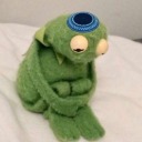
#Also a light redesign to this outfit
Explore tagged Tumblr posts
Visit Tumblr Blog
Explore Tumblr blogs with no restrictions, modern design and the best experience.
Last Seen Tumblr Blogs


Fun Fact
Premium Tumblr themes are available from anywhere between $9 to $49.
Text
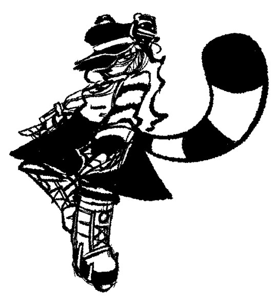
Black and white sketch of RAC I did to help portray how I deal with contrast value for pure black and white.
[Ko-Fi] - [Art] Coloured alt below.
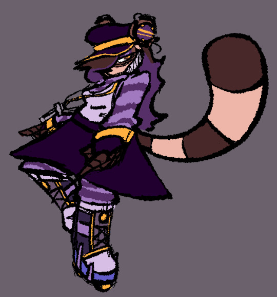
The first sketch in black and white is the original version of this drawing, I wanted to try and figure out what it'd be like if I tried giving it a coloured edition in a similar vein to what the Scott Pilgrim books did. I didn't do shading since this is also meant to work as a slight reference aswell.
#lavartory#fursona#furry#raccoon#OC: RAC-BOT#Also a light redesign to this outfit#the golden trims on the boots were added by my friend Rosa in a commission she did a few months ago for me#Rosa actually designed the original version of this outfit in a way older commission#I decided to also add a golden trim to her cap's brim because it looks nicer
26 notes
·
View notes
Text


EPIC CHARACTER DESIGNS? ANYONE?
im gonna tag this as greek mythology/the odyssey BECAUSE THESE DESIGNS WERE MADE FOR BOTH EPIC AND THE ODYSSEY/GENERAL MYTHOLOGY !!! DONT YELL AT ME GUYS, I TOO GET ANNOYED WHEN PEOPLE MISTAG EPIC!! obvi the odyssey versions wouldnt have sirenelope or the small outfit change for ody
#i love redesigning things hehe#these outfits are based on mycenaean greece#again - these were made to be good for both epic and greek mythology in general#also penelopes design has teal in it to represent her being the only one out of the couple to see telemachus grow up !!#she looks like shes about to go light some fireworks for fourth of july#or say oui oui#that wasnt my intention guys#ok lemme shut up time for actual tags#epic the musical#epic: the musical#epic#epic fanart#epic the musical fanart#the odyssey#greek mythology#tagammemnon#odysseus#penelope#circe#art#fanart#ophii#ophii draws things
133 notes
·
View notes
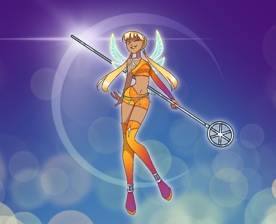
Text

Twirling champion
Big surprise! a double update!
and no I'm not a background wizard. I just decided to use some tricks instead. Aka: painting over a picture.
I started drawing way back when, by copying other pictures onto paper by hand and I already know that trying to draw environment isn't easy. Thus I hope to learn something by doing this instead, until I learn how to implement real pictures into my art, without making it obvious as fuck.
anyway I think i did a pretty good job for my first try, and tried to change it so that it isn't a carbon copy of the original
#art#fanart#redesign#sky cotl#digital art#redraw#sky children fanart#sky children of the light#outfit#sky#man this is like photoshop for poor#i think it's fun like this#wanna do more hehehe#it's also faster and I now know that my splatter brush makes some good low quality leaves#season of lightseekers#sky season of lightseekers
28 notes
·
View notes
Text

it turns out you in fact can finish a drawing if you actually draw for more than 15 minutes instead of staring at the wall. however it also turns out that one cannot get it to NOT be miserably compressed. shame i really like this one lol it has so many layers of lighting ^^'
#its 8 shadow layers total i think. and 5 layers are for light and lighting effects. out of 42 layers. off top of my head#funnily that is a lower layer count than most of my other drawings. like its in the ballpark of normal but its lower than usual#rainworld#rain world oc#rainworld oc#rain world#rainworld slugcat oc#rainworld iterator oc#digital art#i did forget why i wanted to make this one or what the goal/meaning of it was its just to be pretty atp tbh#ALSO im like. strongly considering a redesign for iw's outfit that i've got in sketch rn so this may be the last time she looks like that
8 notes
·
View notes
Text
i wanna do another marineve drawing but w different fits this time…
#think their more casual outfit bc so no hat for neve which is unfortunate 😔#but it’s gonna b w my redesign of the rivaini panoply for marina 🤭i want to draw a full body of that she’s like wearing this skirt#situation but that’s def her more casual outfit. the pirate fit with the feathers is more her formal one#or if she’s meeting w people n all that stuff. I still want to design her end game fit tho but probably work off from that#where her coat gets bigger or maybe the tail end of the coat resemble a fish tail or something idk#but the vibe is BOTH mermaid and pirate. and also light mage armor. if we can make that work somehow
1 note
·
View note
Text


Adding a new hero or princess to the cast introduces a whole new variable. Much like when TotK was released, it would have taken something extraordinary and mind-blowingly inspiring for me to make such a big change to LU. As for EoW, while it was a fun and memorable adventure through Hyrule, it didn’t quite reach the level needed to be a permanent part of LU. I really like this Link, but the story’s simplicity and lack of a first/second-person perspective make it hard to build on. Plus, this game is more about Zelda than Link, and if anyone were to be featured, it would be her. While EoW may not be groundbreaking, it’s still a charming and significant part of the Zelda universe. I’d love to give this Zelda a special role in LU later in the story. Either a special guest, a cameo or some sort of significant contribution to LU.
That said, I’ve already redesigned her for LU, and since she’s not a major character in the cast, I’m excited to share her now!
Design thought prosses: Most of the girls in LU haven’t been revealed yet, but some embrace their royal identity in their attire. This Zelda gave me the chance to redesign a princess without the usual regal aesthetics. Similar to zelda's blue maiden dress and Skyloft outfit this outfit was to have a more humble look that blends into everyday commoner attire. But In contrast, SS Zelda is vibrant, with Skyloft giving off a feeling of saturated, contrasting colors, much like their avian companions. EoW, however, has a more wholesome, toy-like style, and I wanted her design to reflect more light pastels with calmer saturations. Also the art style it'self in EoW and LA remake is very simple, a redesign didn't need much embellishments. I think after focusing on drawing the boys for so long, I was excited to explore delicate youthful femininity—so I went with a cutesy vintage-doll meets cottagecore mood board to set her look.
5K notes
·
View notes
Text

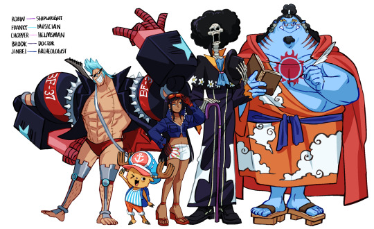
what if the strawhats had different roles on the ship⁉️ i swapped everyone’s roles except for luffy because i can’t imagine him being anything but the captain
these are loose redesigns since their canon designs don’t really read as their roles all that much to begin with. some extra doodles and ideas for this in the cut !!
nami, vice captain: i took a lot of inspiration from her beta design!! canon nami already bosses everyone around so she fits right into the role. she wields an extendable staff (usopp still makes it for her); she lost her arm over the time-skip like how zoro lost his eye. i LOVE drawing cargo pants and boots, so she ended up with a sorta bottom-heavy design. frankly it’s probably not her style but i like how she looks
zoro, the cook: my foolproof logic is zoro uses swords = good with knives. he does not use katanas to cut produce however, just normal knives. i was trying to go for “sweaty ramen guy” with the towel around his neck. the majority of the shit he cooks would probably be drowned in alcohol. he also wears his bandana the majority of the time now!! it completes the ramen guy look
sanji, the sniper: i also took inspiration from his beta design for this!!! he has guns!! and perfect aim of course. i was going for more of a mafioso look so germa 66 would be like, a mafia organization on top of all the other villain shit they already do. he has two guns but i didn’t draw a holster bc that’s annoying🤞 he lights his cigarettes with his guns. how would that even work? don’t ask me
usopp, the navigator: his artistic talent lends itself to creating perfect maps! he also still tinkers, making nami’s staff as well as having a specialty for compasses. he uses a slingshot still (no perfect aim we gotta nerf him) and shoots weather-related projectiles. his goggles serve as binoculars, they can zoom to several different distances. i drew him in his zou outfit purely bc it’s my favorite one
chopper, the helmsman: he would predominately use heavy point while maneuvering the wheel. i changed his hat up to look more like a sailor’s cap, with an anchor symbol instead of an X. to be honest i don’t have much else bc helmsman doesn’t bring much to my mind :(
franky, the musician: ROCK N ROLL BABY YEEAHHH come on his stage presence is unmatched. he’s still a cyborg, he has instruments all over his body like apoo does but they were installed manually. his personality changes depending on what genre he’s playing but rock n roll is his default B) (ex. classical calls for a refined gentleman)
robin, the shipwright: her devil fruit gives her as many helpful hands as she needs! she developed nami’s arm (definitely installed some random shit she did Not ask for). she has a robot mecha that she’s able to pilot all by herself using clones. i changed her orange sunglasses to goggle eyewear
brook, the doctor: the irony of being nursed back to health by a literal skeleton 💀the irony of being the doctor of the rumbar pirates yet being the only survivor, saving no one from the poison 💀 i went for a plague doctor look! IM VERY HAPPY WITH HOW HE TURNED OUT i was really tempted to give him the plague mask too, but i feel that would’ve changed his appearance too much compared to the others
jinbei, the archaeologist: the shape of this man demands a little pair of round glasses on his face. he’s an intellectual i tell you!!! plus still a fishman karate master. the history of joyboy and fishman island being so intertwined is how he developed an interest in history
#i would love to make more doodles of this but i don’t have the time nor energy rn oops#one piece#art#ei98 art#one piece usopp#nico robin#one piece fanart#franky one piece#nami#monkey d. luffy#roronoa zoro#sanji#one piece brook#one piece jinbe#tony tony chopper#role swap au
11K notes
·
View notes
Text
A very special day has arrived. April Fools? Never heard of it.
It's Cody's Birthday!
Can you believe this guy turns 34 this year?
Long rambles and extra pictures below the cut
Maybe I got a bit ambitious with the composition, especially since I was scrounging for time to get this done (we had quite a busy month) which meant I couldn't focus on details as much. But I knew I wanted to make something that felt significant for my boi.
I initially planned to include even more characters; the entirety of Gen 1 and a handful of others, but I knew that would've been too much for me to handle.
So I left on the cutting room floor-
The characters who Cody is on more negative terms with canonically (Duncan, Courtney, Alejandro)
Katie and Sadie (Sorry)
All but three of the post Gen 1 characters.
It's also the one year anniversary of posting my Total Drama art. Not that it's an especially significant thing to note, but it's pretty cool nonetheless.
Here are some alternate renders.


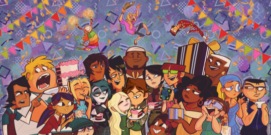
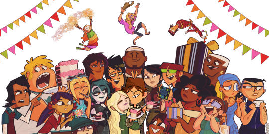

The background is mostly just a mix of background tiles & tones in MediBang, as well as overlays and decorative brushes.
Next are the characters laid out individually and transparently (Sans Justin, Trent, DJ and Lightning as they're egregiously incomplete below the shoulders (At least they have a full head, which is more than can be said of Zeke or Sierra))
Cody & Dawn and LeShawna & Beth were drawn on the same layer, so I can't really separate them.
Geoff, Izzy and Tyler are just very small.
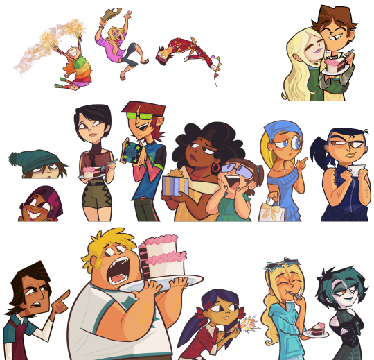
Some characters get cool outfits, some get very light redesigns, a couple look pretty much how they do in the show.
Izzy is dressed as a piñata, because why wouldn't they be?
Harold's look is very loosely based on Beat from JSRF
LeShawna's design is based on a look she has in Dramarama.
I can't draw Gwen the same way twice.
Nobody else has any specific inspirations for their looks.
Now that I think of it, the centre of the drawing is not dissimilar to what I drew last year. Similar compositionally, but different contextually.

Kinda embarrassing to look at my older art now, but that just means I'm super happy with the stylistic evolution. You can tell I've gotten more comfortable with the way I draw TD characters.
Anyway, enough of my rambling.
Happy Birthday Cody!
#my fanart#artists on tumblr#total drama#td cody#would it be poor form of me to tag every character?#eh screw it I'll do it anyway#td dawn#td trent#td heather#td gwen#td harold#td sierra#td leshawna#td bridgette#td dj#td justin#td ezekiel#td beth#td lindsay#td lightning#td kitty#td owen#td noah#td eva#td geoff#td izzy#td tyler
659 notes
·
View notes
Text

Here's an addition to the previous Mal redesign I posted, just with an extra outfit. This is my take on her coronation dress at the end of the story, fully embracing the red palette that was previously creeping in, now that she's standing in her individuality, away from and opposing her mother.
I wanted her coronation look to have a mix of princess and lightness in there, but not take away the witchiness and villain aesthetic from her. I also gave her a small cape to reflect her hero moment at that point in the story.
These are some images I was looking at for her two looks, going back to some early concepts from Sleeping Beauty (1959):

--
Check out more of my work on other platforms!
My Instagram -- My Twitter
#descendants#descendants art#descendants fanart#disney descendants#descendants 2015#dove cameron#mal#maleficent#sleeping beauty#disney villain#disney villains#disney fanart#vks#mal descendants#isle of the lost#villain kids#disney art#mal bertha#descendants 4#descendants rise of red
1K notes
·
View notes
Text


ii designs + oj being a little fruity with it
i'm gonna yap below about the designs actually vvvv
springy is just an alien thingy + micky mouse (the smallest inspo from the trix rabbit)
bots design is pretty simple, i kept thinking back to that line "now you're a butterfly!" and im just like, i can't just give them little butterfly designs I NEED THEM TO HAVE A LITTLE SLEEVE/CAPE THINGY SO THEY ARE ONE
for mephone, this is like my 5th redesign of him. to give myself credit, this isn't a redesign from my last one it's just an android version of it, since the last one was fully human. i got VERY inspired by dbh when designing him, his glasses are basically apple glasses glued forever on his head. but he doesn't use it as a screen, it's just where notifications/calls are located at. (when cobs is calling mephone he is literally forced to see his name in his eyes i just think thats evil),where he actually uses his "powers" is like dbh, kinda. the skin on his arm goes white/the original robot form from when he was first made then he just taps it a few times and someone gets revived. i imagine there's colors and the final press is the color of the character he's reviving. 3gs would also just look very dbh damaged robot, white spots of his original robot skin and stuff.
also every phone has some type of glasses eyes , i think mepads would be more rectangle, 3gs would have like goggles. me just trying to keep on this consistent thing i told myself where, if a object has some form of glass on them, then they need some type of glasses. light bulb has sunglasses on her head, oj HAD glasses in s1 then changes to contacts (example below)

uh i got a little side tracked what was i talking about, right mephone4. last thing i want to point out is that they also have a default outfit, like the company uniform. when mephone escapes he just generates a new outfit. i think it would also be cute that mephone generates new clothes for mepad too and left it next to him while he waits for him to wake up <3
#hoodedjelly art#inanimate insanity#inanimate insanity 3#ii springy#ii bot#ii mephone4#ii oj#ii paper#ii gijinka#osc
604 notes
·
View notes
Text
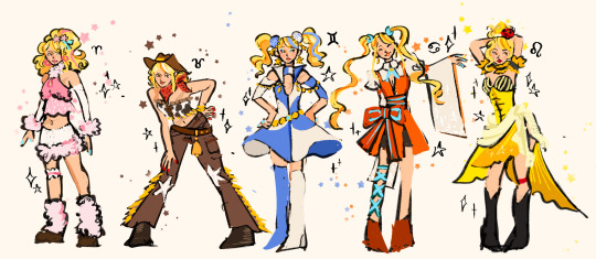
redesigning star dresses part 1!
part 2 and part 3
notes and individual pieces below <3
keep this in mind i love the og stardresses! i just wanted to challenge myself and i’m an inspiring fashion designer!!! my goal was to create dresses that reflect the spirits and u could easily match them up.
these were my initial sketches, i wanted every dress/outfit to have a different colour and silhouette to make them more recognisable.
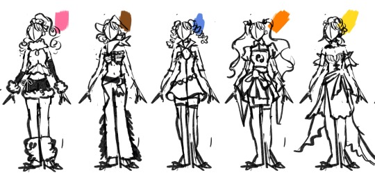
aries ~

- pink was the obvious choice for a colour. I didn’t want to use any major black like in the og design because aries design is so light and bright!
- i really think the og stardress hair is lacking. A fun fluffy 80s hair adds to the whole sheep aesthetic and creates a different silhouette to other designs.
- the 80s hair also inspired a more 80s look with fluffy legwarmers and big hoop earrings.
- i also wanted to bring in those pink pompoms on the side of aries dress so i made them star shaped and put them in lucy’s hair
taurus ~
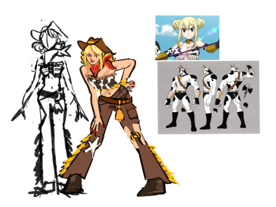
- why put her in a bikini if she’s a cowboy??? this haunts me everyday.
- I couldn’t put her in mainly black and white cos that’s virgo i comprised and landed on a brown.
- for inspiration it was pretty obvious to go with a cowboys and the wild west! i always disliked the one leg pants her og design has so i modified it to a cut out.
- her og design was a mix of the aquarius and scorpio one and it always didn’t stand out to me, so i think by exaggerating the cowboy aesthetic it stands out much more.
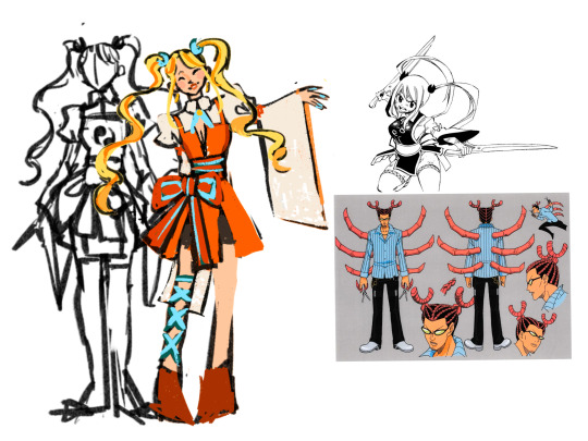
gemini ~

- her og design is actually one my favs. so i really only made minor changes
- the colours stood out against other dresses and were easily identified as gemini. the dual colour symmetrical dress is a great way to reflect the double spirit.
- Gemini is a pretty symbol spirit so to reflect them i used circular shapes and organic lines. i changed the head piece mainly because i struggled drawing it but i realised it made the design too top heavy anyways.
- i extended the dress width and length mainly for silhouette reasons (she wears so many skin tight dresses) as well as to give a nod to the dresses the alternate geminis wear.
cancer ~
- my issue with cancer star dress isn’t the dress itself. I actually love the dress in the manga. it’s the colour. WHY IS GREEN?!?
- if it weren’t for the symbol i wouldn’t be able to match this dress with cancers design, so it had to change.
- other than that there’s no major differences, the ribbon tie is meant to resemble scissors, i love the claw shape hair ties in the og design so i brought them back and i brought the stripes in cancers top to her bow.
leo ~

- i was inspired by beauty and the beast, in the movie the beast kinda looks like lion.
- i swapped the yellow and black in the og design since it has a pretty similar colour story to virgos dress. The og kinda gets lost next to leo since the black doesn’t have variation and leo is in a deep black too.
- i wanted to make her hair bigger like a lions mane and curled around her face.
#fairy tail lucy#lucy fairy tail#fairy tail fanart#fairytail redesign#redesign#fairytail#fairy tail#lucy star dress#lucy heartfilia#i did this for funsies and i actually love the results#fashion and fairytail two of my fav things#part 2 will come soon i have so many thoughts about the sag design#don’t take this seriously i love the og designs lols#daisy art
1K notes
·
View notes
Text
TWISTED WONDERLAND OC
Except it's not a new one and I basically made a redesign for Blade and... Changed everything about him

(more under the cut)
"A cursed boy who always carries a strange sword, he seems to take life lightly."
INFO
Name: Caliburn
Grade: Sophomore
Age: 17
Height: 183 cm
Dominant hand: Right
Homeland: Briar Valley (?)
Club: Mountain lovers club
Best subject: Physical Education, Flying, Swimming
Least favorite subject: History of magic
Hobbies: Dancing
Pet peeves: Feeling trapped
Favorite food: Omelet
Least favorite food: Honey.
PERSONALITY
Talent: Swordmanship
A gentleman by nature, charming and extremely lively – although in a more passive way.
Caliburn carries a lot of energy with him, being quite restless and a born explorer. Sociable and popular, Caliburn seems to be open-minded and doesn't care much about “status” or rules, in addition to often acting as a “mediator” and standing by others.
Despite aiming for the good of the people around him, Caliburn is quick to define his limits and is very strict with them, as well as not letting go of the idea of using light manipulation or blackmail to get what he wants.
However, in general, he prefers to be more virtuous, firmly maintaining his ideals and not being afraid to defend them, appearing to be a very courageous individual.
It's also worth mentioning, even though it's a considerably rarer event, when triggered Caliburn can become extremely impulsive and even violent without wanting it, hence why he always tries to remain calm and in control of his own feelings.
In short, Caliburn is a warm person, who genuinely seeks to keep himself and the people around him positive. However, instead of being completely selfless, Caliburn also cares about his own happiness and limits, and can show irritable and impulsive tendencies if disrespected (normally these impulses are controlled).
FACTS
Caliburn is twisted from Prince Phillip from Sleeping Beauty

Most of his harmful impulses come from his curse, which connects him to the sword. Currently, the curse is under control because of treatments.
One of the Knights who protect Malleus in NRC, although he never shared a past with him. He was appointed to this role on the recommendation of his father, accepting this responsibility in search of a challenge.
Funnily enough, let's just say that his relationship with Malleus is somewhat turbulent.
Due to his curse, Caliburn needs to stay close to the sword. Thus being allowed to carry it around campus.
Caliburn is amnesiac, he remembers almost nothing about his life before the age of 14 and that includes his biological family. Even so, he doesn't seem to actively try to seek answers, preferring to move on.
Caliburn loves horses.
Caliburn is a very energetic person, constantly finding himself trying to expend energy in some way. In addition to his natural dislike of small or cramped spaces, Caliburn frequently leaves the campus without permission. (He's crowley biggest opp/j)
Dancing is one of his biggest joys!
He shares a room with Silver.
APPEARANCE
Caliburn cares about maintaining a good appearance, even being a bit vain.
His hair is mostly light brown, with some blonde highlights in certain parts, tied with a small red ribbon. His eyes are the same colour of an aurora.
His diasomnia uniform is a little different from the others, using the much larger coat as a cape, held to his clothes by silver thread. Around his neck he wears a purple ribbon and a golden necklace with a sword pendant. The shoulders of his shirt are puffed.
His hat is longer than usual, with a feather on one side. The lower part of his outfit is like the others, except for the presence of purple fabrics at his waist that resemble a tailcoat.

Bonus drawing made by my pookie @lumdays
@cyanide-latte @oya-oya-okay @theleechyskrunkly @thehollowwriter @distant-velleity @boopshoops @br3adtoasty @casp1an-sea @heyhellohihowareyou @tixdixl @sillyslipperybananapeel @cheerleaderman @revolllutionary @nyx-of-night @lumdays @skriblee-ksk @nemisisnemi @althea-and-alcestris @miyanaranagikenmal-intp @the-necromancer-wife
#he's not emo anymore#AND HE'S FINALLY HERE#he's just a silly guyyy#drawing the sword was the bane of my existence#HOPE YALL LIKE HIM#caliburn#twst oc#twst#twisted wonderland#diasomnia#disney twisted wonderland
316 notes
·
View notes
Text


doodle dump!!!!! theres a lot of stuff in here, ranging back abouuuut a month and a half! putting explanations for all of these under the cut <3
1 - sort of a color study of a Forces screenshot cuz i thought the lighting was cool, but also its for a friends rewrite of the game!
2 - idk, i just wanted to draw hipster sonic from Boom except with modern sonic :P
3 - a silly concept for Prime! i have a headcanon that, after Sonic left the shatterverse, it sorta "reset" and repaired itself, and because of that it gained back the people it lost when it was originally shattered, aka Sonic and Shadow were brought into those timelines! the guy i drew here is named Breeze and hes from New Yoke -- Nine calls him Breezy :)
4 - a sorta-redraw of a screenshot from Boom. i just wanted to draw the bros hugging <3
5, 6, 7 - redraws of panels im particularly fond of from Scrapnik Island!
8 - ive been watching Sonic X and i absolutely fell in love with that little guy Bokkun so! i made a redesign of him if he was canon <3
9 - Surge in Android 18's outfit!
10 - triple s hand ideas <3 might make more of em with other characters
11, 12 - concepts of what i think Silver and Blaze looked like when they were kids!
13 - unfinished idea of what Silver's room would look like
14 - a Sonic OVA screenshot redraw
15 - ideas for modern Mighty and Ray! theyve got matching bows hehe <3
16 - Chris Thorndyke redesign, specifically with idw in mind! i have some more concepts of him with a special wispon for crimson wisps. oh, and his wisps name is Ava!
17 - ive seen people draw Terios and Feels together, but Feels transitioned to Mika!!!! anyways, i just think those two could be a cute duo, sorta with a quiet older brother and peppy younger sister vibe hehe
if anyone has any questions about any of these, feel free to shoot me an ask!!
#twip draws#oh boy#sonic#sonic the hedgehog#sth#tails the fox#miles tails prower#knuckles the echidna#scrapnik island#bokkun#bokkun sonic x#silver the hedgehog#shadow the hedgehog#blaze the cat#surge the tenrec#classic sonic#classic tails#mighty the armadillo#ray the flying squirrel#mighty and ray#chris thorndyke#sonic x#terios the hedgehog#cyber singer mika#crimson wisp#long post
428 notes
·
View notes
Text
The Elves of the Reach

A pretty elf-light hold. It's been ages since I showed off my Calcelmo redesign, so here he is as well:

Prosthetic arm is bundled into his robes, which will be available as a separate mod.
Aicantar

Calcelmo's nephew, as a scholar I thought he should look a little more studious. I also gave him some fussier robes.

Ondolemar

Worried it might be controversial but...


I gave him hair. I really don't like the shaved hair texture on light-haired NPCs. Kept the goatee, tho. He also gets some fancier robes to set him apart.

Orchendor

Bosmer ex-priest of Peryite, stinky.
Nimphaneth

A one-off cannibal you'll meet in A Taste of Death. I have made her a yucky Namira devotee robe that I'm not sure how to distribute to her and Sanyon (as they both use leveled items, and the Skypatcher set default outfit function doesn't seem to replace leveled outfits?)

I also tried to give her a unique haircut.

Sanyon

Another rando cannibal
Additionally, I updated my Elenwen design:

113 notes
·
View notes
Text
Might end up redoing this one, but here's Stella's redesign!


Except I couldn’t settle on a color combination, so pls have three more:


We have, in order: saturated oranges and purple gradients, pale oranges and purple gradients, and finally saturated oranges with green gradients. I am not 100% happy with any of them, but I’ve changed them around so much that I’ve given up now. Also I am once again abusing that shiny bubble brush for the background.
Stella's canon redesign, I wasn’t too unhappy with in the trailer, but am absolutely APPALLED by in this final shot. Not only does it melt into the background like she's Stella, the Fairy of Camouflage and Making Me Squint, something about the lighting is bothering me as well. If this were an illustration I would say that they shaded her skirt with black, which is beginner mistake number 1. I don’t know if it’s the VFX of those solar flares (which also look like a flat yellow brush without any glow effects) or my eyesight, but I find it hard to see any detail in her costume. But let’s scrap all the post processing, and focus only on her outfit.
As @wearethewinx has pointed out in her analysis post, the shoes don’t match any color in her outfit. They do seem to be matching the pink in her wings, but it’s hard to tell, and even then, the peachy yellow they fade into remains the only instance of that color.
I like what they were going with for the top! The different halters create visual interest, and mimic the shape of light beams from a rising sun. Where it falls apart to me is the shoulder pads. Just like Bloom's, they look too thin and fabric-y to be armor, but not decorative enough to work as accessories. They actually cut into the shape of those light-beam halters, but since they’re not thick enough to overlap, they just kind of… intersect weirdly? There are so many oddly placed ribbons around her shoulders and neck that don’t really serve any purpose, and I’m not sure where most of them are going. Her lower arms are completely bare though, which is where I miss Stella's silver little wrist bracers from the original.
I also think the colors are. VERY saturated. Her hair doesn’t give a lot of contrast and I’m having trouble telling where her top ends and her hair begins. I feel like I’m staring into a microwave. Or at molten iron. Though I’m not really one to speak here I know I know
The only thing I really fixed in my redesign is adding the silver-blue accents. With her yellow hair and the orange outfit, you need something cold and shiny to balance it out, in my opinion. I tried incorporating that sunbeam shape into her silver halters, and gave her the pigtails back because that’s an ICONIC silhouette rainbow, STOP RUNNING FROM YOUR OWN GENIUS. Plus it gives more room between her orange outfit and her hair.
I tried to make her OG wings more moon-shaped. I failed. If I have to redo them one more time I will cry.
The part I’m actually proud of is the greens in her sleeves, if I’m being honest. It looks a little weird, and the sleeve itself also doesn’t really scream Stella to me, but it does look very bright and luminous. Plus, green is not something that’s usually in Stella's transformation, so I feel like I’m expanding my horizon a little.
All in all, not the redesign I’m proudest of, but it’ll do.
Also:

Get that goddamn rattle orb away from me. What’s she gonna do, bonk Knut on the head with this???
#winx club#winx club reboot#winx club s9#winx club Stella#winx redesign#WHERE is her scepter you cowards
95 notes
·
View notes
Text


Luci and Adam redesign/my version! 🍎🎸
Here’s the brief explanation n a bit of lore for why i designed them like this! (Warning, it’s basically just me rambling LMAOO)
Lucifer 🍎:
I let him kept the whole angelic aesthetic cause even if he’s a fallen Angel his features didn’t seem to get distorted or turn “demonic” (from what I’ve read anyways), so by that logic he can still be God most beautiful Angel, and it fit too cause Demons are usually more attractive or good looking to lure in people, deceiving people with their good look. He’s also kinda stuck in the past so usually he’ll appear in his heavenly robe or any old school outfits that he deems old enough
Lucifer in my version is more similar to his pilot personality, he’s more king like in this sense! And of course he’s pretty prideful, and is in denial about having Fallen, he still present himself as if he’s a pure Angel and hates having to interact with Sinners, he’s more lenient with hellborns as they are his rightful subjects after all. But yeah, anyone that isn’t him is often meet with nonchalant or cold attitude, he also doesn’t really care about Charlie whole Hotel, he doesn’t support it nor does he hate it. Cause it have nothing to do with him, he does think it’s a little silly and speak to Charlie like she’s still a child essentially. (He still like ducks in my ver heheheh)
Adam 🎸:
I wanted him to have something nature related in his outfit so I gave him some leaf lol, and his fit is changed so that it resembles a priest outfit more than a simple dress, the halo on his neck and hands restricts his powers, like a power dampener (I based them off of Sun Wu Kong headband!), the seraphim uses it to control how he acts, they can also communicate with him through them, commanding him without using too much energy, Words of god kinda thing. These halo can weaken him A LOT like at some point it can even stop him from using powers entirely, it doesn’t hurt him physically. The halo on his head make it so that anyone who look at him will only see a blur, or blurry version of his face
His helmet has three faces, when he’s wearing it he can see from either sides or all of them, it help him counter attacks, his exorcist uniform is just like his normal outfit, just with more gold, the horns on his head emit holy light, stopping any demons n Sinners from looking at him unless they want to lose their sight, he can also use it to gather up energy to shoot out a massive beam that can erase anything in it path. His wings are based on duck wings but more durable, water and blood can’t stick to it which is fantastic for clean up!
#fanart#hazbin hotel#adam hazbin hotel#hazbin hotel adam#first man adam#hazbin adam#adam#hazbin hotel fanart#hazbin art#adamsapple#lucifer x adam#adam redesign#hazbin hotel Adam redesign#lucifer hazbin hotel fanart#lucifer hazbin#lucifer hazbin hotel#hazbin lucifer#lucifer morningstar#hazbin hotel lucifer#lucifer redesign#hazbin hotel Lucifer redesign#hazbin hotel redesign#redesign
338 notes
·
View notes