#8px
Explore tagged Tumblr posts
Visit Tumblr Blog
Explore Tumblr blogs with no restrictions, modern design and the best experience.
Last Seen Tumblr Blogs


Fun Fact
In February 2021, Tumblr had 518.6 million blog accounts.
Text

this is a screenshot of a world generation project I created for computer science coursework it's been pointed out to me that I need a profile picture, so I think I'll use this?
1 note
·
View note
Note
Bechloe broke our brains and we grateful for it
Well......
Sure would be nice to get compensation for it though..
#bechloe#like‚ a better compensation than a 8px video of the kiss#send help my mind is fucked up and i can blame pitch perfect for like. 11% of the problem#asks#it did help me get into the gay tho for true#*plays toxic in my head*
9 notes
·
View notes
Text
Scope creeeeeeep
#i'm also getting experimental and funky#experimenting with multiple gifs inside one image#which means experimenting with sizes#for a gif that looks 250x180 on the dash#my gifs are typically actually 500x360#so i need to remember to double the actual gap between images in photosets on tumblr#(which is 4px on desktop btw yes i counted)#so all of the gaps in mine need to be 8px in order to reduce to the right size#the gap is a different size on mobile but i accept defeat and will stick to the desktop gap size
2 notes
·
View notes
Text


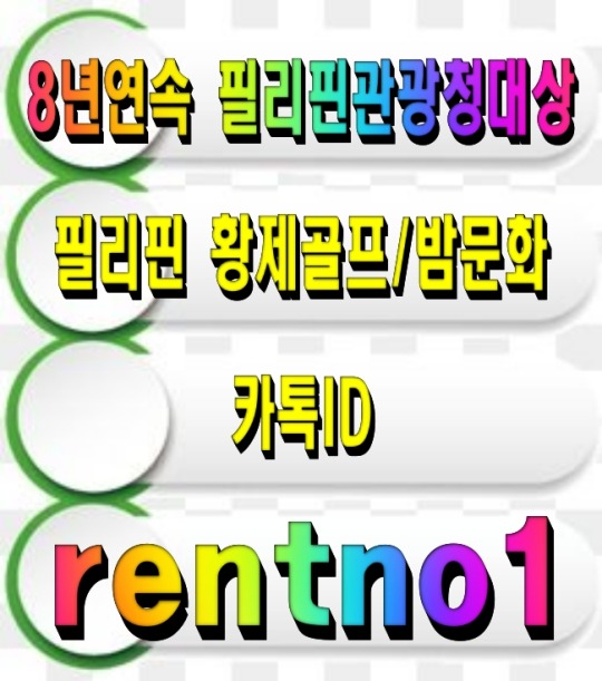

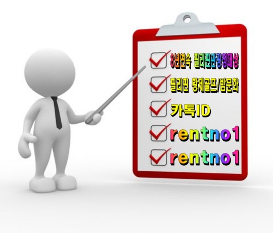


[회원수5만명 검증된 밤문화골프여행 현지여행사]
[ 여행문의 카톡 : rentno1 ]
[필리핀관광청선정 8년연속 BEST AGENCY]
↓↓더 많은 필리핀 정보가 필요하시면 클릭해 주세요↓↓ 필맨스토리 필리핀골프여행
#font-family: 'Arial'#FFB6C1#87CEFA); padding: 30px; border-radius: 15px; box-shadow: 0 4px 8px rgba(0#0#0.1);#color:#FF4500; font-size: 24px; font-weight: bold; text-shadow: 2px 2px 4px rgba(0#0.2);#1E90FF; text-decoration: underline; font-weight: bold;#background: linear-gradient(135deg#FFD700#FF8C00); color: white; font-size: 22px; padding: 15px 30px; border: none; border-radius: 50px; cursor: pointer; font-weight: bold; box-shad#0.2); transition: all 0.3s ease;#<div style=>#<p style=>#[회원수5만명 검증된 밤문화골프여행 현지여행사]#</p>#32CD32; font-size: 20px; font-weight: bold; text-shadow: 1px 1px 3px rgba(0#[ 여행문의 카톡 : <span style=>rentno1</span> ]#FF6347; font-size: 20px; font-weight: bold; text-shadow: 1px 1px 3px rgba(0#[필리핀관광청선정 8년연속 BEST AGENCY]#FF1493; font-size: 22px; font-weight: bold; margin-top: 20px; text-shadow: 2px 2px 4px rgba(0#↓↓더 많은 필리핀 정보가 필요하시면 클릭해 주세요↓↓#<a href=“https://cafe.naver.com/philmanlove” target=“_blank” style=“text-decoration: none;”>#<button style=>#필맨스토리 필리핀골프여행#</button>#</a>#</div>
0 notes
Text
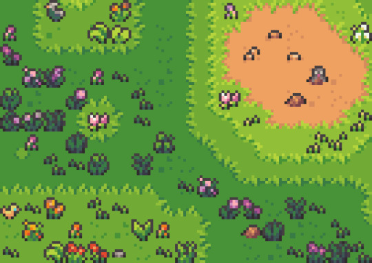
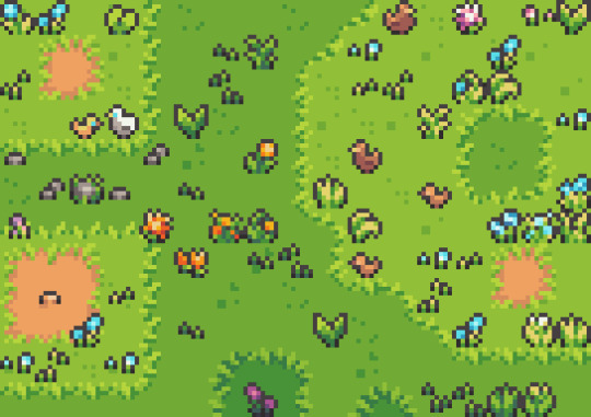
working on a little set of 8px flowers and plants💚
#dinchenix#work in progress#pixel#pixel art#pixelart#artists on tumblr#art#flowers#plantlover#plantblr#asset pack#game art
600 notes
·
View notes
Note
is it possible for you to draw with a bigger brush size? its difficult to be drawn to specific parts of the comics and stories at times
I mean, I can
But you’d have to be ok with a downgrade in brushstrokes quality chchchch

The thing about the program I use, is that it’s extremely simple, it’s not as advanced as other programs (and I’m not using it on Desktop, but the app version on phone with my trusty finger, which is even simpler than its Desktop counterpart)
Meaning, something as simple as some brushes having a varying weight that you can control when drawing is nonexistent
I have to consciously emphasize, and weigh my own lines as you would do in traditional art, something that I can’t do if I go for thick/bigger lines on the get go
I have to start with thin lines if I want to weigh my lines to look more presentable, then reemphasize and thicken my lines afterwards, all while taking into account different brush sizes depending on how big the area I’m drawing is (e.g. if I use a brush size of 5px while drawing the face, it’ll look much thicker/bigger than if I used that same size for the body, so when I draw the body, I have to raise that size to 7-8px just to maintain the same line weight and give you the illusion that I used the exact same brush size when I actually didn’t, something that can also help with the illusion that there’s a line weight to the brush, when in reality there isn’t)
(Same thing can be applied to thick lines on the get go, if I draw the face with a 8px then it’ll look much bigger in comparison to the body, so i’d have to raise it to 11-12px if I want to maintain that line weight and keep it a bit consistent)
Not to mention, the brush I use specifically is very textured, so starting with thick lines means I can’t control the texture of the brush to look neat, and instead, it looks really messy (and not the good kind of messy, cause believe me, I love messy art)
Thick/bigger lines are something that I already do in my comics all while taking into consideration everything I mentioned above, meaning it needs mental presence and actual critical thinking
It’s just, sometimes, I do them quickly, whether because I didn’t have time, energy, or simply because I was sleep deprived or drawing right after work and I’m exhausted, doing them quickly means that I don’t do any varying line weights or keep in mind brush sizes, and that means no thicker/ bigger lines or any line weight at all, just lil ol��� me using that 4px for the entire thing :)
116 notes
·
View notes
Note
hhhhiii how did you make the font bigger

Metadata !! Assuming you mean the last rentry I posted, these are the settings I used for it

I’d rec keeping the text size to around 15 - 20px imo, tends to fit better , but obviously do what fits best for u
Smallest font size goes from 8px to the biggest 64px


91 notes
·
View notes
Text
ooo question for fellow digital artists
what's your usual starting canvas size and the size of your regular sketch brush/tool?
i always start at 2000x2000 with a 8px brush
258 notes
·
View notes
Text
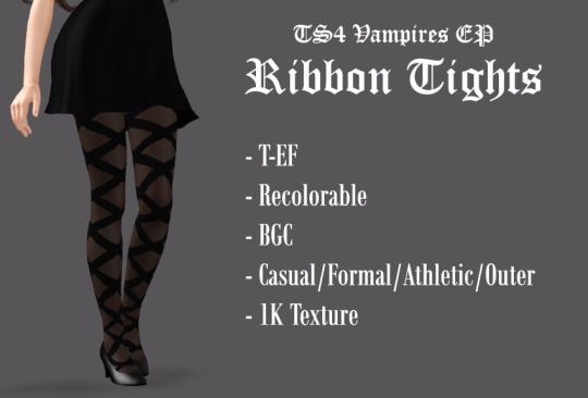
TS4 Vampires GP Ribbon Tights - 4t3 Conversion
Please ignore that I put EP instead of GP in the preview
This could only be possible with @thornowl's tutorial - without it, I would have NO IDEA of aligning the ribbon design below the ankle, since TS3 and TS4 foot UV maps are incredibly different.
SO YEAH, IT WORKS! And those are legit tights instead of leggings!
There's only some slight pattern distortion close to the inner ankles - not very noticeable, probably a result of the 8px bake border, the discrepancy of the UVs or maybe the raytrace setting, dunno. Not that perceptible + it's the first time I followed the tutorial, so... bear with me on this one.
DOWNLOAD (package): SFS / Dropbox
563 notes
·
View notes
Text

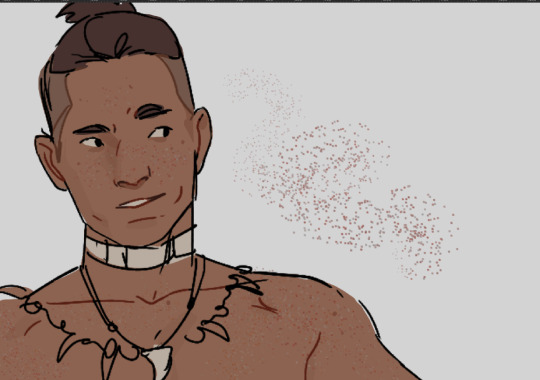
josie’s gaze lingers on juno , a faint smile on lips , acknowledging the shared understanding between them . their family legacy cast a long shadow , but in this moment , it’s just two cousins sharing their truths . “ you’re right , ” she nods slightly , tone thoughtful , yet tinged with a hint of wonder . “ there’s just … there’s something genuinely different with them , something … liberating , i guess . in a way i didn’t know i needed . ” shoulders relax , the admission seeming to ease some inner tension . “ they bring out sides of me i forgot i had , or maybe never knew . and yeah , it’s scary , i’m used to scripts , to knowing my lines and cues . but this ? it’s … shit , it’s unpredictable . ” she chuckles softly , a genuine , unrehearsed sound . “ i might end up making things weird on set , losing two of my best friends , damaging my reputation , facing the possibility of my parents never speaking to me again , and , who knows , maybe even end up with a broken heart in the end … ” josie pauses , her gaze drifting back to the crowd . yes , she’s searching for her girls . “ but you know what ? they’re totally worth it . they’re worth every single gamble i’d never usually even dream of taking . i guess it does mean something , doesn’t it ? ” she offers one final smile before her hand comes to rest on juno’s arm . her expression shifts , revealing a playful curiosity that lights up her features . “ but enough about my dramatic love life . what about you , huh ? how’s your heart beating these days ? got anyone special i should know about ? ” // @junipcrs

juno and josie really weren’t so different . she too once held the need for perfectionism . the need to meet the unspoken expectations . but she was also younger . desperate to prove herself to her family . but when opportunity came knocking to do something more , she had grasped it with both hands and flew . “ it’s not a bad thing . you’re different when you’re with them . ” and she thinks josie needs that . juno had damon and nia . two people she trusted the most in the world after her cousin . she watches josie , nodding every so often . even if they were just allegations , anyone can see there was a connection between the trio . “ i mean with the way you talk about the both of them , i’m sure it does mean something . like you said , it’s different than what you had with both xavier and nika . ” it’s none of her business but she sees the way josie talks about her co-workers . she doesn’t need intuition to tell her that it’s very clear something is brewing . “ it sounds like a good different . i feel like you’re more . . . you when you’re with them . or am i wrong to assume ? i know the three of you are talented actresses but i don’t think anyone is capable of faking it that well . ”
#so maybe this seemed a lot shorter when i typed it up in tiny 8px roboto font on google docs#* 𝑗𝑜𝑠𝑒𝑡𝑡𝑒 𝑠𝑒𝑜𝑛𝑔 : colloquy .#* 𝑗𝑜𝑠𝑒𝑡𝑡𝑒 𝑠𝑒𝑜𝑛𝑔 : colloquy ↷ juniper choi .#* 𝑗𝑜𝑠𝑒𝑡𝑡𝑒 𝑠𝑒𝑜𝑛𝑔 : events .#* 𝑗𝑜𝑠𝑒𝑡𝑡𝑒 𝑠𝑒𝑜𝑛𝑔 : event ↷ met gala 2023 .
3 notes
·
View notes
Note
What brushes do you use?
i am sorry for the later reply i was out cold. this is not gona be a satesfying reply though. i just use... one square shaped boy.
you can easely make this one in PS by opening a 500x500px file and you either fill it compleatly in with black, or make it a vary slightly wonky square. (don't think it matters but it gives it your own handtouch) once you have you square you go to 'Edit' > 'Define Brush Preset' and you get the square boy in your brushes lybrary. I am sorry I don't know how how to create your own brushes in other drawing softwares.
I usually use the brush size 8px, 10px or 15px. and this boy has never failed me once! i sometimes try to make myself some other brushes to get a quicker workflow. but then i have to readjust the sizing and angles or i don't like how the shape looks and... i just stick to this one brush and call it a day. i do change settings though! Switching on Transfere + Opacity around or below 50% i make fur.

Add scatter effect + colour dynamics: i can like make quck freckles texture or in some cases like sand grain.
(if i lessen the distance between forms and the count on how many get scattered texture also works for stars, water droplets, atmospheric dust)
For details, or jewlery i like to make a seperate layer, adding an effect to it to get a "Contour Lineart".
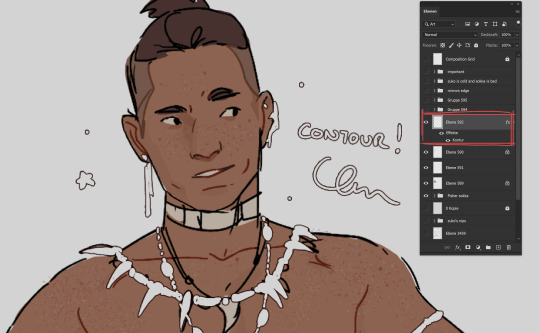
i know this is barly (if even) a tutorial. so if there are more questions i would love to awser them. though i use photoshp (still). and i am just barly scratching and begining to learn and get comfortable with Clip Studio Paint. I will have to save my square boy and move it there but maybe i finally learn to use more then just one brush for once! and by the next time someone asks me "what brushes i use" i have an easyer time explaining because i just have to point at the CSP brush ones.
#chip!ask#photoshop#before anyone comes at me for using Adobe#listen 15 years ago they were eh... but not as catastrophic like they are today!#most of my colouring happens with lasso tool btw#and blush and gradiants with well... gradiant tool#but these wern't anons question
128 notes
·
View notes
Text


Bruges — a responsive, single-column theme
Static previews: - left sidebar - right sidebar
Download code: GitHub
This is a single-column Tumblr theme with an sidebar (left or right option), and a body font family (Google font) of your choosing. Optional dark mode and update tab included. Supports NPF posts.
Updated May 2024: Version 2.0.0!
Read features and notes below the cut.
Features:
Customize colours for dark and light mode.
Select font-size
Select blog layout: right sidebar / left sidebar
Select post-width: 350-540px
Select photoset gutter: 1-8px
Select post info display: icons / text
Select tumblr controls: shown / hidden behind toggle
Select update tab: none / left corner / right corner
Toggle optional dark mode
Toggle center post column
Toggle on round corners on content
Toggle on round corners on photo(sets)
Toggle search bar
Toggle on accent pinned post
Toggle gradient border on sidebar image
Navigation: An unlimited display of native Tumblr pages - learn how they work, in my helpdesk right here. Custom label for home + ask + archive link.
Sidebar Image: Choose between sizes 70x70px/90x90px/120x120px. Choose a shape between shapes square, rounded, circle or blob. Separate icons for light and dark mode! But If you want the same icon, simply upload it twice.
Dark Mode: detects if visitor’s operating system is on dark mode, and displays that choice at the first visit - of course with the option to toggle the other mode on/off.
Icon change for update tab: To change the icons, go to https://tabler.io/icons and simply copy the name of the icon like so:

Into the corresponding field:

Notes:
Via/source links are on permalink pages
to hide the archive link, simply delete the text in the field.
Submit-link and ask-link only shows if toggled on in your blog’s settings.
Credits
1K notes
·
View notes
Text
@staff
im sure someone with an actual UI/UX degree can explain this better than me but:

a. idk what this logo is doing in the middle. given the majority of the left hand side column is left-aligned i think that's what you should've done with the logo too b. this menu needs bigger font and larger spacings. when you have this much blank space below it looks unnecessarily crowded c. at this point you have a middle-aligned logo, left-aligned menu and right-aligned new post button. sure you know that's bad... it's like they were designed by three different teams at three diff companies.... d. there's no reason to leave this big square of dead space to the left of the discovery menu esp since we're expected to scroll through the discovery menu that's already too big to fit into the same screen? e. the margins and paddings here look very odd. the "Manage..." on top right has a 0px margin between itself and the lil grey line. the new post menu on bottom right has about 15px, everything on the right hand side has about 8px. im pretty sure if your margins are consistent it'd look better f. also the "Following | For you | Your tags etc etc" received the biggest font in this whole layout but shouldn't the visual focus be put on the actual content itself?
270 notes
·
View notes
Note
can you make a tutorial on how you made your header please (of course you don’t have to if you don’t want to)
hi anon! unfortunately as i was doing so my computer died so i've lost the original one </3 but we'll just make a new one using the same steps hehe! see under the cut.
i'm using photoshop 2024. open ps, and create a new canvas that is 640 x 360 px. add the image of your choice. the original picture i used was already rotated, but if you still want that effect and yours isn't, rotate it by 90 degrees. size it to your liking then click the check mark! after that, click your pen tool (or press p). create a rough outline of the areas you want outlined.

after that, click make selection at the top. the settings that pop up are fine. press ok. then, go to your marquee tool and right click on your outline. select stroke. choose the settings and color you want, im using 2px and making it white.

with that done, we can get to work on your text. the original font i used is called payback. here, i am using the font 'grandma house sans'. i am using gradient overlay, stroke and outer glow. after you have your main text, create a rectangle shape underneath. you will use this as the path for your subtext. with the rectangle selected, grab the font tool and place your text within the rectangle. i'm using the font asenine wide. once you have selected your text, look on the right side of your ps at the text properties. scroll down to paragraph and click 'justify all'

i'm adding a drop shadow and outer glow to the text to accentuate it but that's all i'll do. when that's done, you'll want to use the line tool to draw a line between the first space. duplicate the line and drag it over to the other empty space. i'm using a 1px purple line. i'll also add a drop shadow and outer glow to it bc the colors are light.

now, we are going to go back to our rectangle tool. create a rectangle the same length as the rest of the text. its color is up to you, i'm using a gradient overlay the same colors as the main text so it's cohesive! grab your text tool and again, with the rectangle selected, place your text within it. this text will be your tumblr url (unless you don't want it to be haha). i'm using the same font, asenine wide regular. i've added a drop shadow to the text. this is how it should look.

now, we're going to grab the rectangle tool one more time and place a rectangle at the top that is the same width as the canvas. the height is up to you, mine is 14 px.

now, change your shape to the ellipse and create a circle within the rectangle that's about 8px wide + long. duplicate it twice and place them about 4px from eachother. you can change the colors, i'm going to leave one white and then use two shades of light purple.
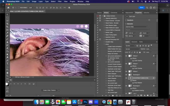
now, head on over to the other side of your canvas and use your type tool to add your date (and time if you wish, i didn't). mine is seventeen's debut date :) i used the same font, asenine wide regular. this is what i have so far.
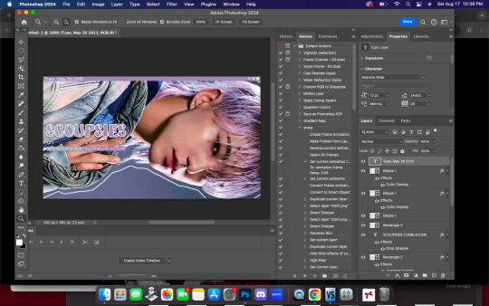
last but not least, we're going to add the particle effect. i screenrecorded effect #5 from this video. to make your life easier and save me from explaining the process, i've uploaded it as a psd here.
before you open the psd, open the timeline on your current canvas. this can be done by going to window -> timeline. mine is already open as you can see, once it is open click create video timeline.

then, you're going to go over to sparkles.psd and copy the 'group one' layer. paste it underneath your text! now, you're going to have the wonky problem of a gif that's significantly shorter than your other layers and cuts off, see here:

so to fix this, use this little thingy and drag it until it no longer goes over the edge of 'group one' in your timeline. it should look like this.

now, why is our overlay still blocking the rest of our image out? this is an easy fix, go over to layers, and with group one still selected, change the blend mode to 'screen'. bam!

finally, to achieve the background effect i have, create a new layer underneath all your other layers, then, go to the layer with your outline on it and use the magic wand tool to select everything outside of the line. go to your image layer with the selection still intact and go to image -> cut to remove the bg. i had to do this in 2 pieces.

then go to that new layer you created and make it whatever color you want. you can use a gradient map, solid color, whatever you want. i'm using a gradient fill similar to background colors, then over it i'm putting a crumpled paper texture (i just googled black paper texture haha) on screen mode. feel free to get creative. this is how it looks!

and that's all, your header is ready to use. go over to file -> export -> save for web (legacy) and save it to your computer. this is our end result! i did add a bit of noise to hoshi bc the image was low quality but otherwise, i did nothing that wasnt't outlined here!

i hope this was semi easy to understand! ♡
#answered#tutorial#tagging some friends for exposure <3#tuserflora#userzaynab#userace#usermery#heymax#cheytermelon#rinblr#long post#image heavy
36 notes
·
View notes
Text
my boyfriend makes fun of me for using 0.7 and 1px brushes so i wanna see what everyone else uses
28 notes
·
View notes
Text
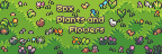
🌱🌻Today I released my first asset pack on itchio! It's a free collection of 64 plants and flowers fitting for 8px tiles!🌷🌿
Find the pack here on itch.io!😊
#dinchenix#pixel art#pixelart#pixel#artists on tumblr#art#game art#game assets#game resources#plantlove#free assets#itch.io
576 notes
·
View notes