#540px at last!
Explore tagged Tumblr posts
Visit Tumblr Blog
Explore Tumblr blogs with no restrictions, modern design and the best experience.
Last Seen Tumblr Blogs


Fun Fact
Tumblr Inc. is funded by 13 investors.
Text


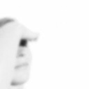
CHANEIL KULAR as Anwar Bakshi Sex Education 2x06
#chaneil kular#sex education#anwar bakshi#chaneilkularedit#tvedit#filmtvcentral#tvgifs#televisiongifs#menedit#userkei#usermichi#userpedro#usfw#*#mine#540px at last!
661 notes
·
View notes
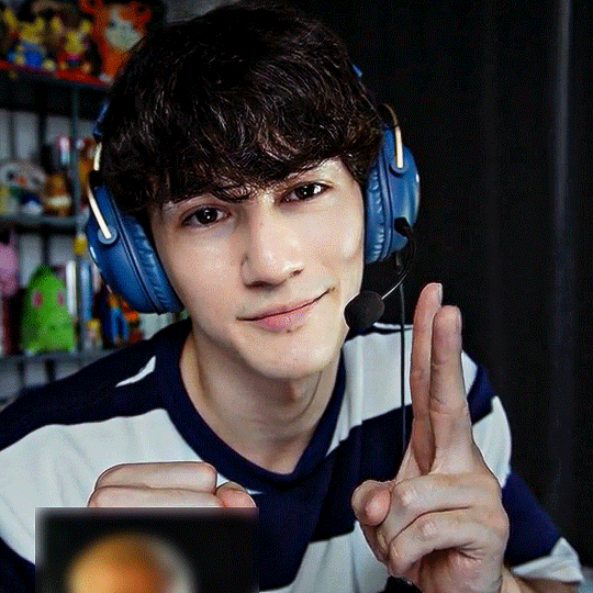
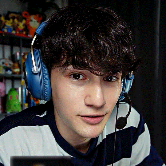
Text


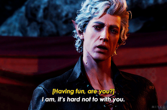
Baldur's Gate III | ▶ dev. Larian Studios
#astarion#Baldur's Gate 3#Baldur's Gate#BG3#mybg3#540px#userwolfkissed#gamingnetwork#videogameedit#gamediting#vgedit#dailygaming#mikaeled#apocalypsekid#radioactive-synth#userliliana#necroticpetals#'it worked on you last time....'#touché theater kid ...touché#bg3 spoilers
12K notes
·
View notes
Text
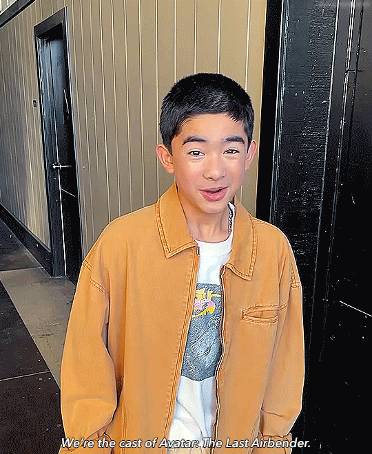
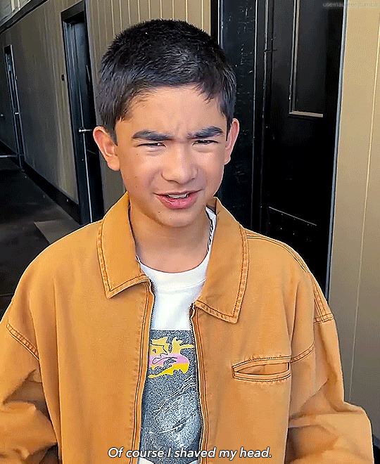
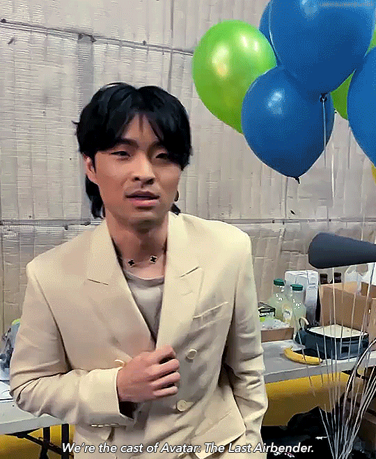


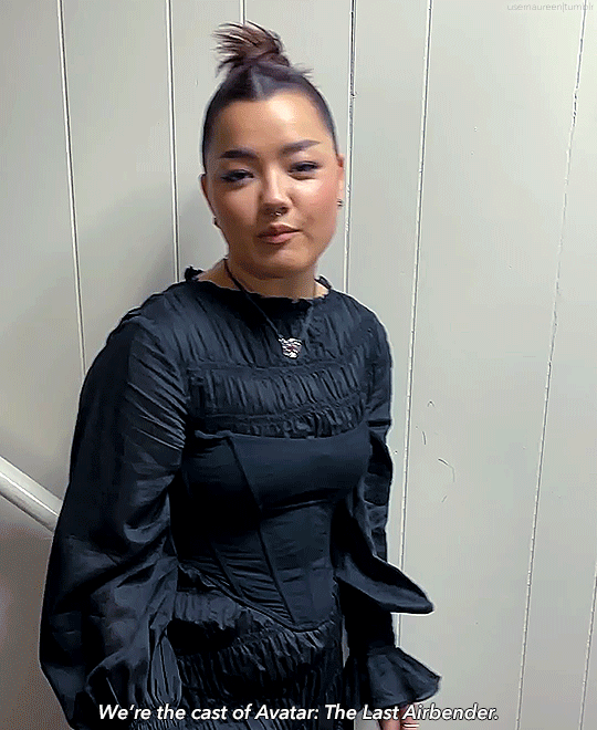

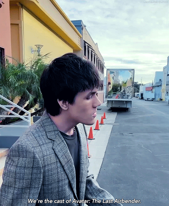
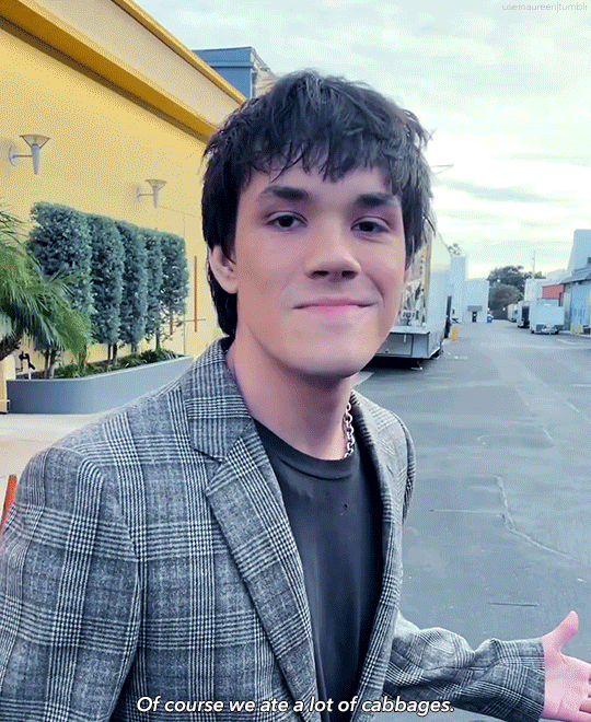
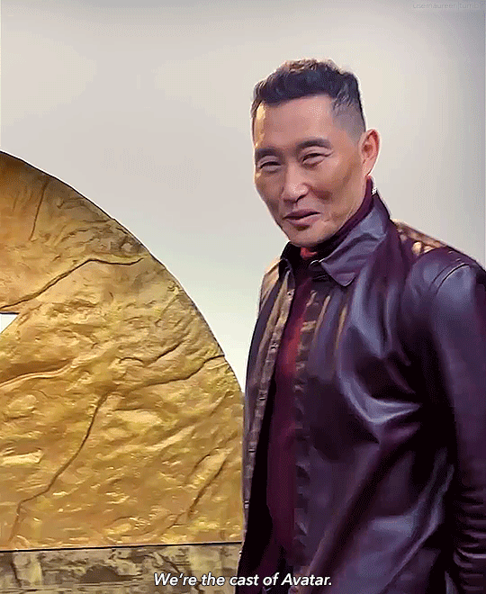
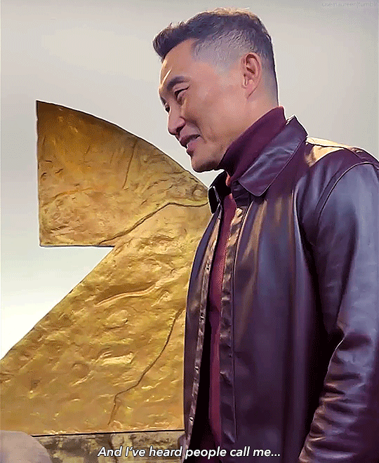


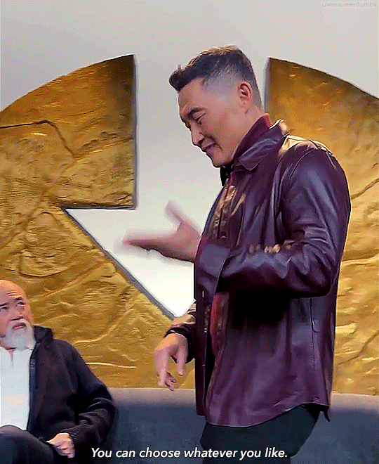

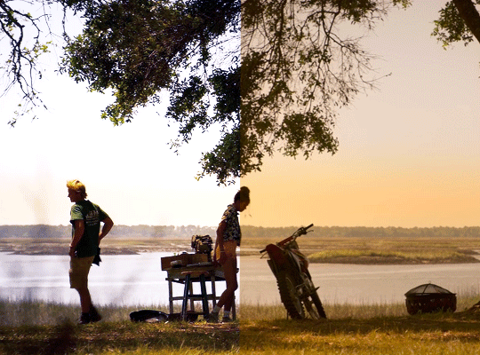
#gordon cormier#dallas liu#kiawentiio#elizabeth yu#ian ousley#daniel dae kim#paul sun hyung lee#mystuff#mygifs#atla live action#atla netflix#atla cast#atlacastedit#atlaedit#atla#avatar the last airbender#natla#atlaliveedit#.gaang can we please agree on what this show's tag is gonna be?#.also this would of course be a better composition with 2 columns but I wanted firelord papi in 540px
847 notes
·
View notes
Text
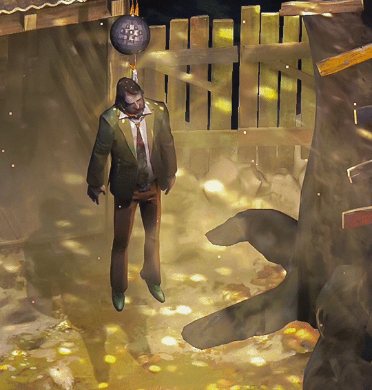
#disco elysium#video game#disco ball#lynched#my gifs#540px#10mb#Doing the Thinker archetype#So I couldn't punch Cuno like last time#video games#I have never delved into my past#Regardless of my build#I just do the job#And that's how this game fucks with your brain#even when you're not playing it#I am#Sorry Cop#at all times
164 notes
·
View notes
Text
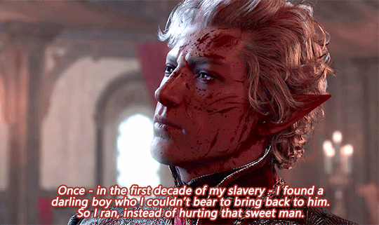


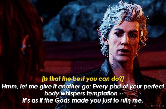
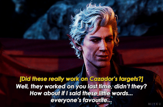
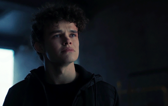
[Was it true what they said? That you gave up fighting him long ago?]
"You don't know what it was like! There was no way out!"
#pls pay close attention to the beginning of the last gif u can ltrly see the glint of a tear in his eye i want to die#also dont say he broke him it gets u disapproval obviously it hurts so much#but i really fucking adore that he says hes not broken#he's still fucking here and he wont give up until hes dead#i need to lie down#astarion#astarion ancunin#astarion bg3#baldur's gate 3#bg3#bg3 spoilers#the pale elf#bg3 gif#bg3edit#my uploads#540px#my beloved#mygifs
339 notes
·
View notes
Text


Perth Nakhun as Kev in Ships In The Night
#the tiktok linked in source!!#it look me a minute to work out how i wanted to gif this but here he is. looking extremely babygirl#they're 540px bc i changed my mind on layout at the last second so click for better quailty hehe#perth nakhun#kinnporsche cast#ships in the night#gif
194 notes
·
View notes
Photo
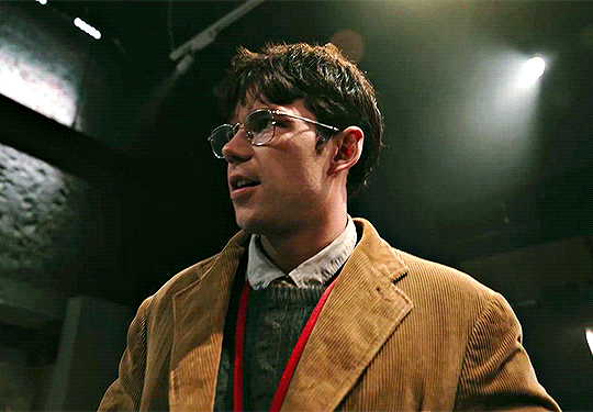
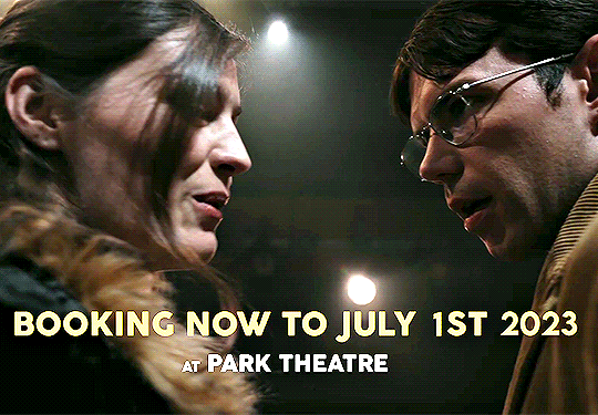
The Shape of Things | Production Trailer
#luke newton#lukenewtonedit#amber anderson#the shape of things#the shape of things (2023)#bridgerton cast#*mine*#bunnykaye#bkln#bklnfilm#LUKE PAUL ANTHONY NEWTON IN GLASSES LAWWWDDD#sorry for cropping the ~video frame~ in the last two gifs but i needed it to be 540px SARREH
65 notes
·
View notes
Text
obsessed with making big gifs that smaller ones feel weird
hmmm do other gif makers feel the same way?
#tiffany tag#the set i made for miles felt so weird bc i don't remember the last time i made smaller gifs#i'm so used to 540px by 540px ones
4 notes
·
View notes
Note
hi tumblr wip! is there anything that can be done about images stretching to the full width of a tumblr post? i make art and images that are sometimes under 540px, and there seems to be a point where they will stretch automatically to 540px. it makes things like pixel art or otherwise small images look terrible!
Answer: Hi there, @moxley!
We’re really glad you asked this question, as we love getting the opportunity to share the tips and tricks that are applicable in this area.
First off, here are the rules of our image stretching:
On mobile apps and mobile sites, we always stretch images to the full width of the post—since a small image on a small screen doesn’t make for an easy viewing experience.
On the desktop site, we only stretch images to the full width of the post if the image is at least 300px wide and/or 600px tall.
Any images that are placed side-by-side are always stretched to fit their frames, no matter the image’s dimensions or the viewer’s platform.
However, the vast majority of devices and browsers use antialiasing in their default image scaling algorithms. This, as you point out, doesn’t play nicely with pixel art at all. Boooooo!
So, how can you preserve your sharp pixels with 100% consistency for your viewers? The answer is simply to upscale the image yourself before uploading. To keep the pixels square, you’ll need to resize by factors of 100% (200%, 500%, etc.) and use a simple upscaling algorithm that doesn’t use antialiasing. For example, in Paint.NET’s image resize dialog, you can use “Resampling: Nearest Neighbor”, or in GIMP’s, “Interpolation: None”.
The trick here is to resize your pixel art to dimensions above 540px wide so that every viewer’s device is actually forced to downscale the resultant image instead. That way, instead of the resizing algorithm making up details by blurring the pixels, each original pixel is preserved as a perfect square.
We really hope this helps you and the other pixel artists out there. Please, have a great day, week, and month. No, in fact—a great rest of your Tumblr experience, however long it may last. Of course, if you have any other questions on this subject, we will be happy to answer those too!
445 notes
·
View notes
Note
hi sole! your sharpening is always so soft and pretty, i was wondering if you would be open to share it? hope you are having a wonderful november so far <3
Hi, Anon! Thank you so much <3 Yeah, sure, tutorial under the cut:
What you'll need:
Photoshop (I use Photoshop 2023)
Basic knowledge on how to make gifs
Camera Raw filter installed
Okay so, first of all, I use two different methods depending on the size of the gif. Let's start with the one I use for most of my gifsets which are big gifs (examples: x x x x.)
METHOD #1: Smart Sharpen + Camera Raw
I started using the Camera Raw filter last year and let me tell you, I'm obsessed! It completely changes the game of sharpening. I use this method for all gifs with a 540px width.
We're going to work on timeline so get your gif ready and convert it for smart filters. I'm using this scene from my last set as a base:

Here's the gif after I color it (I usually sharpen my gifs before I color them but for the sake of the tutorial I'm showing you this so you guys can see the difference):

(1) Smart Sharpen Layer: Let's start by adding a Smart Sharpen layer (Filter > Sharpen > Smart Sharpen) with these settings:
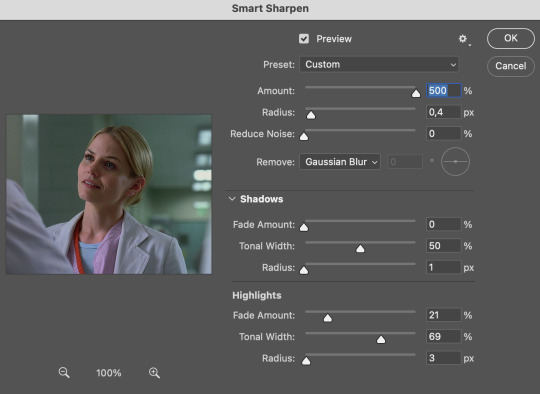
Disclaimer: I didn't come up with these settings myself I got them from these sharpening actions forever ago so I don't know which one it is :/. I also wasn't able to find that person's new blog (if they even have one since they've been inactive since 2021) so if anyone knows please let me know and I'll give them proper credit!
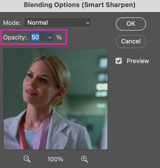
Now we're going to go to the 'Layers' panel and click on this little thingy:

This window will pop up and we are going to change the Opacity to 50%.
(2) Camera Raw Filter: Here's where the fun begins. Go to Filter and click on Camera Raw Filter (you'll need to have the plugin installed for it to show up.) I don't know how the Camera Raw window will look like the first time you open it but good thing you only need to change a couple of things!
If it isn't opened yet click on 'Effects' and we're going to change the Texture and Clarity:
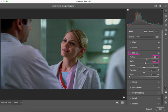
Depending on the scene/show/film I'm giffing, or if I want a stronger or softer sharpening, I'll use two different settings, but 99% of the time they are these:
First setting: Texture (+20) Clarity (+10)
Second setting: Texture (+40) Clarity (+20)


As you can see the difference isn't huge but the first setting gives a "softer" look. As I said I'll use one or the other depending on how I see the scene (it's almost always about the vibes yk.)
Feel free to experiment with these two and see what works best for you (although I wouldn't go higher than 40 on texture because the sharpening will look too fake imo.)
Also this filter is soooo good at making low quality videos look 1080p! Every time I've had to use 720p videos the Camera Raw filter has saved me 🫡
METHOD #2: Smart Sharpen
I use this method for smaller gifs. For example, 8 gifs of 268px x 180px sets (like these) or small-ish gifs in complex sets (like the second gifs in this set.)
This process is much simpler since it's the one I explained before but without adding the Camera Raw filter. That's it that's the method. Just a Smart Sharpen layer with the Opacity turned down to 50%.
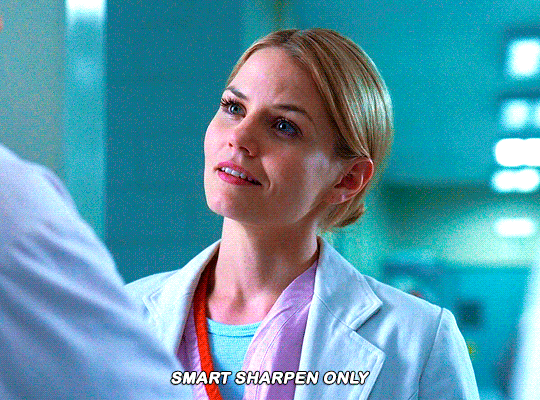
As I said this method looks best on smaller gifs but to be honest it looks good on big gifs too? Depends on what you like most!
Anyway I hope this was easy to follow and if anyone has any questions please feel free to dm me or send an ask! ♡
#ask#Anon#ps tag#useraljoscha#usermelone#userchibi#usermagic#uservivaldi#userlorna#tuserhol#usercats#userlix#usersavana
189 notes
·
View notes
Text

Welcome to the donahdevotee's gift exchange, the event where selfshippers get to celebrate their fem f/o's and share their creativity with one another! (Sign up form is at the bottom of this post, please read through the guidelines before signing up!)
This gift exchange will cover art, writing and moodboards! So if you're not inclined towards art or writing you can still participate to share some love for other people's ships and have some love given to your own! On that note; all skill levels are welcome, as long as you're giving it your all, you're welcome to join!
Obviously the very basic requirement is to have a fem f/o! Your ship with her can be romantic, platonic, familial, queerplatonic, fwb, what have you! Every ship is welcome and so is every fem f/o! (If you headcannom your f/o as fem in any way, she is welcome as well!!)
GUIDELINES:
Art must comply with the rules of tumblr. A width of at least 540px wide, max file size is 20MB, please keep that in mind! If you’re drawing nsft art for your Giftee (You both must be 18+, minors are only allowed to create sfw works) you should censor it to post it. You can send the uncensored art to your Giftee!
Fics must be at minimum 500 words, no cap on the maximum however, go wild! (If you want to make a graphic to go with your fic, go for it! But it’s not mandatory <3)
Aesthetics/Moodboards should have a minimum of 4 graphics/images. You can make multiple for your giftee if you'd like! (Be considerate of eyestrain and/or flashing/etc. if using gifs!)
If you wish to back out at any point please let us know as soon as possible so we can work on a backup gift for your giftee, try not to leave it until the last day of the event!
Content that is NOT allowed: Self harm, Non-Con, Incest, Minors doing anything even remotely sexual, Pedophilia, Bestiality, Racist depictions or Fetish content.
Content that IS allowed: Anything else your Giftee has stated they’d enjoy. Character death and gore is allowed, smut is allowed. Everything MUST be tagged appropriately. If you aren’t sure; tag it!
SCHEDULE:
Nov 1: Sign ups open
Nov 10: Sign ups close at midnight
Nov 11-12: Participants are matched up!
Nov 13-14: INFO about your Giftee will be sent you via DM's
Nov 28: First check-in!
Dec 12: Second check-in!
Dec 23: FINAL DEADLINE, have all gifts submitted by midnight!
Dec 26-30: Post those gifts!!
Dec 31: List of participants and their gifts posted with links!
HOW TO SUBMIT YOUR GIFT:
Option 1: Submit your artwork/fic/moodboard to this blog via the submit button!
Option 2: Send a google drive/google doc link for your gift to this blog through an ask or the submit button!
Option 3: Email your artwork/fic/moodboard to [email protected]!
With your submission please include your selfship url just to ensure we don't have any mix ups! If you would like us to post your gift for you please mention that as well as we'd be more than happy to!
HOW TO POST YOUR GIFT:
You can post the gift directly to tumblr or post a link to your gift!
If you are posting your gift yourself please ensure you use the tag: #donahdevotee's gift exchange 2024 and also tag this blog and the blog of your giftee in your post!
You do have the option to ask the admins of this blog to post your gift on your behalf, where you and the giftee will both be tagged!
#self ship#self ship community#self insert#self insert community#self shipping#f/o#f/o community#fem f/o#donahdevotee's gift exchange 2024
79 notes
·
View notes
Note
Hel!o, again! I meant ur Van Helsing poster 😊 Happy Holidays if you celebrate 😊

i'd be more than happy to! happy holidays to you as well! here's the kind of poster i'll walk you through how to make:

the most important thing you need to think about with this type of poster is which shots will blend best with each other. i recently made a blending tutorial for another anon and you can find it here. in it, i go a bit more in depth on what types of shots will blend best, and you can also check out the blending tutorial tag on my resource blog, @gifmakerresource.
overall, dark on dark blends the best. the lighter your scene(s), the harder it's going to be to see. when making this poster, i went in knowing i wanted to use this silhouetted shot of van helsing. silhouetted shots are one of the best kinds of shots you can blend with because the silhouette itself will be much darker than the surrounding area.

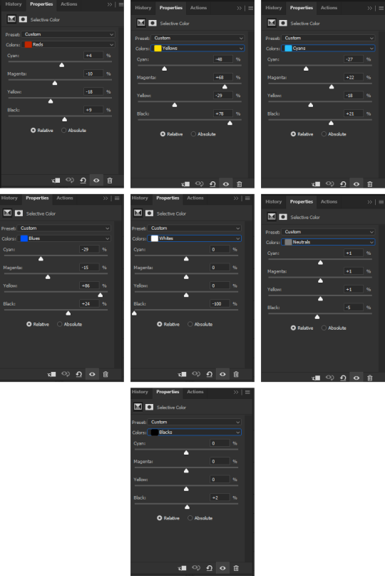
this is what i started with (after cropping and sharpening). the dimensions i used are 540px x 700px but the height can be whatever you want. next, i wanted to focus on lightening the background and further darkening his silhouette.
here are my coloring layers (which will, of course, vary with every shot and every movie):

and here are the specifics for each layer in order from bottom (first) to top (last)*:


*note: the blue selective color layer also makes the same adjustments to cyan
i created a new layer (ctrl+shift+n) and painted over the extra-bright parts around his head for later blending. this is a layer i added after the fact once i found all the shots i wanted to use and blend together.

this is the second shot i used:

once cropped, sharpened, and converted to a smart object, i bring it over to the existing canvas, making sure it's properly aligned with ctrl+t, and set the blending mode to screen.
here are my coloring layers:

and the details for each (and if you're wondering, to color code your layers, right click in the box where the eye is and select your color):

and this is what the gif looks like prior to using a layer mask:

it's not terrible, but i wasn't happy with how much of the second gif could be seen outside of the silhouette. this is also a good illustration of how dark blends with dark best, compared to dark and light or light and light. i grouped together the second gif and the coloring layers (select the appropriate layers and ctrl+g) and then added a layer mask to the group by clicking this at the bottom of the layers panel:

when using a layer mask, you're only working with 2 colors: black and white. using a soft circular brush (0% hardness), as you can see in the selected thumbnail titled Group 3, i used black to color all around van helsing's silhouette. if you make a mistake when coloring, simply press x to switch to white and brush over the desired area and your gif will reappear. it's a way to "erase" a layer without permanently deleting it and is something i use frequently!
i used another layer mask so the gif was only visible right around the top of his hat:

and the coloring layers (note the gradient map is applied to the gif using a clipping mask [right click on the gradient map layer and choose 'create clipping mask'] so it only is applied the the layer immediately below it [the third gif] and not everything below it):

details:


this is the final gif before all the typography:

for the typography, i don't really remember why i didn't just use a transparent png of the movie logo other than knowing i had the actual font they use on the poster already installed. you can find it here (dafont). at the top of this screenshot, you can see my font settings and at the bottom, you can see the blending modes i added:

and here are those details (click to enlarge):


using the same font, i added these two layers and positioned them where i wanted:

the names layer is 24pt and adventure is 36pt. to create/position the typography, i was referencing one of the movie posters btw!
for the final two layers, i used the font sf movie poster, which you can download here (dafont) and decreased the opacity of both to 30%:

ignore the warning symbols - i had to replace the font files and ps is mad at me

the "larger" letters are just capitals while the smaller ones are lowercase. i'm pretty sure this is the typical font used at the bottom of movie posters. i believe i either typed all this out referencing one of the posters or i went through the imdb page for the movie and went through the cast and crew sections.
and that's it! we have our finished gif! making a poster like this can result in a large file size, so keep in mind that tumblr's upload limit per gif is 10mb. i believe this gif is 45 frames, which is probably pushing it with these dimensions. if you finish your gif and find that it's over the limit, i HIGHLY recommend using ezgif's optimizer. you upload your file and then adjust the lossy slider and you'll be surprised just how much it drops the file size down without a noticeable difference. i also use this site to convert webp files to gifs/pngs when necessary.
if you have any further questions or didn't understand something, please let me know! i'm always happy to help :) and lmk if you ever want a tutorial on any of my other gifs! happy holidays!
#answered#Anonymous#gif tutorial#my tutorials#flashing gif#gifmakerresource#completeresources#dailyresources#chaoticresources
29 notes
·
View notes
Text

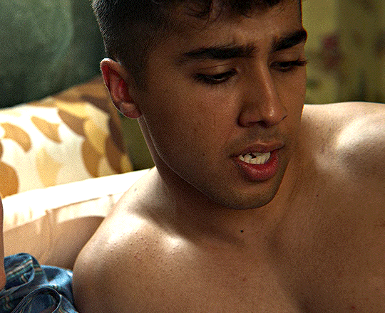
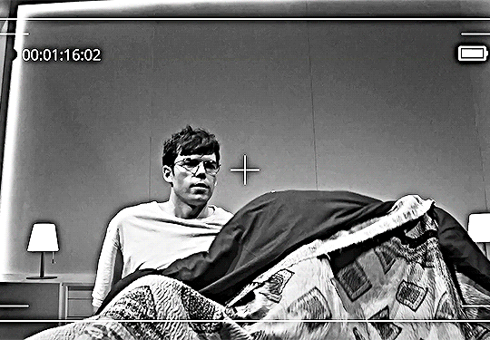
#ambition#movie#1991#albert merrick#played by#clancy brown#I need to re-rip this movie#it's right there in my disconnected dvd drive#I'll read up more on how to do a quality rip first#i reckon#my gifs#prompt me to learn new skills#540px#10mb#The Scrounged#upset man on bed#is what is depicted here#distress#guys in distress#that last tag pops up as an autofill option and I don't think that is drawing from my tag pool#adore this shit#adore the vulnerability of#GIANT MAN#that is the point#stunted from being in jail since he was 17
2 notes
·
View notes
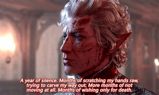
Text


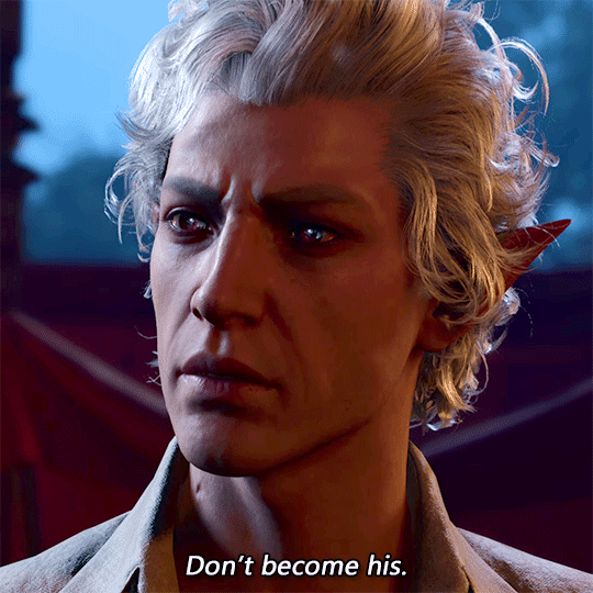
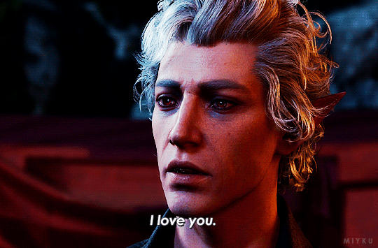
"You know, I didn't realize you and I were so alike."
#he makes me so emotional#ngl i think i cried a lil here#the last gif.... the way he whispers that line#he wants so much better for durge#astarion#astarion ancunin#astarion bg3#my beloved#dark urge#astarion x dark urge#astarion x durge#dark urge spoilers#bg3 spoilers#baldur's gate 3#bg3#bg3edit#my gifs#my uploads#540px#mygifs
321 notes
·
View notes
Text
Gif/Coloring Tutorial

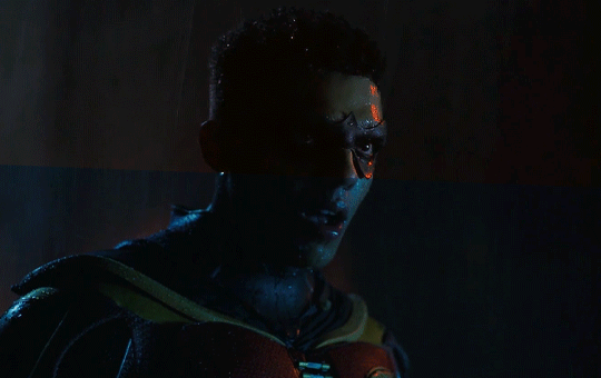
I was asked by @just-lost-inbetween-worlds�� how I make, specifically, my Titans gifs so I figured I’d just make a tutorial on the gif making and coloring since the show is SO blue and the process is the same for all of my gifs.
I did try and go into every step so it’s hopefully beginner friendly lol It did get a little long but I hope it helps!!
What you’ll need:
Clip of what you’re giffing (try using footage that’s 1080p or 4k, nothing below 720p)
Adobe Photoshop (I’m using 2022)
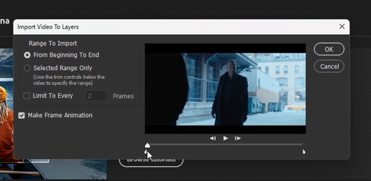
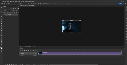
Step 1:
Open photoshop, click file > import video frames to layers

Use the cursors to trim the part you want to gif, make sure you have “make frame animation” selected
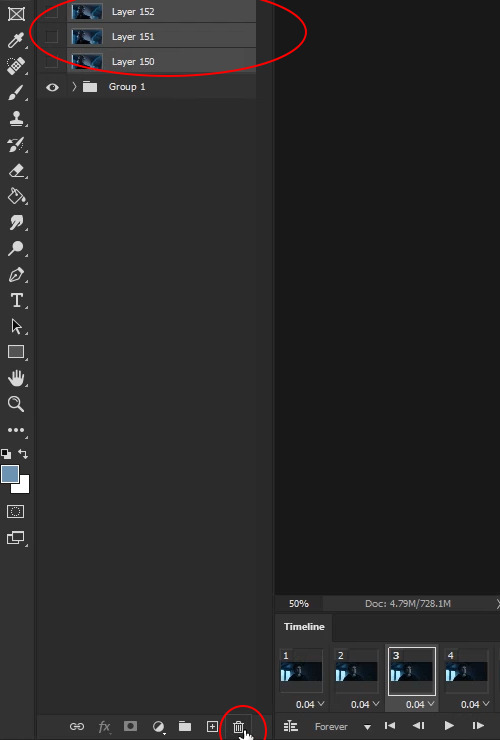
Step 2:
Group all of the frames you want to be a part of your gif. Click your first layer then crtl+shift+click your last layer

Step 3:
Delete the frames and layers you don’t want to be a part of your gif. Select the layers and click the little trash can at the very bottom of your layer panel. Do the same in your timeline
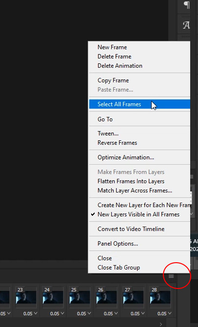
Step 4:
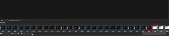
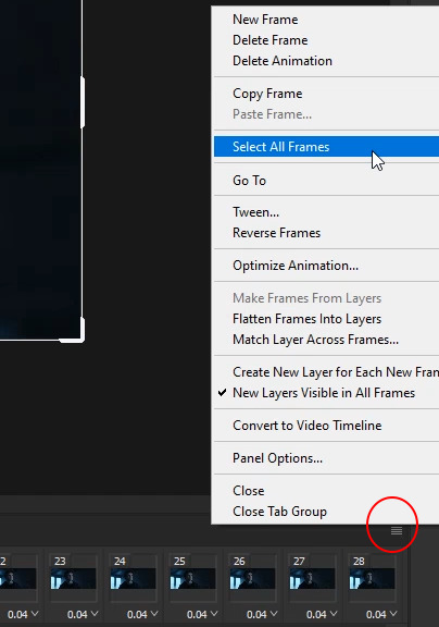
Click the hamburger stack at the right hand side of your timeline then click “select all frames”
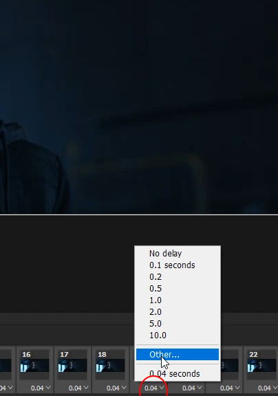
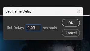
Click one of the little arrows on one of your frames and change the speed to 0.05
Step 5:
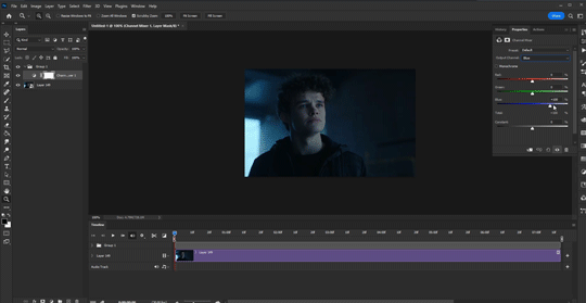
Change the size of your canvas. Tumblr has specific dimensions for gifs. For 1 column gifs, the width should be 540px, for 2 column gifs the width should be 268px, and for three column gifs the width should be 177px on the outside gifs and 178px for the middle gifs.
My favorite dimensions are 540px by 340px but you can mess around with the height. The height of the gif does not matter


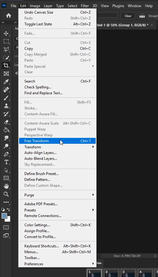
Step 6:
Select your group then go to edit > free transform. Use free transform to adjust your frames to fit your new canvas size

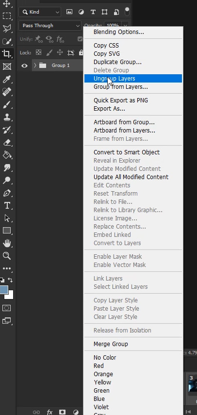
Step 7:
Click the hamburger stack and select all frames. Ungroup your layers by right clicking your group then “ungroup layers”. On the bottom left side of your timeline, click the little hamburger stack with a line through it to covert your timeline to frame animation. Just make sure all of your frames and layers are selected when you turn your timeline into frame animation


Step 8:
Select all of your layers and right click > “covert to smart object”
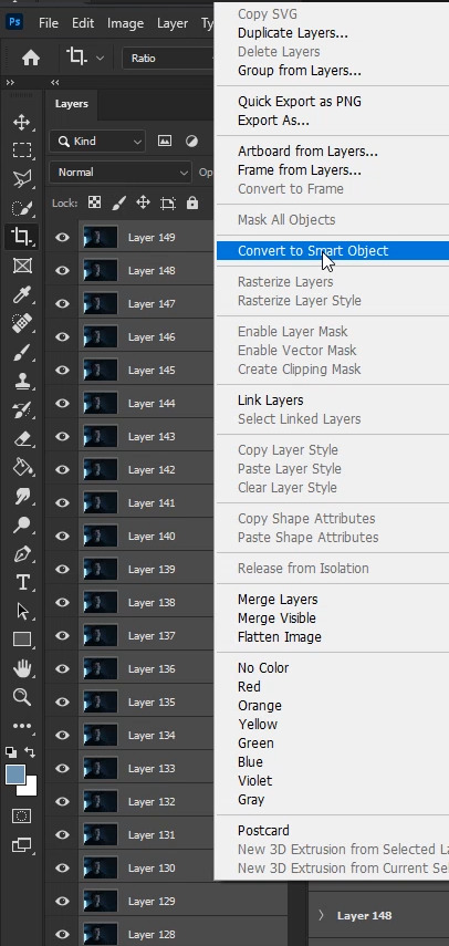
Your work space should look like this
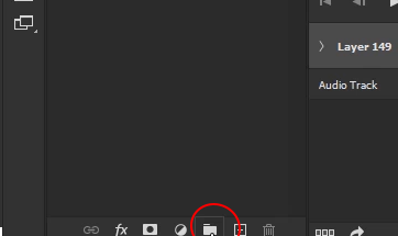
Step 9:
The coloring! Click the little folder at the very bottom of your layers panel
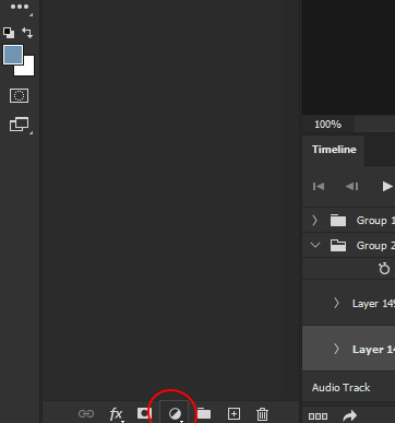
Step 10:
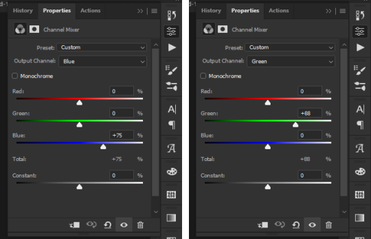
Click the adjustment layers option and select “Channel mixer”.
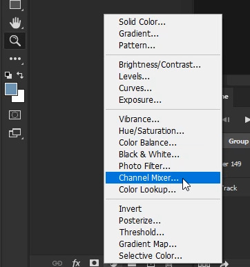
I really like channel mixer for scenes that are really blue and really yellow. It’s a quick way to reverse those filters. Channel Mixer works with contrasting colors. So, your blues go yellow, your greens go purple and your reds go blue. I highly recommend this tutorial by @zoyanazyalensky . It is amazing and they explain channel mixer worlds better than I ever could lol
For my gif, it’s really blue, so I go to the blue channel and bring the blue blues down a little
My gif starts going a little bit green so I open the green channel and bring the green greens down a little bit

I just messed with the blue and green mixer until I was happy with it. My channel mixer settings ended up looking like this
Step 11:
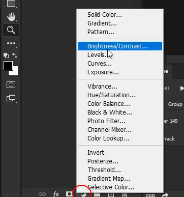
Click the adjustments layer option and select "Brightness/Contrast”
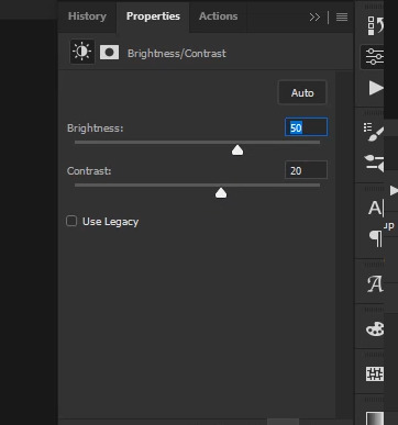
These are my brightness and contrast settings. Set these to whatever works best for your gif. Be careful not to brighten too much because your gif can go a bit grainy if you do
Step 12:
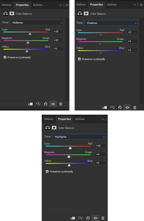
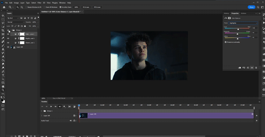
Click the adjustments layer option and select “Color Balance”
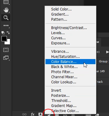
I love color balance. You can adjust a lot with it and it’s a great adjustment layer. For every gif, I start with midtones. For blue gifs like this one, I slide all of the sliders to the right and staircase them. There isn’t a specific number I set them to since every gif is different so I just slide them until I’m happy with them.
Next, click the drop down menu that says “midtones” and select “shadows”. For shadows, I also slide them just a little bit to the right.
Next, click the drop down menu and click “highlights”. Again, just move those a little bit to the right.
This is what mine looks like
For gifs that are more yellow, you’ll likely slide your sliders to the left instead of the right!!
This is what my gif looks like with Channel Mixer, Brightness/Contrast, and Color Balance
Step 13:
Click the adjustments layer option and select “Selective Color”
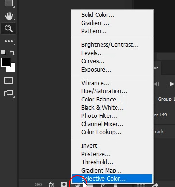
Selective color is great because it allows you to fine tune individual colors within your gif rather than changing the entire color of it. Selective color is really helpful when it comes to skin tones as well. There isn’t a specific way I do this lol I just slide the sliders left and right until I like what it looks like lol
This is what mine looks like
I almost allows brings the white blacks all the way to -100 and have the black blacks set to +1 to +3
Step 14:
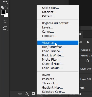
Click the adjustments layer option and select "Vibrance”. I just upped the vibrance and saturation a bit since Jason’s skin was looking a little washed out.
This is what mine look like

Step 15:
Add your sharpening!! Click your smart object then go to filter > sharpen > smart sharpen. I’m using sharpening by @anya-chalotra but I usually set the reduce noise to 7

Step 16:
Export!! Go to file > export > save for web


Make sure your gif is under 10mb (red circle) because if it’s over 10, it won’t play on Tumblr.
Make sure your colors are set to 256 and your dither is 100% (green circle), the quality is set to “bicubic” (blue circle), and the looping is set to forever (pink circle). The yellow circle are my other settings. You can play around with those but I find adaptive and diffusion work best in most cases!!
Step 17:
Photoshop will export your gif with a speed of 0.07 so now you need to fix that. Once your gif is saved, open your gif in Photoshop again. Select all of your frames and change the speed to 0.05. Then export it like above and save!!
And that’s it!! I hope this was at least somewhat helpful!! If you have any questions, feel free to send me an ask!!
Here are some other gifs I’ve done following these same steps

#tutorials#tutorial#gif tutorial#coloring tutorial#photoshop#adobe photoshop#photoshop tutorial#giffing tutorial#chaoticresources#completeresources#allresources#dailyresources#userautie#userzesty#userriel#userfaiths#tusernoor#my tutorials
203 notes
·
View notes
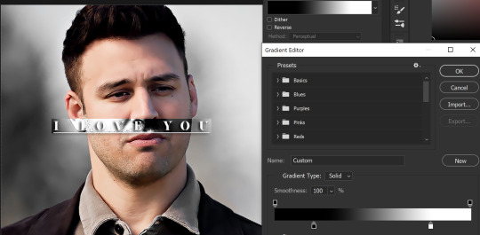
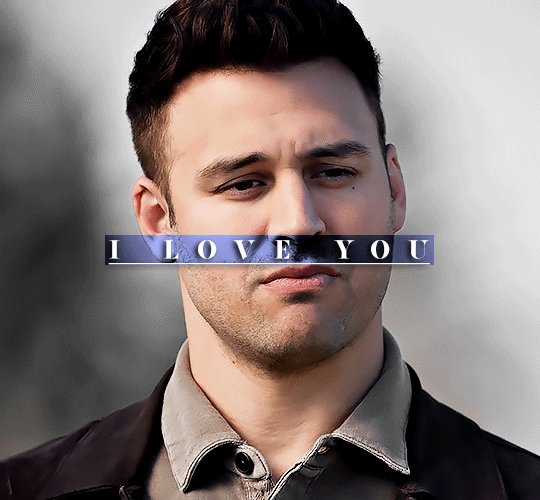
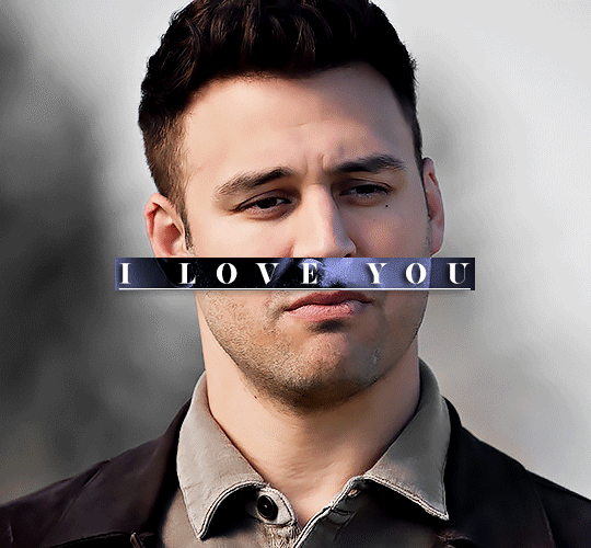
Note
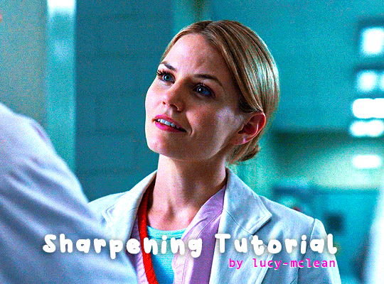
Hey, I love how you did the B/W strip + the text effect on your margaret atwood set, would you be willing to do a tutorial? 🙈
Hey Nonnie, thank you! Sorry this is a little late, but I did manage to hang onto this PSD for you.
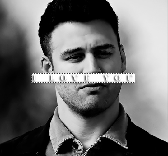
We'll be making this gif:

This tutorial assumes basic knowledge of gif-making, Photoshop, and coloring. I’ve only described the text tutorial in this, but you can reach out if you have any questions.
(This is a different version of my gradient text tutorial, but the same principle applies!)
Tutorial under the cut:
Couple things to note beforehand:
There is a lot of trial and error involved when doing any sort of effect, and this is no exception! You might have to play around with the colors and the settings before you find something that looks good and readable and that fits your set!
This text effect works better on big gifs (540px width) that have quite a bit of movement below the shape so you get that effect.
For this effect, I find that a simple font works better than a cursive one, but play around with what you like.
We're going to start with this gif:
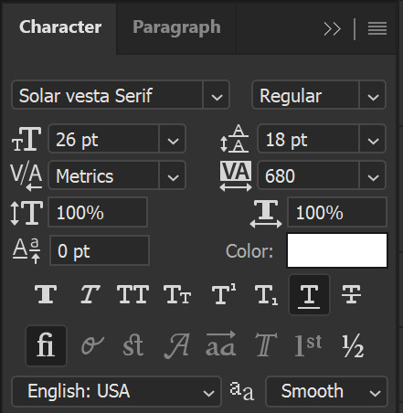
First, I'm going to add my text and center it. For this text, I used the font, Solar vesta Serif, with these settings:
Note: when you do letter spacing + underline, sometimes, the space after the last letter can lead the underline to stretch a little too far past the letter, making it look like the underline isn't centered properly.
To get past this, I just select the last letter separately, and put the VA setting to 0-10, depending on the font/letter.
We're also going to add a drop shadow here itself, and this is fully up to preference, but I used this:

All of that should give us this (yeah, it's the simplest thing because I'm lazy and I like easy things xD nothing too fancy)

Next, we're going to draw our rectangle around the letters. I like to keep even spacing around all the letters on all sides (in this gif, it's 4px on all sides) but just eyeball it initially, and then adjust accordingly.
I changed the fill to white (this color isn't important, I just used white because it's easier to show) and moved the layer in the back so the text is on top. It should all look like this:

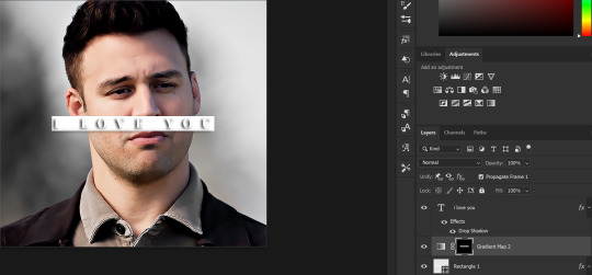
Next, we're going to add a gradient map between the rectangle and the text later. I simply used a black and white gradient, and my gif now looks like this:

Here are the settings:
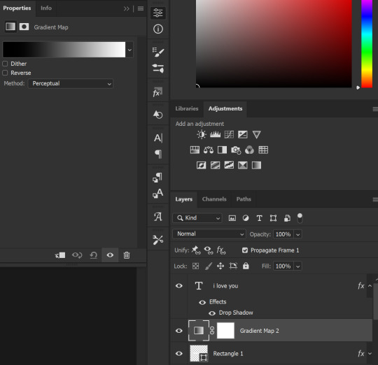
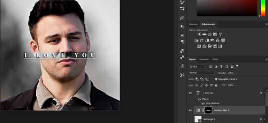
Next, we're going to delete that white box - the layer mask - next to the gradient map. Just click that and press delete (or right-click > delete layer mask). Your layers should look like this:
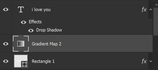
Now, we're going to add the rectangle as a layer mask. While pressing Ctrl, we’re going to hover our mouse over the square box next to Rectangle 1. Your cursor should show a white box with a dotted border. Click the square box with that dotted cursor and you should get a dotted selection line all around the box, like so:
Next, we're going to select our gradient map layer, and then create a new layer mask. At the bottom of the layers panel, you should see a box with a circle in it (denoted with a red arrow). Click that - make sure you have your gradient map layer selected, or you'll end up putting the mask on the wrong layer.

The black and white will disappear, leaving you with just the box again. It'll look like this:
Now, just hide the rectangle layer so it looks like this;
And you're done! This is my final gif:
Once you get this basic thing down, you can play around with it all. For example, I like to adjust my gradient sliders so they emphasize the colors:
You can also just change the colors;
Unlike my previous text effect, we're not going for inverse X-ray effect, so for this, I like to make sure the lighter shade of the gradient is on the lighter parts of the gif, and same with the dark shade.
(If that's confusing, here's a side by side comparison of what the "X-ray" effect vs normal color effect looks like)
Anyway - it's fully up to you!
Because of the effect I was going for, I didn't add a drop shadow underneath the rectangle itself, but you always can if you want to make that a little bit more 3D.
You can also do this with any other shapes, too, with the same procedure.
Hope this helps, Nonnie! Let me know if you have any questions.
#zee's tutorials#tutorials#gif tutorial#photoshop tutorial#resources#dailyresources#completeresources#itsphotoshop#allresources#dailypsd#userisha#userdahlias#alielook#userabs#tuserheidi#userelio#userjaelyn#userisaiah#usermorgan#usergert
175 notes
·
View notes