#5 more gifsets to go
Explore tagged Tumblr posts
Text


@animangacreators challenge ⟡ spring 2024
↳ WIND BREAKER
You haven't given up on others yet. And you don't need to give up. At the least I'm looking your way, Sakura. So why don't you look this way as well? If you do, I'm sure… you'll become what you want to be.
#wind breaker#wbkedit#windbreakeredit#wbk#animangahive#anime gif#*gifs#usertorichi#fyanimegifs#animangaboys#animeedit#userhanyi#userinahochi#usermoonz#userjenny#usercomfort#userkyaa#userartless#usericybtch#himawaari#user.roy#believe it or not this took 5 hours to make LMAO#not to sound like a grandma but TECHNOLOGY IS CONSPIRING AGAINST MEEEE#my laptop died haha i lost everything. so i had to resurrect an old laptop for this and u would not believe the extent to which ps fought m#also this laptop is so geriatric to the point multiple keys stopped working like#imagine navigating a laptop without the letters n m or v. every single one of those letters u see here had to be copy pasted#tech may b against me BUT MY WILLPOWER IS STRONGER.#and the result is. the most basic ass gifset of all time lmao#btw tried to go for a more muted coloring here which is different from my usual style#ANYWAYS this show is so good i genuinely did not expect to love it as much as i did. insane character writing
798 notes
·
View notes
Text
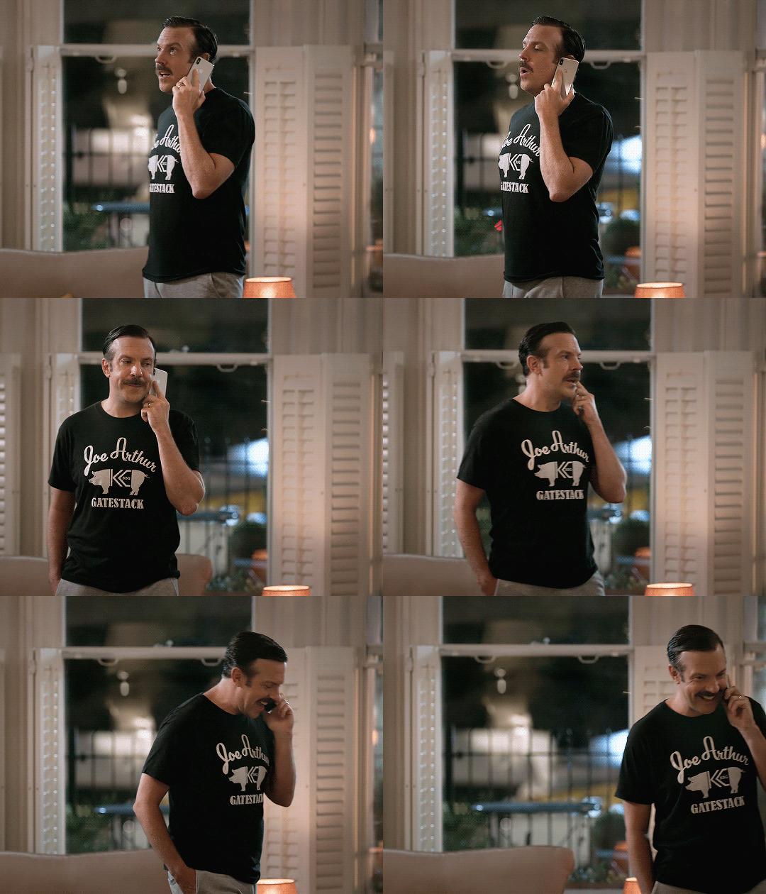
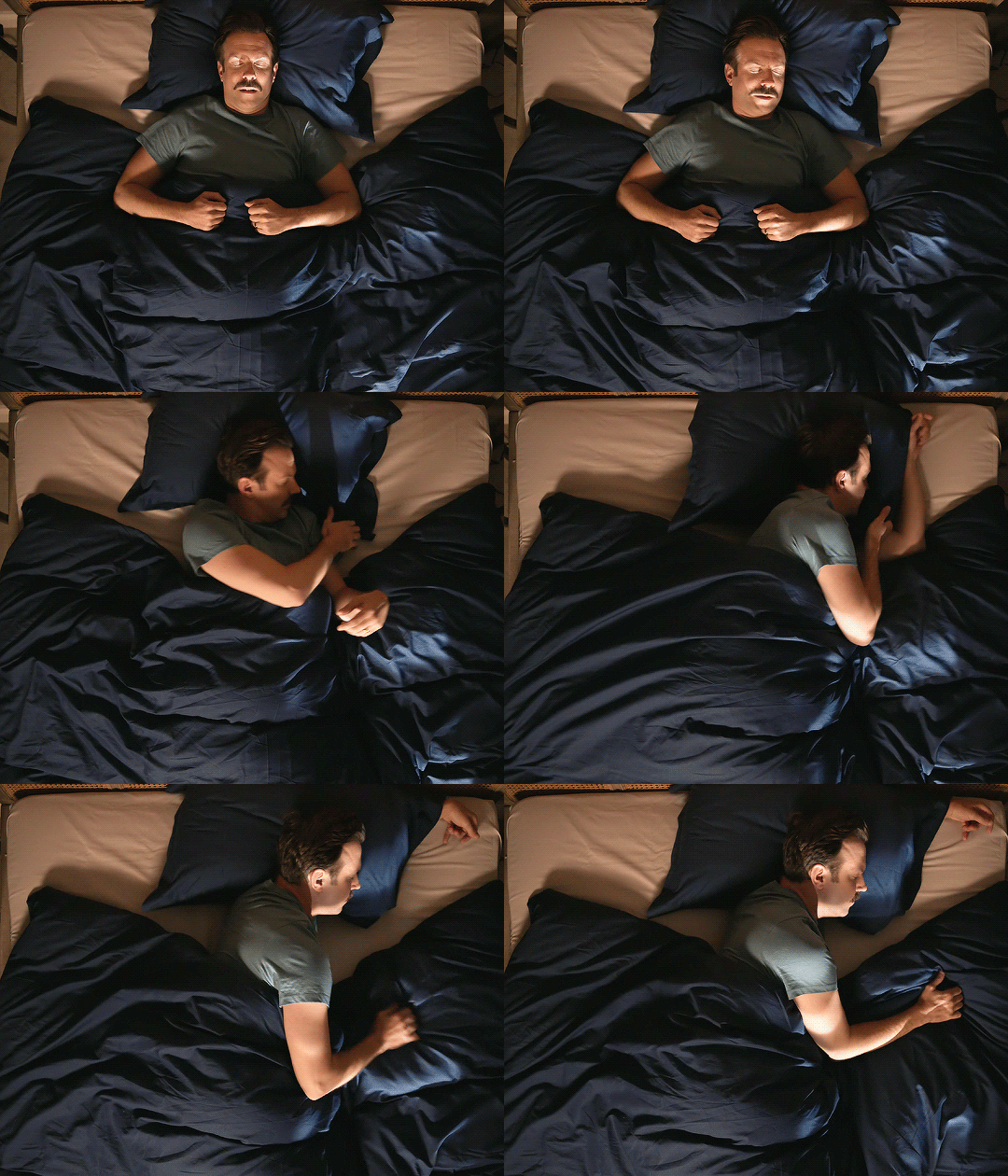
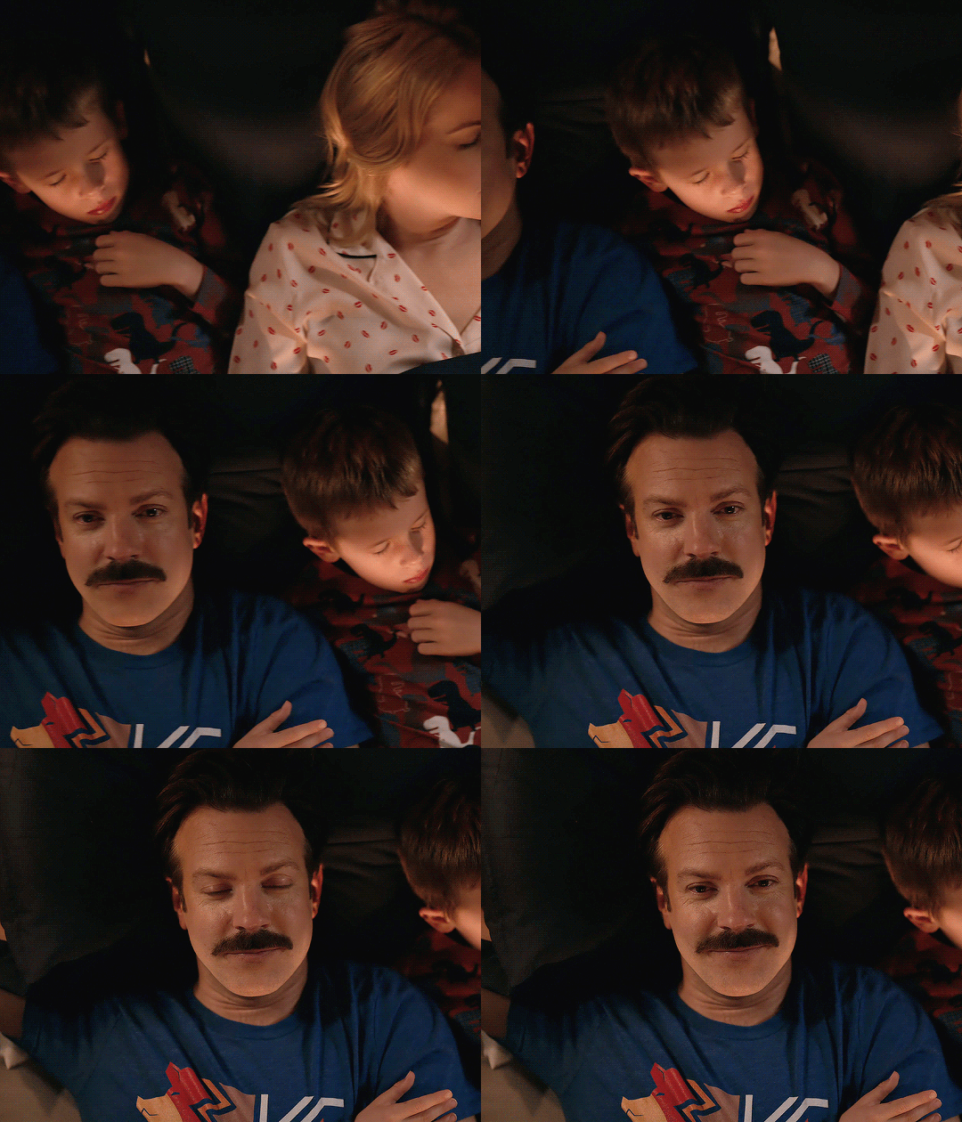
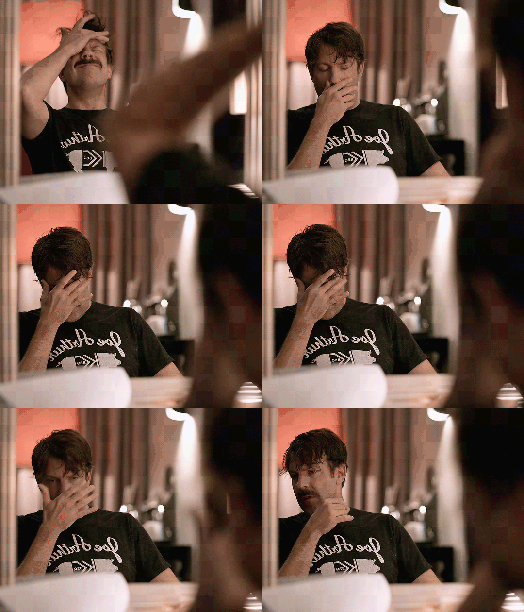
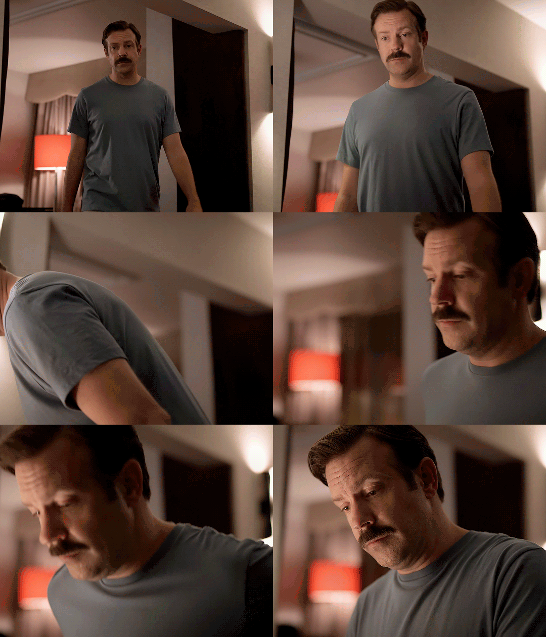
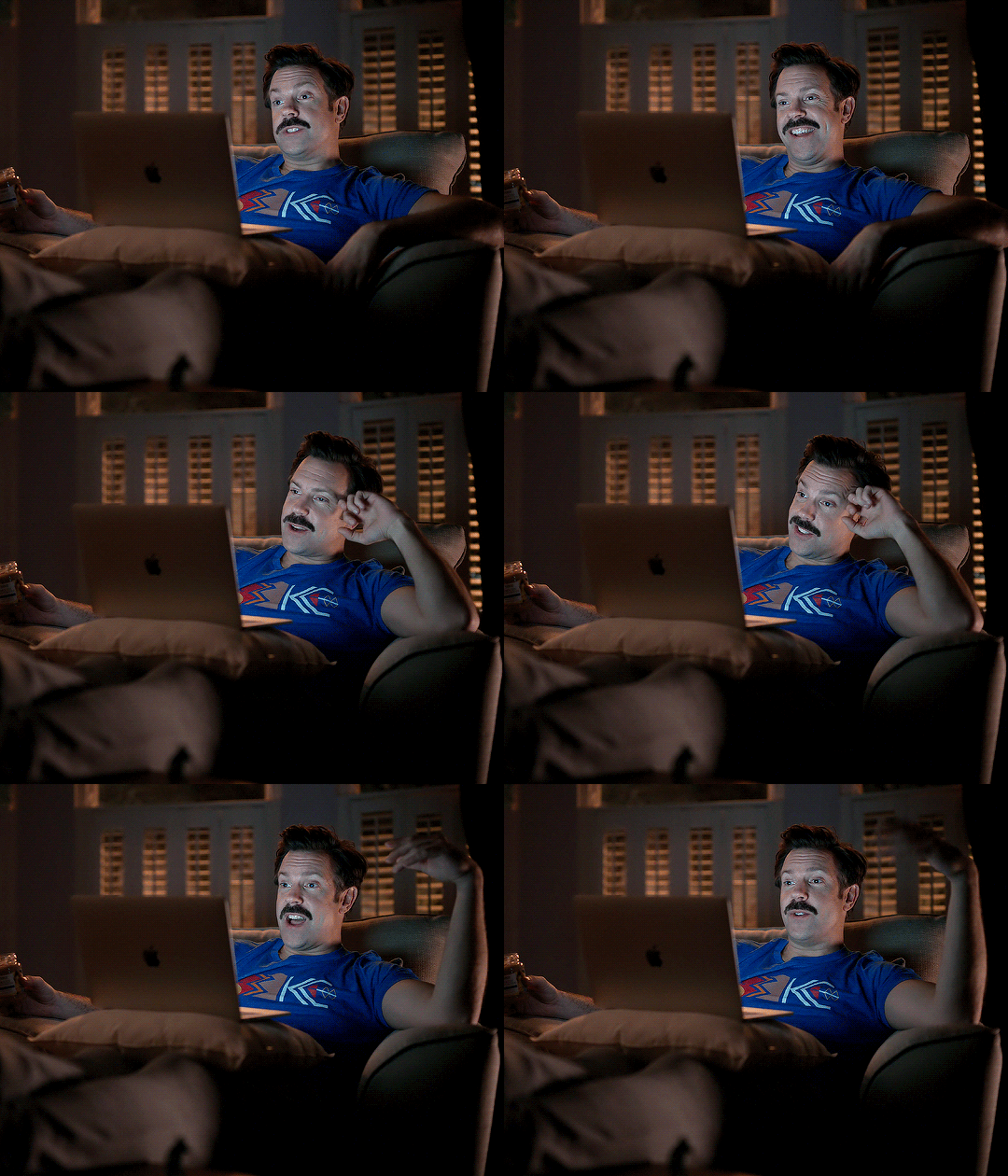
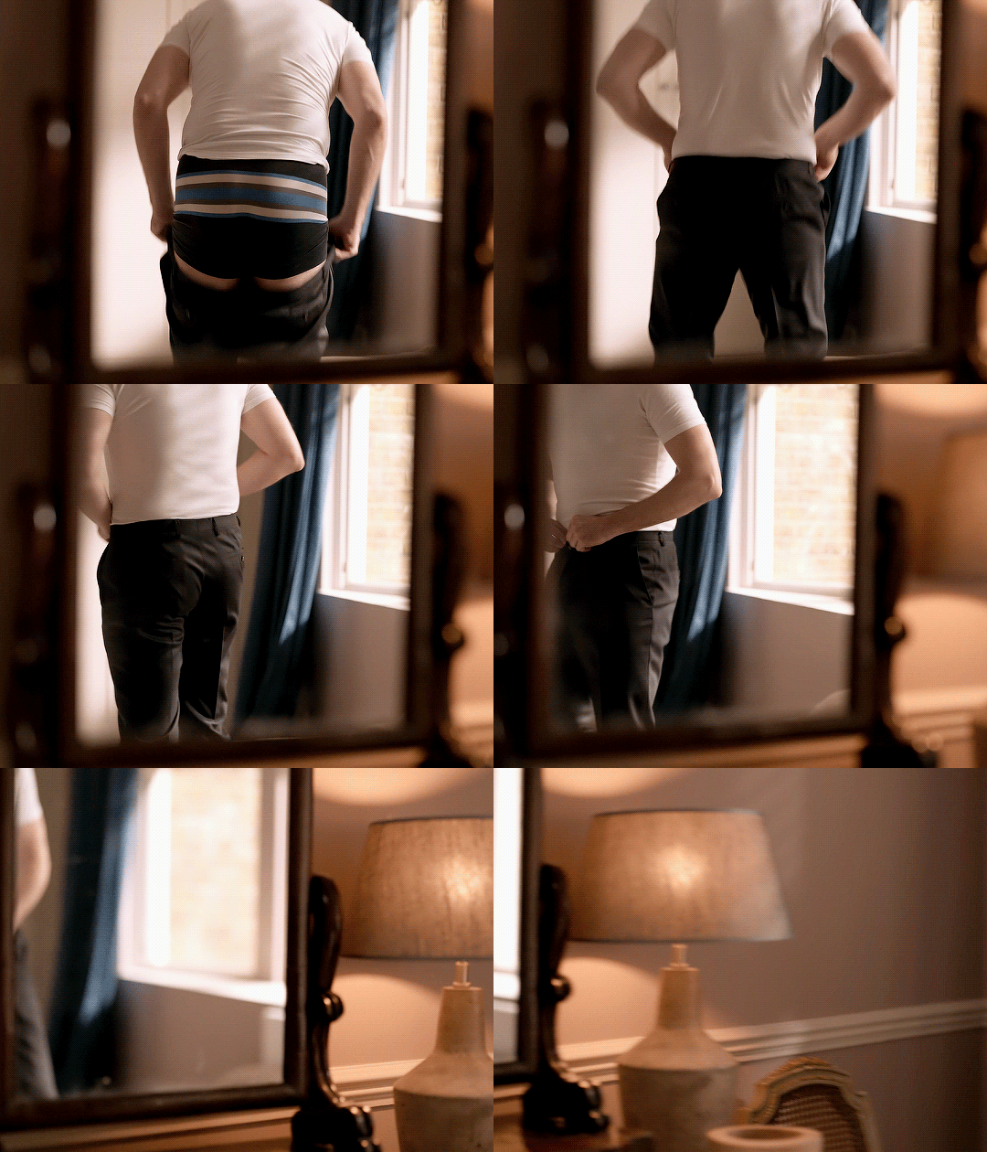
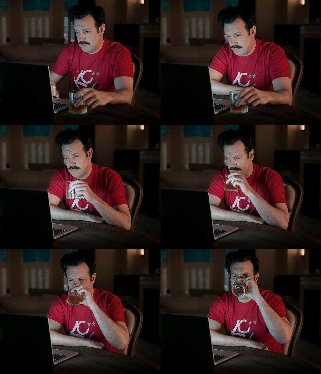
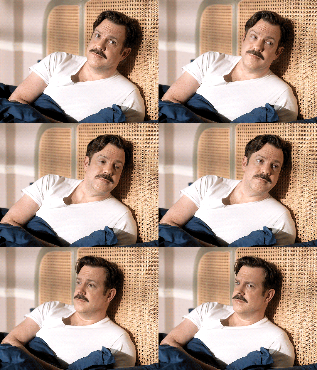
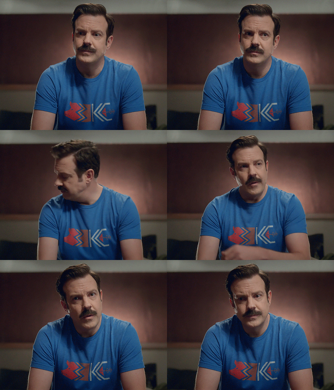

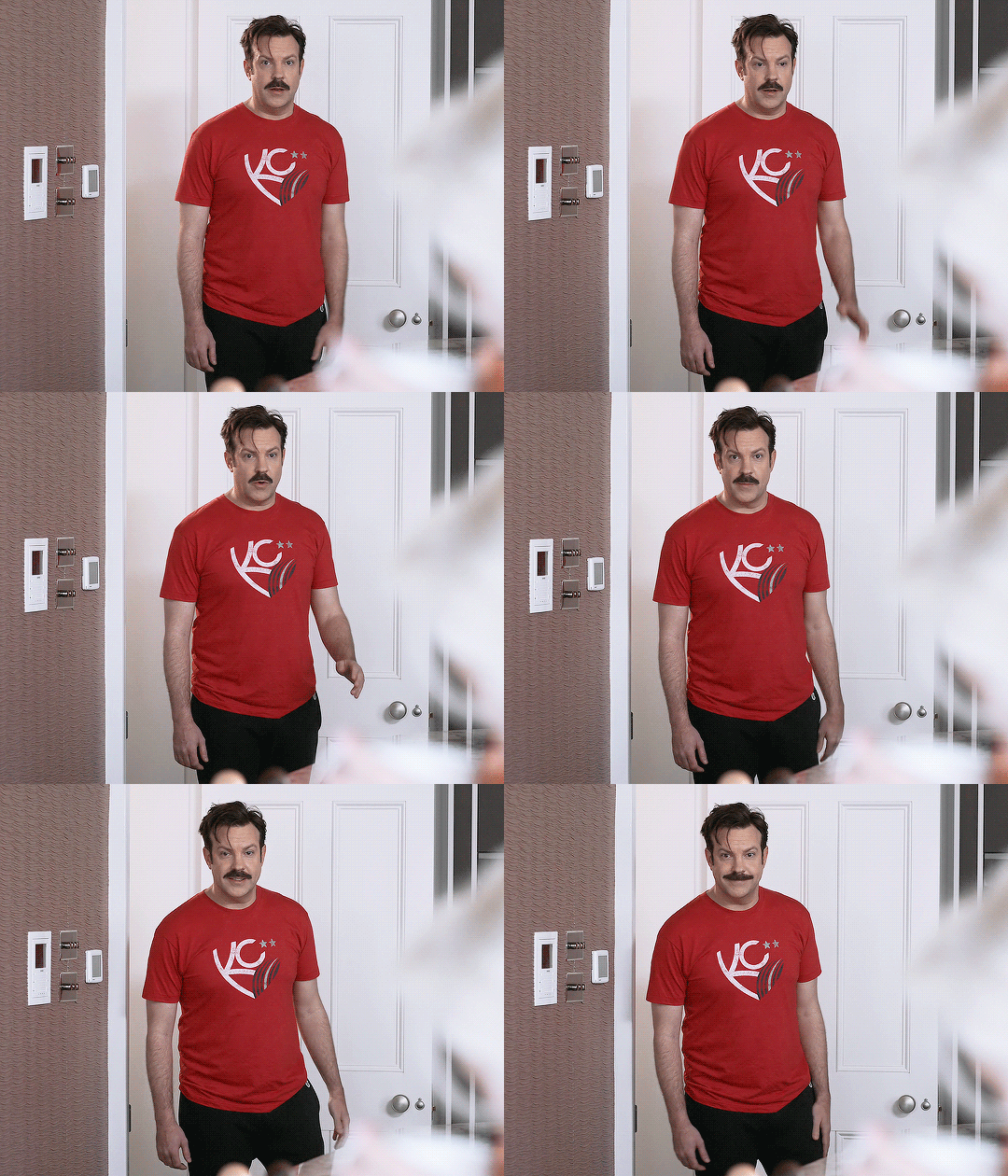
Jason Sudeikis as Ted Lasso Seasons 1-3 » T-shirts
#Ted Lasso#Theodore Lasso#Jason Sudeikis#*mine: gif#tedlassoedit#ugh you idiot with that face#stop staring at me swan#I think I got all the T-shirt moments for Ted. Can you guess the two scenes I forgot and had to go back and add???#I've also kept these in order of season/episode appearance and it feels kind of telling#not quite sure how I'm feeling about these and how they turned out#these are all from 2160p video files (I've only worked with 2160 one other time) and the timing of these frames looks off#I did my best to fix and readjust them#to the 5 to 8 people that read these tags let me know if I should keep trying/working with 2160p or just stick with 1080p#can we see a major difference in the image quality? I'm using all my same edit settings here#@chainofclovers I saw your tags about the black Joe Arthur shirt I was/have been thinking the same thing#I'm glad I got my o.g. laptop to power up to finish this gifset (definitely a power button issue)#will I ever make that mirror gifset idea??? probably not but I got a couple of mirror moments here#I almost used the other mirror moment from episode 7 but I wanted a different angle/view#this gifset could've been a lot more of Ted in bed wearing T-shirts tbh#¯\_(ツ)_/¯
451 notes
·
View notes
Text
can't wait to find out what broadcasting hell we will get for this season
#will it be season 3's 'you get the season finale when there's two more episodes to go'#or season 4's 'these episodes should air earlier in the season but it ends up being aired later in the season'#or season 5's 'i had to literally pause reblogging gifsets to the daily blog bc what's with this random ass episode releases?'
27 notes
·
View notes
Text

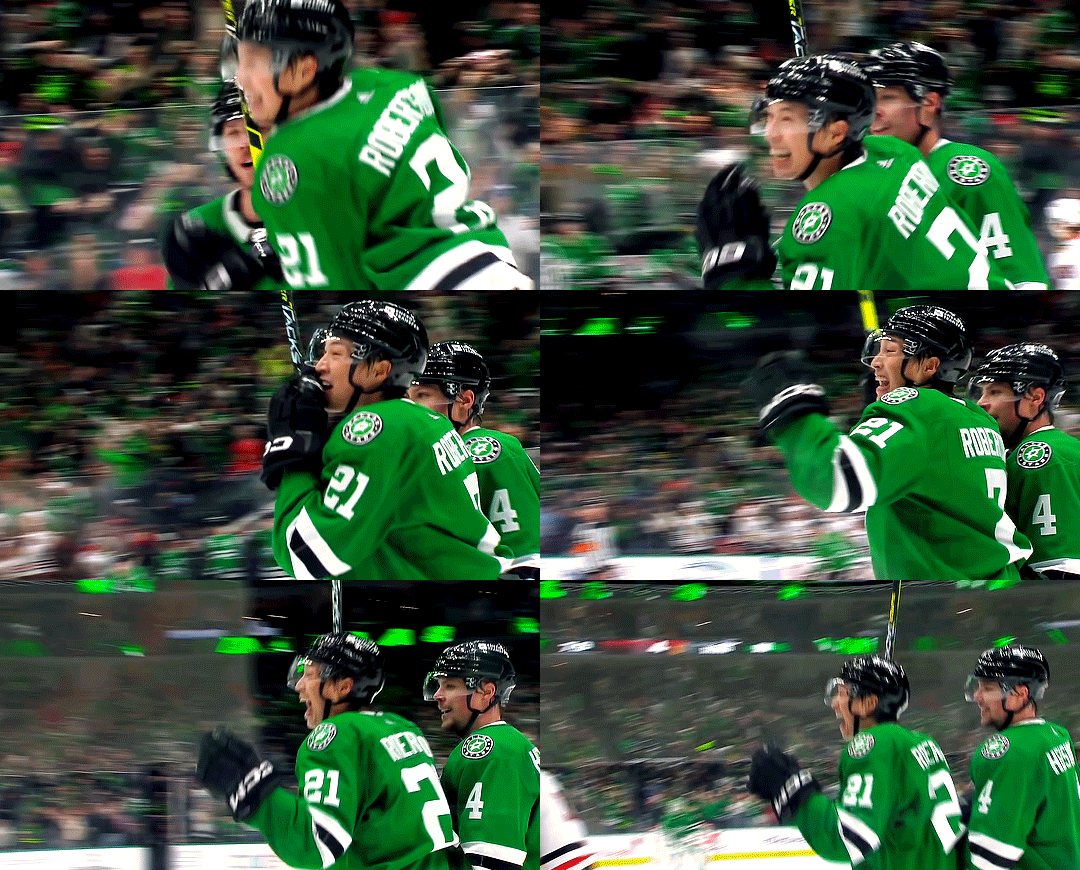
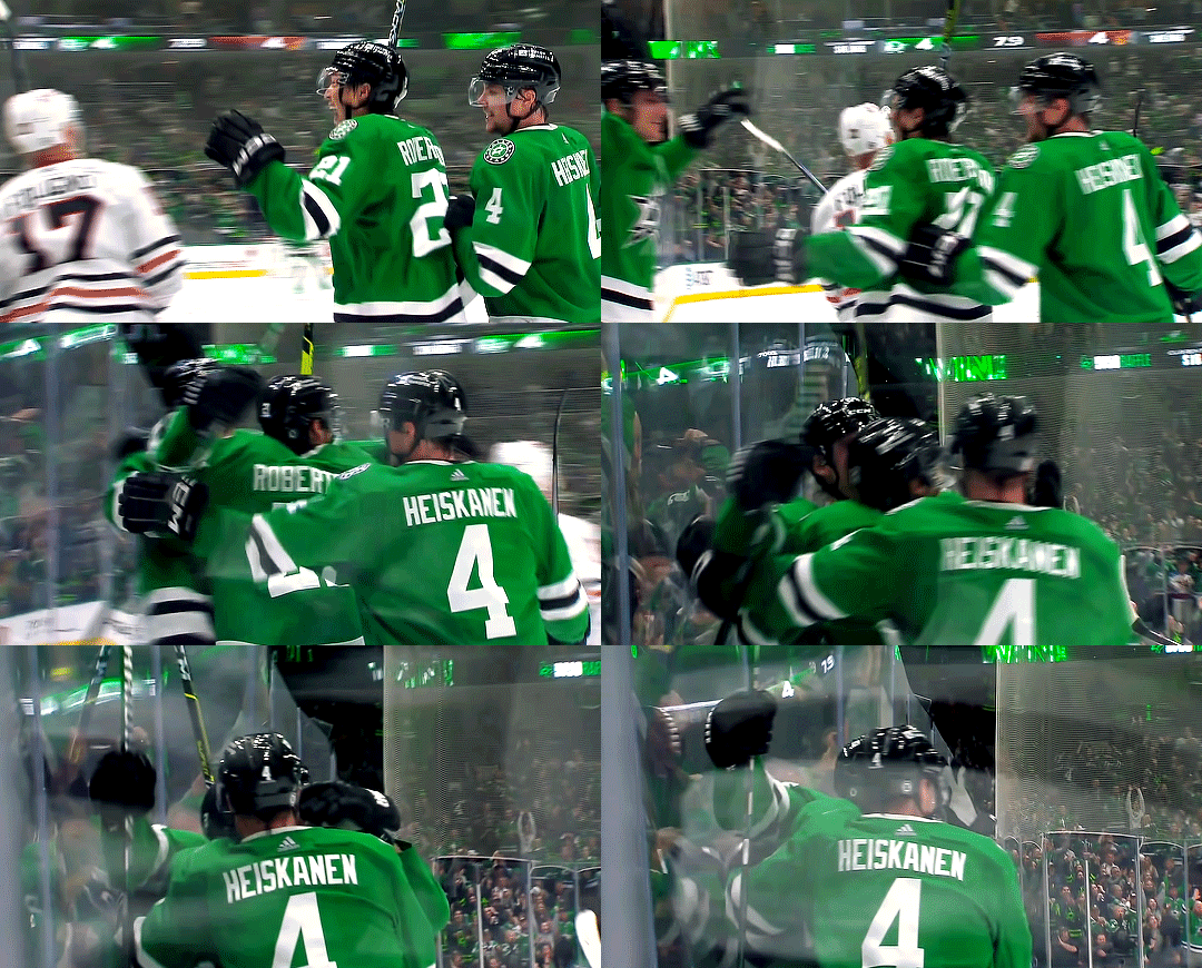


CHI @ DAL (12.29.23) — ot hatty for roope 🎩
#i've literally never loved anyone more. yes i needed a 5-part gifset for just the celly sorry#roope in his post-game interview going that's one thing we don't do... we don't quit 😌 the cringefail finnish earnestness of it all <3#roope hintz#jason robertson#dallas stars#stars#*
62 notes
·
View notes
Text


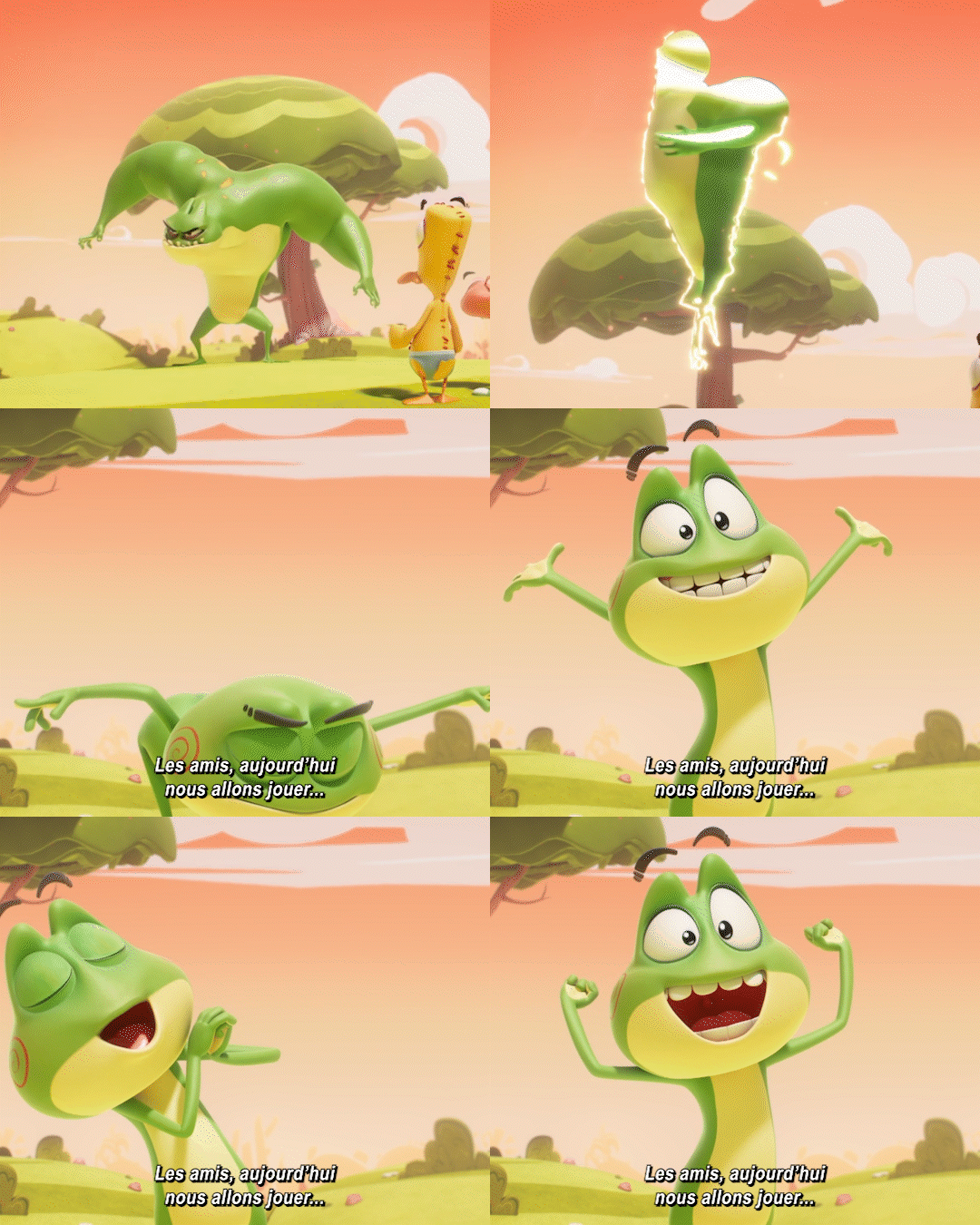

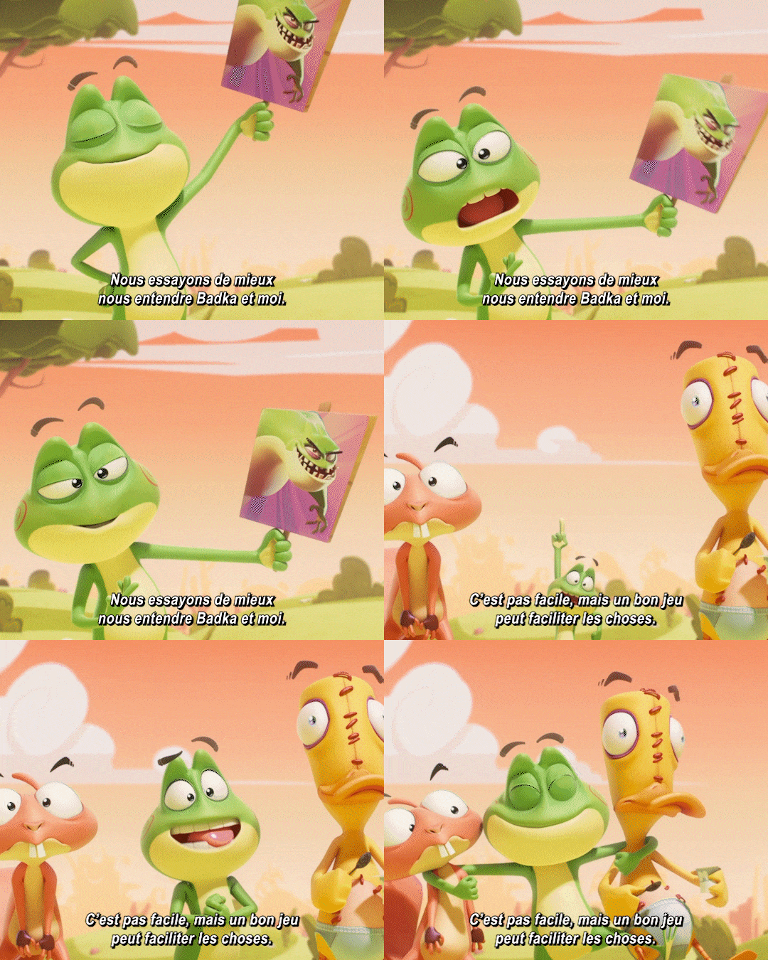


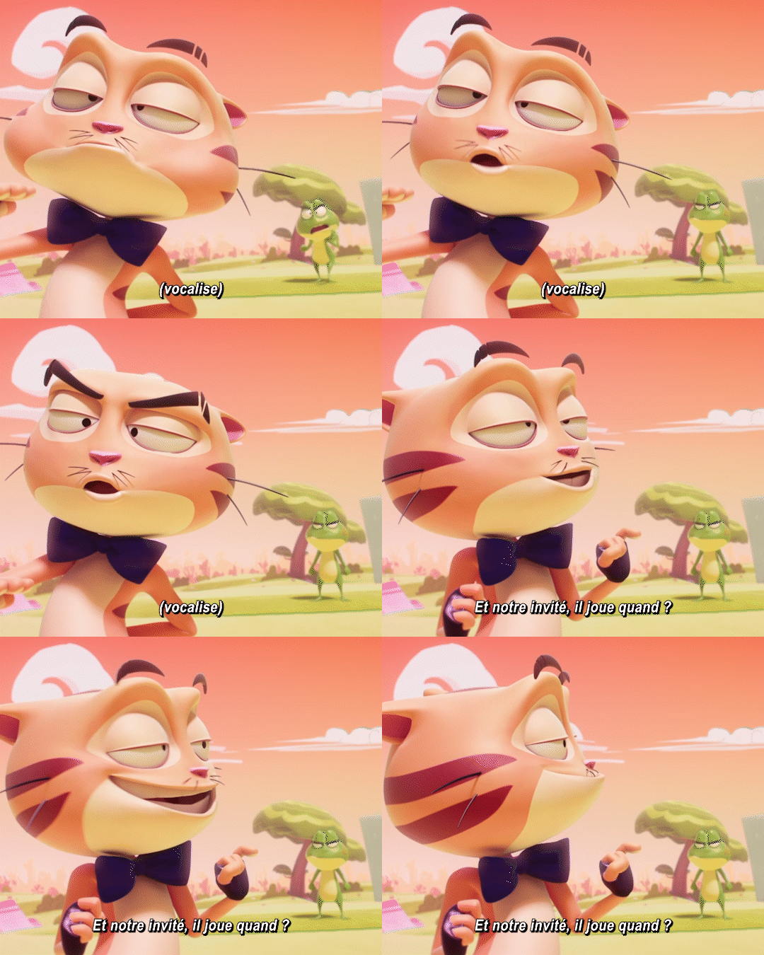
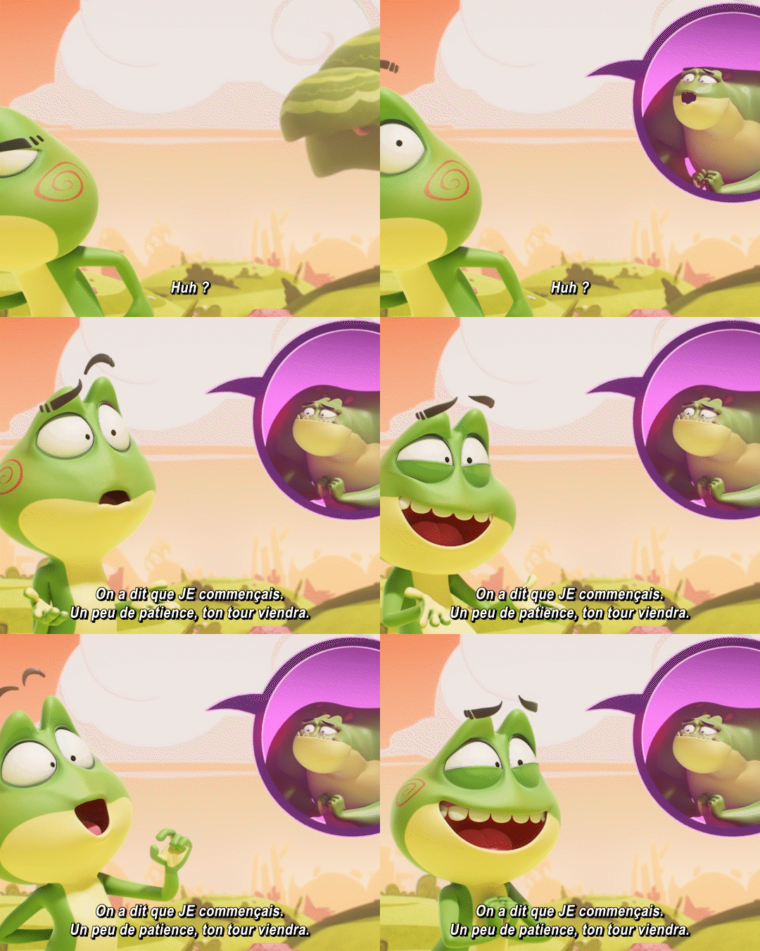
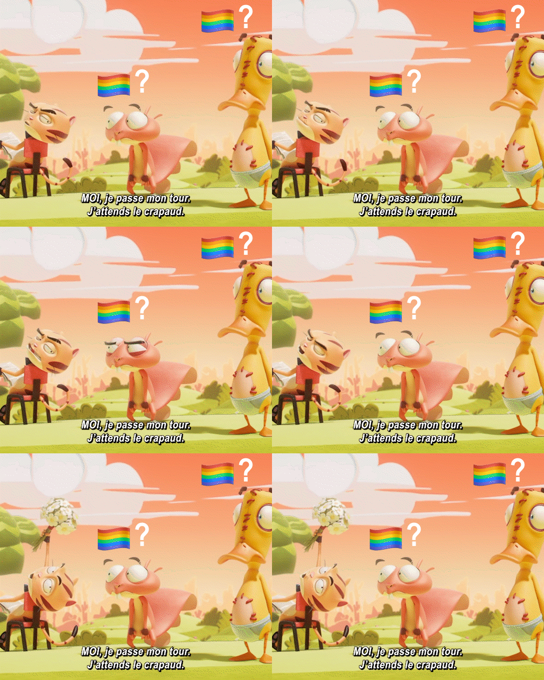

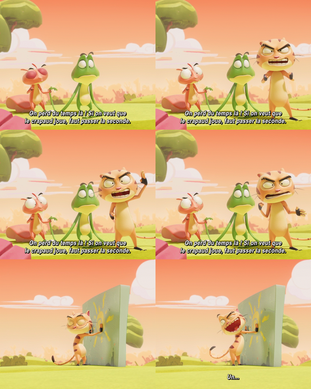
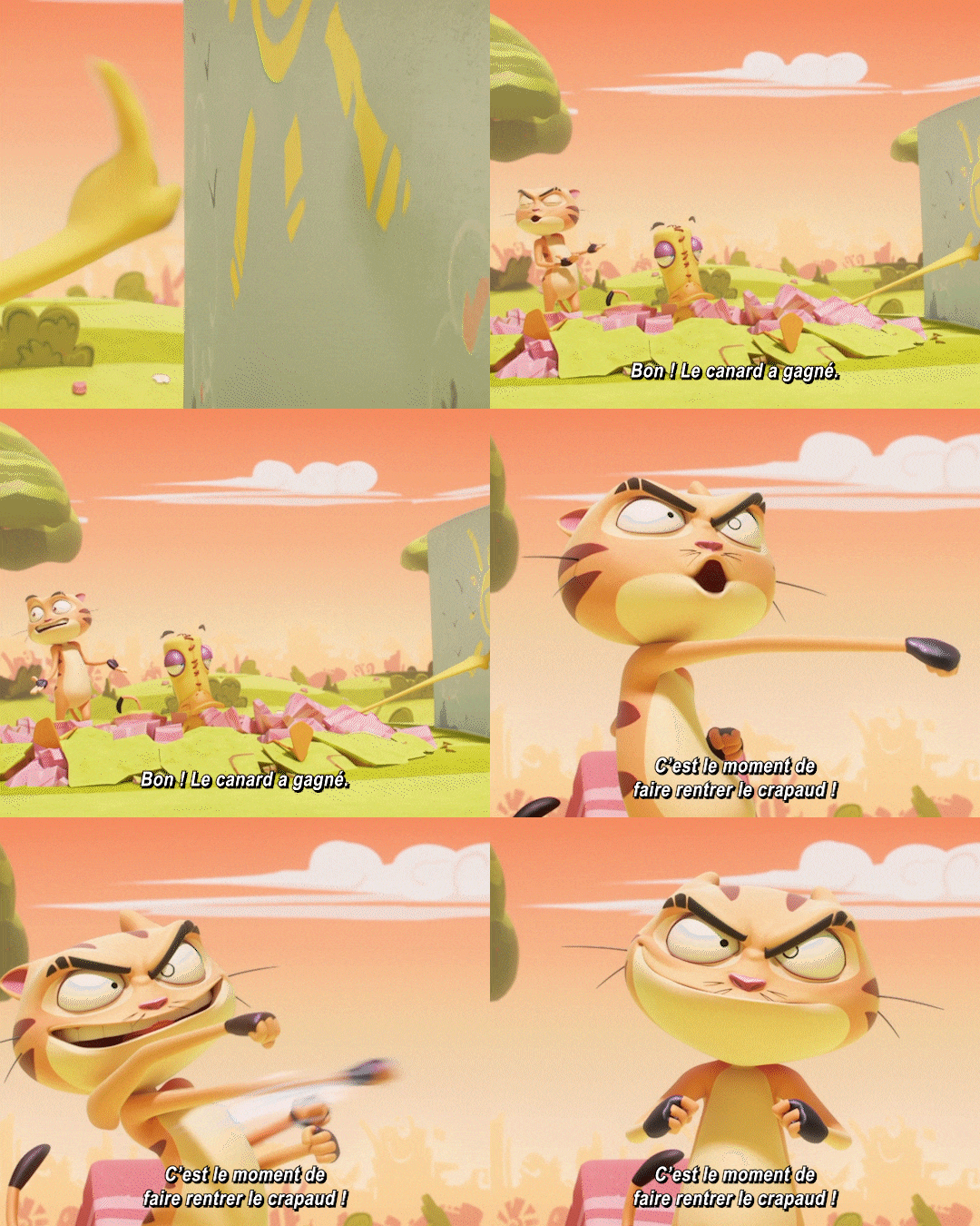

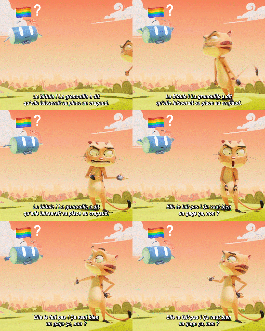

[English ID (the dialogue has been loosely translated from french to english): A gifset of a Kaeloo episode. 1. Badka yelling "Hello friends!". 2. Stumpy, Quack-Quack and Mr Cat are blow away by his yelling and are shouting in fear. Once it’s over, Mr Cat says "Oh yeah…" while Badka is bashful. 3. Kaeloo transforms back, then says "Friends, today we’re gonna play...". 4. Mr Cat is sulking afar and says : "Oh no…". Kaeloo brings up a picture of Badka and says "With Badka!". Mr Cat gets close to her in an instant and says "Ah! Very well.". 5.Kaeloo: "Me and Badka are trying to get along better. It’s not easy, but a good game can help out." 6. Mr Cat, while putting on a black bow tie: "Absolutely." 7. Kaeloo, very seriously: "Finally, Mr Cat… You are obviously forbidden from hurting Quack Quack!" 8.Mr Chat does a vocal warm-up, then asks : "And our guest, when does he play?". 9.Badka calls out Kaeloo: "Huh?". Kaeloo answers : "We agreed I would go first. Be patient, your time will come." 10. Mr Chat, waving a flower bouquet : "I’m skipping my turn. I’m waiting for the toad." Stumpy and uQack-Quack look at him with eyes wide open. Gay flags and questions marks have been added on top of them. 11. Kaeloo’s arms become long and soft, she yells. Stumpy takes up one of her arms and shouts : "Ah ! Gross !" 12. Mr Cat : "We’re loosing time there! If we want the toad to play, we need to speed things up." He runs up to the wall and counts : "One..."13. Quack-Quack blown up to the ground, and touching the wall with his finger. Mr Cat : "Alright! The duck won. Time to bring the toad in." 14. Badka, to Kaeloo: "Hey ! It’s my time to play!". Kaeloo : "Yes, I know! It was supposed to be your turn but now is not the time !"15. Mr Cat, to the Rules : "Thinggumabob! Froggy said she would trade places with the toad. She’s not doing it! It deserves a forfeit, right ?" The Rules has a gay flag and an interrogation point on top of her. 16. Mr Cat jumps towards Badka whith his flower bouquet in his hand. Kaeloo transforms back and shouts "Red light!", and instead of touching Badka, Mr Cat crash into the wall. Kaeloo and Badka laugh. / END ID]
[Description d'image: Une série de gif de la série Kaeloo. 1. Badka criant "Bonjour les amis!". 2. Moignon, Coin-Coin et Mr Chat sont dans un canapé et se prennent la violence du cri dans la tête et crient. Mr Chat est tout content, et une fois que c’est fini il dit "Oh ouais…" pendant que Badka est tout timide. 3. Kaeloo se détransforme, puis dit "Les amis, aujourd’hui nous allons jouer…". 4. Mr Chat boude au loin et dit : "Oh non…". Kaeloo prend un panneau avec une photo de Badka dessus et dit "Avec Badka!". Mr Chat s’approche immédiatement et dit "Ah! Très bien.". 5.Kaeloo: "Nous essayons de mieux nous entendre Badka et moi. C’est pas facile, mais un bon jeu peut faciliter les choses." 6. Mr Chat, en mettant un noeud papillon noir: "Absolument." 7. Kaeloo, très sérieuse: "Enfin, Mr Chat… Il vous est évidemment interdit de faire bobo à Coin-Coin ! 8.Mr Chat vocalise, puis demande : "Et notre invité, il joue quand?". 9.Badka interpelle Kaeloo: "Huh?". Kaeloo lui répond : "On a dit que je commençais. Un peu de patience, ton tour viendra." 10. Mr Chat, brandissant un bouquet de fleurs : "Moi, je passe mon tour. J’attends le crapaud." Moignon et Coin-Coin le regardent avec des grand yeux. Des drapeaux gays et des points d’interrogation ont été rajouté au dessus de leurs têtes. 11. Les bras de Kaeloo deviennent tous longs et mous, elle crie. Moignon prend un de ses bras et crie : "Ah ! Dégueu !" 12. Mr Chat : "On perd du temps là! Si on veut que le crapaud joue, faut passer la seconde." Il se met à un mur et commence : "Un..."13. Coin-Coin explosé au sol qui touche le mur du bout du doigt. Mr Chat : "Bon ! Le canard à gagné. C’est le moment de faire rentrer le crapaud !" 14. Badka, a Kaeloo: "Hé ! A moi de jouer !". Kaeloo : "Oui, je sais ! Ça devrait être ton tour mais c’est pas le moment ! 15. Mr Chat, à la Règle : "Le bidule ! La grenouille a dit qu’elle laisserait sa place au crapaud. Elle le fait pas ! Ca vaut bien un gage ça non ?" La règle a un drapeau gay et un point d’interrogation au dessus d’elle. 16. Mr Chat s’élance vers Badka bouquet à la main. Kaeloo se transforme et crie "Soleil !", et au lieu de toucher Badka, Mr Chat s’excrase au mur. Kaeloo et Badka rigolent. / Fin de la description]

[ID: A green line divider /END ID]
[english] mr cat really said "alright this season i'm CLASSY about my crush, i will stop barking and drooling and i WILL impress him by wearing a fruity lil bow tie and bringing nice flowers just for him"
...so somehow they managed to make mr cat gayer than before??? impressive feat, kaeloo season 5 we're not even 7 minutes in and you're already so damn great 🏳️🌈🏳️🌈
[french] mr chat a vraiment fait "ok dans cette saison je suis CLASSE a propos de mon crush, je vais arrêter de lui aboyer et lui baver dessus et je vais l'IMPRESSIONER en portant un ptit nœud pap' et en lui apportant des jolies fleurs rien que pour lui"
...contre toute attente iels ont réussi à rendre mr chat encore plus gay qu'avant??? très impressionant, kaeloo saison 5 ça fait même pas 7 minutes que tu as commencé et tu es déjà incroyable 🏳️🌈🏳️🌈
#kaeloo#kaeloo season 5#kaeloo spoilers#mr cat#mr chat#moignon#stumpy#quack quack#coin coin#badkat#gifset#yes we're back on that sweet kaeloo posting#reminder that on this grounds we will die for badkat and kaetty#name a gayest cat than this mf 😭#on the FIRST episode of the season too????#he said i'm not loosing one more minute i will go on a date with him on the FIRST episode
77 notes
·
View notes
Text
the feeling when you posted a couple of gifsets hours ago, which got a collective 5 notes (all on one post), but you still want to make many more over the holidays
nothing is gonna stop me from posting more star trek
#personal#i made one more gifset earlier but that's dw and it's scheduled for later#giffing keeps me sane as i stay at my parents'#and oh boy staying sane here is fucking hard#i'm already fed up with the lot of them after 24 hours#and they are all shocked i want to go back to mine on the 27th instead of staying till new year's#like i can barely make it these 5 days folks
7 notes
·
View notes
Text
Congratulations to Never Let Me Go for being the second drama to get the highest rating from me this year. Currently preparing my mind and body to be insufferable about it forever.
#haha! sike! I've actually already started-#(list of things I did BEFORE finishing NLMG tonight:#1. downloaded the episodes to cherish and protect in case the downfall of internet is tomorrow/other disasters#2. bought a replica of Nueng's necklace for the price of two croissants in the not-very-legal market#3. included a shot from the series in a special gifset#4. had heated mental arguments with the people making negative comments about it#5. .......... considered giving FUTS another chance out of gratitude to PP (not sure yet but just the fact that I gave it a THOUGHT-))#//#well now that being said#I'm kinda disappointed there are only 2 new dramas in the annual list that got the ''I will definitely rewatch this'' badge#last year there were 3 BLs alone. not even counting OTHER genres!!! and in 2023 I watched many MORE dramas!!! what is this!!!!!!#was I unlucky. was I going after the wrong stuff. I keep thinking about that.#but there were also a good number of dramas that got the ''I might rewatch this'' badge#and even the ones I didn't really enjoy were important to give me perspective/parameter#so... no time was wasted. and I was doing what I like to do? so I guess it's ok...
7 notes
·
View notes
Note
Hiii, i just recently got around to reading heart of the great wolf and i just wanted to say how amazing and beautifully written it is, your works are incredibly underrated and you’re a very talented writer. I don’t really have a question just wanted to show my appreciation <3333
This is incredibly sweet, thank you so much!
It's a series that I absolutely love writing, but I also know it was a big gamble to post on here since I was mostly a one actor character writer, and not with a big series as well. But I feel like Heart of the Great Wolf has helped challenge me on my writing skills and I really love everything I've done so far. I so far am about to start writing chapter 28 and still have more planned, so this is a massive undertaking for me to post as a not popular fic writer. But all I can hope is that I don't disappoint the people who have stuck with this story for 12 chapters now, because the later chapters are the ones I've been having the most fun outlining and writing.
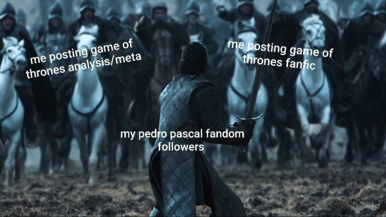
Asoiaf/got also was an incredibly big influence on me that I rarley talked about before. I watched the shows pilot cold open and realized that it might be easier to understand if I read the books, only to read all the books and not have caught up on the show until half way through season 2. Meaning I blitzed through season 1 and most of season 2 in a short amount of time, and it's just a series I constantly go back too and I finally feel confident enough to write for it and hope I do it justice. Even though I know its alienated me as a pedro blog from a fandom I was very active in since late 2020.
But I understand why it's not popular. I'm an unknown who writes way too long chapters in a fandom I haven't been active in since 2013, after spending years being soley a pedro pascal blog. Like this is essentially what everyone who has followed me in the past 2 years is suddenly having to put up with every day:
#i reblogged one jon snow gifset in like early july#and i just never stopped#and same with this series i have 2 more chapters for part 5 to write and then i have even more in outlines for part 6#i just want to keep going until i reach the end because ive never had such motivation with an ending in sight of a fic#so thank you i dont get a chance to talk about this series much so your words are very kind
8 notes
·
View notes
Text
those 40 gifs took 5 hours btw
#from capping#bc i dont have a capping program#i dont know how ppl have VLC autocap i cant get the tutorials to work#i am doing each cap frame by frame w the e > shift + s > e > shift + s repeat#frame by frame#WITH arthritis#so 5 hours is an estimate bc it took at least two hours to cap everything#at LEAST and its been 3 hours of other work#the only reason it didnt take longer is bc i have a photographic memory of TB22 its ingrained into my brain#someone tell me how to make the vlc capping thing work it hasnt yet i dont know what im doing wrong#but imagine how much faster i could crank gifs out if i knew how to autocap#kpplayer i think its called?? that does too much#adapter only works on mp4 videos that are shorter than 40 minutes#and even then it sometimes doesnt work#anyways im tired#im gonna go do more of jefferson now#i woke up and started jefferson 3000 caps was abt an hour and a half or so i think#bc i didnt have to skip back and forth between scenes its all chronological#anyways howdy. im tired#remember to rb tho bc honestly my gifsets that get less than 10 notes and most of them are likes??? really drains my brain down#like. not worth it.#esp when its chars the fandom is all 'WE NEED MORE' of like clearly no u dont#i'll delete this later i promise i just needed to complain
2 notes
·
View notes
Text
HUGE criminal minds gif dump coming, I make no apologies... but I'm sorry 😬
Not even going to queue them, just gonna post them all at once, don't hate me 🫶
@baubeautyandthegeek i love u, hope you like them <3
#there's still going to be a Melissa gifset later today#just said i was trying to keep a more regular posting schedule and here i am making 5 posts in one day... ooops
5 notes
·
View notes
Text
By the Numbers: halfway through the signup window edition!
That's right, signups for FTH 2025 have been open for a week, and what a week it has been! In 7 days we've had MORE signups than we did when we closed signups in 2024 … but not quite as many as we had after we re-opened for 4 hours to see whether or not we could crack that 1000 signup barrier.
We expected a big year, and you're definitely delivering!
So, what are the actual numbers?
756 creators have signed up to offer 1020 auctions in 117 listed fandoms and 214 write-in fandoms. And there's a WEEK to go!
A couple of quick breakdowns on the offers we have so far:
Types of written fanwork:
660 fan fiction (new) 170 fan fiction (remix of an existing fic) 36 meta/analysis 32 fan poetry 23 other written fanwork
Types of fan art:
33 banner 53 book cover 29 comic 125 drawing/painting/etc 5 gifset 26 icon(s) 8 moodboard 8 photo manip
And over in our supported orgs, creators *overwhelmingly* are leaving the decision to their bidders. That said, the umbrella category heads up the list when creators weighed in on which orgs to support. The rest of the list shakes out like this:
Young Center for Immigrant Children’s Rights Middle East Children’s Alliance Freedom to Read Foundation Disability Law United Crips for eSims for Gaza News Literacy Project Global Project Against Hate And Extremism Hope for Ukraine Environmental Integrity Project Never Again Action In Our Own Voice: National Black Women’s Reproductive Justice Agenda National Network to End Domestic Violence Fight for the Future Education Fund Bellingcat Congo Leadership Initiative
So that's where we are at 7 days in to our 2-week-long signup window. Where will we be on Feb 2? We suspect it will be over our 2024 total and into new record territory. It's a terribly exciting journey — and there's still plenty of time to join us!
Signups are OPEN!
200 notes
·
View notes
Text
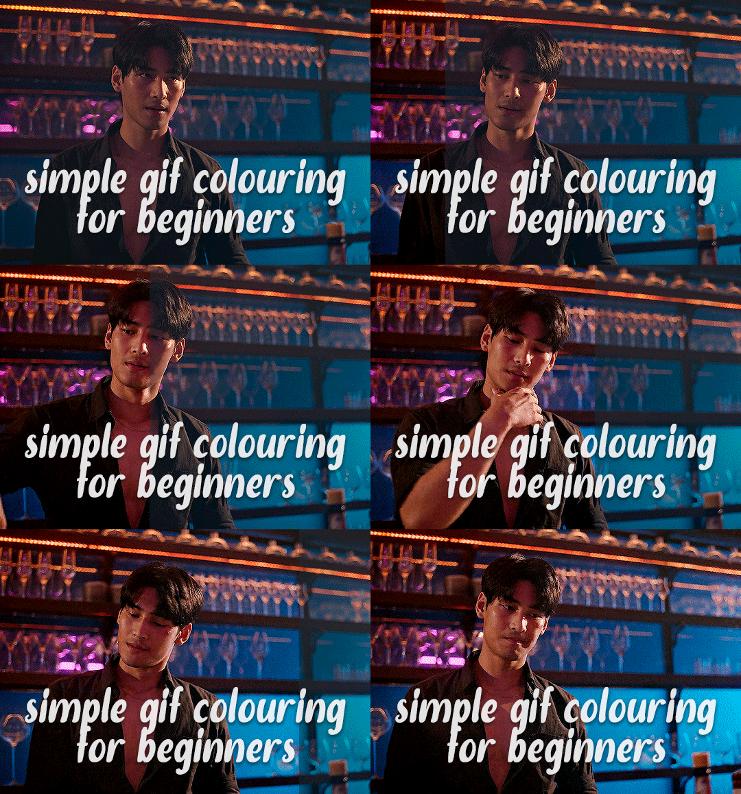
✨ Simple Gif Colouring for Beginners ✨
I wrote up my basic gif colouring process for a friend recently, but a couple of people here mentioned they'd also find it helpful! so, as requested, this is a beginner-friendly walkthrough of the way I colour my gifs :) it's aimed at brand new gif makers with no prior experience with photoshop or photo editing.
when I first started gif making I found colouring and photoshop in general suuuper daunting, so I've tried to simplify everything here as much as possible. hopefully this will be relatively easy to follow and not too intimidating!
a couple of things to begin with:
I'm only talking about colouring here - this is not a full gif making tutorial. I've linked to some of my favourites of those here!
I personally like to make bright, 'clean' looking gifs with vibrant but natural colours, so that is the style of colouring this tutorial is geared towards. most of gif colouring is subjective and about personal taste - the only thing that I'd say is possible to get wrong is skin tones, which I talk about a lot in this guide.
as I mostly gif Thai dramas, most of the advice is geared towards colouring for East Asian/South East Asian skin tones - but the techniques should be fairly universally applicable (and here are some tutorials that talk about gif colouring for other skin tones).
I'm not an expert! I'm not claiming this is the best or the only way to colour gifs - it's just how I do it.
this post is very image-heavy. if the images aren't loading (or the gifs are running slowly or cutting/looping weirdly), then try viewing the post in its own tab (rather than on the your dash or someone's blog) and refreshing the page.
okay, full walkthrough beneath the cut!
contents:
1. intro a. natural gif colouring goals b. very very basic colour theory 2. super simple colouring (the essentials) a. curves b. selective colour (and skin tone correction) c. hue/saturation d. saving and reusing colouring e. another simple colouring example 3. other adjustment layers a. brightness/contrast b. levels c. vibrance d. colour balance e. channel mixer 4. troubleshooting a. curves b. saturation 5. fin!
1. intro
the colouring part of gif making can be super overwhelming, especially if (like me when I first started!) you're completely new to photoshop and/or have no experience with colour theory or photo/video editing.
if you're opening photoshop and making gifs for the first time, I highly recommend getting used to making a few basic, uncoloured gifs to begin with. just to practice, rather than post anywhere (though you can always come back and colour them later if you want) - but it'll make the rest of the process much easier if you're already beginning to get used to working in timeline mode of photoshop. give yourself a bit of time to practice and get a feel for things like how many frames you tend to like in a gif, where you like to crop them for the best loop, what kind of aspect ratio you like etc* - so that you're not trying to navigate all of that for the first time on top of everything else!
* frames: for me between 60-90 frames is ideal, but 40-120 frames is the absolute min-max I'd personally use in a normal gifset loops: for the smoothest loops, try to avoid cutting someone off mid-movement or mid-word if possible. aspect ratio: for full-size (540px) gifs, I tend to go for either 8:5 (slightly 'skinnier' gifs), 7:5, or 5:4 (particularly big, thick gifs lmao)
✨ natural gif colouring goals
part of what can be so daunting about starting gif making is not knowing where to start or what you want to achieve. this is definitely something that gets easier with practice - the more gifs you make, the more you'll get a feel for what kind of look you like and the more instinctively you'll know how to get there. it also helps to see if any gif makers you like have made "before and after colouring" posts - these can help with getting a sense of the kinds of changes made through gif colouring. here's one I made!
in general, I like to make my gifs bright and 'clean' looking, with vibrant but natural colours. these are the things I'm usually hoping to achieve with colouring:
brighten dark scenes
remove muddy, yellowish lighting or filters
saturate colours
correct any skin lightening filters or overexposure
make lighting and colours as consistent as possible between gifs within a single gifset, especially gifsets featuring gifs from multiple scenes/episodes/videos
this guide is focusing on natural colouring, but of course there are many cool ways to make stylised/unnaturally coloured gifs. imo you'll need to master these basics first, but if you want to learn how to do things like change the background colour of gifs or use gradients or other cool effects, then @usergif's resource directory has loads of super helpful tutorials!
✨ very very basic colour theory
[disclaimer! I don't know shit about fuck. I do not study light or art. this is just an explanation that makes sense to me exclusively for the purposes of gif making.]
the primary colours for light/digital screens are red, blue, and green. having all three colours in equal measures neutralises them (represented by the white section in the middle of the diagram).
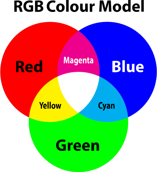
so to neutralise a colour within a gif, you need to add more of the colour(s) that are lacking.
in practice this usually means: the scene you want to gif is very yellow! yellow is made of red and green light, so to neutralise it you need to add more blue into your gif.
it can also mean the reverse: if you desaturate the yellow tones in a gif, it will look much more blue.
looking at the colour balance sliders on photoshop can make it easier to visualise:
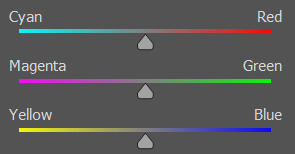
so making a gif more red also means making it less cyan.
removing green from a gif means adding magenta.
taking yellow out of a gif will make it more blue.
tl;dr:
neutralise yellows by adding blue (and vice versa)
neutralise reds by adding cyan (and vice versa)
neutralise green by adding magenta (and vice versa)
2. super simple colouring (the essentials)
starting with a nice sharpened gif in photoshop in timeline mode. (these are the sharpening settings I use!)
some scenes are much harder to colour than others - it helps to start out practising with scenes that are bright/well-lit and that don't have harsh unnaturally coloured lights/filters on. scenes with a lot of brown/orange also tend to be harder.
I usually save a base copy of my gif before I start colouring just in case I end up hating it, or find out later that it doesn't quite fit right into a set and need to redo it etc.
so here is my base gif!

it's an okay gif, but it has a bit of a yellow tint to it that I want to reduce.
colouring is easiest to do in adjustment layers, which can be found under layer -> new adjustment layer - or for me they are here:
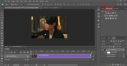
there are lots of different types of adjustment layers that do lots of different things - but for me the absolute essentials for colouring are curves, selective colour, and hue/saturation.
I also use brightness/contrast, levels, exposure, vibrance, colour balance, and channel mixer sometimes, depending on the gif - but I use curves, selective colour, and hue/saturation on every single gif.
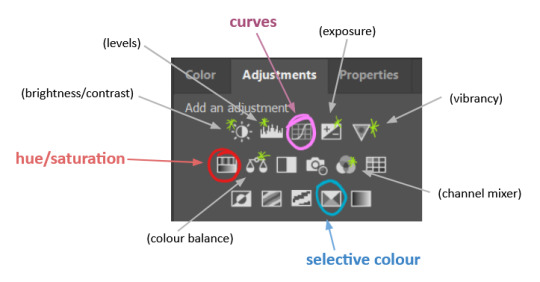
✨ curves layer
the first thing I always do is a curves layer. when you first open one it will look like this:
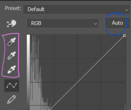
first I usually click the ‘auto’ button, just to see what happens. sometimes it makes a big difference (it usually brightens the gif a lot) - but on this gif it didn’t do much.
if it had made the gif look nicer then I would have kept it and added a second curves layer on top to do the rest of these steps.
the next step is selecting the white and black points with the little eyedropper tools.
the bottom eyedropper lets you pick a white point for the gif. click somewhere super light on the gif to see what happens - for this gif, I clicked on the lampshade on the left. if it looks weird, I just undo it and try somewhere else - it usually takes a few goes to find something that looks good.
here's what that did to the gif:

then I pick the top eyedropper and use it to pick a black point by clicking somewhere really dark, again playing around until I find a black point that looks good.
here's what the gif looks like after picking the white and black points:

this can take some experimenting, but you can make super easy drastic changes to your gif just with this. in this case, the curves layer took out a lot of that yellowy tint.
and this is what the curves graph looks like now:
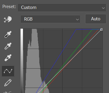
you can click and drag those lines to make further changes if you want - I usually leave them alone though. the colours of the lines indicate which colours have been changed in the gif - for example, you can see from that steep blue line on the graph that blue has been added to neutralise those yellows.
next I usually do another curves layer and just press the ‘auto’ button again to see what happens. usually it brightens the gif a bit more, which I like.
‼️if nothing is working: usually with a bit of fucking about a curves layer works well - but sometimes you can’t find a good white and black point anywhere, and instead your gif turns wacky colours and nothing looks good. this happens more often with very heavily colour tinted scenes :( the troubleshooting section at the end goes over some options, including starting with a levels layer instead.
✨ selective colour (and skin tone correction)
skin tones are made up of a mixture of yellow and red.
removing yellow (or adding blue or red) to a gif will make the skin-tones too red - and removing red (or adding cyan or yellow) to a gif will make the skin-tones too yellow.
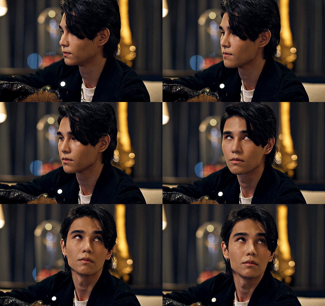
adding blue to this gif with the curves layer took out the yellowy tint, which I wanted - but it also took the yellows out of Kim's skin tone, which I don’t want. so I need to put yellow back into the skin tones specifically - without putting it back into the rest of the gif.
selective colour layers let you select an individual colour and adjust the levels of other colours within that colour. you can change how yellow the green shades are, or how much cyan is in the blues, for example.
I need to add yellow back into the red tones to correct the skin tones on this gif. this is the case for most gifs in my experience - the vast majority of the time, unless a scene is very heavily tinted in another colour, a curves layer will add blue/remove yellow.
in the 'colors' dropdown, select the 'reds' section and drag the 'yellow' slider higher - this will add more yellow into just the red shades within the gif.

the amount of yellow you need to add back into the reds depends on how much yellow was taken out of the gif initially - I just play around with the slider until it looks right. if you're not sure, it helps to have some neutrally-coloured (not white-washed!) reference photos of the people in your gif to compare to.
here's the result. Kim's skin is a lot less pink toned and much more natural looking:
✨ hue/saturation
this adjustment layer lets you adjust the hue and saturation of the gif as a whole, and also of each colour individually.
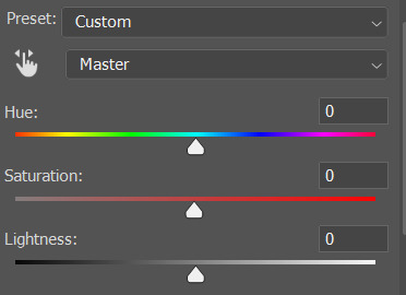
I don't use the hue or lightness sliders unless I'm trying to do something more complicated with the colouring.
clicking the dropdown menu that says 'master' lets you edit the saturation of each colour individually. this is useful if your gif is still super tinted in one colour.
I thought the yellows on this gif were still slightly too bright, so I switched to the yellow channel and desaturated them slightly. (remember if you do this then you need to go back to selective colour and add more yellow into the red skin tones to balance out the desaturation!)
then I increased the 'master' saturation of all the colours to +5:

I usually find the right amount of saturation is somewhere between +5 and +12, but it depends on the gif.
‼️if the gif feels undersaturated, but the saturation slider isn't helping/is making the colours worse, try a vibrance layer instead.
done!
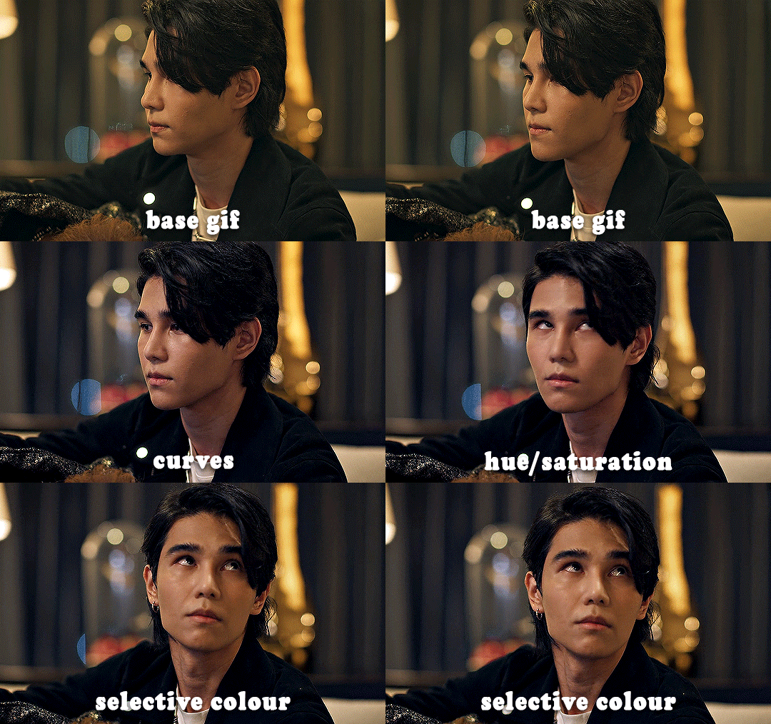
✨ saving and reusing colouring
you can copy and paste adjustment layers between gifs to make your colouring even across each of your gifs for one scene - so if you're making a set of multiple gifs of the same scene, or you think you might want to gif the same scene again in the future, you can save it as a psd so you can reuse the colouring again later.
each gif's colouring will then still need tweaking - different cameras/angles/shots of the same scene can still start out with slightly different colouring.
I recommend uploading the gifs as a draft post on tumblr so you can see what they all look like next to each other and catch any inconsistencies.
✨ another one! (speedrun!)
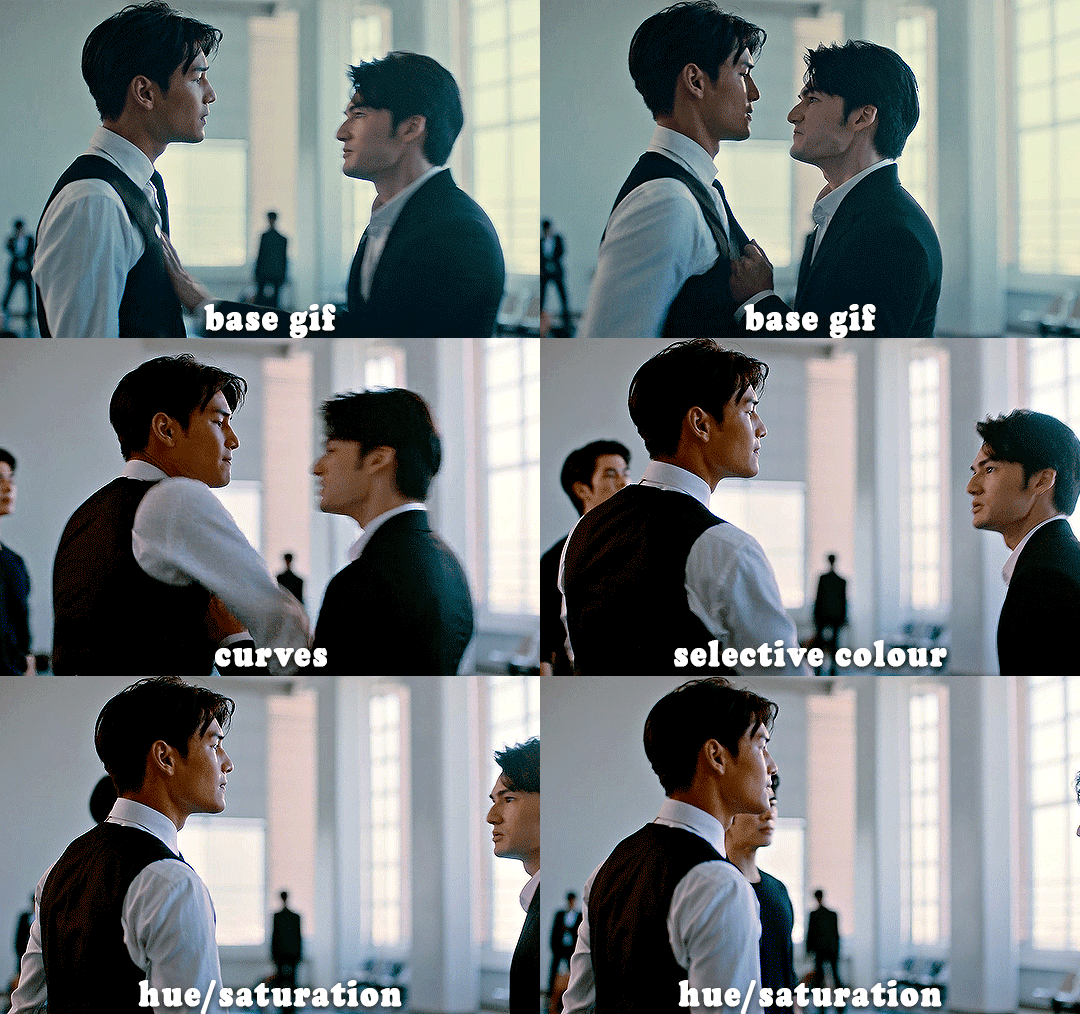
HI KEN!
the white point for the curves layer was in the window behind them.
the curves layer removes the muddy yellow tint, but again it makes their skin tones (especially Ken's) very red toned, which is adjusted by the selective colour layer.
3. other adjustment layers
imo many many gifs can be coloured really nicely with just those three adjustment layers, but some need different adjustments.
✨ brightness/contrast
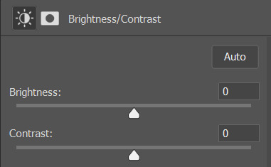
pretty self explanatory!
I personally usually avoid using the 'brightness' slider because I rarely like the effect - I only tend to use the 'contrast' one.
the 'auto' button is sometimes useful though, especially if you’re struggling with the curves layer.
✨ levels

levels alters the white and black points of the gif, like curves - but unlike curves it doesn't also alter other colours.
use the sliders beneath the graph to alter how dark/light the gif is. you can slide the black slider further to the right to make the blacks darker, and the white slider to the left to make the whites lighter.
levels is a good place to start if your curves layer isn't working.
(I'm going to hit the image limit for this post lol so here are some screenshots of a table I made to demonstrate this rather than actual gifs. sorry!)
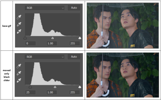

on both sides, I dragged the sliders up to where the big jumps are on the graph - this is usually a good place to start!
✨ vibrance
vibrance... makes the colours more vibrant. it's more subtle than saturation.
it's really helpful for gifs that feel grey. sometimes adjusting saturation just makes the greys kind of weirdly tinted, but a vibrance layer can fix that.
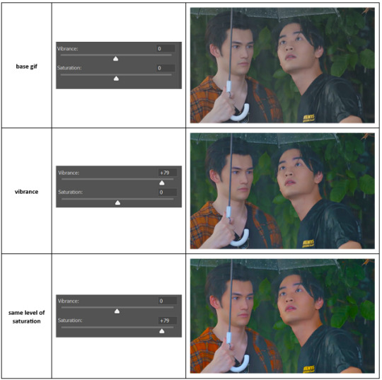
vibrance is much more subtle!
✨ colour balance
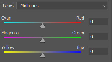
colour balance affects the overall balance of colours within a gif.
it's good for scenes with heavy tints.
I tend to stick to the 'midtones' dropdown, but you can also alter the colour balance within the shadows and highlights if you want.
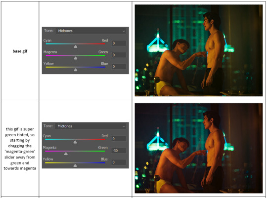

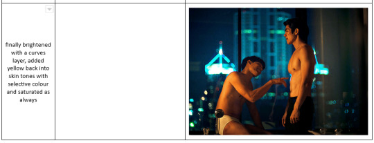
✨ channel mixer
I avoided channel mixer for such a long time because it scared me. but it's great for scenes that are very heavily tinted in one colour.
basically, it works with the levels of red, green, and blue within a gif. you select an output colour and then play around with the levels of the colour you selected within each other colour.
kind of the reverse of selective colour?
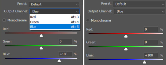
so in the 'blue' channel, the levels of blue are at 100%, and the levels of red and green are at 0% - but you can impact how much blue is in the reds and greens and blues.
this tutorial explains it well - but imo the best way to get to grips with channel mixer is just to play around with it a bit (sorry)
(when I made this guide for my friend, I also made a slightly more complicated gif colouring walk-through that included using channel mixer. there isn't space to include it within this post, but if anyone is interested I could always upload it as an 'intermediate' gif colouring tutorial - lmk!)
4. troubleshooting
‼️curves
usually with a bit of fucking about a curves layer works well - but sometimes you can’t find a good white and black point anywhere, and instead your gif turns wacky colours and nothing looks good. this happens more often with very heavily colour tinted scenes :(
for example, with this base gif:
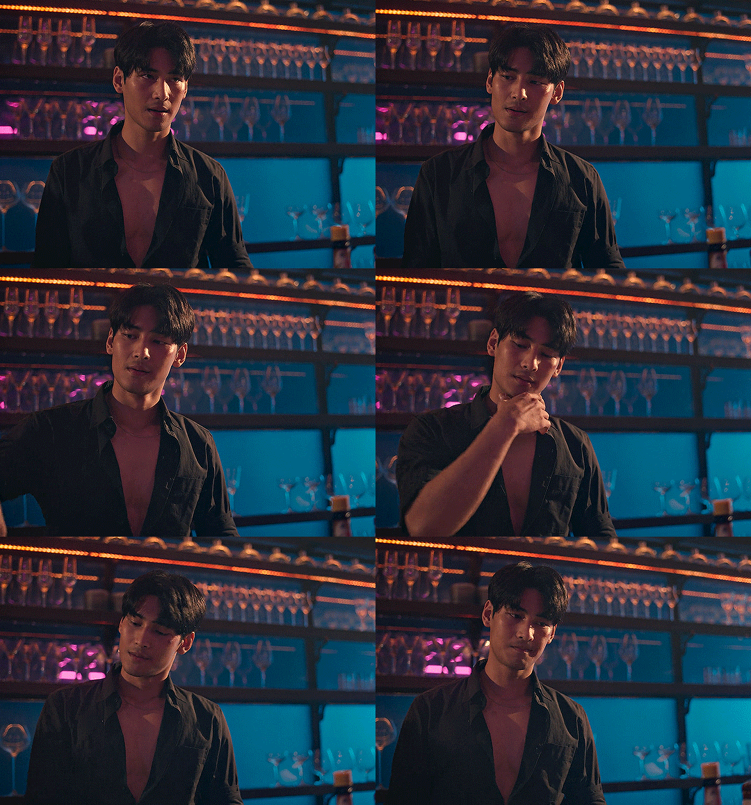
using many of the brightest points as a white point turn it wacky colours, like this:

yikes :(
some options for these cases:
try brightening the gif first with the 'auto' button on the curves layer or with a levels layer. having a brighter gif to start with can give you better options for picking a white point.
try finding an alternate, whiter/brighter white point. look for places the light reflects - on this gif, using the light on Porsche's cheekbone works well as the white point. it also helps to find places that would be white if the scene wasn't tinted - the lightest part of a white shirt is often a good place to start, for example.
skip the curves layer, and instead use a levels layer to alter your white/black points, and colour balance or channel mixer to balance the colours.
‼️over/undersaturation
if your gif (especially the skintones) is looking a little washed out or lifeless, it might be undersaturated. boost that saturation - or if that's not working, try a vibrance layer.
oversaturation is often easiest to spot in the mouths and ears of any people in a gif. if the mouths are looking unnaturally, vibrantly red, then you've gone too far with the saturation.
5. fin!
and done! I hope this was coherent helpful to somebody.
if there's anything that I've missed or that doesn't make sense pls feel free to shoot me an ask or a message and I'll do my best to help! I've also collated a bunch of additional reading/resources below.
happy gifmaking 🥰
✨ some links!
photoshop basics by @selenapastel
gifmaking for beginners by @hayaosmiyazaki
gifmaking guide for beginners by @saw-x
dreamy's gif tutorial by @scoupsy-remade (includes instructions on how to blur out burned-on subtitles or annoying video graphics)
beginner's guide to channel mixer by @aubrey-plaza
how to fix orange-washed characters by aubrey-plaza
colour correcting and fixing dark scenes by @kylos
does resampling matter? by usergif
how to put multiple gifs on one canvas by @fictionalheroine
watermarking using actions by @wonwooridul
resource directory by @usergif
#i got a couple of asks about this so i figured i'd type it up as a post#it's been sitting in my drafts for a while now though i'm so sorry omg.#i had to replace my laptop and it took me a while to get round to downloading photoshop on the new one#but i hope this is helpful!!#gif making#tutorial#photoshop tutorial#colouring tutorial#coloring tutorial#gif colouring#gif coloring#photoshop resources#gif tutorial#gif resources#userbunn#uservik#darcey.txt#darcey.gif#usergif
786 notes
·
View notes
Note
what I don't understand is like .... they wrote the guillermo and nandor dynamic the way they did AND made both of them queer. like. nobody asked them to do ANY of that. so turning around and mocking everyone who very reasonably looked at what the writers of this show wrote and said "they are written like a couple" is just a baffling thing to do. imho
Exactly. And if you don't mind, I'm going to use your ask as an excuse to write out why I'm upset about certain things, because what you said is the root of my problem.
My disappoint doesn't come from Nandor/Guillermo not going canon in the traditional sense (at least not fully), but from the very 2010s-esque way everyone seems to be talking about fans post-finale. Basically saying they never intended Nandor & Guillermo to be anything but platonic and blaming the weird fans for wanting their pornographic whishes (🙄) to actually happen in the show, like they were not in any way responsible for creating those wishes, is insulting but, more importantly, not true. And they can't convince me otherwise because I was there, watching the whole thing unfold in real time.
I already mentioned being remotely normal about Nandor/Guillermo pre season 3 and there is a reason for that. During the first season the fandom was small. And by that I mean both Nandor/Guillermo shippers and also the people watching wwdits in general. During season 1, sometimes all you saw when going into the tags was about 5 of my gifsets in a row, for instance. Even if people watched the show, they didn't really interact with it in a fandom-y way. During the middle of s1, I complained about there not being Nandor/Guillermo fics at all and even between s1 and s2 I posted about there not being a lot. It was also this era when the first mentions of possible canon romantic feelings were brought up and it was by Harvey himself, who said he thinks Guillermo has feelings for his boss. This was, of course, only Harvey explaining how he views his character but I feel it's important because, as it's been mentioned before, Harvey came up with a lot of Guillermo's character, starting with his surname. He basically created current Guillermo. In the original pilot script, Guillermo is a 40-something, very bitter man. Quite different from our Guillermo and it's all thanks to Harvey.
But during this period, that is during s1 and s2, anything romantic between Nandor and Guillermo was purely accidental and mostly due to Kayvan and Harvey's chemistry. We all knew this, even if by s2 we did get the first articles about Nandor & Guillermo's relationship being maybe not fully platonic. By the end of season 2, the fandom has grown for sure but it was still nowhere near its current size. We also had Nandor say he treated Guillermo like a son, which was quite annoying but we at least knew where we stood with the show. Didn't stop us from shipping those two, of course, because fandoms have survived on less (Looking back, it is funny how much I hated that line when now it's just *vaguely gestures around*). It's important to note that after season 2, Jemaine left and Paul took over. And then came season 3.
There is a reason why I was so insane about the Cloak of Duplication and then Gail. The former canonized Guillermo's feelings for Nandor on screen for the first time and the latter showed that it was not just a single episode, throw away scene. Instead they continued with Guillermo being jealous of Nandor and his sexual partner. That was huge. But the fandom still hasn't blown up fully, that happened later during season 3. And I think it's important to say that because they wrote and filmed season 3 before the show blew up. They cannot say they wrote those scenes to please (or bait) fans. They weren't 'pressured' to do anything with Nandor and Guillermo. Season 3 was also when the very heavy Nandor/Guillermo promoting started. (Like the parody of The Bodyguard poster with 'Never fall in lo-', for example). Now, I don't remember if the first articles calling them the will-they-won't-they couple of the show came out during this season or later, but it was definitely past season 3. So by the end of season 3 the fandom has grown large and people were obviously very into the ship.
Now we can say shippers are pushy or annoying but fans can be annoying in general. People can be annoying lol. When your show grows big enough, annoying people you don't like are going to watch it too. (I'm sure if those annoying people are cishet men then this burden is easier to bear but I digress. I am a little bitter, after all). But at this point, fans had no reason to be pushy, we thought every sign was pointing to canon romantic Nandor/Guillermo.
At this point, the show saw how large the fandom has grown and how invested people were in Nandor/Guillermo. If that's not what they wanted, if they felt people were seeing things differently than how they intented, they could have pulled back. They had enough time between season 3 and season 4 to do that. But they didn't. Instead, they doubled down and continued to do the same for 2 more season. Even if by season 5 the latest we already had Paul saying weird things about the dynamic.
Instead it seems they decided to pull back in season 6 but by then it was too late. People were expecting them to come through on the thing they have been teasing for 3 seasons. And then they blamed the fans for not liking what they offered up instead. For wanting 'pornographic scenes'. Because it's 'not that kind of a show'. They say this about a show with an episode called The Orgy.
And even while saying all that, they didn't stop them from teasing the fans until the very last moment. Nandor's 'you know what would be cooler than being friends' is just cruel lmao. And that's why it felt more like mocking to me. Not only because of what happened in the show, but because when I watch those scenes, I can't seperate them from how the cast and crew talk about the ship and the fans in interviews. They apparently now think it's stupid and weird but will gladly tease it in the show for whatever reason? It's funny because fans are weird and kinky, I guess. Things unheard of in relation to this show.
I also don't understand Kayvan and Harvey's complete 180 turn. During the early seasons, Kayvan was not really into the idea of the ship, saying it's a bit toxic due to the power imbalance in their dynamic but he seemed to go full throttle later, even overtaking Harvey in hyping the ship up. And then in the first post-finale interview, he says that 'Nandor is never going to have sex with Guillermo', even if the show left that door open with the last scene. And then there's Harvey, who was the first to say Guillermo has feelings for his boss, who is now championing the repserentation of platonic gay male friendships on tv. In his case, I can give him the benefit of doubt, because he must have his own experiences with that and it's not my place to dismiss or doubt them. I do find the change strange and have complained about it but it's more understandable than Kayvan's. (EDIT: I didn't read this interview after the finale but it just makes things even more confusing, if I'm honest.)
I tried to be as coherent as possible and write out all my thoughts about this topic but I most likely still missed some things. I don't really like to talk about my feelings and thoughts this elaborately because I find it difficult to fully express myself but I tried my best because I felt like I was going insane.
#i talked to a friend about this and it was nice so i ended up wanting to collect my thoughts and putting them out there#hopefully it makes sense#ask#wwdits spoilers#nandor x guillermo#and if you dont agree thats fine its just my experience and feelings on the matter#wwdits negativity#not really. more like paul negativity lmao. but just in case#wwdits critical
173 notes
·
View notes
Text
PLEASE HELP THESE FAMILIES ❤️🇵🇸
hello all, several Gazan families have reached out to me to share their campaigns. please, PLEASE if you can spare it match my donation of the minimum 5 euros and if you send me proof of such a donation eg the receipt i will make a gifset or write a minimum 500 word fanfic (nothing explicit/suggestive) of your choice. if that is an incentive. i hope you donate anyway and don’t need to be encouraged to like that
if not, PLEASE SHARE
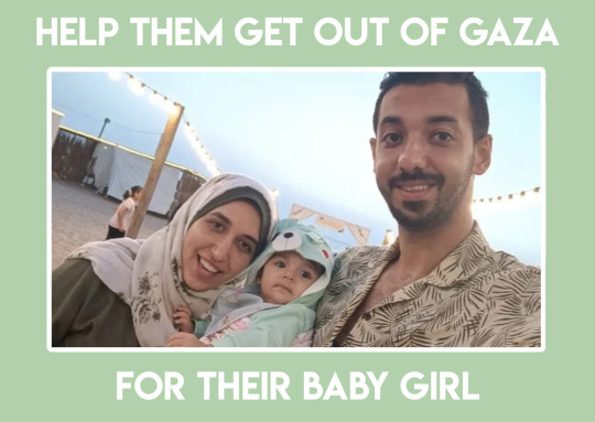
first @amalashuor reached out to me.
Amal and her husband and their beautiful baby girl Maryam were made to flee their home and after staying with friends for some months ended up in a tent in Rafah. I do not need to tell you of the carnage, the death and destruction livestreamed to us every single day of this genocide, that Israel is wreaking there but imagine living that. we see it through our screens but Amal, baby Maryam and her husband LIVE it. on top of the direct impacts of genocide there is the indirect disease and famine and unsanitary conditions manmade by Israel and its supporters ravaging the Gaza Strip. and they have been made to evacuate once more but THERE IS NOWHERE IN GAZA LEFT TO GO
Amal should be continuing her studies, her master’s degree in French language. baby Maryam should be giggling and playing. please help, in any way you can, to make this their reality
HERE IS THEIR GOFUNDME
€21,516 raised of €30,000 target
number #175 on the vetted fundraiser spreadsheet by @el-shab-hussein and @nabulsi
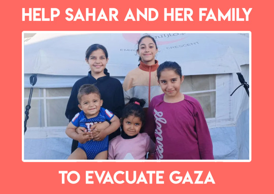
secondly, @fahedshehab-new reached out to me
Mr Shehab, Fahed, is a father of 5 beautiful children: Sahar, the eldest at only 14; Dana; Mona; Malak; and Yehya, the youngest at one and a half years old. there is also his wife and their mother Mrs Shehab, Reem, and their grandmother, Mona
Israel bombed their home and the gym Fahed owned in Gaza, forcibly displacing them to the south of the strip where they have been surviving this genocide in inhumane conditions. they have been displaced ten times and are now in a tent in Rafah where conditions get worse and worse as the genocide persists. they are threatened every day with bombing and ground offences from Israel on top of the ecocidal campaigns that have led to disease and famine other health issues and unsanitary conditions that further exacerbate all of this. again THERE IS NOWHERE IN GAZA LEFT TO GO. THIS IS A GENOCIDE
the funds will be used for departure costs as well as basic living costs: accommodation, food, transportation and healthcare
this family like yours and mine should be living in safety and peace and freedom of oppression. these kids should be playing and going to school. Fahed, Reem and Mona should be at peace knowing they can do that
HERE IS THEIR GOFUNDME
€28,790 raised of €50,000 target
vetted by @el-shab-hussein
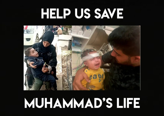
thirdly, Amal’s sister @nourashoure44 reached out and needs urgent help for her son Muhammad
Muhammad has a medical condition resulting in muscle relaxation and immobility and was receiving treatment in Gaza before Israel’s genocidal campaign destroyed the healthcare services. his condition has deteriorated and puts him at even greater risk, he NEEDS his treatment to continue URGENTLY
HERE IS THEIR GOFUNDME
£347 raised of £80,000 target
vetted by @90-ghost and Amal herself
if you cannot donate PLEASE SHARE
@feluka @appsa and tagging scooby blogs @tubapun @thescoobydooby @threephantomrey @scoobypineapple @scrappedtogether @cometcrystal @velmautism @nemmet
322 notes
·
View notes
Text
Predictions if there are more seasons of NATLA
Yue will appear again in fox form and have some awkward dialogue with Sokka *obligatory furry joke*
Sometime during the Ba Sing Se arc we’re going to see some brutal death by bending like in episode 1
There’s going to be some kind of ~progressive~ spin on Toph’s parents that downplays the ableism
They’re going to cut out the beach episode
Obligatory Zuko thirst trap scenes when his hair starts growing out
Azula and Zuko will duel in the same courtyard where Ozai burned Zuko and there will be flashbacks to that scene and some monologuing about ~mercy~ and ~weakness~
Zuko’s arc will be hella rushed
They’re going to tamper with the Ba Sing Se political plotlines and come up with something really dumb
A random side character will be revealed as gay in a 5 second throwaway scene
Appa being stolen will not be the reason why they go to Ba Sing Se; instead they’ll go there because Azula will set her sights there after conquering Omashu
Jin will either not exist or will have a scene with Zuko with strong sexual undertones that we will be subjected to through tumblr gifsets for all eternity
(at least) one of the actors will make a joke about a character and/or ship and get #canceled and ruthlessly spammed on Twitter
Both Zukka and Zutara will be baited to some extent both on and off screen and when neither are made canon it will unleash a shitstorm even worse than voltron
#natla spoilers#atla#avatar: the last airbender#avatar the last airbender#zuko#katara#zutara#azula#sokka#yue#toph#jin#jinko#zukka
701 notes
·
View notes
Text
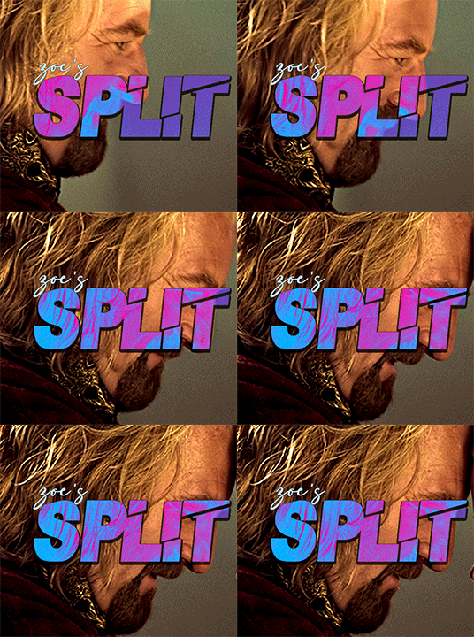
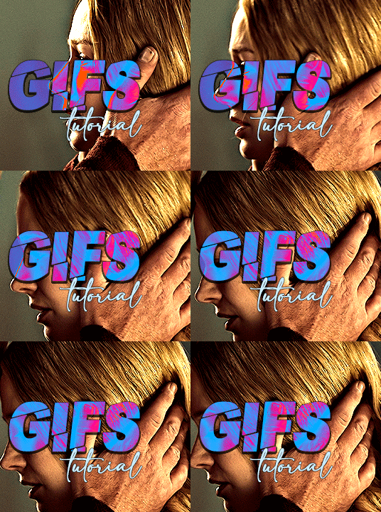
i always get questions when i do a split gifset, and it's a deceptively simple process so i thought i'd try to show how i do it! i don't know if these types of gifsets have a more universally recognized name, but that's what i call them so that's what i'm going with.
i'm going to write this assuming you have a solid familiarity with photoshop and making gifs, but please feel free to send me an ask if anything is unclear. i use video timeline/smart objects so will be showing that (here's a great general tutorial on giffing with timeline). i will also be talking A LOT about gif dimensions, so first let's briefly go over the limits and theory a little bit.
a 1 column gifset can accommodate gifs 540 pixels wide
2 columns = 268 pixels each with a 4 pixel gutter between
3 columns = 177, 178, 177 pixels with 4 pixel gutters
i'm mostly going to talk about 2 column split gifs here (what i will refer to as 2x1 from now on - 2 across and 1 high), but the process is the same for 3 column (3x1) and so on (1x2, 2x2, etc).
so, why would you even want to make a gifset like this? i mean, let’s face it, generally, bigger is better for gifs on tumblr, and there are obvious incentives to 540 width gifs over 268 or 177/8 width, especially since the upload limit went to 10MB. but even 10MB isn’t much when you’re talking about high quality footage. gif making is a constant balance between quality (whatever that means to you: frame dimensions, sharpening, coloring, etc) and file size. split gifs are a cheat to that limitation >:)
i personally believe an untapped frontier of tumblr gifmaking is playing with dimensions and time. that sentence makes me sound like an old-timey sci-fi villain, but you get the idea: gifmaking is an art and there are many fun and interesting ways of exploring the medium. you can do a lot with 268 pixels! longer frame loops to gif longer scenes unbroken, bolder coloring on a wide shot you don’t want to pare down. and, a shorter x axis means the y axis’s bang goes a lot further on a buck. also just if you have a 2 column set but only 5 gifs so you need to make one take up 2 slots. there's a lot of reasons but the most important one is it's fun :) here are some examples of other split gifs i've made: x, x, x
this isn't so much a limitation, more of a shift in how you think about gifs, but it's important to remember that each gif should ideally be doing something still. when making split gifs, it’s easy to pick a wide scene without thinking about how it’ll be split down the middle, and then you’re left with a lot of something on one side and a lot of incongruous nothing on the other - or you're left with a person cut in half awkwardly in the middle. so while a split gif can still be a whole scene, you shouldn’t ignore the break and what it means to the bigger picture. now this is personal preference, but i like to play with the break and make it a part of the gifset. mirrored movement, subjects trapped on either side but still talking to each other, a bird flying from one side to the other. fun with frames! it can be another way of drawing attention to specific images/moments/feelings happening within the same shot.
SIMPLE SPLIT GIFS
to more narrowly define what i’m calling “simple split gifs,” it’s one set of frames split down the middle into two separate gifs that are meant to play concurrently, side by side.
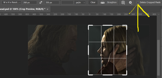
first thing's first, crop your gif and uncheck delete cropped pixels if it is not already (very important). i'm cropping it to the 1x1 size, in this case 268x350. if you need to see how the full size will look, you can try it out with 536 first. but this one is pretty easy, this is the exact center of the frame (the left boundary of this crop is the center line) and both their heads fit within their respective 1x1 crop.
then color as you normally would. if your scene is very different one side to the other, it might be easier for you to color on a wider crop and then either crop again or copy paste your coloring to the smaller crop version. i do that with the 2x6s, but it's usually not that big a deal to color the 2x1s with just the small crop on your canvas at the time. this scene is very symmetrical, both in movement and colors, so i'm good.
now the fun part! once you've got one side how you want it, save/export as you normally would. at this point i also like to make a mental note of how many frames there are.

so i have 49 frames and it's still only ~3MB! this is just an example that i picked from my rotk fancy set, otherwise i probably would have made this gif longer.
then onto the other side, so i ctrl + z my way back to my smart object video timeline. to get to theoden i just drag and drop the smart object 268 pixels over. since this one is in the exact center of the image, it even helpfully guides me (this can get annoying if you are NOT giffing the center of the image fyi, but you can always manually go pixel by pixel too if you need to with your <- -> keyboard buttons. just always remember where you started and count accurately). i can never move around my smart object without hiding the adjustment layers on top of it, so you'll see me do that in this screen recording.
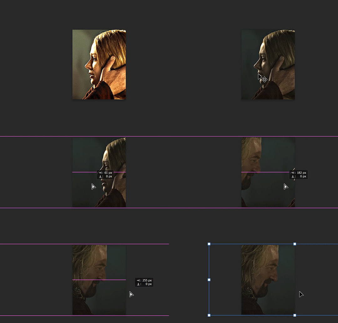
see how it corrected me when i dragged it a few pixels down by accident, and with all those pink guidelines? sometimes photoshop is good 😌
then make sure you still like the coloring, adjust whatever needs to be adjusted, but watch out! don't make any major changes because it still has to match the other side. and export again.

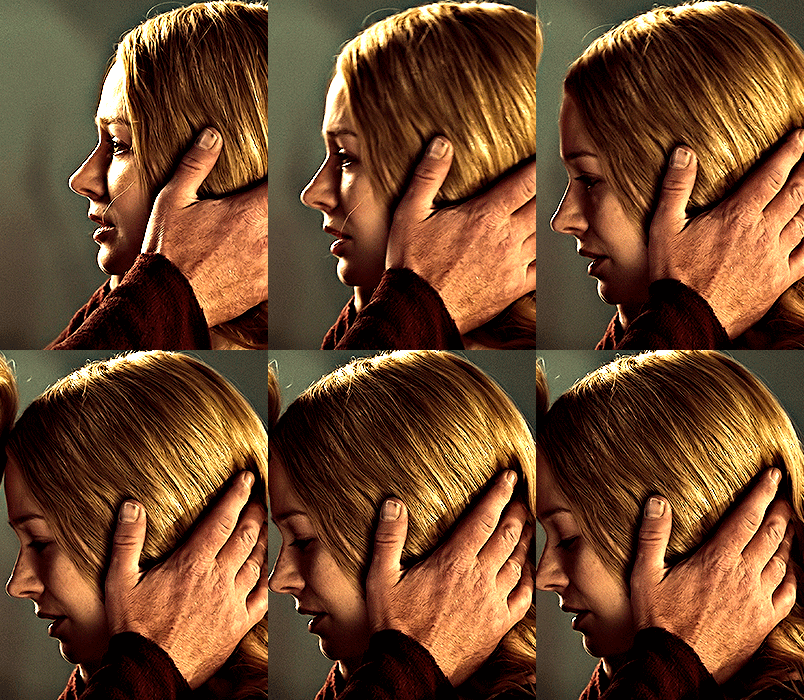
what we perceive as 1 series of frames chopped down the middle is just 2 separate gifs with the same frame rate. when tumblr loads the images, it will run concurrently in the post (even though it never does in the draft post 🙄). and that's it!
COMPLEX SPLIT GIFS
again i'm making up terms, but i call anything with more than 2 components a complex split gifset. i've tweaked some things in the process as i went along, but this is generally how i did the lotr series. these sets are basically just many split gifs with transitions. and here's where endurance becomes a factor :) there's a lot of prep done blind. but if set up well, it will be fairly easy to pull together by the end.
first i decide on my dimensions, using my upper bounds to determine how big i'm going to go. since lotr has very nice large file sizes, i can go pretty big without sacrificing much in quality. i decided on 3 rows of 350 pixel height gifs and it's worked well for me. that means my biggest gif will have a total height of 1050 pixels - fun! you could also do 8 rows, with two 2x2s or just a series of 2x1s that transition to 1x1s. there really is no limit to this except your imagination and source material.
i cap everything i'm going to use before i even open photoshop, then do all of them at once. uncheck delete cropped pixels, then i make my gifs! this is where i spend 90% of the time on this set. every gif should be the size of the smallest 1x1 gif (268x350 for me). i make all 10 into a fully colored, separate psd. (and then i usually go back through all of them a few times to get the colors to match better 😅) for the bigger ones (2x1: 536x350 and 2x6: 536x1050), i just crop them as if they were 1x1 but always thinking about how they will look when big. this gets tricky when i do the big one :) my lazy workaround for that is to basically make it twice: one cropped as it will be and one full size for me to color. then i copy and paste all the coloring layers onto the small one and voila, i know that the coloring in the upper right slice will also look good on the bottom left slice 1050 pixels away because i saw it on the full size version.
coloring is probably the biggest thing i'm thinking about with this kind of set. the whole idea is that these gifs are using the same colors, more or less, throughout each phase. even with the 1x1s, they're still part of a larger color concept, and they should (🤞) work with each other.

in a pinch, i like to eyedrop a color from one gif and add it as an accent to another. one of my 1x1s had a much more muted color palette originally, but i wanted it to have deeper blues and yellows to complement the 1x1 that would go next to it, so i added some gradients on lower opacity over it, color picked from other gifs i already colored.

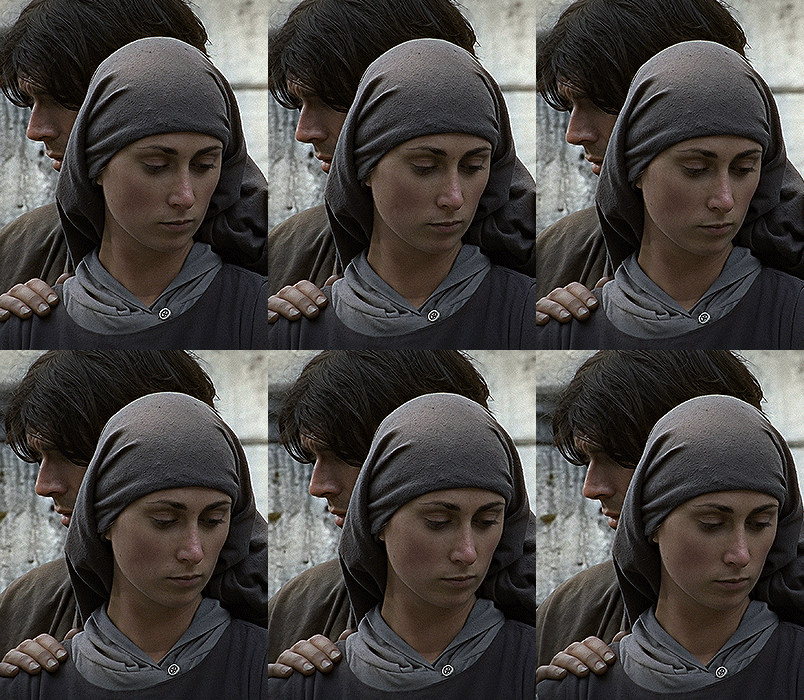
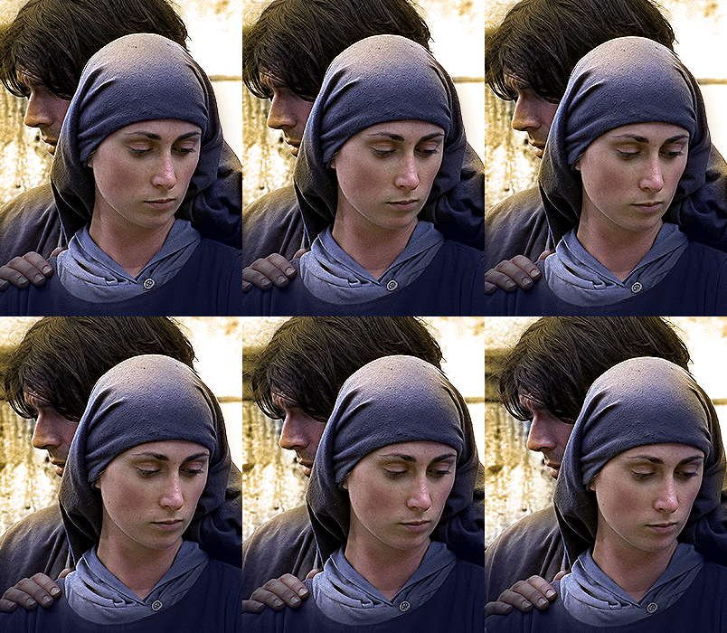
i keep my coloring and the smart object in separate folders to help me in the final step of combining everything, and then i trim everything down to my lowest common denominator of frames. you might think you need to keep frames pretty minimal if you're doing 3 phases with transitions like this, but there's more room to work with on a small gif, in terms of file size. i usually do 30-50 frames for each phase, with the assumption that i'll be adding a transition on each side of each gif that will eat up some frames (i usually do 4-6 frame fade transitions). for the rotk set my final frame count was 129 and i never went over 8MB on a gif, so there's plenty of space play around with things :)
and then, combine! whatever order you start with, you are stuck with (unless you're getting even more complicated, but we won't go into that lol). for these sets i go small 1x1 -> medium 2x1 -> big 2x6. i like to think of it in phases from this point on. small is the first phase, then medium, then big. then i put in the fade transitions, chopping up the first phase gif so the last one will fade into it, restarting the whole cycle seamlessly. i'm just doing a quick and dirty fade here, but here's a tutorial if you want more explanation on transitions.
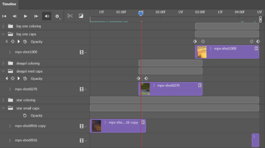
at this point i save this psd as its position, "top left" or whatever (usually it's a psb by this point too 🥲), just in case i need to go back to it. then i export this first gif and move on to the rest.
it's the same concept as a simple split gif: drag and drop the smart object to the new position, but now there are multiple phases to keep track of. folder organization has been key for me to keep everything straight. i move through the gifs in a backwards S, starting with the top left. but you could go any direction, just gotta stick with it and remember your counts. in my case, i'm always thinking of 268 pixels over and, for the 2x6, 350 up/down. it's a tedious process, but it goes quick (apart from waiting for photoshop to load each time you export).
i did this series as a color concept aesthetic kind of thing, so my theory was by using the same-ish colors throughout, that would save me in the end when it came time to export. there's only 256 colors max to work with on a gif, and that's usually what gets me over the 10MB limit. but as i said, i have never even gotten close to the size limit on this series. it's pretty hard to reach the limit on 268 pixels, but not impossible. (i did run into that on the emma set i did, and that was hell. but also not an impossible fix in the end.)
and that's it! if you try any of this and have trouble, i'm happy to help if i can but mostly this is a "click around and see what works for you" kind of process. and feel free to tag me on your split gifsets :) i love seeing them <3
#*lotrsplit#*#split gifs#gif tutorial#photoshop tutorial#usergif#allresources#chaoticresources#completeresources#photoshop tag
293 notes
·
View notes