#3d moving animated wallpapers
Explore tagged Tumblr posts
Text
A little something different...
I thought I'd talk about this electronic toy I imported from Korea, the WishCat WishPad! It's super cute, but... somewhat scammy!?
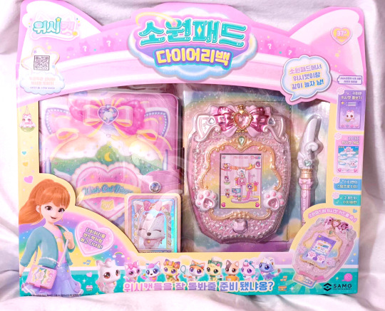
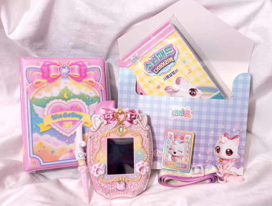
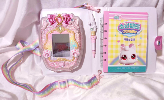
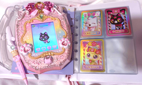
Based on the WishCat Korean animated series by the same studio that brought TeeniePing, the WishPad has a 2.8 inch touch screen and comes with a stylus (that can be separated in half as the feather part has a sensor), a strap, one card, card portfolio pages, activity pages, and a binder than can hold all the pages as well as the device itself.
I find that the home button on my device keeps getting stuck, and I noticed that there is some extra acrylic that jams it, so must be a manufacturer error with just mine.
The device has 20 games, the ability unlock Wish Cats to care for, a shop so you can renovate your room, and some pointless profiles for human characters from the animated series. Here is what I think of it!
Pros:
Audio - It has cute music and a lot of spoken dialogue, including cute cat meow sounds. The speaker isn't the best quality of course, but I am very pleased with all the audio.
Graphics - The animations aren't very smooth, but the sprites themselves are super cute and in the mini-games there is usually a lot of detail on screen. The device sometimes even displays the full-on 3D artworks as the characters appear in the show.
Exterior design - The design of this device is intricate and dazzling! Every detail, including the little cat ears and paws, is gorgeous!
Variety of games - 20 games is a lot, and they're of varying difficulty and styles. Many of them are really basic but I still find myself failing to win sometimes even as an adult. A few are like "move the character to avoid or collect objects", but there's a Bejeweled-style game, dress-up games, a tennis game, a very simplified rhythm game, etc.
Battery level on display - The device takes four AAA batteries and there is a meter with 4 bars in the upper right of the screen sometimes, so you know how much power is left. Oddly while I was playing, the meter went down to 3 bars but later back up to 4 bars haha.
Decent touch screen - I've had touch screen toys where the touch sensors were literally divided into only 4 areas... Thankfully, this is more like a normal touch screen even if there's a slight delay to respond. You can even move your cats around on the main room screen, which I find nice because you can choose precisely where you want each cat to sit!
Cons:
This device is almost useless unless you buy separate figures. You do NOT earn ANY points for playing a game UNLESS you have scanned a card from a separately purchased figure, after which the corresponding game's "Star mode" will be unlocked. This means you CANNOT buy any wallpaper or furniture for your room unless you buy additional figures. You better hope the figure you bought corresponds to a game that isn't too hard to win, and that you're okay with playing the same game tons of times for points. Additionally, you cannot care for any cats beside Iemeow, or read ANY profiles for any of the cats, unless you buy these extra figures. I understand the former so that scanning the cards will have more incentive, but the latter bothers me because the boring human profiles are readily available. Thankfully I bought 5 Wish Cat figures as well, but the fact that an entire feature (buying furniture and customizing your room) is paywalled feels scammy to me.
Even if you do buy figures, you have to grind - You earn 20 points for winning a game that you have scanned a card for. How much is the cheapest customization item? 1000 points. The most expensive is 20,000 points. Three of the games have a "Special mode" where you can win 300 points instead of 20. For each of these three games, you need to scan 5-7 unique and specific cards to get Special Mode. I find this quite predatory considering the toy is for young children and the figures with the cards cost $10 or so each. Despite me buying 5 figures, they aren't the right ones for any of the exact lists, so no Special modes for me!
You cannot pet the cats! - I was almost devastated to discover this! Despite the touch screen, if you touch the cat while in care mode, nothing happens. Instead, you can choose petting under one of the options and WATCH a hand pet the cat... I saw this petting animation in marketing and assumed you could pet the cat manually, so I am a bit disappointed!
The card it comes with doesn't really do anything - It's a card of Iemeow (the default cat on the device), but it does NOT unlock Iemeow's profile or Star mode for her game. It just plays the Wish Cat music theme and a simple looping animation of all the Wish Cats. That is still cute and nice, but I had thought it would at least unlock her profile... You still need to buy the separate Iemeow figure for all that.
Neutral aspects:
The stylus has a sensor, but... - In care mode, you can choose to feed, bathe, or play with your cat and to activate the option you selected, you have to touch the base of the plastic feather to the emerald above the screen. This is cool, but if you lose the stylus or even just the removable feather bit, you won't be able to care for the cats at all.
You can get extra foods and toys, but... - They are single use. And to get a new food or toy, your Wish Cat has to have a full meter, and their meter will empty after you exchange it for the new item. So, you deplete your Wish Cat's meter entirely in exchange for an item that will increase the meter by 2 bars once... It's a little odd. But the extra toy animations are cute, at least.
Sorry for the long post. I know I complained a lot, but I just wanted to express my thoughts on this toy! It was very expensive but I do not regret buying it; it is very cute and I like electronic toys that have a lot of games. I just hope the figures show up on AliExpress at some point so I can get more (International shipping from Korea destroyed my bank account lol).
32 notes
·
View notes
Text
ok here's my overall thoughts on the whole dark beginnings trilogy. spoilers below!
things i liked:
- the visuals. the action was especially vivid and really helped me understand how i'm supposed to imagine these characters in a fight. there were also a lot of wallpaper-worthy shot compositions. the use of 3D within a 2D art style was...a little noticeable, but not immersion-breaking.
- seeing all these characters together again. we haven't seen team dark in a context like this for a while! and it's especially nice to see fresh interactions between shadow and rouge/shadow and maria. fun GUN commander surprise, too.
- rouge's characterization. i like that they're leaning into a lot of my favorite Rouge Traits again---she's tech-savvy, smart, does what she wants, and she's kinda Shadow's best friend currently living. this still isn't my favorite voice for her, but, you know.
- the angst, for lack of a better word. i loved seeing shadow's canon insecurities about his identity and his place in the world. i also think it was so effective to show how isolated shadow felt on the ark, and how maria was the only person there for him. it puts his grief for her into even better perspective.
things i'm kinda iffy on:
- i wish omega had more dialogue. plus, why did they repeat him saying "i call dibs" across shorts 2 &3 ? that was really glaring. he's kinda just the less important robot third wheel to the two other more interesting characters in team dark.
- the series ended on a kind of lukewarm note. it was just a reminder that oh, yeah, this is mainly a piece of promotional material for a game that will tell the rest of the story. presumably.
- i didn't really like the sentiment that maria is the only person who could talk shadow down. listen, i love shadow's backstory and how it informs his character. like i said, i was happy to see more scenes of him interacting with maria! the thing is, though, i don't want to see him married to his tragic past when he already decided to move on from it way back in shadow the hedgehog's true ending. shadow doesn't do good because of maria's wish anymore---he does it for himself, because he chooses to. he doesn't have maria anymore, but he has new friends who understand him. why must maria continue to occupy this unattainable high standard that even rouge can never reach? even shadow recognizes that his old life was taken from him, and he can never return to it. so why does the narrative seem to push back against that?
i'm willing to give this short series a little grace since it's not the full picture. plus, i think the theme of finding new friends is still there, it's just...not carried as far as i'd like it to be, i guess. i'm not saying maria needs to be replaced, i'm not saying shadow can't remember her. i just think her memory should be used as more of a foundation for him to build new connections.
at the end of the day, though...i wanna see more stuff like this! i love that they're exploring the parts of sonic characters that make them beloved and interesting and cool-looking (same as the knuckles prologue short for frontiers)! i would take a full anime in this style any day of the week.
#merlyybird rambles#sonic x shadow generations#shadow dark beginnings#dark beginnings#dark beginnings spoilers#shadow the hedgehog
8 notes
·
View notes
Text
My Time at Game Anglia
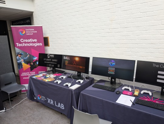
Yesterday we went on a trip to the University of Suffolk to show off last project's games as part of Game Anglia. My group of three displayed Wallpaper of the Mind, but only one person played it due to us getting moved to the very last time slot for showcasing. He enjoyed the game, though had some trouble navigating the map, though this is somewhat to be expected, with it being a maze-based game. I gave him a few navigation tips, but mostly tried to stay ambivalent, so the game could speak for itself. At the end, he said that his favorite elements were the fonts at the end, and the texture work. Technically, this means 100% of players liked it though.
It is hard to say what elements needed refinement from the playtesting. WotM was a maze-based game, and so I wouldn't change the map design just because someone got temporarily lost in it. I think that the objectives were made clear to the player, since he knew what to do and found each item relatively quicker. The art design was especially well-praised because he identified that he was in a care home almost immediately after starting.
I also got to play some games. I played Foques, a horror puzzle game where you play as an arctic fox trying to avoid mutant animals, which seemed very promising. I could sense some John Carpenter influences in the enemies - very fleshy and toothy. I haven't played too many horror puzzle games as of recent, so this was a nice look back at the sort of game I would have played in my childhood.
I also tried out Valerie, a sidescroller which seemed to be a homage to Celeste with its various platforming mechanics (mantling, air dashing, et cetera), though it also had some interesting bubble mechanics that doubled as a launch pad and a way to incapacitate enemies and obstacles such as spike walls. The demo was two hours long, which would be impressive enough on its own except it was also made by one guy over several years.
Another game I played I have unfortunately forgotten the name of, but it had an interesting perspective where you'd always be facing forward, but it was 3D. You went between strange islands that represented people's memories, and had to solve puzzles that involved drawing lines between eyes. They started off simple but quickly became more complex, with new features such as staring eyes that would shuffle the tiles around, and softlock you if you did them in the wrong order. It was cool, but not something I would play in my own time.
The final game I played was Task Time, a Gangbeasts-esque party game where four people could compete against each other to do various tasks such as a paintball fight, avoiding lasers from the sky, and eating as many mushrooms as possible.
Events like this are a great opportunity to network, and so I talked with many of the game designers, to get an idea of the development process of each game, and also to become more well-known in the local gamedev community. Unfortunately I forgot the username of the Discord account I made specifically for this, so I could only give out my Itch.io handle. I'd like to think I made good use of the time spent though.
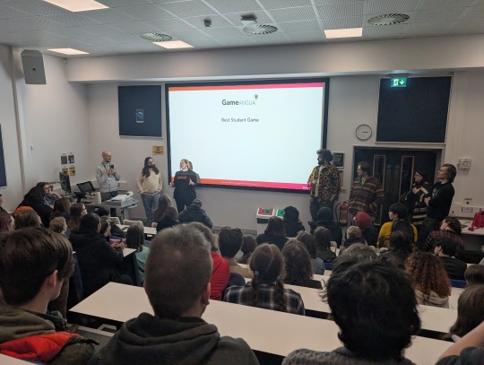
After the demos were all showcased, we went through the Awards Ceremony and Industry Talks. The latter of these consisted of various game designers talking about the process of developing their games, and how they got into the industry. I found that becoming a QA tester was often an inlet for a lot of people, and then they moved up through the ranks, so that could be a way in for me if I decide to join a studio in the future.
Overall, I enjoyed the experience, but one piece of feedback I have for the Game Anglia organizers is that the exhibition space was too small.

The red highlighted areas are where the stalls were - the demos were essentially spaced out along a corridor, and so moving from stall to stall required pushing through dense crowds or going around through the equally packed seating areas. For the next show, I would recommend finding a gym or other large hall for exhibiting the games. Otherwise it was good.
2 notes
·
View notes
Text
No Joycon Drift, Kirby, and Themes??!!! What I want out of the Nintendo Switch 2!
Hello Gamers and Nintendo-Nerds, welcome back to That Vegetarian Gamer!!! Yesterday, we discussed the very empty and ominous Nintendo Switch 2 reveal. Unfortunately, we don't have much information about the Switch 2, but that just means we have room to theorize and make wishes. So today, I decided to make my wishlist for the Nintendo Switch 2, including things I want fixed, games, and customization.

Fixes
The Switch was an amazing console still selling years after its launch, but it wasn't perfect. There are, of course, always going to be issues in life, but there are absolutely many changes that can and should be made to the new Switch to make it more functional than the last.
Joycon Drift was a huge issue on the Nintendo Switch, even sometimes making it unplayable. Joycon Drift is when the Nintendo Switch controllers (Joycons) essentially move in-game without player input. On the bright side, I have high hopes for the Switch 2 fixing this issue. In the first look trailer, there seems to be a focus on the joysticks, hinting at maybe a fix to this problem.
Bad Quality has been a huge issue these last couple of years. Way too many games lag or buffer, so I'm hoping with the new console, the quality will improve.
The Nintendo E-shop is just a complete mess. It is extremely laggy at first, I thought it was my internet connection, but this seems to be a universal problem. There's little to no quality control of the games Nintendo allows on the shop, with there being many poorly made games on the shop. There's no cart function, meaning you can only purchase games one at a time. This is probably my most unrealistic want, but I'm still praying for changes.
youtube
Games
Of course, this is the most exciting part about new consoles, so let's just get right into it.
Mario Kart 9, The first Switch didn't even get a real new version, just a deluxe of Mario Kart 8, so we are long overdue for a new edition, and from the looks of it, we may get it.
Animal Crossing, it may be hard to believe, but Animal Crossing: New Horizons is almost 5 years old, and the game is kinda dying off. We have gotten a new Animal Crossing for every Nintendo Console since the Nintendo 64 except the Wii U, so I definitely believe we will get a new game soon
Kirby, Kirby games are such a huge comfort to me. Something about that round pink alien hits a soft spot. The last game, Kirby the Forgotten Land, was amazing, and I really hope we get a new game soon.

Customization
I love being able to decorate and customize my tech products. I love buying cute phone cases and finding even cuter wallpapers. Unfortunately, The Nintendo Switch does not allow for this experience, with there being little to no customization options. You can absolutely still find cute cases and charms for your switch, but the actual console only allows for a light or dark mode for your home screen. So here are my wishes for customization for the Nintendo Switch 2.
Wallpapers are a must. This is the most simple customization feature to add, but it allows for so much creativity
A fully customizable home screen. I want to change the position, size, and color of the buttons and app icons. This is honestly very unrealistic, but I still hope the home screen is somewhat customizable
Themes were on the Nintendo 3ds, and I'm still puzzled as to why they didn't bring them back for the Switch. Themes were purchased through the e-shop, and they completely customized your home screen. I have no idea what possessed Nintendo to get rid of them, but they need them back ASAP
Some of these wishes are more realistic than others, but overall, I think these problems will be addressed one way or another in Switch 2. Even if they aren't, I am still going to love the Switch 2. What do you wish for in the Switch 2? Do you think it's realistic? Why or why not? Thank you for reading the daily post, see you, gamers, tomorrow.
2 notes
·
View notes
Text
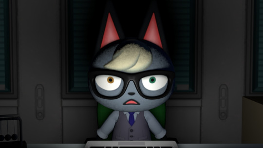
Here is some behind-the-scenes commentary for my new animation, "Raymond's New (Cat) Groove"! I want to get out all my thoughts here before I forget anything. I'll be covering the entire video, so if you want to avoid spoilers, go watch it first!

First up is The Zoom! Ever since I started planning this animation 2+ years ago, I knew that this would be the first shot. Since zooming in on his eye would produce a mirrored view of the video, a double-zoom-out was necessary.
My original plan was to have the zoom be done purely in 3D. However, when it came time to implement it, I realized the shot did not look good when done realistically. The images distorted due to the curvature of the reflection, and Raymond's glasses got in the way due to how big and round his head is.
Also, even his iris was edited in. I made an HD version of his face texture, which you can see in how smooth the edge of his eye is, but because of the model's texture mapping (UVs), the iris was all distorted. I'm glad I edited in the new iris, though, because I got to make it even higher-resolution.
I already covered all the details on the laptop screen in a separate post, which you can find here.
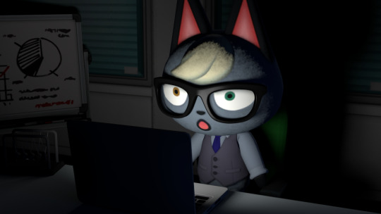
The first good view of Raymond's room. For the most part, it is a recreation of his default room layout in New Horizons, with a few differences, such as his fax machine being removed. I didn't have all of the furniture models, so all the stuff that isn't shown directly (e.g. safe, water cooler, second desk) are super-low-poly recreations.
The laptop is from Splatoon 2. It is Marina's laptop, with all the stickers removed. If you look closely during the zoom out, you can see that the keys still have the Splatoon language keys.
Also, fun fact, his chair was a Froggy Chair as a placeholder until I got the office chair model. I was planning to keep it, too, if I couldn't get the office chair.
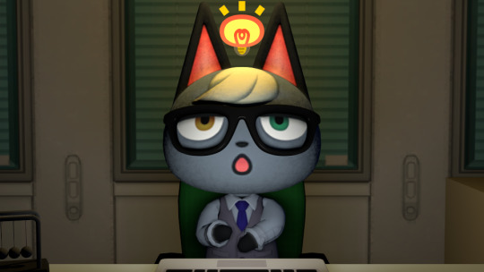
The animation's events really kick off once Raymond begins dreaming. The way his idea lightbulb lights up the room, and how the light persists afterward, is the first sign that things are not normal.
When I first started planning this, I had the New Leaf version of the office wallpaper in mind. While New Horizons has the windows completely obscured by blinds, the New Leaf version has a cityscape visible through the gaps in the blinds. I was originally planning to have the sky change, going from a fake sky to a vibrant real night sky.
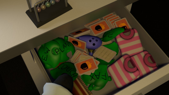
Raymond reaches into his desk for the Ocarina of Time, giving the first style shift. This is another scene that I had in mind for years. Originally, I wanted this scene to be super-realistic. Instead of those cartoony leaves from the game, I wanted just a big pile of real-life dried up leaves, with labels written on them. They'd rustle and slide around when the drawer is pulled open just as you'd expect from leaves. I love the idea that, from an outsider's perspective, the villagers are just a bunch of adorably dumb animal children, gathering leaves and pretending they are furniture.
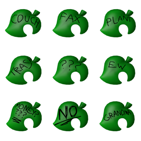
Here are all the leaf types in Raymond's desk. There are two "???" leaves, for a total of 10. Sadly, my favorite ones are completely hidden due to how the physics simulation worked out.
Speaking of physics, I meant to have Raymond pull the Ocarina out. However, every time I ran the simulation, everything freaked out the moment the Ocarina tried to move to his hand, causing the contents to fly out everywhere. Maybe later I'll render out that part for fun.

The Majora's Mask time travel scene. I had the scene ripped from when I was mapping the game, so recreating it was easy. I referenced footage from the game for the animation timing, which is why this and the Ocarina-playing scene are some of the only parts of the video that aren't overly fast-paced. If I had more time, I would have added in the light-blue sparkles that come off the items, just like in the game.

For the anime-esque sequence, the original idea was just to have the hair be flowing smoothly. At some point, I realized that drawing hair on the 3D model would look weird, so I decided to draw the whole thing. I've never really animated like this before, so it was a fun experiment. I posted the raw drawings in another post, here.
For the background, I wanted to reference the time travel scene in the cartoon Samurai Jack. However, the effect there is very intense and hard to look at, so I greatly toned down the flashing effect to the point of being unrecognizable.

Raymond crash-lands in the city from Animal Crossing for the Wii. All the trash that pop up are items from the game, of course. I chose an alleyway so that I didn't have to bother with assembling the city itself. While most of the scene is made from assets from the city, the brick texture is just one of the home wallpaper options.

Did you notice? Before Raymond puts his glasses on, the world is only in 480p, but when he puts them on (stylishly), the screen transitions to full 1080p. The Wii's resolution isn't 480p, but the original Cat Groove's is.
Also, this scene gives a clear example of one of the dream-like effects I used throughout the latter half of the animation. Take a close look at the placement of the bricks relative to the poster. Every time the camera changes, things subtly shift around! It's hard to notice because these are details you normally don't pay much attention to. My favorite use of this effect is in Yoshi's Island, where terrain details are randomized every time you enter a room.

It's not easy to make Raymond look happy when his expressions are normally so serious. Also, did you notice? The floor is entirely different in some shots. It has the same color palette and general design, so it feels the same, but the details and patterns are entirely different.
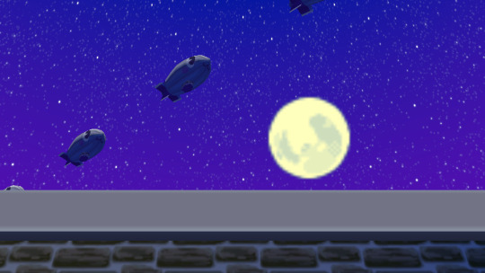
When the camera points up, you get a brief view of the highly-saturated night sky. Even though it's night, everything is brightly lit, another dream sign. By the way, there's supposed to be a chimney up there, but I guess I didn't put it close enough to the edge to be seen. I completely forgot about it until later.
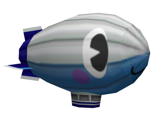
Here is a closer look at one of the blimps flying in the sky. It's an edit of the Luigi blimp from Mario Kart: Double Dash!!, with Rosie's face added on. This is actually an homage to an anime movie, something I rarely talk about. Specifically, the Madoka Magica movie. Rebellion.
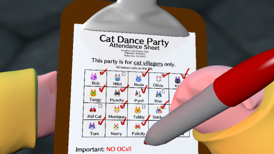
Raymond meets a younger Dr. Shrunk at the club entrance, leading to another style shift. This is another scene I imagined for years. Those hands are actually Pikachu's from Super Smash Bros. for Wii U/Ultimate, with some clothes added on. Also, again, different floor.
While the art style here looks like late-'90s/early 2000s CGI, this wasn't intentional. I didn't realize the resemblance until after I had rendered it. I guess it's just a natural result of using smooth models with super-basic lighting and solid-color materials.
One idea that I'm sad I didn't have time to implement was that the text on the checklist was going to subtly change as Shrunk's hand passed over it. Just like a dream, the text would change every time you read it.
At the bottom there is the rule against allowing OCs in, the explanation for why Raymond can't get in. It continues out of frame, but you can see more of it when he puts the clipboard away. I even included doodles of some YouTuber OCs! Just for clarification, I have nothing against OCs, it just seemed like the funniest option.

The orb appears!
I am not great at special effects, so this was my best attempt at a reality-warping entrance effect. Sure, it's not very dynamic, but I like how it came out. The sound it makes is a distorted, reversed version of one of the Animal Crossing jingles.
I originally had a different ending in mind. Rather than dashing into the door, Raymond would have climbed up on top of the building to look for another way in. There, he would have seen the orb sinking into the roof.
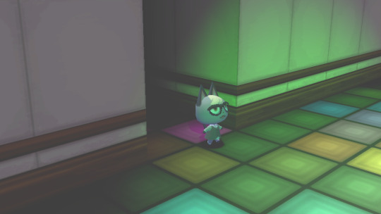
Raymond achieves his dream! For this scene, I originally imagined it ending with that Undertale sound that plays when going through the dramatic exit door to the ruins. You know the one.
Also, darn walk cycles! This was the fifth one I had to animate in a row, using nothing but pure IK. If I wasn't so exhausted by that point, I might have thought to have the camera zoom in or something.

Raymond sleeps soundly while Cat Spin auto-plays. The snoring you hear is a recording of a real cat snoring, which I found on a free sound effect website. The main reason I included it was so that nobody thought Raymond was dead. His tiny arms don't really lend themselves well to a good sleeping pose.
So, why is Rosie there?? Well, originally, my plan was for the camera to look over at the whiteboard, where something like "Happy Anniversary Cat Groove" would be written on it. This is why the whiteboard is at an angle instead of parallel to the wall like normal. However, when I animated the scene, I didn't have the whiteboard yet.
When I finally got the whiteboard model, I realized I had overestimated its size, and sizing it up didn't look good. So, I had to find a way to fill the empty space above the board. I considered a banner or Rosie-shaped balloons, but I eventually settled on the most ridiculous option: having Rosie herself.
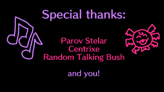
The End!
For the credits music, I chose the Smash remix of Bubblegum K.K., not just because of how many people associate it with Raymond (because of those singing videos people made), but because I just really like it. Other songs I considered were K.K. Disco and the Jimmy T. stage intro from WarioWare: Smooth Moves.
You may have noticed that I used very little of the song Catgroove in the video. Back when I made the original Cat Groove video, the video got a copyright claim, blocking it from being viewed by my European friends. I don't know if the company making the claim was legitimate or not, but I appealed and they removed the block.
Fast-forward a number of years, and Cat Groove was at hundrends of thousands of views, eclipsing everything else I've ever made. I decided that, as much as I enjoy his music, I didn't want to be mooching off of Parov Stelar's work. That's part of why I made Cat Spin, using only Nintendo music, to show the direction I wanted to go. Besides, if the video gets claimed, then I can't show it to all my friends. Otherwise, I might have chosen something like Jimmy's Gang for the credits music.
~
Anyway, that's all I had to say! The end result may be a bit rough, but I'm glad I finally got to bring this idea to life and share it with the world after years of tossing it around in my mind.
A big "Thank you!" to everyone who watched the video from start to finish! I don't know if/when I'll make another big animation like this, but I hope you'll look forward to whatever I make next.
12 notes
·
View notes
Text
Sonic Superstars launches October 17
Gematsu Source

Sonic Superstars will launch for PlayStation 5, Xbox Series, PlayStation 4, Xbox One, Switch, and PC on October 17, SEGA announced.
Get the latest details below.
The newest trailer for Sonic Superstars showcases more gameplay from Sonic’s upcoming adventure including deeper looks at local co-op and Battle Mode. Play through the entire campaign with up to three other players in drop-in and drop-out local co-op, or challenge up to seven other players online or three other players locally in the new Battle Mode. SEGA also unveiled Sonic Superstars‘ Digital Deluxe edition, which will include the base game, LEGO Fun Pack with LEGO character skins for Amy, Tails and Knuckles and levels for Battle Mode, as well as extra content including a special Sonic Rabbit skin that shows off Sonic’s original character design, Mecha Sonic parts for Battle Mode, exclusive wallpapers, a digital artbook and a mini-original soundtrack for $69.99 USD. Sonic fans can pre-order the physical and digital standard or Digital Deluxe editions of Sonic Superstars ahead of launch at sonicsuperstars.com to receive an exclusive in-game LEGO Eggman character skin. Plus, every player of Sonic Superstars will be able to experience the Blue Blur in brick form with a free LEGO Sonic skin available at launch!
-Standard Edition ($59.99 USD)
Base game (Physical or Digital)
Free LEGO Sonic skin
-Digital Deluxe Edition ($69.99 USD)
Base game (Digital Only)
Sonic Rabbit Skin
LEGO Fun Pack
Mecha Sonic parts for Battle Mode
Additional menu screen wallpapers
Digital art book and mini-original soundtrack
Free LEGO Sonic skin
Adventure through the mystical Northstar Islands in this all-new take on classic Sonic high-speed action platforming. Play as Sonic, Tails, Knuckles and Amy Rose and harness all-new Emerald Powers to move and attack in dynamic new ways. Navigate gorgeous, never-before-seen environments solo or with up to three other players and stop Dr. Eggman, Fang and a mysterious new adversary from converting the islands’ giant animals into Badniks before it’s too late!
Key Features
A New Spin on a Classic – The 2D Sonic high-speed sidescrolling action platforming you know and love, reimagined with fully 3D graphics, new powers and abilities, an all-new setting, and new ways to play! You’ve never played classic Sonic like this before!
Play as your Favorite Characters – Choose from Sonic, Tails, Knuckles, and Amy Rose and take advantage of their unique abilities to blaze a path across the Northstar Islands as they race to defeat Dr. Eggman, who has teamed up with an old nemesis, Fang.
Harness the Power of the Chaos Emeralds – Multiply, swim up waterfalls, change form, and more with the powers of the Chaos Emeralds.
More Friends, More Fun – For the first time ever in a Sonic game, play through the entire campaign with up to three other players with drop-in and drop-out four-layer local cooperative play.
Battle Your Friends – Compete online with up to seven other players, or three other players locally, in an all-new player-versus-player minigame!
Watch a new trailer below.
Multiplayer Trailer
English
youtube
Japanese
youtube
6 notes
·
View notes
Text
youtube
Sonic Superstars - Multiplayer Trailer
Sonic Superstars will launch for PlayStation 5, Xbox Series X|S, PlayStation 4, Xbox One, Nintendo Switch, and PC on October 17, 2023.
The newest trailer for Sonic Superstars showcases more gameplay from Sonic’s upcoming adventure including deeper looks at local co-op and Battle Mode. Play through the entire campaign with up to three other players in drop-in and drop-out local co-op, or challenge up to seven other players online or three other players locally in the new Battle Mode.
SEGA also unveiled Sonic Superstars‘ Digital Deluxe edition, which will include the base game, LEGO Fun Pack with LEGO character skins for Amy, Tails and Knuckles and levels for Battle Mode, as well as extra content including a special Sonic Rabbit skin that shows off Sonic’s original character design, Mecha Sonic parts for Battle Mode, exclusive wallpapers, a digital artbook and a mini-original soundtrack for $69.99 USD.
Sonic fans can pre-order the physical and digital standard or Digital Deluxe editions of Sonic Superstars ahead of launch at sonicsuperstars.com to receive an exclusive in-game LEGO Eggman character skin. Plus, every player of Sonic Superstars will be able to experience the Blue Blur in brick form with a free LEGO Sonic skin available at launch!
Standard Edition ($59.99 USD)
Base game (Physical or Digital)
Free LEGO Sonic skin
Digital Deluxe Edition ($69.99 USD)
Base game (Digital Only)
Sonic Rabbit Skin
LEGO Fun Pack
Mecha Sonic parts for Battle Mode
Additional menu screen wallpapers
Digital art book and mini-original soundtrack
Free LEGO Sonic skin
Adventure through the mystical Northstar Islands in this all-new take on classic Sonic high-speed action platforming. Play as Sonic, Tails, Knuckles and Amy Rose and harness all-new Emerald Powers to move and attack in dynamic new ways. Navigate gorgeous, never-before-seen environments solo or with up to three other players and stop Dr. Eggman, Fang and a mysterious new adversary from converting the islands’ giant animals into Badniks before it’s too late!
Key Features
A New Spin on a Classic – The 2D Sonic high-speed sidescrolling action platforming you know and love, reimagined with fully 3D graphics, new powers and abilities, an all-new setting, and new ways to play! You’ve never played classic Sonic like this before!
Play as your Favorite Characters – Choose from Sonic, Tails, Knuckles, and Amy Rose and take advantage of their unique abilities to blaze a path across the Northstar Islands as they race to defeat Dr. Eggman, who has teamed up with an old nemesis, Fang.
Harness the Power of the Chaos Emeralds – Multiply, swim up waterfalls, change form, and more with the powers of the Chaos Emeralds.
More Friends, More Fun – For the first time ever in a Sonic game, play through the entire campaign with up to three other players with drop-in and drop-out four-layer local cooperative play.
Battle Your Friends – Compete online with up to seven other players, or three other players locally, in an all-new player-versus-player minigame!
#Sonic Superstar#Sonic the Hedgehog#Sega#video game#PS5#Xbox Series#Xbox Series X#Xbox Series S#PS4#Xbox One#Nintendo Switch#PC#Gamescom 2023#Gamescom
2 notes
·
View notes
Text
Why Wildlife Wallpaper is Perfect for Kids’ Rooms and Nurseries
When decorating kids’ rooms and nurseries, parents often look for ways to create a playful, comforting, and inspiring space. Wildlife wallpaper is an ideal choice for this, as it transforms walls into scenes of nature and wildlife, sparking curiosity and imagination. With wildlife wallpaper, children can feel like they’re stepping into a vibrant forest, underwater world, or jungle surrounded by fascinating animals. Let’s explore why wildlife wallpaper, including monkey wallpaper, vintage wallpaper, and nature-inspired designs, is the perfect choice for kids’ rooms and nurseries.
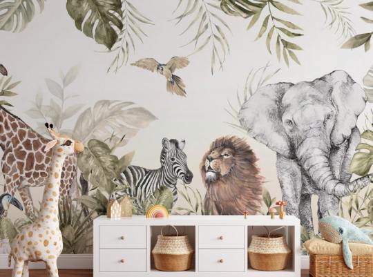
Fostering Curiosity and Imagination
Wildlife wallpaper fills a room with scenes of nature, whether animals in a lush jungle, a forest of towering trees, or underwater fish swimming by. Children are naturally curious, and having such designs on their walls can inspire them to ask questions about the animals and environments they see, encouraging them to learn more about the world. Wallpaper with animals like monkeys, elephants, or a fish-filled sea scene turns walls into storytelling backdrops, helping parents introduce their kids to different animals and ecosystems.
For example, wildlife murals can create a larger-than-life scene that captures the imagination. A 3D wildlife wallpaper adds depth and realism, making animals like lions, zebras, and exotic birds appear to leap off the wall. This immersive experience can help children feel more connected to nature and inspire early learning.
A Calming and Soothing Atmosphere
The serene greens of a rainforest, the blues of an underwater scene, or the soft hues of a vintage nature landscape can create a calming effect in a child’s room. Nature has a soothing influence, and wallpaper with nature scenes can help to create a peaceful environment that supports sleep and relaxation.
Wildlife peel and stick wallpaper is a versatile option for nurseries, allowing parents to try out different designs until they find one that feels just right. Gentle animal scenes, like a family of elephants or a monkey swinging from tree to tree, can provide comfort to babies and toddlers. These soothing scenes make wildlife wallpaper an especially appealing choice for bedtime routines.
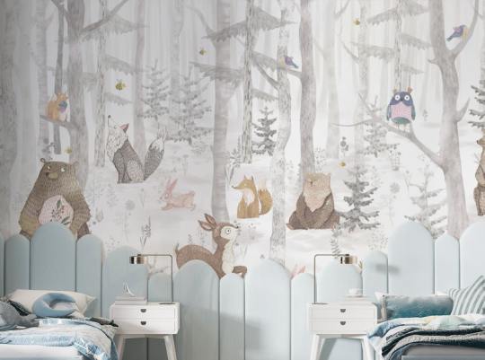
Educational Benefits of Wildlife Wallpaper
Wildlife wallpaper can be an educational tool in disguise. Whether it's wild animal wallpaper with creatures from the African savanna or nature wildlife wallpaper that features a lush forest ecosystem, kids can learn the names and characteristics of various animals as they grow. Placing animals in their natural habitats helps children begin to understand concepts of environment, habitat, and even biodiversity.
Choosing wildlife mural wallpaper that displays different biomes—like oceans, jungles, or savannas—can further enrich their understanding. A wallpaper that combines animals like fish, birds, and land animals lets children observe how different species coexist in nature. By interacting with the environment on their walls daily, kids may develop a lasting respect for wildlife and nature wallpaper.
Encouraging Creativity and Playfulness
Wildlife wallpaper designs bring playfulness to any room. Whether monkeys swinging in trees, birds in flight, or fish swimming through coral reefs, kids’ rooms are instantly more dynamic and fun with wildlife wallpaper.
Monkey wallpaper, for example, is a favourite for nurseries and playrooms. Monkeys are playful and animated, capturing the spirit of adventure and fun that children often exude. The lively designs encourage kids to play, imagine, and interact with the world around them. Moreover, because wildlife wallpaper usually comes in peel-and-stick options, parents can easily switch up the designs as their children grow, moving from cute animal scenes in their early years to more intricate wildlife landscapes as they age.
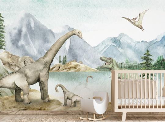
Vintage and Classic Style for Timeless Design
While wildlife wallpaper is often playful, it mustn’t be overly bright or modern. With their classic styles and muted tones, vintage wallpaper designs bring a sense of timelessness to a nursery or child’s room. A vintage wildlife wallpaper with soft, hand-drawn animals or antique botanical illustrations can create a beautiful, calming atmosphere that feels elegant and enduring.
Vintage wildlife wallpaper often features gentle colours and illustrations, making it an excellent choice for parents who want a stylish and classic room while still being child-friendly. Vintage wildlife wallpapers are also versatile, working well with various decor styles and allowing a seamless transition from nursery to older children’s room as they grow.
Practicality and Easy Installation
Many parents choose wildlife peel and stick wallpaper for its flexibility. Peel and stick options are easy to install and remove, allowing for design changes without the hassle of traditional wallpaper installation. As children grow, parents can easily swap the current design for something more age-appropriate without a complete room makeover.
For example, a room that begins with simple wildlife murals in soft colours can later transition to bolder, more complex scenes featuring jungle animals or fish wallpaper for a splash of colour and adventure. Peel and stick wallpapers are particularly useful in rented spaces where long-term wall alterations are not allowed.
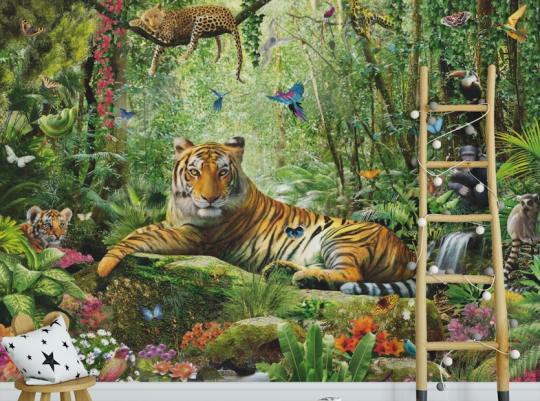
A Personalized and Unique Space
Wildlife wallpaper can make a child’s room feel genuinely unique and special. Wildlife wallpaper gives each room its character, unlike solid paint colours, which can sometimes feel impersonal. Whether it’s a jungle filled with colourful parrots and curious monkeys or an ocean scene with fish gliding through coral reefs, each design offers a unique world for children to explore.
Parents can mix and match different types of wildlife wallpaper, adding accents with fish wallpaper on one wall and a jungle scene on another, creating a personalized, imaginative space that will grow with their child.
Conclusion
Wildlife wallpaper is a versatile, visually appealing option for kids’ rooms and nurseries. From stimulating curiosity and learning to creating a soothing environment and playful atmosphere, it’s a design choice that benefits both children and parents. Whether you opt for monkey wallpaper, vintage wallpaper, or 3D wildlife wallpaper, the right design can inspire and comfort your children as they grow. Wildlife wallpaper lets children experience the beauty of nature up close, creating a space that’s as educational as it is enchanting.
0 notes
Text
Nostalgia and Memory
Week 4
Sphynx Cat
This week, I embarked on creating a 3D animal asset for games. Given that the assignment revolves around nostalgia and memory, I decided to model a Sphynx cat. As a child, I was captivated by cats, particularly the Sphynx breed. Their unique appearance and the ancient Egyptian reverence for cats added a layer of historical intrigue that resonated with my childhood interests.

pureref
Darkest (2019). n.d. [Online] goodfon.com. Available at: https://www.goodfon.com/cats/wallpaper-sphynx-eyes-look.html.
international cat care (2018). Sphynx. [Online] icatcare. Available at: https://icatcare.org/advice/sphynx/.
Zerindo (2022). Sphynx Cat. [Online] Available at: https://sketchfab.com/3d-models/sphynx-cat-df561a01189e4b3abea579432e66b130.


Sculpting Phase
To start, I employed the ZSphere method to block out the basic shape of a standing cat. This approach was quite challenging due to the complex anatomy of cats, especially around the legs. To tackle this, I primarily used standard and clay-build-up brushes, while the dam-standard brush helped refine intricate details. I used a few references, including Sphynx cat wallpapers and models from Sketchfab.
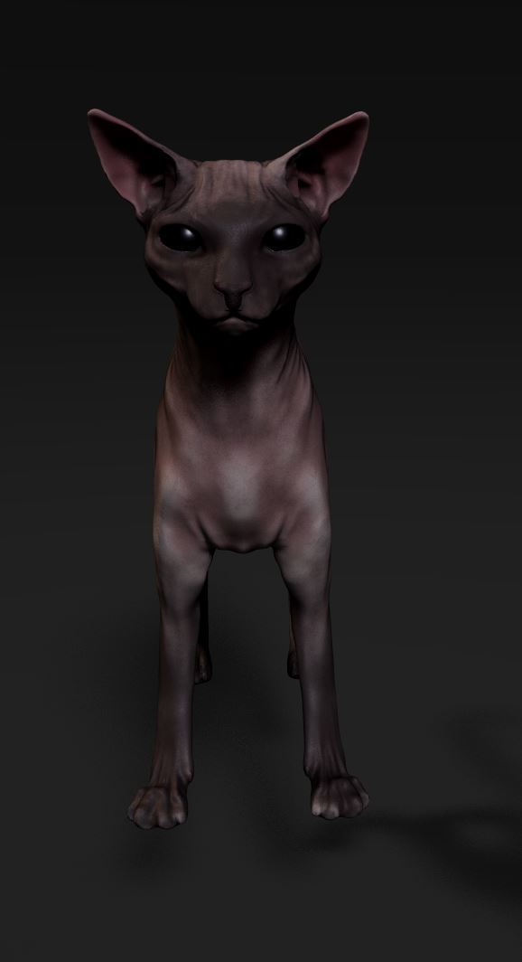
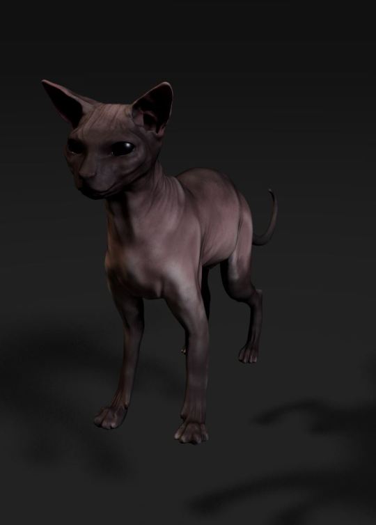
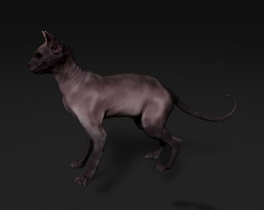
Texture Tests
As the cat's shape became more defined, I exported the mesh to examine its appearance with textures applied. This step was crucial, as it highlighted several anatomical inaccuracies. This realization prompted me to acknowledge the need for significant adjustments. Moving forward, I plan to revisit and reshape the cat's form, paying closer attention to the anatomical details to achieve a more precise and realistic model.
Overall, this project has been a fascinating blend of nostalgia and technical challenge. It allowed me to delve into a cherished childhood memory while honing my skills in 3D modeling and anatomical accuracy. The process has been both educational and sentimental, reinforcing my appreciation for the intricate beauty of the Sphynx cat. I’m eager to continue refining the model and see how it evolves with further adjustments and improvements.
0 notes
Text
Developing the Experience
Blog Post # 2
Angelique Shelley (MA Concept Art)
To begin creating the portal, I experimented with setting up a camera animation through some planets/spheres in Maya and choosing Arnold VR in the render settings (see fig. 1).
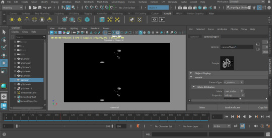
Fig. 1 A screenshot of Maya before rendering out the spheres.
Fig. 2 A brief test to see if the VR render would output to dome format correctly.
I rendered out a couple of seconds as a test and output it into dome format, but there was something amiss with the way it was rendered (see fig. 2). It may be due to traveling vertically rather than horizontally and the eye-spacing setting. This needs some troubleshooting, so I moved onto the bulk of the portal animation which was the portal effect itself and I’ll attempt to correct the 3D aspect later.
youtube
Fig. 3. How To Make a Portal Tunnel In After Effects (EASY), LuCa, 2023.
I had decided to use After Effects to create the portal after some research into tutorials and was fairly confident I could do it. I followed a tutorial (see fig. 3), but it was slow and arduous as I'm fairly new to After Effects and they used unspecified hotkeys I did not know, I also had to reverse engineer a plugin that I did not own with blending modes. I had trouble with After Effects interpreting the camera settings in the tutorial shown. I realised belatedly that it was still set up for dome output. I reset my composition settings and had to restart the tutorial. Despite this steep learning curve, the initial result was really convincing and I was able to apply the technique to new layers, building a richer image, such as the stars in fig. 5&6. Because I chose not to warp the stars it created a 3D parallax effect. I attempted using alternative source images for the portal effect, but none worked as well as the detailed nebula in fig. 7.
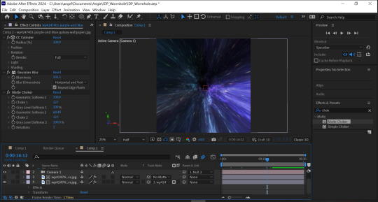
Fig. 4 A work in progress shot of the portal.
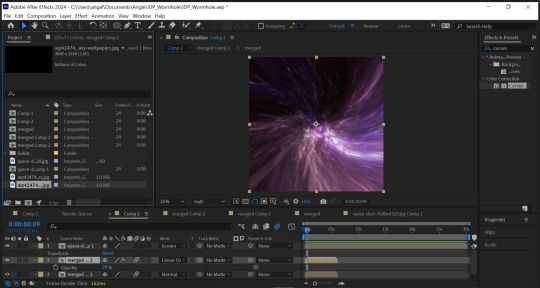
Fig. 5 I applied a starry effect to the portal with a different animation type and speed.
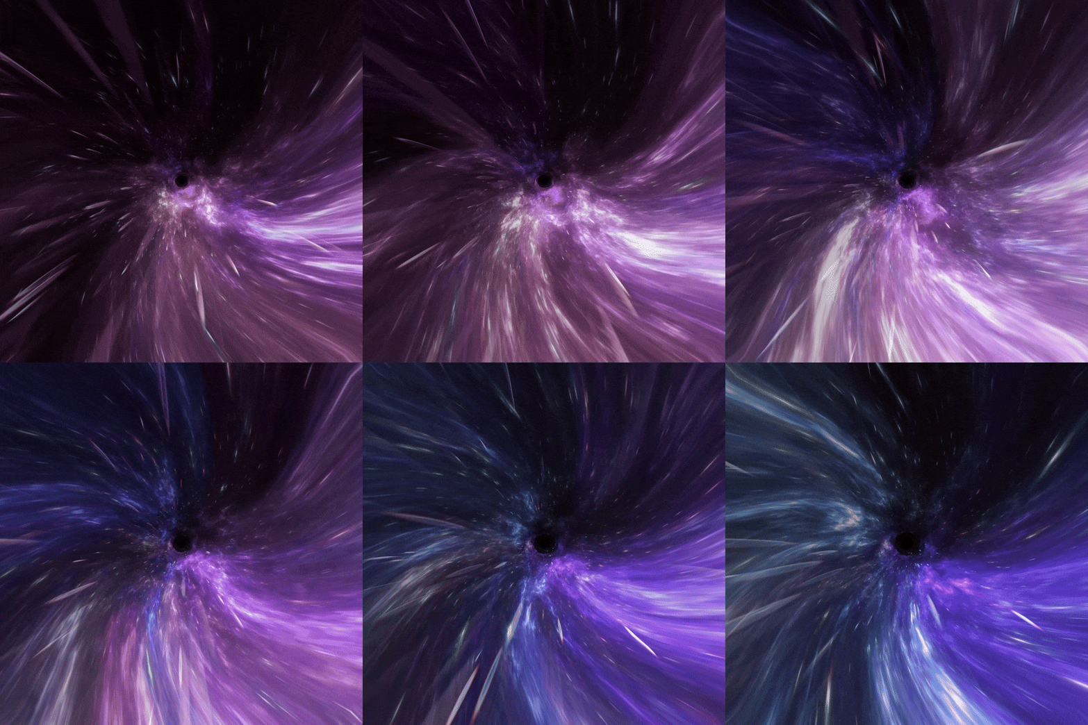
Fig. 6 A GIF showing the 3D parallax effect.
I wanted to further enrich the portal and lengthen the time, so I precomposed my work yet again (this would be the fourth time to achieve the effect) and offset two duplicate layers all on a screen blending mode and faded them into one another using opacity and keyframing. I also needed to conceal the “black hole” that was created from the edge of the source image. I took the source images into Photoshop and painted in a black, feathery edge to help soften the fade, I also offset the image and removed the seam for clean wrapping (see fig. 7&8).
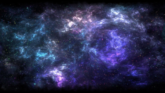
Fig. 7 Purple and blue galaxy wallpaper, jor4gea, 2024, altered for better fading.
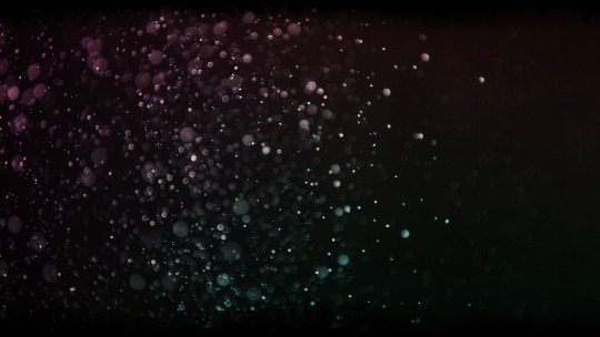
Fig. 8 Space-Dust …, Wallpaperwolf, 2024, altered for better fading.
I precomposed again, scaled it down and created a circle mask about the same size as the hole. I then increased the feathering as much as I could. There was still a visible black dot, so I repeated the above technique only pulling from another part of the portal. I added a gaussian blur to this to reduce the amount of animation (see Fig. 9). The final result is quite effective (see Fig. 10). To tie into the original portal concept and to prepare to transition into the final scene, I added a hue/saturation effect to turn the portal red. I rendered the portal using Adobe Media Encoder.
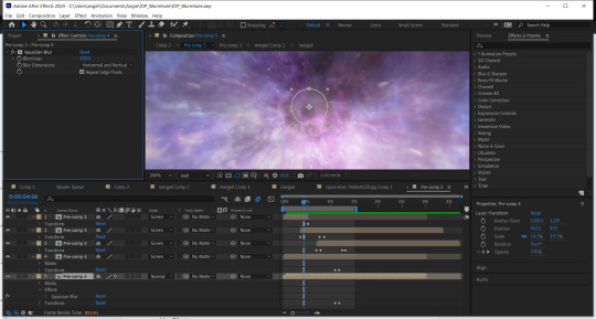
Fig. 9 A screenshot showing my keyframes for the fades and my feathered and blurred mask to conceal the “black hole”.
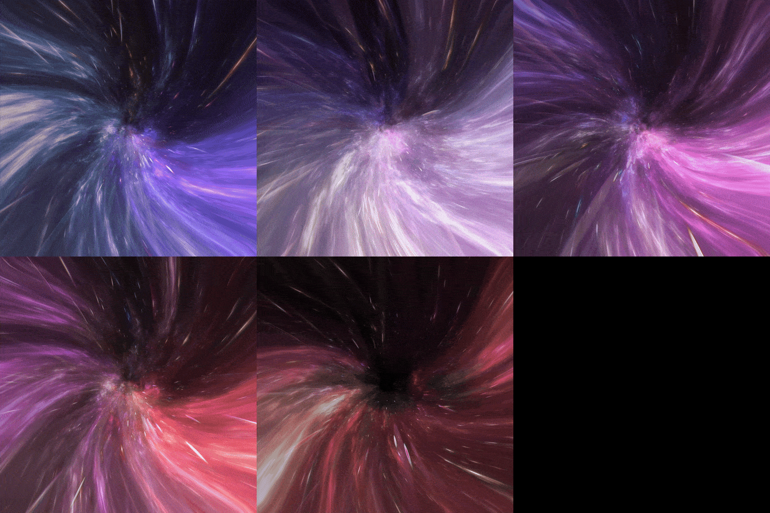
Fig. 10 A GIF showing a part of the final render of the base portal, please see separate blog post for full render.
References:
Jor4gea (2023). Purple and blue galaxy wallpaper. [Online]. Available at: https://wallpapercave.com/w/wp4247401 [Accessed 07 February 2024]
LuCa (2023). How To Make a Portal Tunnel In After Effects (EASY). [Video]. [Online]. Available at: https://www.youtube.com/watch?v=MHipcwcsZ0k [Accessed 07 February 2024]
Wallpaperwolf (2024). Space-Dust … [Online]. Available at: https://www.chromethemer.com/wallpapers/8k-wallpapers/space-dust-wallpaper-8k.html [Accessed 07 February 2024]
0 notes
Text


I am happy with this final version of the Oxford library and feel it looked how I imagined it looking roughly. I found making the steam rising up from the coffee particularly challenging as making the actual steam was very complicated and made less sense to me than the rest of the building and 3D work I had previously done in maya. When using maya again I would like to get a better understanding of its animation side like the coffee steam. I believe the rooms layout is quite simple which I like, however given more time I would add some more intricacies to objects like the door or the floorboards to achieve a rougher and less smooth look to the whole room. If the floorboards looked a little more like wood with the use of the extrude tool and tools I would like to further learn I could make the floor look more realistic and interesting. The same is said for the door. I also would have added a wallpaper texture on the walls so they look less plain. I also think I could have added more to the room rather than it just having three objects on the floor, perhaps also making the objects a little smaller to achieve more space for other furniture etc. I enjoyed doing the texturing of objects and using photoshop to be able to move any design into my project and make the project more colourful and realistic. The rooms turnaround was difficult as it would not render with the correct lighting many times. I feel I should have learnt lighting a little more to truly understand why it was not rendering the way I wanted it to. When I finally rendered it correctly the frames resolution was quite poor but I had to continue and put the frames into after effects. Though being proud of the outcome of this project I feel there are many missed opportunities in the structure of the room that I will consider in my next project in Maya 3D.
0 notes
Text
BEST OF GOOGLE PLAY 2018 Start breathing life into your photos with our multiple award-winning aesthetic tool! VIMAGE is a cinemagraph creator app that lets you animate your image and add hundreds of moving photo effects, presets, filters, and overlays onto your photos and turn them into creative living pictures or GIFs. Our photo editor lets you share your art with your friends and other VIMAGE creatives. Get instant exposure with your animation,not only for photographers and experts! WHY VIMAGE? Cinemagraphs are the latest trend for telling engaging stories about your life with picture animation. Animate your photos and share them with friends and your loved ones. VIMAGE is an award winning cinemagraph animator tool with amazing capabilities: put creative, eye-catching 3D motion effects, parallax illusion, flow animation or overlays on your pictures. Animate your pics beautifully for slideshows or for visual marketing content. Create engaging moving pictures and live photos with ease, while having a ton of funWhether you are a photographer or just a casual storyteller taking pictures, VIMAGE will up your photography skills in no time. CREATE Harness the power of our sky replacement tool! Selecting, animating and changing skies was never this easy. Let the AI handle the hard work of selecting the sky, all you have to do is choose from the 100 presets which sky fits your image best! With this tool you can easily breathe life into your photos, change a gloomy sky into one from a sunny beach. It’s time to animate and create the best motion picture yet. Make it move with our presets and animations and create a living wallpaper! FEATURES - New AI-Sky feature: Sky replacement! Select, change, animate skies in seconds. - 3D picture animation feature, which creates a parallax animation effect. - Add custom sounds to your creations. Nature sound effects or music? It's up to you what you include in your live image! - Tell your story with the new text tool. Add custom texts to your motion photo. - Add up to 10* different fully customizable photo effects, presets, filters or overlays onto a single photo. - Export your images in high quality, up to 2560p! - Choose between the Flow or Stretch animator and create amazing motion photos! - Crop your image or edit the color, hue, brightness, and contrast of all effects and overlays to blend it in your original photo and create more realistic cinemagraph after effects. - Choose a picture from the built-in stock photo library or choose one of your own and create an animated picture - Create live wallpapers and moving backgrounds from the free to use filters, animation effects and presets. - With new feature idea contact us at: https://vimageapp.com/feature-requests/ We hear your voice and will try to implement all the entries! CONTEST Submit your best animation creations with presets to the in-app contests. Receive trophies from other users, and get featured in the official hot picks every week. You can be one of our weekly artists. Become part of the ever-growing VIMAGE community. Want to show the world your awesome live photo? If you create something you’re really proud of, be sure to add the hashtag #vimage to your post when you upload your creation to your Instagram feed or other social media. This way you have the chance to be featured in our aesthetic app and on our Instagram, and go viral! We are constantly doing giveaways for our lovely users, so stay tuned! Our live photo animator app is free to use. However, we offer different Pro packages for those who would like to take their art to the next level: – 1 Month Pro Subscription – 12 Month Pro Subscription – Lifelong package WHY BECOME PRO? With the pro version – you don’t have to watch ads – you can remove the watermark – you can access all the vfx – you can render in high quality – you and add up to 10 photo effects For tech support or any questions or suggestions, email us: [email protected]
0 notes
Text
WLOP
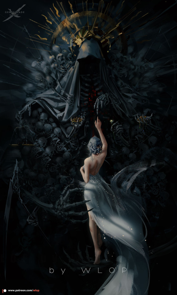
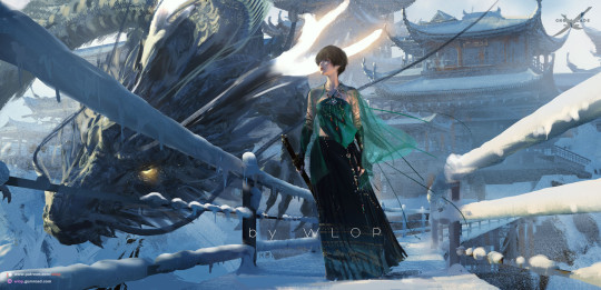
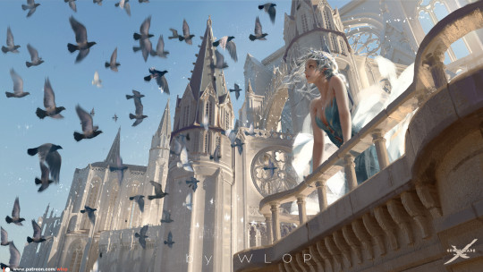
WLOP Wlop is a Chinese freelance artist and software engineer. Wlop has been a huge influence on my art style since before I joined. They use paint-over and 3D models to create their vast landscapes and characters. I would like to be more influenced by these 3d bases when using photo bashing and paint overs on Photoshop. Wlop’s use of lighting is also gorgeous they manage to create some of the best reality-type lighting I’ve seen in artworks which is hard to accomplish I want to work more of my light work in my art since I need more practice in this as well. They manage to find some fluidity in their models and even use moving models to create 3D wallpapers that move with small animations. Their laying in their paintings is so well thought out especially when it comes to light and shading. My main goal that this project will help me with is to continue practicing more 3D aspects of my work which you will find a similar theme with the multitude of artists I’m looking at in this project.
0 notes
Text
Akibas Trip Undead And Undressed Director’s Cut Review (Nintendo Switch OLED)
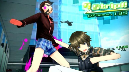
For this Akibas Trip Undead And Undressed Director’s Cut Review, we find out that This suburban Tokyo ward's seen it all, from Japan's post-war reconstruction to the economic bubblegum crisis of the '80s. Always on the cutting edge of progress, with a little something to offer even the most fetishistic of appetites, it was almost inevitable that this singular technocracy of indulgence would give birth to a whole new kind of appetite altogether. Enter, the “Synthisters” – vampires who prey upon the life energy of the town’s unsuspecting figurine-chasers, maid café connoisseurs, and cosplayers. Those victimized by Synthisters take on the properties of their attackers while also withdrawing from society and becoming veritable shut-ins due to their newfound fatal weakness to sunlight.
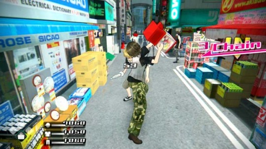
Akibas Trip Undead And Undressed Director’s Cut Review Pros: - Anime graphics. - 3.1GB download size. - Has its own in-game achievements. - Text and/or voice can be changed between English and Japanese. - Three difficulty options: Easy, Casual, and Gamer. - Opening and ongoing tutorial. - Display settings - damage display, experience display, counter guide ui, and map ui. - Auto, Skip, and fast-forward buttons for cut scenes and conversations. - Eight control layouts. - Basic character creator but you get clothing all the time so it doesn't really matter. - Smartphone wallpaper unlocks. - Excellent voice work. - Invert axis option. - Toy box mode: Here you have free roam of the Akibas and have all abilities and items unlocked. - Toy Box mode has the same 3 difficulty options as the main game. - The entertaining story is loosely based on Vampire equivalents. You can answer and set branching questions and answers. The answers given affect the story in multiple ways. - Lightening fast loading times. - Smartphone, Your hub contains all the options and menus. Here you can read emails, read Potter, and change game options like save/load. The whole phone can be customized with pictures taken from cut scenes etc. - Combat: your aim is to strip your enemies of all their clothes. you have a high medium and low attack which are used to target specific pieces of clothing. Once that particular piece of clothing is flashing, You can then rip off the garment. - Unlock and use Fast travel points found around the map. - Random street fights. - Music is a mix of J-Pop meets techno with a layer of nuts to it all. Hear music booming from hops and cars as you stroll the streets. - Huge living, breathing world. - Pitter is the game in the world social media app where you can get information. - E-mail is a place to get side mission opportunities and hear from certain characters. - defeated enemies drop loot. - marker in the game for main story missions and a few key side missions. - Combat relies heavily on combos and you can actually chain moves together, Wrapping them into a strip frenzy where you can strip a whole gang in one chain. - get arrested by cops for fighting, Pay a bailout price penalty. - Save/Load whenever. - A full 3D world with full 360-degree camera control. - Cutscenes are a mix of in-game shorts and character art interactions. - Shops are scattered all over the area and each seller is unique in terms of pricing and stock. - Battle arenas. Fight off against waves of enemies, Rank up, and earn loot and cash. - Side missions are optional and plentiful. - Fuse (craft) items together to make new ones, make current weapons stronger, and much more. - Collect flyers from salespeople in the street. These flyers are for real-world shops that you can visit. - New game features unlock as you go through the main story missions. - Memorable characters. - Ui is clean and bright. - Looks just as crisp as the big-boy console versions. - Weaponry is crazy with such weapons as laptops, umbrellas, and even suitcases can be used. - Earn experience and level up and learn new moves and gain better stats. - Finishing moves can be performed where you take your opponent's underwear. - The game is very fast-paced but so playable. - Multiple choice encounters. - Full camera photo mode for you but also used for missions. - The definitive version of the game for both looks and performance. - Difficulty affects combat and easier difficulties disable high, mid, and low attacks. - Can skip cutscenes. - Full stats screen with a detailed breakdown. - The visual editor lets you fully tinker and customize the look of the game with - presets, character colors, map color, sky color and contrast, fog, and color offset.

Akibas Trip Undead And Undressed Director’s Cut Review Cons: - The a slight learning curve at the begininng. - So slow to start with as you get so much information and mechanic knowledge. - Fighting is the trickiest part to learn especially with no proper lock-on options. - Very little in terms of character creation. - Watching out for when to strip is hard, especially in group fights. - You can bring up a marker on screen but it's only for main missions, We could do with one for active side quests. - Very slight slowdown in places. - Picking up items is a pain, especially after fights as you have to quickly grab them all, Due to the crazy weapons, some can be crazy small. - Some of the shop fronts in the world look bland, pixel aged, and dare I say it, PlayStation 1-era looking. - Pervert, Sexual tone throughout. I mean you expect it somewhat from a game that evolves around stripping your enemies but it kicks it up a notch. You can zoom your camera in on your female party members and actually jiggle their breasts. - Toybox mode disables achievements and it doesn't recognize clear data. - Cannot rebind controls. - An FYI that it doesn't support any sort of save transfer. - The choices you make don't feel that impactful. Related Post: Legend Bowl Review (PlayStation 5)
Akibas Trip Undead And Undressed Director’s Cut: Official website. Developer: 株式会社アクワイア ACQUIRE Corp. Publisher: Home | XSEED Games Store Links - Nintendo Read the full article
0 notes
Text
Copy and pasted from itch.io:
Oh my goodness, where do I even start? This game, if I could describe it in one sentence, is like going through a melancholic artbook. Each and every scene looks like it could be someone's desktop wallpaper. It's beautiful, and the texture is so well done that I didn't even realize it was 3D at first! I initially thought it was 2D art that was rigged to be animated. When I realized this was all 3D, a big smile came across my face because it was totally unexpected. The choice to have the text move along with the artistic style of the game rather than being in its own textbox is also wonderful. I especially enjoy how the text is distorted to match the angle of a window or wall, or changed to add to the also changed tone of a scene.
Speaking of the tone, it really matches what the characters are talking about. There's only two characters in this demo, but they draw me in and keep me very engaged. This game is very good narrative wise because it feeds you information through the dialogue of the characters and their internal thoughts rather than just straight-up telling things to you bluntly. The descriptions, the metaphors and similes and imagery, are fantastic. They feel so guttural, depressing, yet beautiful at the same time. Despite this being a kinetic novel, the usage of the spacebar makes the player still feel like they're "playing" the game. For instance, the spacebar being tapped a certain amount of times to turn on the lights in a store.
You also get attached to the characters pretty fast. Yes, they do talk about some rather existential and depressing stuff, but it's interesting to hear about their opposing viewpoints, and sometimes the things they agree on. The sudden cut from Michelle to Alex's perspective is very well-done, by the way. Jarring in the best way possible! It actually put me on edge and made me preeetttyyy unnerved. But I love it. The change in art style perfectly accompanies this. I know this isn't a horror game, but I was still waiting for a jumpscare to happen because of how creepy it was.
Overall, I don't have any negative critiques I can think of at the moment! One of them was initially that some transitions might work better if they were smooth instead of just hard-cutting to the next scene. But the more I played, the more I realized that the hard-cut transitions actually fit in my opinion! The characters' perspective on their lives is as if their lives are labor, or like they really don't exist in their bodies. The sudden cuts make sense to me because it's like the passage of time really can't be comprehended in their minds.
Awesome and alluring demo!!! I can't wait to see more.
Edit: I actually do have one criticism!! And that there not really the ability to save or load a game. At least when I played it? There was no lower menu that I could select from that I could see. I'm not sure if that's a me problem because I saw that the menu was available in the screenshots, but not when I played it.
Set Yourself on Fire - DEMO released on Itch.io
A quiet town awaits death.
Stagnation is the default state of being.
Those who dare to hope are seen as demented.
Two aimless young women fall in love.
I lost my soul somewhere along the line. It must have slipped, fallen into a storm drain, vanished – It dissipated in that putrid water.


77 notes
·
View notes
Text
#if you love the Dynamic Ocean wallpapers#Betta Fish backgrounds#3D Aquarium Backgrounds#Water Garden Live wallpapers#Jelly Fish moving wallpapers#KOI screensaver and Pet Fish Pool interactive . Download the app from this link : https://apple.co/3KUdqYU#wallpaper#art#background#iphone#ios#cute#anime#photography
8 notes
·
View notes