Don't wanna be here? Send us removal request.
Text
Final Reflection
Now that we’re all finished, I’m genuinely surprised at how much we managed to get done. For all the other semesters I found myself sticking with what I already knew I was strong at and maybe dipped my feet into something new so I decided it’d be a good idea to have a go at taking up roles that I haven’t done in previous projects, I haven’t ever been a lead role in designing the UI or ever had a go at coding for the project. At the start of this semester I was petrified at the thought of having to do coding as I have never explored it more than what we had done in James’ workshops, having the help and support from James was invaluable. A difficult thing whilst running into problems with the code was that because the main “game” mechanics of our game aren’t a very common thing to do there were no tutorials or documentation on YouTube or forums so when I ran into a problem I found myself feeling extremely lost until I spoke to James next. James helped me understand code a lot faster than I thought I would and guided us on more practical ways of designing the code, to the point that we created a neural network to influence the design choices/ relationships between the variables when changes were made.
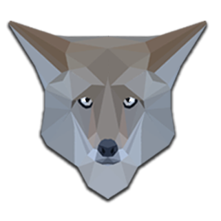
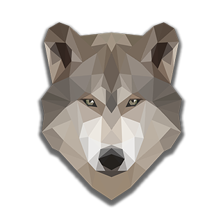
I think me and Cameron, overall, worked well, we had our ups and downs with motivation but that was sorted once we listed what we needed to do, seeing Adam when we had our one to one’s helped a lot. When it came to giving feedback to each other we didn’t have any troubles, which could be seen as a negative, I can only count one occasion where I wanted Cameron to change something within one of his designs and it was to add some more triangles into a wolf’s shading to make it look more like Low-poly art.
I took an approach differently to how I came up with designs in previous semesters, in the sense that I think I iterated a lot more than what I normally do, this semester I kept an open mind with changes to how things look whereas normally I’d find myself liking the first design I sketch up or bring into photoshop then try to come up with other iterations even though I knew that I’d just end up picking the first idea. In this semester, art wise, I think that I’ve come up with my strongest pieces of work since starting the course, it’s had the most thought and variations out of all of my other projects and think I’ve taken into account what I’d researched not only this semester but last semester also.
We didn’t use the sprint and scrum methods for getting things done, personally I don’t think that that’s a bad thing because we didn’t have a time where we felt too stressed to get things done. We trusted each other to get work done and we did. There was only one time I can think of where there was a little bit of tension, and it was my fault when I was on tour in Europe for a couple of days I had little access to internet so I wasn’t able to update Cameron on my progress as much as I should have, it was at the same time as the reflective journal also so that was a hectic time. I think that the workload was spread out fairly and challenged us to do better than all the other semesters, Cameron really excelled at the social media promotional aspect of the branding, gaining us over 6000 followers online through posting his art work that he’d made this semester.
What we pictured for our app was quite different to how it ended up turning out. When we first started out we wanted there to be sliders to control the variables but talking when talking to Adam he wanted something us the app to be more engaging so we added the flicking aspect. We wanted there to be 2 info boxes, one info box to be summarising what’s happening in general in the overall scene and then a dynamic info box summarising what’s happening more specific to the variable you’re hovering over. We did get rid of the dynamic info box but all the info that would’ve been in there would now be in the main info box and the population counter. When researching into the Key Stage 3 material we thought of a way to make our game more engaging to the user which was to bring in a food web activity which tests what the user has learnt from playing with the variables and reading the info box. I think adding this aspect really changed our project from an infographic to an engaging app.
Moving forward it’d be great to see what this project could become if we were able to recruit more people to every aspect of this project. Getting an extra coder who’s more competent than I am would open up many more possibilities to what we could make and how we could make the app behave. Having more artists would make us be able to fully find our own style for the game and make our brand more distinguishable, because our art style is based on low poly art experimenting with a 3d modeller could be a good idea. With the code we already have we can model it onto different ecosystems, this would be beneficial because we’d be able to bring in more aspects of the Key Stage 3 curriculum, the main one teaching students about Toxic materials within a food chain, like pollution and Mercury. We used to use mercury in insecticides but when it gets into a food chain it can damage the nervous system and reproductive system of mammals, this aspect can be mapped to an ocean based ecosystem or even just an ecosystem involving crops. Cameron’s original reason for wanting to make this app was because he wanted to educate children to be aware of their actions that could contribute to destroying certain ecosystems.
0 notes
Text
Trailer
youtube
This is the trailer I made in after effects for our app, basically showing a more complex version of our app and little hints about what it’s about.
0 notes
Text
IOS Icons

This was my first attempt at making the IOS icon for the app, I thought it looked a little too plain and didn’t reflect the sort of style our game goes for clearly enough

With a little bit of thought and experimentation this is what the final icon will look like, the background is supposed to mimic the sort of art style we’re going for and looks most similar to the way the terrain was shaded and the terrain is one of the most important aspects of the app.
0 notes
Text
Final Coding Design Decisions
SKETCHBOOK 3 PAGES 2-12
I’m going to cover the main scripts over one post. I spoke to Adam about how to present it and he said to explain and mention the design choices more than anything in the code rather than copy and pasting it and explaining everything (I’ve done something more like that in my sketchbook). I also want to make sure this isn’t glazed over because of the large amount of reading.
Here’s a link to the scripts any way if you want to read them : https://drive.google.com/open?id=0BwWF57RYaLmYc2R6OThsMjlMX3c
The first piece of script im going to talk about is our Scene stats script for the main scene with the info box and the variable controllers, etc. The scene stats script mainly manages the population statistics needed for our scene. At the start of the script I created an index defining the population of each of the variables the I had to leave three parts which’ll be read by the script as the previous population, which was useful for when I implemented the info box. The starting populations were 5 wolves, 100 Elk and 10000 Trees. We originally wanted our app to be as true to Yellow Stone National Park as possible, but when going to visualise everything it either looked too cramped because the values are so high in the actual data, and because there’s so many Elk compared to Wolves it looked very lop sided, then if I made it so one visualised Elk stood for a large amount in the actual population you couldn’t see as much activity on screen as we wanted to. it’s main point is to teach students about ecosystems and food chains. We also think that because of the low numbers in the initial population, it gave the player some initial leg room to play with the buttons and get a feel of the theme of the game.
I used no coding for the main icon bit for the population counters, only for the actual text by using GameObject.find(“wolfpop”) which finds the game object called wolfpop which is a text UI element. And then told the text to show the corresponding population. The other scripts use this script to get use the population index
The next piece of script I’m going to talk about is the popControl Script. The title describes what it does, it manages the population control from using the buttons via requests from the IncreasePop script (I’ll talk about that one after). The start of this script defines how many of each variable is added to the actual population (not the visualised) . For this I chose 5 wolves to be added, 100 Elk and 1000 trees. Even though I stated that our values couldn’t be too close to the actual data, we still want to take some basis on the previous research and the neural network I did with James. if it is an app designed to help with teaching then it should have some sort of backbone as to why we chose the numbers, but I think the most important thing is that it gets the points across more than being an actual simulator.
The start method of this script also says to initiate the functions that change what’s on screen (Wolves,Elk,Trees and text that’s in the info box).
The next design based function to be used in the script is the one that changes the text that’s in the info box, I’ve already done a post of what’s gone in the box and why I’ve included certain vocabulary. This function is filled with if else statements. One example I’ll explain on here is to check if the new wolf population (written as sStats.GetPop (0) ) is lower than the old wolf population (written as sStats.GetPop(3)) and if it is the text in the info box will state that the wolf population has decreased.
After that is the functions that add the variables to the screen. They start off by clearing the corresponding variables by “destroying” the variables that are seen on screen, I’m going to reference ChangeWolfDisplay() for this one they basically all state the same thing. The next part creates new wolves and shows one wolf for every 5 in the actual population. For the next part to work I had to add an empty object into the hierarchy, named “WolfZone”, and tell the script to find it. Then wherever it was I had to state where to “instantiate” them, which cloned a “WolfMaster” seen off screen and placed it in a range on the X and Y axis. With some fiddling I made it so the wolves would take up the left half of the grass on the screen and the Elk took up the right half then had the trees run across the top edge of the grass. I did this because through experimenting it looked too cluttered when they were surrounding each other, it also makes it easier to see how many are being visualised and some of the wolves would overlap on the Elk and it looked ugly. It also helped stick to our theme of symmetry, so that created some consistency in the layout design of the UI and the main “Game” screen.
(NEURAL NETWORK RESEARCH FOUND IN RESEARCH FOLDER)
In my previous research I stated a basic way we could calculate the changes every year but through talking to Dr James he suggested a more effective way of doing it. The influence for a lot of these rates came from when James and I created a neural network using the data we got from Ripple and beschta. The first part of it is to set a birth rate for each of the variables, it then calculated a new population by multiplying the old population by the birth rate, it would only do this if there were at least 2 of the same animal (doesn’t need to for trees), and setting that as the new value. The values were then put into a consumption rate for how many a single animal eats per “year”. We had some trouble with things decreasing too rapidly so I made it so a single Elk eats 1 “tree” every year and a single Wolf eats 1 Elk a year, the overall amount changes depending on how many are currently in the population. Because nothing was consuming the Wolves it meant their population never went down by it’s own accord so instead of adding a consumption rate I added a very simple death rate saying that 1 wolf dies a year, because if It was a percentage it would just cancel out with the birth rate.
The CallAction() method is for when the play button is pressed. The other scripts are a lot shorter than these ones, the next one is the IncreasePopulation script, which increases population for whatever this is attached to so if it were added to the Tree button you can select on the inspector for it to add trees when clicked.
CrunchNumbers is made for the Play Button as requests the CallAction() function from the PopControl script.
0 notes
Text
Final Food Web Minigame
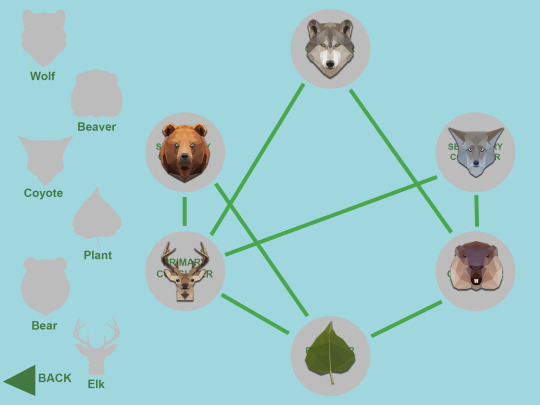
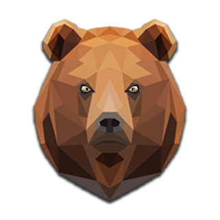
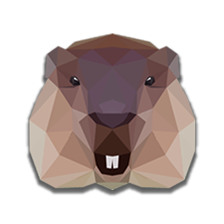
This is the final design for the drag and drop food web minigame. We needed something to test the user’s engagement with the game so we thought having something where the user can create their own food web would be a good way to test them. It’s one of the main aims of a lesson teaching food chains and ecosystems, for the student to be able to make their own food web. I used the same icons for this as the ones using the population and created some new ones for the bear, beaver and the coyote. The circles hinting where things go have the key words I’ve talked about before, those key words are used in the info box in the main screen, if the user reads the different info box text then it should be easy for them to know where to place everything. I decided to label the animals because the user could get confused between the coyotes and wolves because they look very similar.


0 notes
Text
How To Play Screen
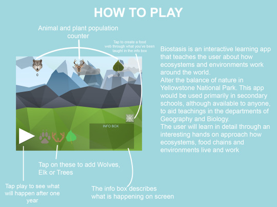
This is the How to play screen, I thought to make it more clear for the user I’d include a diagram showing what everything on the main screen is so it says that the play button advances the screen a year, the buttons next to it add corresponding variables to the scene, the info box describes what’s happening on the screen, the spiders web button above it brings you to the screen that lets the user create a food web based on what the info box teaches the user and the icons on the top show the population of each variable. The text next to it is a simple synopsis of Biostasis which was written by Cameron.

0 notes
Text
Final Main Screen

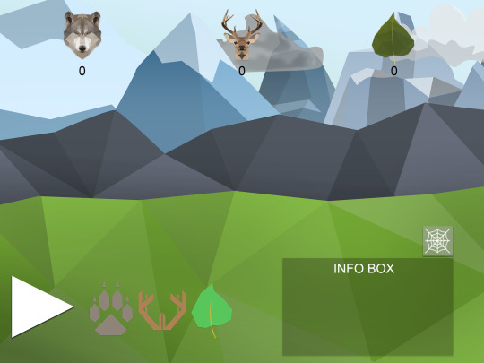
This is what the final main screen looks like. On the bottom left I have put all the buttons that add the corresponding variables then added the info box and food web button on the right hand side. The shape and shading of the food web button takes very strong inspiration from the Metro UI framework especially with the shaping of the info box. I originally wanted the buttons to be in the middle but that made it difficult to place the info box, it either made the layout of the UI asymmetrical which would be a sign of bad layout design because it didn’t stick to the rule of thirds or the Fibonacci sequence either. I chose to put the population counters at the top because they’re clear and out of the way of where the main activity happens on the screen, it also helped balance out the bottom heaviness of the other assets all being at the bottom of the screen. I did try and see what the counters looked like going down the left side but because the area for activity to happen is reduced greatly because of the info box and buttons (this isn’t a design floor because they need to be this size to be readable on an ipad screen). The population icons are more clear when they’re up at the top as well because of the lighter toned colours of the background in contrast to the icons.




0 notes
Text
Final UI Emblem iterations

This is the first in my set of further iterations for the paw. I kept it as simple as possible whilst keeping it stylised like the original and had a go at simplifying it even more without it losing it’s clearness of what it’s for. I think it’s going to be a reoccurring theme with these iterations that I prefer the originals compared to the new versions because I prefer the one in the middle compared to the other designs. If it wasn’t for the style we were going for in our app I’d prefer the design on the right because the rounded edges makes the claws pop a bit more, symbolising that it is the main predator of the scene but the rounded edges also draw it away from the art style we’re going for and consistency throughout the UI is key to making it look neat and clean.

For these designs I didn’t want to add any more details because you can clearly see what the designs are supposed to be so I experimented with the sharpness of the different shapes within the designs. Whilst I do like how they look, I think my other iterations are stronger even though these are more stylised and link more strongly to the low poly flat design art style with the use of shapes, the other iterations have a clearer resemblance to a wolves paw and will hopefully end up with an easier UI experience because it’ll clearly show what the icon is for.

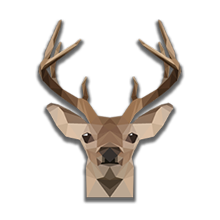
I thought I nailed the antlers in the first iteration but there was no harm in doing a few more experiments in how influenced the shaping of everything is by previous artist I’ve looked at. The antlers on the left are the originals. For the iteration in the middle I wanted to show more inspiration from the idents seen in the Channel 4 rebrand by keeping the majority of the angles straight with the diagonal endings seen in a lot of the Channel 4 adverts but joined together

The final one on the right has a mixture of inspirations from the channel 4 rebrand and the icons seen used in the design museum. I wanted to mix the curves and thin stroke of the design museum signs with the diagonal edge of the channel 4 rebrand. I do like how it looks and think it’d be usable if the other emblems had curviness to them.

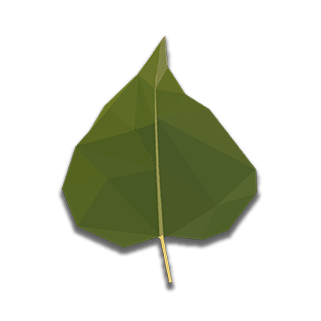
This is an attempt to make the leaf designs even more simple. I think the most useable ones are the middle and right hand side asset. The asset on the right hand side is the original. The middle asset resembles the cottonwood leaf the most because of it’s shallow curve at the bottom/ how bottom heavy it is (I don’t know how to phrase it)

I had a go at doing these iterations coming from a different aspect, instead of trying to make the designs more simple I wanted to give them more depth. Following a one to one with Adam he didn’t like the seed designs because they resembled coffee beans too much because of the colour and the way I shaped them. He said that I should try and find a middle ground between the left design and the design on the right and with one simple change and adding a shadow on the right hand side. I still think I prefer the design on the right because not only does it fit with the art style more than the others with the straight edges and block triangle shading, I’ve also found that the edges where the edges of the different shades meet resembles the veins seen within a cottonwood leaf, the only thing is that this style is a lot different to my other preferred iterations.
0 notes
Text
Title Screen Iterations

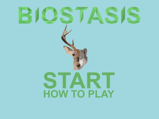
Here’s some variations of how the start screen could look like. I created a logo which is of half of one of the Elk emblems and half of one of the Wolf emblems I designed to originally be for the variable buttons. I wanted to use these designs for the main logo/image because of how much it linked to the art style of the main game assets. The font used for the “Biostasis” text is based on Arial, like stated in a previous post, I’ve explain why I’ve used arial. The options users can choose is Start, to bring them to the main home screen, and How To Play, which will contain a diagram of what things are on the main page and a small synopsis of Biostasis. My favourite layout is the one on the bottom left. I’ve made the “Start” Arial Bold and “How To Play” Arial Regular, I’ve done this for a couple of reasons; One, To draw more attention to start, because that’s a more crucial asset and Two, because “How To Play” is at a smaller font size, it’s more readable to use a less thick, blocky font. I’ve chosen to put the Logo in between the title font and the options to break them up and make the title more memorable and make that part of the brand image more distinguished.
0 notes
Text
Info Box Text
SKETCHBOOK 2 PAGES 22-27
Here’s a list of what I’m going to put in the info box. As I’ve previously mentioned most of the key words and vocabulary used will include key words from most key stage 3 curriculums. The text in the info box will change based on what happens in the game screen. This is all the possible different things the info box will say.
If the Wolves and the trees are increasing but the Elk are decreasing it’ll say:
“The Wolf (Apex Predator) population is increasing because there’s enough Elk (Primary Consumer) to support their carnivorous diet. The decrease in the Elk population has allowed more Plants (Producer) to grow resulting in an increase in the tree population”
If the wolves and trees are decreasing but the elk are increasing:
“The Wolf (TERTIARY CONSUMER) population is decreasing meaning that they cant regulate how much the Elk (PREY) breed, resulting in a rise in the Elk population. The increase in the Elk’s population means that more plants (PRODUCER) need to be consumed to support their Herbivorous diet”
If the wolves, Elk and plants are decreasing:
“The wolf (APEX PREDATOR) population is decreasing, this could be because they couldn’t hunt enough Elk or other primary or secondary consumers this year or it could be because of disease or a virus. The Elk (PRIMARY CONSUMER) population is decreasing even though the Wolves haven’t been hunting them, the reason for this drop could be because they’ve been hunted by Coyotes (SECONDARY CONSUMER) because there’s less wolves to stop them trespassing on their hunting ground. The plant (PRODUCER) population is declining this could be due to animals like Beavers (PRIMARY CONSUMER) eating the vegetation.”
If the wolves and Elk increase but the Plant level decreases:
“The wolf (TERTIARY CONSUMER) population is increasing so are the Elk (PRIMARY CONSUMER) this means that the Wolves are sustaining their Carnivorous diet with different animals like Beavers (PRIMARY CONSUMER) for example. The Plant (PRODUCER) population is decreasing due to the increase in the Elk Population.”
If the wolves, Elk and Plant level is increasing
“The Wolf Population (TERTIARY CONSUMER) is increasing along with the Elk population (PRIMARY CONSUMER). The Plant (PRODUCER) population is also increasing due to getting their energy through the process of Photosynthesis”
If the wolf population is declining but the elk and plant level is increasing
“The wolf (TERTIARY CONSUMER) population is decreasing, giving the Elk (PRIMARY CONSUMER) a chance to increase. There was enough plants(PRODUCER) to support the Elk’s herbivorous diet whilst the plant population is still increasing.”
If the wolf and elk population decline and the plant level increases
“The wolf (TERTIARY CONSUMER) population is decreasing along with the elk (PRIMARY CONSUMER) population, this could be due to disease. The decline in the elk population has allowed more plants (PRODUCER) to grow.”
If the wolves are increasing and the elk and plants are decreasing:
“The Wolf (Tertiary Consumer) Population is increasing resulting in a decline in the Elk (Primary Consumer) population due to being hunted by the Wolves. The decline in the Plant(Producer) population and the Elk population could be caused by an animal with an omnivorous diet such as Bears (Secondary Consumer) who eats both plants and animals.”
0 notes
Text
Food Web Mini Game Idea
SKETCHBOOK 2 PAGE 22
When researching Key Stage 3 lesson plans, I found that at the end of class the teacher quizzes the students in some way to give them a chance to put what they’ve learnt into practise in the form of a word search or a food web. So I decided that we should make a minigame for the users to play, it’ll be a simple food web puzzle where the user will have to drag and drop parts of a food web using hints from the info box in the main game scene. The Key words I’ll use in the minigame will match what’s used in the classroom. I’m going to label the animals mentioned with the keywords, that will make it easier for the user to transfer them from the info box to the food web. Key Words Producer – I’ll use when mentioning plants or trees Primary Consumer – Elk or beavers Secondary Consumer – Coyotes or Bears Tertiary Consumer/Apex Predator = Wolf
There’ll also be other key words used like Herbivore, Omnivore, carnivore, prey, energy and photosynthesis.
0 notes
Text
Initial Coding Idea
SKETCHBOOK 2 PAGES 18-21
I went back to the research I did last semester and made some tables of showing populations, rates of change and ratios from 2005 – 2010 in my sketchbook. My only problem is that I couldn’t find research showing actual numbers for the population for any trees, I could only find a tree “level”. I wanted to find an average over the whole selection so I could decide what values to start off with when the user initially “Plays” our app. I wasn’t able to talk to james until after I made this so this is a very initial idea on how to calculate/change the populations. Through getting an average ratio from the data I got from 2005 – 2010. So when the ratio is around 1 wolf : 54 Elk then the rate of change = 0. I wrote out some ultra simple if statements for how to calculate/change population
Wolves:Elk If ratio = 1:49 – 1:59 then keep levels same (chose 5 elk either side of average ratio) If ratio < 1:49 then decrease wolf pop and increase Elk Pop If ratio > 1:59 then increase wolf pop and decrease Elk Pop
Elk:Tree If ratio = 1:90-110 keep values the same If ratio > 1:110 increase the elk population but decrease tree pop If ratio <1:90 decrease the elk population but increase tree population
The next thing I’d have to work out is the rate of change for how fast the values change when outside the equilibrium values. When talking to James he suggested to do it using a neural network. (RESEARCH IN RESEARCH FOLDER)
0 notes
Photo
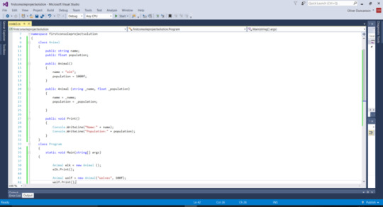
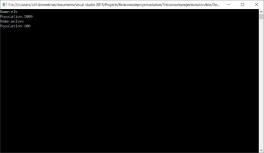
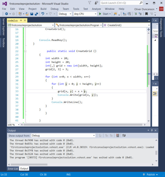
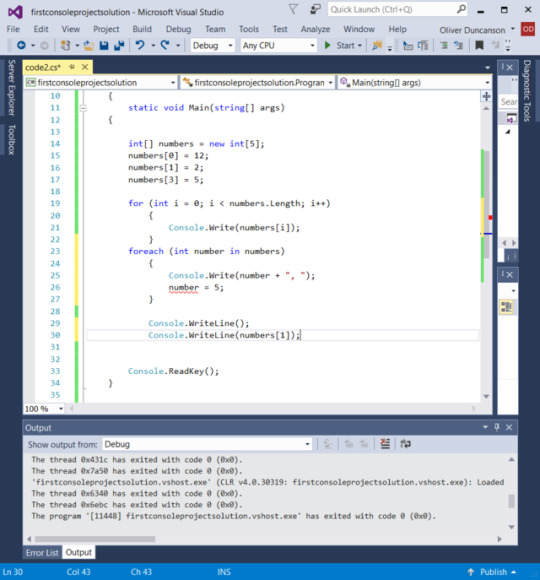
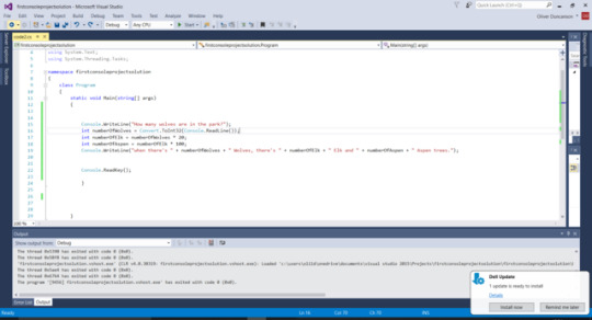
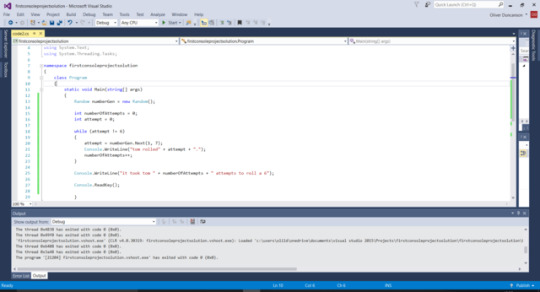
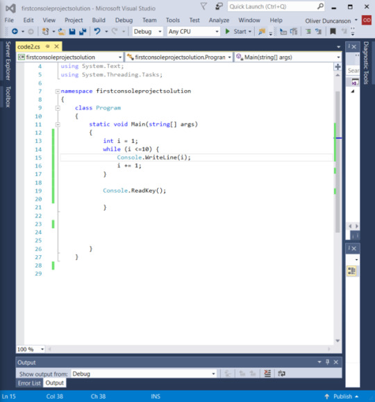
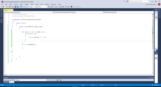
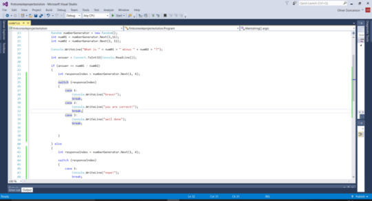
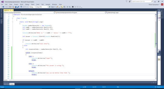
These were some coding experiments I did during easter to get myself back up to scratch with coding and become familiar again with different definitions. This was done during easter when I wasn’t able to see Dr James who taught me more in a fraction of the time when we came back
0 notes
Text
KEY STAGE 3 RESEARCH
(SKETCHBOOK 2 PAGES 10-13)
In my folder you’ll be able to find my research on KS3 curriculum and lesson plans regarding the topic of food chains and ecosystems if you want to see specifics of what I found. I think going over the main points I’ve found through my research would be more productive to put on my blog instead of boring you with a load of waffle on everything single thing I’ve found as I think you wouldn’t read this post properly and this is a very integral part of our app. When talking to Adam about our target audience initially he said that our target age was too broad and suggested we targeted a certain Key Stage group, so we decided to target Key Stage 3, which is ages 11-14 because we feel that these ages are when one starts to understand the concept of trophic cascades and food chains. This age group is when people start to understand the concept of taking responsibility for your actions which is where the idea of the app stemmed from, because when we brainstormed what made us angry in the first semester global warming is something that came up which clicked with Cameron, so he wanted to make something that informs the user the importance of not messing with nature even though this isn’t completely linked to global warming, the story of the trophic cascade in Yellowstone National Park shows the importance of not messing with the natural course of an ecosystem so hopefully this can translate to the students doing what they can to not do anything that can mess with their environment. When we knew the age group I then searched up a load of teaching lesson plans and curriculums to find terms and main objectives when teaching this subject. The whole reason for this app is to be used along side the teacher in the class room so if the mechanics and information is modelled after how and what they teach in Biology and Geography. The main objectives of most lesson plan I’ve looked at is: ⦁ To Spot chains within a food web ⦁ to be able to construct their own food webs and chains ⦁ understand energy transfer and loss within a food web ⦁ explore different habitats’ food webs
These objectives are supported by teaching the kids some key words so they understand what is happening in the context of the situation. These keywords are: ⦁ Habitat ⦁ Producer ⦁ Consumer ⦁ Herbivore ⦁ Omnivore ⦁ Carnivore ⦁ Energy ⦁ Population ⦁ Organism ⦁ Photosynthesis ⦁ Predator ⦁ Prey ⦁ Primary consumer ⦁ Secondary consumer ⦁ Tertiary consumer ⦁ Web ⦁ Chain A couple of these words can be used outside of the info box, for example we want the numbers showing the separate variable’s populations on screen and updating every time something changes, hopefully the user will be able to spot this and make the correlation between the word and what’s happening. I think learning like this will be very effective for the class room because it allows the user to learn in the context they’re exploring instead of being taught it, listening to the teacher first then applying what they’ve been told to a worksheet. Teaching in this interactive way adds an extra aspect of interaction and engagement. The info box will be the main place that teaches the children these key words for example when something changes within the app to do with the trees then the key word PRODUCER can be bracketed next to it or if the tree population rises then we can say that this could be because of PHOTOSYNTHESIS and so on. Lesson plans generally structure the lesson from introducing the concepts of food chains and the flow of energy within food web then showing examples of food chains to developing their understandings of it then ends with something that quizzes what they’ve learnt. I honestly think that apps with the same concept of ours/premise as ours could change how teachers teach in the classroom because it allows more active / hands on learners to learn the concept of what’s being taught whilst being able to change/manipulate what’s happening, it adds an aspect of discovery learning where it previously wasn’t there. The main thing that records that the student has learnt from the lesson is that there’s an activity or quiz at the end of the lesson giving them the opportunity to put it all into practise by them by them creating something like a food web or chain, so I think it’d be a good idea to have an activity like that to do whilst they’re still using the app. I’m going to mind map some ideas of what we could do whether that be a food chain, web or even some how integrate energy transfers within that.
0 notes
