Don't wanna be here? Send us removal request.
Text
Translating the Cyberpunk Future

I'm a video game translator, and I love my job. It's odd work, sometimes stressful, sometimes bewildering, but it always provides interesting and inspiring challenges. Every project brings new words, slang, and cultural trends to discover, but translating also forces me to reflect on language itself. Each job also comes with its own unique set of problems to solve. Some have an exact solution that can be found in grammar or dictionaries, but others require a more... creative approach.
Sometimes, the language we’re translating from uses forms and expressions that simply have no equivalent in the language we’re translating to. To bridge such gaps, a translator must sometimes invent (or circumvent), but most importantly they must understand. Language is ever in flux. It’s an eternal cultural battleground that evolves with the lightning speed of society itself. A single word can hurt a minority, give shape to a new concept, or even win an election. It is humanity’s most powerful weapon, especially in the Internet Age, and I always feel the full weight of responsibility to use it in an informed manner.

One of my go-to ways for explaining the deep complexity of translation is the relationship between gender (masculine and feminine) and grammar. For example, in English this is a simple sentence:
"You are fantastic!"
Pretty basic, right? Easy to translate, no? NOT AT ALL!
Once you render it into a gendered language like Italian, all its facets, its potential meanings, break down like shards.
Sei fantastico! (Singular and masculine)
Sei fantastica! (Singular and feminine)
Siete fantastici! (Plural and masculine)
Siete fantastiche! (Plural and feminine)
If we were translating a movie, selecting the correct translation wouldn't be a big deal. Just like in real life, one look at the speakers would clear out the ambiguity in the English text. Video game translation, however, is a different beast where visual cues or even context is a luxury, especially if a game is still in development. Not only that, but the very nature of many games makes it simply impossible to define clearly who is being addressed in a specific line, even when development has ended. Take an open world title, for example, where characters have whole sets of lines that may be addressed indifferently to single males or females or groups (mixed or not) within a context we don't know and can't control.
In the course of my career as a translator, time and time again this has led into one of the most heated linguistic debates of the past few years: the usage of the they/them pronoun. When I was in grade school, I was taught that they/them acted as the third person plural pronoun, the equivalent of the Italian pronoun "essi." Recently, though, it has established itself as the third person singular neutral, both in written and spoken English. Basically, when we don't know whether we're talking about a he/him or a she/her, we use they/them. In this way, despite the criticism of purists, the English language has brilliantly solved all cases of uncertainty and ambiguity. For instance:
“Somebody forgot their backpack at the party.”
Thanks to the use of the pronoun "their," this sentence does not attribute a specific gender to the person who has forgotten the backpack at the party. It covers all the bases. Smooth, right? Within the LGBT circles, those who don’t recognize themselves in gender binarism have also adopted the use of they/them. Practically speaking, the neutral they/them pronoun is a powerful tool, serving both linguistic accuracy and language inclusiveness. There's just one minor issue: We have no "neutral pronouns" in Italian.
It's quite the opposite, if anything! In our language, gender informs practically everything, from adjectives to verbs. On top of that, masculine is the default gender in case of ambiguity or uncertainty. For instance:
Two male kids > Due bambini
Two female kids > Due bambine
One male kid and one female kid > Due bambini
In the field of translation, this is a major problem that often requires us to find elaborate turns of phrase or different word choices to avoid gender connotations when English maintains ambiguity. As a professional, it’s not only a matter of accuracy but also an aesthetic issue. In a video game, when a character refers to someone using the wrong gender connotation, the illusion of realism is broken. My colleagues and I have been navigating these pitfalls for years as best we can. Have you ever wondered why one of the most common Italian insults in video games is "pezzo di merda"? That's right. "Stronzo" and "bastardo" give a gender connotation, while "pezzo di merda" does not.
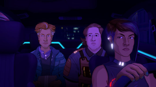
A few months ago, together with the Gloc team, I had the pleasure of working on the translation of Neo Cab, a video game set in a not too distant future with a cyberpunk and dystopian backdrop (and, sadly, a very plausible one). The main character is Lina, a cabbie of the "gig economy," who drives for a hypothetical future Uber in a big city during a time of deep social unrest. The story is told mainly through her conversation with the many clients she picks up in her taxi. When the game’s developers gave us the reference materials for our localization, they specified that one of the client characters was "non-binary" and that Lina respectfully uses the neutral "they/them" pronoun when she converses with them.
"Use neutral pronouns or whatever their equivalent is in your language," we were told.
I remember my Skype chat with the rest of the team. What a naive request on the client's part! Neutral pronouns? It would be lovely, but we don't have those in Italian! So what do we do now? The go-to solution in these cases is to use masculine pronouns, but such a workaround would sacrifice part of Lina’s character and the nuance of one of the interactions the game relies on to tell the story. Sad, no? It was the only reasonable choice grammatically-speaking, but also a lazy and ill-inspired one. So what were we to do? Perhaps there was another option...
Faced with losing such an important aspect of Lina’s personality, we decided to forge ahead with a new approach. We had the opportunity to do something different, and we felt like we had to do the character justice. In a game that's completely based on dialogue, such details are crucial. What's more, the game's cyberpunk setting gave us the perfect excuse to experiment and innovate. Language evolves, so why not try to imagine a future where Italian has expanded to include a neutral pronoun in everyday conversations? It might sound a bit weird, sure, but cyberpunk literature has always employed such gimmicks. And rather than take away from a character, we could actually enrich the narrative universe with an act of "world building" instead.
After contacting the developers, who enthusiastically approved of our proposal, we started working on creating a neutral pronoun for our language. But how to go about that was a question in itself. We began by studying essays on the subject, like Alma Sabatini's Raccomandazioni per un uso non sessista della lingua italiana (Recommendations for a non-sexist usage of the Italian language). We also analyzed the solutions currently adopted by some activists, like the use of asterisks, "x," and "u."
Siamo tutt* bellissim*.
Siamo tuttx bellissimx.
Siamo tuttu bellissimu.
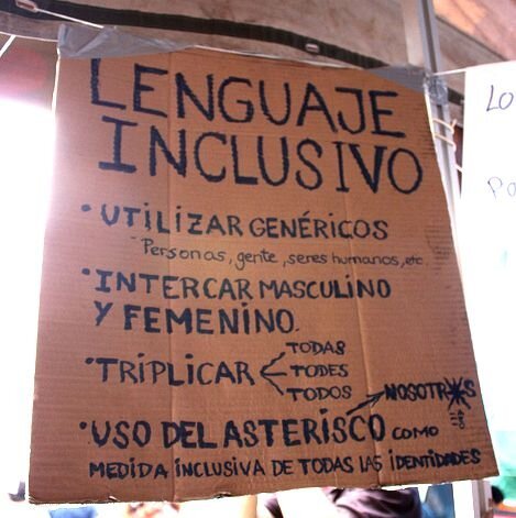
I’d seen examples of this on signs before, but it had always seemed to me that asterisks and such were not meant to be a solution, but rather a way to highlight the issue and start a discourse on something that's deeply ingrained in our language. For our cyberpunk future, we wanted a solution that was more readable and pronounceable, so we thought we might use schwa (ə), the mid central vowel sound. What does it sound like? Quite familiar to an English speaker, it's the most common vowel sound. Standard Italian doesn’t have it, but having been separated into smaller countries for most of its history, Italy has an extraordinary variety of regional languages (“dialetti”) and many of them use this sound. We find it in the final "a" of "mammeta" in Neapolitan, for instance (and also in the dialects of Piedmont and Ciociaria, and in several other Romance languages). To pronounce it, with an approximation often seen in other romance languages, an Italian only needs to pretend not to pronounce a word's last vowel.
Schwa was also a perfect choice as a signifier in every possible way. Its central location in phonetics makes it as neutral as possible, and the rolled-over "e" sign "ə" is reminiscent of both a lowercase "a" (the most common feminine ending vowel in Italian) and of an unfinished "o" (the masculine equivalent). The result is:
Siamo tuttə bellissimə.
Not a perfect solution, perhaps, but eminently plausible in a futuristic cyberpunk setting. The player/reader need only look at the context and interactions to figure it out. The fact that we have no "ə" on our keyboards is easily solved with a smartphone system upgrade, and though the pronunciation may be difficult, gender-neutrals wouldn't come up often in spoken language. Indeed, neutral alternatives are most needed in writing, especially in public communication, announcements, and statements. To be extra sure our idea worked as intended and didn't overlook any critical issues, we submitted it to a few LGBT friends, and with their blessing, then sent our translation to the developers.
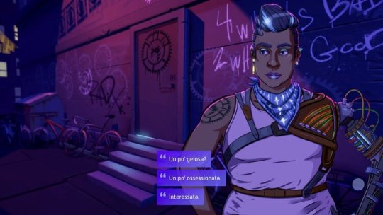
Fast forward to now, and the game is out. It has some schwas in it, and nobody complained about our proposal for a more inclusive future language. It took us a week to go through half a day's worth of work, but we're happy with the result. Localization is not just translation, it's a creative endeavour, and sometimes it can afford to be somewhat subversive. To sum up the whole affair, I'll let the words of Alma Sabatini wrap things up:
"Language does not simply reflect the society that speaks it, it conditions and limits its thoughts, its imagination, and its social and cultural advancement." — Alma Sabatini
Amen.
33 notes
·
View notes
Text
Meet Your Pax

You'll meet many characters as they slid into your car. If someone wanted a quiet ride, they'd call one of the automated Capra cars. To compete with the efficiency of the sleek autocar experience, human drivers need to offer something unique. People call Neo Cab for a connection: hear their stories, learn their secrets, and maybe even make a new friend. Learn which Neo Cab pax you're most like with our Personality Quiz.

Here are a few of the pax you’ll meet in Neo Cab:
Fiona Pak

Fiona's off to the executioner and could use your advice... ☠
Carlos Wong

Carlos has a work emergency and wants to help... 🩺
Gideon DeKalb

Gideon just got kicked out of a fundraiser and needs to vent... 💢
7 notes
·
View notes
Text
Anatomy of a Neo Cab Character

Character is key. It's why viewers binge tales of antiheroes and epic family battles. It's what makes audiences care enough to spend hours in worlds that don't exist. So how can we translate the power of character-driven storytelling into the interactive space? Well, here’s one approach we took on Neo Cab. The short answer is a lot of foundational concept work.
Anyway, hello again! It’s Paula Rogers, Writing Lead and Story Editor for the game. Earlier this year, I gave a talk for LudoNarraCon about how we created one of our pax from initial story concept to final character design. So click the video below to see me walk you through how we used our main themes and plot to create compelling pax characters, the process for turning a character’s thesis statement into an actual storyline, and all the way through the visual development that we did with Vincent.
youtube
You’ll get to play through Fiona’s whole story when Neo Cab is released later this year. Until then, stay tuned to @neocabgame for more exciting news and updates. You can find me on Twitter @paula_bot and thanks for stopping by!
3 notes
·
View notes
Text
Neo Cab catches a ride to E3
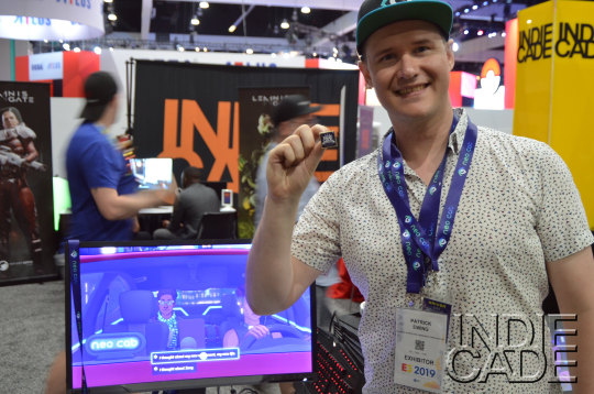
This year Neo Cab carpooled to E3 with the IndieCade Showcase. We’ve always considered IndieCade to be the coolest part of E3! We are honored that Neo Cab was selected for the showcase.
It's exciting to meet new and old fans & show them what we’ve been working on. We can get lost in ourselves while working and it's good to remember that we're not making this game for us: we're doing it for other people (like you!) to appreciate.
If there's a game you're excited about, it's so worth it to find the devs at a show and fan out to them! It means so much to us and it's always a great, unexpected bonus from shows like E3. That one person is worth more fuel to us as developers than a thousand.

We've been in the news recently and wanted to share a few of our favorite articles with you:
“I only got to play Neo Cab for around 20 minutes, but it left me craving more. Neo Cab is a ride worth taking.” -Nintendo Enthusiast
“Neo Cab was the most perfect demo I played at E3 this year, a game designed not just with the sort of clean and simple choice-based interface that could be grasped by many, but also calling attention to the mini emotional mind games that occupy and wreak havoc on our day.” -LA Times
“The game’s core question: In an app-driven world that’s making our daily life feel like a game, do “likes” and five-star ratings have anything to do with happiness, or are we all slowly making each other miserable?” -Seattle Times
"Keeping a sense of humanity matters in this world. Interaction is rare, but the key gameplay component." -Forbes
“Branching dialog choices isn’t a new concept in video games, but the way Neo Cab implements it feels unlike anything I’ve played. That might come down to the fact that Lina clearly experiences anxiety. In those moments, Neo Cab stopped feeling like a video game. Instead, it felt like a glimpse into the lives of real people.” -Tech Raptor
“Video games invite moments of self-realization and have the unique ability to promote empathy—at the press of a button, you can comfort a sad passenger in the back of your cab, provide moral support to your fellow soldiers, or sing a sad song to remember a loved one.” -EGM
We're excited to get back to work now, so until next time! 👋🏽
1 note
·
View note
Text
The Music of Los Ojos

Hey there! This is Joe, also known as Obfusc. I’m making the music and sound for Neo Cab. There’s a chance you’re familiar with my work from the Monument Valley soundtrack or from one of my albums or EPs over the years. There’s also a very, very good chance you’ve no idea who I am. Rest assured, in either case, I’m positively tickled that you’re here.
Back in May, along with some of the other Neo Cab dev team folk, I participated in the inaugural LudoNarraCon. For just about twenty minutes, I presented a high-level dive into The Music of Los Ojos -- how I came to work on Neo Cab, the visual and sonic influences that got the aural ball rolling, a bit of the sonic palette of the game’s music, and an instrument-by-instrument breakdown of one of the game’s pieces, “Neon Moon.”
youtube
Thanks a million for reading, watching, and listening! Like everyone on the team, I can’t wait for Neo Cab to release later this year on PC, Mac, and Nintendo Switch. In the meantime, find me on Twitter @josephxburke and be sure to follow @neocabgame for updates, too.
4 notes
·
View notes
Text
Procedural Route Generation in Neo Cab
In Neo Cab, we need interesting background scenery for Lina to travel through as she interacts with the pax. The fictional city of Los Ojos is a massive place, drawing inspiration from real world cities such as Mexico City, San Diego, and Dubai. We needed Lina’s routes to cover many miles of game-world, without repeating in a way that would be distracting to the player.
In an open-world game such as GTA, a real-world scale city is built and can be freely explored by the player. But this is not only a huge technical challenge, its takes a small army of artists and designers to create and populate every street and avenue. And in reality, we didn’t need to build the whole city, even though Lina may travel anywhere in Los Ojos, once she starts a ride her route is mostly predetermined (with some exceptions for gameplay choices that may affect her route).
We decided to take a procedural generation approach, generating routes that were informed by the length, character, and neighborhoods that Lina would need to pass through on the city map, but not worrying about matching every twist and turn exactly.
Chunks
The route is created by assembling a set of prefab models we call “chunks.” Each chunk represents roughly one city block or so, and can be straight sections, turns, forks, etc. Most of the chunks are square but they can be any shape to allow for curves and create more variety in the route.

Here are a few of the chunks used to build the city.
First Attempt
The first attempt to assemble the chunks was a kind of “What’s the simplest thing that could possibly work?” approach. We treat the chunks as a deck of cards, and simply picked the next one at random out of all the possibilities that would avoid overlapping. By weighting the probability that each chunk is chosen, we can favor chunks that would make a route with more distance or more compactness, and have some control over the overall characteristics of the route.

However, this simple approach didn’t offer enough control. Routes were too zig-zaggy, and often in an illogical way. If we increased the weighting on the “straight” tiles, it would begin to look reasonable in some areas, but we’d end up with miles of straight road in other places. Worse, even though we checked for overlapping tiles at each step, a route could easily “spiral in” on itself and get to a dead end where nothing would fit. Of course, there are ways around this — typically you’d backtrack or use a charming algorithm called “rip-up-and-replace.” We could have kept adding rules and conditions like this, but at some point we would lose the simplicity that made this approach appealing in the first place.
The L-System Prototype
In order to be able to iterate quickly and test ideas, I created a prototype to test the system with a simple 2D version of the route generation, using simple shapes instead of the full 3D chunks. The prototype enabled quick iteration on the algorithm and is still useful to try out new ideas for chunk shapes or route rules.

I implemented a simplified 2D version of the original route generation algorithm but the real breakthrough was using an L-System approach to generate the whole route. Instead of checking for collisions or overlaps at each step, and somehow rewinding and regenerating, we can simply define our rules to avoid overlaps.
An L-System is a procedural system that works by starting with a very simple pattern, called a “Start Rule,” and then replacing parts of that with slightly more complicated ones. By repeating this over and over, you end up with a complex pattern, and have a high degree of control over the results through your choices of which symbols to replace and what to replace them with.
For example, here is very simple L-System that starts with a single line segment, and then replaces each line segment in the figure with a line with a pointy part in it. That replacement is itself built of four line segments, so this can be repeated on all of those line segments until you have an arbitrarily detailed figure. (This is called a Koch Snowflake.)

In our system, there are two types of symbols: terminal rules, which are not expanded any further but represent a chunk of city geometry, and a non-terminal, which will be expanded.

Here’s a simple example: By convention, non-terminals are lower case and terminals are upper-case. In this case we have a non-terminal “s” that generates a straight section that is one, two, or three chunks long (and might have an intersection, the “+” symbol). We also have a terminal “L” and “R” which generate chunks that turn left and right. The turns might be a curve or an intersection, but that doesn’t affect the route shape. The non-terminal “a” simply generates a sequence of “straight, left, straight, right” or “straight, right, straight, left.” We stick a few of these together and get a route that contains turns and a mix of short- and long-straights, but always ultimately proceeds forward and will never wrap back to overlap itself.
Generating the Routes
The system used to generate the routes takes the list of chunks as a starting point and loads detailed geometry for each chunk along the way. It also assembles a road spline for Lina’s car to follow from smaller splines defined as part of each chunk.

Some of the chunks are intersections or have open turns, and so we have special chunks that we call “end-caps” that will extend or close off unused road sections. Finally, to add a layer of mid-ground geometry and block any open holes between buildings, we add geometry we call “mid-caps,” these are blocks of shadowy, lower-detail buildings and are simply added by attempting to place them along every edge of every chunk we’ve already placed, and skipping it if it would overlap existing geometry. These mid-caps are the green boxes you see on the right.
Final Touches — Decorators

To add even more variety, each chunk can have a bunch of “decorators,” which are spots where we can randomly place extra-detail objects such as signs, parked cars, trash cans, trees, or anything to spice up the route. I was expecting to have something like two or three of these for each chunk but it turns out our 3D artist, Lisa, is some kind of superhero and she defined, like, thirty of them for each chunk. In the screenshot above, each magenta cube is a location to possibly spawn a decorator, and the bottom shows one possible result.
Results
youtube
Conclusion and Next Steps
The basic system is in place and working well. Next we want to give the route more character and variety based on which neighborhoods of Los Ojos you’re traveling through, including having neighborhood-specific chunks and decorators, and even L-System rule-sets to pick from when you are travelling through a distinct neighborhood.
With too much randomness, procedural generation be wildly unpredictable. With too many constraints, it can build levels that are technically unique but all feel the same. It’s all about tuning the algorithm and the inputs to strike the right balance. In our case, the procedural elements form the backdrop and having some randomness helps prevent the routes from feeling identical or distractingly repetitive. But at the same time, this isn’t a racing sim and the gameplay comes from the human-authored stories that Lina experiences. So the goal for our procedural system is to reflect and enhance the narrative experience that’s the core of the gameplay.
6 notes
·
View notes
Text
Making the Neo Cab OST
I'm Joe—perhaps, in this context, better known as Obfusc—and am enthusiastically handling all-things-audio for Neo Cab.
The project first popped onto my radar via a rather cryptic-yet-beamingly-positive tweet reply from Patrick (@hoverbird): "We should REALLY talk about what I'm doing next! #videogames." I slid (respectfully) into his DMs and he laid out a high-level pitch: Near future. Night. Automation. Surveillance. Driving. Dystopia.

When we talked prospective music, the keywords we exchanged meshed; the sonic palette touched on everything from the obvious flavors of synthwave and vaporwave, to world instruments and jazz breaks. I knew Patrick's taste from occasional listens to his now silent, then fantastic bff.fm radio program, "Warm Focus," which occasionally featured my work as Obfusc. Via the magic of short-form message exchange, I organically slipped into the Chance Agency/Neo Cab fold in November 2016.

Vincent's incredible, early mood/concept pieces translated to buoyant sonic inspiration, as did the phrase "Stay Human." The music, in my mind, would have a certain solitary sensuality of night. Occasionally, there should be darkness, claustrophobia, ominous foreboding. As the writing team churned out the foundation of the city we now call Los Ojos, it was all too easy to imagine a landscape within it, the places a driver-for-hire (or nocturnal urban explorer) would encounter. The inspiration was—and is—everywhere.

As time has elapsed and work progressed, I've produced just south of thirty pieces that comprise the working draft soundtrack of Neo Cab. I can't express how hard it is to keep this under wraps; I'm really, really proud of the work thus far. Since the release of our gameplay trailer at E3, it's been amazing to pull back the metaphorical curtain a bit to let everyone see the collective effort that I'm privileged and proud as hell to be a part of. I've chosen a working draft for a track titled "Halogen Mosaic" to break down a bit, discussing the sonic choices and how it relates to the overall whole of the music created for the game.
youtube
Thanks a million for your interest in the game, the music, and those who are behind it. I'm confident in saying that we, the collective Chance Agency, are beyond thrilled with the enthusiasm and curiosity expressed toward our work.
2 notes
·
View notes
Text
Building Narrative in Neo Cab
Hello! I’m Paula Rogers, the Story Editor for Chance Agency.
Lately I’ve been asked, what’s a Story Editor? Writing is a familiar enough job, and if you imagine a temperamental housecat who hoards caffeine and sugar between naps, you’ve pretty much got the idea of that part of my workday. But, what does my editorial role mean in games, and even more importantly, can it be explained with a cat metaphor?
First off, I work closely with Patrick, the Creative Lead, to develop the overall plot arc and narrative structure of the game. We’re a choice-based adventure game with a branching story, so we’re designing for several different ways the plot could go at any time. On top of that, our narrative is unique in a few key ways, first being that we have a huge cast of characters when you account for all the passengers (pax). Therein lies the bulk of my work.

To capture the energy of driving in a big city, it had to feel like anyone could hop in Lina’s car—any weird or sad or funny or kind person from any walk of life. That meant not only a high number of pax, but a very broad range of diversity in those characters—while all being thematically linked in some way so everything feels like part of the same game. It’s like a short story collection viewed through a hall of mirrors, or a season of television where each episode is told by a different character.
So, even though we have a fairly traditional story structure of protagonist (Lina), antagonist (Top Secret), and a handful of plot-essential characters who help you along the way, most of the game is not actually spent with any of those characters. Instead, you talk with the pax as you do your job, and most of the game is spent entirely inside Lina’s car.
Sometimes I think we couldn’t have designed a more extreme set of narrative constraints if we’d tried—like, just for kicks let’s also tell a story only through dialogue between strangers and in a very small space where they can’t move or face each other!

So another big part of my job is to keep an eye on how the overall story and Lina’s character journey weave in with all the pax she might pick up at any given moment, while also making sure all these tiers of stories never compete with one another. They should all, in some way, complement each other, but I also need to check that the symmetry doesn’t feel contrived. For instance, I kept suggesting Lina might reasonably pick up a magical talking piglet with an encyclopedic knowledge of Los Ojos, but Patrick and the other writers just couldn’t see it. What might have been, and in a tiny tuxedo, too!
As Story Editor, I am also the keeper of the lore, which in retrospect is a much better title. So I develop and maintain the bibles for our story, our world, and our characters, including each pax. These character guides include their backstories, the way they speak, how they act in different emotional states, and what they want out of life. I work with the writers to create each pax and design how their story can be woven into the larger themes of the game, the overall plot, and Lina’s own character arc.
Lastly, I manage a robust team of writers scattered across the globe. So it’s also my job to wrangle all the moving pieces that entails—grammar, style, voice, and way too many time zones—into one cohesive whole. It hurts me a little bit every time I have to change a lovely, spacious “colour”-type spelling to a painfully straightforward “color,” but alas. I maintain our Inky Cheat Sheet and Neo Cab Style Guide, lead exercises to keep us all thinking and writing as one, manage assignments, review and guide story pitches, edit the writers’ work, and run a weekly meeting where I definitely do not force the writers to answer questions about their favorite animals or how they might dress a magical piglet.
We’re building a story that explores the bonds between friends and strangers, that’s about what tech can destroy and what it can never touch, and that features an incredibly strong protagonist whose deep empathy is the source of her power. I’m so very excited to share it with all of you. Working on Neo Cab is one of the most fulfilling and challenging writing jobs I’ve ever had, and I thank my lucky cats every day that I get to do it.
3 notes
·
View notes
Text
Cinematic Cameras in Neo Cab
In Neo Cab, the world of Los Ojos is seen from a car. One of our design pillars is to make a world that feels cinematic, and so we looked for ways to make this constraint enhance that goal rather than limit it.

We also had the constraint of wanting to leverage cinematic lighting and Unity’s powerful new post-processing stack to try and evoke the rich and moody visuals of our concept art and reference, yet still build a game that was playable on mobile devices.
And finally, we wanted a solution that was not realistic but rather hyper-real, where the lighting felt right but didn’t need to be physically correct, and offered plenty of opportunity for the artist to fine tune the visuals.
youtube
We gathered reference from films with car interior shots that we liked. These included shots where the city the character was driving through was important to the shot and set up the mood and feelings of the scene, but also scenes where it was just background and the characters and their conversation was the focus.

The Night Of

A Night on Earth

Taxicab Confessions
We also began experimenting with Unity post-processing. I set up a test scene with the car and some placeholder geometry and lights and got some promising results, but had serious framerate issues on mid-range mobile devices from heavy use of the bloom and DOF. We also had some problems with the post-effects interacting in strange ways with our Pax sprites, which are sprite based and used completely different rendering setup. Also, our art director wanted to be able to color-correct and post-process the car interior and the outside scene differently.
Looking at classic film techniques, we realized a lot of these used a “rear-projection” technique, where actors are filmed in a stationary car on a soundstage, with a screen projecting footage from a car-mounted camera elsewhere behind them. Modern films did essentially the same thing with green screen. Often a setup called a “chaser rig” is used where lights on set are moved mechanically or simply waved around by a grip to simulate passing headlights and streetlamps.

We apply this approach to our car cameras. Our car rig is stationary, which helps keep it simpler and also has the advantage of not having to worry about the whole rig moving around under one root. We have a separate camera that is constrained to point in the same direction as the car camera, but follows the car path through the city. On mobile devices and PC on low settings, these renders can be set at a lower resolution than the main screen which allows use to use fragment-heavy effects like bloom and DOF even on these targets, while the car interiors and character art remain at full resolution so we can keep the character art crisp and detailed. On a higher end PC we can render the exterior camera at full res and still make use of cinematic post effects. A nice side benefit of this is being able to apply different post processing to the interior and exterior scenes.

Making the lighting feel in sync between the interior and exterior is a challenge. I initially set up some experiments that looked for lights in the scene near the car EXT camera and used those to drive the color and brightness of the “chaser” lights but it was difficult to control, and just adjusting the speed of these chaser lights proportionally to the car speed gave the impression of driving, and left the artist more in control of the color and movement of the light. Another problem is making the lighting feel right when Lina is turning. At the moment we’re not doing anything to handle this, and though it’s not distracting it’s noticeable if you’re looking for it. It’s also a missed opportunity to reinforce the feeling of motion -- the light sliding across the passenger and backseat is a strong visual cue that we’re not taking advantage of yet. We plan to make more adjustments to this system as we expand our virtual Los Ojos and add more variety between the distinct neighborhoods of if the city but it feels like the overall approach is solid.

3 notes
·
View notes
Text
GDC 2018 Recap
A little over a year ago, the Neo Cab team was just a few people pulling together over Slack everyday to try and iron out the details of our new game. Back then, we pretty easily fit around a 4-top dinner table. We hadn’t finalized the name or decided on an art style yet, but we had a clear vision, some business cards, and a dizzying amount of passion.

Since then, we’ve gotten a little bigger and also got quite a lot done. Our team is remote and scattered across the country and the planet, but we still gather together everyday on appear.in for our daily check-ins.

These check-ins have been everything from entertaining to tense, and they’ve played a critical role in turning us into a high-functioning team despite our varying time zones. At this point, it’s safe to say we know the quirks of each other’s pets and the sway of each other’s bedhead. We even know the pick-up and drop-off schedules of those with kids.
So at this year’s GDC, though many of us were meeting in person for the first time, it was no surprise that it felt more like a reunion than an initial gathering.
Here are a few of the highlights:
We stayed together in an Airbnb called The Starship.

We went to some parties

We passed out swag
We broke bread and brunched

We took rooftop photos

And, we played DropMix until we passed out in a room affectionately deemed “The Opium Den”
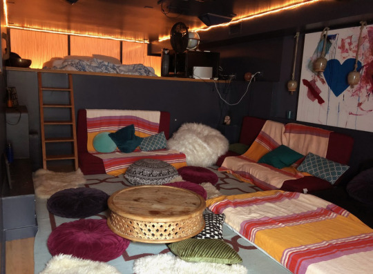
It’s been a wild year of challenges and growth for all of us. We have a lot more work to do, but for now, we’re grateful for the enthusiasm and encouragement we’ve received, and we can’t wait to show you more.
3 notes
·
View notes
Text
Fashion Trends of Los Ojos
Hello, I’m Vincent Perea, the Art Director for Chance Agency, and I want to tell you a little bit about the inspiration behind our character designs.
In Neo Cab, we’re trying to tell relatable human stories in a world that’s quickly becoming less and less human. The game is set in a future fractured by tech-control and gig economics, but that isn’t the core of what it’s about. It’s actually a game about people, and the brief moments where one life intersects with another.
As such, most of the game takes place in Lina’s car. You pick up passengers (or “pax” for short) and reveal their stories as you chat during the ride. You see glimpses of the city of Los Ojos, but a lot of the focus is on characters interacting in a confined space. This meant that a pax’s attire and appearance had to not only convey their personality, but also offer hints at what the larger world was like.
If all I have to describe the world outside the car is the upper part of a character’s body, I have to be bold with my style choices. It’s been a fun challenge, and I’ve been drawing on several references to create a future fashion that’s as believable as it is strange.
1980s
The fashion of the 1980s was a big inspiration on the project. Even today, it feels like designers of the time had their eye on the future. It feels like they were not just trying to represent 1980, but 2180—especially in high fashion and New Wave looks. 80s design cues that I drew on include: bold sharp angles, neon colors, contrasting sizes and cuts, diversity of patterns (often clashing), and dramatic makeup.
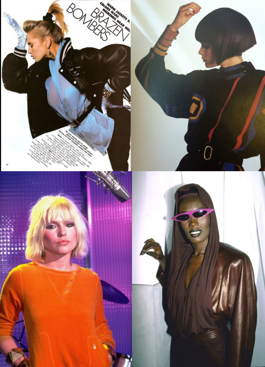
Debbie Harry inspired a generation of thieves with her impeccably casual-cool style. I am 90% certain Grace Jones was actually sent back in time from the future.
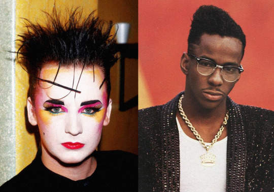
But I was almost more attracted to how we remember the 80s. With time we tend to exaggerate the styles of the past, and “retro” looks become more about the feelings an era inspires in modern minds, instead of any kind of accurate day-to-day look.
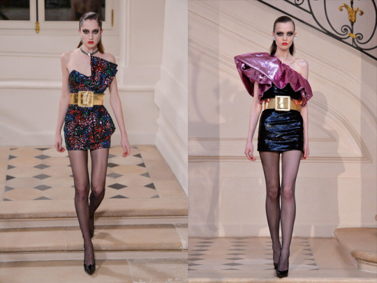
Saint Laurent fall 2016 collection
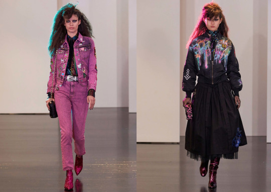
Marc Jacobs Resort 2017 collection.
Case in point: when Atomic Blonde came out, I breathed a sigh of relief. “This duotone palette works!” (There’s a great meme on this kind of lighting dubbed, “Bisexual Lighting.”) The whole film is excellently art directed to capture the cool, neon vibe of the time period—or at least the feeling of why the 80s are still so captivating today.

Athleisure
Next I looked to the modern trend of Athleisure. I liked how this style uses newer synthetic fabrics, and a diversity of materials in one garment. I was drawn to how these pieces use panelling not just as a construction method, but as an expressive element in the overall design.

Hair Styles
Since most of our characters are only ever seen in the backseat of a car, anything above the neck was prime real estate. So deciding that everyone has “cool” haircuts was as much a practical decision as a creative one.
Any 10-minute walk around GDC was enough time for me to gather reference for all the hairstyles in Los Ojos...so it didn’t seem outlandish to imagine that some current edgy styles (half-shaved heads, multi-color layers) would become mainstream looks as our generation ages up.

Setting a Style Guide
To focus my efforts, I made myself a cheat sheet of the “current” style trends that would be seen on the streets of Los Ojos. I also added some elements that are a little more under-the-radar, like fashionable prosthetics, reflective detailing, and illuminated clothing.


I curated a deep list of references, then sat down and started to sketch some of my favorites, updating details and colors to unite the drawings together. I should note that we’ve imagined Los Ojos to be a very culturally diverse city. It was important to me that the design of the pax represented a wide range of ages, ethnicities, and body types.


Emissive Details
The game changer in designing the pax turned out to be adding illuminated (or emissive) detailing.
This was exciting to me because it helped answer some deeper narrative questions in the game—in a city you mainly experience at night, how will a person feel seen? How will they make themselves stand out in the literal and emotional darkness of the world?
I worked up the concept below, with illumination not just on garments but on tattoos and hair highlights, as well.

These details had that little bit of “extra” I was looking to add to our design language. Having highlights and tattoos that glow are not entirely possible at the moment, but in 30 years...who knows? It was a small but bold touch that marked these characters as existing in a future setting. It was also a trend I could use to unite all the character designs, no matter their backgrounds.
I tried this emissive approach out in full color, and was satisfied with how it held up. The final game uses a limited palette about halfway between this and the previous concept.

Final Look
Once I had these general style guidelines for the world, I could set about designing specific characters. The details of how we prepped and built individual looks is a topic for another time. But I’ll include two characters in their final states below. The character on the left has a nice balance of familiar and futuristic elements. The character on the right has much more extreme style, however it serves a very specific narrative purpose which I can only reveal in...the future.
Final Look of a Pax

9 notes
·
View notes
Text
The Backbone of our Animation System
Hello! I’m Laura - the technical artist at Chance Agency. I developed our 2D master character rig for Neo Cab. A “rig” is like a digital puppet made of a hierarchical set of dozens of “bones”, with layered images attached. We use this rig to animate every aspect of our characters- it’s what makes Vincent’s (our Art Director) hand-painted character art feel alive.
Our main goal was for our pax (passengers, in the parlance of rideshare drivers) to visibly express their emotions and certain reactions during their conversations with Lina.
youtube
We also wanted the pax to constantly move, or idle, so they don’t feel static.

When weighing our software options, we narrowed it down to two contenders - Spine & Live2D. We were inspired by the character animations in Wispfire’s Herald, an interactive period drama. Using Live2D, they breathed so much life into these portraits with their moving features and smooth head turns. They wrote a great series of posts detailing how they set up one of their characters. With this style in mind, we started comparing Live2D and Spine. We ultimately decided that the skeleton animation in Spine was more appropriate for us because we had to an unusually large cast of characters to create, and sharing a “master” skeleton across all of our characters felt easier in Spine. I’m really glad we explored Live2D, though- we carried some of that animation style over to our Spine workflow (with a few crazy hacks!)
Once we decided to use Spine, we got to work developing our master rig. First, Vincent illustrates the characters in Photoshop. Each piece is drawn on a separate layer so we can export our assets using Esoteric’s Photoshop to Spine script.
We developed our master rig (we call her Neo Zero) through lots of trial and error. The bones are positioned on the face and body in specific areas so we can make the character feel like it has depth and life.

Meshes and weights are also very important to our rigs. Converting an asset to a mesh and binding bones to that mesh allows us to deform/stretch it freely. This is how we manipulate the eyebrows, eyelids, face, body, hair, and mouth (the hardest one!).

We wanted our characters to be capable of “acting” with their face and their body language, independently, so we developed a skeleton with a few different bone sets. For example, the character's face may read as 'happy', but their body reads as 'drunk'... and we need to be able to transition between all these possible states as the story requires. Spine lets you set up various tracks so you can layer animations in Unity. There is a track hierarchy, so a bone keyed on a higher track overrides that same bone that’s used on a lower track. Our system takes this into account and we have certain bones that are meant for idles and others that are meant for emotes. To keep track of this system, we developed a naming structure to differentiate bone types (like root, exp, and def).
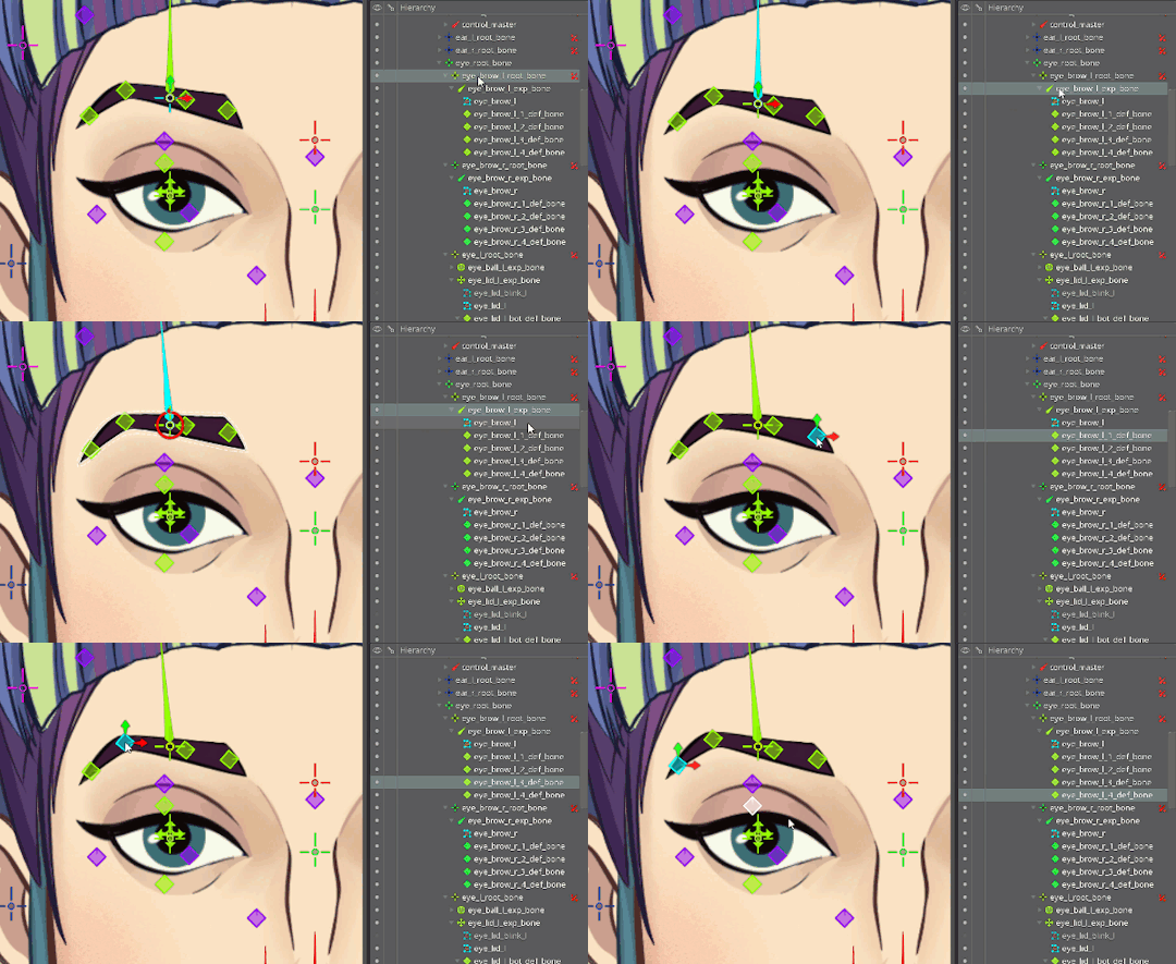
We also intentionally override certain bones when we want to interrupt an ongoing idle or emote with a time-sensitive react animation.
After we made it past the basic rig setup, we experimented with a few more complex features. We established a custom constraint system so we’re able to move each character’s head with one master bone. These constraints also enable us to parallax parts of their face, adding a feeling of depth to an otherwise 2D character. We constrain that master bone to custom paths so we can move the head around smoothly. This is how we achieved that Live2D look we were going for. It took a lot of work, and it’s probably the part of the rig I’m most excited about.
youtube
Next, we experimented with creating a new character based on Zero’s skeleton- and we were pleasantly surprised with our results! Everything translated over with minimal tweaking- even the animations! That was very exciting.
youtube
Our pax setup process in a nutshell:
Start with our established Zero rig, which has a base set of emotes, idles, and react animations.
Export the assets of the new pax into a new image folder. The asset names have to be exactly the same for all of the pax so we don’t break the image references.
Reposition the rig bones based on a guide image of the new Pax's design. Not all pax are the same height or build, so we usually need to shimmy the bones around before positioning the assets for real.
Once the bones are in a good spot, move the assets into place (following the guide image).
Build the meshes of the assets we need to deform. This step (and the next one) usually takes the most time.
Bind the deformation bones to the meshes, then paint the weights.
Hook up the transform and path constraints, then fill in those values.
We then verify that the base animation set transferred over smoothly to the new pax. Since all faces are different, we always need to spend time cleaning up certain things (especially those damn mouths), but it’s so helpful to have a starting point instead of having to start from scratch animating each character.
Now that we have a solid master rig, our process is pretty efficient. It usually takes a couple days to rig a new character and then some additional time to customize animations.
I hope this was an informative overview! There’s so much to talk about, so we’ll be posting more deep dives in the near future. Thanks for checking this out!
3 notes
·
View notes
Text
Capra Cars
Hi! I’m Lisa. One of my first assignments on Neocab was to make an iconic autonomous car using Vincent’s lovely concepts pictured here:

My job is to translate these awesome 2D images into a 3D asset for use on the Los Ojos streets!
The first step is to model it in a 3D modeling software. I used Maya for this asset due to its hard surface qualities. At this stage, I like to get all the feedback I can to avoid any rework later on. This model went through a couple of rounds of feedback before it came out looking like this:

Once the model passes muster, I start to UV the model in Maya. This process is a way to unfold the geometry you’ve made to be flat so that it can then be painted as a texture.
A texture sheet looks like this:

I turned on the wireframe layer in Photoshop so you can see the thin lines representing the wireframe of the 3D geometry. This is like a roadmap to tell you where each piece of the 3D car is located in this 2D space. The texture was kept quite simple with just a quick ambient occlusion bake and some basic color. Ambient occlusion is a shadow based on proximity to other geometry in the scene as well as self-shadowing based on an ambient light.
The final result will have layered specular, reflectivity, decals and emission maps overtop of this base texture to hit the look we are going for.
Some quick jargon-y explainers just in case I lost you:
Specular - the amount of shininess the object has and what color that shine will be
Reflectivity - how reflective the object is and what texture it reflects
Emissive- whether the object emits light like a glow and what color that glow is
Decals - I went old school and layered some transparent geometry overtop of the car to add the logos and turn signals
Once we have all of these textures and the geometry finished, we can start getting this thing in engine! This is where we can tweak the specular, reflection, and emissive textures in a neat package called a “Material.” This step is where it all comes together and the hard work starts paying off.
The final result (with both sets of turn signals on) looks something like this:

youtube
2 notes
·
View notes
Text
Hi, I’m Patrick Ewing.
You might remember me as a programmer on titles like Firewatch (2016) and Twitter (2009-2014), or as an actor in Space Jam (1995). Welcome to the Neo Cab dev log.
Here we’ll be sharing concept art, code, music, visual inspiration and all sorts of ephemera produced when making an indie game.
I’ve been trying to tell stories with games since I first laid my hands on code. It was in the first grade—we were writing commands to make the LOGO Turtle walk around the screen. As soon as I got him to walk, I asked my teacher about making the turtle talk, and giving him a house, or maybe a whole turtle village and… well, my ambitions to make the next Sierra or LucasArts game were far beyond the abilities of a six-year-old on a Commodore 64.

Games were always like this, for me— just within reach, but not quite attainable. I kept coding, though, which eventually led me to Twitter, and then to Campo Santo.
Being part of the Firewatch team was the chance of a lifetime— the atmosphere in the studio was open, collaborative, and interdisciplinary. I started building out our dialog recording pipeline, and by the end of the project I was coding gameplay logic, hand-drawing maps, writing filler dialog, and localizing the game in five languages. It was insanely fun, and unbelievably hard. Even in all my years of launching updates to Twitter.com, I'd never felt an honest-to-god panic attack until the day before we threw the switch and Firewatch went live.
The response to the game was unbelievable— two years after launch and people are still reaching out with deeply personal stories about how Firewatch touched their lives. People dealing with loss, people looking to make a change in their lives— a 14 year old kid saved a lookout tower, for crying out loud.
That itch I’d had since I first made that turtle move across the screen— to build a world that players felt they could live inside? That only intensified.
So a little over a year ago, we started assembling our amazing team, Chance Agency, and we’re so excited to start sharing some of our work for the first time. Neo Cab will invite you to explore the busy streets and back alleys of a vibrant border city, interact with a large and diverse cast of characters, and figure out how to stay human in a society disrupted by automation.
However you found your way to this {mailing list | blog}, please fix yourself a drink, grab a seat, and SMASH that subscribe button, friend. We've got stories to share— tales of worldbuilder wishes and developer dreams. These will be told for the kids in the back row who've wanted to make games since before they can remember. We hope our posts about the way our art, code, stories, and music were made and pieced into a whole will end up slotting into your own personal gamedev inventory in some small way. At the very least, we hope sharing with you will keep us inspired to make this the best possible version of Neo Cab we can, and that some of that inspirado will be contagious.
2 notes
·
View notes

