#360 animated renders
Explore tagged Tumblr posts
Text
The Best 3D Product Renders: Elevating Your Brand’s Visual Appeal
Discover how the best 3D product renders can improve your brand's visual appeal. With lifelike detail and stunning accuracy, 3D renders show off your products from every angle, creating an engaging customer experience. Transform your product presentations and increase engagement with eye-catching, professional 3D renders. Visit us now to know more about the Best 3D Product Renders.
#Best 3d product renders#Best 3d product renders in Australia#insiteimagery#360 animated renders#beautiful photos#photography#product photography#wildlife photos#lifestyle product renders
1 note
·
View note
Text

LITTLE GUY #3 IS HERE
I made a chicken!! My skill is not improving but I sure am having fun.
#3d render#low poly animals#low poly art#low poly#i made this#little guy#chicken#art#autodesk fusion 360#juleboo
11 notes
·
View notes
Text
DIP FIGURES

dip figures DIP FIGURES DIP FIGURES
(I’ll have more tomorrow!)
#these took way too long to make T_T#I still love how they came out tho!#everything was done in 3ds max#I tried to render out a 360-turnaround animation showcasing the models & I sat there for nearly an hour only to have the video file corrupt#I'm so done#pip's hair was also a NIGHTMARE to figure out#anyways#pip pirrup#damien thorn#sp dip#pip x damien#south park fanart#south park#3d artwork#my art
15 notes
·
View notes
Text

plesiastrea versipora orange:



Plesiastrea versipora is an encrusting coral found in the Indian and Pacific Oceans. (visit here: https://cults3d.com/en/3d-model/art/plesiastrea-versipora-orange)
It is of interest because of its ability to thrive in both tropical and temperate environments, and to grow massive.
I have created a 3D model of it which is a completely different shape that can be studied at a different scale for building construction and for architecture.
#3d#3d model#blender3d#3d printing#cults3d.com#tumblr milestone#3dmodeling#3d render#art#marine animal#marine life#lifestyle#emotions#ocean#epic the ocean saga#stone ocean#water#coral reef#reef#360 video#architecture#home decor#educational#youtube#educate yourself
1 note
·
View note
Text
Revolutionize Your Product Displays with 360 Furniture Modeling Services
The furniture industry is evolving rapidly, and staying ahead of the competition requires innovative solutions that captivate your audience. One such groundbreaking innovation is 360 furniture modeling services. At 3D Furniture Modeling Studio, we specialize in creating lifelike, interactive 3D furniture models that allow your customers to explore products from every angle.
What Are 360 Furniture Modeling Services?
360 furniture modeling involves the creation of high-quality, detailed 3D models of furniture pieces that can be rotated and viewed from all angles. These models provide a comprehensive view of the product, highlighting every curve, texture, and finish in stunning detail. Whether for e-commerce, marketing, or design purposes, these models deliver a truly immersive experience.
Why Are 360 Furniture Models a Game-Changer?
In a world driven by visual content, static images no longer suffice. Here’s why 360 furniture models are essential:
Enhanced Customer Experience: Interactive models allow customers to inspect products as they would in person.
Greater Transparency: By showcasing every detail, customers gain confidence in their purchasing decisions.
Increased Engagement: Interactive elements keep users on your platform longer, boosting brand interaction.
Competitive Edge: Stand out with cutting-edge visuals that set your brand apart.
Industries Benefiting from 360 Furniture Modeling Services
360 furniture modeling isn’t just for furniture retailers. It offers value across multiple industries:
E-Commerce Stores: Drive sales by letting customers explore products online as if they were in a showroom.
Interior Designers: Present your vision to clients with dynamic 3D furniture models.
Manufacturers: Display your product line with precision and style, attracting buyers and distributors.
Key Features of Our 360 Furniture Models
At 3D Furniture Modeling Studio, we focus on creating models that deliver impact:
Photorealistic Details: Textures, materials, and finishes that replicate the real product.
Smooth Rotation: Seamless and interactive 360-degree views for an engaging user experience.
Customizable Backgrounds: Add realistic environments or plain backgrounds as per your needs.
Compatibility: Models optimized for integration with websites, apps, and virtual reality platforms.
Why Choose 3D Furniture Modeling Studio?
We are pioneers in 360 furniture modeling services, offering:
Expertise: A skilled team dedicated to crafting precise and detailed models.
Innovation: Use of advanced tools and software for superior results.
Customization: Models tailored to meet your specific business needs.
Reliability: Timely delivery without compromising quality.
The Impact of 360 Furniture Models on Sales and Marketing
Studies show that interactive content can boost conversion rates significantly. With 360 furniture models:
Customers spend more time on product pages, increasing engagement.
Trust levels rise as customers feel more informed about the product.
Sales improve due to the enhanced shopping experience.
#3D Furniture Silo Rendering#3D Furniture Lifestyle Rendering#3D Product Rendering#3D Furniture Animation#Product Animation#360° Product View#High-Poly 3D Modeling#Low- Ploy 3D Modeling#Furniture Modeling for AR#Product Modeling for AR#high-poly 3d modeling services#Low-Poly 3D Modeling#Low-poly 3d modeling services#Low and high-poly 3D design
1 note
·
View note
Text
Transform Your Ideas with Professional 3D Rendering Services

Elevate your projects with our high-quality 3D rendering services. Perfect for architects, designers, and developers seeking realistic visualizations.
1 note
·
View note
Text
✅ If you need any other software, you will find it in this store at a nice price that will work for lifetime,l buy this software in this store it works easily and the seller is satisfied and it ships fast and you can share this software with your friends 🎁✅👇
#artificial intelligence#barbie#programming#software engineering#succession#autodesk fusion 360#autodesk sketchbook#autodesk maya#autodescubrimiento#autodestrukcja#autodesk revit#autodesk inventor#3d#tw 3d vent#3d art#3d model#blender#animation#art#3d render#low poly#cgi#4d#cinema 4d#4d reality#4door#togel 4d#physics#adobe#adobe photoshop
1 note
·
View note
Text
In this blog, dive into the transformative world of 3D rendering product animation, where your jewelry concepts come alive with mesmerizing brilliance. Visualize every detail, and precisely tailor your designs while experiencing the realism redefined by hyper-realistic representations. Engage interactively and unleash efficiency by receiving valuable feedback for perfection. Explore cost-effective innovation or future-proof your designs and achieve global accessibility.
#3d animation services#360 product animation#rendering in 3d animation#jewelry 3d model#jewelry 360 animation
0 notes
Text
Discover a revolution in immersive exploration with our cutting-edge, people-friendly 360 Virtual Reality tours. It’s not just a tour; it’s an adventure through every nook and cranny of a space, offering a glimpse into the soul of a project.
Feel the Difference: Imagine being transported into the heart of a design, with the freedom to roam in every direction. Our 360 VR tours bring spaces to life, providing a dynamic and engaging journey through your project
#360 Virtual Tour#3D Virtual Tour#Animated walkthrough#3d Visualisation Services#Exterior Visualisation Service#Interior Visualisation#home remodeling#Exterior rendering#Interior Designing#3d render#animation
0 notes
Text
I started Banjo-Kazooie again because I never finished it, but recalled relatively enjoying it, just feeling that it ended up getting a bit too big and tedious pretty quickly in the past.
I’m probably gonna emulate the 360 version next time I give this game a shot. Had a great time up until I died in Treasure Trove cove with like 90 notes. The 360 version just remembering what notes you’ve gotten is so much better, that really is just a massive QoL thing, huh?
#Doesn't help that n64 emulators STILL seem to have the issue rendering the puzzle pieces on the intro properly#Like puzzle pieces as in the the weird animation the game uses in the intro#Not the jiggies#It's probably because it's likely literally not rendered the same way in the 360 port#but I think that works right in Xenia
0 notes
Text
ok so im obsessed now, and ive learned a little bit more about the Roddenberry Archive, the project responsible for Star Trek Unification.
This goes a LOT further than just the one short film. Rod Roddenbery is heading "a multi-decade collaboration to preserve Gene Roddenberry’s lifetime of work for future generations to experience in next generation media formats."
Basically they're digging deep into concept work for star trek phase II, Star Trek: Planet of the Titans, the motion picture novelization, and the Cage. Mostly with a goal an preservation and recreation? its a lot of meticulous 3d models and renders. They want to make physical sets for everything. They're really heavily into the cage pilot, which is why THIS girl with the pony tail keeps showing up. her name is J.M. Colt

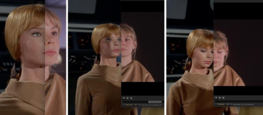
they are apparently developing a Roddenberry Archive Interactive Exhibit (WHICH I GOTTA ATTEND SO BAD) based off the Cage. theyre implementing "new holographic mediums for future generations to experience Gene Roddenberry’s legacy with the highest levels of immersion and historical fidelity." which sounds BANANAS. It's a fully immersive, interactive 360-degree experience where you can just WALK around the cage enterprise. You can use the turbolift to go to different levels, flip through Spock’s presentation of Talos IV in the briefing room, go through all of pikes stuff in his room. AND YOU LEAVE. BY BEAMING OUT.

I WANA GO SO BAD
Also bonus:

They got a little Animated series Arex!! Look at him!!! My boy!!
feel free to correct me if im wrong or add stuff! All of what i know is from like 2022 lol
X
X
#i love tas little known fact#star trek#star trek tos#star trek unification#star trek pilot the cage#captain pike#gene roddenberry#star trek tas#spock#lt arex#star trek phase II#star trek tmp#rod roddenberry#Star Trek Planet of the Titans#leonard nimoy#captains personal log
1K notes
·
View notes
Text

My 2024 Art Summary and Top Ten posts under the cut!! :DD
Honourable mention at No. 11 is this Watership Down-inspired piece with 275 notes!! I was working through a lot while I drew it so it holds a very special place in my heart <3
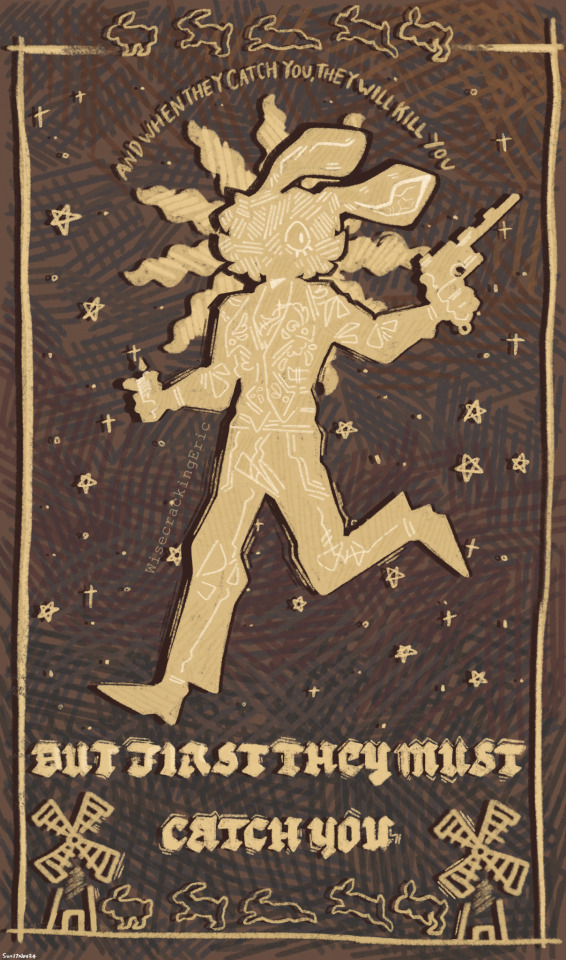
No. 10 is This Piece I made for Chreon Week with 342 notes!! I need to draw Chreon more oouughhh,,,

No. 9 is my Cowboy Serennedy Doodle with 360 notes!! I'm STILL not immune to them HGBDJBJDSJH

No. 8 is my 'I Saw The TV Glow' Redraw with 369 notes hehe nice

No. 7 is This Drawing with 420 (nice) notes!! I still really really like how it looks I really need to do another photobashing piece like this again
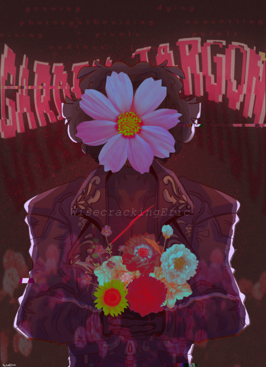
No. 6 Is my RE4R One Year Anniversary piece with 424 notes!! I've definitely improved a TON with my rendering since then
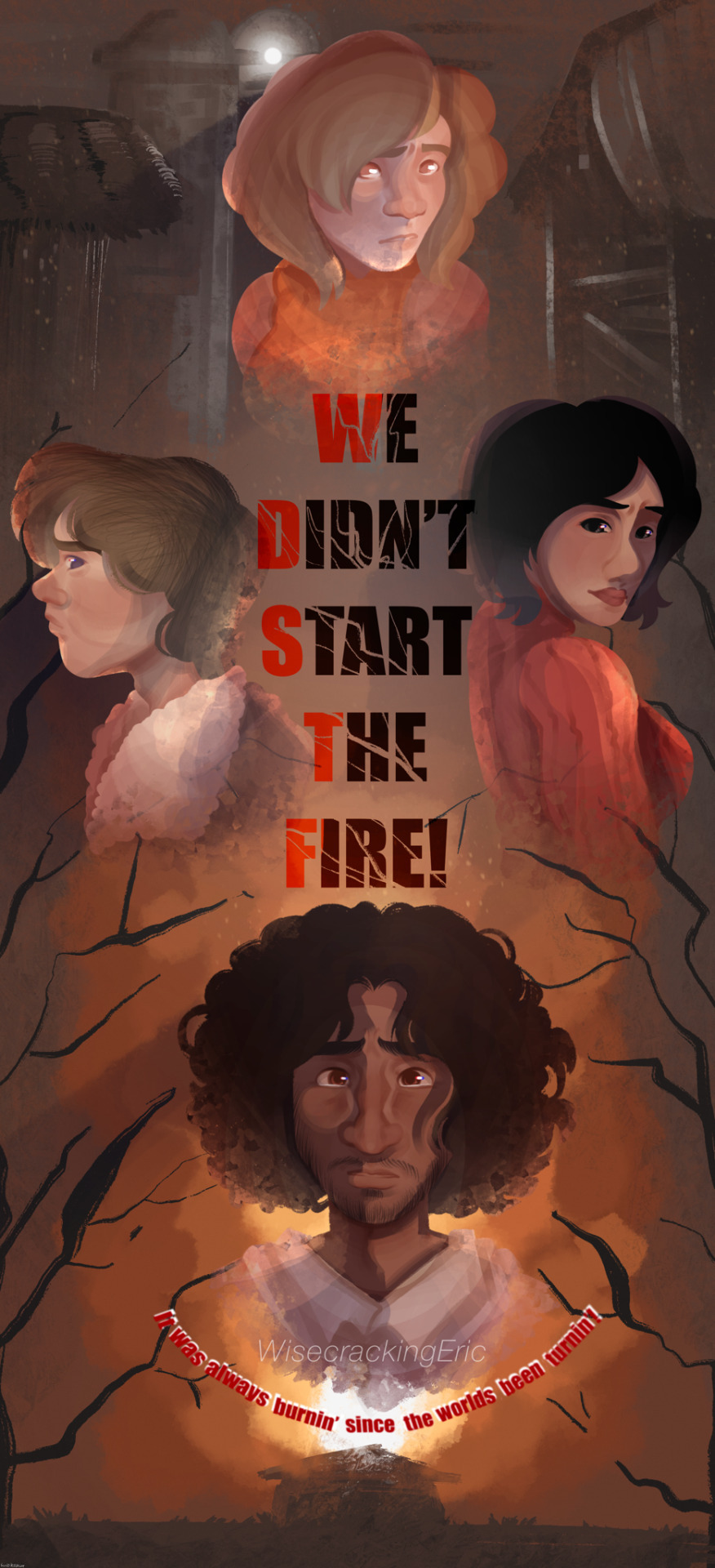
No. 5 is my Serennedy Pride Week Finale animation with 430 notes!! For an animation I did completely by myself outside of work/classes I'm really really proud of it!! :DD (and also I made a lot of people cry HGFFGFFDS)

No. 4 is ANOTHER animation that I'm ALSO super duper proud of with 651 notes!! I'm glad I wasn't alone in wanting to hold Luis' face gently and give him a lil kiss BCBDGHFSST

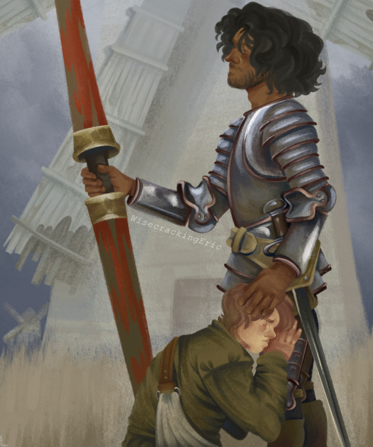
No. 3 is my Don Quixote Redraw with 834 notes!! Still to this day my absolute FAVOURITE painting I have EVER done I'm still so so beyond proud of it and I learnt so much while making it too <<3
No. 2 is this really silly doodle I did of the RE4R cast as horses that SOMEHOW got 963 notes??? How?? I have no idea!! My best guess is cuz Weskers there GDFHDJSDSSDB

AAAND FINALLYYYY AT NO. 1 IS This Cowboy Luis Piece with 1,295 notes!!!! STILL to this day my second most popular post ever, only second to This Piece from last year with 1,609 notes!! Horses stay winning I guess!!

I'll try and keep this brief cuz I don't want this post to be sad, but MAN this year has been rough!!! Between dealing with homelessness and the worst mental health I've ever experienced I'm SO glad this years over and done with, and I'm hoping 2025 will be a REALLY great year for not just me but everyone else too!! <<33
#ericsart#luis serra#luis serra fanart#luis serra navarro#luis sera#luis sera fanart#luis sera navarro#serennedy#resident evil#serrennedy#serrenedy
64 notes
·
View notes
Text

HIM
LOOK AT HIM LOOK AT THE LITTLE GUY I MADE!!!! First time rendering and it certainly won’t be the last wowee I could spend hours making these little guys.
Made with Autodesk Fusion 360 for free! I love me some good no-cost entertainment.
#3d render#low poly animals#low poly#low poly art#i made this#little guy#bear#art#autodesk fusion 360#juleboo
10 notes
·
View notes
Text
— HOMECOMING | SATORU GOJO
wc: 1.1k
cw: moving in together, implied childhood trauma/abuse, comfort/fluff, light descriptions of sex, established relationship, nervous reader.
author’s note: doing a little draft clearing <3

Moving in together managed to show all kinds of sides to Satoru’s girlfriend of almost two years. You planned every room, insisting on a theme for each to make it ‘fun’—which Satoru loved. His childhood had been nothing but sterile decor, too much white, or light beige, but you wanted cosy and he was completely onboard.
Warm lights and plants made everything seem closer and cosier, rendering the 360 penthouse windows mere spectators.
It felt as if every decision you made was done carefully, so you could fill every space with love and prepare it for the memories you would make together. As it came together it made Satoru’s gut pull with an unexpected feeling, walking into each room was like walking through the great mysteries of your mind, and embrace of your heart.
It made him realise that he was really starting his life with you, so he’d pick you up and spin you around with every step of progress.
You too saw different sides to Satoru, like when he insisted on driving to the only store who had the paint you wanted 60 miles away before the final one was gone. When he didn’t realise how rich he really was when getting an interior decorator isn’t the first thing you arrange, but when you tell him “I want it to be ours” he pulls you in a for a kiss and whispers, “anything you want.”
The next day when you’re shopping for bed sheets and you pick up some ones you think he might like, but he clicks and then softly hums, “Babe, they’re recycled polyester,” as he compares two paint splotches with one eye cocked shut.
Your mouth parts in surprise, “H-how can you tell-“
He sighs into a smile, cocking a brow at you, “Aren’t they?”
He was right.
But it’s the first week of living together that completely blindsides Satoru. When you sleep in one morning and he catches you walking almost silently around the apartment, afraid to make noise, afraid to exist.
He’s almost perplexed, frowning with his thumb to his chin, wondering if he should even call your name in case he startles you. You knock into a piece of furniture and your eyes widen like this is it, hell is about to break loose. Your breath quickens and you hurriedly realign it, before carrying on with quietened and now shaky movements.
The sight pulls on his heart, no—tugs on it until it feels like it’s not cemented in his chest. What had your first home been like? He needed you to know that this one was nowhere near the same, so he stops peeking in the doorway and says your name softly to get your attention.
But you still startle, yelping but then trying to laugh it off. But your palm is glued to your chest and your eyes are wide. He says your name softly, once more. You swallow and nod. When he says it a second time you draw closer, footsteps so soft he barely hears them, he feels like he’s coaxing an injured animal, suddenly wondering if his tall, broad frame is too overwhelming.
But then you place your hands on his forearms, stroking the veins that rest there, and press your cheek into his chest. “Hello,” you murmur in apology. He frowns, carefully wrapping his arms around your waist.
You hold onto him like somebody is trying to pry you apart. The sensation that erupts in his gut is so consuming, that he rocks you to keep himself together too.
You stay like that for a long time. Every squeeze and gentle caress carries silent words like, “You’re safe.”
But still, Satoru doesn’t ask. He tries not to ask you too many questions about anything you do in the apartment.
One morning after an especially late night, your shared laughter rings through the kitchen, Satoru’s whipping up a compote of berries for the plates of pancakes you’re arranging when you accidentally swipe your glass of orange juice.
Satoru startles so little it’s almost imperceptible, but your hands fly to your ears and you’re so stricken by the sight you look like you might just collapse. “I’m so sorry,” you chant, ducking to grab the shards of the broken glass.
But Satoru’s already leaning over and grabbing you, “It’s okay,” he says firmly, and you worry so much that he sounds upset. He’s not upset with you, he’s upset with how you have been failed.
He sits you carefully on the couch and kneels below you, you immediately cover your face with your hands. “Give me a moment.”
You sit curled up on the large pink couch, sinking into the array of blankets and pillows Satoru keeps arranged. He hums little songs to himself as he cleans away the mess, and before you know it he’s cuddling up beside you with one plate of pancakes instead of two.
He leans over and kisses your forehead, and says, “Let’s share?”
You nod silently and he makes a triumphant “hmph” sound, carefully cutting into the pancakes and bringing the heaped spoonful to your lips.
As you take the first bite, so warm, and fluffy and tasty it makes you feel so cared for your eyes grow glassy. Satoru pretends not to notice, humming to Chet Baker’s Let’s get lost, playing on the vinyl in the kitchen.
With every other bite he has one too, humming in content as he leaves the plate on the coffee table and helps you clamber onto his lap. “Thank you, Satoru.”
He cups your cheek and then kisses the tip of your nose, “It’s okay, sweetness…” His voice trails away, staring at you like you’re simultaneously the most bewitching and confusing thing he’s ever seen. “How can I help?”
You dither for a moment, reaching for his hand just to anxiously drum your fingers against it. “Just keep being you.”
Your words seem to reassure him. They reassure him to softly push your back against the couch and spread your thighs. He settles there like his true home is your body and not the place you’re even in, he takes his time to unravel you, making you burst until he realises he’ll have to get the couch cleaned. He shifts your hair from your eyes, loving you so good that you cry a little from how much pleasure he’s giving you with even the most minimal effort.
From then on, Satoru notices the day that you don’t jolt as he hugs you when he steps into a room, when you don’t flinch at loud sounds or startle when his voice fills the room
He asks you and then you begin to always say; because it’s only you.
He grins, enamoured and content, pulls you into his arms and whispers back. “Exactly, and you’re the safest when you’re with me.

©mrsackermannx: do not repost, plagiarise, translate or modify my works.
108 notes
·
View notes
Text


July 2024 Commissions OPEN
hello everyone! happy tail end of pride month. I wanted to make another commission post to update some of my prices and feature some more recent artwork :) I'm also offering a few new things! Weapon designs will feature a full 360* turnaround of a weapon or item, and you can now get another sketch for a reduced rate, or a fully rendered background. It's also cheaper than ever to get your party portrait painted, at a flat rate of 75$ per character, no matter the base price. A fully rendered couples' portrait is now 225$!
I will be using the money raised to pay pretty much exclusively for food and rent. Even if you're unable to commission me right now, reblogs would be much appreciated so I can afford my groceries this month. There will be no limitations on the number of slots, since the workload hasn't made it historically necessary, but I would love for this to be the time I'm proven wrong.
Check the tag on my blog #ghost art for more examples of my work!
the standard rules apply: 1. Spicy content is okay, provided the commissioner and commissioned characters are both 18+. These will not be shared publicly!
2. I do not draw in a traditional furry style (obviously). That being said, I'm happy to draw anthros or mechanical designs, provided I have references to work with. I'm also happy to draw fanart!
3. No drawn references? no problem! a written description is perfectly fine. Just know that if there's a lot of back and forth about a particular design, I may have to charge more to make sure my time is adequately compensated. I may also ask for photo references, if needed.
4. Blood and minor Injury is okay. I do not draw excessive gore. I will not draw violence of any kind being done to children or to animals.
5. Commissioned art will be posted on my social media publicly, unless otherwise requested specifically by the commissioner.
Thank you for checking out my work :)
#ghost art#dungeons and dragons#dnd#pathfinder#dragon age#final fantasy 14#orginal character#artists on tumblr#open commissions#art commissions#dnd commissions#dnd art#commissions#furry commissions#art comms#commission info#painting commissions#character design#character art#fantasy art#fantasy illustration#concept art#concept design#character concept art#dnd oc#dnd character#dnd 5e#pf2e
53 notes
·
View notes
Text
Microsoft XBOX 360 - Sonic World Adventure (Sonic Unleashed)
Title: Sonic World Adventure / ソニック ワールドアドベンチャー
Developer/Publisher: Sega (Sonic Team)
Release date: 19 February 2009
Catalogue No.: HEC-00002
Genre: 3D Action Adventure

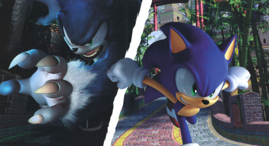
Sega's Sonic team development division, learning from Sonic 06's mistakes, made the XBOX 360 perform some pretty impressive tasks in their demos, some of which were used in their games. Sonic Unleashed is one of those games (the other one being 2019's Shin Sakura Taisen, a visual novel for the PS4). The game marks the first-ever time a Sonic game debuted with a rendering system dubbed by Sonic Team as the "Hedgehog Engine", designed specifically to handle the drawing of 3D geometry and environments in a fast-paced setting. (The game still uses CRI Middleware and Havok technologies in some parts).
As a result, compared to the likes of Sonic 2006, Sonic Unleashed is capable of producing CGI film quality graphics very similar to those from the best Disney/Pixar animated film properties. Yoshihisa Hashimoto who was the Director of this game at the time, spent months analyzing video games, CGI films, and even people and places in real life. He came to the conclusion that current-generation games are missing an element known in the computer animation field as Global Illumination.
This allows for a light source to hit a scene, and light is reflected off every object in the environment. To cover the vast amounts of calculations that needed to be processed, they also came up with a system that connected 100 computers for the team to distribute the workload. This enabled them to complete all the lighting calculations for an action stage (which is about 6-8 miles long) in 2 or 3 days.
Hashimoto's team also developed a technology called Light Field, which blended the characters naturally into the environments. With this technology, Sonic can run through an action stage while the light is being reflected off him naturally as if he “belongs” there (in contrast to past games where Sonic looks out of place in several environments). As a result, Sonic Unleashed manages to stand out from the rest of the platformers of its age in that rather than lowering the quality down to PS2 levels (as was the case with some early PS3 and 360 games around 2005-2007), the game uses pseudo-raytracing, coupled with the introduction of the then-novel Boost gameplay mechanic and a custom control scheme dedicated to the Werehog/Night levels, as well as a seamless day/night cycle to provide fast and smooth looking 3D environments.
Coupled together with the XBOX 360's great sprite and polygon capabilities for enemies and explosions and polygon-built ships (mainly those from Dr. Eggman), along with the PS1-quality ease of development that made the XBOX 360 the king in the eyes of general gamers, makes Sonic Unleashed look like quite a feast for the ears, as well as the eyes.
So how does it play? Well, I'm not too sure if it went down well in Malaysia but judging by how hard it is to find a copy, I'd say it wasn't well received (in my area). Most households in Malaysia probably only owned a PS2 back in the day, so the PS2 version of Unleashed is much more common. Globally though, and on the Sonic circles, I remember Sonic Unleashed being showered with praise the world over, with high critic scores and glowing fan and user reviews. This could be because Sonic Unleashed fixed the flawed controls that plagued '06 and turned the franchise's reputation from being stained into a great sendoff for the future, with great gameplay, a killer story, and an AWESOME mix of orchestral, rock, and miscellaneous soundtrack genres as you played all the way from Apotos (based on Mykonos, Greece) to Eggmanland (based on Luna Park Sydney).
There is a lot to blast and search for as well as getting yourself lost quite often in the Open World Hubs (^o^;) Oh and about the gameplay, the Daytime stages are some of the BEST that you'll ever see in terms of graphical fidelity (only bested by Frontiers, Shadow Generations, and the upcoming Crossworlds), and the Werehog stages, it's debatable, but it is pretty good to me. It's not 100% perfect though - there are some minor flaws such as very weird frame-rate issues, and falling down easily when using your ring energy, the Werehog levels can be very long but not as bad as other worse beat-em-ups on the 360 such as TMNT Turtles in Time Re-Shelled and Golden Axe Beast Rider. I wanted to call it "God of War inspired" but that would be me pulling the Sony fanboy card. Let's just say the combat reminded me of either Spike Out, Streets of Rage, or even Batman Returns on the Super Famicom, maybe a touch of Arkham Asylum and Arkham City (though these are later games). You need to replay levels to get the medals which become harder to find.
Bottom line, if you're into the odd type of action platformer with a killer story, then I think Sonic Unleashed will suit you. This game is compatible with XBOX ONE and XBOX SERIES consoles, and if you play it on an XBOX SERIES S or X, you get the added bonus of 60 FPS boost mode which is really awesome.




youtube
youtube
#xbox 360#microsoft xbox#sonic the hedgehog#sonic unleashed#sonic world adventure#sonic the werehog#chip sonic unleashed#light gaia#dark gaia#Youtube
10 notes
·
View notes