Text
i just remembered this acc....and found some unpleasant things........yay
1 note
·
View note
Text
im going to start a thread of pokemon drawn to the sizes of the things theyre based on
here, i’ll start

512K notes
·
View notes
Video
Um, you know, there’s a uh, during World War… Two, uh, you know, where Roosevelt came up with a thing that uh, you know, was totally different than a, than the, the, it’s called, he’s called it a, you know, the World War Two, he had the World, the War Production Board.
4K notes
·
View notes
Photo
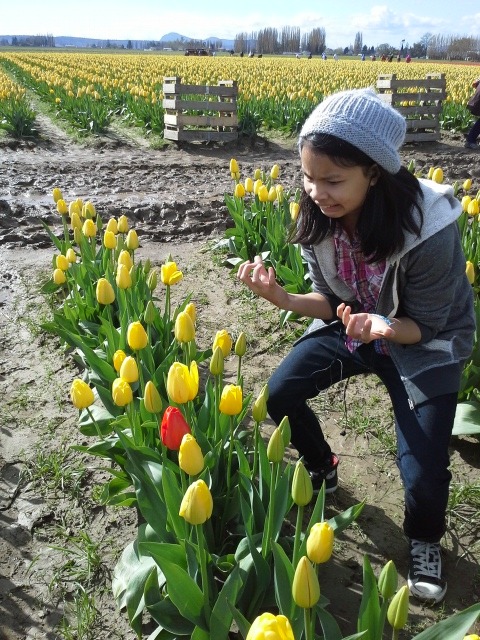
so my family went to the tulip fields and my little sister didn’t have a good time at all
1M notes
·
View notes
Text
hello dark mode users :)
. . ✦ ˚ . ✦ . . ゚ . • . , . . ✦ . • ✦ • ˚ . ☄ . . . • ✦ . . . . . . . ゚ . ✦ , . . ✦ . . ☀️ • . . . . • . . . .
✦ . ✦ . ✦ . • .
• . . 🌏 . . ✦ . • ✦ • ˚ . ☄ . . . . • . . ✦ . . . . . . . . . ゚ .
. . . . . . . . . ✦ . • ✦ • ˚ . . ☄ . • . . . . . • . . • ✦ . . 🪐 . . . . . ゚ . ✦ , . . . ✦ . • ✦ . 🌘 . . . . . . ゚ . ✦ , . . ✦ ✦ . • ✦ • ˚ . . ☄ . • . . . . . . ✦ ✦ . •
🔭
355K notes
·
View notes
Text




i thought it was important i shared my cat here too
#cat#photogenic cat??#my cat is literally everything i wanna be#like wtf#Bean?? ily???#im gonna make a instagram for her smh#cats#animals#LOOK AT HERRR.
5 notes
·
View notes
Text
Learn Log #4 - Grassy Grove
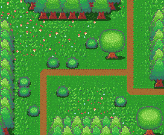
On week 4 of my pixel art journey, I learned how to make objects of nature including grass, bushes and trees. Unfortunately, I had to postpone this to this week when the learning and blog post was set for last week as I was just preparing for a return to university (it’s all online – social distancing dw). Anyway, I ended up making the forest scene you see above, and it was a lot of fun. I think that the GUI elements last week had a focus on technicality and exactness. Letters are very rigid, and we have somewhat set ideas about what each character should look like. However, nature is more flexible and therefore logic isn’t as heavily involved.
Tile Sets
Before jumping into the actual elements of this week’s piece I want to talk about making pixel art tiles. You will have probably noticed that the nature scene is quite rigid like each element is set into a box. This is because I’m learning pixel art to make games and games often use tile sprites to build their environment.
Tile sprites are the floors and sometimes walls of the environment. They often loop or repeat to cover the environment, however, some engines have tools allowing game designers to build environments tile by tile.
In the first case, the tile sprite will have to be created with its looping in mind and details may be added to provide variation in the environment. However, these added details may highlight the repeating the pattern and the more a detail sticks out the obvious the repetition becomes. Additionally, smaller tiles will repeat more frequently, and this also shows repeating textures.
The second scenario requires variation to be created from the creation of multiple tiles. This is great for creating variation; however, the tiles will also have to line up with each other which may be trickier for more rigid surfaces like rocks or bricks.
Since Unity has a tile builder tool and I was creating a natural environment where tiles wouldn’t need to line up so clearly – I decided to go with the second option.
The size of the tiles may also dictate the size of the rest of the game. For example, a bush may be 1 tile large in terms of level design, so the size of that bush is determined by the size of the tile. This also goes for the player whose sprite will typically range from 1 tile to 2x2 tiles. I decided to just make my tiles 16x16 as I enjoy learning within that space.
Grass
A grass tile is typically made of a green background with blades of grass texturing the surface. Many people may open up a couple of green canvases and start texturing them with green lines, however, there’s a much better way to do things I think. Since we’re working with 16x16 tiles there’s a limited number of shapes that look like grass and are small enough to fit within the tile. So, if we make a bunch of lines in green then we have blades of grass that we can copy and paste into each tile (the blades should typically be a lighter green as light will be hitting them).
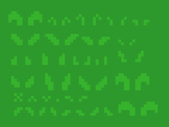
However, having blades of grass like this make tiles look flat. Adding shading will fix this issue by giving the grass depth, however, more complicated shading will obviously make the background more complicated which can affect the readability of your game.
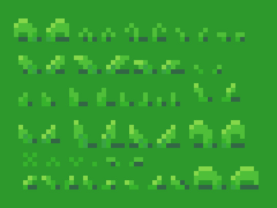
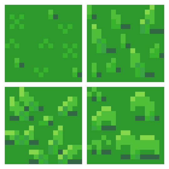
Each blade of grass can now be copied into a 16x16 canvas to make grass tiles. I made 4 grass tiles shown below putting approximately 10 blades into each tile. I made each tile with different elements of the environment in mind such as short grass, long grass, bushy grass and leafy grass.
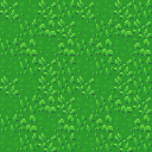
With these tiles, I created a larger image to test the repetition of the tiles. The repetition wasn’t a big issue; however, I didn’t think the leafy grass fit with the rest of the grass, so I decided to leave it behind for the next stage.
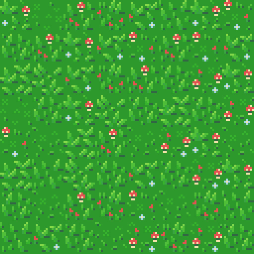
Next, I was going to add an extra tile for each of the current textures to reduce repetition as well as two flower variants for each tile type to add some colours into the textures. I did another test of the tiles’ repetition and overall look and it looked good but somewhat cluttered though I figured that this wouldn’t be an issue when I deliberately place the tiles rather than randomly scatter them.
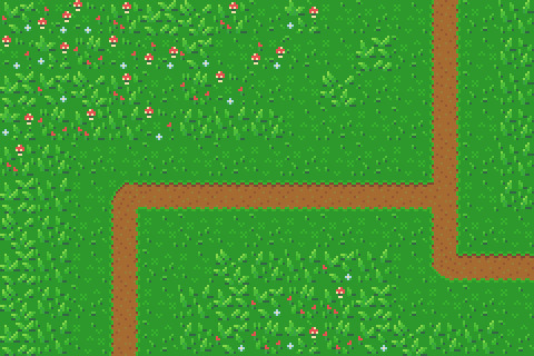
I had in my mind the type of scene I wanted to make for this week, but it required dirt paths. Luckily this wasn’t an issue to make. I made two variations of the straight, one-way paths as they would be tiling and altered one of these tiles slightly to make the curve and intersection tiles.

I then assembled these 15 tiles into the image below.
Trees
Next, I wanted to add some plant life which would involve trees and bushes. I decided to do trees first as they would be larger than the bushes. First, I started with the shape of the tree which would be fairly basic. I made a rough tree trunk shape to start with and topped it with a circle that was a little squished before refining the shape a little more to get what’s shown below.

I then added colour into the tree. A simple brown for the bark and 4 shades of green for the leaves. These greens were made by colour picking the base green background and hue-shifting it towards yellow so the tree would stand out more from the background.

The colours are organised into ovals to help give the tree a sense of depth. The dark shades wrap around the edges of the tree to show the tree’s roundness. The colour thins out as it goes around because you’re viewing the shaded leaves from a side-on perspective.
Next, I blurred the lines between these circles by mixing the colours slightly. This was the start of adding leaves onto the tree. Quickly after that, I added more detail to the leaves by spotting the head of the tree with lighter greens. The details added were in ‘leaf-like’ shapes like hearts, single lines, and arrows. They don’t look like leaves individually and can’t receive much detail themselves (such as a stem) but together they make the tree look nice and bushy. I also added some detail to the tree trunk including shading.

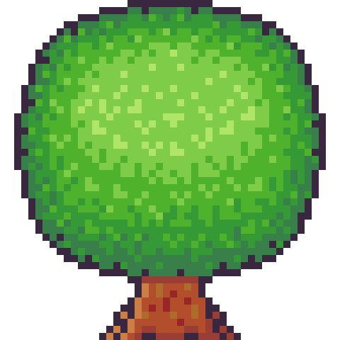
The tree trunk seemed a little off when I checked it out with the image I had so far, unfortunately. So, I added some extra trunk at the bottom along with a nice shadow. This shadow was the colour black at a transparency of 127 (or half transparency). This works really well as a quick and easy shadow on detailed background, but it does, unfortunately, mean the shaded area is not hue-shifted as typically preferred. The final product is below.
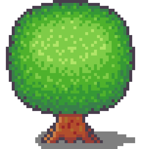
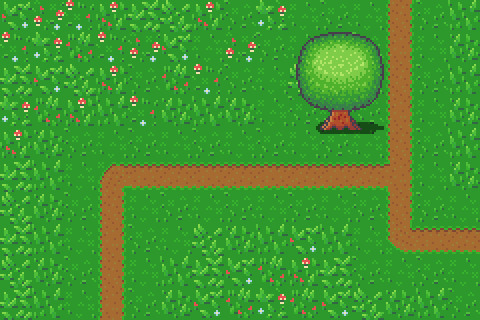
Looking at this sprite you may think it would be difficult to construct a game environment due to the leaves, trunk shape and shadow involved. However, we can place each section down as a separate 16x16 tile with the main trunk tile being a collider and other tiles not having a collision box (like decoration tiles – we don’t want players to run into tree leaves). This works out really well, and I focused on the main trunk tile when positioning the sprite in the piece. Which is shown below.
However, the scene below is bit lonely so I thought I’d add some pine trees as a level border. The process of the pine tree is similar so I won’t describe each step but will show the images. This time around I did shape the tree a bit more wildly with branches and leaves sticking out from the tree. I also hue shifted towards bluer colours rather than the more yellow colours I used in the round tree.
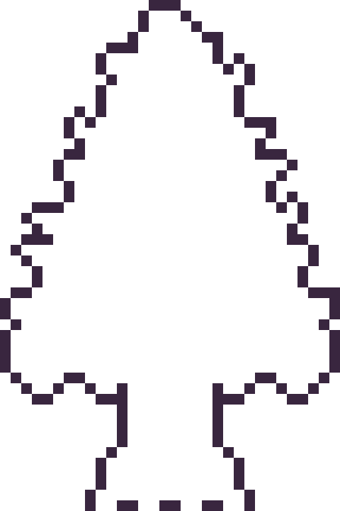
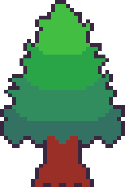
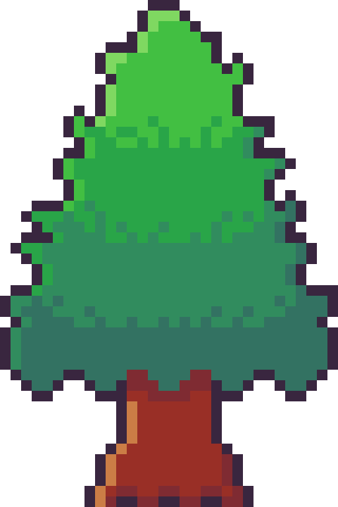

Next, it was time to add more trees into the scene and add some grass beneath them. I made the grass beneath them short grass simply because it looks a bit neater than the other grass types.
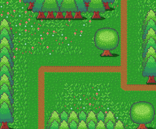
I think it looks pretty neat! I made a pine tree variant by swapping the colours with that of the round tree for some variation which worked as a nice, easy trick. But it would look livelier with some bushes.
Bushes
You might have looked at the trees just before and thought, ‘That kind of looks like a bush on a stump.’ That’s because the techniques used to make bushes and trees are typically very similar depending on the style of the game. Since we’re using a 16x16 size which is somewhat limited they will likely turn out in roughly the same way.

I started with a circle shape that was modified at the bottom to be a bit flatter. This will hopefully give the impression that the bush is touching the ground and rounds out on the top

I did a similar process in colouring the bush as I did with the tree, however, I used fewer colours as I didn’t have as much room for highlights with the bush. The colours used are actually the same as those in the pine tree.
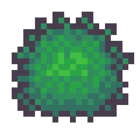
I then adjusted the outline to give the bush a wilder feel as well as texturing the inside of the bush to create the appearance of leaves.
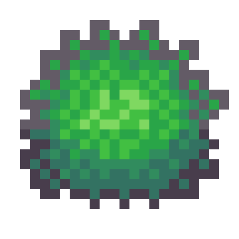
The bush still felt a little flat, so I added highlights to the top of it to add a greater sense of depth. The highlight was rounded towards its end at the bottom to enforce the rounded nature of the bush. This required me to add another outline tone for highlights which I might apply to other elements of the picture. I was pretty happy with the bush, so I made another for variation and added them into the picture with some shadows.
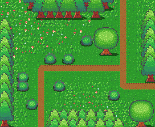
The picture looked pretty good, but I thought some touch-ups might make it just that little bit better.
Touch-Ups/Conclusion

To touch up the piece I added some more trees for denser looking forest, added the lighter outline colour to the tress and expanded shadows around some of the pine trees. I’m pretty happy with how it turned out. I think the shadows could use some refinement at the top border of trees. I also think that top border highlights the repeating pine tree trunk which could also be changed to tile better. I do wish my bushes were a bit leafier than shrub-like, however, I think my ability to make leaves on both bushes and trees will improve as I practice. I also think a 32x32 base picture would allow me to make some more defined leaves. The lighting on the pine trees also uses a different technique to the round tree so next time I’ll try to be more consistent with that. Overall though I’m happy and I quite like the outline highlights as they make the image a bit softer.
That concludes week 4 of learning how to make pixel art. Next week I’ll be looking at sand, water and rocks to make a top-down beach scene.
My learning and this blog post wouldn’t have been made possible without these fantastic resources. Go check them out if you wanna learn some stuff about pixel art!
How to Draw Tiled Pixel Art by TipTut
Creating Variation in Pixel Art TutsByKai
Pixel Art 101: Grass by Pixel Pete
How to Make Pixel Grass Tiles by TutsByKai
RPG Grass Background Tiles by HeartBeast
Pixel Art 101: Trees by Pixel Pete
[Let’s Pixel] Tree by HeartBeast
[Let’s Pixel] Spruce Tree by HeartBeast
Pixel Art 101: Bush by Pixel Pete
203 notes
·
View notes
Photo

It’s okay if all you did today was survive.
Art by Liberal Jane
8K notes
·
View notes
Photo
WITH 5 MINUTES LEFT

I have been waiting all year to post this.
2M notes
·
View notes
Text
don’t talk to me or my emotional support music album ever again
185 notes
·
View notes

