#2px outline
Explore tagged Tumblr posts
Visit Tumblr Blog
Explore Tumblr blogs with no restrictions, modern design and the best experience.
Last Seen Tumblr Blogs


Fun Fact
Tumblr was created by web developers David Karp and Marco Arment.
Text


#all caps#we're shouting tonight#gif warning#glitter text#rainbow#idek how to tag this one i think it'll find its audience. feel free to plaster on ur + ur friends donation posts etc#bloggif.com#porky s font#42px#2px outline#1px shadow#fag#dyke#queer
836 notes
·
View notes
Text
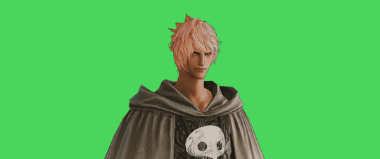
FF14 Battle Portrait Tutorial
For the past few weeks I was trying to find a way to recreate the battle portrait from FF14 as there was a few characters that I want to see in that style but don't officially have one yet. I think I got it down more or less (see image below) so I thought it's a good time to share what I did.

First of all, I made a few files that would help make life a little easier. They can be grabbed here .
Note: I did use Reshade to do a bit of work at the screenshot stage to help speed up the process but the same effect can be recreated in Photoshop with a vanilla screenshot. There are a lot of tutorials on how to do comic/cartoon effect in photoshop and those would make good bases to work off of.
Step 1: Take the screenshot with the PortraitBase Shader on. I usually take two screenshots. One with "Comic" on and one with it turned off. This is so that I have more to work with if needed.

Step 2: Drag all the screenshots into photoshop and remove the background. In photoshop, arrange the layer so that the screenshot with the Comic lines visible is on top of the one with the effect off.
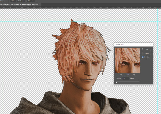
Step 3: Duplicate the the layer with the "comic" effect and apply Blur->Gaussian blur (radius 0.5)
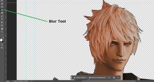
Step 4: Take a look at the hair. In Eric's case, It still doesn't look blur enough to me so I used the blur tool and blurred it a bit more
Step 5: Create a new layer above the layer in the previous step and use the brush tool to start outlining the edges. Where to outline is up to you but the idea is to make edges defined so that it looks more like a drawing.

Step 6: Duplicate the outline layer and then hide that layer. Step 7: Merge everything under the outline layer. Step 8: Drag and drop the "Texture.png" into the project and Clip it to your character layer. Set the blending of the texture to "soft light". Step 9: Drag and drop the "stroke Texture.png" into the project and Clip it to your character layer. Adjust the size till you are happy then set the blending to "overlay". Step 10: Adjust the opacity settings of both texture layers until it looks good to you.
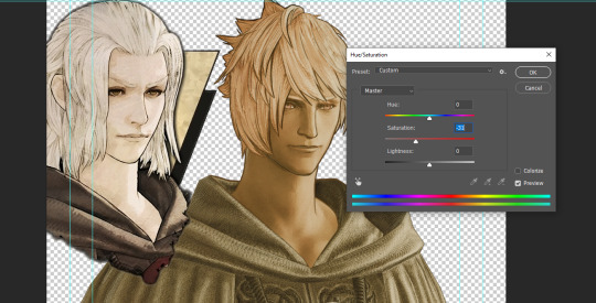
Step 11: Click on your character layer and go to image->Adjustments->Hue/Saturation (note: you will see I dragged in the official Hades portrait as a point of reference to work off of). Adjust the saturation till you are happy.
Step 12: Go to image->Adjustments->Color Balance and adjust the color till you are happy. In this example, since Eric is also wearing the Sophist robe, I tried to match that color to Hades' Sophist robe color.
Step 13: Once you are happy, drag the "Template.png" into the project and scale that to the size you want. Make sure it is completely covering the character. If it's not, you can just use paint more of it with the brush tool to extend it till it covers everything.

Step 14: Hide the "template.png" layer and select your character layer. Use the magic wand tool to select the outside of the character.
Step 15: With the selection still selected, click on the "Template.png" layer and press delete on your keyboard. You should now be left with a blank in the shape of your character.

Step 16: Drag the"Template.png" layer to be below your character layer. Then click on your character layer and clip it.
Step 17: Click on the "Template.png" layer and add a 2px stroke and shadow to it.
Step 18: Drag "Back_Deco.png" into the project and place it behind your character. Scale it till you are happy with it.
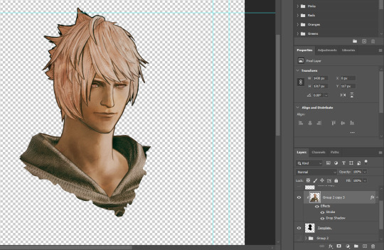
And that's it! Now you can recreate portraits for any NPCs that you want (in theory). A lot of it is also fine tuning to what you want but this should at least give you a decent base to work off of :)
971 notes
·
View notes
Note
Hello hello!! I just wanna start off by saying how GORGEOUS your art is! Truly inspiring. I was wondering what your process was? Again, your art is truly impressive
Thank you!! Oh man, it was a saga and you've opened a can of worms because my favorite thing to ramble about outside of sad gay space robots is our unholy overlord Photoshop (warning for length)
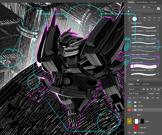
Hatching workflow: step 1: have too many Doré artbooks The refined process is thumbnail > cleaner sketch > black-and-white base OR 3D render > cut out whites > clean up edges > mask out each building/section > hatching lines with the upcoming layer setup
One:
And another:
Below is the layer setup I use for hatching! First I separated each element into its own folder, with its own mask—
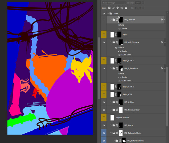
Then used this structure in each folder— I just want the hatching lines to appear black when on lit areas, and white on shadowed areas (as opposed to having to draw part of a line in white and another part in black). So, after separating the lit and shadowed sides, I copied the "Light" layer, clipped it on top of a folder of hatching lines, and inverted its layer mask.
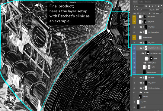
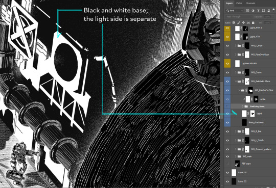
(*I draw on layer masks because it's easier to recolor lines + toggle between drawing and erasing with the "X" shortcut (I have fore- and background colors set to black and white for layer masks))
Sometimes I do a pass of grayscale values and overlay that layer on top as a reference while hatching.
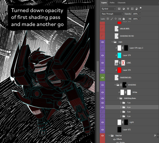
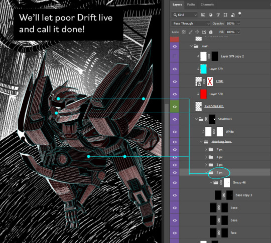
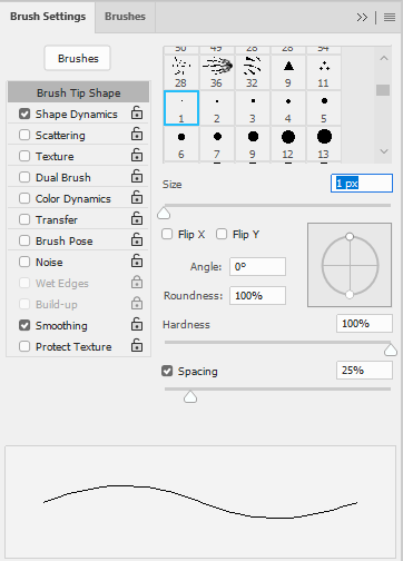
I've two main brushes: one choppier and one smoother and tapered at the ends (for thin lines, 2px-3px). Really thin horiz/vert lines are just the Pencil at 1px.
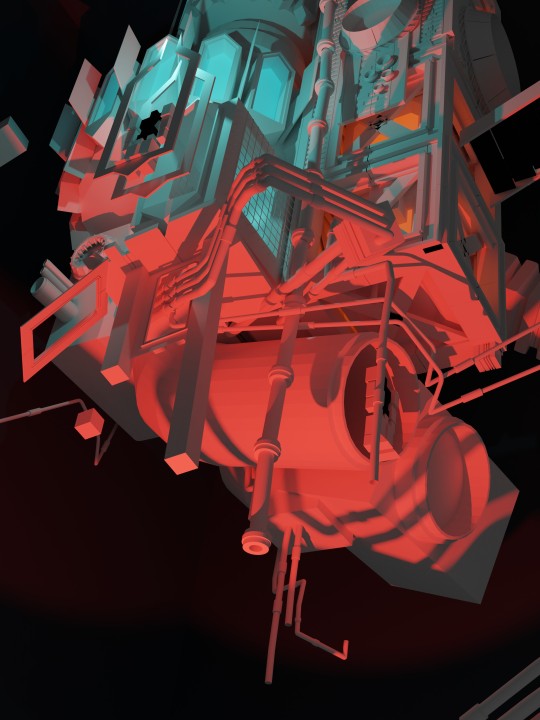
Black-and-white workflow with 3D:
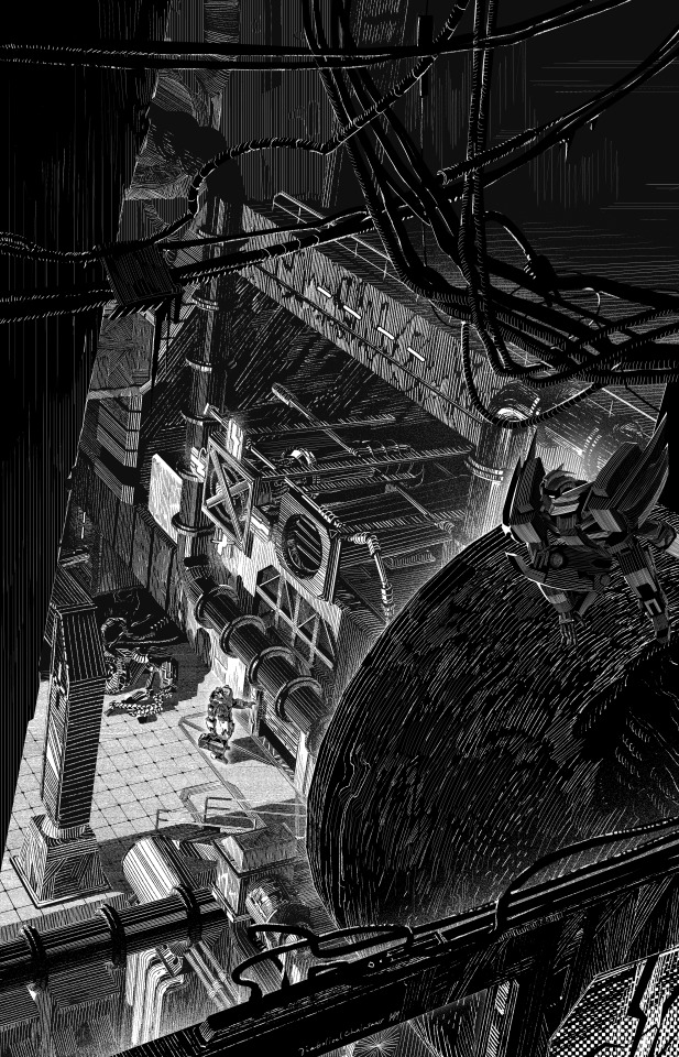
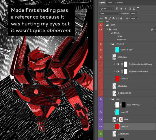
Tbh at first I only intended to make that one lurking Drift illustration. But I cower from 3D like it’ll kill me, so I turned it into a 3D assignment. First I used that "separate ways" piece to make myself model at low stakes (I just made items from the comic backgrounds and jammed them together), then I modeled the Dead End wide shot and got the final lurking Drift comp from that.
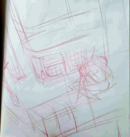
1. Drew enough detail to model (>see the 5th image in this post)
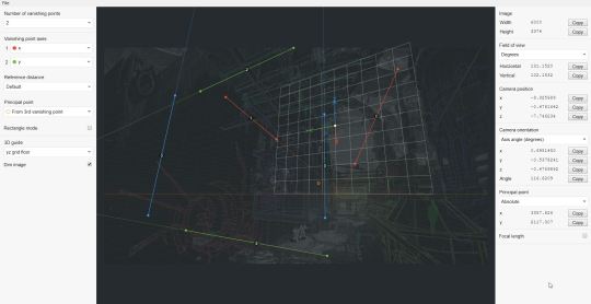
2. Used fSpy to generate a Blender camera that matched my perspective
3. Shoved together the barest essentials of the clinic set in Blender (setting the 5th image in this post as a background image in Viewport)
4. Rendered at hi-res twice: once with lighting, once with Freestyle outlines.
5. Changed clinic design in the close-up, so I went back to revise the wide shot.
In conclusion, my hobby is wrangling Photoshop to minutely speed up the extremely tedious and niche thing I can't stop myself from doing If anyone's got a faster way to do any of this, tell me!!
here's a gif for funsies because I get 1 more image on this post
#if anyone recognizes certain buildings from the photobash HELLO COMRADE where the hell can i get an idw megs flame toys kit in this country#i wrote this out before i realized you hadn't specified which process whoops#my brain's still full of fake engraving though so thank you for giving me an opening and well here ya go#process#photoshop#my art#blender#asks
248 notes
·
View notes
Note
what brush did hussie use to draw everything
He used the default hard round brush preset in Photoshop with the Pencil tool. Some newcomers to digital art might hear the word "pencil" and get confused, thinking it refers to a literal pencil texture brush, but it's a distinct tool from the typical Brush tool. In other programs, similar brushes might also be called the Binary brush or Pixel brush.
The Pencil tool is basically the same as the Brush tool, but draws the strokes with pixelated hard edges. The Brush tool on the other hand draws strokes with anti-aliasing, smoothing the outline of the strokes. This is done with semi-transparent pixels, something that the Pencil tool specifically does not use (hence why it could be called a Binary brush, because a pixel is either fully opaque or not).
Something to note is the version of Photoshop Hussie used: CS3. In CS3, if you had pen pressure enabled, the minimum brush size the strokes could go down to was 2px only (if the brush diameter was set to at least 3px). Setting it to 1-2px would not net you any benefits out of having a pressure-sensitive drawing tablet. In other words, brushstrokes can't taper off to 1px thin ends.
(Bear with me since I currently don't have a computer with Photoshop installed so I'm using these kinda shitty old demo gifs that weren't supposed to be used)
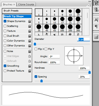
Photoshop CS3 brush engine
The brush engine changed slightly in versions after Photoshop CS3, however. Starting from Photoshop CS4, setting the brush size to 2px with pen pressure enabled would make the 2px brush size invert and jump up to 3px as the minimum brush size, while only going back down to 2px if you applied pressure or drew at an angle or something. (I unfortunately don't have any images on hand demonstrating this clearly.) Only setting the diameter to 3px makes the ends 2px, as you can see below.

Photoshop CS4 brush engine
You can still see this shitty behavior in Photoshop CC versions to this day:
Photoshop CC 2024 brush engine
Maybe this doesn't really matter too much if you're normally drawing hero mode panels, but it does produce slightly different results when drawing sprites.
Also if anyone tries to sell you on using a square brush, disregard them. They're an idiot, plain and simple.
78 notes
·
View notes
Note
hi kelli i love the gif set you made for jimin's birthday especially the "choose your album" one. is it possible you could give a tutorial or show how you made the effect? or the imessage one too its so cute!! only if you want!!
thanks anon 💛🥺 that's the first gif i started with when i started making the set because i wanted to make sure i could execute it well lol. i can break it down and show you how i made those, but i won't call it a tutorial since it might be messy lol. i also didn't come up with the concepts, so please note that i took inspo from gifs in sets like this, this, this, and this. since i didn't have any templates for these overlays, i referenced those as a guide for making my own.
i'll put this under a read more because it might be long.
we'll start with this one!!

there are three main things going on in this gif that i'll focus on: a playlist overlay, a cross-fade transition between mutliple elements (background gif, album logos, and years), and the "selected album" switching in conjunction with the transition.
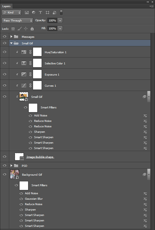
i like to organize all my layers into groups and label them so i can find everything easily if i need to make adjustments, so here is what my layers palette looks like for the finished gif.

i'll break down everything starting from the bottom since that's how you build things in photoshop.
the background gif is two gifs with the same amount of frames and similar camera movement because i thought the transition would look cool if the shot was circling around jimin in both gifs. i applied my sharpen and noise settings to each gif's smart layer, then put them both on the same timeline track. next, i dragged the cross fade transition with the fastest speed (0.25 s) onto the timeline between my gifs.

then i added a few adjustment layers to make it black and white with some contrast and grouped those into a folder labeled as "b&w psd" to keep it organized.
now time for the overlay group!
starting with the "player" folder first, here's what's inside.
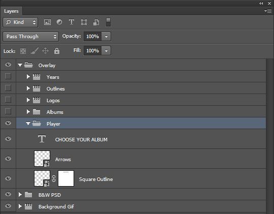
two smart objects and a text layer.
the "square outline" layer is essentially just a square that i selected with the marquee tool, then applied a new color fill with the fill at 0% opacity. then i added a 2px white stroke to it, which left me with just an outline of a square. i converted that to a smart object.
the "arrows" layer, i just used the eclipse shape tool (no fill, 2px white stroke) and some custom shape arrows inside. i duplicated those shapes, flipped them, then positioned each skip button where i wanted them before coverting them both to a single smart object as well.
then i added my "choose your album" text at the top of the square, selected around it with the marquee tool on the "square outline" layer, and applied a layer mask to erase where the outline cut through it. i made this all as centered as possible and made these three layers the same length as my background gif on the timeline.
onto the "abums" folder, here's what's inside.
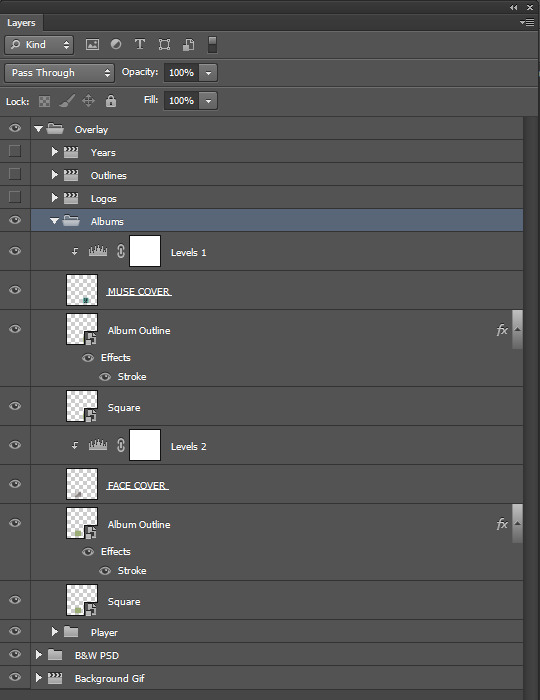
i made two 100px by 100px square shapes and positioned them along the bottom line of the big square outline with equal distance between the center and the corners. all i had to do was resize images of jimin's album covers atop each shape. i also clipped levels adjustments to both covers to make them pop.
the "album outline" layers are just duplicates of the square layers with a 2px stroke in alternate colors per that album's color scheme. i referenced album images and used the eyedropper tool for accurate colors.
to make the strokes visible at different times, those two layers are trimmed on the timeline at the very center of the cross fade transition on the background gif to emulate switching between albums. TECHNICALLY, no, i didn't need to keep the shape layers and i could have deleted them after i positioned the covers + added the stroke to a duplicated cover image instead, but i liked having them as a guide.
anyway it looks like this:
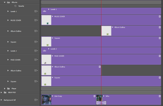
next, came the album title logos and extra text! here are the "logos", "outlines", and "years" folders open.

these are all in seperate folders because i stacked each title logo and it's outline back to back on the timeline in order to add the cross fade transition to them into each other along with the background gif. i thought it would look too abrupt if the logos changed without the same transition.
so i found large png files of each of jimin's album title fonts, made them white, and positioned them in the center. i set the blending modes on each of them to "exclusion", then applied a color overlay set to "color" in those same colors i used for the album cover outlines. i then duplicated the logos and changed the fill to 0%, added a 1px white stroke around them and then nudged them a few pixels away from the real ones for that depth look.
i also added the years each album came out too. i trimmed and stacked them accordingly on the timeline and added the same transition between them all as the one on the background gif.
here is what it looks like on the timeline:
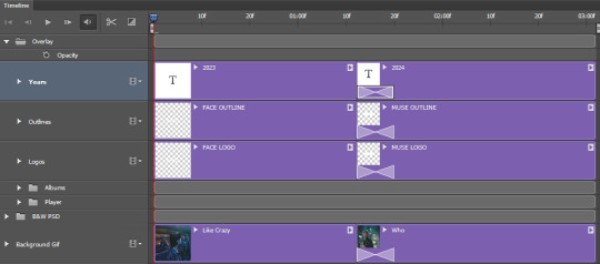
then i converted to frames and saved at 0.05 speed and i was done!
as for the imessage gif...
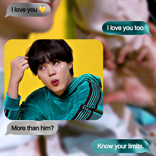
here's what my layers palette looked like:
i made my background gif blurry so it wouldn't distract too much from the smaller gif and the messages, but i still needed it to look clear. i really lucked out with that shot of jimin against a yellow couch with teal detailing on his sleeve because look how well it matches the color theme!!! AND he's making a hand heart??? score.
anyway, it was mostly about spacing all the imessage bubbles so everything was nice and equal. i didn't think i could make the bubbles look good if i made them manually with the shape tool, so i just searched for imessage bubble pngs online at differing lengths and made the ones i used white before converting them to smart objects. i resized them all to 48px in height and positioned them with 15px gaps between each other (10px from the top and bottom edges of the gif, 15px from the sides). i set them each to "exclusion" and added a color overlay to them set to "color" and chose which teal or gray color to use.
then i added my text on top of them.

the "small gif" folder is just a 280px high rounded square shape with my gif and adjustment layers clipped to it. there's a smaller 3px gap between the small gif and text below it just like an iphone displays images sent with text. i completely scored with this gif too since he's already against a yellow background and he's wearing green, so all i needed to adjust were the tones of those colors to get it as close as i could to the muse colors.
that's pretty much it!!! i hope you found this interesting or fun to read. thank you for liking the set and being curious how i made some of it <3
again, i can't take credit for these concepts. i only tried to recreate them to the best of my own abilities.
37 notes
·
View notes
Note
can you make a tutorial on how you made your header please (of course you don’t have to if you don’t want to)
hi anon! unfortunately as i was doing so my computer died so i've lost the original one </3 but we'll just make a new one using the same steps hehe! see under the cut.
i'm using photoshop 2024. open ps, and create a new canvas that is 640 x 360 px. add the image of your choice. the original picture i used was already rotated, but if you still want that effect and yours isn't, rotate it by 90 degrees. size it to your liking then click the check mark! after that, click your pen tool (or press p). create a rough outline of the areas you want outlined.

after that, click make selection at the top. the settings that pop up are fine. press ok. then, go to your marquee tool and right click on your outline. select stroke. choose the settings and color you want, im using 2px and making it white.

with that done, we can get to work on your text. the original font i used is called payback. here, i am using the font 'grandma house sans'. i am using gradient overlay, stroke and outer glow. after you have your main text, create a rectangle shape underneath. you will use this as the path for your subtext. with the rectangle selected, grab the font tool and place your text within the rectangle. i'm using the font asenine wide. once you have selected your text, look on the right side of your ps at the text properties. scroll down to paragraph and click 'justify all'

i'm adding a drop shadow and outer glow to the text to accentuate it but that's all i'll do. when that's done, you'll want to use the line tool to draw a line between the first space. duplicate the line and drag it over to the other empty space. i'm using a 1px purple line. i'll also add a drop shadow and outer glow to it bc the colors are light.

now, we are going to go back to our rectangle tool. create a rectangle the same length as the rest of the text. its color is up to you, i'm using a gradient overlay the same colors as the main text so it's cohesive! grab your text tool and again, with the rectangle selected, place your text within it. this text will be your tumblr url (unless you don't want it to be haha). i'm using the same font, asenine wide regular. i've added a drop shadow to the text. this is how it should look.

now, we're going to grab the rectangle tool one more time and place a rectangle at the top that is the same width as the canvas. the height is up to you, mine is 14 px.

now, change your shape to the ellipse and create a circle within the rectangle that's about 8px wide + long. duplicate it twice and place them about 4px from eachother. you can change the colors, i'm going to leave one white and then use two shades of light purple.
now, head on over to the other side of your canvas and use your type tool to add your date (and time if you wish, i didn't). mine is seventeen's debut date :) i used the same font, asenine wide regular. this is what i have so far.
last but not least, we're going to add the particle effect. i screenrecorded effect #5 from this video. to make your life easier and save me from explaining the process, i've uploaded it as a psd here.
before you open the psd, open the timeline on your current canvas. this can be done by going to window -> timeline. mine is already open as you can see, once it is open click create video timeline.

then, you're going to go over to sparkles.psd and copy the 'group one' layer. paste it underneath your text! now, you're going to have the wonky problem of a gif that's significantly shorter than your other layers and cuts off, see here:

so to fix this, use this little thingy and drag it until it no longer goes over the edge of 'group one' in your timeline. it should look like this.

now, why is our overlay still blocking the rest of our image out? this is an easy fix, go over to layers, and with group one still selected, change the blend mode to 'screen'. bam!

finally, to achieve the background effect i have, create a new layer underneath all your other layers, then, go to the layer with your outline on it and use the magic wand tool to select everything outside of the line. go to your image layer with the selection still intact and go to image -> cut to remove the bg. i had to do this in 2 pieces.

then go to that new layer you created and make it whatever color you want. you can use a gradient map, solid color, whatever you want. i'm using a gradient fill similar to background colors, then over it i'm putting a crumpled paper texture (i just googled black paper texture haha) on screen mode. feel free to get creative. this is how it looks!

and that's all, your header is ready to use. go over to file -> export -> save for web (legacy) and save it to your computer. this is our end result! i did add a bit of noise to hoshi bc the image was low quality but otherwise, i did nothing that wasnt't outlined here!

i hope this was semi easy to understand! ♡
#answered#tutorial#tagging some friends for exposure <3#tuserflora#userzaynab#userace#usermery#heymax#cheytermelon#rinblr#long post#image heavy
36 notes
·
View notes
Text


Tablilla 37: Severus - Ficha
Descarga: Código
Los colores están en el style con variables, ambas tablillas, tanto post como apertura llevan la misma estructura, si se cambia el color de una, se cambia de todas las que lo usen allí mismo. La único forma de que esto no suceda es cambiando la segunda class en esta parte:
<div class="hogsly vars">
De este modo (pongo la palabra helado como ejemplo, pero ponen la que gustan):
<div class="hogsly helado">
Y para que el css nuevo solo afecte a esta agregar o cambiar el css de este modo:
.hogsly.helado{--blancorgb:255,255,255;--blanco:#fafafa;--eee:#eee;--ddd:#ddd;--444:#444;--accentoa: #11698E;--accentob: #16C79A;--letra: "Ubuntu";--letrab: "Signika Negative";--grad:linear-gradient(90deg, var(--accentoa), var(--accentob));--gradi:var(--accentoa), var(--accentob);}.hogsly-txt::-webkit-scrollbar, .hogsly-txt::-webkit-scrollbar-thumb {border-radius: 10px;overflow: hidden;background: transparent!important;}.hogsly-txt::-webkit-scrollbar-thumb {outline: 1px solid var(--accentoa);outline-offset: -2px;}
#Tablilla#tablilla html#tablillas html#tablillas#tablillas foroactivo#codes#ficha#ficha de personaje#busqueda#busqueda de personaje
9 notes
·
View notes
Text


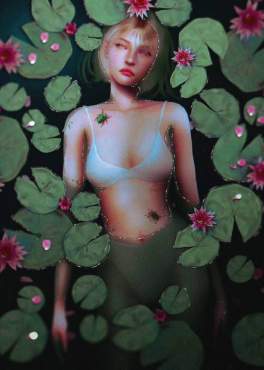
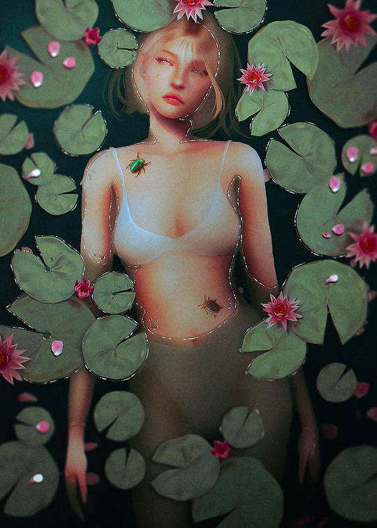
I've tried to do one of these half-submerged water edits many, many times, and I could never figure it out. I want to share what I learned with this edit because it seems a common sentiment that this concept is a little complicated. Hopefully, this info will help if you want to do an edit like this!
I painted the water with a color mask. I filled the whole canvas with medium green, lowered the opacity to about 60%, and erased where Amelia's body would peak through the water. I made the edges irregular to mimic how water pools. I used a hard brush, you want a lined edge, not a soft one. I recommend using a layer mask but you could do it with a regular layer.
The biggest concept I had to work with for this edit was depth. The highest points of Amelia's body would be about the water, but what about the deepest? I filled my canvas again with a darker green and shaded in parts where the water would be deeper; like the bend of her elbow and between her thighs. I recommend erasing with a soft brush.
Next, I outlined the edges of her whole body with a soft brush in the background color to blend Amelia's body into the pool of water. This helped her look more submerged.
This really helps it look like water: Where the body pools on top of her skin like around her armpits and on top of her belly ... I erased along the edges of my first green layer with a brush on ~35% opacity. I didn't want to erase it all but give the impression the water was thinner and more transparent.
I outlined the water on Amelia's body with a dark brown color, about 2px, on multiply, to help make the water look like it's rolling onto her body. If you go over onto the water later, don't worry it actually helps the effect.
After these steps, I continued to tweak things until I liked them. I added more shadows and some highlights.
I placed the lily pads next and added a small drop shadow under them so they looked like they were sitting on top of the water.
This step was my favorite part; I used a 1px white hard brush on 100% and drew different-sized lines along the edges of the water to create small reflections. I did it around some of the lilypads as well. This helps the water look more like water.
That is about all, I drew hair and added petals and bugs, then color grade the picture. The colorgrading really brought this picture to life!
I hope this helps anyone trying to create this kind of edit! I am always available if you have questions or if there is something I can help you with!
18 notes
·
View notes
Text

Holy shit I was working on this since late October, and I'm the most proud I've ever been of a picture I've drawn?
Details and graffiti transcriptions below the cut! 'Cause I worked on that shit for like three entire days, and I'll be damned if I don't show off some environmental storytelling word crimes.


So, first we have a couple closer looks of Sasha! Their outfit was pretty fun. I haven't done modern outfits in... probably ever, and it was nice having a lot more references to work off of.
Their sefirot necklace was fun to draw because I have one almost exactly like it. The flannel was the first time trying to do plaid by hand with a new little technique (Base colors+Multiply layer for dark stripes+Overlay layer for light stripes) but it went way faster than the god damn quilt?
All in all, my favorite detail was doing cosmetics, because I got to do little chips missing in the nail polish, and that's probably the first time I've drawn eyeshadow and willingly shown the result! : D


Next we have the little rat family in the background, with the wall-dwelling Rat King peeking through the wall, which is where I did dipped into tracing a couple photos instead of just looking at references.
Generally my process has been doing anatomy lines over a reference, then working off of those for about... three to four layers for body->clothes->hair->Full sketch, then another with whatever brush I wanna do the lineart with (usually a watercolor detail brush from one of two sets on Krita), but I'll note where I skipped that process and committed some art crimes.
The two background rats (Pestis and Mortar) are from a pair of stock photos from Getty, while the one in the foreground (Yersinia) is a mix of a pic that pops up in meme dumps from time to time of a smoking rat and a few bits that weren't in the original image. (Jewelry, the legs that were covered by an ash tray in the original pics, the "Buns and Roses" lighter she clearly stole from Sasha.)
Time for some graffiti transcriptions! Most of the variation in the graffiti came from switching the size of my brush and trying to mix up my handwriting, but there's a few segments where I use a font, then outlined the font with a 2px across brush to make it fit more into the art. Mostly, this was through screenshotting google docs, but some of the fancier fonts are from cooltext.com.
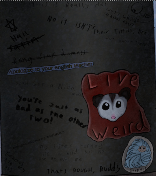
Top:
This is really high
No it's not?
Top Right:
A drawing of a clown that clearly used to be titties
"What's wrong with Bipo's eyes?" (Referring to the tape over the nipples)
"Their titties, bro"
"What about them?"
Top Left going down:
"Hail Satin" written next to a six pointed star
"Rong star, dumass"
A sticker reading "Apologize to your English teacher"
"Yeah, get a brian, morans!"
"You're just as bad as the other two!"
<The URL for the Wikipedia page on sarcasm>
Bottom Left:
Gazebos ate my ass
Bottom center:
"My sister turned into a bird but no one believes me."
"That's rough, buddy."
Bottom right:
A sticker of a possum with "Live Weird" written on it.
A sticker of a more poorly drawn character wrapped in blankets with "Seep eeps" written on it.

...So I made up a fake BDSM club for this one and named the majority of the bands dirty jokes, but I will die on the hill that there should be an all-trans metal band called "The Book of Dead Names."
CHOKE POINT
PRESENTS
LIVE MUSIC
THIS SUNDAY
CUNT MUNCHIES
THE BOOK OF DEAD NAMES
SOME GUY NAMED STEVE
FIST FUCK DUMP TRUCK
WOLFGANGBANG
THE PENIS MIGHTIER

A sticker with a set of vampire fangs that says "Got Blood?"
"Parasitic fucks"
"U got beef w/ Count Chocula?"
"Bro, vamps suck."
"Duh"
"So does your mum.
A sticker of a cross made out of a bunch of interlocking parts with some mirrored Hebrew in the middle. (I'm really proud of making this shape up on the spot. I had an idea for a religious monster hunter group named after the Watchers from Enoch, but I've got no idea if this story will ever happen.)
"Your Hebrew is backwards, you twatwaffle"
A sticker reading "Deus Vult"
"I fucking love Powerwolf"
"VULT DEUS NUTS, GOTTEM!
A cut off poster telling people to vote for, I presume, their favorite chainsmoking rat, clearly.

A sticker of the Autism Creature
"Rizz 'em w' the Tism" with the last S being the one everyone draws in school, but also backwards.
"It's like if Kirby was a centaur"
"I will never unsee that."
"It looks nothing like my vaccuum"
A paper with "Missing Printer" and a cut off phone number written in sharpie.
A meme of a bear in a suit (Partially a trace of the actual meme template) with "You have seasonal affective disorder because you need Vitamin D. I have seasonal affective disorder because one of my ancestors fucked a bear. We are not the same"
"Is that how it happens?"
"Oh, sure, this dude's ancestor fucks a bear, he gets a meme, BUT WHEN I-"
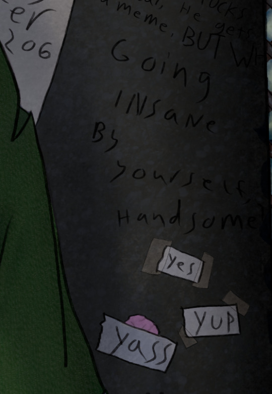
"Going insane by yourself, handsome?"
Three pieces of paper with "Yes" "Yup" and "Yass" written on them, two stuck on with tape, while the third is stuck to a wad of chewing gum.

"You guys seriously pay to print out memes just to vandalize shit?"
"No, I stole the printer, too."
"YOU"

"Paulie never died"
A sticker of the Mothman
"TAX FRAUD"

A large printout with a dramatic portrait of Mitch McConnell with "ARE YA BREEDING YET?" written below it. Several tear off strips are missing, but the remainder all say different variations of "Yes"
A cut off sticker of a smiley face
A sticker of a machete
"BURGLE TURTS"

A sticker of a crying laughing emoji.
A sticker of a pot leaf
A sticker with a picture of bigfoot with pasties on her boobs walking up to a stripper pole with "I want to believe" written in the X-Files font
"Whoever gave Bigfoot tits will never enter the Kingdom of God"
Three notes pointing to the previous message with "Noticed the tits first" "Weirdo" and "Your preoccupation with cryptid mammaries betrays your discomfort with your own sexuality. Consider meditation, therapy, or possibly fucking yourself!"
"Weirdo" pointing to the previous paragraph before being crossed out and replaced with "BASED"
"K, but y tho?"
"No one insults the Bigfoot big naturals on my watch"
(She has them in the Patterson-Gimli footage, too)
"BIGFOOT BIG NATURALS" "NOW LORE ACCURATE"
A swastika being covered up by a peace sign
"Degenerates should be purged" "AMEN" "U FIRST."
A drawing of a penis that's been turned into a weasel in a familiar pose with "Dick weasel" and "Had to do it to 'em" written next to it
A sticker of a stalk of corn labeled "CORN"
"See? Iowa is with us!"
And, finally, "Does reading this hurt your back, too?" which was the last thing I added because I literally spent two days just doing graffiti for this shit.


So, the map behind Sasha is made up on the spot, with some inspiration from a map of the Seattle Bay. Kinda proud of just how dirty this fucking place is, but the final, and greatest achievment in making this picture look grimy...
THE RUST


I didn't exactly nail the perspective on some of these (The sketchy layer for the floor grating was done once, then dragged into place and warped with the perspective... and then completely fucked that up) but god DAMN do I love texturing the fuck out of things!
There's like six Multiply layers scattered about because it turned out it's a phenomenal way to make the shading of multiple textures make sense without losing that texture, and I feel so god damn powerful!

Oh, right, the posters.
Not much to say about them. The righthand one was 95% traced from a mafia stock photo, while the hands in the left came from another stock photo.
Honestly, I drew the frames, then had no idea what to put in them. There was briefly gonna be a pic referencing a cosplay photo I have of myself, but eh...
The rats and the guy in the wall were originally referencing a Vampire the Masquerade character I had named Pretty Paulie, who was a mafioso turned nosferatu who dubbed his crew the Rat Pack. I figured if there was some kind of dramatic, Scarface-esque movie about him, he'd definitely find a way to keep the poster nearby, and I wanted to slap in one of those "Give blood!" posters from the Red Cross except... not from the red cross.
I don't really feel like I put in much effort into these (compared to the Graffiti-a-thon with several subplots), but hey... they covered the tile, which before shading was boring and very flat, so they did their job.


I'll leave you with some zoomed in textures, because I do feel proud about those! I make them via a combo of oil paint and watercolor brushes, usually with a whole lot of different coats of varying opacity until it looks like the thing it's supposed to be. :)
I've only just started drawing again this year (I've been editing a looooot longer) so there's a lot of spaces where I have hiccups, but I'm figuring out the areas I do well in.
...Also sweet Jesus this started as me trying to figure out what a character looked like. It says 3 full days worth of editing was done in Krita on this file, and I don't think it's counting the idle time.
#character art#original character#digital art#digital drawing#oc art#nonbinary character#trans artist
10 notes
·
View notes
Note
Hello there! Can I request tutorial for the white text on the Grogu gif from the blog header if UserGif accepts requests? It looks so cool. Thank you so much, UserGif. This blog is lifesavior for all new Gif makers.
hi! of course, we're always taking effect-related tutorial requests :) luckily, this effect is super easy to achieve! under the cut, I'll do a quick tutorial on how to turn any font into only its outline like this (and as seen on our desktop theme header):

1. arrange and format your text to your liking. here are the fonts I used in our desktop banner:
2. create a new blank layer and command + select the text you want to turn into an outline
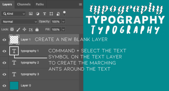
3. with the dotted lines around your text, click on the blank layer you just created and go to edit > stroke (make sure your blank layer is highlighted as shown above otherwise the stroke won't have a layer to go to)

4. adjust the stroke settings to your liking. I prefer to make the stroke on the outside, and I'll usually go between 1-2px for the width

choosing center or inside will make the final shape of your outline match more closely to your original text, if that's what you want. here's a comparison of the different "location" settings:

5. then you can just delete or hide your original text layer to remove the "fill" and voila! you have your outline!

hope this helps!
103 notes
·
View notes
Note
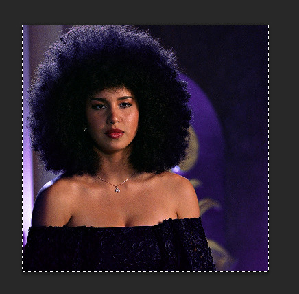
hi! do u mind explaining how u did the square overlay in this set? thank u sm 🫶🏽
hi sorry for taking so long to answer. i hope this helps and makes sense (if you have any other questions feel free to ask or I could even send you the psd if you want). tutorial below the cut as it's image heavy :)
So basically I started with my 2 gifs at 540x540 pixels. This isn't essential, but I'll also note that when I crop the gifs I like to uncheck the "Delete Cropped Pixels" box so that I can move them around after cropping in case I don't like how it was cropped initially.
For this gifset I ended up putting the two gifs and their colourings in a group with clipping masks for the colouring layers (curves, vibrance, etc). Making the two gifs into smart objects would also work and would be my usual preferred method, but for this particular set it was easier to use the groups so I could keep the colouring of the you weren't a maybe speech.
Once the gifs are overlayed on top of each other only the top gif should be visible (as below)
To create the grid effect there are some tutorials for versions of photoshop which have a setting where you can just input the configuration you want (e.g 4x4) and it will draw up the guides for you. Here is the initial tutorial I saw showing how to do that and another one I found just now which outlines the exact same grid effect as in my set. This way is easier than the way I did it, but my photoshop doesn't have the option 😭
For mine I created a New Guide by following the menu path "View > New Guide"
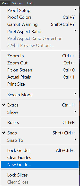
This opens up a dialog box that looks like this

As the guide menu is in cm I doubled checked what the size of the canvas is in cm. A 540 x 540 px canvas comes to 19.05 cm. I wanted to draw a 4x4 guide, so to start I divided 19.05 by 4. This comes to 4.76, so I input this value into the box and clicked ok.

To draw the other lines I just added 4.76 to each previous line drawn so that the lines were even. The guides ended up being (4.76, 9.52 and 14.28). I then repeated the same numbers but with the Vertical orientation button selected.
This gives you a guide which looks like this:

To start exposing the other gif I grabbed the rectangle select tool and started selecting the areas I wanted to mask. The tool should snap to the guides so it is fairly easy to stay within the squares.

Then I just masked over it with a black paintbrush

I continued on with this until I was happy with how it looked - this was my final result
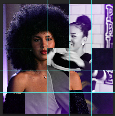
And this is how my layer mask looked
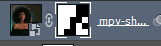
To draw the lines I then selected the line tool and set it to white and 2px. To draw them I held down the shift button, which allowed me to snap the line I'm drawing directly on top of the guides and continue with it as all one shape.
When you draw on top of the guides they go orange
I then toggled the guide off by pushing ctrl + ;
I checked to make sure all the boxes and lines were aligned properly and just cleaned up the gifs by using the selection box and masking until it was perfect (as I'm very type A)
I set the line layer to "Lighten" blending mode and an opacity of 70% as I thought it looked better.
Then I just added the text and moved it around how I pleased.
#asks#resources#tutorials#ps help#usergif#completeresources#allresources#i really hope this makes sense and helps :)
86 notes
·
View notes
Text

#glitter text#pink#trauma#whats the like pink sparkly hello kitty trauma tag. im there these go there.#gif warning#i get nauseous when i remember#burden#bloggif.com#traumacore#verdana Bold Italic#verdana font#2px outline#43px
596 notes
·
View notes
Text
AO3 Site Skin - DarkPurple
for @beastlyinstrument

Theme colors: #070707, #191919, #f2f2f2, #541f7b, #551f78
Code to copy below the cut ↓
#outer .region, #footer .group, .post fieldset fieldset, fieldset fieldset { background: none; }
body, .group, .group .group, .region, .flash, fieldset, fieldset fieldset ul, form dl, textarea, #main .verbose legend, .verbose fieldset, .notice, ul.notes, input, textarea, table, th, td:hover, tr:hover, .symbol .question:hover, #modal, .ui-sortable li, .required .autocomplete, .autocomplete .notice, .system .intro, .comment_error, .kudos_error, div.dynamic, .dynamic form, #ui-datepicker-div, .ui-datepicker table { background: #070707; color: #f2f2f2; border-color: #191919; outline: #191919; box-shadow: none; }
#header .actions a:hover, #header .actions a:focus, #header .dropdown:hover a, #header .open a, #header .menu, #small_login, .group.listbox, fieldset fieldset.listbox, form blockquote.userstuff, input:focus, textarea:focus, li.relationships a, .group.listbox .index, .dashboard fieldset fieldset.listbox .index, #dashboard a:hover, th, #dashboard .secondary, .secondary, .thread .even, .system .tweet_list li, .ui-datepicker tr:hover { background: #070707; }
#header .dropdown .menu a:hover, #header .dropdown .menu a:focus, .splash .favorite li:nth-of-type(odd) a, .ui-datepicker td:hover, #tos_prompt .heading, #tos_prompt [disabled] { background: #191919; }
#outer, .javascript, .statistics .index li:nth-of-type(even), #tos_prompt, .announcement input[type="submit"] { background: #070707; }
#header ul.primary, #outer #footer, .toggled form { background: #191919; }
#header ul.primary, #footer, #dashboard ul, dl.meta, .group.listbox, fieldset fieldset.listbox, #main li.blurb, form blockquote.userstuff, div.comment, li.comment, .toggled form, form dl dt, form.single fieldset, #inner .module .heading, .bookmark .status span, .splash .news li, .filters .group dt.bookmarker { border-color: #070707; }
.group.listbox, fieldset fieldset.listbox, #main li.blurb, .wrapper, #dashboard .secondary, .secondary, form blockquote.userstuff, .thread .comment, .toggled form { box-shadow: -1px -1px 1px #541f7b; }
#dashboard .current, .actions a:active, #outer .current, a.current, .current a:visited, span.unread, .replied, span.claimed, dl.index dd, .own, .draft, .draft .unread, .child, .unwrangled, .unreviewed, .ui-sortable li:hover { background: #191919; border-color: #551f78; box-shadow: 0 0 1px #541f7b; }
input, textarea { box-shadow: inset 0 1px 2px #541f7b; }
li.blurb, .blurb .blurb, .listbox .index, fieldset fieldset.listbox, .dashboard .listbox .index { box-shadow: inset 1px 1px 1px #541f7b; }
#footer a:hover, #footer a:focus, .autocomplete .dropdown ul li:hover, .autocomplete .dropdown li.selected, a.tag:hover, .listbox .heading a.tag:visited:hover, .symbol .question, .qtip-content { background: #541f7b; color: #191919; }
.splash .favorite li:nth-of-type(odd) a:hover, .splash .favorite li:nth-of-type(odd) a:focus { background: #541f7b; color: #191919; }
#header #greeting img, #header .heading a, #header .heading a:visited, #header .user a:hover, #header .user a:focus, #header fieldset, #header form, #header p, #dashboard a:hover, .actions a:hover, .actions input:hover, .delete a, span.delete, span.unread, .replied, span.claimed, .draggable, .droppable, span.requested, a.work, .blurb h4 a:link, .blurb h4 img, .splash .module h3, .splash .browse li a:before, .required, .error, .comment_error, .kudos_error, a.cloud7, a.cloud8, #tos_prompt .heading { color: #541f7b; }
#greeting .icon, #dashboard, #dashboard.own, .error, .comment_error, .kudos_error, .LV_invalid, .LV_invalid_field, input.LV_invalid_field:hover, input.LV_invalid_field:active, textarea.LV_invalid_field:hover, textarea.LV_invalid_field:active, .qtip-content { border-color: #541f7b; }
a, a:link, a.tag, #header a, #header a:visited, #header .primary .open a, #header .primary .dropdown:hover a, #header .primary .dropdown a:focus, #header #search input:focus, #header #search input:hover, #dashboard a, #dashboard span, #dashboard .current, .heading, .group .heading, .filters dt a:hover { color: #f2f2f2; }
a:visited, .actions a:visited, .action a:link, .action a:visited, .listbox .heading a:visited, span.series .divider { color: #f2f2f2; }
.actions a, .actions a:link, .action, .action:link, .actions input, input[type="submit"], button, .current, .actions label, #header .actions a { background: #551f78; border-color: #191919; color: #f2f2f2; box-shadow: inset 0 -8px 4px #551f78, inset 0 8px 7px #551f78; text-shadow: none; }
.actions a:hover, .actions input:hover, #dashboard a:hover, .actions a:focus, .actions input:focus, #dashboard a:focus { color: #551f78; background: #191919; border-color: #191919; box-shadow: inset 2px 2px 2px #191919; }
.actions a:active, .current, a.current, .current a:visited { color: #f2f2f2; background: #551f78; border-color: #f2f2f2; box-shadow: inset 1px 1px 1px #070707; }
.delete a, span.delete { box-shadow: -1px -1px 2px rgba(255,255,255.25); }
ul.required-tags, .bookmark .status span, .blurb .icon { opacity: 0.9; border: 0; }
#outer .group .heading, #header .actions a, fieldset.listbox .heading, .userstuff .heading, .heading, .userstuff h2 { text-shadow: none; color: #f2f2f2; background: none; }
#header .actions a, fieldset fieldset, .mce-container button, .filters .expander { box-shadow: none; }
fieldset fieldset.listbox { outline: none; }
form dd.required { color: #f2f2f2; }
.mce-container input:focus { background: #f2f2f2; }
.announcement .userstuff a, .announcement .userstuff a:link, .announcement .userstuff a:visited:hover { color: #191919; }
.announcement .userstuff a:visited { color: #551f78; }
.announcement .userstuff a:hover, .announcement .userstuff a:focus { color: #551f78; }
.event.announcement .userstuff a, .filters .expander { color: #f2f2f2; }
.chapter p { font-size: 110%; }
114 notes
·
View notes
Note
First off, I am absolutely losing my mind over Supermassive Retinol Overdose it is so good I keep re-reading it!!! The art is so cool and I love how much of a mindfuck the story is
Second, how do you do the colored flashback textbox thing, if you don't mind me asking? At first I thought it was just an image but it's actual text with a cool ass dramatic box around it
Third, I am absolutely drawing Frenchbread like what a character I love her
thank you! i can't wait to see fanart lol make sure to remember her two sets of bangs. they're critical.
i'm answering this publicly because i don't trust tumblr to not eat the css. anyway this is the css for the first box, which is a <div> element:
#workskin .smokeDreamOne {
background: #110f0f; color: #E4A5A5; padding: 20px; border-radius: 35px; border: solid 2px white; outline: 3px solid #110f0f; box-shadow: 0 0 0 6px white, 0 0 0 10px #110f0f; margin: 20px 10px; }
#workskin .smokeDreamOne br {
display: none; }
each individual box has its own styling because i change the color of the background/text to match the image inside. this box is the "red" one at the beginning of the fic. the br element is there because AO3 puts fucking <br> tags on everything and i hate it so i make them vanish.
fyi in case you don't want to use this on AO3: this is not the ideal way to implement a four-border curved box as the border/outline/shadow rendering puts a lot of strain on some mobile browsers during the scroll action (side-eyeing safari), however due to AO3 css parser limitations it's a sacrifice i had to make lol
20 notes
·
View notes
Text
Tidbit: Persnickety About Posters
If you want to avoid overly dark or blurry posters in your fan adventures, then follow my lead:
1) Download JPEG off of Google Images.
2) Import, scale down, and skew/shear it. Use an interpolation method such as Bilinear or Bicubic Sharper. Doing both transformations at once is better than repeatedly transforming the image (i.e. resizing it, applying the transform, and then skewing it), as it helps prevent the image and edges from becoming too blurry. This will be important later.
You can hold down Ctrl + Shift to constrain the Move tool along a single axis so it won't go out of alignment as you're skewing it. If you don't see the Transform Controls by default, enable it in the tool options bar at the top, or go to Edit>Free Transform.
3) Desaturate it. Desaturate means to turn color grayer, until it becomes black and white.

4) Adjust the brightness and contrast using the Levels adjustment tool. It's much too dark as it is! In Photoshop, it is located under Image>Adjustments>Levels..., but I recommend creating an adjustment layer from the bottom of the layers tab instead. Doing so will allow you to make edits non-destructively, meaning you can go back and change any parameters until it looks right.

You could use a Brightness/Contrast adjustment with "Use Legacy" enabled instead to achieve a similar effect, but it won't clip the shadows and highlights as easily. You would have to create an additional duplicate adjustment and turn the brightness and contrast way down on the first one to do so. It's somewhat easier to use but less efficient than Levels in this case.
5) Apply a simple sharpen to the image as it is still too blurry for our purposes. In Photoshop, it is located under Filter>Sharpen>Sharpen... Do not use any other filter, such as Unsharp Mask, unless you absolutely have to in lieu of a basic one. If you must, turn down the radius a bit and the threshold all the way to 0.
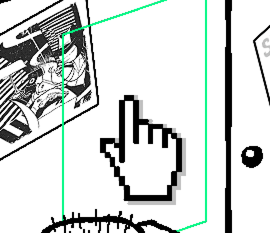
6) Make a selection around the image. Ctrl + left click on the layer's thumbnail to make a selection around it. Doing it this way makes it inherit the level of transparency any pixels have. If you can't, use the Magic Wand tool with "Anti-alias" enabled to select the transparent area outside, then invert it using Shift + Ctrl + I, or go to Select>Inverse.
Create a new layer above the image, then go to Edit>Stroke... and add a black stroke with a width of 2px located Outside. Leave everything else at the default. Doing it this way will create a stroke with anti-aliasing based on the selection you made. This should generally turn out pretty sharp if you follow my advice from Step 2. If you had used the Stroke Effect available from the Blending Options' layer styles, it will always result in a very smooth outline instead. You do not want this.
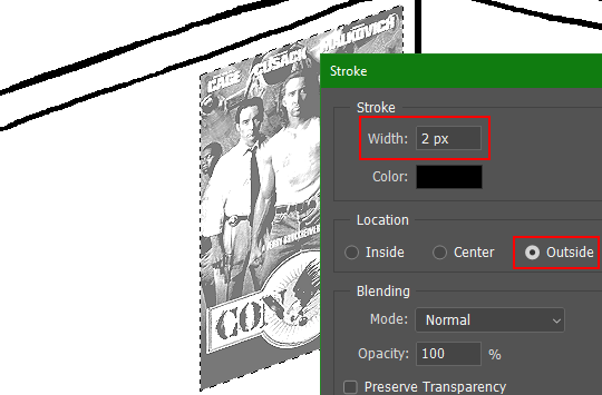
Voila, and Bob's your uncle, you're done!

The instructions above are Photoshop specific, but it should still be pretty software-agnostic. Here is the recreation PSD, and below the read-more link are additional notes, such as transferring the steps to something like GIMP.
ADDENDUM
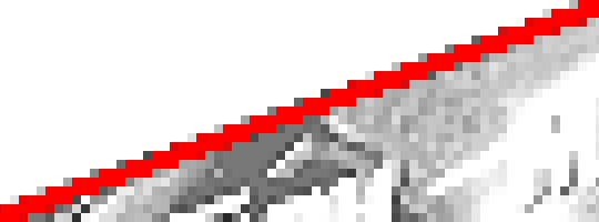
You may be questioning why I deliberately made the stroke anti-aliased. "Isn't that an MSPArt cardinal sin??", I hear you clamoring. Well, my dear readers, let me briefly elucidate you on why your ass is wrong. Exhibit A:
The clearly semi-opaque pixels that can be found in every poster outline, which is especially pronounced here in the Little Monsters poster. I can also see that Hussie actually created a stroke on the same layer as the poster and merged it down into the white background like a dumbass. I omitted this in step 6 for the sake of convenience (and also the fact that you can't add a stroke to a smart object in Photoshop without rasterizing it first).
He had to use the magic wand tool in order to extract it from the layer for this panel, and then fill it in with the paint bucket tool. I can even tell he had the color tolerance set up very high on the magic wand to grab all those near-black and very light gray pixels, AND he had anti-alias enabled and the tolerance on the bucket tool set to be at least higher than 0 to tint similar colors. Exhibit B:

I also didn't address exactly how to desaturate something in Photoshop. Honestly it was because I was feeling pretty lazy. I would have had to rewrite step 4 to not include redundant information about adjustment layers. You can add either a Black & White adjustment layer or a Hue/Saturation one and turn the saturation all the way down to 0. The resulting tones will be slightly different from each other but I'll explain why that is in another tutorial.
Speaking of another tutorial, read this one if you believe this post is missing the step of using a posterize filter.
Now onto applying some steps to GIMP.
RE: step 2) In GIMP, there is a dedicated Unified Transform tool separate from the Move tool, unlike in Photoshop where both features are combined into one. This is how you scale and skew (AKA shear in GIMP) both at the same time, among other things such as rotating.
You'll also find that instead of any interpolation methods labeled "Bilinear" or "Bicubic", there are only ones named "Linear", "Cubic", "NoHalo", and "LoHalo". Basically, Linear and Bilinear are the same, so are Cubic and Bicubic, naturally. I guess NoHalo would be similar to Bicubic Smoother and LoHalo would be kind of similar to Bicubic Sharper as well. It's not an exact 1:1, though.
Honestly it doesn't really matter what you use to reduce the size as long as it isn't None/Nearest-Neighbor. You're going to have to sharpen it no matter what. This applies to Photoshop as well.
RE: step 3) Go to Colors>Hue-Saturation... and repeat turning the saturation down to 0, or go to Colors>Desaturate>Desaturate... and select the Lightness (HSL) method.
RE: step 4) Go to Colors>Levels... or Colors>Brightness-Contrast... The Brightness-Contrast adjustment tool already functions almost exactly like in Photoshop with "Use Legacy" enabled.
RE: step 5) In GIMP 2.10, the developers squirreled away the basic Sharpen filter, making it inaccessible from the Filters menu. To use it, hit the forward-slash (/) key or go to Help>Search and Run a Command... to bring up the Search Actions window and type in "sharpen". Select the option that just reads "Sharpen..." and has a description of "Make image sharper (less powerful than Unsharp Mask)". I find that using a sharpness value of around 40 to be similar to Photoshop's sharpen filter.
RE: step 6) Instead of holding down Ctrl, you hold down Alt and click on the layer thumbnail to make a selection around it. Make a layer underneath the image this time since there isn't an option to place the stroke outside the selection rather than the middle. Go to Edit>Stroke Selection... and create a stroke using these settings:

I recommend keeping anti-aliasing disabled however, as GIMP produces lines that are a little too smooth for my taste.

With "Antialiasing" enabled
Without
If you're using a program that doesn't have a stroke feature available, you could draw a straight 1px thick line across the top of your poster, duplicate it, and move it down 1px. Merge them together, duplicate it again, and move it all the way down to the bottom of the poster. Then repeat the exact same process for the sides. I used to do this before I even knew of the stroke feature, haha.
Another reason I had to do it this way was because my dumb ass did the thing I said not to in step 2, scaling down the image with the scale tool, and then shearing it separately with the shear tool. This caused the edges to become too blurry to be used for a stroke automatically. Oh well, live and learn.
143 notes
·
View notes
Note
hey um how did you code your search bar? sorry to bother ive just been googling around like a headless chicken and have no idea what im doing trying to customize my theme. ty for your time! sorry to bother
No worries! I made it based on the search bar from the theme itself, though by comparing the both of them I realize they hardly resemble eachother. Here's the CSS for mine: (note that .search-bar-disable and {select:Search bar} are specific to the theme I'm using)
.search-container { width: 100px; border-top: 2px border-radius: 2px; padding: 0 5px; padding-left: 2px; transition: 0.3s width ease-out; } .search-container.search-bar-disable { display: none; } .search-container li { padding: 2px 4px; width: 100px; padding-top: 2px; padding-left: 1px; transition: 0.3s; border-radius: 2px; transition: 0.3s width ease-out; } .search-container:hover { background: transparent; } .search-container input { font-size: 1em; padding-left: 3px; height: 20px; width: 100px; display: inline-block; color: #333; background: #f0e2d9; transition: 0.3s width ease-out; } .search-container input:focus { outline: 0; width: 139px; transition: 0.3s width ease-out; }
As for the search function itself, here's the html (the only thing I did, iirc, was add the "Search..." text to it)
<div> <li class="search-container {select:Search bar}"> <form action="/search" method="get" class="search-form"><input type="text" placeholder="Search…" name="q" value="{SearchQuery}"/></form> </li> </div>
I hope this ask got formatted correctly, for some reason tumblr didn't wanna let me add the html to it without adding and removing spaces in weird places first. I've also added colours to make it easier to see. Just in case, I've pasted this code here for easier reading/pasting/etc on your end
4 notes
·
View notes