#24 hands printmaking
Explore tagged Tumblr posts
Visit Tumblr Blog
Explore Tumblr blogs with no restrictions, modern design and the best experience.
Last Seen Tumblr Blogs


Fun Fact
Premium Tumblr themes are available from anywhere between $9 to $49.
Text

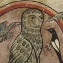
(Polly E. Perkins, “Woodstork Portrait”, 2022 from Ferman Center for the Arts)
24 Hands is a printmaking collective of Florida Gulf Coast printmakers founded by Marjorie Greene Graff. The group has regular exhibitions throughout the year at various locations in the area.
Recently a group of their artists were showing work at The Ferman Center for the Arts, on the University of Tampa’s campus. Below are a few selections from that exhibition.
For more information on Polly E. Perkins, whose work is in the first image, check out her Instagram.
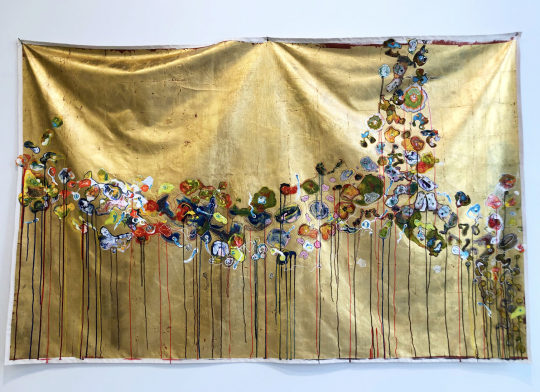
Linda Dee Guy, "Botanical Shroud", 2021, acrylic, Inkjet print, Goldleaf on canvas
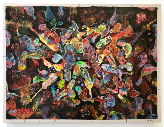
Linda Dee Guy, "Nucleus", 2021
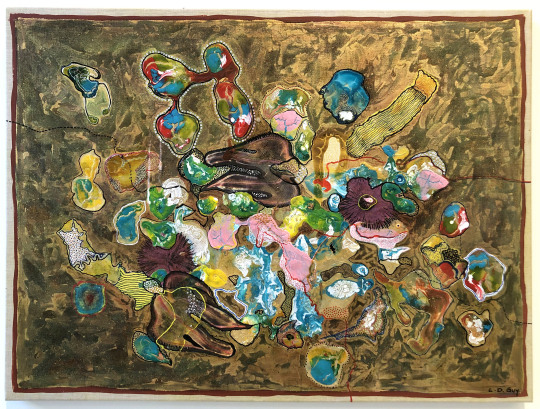
Linda Dee Guy, "Seascape", 2021
For more work by Linda Dee Guy, check out her website and Instagram.

Serhat Tanyolacar, "Untitled", 2020, Laser engraved relief print

Serhat Tanyolacar, "Untitled", 2020, Laser engraved relief print
For more work by Serhat Tanyolacar, check out his website.

Ry McCullough, "Meditations in Orange", 2021, Pochoir, serigraphy, gouache, watercolor, vinyl, gaffers tape on okawara
For more of Ry McCullough's work, check out his website and Instagram.
Currently at Brooker Creek Preserve's Education Center in Tarpon Springs is Nature Inspired, another exhibition of work by the 24 Hands collective.
From the exhibition-
For “Nature Inspired”, the artists visited Brooker Creek Preserve in March 2022 and March 2023 to strategize the exhibit and hike around the Preserve. Their love for Brooker Creek and nature has been inspiring and their work represents a variety of approaches from comical to realist to aesthetic abstraction. The exhibition includes prints by: Holly Bird, Saumitra Chandratreya, Tyrus Clutter, Elizabeth Coachman, Marjorie Greene Graff, Mary-Helen Horne, Stephen Littlefield, Ry McCullough, Polly E. Perkins, Christine Renc-Carter, and Rachel Stewart.
Below is work from the exhibition by Mary-Helen Horne. You can also find her work on Instagram.


Mary-Helen Horne, "Floating on Air", 2023, Monoprint with drypoint, relief and pochoir
Nature Inspired has been extended until 8/13/23. It's a great show and a chance to check out the natural surroundings that helped create the work.
#24 hands printmaking#24 hands printmaking collective#florida artists#florida art shows#tampa art shows#tarpon springs art shows#printmaking#printmaking collective#printmakers#mixed media#art#art shows#brooker creek#brooker creek preserve#Holly Bird#Saumitra Chandratreya#Tyrus Clutter#Elizabeth Coachman#Marjorie Greene Graff#Mary-Helen Horne#Stephen Littlefield#Ry McCullough#Polly E. Perkins#Christine Renc-Carter#rachel stewart#linda dee guy#serhat tanyolacar
0 notes
Text
Morning News with Asmi 14 Oct '24
OOPS I FORGOT TO MAKE A POST YESTERDAY AND SO I GUESS 13TH OCTOBER WILL REMAIN A MYSTERY FOREVER. AAAAAA. ANYWAY HI IT'S TECHNICALLY MORNING OF 15TH TODAY BUT IT'S TOO EARLY TO CARE IT'S 14TH IN TEXAS MMKAY.
1. HURRICANE UPDATE: PEOPLE ARE NOW SHIPPING THE TWO HURRICANES. THERE'S FANART BASED ON THE VAGUE FACE SHAPES THEY MADE?? EVERYTHING IS FINE.
2. I MANAGED TO SURVIVE A VERY SMALL BIT OF THE SPICIEST CHIP IN THE WORLD EVEN THOUGH MY FRIEND WHO LIKES SPICY FOOD ATE THE SAME SIZE TEENY BIT.
3. THE BIRD, REDDIT, FLEW BACK HOME TO ITS HUMANS ON SUNDAY?? ITS HUMANS WERE THE CONSTRUCTION WORKERS FOR THE PLOT NEXT DOOR? SO... THE BIRD JUST WANTED A GODDAMN NIGHT AWAY AS A HOLIDAY WHILE ITS HUMANS WERE SEARCHING FRANTICALLY FOR IT?? IM
4. MY FRIEND INTRODUCED ALIEN STAGE TO ME LAST NIGHT (YEAH THREE OF US JUST RANDOMLY HAD A SLEEPOVER ON A MONDAY EVENING ART SCHOOL IS FINE WE'RE FINE) AND AAAAAAAAAAAAARGH IVAN MY BELOVED AAAAAH SUA AAAAA MIZI (FOR OUR PRINTMAKING CLASS, THE FRIEND--THE SAME ONE WHO THOUGHT TUMBLR WAS DEAD--MADE FANART OF THEM) OH NAAAAAAY CLEMATISSS AAAA
5. NORTH KOREA IS ABOUT TO ATTACK SOUTH KOREA APPARENTLY?
6. SOMEONE NAMED DAVID ALABA HAD AN INJURY WHICH MIGHT AFFECT HIS CHANCES AS REAL MADRID. WHAT THE FUCK IS REAL MADRID? FOOTBALL? CAR RACING? BASKETBALL? YAHTZEE?
7. I FINALLY LEARNED HOW TO PLAY UNO AND I WON THE FIRST PROPER GAME I PLAYED AND IT WAS OF UNO FLIP IM A GENIUS
AND NOW FOR THE WEATHER AND I SWEAR I WILL NOT FORGET ANY CONTINENTS THIS TIME
1. Australia: Hot and stinky. Just like me. I didn't shower yesterday.
2. Asia: Wet. Water. Wet wet sploosh. But not the ao3 way.
3. North America: Hurricane gay porn season I guess.
4. South America: Cloudy with a chance of moqueca.
5. Antarctica: ...still green. I wonder why my brain said piss-coloured. Green isn't piss. I mean. Piss isn't green. It's too early for this.
6. Europe: COZ IT'S TOO COLD FOR YOU HERE AND NOW SO LET ME HOLD BOTH YOUR HANDS IN THE HOLES OF MY SWEATER
7. Africa: The sun peeks out uwu from clouds
AND THE ANSWERS TO SATURDAYS CROSSWORD:
1. Baby food that adults can be allergic to: Milk. Well. It's not an allergy, it's an intolerance. Which involves different biological processes and not being able to digest it rather than the body reacting to an allergen. Shhhh. I never claimed to be smart.
2. Makes shitty copper: El-Nair (thanks @arkytiorlecter for that wild ride)
3. A condition that causes strong reactions to panic and pain at certain sounds: Misophonia (ily mad thanks for educating me @falling-raine)
4. A decaying virtual room of insanity orgies from the 10's: Tumblr
5. With ____, anything is possible: BARBIE!
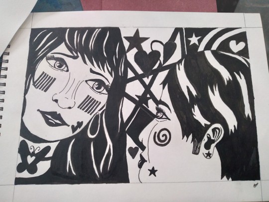
IM TOO LAZY TO MAKE A CROSSWORD SO INSTEAD HAVE THE LESBIANS I PAINTED FOR MY PRINT-MAKING (MY OC'S)
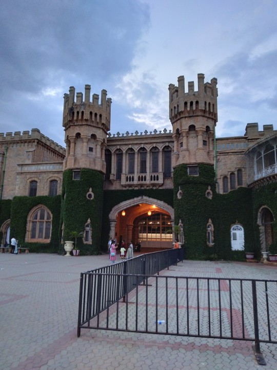
AND BANGALORE PALACE WHICH I VISITED ON SUNDAY:
I LOVE YOU FORGIVE ME FOR MY NEGLIGENCE HAVE A WONDERFUL DAY/NIGHT MAGGOTS OF MINE
#morning news#castle#lesbian art#hurricane milton#hurricane helene#weirdly specific but ok#asmi#maggots#what is even happening#tumblr
81 notes
·
View notes
Text
My online shop called Dirty Rat Grrl Creations is having a holiday fall/autumn sale going on from now until 12/1/24. Everything listed from hand-sewn made bat plushies, heart shaped anatomy themed cute plushies, relief printmaking made punk/goth/metal themed fabric sew patches, and other art like hand embroidery hoop pieces are all half off on sale.
If you’d like to get a head start on purchasing something alternative gothic or punk to gift yourself or a loved one before Christmas holidays start, then please pay a visit to my shop online Etsy linked below here: https://www.etsy.com/shop/DirtyRatgrrlCreation
Or if you’d like, take a look at future items coming soon that I’m creating at my Shop/Art Instagram here: https://www.instagram.com/dirtyratgrrlcreations?igsh=NTc4MTIwNjQ2YQ%3D%3D&utm_source=qr
https://www.instagram.com/dirtyratgrrlcreations?igsh=NTc4MTIwNjQ2YQ%3D%3D&utm_source=qr
#DirtyRatGrrlCreations#smallpunkgothshop#punk#goth#alternative#support small artists#support small business#supportsmallartists#diy#handmade#hand sewn dolls#handsewnplushies#embroidery art#anatomyplushies#bat plushies#bats#printmaking#patches#diy patches#punk goth patches#artbycasscalderon#artbycassandracalderon
25 notes
·
View notes
Text
new bucket list attempt everything on this list at least once
Master list of creative hobbies
Art creative hobbies
1. Botanical illustration
2. Architectural drawing
3. Urban sketching
4. Comic and manga illustration
5. Children’s book illustration
6. Digital art and design
7. Figure drawing
8. Fashion illustration
9. Mapmaking
10. Doodling and zentangle
11. Sticker making
12. Coloring books (for adults)
13. Paint by numbers
14. Diamond painting
DIY creative hobbies and crafts
15. Soap making
16. Resin molding
17. Button making
18. Candle making
19. Basket weaving
20. Terrazzo
21. Sand art bottles
22. String art
23. Perler beads
24. Seed beading
25. Wreath making
Industrial creative hobbies
26. Woodworking
27. Woodturning
28. Wood burning (pyrography)
29. Glass blowing
30. Glass etching
31. Stained glass art
32. Concrete molds
33. Jewelry making
34. Leather working
35. Metalworking and welding
36. Metal embossing
37. Mosaics
Sculpting and carving hobbies
38. Sculpting
39. Ice sculpting
40. Wood carving
41. Pottery
42. Soap carving
43. Sand sculptures and sandcastle building
Printmaking creative hobbies
44. Linocut printmaking
45. Woodcut printmaking
46. Screen printing
47. Rubber stamping
Needlecraft creative hobbies
48. Sewing
49. Cosplay
50. Embroidery
51. Cross-stitching
52. Crewel
53. Needle felting
54. Quilting
55. Crochet
56. Amigurumi
57. Knitting
58. Arm knitting
59. Needlepoint
Fiber arts hobbies
60. Visible mending
61. Macrame
62. Weaving
63. Rug tufting
64. Punch needle
65. Latch hook
66. Lace making
67. Dreamcatchers
Miniature creative hobbies
68. Model building
69. Painting miniatures
70. Dollhouses
71. Fairy gardens
72. Bonkei
73. Diorama making
74. Putz houses and nativity scenes
75. Lego MOC
Stationery and lettering hobbies
76. Calligraphy
77. Hand lettering
78. Art journaling
79. Bullet journaling
80. Card making
81. Scrapbooking
Papercraft creative hobbies
82. Origami
83. Papercraft modeling
84. Paper quilling
85. Collage art
86. Paper making
87. Bookbinding
88. Pop-up making
89. Paper mache
Digital creative hobbies
90. 3D printing
91. Stop motion animation
92. Graphic design
93. Photo manipulation
94. Game development
95. Raspberry Pi
Plant-related creative hobbies
96. Bonsai
97. Tree shaping (Pooktre)
98. Terrariums
99. Aquascaping
100. Flower pressing
101. Flower arranging
102. Topiary gardening
103. Seed art
104. Rock gardening
Other creative hobbies and crafts
105. Puzzles
106. Sudoku
107. Crossword puzzles
108. Writing
109. Learning a foreign language
110. Cooking
111. Music
112. Photography
113. Dancing
114. Sports
115. Improv
116. Nail art
117. Baking
118. Magic
119. Tarot cards
120. Card stacking
121. Collecting
10 notes
·
View notes
Text

I thought it would be interesting to use blue ink on the completely blue surface. The result is nice but I think more ink was needed.


We used this to make a few prints. Using a dry glue and some coloured paper we could put some colour into our prints.

We spent time etching our chosen design into a piece of acetate. I chose this design as I liked the motion in the creature’s pose.
I found that due to the method of scratching into the acetate's surface, my linework came out much more brutal. Many sharp straight lines rather than the flowing curving lines of my reference. I think the difference is cool.


For my first two weeks I decided to do printmaking, I felt the hands-on work would be an ideal start to this project.
We started with drypoint printing to get some ideas down. I drew the Sierpiński triangle, and some dragon curve-like structures converging to one point. They had some unintentional interference but I really enjoy how they look with it.
I wanted to characterize some of the patterns seen in fractals, so I used drypoint to quickly do this.
I ended up deciding to go through with the top right design as I felt it was more compositionally sound.
Printmaking week one: Drypoint, Etching and Colour
(Week 20/01/25 -> 24/01/25)
Movement Project: Fractals
2 notes
·
View notes
Photo
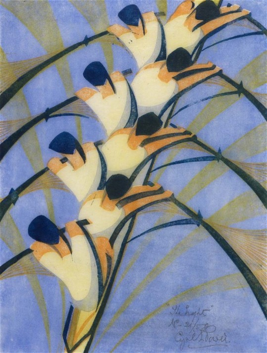
1 Cyril Power (1872-1951) UK The Eight reduction lino cut print (1930) 32.3×23.4cm
2 photographer unknown
economist.com
IT HAS become the custom nowadays,” wrote Claude Flight, a British artist, in 1926, “to go to a shop for the tools of one's trade.” Flight was scornful of shoppers and liked to make things for himself. He kept his own bees and championed the art of the linocut, believing that the use of cheap materials would help democratise art and bring it to the attention of the masses. For his own linocuts he insisted on “a sharp penknife—such a very rare thing among art students” and a gouge he fashioned by fitting a small wooden handle onto a rib he cut from an umbrella.
Hard to imagine health and safety regulations allowing children today to have such fun. But Flight, who was a friend to Henry Moore, Ben Nicholson and Barbara Hepworth, inspired many pupils at the Grosvenor School of Modern Art, where he taught, wrote and organised exhibitions on linocuts.
Among the most famous was Cyril Power, an extraordinarily creative printmaker, born in 1872, who soaked up Flight's enthusiasms and gave them new force. Power drew on many influences—of the German Expressionists (who invented linocutting before the first world war), the Italian Futurists, the Vorticist prints and paintings of Wyndham Lewis—and the enthusiasm for speed and movement that marked the work of so many artists of the period, from Natalya Goncharova to Marcel Duchamp.
While the work of the Germans, Italians, French and Russians has become very well known, the prints and linocuts made by Power and his fellow British artists have lingered in the shadows. An inspired little exhibition—the first major show of Modernist British prints in America, which began earlier this year at the Museum of Fine Arts in Boston and is now at the Metropolitan Museum in New York—will help change that. So too will a newly opened show at a private gallery in London that gathers together for the first time prints of all 46 of Power's linocuts. Some are for sale; others have been lent by museums and private collectors, of which the most important are two New Yorkers, Leslie and Johanna Garfield.
The first impression of the Power show is that he lived his life in reverse. Until he was almost 50 he followed in the professional footsteps of both his father and his grandfather and practised as an architect, making a name for himself also as the author of an erudite study entitled “English Medieval Architecture”. Then, as Philip Vann explains in an elegant essay that accompanies the show, he “embarked on a kind of Gauguin-esque adventure”, leaving his wife and four children to enrol in art school in the company of a 24-year-old artist, Sybil Andrews.
The early prints in the show were made by a middle-aged man and it shows. In black-and-white there is a bridge at Rickmansworth, a street corner in the sleepy Suffolk town of Lavenham. Then suddenly the movement of the windmill in “Elmers Mill, Woolpit” gives an indication of what is to come. Starting in 1930, when he was already 58, Power takes to speed as if he had taken personal charge of the Futurist manifesto, which C.R.W. Nevinson co-signed with an incendiary Italian, Filippo Marinetti, in 1914, with the words “Forward! HURRAH for motors! HURRAH for speed!…HURRAH for lightning!”
Power allows light, noise and speed into everything he sees. Using a series of easily recognised colours, particularly “Chinese orange”, “chrome orange”, “viridian” and “Chinese blue”, he created images of merry-go-rounds, rowers, acrobats, dancers, runners, hockey players and, of course—given that some of his influences were Italian—beautiful cars.
The most successful are those, like “The Eight”, in which the element of formal design is most visible. But Power's vision as an artist really comes to the fore in works containing a hint of menace. The bourgeois-assaulting spirit of Italian Futurism, Mr Vann explains, had fallen into the malign hands of Mussolini and was about to give way to Fascism, while Freud's and Jung's obsessions with the unconscious were increasingly helping to throw up visions of fears, hopes and dreams.
“Monsignor St Thomas” (1931, pictured at left) is a brilliant working of the murder in the cathedral of Thomas à Beckett, but it is technically skilful rather than edgy. The really potent, and most modern-looking, of Power's linocuts are those that lead the viewer right to the edge. These start with “Tennis” (1933, below), a magnificent rendering not just of the energy of the centre court, but of the physical and psychological effects of slicing and spinning—sport at its most gladiatorial.
As the 1930s move towards totalitarianism and then war, Power's work takes on a darker hue. The tube trains and the escalators of the London subway system provide ample opportunity for exploring man's addiction to the rat race. Two further works seem remarkably prescient. In 1934 Power made a linocut which he called “Exam Room”, full of hunched-up concentration and a complex set of figures that show, in turn, fear, nerves, gloating, dreaming—and one who is slyly distracting a neighbour. Watching over them is the overbearing timekeeper and the all-seeing eyes in the ceiling.
Similarly, “Air Raid”, which Power made in 1935 and which has been lent to this show by the RAF Museum in Hendon, is an extraordinarily filmic response to a period of history the artist had not yet even seen. It would be another five years before the start of the Battle of Britain would make such imagery routine. Cyril Power was not just an artist, he was a visionary
5 notes
·
View notes
Text
Tuesday 30/01/24 (Printmaking)
On Tuesday I made more prints using foam stuck on the back of the lino blocks. There was a box of foam letters in the printing room that we could use to cut our shapes from. I ended up cutting out shapes to look like bolts of energy, as repetitive hand movements release a lot of energy.


I did a few prints using that.

I then made another stamp on the back of my other lino block, this time a round swirl shape that represents the repetitive loop of self regulating hand movements, and also is similiar to a fingerprint in a much simpler way.


I then decided to combine my prints with the ones I made on Monday. It took me a few tries but I was able to but the energy bolts on top of one of my finger snapping linos.

2 notes
·
View notes
Text
Magda Léon - Artist Talk and Workshop Recap
✨ What a day! 🎨💛

Big love to everyone who joined us for our Printmaking Workshop & Artist Talk with the amazing Magda Léon (MFA ’24) at Grove Hall Public Library!


From inky hands to powerful conversations, we explored the art of printmaking and community connection.


Magda shared her journey as an artist, diving into themes of bicultural identity and the immigrant experience, while sparking meaningful dialogue and reflection.


Heartfelt thanks to Magda, our incredible participants of all ages and stages, and the Grove Hall Public Library for making this such a special gathering.


Stay tuned for more sparc! events coming soon! 💫
#sparctheArtMobile#PrintmakingMagic#MagdaLéon#CommunityArt#BostonCreatives#artanddesign#makingarttogether#artforall#massart#roxbury#ignitingartanddesign#ourcommunity#joymaking
0 notes
Text

This was trending around bsky, so I ended up doing it! Might as well post it all here as well for reading ease. I'll leave my answers below!

Do you prefer traditional drawing, or digital Digital is my fav nowadays! I do have a warm spot in my heart for pencil and ball point pen sketches though
How long have you been drawing? My earliest memories are of drawing! I’d say… maybe 24-25 years?
How many classes have you taken? Outside of mandatory art classes in school, I took additional classes in printmaking, metal work and ceramics all in high school. I did have ambitions for going to college for art, but ended up unable to proceed due to money.
What is your favorite thing to draw? My favorite thing to draw is my OC’s! Been a big fan self indulgent drawing since the dawn of time. If I had to be specific -my faves are my persona, Katsuo and M’yareh uwu
How often do you use References? Not often enough! But I’m really trying to change that habit. When I look through my portfolio I can always tell my pieces made with references outshine the others.
Whats your least favorite thing to draw? Backgrounds!!! They make me cry even though I know they're important 😩
Do you draw professional, or just for fun? Pretty much just for fun! The tiny bit of money I make from my creative endeavors just goes to savings or a little treat for myself.
Are you confident about your art? As confident as I can be! I feel happy with where I am, but I've noted the things I could improve at
Do you prefer to keep your art personal, or do you like drawing things for other people? I mostly draw for myself, but I do find joy in drawing for others as well
Do you ever collaborate with others? It's pretty rare, but I'm not against it!
Show a WIP/sketch/something that never saw the light of day. 1st design I drafted for my persona, Midas! Completely different vibe, and funny enough waaaay closer to irl me visually 😅

How long does an average piece take you to complete? Probably 8+ hours if I'm putting my all in it. I work slower than I'd like to admit 😅
Do you draw more today than you did in the past, or do you draw less? I'm in my late 20's and my life has put me in various stages of creative rennisance and horrid Art block - so, depends on what age you're comparing me to? Overall, I think I'm pretty middle of the line now. I don't pump out a finished piece a day, but I also draw regularly enough that I'm happy!
What are you currently trying to improve on? I've been interested in creating on more illustrative works - so I've been digging back into strengthening fundamentals like values, color theory, and composition.
What is most difficult for you to draw? I love the human form - hate hands. like - I like having them, but they're frustrating to make look right and match my style cohesively lol
What is the easiest thing for you to draw? Faces and hair - which I'm sure surprises no one.
Do you like to challenge yourself? 50/50! Challenging myself is cool, but I gotta make sure to remind myself that I am good at some things when I struggle lol
Are you confident your are improving steadily? I'd say yes! Even just checking in with myself every so many months I find things I note to myself that I've gotten better at.
Do you feel jealous when you see other people's art, or inspired? I’ve always been inspired to see others art! Art is a language of the heart, and I love to see it spoken. I can’t ever recall a moment where I was ever truly jealous- if there was an aspect I liked from s omeone’s work I would just dive in and study it
Do you like to draw in silence, or with music? Music all the way - or at the very least a podcat/audiobook/video essay in the background
For digital art, what program(s) do you use? Clip Paint Studio is my go-to. I do look fondly back on Paint Tool SAI though.
For traditional art, what medium do you like most? (Pencil,watercolor, etc) My fave traditional medium would be Ink in like… it's forms. I love inking, I love doodling with pens, and I adored the process of print making (ex Linocut, Copper Etching, etc)
What inspires you to not just make art, but to be a better artist? Maybe its cheesy but connecting with people, creating friendships, and sharing parts of myself to allow those connections to flourish have helped me the most find the will to improve.
1 note
·
View note
Text
Printmaking Workshop - 6/11/24


In today's workshop experimenting with mono screening printing. I found the process quite straight forward to follow and I feel I achived some success in these prints related to my stranger brief.
The narrative behind the prints, the eyes are to reinforce the eye of someone or something keeping an EYE on you. I also refer the eyes to self, keeping check on yourself. The idea of being on your guard about everyone you comes into your life. The hands in the prints suggest the need for escape and a sign of help because in this city no one communicate to one another which would be difficult to cope with. I finally included abstract shapes from my finger tips onto the print and the eye in the centre to suggest the main theme in relation to the eyeball watching your every move.
0 notes
Text
7/10/24 Workshop - Printmaking
I chose to do printmaking for this week's workshop, as I was eager to try out a discipline I had little to no experience in (aside from a linocut or two in Leaving Cycle). Also, the idea of mass production, of things being churned out on an assembly line, resonated with my project.

We began with monoprinting. My first attempts were merely texture studies, looking at how different tools and objects created variations in line or shade, whether that be thicker or thinner, darker or fainter, smooth or sharp. I used everything from pens and pencils, my hands, paintbrushes, highlighter markers, erasers, rulers, even the base of a coffee mug.


For my first few proper prints, I used what I had learned from my studies, but I was still playing around with the technique for the most part, trying out little drawings (partly inspired by the Monty Python animations by Terry Gilliam), before moving on to more project-based work.

Trees have always intrigues me, due to their sheer scale, and complex form. I felt a barren, leafless tree would be a striking image, and would be well suited to the medium of printing. It was purely imaginative, no reference photos or anything. At first, I was trying to be very neat with my lines for the branches, but as I went along, my lines became more expressive and wild.

Now we began to remove the ink directly from the plexiglass using rags and white spirits. This lent a more fluid, wavy look to our prints. As we removing dark areas rather then applying them, I thought it would be interesting to depict a face coming out of the shadows by removing layers of ink. The effect was well suited to the monoprinting, and I will certainly considering doing something like this again later in my project.

By now, we had moved on to multi-tone prints. As my new direction in the project focused on the self, I thought it appropriate to begin with a self-portrait. I sketched out a design onto the plexiglass with marker, then applied each colour separately: first yellow, then pink, green, blue, then black. However, the result was a little disappointing: I chose not to print one colour over another, but keep them separate, which made the picture come off as very flat. Also, the technique itself didn't allow for great detail, making it seem too basic, almost amateurish.

1 note
·
View note
Text
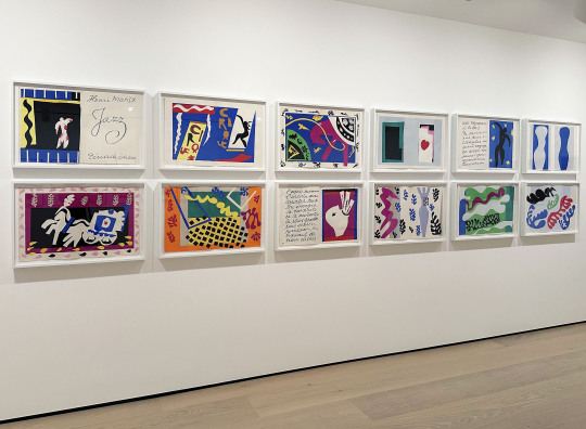
Matisse's Jazz series at Hammer Museum
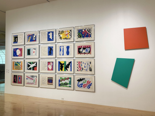
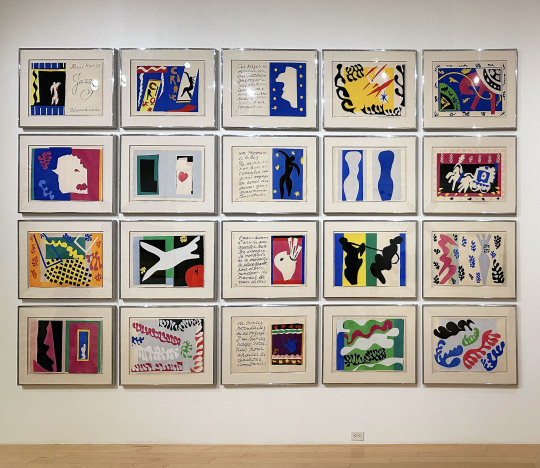
Matisse's Jazz prints at Palm Springs Art Museum with work by Ellsworth Kelly
Both Hammer Museum in Los Angeles and Palm Springs Art Museum are showing prints from Henri Matisse’s Jazz. It’s interesting to see the same work but in two different contexts based on the curation.
At Hammer Museum they are part of the group exhibition Sum of the Parts: Serial Imagery in Printmaking, 1500 to Now, on view until 11/24/24.
From the museum-
Printmaking’s capacity for serial imagery was recognized during the Renaissance in Europe and has continued to be explored by artists across centuries and geographies to creative, oftentimes experimental ends. Print publishers had a hand in issuing series, which could be conceived complete from the start, expanded from shorter sets, or even formed from existing bodies of related works. Diverse organizing principles have shaped the serial format, including pictorial narratives, iconographic groupings, formal innovations, thematic variations, and sequences measuring time and marking place, as well as structural, modular, and conceptual progressions. Importantly, the creative act itself is an open-ended serial pursuit, with each gesture, idea, and decision interacting with or informing the next.
While we can appreciate an individual print extracted from a series as a work in its own right, our visual perceptions, intellectual interpretations, and emotional responses shift when we view multiple images collectively: the whole becomes greater-or other-than the sum of its parts. New meanings surface as commonalities, patterns, or differences emerge. Selected from the collection of the Grunwald Center for the Graphic Arts, this exhibition presents prints conceived as sets or series and further considers artists’ informal serial procedures and approaches to printmaking across five centuries.
At Palm Springs Art Museum they are part of Art Foundations, which places different works together in from their collection into groups organized in different themes. Matisse is paired with Ellsworth Kelly in a section devoted to “artmaking through the angle of a given concept, with each wall dedicated to a single concept: pure color, automatic painting, text as a motif, or ready-made.”
From the museum about the exhibition-
Art Foundations explores how various art forms have been produced throughout the last two centuries. It presents a succession of artwork groupings across multiple media and disciplines, bringing together works not usually shown in the same space. Meant to be visited clockwise, each gallery provides a different angle on what we consider art, with each grouping questioning how art is made, why, where, and by whom.
This presentation shifts the lens through which we look at art, allowing us to explore gallery after gallery, the conception and the material of artmaking, and the spaces where it is created. Art Foundations brings together academically trained and untrained artists as well as visual arts, architecture, design, and glass, displaying the breadth and interconnectedness of the museum's collection.
For more on Matisse's Jazz, The Metropolitan Museum of Art provides detailed information on its website.
#Art#Art Show#Art Shows#Color#Curation#Ellsworth Kelly#Hammer Museum#Henri Matisse#Jazz#Los Angeles Art Show#Los Angeles Art Shows#Painting#Palm Springs Art Museum#Palm Springs Art Shows#Printmaking#Serial Imagery#The Hammer#The Hammer Museum#The Metropolitan Museum of Art
4 notes
·
View notes
Text
FMP: Laser Cutter for Intaglio. LO1 & LO2
Week 4
Cuts precisely on thin plywood and sheets of acrylic, especially acrylic. This is less expensive than the traditional copper.
Can use digital work or scanned hand drawn
Effective method as there is scarcity of original letterpresses
Note for machine use:
Best results with the text as solid black and raster cut at 80% power, 20% speed, while the artwork with fine lines were vector cut at 5% power, 10% speed. Cuts don't need to be deep.
Lewis, S. (2012). Laser Cutter for Intaglio & Letterpress Printmaking. [online] Available from: https://shellielewis.wordpress.com/2012/01/24/laser-cutter-for-intaglio-letterpress-printmaking/ [Accessed 22/02/2024]
The Process:

Laser with raster power 80, raster speed 20. Vector power 5, vector speed 10.

A small dollop of etching or relief ink applied to the plate, ready for spreading.

The etching ink is wiped deep with tarlatan cloth. Continue till spotless.

Ink applied to the laser cut plates, ready for the dampened paper.
The result:

Further detail:
Hudson. (2012). Laser cut intaglio printing. [online]. Available from: https://www.nycresistor.com/2012/01/21/laser-cut-letterpress/ [Accessed 22/02/2024]
I have watched the introduction video for the intaglio printmaking at uni but I wanted to make sure my idea was possible. This information confirmed it was viable. Communication between the innovation studio and the printmaking studio will be key to the success of the project. But first, designs of my prints are needed to get this project going.
0 notes
Text
Gallery visit: MCA Tacita Dean exhibition PART 2 (13.12.23)
Context: Tacita Dean is an artist who reflects on nuances and transformations that exist in memory, impermanence/mortality, time, and the natural environment. She articulates these themes through her approaches to celluloid film, photography, drawing, printmaking and installation.
My Reflection: I was intrigued by the approaches Dean took in the production of her works, particularly of her films and drawings (composition, colour/light, tactility/texture, sound, etc.). I noticed an overarching theme of 'the archive', alongside the other themes (mortality, nature, memory, spirituality, etc.).
In the presentation of her works, elements of theatricality and transformation respond to and connect these themes together. However, they are grounded by personal narratives within the work (which can either be read by audience as Dean's (the artist) experiences or as their own).
Inferno (2021, photogravure series with screenprint)


Description: "Inferno (2021) is an eight-part photogravure with screenprint elements made with the Danish master printmaker Niels Borch Jensen. It depicts an inverted mountainscape, similar to Dean’s drawings in negative for the ballet backdrop, but uses found 19th- century photographs overlaid and inscribed with marks, fragments of hand-drawn text and collage."
Exceptional Study for 'Threshold of Purgatory' (2023, coloured pencil on a photo-negative print)


Description: "The negative is a key motif in Dean’s designs for The Dante Project. Exceptional Study for ‘Threshold for Purgatory’ (2023) is a large-scale image of a jacaranda tree that Dean first photographed in Los Angeles and printed as a negative, transforming the vivid purple foliage into ethereal green, with a hand-coloured background in white pencil."
Paradise (2021, colour anamorphic short film (35mm, 24 mins 30 secs) with music 'Paradiso' by Thomas Adès - screencaps and video excerpt below)


Description: "Paradise (2021) is a 35mm Cinemascope film presented in an architecturally designed pavilion. The film is abstract but refers obliquely to the planetary motifs in Dante’s poem, and its vibrant colour palette is inspired by the watercolours of artist and poet William Blake (b. 1757 – d. 1827). The film’s soundtrack is a MIDI digital simulation of Adès’s 'Paradiso' that was created as a guide until the orchestra were able to convene to record the score after the COVID-19 lockdowns."
0 notes
Text


From East London Printmakers @eastlondonprintmakers (Instagram) 💛🖤
➡️ https://linktr.ee/eastlondonprintmakers ⬅️
Join us for our Screenprint on Fabric courses in the New Year!
These wonderful courses take you through everything you’ll need to know about screen printing on fabric. Starting with selecting designs and exposing screens, moving on to how to set up and work with fabric screens, to specialist technical knowledge on hand to help you ease effortlessly into professional standards of printmaking.
We have two courses starting in the new year, one running on evenings and the other is a day course. Swipe to see the course dates.
5 Evenings
17, 24, 31 January and 7, 14 February
7pm until 10pm
3 Days
17, 14, 21 February
10 am until 4:30pm
FIND THE LINK IN ELP BIO!
#eastlondonprintmakers #elpcourses #elpworkshop #screenprintingclass #screenprintingonfabric #fabricprinting #fabricdesign #printsonfabric #screen #silkscreen #learntoprintmake #londonprintcourses #londonprintstudio
0 notes
Text

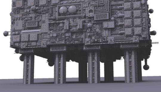

For the yellow sheet, I decided to draw an iterator from the video game Rain World. Iterators are sentient supermassive biological computers, big enough that cities could be comfortably built atop them. Several different types of organisms carry out tasks that make up the whole.


I found that I saw images in these sheets from the imperfections in the ink. The blue one looked as if there was a figure out of the white dots. The red one seemed like it had pingerprints on it, They're not too visable but it's the slightly darker red spots near where I drew the metalic hands.

During the printmaking workshop, I made a few sheets of single colours, with the intent of making more work out of them outside of the workshop.
Exporing materials & Secondary research 14/11/24
0 notes