#*design notes
Explore tagged Tumblr posts
Text


slowly making my way through more
part 1
#amnesia the bunker#fighting the burnout demons by chilling out with more low-stakes cleaning up of doodles in my sketchbooks#probably goes without saying but the ''do this''/''should look like x'' phrases are my notes to self. not a 'everyone do this'#just a little heads up for me to remember when I'm making a bunch of panels to make sure they're consistent.#because I always forget shit when it comes time to do lineart 🫠#shakespeareomnibus#amnesia#*design notes
17 notes
·
View notes
Text
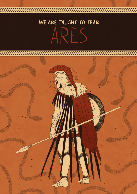
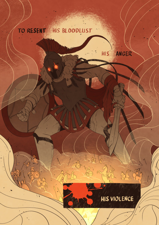
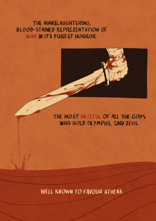
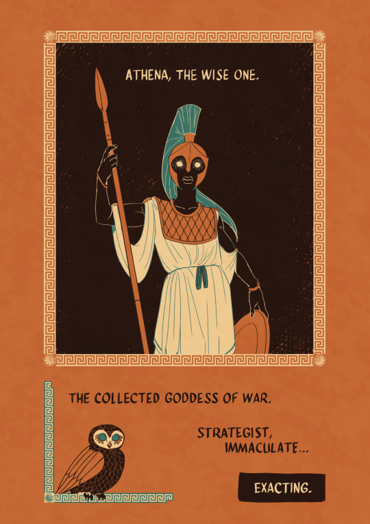
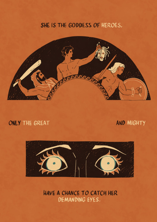
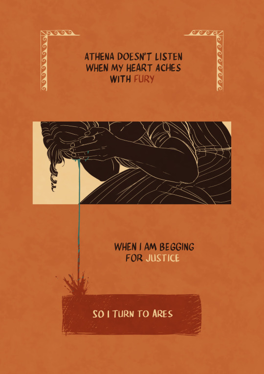
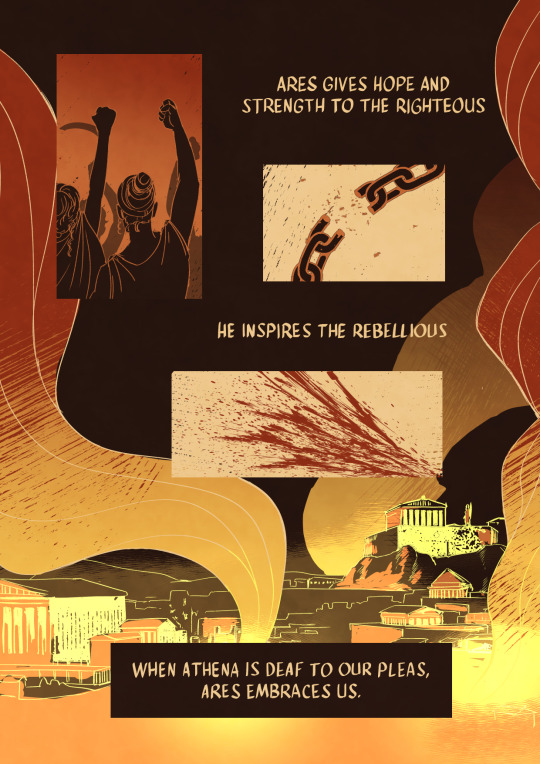
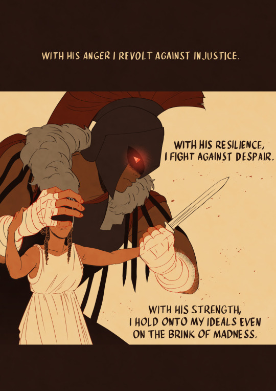
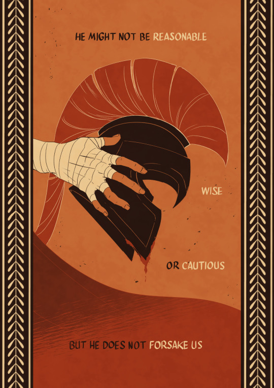
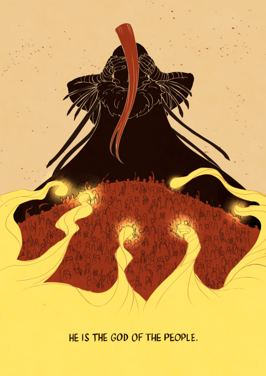
I turn to Ares.
Thanks to Tyler Miles Lockett who allowed me to draw inspiration from his ARES piece for page 2! Look at his etsy page it's SICK
⚔️ If you want to read some queer retelling of arturian legends have a look at my webtoon
#greek mythology#ares#athena#greek gods#dont get me wrong it aint athena slander but it sure is ares praise#on some level at least#man justly accused of bad things deserves some mid praise more at 11#thank you romi for helping me with words though i duly noted you insisted on ares not being cautious rather than him not being careful#romi be like “i want him to care” and honestly good you should say it#also EPIC led to this and i just..... i want to draw some animatics man i just need infinite time now#my long lost love for greek myths just will never stop coming and they dont stop coming and they dont stop coming#i want some vulture design in here for ares but not sure about this one#kochei doodles
96K notes
·
View notes
Text

#silco#silco arcane#jinx#jinx arcane#my art#please dont repost#my jinx bell design is back !#ngl i kinda cooked with that idea#this time it's more HD#i also bought the arcane artbook and i love jinx's notes#she's so unserious#in today's episode fren will draw more jinx & silco#because it seems to be my life since 2021
15K notes
·
View notes
Text
Writing Notes & References
Alchemy ⚜ Antidote to Anxiety ⚜ Attachment ⚜ Autopsy
Art: Elements ⚜ Principles ⚜ Photographs ⚜ Watercolour
Bruises ⚜ Caffeine ⚜ Color Blindness ⚜ Cruise Ships
Children ⚜ Children's Dialogue ⚜ Childhood Bilingualism
Dangerousness ⚜ Drowning ⚜ Dystopia ⚜ Dystopian World
Culture ⚜ Culture Shock ⚜ Ethnocentrism & Cultural Relativism
Emotions: Anger ⚜ Fear ⚜ Happiness ⚜ Sadness
Emotional Intelligence ⚜ Genius (Giftedness) ⚜ Quirks
Facial Expressions ⚜ Laughter & Humour ⚜ Swearing & Taboo
Fantasy Creatures ⚜ Fantasy World Building
Generations ⚜ Literary & Character Tropes
Fight Scenes ⚜ Kill Adverbs
Food: Cooking Basics ⚜ Herbs & Spices ⚜ Sauces ⚜ Wine-tasting ⚜ Aphrodisiacs ⚜ List of Aphrodisiacs ⚜ Food History ⚜ Cocktails ⚜ Literary & Hollywood Cocktails ⚜ Liqueurs
Genre: Crime ⚜ Horror ⚜ Fantasy ⚜ Speculative Biology
Hate ⚜ Love ⚜ Kinds of Love ⚜ The Physiology of Love
How to Write: Food ⚜ Colours ⚜ Drunkenness
Jargon ⚜ Logical Fallacies ⚜ Memory ⚜ Memoir
Magic: Magic System ⚜ 10 Uncommon ⚜ How to Choose
Moon: Part 1 2 ⚜ Related Words
Mystical Items & Objects ⚜ Talisman ⚜ Relics ⚜ Poison
Pain ⚜ Pain & Violence ⚜ Poison Ivy & Poison Oak
Realistic Injuries ⚜ Rejection ⚜ Structural Issues ⚜ Villains
Symbolism: Colors ⚜ Food ⚜ Numbers ⚜ Storms
Thinking ⚜ Thinking Styles ⚜ Thought Distortions
Terms of Endearment ⚜ Ways of Saying "No" ⚜ Yoga
Compilations: Plot ⚜ Character ⚜ Worldbuilding ⚜ For Poets ⚜ Tips & Advice
all posts are queued. will update this every few weeks/months. send questions or requests here ⚜ Writing Resources PDFs
#writing reference#writing inspiration#writeblr#dark academia#spilled ink#literature#writers on tumblr#poets on tumblr#light academia#lit#poetry#writing notes#fiction#novel#booklr#creative writing#writing prompts#writing ideas#worldbuilding#character design#plot#writing resources
13K notes
·
View notes
Text
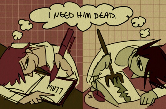
parallel play
#death note#light yagami#l lawliet#lawlight#sketch#might be a bunch of sketches coming soon i burned through soooo many designs coming up w smth but i still kinda like em so i’ll probs#be dumping them here after i clean them up a bit
10K notes
·
View notes
Text
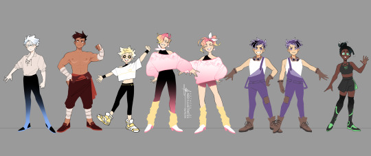

💛 Training Gear 💛
Some alt fit concepts I doodled for the Heartless Crew a while back and forgot to post! Very rough ideas for what I imagine they might wear to train / work out , plus a couple more fashion-forward fits for the gals. ✌️✨
[DO NOT EDIT OR REPOST TO OTHER SITES / ACCOUNTS] ♻️reblogs are lovely tho!♻️
#artists on tumblr#abd illustrates#heartless#costume design#eira hale#flint solveig#River dial#alchemy valentine#doppel glass#so many tags sgjksfd#anyway YAY ive been meaning to post these and finally found a sec#lasso fill tool my beloved#the joy of putting the blorbos from my mind in fun outfits#it will happen again#side note alchemy a hundo percent introduced heartless to the off shoulder crop look#for they also enjoy putting blorbos in fun outfits
4K notes
·
View notes
Text


Some league-playing friends were sad Viktor’s son didn’t make the cut for the show
#as a non-league-playing person#I skimmed the wiki to make this so#I won’t be taking notes#it was either this or Viktor invented the Golems himself#I was initially thinking Viktor designed Blitzcrank when he was a kid#because like- friendly robot that helps people and does stuff for the environment and also he dances#very 10y/o kid of you#but then I saw Golems like existed#and I get they probably weren’t technically around when Viktor was a kid#but it’s steampunk so I say they were#:)#my art#arcane#arcane league of legends#league of legends#Viktor arcane#jayce arcane#blitzcrank
4K notes
·
View notes
Text
DPxDC Idea
Danny working at Wayne Enterprises as some sort of engineer, uses the in-house app for all his blueprints and stuff
He starts getting notes from a coworker in-app, and assumes its this annoying older guy in his department who constantly undermines him because of his age, despite his education and past achievements (i feel like in this AU the Fentons react well to the reveal and they work together on a number of non-lethal ecto inventions that have Danny's name attached to them)
Except one day his coworker mentions never using the app, and Danny suddenly realizes there's only one other TD he could've been arguing with in the notes of the app
#dp x dc prompt#dpxdc#danny phantom#danny fenton#batman#tim drake#red robin#i have no ideas what happens beyond danny realizing it's been tim the whole time#and having a 'fuck ive been arguing with the big boss' moment#cause of course when he thinks its some asshole from his own department hes snarky as hell#but the ceo??#should he stop with the sarcastic explanations behind his designs?#or will tim think its weird if his tone changes#in my head this does end up being dead tired somehow#just because i love the idea of these two bonding over snarkiness and engineering#and i feel like tim would simultaneously love and hate danny's notes#but also is that actually in character? cause the only batman thing i've read is rhe webtoon#and i know some vague things about canon#but thats it
4K notes
·
View notes
Text
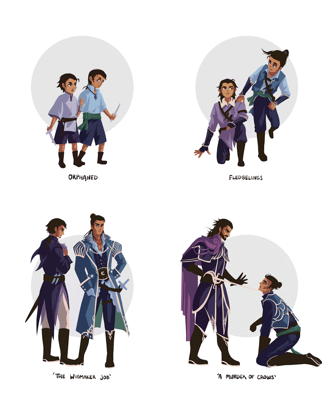


He was my cousin, but we were more like brothers, really. (All we had left...)
lucanis and illario through time
#dragon age#datv#veilguard#lucanis dellamorte#illario dellamorte#had fun with their designs#somehow now lucanis looks like the bad guy lol#but anyway these guys live in my head rent free#they were brothers#i weirdly love drawing illario#lucanis takes me 3x longer to draw to make it look like him but illario just comes out like that#i added a slight asian influence to some of their designs because of that one concept note that mentions korean influence
3K notes
·
View notes
Text
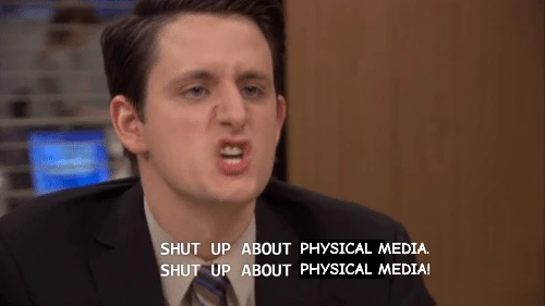

drm-free media is my passion
#as you can see it has been a day in my notes#so i'm inflicting graphic design upon this blog. thank you for your understanding
3K notes
·
View notes
Text
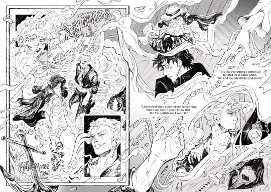
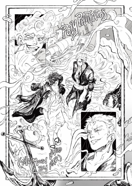
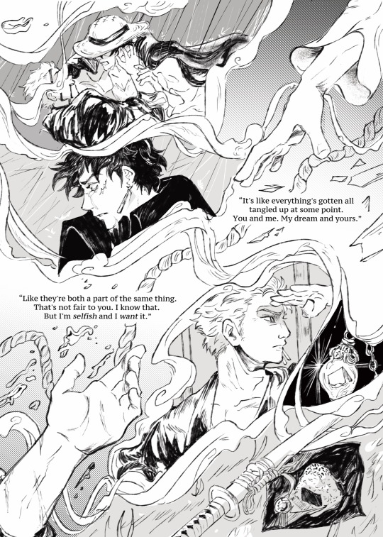
“Those two things can exist at the same time. Like you said, it's all—it's all tangled up together, you and me.”
double page spread for one of my favorite luzo fics of all time, poly philtatos (the most beloved by far) by my good friend - @swordsmans!
I knew I wanted to do a double page spread the second I finished this fic and I drafted abt a dozen ideas before landing on what would ultimately become this. There were so many snippets and moments I wanted to illustrate but I ended up doing more of an abstracted version of the fic as opposed to 1:1 drawings of scenes

funnily enough while the fic itself is told in zoros pov this spread is framed mostly through luffy’s eyes - his tears literally frame comp for their reunion, the moment he loses zoro, and the centerpiece of the first page which is this weird abstraction of him on the beach seeing zoros corpse-not-a-corpse in the waves just beyond his reach.
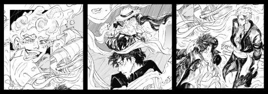
gyro put the crane wives’ never love an anchor on the playlist for this fic which i heavily used as inspiration in picking ornamental things for the spread (the anchor, the fleet of ships by luffy, and the nautical rope splitting the second page). also just like. overall really heartbreaking lyrics guys

there are smaller elements throughout the spread that are 1:1 references though (all i will say for these is if you know, you know hehe) i wish i had more time to do a lengthier piece for fanart for this fic bc it's one of the few luzo fics that have been rattling around in my brain forever now - once again please please please read poly philtatos if you haven't. gyro is a masterful writer and they deserve all the love! ok byeee
#i read this for the first time on a 18 hour flight and all i could do was pace the aisles and obsessively wipe at my eyes when i finished i#so i hope this conveys even 5% of that feeling#my design notes are like only 10% of what i want to say abt this fic. i am very ill#one piece#one piece fanart#luzo#zolu#zolu fic#monkey d. luffy#roronoa zoro#my art#one piece fanfiction#gear 5 luffy
2K notes
·
View notes
Text


trying to make my sporadic sketches and design explanation/notes-to-self readable starting with the first few characters I had to draw up wholecloth 🤙
part 2
#amnesia the bunker#usually I mess around in my sketchbook before posting#but these 4 character designs I've used for a while so they're comfortably worn-in ig#+ civilian clothing bc fuck war all my homies hate war#slowwwlllly working on art at a snail's pace a couple hours at a time in my research site lodging afshj#shakespeareomnibus#amnesia#*design notes
18 notes
·
View notes
Text
so in an attempt to actually use positive thinking, anytime i fuck up and my brain reacts as if ive cause a minor apocalyptic event, i compare my fuck up to the 4 minute fuck up committed by the crew of the uss william d porter.
and only today, as i was having to explain what happened to my mom when i was explaining the whole comparison thing, did i realise that most people dont know about it and ive decided that needs to change because its objectively hilarious.
...which is a weird thing to say about an event that occured on a warship in 1943, specifically november 14th.
see the uss william d porter was a fletcher-class destroyer but you dont need to know what that means, just that she had guns that went bang bang and that she was escorting another ship, the uss iowa, to cairo.
while they were on their way there, they performed some gun trials like testing the anti-aircraft guns or the torpedos. and while they were running a torpedo drill, the crew of the porter managed to fire a live torpedo straight at the iowa which you know, in terms of a list of things to do while escorting a ship, shooting a torpedo at them is not on that list.
especially if the president of the united states is on board.
yeah so fdr was on board and the gun trials were actually his idea, and part of the trials was that they were conducted under radio silence.
and that means the crew of the porter couldnt just call the iowa to be like "move out the way, we accidentally shot a torpedo at you."
but they did have signal lamps and you know, the signalman on board was trained to signal this exact kind of message.
...and uh never mind, the signalman did manage to successfully tell the iowa that a torpedo was coming toward them but wasnt as successful when it came to the direction the torpedo was coming from.
not all hope is lost though because the signalman could still use the signal lamp to correct his previous mistake and-, never mind, he announced that the porter was reversing, which she wasnt.
yeah so at catastrophic mistake number 3, they broke radio silence to warn the iowa and she managed to turn out of the way just in time which meant no one got hurt. and even though the inquiry into the incident led to chief torpedoman (fantastic job title btw) lawton dawson being sentences to hard labour, fdr intervened and waved away his sentence, saying it was all an accident.
but yeah, so thats my new measure for "how much did i really fuck up?" and when i compared accidentally picking up a pencil case without a tag on it in wilko, turns out it was a very minor fuck-up. yes, the cashier had to ask another worker to grab a duplicate so they could scan the barcode, but i didnt nearly kill the president during wartime via accidental friendly fire
#kai rambles#so like#i enjoy ships and learning about them and looking at them but like#i dont really care for warships#i dont hate them viscerally like i do cruise ships but i never really care for them#apart from the ones that were just like either ridiculously designed like the hms captain or the vasa or the novgorod#or the ones where just insane shit happened like with the william d porter#like this isnt even the extent of the porters unfortunate incidents like shr was sank by a kamikaze attack that MISSED#but somehow ended up below the ship and exploded and just like yeeted the porter out of the water#william d porter#uss william d porter#ww2#world war 2#world war ii#warships#again warships are really not my thing but god some of them are so fucking funny#uss iowa#fdr#franklin d. roosevelt#this suddenly got so many notes in like less than 24 hours what the fuck#shipposting
15K notes
·
View notes
Text
im ngl. sometimes i try to make a male character but then the yuri demon possesses me and suddenly she's a woman. i have no control in this.
2K notes
·
View notes
Text
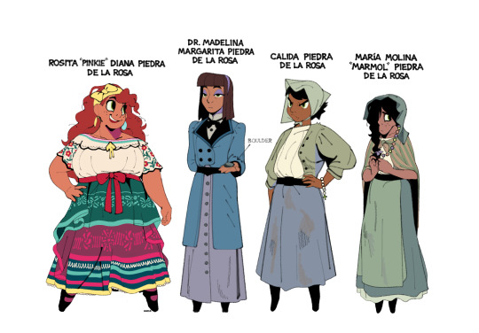
The Piedra sisters.
Born and raised in a small mining town in New Mexico. Calida and María Molina have stayed behind to support their parents while Rosita and Madelina have gone off to pursue their dreams. Madelina recently obtained her Ph.D. in geology from Las Cruces College. Rosita works as a baking apprentice and entertainer in Ponyville, Nebraska. Madelina is the eldest, Calida the middle child, and Rosita and María Molina (non-identical) twins.
#mlp#pinkie pie#maud pie#limestone pie#marble pie#my art#fanart#character designs#the grand galloping 20s#ty to everyone who helped with their names#hopefully the puns in their names work#some quick design notes: i wanted all the sisters to wear a dress/skirt; belt; and some sort of hairband that informs their#personality. so pinkie has bows all over. maud has a buttoned skirt and very basic hairband. limestone and marble wear bonnets#their bonnets are also meant to mirror the shape of their wacky hair in the show#they all sorta stand on their tippy toes too#no reason why#also gave pinkie and marble the same eye shape freckles and curly hair to show they're still twins
7K notes
·
View notes
Text

#I made this for a twitter joke but am compelled by honour to also post it here#also it kinda works I am tempted to draw the outfit lmao#birds#birdblr#eastern rosella#Australia#Australian wildlife#parrots#parrot#psittaciformes#bird#steal her look#steal their look#steal his look#memes#fit guides#outfit guide#toe shoes#rainbow#idk if my favourite is the toe thongs the cork hat or the gay shirt#steal her style#style#steal his style#side note yes that is indeed a female Platycercus eximius diemenensis specifically#character design#outfit design
4K notes
·
View notes