#(ui) original: standard.
Explore tagged Tumblr posts
Note
❝ you passed out, i carried you here. ❞ — vanessa @hazardess , but she’s bitter about it
FEVERISH MUTTERING HAD HAUNTED HIM ALL NIGHT, ALL DAY, AND THE LAST MEMORY HE HAS IS LEAVING THE PIZZERIA, still shivering uncontrollably in the heat of the sticky summer sun. Head aching, angrily waving off his daughter’s questions: I’m fine, he remembers snapping, more of a groan than anything else, I just need air. Don’t you even think about. . .
The rest is a sliding, slippery blur. Despite everything he’s done and the lengths he’s gone to, it seems he’s still just as human as ever.
That’s the really terrifying part.
He can barely even face lifting his head from the makeshift pillow Vanessa has propped under him, the whole world tilting precariously on an axis of its own bearing. But he does: persists in rising, his pale face ghostly and off - color. Even trying to keep his daughter in focus hurts. She blurs in front of him, fades in and out between the little girl he’d initially doted on and the young woman he knows logically that she is. Is this his fever - addled brain trying to offer him a reprieve from the disappointment he feels his daughter has become ? – Clumsily reaches out for her, words heavy and absent.
“ ‘S a good girl, Ness. Always so helpful. ” Her father’s right hand man, through and through. Remembers getting her to hold his tools as he’d painstakingly built that old Spring - Bonnie suit, his pride and joy; remembers more recently handing her his knife to wash. Clean that up for me. We’ve done well today. Both killers. Nobody suspects him, of course they don’t. Confident words and faux charming smile keeping him out of public scrutiny, the loss of his own son only years before at the hands of his daughter.
He smiles that same smile now, but it’s pathetic. Laden with the sudden realization he feels helpless for the first time in a long time. If she’d wanted to kill him, she could have. Ended it all. He wouldn’t have even known. Maybe that’s why he addresses her now, in an exhausted facsimile of love he’d once shown her as a young child. “ Help me stand. [...] How long ‘s it been ? ” How long has he been lying there, human, vulnerable ? How long has she been watching over him; how long has she served her duty to him loyally today ?
#(( I THINK I REMEMBER SEEING YOUR VANESSA USED TO HAVE A YOUNGER BROTHER SO I INCLUDED THAT !!! if it's wrong tho lmk :3 ))#(ii) man behind the slaughter — roleplay thread.#(ui) original: standard.#tw child death#tw child murder#tw mental instability#tw sickness#tw hallucinations#tw illness#tw child abuse#tw dysfunctional family#( most just referenced / implied ! )#a; hazardess#(oxo) rabbit in the headlights: william & vanessa.#(xi) ‘the owner was pretty sentimental i guess 🤭’: movie verse.
6 notes
·
View notes
Text
Adjusted Thumbnails for the Household Panel (incl. a version for shorter teens)
Some of this started off as an experiment following a chat in Creator Musings but a few people wondered if I can share it sometime, so here it is.
1A) Adjusted camera settings for kids and pets
This is just something that bothered me and it mainly affects thumbnails in CAS. There's a strong perspective view applied to the CAS thumbnails of kids and pets, which makes them look a bit distorted and the zoom is too close cutting off the face in some cases:
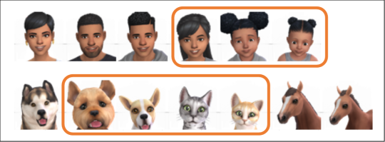
The adjustments are somewhat a compromise of CAS and in-game settings leaning towards the latter. The adjustments for human sims are also included for in-game thumbnails (due to some restrictions this is not quite possible for pets, but their in-game version looks fine anyways).

1B) Adjusted camera settings for shorter teens (tested with the Shorter Teens mod by Menaceman44)
Disclaimer that sims aged teen-elder use the same camera settings and there's no way that I know of to treat teens differently or assign different settings based on the height of a sim, if you use such a mod.
When you use a height mod, the sims faces will be cut off with the default settings.
My workaround here is zooming out to allow shorter sims to fit into the picture frame. It's not an optimal solution, but the only solution I can think of. Below a preview using the standard teen height (first row) and the "shortest" teen height (second row) from the Shorter Teens mod.
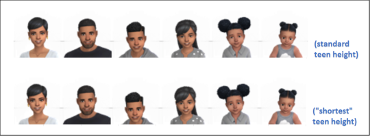
This version uses 1A) as a base, but zooms out more on human sims (pets have the same settings as in 1A).
Note: Also not optimal, but you can try making the UI bigger via the game accessibility settings to make the household panel incl. the thumbnails a bit larger if these settings make the sims portraits too small.
2) Angled Pose (made for Waffle ^^)
Waffle mentioned that we used to have angled pictures in the household panel (seems like this was the case until pets were added to the game). Below I tried to recreate the original settings (based on a very old blurry screenshot :P).
Below an example of how it looks standalone and with the camera settings 1A/1B.
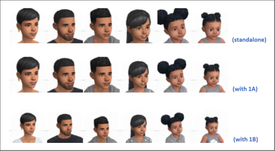
The pose override is only for human sims, not for pets. I feel like the very different proportions and profiles of cats and dogs won't always look great when angled (and I suspect that's the reason this was changed when pets were added).
You can use this option in addition to the above settings or standalone. (This is a pose override, not an override for camera settings and can therefore be used independently.)
Download links are below the cut.
DOWNLOAD
1A) Adjusted camera settings for kids and pets: SFS | MF
1B) Adjusted camera settings for shorter teens: SFS | MF
2) Angled Pose: SFS | MF
Change log:
January 18th 2025: A mermaid specific pose was missing in the Angled Pose mod (only noticeable in CAS). Added it.
Notes:
Pick either 1A) or 1B)! Don't put both files into your mods folder.
You can use 2) in addition or standalone.
You need to delete the file localthumbcache.package to let the game generate new thumbnails. Otherwise you won't see any changes in game until the game needs to update the thumbnails on its own. (You should see the changes in CAS immediately, though.)
599 notes
·
View notes
Text
Lancer Tactics devlog
I'm gonna try out posting my ~monthly devlog roundup here as well. These suckers are glorified changelogs with anecdotes and gifs galore. Let me know if this is something you like seeing show up on your dash?
Map Editor
Got units able to be placed/deleted/moved in the mission editor
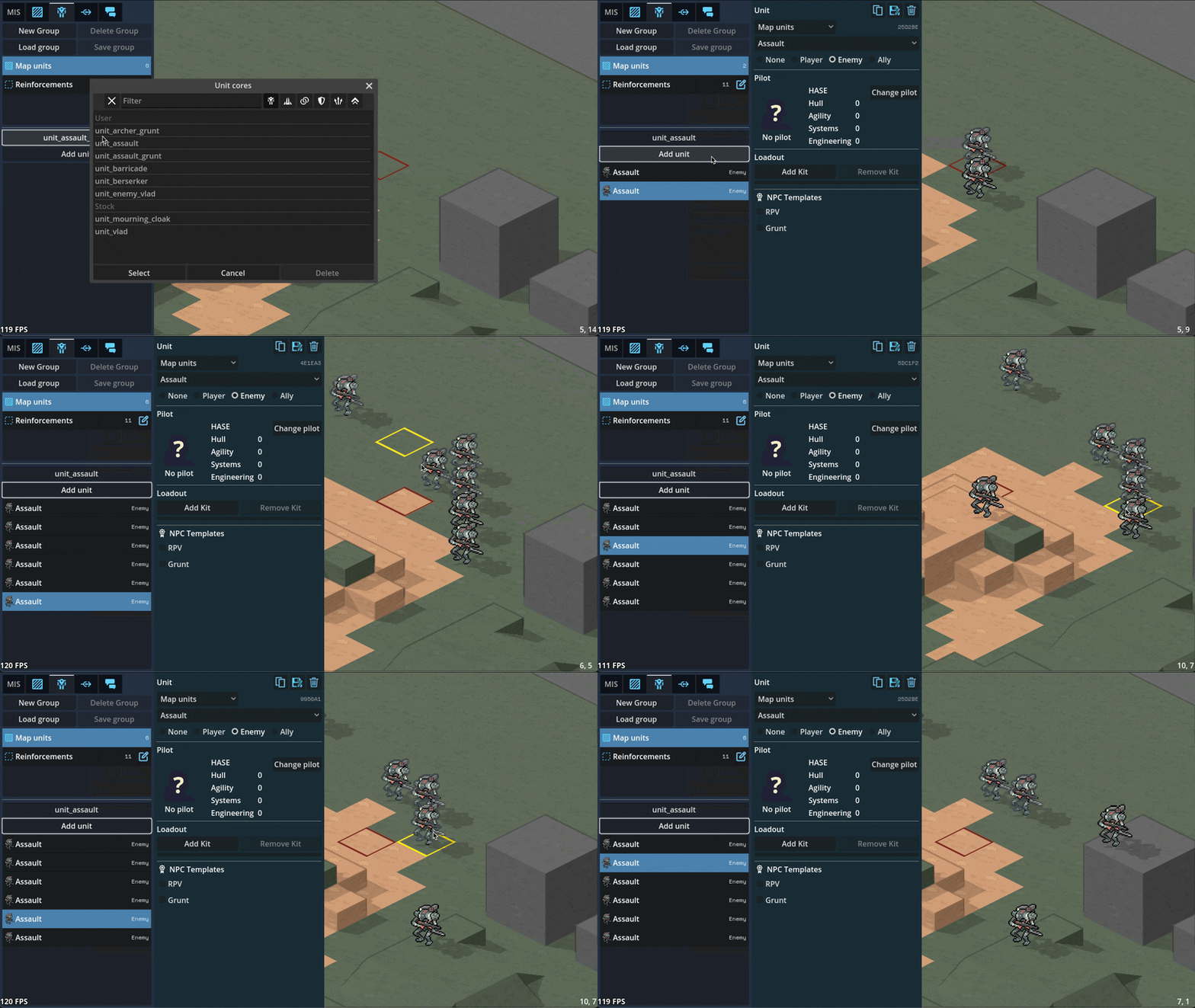
Can paint/remove command zones in the editor
Can paint minecraft-like terrain blocks in the editor

Can paint/rotate multi-tile props in the editor
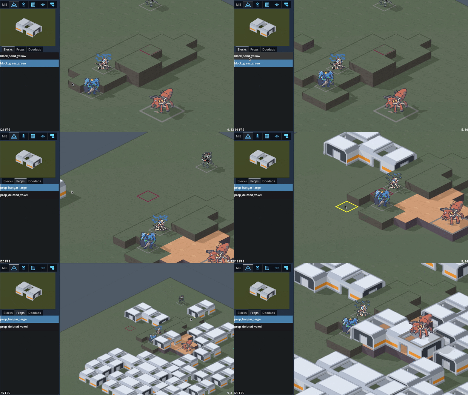
Can edit unit character sheets and portrait via the editor

3D maps
Did a bunch of art tests with 3D mech models, provided by GeneralChaos, which we ended up deciding not to go with to keep things simple.

To avoid the can of worms that is animation, we'd have to lean into a static "tabletop minatures" aesthetic which we decided is not a style we want to be stuck with. By sticking with 2D sprites, we avoid falling into a sort of uncanny valley; it's easier to get away with not animating a 2D sprite than it is for a 3D model.
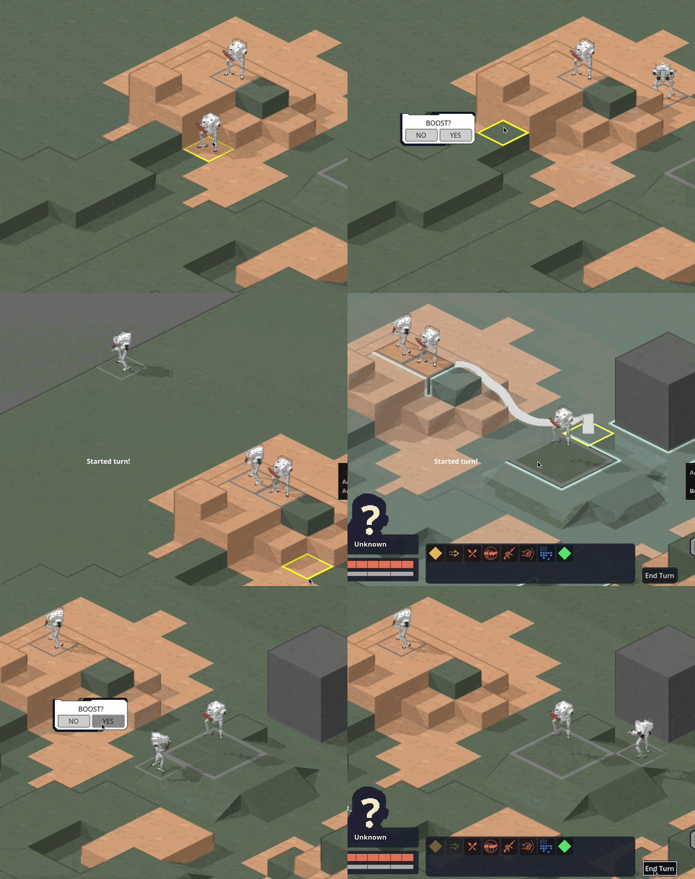
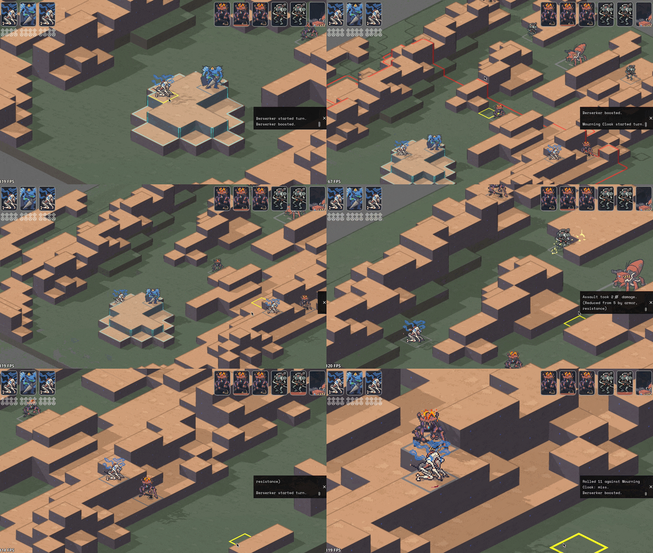
We also experimented with 3D terrain. We decided to make a rule that the visual style for a piece of terrain should match its mechanical effect: obstructing terrain that you can't move through, such as rocks or buildings, will be in 3D, while non-obstructing terrain like trees will stick with 2D sprites.

Hooking up the 3D camera to follow events like movement and attacks did a LOT for making it starting to feel like it's cohering into an Actual Game™
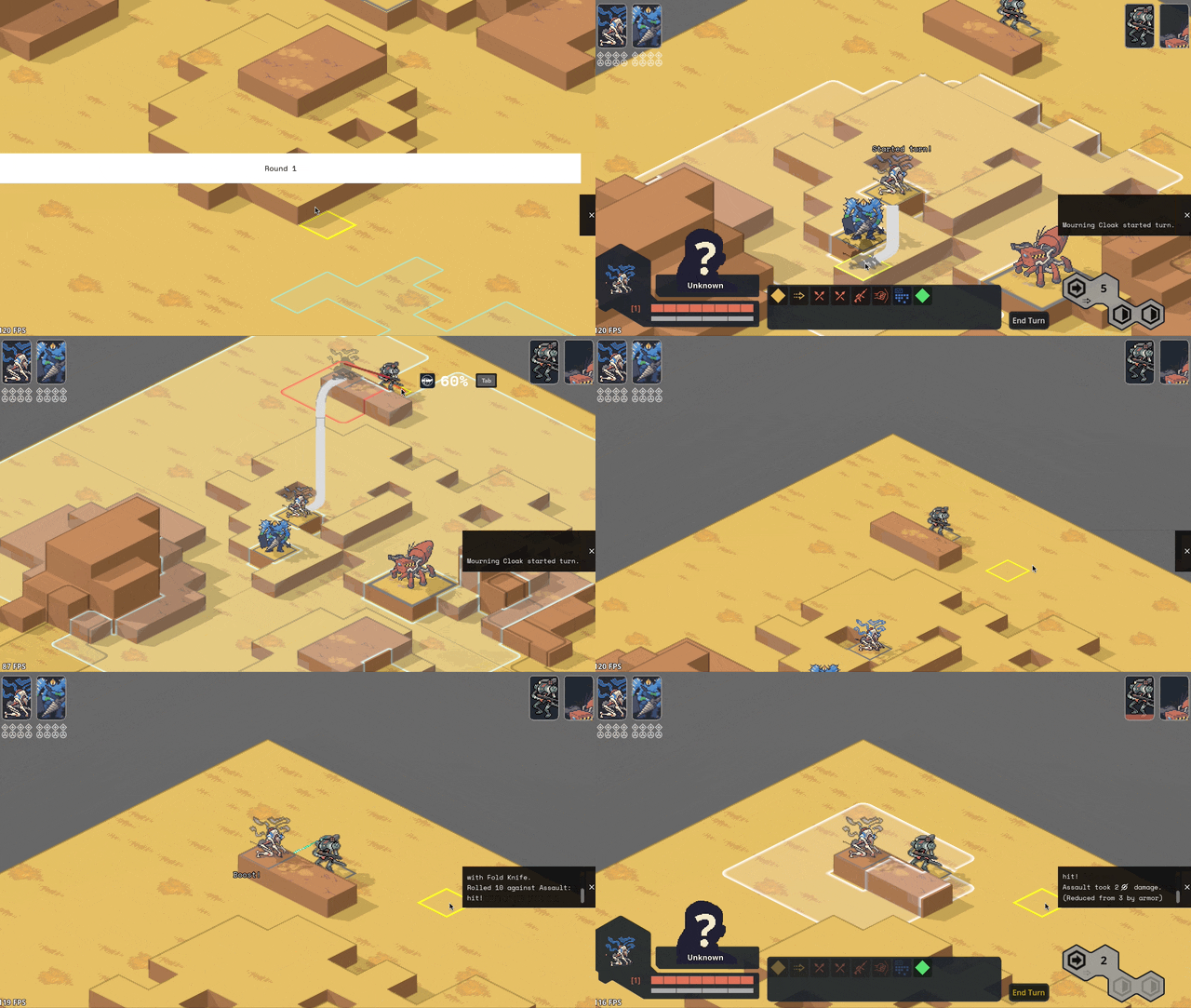
Implemented cover! And an attack preview! Cover works by aiming a ray from the target to the originator (technically to and from each voxel of each, respectively, to handle size 2s shooting above size 1 cover) and tracking all the terrain blocks it hits (how we'll handle non-terrain hard cover TBD). I think I have it working according to Perijove's cover rules manual, but I'm sure there'll be edge cases to work out. This is a case where things are significantly simplified by working in squares instead of hexes; hexes have a lot more possible weird angles you have to deal with.

Re-added what I'm stubbornly calling Combat Popcorn; little bits of text that pop out when you use abilities and attacks.
UI & game screens
Added ability for the engine to show UI that's anchored to the game world via a little word bubble line but also stay on screen as the camera moves around.

Got word bubbles working; you can now write dialogue in the mission editor, hit playtest, and see it work in a mission! (it does actually translate correctly now; this gif is just from a bug I thought was funny)

Got ability effects mostly behaving appropriately again, including muzzle flashes. The easiest way to handle them ended up being NOT billboarding them so they always face the camera (like all other 2D sprites in the game); instead, I put them on a plane parallel with the ground and just spin them around the unit to point at wherever their target is.

Did some work ironing out our tooltip system. The standard in CRPGs these days is this kind of nested labyrinth of tooltops that you see in Baldur's Gate 3:
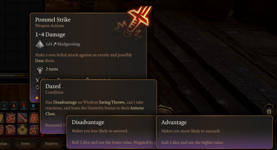
I Did Not Want to try and figure out how to wrangle that much UI, so we're instead opting to cap the nested tooltips at the second layer. You can lock a general tooltip for e.g. an action and then mouseover various items within that tooltip to get glossary definitions...

...and then instead of having those glossary tips be lockable/mouse-overable themselves, I collect all related terms to that glossary definition and let you tab through them.
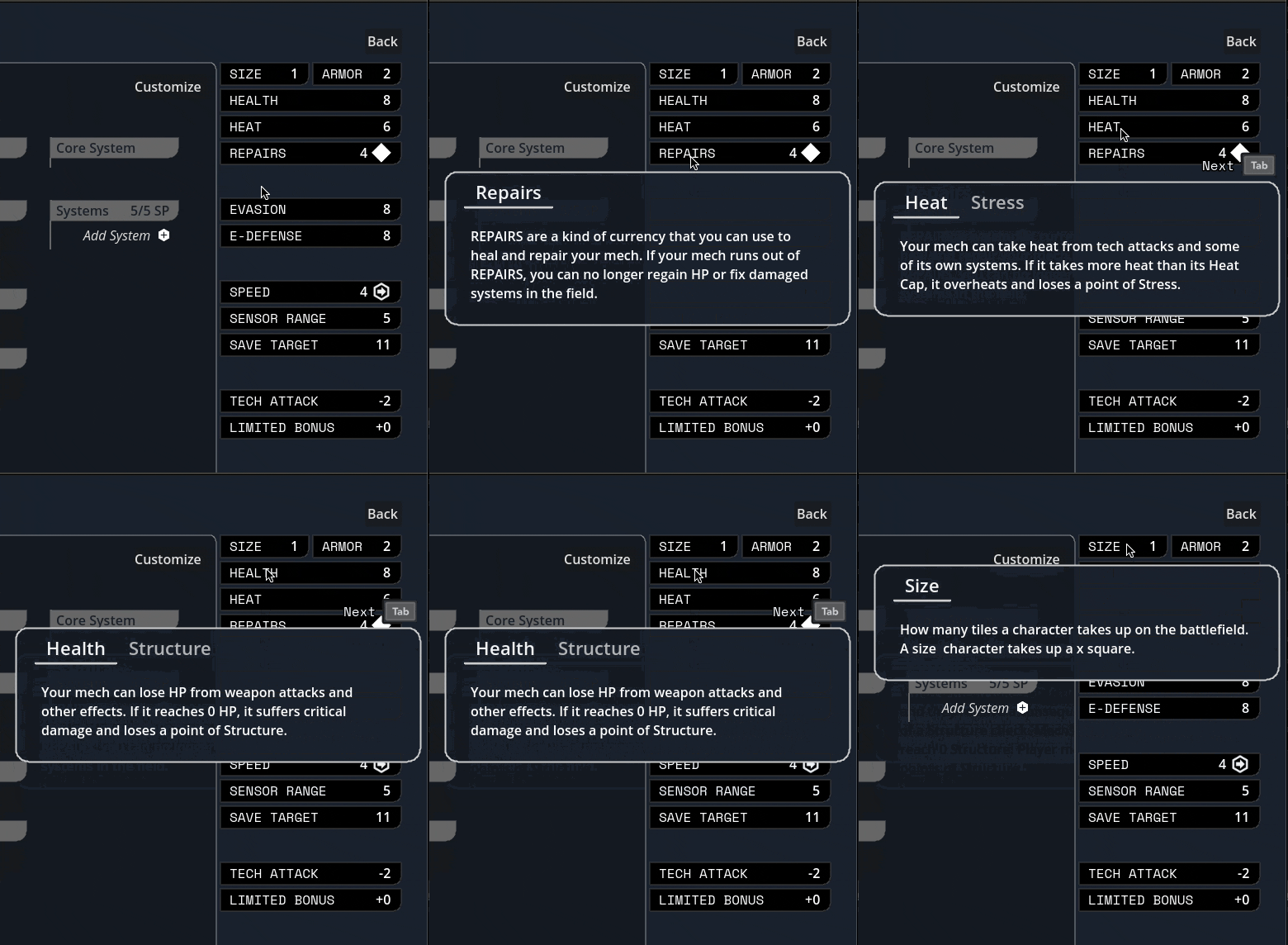
Added skin overlay functionality to the portrait maker, enabling textures like scars, tattoos, stubble, and vitiligo to be applied to just the skin and not extend off into space.
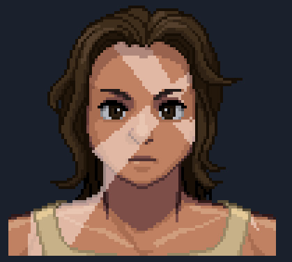
Midway through writing this update, Carpenter sent me this gif of the randomization button working! There's a still a bunch of skintones/assets missing and a few are a bit janky, but it was exciting to start seeing the range of these lil freaks (affectionate) that this editor can create.

Mourning cloak license!
This is the one I'm probably most excited about: I did a bit of a content dive and implemented a basic character sheet + all Mourning Cloak traits and equipment. They don't have fancy graphics yet, but the weapons and systems can be added via the character sheet and used in-game.

It took a little under a day, including adding soon-to-be common mechanisms like bonus damage. This is great news in that it means the engine we've been building for so long in the abstract seems to do a great job in handling comprehensive actual game content, and that it looks like we've set ourselves up for success when it comes time to buckle down on churning that out.
I'm sure other licenses will come with unique difficulties (I fear the day it comes time to do the Mule Harness // Goblin CP) but I'm feeling good about it!
Vertical slice?
Taking a step back, the pressing question on my mind has been "when will we have a playable early access build?"
I was originally hoping for Feb/March, but what we've internally been referring to as the "3D cataclysm" has pushed everything back by at least three months, so the target for the first alpha build is now in May. So, ah, thanks for your patience! Seeing things come together, I've become more and more convinced that moving to 3D was the right call.
#lancer tactics#made with godot#godot 4#indie game dev#game dev#lancer rpg#tactics rpg#indie dev#godot engine
292 notes
·
View notes
Text
Family to Household Text Default Replacement
I've uploaded this mod to MTS already, but why not upload it here too lol.
All it does is replace all instances where households are called "family" to just "household". CAF loading screens and the like are changed too. This mod isn't really necessary but it's a nice change of pace and makes the game feel a bit more modern and in par of TS3 and 4 - at least in my opinion.
CONFLICTS
There's not many mods that do the same changes as mine do, but if you happen to have one of these two mods (or anything similar) keep in mind my changes will overwrite theirs:
NickM406's "Loading the {x} Family" UI Text Replacement (direct conflict; either this or that)
BkajnlConcepts' Custom Scrolling Text for Ultimate Collection (edits the same file - UI.package - but their changes can be applied to mine and viceversa)
INSTALLATION INSTRUCTIONS
I've made the folder path so you don't have to dig through the folders. Either way, to make sure you installed it correctly, it should ask you to replace files. I made this mod mainly for the UC but it could work in older iterations of the game and maybe even Legacy.
Standard Version: EA GAMES\The Sims 2 Mansion and Garden Stuff\TSData\Res\Text
Ultimate Collection: Origin Games\The Sims 2 Ultimate Collection\Fun with Pets\SP9\TSData\Res\Text
UNINSTALLING
Instead of copying the contents from the DEFAULT folder, copy them from the BACKUP one instead.
DOWNLOAD
SFS | MEDIAFIRE

39 notes
·
View notes
Note
Do you have any good VN recommendations that have interesting or notable UIs? Most of the games I've played have stck with RenPy Standard or something similar where all the text is displayed through three-line bottom boxes one at a time.
hm... you didn't mention NVL style text, so just in case, I'll recommend that you try out Fate/stay night and Tsukihime (optionally Remake) if you haven't yet. those are what I'd consider to be very "core" VNs, and I'd feel negligent for not mentioning them if turned out you haven't played many games with that style of text yet
at the end of the day, the reason that ren'py looks like that is because most visual novels do (with a decreasing number of them being presented with fullscreen textboxes), so games that do things outside of that mould are notable for doing so
that aside! to answer your actual question, here's a couple text presentations I've personally found really charming
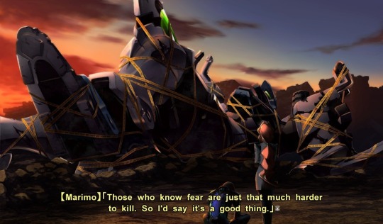
starting off strong by telling you I was fucking lying when I said this was a list of three games (I'm mentioning the Muv-Luv series first, rather than any individual game in it)
Muv-Luv sticks pretty close to the standard setup for horizontal textboxes, but you might notice that they're themed to look like anime subtitles. I've always been charmed by this, and it's probably the only mention here that actually warrants a screenshot just to clarify that it's actually a very visually distinct presentation
I'm not actually a Muv-Luv fan and the next game is one I personally enjoy more, but god, the presentation in Muv-Luv really is just so striking
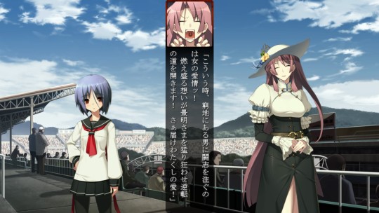
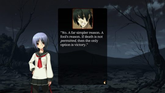
Full Metal Daemon Muramasa features vertical text boxes, which isn't all that notable, except for the fact that these were retained in the translation (because characters use horizontal textboxes to indicate they're speaking english)
I actually really enjoy this style of presentation because it fills the space between two characters while also allowing for a wider background. when I'm looking for styles to steal for my own work, this one lingers in my head a lot
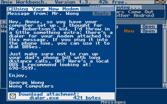
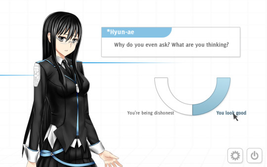
remember when I said I lied early on? I technically told you the truth when I said this was a list of three games. kind of. I'm mentioning one game and have to mention another game in the process. so this is a list of three games and one series.
of the two, Analogue: A Hate Story was definitely the game that seemed to occupy people's memories the longest into present day, but the presentation of Digital: A Love Story was much more striking to me. that being said, I'd be remiss not to mention them in a discussion on VNs that do interesting things with the UI
-
bonus round:
I haven't actually gotten around to CHAOS;HEAD yet, but I want to make an honourable mention of it either way because I really like the hard letterbox of the original release. from what I've seen, it doesn't seem to be present in CHAOS;HEAD NOAH, though
I can't recommend it or recommend against it, but I can say "that looks neat!"
73 notes
·
View notes
Text
Fun CogDis Fact [+ Some Theory Crafting & Regards to Lore itself] (STORY SPOILERS... for a 15 year old fan-game)
So i was doing some data mining (as in looking inside of the game files for fun to see how the game ticks and works, and boy howdy let me tell you, RPG Maker 2003's UI scares me, props to Otherhand for navigating through these... many variables, numbers, & symbols going on, because it honestly overwhelms me) I had learned that:
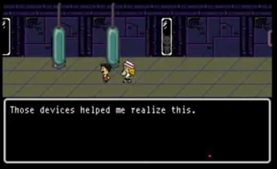
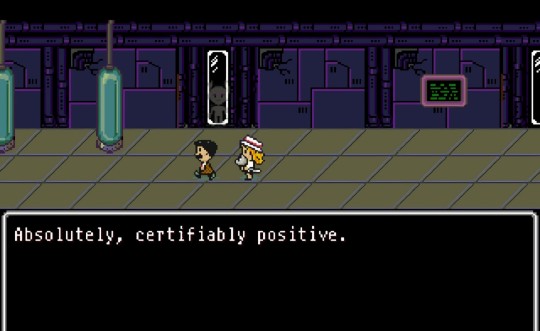
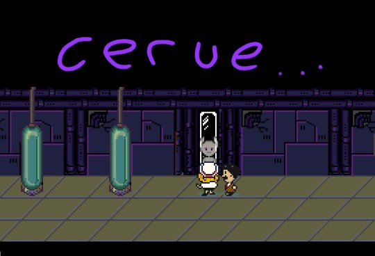
Cerue appears in the Maria & George Magicant Flashback as one of the background Gieegs behind the windows. While this most likely is just a matter of reusing sprites, it should also be noted that not all Gieegs in the "allthegoogs" sprite sheet actually get used. Like, i want to say around 3/4ths of them actually ever get used (there are a total of 4 Gieegs in "allthegoogs".
(UPDATE 1: She's actually present for one more scene, i think? For whatever reason, her event handler has two pages but she appears for both pages, from what i can guess, she is meant to be the Gieeg that appears during the sequence where Maria & George are walking down the hallway [i think i want to say when George wants to show off the mental amps to Maria, since they share similar variables "0049: maction", which is meant to be the activation of an event via some number inputted by some handler)
(UPDATE 2: Yep, she is present for the scene when George & Maria head to the giant vault door to then breach using the Mental Amplifier Device, yet she doesnt seem to look, which could mean Otherhand forgor to make her turn or she wasnt meant to be there)

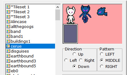

Another fun fact, the two Gieegs (referred to as goog 1 & goog 2 internally) that appear when Giegue has his overstimulation moment by Maria's Melody are actually using Giegue's Sprite Sheet (referred to as "Newgiegue")
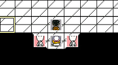
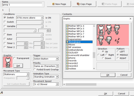

(a part of me wanted to say its probably due to Giegue being the only "stock-standard" looking gieeg to have a moving sprite, but that isnt even remotely true since the gieegs from "allthegoogs" ALSO have walk sprites as well)
...the fact that the misc googs dont get used here either really feels like there was some manner of implication there by the dev. Personally i feel like its meant to imply that this is Giegue's actual parents but that would be a MONSTROUS conclusion to jump to, especially when there is ZERO mention about the BG Gieegs other than them appearing in scenes and the "(They're watching)" interaction.
Actually, the only real plausible theory to make here would be that Cerue was around for the Human Caretaker Experiment/Goog's Arrival to the Solar System. I mean, the fact that she knows about Giegue and refers to him as an anomaly, seems to imply she knows a LOT more about Giegue (as in a majority of his history/biography) than what the player already knows (who he is, what he is, what he becomes, etc.), in addition, she has a Starman in a chamber and seems to know about their origin/capabilities, even calling their transformation into Starmen a mistake yet compliments the design itself.
Which reminds me of something else, the timeline of events in CogDis which are awfully questionable in terms of order (at least for 1 to 4):
"QUESTIONABLE" TIME OF EVENTS
(190X) - The Gieegs arrive to the Solar System and successfully neutralize the Martian's Space Station's Inhabitants to ensure they have the element of Surprise on their hand.
(190X) - The Gieegs arrive to Mars and engage in war against the Martians. They are successful in doing so and assimilate the Martians into their Army/Empire as the "Starmen" (?).
(190X) - Maria & George find Giegue out in the wild, they are then kidnapped and Maria is supposedly in a mini coma for over a week??? Regardless, George & Maria take care of Googie (also George works out some arrangements with the Gieegs to make sure that everything is comfortable to their liking).
(190X) - 2 or so years later, the event occurs, Maria gets Magicant'd and George runs away with the Mental Amplifiers.
(190X -> 198X) - Mother 1's Back Story involving George's Return to Earth occurs and eventually leads to the events of Mother 1 itself (also apparently PSI spreads out across Earth itself?).
I refer to this as being "questionable" as I am highly unsure as to whether or not the Gieegs were the only ones present on the Mothership OR if the Gieegs had done Mars dirty, assimilated the Martians into their Army as the Starmen and then went to Earth.
Personally a part of me wants to believe its potentially the former, as them getting pissed off at Humanity and taking it out on the Martians seems fitting in terms of MOTHER/Earthbound Logic (problem is that this wouldnt really align too well with the Mars' Data Log).
However it might actually be the latter considering that the Gieegs come from outside the Solar System, and by this time the Martians are the only one with a Space Station/Satellite, them getting neutralized by the Gieegs feels fitting, as the Gieegs themselves REALLY dont like it when another race has PSI (or at least, if they do, they dont like them being a potential threat to their goals, whatever THAT may be).
[tl;dr version of this paragraph, either they got super pissy and took out their hate on Mars or they are the equivalent to the Viltrumite Empire from INVINCIBLE and neutralized Mars so nobody would know and potentially warn others who about their arrival]
(now im thinking of the "THINK MARK! THINK!" meme in my head but with Giegue & [insert fitting character role here])
(Also if you're wondering why i've come to such a strong assumption about the Gieegs, it mainly has to do with a friend of mine bringing up a really good point when i was discussing lore stuff about my sona's world (aka the one in my pfp and which i have a ref sheet to), that being "Why would a race that seems peaceful, need weapons of mass destruction to defend themselves? That would imply that they aren't peaceful in the slightest or have blood on their hands." and it sorta stuck with me. Like, the best example I can currently think of is: An alien race comes down to Earth and says "we come in peace" and then pulled out a nuke and vaporized an entire forest after one deer spooked them; thats sorta what the Gieegs feel like to me whenever i think about them now, CogDis obviously doesnt make them peaceful and afr kind of 'shifty' but Official Mother (Game) Lore never actually quite describes what their intentions even were in the first place, only that they were afraid of Humanity having access to PSI and that Giegue needed to stop them)
Actually, i find it even more weird as to what could have possibly had occurred to the other Gieegs. So if we were to go by the theory of "Cerue being around", then there was probably at least... Three to Four unique Gieegs total?
(Hell, maybe there could of been even more aboard the Mothership for all we know, considering that when Maria is running through the halls, she mentions that the aliens on board all sorta just looked at them without stopping them, never brings up if they were just other Gieegs or what, just that they were being observed)
We know Cerue could have potentially disembarked at some random point (maybe potentially after the Human Caretaker Experiment OR after the Mars Invasion, depending upon which happens first) and goes into hiding on Mercury, basically collecting various creatures from around the Solar System (some either being alive or dead).
We do not know what happens to the other 2 to 3 Gieegs except that they were present for the Human Caretaker Experiment & The Invasion of Mars, as they were most likely responsible for the majority of opposition & were described as being all-powerful by the Mars Super Computer's City Records, so I imagine only a few were needed to take over.
Giegue is the only one around on the Mothership (excluding Niiue) but doesn't know where Cerue went.
(...potentially, Niiue's dialogue about him knowing that she doesn't want to meet him could imply that he's referring to his true identity as Giegue & knows that Cerue possibly sensed him but as Giegue and not his own unique being, which is why she said she only trusted the Applechasers [the main 4] and doesnt try to erase their memory).
(WARNING LINKS LEAD TO FANDOM WIKI, CARRY A BLOCKER) Oddly enough, the fandom wiki for Earthbound has a really interesting tidbit of a theory regarding as to what Giegue's Race even was or what may have happened to them (since after Mother 1, Giegue's People gets ZERO mention), mentioning that after he returned to the ship, he may have ended up killing his people in a fit of distress & deterioration before eventually transforming into Giygas, but its fandom wiki so take it with a tablespoon of salt.
(if youre wondering "why not use WikiBound?", it mainly tends to be game information rather than like, external media information..? Idk, i personally feel like i found more substance to Giegue's Fandom Page than compared to his WikiBound Page)
something i will mention however, is that the fandom wiki uses a lot of information from the novel for Mother 1 (apparently?) as a means to sorta fill in information regarding events that occur between the games. Also its the only wiki with a page regarding Giegue's Race, also this really cool illustration of the Mothership:
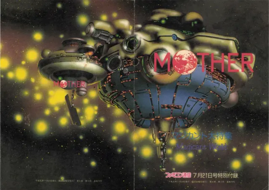
Anyhoot, I'm done rambling now, i just sorta wanted to share this because it was on my mind. Gonna stop now before my brain overheats and combusts from thinking too much, also i am hungry, its lunch.
(UPDATE, 12/23/202X, I've realized Cerue's Sprite has different opacities, which might mean that she's been sticking around quite a bit when George makes his discoveries & when the two escape)
#personal thoughts#scattered thoughts#tism thoughts#cogdis#mother cogdis#niiue#cerue#giegue#gieeg#theory discussion#lore discussion
11 notes
·
View notes
Text
Nintendo 3d rendering vs Sony disc size
The Nintendo 64 and the Nintendo Gamecube both had better 3D geometry than the Playstation and the Playstation 2, but the Playstations were able to have much more music and textures than the Nintendo consoles. They were also able to have more 3d objects in a space at one time. Infamously you could fit all the top 10 N64 games on a single Playstation disc, and then more.
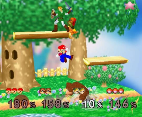
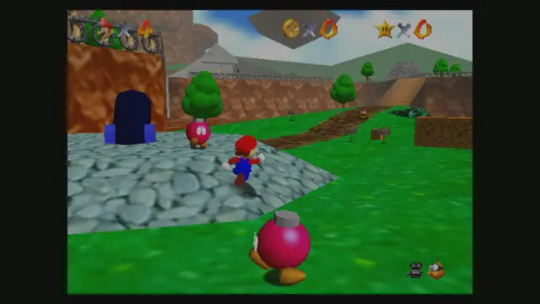
The N64 models looked solid despite their low polygon count. It had this weird double anti-aliaising effect which made images look blurry. However, textures were very, very limited, and the cartridge could not fit much music or fmvs.
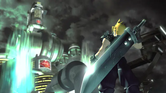
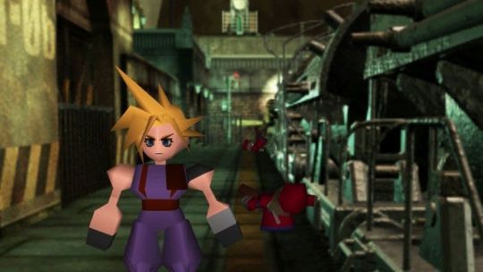
The playstation had worse geometry and even had the "wobble" effect on most games, due to its Z-buffering hardware not being used. However, it was able to make up for its weaknesses.
It used textures to elevate the look of its 3d models, and replaced backgrounds with detailed 2d textures in games like Resident Evil and Final Fantasy 7.
It also used pre-rendered videos and lots of music, things missing from the N64 entirely.
Games that use pre-rendered videos on other platforms, like "Star Wars Episode 1: Racer," had them removed from their N64 ports.

This image seems to be taken from an emulator. I'm having a hard time finding images captured from the original devices. However, you can see that the ps1 has a "wobble" effect and the n64 has lower resolution textures.
These issues ended up carrying over into the PS2/Gamecube generation.
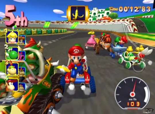
This is Mariokart Double Dash. It's a very good looking gamecube. Its geometry is simple and it only has 16 tracks, but it's more than playable today, and still looks good when upscaled on an emulator.

This is San Andreas. While the game is graphically impressive, you'll notice that the models for vehicles and even the UI look worse when compared to Gamecube games.
However, San Andreas was able to fit so much more information on the disc than any Gamecube game.
Instead of being limited to 16 race tracks and 16 racers like Double Dash, you have an entire open world to explore and dozens of cars to choose from. You have a hundred hours of things to do in this game. There is hours of music that you can listen to in the cars.
That's why San Andreas was never ported to Gamecube - the game requires 4.2gb of DVD space, whereas the Gamecube's DVD-R was never larger than 1.4gb.
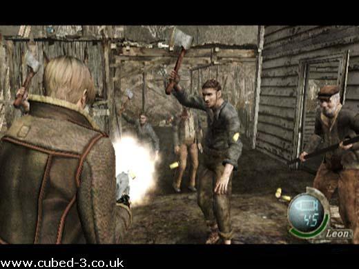
To be honest, I have no idea what black magic Capcom used to port Resident Evil 4 to Gamecube.
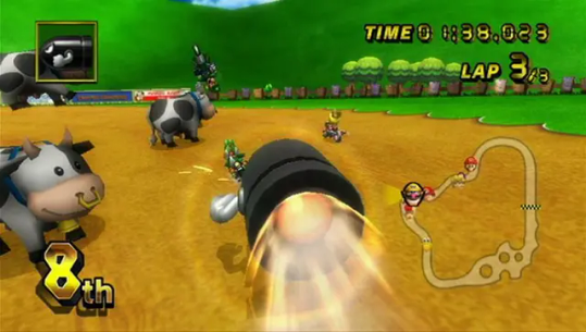
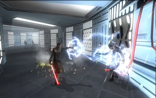
When the Nintendo Wii came out, it retained the Gamecube's power for the most part, while offering DVD space of up to 8gb!!! Finally it could have things like music and voice acting.
However... the PS3 and Xbox 360 were already on their way, and the standard definition Wii was far from their ballcourt.
In the Wii's early days, the PS2 was also still in a lot of hands. So developers who wanted to make games for Wii ported them to PS2, and vice versa. Both consoles ended up having lots of "previous generation" versions of games, like The Force Unleashed, which ran better on Wii than the PS2 by a small margin and had different features like motion controls.
21 notes
·
View notes
Text
funkin blog update!!: THANK YOU ERIC
lots of good stuff in this one :) i highly recommend reading the original blog post itself, there's so much juice that tumblr won't let me put all the juice in one post
but for the sake of tradition, summary ⬇️
so. been a while yeah
they've been working on a lot of stuff that's secret/under NDA/for a different update so they couldn't share any of that on the blog
while they've had instances of people having little things they could and wanted to talk about, they couldn't just put out a post that's like one paragraph and leave it at that lol
so, eric is now going to show us some stuff! yay!!
remember this?
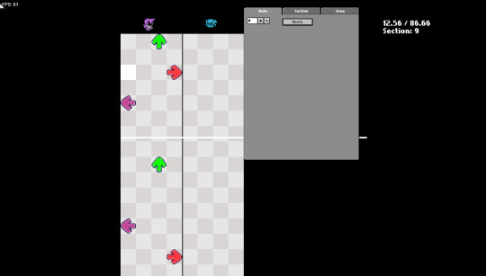
well, eric's been working on rebuilding the chart editor from the ground up!
he's also been pulled aside occasionally to work on other stuff (redo input system, get cutscenes working, redo scoring, work on thing that was blacked out because NDA but when i clicked it i got this video, fix issues with gamepad)
ok now put this song on while you continue reading ⬇️
youtube
and now... the chart editor is COOLER!
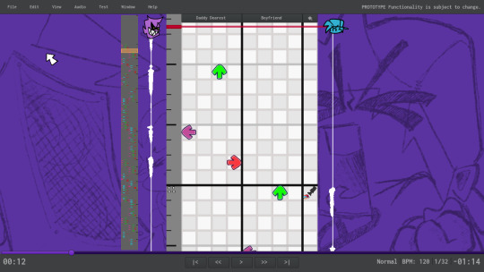
now featuring:
chart isn't divided into sections to scroll through anymore, just one long scroll
opponent is always on the left and player is always on the right, no weird flips
waveforms under the character icons! you can see those!
icons can be clicked to change the character
measure ticks on the left (that thing that looks like a ruler!)
note preview on the further left
video-player-like controls at the bottom for the song
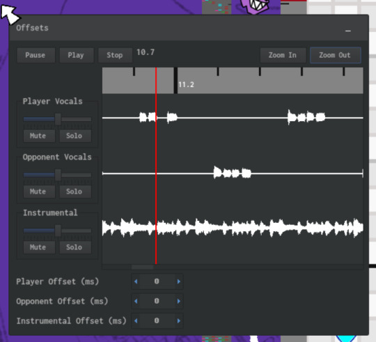
oh, and it's now powered by HaxeUI instead of Flixel UI, which allows for these toolbox windows:
and neat tools like this, which lets you set offsets for each of the tracks:
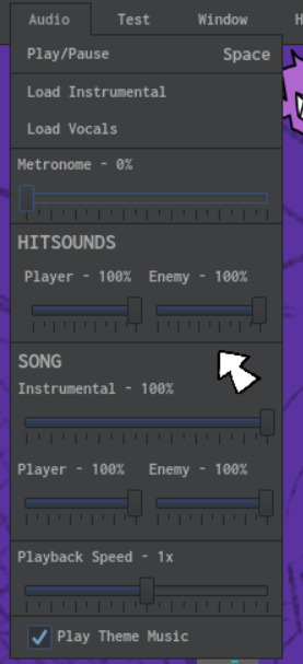
this new chart editor's toolbar has all kinds of neat stuff, like these!

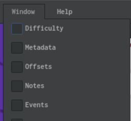
for the third pic: "The Window menu. No the screenshot isn't cutting anything off you're imagining things." 🤨
there's more but at this point you might just wanna go read the original post
FNFC files - new standard for making charts! contains the chart data, including the audio files!
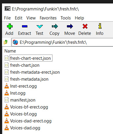
LOTS of new keyboard shortcuts for the editor too!
also a live input mode, where you can place notes at wherever the playhead currently is by pressing WASD/⬆️⬇️⬅️➡️
what that means is you can tap out some notes as the song plays and then proofread them after!
this is the part where i'd put another video because there's another one, but tumblr only lets me put one, so... go read the original post i guess
SONG EVENTS FEATURE! you see that ninth strumline on the right? anything put there doesn't show up as notes for either player, but instead runs a chunk of code at the given time
right now the only built-in events are camera control and getting a character or stage prop to play an animation, but modders are probably gonna have a field day
another video! i already forgot i can't add more than 1. damn you tumblr.
also, it, like, never crashes!

except for when it does!
95 notes
·
View notes
Note
'That was the first good sleep I've gotten in a long time.' ( from h. henry. / @ladyseidr )
STILL HALF ASLEEP, WILLIAM HUMS. IT MIGHT HAVE BEEN A DISAGREEMENT OR AN AFFIRMATION, but it’s impossible to tell due to the fact his head is buried in Henry’s shoulder, blocking out the daylight and the looming threat of getting out of bed. Which is a threat, a major one, in his opinion, when everything outside of bed is so cold — Henry’s warm, warmer than William thinks he’s ever been, and he wants to refrain from moving for as long as possible. “ Shut up, ” he mumbles, lifting his face long enough to speak coherently, “ go back to sleep. Keep having a good sleep. If you leave this bed I think I’ll go crazy and murder you or something. ”
Safe to say he’s slept well too. As a result, his face presses back into Henry’s shoulder firmly: a silent, pushy demand to return to sleeping peacefully. The rest of the world can wait. For now, William is content to rest with Henry by his side.
#(ii) man behind the slaughter — roleplay thread.#(c) answered.#(( TH. THEM ))#(( i kept the verse vague so feel free to see this in any direction / time !!!! ))#(xox) last man standing: william & henry.#(ui) original: standard.#a; ladyseidr#(u) i always come back: queue.
3 notes
·
View notes
Text
How to prioritize your mods with Resource.cfg
My original post: here. Rewritten and reposted to tumblr for easier access. Also added photos. This will be updated more than the original post.
The Issue: NRaas Portrait Panel (NPP) conflicts with Sakura (my UI mod).
You can do this for other mod conflicts. I am only using NPP and Sakura as examples.
The Solution: Have NPP be of higher priority than Sakura...
1 - The "Resource.cfg" file is used to determine how custom content (CC) and mods are loaded by the game. It allows you to prioritize folders and subfolders, which is super useful when organizing your mods.
2 - I assume most people have setup their mods based on this guide
3 - From this, there are 2 folders (Overrides and Packages) and one file (Resource.cfg)
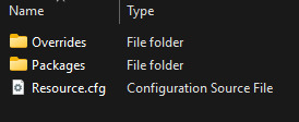
4 - The Resource.cfg from that guide looks like this:
Priority 501 DirectoryFiles Files/... autoupdate Priority 1000 PackedFile Overrides/*.package PackedFile Overrides/*/*.package PackedFile Overrides/*/*/*.package PackedFile Overrides/*/*/*/*.package PackedFile Overrides/*/*/*/*/*.package Priority 500 PackedFile Packages/*.package PackedFile Packages/*/*.package PackedFile Packages/*/*/*.package PackedFile Packages/*/*/*/*.package PackedFile Packages/*/*/*/*/*.package Priority 499 PackedFile Test/*.package PackedFile Test/*/*.package PackedFile Test/*/*/*.package PackedFile Test/*/*/*/*.package PackedFile Test/*/*/*/*/*.package Priority -50 PackedFile Probation/*.package PackedFile Probation/*/*.package PackedFile Probation/*/*/*.package PackedFile Probation/*/*/*/*.package PackedFile Probation/*/*/*/*/*.package Priority 500 PackedFile DCCache/*.dbc
5 - The Priority number determines the load order. Higher numbers are loaded first, so mods with higher priorities override those with lower ones. Higher priority numbers are generally for: overrides, fixes, core mods, replacements, etc.
6 - So, Priority 1000 loads before 500, 499, and -50. Which means this is the priority in terms of folders:
Overrides
Files (???)
Packages, DCCache
Test
Probation.
7A - My Mods folder looks like this:
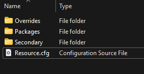
7B - My Resource.cfg file looks like this:
# Overrides = Files that must always take precedence such as fixes, core mods, and replacements. Priority 1000 PackedFile Overrides/*.package PackedFile Overrides/*/*.package PackedFile Overrides/*/*/*.package PackedFile Overrides/*/*/*/*.package PackedFile Overrides/*/*/*/*/*.package # Secondary = Files that must go after Overrides Priority 750 PackedFile Secondary/*.package PackedFile Secondary/*/*.package PackedFile Secondary/*/*/*.package PackedFile Secondary/*/*/*/*.package PackedFile Secondary/*/*/*/*/*.package # Not sure what this is for: # The "autoupdate" flag suggests this folder may be for dynamically updating or monitoring files, possibly for mods or utilities that update automatically or change during gameplay. Further investigation needed... Priority 501 DirectoryFiles Files/... autoupdate # DCCache = .dbc files are created when .sim3pack files are installed Priority 500 PackedFile DCCache/*.dbc # Packages = Standard packages Priority 500 PackedFile Packages/*.package PackedFile Packages/*/*.package PackedFile Packages/*/*/*.package PackedFile Packages/*/*/*/*.package PackedFile Packages/*/*/*/*/*.package # Test = actively developed/tested new content; experimental mods Priority 499 PackedFile Test/*.package PackedFile Test/*/*.package PackedFile Test/*/*/*.package PackedFile Test/*/*/*/*.package PackedFile Test/*/*/*/*/*.package # Probation = under review, has potential issues, outdated, needs fixing Priority -50 PackedFile Probation/*.package PackedFile Probation/*/*.package PackedFile Probation/*/*/*.package PackedFile Probation/*/*/*/*.package PackedFile Probation/*/*/*/*/*.package
Here's a link so you can easily copy-paste it.
8 - This means the load order is:
Overrides
Secondary
Files (???)
Packages, DCCache
Test
Probation
9 - I have NPP in the Overrides Folder, and Sakura in the Secondary Folder. This makes NPP load before Sakura. This also means you can download the latest Sakura versions and throw them in a folder, without having to modify Sakura's files to be 'compatible' with other mods!
Overrides (folder) -- has NPP
Secondary (folder) -- has Sakura
Packages (folder) -- my other mods
Resource.cfg
10 - You can configure your own Resource.cfg however you want, just make sure...
the priority numbers are accurate AND in the order you intended
the folder structure reflects the priority you assign
the folder structure is organized and consistent, with clear and descriptive folder names
you define the depth of subfolder scanning based on how your mods are organized. don't scan deeper levels than necessary, as it may slow down loading. example: stop at 3 or 4 levels if your folders don't go deeper than that. after editing Resource.cfg, test the game's load time. if it is significantly slower, you may need to reduce the scanning depth or reorganize your mods.
use comments for clarity. this is in one line starting with the symbol "#". it should look like this in your text editor:
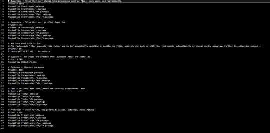
not like this, where there are multiple lines:
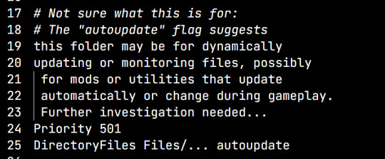
regularly clean and audit your mods for duplicates, outdated, broken, and conflicting mods
if mods have specific instructions with prioritizing, follow that.
// and probably a bunch more mod organizing tips here //
Let me know if this helps! Happy to correct errors or add any extra details you think are useful.
10 notes
·
View notes
Text
PSA: Free Software
Reading this may really save your time, privacy, and money! Reblog or share to spread awareness!
Folks often use software that’s expensive and sometimes even inferior because they don’t know there are alternatives. So to those unfamiliar: basically, free and open-source (FOSS) or "libre" software is free to use and anyone can access the original code to make their own version or work on fixing problems.
That does not mean anyone can randomly add a virus and give it to everyone—any respectable libre project has checks in place to make sure changes to the official version are good! Libre software is typically developed by communities who really care about the quality of the software as a goal in itself.
There are libre alternatives to many well-known programs that do everything an average user needs (find out more under the cut!) for free with no DRM, license keys, or subscriptions.
Using libre software when possible is an easy way to fight against and free yourself from corporate greed while actually being more convenient in many cases! If you need an app to do something, perhaps try searching online for things like:
foss [whatever it is]
libre [whatever it is]
open source [whatever it is]
Feel free to recommend more libre software in the tags, replies, comments, or whatever you freaks like to do!
Some Libre Software I Personally Enjoy…
LibreOffice
LibreOffice is an office suite, much like Microsoft Office. It includes equivalents for apps like Word, Excel, and Powerpoint, which can view and edit files created for those apps.
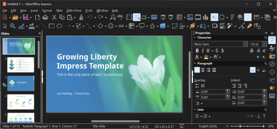
I can't say I've used it much myself yet. I do not personally like using office software except when I have to for school.
OpenShot
OpenShot Video Editor is, as the name suggests, a video editing program. It has industry-standard features like splicing, layering, transitions, and greenscreen.
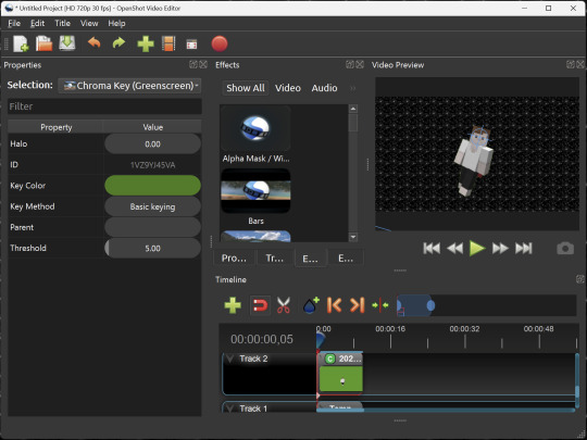
I've only made one video with it so far, but I'm already very happy with it. I had already paid for a video editor (Cyberlink PowerDirector Pro), but I needed to reinstall it and I didn't remember how. Out of desperation, I searched up "FOSS video editor" and I'm so glad I did. There's no launcher, there's no promotion of other apps and asset packs—it's just a video editor with a normal installer.
GIMP
GNU Image Manipulation Program is an image editor, much like Photoshop. Originally created for Linux but also available for Windows and MacOS, it provides plenty of functionality for editing images. It is a bit unintuitive to learn at first, though.
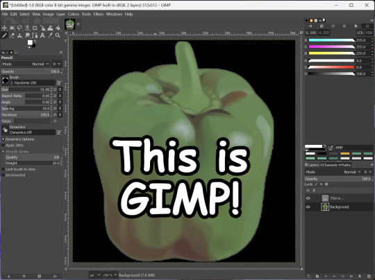
I've used it to create and modify images for years, including logos, really bad traceover art, and Minecraft textures. It doesn't have certain advanced tech like AI paint-in, but it has served my purposes well and it might just work for yours!
(Be sure to go to Windows > Dockable Dialogs > Colors. I have no idea why that's not enabled by default.)
Audacity
Audacity is an audio editing program. It can record, load, splice, and layer audio files and apply effects to them.
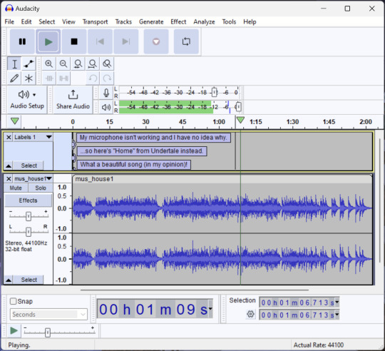
Audacity is another program I've used for a long time. It is not designed to compose music, but it is great for podcasts, simple edits, and loading legacy MS Paint to hear cool noises.
7-Zip
7-Zip is a file manager and archive tool. It supports many archive types including ZIP, RAR, TAR, and its own format, 7Z. It can view and modify the contents of archives, encrypt and decrypt archives, and all that good stuff.

Personally, I use 7-Zip to look inside JAR files for Minecraft reasons. I must admit that its UI is ugly.
Firefox
Firefox is an internet browser, much like Google Chrome, Microsoft Edge, or Safari. While browsers are free, many of them include tracking or other anti-consumer practices. For example, Google plans to release an update to Chromium (the base that most browsers are built from these days) that makes ad blockers less effective by removing the APIs they currently rely on.
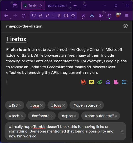
Aside from fighting monopolies, benefits include: support for animated themes (the one in the picture is Purple Night Theme), good ad blockers forever, an (albeit hidden) compact UI option (available on about:config), and a cute fox icon.
uBlock Origin
As far as I know, uBlock Origin is one of the best ad blockers there is.
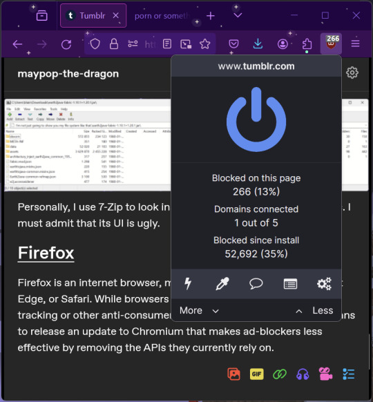
I was on a sketchy website with my brother, and he was using Opera GX's ad blocker. Much of the time when he clicked on anything, it would take us to a random sponsored page. I suggested that he try uBlock Origin, and with uBlock Origin, that didn't happen anymore.
Linux
Linux is a kernel, but the term is often used to refer to operating systems (much like Windows or MacOS) built on it. There are many different Linux-based operating systems (or "distros") to choose from, but apps made for Linux usually work on most popular distros. You can also use many normally Windows-only apps on Linux through compatibility layers like WINE.
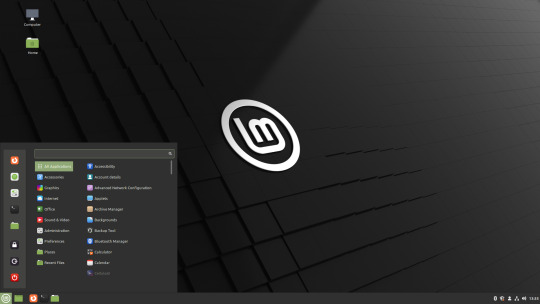
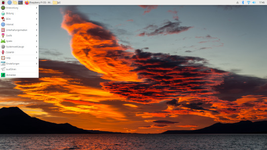
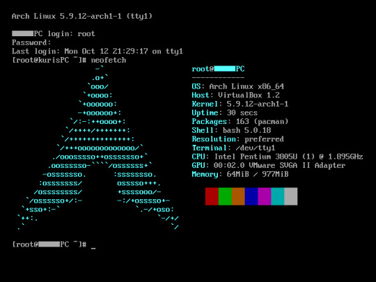
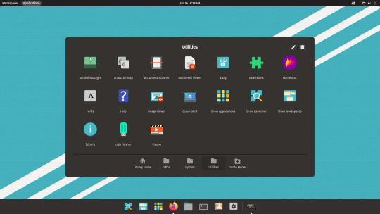
I don't have all four of these, so the images are from Wikipedia. I tried to show a variety of Linux distros made for different kinds of users.
If you want to replace your operating system, I recommend being very careful because you can end up breaking things. Many computer manufacturers don't care about supporting Linux, meaning that things may not work (Nvidia graphic cards notoriously have issues on Linux, for example).
Personally, I tried installing Pop!_OS on a laptop, and the sound output mysteriously doesn't work. I may try switching to Arch Linux, since it is extremely customizable and I might be able to experiment until I find a configuration where the audio works.
Many Linux distros offer "Live USB" functionality, which works as both a demo and an installer. You should thoroughly test your distro on a Live USB session before you actually install it to be absolutely sure that everything works. Even if it seems fine, you should probably look into dual-booting with your existing operating system, just in case you need it for some reason.
Happy computering!
#196#psa#foss#open source#tech#software#apps#computer stuff#I really hope Tumblr doesn't block this for having links or something. Someone mentioned that being a possibility and now I'm worried.#please reblog#2024-01-26
44 notes
·
View notes
Text
Downtimes, module editor, water temple
Happy summer! There's smoke in Portland but it's not too bad. Bless firefighters. Work on Lancer Tactics continues apace.
This month has been mostly focused on the largest heretofore-untouched section of the game: downtimes and the module editor for designing the sequences between combats. We're not planning on doing anything particularly innovative or new in its design — if you've played Banner Saga, Fire Emblem (gameboy versions), or Rogue Squadron you'll recognize what's going on here.

Repair, level up, have visual-novel-style conversations with companions, do some light choose-your-own-adventuring, and pick & launch the next combat. All pretty standard downtime fare — games have pretty thoroughly explored these patterns as vehicles for narrative at this point.

The unique thing that Lancer Tactics is offering on this front is an editor to make your own entire campaigns. Classic games like Warcraft or Age of Empires had incredible scenario editors, but making anything more than a one-mission map was solely the domain of modders. Over the last few weeks, we've gotten a full basically-visual-novel-editor working ingame where you can orchestrate NPC story arcs, clocks ticking, branching paths, and triggered events for all the stuff that happens between combats.


All of the campaigns we ship with the game are going to be made with these same editors, which'll force us to really make sure that they're solid tools. I think it'd be very funny to someday see someone like completely ignore all the mech stuff and just make a visual novel in this engine.
There's no new preview game build this month because adding this big section of the game means too many things are under construction. I'm happy with how fast we've been able to get this going, but making ingame editors is a lot of unglamorous UI piping and data refactoring work. Fingers crossed that it'll come together enough that we'll be able to get the first version of this editor in your hands in time for the next update
Other Changelogs
Carpenter has started re-making the tutorial level from the demo in this new engine, which is pushing us to add a bunch of stuff to the combat editor. I added triggers for playing arbitrary effects on the map, moving the camera, storing arbitrary data to the battle/module states, enabling/disabling/triggering other triggers, AND/OR conditions, and putting execution limits on triggers.

Triggers can highlight UI or actions (so it can be like "use the boost to get through!" and the boost button becomes all shiny)

New "camera start" zone type
Added a "hotspot" zone type that has a little floating title, and plastered the names of other zones on the map (visual style stolen from some Foundry VTT modules)

Added water, whose level can be set via the editor or triggers.


Added unmounted pilots who can mount up into Shut Down mechs. We continue to plan to not have pilot combat be a part of the core game, but it'll be useful for scenario or scripted sequences.

Added activation pips and template icons to the mini healthbar on units.

A bunch more portrait editor assets from Martina, including facial hair. Here's a check Carpenter did where he tried to recreate some official Lancer art ingame. ✨

Schedule update
Taking a look at our original date for the "bones" of the game ("finishing the battle engine, basic character creation, 2 mechs per manufacturer, and an a 'instant action' mode"), we estimated being able to get it done by the end of November. The emotional milestone for me on this front is getting the game to a complete enough state that I feel OK about swapping it in on the itch.io page.
I've been saying that the 3D cataclysm has pushed us back back about 3 months, and I think that's still holding true. Carpenter and I haven't officially made the call yet, but I think it's likely we'll need that time to port more mech content; here's a graph they made that shows about where we're sitting on the PC and NPC mechs for the "bones" target in terms of mechanics and action icon/sprite.

(This data is pulled from a big table they made that includes ALL talents/gear/traits where we've been marking things off as we've implemented them. Very handy for tracking where we are.)

That's all for now. Tata!
80 notes
·
View notes
Text
Dragon Quest III HD-2D Remake launches November 14 - Gematsu

Dragon Quest III HD-2D Remake will launch for PlayStation 5, Xbox Series, Switch, and PC via Steam and Microsoft Store on November 14, Square Enix announced.
Here is an overview of the game, via Square Enix:
About
Dragon Quest III HD-2D Remake is a stunning reimagining of the beloved masterpiece and narrative beginning to The Erdrick Trilogy— the first three games of the mainline Dragon Quest series. Featuring vibrant HD-2D graphics, new and modernized features, and a refined narrative, players are invited to set out on an epic fantasy adventure to save the world from a dark evil. Years ago, the great hero Ortega bid farewell to his wife and child as he set off on a quest to defeat the villainous Archfiend, Baramos. Ortega failed his quest, and Baramos still threatens the world. Now, on their sixteenth birthday, Ortega’s only child is summoned by the king of Aliahan and entrusted with a mission of the highest import: to take on Ortega’s quest, vanquish Baramos, and save the world. Accompanied by a band of travelling companions chosen in the beginning of the game, players are immersed in a vast HD-2D world full of towns, dungeons, and caves, meet fascinating characters, and fight ferocious monsters in enhanced turn-based battles. Rebuilt for modern audiences, Dragon Quest III HD-2D Remake gives existing fans the chance to re-experience a beloved RPG experience and its expanded offerings like never before, while also being a perfect starting point for newcomers to discover one of the most influential RPG franchises in gaming history.
Key Features
A Fully Modernized Remake of the Original – Stunning HD-2D visuals fuse pixel art with 3D graphics, bringing players into the world of Dragon Quest III like never before, along with an improved and modernized UI, and other quality of life improvements.
Traditional Dragon Quest Style Battles – A refined take on the classic turn-based battle system, featuring new animations, additional improvements such as an adjustable battle speed, an auto-battle setting, and more.
Immersive World – Deep exploration of a vast world map with an abundance of rich and captivating locations to discover, challenging players to overcome many unexpected encounters during the journey.
Experience a Timeless Musical Score – An immersive, authentic, and diverse musical composition that captures the timeless essence and magic of the Dragon Quest universe.
Pre-Order Bonuses
Pre-orders for the standard physical or digital edition of DRAGON QUEST III HD-2D Remake will include a free Trouble-Free Travel Kit in the game. The Trouble-Free Travel Kit contains the following items:
Elevating Shoes x1
Seed of Strength x3
Seed of Defence x3
Seed of Agility x3
Seed of Life x3
Seed of Magic x3
Collector’s Edition
Dragon Quest III HD-2D Remake Standard Edition physical game
Collectible game storage box for both Dragon Quest III HD-2D Remake and Dragon Quest I & II HD-2D Remake
Dragon Quest III character, monster and logo acrylic blocks complete set
Including 20 vocations, 2 boss monsters, and logo
The Adventurer Accessory Kit (Dragon Quest III HD-2D Remake in-game items)
Ring of Strength x1
Dragon Scale x1
Words of Wisdom x1
Cat Suit x1
Exclusive digital wallpapers x2
The Trouble-Free Travel Kit (as detailed)
Watch a new trailer below. View a new set of screenshots at the gallery.
Release Date Trailer
English
youtube
Japanese
youtube
15 notes
·
View notes
Text
Okay so. I've been sitting on my full first impressions of the game until after the gameplay reveal, cos I know shit can get twisted in marketing.
I was NOT a fan of the trailer. The vibe was off; I cringed a lot; it gave a off very bog-standard hero team saves the day kind of vibe which I inherently dislike because it seems like Dragon Age has just given up on giving you the freedom to be a bastard, or any kind of character that isn't on rails to be everyone's favourite boy. It also failed to bring any dark fantasy to the table. BUT I know from experience, namely the DA2 trailer (not the CGI one. the other one), that marketing is intent on making Dragon Age look like the goofiest shit possible to appeal to the dregs of society (normies). I watched it. Hated it. Moved on to life stuff.
Now with the gameplay reveal out of the way, I have some more solid takes on everything we now know about the game overall.
Things I liked:
The companions all look pretty cool; I've been excited for Devrin for years now, and seeing that he's a Dalish Elf as well as a Warden is quite exciting to see; everyone else are also not only well designed but don't feel like rehashes of our previous companions (apart from Harding)
The return of multiple weapon sets. Thank fucking god. This may even make archer a viable build again. Also I noted that you only have a set number of arrows which the UI tracks, which I'm a huge fan of
The look and style of Minrathous. I like that Bioware is showing their hard work in coming up with a unique area based entirely around magic-tech and I think the result looks great; I am really intrigued by the dark panopticon vibes and hope that becomes a major theme going forward
Different demon designs. I hope there's a bit more variation as the game progresses, but I liked little details like the Pride demons having some kind of armour aesthetic
Dialogue wheel. No notes; she's here, still the same comforting presence as ever. Praying with fingers crossed that it doesn't turn into a super bland protagonist situation like Inquisition
Choosing a faction in character creation that isn't locked to one's race; this one is a really cool idea and if origins don't come back it can be a decent alternative if the reactivity to your choice is the same as in the prologue
Things I didn't like:
Action wheel. Like. I'm a PC person, so I have no idea what the final UI will actually look like for me. But Bioware hasn't elaborated on their UI style at all and if Inquisition is anything to go by, I'm stuck with shitty console-centred UI for the whole game. I would rather just have the ability bar back, for my sanity.
The two-person companion limit. It automatically restricts people into a specific party build depending on their class and I hate that
The Mass Effect-style gameplay. Party tactics was a HUGE draw to the DA series for me, and is what got me into retro RPGs in the first place. Seeing it replaced completely to the point where we can no longer manually manage our party is a huge disappointment. I am willing to keep an open mind, just because I love Mass Effect that much, but it hurts knowing for a certainty I'm never gonna engage with Veilguard like I did with Origins or 2 as a result
The voice acting. Was this an out of date take, or did everyone sound super flat to anyone else? Especially Neve, who didn't seem to know what she was reacting to, just really wooden. It was disappointing, cos I love her voice overall. Wasn't a fan of Rook's voice but I don't plan to play a man anyway
The breaking pots method of looting. This is gonna feel like such a nitpick but I immediately pulled a face seeing that cos I could TELL some suit somewhere asked the Bioware team to "make it more like breath of the wild" and now for some reason it's not dynamic enough to just click on a crate and choose what loot to take; now Tevinters are storing exactly one (1) random health potion in decorative clay jars around the city (more likely than you think!)
The aesthetic of the veil and spirit stuff so far; it's just all a bit bright and noisy, doesn't really grab me as something fun to explore or fight (again, I'm an Origins girly so I'm biased)
Harding coming back. I know she's cool and everyone likes her and I like her too. In Inquisition. This is just a preference, but if I'm gonna start a new game as a new person I don't want to be inheriting pre-bought friends from the last protagonist ://
Things I HATE:
Why does everyone look like play-doh; it's disconcerting.
Like guys I know DA2 is having a renaissance but I don't think anyone was getting nostalgic over everyone's pudding faces.
Everything put out so far has basically crushed any hope I had for this becoming Dwarf age :/ No new dwarf characters, no mention of Kal-Sharok, Harding being the only dwarf companion basically confirms that dwarves will be unromanceable AGAIN. not a fan
TLDR: This is still definitely not a day-one buy for me. The series has just strayed completely from the genre and format that I loved about the previous games into a full action RPG derivative of games from four years ago. Without the focus on party tactics and the low-tech, dark and gritty worldbuilding from the first two games it just fails to excite me. It looks too much like other games for me to really register it as a Dragon Age game.
I love the story and the world of Dragon Age though, so I do still intend to buy it when it goes on sale, but this is definitely a "wait and see the reviews" situation for me, which is a first when it comes to this series :/
12 notes
·
View notes
Note
This is an odd kind of question but I’ve been seeing a bunch of ifs originally written in CS move over to twine (even this game made this change!!) and, as someone who isn’t on the dev-side of if games and has only been reading ifs for a little while, I was wondering if you could speak to why you chose to make this switch? Was it just personal preference? Could twine do things CS couldn’t? Was there something wrong with CS and COG that pushed people away? Obviously you can only speak to your own experience (and only if you’re comfortable answering!) but getting some perspective could help explain this larger trend I’ve been noticing
i feel like in general this has been hashed out a few times within the community so i can't speak for everyone but i had a few reasons for moving away from choicescript.
to be absolutely clear, these are just reasons for Me Personally and there are obviously plenty of reasons that someone might want to use choicescript that are all perfectly valid and choice of games as a platform still hosts some of my faaaaavourite IF games and writers, so absolutely 0 shade to those lovely people!
in terms of things that you can do in twine that you can't do in choicescript, there's more freedom with UI/design in twine, which is nice! i feel like the new UI (designed & built by @nyehilismwriting mwah mwah) really adds to the ~vibe~ of body count as a story.
in general, though, my concerns were more practical.
the main thing is that choicescript isn't an open source language, which has some implications for ~ownership~. it means that authors get a cut of the earnings of games published through hosted games (that i understand to be pretty decent based on industry standard but correct me if i'm wrong?) but it's a cut nonetheless. it also makes things like having a patreon a bit less secure - i think CoG have said that things like early access are fine on patreon as long as they'll eventually be released through hosted games, but i wanted to be able to write side stories etc that would (and have) stay/ed patreon exclusive and that wouldn't really have technically been allowed. i think most authors using patreon have done so without incident, but just that legality aspect made me nervous! since it's my aim for body count to be a free game in the end, i really rely/ied on the income that comes from patreon during the creation process.
i also had some issues personally with some of the messaging coming from CoG and the idea of my work being associated with another brand first and foremost rather than just with me as an independent author, i guess? there was talk about NFTs which i'm not into and i think that was the final straw that made me decide to take the plunge and move to twine, but actually looking back it was really a culmination of things. had a few bad experiences with the forums, generally just didn't ~feel right~.
ultimately for this project in particular i was like. well if i'm gonna write like a million words and invest years of my life into this thing i want to be able to do what i want with it, release it on my own terms, actually own it etc etc.
anyway, i hope that all makes sense! as i said up top, i can't speak for other authors and there are probably a lot of pros to using choicescript compared to twine as well, it's a perfectly valid choice, just not the right one for me :)
#i have no idea how to tag this lmao#anyway i am trying to take less of a scorched earth approach to stuff like this In General#i am just terrible with authority as a whole so the moment there's A Boss that i think is a cock i struggle deeply to keep my cool hahahaha#it is my workplace achilles heel#but you know there comes a time in every gal's life where they need to grow up and start being like#a sensible adult about things#or whatever
89 notes
·
View notes
Text
youtube
DRAGON QUEST III HD-2D Remake – Release Date trailer
Dragon Quest III HD-2D Remake will launch for Nintendo Switch, PlayStation 5, Xbox Series X|S, and PC (Steam, Microsoft Store) on November 14, 2024.

Logo
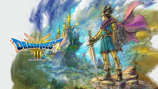
Key visual
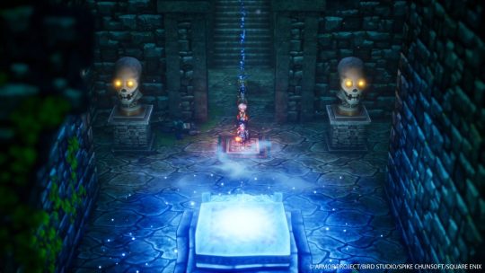
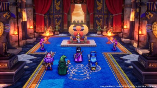
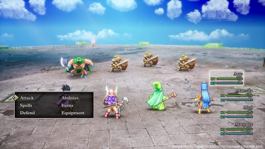
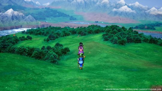
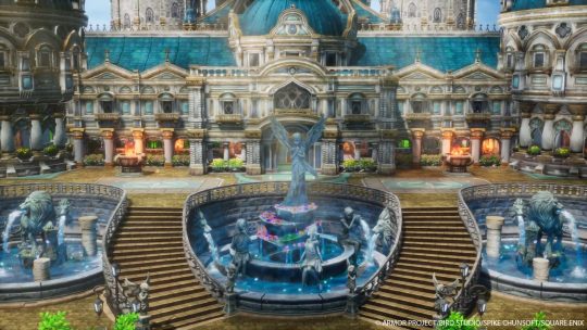
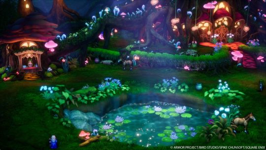
Screenshots
Overview
About
Dragon Quest III HD-2D Remake is a stunning reimagining of the beloved masterpiece and narrative beginning to The Erdrick Trilogy— the first three games of the mainline Dragon Quest series. Featuring vibrant HD-2D graphics, new and modernized features, and a refined narrative, players are invited to set out on an epic fantasy adventure to save the world from a dark evil.
Years ago, the great hero Ortega bid farewell to his wife and child as he set off on a quest to defeat the villainous Archfiend, Baramos. Ortega failed his quest, and Baramos still threatens the world. Now, on their sixteenth birthday, Ortega’s only child is summoned by the king of Aliahan and entrusted with a mission of the highest import: to take on Ortega’s quest, vanquish Baramos, and save the world. Accompanied by a band of travelling companions chosen in the beginning of the game, players are immersed in a vast HD-2D world full of towns, dungeons, and caves, meet fascinating characters, and fight ferocious monsters in enhanced turn-based battles.
Rebuilt for modern audiences, Dragon Quest III HD-2D Remake gives existing fans the chance to re-experience a beloved RPG experience and its expanded offerings like never before, while also being a perfect starting point for newcomers to discover one of the most in
Key Features
A Fully Modernized Remake of the Original – Stunning HD-2D visuals fuse pixel art with 3D graphics, bringing players into the world of Dragon Quest III like never before, along with an improved and modernized UI, and other quality of life improvements.
Traditional Dragon Quest Style Battles – A refined take on the classic turn-based battle system, featuring new animations, additional improvements such as an adjustable battle speed, an auto-battle setting, and more.
Immersive World – Deep exploration of a vast world map with an abundance of rich and captivating locations to discover, challenging players to overcome many unexpected encounters during the journey.
Experience a Timeless Musical Score – An immersive, authentic, and diverse musical composition that captures the timeless essence and magic of the Dragon Quest universe.
Pre-Order Bonuses
Pre-orders for the standard physical or digital edition of DRAGON QUEST III HD-2D Remake will include a free Trouble-Free Travel Kit in the game. The Trouble-Free Travel Kit contains the following items:
Elevating Shoes x1
Seed of Strength x3
Seed of Defence x3
Seed of Agility x3
Seed of Life x3
Seed of Magic x3
Collector’s Edition
Dragon Quest III HD-2D Remake Standard Edition physical game
Dragon Quest III HD-2D Remake Standard Edition physical game
Collectible game storage box for both Dragon Quest III HD-2D Remake and Dragon Quest I & II HD-2D Remake
Dragon Quest III character, monster and logo acrylic blocks complete set
**Including 20 vocations, 2 boss monsters, and logo
The Adventurer Accessory Kit (Dragon Quest III HD-2D Remake in-game items)
**Ring of Strength x1
**Dragon Scale x1
**Words of Wisdom x1
**Cat Suit x1
Exclusive digital wallpapers x2
The Trouble-Free Travel Kit (as detailed)
#Dragon Quest III HD 2D Remake#Dragon Quest III HD 2D#DQIII HD 2D#DQ3 HD 2D#Dragon Quest III#DQIII#Dragon Quest#Amata K.K.#Team Asano#Square Enix#video game#Nintendo Switch#PlayStation 5#Xbox Series#Xbox Series X#Xbox Series S#PC#Steam#Microsoft Store#long post#Nintendo Direct#Nintendo Direct June 2024
10 notes
·
View notes