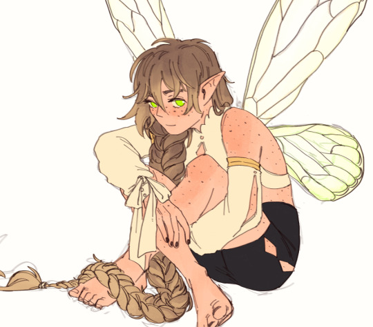
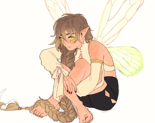
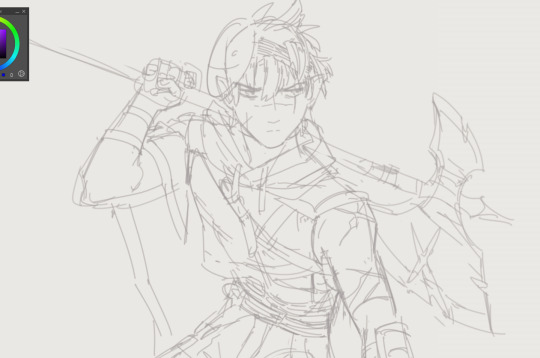
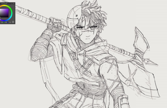
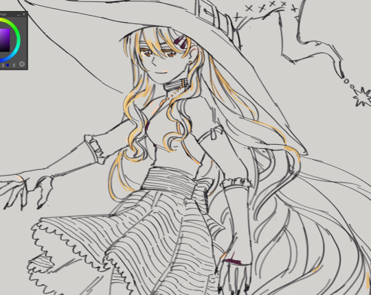
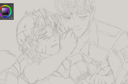
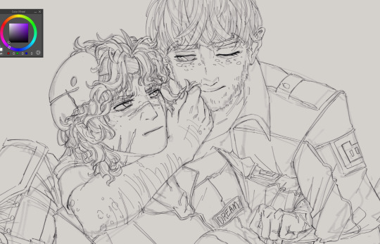
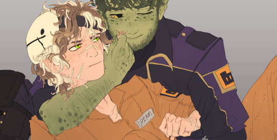
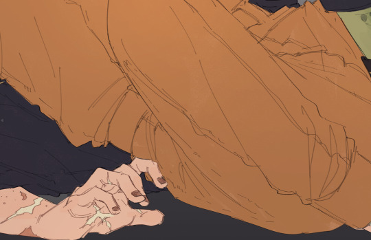
#(first for the lineart. second for the colouring)
Explore tagged Tumblr posts
Note
can you do a breakdown on how you color? i find interesting how you mix many textures and colors in a piece
Ofc! Color is my favorite thing about drawing. :D
I made like a very brief rundown with the technique I use for a majority of my drawings but ofc it still varies a little.
Usually the only cases my process diverges is in the rendering. The color jitter (can be applied to most brushes in most Programms though the water color 6 brush is like my special angel child) makes a rlly big difference during the rendering due to there already being a lot of texture and Color variation and is something I always do.

After step 4 I usually only stick to either the textured ink for a lot of control, to the velvet for a lot of texture and depth or the classic soft for a more soft gradual end product where the color jitter only shines through.

With the first and third the key word really is color picking.


An example for the third brush. I here I made the overlay extremely faint and used the underpainting peeking through as a way to separate the parts of the coat rather than the lineart (at least from the first to the second picture). Using hue as contrast without making a clear dark-light contrast can be a bit difficult if it‘s done solitarily in a painting but due to color having different depth-perceptions (cool colors seem further away, appear darker even if they have the same value) it is fun to play with esp in combination!
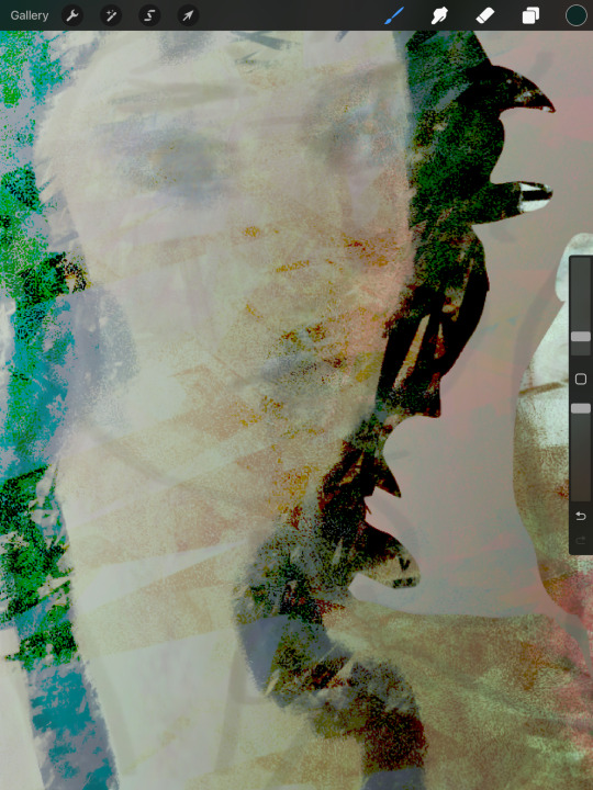
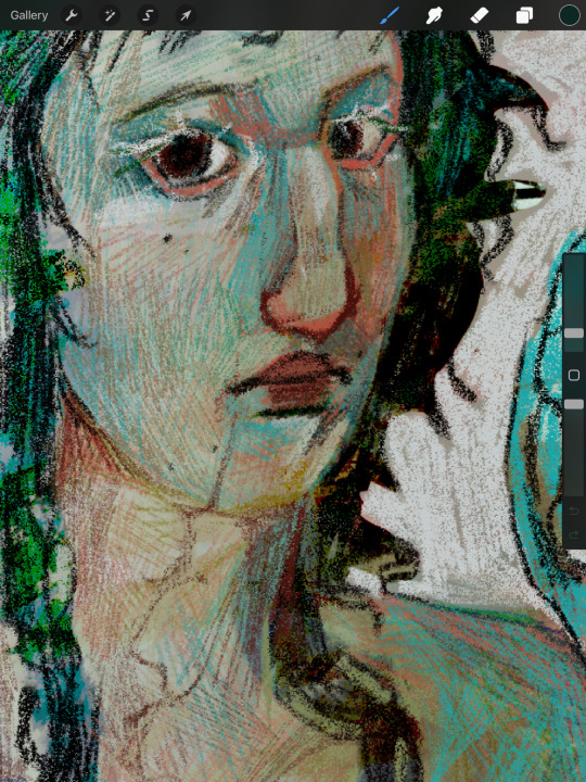
Using the velvet brush is my favorite atm. You can use really vibrant colors and apply them similarly to how you would with ballpoint pens or coloured pencils. It‘s really easy to draw subtle changes in hue without having to be too particular about having the right color and building up the colors leaves you with both a direction that signals to the form of the subject and a rich multitude of different colors that appear completely different than a flat color can.
For this I recommend starting either darker or lighter in order to build up the color in one direction of the other!
Another tip is also to use blur to reduce the sheer amount of color variation of the color jitter if you‘re going to redefine most of the shapes anyways.
Here‘s a speedpaint where I use most of the things I‘m talking about. Flash warning for the sheer amount of color adjustment making the screen flicker at the beginning.
I also didn‘t mention gradient maps yet. Very useful for further color adjustment and in order to bring a very busy composition together color-wise!
Color still is a very individual thing I feel like. There isn‘t one way to color and the way my process is right now is very much fit to my understanding of it. I feel like the decisions you make when rendering; experimenting with colors you thought wouldn‘t go together, breaking the rules you have, figuring out how relative colors are simply because they cannot be isolated. It‘s trial and error but also learning practical lessons that make color make sense to you as you go along.
I hope this makes sense! Color is so fun and I‘m always excited when I get an ask about it. :‘D
Also the jittery water color 6 and Textured Ink brush is free I believe. The bottom two are from a paid brushpack from a creator on instagram. I‘d say only the water Color 6 brush really is something that I find uncommon. The other three can be easily swapped for any other brush that has similar properties. (Pressure sensitivity + texture for the first two and flat marker + texture for the last). I‘ll repost this with a link if anyone‘s interested!
#art#art process#coloring#color theory#artwork#starling‘s art#Ask#flash warning#for the speedpaint#Just to be safe!
28 notes
·
View notes
Text

They’re trying to get ready for the day, but they can’t help but get a little distracted.
My Secret Santa gift for @liemurienn - Merry Christmas <3
Extras under the cut as usual
Background is an edited stock photo taken by Charlotte May !
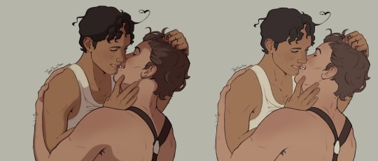
Reference:
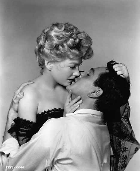
#aph spain#aph romano#spamano#hws spain#hws romano#hws south italy#tem's first spamano drawing ever?? ayo??#also probably the second time I've ever drawn antonio whfjebd#temmie tidbits#THERE WAS A VERSION OF THE LINEART WHERE ANTONIO HAD A BEARD BUT I DELETED IT AND#CAN’T GET IT BACK#Also trying a different hair colour for romano#<3
276 notes
·
View notes
Text
I JUST FOUND OUT HOW TO MAKE LINEART ANY FUCKING COLOUR WITHOUT DOING IT YOURSELF ON MS PAINT
#sunflower rambles#i can even make it rainbow if i get a rainbow image#holy fucking shit#ok so in short if your lineart is for example black you put black as your second slot colour in a second canvas#you copy your black lineart art from your first canvas#you put literally any background on the second canvas as long as the second slot colour is your lineart's colour#turn transparency on#and paste it#and your lineart will now be the colours of whatever image was in the background#this is revolutional
19 notes
·
View notes
Text

My newest art is a fanart of LitchiKitti's character Rhyolite (YouTube). I made many of those before, mostly sketches 👀
#art#artwork#digital art#digital arwork#fanart#cat art#character fanart#flipaclip#ibispaint art#made in ibis paint#(first for the lineart. second for the colouring)#my art#my artwork#feral furry#sfw furry#furry sfw#Idk I'll just tag it somehow
18 notes
·
View notes
Text


art trades with my friend (not on tumblr)
it's a character from a movie based on fairytale


other version because lighting sucks
#ersh art#my art#art#artists on tumblr#traditional art#(not the second one. the second one has a traditional lineart but was coloured digitally)#image description in alt#traditional illustration#pencil art#art trade#fanart#my fanart#I don't know what tags should I put. Nobody knows the fandom anyway#russian fairy tales#russian literature#illustration#horse art#the first one has horses! I spent a lot of time on them#Конёк-горбунок
1 note
·
View note
Text
This Should've Been an Email
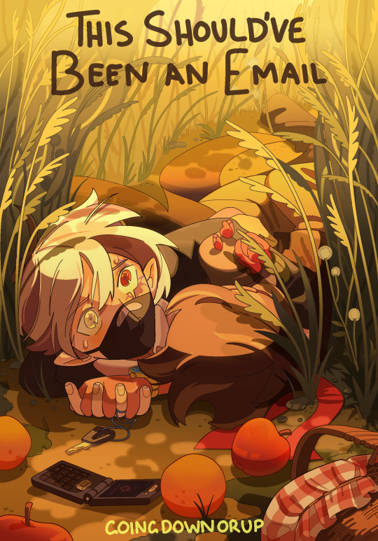
His mouth moved without it telling it to, then closed like whoever was possessing him didn’t know what to say either. There was something going on, something Etho could feel but didn’t understand. They were standing on the edge of the world, and Etho didn’t know how to tell Bdubs he was out of time. Was he out of time? Maybe he was just going insane again. Maybe-
“Etho, there’s a lot of void energy going on right now, can you focus-”
You can’t outsmart a god. You can only run.
-
[ READ HERE ] Latest addition to the Should've Could've Would've series and sequel to the YCAOverse byyyy incredible great @goingdownorup cinemaaaa is HERE and we are BACK IN THE BUILDING!!!
[rambling undercut]
you've fallen for my trap card, ramblings not about the actual fic yet sorry - I'm going to talk about art technicalities at you now :]
Ver without the text:

I drew this up on a whim immediately after finishing the first chapter. Other than it being fanart, this year I want to think smarter when making elaborate pieces - this being the one of the first experiments on it.

sketches have always been my starting foundation I usually go through a few iterations gradually building off the rough thumbnail all the way to lineart. Here I'm establishing perspective and rhythm (movement), using background and props to better frame the emphasis (focal) rather than overwhelm the eye with unnecessary detail.
Shirahama's Witch Hat Atelier manga panels were an inspiration for the lineart (reoccuring character. WHA changed my life)

I even started actually putting base colours instead of skipping to shading... BASE COLOURS. BASE COLOURS WITHOUT SHADING? Crazy world we live in. Above were me testing which colours worked best for the background and purpose. Ethubs look a little out of place atm - this changes in solid filters

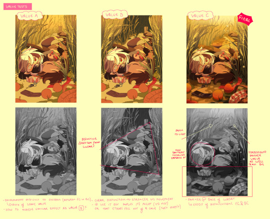
Shading itself was a lot of back and forth in constant fumbles to maintain the rhythm instructed in the lineart, adding emphasis how values needed to carry the visual communication of this piece especially with a line heavy background because of the wheatfields. Everything uses either cel shading, filters, or gradients - I wanted to find a way to add complexity to my regular rendering style without needing to manually blend/paint (takes too long)
During this stage, Heikala's watercolour art was the study in crowd control (backgrounds with organic repetition)

Smaller misc details that couldn't fit anywhere in the previous pages. Overall while there are some things I still would change/redo, overall very pleased as a first (second) attempt ^_^
#stufffsart#character concept stufff#stufff rambles#ycao au#<- Going to be my catch all tag for everything of that tl#This Shouldve Been an Email#ethoslab#etho#bdoubleo100#bdoubleo#bdubs#ethubs#(theres a third person if you can spot them)#hermitcraft#hermitblr#mcytblr#theres still other things from the sequel i wanna draw (jizzie designs - gem and cleo etc) thatll have to wait#this cover and my other fancover are so stylistically different whwhwh
1K notes
·
View notes
Text
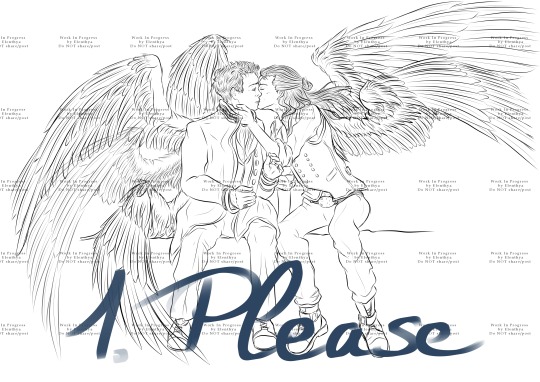
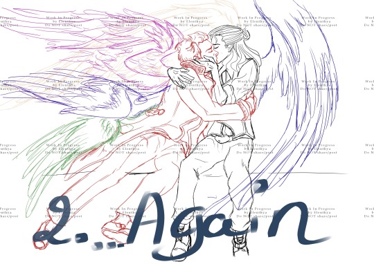
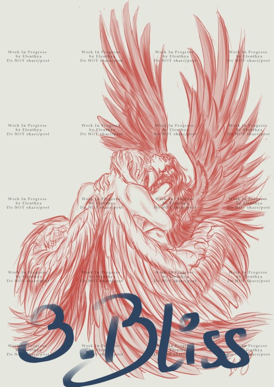
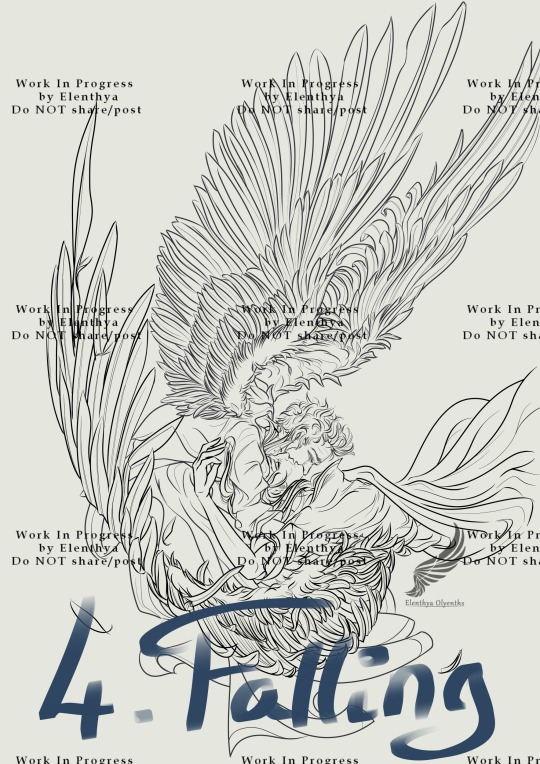
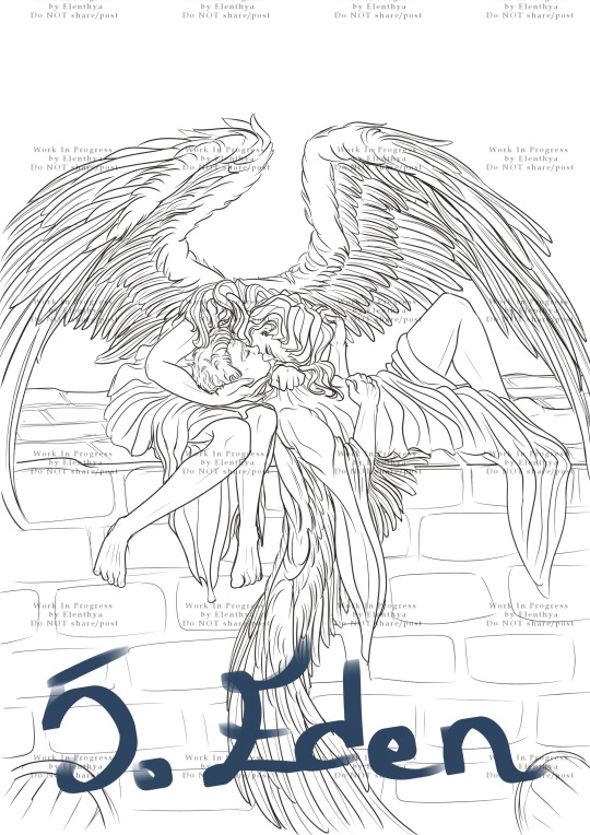
I couldn't decide on where to begin, so thank you all by advance for your help! Please reblog so everyone can see it! The winner of this poll will become one of my top priorities during November.
↓LONG POST under the cut! I describe each WIP with pictures and I explain what I would like to do.↓
Tell me in comments/reblogs what you would like to see for these WIPs!
Num. 1: "Please", inspired by David Tennant Richard II Kiss

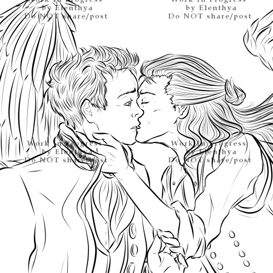
"Please" is the first part of a diptych. Published as a simple WIP in December 2023, it became for no apparent reason (lol) one of my most famous posts on Tumblr. I have always wanted to full-colour it, but I was feeling so much pressure about this one that I didn't dare to try. And then Time has passed...
I have changed a lot of things in my art practice. Different brushes, different lines, and so when I'll work again on "Please", I already know that I'll have to redo all the lineart - that's ok, it's one of my favorite tasks. I will improve Aziraphale's expression and draw more details on his Archangel suit. Crowley with his dark waistcoat (ngk) and his gorgeous black wings will probably stay the same, even if I'll redo all his lineart so they'll complete each other perfectly. And, of course, full-colour... Teehee.
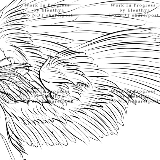
Num. 2: "...Again." (inspired by David Tennant Richard II Kiss)
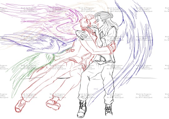

"...Again" is the second part of my "Richard II Kiss" diptych. So much potential in Aziraphale's wings, as he literaly lauches himself into Crowley's arms! And how I love the way Crowley embraces him like nothing else matters. I'll have to do all the lineart for this one, and I'm so glad about it, because I guess I have changed and improved my lineart skills these last months, and "Again" is the perfect challenge for proving it to myself.
Num. 3 "Bliss", one of my favourite Red Art Sketches! But...

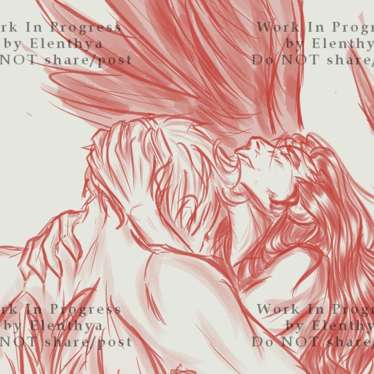
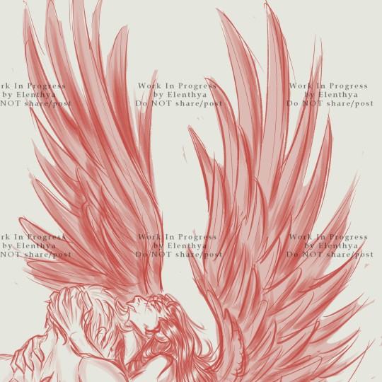
Achieved on the 29 of January, 2024, "Bliss" is a Daily Challenge sketch, so time completion = less than 2 hours. I love the emotion and the movement in this one, but I have always wanted to come back to it and take my time, in order to draw a cleaner and more detailed version, probably in full-colour. The potential of Crowley's wings is phenomenal (I'm so much more skilled now about drawing wings), and his expression is wonderful. Maybe I'll change a little bit the lineart so we could see Aziraphale's embrace on Crowley - tenderness and passion all the way, always.
Num. 4 "Falling Starmaker" - "If Only I could have been there for you"
"Aziraphale saw the Starmaker's Fall, but didn't (couldn't) intervene. 6 thousand years later, he still regrets. He should have been there for him."

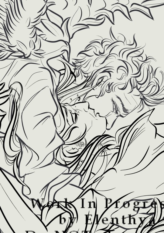
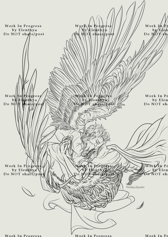
I dearly love this headcanon about Aziraphale, and I like to imagine that he would still dream about saving the Starmaker from his Fall. Not because he prefers Crowley as an angel (Damn, NO), but because he learnt to know Crowley throught the ages. And since he saw how much Crowley has suffered, after 6000 years, Aziraphale would do anything for relieving Crowley of thepast and the pain.
The lineart here is quite ok but needs to be redone so it would be more appropriate for a full-colour rendering. I really want to work on highlights and rendering effects for this one, so the movement of the Fall would be preserved. And I'll work on details like burnt feathers, Crowley's hair and Aziraphale's saddened eye.
Num. 5: "Eden" or "Take me back to Eden"

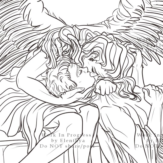
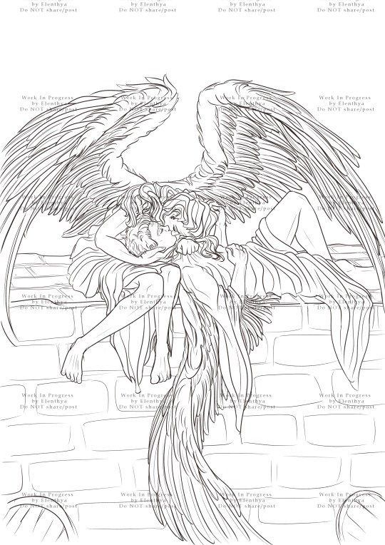
Since my first reading of "Anatomy 1.0.1", a Rating E fanfiction written by Fyre, I have a thing for them already together in the Garden of Eden. So of course, a kiss on the wall (again), but with their wings apparent this time!!!
I gave up this one in April after trying to full-colour it (that was... hideous.) Now that I have a better idea of how to handle full-colour, I need to come back to it. This one will be a peaceful, innocent fluffy scene. With Crowley's proud wings casting a soft shadow on them, probably, and his gorgeous hair flowing like fire and gold over Aziraphale. A lazy and tender moment in the Garden of Eden, when everything seemed simpler...
Ooooouf you did it! You know everything! So, which one you prefer? What would you want to see in it when it's achieved? Reblog/comment and tell me everything, I'm curious!!!
Thanks to you all, love you!!!
Linktree - Tumblr Masterpost
♥ Tag-List below (tell me if you want to be in or out)♥
@goodomensafterdark ;
@floscrap-blog ; @demonsandpieohmy ; @amagnificentobsession ; @captainblou
@ineffable-hyperfixation ; @itsscottiesstark ; @moralsofanalleycatsposts
@fearandhatred ; @eybefioro ; @crowleys-bentley-and-plants ; @ashfae ; @crowleys-hips;
@paperclipninja ; @silverdphantom ; @neverlet ; @naturallyteal
@mad-aims ; @daisydimple20092 ; @seraphhiim ; @rebeccakatmauri
#good omens#artists on tumblr#31daysofgoodomens#good omens fandom#art challenge#crowley#my art#poll time#elenthyaandgoodomens#Red art#or not?#Aziraphale#aziraphale x crowley#crowley x aziraphale#ineffable husbands#ineffable lovers#31DOGO#archangel#archangel aziraphale
118 notes
·
View notes
Text
oh wow haha what is this? fanart of an au (of an au?)
wow. i actually drew something for once! (rare creature sighted: a lone artist picking up her apple pencil for the first time in six months)
ehhh hope u don’t mind that i changed a few details (*cough cough* totallyyy didn’t change one of the sleeves into a shepherd’s cape sleeve because i couldn’t for the life of me figure out how to draw the second arm haha ha *cough cough*)
also i added in different shades of white because i found it impossible to differentiate between the two drapey scarves at the front, the long mini coat cape and the white button down inside.
(rendered version will be posted sometime later. in a few days? flat colours is all i can do for now after struggling through lineart)
(also looking back i’m 75% sure one hand is bigger than the other. god dammit i hate anatomy.)

150 notes
·
View notes
Text
Mia Fey / Lady Justice
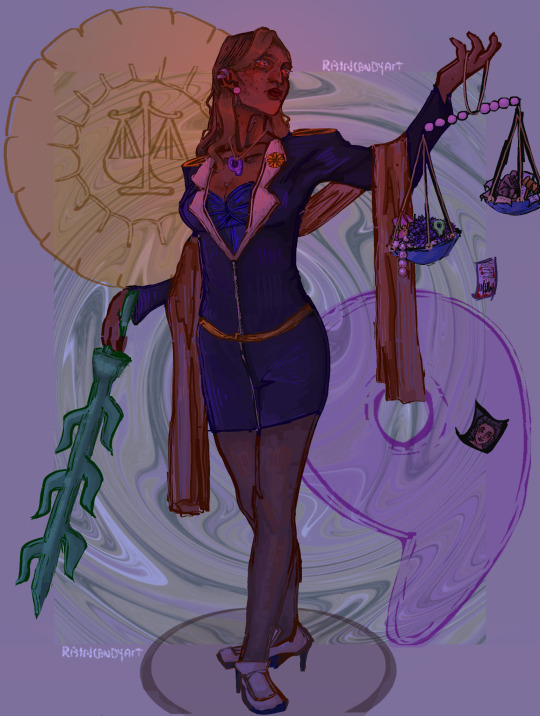
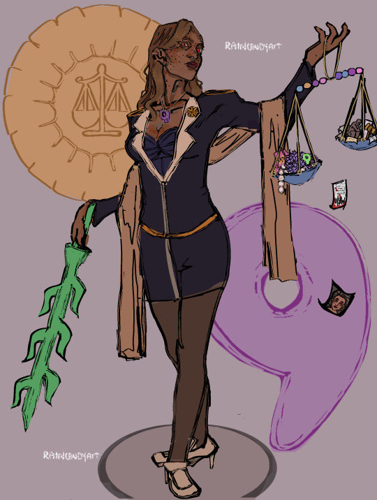
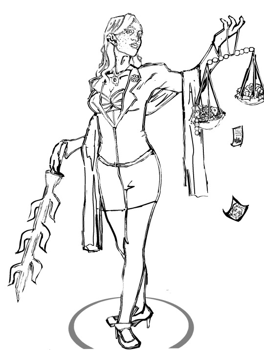
[Id: Three photos of a digital drawing of Mia Fey from the series Ace Attorney. She is drawn as a brown skinned asian woman as she stands with her legs crossing, whilst holding objects in her hands. Her eyes glow with red magatamas and her outfit has more golden detailing. Towards the right of the screen, she's holding up a scale with two bowls, one filled with Dahlia flowers, Iris flowers, a magatama and pearls, and the other bowl filled with evidence from turnabout sisters, a gavel and the thinker, and falling to the ground off the scale is a portrait of Misty Fey. Mia's scarf is wrapped around her arms as her other arm is positioned downwards, with the Shichishito in hand as she faces towards the scale in the other hand. In the background, a purple tint, a pale green swirling texture can be seen alongside a purple magatama on the bottom right , and a defense attorney's badge on the top left. Whilst near Mia's face there seems to be a pinkish light shining. At the top there is the artist's watermark "Raincandyart". The first photo is the full art piece, the second and third photos are of the full art piece again, but the sixth photo is just the base colours and the seventh is just the lineart. /End id]
#art#described#described art#digital art#drawing#ace attorney#digital artwork#ace attorney trials and tribulations#ace attorney justice for all#Mia Fey#Morgan Fey#she's like lady Justice but uhm not impartial#she is all Seeing etc etc
1K notes
·
View notes
Text
「 GABRIEL 2024 REDESIGN TIMELAPSE: LINEART 💫 」
a few people requested more timelapses, so here's one of my character gabriel who's been in sore need of a glowup. i needed their new design for another upcoming art piece, so this was done up real quickly on the fly. i'll likely tinker with it a bit more, but this'll be their new reference sheet once it's coloured and put together.
when working on reference sheets i draw the outfit and second pose on top of the art of the first pose [seen at the 1 minute mark]. this ensures the two poses stay relatively proportionate to one another and helps avoid any weird physique discrepancies.
i typically avoid posing hands in front of the character to ensure the whole body can be seen unobstructed. i've made an exception here as gabriel has very few markings and none would be obscured by having their hands there. that, and their palms have a reference in the second pose.
hope you enjoy watching!
#gabriel#oc#furry art#timelapse#art timelapse#art process#godbirdart#godbird#volume warning: music#sound: quiet piano / slow music#lastly: don't look at my sketch layers i do not enjoy making sketch layers they do not spark joy ;w;
106 notes
·
View notes
Note
Your AweSamDream art has given me so many brain worms how do you make your lines so thin and smooth??? Any time I try ultra thin lineart it always looks very... first time digital artist.
For me it was first i found a brush i liked and then I slowly just kept making it smaller or the canvas bigger. It's a gradual thing and I honestly don't really know what I do or don't do to make the lineart look good. I think maybe part of it is me doing alot of detailing?
I'll put some examples under the cut!
I don't know if these examples will help because I have no idea what im actually doing and can only guess based on what i think i might be doing æsldkjfælksd I colour my lineart which kinda hides(?) the mess a bit sometimes, smooths it out.
I think its important to note that my lineart isn't actually that smooth, it's kinda messy and sketchy alot because i don't put alot of details on my sketches (comparatively) and i dont follow the sketch perfectly when i line. my lineart would probably count as a detailed sketch for many. (the colouring helps alot!)
For an example c!dreams leather armour! in sketches or older arts its more flat where i draw more dimension to it now which also lets me add damage to the leather which i like doing because otherwise i end up feeling the lineart is "empty?" if theres too much space with no lines

I also paint on top of lineart when i don't like how it looked! (link to timelapse of this art)
In the second example i used a round brush for a new way i like with drawing hair! which is why as i wanted to use my favourite brush in this art, i made the lines so small so i could have more lines in the hair! as my favourite bush is fixed in a flat 20 degrees!
My sketches are generally pretty thick lined compared to what i end up lining so many times one line in the sketch becomes two lines in the lineart! i also draw pretty quickly which I'm happy with for the loser energy it gives the lineart (even tho colouring in the lineart can be a pain when i cant just select it all because of so many goddamn holes) But ultimately when you zoom in you can tell its not that smooth, its just smooth-sketchy but throughout it all which makes it conhesive! (i think) (maybe)
the fact c!dream is my own design i know basically on the back of my hand also helps! it means i can just slap it out without really thinking that hard about it because im so practiced ! (which is why i draw him alot lmaoooo) when i dont know a character as well i stuggle more with thinner lineart because i keep refrencing back instead of just doing what i want. when i draw new characters i usually start thicker and then slowly get thinner lines as i figure out how i want them to be drawn.
41 notes
·
View notes
Text

(Click the image for better quality)
Yipeeee that Keiki and Mayumi fanart I posted the WIP of is finally done woooo- This piece was a very experimental one that I'm kind of OK on. Maybe because I've just gone insane looking at it for so long and I'm my own worst critic lol.
Artist's Notes;
So I've once again been playing around with my rendering style, mainly because I have been wanting to improve my lighting for a while now and as I was just scrolling through Tumblr, I saw some of the official art for that one webcomic-turned-animated-TV-Show Lackadaisy and was immediately inspired. I also have seen a technique a few times in the past where the lineart and shading are merged together, so I've been meaning to try that for a little while.

I did some experimentation on this one sketch of Keiki I posted in my sketch dump and I really liked the results of it, so I carried those over to this piece.
I ended up scaling up Keiki and Mayumi from the original WIP because I felt like they were both getting lost in the composition, and I'm glad for that because I think it works a lot better. I'm not a fan of how Mayumi's sword turned out at all, but it's not really meant to be the focus of the piece so eh. Overall, I think I could do better with my colours, probably because with Keiki and Mayumi's colours, I did them flat in greyscale and then used a brush on the overlay blend mode to colour all of them over, after which I changed the base layer for their colours from white to yellow and then lowered the opacity so it all went together better. I also decided to use gradient maps for a lot of the background elements, mainly to experiment with getting in my values first to make them pop out more. I ended up finding a really nice sky gradient on Clip Studio Paint that I really liked, and that kinda helped to establish the colour scheme of the background a lot. I think the whole "start in greyscale then colour" thing really works better with painterly styles rather than more illustrative ones, and while it is good at making sure your values are more readable, I honestly don't think I have the skill level to pull that off yet. Honestly, I think I've been looking at this drawing too long or maybe I added too much to it, but I wish I could've made the colours less monochromatic, but I'll just save that for the next piece I do.
I do love how the flame (...well it's more of a weird space rift than anything in this piece) and the lighting turned out, those were fun to do. I was initially struggling with the flame and how Mayumi is positioned in front of it before realizing "Oh wait! This is a weird abstraction of a weird creature! I don't have to follow the laws of anatomy!" and just dislocated it's flamey bottom jaw from the main body. I also changed the colours of it since I was really not liking how incredibly bright it was when it had lighter colours. Again, the gradient maps served the more painterly style of the flames well.
I also love how Mayumi turned out. I could do her sleeves better but that's more of just me needing to study how those types of sleeves fold in that position more. I'm also very happy with the posing, the technique I used for that was taking photos of myself in the positions I wanted, blocking in the silhouette and then modifying that by adjusting it to my lines of action that I drew on top of the original photos, and then sketching over the silhouettes and drawing in the shapes of the hands overtop of the photo if I needed to get the fine details right. As for what I do to take the pictures myself, I use a tall chair I have, prop up my phone with a phone stand, put on a ten second timer and scramble to get in position. Yes, I did have to use a bunch of thin markers I had to try and get the hand positioning on Keiki's pose right, yes I do have a fake sword that I used to get the positioning of Mayumi's arms and hand right, the sword was for an old Halloween costume from several years ago. I really like how both Keiki and Mayumi turned out in this drawing, I'll have to play around with these designs for them more in future drawings.
Also, if you wanna know why I draw buildings like that, when I watched Fantasia 2000 as a kid (One of the Disney movies where they make really beautiful animations to classical music) the way they drew the buildings in the first few sections Rhapsody in Blue segment (the jazz one with the cities) changed my brain chemistry and now whenever I need to draw buildings really quickly, I refer back to that. Since the buildings aren't really the main subject, I didn't put much thought into them.
As you can tell I am very tired of this piece, mainly because I made things harder for myself by overcomplicating the process compared to what I usually do, mainly with the whole "starting in grayscale then adding colour." I'd honestly just prefer having a black layer set to colour that I can just toggle on and off when I need to see the values, but it was good to experiment. And that was mainly the point of this whole drawing, to experiment. I'm definitely going to have to play around with this new style I'm going for, mainly because I liked how it turned out a lot in the augmented Keiki sketch, and also because I want to find ways of making it suit my style more. I also really want to keep experimenting with my lighting like this, it's very fun. Last but not least I am never starting in greyscale again because dear god I do not like the workflow it forced me into. I don't have a problem with the method itself it's mainly just a skill issue lol.
If you wanna read my headcanons for these two, I put them in my WIP post, so you can read them there if you want to. The more I look at this the more I prefer the simplicity of my WIP. I might go back to this and just take away the fancy colours and effects to see what it looks like without all of that stuff and reblog this post with that drawing, but for now, I don't think I can look at this drawing again for a while.
#touhou project#art#fanart#touhou fanart#touhou 17#wily beast and weakest creature#keiki haniyasushin#mayumi joutougu#haniyasushin keiki
116 notes
·
View notes
Text
Here ye here ye, another breaking down processes post from yours truly!
For this animation, my plan was to make something I'm proud of AND also something to force me to take my time since with all previous animation works they were all rushed. I normally tend to speed through work as someone whose illustrations are painterly and I like to keep them rough. Also lets be totally honest my other plan for this animation was to animate Mizrox being so sickeningly sweet.
Fun fact, this animation was going to be longer. I had tried to plan out Olrox climbing on top of Mizrak during the kiss to lay on his chest. There was an attempt trying to rough that out and several ref videos It was scrapped because for the life of me I could not figure it out. Also hypothetically if I was going to keep it, I would cut to another angle (perhaps Mizrak's face close up) and then cut to another angle that would make it easier to see that climbing over the top. OR, consider Olrox already sleeping on his chest (im just rambling now but this is basically 'if you were able to do this again' section).
I wish I actually went through a more proper tie-down process because the jump from going from my rough straight to clean was rough (badum tsk) for the first few seconds. Defintely learnt my lesson ALSO Olrox is surprisingly really fun to draw from behind.
I challenged myself to see if I could get the idea of "bigger movements, less in-betweens, smaller/slower movements, more in-betweens." Though the effect of Olrox rubbing his face against his arm may be a little too jarring and I steered quite a bit away from my rough and self-reference video in hopes of making the face rubbing more apparent because I thought the character acting was too subtle and wanted a contrast to the other half of the scene. I reconfigured my CSP animation workspace for this too so it definitely made the process less tedious when cleaning up the animation.
(Which by the way I do record a lot of self-references depending on the section! For things I can't do/uncomfortable doing, I'll end up looking up videos. It's the easiest for me to catch subtle things in body language and also get a feels for the motion.)
Also I'm really satisfied with Olrox's anticipation before his smooch and the shoulder roll at the end even though technically the arc doesn't complete itself. MIZRAK THOUGH, when cleaning up I realised my rough wouldn't make sense because he's already looking at him so there's no need for a turn, and then the lack of a shoulder movement felt jarring, so all of that was done without any thought, wish I did think about it more though.

Now compositing was a monster in its own right and basically me jumping back and forth between turning on and off different layers, but here are all the new things I did; I duplicated and blurred the lines of the lineart, beveled the shadows so it was lighter on the inside, and added a rim of blur so the focus drew towards the couple. Also will absolutely admit that my fanboy ass went "... be crazy and try to mimic the show." The final did not go that route because I thought it was more important to emphasize the mood/atmosphere (Also Olrox is intentionally stylized differently because i wanted him to be softer here and I had to give him eye highlights for plot HELP). THOUGH to say I did not try to mimic the style, the #2 lighting test was my 'attempt' LOL 😭 I can never consume media normally.
Here are the lighting tests I went through. I definitely knew I wanted to go with a morning vibe, though I tested out a night ver for fun and did some edge lighting which led to mixing both version #2 and #3 to make #4.
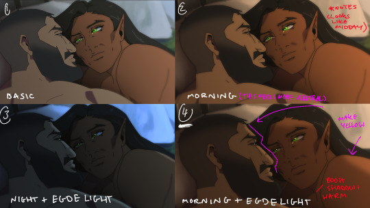
Fun fact, I almost went with #2 due to fear of getting too heavy-handed with compositing and therefore losing the animation (even though I really liked #4 at the time). Thanks to a friend, they also shared the sentiment of liking #4, though pointed out it felt like midday and encouraged me to make the colours warmer and deepen the shadows. It is a really tough balance but I think for a softer scene like this, the more additional layers of comp worked out in the end.
The edge light was a last minute thing because someone told me to add sound and to have light stream in. Also at this point I deadass forgot that you know, Olrox, is a vampire, but hey rule of cute overrules. We can pretend its light not from the sun LOL

Also yay I got to show off my own style a tad, I love paintingggg. It's not as completely fully rendered coz I knew that it would get covered up but I still made sure it was quite clean regardless. I didn't realise how much of it would be covered up even though I did make sure they would fit/make sense for bg LOL
Now we are done!
If you've gotten this far thank you! There's gonna be less frequency of these animations due to the semester starting back up soon and I don't get many opportunities to actually 2D animate (despite it being an animation degree RAH). Also I remembering cringing and laughing a lot when I immediately started putting colour down going "oh i can see the end of the horizon, i have too much power as an artist, people will see this i cant let them see me be crazy"

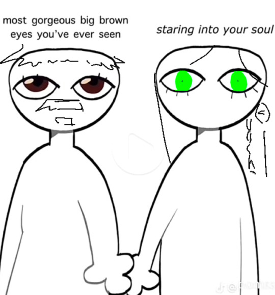
[Here's some memes I drew over while my friend was reviewing my work]
#mystery talks#castlevania nocturne#artists on tumblr#castlevania#castlevania fanart#fan animation#olrox/mizrak#i still keep going “oh no people who worked on the show will see this theyre gonna see im insane /lh”#its ok coz being crazy pushes you to achieve things
87 notes
·
View notes
Text
If We Each Did Half a Miracle

@phoen1xr0se I hope you don't mind a humble spot of unsolicited fanart. I couldn't resist the urge!
Okay, first, I haven't shared art in over a decade. Second, I haven't drawn anything since 2022! Lastly, this is probably the first time in my life I've drawn something that isn't manga-style.
And what ispired me to get all artsy was the absolutely fabulous fanfic There is a Light & It Never Goes Out by even more fabulous @phoen1xr0se The scene comes from the newest chapter of the story (in this AU Crowley has scars on and around his eye; and yes, Dog is absolutely crucial there - if you read it, you know why :D).
I might colour it one day, but the lineart alone took me almost 2 weeks and I haven't coloured anything digitally since 2012 (seriously! I just checked!), so it would probably take me forever!
If you repost outside tumblr, please, please credit me and include the link back here <3 If you'd like to colour it, get in touch - I can provide you with a slightly larger version without the blue shade.
#good omens#ineffable husbands#aziraphale#aziracrow#crowley#good omens fanart#there is a light & it never goes out#phoenixrose314#good omens au
124 notes
·
View notes
Text


kairi icon(s) commissioned from @toytle !!
[ID: digital bust art of Yano Kairi from Lupinranger VS Patranger. he is looking at the viewer and smirking, holding up a calling card between two fingers. the first two images are coloured and on a bright red background. in the first he is wearing his mask while the second shows his bare face. the third image is of the lineart on a white background, once again with a masked and unmasked version. /END ID]
#LOOK AT MY BOYYY#these were originally my bday present to Myself but angie reimbursed me what i spent on them hehe#danny was also so wonderful to work with i highly highly recommend commissioning !!!!#lupat#🎩#🤍#📩
56 notes
·
View notes
Text

Some Stacey sketches from today ft. an outfit I saw on Pinterest.
[Image Description: A series of digital drawings of Eustace Winner from Ace Attorney. First (upper left) is a lineart drawing of young Eustace doing a peace sign at the camera and smiling smugly, with an arrow with the label ‘Eukaryote’ pointing towards him. Second (lower left) is a lineart drawing of Eustace attempting to solve a Rubik’s cube, with a bewildered expression on his face. Third (center) is a coloured drawing of Eustace in an alternative outfit, composed of a red jacket, blue vest, blue skirt over tights and black shoes with ankle straps. The original outfit is to the right for reference. Fourth (lower right) is a lineart drawing of Eustace with the thought bubble containing the ‘You’re Winner’ meme image. End Description]
#ace attorney#ace attorney investigations#ace attorney fanart#ace attorney series#aai#aai2#aai collection#yumihiko ichiyanagi#sebastian debeste#eustace winner#girl obsessed with ace attorney seeing a red jacket over blue vest: ‘Getting Themis Legal Academy vibes from this.’#ngl the beta designs for Seb/Stacey are really funny. especially the little Detective Conan looking one.#the idea that your ‘rival’ was going to be a literal 8 year old is very silly.#I quite like the design with the Rubik’s cube - wonder what he would have done with it?#but I think a baton as the Prop Of Choice was the best.#let me know if the ID is alright. If its preferable I’ll separate images and do individual descriptors for each.
55 notes
·
View notes